Adobe Creative Cloud Design Tools All-in-One For Dummies (2013)
Book II
InDesign CC
Chapter 5: Understanding Color
In This Chapter
![]() Using color in page layout
Using color in page layout
![]() Looking at color controls and models
Looking at color controls and models
![]() Discovering swatches and swatch libraries
Discovering swatches and swatch libraries
Color can be an important part of designs you create. Advertisements often rely on color to relay brands or effective messages — think of the package delivery company based on brown or a soft drink company known for its red cans and bottles. Color can enhance your message and, when used consistently, helps create a brand identity. When you use color, you want it to appear correctly, whether you’re printing or generating electronic documents. In this chapter, you find out some of the fundamental aspects of working with color and the basic instructions on how to prepare documents for printing.
 For more information on general subjects about color, see Book I, Chapters 7 and 8, which cover subjects such as color modes, inks, and printers, and basic color correction across the programs in the Adobe Creative Cloud.
Selecting Color with Color Controls
You have several different color modes and options to choose when working in InDesign. In Chapter 4 of this minibook, we show you how to add color to drawings with the Color panel. In this section, we cover using the Color panel to choose colors and apply them to the elements on your page. In this chapter, you discover how to save colors as swatches so you can easily reuse them.
You should use swatches whenever possible because they use named colors that a service provider can match exactly. A swatch can have exactly the same appearance as any color you choose that’s unnamed, but a swatch establishes a link between the color on the page and the name of a color, such as a Pantone color number. Discover more about these kinds of color in the later section Using Color Swatches and Libraries.
You can use these color controls for choosing colors for selections in a document:
![]() Stroke color: Choose colors for strokes and paths in InDesign. A hollow box represents the Stroke color control.
Stroke color: Choose colors for strokes and paths in InDesign. A hollow box represents the Stroke color control.
![]() Fill color: Choose colors for filling shapes. A solid square box represents the Fill color control.
Fill color: Choose colors for filling shapes. A solid square box represents the Fill color control.
You can toggle between the Fill and Stroke color controls by clicking them. Alternatively, you can press X on the keyboard to toggle between selected controls.
![]() Text color: When you’re working with text, a different color control becomes active. The Text color control is visible and displays the selected text color. Text can have both the stroke and fill colored.
Text color: When you’re working with text, a different color control becomes active. The Text color control is visible and displays the selected text color. Text can have both the stroke and fill colored.
To apply colors to selections, you can click the Apply color button below the color controls in the Tools panel. Alternatively, you can select and click a color swatch.
 The default colors in InDesign are a black stroke and no fill color. Restore the default colors at any time by pressing D. This shortcut works while using any tool, except the Type tool.
Understanding Color Models
You can use any of three kinds of color models in InDesign: CMYK (Cyan, Magenta, Yellow, Black), RGB (Red, Green, Blue), and LAB colors (Lightness and A and B for the color-opponent dimensions of the color space). A color model is a system used for representing each color as a set of numbers or letters (or both). The best color model to use depends on how you plan to print or display your document:
![]() If you’re creating a PDF that will be distributed electronically and probably not printed, use the RGB color model. RGB is how colors are displayed on a computer monitor.
If you’re creating a PDF that will be distributed electronically and probably not printed, use the RGB color model. RGB is how colors are displayed on a computer monitor.
![]() You must use the CMYK color model if you’re working with process color. Instead of having inks that match specified colors, you have four ink colors layered to simulate a particular color. Note that the colors on the monitor may differ from the ones that are printed. Sample swatch books and numbers can help you determine which colors you need to use in a document to match colors printed in the end.
You must use the CMYK color model if you’re working with process color. Instead of having inks that match specified colors, you have four ink colors layered to simulate a particular color. Note that the colors on the monitor may differ from the ones that are printed. Sample swatch books and numbers can help you determine which colors you need to use in a document to match colors printed in the end.
![]() If you know that the document needs to be printed by professionals who determine what each color is before it’s printed, it doesn’t matter whether you use CMYK, RGB, or Pantone colors. In many cases, CMYK colors give you a more accurate representation of what can be printed, because RGB colors are often more vivid and bright on your monitor.
If you know that the document needs to be printed by professionals who determine what each color is before it’s printed, it doesn’t matter whether you use CMYK, RGB, or Pantone colors. In many cases, CMYK colors give you a more accurate representation of what can be printed, because RGB colors are often more vivid and bright on your monitor.
For more information on color models, check out Book I, Chapter 7. This chapter explains how colors are determined in the different color modes.
Using Color Swatches and Libraries
The Swatches panel and swatch libraries help you choose, save, and apply colors in your documents. The colors you use in a document can vary greatly. For example, one publication you make with InDesign may be for a newsletter that has only two colors; another may be a catalog printing with CMYK along with a separate spot color. For each document, you should customize the available swatches so you can work more efficiently.
The Swatches panel
You can create, apply, and edit colors from the Swatches panel. In addition to using this panel to create and edit tints and gradients and then apply them to objects on a page, you can also create and save solid colors. Choose Window⇒Color⇒Swatches to open or expand the Swatches panel.
To create a new color swatch to use in a document, follow these steps:
1. Click the downward-facing arrow located in the upper-right corner of the Swatches Panel to open the Swatches panel menu; choose New Color Swatch.
The New Color Swatch dialog box opens.
2. Type a new name for the color swatch or leave the color named by color values.
The colors in the Swatches panel are named by their color values as a default.
The name you choose is displayed next to the color swatch when it’s entered into the panel.
3. Choose the color type from the Color Type drop-down list.
Are you using a spot color, Pantone, for example, or Process, which is used when printing a color with Cyan, Magenta, Yellow, and Black (CMYK)?
4. Choose the color mode.
From the Color Mode drop-down list, select a color mode. For this example, we use CMYK. Many of the other choices you see are prebuilt color libraries for various systems.
5. Create the color by using the color sliders.
Note that if you start with Black, you have to adjust that slider to the left to see the other colors.
 If you choose a spot color, such as Pantone, to select a color you will be presented with a list of available color swatches instead of the color sliders.
6. Click OK or Add.
Click Add if you want to continue adding colors to the Swatches panel or click OK if this color is the only one you’re adding. The color or colors are added to the Swatches panel. If you clicked Add, click OK when you’re done adding color swatches.
You can make changes to the swatch by selecting it in the Swatches panel and then choosing Swatch Options from the panel menu, or by simply double-clicking it in the Swatches panel.
Swatch libraries
Swatch libraries, also known as color libraries, are standardized sets of named colors that help you because they’re the most commonly and frequently used sets of color swatches. You can avoid trying to mix your own colors, which can be a difficult or tedious process to get right. For example, InDesign includes a swatch library for Pantone spot colors and a different library for Pantone process colors. These libraries are quite useful if you’re working with either color set. If you skipped over it, you may want to review the earlier section Understanding Color Models, where we explain the difference between spot and process colors.
To choose a swatch from a swatch library, follow these steps:
1. Choose New Color Swatch from the Swatches panel menu.
The New Color Swatch dialog box opens.
2. Choose the color type you want to work with from the Color Type drop-down list.
Choose from Process or Spot Color types.
3. Select a color library from the Color Mode drop-down list.
The drop-down list contains a list of color swatch libraries to choose from, such as Pantone Process Coated or TRUMATCH. After choosing a swatch set, the library opens and appears in the dialog box. For this example, we chose standard, solid-coated Pantone. If you’re looking for the standard numbered Pantone colors, this set is the easiest to choose from. The Pantone solid-coated library of swatches loads.
4. Pick a swatch from the library.
Type a Pantone number, if you have one, in the Pantone text box. Most companies have set Pantone colors that they use for consistency. You can also scroll and click a swatch in the library’s list of colors, shown in Figure 5-1.
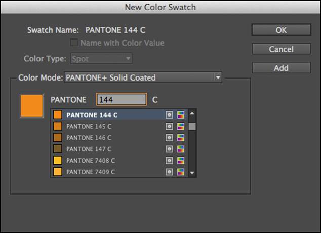
Figure 5-1: Choose a color from the swatch library to add it to the Swatches panel.
Picking Pantone colors using your color monitor isn't easy. Your monitor doesn't provide the most accurate representation of a color or show you how a color will print. If you plan to print your document in large volume, or if color is critical, we suggest purchasing a color swatch book from Pantone, such as the Pantone Color Bridge Set. For more details about this guide, go to www.pantone.com and search for Color Bridge.
5. Click the Add button.
This step adds the swatch to your list of color swatches in the Swatches panel. You can add as many color swatches as you like.
6. When you finish adding swatches, click the OK button.
After you add a new color, the swatch is added to the list of swatches in the swatches panel and is ready to use in your project. Look in the swatches panel to see the newly added colors.
All materials on the site are licensed Creative Commons Attribution-Sharealike 3.0 Unported CC BY-SA 3.0 & GNU Free Documentation License (GFDL)
If you are the copyright holder of any material contained on our site and intend to remove it, please contact our site administrator for approval.
© 2016-2026 All site design rights belong to S.Y.A.