Beginning iPhone Development with Swift: Exploring the iOS SDK (2014)
Chapter 4. More User Interface Fun
In Chapter 3, we discussed MVC and built an application using it. You learned about outlets and actions, and you used them to tie a button control to a text label. In this chapter, we’re going to build an application that will take your knowledge of controls to a whole new level.
We’ll implement an image view, a slider, two different text fields, a segmented control, a couple of switches, and an iOS button that looks like buttons did before iOS 7. You’ll see how to set and retrieve the values of various controls. You’ll learn how to use action sheets to force the user to make a choice, and how to use alerts to give the user important feedback. You’ll also learn about control states and the use of stretchable images to make buttons look the way they should.
Because this chapter’s application uses so many different user interface items, we’re going to work a little differently than we did in the previous two chapters. We’ll break our application into pieces, implementing one piece at a time. Bouncing back and forth between Xcode and the iOS simulator, we’ll test each piece before we move on to the next. Dividing the process of building a complex interface into smaller chunks makes it much less intimidating, as well as more like the actual process you’ll go through when building your own applications. This code-compile-debug cycle makes up a large part of a software developer’s typical day.
A Screen Full of Controls
As we mentioned, the application we’re going to build in this chapter is a bit more complex than the one we created in Chapter 3. We’ll still use only a single view and controller; but as you can see in Figure 4-1, there’s a lot more going on in this one view.
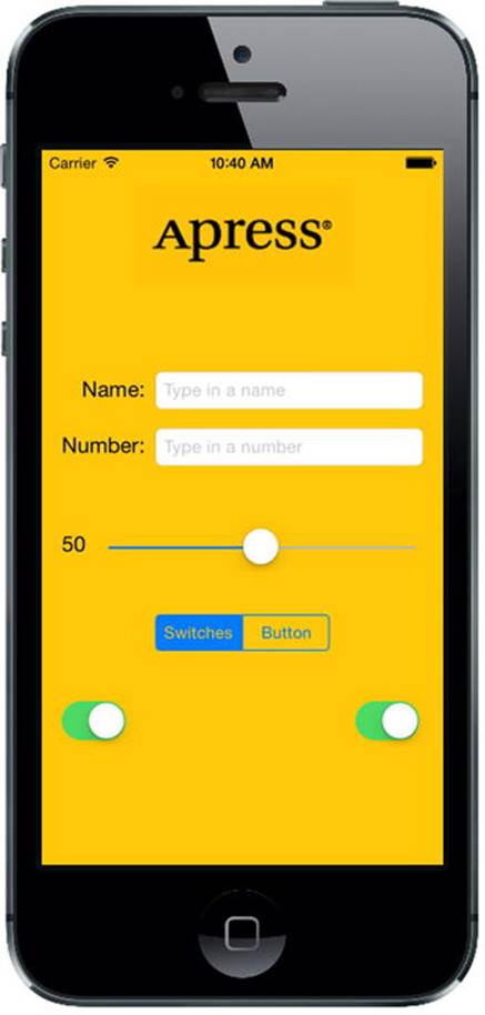
Figure 4-1. The Control Fun application features text fields, labels, a slider, and several other stock iPhone controls
The logo at the top of the screen is an image view. In this application, it does nothing more than display a static image. Below the logo are two text fields: one that allows the entry of alphanumeric text and one that allows only numbers. Below the text fields is a slider. As the user moves the slider, the value of the label next to it will change so that it always reflects the slider’s current value.
Below the slider are a segmented control and two switches. The segmented control will toggle between two different types of controls in the space below it. When the application first launches, two switches will appear below the segmented control. Changing the value of either switch will cause the other one to change its value to match. Now, this isn’t something you would likely do in a real application, but it does demonstrate how to change the value of a control programmatically and how Cocoa Touch animates certain actions without you needing to do any work.
Figure 4-2 shows what happens when the user taps the segmented control. The switches disappear and are replaced by a button. When the Do Something button is pressed, an action sheet pops up, asking if the user really meant to tap the button (see Figure 4-3). This is the standard way of responding to input that is potentially dangerous or that could have significant repercussions, and it gives the user a chance to stop potential badness from happening. If Yes, I’m Sure! is selected, the application will put up an alert, letting the user know that everything is OK (see Figure 4-4).
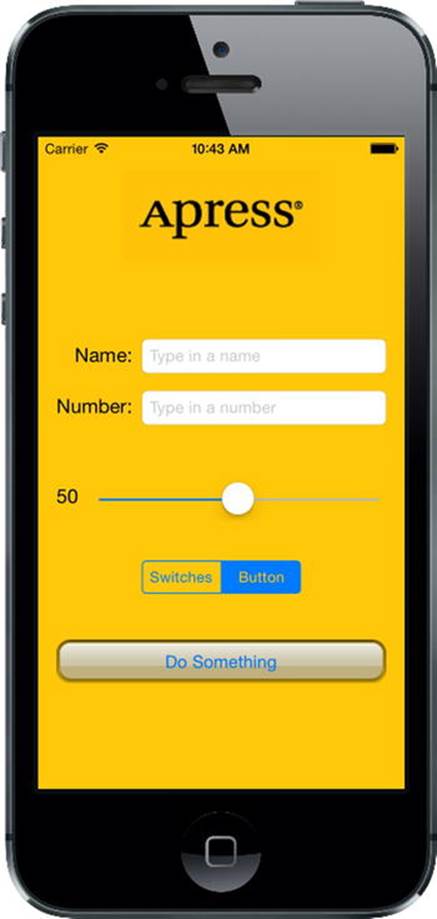
Figure 4-2. Tapping the segmented controller on the left side causes a pair of switches to be displayed. Tapping the right side causes a button to be displayed
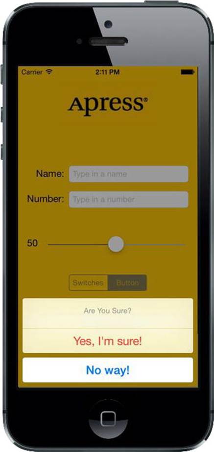
Figure 4-3. Our application uses an action sheet to solicit a response from the user
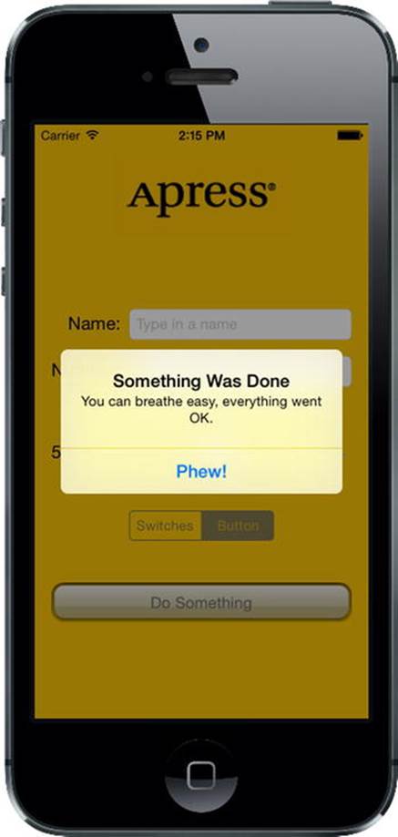
Figure 4-4. Alerts are used to notify the user when important things happen. We use one here to confirm that everything went OK
Active, Static, and Passive Controls
Interface controls are used in three basic modes: active, static (or inactive), and passive. The buttons that we used in the previous chapter are classic examples of active controls. You push them, and something happens—usually, a piece of code that you wrote fires.
Although many of the controls that you will use will directly trigger action methods, not all controls will. The image view that we’ll be implementing in this chapter is a good example of a control being used statically. A UIImageView can be configured to trigger action methods, but in our application the image view is passive—the user cannot do anything with it. Labels and image controls are often used in this manner.
Some controls can work in a passive mode, simply holding on to a value that the user has entered until you’re ready for it. These controls don’t trigger action methods, but the user can interact with them and change their values. A classic example of a passive control is a text field on a web page. Although it’s possible to create validation code that fires when the user tabs out of a field, the vast majority of web page text fields are simply containers for data that’s submitted to the server when the user clicks the submit button. The text fields themselves usually don’t cause any code to fire, but when the submit button is clicked, the text field’s data goes along for the ride.
On an iOS device, most of the available controls can be used in all three modes, and nearly all of them can function in more than one mode, depending on your needs. All iOS controls are subclasses of UIControl, which makes them capable of triggering action methods. Many controls can be used passively, and all of them can be made inactive or invisible. For example, using one control might trigger another inactive control to become active. However, some controls, such as buttons, really don’t serve much purpose unless they are used in an active manner to trigger code.
There are some behavioral differences between controls on iOS and those on your Mac. Here are a few examples:
· Because of the multitouch interface, all iOS controls can trigger multiple actions, depending on how they are touched. The user might trigger a different action with a finger swipe across the control than with just a tap.
· You could have one action fire when the user presses down on a button and a separate action fire when the finger is lifted off the button.
· You could have a single control call multiple action methods on a single event. For example, you could have two different action methods fire on the Touch Up Inside event when the user’s finger is lifted after touching that button.
Note Although controls can trigger multiple methods on iOS, the vast majority of the time, you’re probably better off implementing a single action method that does what you need for a particular use of a control. You won’t usually need this capability, but it’s good to keep it in mind when working in Interface Builder. Connecting an event to an action in Interface Builder does not disconnect a previously connected action from the same control! This can lead to surprising misbehaviors in your app, where a control will trigger multiple action methods. Keep an eye open when retargeting an event in Interface Builder, and make sure you remove old actions before connecting to new ones.
Another major difference between iOS and the Mac stems from the fact that, normally, iOS devices do not have a physical keyboard. The standard iOS software keyboard is actually just a view filled with a series of button controls that are managed for you by the system. Your code will likely never directly interact with the iOS keyboard.
Creating the Application
Let’s get started. Fire up Xcode if it’s not already open, and create a new project called Control Fun. We’re going to use the Single View Application template again, so create your project just as you did in the previous two chapters.
Now that you’ve created your project, let’s get the image we’ll use in our image view. The image must be imported into Xcode before it will be available for use inside Interface Builder, so we’ll import it now. You’ll find three files in the 04 - Logos folder in the example source code archive, named apress_logo.png, apress_logo@2x.png, and apress_logo@3x.png, which are a standard version and two Retina versions of the same image. We’re going to add all three of these to the new project’s image resource catalog and let the app decide which of them to use at runtime. If you’d rather use an image-pair of your own choosing, make sure that they are .png images sized correctly for the space available. The small version should be less than 100 pixels tall and a maximum of 300 pixels wide, so that it can fit comfortably at the top of the view on the narrowest iPhone screen without being resized. The larger ones should be respectively twice and three times the size of the small version.
In Xcode, select Images.xcassets in the Project Navigator and click the plus (+) button in the lower-left corner of the editor area. This brings up a small menu of choices, from which you should select New Image Set. This creates a new spot for adding your actual image files. Right now it’s just called Image, but we want to give it a unique name so that we can refer to it elsewhere in the project. Select the Image item, bring up the Attributes Inspector (
 4, or Opt-Cmd-4), and use it to change the image’s name to apress_logo.
Now add the images themselves to the apress_logo image item by dragging each image from the Finder to the image detail box. Drag apress_logo.png to the spot labeled 1x, apress_logo@2x.png to the 2x slot, and apress_logo@2x.png to the 3x slot.
Implementing the Image View and Text Fields
With the image added to your project, your next step is to implement the five interface elements at the top of the application’s screen: the image view, the two text fields, and the two labels (see Figure 4-5).
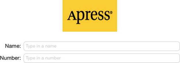
Figure 4-5. The image view, labels, and text fields we will implement first
Adding the Image View
In the Project Navigator, click Main.storyboard to open the file in Interface Builder. You’ll see the familiar white background and a single square view where you can lay out your application’s interface.
If the Object Library is not open, select View  Utilities Show Object Library to open it. Scroll about one-fourth of the way through the list until you find Image View (see Figure 4-6) or just type image in the search field. Remember that the Object Library is the third icon on top of the library pane. You won’t find Image View under any of the other icons.
Figure 4-6. The Image View element in Interface Builder’s library
Drag an image view onto the view in the storyboard editor. Notice that, as you drag your image view out of the library, it changes size twice. As the drag makes its way out of the library pane, it takes the shape of a horizontal rectangle. Then, when your drag enters the frame of the view, the image view resizes to be the size of the view, including the status bar at the top. This behavior is normal. Indeed, in many cases it is exactly what you want because the first image you place in a view is often a background image. Release the drag inside the view, taking care that the newUIImageView snaps to the sides and bottom of the surrounding view. In this particular case, we actually don’t want our image view to take the entire space, so we use the drag handles to resize the image view to the approximate size of the image previously imported into Xcode. Don’t worry about getting it exactly right yet; we’ll take care of that in the next section. Figure 4-7 shows our resized UIImageView.
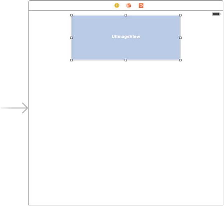
Figure 4-7. Our resized UIImageView, sized to approximate the dimensions of the image we will place here
Remember that, if you ever encounter difficulty selecting an item in the editing area, you can open the Document Outline by clicking the small rectangular icon in the lower-left corner. Now, click the item you want selected in the Document Outline and, sure enough, that item will be selected in the editor.
To get at an object that is nested inside another object, click the disclosure triangle to the left of the enclosing object to reveal the nested object. In this case, to select the image view, first click the disclosure triangle to the left of the view. Then, when the image view appears in the Document Outline, click it, and it will be selected in the editing area.
With the image view selected, bring up the object Attributes Inspector by pressing  4, and you should see the editable options of the UIImageView class (see Figure 4-8).
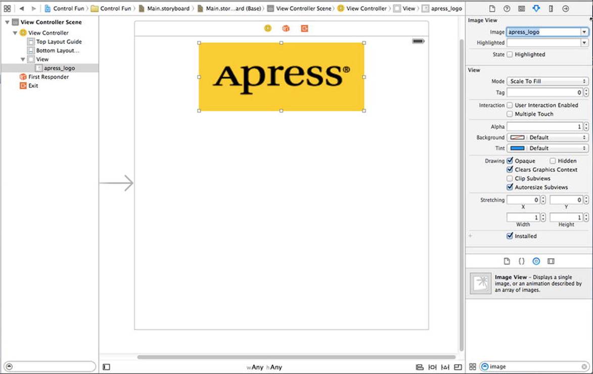
Figure 4-8. The image view Attributes Inspector. We selected our image from the Image pop-up at the top of the inspector, and this populated the image view with our image
The most important setting for our image view is the topmost item in the inspector, labeled Image. Click the little arrow to the right of the field to see a pop-up menu that lists the available images. This list includes any images you added to your project’s image assets catalog. Select theapress_logo image you added earlier and it should appear in your image view.
Resizing the Image View
As it turns out, the image we used is a fair amount smaller than the image view in which it was placed. If you take another look at Figure 4-8, you’ll notice that the image we used was scaled to completely fill the image view. A big clue that this is so is the Mode setting in the Attributes Inspector, which is set to Scale To Fill.
Though we could keep our app this way, it’s generally a good idea to do any image scaling before runtime, as image scaling takes time and processor cycles. Let’s resize our image view to the exact size of our image.
Make sure the image view is selected and that you can see the resize handles. Now select the image view one more time. You should see the outline of the image view replaced by a thick gray border. Finally, press = or select Editor Size to Fit Content. This will resize the image view to match the size of its contents. If pressing = does not work, or Size to Fit Content is grayed out, reselect the image view, drag it a little way to the side, and try again.
Now that the image view is resized, let’s move it back to its final position by selecting it and choosing Editor Align Horizontal Center in Container. This creates a constraint that makes the image view always want to remain centered within the view that contains it, even if that view changes size. In Chapter 3, you did the same thing by using the Horizontal Center in Container check box in the Align pop-up at the bottom of the editing area. You may have noticed the way Interface Builder shows some solid lines running from an edge of one view to an edge of its superview (not to be confused with the dashed blue lines that are shown while you’re dragging things around). These solid lines represent the constraints that express the layout rules that are built directly in Interface Builder. When you select the constraint that you just added by clicking it, you’ll see that it becomes a solid orange line, running the entire height of the main view (see Figure 4-9). This specifies that the center of the image view will remain horizontally centered within its parent view, even if the parent view’s geometry changes (as it may, for example, when the device is rotated). We’ll talk more about constraints throughout the book.
Note You may have noticed that there is an orange warning indicator in the Activity View. If you click it, you’ll see that it’s telling you that the vertical position of the Image View is ambiguous. What Xcode is telling us is that we need to set a vertical constraint for that view. You can either do so now, using the techniques you saw in Chapter 3, or wait until we fix all the constraints for our layout later in the chapter.
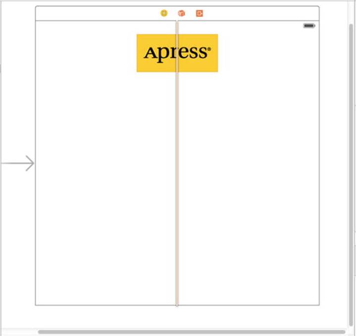
Figure 4-9. Once we have resized our image view to fit the size of its image, we drag it into position using the view’s blue guidelines, and create a constraint to keep it centered
Tip Dragging and resizing views in Interface Builder can be tricky. Don’t forget about the Document Outline, which you can open by clicking the small rectangular icon at the bottom left of the editing area. When it comes to resizing, hold down the key, and Interface Builder will draw some helpful red lines on the screen that make it much easier to get a sense of the image view’s size. This trick won’t work with dragging, since the key will prompt Interface Builder to make a copy of the dragged object. However, if you select Editor Canvas Show Bounds Rectangles, Interface Builder will draw a line around all of your interface items, making them easier to see. You can turn off those lines by selecting Show Bounds Rectangles a second time.
Setting View Attributes
Select your image view and then switch your attention back over to the Attributes Inspector. Below the Image View section of the inspector is the View section. As you may have deduced, the pattern here is that the attributes that are specific to the selected object are shown at the top, followed by more general attributes that apply to the selected object’s parent class. In this case, the parent class of UIImageView is UIView, so the next section is simply labeled View, and it contains attributes that any view class will have.
The Mode Attribute
The first option in the view inspector is a pop-up menu labeled Mode. The Mode menu defines how the view will display its content. This determines how the image will be aligned inside the view and whether it will be scaled to fit. Feel free to play with the various options, but the default value of Scale To Fill will work fine for now, because we made the image view exactly the right size for its image.
Keep in mind that choosing any option that causes the image to scale will potentially add processing overhead at runtime, so it’s best to avoid those and size your images correctly before you import them. If you want to display the same image at multiple sizes, generally it’s better to have multiple copies of the image at different sizes in your project, rather than force the iOS device to do scaling at runtime. Of course, there are times when scaling at runtime is appropriate and even unavoidable; this is a guideline, not a rule.
Tag
The next item, Tag, is worth mentioning, though we won’t be using it in this chapter. All subclasses of UIView, including all views and controls, have a property called tag, which is just a numeric value that you can set here or in code. The tag is designed for your use—the system will never set or change its value. If you assign a tag value to a control or view, you can be sure that the tag will always have that value unless you change it.
Tags provide an easy, language-independent way of identifying objects in your interface. Let’s say you have five different buttons, each with a different label, and you want to use a single action method to handle all five buttons. In that case, you probably need some way to differentiate among the buttons when your action method is called. Sure, you could look at the button’s title, but code that does that probably won’t work when your application is translated into Swahili or Sanskrit. Unlike labels, tags will never change, so if you set a tag value here in Interface Builder, you can then use that as a fast and reliable way to check which control was passed into an action method in the sender argument.
Interaction Check Boxes
The two check boxes in the Interaction section have to do with user interaction. The first check box, User Interaction Enabled, specifies whether the user can do anything at all with this object. For most controls, this box will be checked because, if it’s not, the control will never be able to trigger action methods. However, image views default to unchecked because they are often used just for the display of static information. Since all we’re doing here is displaying a picture on the screen, there is no need to turn this on.
The second check box is Multiple Touch, and it determines whether this control is capable of receiving multitouch events. Multitouch events allow complex gestures like the pinch gesture used to zoom in in many iOS applications. We’ll talk more about gestures and multitouch events inChapter 18. Since this image view doesn’t accept user interaction at all, there’s no reason to turn on multitouch events, so leave this check box unchecked.
The Alpha Value
The next item in the inspector is Alpha. Be careful with this one. Alpha defines how transparent your image is—how much of what’s beneath it shows through. It’s defined as a floating-point number between 0.0 and 1.0, where 0.0 is fully transparent and 1.0 is completely opaque. If you use any value less than 1.0, your iOS device will draw this view with some amount of transparency so that any objects behind it show through. With a value of less than 1.0, even if there’s nothing interesting behind your image, you will cause your application to spend processor cycles compositing your partially transparent view over the emptiness behind it. Therefore, don’t set Alpha to anything other than 1.0 unless you have a very good reason for doing so.
Background
The next item down, Background, determines the color of the background for the view. For image views, this matters only when an image doesn’t fill its view and is letterboxed, or when parts of the image are transparent. Since we’ve sized our view to perfectly match our image, this setting will have no visible effect, so we can leave it alone.
Tint
The next control lets you specify a tint color for the selected view. This is a color that some views use when drawing themselves. The segmented control that we’ll use later in this chapter colors itself using its tint color, but the UIImageView does not.
Drawing Check Boxes
Below Tint is a series of Drawing check boxes. The first one is labeled Opaque. That should be checked by default; if not, click to check that check box. This tells iOS that nothing behind your view needs to be drawn and allows iOS’s drawing methods to do some optimizations that speed up drawing.
You might be wondering why we need to select the Opaque check box when we’ve already set the value of Alpha to 1.0 to indicate no transparency. The alpha value applies to the parts of the image to be drawn; but if an image doesn’t completely fill the image view, or there are holes in the image thanks to an alpha channel, the objects below will still show through, regardless of the value set in Alpha. By selecting Opaque, we are telling iOS that nothing behind this view ever needs to be drawn, no matter what, so it does not need to waste processing time with anything behind our object. We can safely select the Opaque check box because we selected Size To Fit earlier, which caused the image view to match the size of the image it contains.
The Hidden check box does exactly what you think it does. If it’s checked, the user can’t see this object. Hiding an object can be useful at times, as you’ll see later in this chapter when we hide our switches and button; however, the vast majority of the time—including now—you want this to remain unchecked.
The next check box, Clears Graphics Context, will rarely need to be checked. When it is checked, iOS will draw the entire area covered by the object in transparent black before it actually draws the object. Again, it should be turned off for the sake of performance and because it’s rarely needed. Make sure this check box is unchecked (it is likely checked by default).
Clip Subviews is an interesting option. If your view contains subviews, and those subviews are not completely contained within the bounds of its parent view, this check box determines how the subviews will be drawn. If Clip Subviews is checked, only the portions of subviews that lie within the bounds of the parent will be drawn. If Clip Subviews is unchecked, subviews will be drawn completely, even if they lie outside the bounds of the parent.
Clip Subviews is unchecked by default. It might seem that the default behavior should be the opposite of what it actually is, so that child views won’t be able to draw all over the place. However, calculating the clipping area and displaying only part of the subviews is a somewhat costly operation, mathematically speaking; most of the time, a subview won’t lie outside the bounds of its superview. You can turn on Clip Subviews if you really need it for some reason, but it is off by default for the sake of performance.
The last check box in this section, Autoresize Subviews, tells iOS to resize any subviews if this view is resized. Leave this checked (since we don’t allow our view to be resized, it really does not matter whether it’s checked).
Stretching
Next up is a section simply labeled Stretching. You can leave your yoga mat in the closet, though, because the only stretching going on here is in the form of rectangular views being redrawn as they’re resized on the screen. The idea is that, rather than the entire content of a view being stretched uniformly, you can keep the outer edges of a view, such as the beveled edge of a button, looking the same even as the center portion stretches.
The four floating-point values set here let you declare which portion of the rectangle is stretchable by specifying a point at the upper-left corner of the view and the size of the stretchable area, all in the form of a number between 0.0 and 1.0 that represents a portion of the overall view size. For example, if you wanted to keep 10% of each edge not stretchable, you would specify 0.1 for both X and Y, and 0.8 for both Width and Height. In this case, we’re going to leave the default values of 0.0 for X and Y, and 1.0 for Width and Height. Most of the time, you will not change these values.
Adding the Text Fields
With your image view finished, it’s time to bring on the text fields. Grab a text field from the Object Library and drag it into the View, underneath the image view. Use the blue guidelines to align it with the right margin and make it snug, just under your image view (see Figure 4-10).
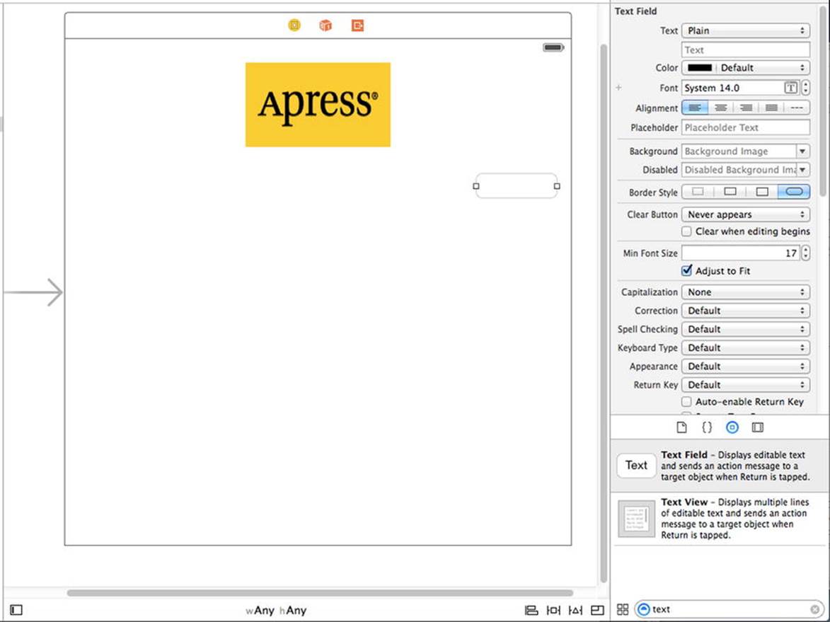
Figure 4-10. We dragged a text field out of the library and dropped it onto the view, just below our image view and touching the right-hand side’s blue guideline
A horizontal blue guideline will appear just above the text field when you move it very close to the bottom of your image view. That guideline tells you when the object you are dragging is the minimum reasonable distance from an adjacent object. You can leave your text field there for now, but to give it a balanced appearance, consider moving it a little farther down before moving it to toward the guideline at the right edge. Remember that you can always use Interface Builder to edit your GUI again in order to change the position and size of interface elements—without needing to change code or reestablish connections.
After you drop the text field, grab a label from the library, and then drag that over so it is aligned with the left margin of the view and vertically with the text field you placed earlier. Notice that multiple blue guidelines will pop up as you move the label around, making it easy to align the label to the text field using the top, bottom, or middle of the label. We’re going to align the label and the text field using the baseline, which shows up as you’re dragging around the middle of those guidelines (see Figure 4-11).
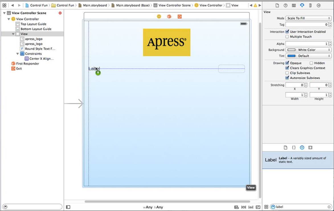
Figure 4-11. Aligning the label and text field using the baseline guide
Double-click the label you just dropped, change it to read Name: instead of Label (note the colon character at the end of the label), and press the Enter key to commit your changes.
Next, drag another text field from the library to the view and use the guidelines to place it below the first text field (see Figure 4-12).
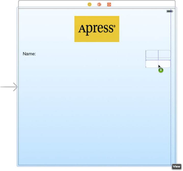
Figure 4-12. Adding the second text field
Once you’ve added the second text field, grab another label from the library and place it on the left side, below the existing label. Again, use the middle blue guideline to align your new label with the second text field. Double-click the new label and change it to read (again, don’t forget the colon).
Now, let’s expand the size of the bottom text field to the left, so it is snug up against the right side of the label. Why start with the bottom text field? We want the two text fields to be the same size, and the bottom label is longer.
Single-click the bottom text field and drag the left resize dot to the left until a blue guideline appears to tell you that you are as close as you should ever be to the label (see Figure 4-13). This particular guideline is somewhat subtle—it’s only as tall as the text field itself, so keep your eyes peeled.
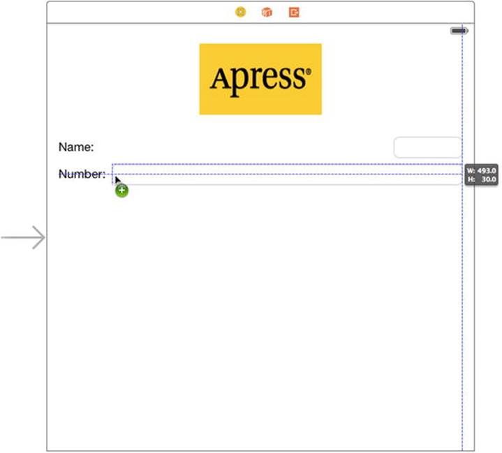
Figure 4-13. Expanding the size of the bottom text field
Now, expand the top text field in the same way, so that it matches the bottom one in size. Once again, a blue guideline provides some help, and this one extends all the way down to the other text field, making it easier to spot.
We’re basically finished with the text fields, except for one small detail. Look back at Figure 4-5. Do you see how the Name: and Number: are right-aligned? Right now, ours are both against the left margin. To align the right sides of the two labels, click the Name: label, hold down the  (Shift) key, and click the Number: label, so both labels are selected. Next, press 4 to bring up the Attributes Inspector and make sure the Label section is expanded, so you can see the label-specific attributes. If it’s not expanded, click the Show button on the right of the header to open it. Now use the Alignment control in the inspector to make the content of these labels right-justified, and then make a constraint to make sure these two fields are always the same width by selecting Editor Pin Widths Equally.
When you are finished, the interface should look very much like the one shown in Figure 4-5. The only difference is the light-gray text in each text field. We’ll add that now.
Select the top text field (the one next to the Name: label) and press  4 to bring up the Attributes Inspector (see Figure 4-14). The text field is one of the most complex iOS controls, as well as one of the most commonly used. Let’s take a walk through the settings, beginning from the top of the inspector.
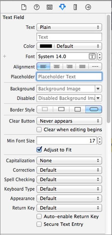
Figure 4-14. The inspector for a text field showing the default values
Text Field Inspector Settings
In the first section, the Text label points out two controls that give you some control over the text that will appear in the text field. The upper one is a pop-up button that lets you choose between plain text and attributed text, which can contain a variety of fonts and other attributes. We used attributed text to add bold to part of the text in our example in Chapter 3. Let’s leave that pop-up button set to Plain for now. Immediately below that, you can set a default value for the text field. Whatever you type here will show up in the text field when your application launches, instead of just a blank space.
After that comes a series of controls that let you set the font and font color. We’ll leave the Color at the default value of black. Note that the Color pop-up is divided into two parts. The right side allows you to select from a set of preselected colors, and the left side gives you access to a color well to more precisely specify your color.
The Font setting is divided into three parts. On the right side is a control that lets you increment or decrement the text size, one point at a time. The left side allows you to manually edit the font name and size. Finally, click the T-in-a-box icon to bring up a pop-up window that lets you set the various font attributes. We’ll leave the Font at its default setting of System 14.0.
Below these fields are five buttons for controlling the alignment of the text displayed in the field. We’ll leave this setting at the default value of left-aligned (the leftmost button).
Rounding out this first section, Placeholder allows you to specify a bit of text that will be displayed in gray inside the text field, but only when the field does not have a value. You can use a placeholder instead of a label if space is tight, or you can use it to clarify what the user should type into this text field. Type in the text Type in a name as the placeholder for our currently selected text field, and then hit Enter to commit the change.
The next two fields, Background and Disabled, are used only if you need to customize the appearance of your text field, which is completely unnecessary and actually ill-advised the vast majority of the time. Users expect text fields to look a certain way. We’re going to skip over these fields, leaving them set to their defaults.
Next are four buttons labeled Border Style. These allow you to change the way the text field’s edge will be drawn. The default value (the rightmost button) creates the text field style that users are most accustomed to seeing for normal text fields in an iOS application. Feel free to try all four different styles. When you’re finished experimenting, set this setting back to the rightmost button.
Below the border setting is a Clear Button pop-up button, which lets you choose when the clear button should appear. The clear button is the small X that can appear at the right end of a text field. Clear buttons are typically used with search fields and other fields where you would be likely to change the value frequently. They are not typically included on text fields used to persist data, so leave this at the default value of Never appears.
The Clear when editing begins check box specifies what happens when the user touches this field. If this box is checked, any value that was previously in this field will be deleted, and the user will start with an empty field. If this box is unchecked, the previous value will remain in the field, and the user will be able to edit it. Leave this check box unchecked.
The next section starts with a control that lets you set the minimum font size that the text field will use for displaying its text. Leave that at its default value for now.
The Adjust to Fit check box specifies whether the size of the text should shrink if the text field is reduced in size. Adjusting to fit will keep the entire text visible in the view, even if the text would normally be too big to fit in the allotted space. This check box works in conjunction with the minimum font size setting. No matter the size of the field, the text will not be resized below that minimum size. Specifying a minimum size allows you to make sure that the text doesn’t get too small to be readable.
The next section defines how the keyboard will look and behave when this text field is being used. Since we’re expecting a name, let’s change the Capitalization pop-up to Words. This causes the first letter of every word to be automatically capitalized, which is what you typically want with names.
The next four pop-ups—Correction, Spell Checking, Keyboard, and Appearance—can be left at their default values. Take a minute to look at each to get a sense of what these settings do.
Next is the Return Key pop-up. The Return key is the key on the lower right of the virtual keyboard, and its label changes based on what you’re doing. If you are entering text into Safari’s search field, for example, then it says Search. In an application like ours, where the text fields share the screen with other controls, Done is the right choice. Make that change here.
If the Auto-enable Return Key check box is checked, the Return key is disabled until at least one character is typed into the text field. Leave this unchecked because we want to allow the text field to remain empty if the user prefers not to enter anything.
The Secure check box specifies whether the characters being typed are displayed in the text field. You would check this check box if the text field was being used as a password field. Leave it unchecked for our app.
The next section (which you will probably have to scroll down to see) allows you to set control attributes inherited from UIControl; however, these generally don’t apply to text fields and, with the exception of the Enabled check box, won’t affect the field’s appearance. We want to leave these text fields enabled, so that the user can interact with them. Leave the default settings in this section.
The last section on the inspector, View, should look familiar. It’s identical to the section of the same name on the image view inspector we looked at earlier. These are attributes inherited from the UIView class; since all controls are subclasses of UIView, they all share this section of attributes. As you did earlier for the image view, check the Opaque check box and uncheck Clears Graphics Context and Clip Subviews—for the reasons we discussed earlier.
Setting the Attributes for the Second Text Field
Next, single-click the lower text field (the one next to the Number: label) in the View window and return to the inspector. In the Placeholder field, type Type in a number, and make sure Clear When Editing Begins is unchecked. A little farther down, click the Keyboard pop-up menu. Since we want the user to enter only numbers, not letters, select Number Pad. On the iPhone, this ensures that the users will be presented with a keyboard containing only numbers, meaning they won’t be able to enter alphabetical characters, symbols, or anything other than numbers. We don’t need to set the Return Key value for the numeric keypad because that style of keyboard doesn’t have a Return key; therefore, all of the other inspector settings can stay at the default values. As you did earlier, check the Opaque check box and uncheck Clears Graphics Context andClip Subviews. On the iPad, selecting Number Pad has the effect of bringing up a full virtual keyboard in numeric mode when the user activates the text field, but the user can switch back to alphabetic input. This means that in a real application, you would have to verify that the user actually entered a valid number when processing the content of the Number field.
Tip If you really want to stop the user typing anything other than numbers into a text field, you can do so by creating a class that implements the textView(_, shouldChangeTextInRange:, replacementText:) method of the UITextViewDelegate protocol and making it the text view’s delegate. The details are not too complex, but beyond the scope of this book.
Adding Constraints
Before we go on, we need to adjust some constraints for this layout. When you drag a view into another view in Interface Builder (as we just did), Xcode doesn’t create any constraints for it automatically. The layout system requires a complete set of constraints, so when it’s time to compile your app, Xcode will make a set of default constraints describing the layout. The constraints that are created depend on each object’s position within its superview. Depending on whether it’s nearer the left or right edge, it will be pinned to the left of the right. Similarly, depending on whether it’s nearer the top or the bottom edge, it will be pinned to the top or the bottom. If it’s centered in either direction, it will typically get a constraint pinning it to the center.
To complicate matters further, Xcode may also apply automatic constraints pinning each new object to one or more of its “sibling” objects within the same superview. This automatic behavior may or may not be what you want, so normally you’re better off creating a complete set of constraints within Interface Builder before your app is compiled and in the last two chapters, you have seen some examples of that.
Let’s start poking around what we have so far. To see all the constraints that are in play for any particular view, try selecting it and opening the Size Inspector. If you select any of the labels, text fields, or the slider, you’ll see that the Size Inspector shows a message claiming that there are no constraints for the selected view. In fact, this GUI we’ve been building has only the one constraint that we applied earlier, binding the horizontal centers of the image view and the container view. Click either the container view or the image view to see this constraint in the inspector.
What we really want is a full set of constraints to tell the layout system precisely how to handle all our views and controls, just as it would get at compile time. Fortunately, this is pretty simple to accomplish. Select all the views and controls by click-dragging a box around them, from inside the upper-left corner of our container view down toward the lower right. If you start dragging and find that the view starts moving instead, just release the mouse, move it a little bit further inside the view and try again. When all items are selected, use the menu to execute the Editor Resolve Auto Layout Issues Add Missing Constraints command. After doing that, you’ll see that all our views and controls now have some little blue sticks connecting them to one another and to the container view. Each of those sticks represents a constraint. The big advantage to creating these now instead of letting Xcode create them at compile time is that we now have a chance to modify each constraint if we need to. We’ll explore more of what we can do with constraints throughout the book.
Tip Another way to apply constraints to all the views owned a view controller is to select the view controller in the Document Outline and then use Editor Resolve Auto Layout Issues Add Missing Constraints.
Normally, the layout we’ve created here wouldn’t require any particular modification of these constraints to make sure it works fine on all devices, but this is not always the case. For example, if you were to add more text fields below the two that we already have until you reach the bottom of the view, and then have Xcode add constraints, you would find that it would tie the whole column of text fields to the bottom of the view, not to the top, so when you run the application on a taller screen than the one in Interface Builder (for example, on an iPhone 6 Plus), the text fields would all move down relative to the image view and not be where you want them to be.
For our current GUI, this isn’t a problem, however, which we can verify by using the Preview Assistant again. Open the Assistant Editor by selecting the middle toolbar button labeled Editor or by clicking View Assistant Editor Show Assistant Editor, and then select Preview andMain.storyboard in the jump bar. When the preview for the 4-inch iPhone appears, add an extra one for the 5.5-inch iPhone and you’ll see that the layout remains exactly as it is on the smaller phone, although the text fields are now a little wider because of the larger width of this screen. Later in the book, we’ll deal with some GUIs that need a bit of adjustment in this area and in most of the examples that follow, we’ll create explicit constraints instead of allowing Xcode to do the work for us, so that you have plenty of opportunity to get used to adding constraints manually.
Caution For this relatively simple example, Xcode is perfectly capable of creating constraints that will preserve that layout that we need, but that’s not always the case. Any time you use the Editor Resolve Auto Layout Issues Add Missing Constraints command, you should check carefully the constraints that Xcode added. If they don’t work as you expected, then delete them and add constraints manually using the techniques that you saw in Chapter 2 and Chapter 3.
Creating and Connecting Outlets
We are almost ready to take our app for its first test drive. For this first part of the interface, all that’s left is creating and connecting our outlets. The image view and labels on our interface do not need outlets because we don’t need to change them at runtime. The two text fields, however, will hold data we’ll need to use in our code, so we need outlets pointing to each of them.
As you probably remember from the previous chapter, Xcode allows us to create and connect outlets at the same time using the Assistant Editor, which should already be open (but if it’s not, open it as described earlier).
Make sure your storyboard file is selected in the Project Navigator. If you don’t have a large amount of screen real estate, you might also want to select View Utilities Hide Utilities to hide the utility pane during this step. In the Assistant Editor’s jump bar, select Automatic and you should see the file ViewController.swift (see Figure 4-15).
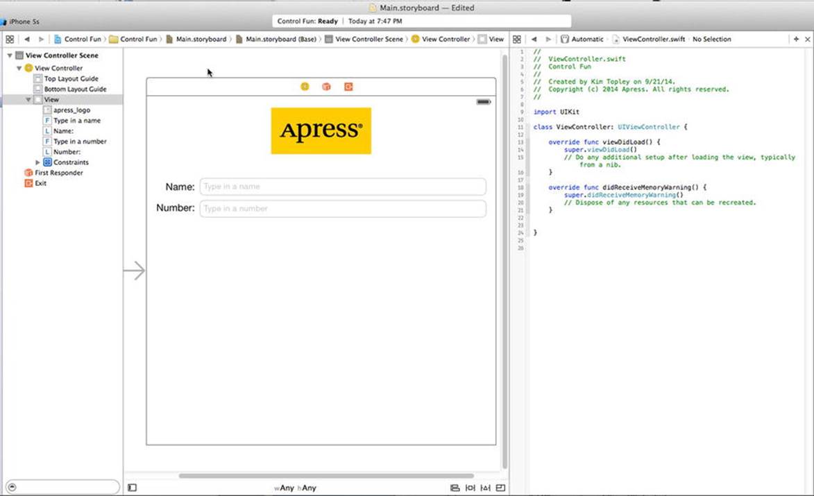
Figure 4-15. The storyboard editing area with the Assistant Editor turned on. You can see the Assistant Editor on the right, showing the code from ViewController.swift
Now comes the fun part. Control-drag from the top text field in the view over to the ViewController.swift file, right below the ViewController line. You should see a gray pop-up that reads Insert Outlet, Action, or Outlet Collection (see Figure 4-16). Release the mouse button, and you’ll get the same pop-up you saw in the previous chapter. We want to create an outlet called nameField, so type nameField into the Name field (say that five times fast!), and then hit Return or click the Connect button.
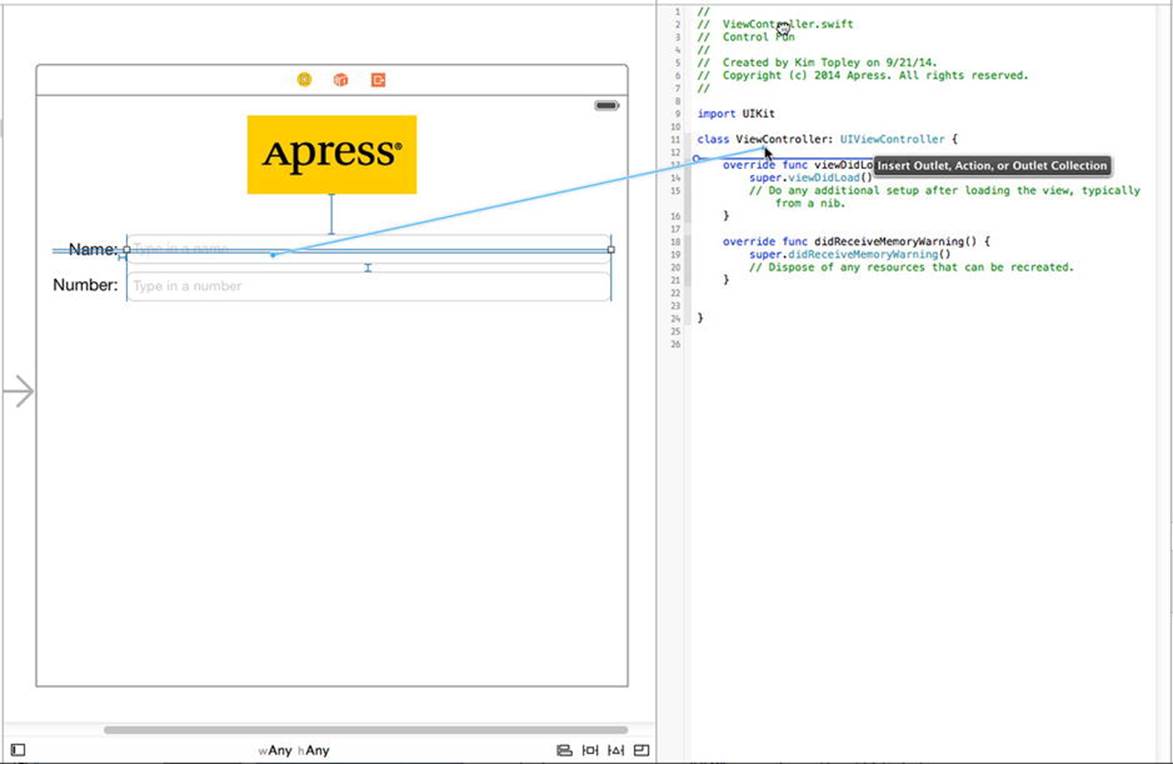
Figure 4-16. With the assistant turned on, we Control-drag over to the source code in order to simultaneously create the nameField outlet and connect it to the appropriate text field
You now have a property called nameField in ViewController, and it has been connected to the top text field. Do the same for the second text field, creating and connecting it to a property called numberField.
Closing the Keyboard
Let’s see how our app works, shall we? Select Product Run. Your application should come up in the iOS simulator. Click the Name text field, and the traditional keyboard should appear. Type in a name and then tap the Number field. The numeric keypad should appear (see Figure 4-17). Cocoa Touch gives us all this functionality for free just by adding text fields to our interface.
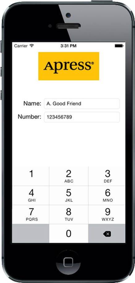
Figure 4-17. The keyboard comes up automatically when you touch either the text field or the number field
Woo-hoo! But there’s a little problem. How do you get the keyboard to go away? Go ahead and try. We’ll wait right here while you do.
Tip If the keyboard doesn’t show up on the simulator, try selecting Hardware Keyboard Toggle Software Keyboard.
Closing the Keyboard When Done Is Tapped
Because the keyboard is software-based rather than a physical keyboard, we need to take a few extra steps to make sure the keyboard goes away when the user is finished with it. When the user taps the Done button on the text keyboard, a Did End On Exit event will be generated; at that time, we need to tell the text field to give up control so that the keyboard will go away. In order to do that, we need to add an action method to our controller class.
Select ViewController.swift in the Project Navigator and add the following action method at the bottom of the file, just before the closing brace:
@IBAction func textFieldDoneEditing(sender: UITextField) {
sender.resignFirstResponder()
}
As you learned in Chapter 2, the first responder is the control with which the user is currently interacting. In our new method, we tell our control to resign as a first responder, giving up that role to the previous control the user worked with. When a text field yields first responder status, the keyboard associated with it goes away.
Save the file you just edited. Let’s hop back to the storyboard and trigger this action from both of our text fields.
Select Main.storyboard in the Project Navigator, single-click the Name text field, and press 6 to bring up the connections inspector. This time, we don’t want the Touch Up Inside event that we used in the previous chapter. Instead, we want Did End On Exit since that event will fire when the user taps the Done button on the text keyboard.
Drag from the circle next to Did End On Exit to the yellow View Controller icon in the storyboard, in the bar that’s just above the view you’ve been configuring, and let go. A small pop-up menu will appear containing the name of a single action, the one we just added. Click thetextFieldDoneEditing action to select it. You can also do this by dragging to the textFieldDoneEditing() method in the assistant view. Repeat this procedure with the other text field, save your changes, and then press R to run the app again.
When the simulator appears, click the Name field, type in something, and then tap the Done button. Sure enough, the keyboard drops away, just as you expected. All right! What about the Number field, though? Um, where’s the Done button on that one (see Figure 4-17)?
Well, crud! Not all keyboard layouts feature a Done button. We could force the user to tap the Name field and then tap Done, but that’s not very user-friendly, is it? And we most definitely want our application to be user-friendly. Let’s see how to handle this situation.
Touching the Background to Close the Keyboard
Can you recall what Apple’s iPhone applications do in this situation? Well, in most places where there are text fields, tapping anywhere in the view where there’s no active control will cause the keyboard to go away. How do we implement that?
The answer is probably going to surprise you because of its simplicity. Our view controller has a property called view that it inherited from UIViewController. This view property corresponds to the View in the storyboard. The view property points to an instance of UIView that acts as a container for all the items in our user interface. It is sometimes referred to as a container view because its main purpose is to simply hold other views and controls. For all intents and purposes, the container view is the background of our user interface.
Using Interface Builder, we can change the class of the object that view points to so that its underlying class is UIControl instead of UIView. Because UIControl is a subclass of UIView, it is perfectly appropriate for us to connect our view property to an instance of UIControl. Remember that when a class subclasses another object, it is just a more specialized version of that class, so a UIControl is a UIView. If we simply change the instance that is created from UIView to UIControl, we gain the ability to trigger action methods. Before we do that, though, we need to create an action method that will be called when the background is tapped.
We need to add one more action to our controller class. Add the following method to your ViewController.swift file, right after textFieldDoneEditing():
@IBAction func backgroundTap(sender: UIControl) {
nameField.resignFirstResponder()
numberField.resignFirstResponder()
}
This method simply tells both text fields to yield first responder status if they have it. It is perfectly safe to call resignFirstResponder on a control that is not the first responder, so we can call it on both text fields without needing to check whether either is the first responder.
Save this file. Now, select the storyboard again. Make sure your Document Outline is expanded (click the triangle icon at the bottom left of the editing area to toggle this), and then single-click View so it is selected. Do not select one of your view’s subitems; we want the container view itself.
Next, press 3 to bring up the Identity Inspector (see Figure 4-18). This is where you can change the underlying class of any object instance in your storyboard.
Figure 4-18. We switched Interface Builder to list view and selected our view. We then switched to the Identity Inspector, which allows us to change the underlying class of any object instance in our storyboard
The field labeled Class should currently say UIView. If not, you likely don’t have the container view selected. Now, change that setting to UIControl and press Return to commit the change. All controls that are capable of triggering action methods are subclasses of UIControl; by changing the underlying class, we have just given this view the ability to trigger action methods. You can verify this by pressing 6 to bring up the connections inspector. You should now see all the events that you saw when you were connecting buttons to actions in the previous chapter.
Drag from the Touch Down event to the View Controller icon (see Figure 4-19), and choose the backgroundTap action. Now, touches anywhere in the view without an active control will trigger our new action method, which will cause the keyboard to retract. Connecting to View Controller like this is exactly the same as connecting to the method in the code. Inside the storyboard, the View Controller is simply an instance of the view controller class, so that was just a slightly different way of achieving the exact same result.
Figure 4-19. By changing the class of our view from UIView to UIControl, we gain the ability to trigger action methods on any of the standard events. We’ll connect the view’s Touch Down event to the backgroundTap: action
Note You might be wondering why we selected Touch Down instead of Touch Up Inside, as we did in the previous chapter. The answer is that the background isn’t a button. It’s not a control in the eyes of the user, so it wouldn’t occur to most users to try to drag their finger somewhere to cancel the action.
Save the storyboard, and then compile and run your application again. This time, the keyboard should disappear not only when the Done button is tapped, but also when you tap anywhere that’s not an active control, which is the behavior that your users will expect.
Excellent! Now that we have this section all squared away, are you ready to move on to the next group of controls?
Adding the Slider and Label
Now it’s time to add the slider and accompanying label. Remember that the value in the label will change as the slider is used. Select Main.storyboard in the Project Navigator, so we can add more items to our application’s user interface.
Before we place the slider, let’s add a bit of breathing room to our design. The blue guidelines we used to determine the spacing between the top text field and the image above it are really suggestions for minimum proximity. In other words, the blue guidelines tell you, “Don’t get any closer than this.” Drag the two text fields and their labels down a bit, using Figure 4-1 as a guide. Now let’s add the slider.
From the Object Library, bring over a slider and arrange it below the Number text field, using the right-hand side’s blue guideline as a stopping point and leaving a little breathing room below the bottom text field. Our slider ended up about halfway down the view. Single-click the newly added slider to select it, and then press 4 to go back to the Attributes Inspector if it’s not already visible (see Figure 4-20).
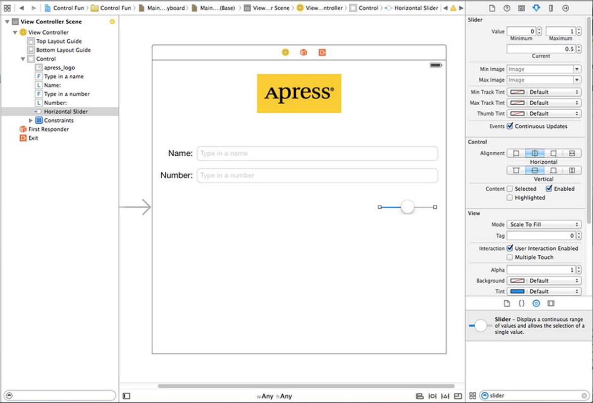
Figure 4-20. The inspector showing default attributes for a slider
A slider lets you choose a number in a given range. Use the inspector to set the Minimum value to 1, the Maximum value to 100, and the Current value to 50. Leave the Events Continuous Update check box checked. This ensures a continuous flow of events as the slider’s value changes. That’s all we need to worry about for now.
Bring over a label and place it next to the slider, using the blue guidelines to align it vertically with the slider and to align its left edge with the left margin of the view (see Figure 4-21).
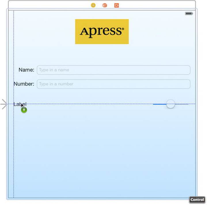
Figure 4-21. Placing the slider’s label
Double-click the newly placed label, and change its text from Label to 100. This is the largest value that the slider can hold, and we can use that to determine the correct width of the slider. Since “100” is shorter than “Label,” Interface Builder automatically makes the label smaller for you, as if you had dragged the right-middle resize dot to the edge. Despite this automatic behavior, you’re still free to resize the label however you want, of course. If you later decide you want the tool to pick the optimum size for you again, just press = or select Editor Size to Fit Content.
Next, resize the slider by single-clicking the slider to select it and dragging the left resize dot to the left until the blue guidelines indicate that you’re getting close to the label’s right-side edge.
Adding More Constraints
Now that we’ve added two more controls, we need to add the matching Auto Layout constraints. We’ll do it the easy way again this time, so just select the View Controller icon in the Document Outline and then click Editor Resolve Auto Layout Issues Add Missing Constraints. That’s not all, though. Since we moved the text fields and labels down a little to space out our design, we need to update their constraints to match their new positions. If you don’t do this, you’ll see warnings in the Activity View telling you that they will appear at different positions at runtime. To fix that, select the View Controller icon in the Document Outline again and select Editor Resolve Auto Layout Issues Update Constraints. Xcode adjusts the constraints so that they match the positions of all of the controls on screen and the warnings in the Activity View should go away.
Creating and Connecting the Actions and Outlets
All that’s left to do with these two controls is to connect the outlet and action. We will need an outlet that points to the label, so that we can update the label’s value when the slider is used. We’re also going to need an action method for the slider to call as it’s changed.
Make sure you’re using the Assistant Editor and editing ViewController.swift, and then Control-drag from the slider to just below the backgroundTap() method in the Assistant Editor. When the pop-up window appears, change the Connection field to Action, type sliderChanged in theName field, set the Type to UISlider, and then hit Return to create and connect the action.
Next, Control-drag from the newly added label (the one showing “100”) over to the Assistant Editor. This time, drag to just below the numberField property declaration at the top of the file. When the pop-up comes up, type sliderLabel into the Name text field, and then hit Return to create and connect the outlet.
Implementing the Action Method
Though Xcode has created and connected our action method, it’s still up to us to actually write the code that makes up the action method so it does what it’s supposed to do. Add the following code to the sliderChanged() method:
@IBAction func sliderChanged(sender: UISlider) {
let progress = lroundf(sender.value)
sliderLabel.text = "\(progress)"
}
The first line in the method retrieves the current value of the slider, rounds it to the nearest integer, and assigns it to an integer variable. The second line of code creates a string containing that number and assigns it to the label.
That takes care of our controller’s response to the movements of the slider; but in order to be really consistent, we need to make sure that the label shows the correct slider value before the user even touches it. Add this line to the viewDidLoad() method:
override func viewDidLoad() {
super.viewDidLoad()
sliderLabel.text = "50"
}
The preceding method will be executed immediately after the running app loads the view from the storyboard file, but before it’s displayed on the screen. The line we added makes sure that the user sees the correct starting value right away.
Save the file. Next, press R to build and launch your app in the iOS simulator, and try out the slider. As you move it, you should see the label’s text change in real time. Another piece falls into place.
But if you drag the slider toward the left (bringing the value below 10) or all the way to the right (setting the value to 100), you’ll see an odd thing happen. The label to the left will shrink horizontally when it drops down to showing a single digit, and will grow horizontally when showing three. Now, apart from the text it contains, you don’t actually see the label itself, so you can’t see its size changing, but what you will see is that the slider actually changes its size along with the label, getting smaller or larger. It’s maintaining a size relationship with the label, making sure the gap between the two is always the same.
This isn’t anything we’ve asked for, is it? Not really. It’s simply a side effect of the way Interface Builder works, helping you create GUIs that are responsive and fluid. We created some default constraints previously, and here you’re seeing one in action. One of the constraints created by Interface Builder keeps the horizontal distance between these elements constant.
Fortunately, you can override this behavior by making your own constraint. Back in Xcode, select the label in your storyboard and select Editor Pin Width from the menu. This makes a new high-priority constraint that tells the layout system, “Don’t mess with the width of this label.” If you now press R to build and run again, you’ll see that the label no longer expands and contracts as you drag back and forth across the slider.
We’ll see more examples of constraints and their uses throughout the book. But for now, let’s look at implementing the switches.
Implementing the Switches, Button, and Segmented Control
Back to Xcode we go once again. Getting dizzy, yet? This back and forth may seem a bit strange, but it’s fairly common to bounce around between source code, storyboards, and nib files in Xcode, testing your app in the iOS simulator while you’re developing.
Our application will have two switches, which are small controls that can have only two states: on and off. We’ll also add a segmented control to hide and show the switches. Along with that control, we’ll add a button that is revealed when the segmented control’s right side is tapped. Let’s implement those next.
Back in the storyboard, drag a segmented control from the Object Library (see Figure 4-22) and place it on the View window, a little below the slider and horizontally centered.
Figure 4-22. Here’s what we see when dragging a segmented control from the library to the left side of the parent view
Tip To give you a sense of the spacing we’re going for, take a look at the image view with the Apress logo. We tried to leave about the same amount of space above and below the image view. We did the same thing with the slider: we tried to leave about the same amount of space above and below the slider.
Double-click the word First on the segmented control and change the title from First to Switches. After doing that, repeat the process with the Second segment, renaming it Button (see Figure 4-23) and drag the control back into its centered position.
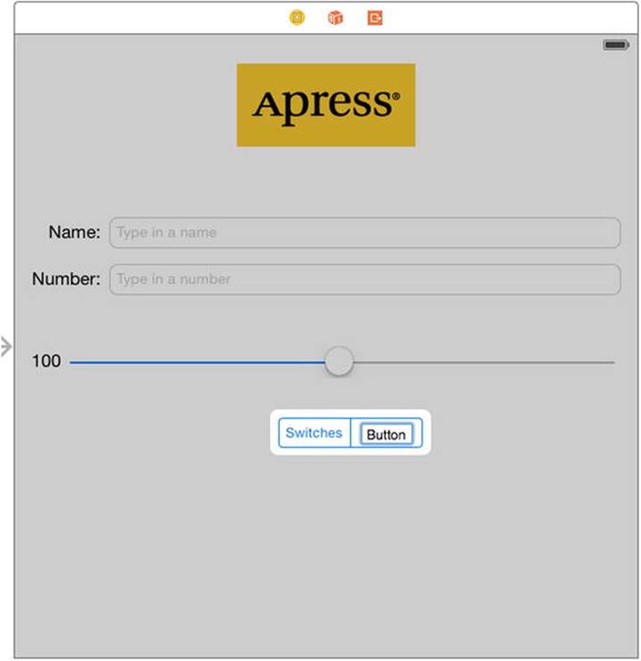
Figure 4-23. Renaming the segments in the segmented control
Adding Two Labeled Switches
Next, grab a switch from the library and place it on the view, below the segmented control and against the left margin. Now drag a second switch and place it against the right margin, aligned vertically with the first switch (see Figure 4-24).
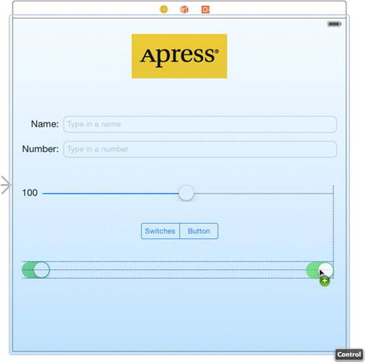
Figure 4-24. Adding the switches to the view
Tip Holding down the key and dragging an object in Interface Builder will create a copy of that item. When you have many instances of the same object to create, it can be faster to drag only one object from the library, and then Option-drag as many copies as you need.
The three new controls we’ve added need layout constraints. This time, we’ll add the constraints manually. Start by selecting the segmented control and pinning it to the center of the view using Editor Align Horizontal Center in Container from the menu. Next, select the segmented control with the mouse and then Control-drag upward a little until the background of the main view turns blue. Release the mouse and select Top Space to Top Layout Guide in the pop-up menu to fix the distance from the segmented control to the top of the view.
Now let’s deal with the switches. Control-drag from the left switch diagonally left and upward, toward the 10 o’clock position relative to the switch, and release the mouse. Hold down the Shift key and select Leading Space to Container Margin and Top Space to Top Layout Guide from the pop-up, and press the Return key or click anywhere outside the pop-up to apply the constraints. Do a similar thing with the other switch, but this time Control-drag to the top right (the 2 o’clock position) and select Trailing Space to Container Margin and Top Space to Top Layout Guide. When you apply constraints by dragging, Xcode offers you different options depending on the direction in which you drag. If you drag horizontally, you’ll have options that let you attach the control to the left or right margins of its parent view, whereas if you drag vertically, Xcode assumes you want to set the position of the control relative to the top or bottom of its parent. Here, we needed one horizontal and one vertical constraint for each switch, so we dragged diagonally to indicate that to Xcode, and we got both horizontal and vertical options.
Connecting and Creating Outlets and Actions
Before we add the button, we’ll create outlets for the two switches and connect them. The button that we’ll be adding next will actually sit on top of the switches, making it harder to Control-drag to and from them, so we want to take care of the switch connections before we add the button. Since the button and the switches will never be visible at the same time, having them in the same physical location won’t be a problem.
Using the Assistant Editor, Control-drag from the switch on the left to just below the last outlet in ViewController.swift. When the pop-up appears, name the outlet leftSwitch and hit Return. Repeat this process with the other switch, naming its outlet rightSwitch.
Now, select the left switch again by single-clicking it. Control-drag once more to the Assistant Editor. This time, drag to just above the brace at the end of the class declaration before letting go. When the pop-up appears, change the Connection field to Action, name the new action methodswitchChanged(), and set the Type of its sender argument to UISwitch. Next, hit Return to create the new action. Now repeat this process with the right switch, with one change: instead of creating a new action, drag to the switchChanged() method that was just created and connect to it, instead. Just as we did in the previous chapter, we’re going to use a single method to handle both switches.
Finally, Control-drag from the segmented control to the Assistant Editor, right below the switchChanged() method. Insert a new action method called toggleControls(), just as you’ve done before. This time, set the Type of its sender parameter to UISegmentedControl.
Implementing the Switch Actions
Save the storyboard and let’s add some more code to ViewController.swift, which is already open in the assistant view. Look for the switchChanged() method that was added for you automatically and add this code to it:
@IBAction func switchChanged(sender: UISwitch) {
let setting = sender.on
leftSwitch.setOn(setting, animated: true)
rightSwitch.setOn(setting, animated: true)
}
The switchChanged() method is called whenever one of the two switches is tapped. In this method, we simply grab the value of the on property of sender (which represents the switch that was pressed) and use that value to set both switches. The idea here is that setting the value of one switch will change the other switch at the other time, keeping them in sync at all times.
Now, sender is always going to be either leftSwitch or rightSwitch, so you might be wondering why we’re setting them both. The reason is one of practicality. It’s less work to set the value of both switches every time than to determine which switch made the call and set only the other one. Whichever switch called this method will already be set to the correct value, and setting it again to that same value won’t have any effect.
Adding the Button
Next, go back to Interface Builder and drag a Button from the library to your view. Add this button directly on top of the leftmost switch, aligning it with the left margin and vertically aligning its top edge with the top edge of the two switches (see Figure 4-25).
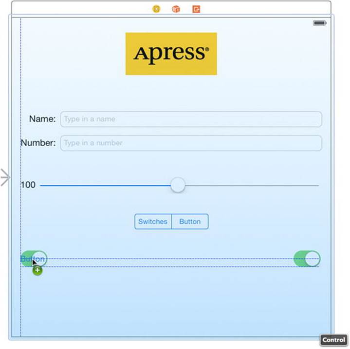
Figure 4-25. Adding a button on top of the existing switches
Now, grab the right-center resize handle and drag all the way to the right until you reach the blue guideline that indicates the right-side margin. The button should completely overlay the space occupied by the two switches, but because the default button is transparent, you will still see the switches (see Figure 4-26).
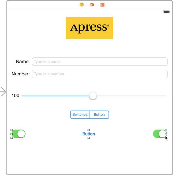
Figure 4-26. The round rect button, once placed and resized, will fill the space occupied by the two switches
Double-click the newly added button and give it a title of Do Something.
The button needs Auto Layout constraints. We’re going to pin it to the top and to both sides of the main view. Control-drag upward from the button until the view background turns blue, and then release the mouse and select Top Space to Top Layout Guide. Then Control-drag horizontally until the main view background turns blue again and select Leading Space to Container Margin. You’ll only get this option if you drag far enough to the left, so if you don’t see it, try again and drag left until the mouse is outside the bounds of the button. Finally, Control-drag to the right until the main view background turns blue, and then select Trailing Space to Container Margin. Now run the application to see what we’ve just done.
Spiffing Up the Button
If you compare your running application to Figure 4-2, you might notice an interesting difference. Your Do Something button doesn’t look like the one in the figure. That’s because, starting with iOS 7, the default button has a very simple appearance: it’s just a piece of plain text with no outline, border, background color, or other decorative features. That conforms nicely to Apple’s design guidelines for iOS 7 and later, but there are still cases where you’ll want to use custom buttons, so we’re going to show you how it’s done.
Many of the buttons you see on your iOS device are drawn using images. We’ve provided images that you can use for this example in the 04 – Button Images folder of the source code archive for this book. In the Project Navigator in Xcode, select Images.xcassets (the same assets catalog that we used earlier when we added images for the Apress logo), and then just drag both images from the 04 – Button Images folder in the Finder straight into the editing area in your Xcode window. The images are added to your project and will be immediately available to your app.
Stretchable Images
Now, if you look at the two button images we just added, you’ll probably be struck by the size of them. They’re very small and seem much too narrow to fill out the button you added to the storyboard. That’s because these graphics are meant to be stretchable. It so happens that UIKit can stretch graphics to nicely fill just about any size you want. Stretchable images are an interesting concept. A stretchable image is a resizable image that knows how to resize itself intelligently, so that it maintains the correct appearance. For these button templates, we don’t want the edges to stretch evenly with the rest of the image. Edge insets are the parts of an image (measured in pixels) that should not be resized. We want the bevel around the edges to stay the same, no matter what size we make the button, so we need to specify how much nonstretchable space makes up each edge.
In the past, this could only be accomplished in code. You’d have to use a graphics program to measure pixel boundaries of your images, and then use those numbers to set edge insets in your code. Xcode 6 eliminates the need for this by letting you visually “slice” any image you have in an assets catalog! That’s what we’re going to do next.
Select the Images.xcassets asset catalog in Xcode, and inside that select whiteButton. At the bottom of the editing area, you’ll see a button labeled Show Slicing. Click that to initiate the slicing process, which begins by simply putting a Start Slicing button right on top of your image. That’s where the magic begins, so click it! You’ll see three new buttons that let you choose whether you want the image to be sliced (and therefore stretchable) vertically, horizontally, or both. Choose the button in the middle to slice both ways. Xcode does a quick analysis of your image, and then finds the sections that seem to have unique pixels around the edges, and vertical and horizontal slices in the middle that should be repeatable. You’ll see these boundaries represented by dashed lines, as shown in Figure 4-27. If you have a tricky image, you may need to adjust these (it’s easy to do, just drag them with the mouse); but for this image, the automatic edge insets will work fine.
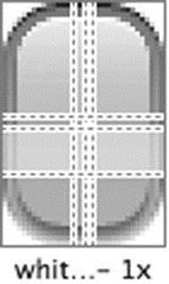
Figure 4-27. This is what the default slicing for the white button looks like
Next, select blueButton and do the same automatic slicing for it. All done! Now it’s time to put these graphics to use.
Go back to the storyboard you’ve been working on and single-click the Do Something button. With the button selected, press 4 to open the Attributes Inspector. In the inspector, use the first pop-up menu to change the type from System to Custom. You’ll see in the inspector that you can specify an Image and a Background for your button. We’re going to use the Background to show our resizable graphic, so click in the Background pop-up and select whiteButton. You’ll see that the button now shows the white graphic, perfectly stretched to cover the entire button frame. Nice!
Now we want to use the blue button to define the look of this button’s highlighted state, which is what you see while the button is pressed. We’ll talk more about control states in the next section of this chapter; but for now, just take a look at the second pop-up from the top, labeled State Config. A UIButton can have multiple states, each with its own text and images. Right now we’ve been configuring the default state, so switch this pop-up to Highlighted, so that we can configure that state. You’ll see that the Background pop-up has been cleared; click it to selectblueButton, and you’re done!
There’s just one problem with this new button appearance: the default UIButton size isn’t tall enough to properly show the gradient buttons we imported. In fact, there’s a warning in the Activity View indicating that the button will have a different frame at runtime. You can fix this by selecting the button, and then clicking Editor Resolve Auto Layout Issues Update Frames in the menu.
Configuring this button introduces two new concepts: stretchable images and control states. We already talked about the former, so now let’s tackle the latter.
Control States
Every iOS control has four possible control states and is always in one, and only one, of these states at any given moment:
· Normal: The most common state is the normal control state, which is the default state. It’s the state that controls are in when not in any of the other states.
· Highlighted: The highlighted state is the state a control is in when it’s currently being used. For a button, this would be while the user has a finger on the button.
· Disabled: Controls are in the disabled state when they have been turned off, which can be done by unchecking the Enabled check box in Interface Builder or setting the control’s enabled property to NO.
· Selected: Only some controls support the selected state. It is usually used to indicate that the control is turned on or selected. Selected is similar to highlighted, but a control can continue to be selected when the user is no longer directly using that control.
Certain iOS controls have attributes that can take on different values depending on their state. For example, by specifying one image for UIControlStateNormal and a different image for UIControlStateHighlighted, we are telling iOS to use one image when the user has a finger on the button and a different image the rest of the time. That’s essentially what we did when we configured two different background states for the button in the storyboard.
Connecting and Creating the Button Outlets and Actions
Control-drag from the new button to the Assistant Editor, just below the last outlet already in the section at the top of the file. When the pop-up appears, create a new outlet called doSomethingButton. After you’ve done that, Control-drag from the button a second time to just above the closing brace at the bottom of the file. There, create an action method called buttonPressed() and set the Type to UIButton.
If you save your work and take the application for a test drive, you’ll see that the segmented control will be live, but it won’t do anything particularly useful yet. We need to add some logic to make the button and switches hide and unhide.
We also need to mark our button as hidden from the start. We didn’t want to do that before because it would have made it harder to connect the outlets and actions. Now that we’ve done that, however, let’s hide the button. We’ll show the button when the user taps the right side of the segmented control; but when the application starts, we want the button hidden. In the storyboard, select the button and press 4 to bring up the Attributes Inspector. Scroll down to the View section and click the Hidden check box. The button will still be visible in Interface Builder, but will look faded out and transparent, to indicate its hidden status.
Implementing the Segmented Control Action
Save the storyboard and focus once again on ViewController.swift. Look for the toggleControls() method that Xcode created for us and add the code in bold to it:
@IBAction func toggleControls(sender: UISegmentedControl) {
if sender.selectedSegmentIndex == 0 {
leftSwitch.hidden = false
rightSwitch.hidden = false
doSomethingButton.hidden = true
} else {
leftSwitch.hidden = true
rightSwitch.hidden = true
doSomethingButton.hidden = false
}
}
This code looks at the selectedSegmentIndex property of sender, which tells us which of the sections is currently selected. The first section, called switches, has an index of 0. We’ve noted this fact in a comment, so that when we revisit the code later, we will know what’s going on. Depending on which segment is selected, we hide or show the appropriate controls.
Before we run the application, let’s apply a small tweak to make it look a little better. With iOS 7, Apple has introduced some new GUI paradigms. One of these is that the status bar at the top of the screen is transparent in iOS 7 apps, so that your content shines right through it. Right now, that yellow Apress icon really sticks out like a sore thumb against our app’s white background, so let’s extend that yellow color to cover our entire view. In Main.storyboard, select the main content view, and press 4 to bring up the Attributes Inspector. Click the color swatch labeledBackground to open the standard OS X color picker. One feature of this color picker is that it lets you choose any color you see on the screen. With the color picker open, click the Apress image view in the storyboard to select it. Now click the icon showing a magnifying glass at the upper left of the color picker and click the Apress image view again. You should now see the background color of the Apress image at the top of the color picker, next to the magnifying glass. To set it as the background color for the main content view, select the main view in the Document Outline (it’s called Control because we changed its class to UIControl a while ago) and then click the color in the color picker. When you’re done, close the color picker.
On your screen, you may find that the background and the Apress image seem to have slightly different colors, but when run in the simulator or on a device, they will be the same. These colors appear to be different in Interface Builder because OS X automatically adapts colors depending on the display you’re using. On an iOS device and in the simulator, that doesn’t happen.
Now run your app, and you’ll see that the yellow color fills the entire screen, with no visible distinction between the status bar and your app’s content. If you don’t have full-screen scrolling content, or other content that requires the use of a navigation bar or other controls at the top of the screen, this can be a nice way to show full-screen content that isn’t interrupted by the status bar quite as much.
If you’ve typed everything correctly, you should also be able to switch between the button and the pair of switches using the segmented control. And if you tap either switch, the other one will change its value as well. The button, however, still doesn’t do anything. Before we implement it, we need to talk about action sheets and alerts.
Implementing the Action Sheet and Alert
Action sheets and alerts are both used to provide the user with feedback:
· Action sheets are used to force the user to make a choice between two or more items. On iPhones, the action sheet comes up from the bottom of the screen and displays a series of buttons (see Figure 4-3). On the iPad, you specify the position of the action sheet relative to another view, typically a button. Users are unable to continue using the application until they have tapped one of the buttons. Action sheets are often used to confirm a potentially dangerous or irreversible action, such as deleting an object.
· Alerts appear as a rounded rectangle in the middle of the screen (see Figure 4-4). Like action sheets, alerts force users to respond before they are allowed to continue using the application. Alerts are usually used to inform the user that something important or out of the ordinary has occurred. Like action sheets, alerts may be presented with only a single button, although you have the option of presenting multiple buttons if more than one response is appropriate.
Note A view that forces users to make a choice before they are allowed to continue using their application is known as a modal view.
Showing an Action Sheet
Let’s switch over to ViewController.swift and implement the button’s action method. Begin by looking for the empty buttonPressed() method that Xcode created for you, and then add the code in bold to that method to create and show the action sheet:
@IBAction func buttonPressed(sender: UIButton) {
let controller = UIAlertController(title: "Are You Sure?",
message:nil, preferredStyle: .ActionSheet)
let yesAction = UIAlertAction(title: "Yes, I'm sure!",
style: .Destructive, handler: { action in
let msg = self.nameField.text.isEmpty
? "You can breathe easy, everything went OK."
: "You can breathe easy, \(self.nameField.text),"
+ " everything went OK."
let controller2 = UIAlertController(
title:"Something Was Done",
message: msg, preferredStyle: .Alert)
let cancelAction = UIAlertAction(title: "Phew!",
style: .Cancel, handler: nil)
controller2.addAction(cancelAction)
self.presentViewController(controller2, animated: true,
completion: nil)
})
let noAction = UIAlertAction(title: "No way!",
style: .Cancel, handler: nil)
controller.addAction(yesAction)
controller.addAction(noAction)
if let ppc = controller.popoverPresentationController {
ppc.sourceView = sender
ppc.sourceRect = sender.bounds
}
presentViewController(controller, animated: true, completion: nil)
}
What exactly did we do there? Well, first, in the doSomething() action method, we allocated and initialized a UIAlertController, which is a view controller subclass that can display either an action sheet or an alert:
let controller = UIAlertController(title: "Are You Sure?",
message:nil, preferredStyle: .ActionSheet)
The initializer method takes a number of parameters. Let’s look at each of them in turn.
The first parameter is the title to be displayed. Refer back to Figure 4-3 to see how the title we’re supplying will be displayed at the top of the action sheet. The second parameter is a message that will be displayed immediately below the title, in a smaller font. For this example, we’re not using the message so we supply the value nil for this parameter. The final parameter specifies whether we want the controller to display an alert (value UIAlertControllerStyle.Alert) or an action sheet (UIAlertControllerStyle.ActionSheet). Since we need an action sheet, we supply the value UIAlertControllerStyle.ActionSheet here.
The alert controller does not supply any buttons by default—you have to create a UIAlertAction object for each button that you want and add it to the controller. Here’s part of the code that creates the two buttons for our action sheet:
let yesAction = UIAlertAction(title: "Yes, I'm sure!",
style: .Destructive, handler: { action in
// Code omitted – see below.
})
let noAction = UIAlertAction(title: "No way!",
style: .Cancel, handler: nil)
For each button, you specify the title, the style, and a handler to be called when the button is pressed. There are three possible styles to choose from:
· UIAlertActionStyle.Destructive should be used when the button triggers a destructive, dangerous, or irreversible action, such as deleting or overwriting a file. The title for a button with this style is drawn in red in a bold font.
· Use UIAlertActionStyle.Default for a normal button, such as an OK button, when the action that will be triggered is not destructive. The title is drawn in a regular blue font.
· UIAlertStyle.Cancel is used for the Cancel button. The title is drawn in a bold blue font.
Finally, you add the buttons to the controller:
[controller addAction:yesAction];
[controller addAction:noAction];
To make the alert or action sheet visible, you need to ask the current view controller to present the alert controller. Here’s how you present an action sheet:
if let ppc = controller.popoverPresentationController {
ppc.sourceView = sender
ppc.sourceRect = sender.bounds
}
presentViewController(controller, animated: true, completion: nil)
The first four lines configure where the action sheet will appear by getting the alert controller’s popover presentation controller and setting its sourceView and sourceRect properties. We’ll say more about these properties shortly. Finally, we make the action sheet visible by calling our view controller’s presentViewController(_, animated:, completion:) method, passing it the alert controller as the controller to be presented. When a view controller is presented, its view temporarily replaces that of the view controller that’s presenting it. In the case of the alert view controller, the action sheet or alert partially covers the presenting view controller’s view; the rest of the view is covered by a dark, translucent background that lets you see the underlying view but makes it clear that you can’t interact with it until you dismiss the presented view controller.
Now let’s revisit the popover presentation controller configuration. On the iPhone, the action sheet always pops up from the bottom of the screen, as shown in Figure 4-3, but on the iPad, it’s displayed in a popover—a small, rounded rectangle with an arrow that points toward another view, usually the one that caused it to appear. Figure 4-28 shows how our action sheet looks on the iPad simulator.
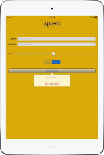
Figure 4-28. An action sheet on iPad
As you can see, the popover’s arrow points to the Do Something button. That’s because we set the sourceView property of the alert controller’s popover presentation controller to point to that button and its sourceRect property to the button’s bounds:
if let ppc = controller.popoverPresentationController {
ppc.sourceView = sender
ppc.sourceRect = sender.bounds
}
Notice the if let construction—this is necessary because on the iPhone, the alert controller does not present the action sheet in a popover, so its popoverPresentationController property is nil.
In Figure 4-28, the popover appears below the source button, but you can change this, if you need to, by setting the popover presentation controller’s permittedArrowDirections property, which is a mask of permitted directions for the popover’s arrow. The following code moves the popover above the source button by setting this property to UIPopoverArrowDirection.Down:
if let ppc = controller.popoverPresentationController {
ppc.sourceView = sender
ppc.sourceRect = sender.bounds
ppc.permittedArrowDirections = .Down
}
If you compare Figure 4-28 and Figure 4-3, you’ll see that the No Way! button is missing on the iPad. The alert controller does not use buttons with style UIAlertStyle.Cancel on the iPad, because users are accustomed to dismissing a popover without taking any action by tapping anywhere outside of it.
Showing an Alert
When the user presses the Yes, I’m Sure! button, we want to pop up an alert with a message. When a button that was added to an alert controller is pressed, the action sheet (or alert) is dismissed and the button’s handler block is called with a reference to the UIAlertAction from which the button was created. The code that’s executed when the Yes, I’m Sure! button is pressed is shown in bold:
let yesAction = UIAlertAction(title: "Yes, I'm sure!",
style: .Destructive, handler: { action in
let msg = self.nameField.text.isEmpty
? "You can breathe easy, everything went OK."
: "You can breathe easy, \(self.nameField.text),"
+ " everything went OK."
let controller2 = UIAlertController(
title:"Something Was Done",
message: msg, preferredStyle: .Alert)
let cancelAction = UIAlertAction(title: "Phew!",
style: .Cancel, handler: nil)
controller2.addAction(cancelAction)
self.presentViewController(controller2, animated: true,
completion: nil)
})
The first thing we do in the handler block is create a new string that will be displayed to the user. In a real application, this is where you would do whatever processing the user requested. We’re just going to pretend we did something, and notify the user by using an alert. If the user has entered a name in the top text field, we’ll grab that, and we’ll use it in the message that we’ll display in the alert. Otherwise, we’ll just craft a generic message to show:
let msg = self.nameField.text.isEmpty
? "You can breathe easy, everything went OK."
: "You can breathe easy, \(self.nameField.text),"
+ " everything went OK."
The next few lines of code are going to look kind of familiar. Alert views and action sheets are created and used in a very similar manner. We always start by creating a UIAlertController:
let controller2 = UIAlertController(
title:"Something Was Done",
message: msg, preferredStyle: .Alert)
Again, we pass a title to be displayed. This time, we also pass a more detailed message, which is that string we just created. The final parameter is the style, which we set to UIAlertControllerStyle.Alert because we want an alert, not an action sheet. Next, we create aUIAlertAction for the alert’s cancel button and add it to the controller:
let cancelAction = UIAlertAction(title: "Phew!",
style: .Cancel, handler: nil)
controller2.addAction(cancelAction)
Finally, we make the alert appear by present the alert view controller:
self.presentViewController(controller2, animated: true,
completion: nil)
You can see the alert that’s created by this code in Figure 4-4. You’ll notice that our code does not attempt to get and configure the alert controller’s popover presentation controller. That’s because alerts appear in a small, rounded view in the center of the screen on both iPhone and iPad, so there is no popover presentation controller to configure.
Save ViewController.swift and then build, run, and try out the completed application.
Crossing the Finish Line
This was a big chapter. Conceptually, we didn’t hit you with too much new stuff, but we took you through the use of a good number of controls and showed you many different implementation details. You got a lot more practice with outlets and actions, saw how to use the hierarchical nature of views to your advantage, and got some more practice adding Auto Layout constraints. You learned about control states and stretchable images, and you also learned how to use both action sheets and alerts.
There’s a lot going on in this little application. Feel free to go back and play with it. Change values, experiment by adding and modifying code, and see what different settings in Interface Builder do. There’s no way we could take you through every permutation of every control available in iOS, but the application you just put together is a good starting point and covers a lot of the basics.
In the next chapter, we’re going to look at what happens when the user rotates an iOS device from portrait to landscape orientation or vice versa. You’re probably well aware that many apps change their displays based on the way the user is holding the device, and we’re going to show you how to do that in your own applications.
All materials on the site are licensed Creative Commons Attribution-Sharealike 3.0 Unported CC BY-SA 3.0 & GNU Free Documentation License (GFDL)
If you are the copyright holder of any material contained on our site and intend to remove it, please contact our site administrator for approval.
© 2016-2026 All site design rights belong to S.Y.A.