Beginning Visual Basic(2012)
Chapter 4
Working with ASP.NET Server Controls
What You Will Learn in This Chapter:
· What ASP.NET Server Controls are
· The different kinds of server controls you have at your disposal
· The common behavior shared among most of the server controls
· How the ASP.NET run time processes the server controls on your page
· How server controls are able to maintain their state across postbacks
Wrox.com Code Downloads for this Chapter
You can find the wrox.com code downloads for this chapter on the Download Code tab at www.wrox.com/remtitle.cgi?isbn=1118311809. The code is in the Chapter 4 download.
ASP.NET Server Controls are the workhorses of ASP.NET. Almost all the Web Forms pages you build in Visual Studio (VS) will contain one or more server controls. These controls come in all sorts and sizes, ranging from simple controls like a Button and a Label to complex controls like theTreeView and the ListView that are capable of displaying data from a data source (like a database or an XML file). You see these controls in Chapters 7, 13, and 14.
The architecture of ASP.NET Server Controls is deeply integrated into ASP.NET, giving the controls a feature set that is quite unique in today's technologies for building websites. This chapter shows you what server controls are, how they work, and which ones are available out of the box when you install VS.
The chapter starts off with a general discussion of server controls. You see how to define them in your code by adding them to Design or Markup View.
The section that follows gives you a thorough look at the many controls that are available in the VS Toolbox.
Introduction to Server Controls
It's important to understand how server controls operate and how they are completely different from the way you define controls in other languages like classic ASP or PHP (another popular programming language for creating dynamic websites).
For example, to influence the text in a text box in these languages, you would use plain HTML and mix it with server-side code. This works similarly to the example in Chapter 2 where the current date and time are displayed on the page. To create a text box with a message and the current time in it in classic ASP, you can use the following code:
<input type="text" value="Hello World, the time is <%=Time()%>" />
As you can see, this code contains plain HTML, mixed with a server-side block, delimited by <% and %> that outputs the current time using the equals (=) symbol. This type of coding has a major disadvantage: the HTML and server-side code is mixed, making it difficult to write and maintain your pages. Although this is a trivial example in which it's still easy to understand the code, this type of programming can quickly result in very messy and complex pages.
Server controls work differently. In ASP.NET, the controls “live” on the server inside an ASPX page. When the page is requested in the browser, the server-side controls are processed by the ASP.NET run time—the engine that is responsible for processing requests for ASPX pages. The controls then emit client-side HTML code that is appended to the final page output. It's this HTML code that eventually ends up in the browser, where it's used to build up the page.
So, instead of defining HTML controls in your pages directly, you define an ASP.NET Server Control with the following syntax, where the italicized parts differ for each control:
<asp:TypeOfControl ID="ControlName" runat=”server" />
For the controls that ship with ASP.NET 4.5 you always use the asp: prefix followed by the name of the control. For example, to create a TextBox that can hold the same welcome message and current time, you can use the following syntax:
<asp:TextBox ID="Message" runat="server" />
Note that the control has two attributes: ID and runat. The ID attribute is used to uniquely identify a control on the page, so you can program against it. It's important that each control on the page has a unique ID; otherwise the ASP.NET run time won't understand what control you're referring to. If you accidentally type a duplicate control ID, VS signals the problem in the error list. The mandatory runat attribute is used to indicate that this is a control that lives on the server. Without this attribute, the controls won't be processed and will end up directly in the HTML source. If you ever feel you're missing a control in the final output in the browser, ensure that the control has this required attribute. Note that for non-server elements, like plain HTML elements, the runat attribute is optional. With this attribute, non-server controls can be reached by your programming code. You learn more about this later in the book.
You can easily add the runat attribute to an existing element using a code snippet by typing runat and pressing the Tab key.
The preceding example of the TextBox uses a self-closing tag where the closing slash (/) is embedded in the opening tag. This is quite common for controls that don't need to contain child content such as text or other controls. However, the long version, using a separate closing tag, is acceptable as well:
<asp:TextBox ID="Message" runat="server"></asp:TextBox>
You can control the default behavior of closing tags per element using Tools ⇒ Options ⇒ Text Editor ⇒ HTML ⇒ Formatting ⇒ Tag Specific Options.
You can program against this text box from code that is either placed inline with the page or in a separate Code Behind file, as you saw in Chapter 2. To set the welcome message and the time, you can use the following code:
VB.NET
Message.Text = "Hello World, the time is " & DateTime.Now.TimeOfDay.ToString()
C#
Message.Text = "Hello World, the time is " + DateTime.Now.TimeOfDay.ToString();
The definition of the control in the markup section of the page is now separated from the actual code that defines the text displayed in the text box, making it easier to define and program the text box (or any other control) because it enables you to focus on one task at a time. You can either declare the control and its visual appearance in the markup section of the page, or program its behavior from a code block.
In general, controls defined in Markup View are not case-sensitive, although some of the values you can set are case-sensitive. I prefer to use the capitalization as suggested by IntelliSense. Note that when using C#, properties you use in the Code Behind are case-sensitive.
You see how server controls send their underlying HTML to the client in the next exercise.
Try It Out: Working with Server Controls
In this exercise, you add a TextBox, a Label, and a Button control to a page. When you request the page in the browser, these server controls are transformed into HTML, that is then sent to the client. By looking at the final HTML for the page in the browser, you'll see how the HTML is completely different from the initial ASP.NET markup.
1. Open the Planet Wrox project in Visual Studio.
2. In the Demos folder in the Solution Explorer, create a new Web Form called ControlsDemo.aspx. Choose your programming language and make sure the Web Form uses Code Behind.
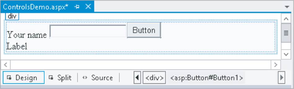
3. Switch to Design View. From the Standard category of the Toolbox, drag a TextBox, a Button, and a Label control onto the design surface within the dashed lines of the <div> tag that was added for you when you created the page.
Type the text Your name in front of the TextBox and add a line break between the Button and the Label by positioning your cursor between the two controls in Design View and then pressing Enter. If you're having trouble positioning the cursor between the controls, place it after the Labelcontrol and then press the left arrow key twice. The first time you press it, the Label is selected; the second time, the cursor is placed between the two controls, enabling you to press Enter. Your Design View should now look like Figure 4.1.
Figure 4.1
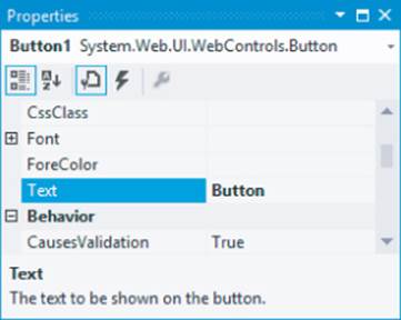
Right-click the Button control and choose Properties to open up the Properties Grid for the control. Pressing F4 after selecting the Button does the same thing. The window that appears, shown in Figure 4.2, enables you to change the properties for the control, which in turn influences the way the control looks and behaves at run time.
Figure 4.2
5. Set the control's Text property to Submit Information and set its ID (which you'll find all the way down at the bottom of the list wrapped in parentheses) to SubmitButton.
6. Change the ID of the TextBox to YourName using the Properties Grid.
7. Clear the Text property of the Label using the Properties Grid. You can right-click the property's label in the grid and choose Reset, or you can remove the text manually. Set its ID to Result.
8. Still in Design View, double-click the Button control to have VS add some code to the Code Behind of the page that will be fired when the button is clicked in the browser. You see later how to accomplish the same thing from Markup View. Add the bolded line of code to the code block that VS inserted for you:
VB.NET
Protected Sub SubmitButton_Click(sender As Object,
e As EventArgs) Handles SubmitButton.Click
Result.Text = "Your name is " & YourName.Text
End Sub
C#
protected void SubmitButton_Click(object sender, EventArgs e)
{
Result.Text = "Your name is " + YourName.Text;
}
Note that the VB.NET example doesn't need an underscore here to split the code over two lines. In older versions of VB.NET, the underscore was required to split this code over two lines.
9. Save the changes to the page and then open it in the browser by pressing Ctrl+F5. Don't click the button yet, but open up the source of the page by right-clicking the page in the browser and choosing View Source or View Page Source. You should see the following HTML code (I changed the formatting slightly so the HTML fits on the page):
<div>
Your name <input name="YourName" type="text" id="YourName" />
<input type="submit" name="SubmitButton" value="Submit Information"
id="SubmitButton" />
<br />
<span id="Result"></span>
</div>
10. Switch back to your browser, fill in your name in the text box, and click the button. When the page is done reloading, open up the source for the page in the browser again using the browser's right-click menu. The code should now look like this:
<div>
Your name <input name="YourName" type="text" value="Imar" id="YourName" />
<input type="submit" name="SubmitButton" value="Submit Information"
id="SubmitButton" />
<br />
<span id="Result">Your name is Imar</span>
</div>
Note that the two bold lines have changed, and now show the name you entered in the text box. You can ignore the other HTML in the page for now.
How It Works
As its name implies, an ASP.NET Server Control lives on the server in your ASPX page where it can be processed by the ASP.NET run time. When you request a page in the browser, the run time creates an in-memory representation of the ASPX file with the controls you created. When the run time is about to send the HTML to the browser, it asks each of the controls in the page for their HTML, which is then injected in the final response. For example, when the Label control is asked for its HTML the first time it loads, it returns the following:
<span id="Result"></span>
Although you defined the Label control with the <asp:Label> syntax, it ends up as a simple <span> element in the browser. Because the Text property of the Label control is empty, you don't see any text between the two <span> tags. The same applies to other controls; an <asp:TextBox>ends up as <input type="text">, whereas the <asp:Button> ends up as <input type="submit">.
When you click the button, the control causes a postback, which sends the information for the controls in the page to the server, where the page is loaded again. Additionally, the code that you wrote to handle the button's Click event is executed. This code takes the name you entered in the text box and then assigns it to the Label control as shown in this C# example:
Result.Text = "Your name is " + YourName.Text;
Don't worry about the syntax for the code that handles the button's Click event for now. In Chapter 5, you see how this works, and why you need this code.
At this stage, the Label control contains the text you entered in the text box, so when it is asked for its HTML, it now returns this:
<span id="Result">Your name is Imar</span>
You get a more in-depth look at postbacks later in this chapter when the ASP.NET state engine is discussed.
A Closer Look at ASP.NET Server Controls
Because you'll be working with server controls most of the time when building your ASP.NET Web Forms pages, you need to know in detail how they work and how to use them. In the next section, you see how to add the controls to your pages and change the way they behave in the browser. In the section that follows, you get an overview of the behavior that all server controls have in common. Once you understand this shared behavior, it's easy to apply this knowledge to other, new controls as well, enabling you to get up to speed with them very quickly.
Defining Controls in Your Pages
As demonstrated in the previous Try It Out, you can simply drag controls from the Toolbox onto the design surface of the page. This makes it very easy to add a bunch of controls to a page to get you started. However, because of the way the design surface works, it's sometimes difficult to add them exactly where you want them. For example, it can be difficult to drag a control between the opening and closing tags of an HTML element. Fortunately, you can just as easily drag a control from the Toolbox in Markup View. Additionally, you can also type the control's markup directly in Markup View, letting IntelliSense and code snippets help you with the different tags and attributes. You'll also find that the Properties Grid works in Markup View. Simply click the relevant markup, and the Properties Grid is updated to reflect the tag you clicked. This makes it easy to change the properties of the control, while you can still see exactly what markup gets generated for you. If you've worked with older versions of VS, you'll appreciate one great new feature in VS 2012: you can now bind handlers (such as the Click event used in the preceding exercise) directly in Markup View without switching to Design View. You'll also be able to access the Smart Tasks panel for the controls from code. You see more of these features later in this chapter.
If you look at the Properties Grid for some of the controls in a page, you'll notice that many of them have similar properties. In the next section, you see exactly what these properties are and what they are used for.
Common Properties for All Controls
Most of the server controls you find in the VS Toolbox share some common behavior. Part of this behavior includes the so-called properties that define the data a control can contain and expose. You learn more about properties and other behavior types in the next chapter. Each server control has an ID to uniquely identify it in the page, a runat attribute that is always set to server to indicate the control should be processed on the server, and a ClientID that contains the client-side ID attribute that is assigned to the element in the final HTML. In versions of ASP.NET up to 3.5 this ClientIDwas always generated for you automatically. However, in ASP.NET 4 a new ClientIDMode property was introduced that gives you more control over the ID of an element at the client. You see how this works in later chapters. The runat attribute is technically not a property of a server control, but is necessary to indicate that the markup for the control should be processed as a server control and not end up as plaintext or HTML in the browser.
Besides these properties, many of the server controls share more properties because they share the same Control base class. The next chapter digs deeper into base classes and inheritance. The following table lists the most common shared properties and describes what they are used for.
|
Property |
Description |
|
AccessKey |
Enables you to set a key with which a control can be accessed at the client by pressing the associated letter. |
|
BackColor |
Enables you to change the color of the background (BackColor) and text (ForeColor) of the control. |
|
BorderColor |
Changes the border of the control in the browser. The similarities with the CSS border properties you saw in the previous chapter are no coincidence. Each of these three ASP.NET properties maps directly to its CSS counterpart. |
|
CssClass |
Enables you to define the HTML class attribute for the control in the browser. This class name could then point to a CSS class you defined in the page or an external CSS file. |
|
Enabled |
Determines whether the user can interact with the control in the browser. For example, with a disabled text box (Enabled="False") you cannot change its text. |
|
Font |
Enables you to define different font-related settings, such as size, family and whether or not the font should be bold. |
|
Height Width |
Determines the height and width of the control in the browser. |
|
TabIndex |
Sets the client-side HTML tabindex attribute that determines the order in which users can move through the controls in the page by pressing the Tab key. |
|
ToolTip |
Enables you to set a tooltip for the control in the browser. This tooltip, rendered as a title attribute in the HTML, is shown when the user hovers the mouse over the element. |
|
Visible |
Determines whether or not the control is sent to the browser. You should really see this as a server-side visibility setting because an invisible control is never sent to the browser at all. This means it's quite different from the CSS display and visibility properties you saw in the previous chapter that hide the element at the client. |
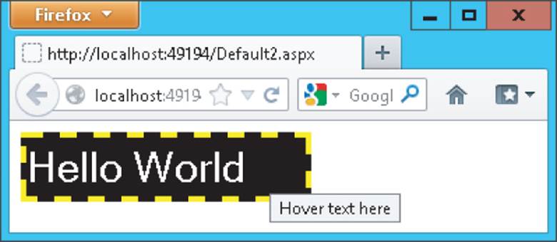
To see how all these attributes end up in the browser, consider the following markup for a TextBox server control:
<asp:TextBox AccessKey="a" BackColor="Black" ForeColor="White" Font-Size="30px"
BorderColor="Yellow" BorderStyle="Dashed" BorderWidth="4" CssClass="TextBox"
Enabled="True" Height="40" Width="200" TabIndex="1" ToolTip="Hover text here"
Visible="True" ID="TextBox1" runat="server" Text="Hello World">
</asp:TextBox>
When you request the page with this control in the browser, you end up with the following HTML:
<input name="TextBox1" type="text" value="Hello World" id="TextBox1" accesskey="a"
tabindex="1" title="Hover text here" class="TextBox" style="color:White;
background-color:Black;border-color:Yellow;border-width:4px;
border-style:Dashed;font-size:30px;height:40px;width:200px;"
/>
This results in the text box shown in Figure 4.3.
Figure 4.3
Note that most of the server-side control properties have been converted into CSS inline styles with the style attribute.
When building websites, it's quite uncommon to define a TextBox in this manner. As you learned in the previous chapter, you should avoid inline styles as much as possible, and opt for external cascading style sheets instead. You can accomplish the exact same behavior with this server-side control:
<asp:TextBox ID="TextBox1" AccessKey="a" CssClass="TextBox" TabIndex="1"
ToolTip="Hover text here" runat="server" Text="Hello World">
</asp:TextBox>
And the following CSS class:
.TextBox
{
background-color: Black;
color: White;
font-size: 30px;
border-color: Yellow;
border-style: Dashed;
border-width: 4px;
height: 40px;
width: 200px;
}
Obviously, the second example is much easier to read, reuse, and maintain. If you want another text box with the exact same look, you simply assign TextBox to the CssClass of that control. Also, notice I left out the Enabled and Visible properties. Both default to True, so there's no need to explicitly state that in the control declaration.
Although it's recommended to use CSS classes instead of these inline styles, it's good to know about the server-side control properties in case you need fine control over them. If you change the control's properties programmatically (as you learn how to do later), they still end up as inline styles, and thus possibly override settings in embedded or external style sheets.
Now that you have seen the generic behavior that all server controls share, it's time to look at the large number of controls that ship with ASP.NET 4.5.
Types of Controls
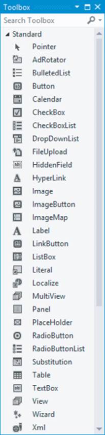
Out of the box, ASP.NET 4.5 comes with a large number of server controls, supporting most of your web development needs. To make it easy for you to find the right controls, they have been placed in separate control categories in the VS Toolbox (accessible by pressing Ctrl+Alt+X). Figure 4.4shows the Toolbox with all the available categories.
Figure 4.4
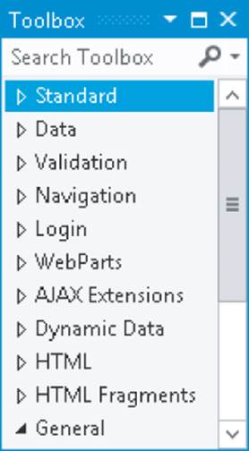
Note that depending on your version of Visual Studio, you may have other categories as well.
A handy new feature in VS 2012 is the ability to search in the Toolbox. Just type in a few letters of the control you're looking for in the Search text box at the top of the control, and VS filters the list with controls matching your criteria.
In the following sections, you see the controls in each category and the tasks for which they are designed.
With the discussion of the various controls, you see a mention of the properties of a control. For example, a TextBox has a Text property (among many others), and a ListBox has a SelectedItem property. Some properties can only be set programmatically and not with the Properties Grid. Reading and changing control properties programmatically is discussed in detail in the next chapter.
Standard Controls
The Standard category contains many of the basic controls that almost any web page needs. You've already seen some of them, like the TextBox, Button, and Label controls earlier in this chapter. Figure 4.5 shows all the controls in the Standard category.
Figure 4.5
Many of the controls probably speak for themselves, so instead of giving you a detailed description of them all, the following sections briefly highlight a few important ones.
Simple Controls
The Toolbox contains a number of simple and straightforward controls, including TextBox, Button, Label, HyperLink, RadioButton, and CheckBox. Their icons in the Toolbox give you a good clue as to how they end up in the browser. In the remainder of this book, you see these controls used many times. In ASP.NET 4.5 the TextMode property of the TextBox control has been expanded to support new HTML5 types such as DateTime, Email, and Number. You see more about this later in the book.
List Controls
The standard category also contains a number of controls that present themselves as lists in the browser. These controls include ListBox, DropDownList, CheckBoxList, RadioButtonList, and BulletedList. To add items to the list, you define <asp:ListItem> elements between the opening and closing tags of the control, as shown in the following example:
<asp:DropDownList ID="FavoriteLanguage" runat="server">
<asp:ListItem Value="C#">C#</asp:ListItem>
<asp:ListItem Value="Visual Basic">Visual Basic</asp:ListItem>
<asp:ListItem Value="CSS">CSS</asp:ListItem>
</asp:DropDownList>
The DropDownList enables a user to select only one item at a time. To see the currently active and selected item of a list control programmatically, you can look at its SelectedValue, SelectedItem, or SelectedIndex properties. SelectedValue returns a string that contains the value for the selected item, like C# or Visual Basic in the preceding example. SelectedIndex returns the zero-based index of the item in the list. With the preceding example, if the user had chosen C#, SelectedIndex would be 0. Similarly, if the user had chosen CSS, the index would be 2 (the third item in the list).
For controls that allow multiple selections (like CheckBoxList and ListBox), you can loop through the Items collection and see what items are selected. In this case, SelectedItem returns only the first selected item in the list; not all of them. You learn how to access all the selected items in the next exercise. Note that in the browser, both the DropDownList and the ListBox control render as a <select> element. Attributes such as size and multiple set by these two controls determine the appearance and behavior of the HTML element in the browser.
The BulletedList control doesn't allow a user to make selections, and as such doesn't support these properties.
To see how to add list items to your list control, and how to read the selected values, the following exercise guides you through creating a simple Web Form with two list controls that ask users for their favorite programming language.
Try It Out: Working with List Controls
In this exercise you add two list controls to a page. Additionally, you add a button that, when clicked, displays the selected items as text in a Label control.
1. In the Demos folder, create a new Web Form called ListControls.aspx. Make sure you create a Code Behind file by checking the Place Code in Separate File option.
2. Switch to Design View and drag a DropDownList from the Toolbox onto the design surface of the page within the dashed border of the <div> element that is already present in your page.
3. Notice that as soon as you drop the DropDownList control on the page, a pop-up menu appears that is labeled DropDownList Tasks, as shown in Figure 4.6.
Figure 4.6
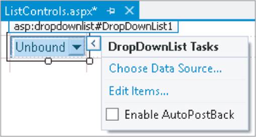
This pop-up menu is called the Smart Tasks panel. When it appears, it gives you access to the most common tasks of the control it belongs to. In the case of the DropDownList, you get three options. The first option enables you to bind the control to a data source, which is demonstrated in Chapter 13. The second item enables you to manually add items to the list, and the last option sets the AutoPostBack property of the control. With this option checked, the control submits the page in which it is contained back to the server as soon as the user chooses a new item from the list. Note that the browser must have JavaScript enabled for this to work.
The Smart Tasks panel appears only for the more complex controls that have a lot of features. You won't see it for simple controls like Button or Label. To reopen the Smart Tasks panel, right-click the control in the designer and choose Show Smart Tag. Alternatively, click the small arrow at the top-right corner of the control, visible in Figure 4.6, or press Shift+Alt+F10 when the control is selected. You can also open the Smart Tasks panel from markup view. Simply click anywhere on the opening or closing tag of a control or other piece of markup and press Ctrl+Dot (Ctrl+.). Alternatively, hover over the tiny blue rectangle at the start of the opening tag and then click the grey arrow that appears.
On the Smart Tasks panel of the DropDownList, click the Edit Items link to bring up the ListItem Collection Editor, shown in Figure 4.7.
Figure 4.7
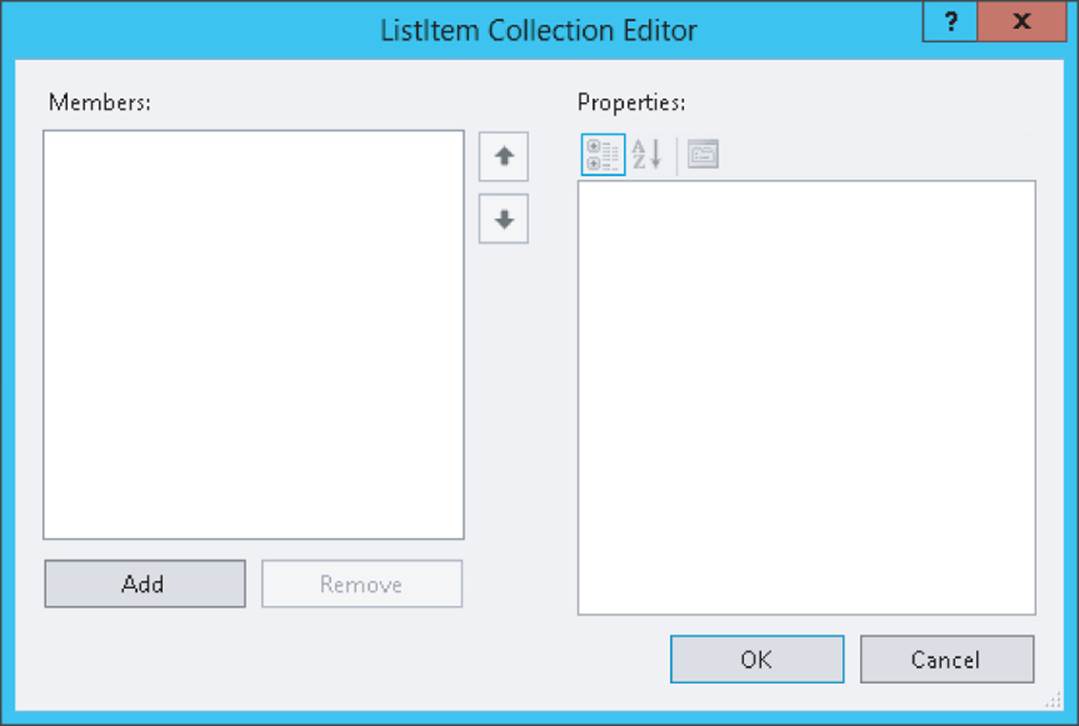
This dialog box enables you to add new items to the list control. The items you add through this window are added as <asp:ListItem> elements between the tags for the control.
4. Click the Add button on the left side of the screen to insert a new list item. Then in the Properties Grid on the right, enter C# for the Text property and press Tab. As soon as you tab away from the Text property, the value is copied to the Value property as well. This is convenient if you want both the Text and the Value property to be the same. However, it's perfectly OK (and quite common) to assign a different value to the Value property.
5. Repeat step 4 twice, this time creating list items for Visual Basic and CSS. You can use the up and down arrow buttons in the middle of the dialog box to change the order of the items in the list. Finally, click OK to insert the items in the page. You should end up with the following code in Markup View:
<asp:DropDownList ID="DropDownList1" runat="server">
<asp:ListItem>C#</asp:ListItem>
<asp:ListItem>Visual Basic</asp:ListItem>
<asp:ListItem>CSS</asp:ListItem>
</asp:DropDownList>
6. In Markup View drag a CheckBoxList control from the Toolbox directly into the code window, right after the DropDownList.
7. Copy the three <asp:ListItem> elements from the DropDownList you created in steps 4 and 5 and paste them between the opening and closing tags of the CheckBoxList. You should end up with this code:
<asp:ListItem>CSS</asp:ListItem>
</asp:DropDownList>
<asp:CheckBoxList ID="CheckBoxList1" runat="server">
<asp:ListItem>C#</asp:ListItem>
<asp:ListItem>Visual Basic</asp:ListItem>
<asp:ListItem>CSS</asp:ListItem>
</asp:CheckBoxList>
8. Switch to Design View and drag a Button from the Toolbox in Design View to the right of the CheckBoxList control. The Button will be placed below the CheckBoxList. Next, drag a Label control and drop it to the right of the Button. Create some room between the Button and theLabel by positioning your cursor between the controls and then pressing Enter twice. Double-click the Button to open the Code Behind of the page.
9. In the code block that VS added for you, add the following bolded code, which will be executed when the user clicks the button:
VB.NET
Protected Sub Button1_Click(sender As Object, e As EventArgs) _
Handles Button1.Click
Label1.Text = "In the DDL you selected " &
DropDownList1.SelectedValue & "<br />"
For Each item As ListItem In CheckBoxList1.Items
If item.Selected = True Then
Label1.Text &= "In the CBL you selected " & item.Value & "<br />"
End If
Next
End Sub
C#
protected void Button1_Click(object sender, EventArgs e)
{
Label1.Text = "In the DDL you selected " +
DropDownList1.SelectedValue + "<br />";
foreach (ListItem item in CheckBoxList1.Items)
{
if (item.Selected == true)
{
Label1.Text += "In the CBL you selected " + item.Value + "<br />";
}
}
}
Notice how in the VB.NET code the underscore is needed to split the code over two lines. VB.NET requires the underscore if you want to move the Handles keyword to its own line.
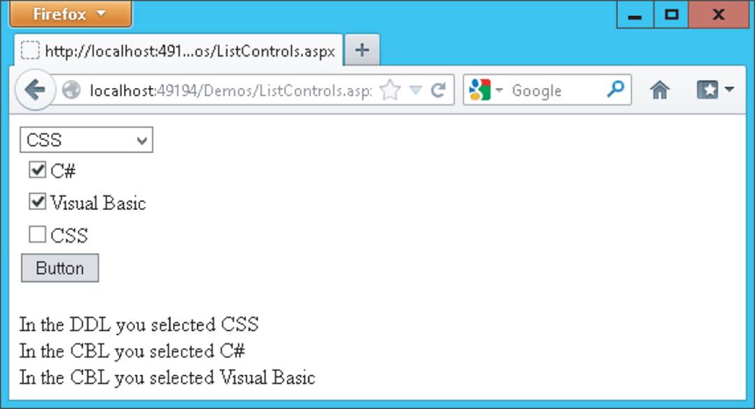
10. Save the changes to the page and then request it in the browser. Choose an item from the DropDownList, check one or more items in the CheckBoxList, and click the button. You should see something similar to Figure 4.8, which shows the page in Firefox.
Figure 4.8
How It Works
The various list controls all use <asp:ListItem> elements. That makes it easy to reuse them by copying them from one control to another. Because the DropDownList supports only one selected item at a time, it's pretty easy to get its selected value. All it takes is a single line of code (shown in C#):
Label1.Text = "In the DDL you selected " + DropDownList1.SelectedValue + "<br />";
The CheckBoxList control enables a user to select multiple items at once. Therefore, you need a bit more code to loop over the collection of items, checking the Selected property of each item (again shown in C#):
foreach (ListItem item in CheckBoxList1.Items)
{
if (item.Selected == true)
{
Label1.Text += "In the CBL you selected " + item.Value + "<br />";
}
}
The CheckBoxList and the other list controls have an Items collection that contains all the items you defined in the code. So, given the code from
this Try It Out, CheckBoxList1 contains three items, for C#, Visual Basic, and CSS, respectively. Each ListItem in turn contains a Selected property that determines whether or not the user has checked the item in the list.
Using a foreach loop (For Each in VB.NET), you can iterate over the collection of ListItem elements, testing the Selected property one by one. If the item was selected in the list, its Selected property is true (True in VB) and its Value is appended to the text of the Label. Notice the use of+= (&= in VB.NET) in the last code example to assign the Value of the list item together with the text to the Label control's Text property. The += and &= syntax is shorthand for this:
Label1.Text = Label1.Text + "In the CBL you selected" + item.Value + "<br />";
This code takes the current text from the Label control, appends the literal text "In the CBL you selected" to it, then appends the value of the item using item.Value and finally appends the literal text "<br />". It then reassigns the entire string back to the Text property of the label. Using the += syntax is often a bit easier to write and understand, but the longer version is common as well.
Both VB.NET and C# have support for a for each loop, although both languages use a slightly different syntax. In the next chapter, you learn a lot more about looping and other language constructs.
Also of note is the way the ListItems are set up. In the first example, before the Try It Out, you saw ListItem elements with both a value and text:
<asp:ListItem Value="C#">C#</asp:ListItem>
<asp:ListItem Value="Visual Basic">Visual Basic</asp:ListItem>
<asp:ListItem Value="CSS">CSS</asp:ListItem>
When you add items to the list yourself with the ListItem Collection Editor, you don't get the Value attributes:
<asp:ListItem>C#</asp:ListItem>
<asp:ListItem>Visual Basic</asp:ListItem>
<asp:ListItem>CSS</asp:ListItem>
You didn't get the Value attribute because you didn't supply an explicit value for the item in the ListItem Collection Editor. If you omit the Value, the text between the opening and closing tags of the ListItem is used implicitly as the value, which is fine in many cases. However, it's also quite common to have a different Value and Text property in the list. For example, when you have a list with countries, you could use the full name of the country as the Text (like The Netherlands) and use the official country code (nl) as the Value for the drop-down list. You see the list controls at work in other chapters in this book.
Container Controls
Quite often it's desirable to group related content and controls. You can do this by putting the controls (and other markup) in one of the container controls, like the Panel, the PlaceHolder, the MultiView, or the Wizard. For example, you can use the PlaceHolder or the Panel control to hide or show a number of controls at once. Instead of hiding each control separately, you simply hide the entire container that contains all the individual controls and markup. Both of these controls have their own advantages and disadvantages. The good thing about the PlaceHolder control is that it emits no HTML of its own into the page, so you can use it as a container without any side effects in the final page. However, it lacks design-time support, making it hard to manage the controls inside the PlaceHolder at design time in VS. In contrast, the Panel enables you to easily access all controls and other content it contains but renders itself as a <div> element. In many cases this isn't a problem, and can even be useful as you can target that div using CSS at the client, so usually you're best off with the Panel control because of its design-time support.
The MultiView (which can contain one or more <asp:View> elements) and the Wizard are similar in that they enable you to split up a long page into multiple areas, making it easy to fill in a long form, for example. The Wizard has built-in support for moving from page to page using Previous, Next, and Finish buttons, whereas the MultiView must be controlled programmatically.
A Closer Look at the Panel Control
In the following exercise, you use a Panel control to create a container for other controls and markup. You only add some text for now, but in a subsequent Try It Out exercise you add ASP.NET controls to the panel.
Try It Out: Using the Panel Control
In this exercise you see how to use the Panel control as a container for some simple text. In addition, you use a CheckBox to control the visibility of the Panel at the server.
1. Start by creating a new Web Form with Code Behind called Containers.aspx in the Demos folder.
2. Switch the page into Design View and drag a CheckBox and a Panel control from the Toolbox on the design surface into the dashed <div> element.
3. Give the CheckBox control a meaningful description by setting its Text property to Show Panel and set its AutoPostBack property to True using the Properties Grid. Rather than choosing True from the drop-down list for the property, you can also double-click the AutoPostBack property or its value to toggle between False and True.
4. Set the Visible property of the Panel control to False using the Properties Grid. This hides the Panel control when the page first loads.
5. Inside the Panel control, type some text (for example, I am visible now). Note that the panel behaves like the rest of VS's design surface. You can simply add text to it, select and format it, and add new controls to it by dragging them from the Toolbox. The code for the panel should end up like this in Markup View:
<asp:Panel ID="Panel1" runat="server" Visible="False">
I am visible now
</asp:Panel>
6. If necessary, switch to Markup View and locate the code for the CheckBox. Position your cursor right before the closing forward slash (/) and type On, followed by Ctrl+Space. This brings up IntelliSense, as shown in Figure 4.9.
Figure 4.9
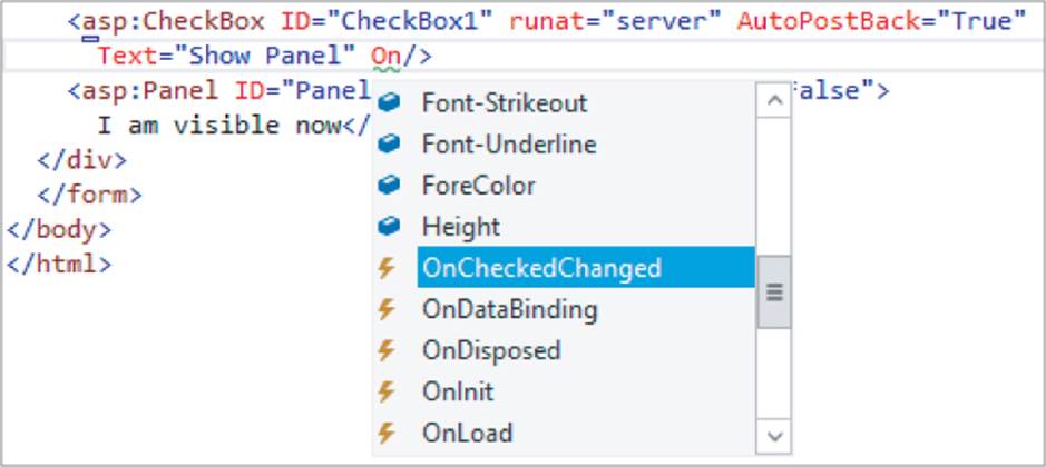
Select OnCheckChanged by pressing Tab or Enter. Next, type an equals sign (=), which brings up IntelliSense again as shown in Figure 4.10. Note that if you're using C#, you may also see a Page_Load item in the list of event handlers.
Figure 4.10
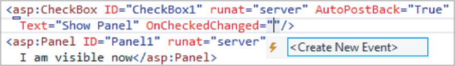
Select the <Create New Event> item and press Tab. VS completes the code as follows:
OnCheckedChanged="CheckBox1_CheckedChanged"
Although this auto-completion is nice, VS has done something else that's much more useful: when you pressed Tab, it also added the handler code for you in the Code Behind. To see that code, press F7 to switch to Code View.
Note
I have wanted this feature since the very first version of Visual Studio for .NET, and I am really glad it has been added. With this new feature, the need to switch to Design View and set up the handler by double-clicking a control (as you did in an earlier exercise) or using the Events tab of the Properties Grid (as you see later) has been greatly reduced. This is great for people who prefer hand-coding over the Design View and is especially useful in more complex pages where Design View isn't that useful anyway.
Note that there is a subtle difference between adding the handler using Markup View and Design View if you're using VB.NET. If you use Markup View, the handler is added to the markup (OnCheckedChanged="CheckBox1_CheckedChanged") and code is added to the Code Behind. When you use Design View, the code in Markup View is not affected, and the code in the Code Behind is annotated with the Handles keyword to indicate which event (for instance, the click on a button, the check changed event of a check box, and so on) the code responds to. At run time, however, there is no difference.
7. Next, add the following bolded line within the handler code that VS added for you:
VB.NET
Protected Sub CheckBox1_CheckedChanged(sender As Object, e As EventArgs)
Panel1.Visible = CheckBox1.Checked
End Sub
C#
protected void CheckBox1_CheckedChanged(object sender, EventArgs e)
{
Panel1.Visible = CheckBox1.Checked;
}
8. Save all your changes and then request the page in the browser by pressing Ctrl+F5.
9. When the page first loads, all you see is the check box and the text beside it. When you look at the HTML for the page in the browser (right-click the page and choose View Source or View Page Source depending on your browser), you'll only see the check box; there's no code for thePanel control at this stage sent to the browser. When you click the check box to place a checkmark in it, the page reloads and now shows the text you entered in step 5.
Warning
If nothing happens, go back to the source of the page in VS and ensure that AutoPostBack is set to True on the CheckBox control.
If you look at the HTML in the browser, you'll see that the text you typed in step 5 is wrapped in a <div> element with an id of Panel1:
If you look at the HTML in the browser, you'll see that the text you typed in step 5 is wrapped in a <div> element with an id of Panel1:
<div id="Panel1">
I am visible now
</div>
How It Works
In step 4 of this exercise you set the Visible property of the Panel control to False. This means that when the page loads, the control is not visible on the server and thus its HTML never makes it to the browser. When you then check the check box, a postback occurs, which sends the information contained in the form to the server. At the server, some code is run that is fired whenever the check box changes its state from checked to unchecked or vice versa. Inside that code block, the following code is executed (shown in C#):
Panel1.Visible = CheckBox1.Checked;
This means that the Panel is only visible when the check box is checked. When it isn't, the Panel is hidden automatically.
As you can see, it's easy to add text and other markup to the Panel control in VS. Right now, you only added some plaintext, but in the next section you see how to add a Wizard control and how to use it.
Magic with the Wizard Control
The Wizard control is a great tool for breaking apart large Web Forms and presenting them as bite-sized chunks of information to the user. Instead of confusing your user with one page with many controls and text on it, you can break the page apart and present each section on a separate wizard page. The Wizard control then handles all navigation issues by creating Next, Previous, and Finish buttons automatically. In the following exercise you use a wizard to ask a user for her name and favorite programming language. Although the example itself is pretty trivial, and you could have placed both questions on the same page without confusing the user, the example shows how the wizard works and why it's useful. You can easily apply the same techniques to your own, possibly larger, Web Forms.
Try It Out: Using the Wizard to Create Easy-to-Use Forms
In this Try It Out, you place a Wizard inside the panel you created in the previous exercise that enables a user to fill in a form that is spread over a couple of pages. The wizard will have two steps where a user can enter details, and a results page that shows the data the user has provided.
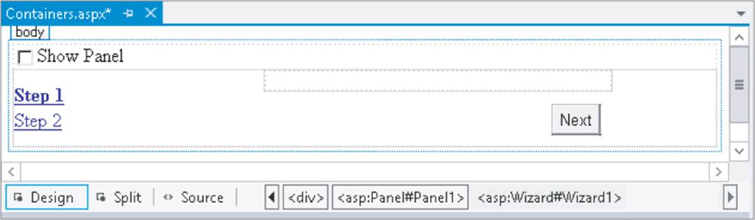
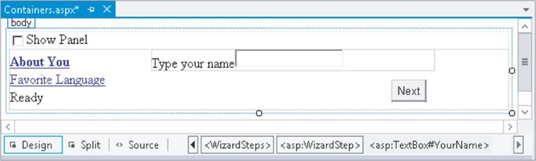
1. Make sure you still have Containers.aspx page open in Design View. Remove the text “I am visible now" that you entered in the previous Try It Out, and then drag a Wizard control from the Toolbox inside the Panel. Drag its right edge further to the right, increasing the total width of the control to 500px. Your page now looks similar to Figure 4.11.
Figure 4.11
2. Open the Wizard's Smart Tasks panel (click the arrow in its upper right-hand corner) and choose Add/Remove WizardSteps. In the dialog box that follows, click the Add button to insert a third wizard step, shown in Figure 4.12.
Figure 4.12
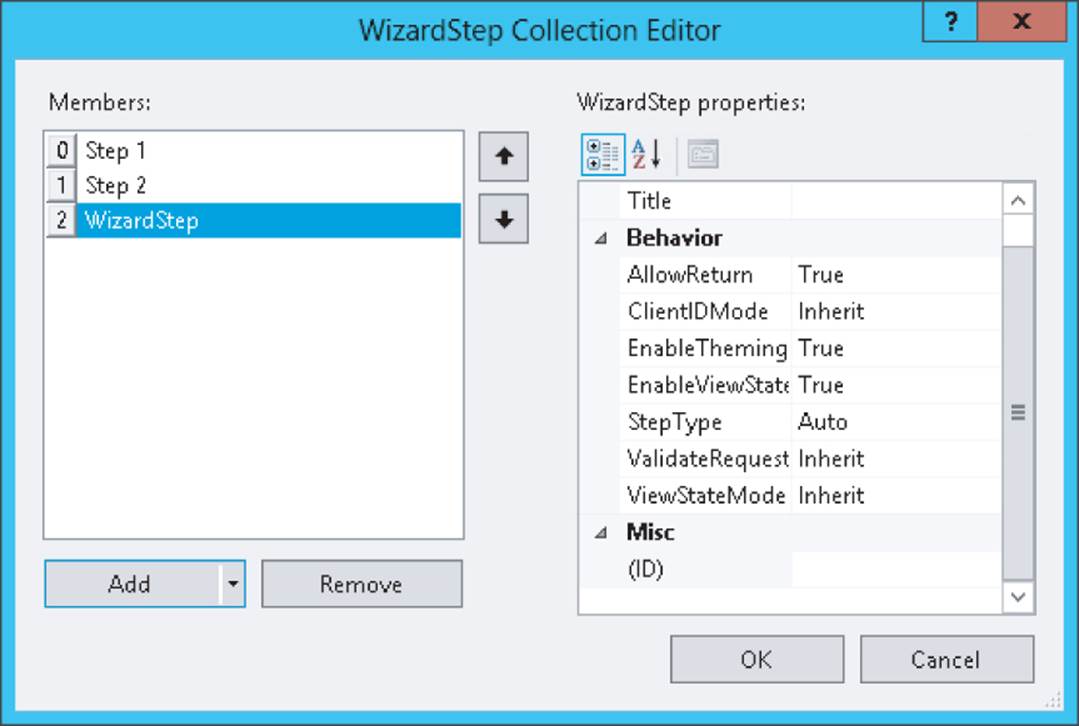
3. Click the first WizardStep labeled Step 1 in the Members list on the left and change its Title from Step 1 to About You. Set the Title of the other two steps to Favorite Language and Ready, respectively.
4. Change the StepType of the second step (now labeled Favorite Language) to Finish, and of the last step to Complete. You can leave the StepType of the first step set to Auto. Click OK to close the WizardStep Collection Editor.
5. In Design View, click About You in the list at the left to make it the active step and drag a Label and a TextBox to the right side of the Wizard. You need to drag them inside the gray rectangle that's in the upper-right corner of the Wizard, or the controls won't end up inside the Wizard. Set the Text property of the Label to Type your name and change the ID of the TextBox to YourName. When you're done, your Wizard looks like Figure 4.13.
Figure 4.13
6. Click the Favorite Language item in the list on the left to make it the active step. Add a DropDownList to the rectangle with the gray border on the right part of the wizard step. Rename the DropDownList by setting its ID to FavoriteLanguage. Open the Smart Tasks panel of theDropDownList control and choose Edit Items. Add the same three items you added in an earlier Try It Out: for C#, Visual Basic, and CSS, respectively. If you want, you can copy the three items from the page ListControls.aspx and paste them between the <asp:DropDownList> tags inside the second step. You should end up with the following code for the second step:
</asp:WizardStep>
<asp:WizardStep runat="server" Title="Favorite Language" StepType="Finish">
<asp:DropDownList ID="FavoriteLanguage" runat="server">
<asp:ListItem>C#</asp:ListItem>
<asp:ListItem>Visual Basic</asp:ListItem>
<asp:ListItem>CSS</asp:ListItem>
</asp:DropDownList>
</asp:WizardStep>
<asp:WizardStep runat="server" StepType="Complete" Title="Ready">
7. For the final step, switch to Markup View. If you try to switch to the last step in Design View, you may notice that the Wizard disappears. If that happens, switch to Markup View and set ActiveStepIndex to 0 again on the opening tag of the Wizard control.
Inside the last WizardStep labeled Ready, drag a label control from the Toolbox and rename it by setting its ID to Result. Alternatively, inside the code for the last step, type the word label and then press Tab to execute a code snippet for inserting a Label. Then add the ID attribute manually.
8. Double-click the Wizard in Design View and add the following bolded code, which will be executed when the user clicks the Finish button on the last step of the wizard. If you're having problems getting VS to create the correct code for you, as you see it in the next snippet, select theWizard, press F4 to open up the control's Properties Grid, and then click the button with the lightning bolt on it (the fourth button from the left on the toolbar of the Properties Grid), as shown in Figure 4.14.
Figure 4.14
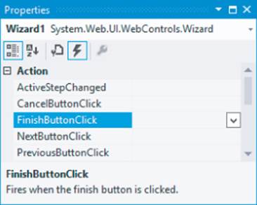
This part of the Properties Grid is often referred to as the Events tab of the Properties Grid. Locate and double-click FinishButtonClick in the Action category. With both methods, you should end up with some code for Wizard1_FinishButtonClick that you need to extend with the following code:
VB.NET
Protected Sub Wizard1_FinishButtonClick(sender As Object,
e As WizardNavigationEventArgs) Handles Wizard1.FinishButtonClick
Result.Text = "Your name is " & YourName.Text
Result.Text &= "<br />Your favorite language is " &
FavoriteLanguage.SelectedValue
End Sub
C#
protected void Wizard1_FinishButtonClick(object sender,
WizardNavigationEventArgs e)
{
Result.Text = "Your name is " + YourName.Text;
Result.Text += "<br />Your favorite language is " +
FavoriteLanguage.SelectedValue;
}
9. Switch back to Design View and open the Properties Grid for the Wizard and make sure its ActiveStepIndex is set to 0. The designer remembers the last step you designed and stores the value in the ActiveStepIndex of the Wizard in Markup View. To make sure the Wizard starts on the first page, you should always set the ActiveStepIndex back to 0 (or click the first step in the Wizard control in Design View) before you save your changes and run the page.
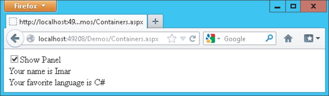
10. Save all changes, close all open browser windows, and press Ctrl+F5 to open the page in the browser. Select the check box to make the Panel visible and enter your name on the first wizard page. Click Next and choose your favorite programming language. Notice how there's now a Previous button available that enables you to go back to the first step of the wizard if you want to change your name. Instead of clicking the Next and Previous buttons, you can also click the links on the left of the wizard in the browser. When you click the Finish button, you'll see the results of the information you entered in the wizard (see Figure 4.15).
Figure 4.15
How It Works
The Wizard control takes care of most of the hard work for you. It handles the navigation, determines when to show the correct buttons (Next, Previous, and Finish), and ensures that in the resulting page the values for the controls you added in the wizard steps are still available so you can show them with the label. It does this with a concept called View State, something you learn more about toward the end of this chapter.
All you have to do is define the steps and set their StepType. You set the StepType of the first step to Auto. With this setting, the Wizard figures out what buttons to show. Because it's the first step in the wizard and there's no previous step to go to, it leaves out the Previous button (this is the equivalent of setting the StepType to Start manually.) You set the StepType of the second step to Finish, which tells the Wizard to draw a Previous button and a Finish button. When you click the Finish button, the Wizard arrives at the last step with its StepType set to Complete. On this step, the navigation buttons are hidden, and all you see is the label with the result, which was assigned with the code in the Code Behind of the page. In Chapter 5, you learn more about the code in the Code Behind that makes this possible.
In addition to the controls you have seen in the previous sections, a few other controls are worth examining. Not all of them are discussed here in detail because they aren't used any further in this book. A good source of information about these controls is the Microsoft Developer Network (MSDN) site at http://msdn.microsoft.com. To find information about controls on this site, use your favorite search engine and then search for ControlName Control MSDN. For example, to find more information on the Wizard control you'd search for Wizard Control MSDN. Typically, the MSDN site is at the top of the search results.
Other Standard Controls
This section briefly discusses the remainder of the controls in the Standard category of the Toolbox. You see many of them used in the sample application in the rest of the book.
LinkButton and ImageButton
The LinkButton and the ImageButton controls operate similarly to an ordinary Button control. Both of them cause a postback to the server when they are clicked. The LinkButton presents itself as a simple <a> element, but posts back (using JavaScript) instead of requesting a new page. TheImageButton does the same, but displays an image that the user can click to trigger the postback.
Image and ImageMap
These controls are pretty similar in that they display an image in the browser. The ImageMap enables you to define hotspots on the image that, when clicked, either cause a postback to the server or navigate to a different page.
Calendar
The Calendar control presents a rich interface that enables a user to select a date. You see more of it toward the end of this chapter when the ASP.NET state engine is discussed.
FileUpload
The FileUpload control enables a user to upload files that can be stored on the server. You see more of this control in Chapter 14.
Literal, Localize, and Substitute
All three controls look a little like the Label control because they can all display static text or HTML. The biggest advantage of the Literal is that it renders no additional tag itself; it displays only what you assign to its Text property, and is thus very useful to display HTML or JavaScript that you build up in the Code Behind or that you retrieve from a database.
The Localize control is used in multilingual websites and is able to retrieve its contents from translated resource files. The Substitute control is used in advanced caching scenarios and enables you to update only parts of a page that is otherwise cached completely. Both of these controls fall outside the scope of this book, but for a good discussion of them you may want to get a copy of Wrox's Professional ASP.NET 4.5 in C# and VB (ISBN: 978-1-118-31182-0).
AdRotator
The AdRotator control enables you to display random advertisements on your website. The ads come from an XML file that you create on your server. Because it lacks advanced features like click tracking and logging that are required in most but the simplest scenarios, this control isn't used much in today's websites.
HiddenField
The HiddenField control enables you to store data in the page that is submitted with each request. This is useful if you want the page to remember specific data without the user seeing it on the page. Because the field does show up in the HTML source of the page, and is thus accessible to the end user, you should never store any sensitive data in it.
XML
The XML control enables you to transform data from an XML format to another format (like XHTML) for display on a page. Check out Professional ASP.NET 4.5 for a detailed description.
Table
The <asp:Table> control is in many respects identical to its HTML <table> counterpart. However, because the control lives at the server, you can program against it, creating new columns and rows dynamically and adding dynamic data to it.
This concludes the discussion of the controls in the Standard category of the Toolbox. In most web pages, you'll be working with at least a few of these controls. The remainder of this section discusses the other categories of the Toolbox. Because most of them are used in some form in the remainder of this book, this chapter just briefly describes their purpose so you get a rough idea what they are used for. You'll find cross-references to the other chapters where you can find out more information about them.
HTML Controls
The HTML category of the Toolbox contains a number of HTML controls that look similar to the ones found in the Standard category. For example, you find the Input (Button) that looks like the <asp:Button>. Similarly, there is a Select control that has the <asp:DropDownList> and<asp:ListBox> as its counterparts.
In contrast to the ASP.NET Server Controls, the HTML controls are client-side controls and end up directly in the final HTML in the browser. You can expose them to server-side code by adding a runat="server" attribute to them. This enables you to program against them from the Code Behind of a Web Form, to influence things like their visibility.
The HTML controls have a lot less functionality than the ones in the Standard category. For example, the Select control lacks design-time support for adding new items to the list with the ListItem Collection Editor. This forces you to write the items by hand in the Markup View of VS.
Because the controls in the Standard and HTML category look quite like each other, the next section discusses their differences and gives you some idea of when to favor one category over the other.
How to Choose between Standard and HTML Controls
There seems to be some overlap between the controls in the Standard and HTML categories of the Toolbox. So which ones should you choose and when? Generally, the true server controls in the Standard category offer you a lot more functionality, both in terms of design-time support in VS and what they can do at run time. But this functionality comes at a price. Because of their increased complexity, the server controls take a little more time to process. However, on most websites you probably won't notice the difference. Only when you have a high-traffic website with lots of controls on the page do the HTML controls give you a slightly better performance and consume less memory on the server when compared to the server controls.
In most scenarios, favor the server controls over their HTML counterparts. Because server controls offer more functionality, they give you more flexibility in your pages, enabling you to create a richer user experience. Also, the better design-time support makes it worth choosing these controls.
Choose the HTML controls if you're really sure that you don't need the functionality that the server controls offer you.
The remainder of this section quickly guides you through the other categories in the Toolbox.
Data Controls
Data controls were introduced in ASP.NET 2.0, and offer an easy way to access various data sources like databases, XML files, and objects. Instead of writing lots of code to access the data source as you had to do in earlier versions of ASP.NET, you simply point your data control to an appropriate data source, and the ASP.NET run time takes care of most of the difficult issues for you. You see a lot more about these controls in Chapter 13 and onward.
Validation Controls
Validation controls enable you to rapidly create Web Forms with validation rules that prohibit users from entering invalid data. For example, you can force users to enter values for required fields and check whether the entered data matches a specific format like a valid date or a number between 1 and 10. They even allow you to write custom code to create validation routines that are not covered by the standard controls. The beauty of the validation controls is that they can execute both on the client and the server, enabling you to create responsive and secure web applications. Chapter 9 digs much deeper into these controls.
Navigation Controls
The controls you find under the Navigation category of the Toolbox are used to let users find their way through your site. The TreeView control presents a hierarchical display of data and can be used to show the structure of your site, giving easy access to all the pages in the site. The Menu control does a similar thing and provides options for horizontal and vertical fold-out menus.
The SiteMapPath control creates a “breadcrumb trail” in your web pages that enables your users to easily find their way up in the hierarchy of pages in your site.
You see all of these controls in action in Chapter 7, which deals with navigation in websites exclusively.
Login Controls
Just like the data and navigation controls, the login controls were introduced in ASP.NET 2.0 and are still strongly present in ASP.NET 4.5. With very little effort, login controls enable you to create secure websites where users need to sign up and log in before they can access specific parts of the website (or even the entire website). In addition, they provide the tools for users to change their password, or request a new password if they forget the old one, and enable you to display different data depending on the logged-in status and role of the user. Chapter 16 provides more details about the security features and login controls of ASP.NET.
Ajax Extensions
The Ajax Extensions enable you to create flicker-free web applications that are able to retrieve data from the server from client-side JavaScript without a full postback. You can find the full details on them in Chapter 10.
WebParts
ASP.NET WebParts are a set of controls that enables an end user of a web page to change the appearance and behavior of a website. These controls are outside the scope of this book.
Dynamic Data
The controls in this category are used in Dynamic Data websites. Dynamic Data sites enable you to quickly build a user interface to manage data in a database. These controls are not discussed further in this book. To learn more about them, check out Sams' ASP.NET Dynamic Data Unleashed, Oleg Sych and Randy Patterson, 2012 (ISBN: 978-0-672-33565-5).
The ASP.NET State Engine
In the previous chapter, you created a page with a TextBox and a Button control. In the Try It Out, you ran this page in the browser, typed some text, and clicked the button. The button caused a postback to the server, and when the page reloaded, the text was still present in the text box. You pretty much did the same thing with the Wizard control in this chapter, where the values from the text box and the drop-down list were maintained as well. If you're familiar with other web technologies like ASP or PHP, this probably surprised you. In those languages, you often need to write lots of code to make this happen. So why and how does this work automatically in ASP.NET?
The text in the text box is maintained by the ASP.NET state engine, a feature that is deeply integrated into the ASP.NET run time. It enables controls to maintain their state across postbacks, so their values and settings remain available after every postback of the page.
What Is State and Why Is It Important?
To understand state, it's important to realize that, by design, HTTP—the protocol used to request and serve pages in a web browser—is stateless. What this means is that the web server does not keep track of requests that have been made from a specific browser. As far as the web server is concerned, each request you make to the server by browsing to a page and clicking links to other pages stands on its own. The web server has no recollection of pages you requested previously.
This poses some interesting problems. Consider, for example, a simple login page that enables you to log in to a website, like your favorite web mail program. You can see a sample of the login box in Figure 4.16.
Figure 4.16
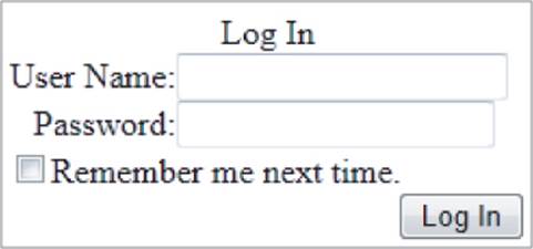
Now imagine that you try to log in with a correct username but with an incorrect password. The page will then inform you that your login attempt failed. Ideally, you would also want your username to be filled in for you automatically, and you'd want the Remember Me Next Time check box to retain its selection as well. That way, it's easy for the user to enter the correct password and click the Log In button again. This is just a trivial example, but it's easy to come up with many more scenarios where it's useful if controls are able to maintain their own state.
However, by default, a web page or a control cannot do this on its own. Because each request is a standalone request, the server won't fill in the text boxes again after a postback, but will simply serve the page the same way it did when it first loaded it. In other web technologies, like classic ASP or PHP, you could work around this by manually writing code that prepopulates controls after a postback. Fortunately, ASP.NET makes this much easier for you by integrating this functionality in the ASP.NET feature set.
How the State Engine Works
The state engine in ASP.NET is capable of storing state for many controls. It can store state not only for user input controls like a TextBox and a CheckBox, but for other controls like a Label and even a Calendar. This is best demonstrated by a demo. The following exercise shows you how to create a page with controls that are capable of maintaining their state. The sections that follow then explain how ASP.NET is able to do this.
Try It Out Examining the ASP.NET State Engine
In this exercise you add Label, Button, TextBox, and Calendar controls to the page. These controls are used to demonstrate some of the inner workings of ASP.NET, including postbacks and the way ASP.NET maintains state.
1. Under the Demos folder, create a new page called State.aspx. Make sure it uses Code Behind, and don't forget to choose your preferred programming language.
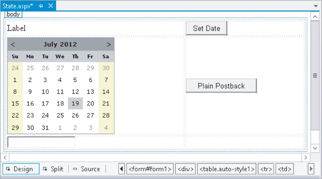
2. Switch the page to Design View, click inside the dashed <div> to put the focus on it, and then choose Table ⊆ Insert Table from the main menu. Set Rows to 3 and Columns to 2 and click OK to insert a table with three rows and two columns.
3. In the first cell of the first row, drag a Label control from the Toolbox. In the first cell of the second row, drag a Calendar control.
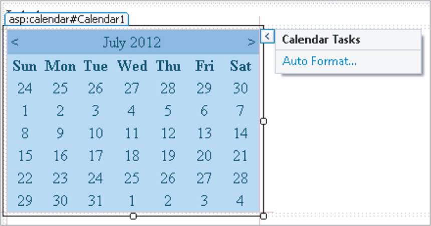
4. Note that as soon as you drop the Calendar control in the cell, its Smart Tasks panel pops up as shown in Figure 4.17.
In the case of the Calendar control, you only get one option on this panel, Auto Format, which enables you to change the appearance of the calendar. Click the link, choose from one of the predefined color schemes, like Simple, and click OK.
5. In the first cell of the last row, drag a TextBox control.
6. Next, drag Button controls into the right column of the first two rows of the table.
7. Click the Button in the first row and press F4 to open the Properties Grid. Set the Button's Text property to Set Date and its ID to SetDate. You'll find the ID property all the way at the end of the list with properties, or at the beginning if you have the list with properties sorted alphabetically.
8. Repeat the previous step for the other button but call it PlainPostback and set its Text property to Plain Postback. When you're done, the page should look like Figure 4.18 in Design View.
9. Double-click the Set Date button in Design View and add the following bolded code on the empty line between the code lines that VS inserted for you:
VB.NET
Protected Sub SetDate_Click(sender As Object, e As EventArgs) Handles SetDate.Click
Label1.Text = DateTime.Now.ToString()
End Sub
Figure 4.17
C#
Figure 4.18
protected void SetDate_Click(object sender, EventArgs e)
{
Label1.Text = DateTime.Now.ToString();
}
There's no need to write code for the Plain Postback button.
10. Open the page in the browser by pressing Ctrl+F5. Select a date on the calendar by clicking one of the days. Notice that as soon as you click the date, the page reloads, caused by a postback. You learn more about this in the How It Works section that follows this exercise.
11. Enter some text in the TextBox control and then click the Set Date button a few times. Again, the page is posted back to the server and the Label is updated with today's date and time each time you click the button. The TextBox still shows the text you entered. Wait a few seconds, and then click the Plain Postback button. Once again, a postback occurs, and the page reloads. Now take a look at the text for the Label. It still contains the date and time that was displayed when you last clicked the Set Date button. Click the Plain Postback button a few more times and notice that the Label doesn't change. The TextBox should still display the text you entered.
12. Go back to VS and open the Properties Grid for the Label control in Design View. Locate the EnableViewState property and set it to False by selecting that value from the drop-down list or by double-clicking the property name or its value. Repeat this step for the TextBox control.
13. Repeat steps 10 and 11 by reopening the page in the browser and clicking the calendar and the buttons. This time, when you click the Plain Postback button, you'll see that the Label control defaults to its initial text: Label. The TextBox, however, still displays the text you entered.
How It Works
To understand how this all works, you need to look at a few important elements. First, open up the page in the browser again and view its HTML source. You can do this by right-clicking the page in the browser and choosing the View Source or View Page Source menu item. Near the top of the window, you see the following <form> element:
<form method="post" action="State.aspx" id="form1">
...
</form>
The HTML <form> element is used to enable a user to submit information from the browser to the server. A user can enter information using controls like text boxes, drop-down lists, check boxes, and so on. A form can be submitted in two ways: with POST (as shown in the previous <form>element) or with GET. In the former case, all data from the form is added to the body of the request and then sent to the server. In the case of the GET method, all the data is appended to the actual address of the request. The intricacies of the differences are not that important right now; what's important to understand is what the <form> element is used for: it encapsulates form controls whose values are submitted back to the server en masse.
When a control like a Button is clicked, it causes a postback to the server. During this postback, all the relevant information in the form is submitted back to the server where it can be used to rebuild the page.
By default, all your ASP.NET Web Forms always use the POST method to send data to the server. Also, by default, an entire ASP.NET page always contains exactly one form. Because this is so common, a new page (or Master Page as you learn in Chapter 6) created in VS already contains the <form> element, so you don't have to add it yourself. Finally, it's important to understand that an ASP.NET Web Form by default always submits back to itself. In other web environments, like classic ASP and PHP, it's not uncommon to set the action attribute of the page to a second page that then processes the data the user has submitted. However, with an ASP.NET page, you'll find that even if you set the action attribute in the code explicitly, the ASP.NET run time will revert it to the name of the current page.
Note
ASP.NET supports a feature called Cross Page Postbacks that enables you to submit from one page to another. To learn more about this concept, search the MSDN site for Cross Page Postbacks or get yourself a copy of Professional ASP.NET 4.5 from Wrox.
The next thing to look at is ASP.NET's View State functionality implemented with the hidden _VIEWSTATE field that you see in the HTML source bolded in the following snippet:
<form method="post" action="State.aspx" id="form1">
...
<input type="hidden" name="_VIEWSTATE" id="_VIEWSTATE"
value="IXcrUZ51B9YmtdoSL9csn2+VrYx5oW32kAw0oRXGsf3F0/W0l6/upieH7Nht1f
hyr99U0IRRKmjvYk4FdH5E9ZRucaja0xPkwCyRoNBI3KkidqR5eAVX86D
qOfEl584eSB0ff3IF4o3Y+ZqD7qZp3A==" />
</div>
Although at first the text appears to contain nothing more than random characters, it actually contains useful information. To protect the information stored in this field, ASP.NET has converted the page state in the preceding string. If you were able to look inside the value of the fields, you'd find a value for the Label1 control with the current date and time.
When your ASP.NET page loads, the ASP.NET run time fills this hidden field with information about the page. For example, it added the value for the Text property of the Label1 control when you caused a postback by clicking the Set Date button. Similarly, it contains the selected date for the Calendar control. When the page is then submitted back by a postback, the value in this hidden _VIEWSTATE field is sent with the request. Then, when ASP.NET creates the new page on the server, the information from the _VIEWSTATE field is read and applied to the controls in the page. This way, a control like the Label is able to maintain its text even after the page has been posted back to the server.
The TextBox doesn't need View State, though. It's able to maintain its value because the browser submits it to the server with each postback.
To reiterate, here's a rundown of the process that took place in the preceding Try It Out.
1. You requested the page in the browser by opening it from within VS.
2. The browser got the page from the server by making a request for it.
3. The ASP.NET run time read the page from disk, processed it, and sent the resulting HTML to the browser. At this stage, all the controls were set to their default values that were defined in the markup of the page. For example, the Text of the Label control is set to Label.
4. After the page got displayed in the browser, you clicked the Set Date button. This caused a postback to the server.
5. At the server, the page was reconstructed again, similar to the first time it loaded, described in step 3. At this stage, all the controls contain their default values. So, again, the Label1 control had its Text property set to Label. Shortly after the defaults have been set, the run time overrides these defaults for controls it finds in View State. However, because this was the first postback and the Label control's Text property hadn't changed yet, its value was not present in View State. So the Text property just contained the default word Label.
6. While still processing the same request, the ASP.NET run time fired the code in SetDate_Click. As you have seen, this code changed the Text property of the Label control to the current date and time. The ASP.NET run time sees this change and stores this new value in View State as well, so it stays available for subsequent postbacks.
7. Next, you entered some text and clicked the Plain Postback button. Just as with the other button, this caused a postback to occur. The page was constructed again, and all defaults are set. Again, this means that the Text property of the Label1 control simply contains the word Label. However, shortly after that, during the same processing cycle, the ASP.NET run time processes the View State, restoring control values it finds in the hidden _VIEWSTATE field. In this example, it found the Text property with the current date and time, and assigned it again to the Labelcontrol. Because the Plain Postback button doesn't change the Text of the Label anymore, the Text property doesn't change: it contains the date and time from the previous postback. The Text property of the TextBox control is set using the value submitted to the server; that is, this control does not use View State to maintain its value. At the end, the entire page is sent to the browser, where the label correctly displays its previous value.
8. Finally, you turned off the View State for the Label and TextBox controls by setting EnableViewState to False. With this setting turned off, the ASP.NET run time doesn't track the Label control anymore. So when you click the Plain Postback button, the ASP.NET run time doesn't find any information for the label in View State, which eventually results in the label displaying its own default text: the word Label.
Not All Controls Rely on View State
You have to understand that not all controls rely on View State all the time. A number of controls are able to maintain some of their own state, as you saw with the TextBox control in the preceding exercise. These controls include, among others, the TextBox, CheckBox, RadioButton, andDropDownList controls. They are able to maintain their values because they are rendered as standard HTML form controls in the browser. For example, a TextBox server control ends up like this in the browser:
<input name="TextBox1" type="text" value="Initial Text" id="TextBox1" />
When a page with such a TextBox in it is posted back, the browser also sends the value of the control back to the server. The ASP.NET run time can then simply look at that value to prepopulate the text box again, instead of getting the value from View State. Obviously, this is more efficient than storing the value in View State too. If that were the case, the value would get sent to the server twice: once in the text box and once in View State. Especially with large values, this could quickly increase the page's size, and thus its load time. For some features—such as tracking changes made at the client—these controls still need to store their values in View State as well, and do so on a need-to-have basis.
In addition to View State, controls support the concept of Control State. Controls use that mechanism to keep track of data they absolutely need to operate correctly. You cannot disable Control State but since only limited amounts of data are stored in Control State, this is not a problem.
A Note about View State and Performance
Because the View State engine adds a considerable amount of information to the page, it's often a good idea to turn it off when you don't need it. This way, you can minimize the size of the hidden _VIEWSTATE field, which means the page becomes smaller and thus loads faster in the browser. Note that when you turn of View State you still see the hidden _VIEWSTATE field because Control State uses the same field to store its data. Turning off View State is easy, and you can do it at three different places:
· At the website level—You can do this in the Web.config file in the root of the site by modifying the <pages> element under <system.web>, setting the enableViewState attribute to false:
<pages enableViewState="false">
...
</pages>
· At the page level—At the top of each page you find the page directive, a series of instructions that tell the ASP.NET run time how the page should behave. In the page directive you can set EnableViewState to False:
<%@ Page Language="VB" AutoEventWireup="False" CodeFile="State.aspx.vb"
Inherits="Demos_State" EnableViewState="False" %>
This option is useful for pages where you're sure you don't need View State at all.
· At the control level—Each ASP.NET Server Control enables you to set EnableViewState individually, giving you the option to turn it off for some controls, while leaving it on for others.
Once you've turned off View State at a higher level (Web.config or page level), setting EnableViewState to True again at a lower level (the page or a specific control) has no effect. However, using the ViewStateMode property you can still accomplish this as follows:
· Do not turn off View State in the Web.config file.
· At the page level, set EnableViewState to True and ViewStateMode to Disabled like this:
· <%@ Page Language="C#" … EnableViewState="True" ViewStateMode="Disabled" %>
This turns off View State for all controls in the page except for those that explicitly enable it again by setting the ViewStateMode to Enabled.
· For the controls you want to give View State support, set the ViewStateMode to Enabled, like this:
<asp:Label ID="Label1" runat="server" Text="Label" ViewStateMode="Enabled" />
If you want to see this at work in your demo page, modify the page directive of State.aspx as in the previous example by setting EnableViewState to True and ViewStateMode to Disabled. Then create a second Label in the page and set ViewStateMode for the first to Enabled:
<asp:Label ID="Label1" runat="server" Text="Label" ViewStateMode="Enabled" />
<asp:Label ID="Label2" runat="server" Text="Label" />
In the Code Behind of the page, assign today's date and time to the second label as well:
VB.NET
Label1.Text = DateTime.Now.ToString()
Label2.Text = DateTime.Now.ToString()
C#
Label1.Text = DateTime.Now.ToString();
Label2.Text = DateTime.Now.ToString();
Finally, run steps 10 and 11 of the last Try It Out exercise. You'll notice the first Label maintains its text, whereas the second defaults back to the text Label.
Practical Tips on Working with Controls
The following list presents some practical tips on working with controls:
· Spend some time trying out the different controls in the Standard category. Although many of them are used and discussed throughout the book, it's good to know how you should use them and how they operate. By experimenting with them now in a few sample pages, you have a head start when the controls reappear in later chapters.
· Consider turning off View State for controls that don't need it. In many cases, you hardly notice the difference, but especially with the data-driven controls discussed in Chapter 13 and onward, disabling View State can seriously decrease the size of your web page, resulting in shorter load times and improved user experience.
· Before you design a complex Web Form with multiple controls to accept user input, step back from your computer and take a piece of paper and a pen to draw out the required functionality. By thinking about the (technical) design of your application before you start coding, it's much easier to create a consistent and well-thought-out user interface. Making considerable changes later in the page if you've taken a wrong route will always take more time than doing it (almost) right the first time.
· Experiment with the View State mechanism to get a better understanding of how it works. Create a couple of pages similar to the one you created in the last exercise. Then turn off View State at the page or control level and see how the page behaves. Take note of the controls, such asTextBox, that are capable of maintaining their value even with View State off.
Summary
This chapter gave you a good look at the large set of ASP.NET Server Controls. Because these controls are so important and used throughout every ASP.NET application, it's really critical that you understand what controls you have available in the Toolbox, what they are used for, how they work, and how they maintain their own state.
One of the biggest inventions in ASP.NET is the state engine that enables controls to maintain their state across postbacks. The state engine is a real time-saver and frees you from writing loads of tedious and boring code in every single web page to replicate this behavior. However, you should turn View State off when possible to improve performance.
This chapter also introduced you to some trivial server-side code in Visual Basic and in C#. The next chapter gives you a much better understanding of programming ASP.NET pages. You see how a programming language looks, what elements it contains, and how to write code yourself to use in your ASP.NET pages. And best of all, the examples are presented in Visual Basic and C#, so you're not stuck with a language you may not like.
Exercises
1. Name the mechanism that enables server controls to maintain their state.
2. How is the ASP.NET run time able to keep track of control state between postbacks?
3. Name a difference between an <asp:DropDownList> and an <asp:ListBox>.
4. What property do you need to cause a postback to the server when you change the checked state of a CheckBox in the browser?
5. Many server controls have a common set of properties that affects their looks at run time. Name three properties that change styling elements such as color, borders, and size.
6. Instead of setting individual control properties like BackColor and ForeColor, it's better to set a single CSS-related property. What's the name of this property and what benefit does it give you?
You can find answers to these exercises in Appendix A.
What You Learned in this Chapter
|
_VIEWSTATE |
The hidden form field that is used to transfer the state from the server to the client and back. |
|
Container controls |
Server controls that serve as a container by wrapping other content and controls. |
|
Events tab |
The part of the Properties Grid that lets you set up handlers for control events such as Click for a Button. |
|
List controls |
Server controls that present a list of items to the user. Controls include the DropDownList, CheckBoxList, and more. |
|
POST and GET methods |
Different methods to submit data from the client to the server. With POST the data is added to the body of the request, whereas with GET the data is appended to the address of the requested page. |
|
Postback |
The process of sending form data from a client browser back to the server. |
|
Server Controls |
The work horses of ASP.NET, used to build up the user interface of a web page in the browser. |
|
Smart Tasks panel |
The action panel that appears for some controls to help you accomplish common tasks. |
|
View State |
The mechanism that enables the ASP.NET controls to store state at the client. |
All materials on the site are licensed Creative Commons Attribution-Sharealike 3.0 Unported CC BY-SA 3.0 & GNU Free Documentation License (GFDL)
If you are the copyright holder of any material contained on our site and intend to remove it, please contact our site administrator for approval.
© 2016-2026 All site design rights belong to S.Y.A.