C# 6.0 and the .NET 4.6 Framework (2015)
PART VIII
ASP.NET
CHAPTER 32
ASP.NET Web Controls, Master Pages, and Themes
The previous chapter concentrated on the general composition of an Web Forms page and the role of the Page class. This chapter will dive into the details of the web controls that make up a page’s user interface. After examining the overall nature of an Web Forms control, you will learn how to use several UI elements, including validation controls and various data-binding techniques.
The good portion of this chapter will examine the role of master pages and show how they provide a simplified way to establish a common UI skeleton that will be replicated across the pages in your web site. Closely related to the topic of master pages is the use of site navigation controls (and a related *.sitemap file) in order to define the navigational structure of a multipage site via a server-side XML file.
To wrap things up, you will learn about the role of Web Forms themes. Conceptually, themes serve the same purpose as a cascading style sheet (CSS); however, Web Forms themes are applied on the web server (as opposed to within the client-side browser) and, therefore, have access to server-side resources.
Understanding the Nature of Web Controls
A major benefit of Web Forms is the ability to assemble the UI of your pages using the types defined in the System.Web.UI.WebControls namespace. As you have seen, these controls (which go by the names server controls, web controls, or Web Form controls) are extremely helpful in that they automatically generate the necessary HTML for the requesting browser and expose a set of events that may be processed on the web server. Furthermore, because each Web Forms control has a corresponding class in the System.Web.UI.WebControls namespace, it can be manipulated in an object-oriented manner.
When you configure the properties of a web control using the Visual Studio Properties window, your edits are recorded in the opening control tag of a given element in the *.aspx file as a series of name/value pairs. Thus, if you add a new TextBox to the designer of a given *.aspxfile and change the ID, BorderStyle, BorderWidth, BackColor, and Text properties, the opening <asp:TextBox> tag is modified accordingly (however, note that the Text value becomes the inner text of the TextBox scope).
<asp:TextBox ID="txtNameTextBox" runat="server" BackColor="#C0FFC0"
BorderStyle="Dotted" BorderWidth="3px">Enter Your Name</asp:TextBox>
Given that the declaration of a web control eventually becomes a member variable from the System.Web.UI.WebControls namespace (via the dynamic compilation cycle mentioned in Chapter 31), you can interact with the members of this type within a server-side <script>block or more commonly via the page’s code-behind file. Thus, if you were to add a new Button control to an*.aspx file, you could handle the Click event and write a server-side handler that changes the background color of the TextBox, like so:
partial class _Default : System.Web.UI.Page
{
protected void btnChangeTextBoxColor_Click(object sender, EventArgs e)
{
// Change color of text box object in code.
this.txtNameTextBox.BackColor = System.Drawing.Color.DarkBlue;
}
}
All Web Forms controls ultimately derive from a common base class named System.Web.UI.WebControls.WebControl. In turn, WebControl derives from System.Web.UI.Control (which derives from System.Object). Control and WebControl each define a number of properties common to all server-side controls. Before you examine the inherited functionality, let’s formalize what it means to handle a server-side event.
Understanding Server-Side Event Handling
Given the current state of the World Wide Web, it is impossible to avoid the fundamental nature of browser/web server interaction. Whenever these two entities communicate, there is always an underlying, stateless HTTP request-and-response cycle. While Web Forms server controls do a great deal to shield you from the details of the raw HTTP protocol, always remember that treating the Web as an event-driven entity is just a magnificent smoke-and-mirrors show provided by the .NET platform, and it is not identical to the event-driven model of a Windows-based desktop GUI framework such as WPF.
For example, although the WPF-centric System.Windows.Controls namespace and the Web Forms System.Web.UI.WebControls namespace both define classes with the same simple names (Button, TextBox, Label, and so on) they do not expose an identical set of properties, methods, or events. For example, there is no way to handle a server-side MouseMove event when the user moves the cursor over a Web Form Button control.
The bottom line is that a given Web Forms control will expose a limited set of events, all of which ultimately result in a postback to the web server. Any necessary client-side event processing will require you to author blurbs of client-side JavaScript/VBScript script code to be processed by the requesting browser’s scripting engine. Given that Web Forms is primarily a server-side technology, I will not be addressing the topic of authoring client-side scripts.
 Note Handling an event for a given web control using Visual Studio can be done in an identical manner as doing so for a Windows GUI control. Simply select the widget from the designer and click the lightning bolt icon on the Properties window.
The AutoPostBack Property
It is also worth pointing out that many of the Web Forms controls support a property named AutoPostBack (most notably, the CheckBox, RadioButton, and TextBox controls, as well as any widget that derives from the abstract ListControl type). By default, this property is set to false, which disables an immediate postback to the server (even if you have indeed rigged up the event in the code-behind file). In most cases, this is the exact behavior you require, given that UI elements, such as check boxes, typically don’t require postback functionality. In other words, you don’t want to post back to the server immediately after the user checks or unchecks a check box, as the page object can obtain the state of the widget within a more natural Button Click event handler.
However, if you want to cause any of these widgets to post back to a server-side event handler immediately, simply set the value of AutoPostBack to true. This technique can be helpful if you want to have the state of one widget automatically populate another value within another widget on the same page. To illustrate, assume you have a web page that contains a single TextBox (named txtAutoPostback) and a single ListBox control (named lstTextBoxData). Here is the relevant markup:
<form id="form1" runat="server">
<asp:TextBox ID="txtAutoPostback" runat="server"></asp:TextBox>
<br/>
<asp:ListBox ID="lstTextBoxData" runat="server"></asp:ListBox>
</form>
Now, if you were to handle the TextChanged event of the TextBox, the server-side event handler could attempt to populate the ListBox with the current value in the TextBox, like so:
partial class _Default : System.Web.UI.Page
{
protected void txtAutoPostback_TextChanged(object sender, EventArgs e)
{
lstTextBoxData.Items.Add(txtAutoPostback.Text);
}
}
If you run the application as is, you will find that as you type in the TextBox, nothing happens.
Furthermore, if you type in the TextBox and tab to the next control, nothing happens. The reason is that the AutoPostBack property of the TextBox is set to false by default. However, if you set this property to true, as in
<asp:TextBox ID="txtAutoPostback" runat="server"
AutoPostBack="true" ... >
</asp:TextBox>
you will find that when you tab away from the TextBox (or press the Enter key), the ListBox is automatically populated with the current value in the TextBox. To be sure, beyond the need to populate the items of one widget based on the value of another widget, you won’t typically need to alter the state of a widget’s AutoPostBack property (and even then, sometimes this can be accomplished purely in client script, removing the need for server interaction at all).
The Control and WebControl Base Classes
The System.Web.UI.Control base class defines various properties, methods, and events that provide the ability to interact with core (typically non-GUI) aspects of a web control. Table 32-1 documents some, but not all, members of interest.
Table 32-1. Select Members of System.Web.UI.Control
|
Member |
Meaning in Life |
|
Controls |
This property gets a ControlCollection object that represents the child controls within the current control. |
|
DataBind() |
This method binds a data source to the invoked server control and all of its child controls. |
|
EnableTheming |
This property establishes whether the control supports theme functionality (the default is true). |
|
HasControls() |
This method determines whether the server control contains any child controls. |
|
ID |
This property gets or sets the programmatic identifier assigned to the server control. |
|
Page |
This property gets a reference to the Page instance that contains the server control. |
|
Parent |
This property gets a reference to the server control’s parent control in the page control hierarchy. |
|
SkinID |
This property gets or sets the skin to apply to the control, which allows you to set the look and feel using server-side resources. |
|
Visible |
This property gets or sets a value that indicates whether a server control is rendered as a UI element on the page. |
Enumerating Contained Controls
The first aspect of System.Web.UI.Control that you will examine is the fact that all web controls (including Page itself) inherit a custom controls collection (accessed via the Controls property). Much like in a Windows Forms application, the Controls property provides access to a strongly typed collection of WebControl-derived types. Like any .NET collection, you have the ability to add, insert, and remove items dynamically at runtime.
While it is technically possible to add web controls directly to a Page-derived type, it is easier (and more robust) to make use of a Panel control. The Panel class represents a container of widgets that may or may not be visible to the end user (based on the value of its Visible andBorderStyle properties).
To illustrate, create a new empty web site named DynamicCtrls and add a new Web Forms to your project. Using the Visual Studio page designer, add a Panel control (named myPanel) that contains a TextBox, Button, and HyperLink widget named whatever you choose (be aware that the designer requires that you drag internal items within the UI of the Panel type). Next, place a Label widget outside the scope of the Panel (named lblControlInfo) to hold the rendered output. Here is one possible HTML description:
<html xmlns="http://www.w3.org/1999/xhtml">
<head runat="server">
<title>Dynamic Control Test</title>
</head>
<body>
<form id="form1" runat="server">
<div>
<hr />
<h1>Dynamic Controls</h1>
<asp:Label ID="lblTextBoxText" runat="server"></asp:Label>
<hr />
</div>
<!-- The Panel has three contained controls -->
<asp:Panel ID="myPanel" runat="server" Width="200px"
BorderColor="Black" BorderStyle="Solid" >
<asp:TextBox ID="TextBox1" runat="server"></asp:TextBox><br/>
<asp:Button ID="Button1" runat="server" Text="Button"/><br/>
<asp:HyperLink ID="HyperLink1" runat="server">HyperLink
</asp:HyperLink>
</asp:Panel>
<br />
<br />
<asp:Label ID="lblControlInfo" runat="server"></asp:Label>
</form>
</body>
</html>
With this markup, your page designer will look something like Figure 32-1.
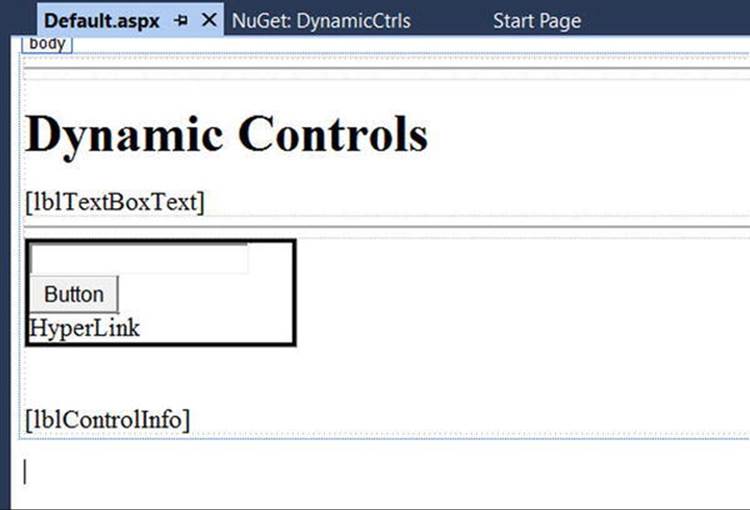
Figure 32-1. The UI of the Dynamic Controls web page
Assume in the Page_Load() event that you want to obtain details regarding the controls contained within the Panel and assign this information to the Label control (named lblControlInfo). Consider the following C# code:
public partial class _Default : System.Web.UI.Page
{
protected void Page_Load(object sender, System.EventArgs e)
{
ListControlsInPanel();
}
private void ListControlsInPanel()
{
var theInfo = "";
theInfo = $"<b>Does the panel have controls? {myPanel.HasControls()} </b><br/>";
// Get all controls in the panel.
foreach (Control c in myPanel.Controls)
{
if (!object.ReferenceEquals(c.GetType(), typeof(System.Web.UI.LiteralControl)))
{
theInfo += "***************************<br/>";
theInfo += $"Control Name? {c} <br/>";
theInfo += $"ID? {c.ID} <br>";
theInfo += $"Control Visible? {c.Visible} <br/>";
theInfo += $"ViewState? {c.EnableViewState} <br/>";
}
}
lblControlInfo.Text = theInfo;
}
}
Here, you iterate over each WebControl maintained on the Panel and perform a check to see whether the current type is of type System.Web.UI.LiteralControl, and if so, you skip over it. This class is used to represent literal HTML tags and content (such as <br>, text literals, etc.). If you do not do this sanity check, you might be surprised to find many more controls in the scope of the Panel (given the *.aspx declaration seen previously). Assuming the control is not literal HTML content, you then print out some various statistics about the widget.Figure 32-2 shows the output.
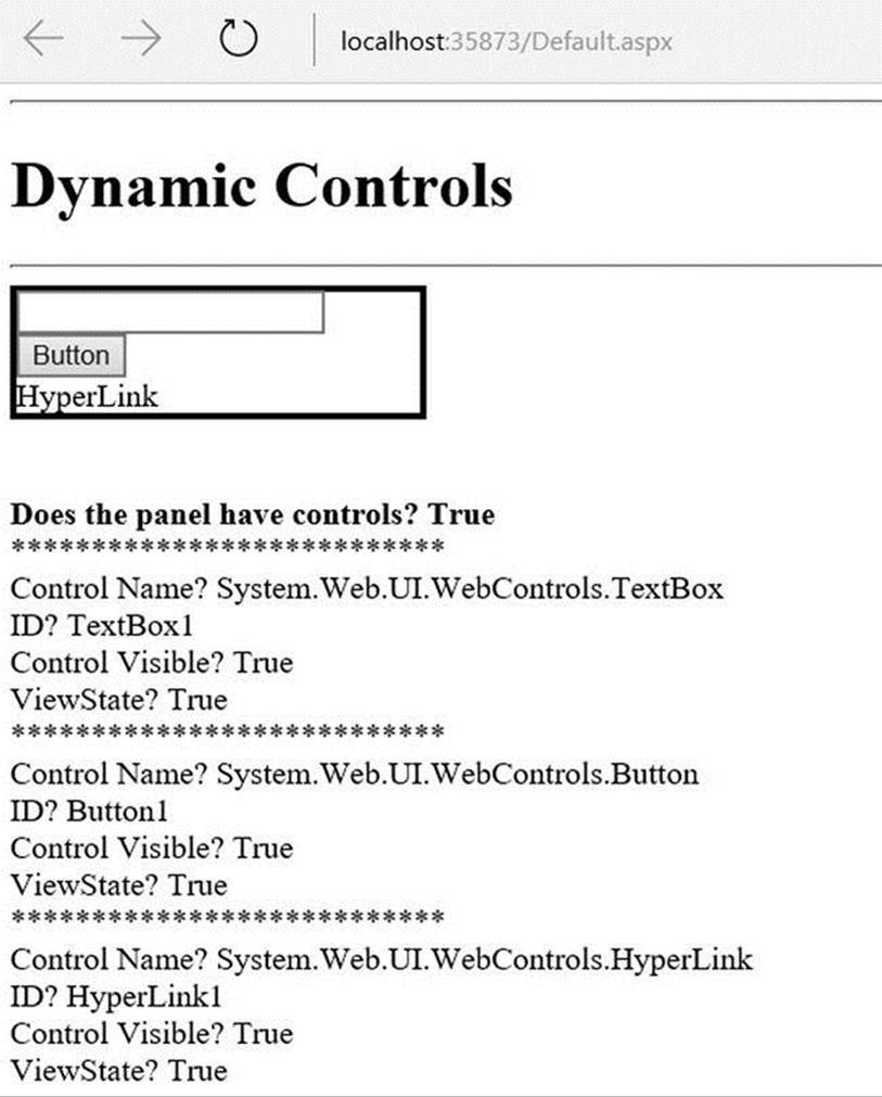
Figure 32-2. Enumerating controls at runtime
Dynamically Adding and Removing Controls
Now, what if you want to modify the contents of a Panel at runtime? Let’s update the current page to support an additional Button (named btnAddWidgets) that dynamically adds three new TextBox controls to the Panel and another Button (named btnClearPanel) that clears the Panel widget of all controls. The Click event handlers for each are shown here:
protected void btnClearPanel_Click(object sender, System.EventArgs e)
{
// Clear all content from the panel, then relist items.
myPanel.Controls.Clear();
ListControlsInPanel();
}
protected void btnAddWidgets_Click(object sender, System.EventArgs e)
{
for (int i = 0; i < 3; i++)
{
// Assign an ID so we can get
// the text value out later
// using the incoming form data.
TextBox t = new TextBox {ID = $"newTextBox{i}"};
myPanel.Controls.Add(t);
ListControlsInPanel();
}
}
Notice that you assign a unique ID to each TextBox (e.g., newTextBox0, newTextBox1, and so on). If you run your page, you should be able to add new items to the Panel control and clear the Panel of all content.
Interacting with Dynamically Created Controls
Now, if you want to obtain the values within these dynamically generated TextBoxes, you can do so in a variety of ways. First, update your UI with one additional Button (named btnGetTextData), a final Label control named lblTextBoxData, and handle the Click event for the Button.
To get access to the data within the dynamically created text boxes, you have a few options. One approach is to loop over each item contained within the incoming HTML form data (accessed via HttpRequest.Form) and concatenate the textual information to a locally scopedSystem.String. Once you have exhausted the collection, assign this string to the Text property of the new Label control, like so:
protected void btnGetTextData_Click(object sender, System.EventArgs e)
{
string textBoxValues = "";
for (int i = 0; i < Request.Form.Count; i++)
{
textBoxValues += $"<li>{ Request.Form[i]}</li><br/>";
}
lblTextBoxData.Text = textBoxValues;
}
When you run the application, you will find that you are able to view the content of each text box, including some rather long (unreadable) string data. This string contains the view state for each control on the page. You’ll learn about the role of the view state in Chapter 33.
To clean up the output, you could instead pluck out the textual data for your uniquely named items (newTextBox0, newTextBox1, and newTextBox2). Consider the following update:
protected void btnGetTextData_Click(object sender, System.EventArgs e)
{
// Get each text box by name.
string lableData = $"<li>{Request.Form.Get("newTextBox0")}</li><br/>";
lableData += $"<li>{Request.Form.Get("newTextBox1")}</li><br/>";
lableData += $"<li>{Request.Form.Get("newTextBox2")}</li><br/>";
lblTextBoxData.Text = lableData;
}
Using either approach, you will notice that once the request has been processed, the text boxes disappear. Again, the reason has to do with the stateless nature of HTTP. If you want to maintain these dynamically created TextBoxes between postbacks, you need to persist these objects using Web Forms state programming techniques (again, see Chapter 33).
Source Code The DynamicCtrls web site is included in the Chapter 32 subdirectory.
Functionality of the WebControl Base Class
As you can tell, the Control type provides a number of non–GUI-related behaviors (the controls collection, autopostback support, etc.). On the other hand, the WebControl base class provides a graphical polymorphic interface to all web widgets, as suggested in Table 32-2.
Table 32-2. Select Properties of the WebControl Base Class
|
Property |
Meaning in Life |
|
BackColor |
Gets or sets the background color of the web control |
|
BorderColor |
Gets or sets the border color of the web control |
|
BorderStyle |
Gets or sets the border style of the web control |
|
BorderWidth |
Gets or sets the border width of the web control |
|
Enabled |
Gets or sets a value indicating whether the web control is enabled |
|
CssClass |
Allows you to assign a class defined within a Cascading Style Sheet to a web widget |
|
Font |
Gets font information for the web control |
|
ForeColor |
Gets or sets the foreground color (typically the color of the text) of the web control |
|
Height, Width |
Get or set the height and width of the web control |
|
TabIndex |
Gets or sets the tab index of the web control |
|
ToolTip |
Gets or sets the tool tip for the web control to be displayed when the cursor is over the control |
Almost all of these properties are self-explanatory, so rather than drill through the use of them one by one, let’s instead check out a number of ASP.NET Web Forms controls in action.
Major Categories of Web Forms Controls
The Web Forms control library can be broken down into several broad categories, all of which can be viewed within the Visual Studio Toolbox (provided you have an *.aspx page open for design) (see Figure 32-3).
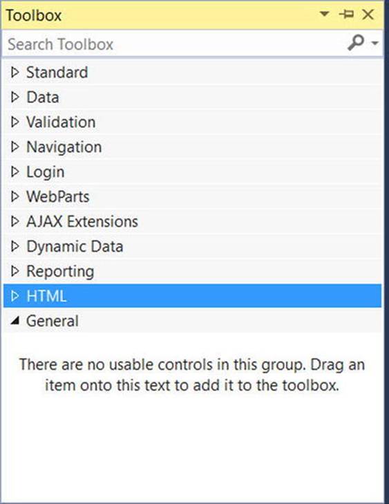
Figure 32-3. The categories of Web Forms controls
Under the Standard area of the Toolbox, you will find the most frequently used controls, including Button, Label, TextBox, and ListBox. In addition to these vanilla-flavored UI elements, the Standard area also lists more exotic web controls, such as Calendar, Wizard, andAdRotator (see Figure 32-4).
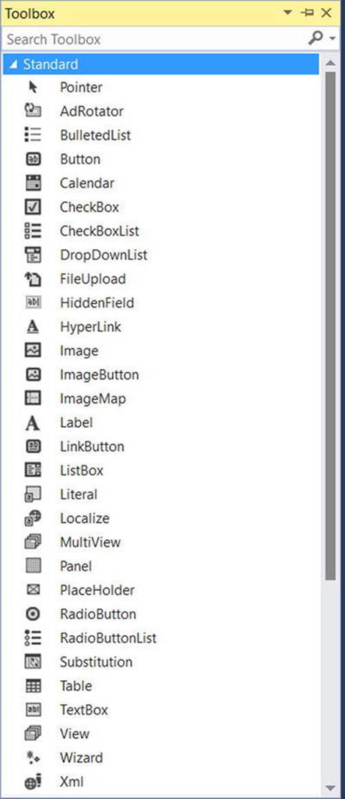
Figure 32-4. The standard Web Forms controls
The Data section is where you can find a set of controls used for data-binding operations, including the Web Forms Chart control, which allows you to render out graphical chart data (pie charts, line charts) typically as the result of a data-binding operation (see Figure 32-5).
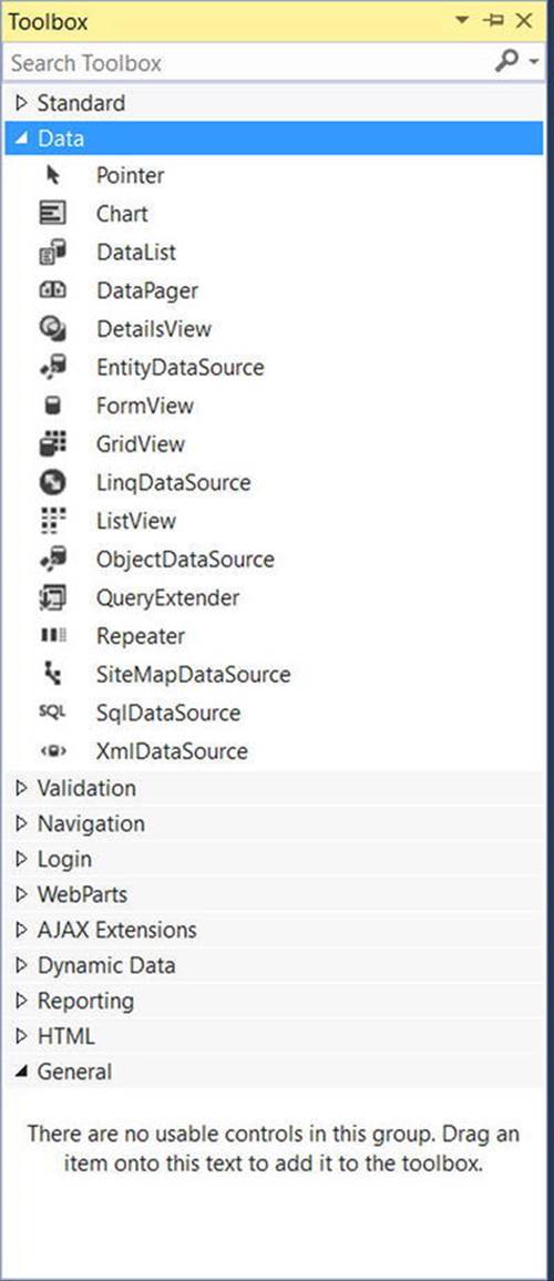
Figure 32-5. Data-centric Web Forms controls
The Web Forms validation controls (found in the Validation area of the Toolbox) are very interesting in that they can be configured to emit back blocks of client-side JavaScript that will test input fields for valid data. If a validation error occurs, the user will see an error message and will not be allowed to post back to the web server until the error is corrected.
The Navigation node of the Toolbox is where you will find a small set of controls (Menu, SiteMapPath, and TreeView), which typically work in conjunction with a *.sitemap file. As briefly mentioned earlier in this chapter, these navigation controls allow you to describe the structure of a multipage site using XML descriptions.
The most exotic set of Web Forms controls would have to be the Login controls (see Figure 32-6).
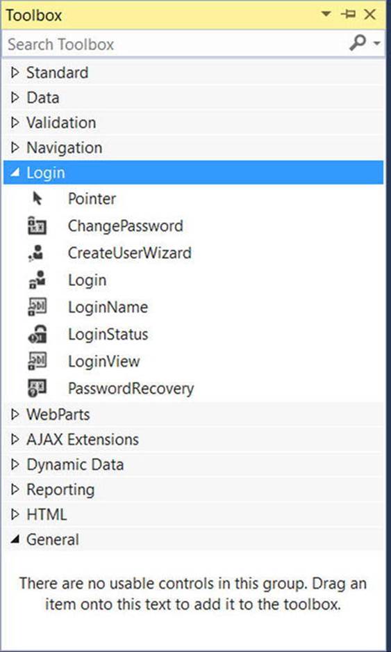
Figure 32-6. Security Web Forms controls
These controls can radically simplify how to incorporate basic security features (password recovery, login screens, etc.) into your web applications. In fact, these controls are so powerful, they will even dynamically create a dedicated database to store credentials (saved under theApp_Data folder of your web site) if you do not already have a specific security database.
Note The remaining categories of web controls shown in the Visual Studio Toolbox (such as WebParts, AJAX Extensions, and Dynamic Data) are for more specialized programming needs and will not be examined here.
A Brief Word Regarding System.Web.UI.HtmlControls
Truth be told, there are two distinct web control toolkits that ship with Web Forms. In addition to the Web Forms controls (within the System.Web.UI.WebControls namespace), the base class libraries also provide the System.Web.UI.HtmlControls control library.
The HTML controls are a collection of types that allow you to make use of traditional HTML controls on a Web Forms page. However, unlike simple HTML tags, HTML controls are object-oriented entities that can be configured to run on the server and thus support server-side event handling. Unlike Web Forms controls, HTML controls are quite simplistic in nature and offer little functionality beyond standard HTML tags (HtmlButton, HtmlInputControl, HtmlTable, etc.).
The HTML controls can be useful if your team has a clear division between those who build HTML UIs and .NET developers. HTML folks can make use of their web editor of choice using familiar markup tags and pass the HTML files to the development team. At this point, the developers can configure these HTML controls to run as server controls (by right-clicking an HTML widget within Visual Studio). This will allow the developers to handle server-side events and work with the HTML widget programmatically.
The HTML controls provide a public interface that mimics standard HTML attributes. For example, to obtain the information within an input area, you make use of the Value property rather than the web control–centric Text property. Given that the HTML controls are not as feature-rich as the Web Forms controls, I won’t make further mention of them in this text.
Web Control Documentation
You will get a chance to work with a number of Web Forms controls during the remainder of this book; however, you should certainly take a moment to search the .NET Framework 4.6 SDK documentation for the System.Web.UI.WebControls namespace. Here, you will find explanations and code examples for each member of the namespace (see Figure 32-7).
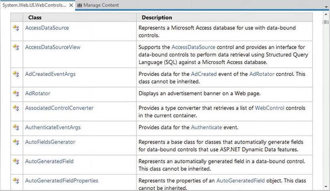
Figure 32-7. All Web Forms controls are documented in the .NET Framework 4.6 SDK documentation
Building the Web Forms Cars Web Site
Given that many of the “simple” controls look and feel so close to their Windows GUI counterparts, I won’t bother to enumerate the details of the basic widgets (Buttons, Labels, TextBoxes, etc.). Rather, let’s build a new web site that illustrates working with several of the more exotic controls, as well as the Web Forms master page model and aspects of the data-binding engine. Specifically, this next example will illustrate the following techniques:
· Working with master pages
· Working with site map navigation
· Working with the GridView control
· Working with the Wizard control
To begin, create an empty web site project named AspNetCarsSite. Note that you are not yet creating a new full ASP.NET web site project because this will add a number of starter files to the mix that we have not yet examined. For this project, you will add what you need manually.
Working with Web Forms Master Pages
Many web sites provide a consistent look and feel across multiple pages (a common menu navigation system, common header and footer content, company logo, etc.). A master page is little more than an Web Forms page that takes a *.master file extension. On their own, master pages are not viewable from a client-side browser (in fact, the ASP.NET runtime will not serve this flavor of web content). Rather, master pages define a common UI layout shared by all pages (or a subset of pages) in your site.
As well, a *.master page will define various content placeholder areas that establish a region of UI real estate that other *.aspx files may plug into. As you will see, *.aspx files that plug their content into a master file look and feel a bit different from the *.aspx files you have been examining. Specifically, this flavor of an *.aspx file is termed a content page. Content pages are *.aspx files that do not define an HTML <form> element (that is the job of the master page).
However, as far as the end user is concerned, a request is made to a given *.aspx file. On the web server, the related *.master file and any related *.aspx content pages are blended into a single unified HTML page declaration.
To illustrate the use of master pages and content pages, begin by inserting a new master page into your web site via the Website Add New Item menu selection (Figure 32-8 shows the resulting dialog box).
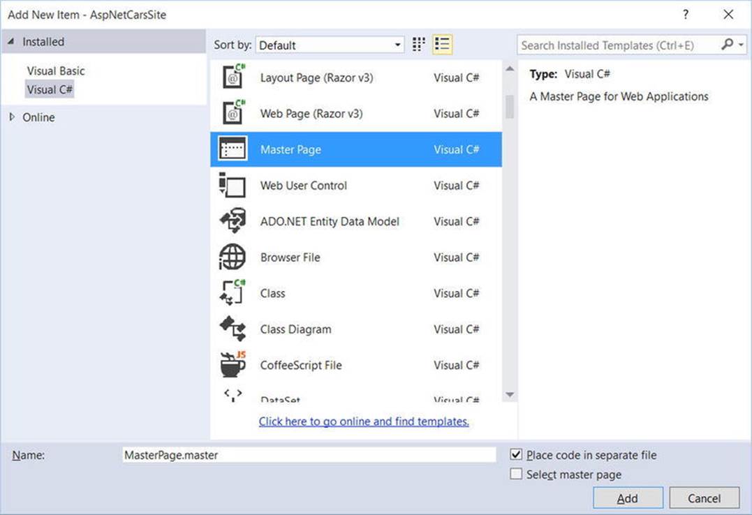
Figure 32-8. Inserting a new *.master file
The initial markup of the MasterPage.master file looks like the following:
<%@ Master Language="C#" AutoEventWireup="true" CodeFile="MasterPage.master.cs" Inherits="MasterPage" %>
<!DOCTYPE html>
<html xmlns="http://www.w3.org/1999/xhtml">
<head runat="server">
<title></title>
<asp:ContentPlaceHolder id="head" runat="server">
</asp:ContentPlaceHolder>
</head>
<body>
<form id="form1" runat="server">
<div>
<asp:ContentPlaceHolder id="ContentPlaceHolder1" runat="server">
</asp:ContentPlaceHolder>
</div>
</form>
</body>
</html>
The first point of interest is the new <%@Master%> directive. For the most part, this directive supports the same attributes as the <%@Page%> directive described in Chapter 31. Like Page types, a master page derives from a specific base class, which in this case is MasterPage. If you were to open up your related code file, you would find the following class definition:
public partial class MasterPage : System.Web.UI.MasterPage
{
protected void Page_Load(object sender, EventArgs e)
{
}
}
The other point of interest within the markup of the master is the <asp:ContentPlaceHolder> definition. This region of a master page represents the area of the master that the UI widgets of the related *.aspx content file may plug into, not the content defined by the master page itself.
If you do intend to plug in an *.aspx file within this region, the scope within the <asp:ContentPlaceHolder> and </asp:ContentPlaceHolder> tags will typically remain empty. However, you can populate this area with various web controls that function as a default UI to use in the event that a given *.aspx file in the site does not supply specific content. For this example, assume that each *.aspx page in your site will indeed supply custom content and, therefore, your <asp:ContentPlaceHolder> elements will be empty.
Note A *.master page may define as many content placeholders as necessary. As well, a single *.master page may nest additional *.master pages.
You can build a common UI of a *.master file using the same Visual Studio designers used to build *.aspx files. For this site, you will add a descriptive Label (to serve as a common welcome message), an AdRotator control (which will randomly display one of two image files), and a TreeView control (to allow the user to navigate to other areas of the site). Here is my markup after designing my master page via the IDE:
<html xmlns="http://www.w3.org/1999/xhtml">
<head runat="server">
<title> </title>
<asp:ContentPlaceHolder id="head" runat="server">
</asp:ContentPlaceHolder>
</head>
<body>
<form id="form1" runat="server">
<div>
<hr />
<asp:Label ID="Label1" runat="server" Font-Size="XX-Large"
Text="Welcome to the ASP.NET Cars Super Site!"></asp:Label>
<asp:AdRotator ID="myAdRotator" runat="server"/>
<br />
<br />
<asp:TreeView ID="navigationTree" runat="server">
</asp:TreeView>
<hr />
</div>
<div>
<asp:ContentPlaceHolder id="ContentPlaceHolder1" runat="server">
</asp:ContentPlaceHolder>
</div>
</form>
</body>
</html>
Figure 32-9 shows the design-time view of the current master page (note the display area of your AdRotator control will be empty for the time being).
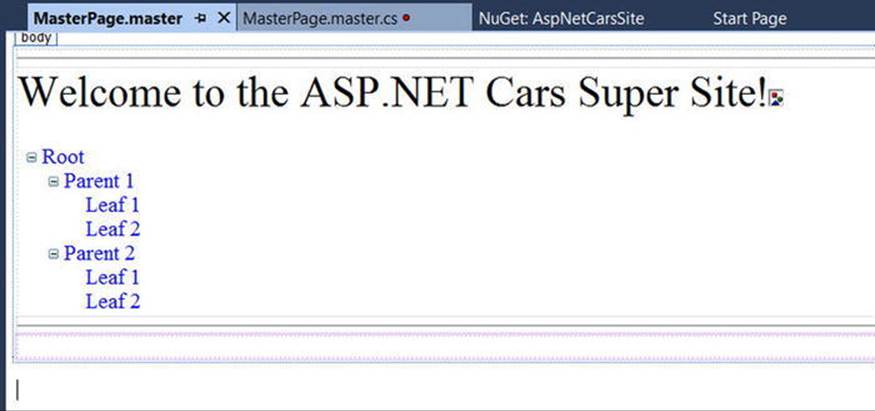
Figure 32-9. The *.master file’s shared UI
Feel free to enhance the look of your TreeView control by using the inline editor of the control and selecting the Auto Format link. As well, feel free to spice up the display of the remaining controls using the Properties editor. When you are happy with your results, move to the next section.
Configuring the TreeView Control Site Navigation Logic
Web Forms ships with several web controls that allow you to handle site navigation: SiteMapPath, TreeView, and Menu. As you would expect, these web widgets can be configured in multiple ways. For example, each of these controls can dynamically generate its nodes via an external XML file (or an XML-based *.sitemap file), programmatically generate nodes in code, or through markup using the designers of Visual Studio.
Your navigation system will be dynamically populated using a *.sitemap file. The benefit of this approach is that you can define the overall structure of your web site in an external file and then bind it to a TreeView (or Menu) control on the fly. This way, if the navigational structure of your web site changes, you simply need to modify the *.sitemap file and reload the page. To begin, insert a new Web.sitemap file into your project using the Website  Add New Item menu option to bring up the dialog box shown in Figure 32-10.
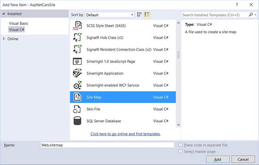
Figure 32-10. Inserting a new Web.sitemap file
As you can see, the initial Web.sitemap file defines a topmost item with two subnodes, as follows:
<?xml version="1.0" encoding="utf-8" ?>
<siteMap xmlns="http://schemas.microsoft.com/AspNet/SiteMap-File-1.0" >
<siteMapNode url="" title="" description="">
<siteMapNode url="" title="" description="" />
<siteMapNode url="" title="" description="" />
</siteMapNode>
</siteMap>
If you were to bind this structure to a Menu control, you would find a topmost item with two subitems. Therefore, when you want to define subitems, simply define new <siteMapNode> elements within the scope of an existing <siteMapNode>. In any case, the goal is to define the overall structure of your web site within a Web.sitemap file using various <siteMapNode> elements. Each one of these elements can define a title and URL attribute. The URL attribute represents which *.aspx file to navigate to when the user clicks a given menu item (or node of aTreeView). Your site map will contain three site map nodes (underneath the top-level site map node), as follows:
· Home: Default.aspx
· Build a Car: BuildCar.aspx
· View Inventory: Inventory.aspx
You will add these three new Web Forms pages to your project in the pages to come. For the time being, you will simply configure the site map file.
Your navigation system has a single topmost Welcome item with three subelements. Therefore, you can update the Web.sitemap file as follows, but be aware that each url value must be unique (if not, you will receive a runtime error):
<?xml version="1.0" encoding="utf-8" ?>
<siteMap xmlns="http://schemas.microsoft.com/AspNet/SiteMap-File-1.0" >
<siteMapNode url="" title="Welcome!" description="">
<siteMapNode url="~/Default.aspx" title="Home"
description="The Home Page" />
<siteMapNode url="~/BuildCar.aspx" title="Build a car"
description="Create your dream car" />
<siteMapNode url="~/Inventory.aspx" title="View Inventory"
description="See what is in stock" />
</siteMapNode>
</siteMap>
Note The ~/ prefix before each page in the url attribute is a notation that represents the root of the web site.
Now, despite what you might be thinking, you do not associate a Web.sitemap file directly to a Menu or TreeView control using a given property. Rather, the *.master or *.aspx file that contains the UI widget that will display the Web.sitemap file must contain aSiteMapDataSource component. This component will automatically load the Web.sitemap file into its object model when the page is requested. The Menu and TreeView types then set their DataSourceID property to point to the SiteMapDataSource instance.
To add a new SiteMapDataSource to your *.master file and automatically set the DataSourceID property, you can make use of the Visual Studio designer. Activate the inline editor of the TreeView control (i.e., click the tiny arrow in the top-right corner of the TreeView), expand the Choose Data Source drop-down list, and select New Data Source, as shown in Figure 32-11.
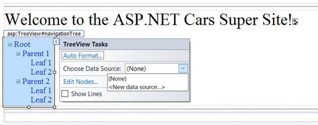
Figure 32-11. Adding a new SiteMapDataSource
From the resulting dialog box, select the SiteMap icon. This will set the DataSourceID property of the Menu or TreeView control, as well as add a new SiteMapDataSource component to your page. This is all you need to do to configure your TreeView control to navigate to the additional pages on your site. If you would like to perform additional processing when the user selects a given menu item, you may do so by handling the SelectedNodeChanged event on the TreeView control. There is no need to do so for this example, but be aware that you can determine which menu item was selected using the incoming event arguments.
Establishing Breadcrumbs with the SiteMapPath Type
Before moving on to the AdRotator control, add a SiteMapPath type (located in the Navigation tab in the Toolbox) onto your *.master file. This widget will automatically adjust its content based on the current selection of the menu system. As you might know, this can provide a helpful visual cue for the end user (formally, this UI technique is termed breadcrumbs). Once you complete this example, you will notice that when you select the Welcome Build a Car menu item, the SiteMapPath widget updates accordingly automatically.
Configuring the AdRotator Control
The role of the Web Forms AdRotator widget is to randomly display a given image at some position in the browser. At this point, the AdRotator is displaying an empty placeholder. This control cannot do its magic until you assign the AdvertisementFile property to point to the source file that describes each image. For this example, the data source will be a simple XML file named Ads.xml.
To add the XML file to the web site, go to the Website Add New Item menu option and select XML file. Name the file Ads.xml and specify a unique <Ad> element for each image you want to display. At minimum, each <Ad> element specifies the image to display (ImageUrl), the URL to navigate to if the image is selected (TargetUrl), mouseover text (AlternateText), and the weight of the ad (Impressions).
<Advertisements>
<Ad>
<ImageUrl>SlugBug.jpg</ImageUrl>
<TargetUrl>http://www.Cars.com</TargetUrl>
<AlternateText>Your new Car?</AlternateText>
<Impressions>80</Impressions>
</Ad>
<Ad>
<ImageUrl>car.gif</ImageUrl>
<TargetUrl>http://www.CarSuperSite.com</TargetUrl>
<AlternateText>Like this Car?</AlternateText>
<Impressions>80</Impressions>
</Ad>
</Advertisements>
Here, you have specified two image files (slugbug.jpg and car.gif). As a result, you need to ensure that these files are in the root of your web site (these files have been included with this book’s code download). To add them to your current project, select the Website Add Existing Item menu option. At this point, you can associate your XML file to the AdRotator control via the AdvertisementFile property (in the Properties window), like so:
<asp:AdRotator ID="myAdRotator" runat="server"
AdvertisementFile="~/Ads.xml"/>
Later, when you run this application and post back to the page, you will be randomly presented with one of two image files.
Defining the Default Content Page
Now that you have a master page established, you can begin designing the individual *.aspx pages that will define the UI content to merge within the <asp:ContentPlaceHolder> tag of the master page. The *.aspx files that are merged within a master page are called content pages and have a few key differences from a normal, stand-alone Web Forms page.
In a nutshell, the *.master file defines the <form> section of the final HTML page. Therefore, the existing <form> area within the *.aspx file will need to be replaced with an <asp:Content> scope. While you could update the markup of your initial *.aspx file by hand, you can insert a new content page to your project. First, delete the existing Default.aspx file, then right-click anywhere on the designer surface of the *.master file and select the Add Content Page menu option (see Figure 32-12).
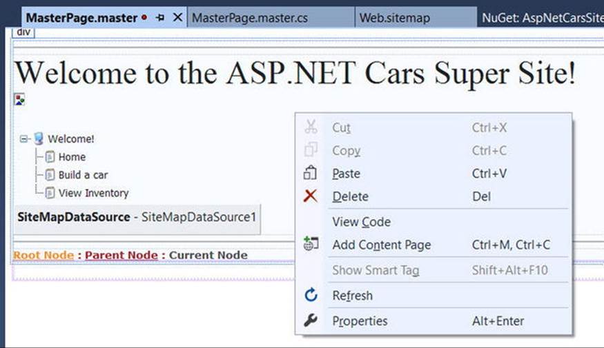
Figure 32-12. Adding a new content page to the master page
This will generate a new *.aspx file with the following initial markup:
<%@ Page Language="C#" MasterPageFile="~/MasterPage.master"
AutoEventWireup="true" CodeFile="Default.aspx.cs"
Inherits="_Default" Title="" %>
<asp:Content ID="Content1"
ContentPlaceHolderID="head" Runat="Server">
</asp:Content>
<asp:Content ID="Content2"
ContentPlaceHolderID="ContentPlaceHolder1" Runat="Server">
</asp:Content>
First, notice that the <%@Page%> directive has been updated with a new MasterPageFile attribute that is assigned to your *.master file. Also note that rather than having a <form> element, you have an <asp:Content> scope (currently empty) that has set theContentPlaceHolderID value identical to the <asp:ContentPlaceHolder> component in the master file.
Given these associations, the content page understands where to plug in its content, while the master’s content is displayed in a read-only nature on the content page. There is no need to build a complex UI for your Default.aspx content area. For this example, simply add some literal text that provides some basic site instructions, as you see in Figure 32-13 (also notice on the upper right of the content page in the designer that there is a link to switch to the related master file).
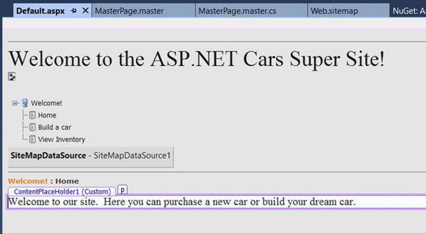
Figure 32-13. Authoring the first content page
Now, if you run your project, you will find that the UI content of the *.master and Default.aspx files has been merged into a single stream of HTML. As you can see from Figure 32-14, the browser (or end user) is unaware that the master page even exists (note the browser is simply showing the HTML from Default.aspx). Also, as you refresh the page (via the F5 key), you should see the AdRotator randomly displaying one of two images.
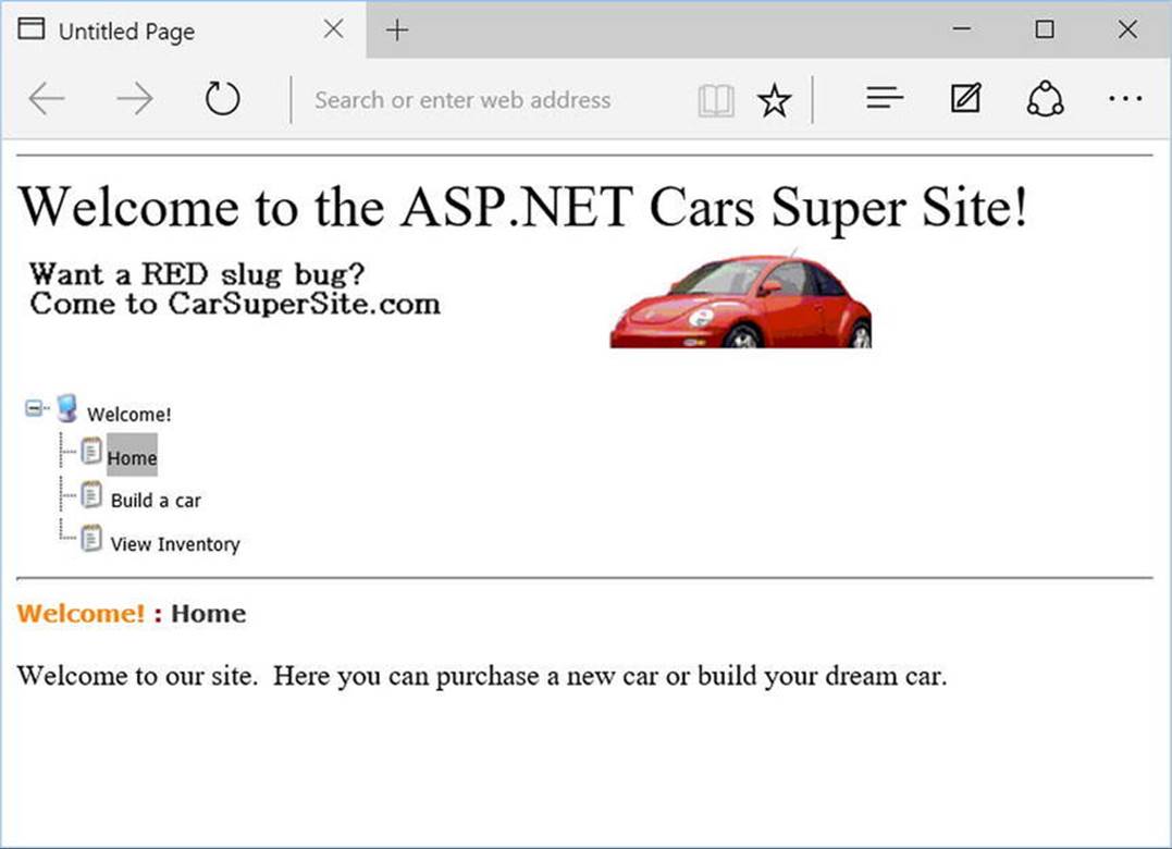
Figure 32-14. At runtime, master files and content pages render back a single form
Designing the Inventory Content Page
To insert the Inventory.aspx content page into your current project, open the *.master page in the IDE, select Website Add Content Page, and use the Solution Explorer to rename this file to Inventory.aspx. The role of the Inventory content page is to display the contents of theInventory table of the AutoLot database within a GridView control. However, unlike the previous chapter, this GridView will be configured to interact with the AutoLot database using some built-in data-binding support and the updated AutoLotDAL assembly from Chapter 30.
While the Web Forms GridView control has the ability to represent connection string data and SQL Select, Update, and Delete statements (or alternatively stored procedures) in markup, the preferred method is to use a Data Access Layer (DAL). This promotes separation of concerns and it isolates changes to the data store from the front-end code.
With a few simple attributes and minimal code (presuming you have already built a DAL), you can configure the GridView to automatically select, update, and delete records of the underlying data store. This greatly simplifies the amount of boilerplate code and is enabled by theSelectMethod, DeleteMethod, and UpdateMethod properties (as well as additional features for list view controls) introduced in ASP.NET 4.5.
Adding AutoLotDAL and Entity Framework to AspNetCarsSite
Use Windows Explorer to copy the AutoLotDAL assembly from Chapter 31 (or from the download directory for this chapter). Add a reference to the AutoLotDAL assembly by right-clicking the references node in the AspNetCarsSite project, clicking Browse in the Add References Dialog, and navigating to and selecting AutoLotDAL.dll.
Next, add Entity Framework to the web project by right-clicking the project and selecting Manage NuGet Packages for Solution. You will also need to update the Web.config file to add the connection string. The change to the Web.config file will resemble the following (your connection string might be different based on how you installed SQL Server Express):
<connectionStrings>
<add name="AutoLotConnection"
connectionString="data source=.\SQLEXPRESS2014;initial catalog=AutoLot;integrated security=True;MultipleActiveResultSets=True;App=EntityFramework"
providerName="System.Data.SqlClient"/>
</connectionStrings>
Filling the GridView with Data
To illustrate how to work with the GridView in a declarative manner, begin by updating the Inventory.aspx content page with a GridView control. Table 32-3 lists the attributes that you will be adding over the next few sections and what each is used for.
Table 32-3. Select Attributes of List Controls
|
Attribute |
Meaning in Life |
|
DataKeyNames |
Specifies the primary key of the table. |
|
ItemType |
Enables strong typing for list controls. |
|
SelectMethod |
Indicates the method in the code-behind that is used to fill the table. It is called each time the list control is rendered. |
|
DeleteMethod |
Indicates the method that will be used to delete a record from the data source for the table. |
|
UpdateMethod |
Indicates the method that will be used to update a record when the edit is posted back to the server. |
You will start by just using the ItemType and SelectMethod attributes (as you did in Chapter 31). Update the GridView declaration (in the second <asp:Content> element) to the following:
<asp:GridView ID="GridView2" runat="server" CellPadding="4" AutoGenerateColumns="False"
ItemType="AutoLotDAL.Models.Inventory" SelectMethod="GetData"
EmptyDataText="There are no data records to display." ForeColor="#333333"
GridLines="None">
Next, add the following Columns entries (don’t mind the SortExpressions for now):
<Columns>
<asp:BoundField DataField="CarID" HeaderText="CarID" ReadOnly="True"
SortExpression="CarID" />
<asp:BoundField DataField="Make" HeaderText="Make" SortExpression="Make" />
<asp:BoundField DataField="Color" HeaderText="Color" SortExpression="Color" />
<asp:BoundField DataField="PetName" HeaderText="PetName" SortExpression="PetName" />
</Columns>
Make sure the closing GridView tag is after the closing Columns tag:
</asp:GridView>
Open Inventory.aspx.cs and add the GetData method. The GetData method doesn’t take any parameters and needs to return an IEnumerable<Inventory>. Because you created your DAL already, this becomes trivial. Make sure to add using statements forAutoLotDAL.Models and AutoLotDAL.Repos and update the GetData method as follows:
public IEnumerable<Inventory> GetData() => new InventoryRepo().GetAll();
At this point, you can run your web program. Click the View Inventory menu item and view your data, as shown in Figure 32-15. (Note that I updated my GridView with a unique look and feel using the inline designer.)
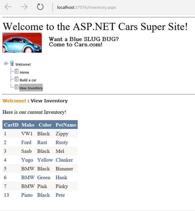
Figure 32-15. The Inventory page with data
Enabling In-Place Editing
The next order of business is to enable the GridView control’s support for in-place activation. You will start by using the DataKeyNames, DeleteMethod, and UpdateMethod attributes. Update the GridView declaration markup to the following:
<asp:GridView ID="GridView2" runat="server" CellPadding="4" AutoGenerateColumns=”False”
DataKeyNames="CarID, Timestamp" ItemType="AutoLotDAL.Models.Inventory"
SelectMethod="GetData" DeleteMethod="Delete" UpdateMethod="Update"
EmptyDataText="There are no data records to display." ForeColor="#333333"
GridLines="None">
The CarId is the primary key, so it makes sense to be in the DataKeyNames attribute. The Timestamp field is added as a DataKeyName so that it will be passed into the Update and Delete methods. Add the following CommandField entry to the Columns entries. This will add Edit and Delete links into each row. The updated markup looks like this:
<Columns>
<asp:CommandField ShowDeleteButton="True" ShowEditButton="True" />
<asp:BoundField DataField="CarID" HeaderText="CarID" ReadOnly="True"
SortExpression="CarID" />
<asp:BoundField DataField="Make" HeaderText="Make" SortExpression="Make" />
<asp:BoundField DataField="Color" HeaderText="Color" SortExpression="Color" />
<asp:BoundField DataField="PetName" HeaderText="PetName" SortExpression="PetName" />
</Columns>
Open Inventory.aspx.cs, and add the Delete and Update methods. The Delete method is void, and takes an int carId and byte[] timeStamp as parameters. Both of those values come into the method as parameters because they are specified as DataKeyNames in the markup.
public void Delete(int carId, byte[] timeStamp)
{
new InventoryRepo().Delete(carId, timeStamp);
}
The Update method is void and uses model binding so it can take an Inventory type as the parameter. Model binding is a feature of ASP.NET MVC that was ported to ASP.NET WebForms 4.5. It takes all of the form/querystring/etc. name value pairs and attempts to reconstitute a specified type using reflection. There is explicit model binding and implicit model binding. In each case, the Model Binding engine attempts to assign the values from the name value pairs (from the submitted form) to matching properties on the desired type. If it can’t assign one or more values (due to data type conversion issues or validation errors) it will set ModelState.IsValid = false. If all matched properties are successfully assigned, it sets ModelState.IsValid = true.
For explicit model binding, you call TryUpdateModel, passing in an instance of the type. If the model binding fails, the TryUpdateModel returns false. For example, you could write the Update method this way:
public async void Update(int carID)
{
var inv = new Inventory() {CarID = carID};
if (TryUpdateModel(inv))
{
await new InventoryRepo().SaveAsync(inventory);
}
}
For implicit model binding, you pass the desired type in as the parameter for the method. Do this for the Update method. In the method body, first check to ensure the model state is valid (more on validation later in this chapter), then call SaveAsync on the InventoryRepo. Since you are awaiting the SaveAsync method, add the async modifier to the Update method, like this:
public async void Update(Inventory inventory)
{
if (ModelState.IsValid)
{
await new InventoryRepo().SaveAsync(inventory);
}
}
When you add the async modifier to the Update method you will get an error when the Update method gets called because the Page is not marked as async. Fortunately, that is as easy as adding Async=”true” to the Page directive, like this:
<%@ Page Title="" Language="C#" MasterPageFile="~/MasterPage.master"
AutoEventWireup="true" CodeFile="Inventory.aspx.cs" Inherits="InventoryPage"
Async="true" %>
Now, when you run the app, you will see Edit and Delete links. Clicking the Edit link enables in-place editing, as shown in Figure 32-16. When in edit mode, the links change to Update or Cancel.
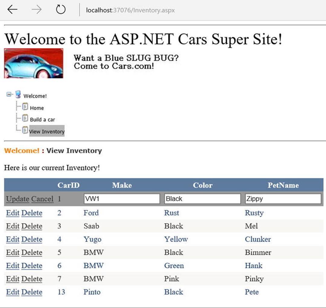
Figure 32-16. In-place editing and deleting
Enabling Sorting and Paging
The GridView control can easily be configured for sorting (via column name hyperlinks) and paging (via numeric or next/previous hyperlinks). To do so, update the markup for the GridView, adding in the AllowPaging, PageSize, and AllowSorting attributes as follows:
<asp:GridView ID="carsGrid" runat="server"
AllowPaging="True" PageSize="2"
AllowSorting="True" AutoGenerateColumns="False" CellPadding="4"
DataKeyNames="CarID" ItemType="AutoLotDAL.Models.Inventory"
SelectMethod="GetData" DeleteMethod="Delete" UpdateMethod="Update"
EmptyDataText="There are no data records to display." ForeColor="#333333"
GridLines="None">
If you run the app now, you will get the following error:
When the DataBoundControl has paging enabled, either the SelectMethod should return an IQueryable<ItemType> or should have all these mandatory parameters: int startRowIndex, int maximumRows, out int totalRowCount
This is easily fixed by adding AsQueryable() after the GetAll call on the InventoryRepo, and changing the signature for the method to IQueryable, as follows:
public IQueryable<Inventory> GetData() => new InventoryRepo().GetAll().AsQueryable();
Note While adding AsQueryable() solved the problem in this example, it would be better to expose an IQueryable version of GetAll on the repository itself.
When you run your page again, you will be able to sort your data by clicking the column names and scrolling through your data via the paging links (provided you have enough records in the Inventory table!), as shown in Figure 32-17.
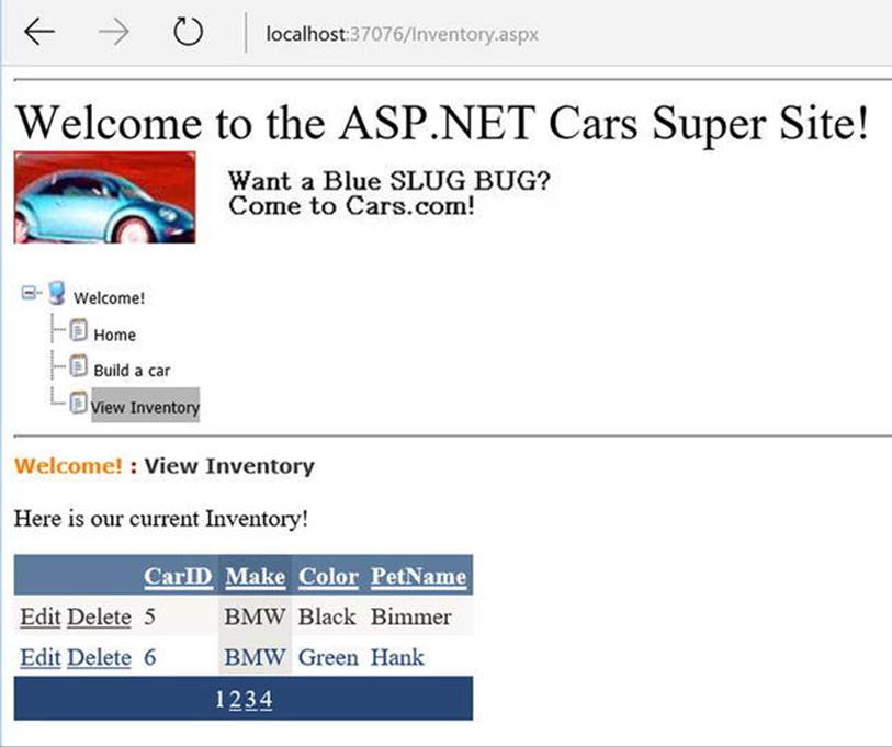
Figure 32-17. Enabling sorting and paging
Enabling Filtering
The next step is to add filtering to the Inventory list. Again, with the additional features added in ASP.NET Web Forms 4.5, this is fairly trivial. Start by adding a DropDownList box that will be bound to the distinct list of Makes in the AutoLot database. The DataTextField (what is displayed) and the DataValueField (the value of the dropdown list based on the selected item) are both set to Make. The SelectMethod should be set to a method named GetMakes. The key is that the control must have the runat=server setting. Also see the<asp:ListItem> tag. This adds the "(All)" selection if nothing from the databound list is selected. The markup is as follows:
<asp:DropDownList ID="cboMake" SelectMethod="GetMakes"
AppendDataBoundItems="true" AutoPostBack="true"
DataTextField="Make" DataValueField="Make" runat="server">
<asp:ListItem Value="" Text="(All)" />
</asp:DropDownList>
Next, open Inventory.aspx.cs and create the GetMakes method. In this method, return a list of new anonymous objects that hold the distinct makes from the data. The method is as follows:
public IEnumerable GetMakes() =>
new InventoryRepo().GetAll().Select(x => new {x.Make}).Distinct();
The GetData method also has to be updated to filter the data if a Make is passed in. The parameter is marked with the [Control(“cboMake”)] attribute, specifying the name of the control. The name of the control isn’t necessary if the control name matches the parameter name, but since they don’t match in this example, you need to specify the control name. This parameter will take the value of the control when the form data is posted back (hence the runat=”server” requirement) and will be an empty string if nothing is selected. This is done as follows:
public IQueryable<Inventory> GetData([Control("cboMake")]string make="")
{
return string.IsNullOrEmpty(make) ?
new InventoryRepo().GetAll().AsQueryable() :
new InventoryRepo().GetAll().Where(x => x.Make == make).AsQueryable();
}
Now, when you run the app, you can select a car make, and it will filter the result set based on the selected value, as in Figure 32-18.
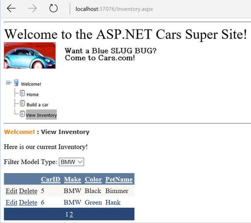
Figure 32-18. Filtering data based on the value of a control on the page
Designing the Build-a-Car Content Page
The final task for this example is to design the BuildCar.aspx content page. To do so, make sure you have your *.master file open for editing, then insert this file into the current project (via the Website Add Content Page menu option; this is an alternative to right-clicking the project’s master page). Rename this new file to BuildCar.aspx using the Solution Explorer.
This new page will make use of the Web Forms Wizard web control, which provides a simple way to walk the end user through a series of related steps. Here, the steps in question will simulate the act of building an automobile for purchase.
Place a descriptive Label and Wizard control onto the content area. Next, activate the inline editor for the Wizard and click the Add/Remove WizardSteps link. Add a total of four steps, as shown in Figure 32-19.
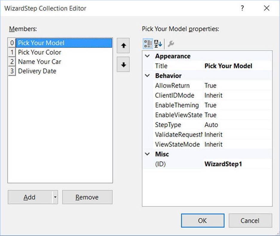
Figure 32-19. Configuring your wizard
After you define these steps, you will notice that the Wizard defines an empty content area where you can now drag and drop controls for the currently selected step. For this example, update each step with the following UI elements (be sure to provide a fitting ID value for each item using the Properties window):
· Pick Your Model: A TextBox control
· Pick Your Color: A ListBox control
· Name Your Car: A TextBox control
· Delivery Date: A Calendar control
The ListBox control is the only UI element of the Wizard that requires additional steps. Select this item on the designer (making sure you first select the Pick Your Color link) and fill this widget with a set of colors using the Items property of the Properties window. After you do so, you will find markup much like the following within the scope of the Wizard definition:
<asp:ListBox ID="ListBoxColors" runat="server" Width="237px">
<asp:ListItem>Purple</asp:ListItem>
<asp:ListItem>Green</asp:ListItem>
<asp:ListItem>Red</asp:ListItem>
<asp:ListItem>Yellow</asp:ListItem>
<asp:ListItem>Pea Soup Green</asp:ListItem>
<asp:ListItem>Black</asp:ListItem>
<asp:ListItem>Lime Green</asp:ListItem>
</asp:ListBox>
Now that you have defined each of the steps, you can handle the FinishButtonClick event for the autogenerated Finish button. Be aware, however, that you won’t see this Finish button until you select the final step of the wizard on the designer. Once you have selected the final step, simply double-click the Finish button to generate the event handler. Within the server-side event handler, obtain the selections from each UI element and build a description string that is assigned to the Text property of an additional Label type named lblOrder, like so:
public partial class BuildCarPage : System.Web.UI.Page
{
protected void Page_Load(object sender, EventArgs e)
{
}
protected void carWizard_FinishButtonClick(object sender,
WizardNavigationEventArgs e)
{
// Get each value.
string order = $"{txtCarPetName.Text}, your { ListBoxColors.SelectedValue } { txtCarModel.Text } will arrive on { carCalendar.SelectedDate.ToShortDateString()}";
// Assign to label.
lblOrder.Text = order;
}
}
At this point, your AspNetCarsSite web application is complete! Figure 32-20 shows the wizard in action.
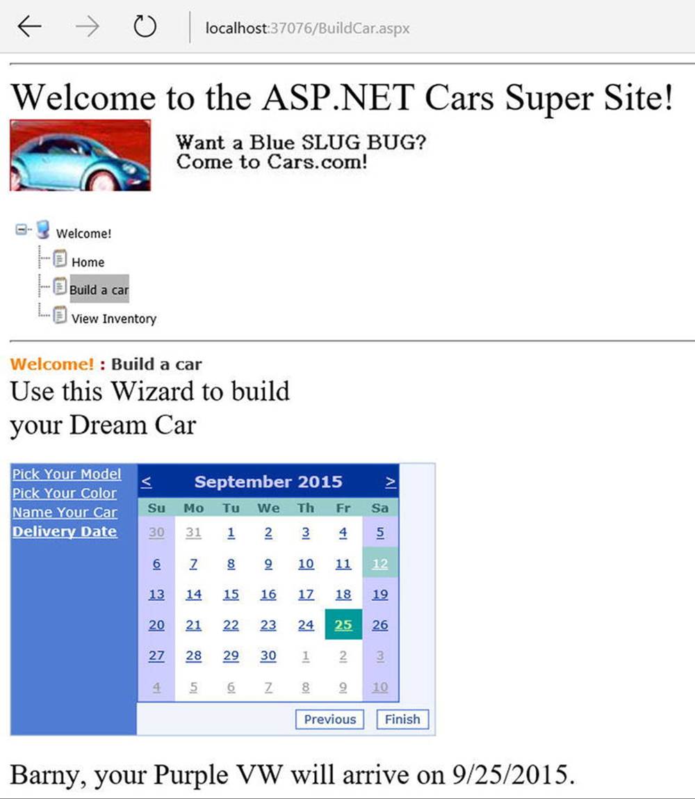
Figure 32-20. The Wizard control in action
That wraps up your first look of various Web Forms web controls, master pages, content pages, and site map navigation. Next up, let’s look at the functionality of the Web Forms validation controls. To keep the topics in this chapter somewhat isolated and atomic, you will build a new web site to illustrate validation techniques; however, you can most certainly add validation controls to your current project.
Source Code The AspNetCarsSite web site is included in the Chapter 32 subdirectory.
The Role of the Validation Controls
The next set of Web Form controls you will examine are known collectively as validation controls. Unlike the other Web Form controls you’ve examined, validation controls are not used to emit HTML for rendering purposes, but are used to emit client-side JavaScript for the purpose of form validation. As illustrated at the beginning of this chapter, client-side form validation is quite useful because you can ensure that various constraints are in place before posting back to the web server, thereby avoiding expensive round trips. Table 32-4 gives a rundown of the Web Forms validation controls.
Table 32-4. Web Forms Validation Controls
|
Control |
Meaning in Life |
|
CompareValidator |
Validates that the value of an input control is equal to a given value of another input control or a fixed constant. |
|
CustomValidator |
Allows you to build a custom validation function that validates a given control. |
|
RangeValidator |
Determines that a given value is in a predetermined range. |
|
RegularExpressionValidator |
Checks whether the value of the associated input control matches the pattern of a regular expression. |
|
RequiredFieldValidator |
Ensures that a given input control contains a value (i.e., is not empty). |
|
ValidationSummary |
Displays a summary of all validation errors of a page in a list, bulleted list, or single-paragraph format. The errors can be displayed inline and/or in a pop-up message box. |
All of the validation controls (minus ValidationSummary) ultimately derive from a common base class named System.Web.UI.WebControls.BaseValidator and, therefore, they have a set of common features. Table 32-5 documents the key members.
Table 32-5. Common Properties of the Web Forms Validators
|
Member |
Meaning in Life |
|
ControlToValidate |
Gets or sets the input control to validate |
|
Display |
Gets or sets the display behavior of the error message in a validation control |
|
EnableClientScript |
Gets or sets a value indicating whether client-side validation is enabled |
|
ErrorMessage |
Gets or sets the text for the error message |
|
ForeColor |
Gets or sets the color of the message displayed when validation fails |
To illustrate working with these validation controls, create a new empty web site project named ValidatorCtrls and insert a new Web Forms named Default.aspx. To begin, place four (well-named) TextBox controls (with four corresponding and descriptive Labels) onto your page. Next, place a RequiredFieldValidator, RangeValidator, RegularExpressionValidator, and CompareValidator control adjacent to each respective input field. Finally, add a single Button and a final Label. Figure 32-21 shows one possible layout.
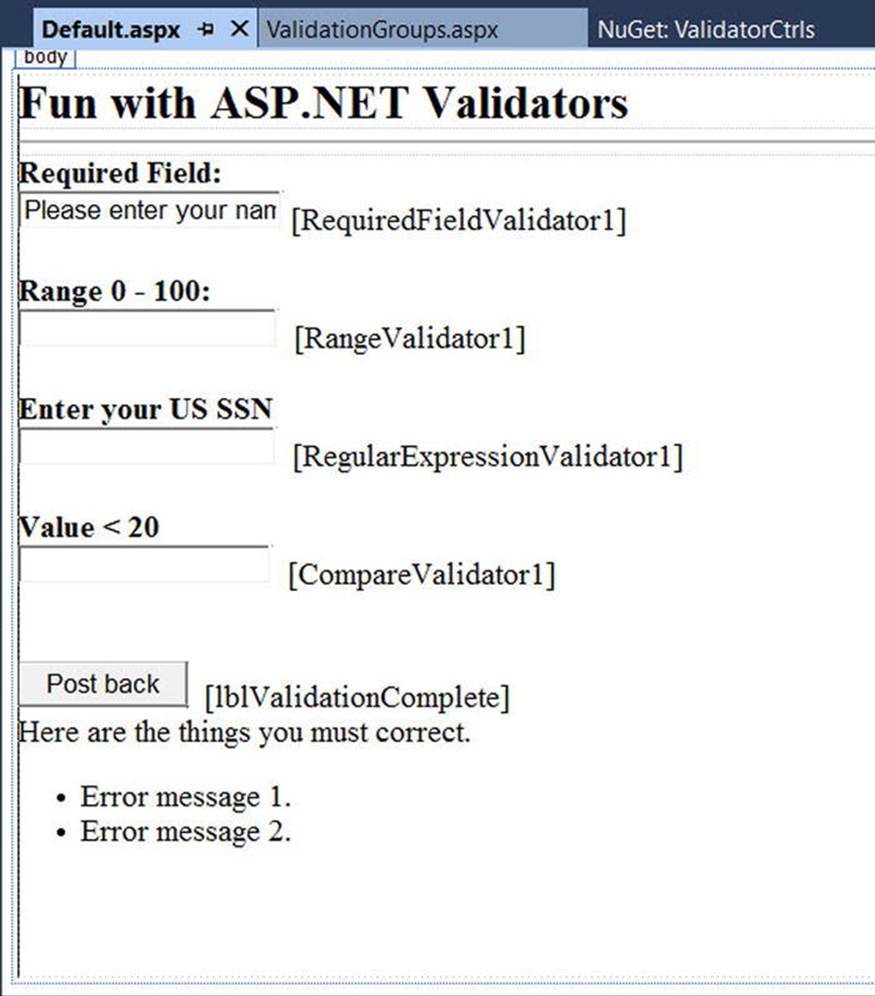
Figure 32-21. Web Forms validation controls will ensure your form data is correct before allowing postback
Now that you have an initial UI to experiment with, let’s walk through the process of configuring each validator control and see the end result of doing so. However, first you need to modify the current web.config file to allow client-side processing of your validation controls.
Enabling Client-Side JavaScript Validation Support
Beginning with ASP.NET 4.5, Microsoft introduced a new setting to control how validation controls respond at runtime. When you create an ASP.NET web application and open the web.config file, you will find the following setting:
<appSettings>
<add key="ValidationSettings:UnobtrusiveValidationMode" value="WebForms" />
</appSettings>
When this setting is in your web configuration file, the web site will process validation using various HTML 5 data attributes, rather than sending back blurbs of client-side JavaScript code to be processed by the web browser. Given that this edition of the text does not dive into the details of HTML 5, if you create a Web Forms application (instead of a web site), you need to comment out (or remove) this line in order for the current validation example to work correctly.
The RequiredFieldValidator
Configuring the RequiredFieldValidator is straightforward. Simply set the ErrorMessage and ControlToValidate properties accordingly using the Visual Studio Properties window. Here is the resulting markup that ensures the txtRequiredField text box is not empty:
<asp:RequiredFieldValidator ID="RequiredFieldValidator1"
runat="server" ControlToValidate="txtRequiredField"
ErrorMessage="Oops! Need to enter data.">
</asp:RequiredFieldValidator>
The RequiredFieldValidator supports an InitialValue property. You can use this property to ensure that the user enters any value other than the initial value in the related TextBox. For example, when the user first posts to a page, you might want to configure a TextBoxto contain the value “Please enter your name”. Now, if you did not set the InitialValue property of the RequiredFieldValidator, the runtime would assume that the string “Please enter your name” is valid. Thus, to ensure a required TextBox is valid only when the user enters anything other than “Please enter your name”, configure your widgets as follows:
<asp:RequiredFieldValidator ID="RequiredFieldValidator1"
runat="server" ControlToValidate="txtRequiredField"
ErrorMessage="Oops! Need to enter data."
InitialValue="Please enter your name">
</asp:RequiredFieldValidator>
The RegularExpressionValidator
The RegularExpressionValidator can be used when you want to apply a pattern against the characters entered within a given input field. To ensure that a given TextBox contains a valid U.S. Social Security number, you could define the widget as follows:
<asp:RegularExpressionValidator ID="RegularExpressionValidator1"
runat="server" ControlToValidate="txtRegExp"
ErrorMessage="Please enter a valid US SSN."
ValidationExpression="\d{3}-\d{2}-\d{4}">
</asp:RegularExpressionValidator>
Notice how the RegularExpressionValidator defines a ValidationExpression property. If you have never worked with regular expressions before, all you need to be aware of for this example is that they are used to match a given string pattern. Here, the expression"\d{3}-\d{2}-\d{4}" is capturing a standard U.S. Social Security number of the form xxx-xx-xxxx (where x is any digit).
This particular regular expression is fairly self-explanatory; however, assume you want to test for a valid Japanese phone number. The correct expression now becomes much more complex: "(0\d{1,4}-|\(0\d{1,4}\)?)?\d{1,4}-\d{4}". The good news is that when you select the ValidationExpression property using the Properties window, you can pick from a predefined set of common regular expressions by clicking the ellipse button.
Note If you are interested in regular expressions, you will be happy to know that the .NET platform supplies two namespaces (System.Text.RegularExpressions and System.Web.RegularExpressions) devoted to the programmatic manipulation of such patterns.
The RangeValidator
In addition to a MinimumValue and MaximumValue property, RangeValidators have a property named Type. Because you are interested in testing the user-supplied input against a range of whole numbers, you need to specify Integer (which is not the default!), like so:
<asp:RangeValidator ID="RangeValidator1"
runat="server" ControlToValidate="txtRange"
ErrorMessage="Please enter value between 0 and 100."
MaximumValue="100" MinimumValue="0" Type="Integer">
</asp:RangeValidator>
The RangeValidator can also be used to test whether a given value is between a currency value, date, floating-point number, or string data (the default setting).
The CompareValidator
Finally, notice that the CompareValidator supports the following Operator property:
<asp:CompareValidator ID="CompareValidator1" runat="server"
ControlToValidate="txtComparison"
ErrorMessage="Enter a value less than 20." Operator="LessThan"
ValueToCompare="20" Type="Integer">
</asp:CompareValidator>
Given that the role of this validator is to compare the value in the text box against another value using a binary operator, it should be no surprise that the Operator property may be set to values such as LessThan, GreaterThan, Equal, and NotEqual. Also note that theValueToCompare is used to establish a value to compare against. Note that the Type attribute is set to Integer. By default, the CompareValidator will be testing against string values!
Note The CompareValidator can also be configured to compare a value within another Web Forms control (rather than a hard-coded value) using the ControlToCompare property.
To finish up the code for this page, handle the Click event for the Button control and inform the user that he or she has succeeded in the validation logic, like so:
public partial class _Default : System.Web.UI.Page
{
protected void Page_Load(object sender, EventArgs e)
{
}
protected void btnPostback_Click(object sender, EventArgs e)
{
lblValidationComplete.Text = "You passed validation!";
}
}
Now, navigate to this page using your browser of choice. At this point, you should not see any noticeable changes. However, when you attempt to click the Submit button after entering bogus data, your error message is suddenly visible. When you enter valid data, the error messages are removed and postback occurs. If you look at the HTML rendered by the browser, you can see that the validation controls generate a client-side JavaScript function that makes use of a specific library of JavaScript functions that is automatically downloaded to the user’s machine. After the validation has occurred, the form data is posted back to the server, where the ASP.NET runtime will perform the same validation tests on the web server (just to ensure that no along-the-wire tampering has taken place).
On a related note, if the HTTP request was sent by a browser that does not support client-side JavaScript, all validation will occur on the server. In this way, you can program against the validation controls without being concerned with the target browser; the returned HTML page redirects the error processing back to the web server.
Creating Validation Summaries
The next validation-centric topic you will examine is the use of the ValidationSummary widget. Currently, each of your validators displays its error message at the exact place in which it was positioned at design time. In many cases, this might be exactly what you are looking for. However, on a complex form with numerous input widgets, you might not want to have random blobs of red text pop up. Using the ValidationSummary type, you can instruct all of your validation types to display their error messages at a specific location on the page.
The first step is to simply place a ValidationSummary on your *.aspx file. You may optionally set the HeaderText property of this type as well as the DisplayMode, which by default will list all error messages as a bulleted list.
<asp:ValidationSummary id="ValidationSummary1"
runat="server" Width="353px"
HeaderText="Here are the things you must correct.">
</asp:ValidationSummary>
Next, you need to set the Display property to None for each of the individual validators (e.g., RequiredFieldValidator, RangeValidator) on the page. This will ensure that you do not see duplicate error messages for a given validation failure (one in the summary pane and another at the validator’s location). Figure 32-22 shows the summary pane in action.
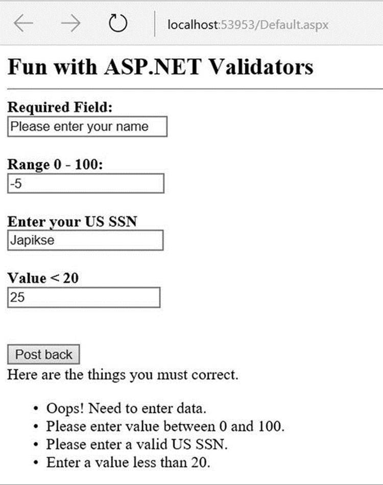
Figure 32-22. Using a validation summary
Last but not least, if you would rather have the error messages displayed using a client-side MessageBox, set the ValidationSummary control’s ShowMessageBox property to true and the ShowSummary property to false.
Defining Validation Groups
It is also possible to define groups for validators to belong to. This can be very helpful when you have regions of a page that work as a collective whole. For example, you could have one group of controls in a Panel object to allow the user to enter his or her mailing address and anotherPanel containing UI elements to gather credit card information. Using groups, you can configure each group of controls to be validated independently.
Insert a new page into your current project named ValidationGroups.aspx that defines two Panels. The first Panel object expects a TextBox to contain some form of user input (via a RequiredFieldValidator) and the second Panel expects a U.S. SSN value (via aRegularExpressionValidator). Figure 32-23 shows one possible UI.
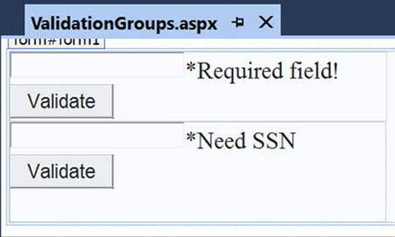
Figure 32-23. These Panel objects will independently configure their input areas
To ensure that the validators function independently, simply assign each validator and the control being validated to a uniquely named group using the ValidationGroup property. In the following possible markup, note that the Click event handlers used here are essentially empty stubs in the code file:
<form id="form1" runat="server">
<asp:Panel ID="Panel1" runat="server" Height="83px" Width="296px">
<asp:TextBox ID="txtRequiredData" runat="server"
ValidationGroup="FirstGroup">
</asp:TextBox>
<asp:RequiredFieldValidator ID="RequiredFieldValidator1" runat="server"
ErrorMessage="*Required field!" ControlToValidate="txtRequiredData"
ValidationGroup="FirstGroup">
</asp:RequiredFieldValidator>
<asp:Button ID="bntValidateRequired" runat="server"
OnClick="bntValidateRequired_Click"
Text="Validate" ValidationGroup="FirstGroup" />
</asp:Panel>
<asp:Panel ID="Panel2" runat="server" Height="119px" Width="295px">
<asp:TextBox ID="txtSSN" runat="server"
ValidationGroup="SecondGroup">
</asp:TextBox>
<asp:RegularExpressionValidator ID="RegularExpressionValidator1"
runat="server" ControlToValidate="txtSSN"
ErrorMessage="*Need SSN" ValidationExpression="\d{3}-\d{2}-\d{4}"
ValidationGroup="SecondGroup">
</asp:RegularExpressionValidator>
<asp:Button ID="btnValidateSSN" runat="server"
OnClick="btnValidateSSN_Click" Text="Validate"
ValidationGroup="SecondGroup" />
</asp:Panel>
</form>
Now, right-click this page’s designer and select the View In Browser menu option to verify that each panel’s widgets operate in a mutually exclusive manner.
Validation with Data Annotations
In addition to the validation controls, ASP.NET Web Forms supports validation using Data Annotations. Recall from Chapter 23 that you can mark model classes with attributes that define business requirements for the model (such as Required). Using the new ModelErrorMessagecontrol and an additional property on the ValidationSummary control, you can present errors resulting from Data Annotation violations with very little code.
Creating the Model
While you could certainly use the AutoLotDAL library from Chapter 31, to keep things simple, create a new Inventory class. Start by adding a new App_Code directory by right-clicking the project and selecting Add Add ASP.NET Folder App_Code. In this folder, add a new class named Inventory.cs. In this class, add the following code (make sure to add a using for System.ComponentModel.DataAnnotations):
public class Inventory
{
[Key,Required]
public int CarID { get; set; }
[Required(ErrorMessage="Make is required.")]
[StringLength(30,ErrorMessage="Make can only be 30 charaters or less")]
public string Make { get; set; }
[Required, StringLength(30)]
public string Color { get; set; }
[StringLength(30, ErrorMessage = "Pet Name can only be 30 charaters or less")]
public string PetName { get; set; }
}
Building the User Interface
Next, add a new Web Form named Annotations.aspx. In this page, add an asp:FormView control inside the Form tag. The FormView control can switch from display, edit, to insert mode very simply. First, update the header attributes as follows (the DefaultMode=Insertloads the FormView in Insert mode):
<asp:FormView runat="server" ID="fvDataBinding" DataKeyNames="CarID"
ItemType="Inventory" DefaultMode="Insert" InsertMethod="SaveCar"
UpdateMethod="UpdateCar" SelectMethod="GetCar">
Next, create the ItemTemplate. This is the content that will be displayed in read only mode. The ItemType strongly types the FormView, and allows for the <%# Item.FieldName %> syntax. Add the following markup:
<ItemTemplate>
<table style="width:100%">
<tr>
<td><asp:Label runat="server" AssociatedControlID="make">Make:</asp:Label></td>
<td><asp:Label runat="server" ID="make" Text=’<%# Item.Make %>’ /></td>
</tr>
<tr>
<td><asp:Label runat="server" AssociatedControlID="color">Color:</asp:Label></td>
<td><asp:Label runat="server" ID="color" Text=’<%#: Item.Color %>’ /></td>
</tr>
<tr>
<td><asp:Label runat="server" AssociatedControlID="petname">Pet Name:</asp:Label></td>
<td><asp:Label runat="server" ID="customerAge" Text=’<%#: Item.PetName %>’ /></td>
</tr>
<tr>
<td colspan="2">
<asp:Button ID="EditButton" runat="server" CommandName="Edit" Text="Edit" />
</td>
</tr>
</table>
</ItemTemplate>
The CommandName=”Edit” indicates that clicking the button will put the FormView into Edit mode. Once in Edit mode, the EditItemTemplate is displayed, which you will add next. There are some differences between the syntax for Edit and Display templates. First of all, in Edit templates, instead of using the <%# Item.FieldName %> syntax, use <%# BindItem.FieldName %>. Using BindItem sets up the control for two-way binding. The next difference is the ModelErrorMessage control that follows the edit controls. TheModelErrorMessage will display any model binding errors for the property identified by the ModelStateKey. Note that this is dependent on making the FormView strongly typed.
<EditItemTemplate>
<table style="width:100%">
<tr>
<td><asp:Label runat="server" AssociatedControlID="make">Make: </asp:Label></td>
<td>
<asp:TextBox runat="server" ID="make" Text=’<%# BindItem.Make %>’ />
<asp:ModelErrorMessage ModelStateKey="make" runat="server" ForeColor="Red" />
</td>
</tr>
<tr>
<td><asp:Label runat="server" AssociatedControlID="color">Color: </asp:Label></td>
<td>
<asp:TextBox runat="server" ID="color" Text=’<%#: BindItem.Color %>’ />
<asp:ModelErrorMessage ModelStateKey="color" runat="server" ForeColor="Red" />
</td>
</tr>
<tr>
<td><asp:Label runat="server" AssociatedControlID="petname">Pet Name: </asp:Label></td>
<td>
<asp:TextBox ID="petname" runat="server" Text=’<%#: BindItem.PetName %>’ />
<asp:ModelErrorMessage ModelStateKey="petname" runat="server" ForeColor="Red" />
</td>
</tr>
<tr>
<td colspan="2">
<asp:Button runat="server" CommandName="Update" Text="Save" />
<asp:Button runat="server" CommandName="Cancel" Text="Cancel"
CausesValidation="false" />
</td>
</tr>
</table>
</EditItemTemplate>
The InsertItemTemplate is virtually the same as the EditItemTemplate, the only difference (other than the name of the tag) is that the CommandName for the Button is Insert.
<InsertItemTemplate>
<table style="width:100%">
<tr>
<td><asp:Label runat="server" AssociatedControlID="make">Make: </asp:Label></td>
<td>
<asp:TextBox runat="server" ID="make" Text=’<%#: BindItem.Make %>’ />
<asp:ModelErrorMessage ModelStateKey="make" runat="server" ForeColor="Red" />
</td>
</tr>
<tr>
<td><asp:Label runat="server" AssociatedControlID="color">Color: </asp:Label></td>
<td>
<asp:TextBox runat="server" ID="color" Text=’<%#: BindItem.Color %>’ />
<asp:ModelErrorMessage ModelStateKey="color" runat="server" ForeColor="Red" />
</td>
</tr>
<tr>
<td><asp:Label runat="server" AssociatedControlID="petname">Pet Name: </asp:Label></td>
<td>
<asp:TextBox ID="petname" runat="server" Text=’<%#: BindItem.PetName %>’ />
<asp:ModelErrorMessage ModelStateKey="petname" runat="server" ForeColor="Red" />
</td>
</tr>
<tr>
<td colspan="2">
<asp:Button runat="server" CommandName="Insert" Text="Save" />
</td>
</tr>
</table>
</InsertItemTemplate>
Finally, close out the FormView:
<asp:FormView>
Finally, add the ValidationSummary control. The difference here from the earlier examples is setting the ShowModelStateErrors property to true. This instructs the control to show any Model Binding errors. After the closing tag for the FormView, add the following markup:
<asp:ValidationSummary runat="server" ShowModelStateErrors="true"
ForeColor="Red" HeaderText="Please check the following errors:" />
Adding the Code
You are going to add just enough code to show the validation. In a real application, your methods to support the FormView would involve calling out to a DAL, and not just tinkering with a local variable. But to keep the example focused, add the following code inAnnotations.aspx.cs. You will need to add the Microsoft.CodeDom.Providers.DotNetCompilerPlatform NuGet package to enable the C# 6 features. Note the implicit model binding on the SaveCar method and the explicit model binding on the UpdateCar method.
private Inventory _model = null;
public void SaveCar(Inventory car)
{
if (ModelState.IsValid)
{
_model = car;
//Add new record here
}
}
public void UpdateCar(int carID)
{
Inventory car = new Inventory();
if (TryUpdateModel(car))
{
_model = car;
//Update record here
}
}
public Inventory GetCar() => _model;
Test the App
Now, run the app, and you will see a page similar to Figure 32-24.
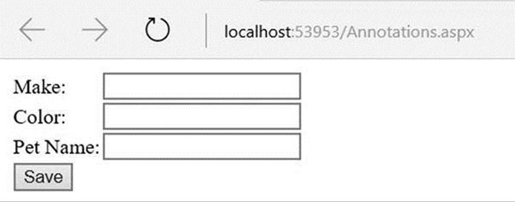
Figure 32-24. The FormView control in Insert mode
Leave the Make and Color blank, and add a Pet Name longer than 30 characters, and click Save. You should see the same errors as in Figure 32-25.
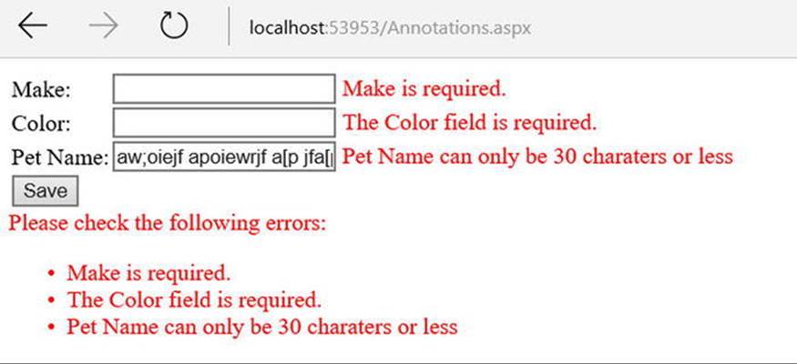
Figure 32-25. The FormView control with errors showing
As with the other Web Forms controls, both the ModelErrorMessage and ValidationSummary controls can be styled much better than what I have done here.
Source Code The ValidatorCtrls web site is included in the Chapter 32 subdirectory.
Working with Themes
At this point, you have worked with numerous Web Forms web controls. As you have seen, each control exposes a set of properties (many of which are inherited by System.Web.UI.WebControls.WebControl) that allow you to establish a given UI look and feel (background color, font size, border style, and whatnot). Of course, on a multipage web site, it is quite common for the site as a whole to define a common look and feel for various types of widgets. For example, all TextBoxes could be configured to support a given font, all Buttons to have a custom image, and all Calendars to have a light blue border.
Obviously, it would be very labor intensive (and error prone) to establish the same property settings for every widget on every page within your web site. Even if you were able to manually update the properties of each UI widget on each page, imagine how painful it would be when you needed to change the background color for each TextBox yet again. Clearly, there must be a better way to apply site-wide UI settings.
One approach to simplifying the application of a common UI look and feel is to define style sheets. If you have a background in web development, you are aware that style sheets define a common set of UI-centric settings that are applied on the browser. As you would hope, Web Forms web controls can be assigned a given style by assigning the CssStyle property.
However, Web Forms ships with a complementary technology to define a common UI termed themes. Unlike a style sheet, themes are applied on the web server (rather than the browser) and can be done programmatically or declaratively. Given that a theme is applied on the web server, it has access to all the server-side resources on the web site. Furthermore, themes are defined by authoring the same markup you would find within any *.aspx file (as you might agree, the syntax of a style sheet is a bit on the terse side).
Recall from Chapter 31 that ASP.NET web applications may define any number of special subdirectories, one of which is App_Themes. This single subdirectory may be further partitioned with additional subdirectories, each of which represents a possible theme on your site. For example, consider Figure 32-26, which illustrates a single App_Themes folder containing three subdirectories, each of which has a set of files that make up the theme itself.
Figure 32-26. A single App_Theme folder may define numerous themes
Understanding *.skin Files
The one file that every theme subdirectory is sure to have is a *.skin file. These files define the look and feel for various web controls. To illustrate, create a new empty web site named FunWithThemes, and insert a new Default.aspx Web Form. On this new page, add a Calendar,TextBox, and Button control. You don’t need to configure these controls in any special way, and the names of these controls are irrelevant for the current example. As you will see, these controls will be the targets for your custom skins.
Next, insert a new *.skin file (using the Website Add New Item menu option) named BasicGreen.skin, as shown in Figure 32-27.
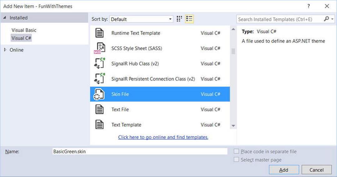
Figure 32-27. Inserting *.skin files
Visual Studio will prompt you to confirm that this file can be added into an App_Themes folder (which is exactly what you want). If you look in your Solution Explorer, you will indeed find that your App_Themes folder has a subfolder named BasicGreen containing your newBasicGreen.skin file.
A *.skin file is where you can define the look and feel of various widgets using Web Forms control declaration syntax. Sadly, the IDE does not provide designer support for *.skin files. One way to reduce the amount of typing time is to insert a temporary *.aspx file into your program (temp.aspx, for example) that can be used to build up the UI of the widgets using the Visual Studio page designer.
The resulting markup can then be copied and pasted into your *.skin file. When you do so, however, you must delete the ID attribute for each web control! This should make sense, given that you are not trying to define a UI look and feel for a particular Button (for example), but rather all Buttons.
This being said, here is the markup for BasicGreen.skin that defines a default look and feel for the Button, TextBox, and Calendar types:
<asp:Button runat="server" BackColor="#80FF80"/>
<asp:TextBox runat="server" BackColor="#80FF80"/>
<asp:Calendar runat="server" BackColor="#80FF80"/>
Notice that each widget still has the runat="server" attribute (which is mandatory), and none of the widgets have been assigned an ID attribute.
Now, let’s define a second theme named CrazyOrange. Using the Solution Explorer, right-click your App_Themes folder and add a new theme named CrazyOrange. This will create a new subdirectory under your site’s App_Themes folder.
Next, right-click the new CrazyOrange folder within the Solution Explorer and select Add New Item. From the resulting dialog box, add a new *.skin file. Update the CrazyOrange.skin file to define a unique UI look and feel for the same web controls, like so:
<asp:Button runat="server" BackColor="#FF8000"/>
<asp:TextBox runat="server" BackColor="#FF8000"/>
<asp:Calendar BackColor="White" BorderColor="Black"
BorderStyle="Solid" CellSpacing="1"
Font-Names="Verdana" Font-Size="9pt" ForeColor="Black" Height="250px"
NextPrevFormat="ShortMonth" Width="330px" runat="server">
<SelectedDayStyle BackColor="#333399" ForeColor="White" />
<OtherMonthDayStyle ForeColor="#999999" />
<TodayDayStyle BackColor="#999999" ForeColor="White" />
<DayStyle BackColor="#CCCCCC" />
<NextPrevStyle Font-Bold="True" Font-Size="8pt" ForeColor="White" />
<DayHeaderStyle Font-Bold="True" Font-Size="8pt"
ForeColor="#333333" Height="8pt" />
<TitleStyle BackColor="#333399" BorderStyle="Solid"
Font-Bold="True" Font-Size="12pt"
ForeColor="White" Height="12pt" />
</asp:Calendar>
At this point, your Solution Explorer should like Figure 32-28.
Figure 32-28. A single web site with multiple themes
Now that your site has a few themes defined, the next logical step is to apply them to your pages. As you might guess, there are many ways to do so.
Note These example themes are quite bland by design (in order to reduce the amount of markup on the printed page). Feel free to spruce things up to your liking.
Applying Site-Wide Themes
If you want to make sure that every page in your site adheres to the same theme, the simplest way to do so is to update your web.config file. Open your current web.config file and define a <pages> element within the scope of your <system.web> root element. If you add a theme attribute to the <pages> element, this will ensure that every page in your web site is assigned the selected theme (which is, of course, the name of one of the subdirectories under App_Theme). Here is the critical update:
<configuration>
<system.web>
...
<pages controlRenderingCompatibilityVersion="4.5"
theme="BasicGreen">
</pages>
</system.web>
</configuration>
If you run this page, you will find that each widget has the UI of BasicGreen. If you update the theme attribute to CrazyOrange and run the page again, you will find the UI defined by this theme is used instead.
Applying Themes at the Page Level
It is also possible to assign themes on a page-by-page level. This can be helpful in a variety of circumstances. For example, perhaps your web.config file defines a site-wide theme (as described in the previous section) but you want to assign a different theme to a specific page. To do so, you can simply update the <%@Page%> directive. If you are using Visual Studio to do so, you will be happy to find that IntelliSense will display each defined theme within your App_Theme folder.
<%@ Page Language="C#" AutoEventWireup="true"
CodeFile="Default.aspx.cs" Inherits="_Default" Theme ="CrazyOrange" %>
Because you assigned the CrazyOrange theme to this page, but the web.config file specified the BasicGreen theme, all pages but this page will be rendered using BasicGreen.
The SkinID Property
Sometimes you might need to define a set of possible UI look-and-feel scenarios for a single widget. For example, assume you want to define two possible UIs for the Button type within the CrazyOrange theme. You may differentiate each look and feel using the SkinID property of a control within the *.skin file:
<asp:Button runat="server" BackColor="#FF8000"/>
<asp:Button runat="server" SkinID = "BigFontButton"
Font-Size="30pt" BackColor="#FF8000"/>
Now, if you have a page that makes use of the CrazyOrange theme, each Button will, by default, be assigned the unnamed Button skin. If you want to have various buttons within the *.aspx file make use of the BigFontButton skin, simply specify the SkinID property within the markup, like so:
<asp:Button ID="Button2" runat="server"
SkinID="BigFontButton" Text="Button" /><br />
Assigning Themes Programmatically
Last but not least, it is possible to assign a theme in code. This can be helpful when you want to provide a way for end users to select a theme for their current session. Of course, I have not yet shown you how to build stateful web applications, so the current theme selection will be forgotten between postbacks. In a production-level site, you might want to store the user’s current theme selection within a session variable, or persist the theme selection to a database.
To illustrate how to assign a theme programmatically, update the UI of your Default.aspx file with three new Button controls, as shown in Figure 32-29. After you have done so, handle the Click event for each Button.
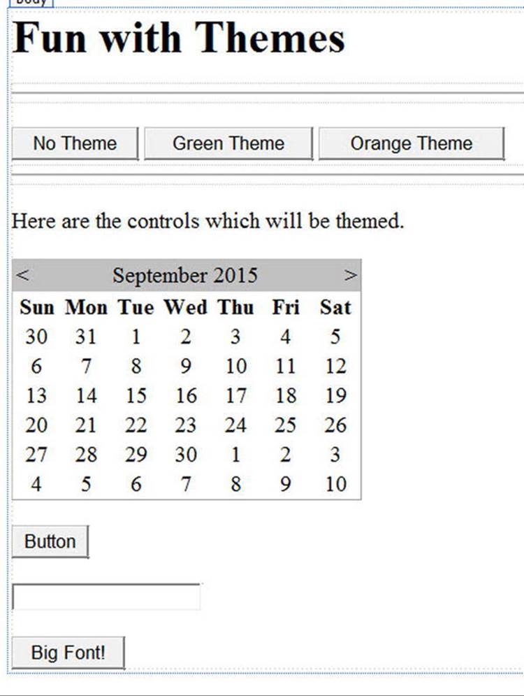
Figure 32-29. The updated UI of the themes example
Now, be aware that you can only assign a theme programmatically during specific phases of your page’s life cycle. Typically, this will be done within the Page_PreInit event. This being said, update your code file as follows:
partial class _Default : System.Web.UI.Page
{
protected void btnNoTheme_Click(object sender, System.EventArgs e)
{
// Empty strings result in no theme being applied.
Session["UserTheme"] = "";
// Triggers the PreInit event again.
Server.Transfer(Request.FilePath);
}
protected void btnGreenTheme_Click(object sender, System.EventArgs e)
{
Session["UserTheme"] = "BasicGreen";
// Triggers the PreInit event again.
Server.Transfer(Request.FilePath);
}
protected void btnOrangeTheme_Click(object sender, System.EventArgs e)
{
Session["UserTheme"] = "CrazyOrange";
// Triggers the PreInit event again.
Server.Transfer(Request.FilePath);
}
protected void Page_PreInit(object sender, System.EventArgs e)
{
try
{
Theme = Session["UserTheme"].ToString();
}
catch
{
Theme = "";
}
}
}
Notice that you are storing the selected theme within a session variable (see Chapter 33 for details) named UserTheme, which is formally assigned within the Page_PreInit() event handler. Also note that when the user clicks a given Button, you programmatically force thePreInit event to fire by calling Server.Transfer() and requesting the current page once again. If you run this page, you will find that you can establish your theme via various Button clicks.
Source Code The FunWithThemes web site is included in the Chapter 32 subdirectory.
Summary
This chapter examined how to make use of various Web Forms web controls. You began by examining the role of the Control and WebControl base classes, and you learned how to dynamically interact with a panel’s internal controls collection. Along the way, you were exposed to the new site navigation model (*.sitemap files and the SiteMapDataSource component), the new data-binding engine, and various validation controls.
The latter half of this chapter examined the role of master pages and themes. Recall that master pages can be used to define a common layout for a set of pages on your site. Also recall that the *.master file defines any number of content placeholders into which content pages plug their custom UI content. Finally, as you were shown, the Web Forms theme engine allows you to declaratively or programmatically apply a common UI look and feel to your widgets on the web server.
All materials on the site are licensed Creative Commons Attribution-Sharealike 3.0 Unported CC BY-SA 3.0 & GNU Free Documentation License (GFDL)
If you are the copyright holder of any material contained on our site and intend to remove it, please contact our site administrator for approval.
© 2016-2026 All site design rights belong to S.Y.A.