Real World .NET, C#, and Silverlight: Indispensible Experiences from 15 MVPs (2012)
Chapter 13
Practical WPF Data Binding
by Christian Nagel
This chapter provides practical information on data binding with Windows Presentation Foundation (WPF). It leads you on a journey to see various aspects of data binding and how you can use it. Simple object binding, as well as list binding (including validation and how to deal with large lists), are explained. Don't expect to see cool user interfaces (UIs) with WPF in this chapter. The UI is kept simple. Various features of WPF for styling, animations, and three dimensional (3D) are not discussed. This chapter focuses only on data binding with WPF.
Sample Application
The sample application used in this chapter is based on a Formula 1 database. Instead of just binding to in-memory data, a database with several tables and thousands of rows demonstrates data-binding features. You can download the database, along with the sample code for this chapter, on this book's companion website (www.wrox.com).
The database contains information about Formula 1 racers, circuits, and race results. With the application, racers can be queried and changed, and race results can be added.
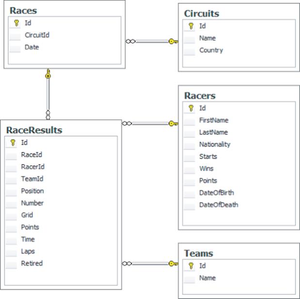
Figure 13.1 shows the database structure. The Circuits table contains information about all Formula 1 circuits that have been raced on. You can find the race date for circuits in the Races table. Each record in the Races table connects to a list of records in RaceResults. An entry in RaceResults contains a link to one record in the Racers table and one record in the Teams table.
Figure 13.1 Database structure for sample application
Using MVVM
In WPF, with applications that are bigger, or ones that should be expanded over time, it is a good practice to make use of the Model-View-ViewModel (MVVM) pattern. This pattern is an adaptation of the Model-View-Controller (MVC) pattern that takes advantages of WPF features. And guess what? The WPF feature that this pattern is based on is data binding. That's why the sample code of this chapter makes use of this pattern as well.
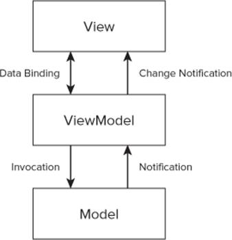
With the MVVM pattern, the entities (Model) are separated from the presentation (View) with the help of the ViewModel. Figure 13.2 shows the architectural overview of this pattern. The Model represents the data classes. The View is the UI designed using Extensible Application Markup Language (XAML). The UI displays data, enables editing of data, and invokes methods of the ViewModel with the help of commands. The ViewModel is an adapter of the model to offer specific features for the View. It offers commands that are invoked by the View, and offers data that is read and written by the View.
Figure 13.2 Architectural overview of MVVM pattern
Instead of using a command handler from the code-behind file of the XAML file, the separation done with the MVVM pattern enables easy unit testing of the functionality by writing test code for the ViewModel, and enables a better separation between developers and UI designers.
To use the MVVM pattern, you can use any of several available frameworks, such as Prism from Microsoft, which is available at www.microsoft.com/prism, the MVVM Light Toolkit (www.galasoft.ch/mvvm/getstarted) from Laurent Bugneon. This chapter doesn't make use of an MVVM framework, but you can easily adapt to any framework you prefer.

For more information on MVVM and the Prism framework, see Chapter 7.
Understanding the Sample Application Structure
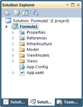
To use the MVVM pattern, the classes of the solution must be structured into Model classes, ViewModel classes, and View classes. The sample solution makes use of separate Model, ViewModels, and Views folders within the project, as shown in Figure 13.3. These folders also have different namespaces for the classes that they contain.
Figure 13.3 Folder structure for sample application
You can also get an even bigger separation by splitting the parts of the pattern into different assemblies. This helps by not adding unwanted dependencies between the layers of the pattern. With Visual Studio 2010 Ultimate Edition, you can also use the Layer Diagram to verify the layer structure if just a single assembly is used.
The project also contains an Infrastructure folder that contains helper classes.
Understanding the Model
The Model contains entity classes. The sample application makes use of the ADO.NET Entity Framework (EF) because data needs to be retrieved and updated. For WPF data binding, it's actually not important what technology you use to read and update the data. You can use ADO.NET directly from the WPF application, or make use of a communication technology such as Windows Communication Foundation (WCF) or WCF Data Services. WPF data binding makes use of .NET objects to bind to, and that's no different than if ADO.NET, WCF, or WCF Data Services is used.
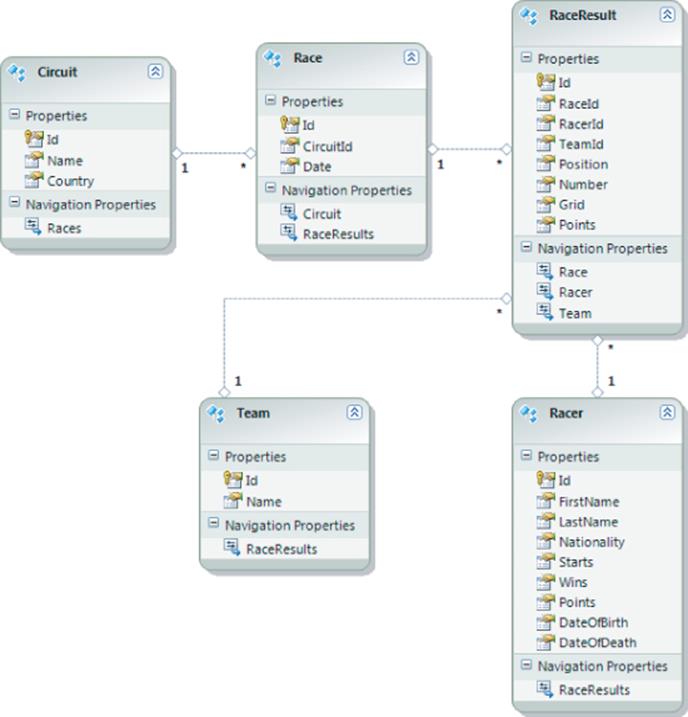
Figure 13.4 shows the EF data model used with the application. The model used here is a simple 1:1 mapping to the database. Racer and Team entities map to the Racers and Teams tables. Both Racer and Team have an association with RaceResult objects. RaceResult has an n-to-1 relationship with Race, and Raceis associated with Circuit.
Figure 13.4 EF data model for sample application
The designer creates partial classes that can easily be extended with custom code that is not changed when the designer re-creates the code. The Racer type is extended with a method ToString and a property Name, as shown here:

namespace Formula1.Model
{
public partial class Racer
{
public override string ToString()
{
return string.Format("{0} {1}", FirstName, LastName);
}
public string Name
{
get
{
return ToString();
}
}
}
}
Code file [Model/Racer.cs] available for download at Wrox.com .
Understanding the ViewModel
The ViewModel defines commands and properties that you can use for data binding. To notify the UI about changes to the properties, the INotifyPropertyChanged interface is implemented in the ViewModel classes. To get this functionality across all ViewModel classes, the base class ViewModelBase (shown in the following code snippet) implements this interface by offering the PropertyChanged event. In addition to this interface, the base class also defines the IsDesignTime property. This property can be used to offer sample data for the Visual Studio and Visual Blend designers without accessing the database or a service.
The ViewModelBase class also provides an error-handling functionality that can be used to report errors to the View using the HasError and ErrorMessage properties, and the SetError and ClearError methods.
public abstract class ViewModelBase : INotifyPropertyChanged
{
public event PropertyChangedEventHandler PropertyChanged;
protected virtual void RaisePropertyChanged(string propertyName)
{
PropertyChangedEventHandler handler = PropertyChanged;
if (handler != null)
handler(this, new PropertyChangedEventArgs(propertyName));
}
protected bool IsDesignTime
{
get
{
return DesignerProperties.GetIsInDesignMode
(new DependencyObject());
}
}
private bool hasError;
public bool HasError
{
get { return hasError; }
private set
{
hasError = value;
RaisePropertyChanged("HasError");
}
}
private string errorMessage;
public string ErrorMessage
{
get { return errorMessage; }
private set
{
errorMessage = value;
RaisePropertyChanged("ErrorMessage");
}
}
public void SetError(string errorMessage)
{
ErrorMessage = errorMessage;
HasError = true;
}
public void ClearError()
{
ErrorMessage = null;
HasError = false;
}
}
Code file [ViewModels/ViewModelBase.cs] available for download at Wrox.com .
A concrete ViewModel class derives from ViewModelBase. An example is the ShowRacerViewModel class. This class contains commands and properties used by the Views. The implementation of these will be explained soon during a discussion of data binding to commands and data binding to simple properties.
using System.Data.Objects;
using System.Linq;
using Formula1.Infrastructure;
using Formula1.Model;
namespace Formula1.ViewModels
{
public class ShowRacerViewModel : ViewModelBase, IDisposable
{
// commands and properties for the view
}
}
Code file [ViewModels/ShowRacerViewModel.cs] available for download at Wrox.com .
Understanding the View
Views are implemented with XAML. The following sample code makes use of user controls. The ShowRacerView.xaml file defines the UI representation for the view to display a racer.
<UserControl x:Class="Formula1.Views.ShowRacerView"
xmlns="http://schemas.microsoft.com/winfx/2006/xaml/presentation"
xmlns:x="http://schemas.microsoft.com/winfx/2006/xaml"
xmlns:mc="http://schemas.openxmlformats.org/markup-
compatibility/2006"
xmlns:d="http://schemas.microsoft.com/expression/blend/2008"
xmlns:utils="clr-namespace:Formula1.Infrastructure"
mc:Ignorable="d"
d:DesignHeight="300" d:DesignWidth="300">
<Grid>
<!-- user interface elements -->
</Grid>
</UserControl>
Code file [Views/ShowRacerView.xaml] available for download at Wrox.com .
Using a Locator Class
The MVVM pattern does not define how the View matches with the ViewModel, nor how different Views can interact. Different frameworks use different techniques. One way to map the View and ViewModel is to use a locator class that knows about all the ViewModel types. Other approaches make use of the Managed Extensibility Framework (MEF) or a dependency injection/inversion of control container to reduce strong dependencies.
Because the various approaches don't make a difference on how data binding is done, the sample code in this chapter takes a simple approach that doesn't add complexity for this purpose.
The sample application uses a locator class that contains a collection of all the ViewModel types used by the main window, as is shown next. The ViewModelInfo class is used by the locator to have names to display inside the UI for every View, and a reference to the type ViewModel. The ViewModelproperty is of type Lazy<T> so that the ViewModel type is not immediately instantiated when the locator is instantiated, but only when the Value property of the type Lazy<T> is accessed.
public class ViewModelInfo
{
public string Name { get; set; }
public Lazy<ViewModelBase> ViewModel { get; set; }
}
Code file [ViewModels/ViewModelInfo.cs] available for download at Wrox.com .
The Formula1Locator class implements the IEnumerable<ViewModelInfo> interface to return an enumerator of the type ViewModelInfo that returns names and lazy types to instantiate the ViewModel types, as shown here:
public class Formula1Locator : IEnumerable<ViewModelInfo>, IDisposable
{
private List<ViewModelInfo> viewModels;
public Formula1Locator()
{
viewModels = new List<ViewModelInfo>()
{
new ViewModelInfo
{
Name = "Show Racer",
ViewModel = new Lazy<ViewModelBase>(() => new
ShowRacerViewModel())
},
new ViewModelInfo
{
Name="Show Racers",
ViewModel= new Lazy<ViewModelBase>(() => new
ShowRacersViewModel())
},
new ViewModelInfo
{
Name="Show Racers with Details",
ViewModel= new Lazy<ViewModelBase>(() =>
new ShowRacersWithDetailViewModel())
}
// ...more ViewModelInfo instances...
}
}
public IEnumerator<ViewModelInfo> GetEnumerator()
{
return viewModels.GetEnumerator();
}
System.Collections.IEnumerator
System.Collections.IEnumerable.GetEnumerator()
{
return GetEnumerator();
}
protected virtual void Dispose(bool disposing)
{
if (disposing)
{
foreach (var viewModel in viewModels)
{
if (viewModel.ViewModel.Value != null)
{
IDisposable disp = viewModel.ViewModel.Value
as IDisposable;
if (disp != null)
{
disp.Dispose();
}
}
}
}
}
public void Dispose()
{
Dispose(true);
}
}
Code file [ViewModels/Formula1Locator.cs] available for download at Wrox.com .
The type Formula1Locator is globally instantiated and available as an application-wide resource in the App.xaml file with the key name Locator.
<Application.Resources>
<viewModels:Formula1Locator x:Key="Locator" />
</Application.Resources>
Code file [App.xaml] available for download at Wrox.com .
The following XAML code snippet for the type MainWindow shows the main window. The DataContext property of the Grid control references the locator by its key with the help of the static resource markup extension {StaticResource Locator}. This makes it possible for all elements within the grid to bind to properties of the locator.
<Window x:Class="Formula1.Views.MainWindow"
xmlns="http://schemas.microsoft.com/winfx/2006/xaml/presentation"
xmlns:x="http://schemas.microsoft.com/winfx/2006/xaml"
Title="Formula 1" Height="300" Width="300">
<Grid DataContext="{StaticResource Locator}">
<Grid.ColumnDefinitions>
<ColumnDefinition Width="Auto" />
<ColumnDefinition />
</Grid.ColumnDefinitions>
<TabControl Grid.Column="1" ItemsSource="{Binding}">
<TabControl.ItemTemplate>
<DataTemplate>
<StackPanel Orientation="Horizontal">
<TextBlock Text="{Binding Name}" />
</StackPanel>
</DataTemplate>
</TabControl.ItemTemplate>
<TabControl.ContentTemplate>
<DataTemplate>
<ContentControl Content="{Binding ViewModel.Value}" />
</DataTemplate>
</TabControl.ContentTemplate>
</TabControl>
</Grid>
</Window>
Code file [Views/MainWindow.xaml] available for download at Wrox.com .
The main UI consists of a TabControl, where every tab displays a separate view. The ItemsSource property makes use of the binding markup extension {Binding} to bind the complete list that is returned from the locator. Every item within the TabControl (defined with ItemTemplate and ContentTemplate) binds to a single item of the list. The ItemTemplate defines the header of the TabItem controls.
With the header, just the name of the view displays within a TextBlock binding the Text property to the Name property of the ViewModelInfo that is returned from the locator. The content of the TabItem controls displays only when the user clicks the tab header. Then a ContentControl displays that binds theContent property to ViewModel.Value. Value is a property of the type Lazy<T> that finally instantiates the type that derives from ViewModelBase, as defined by the locator.
The mapping from the ViewModel types to the views is defined in the App.xaml file with data templates. The following code snippet shows some of the mappings. For example, the ShowRacerViewModel type uses ShowRacerView as a UI representation. Accordingly, the ShowRacersWithDetailViewModel type uses the type ShowRacersWithDetailView.
<Application.Resources>
<viewModels:Formula1Locator x:Key="Locator" />
<DataTemplate DataType="{x:Type viewModels:ShowRacerViewModel}">
<views:ShowRacerView />
</DataTemplate>
<DataTemplate DataType="{x:Type viewModels:ShowRacersViewModel}">
<views:ShowRacersView />
</DataTemplate>
<DataTemplate DataType="{x:Type viewModels:ShowRacersCVSViewModel}">
<views:ShowRacersCVSView />
</DataTemplate>
<DataTemplate DataType=
"{x:Type viewModels:ShowRacersWithDetailViewModel}">
<views:ShowRacersWithDetailView />
</DataTemplate>
<!-- ... -->
</Application.Resources>
Code file [App.xaml] available for download at Wrox.com .
With this mapping, the View type automatically has the data context assigned to the ViewModel type to which it is connected.
Figure 13.5 shows the main window of the application. Here you can see the TabControl with all the items that are returned from the locator, and the content of one of the Views is active.
Figure 13.5 Main window of the sample application
You now have seen the main architecture of the application and some data binding in action. Now it's time to get into the details of data binding.
Data Binding Overview
WPF data binding is based on the Binding class. With data binding, you can bind a dependency property of a UI element to a simple property of a .NET object. The Binding class connects a source (.NET object) and a target (UI element). The Binding class defines the Source property to define the source of the data, and the Path property, where the name of the property to bind to can be defined. The following code snippet shows binding with code-behind:
var p1 = new Person { FirstName = "Matthias", LastName = "Nagel" };
var binding = new Binding { Path = new PropertyPath("FirstName"),
Source=p1};
text1.SetBinding(TextBox.TextProperty, binding);
First, an instance of the class Person is created. (This class defines FirstName and LastName properties.) The Binding instance assigns the Path property to the FirstName property name of the Person class, and the Source property to the Person instance.
To map the binding to the UI element, the SetBinding method of a TextBox named text1 is invoked. The first parameter of SetBinding requires a DependencyProperty. The second parameter is an instance of a class that derives from BindingBase. With the following code, the Text property of the TextBox is bound to the binding variable that binds to the FirstName property.
To show data binding in XAML instead of code-behind, a Person object is instantiated and filled with values from XAML, as shown here:
<Window.Resources>
<local:Person x:Key="p2">
<local:Person.FirstName>Stephanie</local:Person.FirstName>
<local:Person.LastName>Nagel</local:Person.LastName>
</local:Person>
</Window.Resources>
With XAML, the Binding markup extension can be used to bind a Text property of a TextBox to the FirstName property and the source referenced using the key from the resources.
<TextBox Text="{Binding Source={StaticResource p2}, Path=FirstName}" />
Path is a default property for the Binding markup extension, and the XAML code can be simplified as shown here:
<TextBox Text="{Binding LastName, Source={StaticResource p2}}" />
In some scenarios, you must use the longer form of the XAML binding syntax. Instead of using an attribute, you can use an element as well, as shown here:
<TextBox>
<TextBox.Text>
<Binding Path="FirstName">
<Binding.Source>
<StaticResource ResourceKey="p2" />
</Binding.Source>
</Binding>
</TextBox.Text>
</TextBox>
Understanding Data Context
Instead of assigning the source with the binding expression, the DataContext property can be assigned. In the following simplification of the previous version of code-behind, data binding assigns the DataContext of the TextBox named text1 to the Person instance p1 before setting the binding of the TextBox with an overload of the SetBinding method that just requires a property name of the source with the second parameter:
text1.DataContext = p1;
text1.SetBinding(TextBox.TextProperty, "FirstName");
Using data context has a big advantage in that it is used hierarchically. If the property DataContext is not assigned with the control that has the binding defined, the parent control is checked for a DataContext. In the following code snippet, the DataContext is assigned to the StackPanel, and the TextBox controls within the StackPanel make use of the same data context. Checking the data context goes up through the complete hierarchy of the XAML elements.
<StackPanel DataContext="{StaticResource p2}">
<TextBox Text="{Binding FirstName}" />
<TextBox Text="{Binding LastName}" />
</StackPanel>
Understanding Element-to-Element Binding
The source for binding can be a UI element as well. Dependency properties of WPF controls can be accessed via normal property syntax, so this shouldn't be a surprise. Element-to-element binding is defined by using the ElementName property of the Binding class.
The following code snippet binds the Text property of a TextBlock element to the Value property of the Slider control that has the name slider1. Thus, the TextBlock displays the current value of the slider.
<Slider x:Name="slider1" Minimum="0" Maximum="100" SmallChange="1"
IsSnapToTickEnabled="True" />
<TextBlock Text="{Binding ElementName=slider1, Path=Value}" />
Understanding Binding Modes
The direction of a binding can be defined by setting the binding mode. The Binding class defines a Mode property of BindingMode type.
BindingMode is an enumeration that defines if the values should be directed from the source to the target (OneTime and OneWay), from the target to the source (OneWayToSource), or both directions (TwoWay). The difference between OneTime and OneWay is that, with OneTime, the value from the source is read only once, and with OneWay, changes to the source values are taken care of in the UI.
The default value of the BindingMode enumeration depends on the target property and element. Although the Text property of the TextBox control is, by default, TwoWay, the Text property of the TextBlock has the default OneWay.
Binding Based on Interfaces
WPF data binding makes use of several .NET interfaces. This section examines the important interfaces for data binding.
To get changes from the source to the target, the source must implement the INotifyPropertyChanged interface. (Or the source must be a dependency property that has a similar notification feature.) With the sample code you've seen so far, the base class ViewModelBase implements INotifyPropertyChanged to notify the View of property changes.
To get information on a collection change, the INotifyCollectionChanged interface must be implemented with the collection. The ObservableCollection<T> class implements this interface.
An alternative to the INotifyCollectionChanged interface that is of special interest when mixing WPF and Windows Forms applications is the IBindingList interface. This is supported by WPF for collection changes as well. IBindingList is implemented for collection notification with Windows Forms.
In addition to dealing with exceptions, WPF supports the IDataErrorInfo interface to validate bound source objects. This interface enables checking properties for valid values. Later in this chapter, you learn more about this binding feature.
For converting values to be used with data binding, the IValueConverter interface can be implemented. The IMultiValueConverter interface enables converting multiple properties of a source to a single property of a UI element.
To bind collections, WPF uses the IEnumerable and IList interfaces. For filtering and sorting collections, the ICollectionView interface is used. You learn more about these interfaces later in this chapter in the “Binding to Lists” section.
Now it's time get into a bigger example that continues through all the following sections of this chapter. This example shows various binding features and how they can be practically used. Let's begin by looking at commands to interact with the ViewModel from the View.
Using Binding Commands
In addition to supporting .NET events and event handlers that are connected to the events, WPF supports commands. Commands offer a better separation from the source to the target.
For example, the Button class defines a Click event and a Command property. The Button class is a command source that invokes a command. With the Click event, a handler can be assigned that fulfills the requirements of the RoutedEventHandler delegate.
Using XAML 2006 with Visual Studio 2010, event handlers are tightly bound to the XAML. The event handler (in the code-behind file) must be available when the XAML code is compiled. With MVVM, a looser coupling is preferred. This can be achieved by using commands.
The Command property of the Button class enables assigning a command. A command must implement the ICommand interface. The .NET Framework offers some predefined commands in the ApplicationCommands, NavigationCommands, MediaCommands, EditingCommands, and ComponentCommands classes. The commands are defined using static properties.
For example, the ApplicationCommands class defines a static Open property that returns a RoutedUICommand. RoutedUICommand implements the ICommand interface. Such a command can be assigned to a Command property of a Button control, as shown in the following code snippet. With predefined commands, just the name of the command must be written to the XAML file, instead prefixing it with the class name. This shortcut is available in .NET 4 and later editions.
<Button Content="Open" Command="Open" />
What happens when the command is fired (when the button is clicked) is not defined by the command itself. Instead, command bindings bind commands to event handlers.
In the following code snippet, the CommandBindings of the Window define that, if the Open command is fired, the OnOpen method is invoked. The CommandBinding class defines Executed and CanExecute properties to define event handlers that are executed when the command is fired, and with CanExecute it is checked if the command is available. For example, if a file is opened and not yet changed, the Save command might not be available.
<Window.CommandBindings>
<CommandBinding Command="Open" Executed="OnOpen" />
</Window.CommandBindings>
Command bindings are searched in a hierarchy. The CommandBindings property is defined with the UIElement class that is a base class of every WPF element. This way, controls can define command bindings and implement the handlers. Thus, it is necessary only to define the command source. TheTextBox class implements handlers for Cut, Copy, Paste, and Undo commands, and it is necessary only to define command sources for these commands (for example, MenuItem elements).
Using MVVM and DelegateCommand
With the MVVM pattern, the command binding from within the XAML file is not helpful because, with the command binding, tight coupling to the command target is used. With MVVM, a command and the handler are defined by a ViewModel class, and loose coupling is done by binding the command.
To make this possible, an implementation of the ICommand is needed that invokes a handler defined by a delegate. An implementation is shown in the following code snippet. DelegateCommand implements the ICommand interface with the implementation of the Execute and CanExecute methods. The Execute andCanExecute methods invoke delegates assigned in the constructor of the class.
using System;
using System.Windows.Input;
namespace Formula1.Infrastructure
{
public class DelegateCommand : ICommand
{
private readonly Action<object> execute;
private readonly Func<object, bool> canExecute;
public DelegateCommand(Action<object> execute)
: this(execute, null)
{
}
public DelegateCommand(Action<object> execute, Func<object, bool>
canExecute)
{
this.execute = execute;
this.canExecute = canExecute;
}
public bool CanExecute(object parameter)
{
return canExecute == null ? true : canExecute(parameter);
}
public event EventHandler CanExecuteChanged
{
add
{
CommandManager.RequerySuggested += value;
}
remove
{
CommandManager.RequerySuggested -= value;
}
}
public void Execute(object parameter)
{
execute(parameter);
}
}
}
Code file [Infrastructure/DelegateCommand.cs] available for download at Wrox.com .
A class like the DelegateCommand is part of most MVVM frameworks.
Creating a ViewModel
The first sample of the Formula 1 application shows how the values of the Racer type can be shown on the user interface. The sample does not show any racer, but instead a racer who is queried for by the name of the racer. Starting the query is done by using a command.
The View to show the racer is ShowRacerView.xaml. The corresponding file that contains the ViewModel type is ShowRacerViewModel.cs. The class ShowRacerViewModel derives from the base class ViewModelBase.
using System.Data;
using System.Data.Objects;
using System.Linq;
using Formula1.Infrastructure;
using Formula1.Model;
namespace Formula1.ViewModels
{
public class ShowRacerViewModel : ViewModelBase
{
Code file [ViewModels/ShowRacerViewModel.cs] available for download at Wrox.com .
This ViewModel class defines a command started from the user interface, as examined next.
Defining Commands with ViewModels
The previously defined DelegateCommand class can be used in ViewModel classes. The code snippet shown from the ShowRacerViewModel class offers the FindRacerCommand as a read-only property. This property can be used for data binding. The implementation of the get accessor returns the value of thefindRacerCommand if it is not null. If it is null, a new DelegateCommand instance is created where a call to the FindRacer method is assigned to the constructor with a lambda expression.
private DelegateCommand findRacerCommand;
public DelegateCommand FindRacerCommand
{
get
{
return findRacerCommand ??
(findRacerCommand = new DelegateCommand(
param => this.FindRacer(param)));
}
}
Code file [ViewModels/ShowRacerViewModel.cs] available for download at Wrox.com .
As a reminder, ?? is the coalescing operator. The coalescing operator verifies if the preceding variable is null. If it is not null, just the value is returned. If it is null, the expression followed by the coalescing operator is invoked. The coalescing operator was invented with nullable value types and is useful with reference types as well.
The implementation of the FindRacer method makes a query using the ADO.NET EF and the object context that was created from the ADO.NET entity designer. The result of the query is assigned to the Racer property of the ShowRacerViewModel class. In the case of an EF exception, the SetError method of the base class is invoked to give some error information to the View.
public void FindRacer(object name)
{
try
{
string filter = (string)name;
using (Formula1Entities data = new Formula1Entities())
{
var q = (from r in data.Racers
where r.LastName.StartsWith(filter)
select r);
Racer = (q as ObjectQuery<Racer>).
Execute(MergeOption.NoTracking).FirstOrDefault();
}
}
catch (EntityException)
{
SetError("Verify the database connection");
}
}
private Racer racer;
public Racer Racer
{
get { return racer; }
set
{
if (!object.Equals(racer, value))
{
racer = value;
RaisePropertyChanged("Racer");
}
}
}
Code file [ViewModels/ShowRacerViewModel.cs] available for download at Wrox.com .
The sample code offers a Racer object directly with the Racer property. Instead, you could also offer FirstName, LastName, Nationality… properties directly from the ViewModel class. If the user interface needs properties that are somehow different from the entity type, it could be done this way. Here, the entity type fulfills all features needed by the UI and, thus, can be offered directly to the UI.
Binding Commands from XAML Code
In the XAML code of the View, a Button can be defined that binds the Command property to the DelegateCommand instance of the FindRacerCommand property from the ViewModel class. Clicking the button results in the command being executed, and because this DelegateCommand references the FindRacer method, the method is invoked.
Because the FindRacer method has a parameter, a parameter must be sent to the command. This is done by assigning the CommandParameter property of the Button. The FindRacer method requires the name of the racer for returning a racer, so the value should be assigned dynamically from the UI. This again is done via data binding. The value of the parameter comes from the Text property of the TextBox that has the name textName.
<TextBox x:Name="textName" Grid.Row="0" Grid.Column="0"
Margin="5" VerticalAlignment="Center" />
<Button Grid.Row="0" Grid.Column="1" Content="Find Racer" Margin="5"
Command="{Binding FindRacerCommand}"
CommandParameter="{Binding ElementName=textName, Path=Text,
Mode=OneWay}" />
Code file [Views/ShowRacerView.xaml] available for download at Wrox.com .
Instead of using command parameters, you can also bind the property Text of the TextBox to a property of the ViewModel class (for example, a FindName property) and use the property FindName within the method FindRacer instead of the parameter of FindRacer. Usually, this is just a matter of taste.
When you bind the command to the UI, now the FindRacer method is invoked when the button is clicked. The FindRacer method then assigns the result to the Racer property. What's missing is a display of the racer. This is done next.
Using Simple Data Binding
To display information on a racer, several TextBlock elements are created. The Text properties of the TextBlock elements are bound to Nationality, Starts, and Wins properties. These controls are within a Grid control that has the DataContext set to bind to the Racer property of the ViewModel.
Within the outer Grid control that binds directly to the ViewModel is a TextBlock with a red foreground that binds the Text property to the ErrorMessage property to display error information.
Another option without assigning the DataContext to a parent element would be to bind to Racer.Nationality instead of Nationality. Also, be aware that the command bound to the FindRacerCommand property is outside of the Grid with the DataContext and, thus, binds to the property of the ViewModel class directly.
<UserControl x:Class="Formula1.Views.ShowRacerView"
xmlns="http://schemas.microsoft.com/winfx/2006/xaml/presentation"
xmlns:x="http://schemas.microsoft.com/winfx/2006/xaml"
xmlns:mc="http://schemas.openxmlformats.org/markup-
compatibility/2006"
xmlns:d="http://schemas.microsoft.com/expression/blend/2008"
xmlns:utils="clr-namespace:Formula1.Infrastructure"
mc:Ignorable="d"
d:DesignHeight="300" d:DesignWidth="300">
<UserControl.Resources>
<Style TargetType="TextBlock">
<Style.Setters>
<Setter Property="VerticalAlignment" Value="Center" />
<Setter Property="Margin" Value="10,7,5,7" />
</Style.Setters>
</Style>
</UserControl.Resources>
<Grid>
<Grid.RowDefinitions>
<RowDefinition Height="*" />
<RowDefinition Height="Auto" />
<RowDefinition Height="Auto" />
</Grid.RowDefinitions>
<Grid.ColumnDefinitions>
<ColumnDefinition />
<ColumnDefinition />
</Grid.ColumnDefinitions>
<TextBox x:Name="textName" Grid.Row="0" Grid.Column="0" Margin="5"
VerticalAlignment="Center" />
<Button Grid.Row="0" Grid.Column="1" Content="Find Racer" Margin="5"
Command="{Binding FindRacerCommand}"
CommandParameter="{Binding ElementName=textName, Path=Text,
Mode=OneWay}" />
<Grid Grid.Row="1" Grid.ColumnSpan="2" DataContext="{Binding Racer}">
<Grid.RowDefinitions>
<RowDefinition Height="Auto" />
<RowDefinition Height="Auto" />
<RowDefinition Height="Auto" />
<RowDefinition Height="Auto" />
<RowDefinition Height="Auto" />
</Grid.RowDefinitions>
<Grid.ColumnDefinitions>
<ColumnDefinition />
<ColumnDefinition />
</Grid.ColumnDefinitions>
<TextBlock Text="Name" Grid.Row="0" Grid.Column="0" />
<TextBlock Grid.Row="0" Grid.Column="1" />
<TextBlock Text="Country" Grid.Row="1" Grid.Column="0" />
<TextBlock Grid.Row="1" Grid.Column="1"
Text="{Binding Nationality}" />
<TextBlock Text="Starts" Grid.Row="2" Grid.Column="0" />
<TextBlock Grid.Row="2" Grid.Column="1" Text="{Binding Starts}" />
<TextBlock Text="Wins" Grid.Row="3" Grid.Column="0" />
<TextBlock Grid.Row="3" Grid.Column="1" Text="{Binding Wins}" />
<TextBlock Text="Points" Grid.Row="4" Grid.Column="0" />
<TextBlock Grid.Row="4" Grid.Column="1" Text="{Binding Points}" />
</Grid>
<TextBlock Foreground="Red" Text="{Binding ErrorMessage}" Grid.Row="2"
Grid.Column="0" Grid.ColumnSpan="2" />
</Grid>
</UserControl>
Code file [Views/ShowRacerView.xaml] available for download at Wrox.com .
The TextBlock showing the content of the ErrorMessage property should only be visible if there is an error. This is shown next.
Value Conversion
To display the TextBlock for the error message only in cases when there is an error, the Visibility property of the TextBlock can be bound to the HasError property of the ViewModelBase class. However, the HasError property is of type bool, and the Visibility property is an enumeration with three possible values:Visible, Collapsed, and Hidden. Binding such different types can be done by using a converter.
A converter as shown with the VisibilityConverter class implements the interface IValueConverter. This interface defines the Convert and ConvertBack methods. The Convert method is implemented to convert the Boolean input value from true to Visibility.Visible, and false to Visibility.Collapsed.
using System;
using System.Globalization;
using System.Windows;
using System.Windows.Data;
namespace Formula1.Infrastructure
{
[ValueConversion(typeof(bool), typeof(Visibility))]
public class VisibilityConverter : IValueConverter
{
public object Convert(object value, Type targetType,
object parameter, CultureInfo culture)
{
bool input = (bool)value;
if (input)
return Visibility.Visible;
else
return Visibility.Collapsed;
}
public object ConvertBack(object value, Type targetType,
object parameter, CultureInfo culture)
{
throw new NotSupportedException();
}
}
}
Code file [Infrastructure/VisibilityConverter.cs] available for download at Wrox.com .
For using the VisibilityConverter type from within XAML code, the type is defined within the resources and can be accessed by using the VisibilityConverter key.
<UserControl.Resources>
<utils:VisibilityConverter x:Key="VisibilityConverter" />
<!-- ... -->
</Style>
</UserControl.Resources>
Code file [Views/ShowRacerView.xaml] available for download at Wrox.com .
The definition of the TextBlock element can now be changed to bind the Visibility property of the TextBlock to the HasError property of the ViewModelBase type. The Boolean value is now converted to the Visibility enumeration by specifying the converter with the Converter property of the Binding. Without an error, the TextBlock stays collapsed and doesn't take any size in the View.
<TextBlock Foreground="Red" Visibility="{Binding HasError,
Converter={StaticResource VisibilityConverter}}"
Text="{Binding ErrorMessage}" Grid.Row="2" Grid.Column="0"
Grid.ColumnSpan="2" />
Code file [Views/ShowRacerView.xaml] available for download at Wrox.com .
Now, what's missing is a TextBlock that displays the values of the FirstName and LastName properties. Using a single TextBlock to display a combination of multiple properties, MultiBinding can be used, which is shown next.
Binding Multiple Properties
If multiple properties of a source should be bound to one UI element, MultiBinding can be used.
The following sample shows how the Text property of a TextBlock is bound to both the FirstName and LastName properties of a Racer. The child elements of the MultiBinding element define all the properties used for the binding. How the properties are combined is defined by a class implementing theIMultiValueConverter interface. This is referenced by the Converter property of the MultiBinding element.
<TextBlock Grid.Row="0" Grid.Column="1">
<TextBlock.Text>
<MultiBinding Converter="{StaticResource NameConverter}">
<Binding Path="FirstName" />
<Binding Path="LastName" />
</MultiBinding>
</TextBlock.Text>
</TextBlock>
Code file [Views/ShowRacerView.xaml] available for download at Wrox.com .
The converter is defined within resources of the user control to reference the NameConverter class.
<UserControl.Resources>
<utils:NameConverter x:Key="NameConverter" />
<!-- ... -->
</UserControl.Resources>
Code file [Views/ShowRacerView.xaml] available for download at Wrox.com .
The NameConverter class implements the IMultiValueConverter interface in the following code snippet. IMultiValueConverter defines the Convert and ConvertBack methods. For one-way binding, just the Convert method is used. With two-way binding, the ConvertBack method must be implemented as well.
using System;
using System.Globalization;
using System.Linq;
using System.Windows;
using System.Windows.Data;
namespace Formula1.Infrastructure
{
public class NameConverter : IMultiValueConverter
{
public object Convert(object[] values, Type targetType,
object parameter, CultureInfo culture)
{
if (values == null || values.Count() != 2)
return DependencyProperty.UnsetValue;
return String.Format("{0} {1}", values[0], values[1]);
}
public object[] ConvertBack(object value, Type[] targetTypes,
object parameter, CultureInfo culture)
{
throw new NotImplementedException();
}
}
}
Code file [Infrastructure/NameConverter.cs] available for download at Wrox.com .
With the Convert method, the values parameter receives all the bound property values defined as children of the MultiBinding element. The return value is a single object built up from the input values. In a case in which the input values should be dealt with differently based on a parameter, the parameterargument is filled by assigning the ConverterParameter attribute to the MultiBinding element. For example, you could decide if the first name or last name should appear first.
Returning DependencyProperty.UnsetValue from the Convert method means that the Convert method didn't produce any value, and, thus, a FallbackValue should be used (if it is available), or a default value.
In the case in which binding multiple property values can be achieved by a format string, creating a class implementing IMultiValueConverter is not necessary. The following code snippet demonstrates how MultiBinding can be used to specify the StringFormat property to get the same result as before:
<TextBlock Grid.Row="0" Grid.Column="1">
<TextBlock.Text>
<MultiBinding StringFormat="{}{0} {1}">
<Binding Path="FirstName" />
<Binding Path="LastName" />
</MultiBinding>
</TextBlock.Text>
</TextBlock>
Code file [Views/ShowRacerView.xaml] available for download at Wrox.com .
With the Racer type as it is, there's another option instead of using MultiBinding. The Racer type overrides the ToString method to return the values of the FirstName and LastName properties as a single string. So, you can also bind the Text property of the TextBlock to do a default binding, and get the same result in this scenario.
<TextBlock Grid.Row="0" Grid.Column="1" Text="{Binding}" />
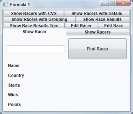
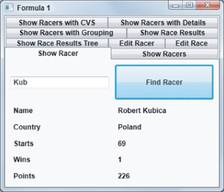
Running the application, a query for a racer can be performed to display the result, as shown in Figure 13.6.
Figure 13.6 Result of querying for a racer
Binding to Lists
The next step is to bind a list of racers. This is done in the View type ShowRacersView with the ViewModel type ShowRacersViewModel.
Controls that derive from the base class ContentControl can only display a single item. To display a list of items, a control that derives from ItemsControl is needed. Examples of such controls are ListBox, ComboBox, and TreeControl classes. These controls have an ItemsSource property that can be used for binding a list. The next sample uses the ListBox and ComboBox controls.
The UI of this sample displays a list of racers. However, not all racers should be displayed in one list, but rather the list should be filtered. The sample enables filtering based on the country of the racers, or a year range when the racers were active, or both.
In the following code, the ViewModel class ShowRacersViewModel defines Boolean properties FilterCountry and FilterYears (if filtering on the country and the year should be active), the Countries property (which returns a list of all countries), and the MinYear and MaxYear properties (which return the range of available years). The SelectedCountry, SelectedMinYear, and SelectedMaxYear properties define the values selected from the UI. The ViewModel class also defines a command named GetRacersCommand that invokes (when fired) the GetRacers method.
using System;
using System.Collections.Generic;
using System.Linq;
using Formula1.Infrastructure;
using Formula1.Model;
namespace Formula1.ViewModels
{
public class ShowRacersViewModel : ViewModelBase, IDisposable
{
private Formula1Entities data;
public ShowRacersViewModel()
{
if (!IsDesignTime)
{
data = new Formula1Entities();
}
}
private DelegateCommand getRacersCommand;
public DelegateCommand GetRacersCommand
{
get
{
return getRacersCommand ??
(getRacersCommand = new DelegateCommand(
param => this.GetRacers()));
}
}
public bool FilterCountry { get; set; }
public bool FilterYears { get; set; }
private string[] countries;
public IEnumerable<string> Countries
{
get
{
return countries ??
(countries = data.Racers.Select(
r => r.Nationality).Distinct().ToArray());
}
}
public string SelectedCountry { get; set; }
private int minYear;
public int MinYear
{
get
{
if (IsDesignTime)
minYear = 1950;
return minYear != 0 ? minYear : minYear =
data.Races.Select(r => r.Date.Year).Min();
}
}
private int maxYear;
public int MaxYear
{
get
{
if (IsDesignTime)
maxYear = DateTime.Today.Year;
return maxYear != 0 ? maxYear : maxYear =
data.Races.Select(r => r.Date.Year).Max();
}
}
private int selectedMinYear;
public int SelectedMinYear
{
get
{
return selectedMinYear;
}
set
{
if (!object.Equals(selectedMinYear, value))
{
selectedMinYear = value;
RaisePropertyChanged("SelectedMinYear");
}
}
}
private int selectedMaxYear;
public int SelectedMaxYear
{
get
{
return selectedMaxYear;
}
set
{
if (!object.Equals(selectedMaxYear, value))
{
selectedMaxYear = value;
RaisePropertyChanged("SelectedMaxYear");
}
}
}
public void Dispose()
{
data.Dispose();
}
//...
}
}
Code file [ViewModels/ShowRacersViewModel.cs] available for download at Wrox.com .
In the following code, the UI uses CheckBox elements that bind to the FilterCountry and FilterYears properties. A ComboBox displays all countries by binding the ItemsSource property to the Countries property of the ViewModel class. The selected item of the ComboBox is bound to the SelectedCountry property. Slidercontrols are used where the user can select the range of years for the racers. Sliders have a special feature to display a range within the complete range where values are bound to the corresponding slider element. Element-to-element binding is used here.
<GroupBox Header="Filter" Grid.Row="0">
<Grid Grid.Row="0">
<Grid.RowDefinitions>
<RowDefinition />
<RowDefinition />
<RowDefinition Height="Auto" />
</Grid.RowDefinitions>
<Grid.ColumnDefinitions>
<ColumnDefinition Width="Auto" />
<ColumnDefinition />
</Grid.ColumnDefinitions>
<CheckBox IsChecked="{Binding FilterCountry}" Content="Country"
Grid.Row="0" Grid.Column="0" Margin="5" />
<ComboBox ItemsSource="{Binding Countries}"
SelectedItem="{Binding SelectedCountry,
Mode=OneWayToSource}"
Grid.Row="0" Grid.Column="1" Margin="5" />
<CheckBox IsChecked="{Binding FilterYears}" Content="Years"
Grid.Row="1"
Grid.Column="0" Margin="5" />
<Grid Grid.Row="1" Grid.Column="1" Margin="5">
<Grid.RowDefinitions>
<RowDefinition />
<RowDefinition />
</Grid.RowDefinitions>
<Grid.ColumnDefinitions>
<ColumnDefinition Width="Auto" />
<ColumnDefinition />
</Grid.ColumnDefinitions>
<TextBlock Text="From" Grid.Row="0" Grid.Column="0"
VerticalAlignment="Center" />
<TextBlock Text="To" Grid.Row="1" Grid.Column="0"
VerticalAlignment="Center" />
<Slider x:Name="minSlider" Grid.Row="0" Grid.Column="1"
IsSelectionRangeEnabled="True"
IsSnapToTickEnabled="True"
TickFrequency="5" TickPlacement="BottomRight"
AutoToolTipPlacement="TopLeft" Margin="5"
Minimum="{Binding MinYear, Mode=OneTime}"
Maximum="{Binding MaxYear, Mode=OneTime}"
Value="{Binding SelectedMinYear}"
SelectionStart="{Binding MinYear, Mode=OneWay}"
SelectionEnd=
"{Binding ElementName=maxSlider, Path=Value,
Mode=OneWay}" />
<Slider x:Name="maxSlider" Grid.Row="1" Grid.Column="1"
IsSelectionRangeEnabled="True"
IsSnapToTickEnabled="True"
TickFrequency="5" TickPlacement="BottomRight"
AutoToolTipPlacement="TopLeft" Margin="5"
Minimum="{Binding MinYear, Mode=OneTime}"
Maximum="{Binding MaxYear, Mode=OneTime}"
Value="{Binding SelectedMaxYear}"
SelectionStart=
"{Binding ElementName=minSlider, Path=Value,
Mode=OneWay}"
SelectionEnd="{Binding MaxYear, Mode=OneWay}" />
</Grid>
<Button Command="{Binding GetRacersCommand}"
Content="Get Racers" Grid.Row="2" Grid.ColumnSpan="2"
HorizontalAlignment="Center" Margin="5" Padding="3" />
</Grid>
</GroupBox>
Code file [Views/ShowRacersView.xaml] available for download at Wrox.com .
As the filtering is done, the ViewModel class can return the filtered racers to the UI. In the following code, the Racers property is bound to the ListBox element. The GetExpression helper method used within the get accessor of the Racers property returns the filtered racers, depending on the SelectedCountry,SelectedMinYear, and SelectedMaxYear properties. From the GetRacers method invoked via the command, the UI just needs to be informed that the Racers property changed.
private void GetRacers()
{
RaisePropertyChanged("Racers");
}
private IQueryable<Racer> GetExpression()
{
var expr = data.Racers as IQueryable<Racer>;
if (FilterCountry)
{
expr = expr.Where(r => r.Nationality == this.SelectedCountry);
}
if (FilterYears)
{
expr = expr.SelectMany(
r => r.RaceResults,
(r1, raceResult) => new { Racer = r1, RaceResult =
raceResult })
.Where(raceInfo =>
raceInfo.RaceResult.Race.Date.Year >= SelectedMinYear &&
raceInfo.RaceResult.Race.Date.Year <= SelectedMaxYear)
.Select(raceInfo => raceInfo.Racer)
.Distinct();
}
return expr;
}
public IEnumerable<Racer> Racers
{
get
{
return GetExpression();
}
}
Code file [ViewModels/ShowRacersViewModel.cs] available for download at Wrox.com .
A ListBox to display the filtered racers now must be bound to the Racers property.
<ListBox ItemsSource="{Binding Racers}" Grid.Row="1" />
Code file [Views/ShowRacersView.xaml] available for download at Wrox.com .
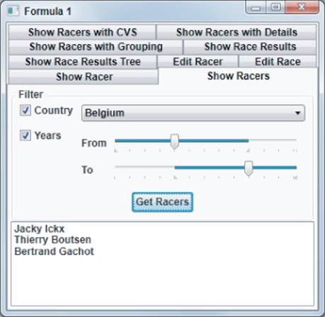
Running the application, racers can now be filtered, as shown in Figure 13.7.
Figure 13.7 Getting a filtered list of racers
Filtering with CollectionViewSource
Instead of filtering and sorting items in the database, WPF itself supports filtering and sorting with the help of the CollectionViewSource class. The disadvantage here is that all the data is needed with the UI layer that should be filtered and sorted. In many scenarios, both are required — filtering by retrieving only a subset of rows from the database, as well as filtering and sorting this subset for the UI.
The next sample is a variation of the previous sample in that all racers are read from the database, and the racers are filtered and sorted on the client side with CollectionViewSource.
The ViewModel class ShowRacersCVSViewModel gets the default ICollectionView for the racers collection inside the constructor. WPF always creates a collection View for a list that is bound, no matter if one is created explicitly. The View that is created automatically can be accessed with theCollectionViewSource.GetDefaultView static method passing in the collection. This method returns an object that implements the ICollectionView interface.
This interface defines properties that can be used for filtering, sorting, and grouping. The Filter property is of the delegate type Predicate<Object>.
The following sample code applies a lambda expression to filter the racers based on the value of the SelectedCountry property. The SortDescription property is of type SortDescriptionCollection, where multiple SortDescription items can be added that will be used for sorting. If, with the first SortDescription, the items are equal, the second SortDescription applies. The sample sorts the racers based on the number of wins. If the number of wins is the same, the sort happens based on the last name.
using System;
using System.Collections.Generic;
using System.ComponentModel;
using System.Linq;
using System.Windows.Data;
using Formula1.Model;
namespace Formula1.ViewModels
{
public class ShowRacersCVSViewModel : ViewModelBase, IDisposable
{
private Formula1Entities data;
private List<Racer> racers;
public ShowRacersCVSViewModel()
{
if (!IsDesignTime)
{
data = new Formula1Entities();
racers = data.Racers.ToList();
ICollectionView cv =
CollectionViewSource.GetDefaultView(racers);
cv.Filter = r => (r as Racer).Nationality == SelectedCountry;
cv.SortDescriptions.Add(new SortDescription("Wins",
ListSortDirection.Descending));
cv.SortDescriptions.Add(new SortDescription("LastName",
ListSortDirection.Ascending));
}
}
//...
Code file [ViewModels/ShowRacersCVSViewModel.cs] available for download at Wrox.com .
The SelectedCountry property just needs a change to refresh the View when the property value changes, as shown here:
private string selectedCountry;
public string SelectedCountry {
get
{
return selectedCountry;
}
set
{
selectedCountry = value;
CollectionViewSource.GetDefaultView(racers).Refresh();
}
}
Code file [ViewModels/ShowRacersCVSViewModel.cs] available for download at Wrox.com .
With this ViewModel class in place, from the UI, just bindings for the Countries and Racers properties are needed, and everything is in place.
<ComboBox ItemsSource="{Binding Countries}"
SelectedItem="{Binding SelectedCountry, Mode=OneWayToSource}"
Grid.Row="0" Margin="5" />
<ListBox ItemsSource="{Binding Racers}" Grid.Row="1" />
Code file [Views/ShowRacersCVSView.xaml] available for download at Wrox.com .
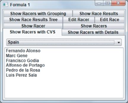
Running the application, you can see a screen similar to what is shown in Figure 13.8.
Figure 13.8 Racers sorted by the number of wins
Displaying Item Details of Lists
Displaying detail information of a selected item inside a list can be done easily with the help of a little magic. All that's needed here is the control displaying the list, controls displaying single-item content to access the same data context, and the list control setting the IsSynchronizedWithCurrentItemproperty to True.
The sample uses a ViewModel class with the same functionality as before, just a different View. The outer Grid control shown in the following code snippet has the DataContext set to the Racers property. Children within this Grid control are a ListBox and several TextBlock elements. Because they are all in the same grid, the same data context is used.
<Grid Grid.Column="0" Grid.Row="1" DataContext="{Binding Racers}">
<Grid.ColumnDefinitions>
<ColumnDefinition />
<ColumnDefinition />
</Grid.ColumnDefinitions>
<ListBox ItemsSource="{Binding}" Grid.Row="0" Grid.Column="0"
IsSynchronizedWithCurrentItem="True" />
<GridSplitter Grid.Column="1" Grid.Row="0"
HorizontalAlignment="Left" Width="4" />
<Grid Grid.Column="1">
<Grid.ColumnDefinitions>
<ColumnDefinition Width="Auto" />
<ColumnDefinition Width="*" />
</Grid.ColumnDefinitions>
<Grid.RowDefinitions>
<RowDefinition />
<RowDefinition />
<RowDefinition />
<RowDefinition />
<RowDefinition />
</Grid.RowDefinitions>
<TextBlock Text="Name" Grid.Row="0" Grid.Column="0" />
<TextBlock Text="{Binding /}" Grid.Row="0" Grid.Column="1" />
<TextBlock Text="Country" Grid.Row="1" Grid.Column="0" />
<TextBlock Text="{Binding Nationality}" Grid.Row="1"
Grid.Column="1" />
<TextBlock Text="Starts" Grid.Row="2" Grid.Column="0" />
<TextBlock Text="{Binding Starts}" Grid.Row="2" Grid.Column="1" />
<TextBlock Text="Wins" Grid.Row="3" Grid.Column="0" />
<TextBlock Text="{Binding Wins}" Grid.Row="3" Grid.Column="1" />
<TextBlock Text="Points" Grid.Row="4" Grid.Column="0" />
<TextBlock Text="{Binding Points}" Grid.Row="4" Grid.Column="1" />
</Grid>
</Grid>
Code file [Views/ShowRacersWithDetailView.xaml] available for download at Wrox.com .
The ListBox control has the ItemsSource property bound to the data context (which is the Racers property because this is the first parent control that has a DataContext assigned), and the IsSynchronizedWithCurrentItem property is set. With IsSynchronizedWithCurrentItem, the selection of the ListBox sets the current item in the data context.
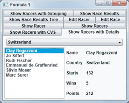
The TextBlock elements bind to properties of a single item: Nationality, Starts, Wins, and Points. The data context is a list of racers. However, because the racer collection doesn't have these properties, there's an automatic fallback. If the property is not available to bind to, WPF tries to bind to a property of the current item, and here this is successful.
The first TextBlock bound displays the name. Using just the markup expression {Binding} to get the result of the ToString method doesn't work because with {Binding} binding to the list is successful. This would just display the type name of the collection class. To get the default result of a single item, binding to / can be used. Accordingly /Nationality and /Starts can be used with the other binding expressions to bind to the properties of the current item.
Running the application gives the result shown in Figure 13.9.
Figure 13.9 Displaying a detailed list of racers
Using Data Templates
The content of the ListBox so far has displayed the value returned from the ToString method of the Racer class. In the case when the ToString method is not overloaded or something different should be displayed, a DataTemplate can be created.
The following code snippet demonstrates using a data template within the ItemTemplate property of the ListBox. This way, every item displays with the elements used within the DataTemplate. Here, the property Text of the TextBlock binds to the default output of the bound item (the racer). It is possible to bind to any property of the Racer type within ListBox items.
<ListBox ItemsSource="{Binding}" Grid.Row="0" Grid.Column="0"
IsSynchronizedWithCurrentItem="True">
<ListBox.ItemTemplate>
<DataTemplate>
<StackPanel Orientation="Vertical">
<TextBlock Text="{Binding}" />
</StackPanel>
</DataTemplate>
</ListBox.ItemTemplate>
</ListBox>
Code file [Views/ShowRacersWithDetailView.xaml] available for download at Wrox.com .
In the case when a data template should be used with more than one control, it's advantageous to define it within resources. By defining data templates within resources, they can be either default ones (for a specific type) or named with a key (in which case, they must be referenced using the key).
This chapter already used default data templates to map the ViewModel class to the View. In the following code, a DataTemplate is defined within the application resources. This template is used as a default template for the ShowRacerViewModel type. The UI representation for this type is the ShowRacerView.
<DataTemplate DataType="{x:Type viewModels:ShowRacerViewModel}">
<views:ShowRacerView />
</DataTemplate>
Code file [App.xaml] available for download at Wrox.com .
If multiple data templates should be used for the same type, a resource key can be specified. This key is then referenced by using a StaticResource or DynamicResource markup extension.
Similar to defining an item template, you can also define a content template for elements that can display single content. Instead of using the ItemTemplate property, these controls have a ContentTemplate property.
Grouping
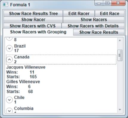
Lists can be grouped based on one or more properties. Grouping can be done with the CollectionViewSource already used for filtering.
The following sample displays all racers grouped by country. The ViewModel class does nothing other than offer a Racers property where all racers are returned. The Racers property is bound by a CollectionViewSource defined within the XAML code. This CollectionViewSource defines that the racers are sorted first by the Nationality property. If this is the same, then it is sorted by Wins, and then by LastName. Grouping is defined by setting the PropertyGroupDescription to Nationality.
<UserControl.Resources>
<CollectionViewSource x:Key="RacersGroup" Source="{Binding Racers}">
<CollectionViewSource.SortDescriptions>
<comp:SortDescription PropertyName="Nationality"
Direction="Ascending" />
<comp:SortDescription PropertyName="Wins"
Direction="Descending" />
<comp:SortDescription PropertyName="LastName"
Direction="Ascending" />
</CollectionViewSource.SortDescriptions>
<CollectionViewSource.GroupDescriptions>
<PropertyGroupDescription PropertyName="Nationality" />
</CollectionViewSource.GroupDescriptions>
</CollectionViewSource>
</UserControl.Resources>
Code file [Views/ShowRacersWithGroupingView.xaml] available for download at Wrox.com .
The following ListBox code binds to the CollectionViewSource. Because grouping is defined with the CollectionViewSource, the GroupStyle of the ListBox becomes active. The GroupStyle element defines a custom template for the GroupItem type returned by grouping. In the template, an Expander control is used. Inside the header of the Expander control, the Name property (which represents the group) and the ItemCount property (which is the number of items in the group) are used for the display. The content of the Expander control is ItemsPresenter, which means that the ItemTemplate is used in that place for every item.
<ListBox ItemsSource="{Binding Source={StaticResource RacersGroup}}"
Grid.Row="1">
<ListBox.GroupStyle>
<GroupStyle>
<GroupStyle.ContainerStyle>
<Style TargetType="GroupItem">
<Setter Property="Template">
<Setter.Value>
<ControlTemplate>
<Expander>
<Expander.Header>
<StackPanel Orientation="Vertical">
<TextBlock Text="{Binding
Name}" />
<TextBlock
Text="{BindingItemCount}" />
</StackPanel>
</Expander.Header>
<Expander.Content>
<ItemsPresenter />
</Expander.Content>
</Expander>
</ControlTemplate>
</Setter.Value>
</Setter>
</Style>
</GroupStyle.ContainerStyle>
</GroupStyle>
</ListBox.GroupStyle>
<ListBox.ItemTemplate>
<DataTemplate>
<Grid>
<Grid.RowDefinitions>
<RowDefinition />
<RowDefinition />
<RowDefinition />
</Grid.RowDefinitions>
<Grid.ColumnDefinitions>
<ColumnDefinition />
<ColumnDefinition />
</Grid.ColumnDefinitions>
<TextBlock Text="{Binding}" Grid.Row="0" Grid.Column="0"
Grid.ColumnSpan="2" />
<TextBlock Text="Wins:" Grid.Row="1" Grid.Column="0" />
<TextBlock Text="{Binding Wins}" Grid.Row="1"
Grid.Column="1" />
<TextBlock Text="Starts: " Grid.Row="2" Grid.Column="0" />
<TextBlock Text="{Binding Starts}" Grid.Row="2"
Grid.Column="1" />
</Grid>
</DataTemplate>
</ListBox.ItemTemplate>
</ListBox>
Code file [Views/ShowRacersWithGroupingView.xaml] available for download at Wrox.com .
Running the application, you can see the racers grouped as shown in Figure 13.10.
Figure 13.10 Racers grouped by country
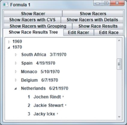
Using Hierarchical Data Binding
You can use a TreeView control to display items in a hierarchical way. For hierarchical binding, use HierarchicalDataTemplate objects instead of DataTemplate objects to display the hierarchy.
The following code displays race results in a hierarchy. The first level is the years of the races. If you select a year, the races display. And, if you select a race, the race results display. For every level of a hierarchy, there's a ViewModel class. The RaceResultHierarchicalViewModel class represents the last level in the hierarchy. This class defines Position and Racer properties to display a race result.
public class RaceResultHierarchicalViewModel : ViewModelBase
{
private int position;
public int Position
{
get { return position; }
set
{
if (!object.Equals(position, value))
{
position = value;
RaisePropertyChanged("Position");
}
}
}
private string racer;
public string Racer
{
get
{
return racer;
}
set
{
if (!object.Equals(racer, value))
{
racer = value;
RaisePropertyChanged("Racer");
}
}
}
}
Code file [ViewModels/RaceResultHierarchicalViewModel.cs] available for download at Wrox.com .
The second level represents a race. The RaceViewModel class defines Date and Country properties. You define the RaceResults property to get to the race results from a race. To not load all race results initially, use the Lazy<T> type. The RaceResults property is of a Lazy<IEnumerable<RaceResultHierarchicalViewModel>>type. Passing a lambda expression to the constructor of the Lazy type, the lambda expression is invoked as soon as the Value property of the Lazy<T> type is accessed, but not with instantiation of the Lazy type. The Value property then returns IEnumerable<RaceResultHierarchicalViewModel>. The query returns all the race results for the date specified with the Date property.
public class RaceViewModel : ViewModelBase
{
private DateTime date;
public DateTime Date
{
get
{
return date;
}
set
{
if (!object.Equals(date, value))
{
date = value;
RaisePropertyChanged("Date");
}
}
}
private string country;
public string Country
{
get
{
return country;
}
set
{
if (!object.Equals(country, value))
{
country = value;
RaisePropertyChanged("Country");
}
}
}
public Lazy<IEnumerable<RaceResultViewModel>> RaceResults
{
get
{
return new Lazy<IEnumerable<RaceResultHierarchicalViewModel>>(() =>
{
List<RaceResultHierarchicalViewModel> results = null;
using (Formula1Entities data = new Formula1Entities())
{
results = (from rr in data.RaceResults
where rr.Race.Date == this.Date
orderby rr.Position
select new RaceResultHierarchicalViewModel
{
Position = rr.Position,
Racer = rr.Racer.FirstName + " " +
rr.Racer.LastName
}).ToList();
}
return results;
});
}
}
}
Code file [ViewModels/RaceViewModel.cs] available for download at Wrox.com .
The first level of the tree is the ChampionshipViewModel that defines Year and Races properties. Similar to the RaceResults property, the Races property uses of the Lazy<T> type for lazy evaluation.
public class ChampionshipViewModel : ViewModelBase
{
private int year;
public int Year
{
get { return year; }
set
{
if (!object.Equals(year, value))
{
year = value;
RaisePropertyChanged("Year");
}
}
}
public Lazy<IEnumerable<RaceViewModel>> Races
{
get
{
return new Lazy<IEnumerable<RaceViewModel>>(() =>
{
List<RaceViewModel> results = null;
using (Formula1Entities data = new Formula1Entities())
{
results = ((from r in data.Races
where r.Date.Year == Year
select new RaceViewModel
{
Country = r.Circuit.Country,
Date = r.Date
}) as ObjectQuery<RaceViewModel>).Execute(
MergeOption.NoTracking).ToList();
}
return results;
});
}
}
}
Code file [ViewModels/ChampionshipViewModel.cs] available for download at Wrox.com .
The ViewModel class that is directly bound to the View is ShowRaceResultsTreeViewModel. This class defines the Years property to return ChampionshipViewModel for every year.
public class ShowRaceResultsTreeViewModel : ViewModelBase
{
public IEnumerable<ChampionshipViewModel> Years
{
get
{
IEnumerable<ChampionshipViewModel> championShips = null;
using (Formula1Entities data = new Formula1Entities())
{
championShips = (from r in data.Races
orderby r.Date.Year
select r.Date.Year).Distinct()
.Select(y => new ChampionshipViewModel
{ Year = y }).ToList();
}
return championShips;
}
}
}
Code file [ViewModels/ShowRaceResultsTreeViewModel.cs] available for download at Wrox.com .
From the UI, a simple TreeView control is bound to the Years property of the ViewModel ShowRaceResultsViewModel class, as shown here:
<TreeView ItemsSource="{Binding Years}">
<TreeView.Resources>
<HierarchicalDataTemplate DataType="{x:Type
vm:ChampionshipViewModel}"
ItemsSource="{Binding Races.Value}">
<TextBlock Text="{Binding Year}" />
</HierarchicalDataTemplate>
<HierarchicalDataTemplate DataType="{x:Type vm:RaceViewModel}"
ItemsSource="{Binding
RaceResults.Value}">
<StackPanel Orientation="Horizontal">
<TextBlock Text="{Binding Country}" Margin="5" />
<TextBlock Text="{Binding Date, StringFormat=d}"
Margin="5" />
</StackPanel>
</HierarchicalDataTemplate>
<DataTemplate DataType="{x:Type vm:RaceResultViewModel}">
<StackPanel Orientation="Horizontal">
<TextBlock Text="{Binding Position}" Margin="5" />
<TextBlock Text="{Binding Racer}" Margin="5" />
</StackPanel>
</DataTemplate>
</TreeView.Resources>
</TreeView>
Code file [Views/ShowRaceResultsTreeView.xaml] available for download at Wrox.com .
The first HierarchicalDataTemplate is used for the ChampionshipViewModel type returned from the Years property. The ItemsSource property of the HiearchicalDataTemplate defines the next level in the tree. This property is bound to Races.Value. Value is a property of the Lazy<T> type to invoke the lambda expression associated with this type. IEnumerable<RaceViewModel> is returned here.
The second HierarchicalDataTemplate is defined for the RaceViewModel type, and displays the country and the date binding to the Country and Date properties. Again, ItemsSource is defined to get an enumeration of RaceResultViewModel returned from RaceResults.Value. Finally, a DataTemplate is defined for theRaceResultHierarchicalViewModel type to display position and racer information.
Running the application, you can see the tree, as shown in Figure 13.11.
Figure 13.11 Hierarchical tree of racers
Binding Long Lists
Instead of binding long lists to a UI element, it's better to not return all records to the client. Rather, you should do filtering on the database side and just return a subset to the client. If this is not possible, filtering can be done with WPF with the CollectionViewSource as shown earlier. If there's still a specific reason to display a complete large list within a UI element, some performance can be tweaked.
The following sample code returns in the UI a list of all race results since the 1950s . A ListBox is used to display a long list of all race results. These are several thousand records to display and to scroll through. The implementation of the ViewModel class ShowRaceResultsViewModel returns a list of all race results, along with the information about the race, and the circuit linked to the information about the racer. All this information can be used from the UI with data binding.
using System;
using System.Collections.Generic;
using System.Data.Objects;
using System.Linq;
using Formula1.Model;
namespace Formula1.ViewModels
{
public class ShowRaceResultsViewModel : ViewModelBase
{
private List<RaceResult> raceResults;
public IEnumerable<RaceResult> RaceResults
{
get
{
if (raceResults == null)
{
using (Formula1Entities data = new Formula1Entities())
{
raceResults = data.RaceResults.Include("Race.Circuit")
.Include("Racer").Execute
(MergeOption.NoTracking).ToList();
}
}
return raceResults;
}
}
}
}
Code file [ViewModels/ShowRaceResultsViewModel.cs] available for download at Wrox.com .
With the UI, the ListBox control uses a DataTemplate to display information about race results. The issue for WPF performance is that for every item in the list, a data template must be created. Such templates can be fancy using cool WPF features that all consume resources such as memory and CPU and, in a long list, take up some time.
<ListBox Grid.Row="1">
<ListBox.ItemTemplate>
<DataTemplate>
<DockPanel>
<TextBlock DockPanel.Dock="Top"
Text="{Binding Race.Date, StringFormat='d'}"
HorizontalAlignment="Center" />
<TextBlock DockPanel.Dock="Left"
Text="{Binding Race.Circuit.Country}" Margin="5" />
<TextBlock DockPanel.Dock="Right" Text="{Binding Racer}"
Margin="5" />
<TextBlock DockPanel.Dock="Right" Text="{Binding
Position}"
Margin="5" />
</DockPanel>
</DataTemplate>
</ListBox.ItemTemplate>
</ListBox>
Code file [Views/ShowRaceResultsView.xaml] available for download at Wrox.com .
Luckily, by default, the ListBox makes use of the VirtualizingStackPanel. Virtualization is done in a way that only data templates shown in the ListBox (and a few more around the viewable area) are instantiated, but not all. With the setup of the UI as it is done next, you can see the effect of the virtualization, and you also see what more can be done.
In the following code snippet, the ListBox sets the attached VirtualizingStackPanel.IsVirtualizing property to a value selected by the isVirtualizing check box. The default setting is that this check box is checked because it is the default with the virtualization mode. If you deselect this check box, you can see that the list box behaves a lot slower, and much more memory is allocated by the application because every data template for every item in the complete list is instantiated.
<Grid>
<Grid.RowDefinitions>
<RowDefinition Height="Auto" />
<RowDefinition Height="*" />
</Grid.RowDefinitions>
<Grid Grid.Row="0">
<Grid.RowDefinitions>
<RowDefinition />
<RowDefinition />
<RowDefinition />
</Grid.RowDefinitions>
<CheckBox IsChecked="True" x:Name="isVirtualizing"
Content="IsVirtualizing"
Margin="5" Grid.Row="0" />
<ComboBox IsEnabled="{Binding ElementName=isVirtualizing,
Path=IsChecked}"
SelectedIndex="0" x:Name="virtualizationMode"
Grid.Row="1" Margin="5">
<ComboBoxItem>Standard</ComboBoxItem>
<ComboBoxItem>Recycling</ComboBoxItem>
</ComboBox>
<CheckBox x:Name="isDeferredScrolling" Content="IsDeferredScrolling"
Grid.Row="2" Margin="5" />
</Grid>
<ListBox VirtualizingStackPanel.IsVirtualizing=
"{Binding Path=IsChecked, ElementName=isVirtualizing}"
VirtualizingStackPanel.VirtualizationMode=
"{Binding ElementName=virtualizationMode, Path=SelectedValue}"
ItemsSource="{Binding RaceResults, IsAsync=True}"
ScrollViewer.IsDeferredScrollingEnabled=
"{Binding Path=IsChecked, ElementName=isDeferredScrolling}"
Grid.Row="1">
<ListBox.ItemTemplate>
<!-- -->
</ListBox.ItemTemplate>
</ListBox>
</Grid>
Code file [Views/ShowRaceResultsView.xaml] available for download at Wrox.com .
Another option that can be set is VirtualizingStackPanel.VirtualizationMode. There are two possible values of the enumeration VirtualizationMode: Standard and Recycling. The default setting is Standard.
With the standard mode, as the user scrolls through the list, new data template objects are dynamically created, and the garbage collector (GC) can release the memory of the other ones not shown anymore. This is a lot of work for the runtime to allocate and release memory. Because the GC doesn't immediately release the memory, you can see that the memory consumption of the application increases as soon as the user scrolls through the list. After some time, when the GC runs, memory consumption reduces again.
A better-performing option is the recycling mode. Here, data template objects that are not needed anymore go into a pool and are reused from the pool as needed.
From the performance standpoint, there's even a better option that can be set: the ScrollViewer.IsDeferredScrollingEnabled attached property. Setting this option to true, when scrolling, just the scroll bar moves, but the items in the list box don't. The data templates do not need to be created until the user completes the scrolling. From the performance standpoint, this is the best option, but not from the user experience — that's why it might not be feasible in most cases.
Running the application, you can see a View, as shown in Figure 13.12. To experience the differences with setting the various options, you need to run it. With the simple data template, you can experience big differences with the various settings. By having a more complex data template, the differences increase.
Figure 13.12 Displaying a list of racers with a scroll bar
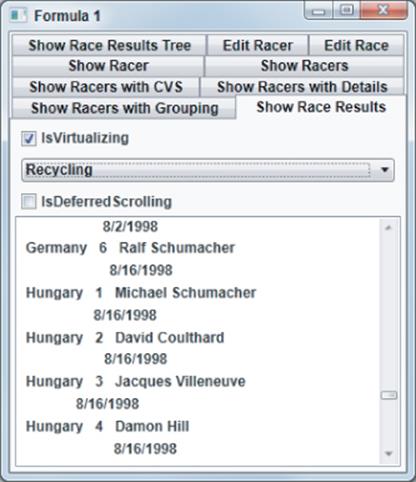
Editing Data
The next samples step you through not only retrieving data for display, but also changing data to save changed information to the database. Here, you learn about editing single records, adding validation to changes, and, finally, using a DataGrid control to make more changes at once.
Updating Data
The following sample demonstrates how to edit and save a single item. For editing that allows cancellation, the IEditableObject interface can be implemented as is shown in the ViewModel class EditRacerViewModel. This interface defines the methods BeginEdit, CancelEdit, and EndEdit. The ViewModel class defines four commands: one to get a racer from the database (GetRacerCommand), and three commands that directly interact with the methods of the IEditableObject interface.
using System.ComponentModel;
using System.Data;
using System.Linq;
using Formula1.Infrastructure;
using Formula1.Model;
namespace Formula1.ViewModels
{
public class EditRacerViewModel : ViewModelBase, IEditableObject
{
private DelegateCommand getRacerCommand;
public DelegateCommand GetRacerCommand
{
get
{
return getRacerCommand ??
(getRacerCommand = new DelegateCommand(param =>
this.GetRacer()));
}
}
private void GetRacer()
{
using (Formula1Entities data = new Formula1Entities())
{
var racer = (from r in data.Racers
where r.Id == this.Id
select r).Single();
RacerToVM(racer);
}
}
private void UpdateRacer()
{
using (Formula1Entities data = new Formula1Entities())
{
Racer r = data.GetObjectByKey(this.key) as Racer;
Racer current = VMToRacer();
data.Racers.ApplyCurrentValues(current);
data.SaveChanges();
}
}
private EntityKey key;
private int id;
public int Id
{
get { return id; }
set
{
if (!object.Equals(id, value))
{
id = value;
RaisePropertyChanged("Id");
}
}
}
private string firstName;
public string FirstName
{
get { return firstName; }
set
{
if (!object.Equals(firstName, value))
{
firstName = value;
RaisePropertyChanged("FirstName");
}
}
}
private string lastName;
public string LastName
{
get { return lastName; }
set
{
if (!object.Equals(lastName, value))
{
lastName = value;
RaisePropertyChanged("LastName");
}
}
}
private string nationality;
public string Nationality
{
get { return nationality; }
set
{
if (!object.Equals(nationality, value))
{
nationality = value;
RaisePropertyChanged("Nationality");
}
}
}
private int? starts;
public int? Starts
{
get { return starts; }
set
{
if (!object.Equals(starts, value))
{
starts = value;
RaisePropertyChanged("Starts");
}
}
}
private int? wins;
public int? Wins
{
get { return wins; }
set
{
if (!object.Equals(wins, value))
{
wins = value;
RaisePropertyChanged("Wins");
}
}
}
private int? points;
public int? Points
{
get { return points; }
set
{
if (!object.Equals(points, value))
{
points = value;
RaisePropertyChanged("Points");
}
}
}
private void RacerToVM(Racer r)
{
this.key = r.EntityKey;
this.Id = r.Id;
this.FirstName = r.FirstName;
this.LastName = r.LastName;
this.Nationality = r.Nationality;
this.Starts = r.Starts;
this.Wins = r.Wins;
this.Points = r.Points;
}
private Racer VMToRacer()
{
var current = Racer.CreateRacer(this.Id, this.FirstName,
this.LastName);
current.Nationality = this.Nationality;
current.Starts = this.Starts;
current.Wins = this.Wins;
current.Points = this.Points;
return current;
}
private DelegateCommand editCommand;
public DelegateCommand EditCommand
{
get
{
return editCommand ??
(editCommand = new DelegateCommand(
param => this.BeginEdit()));
}
}
private DelegateCommand cancelCommand;
public DelegateCommand CancelCommand
{
get
{
return cancelCommand ??
(cancelCommand = new DelegateCommand(param =>
this.CancelEdit()));
}
}
private DelegateCommand saveCommand;
public DelegateCommand SaveCommand
{
get
{
return saveCommand ??
(saveCommand = new DelegateCommand(
param => this.EndEdit()));
}
}
public void BeginEdit()
{
IsEditMode = true;
}
public void CancelEdit()
{
GetRacer();
IsEditMode = false;
}
public void EndEdit()
{
UpdateRacer();
IsEditMode = false;
}
private bool isEditMode;
public bool IsEditMode
{
get { return isEditMode; }
private set
{
if (!object.Equals(isEditMode, value))
{
isEditMode = value;
RaisePropertyChanged("IsEditMode");
}
}
}
}
}
Code file [ViewModels/EditRacerViewModel.cs] available for download at Wrox.com .
When the GetRacerCommand occurs, a racer is retrieved from the database, and properties of the ViewModel class are filled with the values of the Racer properties. The ViewModel class keeps a copy of these values to allow for direct data binding, and to keep it completely independent of the underlying data source.
The following three commands are related to the IEditableObject interface:
· EditCommand — On activation of the EditCommand, the ViewModel changes into edit mode by setting the IsEditMode to true property. This property can be used to change the UI to allow the user to edit values.
· CancelCommand — With CancelCommand, all values of the ViewModel properties are discarded, and the original values from the database are retrieved once more.
· SaveCommand — With the SaveCommand, properties of the ViewModel class are taken to store the information in the database.
With the UI, TextBox elements are used to allow the user to edit the data. With the TextBox elements, the IsEnabled property binds to the IsEditMode property to enable or disable interaction with the TextBox, depending on the mode. The Text property binds to the corresponding properties of the ViewModel class.
<Grid Grid.Row="1">
<Grid.RowDefinitions>
<RowDefinition />
<RowDefinition />
<RowDefinition />
<RowDefinition />
<RowDefinition />
<RowDefinition />
</Grid.RowDefinitions>
<Grid.ColumnDefinitions>
<ColumnDefinition Width="Auto" />
<ColumnDefinition Width="*" />
</Grid.ColumnDefinitions>
<TextBlock Grid.Row="0" Grid.Column="0" Text="FirstName" />
<TextBox IsEnabled="{Binding IsEditMode}"
Text="{Binding FirstName}"
Grid.Row="0" Grid.Column="1" />
<TextBlock Grid.Row="1" Grid.Column="0" Text="LastName" />
<TextBox IsEnabled="{Binding IsEditMode}" Text="{Binding LastName}"
Grid.Row="1" Grid.Column="1" />
<TextBlock Grid.Row="2" Grid.Column="0" Text="Nationality" />
<TextBox IsEnabled="{Binding IsEditMode}"
Text="{Binding Nationality}"
Grid.Row="2" Grid.Column="1" />
<TextBlock Grid.Row="3" Grid.Column="0" Text="Starts" />
<TextBox IsEnabled="{Binding IsEditMode}" Text="{Binding Starts}"
Grid.Row="3" Grid.Column="1" />
<TextBlock Grid.Row="4" Grid.Column="0" Text="Wins" />
<TextBox IsEnabled="{Binding IsEditMode}" Text="{Binding Wins}"
Grid.Row="4" Grid.Column="1" />
<TextBlock Grid.Row="5" Grid.Column="0" Text="Points" />
<TextBox IsEnabled="{Binding IsEditMode}" Text="{Binding Points}"
Grid.Row="5" Grid.Column="1" />
</Grid>
Code file [Views/EditRacerView.xaml] available for download at Wrox.com .
The UI part that interacts with the commands is shown next. A TextBox is used to retrieve a racer with a specified identifier, and Button controls are defined to fire the commands available with the ViewModel class.
<Grid Grid.Row="0">
<Grid.RowDefinitions>
<RowDefinition />
<RowDefinition />
</Grid.RowDefinitions>
<StackPanel Grid.Row="0" Orientation="Horizontal"
HorizontalAlignment="Center" >
<TextBlock Text="Id" />
<TextBox Text="{Binding Id}" Width="80" />
<Button Content="Get Racer" Command="{Binding GetRacerCommand}" />
</StackPanel>
<StackPanel Grid.Row="1" Orientation="Horizontal"
HorizontalAlignment="Center">
<Button Content="Edit" Command="{Binding EditCommand}" />
<Button Content="Cancel" Command="{Binding CancelCommand}" />
<Button Content="Save" Command="{Binding SaveCommand}" />
</StackPanel>
</Grid>
Code file [Views/EditRacerView.xaml] available for download at Wrox.com .
Figure 13.13 shows the UI of the dialog running in edit mode.
Figure 13.13 UI dialog running in edit mode
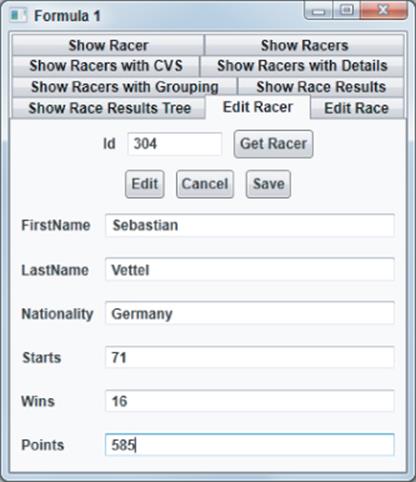
What's not done yet is to check for false input by the user. Validation is added in the next section.
Validation
By default, if the user enters some data that is not accepted by the ViewModel, the properties of the ViewModel do not reflect the changes, and the user is not informed about the missing changes. Exceptions that occur from setting properties are, by default, just silently ignored. A red rectangle displays only if (before the properties are set in the code-behind) conversion fails from a string of the user input to the type of the property.
Supplying information to the user on failing validations can be easily resolved. WPF data binding includes validation rules that define what checking should occur. Validation rules derive from the base class ValidationRule.
The .NET Framework defines two concrete implementations:
· ExceptionValidationRule — This deals with exceptions from the ViewModel class.
· DataErrorValidationRule — With this implementation, it is necessary to implement the IDataErrorInfo interface.
The Binding class defines the ValidatesOnExceptions and ValidatesOnDataErrors Boolean properties that turn on these validation rules. Instead of using these simple properties, you can also define the validation rules using a longer binding term that is also needed with custom validation rules, as shown with the following code snippet:
<TextBox IsEnabled="{Binding IsEditMode}" Grid.Row="3" Grid.Column="1">
<TextBox.Text>
<Binding Path="Starts">
<Binding.ValidationRules>
<DataErrorValidationRule />
</Binding.ValidationRules>
</Binding>
</TextBox.Text>
</TextBox>
The EditRacerViewModel ViewModel class is now changed to implement the IDataErrorInfo interface. This interface exposes the Error property and an indexer where a string is passed as an argument. Only this indexer must be implemented. With the indexer, the parameter receives a property name that should be validated. On error, a string containing the error message must be returned. If the validation is successful, null must be returned.
string IDataErrorInfo.Error
{
get { throw new System.NotImplementedException(); }
}
string IDataErrorInfo.this[string columnName]
{
get
{
string message = null;
switch (columnName)
{
case "Wins":
case "Starts":
if (Wins > Starts)
message = "Wins must be smaller or equal to Starts";
break;
default:
break;
}
return message;
}
}
Code file [ViewModels/EditRacerViewModel.cs] available for download at Wrox.com .
Running the application now and using the validation rule with every TextBox should be validated; nonvalid values are shown to the user with red rectangles surrounding the TextBox. Now take a look at how the UI can be changed for the error messages.
Displaying Errors
To display the error message that is returned via the IDataErrorInfo interface, you must create a custom style for the TextBox that contains a trigger. The trigger is active if the Validation.HasError attached property is true. With this trigger, the ToolTip property of the TextBox is set.
Now, binding is needed to access the value from the error message. To access the TextBox instance from the style, relative binding is used. RelativeSource={x:Static RelativeSource.Self} returns the TextBox instance where the style is applied. All the error messages can be read from the Validation.Errorsattached property. This property returns a collection of active ValidationError objects. With ValidationError, the error message can be accessed with the ErrorContent property. (Validation.Errors)[0].ErrorContent returns the first error message.
<Style TargetType="TextBox">
<Setter Property="Margin" Value="5" />
<Setter Property="VerticalAlignment" Value="Center" />
<Setter Property="Validation.ErrorTemplate"
Value="{StaticResource validationTemplate}" />
<Style.Triggers>
<Trigger Property="Validation.HasError" Value="True">
<Setter Property="ToolTip" Value="{Binding RelativeSource=
{x:Static RelativeSource.Self},
Path=(Validation.Errors)[0].ErrorContent}" />
<Setter Property="Background" Value="Red" />
</Trigger>
</Style.Triggers>
</Style>
Code file [Views/EditRacerView.xaml] available for download at Wrox.com .
To display a different error view than the red rectangle around the failing TextBox, you can define a ControlTemplate referenced from the TextBox style previously shown. The style changes the Validation.ErrorTemplate attached property to the template shown next. Instead of displaying a red rectangle, a big red ! is shown.
<ControlTemplate x:Key="validationTemplate">
<DockPanel>
<TextBlock Foreground="Red" FontSize="32" FontWeight="Bold"
Text="!" DockPanel.Dock="Left" />
<AdornedElementPlaceholder DockPanel.Dock="Right" />
</DockPanel>
</ControlTemplate>
Code file [Views/EditRacerView.xaml] available for download at Wrox.com .
Running the application, you can see the error display, as shown in Figure 13.14.
Figure 13.14 Displaying an error for inaccurate user input
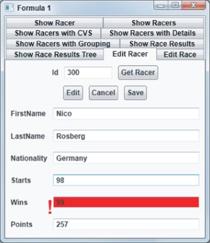
Editing with a Grid
You use the DataGrid control when more than one record should be changed at a time. The last sample of this chapter demonstrates the use of the DataGrid control to add race results to the database.
The sample enables you to edit a race or to add a race. When adding a race, some records are pre-created and bound to the data grid to enable easy editing by the user. When the user has filled in the fields, the Save button can be clicked to store all the records.
The dialog contains buttons to add a race and to edit a race. These buttons are bound to AddRaceCommand and EditRaceCommand, as shown here:
<StackPanel Orientation="Horizontal" Grid.Row="0">
<Button Content="Add a Race" Command="{Binding AddRaceCommand}"
Margin="5" Padding="3" />
<Button Content="Edit a Race" Command="{Binding EditRaceCommand}"
Margin="5" Padding="3" />
</StackPanel>
Code file [Views/EditRaceView.xaml] available for download at Wrox.com .
The commands are defined with the ViewModel class EditRaceViewModel. When AddRaceCommand is fired, the AddRace method is invoked. This method changes the AddRaceVisibility property to Visibility.Visible. The default value assigned in the constructor is Visibility.Collapsed. Also, the RaceDate property is set to today to have a default value for the user to create race data.
Circuits is a property used by the View to retrieve a collection of Circuit objects defined by the EF designer. The Circuit type contains Id, Name, and Country properties.
public class EditRaceViewModel : ViewModelBase, IDisposable
{
private Formula1Entities data;
public EditRaceViewModel()
{
AddRaceVisibility = Visibility.Collapsed;
EditRaceVisibility = Visibility.Collapsed;
RaceResultVisibility = Visibility.Collapsed;
AddRacerVisibility = Visibility.Collapsed;
if (!IsDesignTime)
{
data = new Formula1Entities();
}
}
private DelegateCommand addRaceCommand;
public DelegateCommand AddRaceCommand
{
get
{
return addRaceCommand ??
(addRaceCommand = new DelegateCommand(
param => this.AddRace()));
}
}
public void AddRace()
{
RaceDate = DateTime.Today;
AddRaceVisibility = Visibility.Visible;
}
private Visibility addRaceVisibility;
public Visibility AddRaceVisibility
{
get
{
return addRaceVisibility;
}
set
{
addRaceVisibility = value;
RaisePropertyChanged("AddRaceVisibility");
}
}
private List<Circuit> circuits;
public IEnumerable<Circuit> Circuits
{
get
{
if (!IsDesignTime)
{
return circuits ??
(circuits = new List<Circuit>(
from c in data.Circuits
orderby c.Country
select c));
}
else
return null;
}
}
//...
Code file [ViewModels/EditRaceViewModel.cs] available for download at Wrox.com .
The XAML code for the grid that has the Visibility bound property to the AddRaceVisibility property is shown in the next code snippet. The grid contains a DatePicker, where the SelectedDate property is bound to the RaceDate that is on display of the grid initialized to the current date. The user can change the date, and because of two-way binding, the information is written to the ViewModel class. A ComboBox is bound to the Circuits property. A data template defines TextBlock elements bound to the Country and Name properties available with the Circuit type.
<Grid Visibility="{Binding AddRaceVisibility}" Grid.Row="1">
<Grid.RowDefinitions>
<RowDefinition Height="Auto" />
<RowDefinition Height="Auto" />
<RowDefinition Height="Auto" />
</Grid.RowDefinitions>
<DatePicker Grid.Row="0" Margin="5" SelectedDate="{Binding
RaceDate}" />
<ComboBox Grid.Row="1" Margin="5" ItemsSource="{Binding Circuits}"
IsSynchronizedWithCurrentItem="True">
<ComboBox.ItemTemplate>
<DataTemplate>
<StackPanel Orientation="Horizontal">
<TextBlock Text="{Binding Country}" Margin="5" />
<TextBlock Text="{Binding Name}" Margin="5" />
</StackPanel>
</DataTemplate>
</ComboBox.ItemTemplate>
</ComboBox>
<StackPanel Orientation="Horizontal" Grid.Row="2">
<Button Content="Create" Command="{Binding CreateRaceCommand}"
Margin="5" Padding="3" />
<Button Content="Cancel" Command="{Binding CancelCommand}"
Margin="5" Padding="3" />
<Button Content="Save" Command="{Binding SaveCommand}"
Margin="5" Padding="3" />
</StackPanel>
</Grid>
Code file [Views/EditRaceView.xaml] available for download at Wrox.com .
Starting the application and clicking the “Add a Race” button displays a dialog similar to Figure 13.15, where the user can define a date and select a circuit with the combo box.
Figure 13.15 Dialog for user to define a date and select a circuit
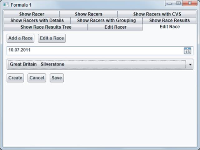
Clicking the Create button invokes the CreateRace method with the help of the CreateRaceCommand command. This method fills some properties used by the DataGrid control for editing races. The Racers property is filled with racers who have results within the last ten years, and the Teams property is filled with all teams. The DataGrid control contains rows for each race result. The race results shown within a row of the grid are defined by the RaceResultViewModel type. Some values (such as position and points) are pre-filled in a loop. The RaceResultViewModel type is a simple ViewModel type designed in a similar way as the other ones to bind properties to the View.
public void CreateRace()
{
RaceResultVisibility = Visibility.Visible;
// racers from the last ten years
Racers = (from r in data.Racers
from rr in r.RaceResults
where rr.Race.Date.Year >= (RaceDate.Year - 10)
select r).Distinct().OrderBy(r => r.FirstName).
ThenBy(r => r.LastName).ToList();
Teams = (from t in data.Teams
select t).OrderBy(t => t.Name).ToList();
Circuit selectedCircuit =
CollectionViewSource.GetDefaultView(Circuits).
CurrentItem as Circuit;
theRace = Race.CreateRace(0, selectedCircuit.Id, RaceDate);
int resultId = -1;
int[] points = { 25, 18, 15, 12, 10, 8, 6, 4, 2, 1 };
for (int i = 0; i < 10; i++)
{
var raceResult = new RaceResultViewModel(this)
{
Id = resultId,
RaceId = theRace.Id,
Position = i + 1,
Points = points[i],
Racers = this.Racers,
Teams = this.Teams
};
raceResults.Add(raceResult);
resultId--;
}
}
Code file [ViewModels/EditRaceViewModel.cs] available for download at Wrox.com .
The RaceResultViewModel type that is returned from the CreateRace method is used to map to race result values, and, thus, defines properties for a race result such as RaceDate, Position… The View supports not adding existing racers just by adding a string for the name, or selecting existing racers. This behavior is represented with the SelectedRacer and NewRacer properties.
using System;
using System.Collections.Generic;
using System.Windows;
using Formula1.Infrastructure;
using Formula1.Model;
namespace Formula1.ViewModels
{
public class RaceResultViewModel : ViewModelBase
{
private IEditRace editRace;
public RaceResultViewModel(IEditRace editRace)
{
this.editRace = editRace;
this.editRace.AddRacerVisibility = Visibility.Collapsed;
}
private DelegateCommand addRacerCommand;
public DelegateCommand AddRacerCommand
{
get
{
return addRacerCommand ??
(addRacerCommand = new DelegateCommand(param =>
this.AddRacer()));
}
}
public void AddRacer()
{
this.editRace.AddRacerVisibility = Visibility.Visible;
}
private DateTime raceDate;
public DateTime RaceDate
{
get { return raceDate; }
set
{
raceDate = value;
RaisePropertyChanged("RaceDate");
}
}
private int position;
public int Position
{
get { return position; }
set
{
position = value;
RaisePropertyChanged("Position");
}
}
private int grid;
public int Grid
{
get { return grid; }
set
{
grid = value;
RaisePropertyChanged("Grid");
}
}
private int points;
public int Points
{
get { return points; }
set
{
points = value;
RaisePropertyChanged("Points");
}
}
private IEnumerable<Racer> racers;
public IEnumerable<Racer> Racers
{
get { return racers; }
internal set { racers = value; }
}
private string newRacer;
public string NewRacer
{
get { return newRacer; }
set
{
if (!object.Equals(newRacer, value))
{
newRacer = value;
RaisePropertyChanged("NewRacer");
}
}
}
private IEnumerable<Team> teams;
public IEnumerable<Team> Teams
{
get { return teams; }
internal set { teams = value; }
}
private string newTeam;
public string NewTeam
{
get { return newTeam; }
set
{
if (!object.Equals(newTeam, value))
{
newTeam = value;
RaisePropertyChanged("NewTeam");
}
}
}
public int Id { get; set; }
public int RaceId { get; set; }
private Racer selectedRacer;
public Racer SelectedRacer
{
get { return selectedRacer; }
set
{
if (!object.Equals(selectedRacer, value))
{
selectedRacer = value;
RaisePropertyChanged("Racer");
}
}
}
private Team selectedTeam;
public Team SelectedTeam
{
get { return selectedTeam; }
set
{
if (!object.Equals(selectedTeam, value))
{
selectedTeam = value;
RaisePropertyChanged("SelectedTeam");
}
}
}
}
}
Code file [ViewModels/RaceResultViewModel.cs] available for download at Wrox.com .
The most important part of this section, of course, is the DataGrid control. The data grid contains UI elements for editing race results. This grid is shown only when the RaceResultVisibility property is set to Visible because of an outer grid control setting. The parent DataContext used by the DataGrid control is set to the RaceResults property of the ViewModel. RaceResults returns a collection of RaceResultViewModel. The data grid can now bind to properties of this type.
A simple configuration of the DataGrid control would be to set the property AutoGenerateColumns to true. This way, the data grid has default UI elements for every property of the bound item and displays the name of the property within the header.
In this scenario, this feature cannot be used. The DataGrid can also use types that derive from the base class DataGridColumn for displaying items. Examples are DataGridTextColumn, DataGridCheckBoxColumn, and DataGridHyperlinkColumn to display text, a check box, and a hyperlink, respectively.
DataGridComboBoxColumn displays enumeration data where the user can select from a list. The following sample code makes use of several DataGridTextColumn elements that bind to the Position, Grid, and Points properties.

<Grid Grid.Row="1" Visibility="{Binding RaceResultVisibility}">
<Grid.RowDefinitions>
<RowDefinition Height="Auto" />
<RowDefinition Height="Auto" />
</Grid.RowDefinitions>
<Grid DataContext="{Binding RaceResults}" Grid.Row="0">
<DataGrid x:Name="raceGrid" ItemsSource="{Binding}"
AutoGenerateColumns="False" SelectionMode="Single"
SelectionUnit="FullRow">
<DataGrid.Columns>
<DataGridTextColumn Width="Auto" Header="Pos"
Binding="{Binding Position}" />
<DataGridTemplateColumn Width="*" Header="Racer"
MinWidth="210">
<DataGridTemplateColumn.CellTemplate>
<DataTemplate>
<StackPanel Orientation="Horizontal">
<ComboBox MinWidth="190"
ItemsSource="{Binding Racers}"
TextSearch.TextPath="Name"
SelectedItem=
"{Binding SelectedRacer,
Mode=OneWayToSource,
UpdateSourceTrigger=LostFocus}"
IsEditable="True"
Text="{Binding NewRacer,
Mode=OneWayToSource,
UpdateSourceTrigger=LostFocus}"
/>
<Button Content="+"
Command="{Binding
AddRacerCommand}" />
</StackPanel>
</DataTemplate>
</DataGridTemplateColumn.CellTemplate>
</DataGridTemplateColumn>
<DataGridTemplateColumn Width="*" Header="Team"
MinWidth="120">
<DataGridTemplateColumn.CellTemplate>
<DataTemplate>
<ComboBox ItemsSource="{Binding Teams}"
TextSearch.TextPath="Name"
SelectedItem=
"{Binding SelectedTeam,
Mode=OneWayToSource,
UpdateSourceTrigger=LostFocus}"
IsEditable="True"
Text="{Binding NewTeam,
Mode=OneWayToSource,
UpdateSourceTrigger=LostFocus}" />
</DataTemplate>
</DataGridTemplateColumn.CellTemplate>
</DataGridTemplateColumn>
<DataGridTextColumn Width="Auto" Header="Grid"
Binding="{Binding Grid}" />
<DataGridTextColumn Width="Auto" Header="Pts"
Binding="{Binding Points}" />
</DataGrid.Columns>
</DataGrid>
</Grid>
Code file [Views/EditRaceView.xaml] available for download at Wrox.com .
For more flexibility, the DataGridTemplateColumn can be used. With this type, a template can be defined to use any WPF UI element for displaying the column. The data grid can be used in a read and an edit mode. For these differentiation settings, CellTemplate and CellEditingTemplate can be defined to have a different View, depending on the mode. With this code, the data grid is always used for editing, and, thus, only the CellTemplate is defined.
The cell template to display and enter the racer for a race result makes use of a ComboBox control bound to the Racers property. The SelectedItem property gives information to the ViewModel about the racer the user selected by binding it to the Racer property.
The ComboBox has an option to either select an existing item, or write a new item. Behind the scenes, the ComboBox makes use of a TextBox control for this option. This feature of the ComboBox can be enabled by setting the IsEditable property to true. Then, to retrieve the value that is added from the user, theText property is bound to the NewRacer property.
The Text property is always set by the ComboBox, no matter if one element of the bound items is selected, or new text is added. This can be differentiated by checking the SelectedItem property. The SelectedItem property is null in case new text is added.
In the sample, the bindings of both the SelectedItem and Text property are configured with the mode OneWayToSource, and the UpdateSourceTrigger is set to LostFocus. OneWayToSource is configured because this binding should only be done from the UI control (the ComboBox) to the bound source (the SelectedRacer andNewRacer properties). The UpdateSource trigger is set because if the ComboBox is used within the template of the DataGrid, the trigger to change the source by default is only done explicitly from program code. Changing the value to LostFocus fires the change of the source on lost focus of the ComboBox control.
With this configuration of the ComboBox, the user can either select an existing racer, or add a new one. Another option for adding a new racer is the additional button that displays in the same column to create a new racer. With the AddRacerCommand command, a new dialog displays.
Running the application, it's now possible to add race results, as shown in Figure 13.16.
Figure 13.16 Adding race results
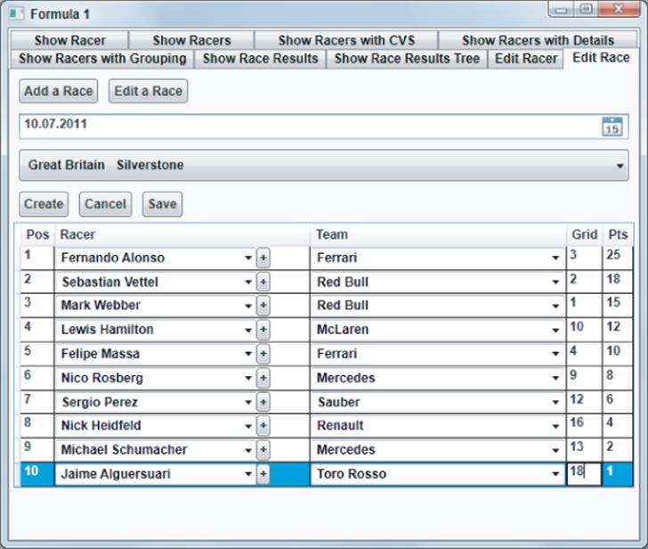
Summary
In this chapter, you've learned about rich WPF data-binding features, starting with binding to simple properties, up to using data grids to edit data. You've learned how to bind lists in various ways with grouping, displaying hierarchical lists, and dealing with large lists in an efficient way. You've also learned about some features for editing data, including validation, and how to customize the UI for this.
About the Author
Christian Nagel has worked with Microsoft .NET and created distributed applications with this technology since the first Beta in 2000. He is author of several .NET books, Microsoft Regional Director, MVP for C#, associate thinktecture, and offers training, coaching, and consulting services. He can be contacted at www.cninnovation.com, and via twitter @christiannagel.
All materials on the site are licensed Creative Commons Attribution-Sharealike 3.0 Unported CC BY-SA 3.0 & GNU Free Documentation License (GFDL)
If you are the copyright holder of any material contained on our site and intend to remove it, please contact our site administrator for approval.
© 2016-2026 All site design rights belong to S.Y.A.