Big Data Bootcamp: What Managers Need to Know to Profit from the Big Data Revolution (2014)
Chapter 5. Why a Picture is Worth a Thousand Words
How Big Data Helps Tell the Story
It’s your first visit to Washington, D.C. Arriving in the capital of the United States, you’re excited to visit all the monuments and museums, see the White House, and scale the Washington Monument. To get from one place to another, you need to take the local public transit system, the Metro. That seems easy enough. There’s just one problem: you don’t have a map.1
Instead of a map, imagine that the person in the information booth hands you an alphabetized list of stations, train line names, and geographic coordinates. In theory, you have all the information you need to navigate the D.C. metro. But in reality, figuring out which line to take and where to get on and off would be a nightmare.
Fortunately, the information booth has another representation of the same data. It’s the Washington, D.C. subway map, and it shows all the stations in order on different lines, each in a different color. It also shows where each line intersects so that you can easily figure out where to switch lines. All of a sudden, navigating the Metro is easy.
The subway map doesn’t just give you data—it gives you knowledge.
Not only do you know which line to take, but you know roughly how long it’ll take to get to your destination. Without much thought, you can see that there are eight stops to your destination, stops that are a few minutes apart each, so it’ll take a bit more than 20 minutes to get from where you are to, say, the Air and Space Museum. Not only that but you can recognize each of the lines on the Metro not just by the name or final destination, but by the color as well: red, blue, yellow, green, or orange. Each line has a distinct color that you can recognize on the map—and on the walls of the metro when you’re trying to find the right line.
This simple example illustrates the compelling nature of visualization. With a mix of color, layout, markings, and other elements, a visualization can show us in a few seconds what plain numbers or text might take minutes or hours to convey, if we can draw a conclusion from them at all.
To put things in perspective, the Washington, D.C. Metro has a mere 86 stations. The Tokyo subway, which consists of the Tokyo Metro and the Toei, has some 274 stations. Counting all of the railway networks in the greater Tokyo area, there are some 882 stations in total.2 That number of stations would be virtually impossible to navigate without a map.
Trend Spotting
If you’ve ever used a spreadsheet, you’ve experienced first-hand how hard it can be to spot trends in a mass of number-filled cells. Table 5-1 is an example of U.S. Census Data on just the county of Alameda, California from 2010.
Table 5-1. U.S. Census population data in tabular form
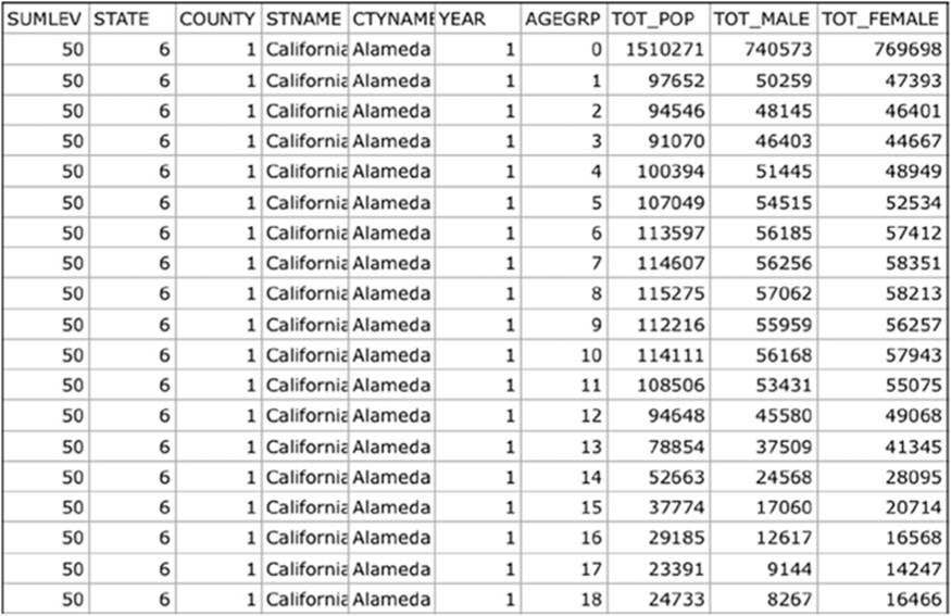
Unlike in the move The Matrix, where numbers look like images and images look like numbers, spreadsheets aren’t quite as easy to interpret. That’s one reason programs like Microsoft Excel and Apple Numbers come with built-in capabilities for creating charts. That census data shown inTable 5-1 is a lot easier to understand when we see it in graphical form, as shown in Figure 5-1.
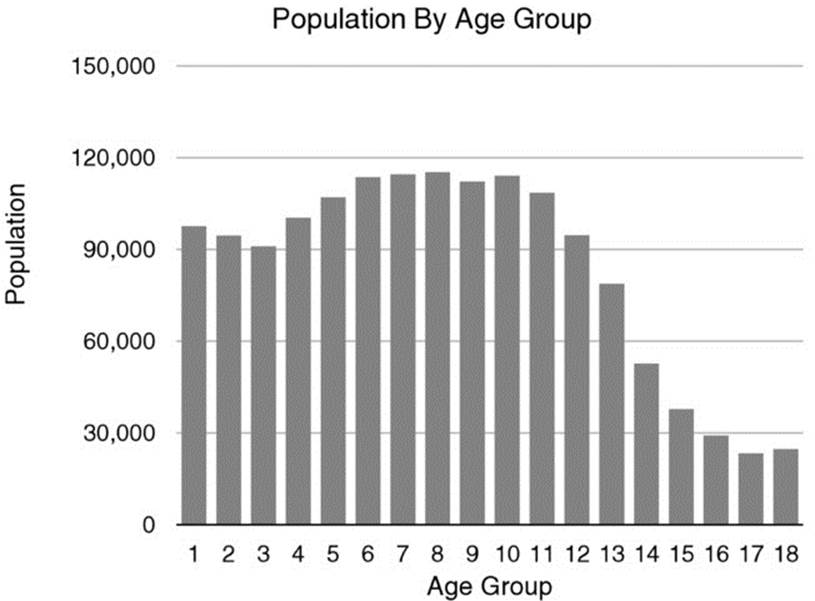
Figure 5-1. U.S. Census population data by age in visual form
When we see a graph like a pie or bar chart, it’s often a lot easier to see how things are changing over time or on a relative basis.
How things change over time is critical when making decisions. A single data point, by itself, is often insufficient to tell you how things are going, regardless of whether you’re looking at sales trends or health data.
Figure 5-2 shows the U.S. Census Bureau data on new home sales starting in the year 2000. If we were to look just at the value for January 2000, which is 873,000, that wouldn’t tell us much by itself. But when we look at new home sales over time, the story is crystal clear. We can see just how dramatic a difference there was between new home sales at the peak of the housing bubble and new homes sales today.3
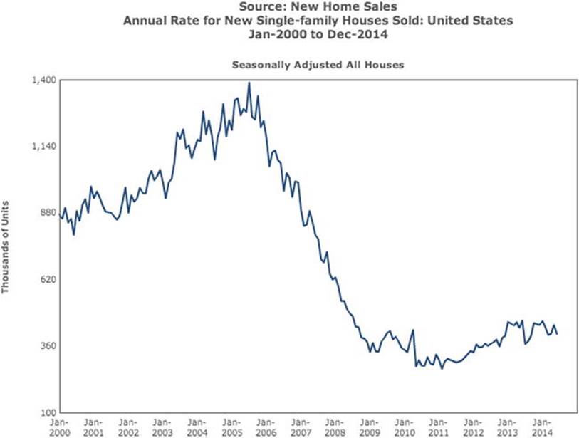
Figure 5-2. U.S. Census new home sales data visualized over time
Using this kind of visual trend analysis is a key way to understand data. Investors, for example, often evaluate a company’s performance over time. A company might report revenue and profits for a given quarter. Without a view of financial performance during previous quarters, investorsmight conclude that the company is doing well.
But what that moment-in-time data can’t tell the investors is that the company’s sales have been growing less and less each quarter. So while sales and profits in the abstract seem to be good, in reality, the company will be headed for bankruptcy if it doesn’t find a way to increase profits.
Internal context is one of the key indicators managers and investors use to figure out how business is trending. Managers and investors also need external context, which tells them how they’re doing relative to others.
Suppose that sales are down for a given quarter. Managers might conclude that their company isn’t executing well. In reality, however, sales might be off due to larger industry issues—for example, fewer homes being built in the case of real estate or less travel, in the case of the airline industry. Without external context, that is, data on how other companies in their industry did over the same time period, managers have very little insight into what’s really causing their business to suffer.
Even when managers have both internal and external context, it’s still hard for them to tell what’s going on just by looking at numbers in the abstract. That’s where visualizations can really help.
The Many Types of Visualizations
Nearly every business user is familiar with the well-known pie chart, bar chart, or line graph. These forms of visualization are just the tip of the iceberg when it comes to converting data into its visual equivalent. There are many other types of visualizations as well.
Geographic visualizations are useful for displaying location information. Geographic visualizations often have additional information layered into them. For example, they can show population densities, store locations, income distributions, weather patterns, and other kinds of data that are helpful to see on a visual basis. Figure 5-3 combines geographic information (a map of the United States) with weather data to illustrate just how much of the country is suffering from drought as of August, 2014.4
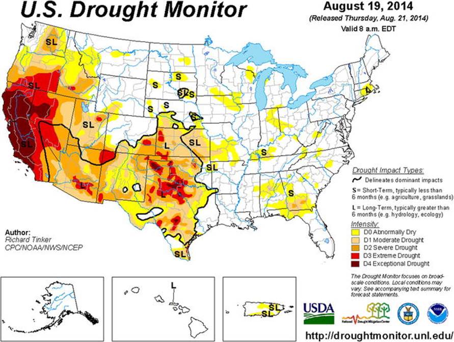
Figure 5-3. A visualization that combines geographic and weather data
Maps can show routing information, telling sales people which locations to visit and when or showing drivers the optimal route to take from one location to another.
Network diagrams show connections and interconnections. Network diagrams can illustrate the way information flows in an organization by showing the relationships between people. Network diagrams can also show connections in a social network or connections between different machines in a computer network.
Time series visualizations illustrate how things change over time. A time series chart might show the consumption of natural resources such as gas, oil, and coal over a period of many years. Or it could show sources of revenue. Time series visualizations can be combined with geographic visualizations to show how the density of populations, or the earning power of certain populations, changes over time.
Infographics are frequently used for marketing purposes, and they don’t just show data in visual form but they also incorporate drawings, text, and graphics that tell a story about the data.
Word maps, like the one shown in Figure 5-4, are useful ways to visualize the most frequently mentioned words in large quantities of text.5 Such visualizations make it easy to determine what a particular body of text is all about. You can create word maps using a variety of tools. One easily accessible web tool is called Wordle, located at wordle.net.

Figure 5-4. A word map of the Constitution of the United States
More and more visualizations are being created that are dynamic in nature. Rather than the static, fixed visualizations of the past, today’s interactive visualizations enable you to interact with them so that you can change the time period viewed, zoom in on certain geographic areas for more detail, or change the combinations of variables included in the visualizations to look at the data in a different way. Interactive visualizations combine the best characteristics of traditional visualizations—the power of seeing data presented in graphical form—with access to modern, dynamic analytical capabilities that are easy to use.
![]() Note Many sites now showcase the incredible range of visualizations being created on a daily basis. Two such sites are visualizing.org and www.informationisbeautiful.net. The visualizations on these sites can serve as an excellent source of inspiration for creating your own compelling visualizations.
Note Many sites now showcase the incredible range of visualizations being created on a daily basis. Two such sites are visualizing.org and www.informationisbeautiful.net. The visualizations on these sites can serve as an excellent source of inspiration for creating your own compelling visualizations.
How to Create Visualizations
A number of easy-to-use tools are available to help you create your own visualizations. Visualization tools are available both online and in desktop and mobile versions. Google Public Data Explorer is one great way to get started with creating visualizations. Available athttps://www.google.com/publicdata/directory, the Public Data Explorer comes loaded with lots of different types of publicly available data. Without installing any software, you can experiment with a variety of different visualizations and view changes in various data sets over time.
There are also online tools available for creating specific types of visualizations. CartoDB (cartodb.com), for example, is a useful tool for creating geographic visualizations. Using CartoDB, it is easy to embed interactive visualizations of complex geographic data sets into your web site, blog, or other application with just a few lines of code.
If you’re building your own application, HighCharts (www.highcharts.com) is another visualization resource available online. With very few lines of code, you can load online data into HighCharts and it will do the hard work of displaying that data in chart form.
Due to compliance, privacy, or security requirements, you won’t always be able to upload data to a cloud-based visualization tool. In that case, you can use a desktop software application like Tableau Desktop or QlikTech’s QlikView. If you need to access data stored in a data repository like Hadoop, Microsoft SQL Server, Oracle, Teradata, or other data sources, you can use Tableau and QlikView to connect directly to these data sources.
These programs can also connect to file-based data sources like Excel files and text files. This means you can access a wide range of different data sources, as well as data sources stored in multiple data repositories, and easily visualize the data contained there.
Software like Tableau Desktop (see Figure 5-5) makes it extremely easy to switch between different kinds of visualizations. That means you can take complex data sets and try out a variety of visualizations quickly to see which one presents your data in the most compelling manner.
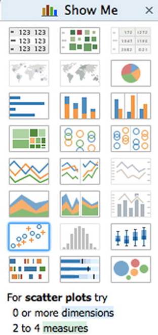
Figure 5-5. The Show Me popup in Tableau Desktop allows users to switch easily between different kinds of visualizations (Courtesy Tableau Software; used with permission)
As you can see in Figure 5-6, with the right tool, it’s easy to take otherwise hard to interpret data like a sales forecast and view that in compelling, visual form.
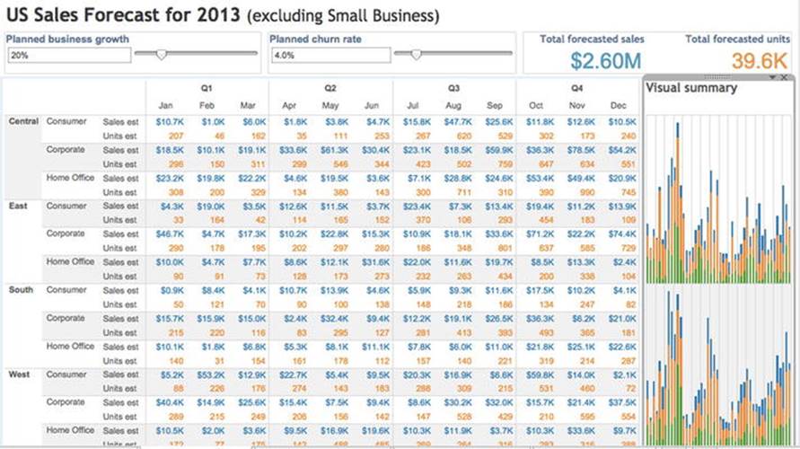
Figure 5-6. Sample sales forecast data shown in Tableau Desktop with a corresponding visualization shown to the right (Courtesy Tableau Software; used with permission)
Regardless of the tool you choose, visualizations make complex data easy to understand. You can not only use visualizations in your presentations, but you can also embed them directly into web sites and applications.
Using Visualization to Compress Knowledge
As the saying goes, a picture is worth a thousand words. But that begs the question of why visualization is so powerful. As visualization expert David McCandless puts it, “visualization is a form of knowledge compression.”6 One form of compression is reducing the size of the data, say by representing a word or a group of words using shorthand, such as a number. But while such compression makes data more efficient to store, it does not make data easier to understand.
A picture, however, can take a large quantity of information and represent it in a form that’s easy to understand. In Big Data, such pictures are referred to as visualizations.
Subway maps, pie charts, and bar graphs are all forms of visualization. Although visualization might seem like an easy problem at first, it’s hard for a few reasons. First, it’s frequently hard to get all the data that people want to visualize into one place and in a consistent format. Internal and external context data might be stored in two different places. Industry data might be in a market research report while actual company sales data may be stored in a corporate database.
Then, the two forms of data might come in slightly different formats. Company sales data might be stored on a daily basis while industry data might be available only on a quarterly basis.
Alternatively, the names given to particular pieces of data might be different; a hard drive might be referred to as “hard drives” in an industry report but referred to by model number in an internal sales database. Such forms of data inconsistency can make it hard to understand what the data is really telling us. There is no silver bullet solution to data inconsistency issues, but newer products like Trifacta and others are emerging to make the problem easier to address.
![]() Tip There remains an large opportunity to build an easy-to-use hosted data-cleansing service. Today many data consistency issues consume time that data analysts might otherwise apply to solving business problems. A hosted data cleansing and data consistency service could solve this problem on a large scale using a combination of algorithmic and human approaches.
Tip There remains an large opportunity to build an easy-to-use hosted data-cleansing service. Today many data consistency issues consume time that data analysts might otherwise apply to solving business problems. A hosted data cleansing and data consistency service could solve this problem on a large scale using a combination of algorithmic and human approaches.
The good news is that modern visualization products can connect directly to a variety of data sources, from local files to databases to data stores like Hadoop. By taking all that data and creating a picture of it, the data can become more than data. It can become knowledge that we can act on.
Visualization is a form of knowledge compression because a seemingly simple image can take vast amounts of structured or unstructured data and compress it into a few lines and colors that communicate the meaning of all that data quickly and efficiently.
Why Is Visual Information So Powerful?
When it comes to visualization, few people have had as big an impact on the field as Edward Tufte. The New York Times called Tufte the “Leonardo da Vinci of data.”
In 1982, Tufte published one of the defining books of the 20th century, Visual Display of Quantitative Information. Although he began his career teaching courses on political science, Tufte’s life work has been dedicated to understanding and teaching information design.
One of Tufte’s contributions is a focus on making every piece of data in an illustration matter, and excluding any data that isn’t relevant. Tufte’s images don’t just communicate information; many consider his graphics to be works of art. Visualizations are not only useful as business tools, Tufte demonstrates, they can also communicate data in a visually appealing way.
Although it may be difficult to match some of the graphical approaches that Tufte popularized, infographics, as they are now commonly known, have become popular ways to communicate information.
Infographics don’t just look good. As with other aspects of Big Data, there is a scientific explanation for what makes visual representations of data so compelling.
In a blog post, Tufte cites a press release about an article published in Current Biology that describes just how much information we visually absorb.7 According to the article, researchers at the University of Pennsylvania School of Medicine estimated that the human retina “can transmit visual input at about the same rate as an Ethernet connection.”8
For their study, the researchers used an intact retina from a guinea pig combined with a device called a multi-electrode array that measured spikes of electrical impulses from ganglion cells. Ganglion cells carry information from the retina to the brain. Based on their research, the scientists were able to estimate how fast all the ganglion cells—about 100,000 in total—in a guinea pig retina transmit information. The scientists were then able to calculate how much data the corresponding cells in a human retina transmitted per second. The human retina contains about one million ganglion cells. Put all those cells together and the human retina transmits information at about 10 megabits per second.
To put that in context, Tor Norretranders, a Danish popular science author, created a graphic illustrating the bandwidth of our senses. In the graphic he showed that we receive more information visually than through any of our other senses. If we receive information via sight at about the same rate as a computer network, we receive information through touch at about one tenth that rate, about the rate that a USB key interfaces with a computer.
We receive information through our ears and nose at an even slower rate, about one tenth of that of touch or about the same speed at which a hard drive interfaces with a computer; and we receive information through our taste buds at a slower rate still.
In other words, we get information through our eyes at a rate that is ten to a hundred times faster than through any of our other senses. So it makes sense that information communicated visually is incredibly powerful. And if that information contains a lot of data compressed into a visualization full of knowledge, we can receive that information even faster.
But that’s not the only reason such visual data representations are so powerful. The other reason is that we love to share and in particular, we love to share images.
Images and the Power of Sharing
On November 22, 2012, users of photo sharing service Instagram shared a lot of photos. It was Instagram’s busiest day ever, with users of the service sharing twice the number of photos on that day as they had the day before. That’s because November 22 wasn’t just any day of the year. It was Thanksgiving day. Users of Instagram uploaded some 10 million photos that mentioned Thanksgiving-themed words in their captions. To put it mildly, that’s a lot of turkey photos, and photos of loved ones too, of course. Some 200 million people now use the service on a monthly basis.9
Early in 2012, Facebook purchased Instagram for a billion dollars. Facebook is no slouch either when it comes to sharing photos. Facebook’s users were uploading an average of 350 million photos a day as of the end of 2013, more than 10 billion photos every month.10
There’s another reason we love photos, of course, and that is that they are now so easy to take. Just a few short years ago, we had to make decisions about which photos to take and which not to, at the moment the image was available. If we were almost out of film, we might have saved the last shot for another day. But today, digital cameras, smartphones, and cheap storage have made it possible to capture a nearly unlimited number of digital images. Just about every smartphone now has a camera built in. That means that it’s possible not only to take all those photos but to upload and share them easily as well.
Such ease of capturing and sharing images has shown us just how fun and rewarding the activity can be. So it’s only natural that when we come across interesting infographics we want to share them too.
And just as with photos, it’s a lot easier to create infographics today than it was in the past. There’s also more incentive for companies to create such graphics. In February 2011, search engine giant Google made a change to its algorithms to reward high-quality web sites, particularly “sites with original content and information such as research, in-depth reports, thoughtful analysis, and so on.”11 As a result, marketers at companies realized they needed to do more in order to get their sites ranked—or listed high—in Google search results.
But what is a marketer with limited information to do in order to create a compelling piece of research? Create an infographic. Infographics can take broad sources of data, mesh them together, and tell a compelling story. These can be stories about the web browser wars raging among Internet Explorer, Chrome, Firefox, and Safari or about job creation when it comes to the crowd funding act. Bloggers and journalists looking for compelling graphics to include in their pieces love such graphics because readers love to look at and share them.
The most effective infographics don’t just get posted online—they get shared, and they get shared repeatedly. Some of them go viral, getting shared thousands or even millions of times on social networks like Twitter, Facebook, and LinkedIn, and through good old email.
As the demand for the creation of infographics has risen, so too have the number of companies and services available to help create them. One relatively new entrant is Visual.ly, a marketplace for creating infographics. Founded in 2011, the company specializes in enabling its customers to communicate complex data graphically. CartoDB helps people create geographic visualizations. Even users with little or no statistics or analytics background can use the company’s web-based design tools. Geographic visualizations are one of the most compelling ways to represent data like population density, store locations, natural resources, and sales routes.
Leading companies such as QlikTech, with its QlikView product, Tableau Software, and TIBCO with Spotfire, provide products that help people create compelling static and interactive visualizations that are used for reporting, analysis and marketing. Meanwhile, the Google Public Data Explorer lets people explore public data sets, such as population growth and per-capita income, online.
Putting Public Data Sets to Use
Business users of visualization tools often think of visualization in terms of creating dashboards. Dashboards take data about sales, marketing, and supply chain and turn that data into meaningful charts that management can review easily.
But the power of visualization extends much further. Public data sets refer to data that is publicly available and frequently collected by governments or government-related organizations. The U.S. Census, first taken in 1790, is one such form of data collection.12 As a result of the Census, there is a vast amount of information available about the U.S. population, including the composition of the population and its geographic distribution.
It’s easy to find public data sets online. One helpful resource is data.gov, which links to an enormous variety of public data sources. These sources include National Weather Service data, labor data, U.S. Census data, economic activity data, and a wide range of other data sources. NASA has a number of interesting data sources on its web site at http://data.nasa.gov/, including images of historical interest and images from the Mars Rover project. Such images provide good examples of unstructured data. They can be extremely useful in creating Big Data-scale image management, categorization, and processing systems.
Another interesting public data set is the Common Crawl Corpus, located at http://commoncrawl.org/. The corpus consists of more than 5 billion web pages. The data set is an incredible resource for developing applications that work with large quantities of unstructured text. It’s also useful for developing machine-learning algorithms to detect patterns in text, language-processing software, and search products.
Public data sources can be useful in learning how to work with and visualize large quantities of data. They can also be useful when conducting real-world data analysis. As data storyteller Hans Rosling illustrates, publicly available population and health data is extremely valuable in understanding population changes, the rise and fall of nations, and the progress (or lack thereof) in fighting infant mortality and other epidemics.13 Rosling uses data visualizations to tell stories with data, in particular public data, in much the way a football commentator uses football replays.
Rosling animates data. He doesn’t make cartoons out of it. Rather, he plots data on a graph and then shows how that data changes over time—how the relative populations or incomes of different nations evolve over periods of 40 or 50 years, for example. Such animations bring data to life, and the software that Rosling developed with his son and daughter-in-law became the basis for the Google Public Data Explorer.
Some of the most famous visualizations of all time are based on presenting publicly available data in new and compelling ways. Visual.ly showcases a few such charts on its web site in a post entitled 12 Great Visualizations That Made History.14 Some of these visualizations illustrate just how impactful the right graphic can be. In one such instance, John Snow’s map of Cholera outbreaks in London in 1854 helped explain that water in contaminated wells was responsible for the spread of the disease.
Another famous life-saving chart from around the same time is from Florence Nightingale, known as the mother of modern nursing. Nightingale used a coxcomb diagram to “convey complex statistical information dramatically to a broad audience.”15 See Figure 5-7.
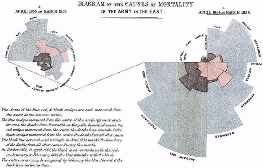
Figure 5-7. Nightingale’s diagram of the causes of mortality in the British Army
In particular, Nightingale’s charts showed that for the British Army, many deaths were preventable. More soldiers died from non-battle causes than battle-related causes. As a result, she was able to convince the government of the importance of using sanitation to decrease mortality rates.
Real-Time Visualization
The information most infographics provide is static in nature, and even the animations Rosling created, compelling as they are, are comprised of historical data.
Frequently, infographics take a long time and a lot of hard work to create: they require data, an interesting story to tell, and a graphics designer who can present the data in a compelling way. The work doesn’t stop there; once the graphic is created, like the tree falling in the woods with no one to hear it, the graphic has real value only if it’s distributed, promoted, shared, and viewed. By then of course the data itself may be weeks or months old. So what about presenting compelling visualizations of data that are real-time in nature?
For data to be valuable in real time, three things must happen. The data itself must be available, there must be sufficient storage and computer processing power to store and analyze the data, and there must be a compelling way to visualize the data that doesn’t require days or weeks of work.
If the idea of knowing what millions of people think about something in real time and being able to illustrate what they think visually seems far-fetched, think again. We need look no further than the 2012 presidential election to be convinced.
In decades past, polling was performed by individual pollsters calling people to ask their opinions or talking to them in person. By combining polls of a relatively small number of people with statistical sampling methods, pollsters were able to make predictions about the outcome of elections and draw conclusions about how people felt about important political issues.
Nielsen used similar forms of statistics for television measurement and comScore did the same for the web. Nielsen originally performed media measurement by using a device to detect to which stations 1,000 people had tuned their radios.16 The company later applied a related approach to television shows in what became widely known as the Nielsen ratings.
Such forms of measurement are still widely used but as in other areas, Big Data is transforming the way we measure. If there is one company in the last few years that has had more impact on our ability to measure public opinion than any other—an activity known as sentiment analysis—it is Twitter.
In fact, Twitter may be one of the most under-appreciated companies around in terms of its Big Data assets. As of October, 2012, Twitter users were sending some 500 million tweets—short text messages—across the network per day,17 a remarkable amount of human-generated information. That’s up from no tweets sent in 2006.
By evaluating the words used in tweets, computer programs can not only detect which topics are trending, that is, receiving more attention, but also can draw conclusions about how people feel and what opinions they hold.
Capturing and storing such data is just one aspect of the kind of Big Data challenge and opportunity a company like Twitter faces. To make it possible to analyze such data, the company has to provide access to the stream of tweets, nearly 5,000 text messages per second, and even more during events like presidential debates, when users create some 20,000 tweets per second. Then comes the task of analyzing those tweets for common words, and finally, presenting all that data in a meaningful way. That means converting all those tweets into a visualization.
Handling such massive, real-time streams of data is difficult, but not impossible. Twitter itself provides programmatic interfaces to what is commonly known as the fire hose of tweets. Around Twitter, companies like DataSift have emerged to provide access as well.
Other companies, such as BrightContext, which was recently acquired by WealthEngine, provide tools for real-time sentiment analysis. During the 2012 presidential debates, the Washington Post used BrightContext’s real-time sentiment module to measure and chart sentiment while viewers watched the debates.18 Topsy, a real-time search company recently acquired by Apple, has indexed some 200 billion tweets. The company powered Twitter’s political index, known as the Twindex. Vizzuality specializes in mapping geospatial data and it powered The Wall Street Journal’s election maps.
All of these systems work by processing massive quantities of unstructured data, in the form of text, and presenting that data in visual form.
In contrast to phone-based polling, which is time-consuming and typically costs around $20 per interview, real-time measurement simply costs compute cycles and can be done on an unprecedented scale. Products like those from some of the companies mentioned here can then provide real-time visualizations of the collected data.
But such visualization doesn’t stop at displaying real-time information in web sites. Google Glass,19 which Time magazine called one of the best inventions of 2012, is “a computer built into the frame of a pair of glasses, and it’s the device that will make augmented reality part of our daily lives.”20 In the future, not only will we be able to see visual representations of data on our computers and mobile phones, we’ll also be able to visualize and understand the physical world better as we move around it.
If that sounds like something out of a science fiction book, it’s not. Today, Google Glass costs $1,500 and is somewhat bulky. But just as other new technologies have gotten smaller and cheaper over time, so too will Google Glass. Augmented visualization may very well become part of our daily lives.
Why Understanding Images Is Easy for Us and Hard for Computers
Ironically, while computers excel at processing large amounts of textual information, they still struggle with analyzing visual information. Just recall the last time you took a few hundred photos and wished you had a web site or a piece of software that would automatically weed out the bad photos and group related photos together. Or what about automatically figuring out who is in the photos and sharing copies of those photos with them?
On a larger scale, companies like Facebook have to filter out inappropriate images. Amazon has to determine which textual product descriptions match their image counterparts and which ones don’t. These would seem to be relatively easy problems for computers to solve and while the science of image recognition and characterization has advanced significantly, performing such analysis on a large scale remains challenging. Today, human beings still perform many of these recognition and matching tasks.
In their paper, Why is Real-World Visual Object Recognition Hard?,21 scientists from MIT and Harvard stated, “the ease with which we recognize visual objects belies the computational difficulty of this feat. At the core of this challenge is image variation—any given object can cast an infinite number of different images onto the retina, depending on an object’s position, size, orientation, pose, lighting, etc.”
Simply put, images can have a lot of variability, making it difficult to tell when different images contain the same objects or people. What’s more, pattern detection is more difficult; while the word “president” is easy to find in a sentence and hence relatively easy to find in millions of sentences, it’s much harder to recognize the person holding that title in images.
Having an individual human being characterize images is one thing. But what about trying to do it with millions of images? To solve their image-characterization problems, companies like Amazon and Facebook turn to crowdsourcing marketplaces like oDesk and Amazon Mechanical Turk.22 On these marketplaces, content moderators who pass certain tests or meet certain qualifications gain access to images and can then characterize and filter them.
Today, computers are good at helping us create visualizations. But tomorrow, as products like Google Glass continue to evolve, they may also help us better understand visual information in real time.
The Psychology and Physiology of Visualization
One industry that understands the importance of presenting information visually better than almost any other is the advertising industry. It is one of several that is on the leading edge of taking advantage of new Big Data technologies.
If there is any doubt that images are a powerful means of communication, we need look no further than the $70 billion that U.S. companies spend each year on TV advertising.23 As Nigel Hollis, chief global analyst at the market research firm Millward Brown, points out, companies wouldn’t spend so much on TV advertising if it didn’t work.24
Where people get confused about the impact of TV advertising, Hollis says, is in thinking that advertisers want to get them to do something immediately. That’s where “they’re wrong.” Brand advertising doesn’t succeed through calls to action or arguments, but rather through leaving positive impressions. “The best advertisements use images, jingles, and stories to focus attention on the brand.” In particular, says Hollis, “engaging and memorable ads slip ideas past our defenses and seed memories that influence our behavior.”
In fact, some advertisers have taken the delivery of visual images one step further, applying data analysis to determine which visualizations are most effective through a science called neuromarketing. Neuromarketing uses functional magnetic resonance imaging (fMRI) and other technologies “to observe which areas of the brain ‘light up’”25 in response to a variety of advertising approaches. Marketers can even simulate situations to determine which placement, such as on billboards or on the sides of buses, produces the most impact.
Thus visualization is not only an effective way to communicate large quantities of data, it also ties directly into the brain, triggering emotional and chemical responses. Visualization may be one of the best ways to communicate a data-based message. What studies have shown is that it is not just the visualization itself that matters, but when, where, and how such visualizations are presented.
By setting the right context, choosing the right colors, and even selecting the right time of day, it’s possible to communicate the insights locked up in vast amounts of data a lot more effectively. As the famous media researcher Marshall McLuhan once said, “the medium is the message.” Now scientific evidence is showing just how important context and delivery is when communicating information.
The Visualization Multiplier Effect
As we’ve seen in this chapter, visualization and data go hand in hand. There are instances, of course, when computers can act on data with no human involvement. For example, it simply wouldn’t be possible for humans to figure out which text ads to display alongside search results when dealing with the billions of search queries we make on sites like Google and Bing. Similarly, computer systems excel at automated pricing decisions and evaluating millions of transactions quickly to determine which ones are fraudulent.
But there remain any number of situations in which humans are trying to make better decisions based on data. Just because we have more data available does not mean that it’s easier to produce better insights from that data. In fact, the opposite may be true. The more data we have, the more important it becomes to be able to distill that data into meaningful insights that we can act on. Visualizing such data is one of the most powerful mechanisms we have for doing so.
Visualization is effective because our eyes have ultra high throughput into our brains, as much as a hundred times greater throughput than some of our other senses. Visualization can trigger emotional responses. It can compress vast amounts of data into knowledge we can use.
Combine the knowledge compression of visualization with the high throughput of visual delivery and you get the visualization multiplier effect—more data absorbed faster.
Big Data isn’t just about the data itself but about how we communicate it and what we do with it. Tools like visualization also mean that Big Data isn’t just the domain of scientists, data analysts, or engineers. Big Data, in the form of visualization, is everywhere around us, from the charts we use to make critical business decisions to the advertisements we create to communicate our messages more effectively.
Social media platforms are changing the way we communicate and are enabling the broader distribution not just of textual information but of high-impact visual knowledge. With the right visualization, data is more than just text or numbers. The right visualization can tell a story that has a very real impact not just in business but in broader contexts such as education and global health as well. As you’ll see in the next chapter, visualization is just one of the many areas in which Big Data is creating exciting new opportunities.
____________________________
1I was searching for a compelling example of why visualizing information is so important when I came across the Washington, D.C. Metro map in the Infographic page on Wikipedia. See http://en.wikipedia.org/wiki/Infographic.
2http://en.wikipedia.org/wiki/Tokyo_subway.
3Chart generated via www.census.gov. The actual query is https://www.census.gov/econ/currentdata/dbsearch?program=RESSALES&startYear=2000&endYear=2014&categories=ASOLD&dataType=TOTAL&geoLevel=US&adjusted=1&submit=GET+DATA.
4http://www.ncdc.noaa.gov/news/us-drought-monitor-update-august-5-2014 Produced by the National Drought Mitigation Center at the University of Nebraska-Lincoln, the United States Department of Agriculture, and the National Oceanic and Atmospheric Administration.
5Created by pasting the text of the U.S. Constitution into wordle.net.
6https://www.ted.com/talks/david_mccandless_the_beauty_of_data_visualization/transcript.
7http://www.edwardtufte.com/bboard/q-and-a-fetch-msg?msg_id=0002NC.
8http://www.eurekalert.org/pub_releases/2006-07/uops-prc072606.php.
9http://blog.instagram.com/post/80721172292/200m.
10http://internet.org/efficiencypaper.
11http://googleblog.blogspot.com/2011/02/finding-more-high-quality-sites-in.html
12http://www.census.gov/history/www/census_then_now/
13http://www.ted.com/talks/hans_rosling_the_good_news_of_the_decade.html
14http://blog.visual.ly/12-great-visualizations-that-made-history/
15http://www.datavis.ca/gallery/historical.php
16http://en.wikipedia.org/wiki/Nielsen_Company
17http://news.cnet.com/8301-1023_3-57541566-93/report-twitter-hits-half-a-billion-tweets-a-day/.
18http://www.forbes.com/sites/davefeinleib/2012/10/22/not-your-grandmothers-presidential-debate/5/.
19http://www.forbes.com/sites/davefeinleib/2012/10/17/3-big-data-insights-from-the-grandfather-of-google-glass/
20http://techland.time.com/2012/11/01/best-inventions-of-the-year-2012/slide/google-glass/
21http://www.ploscompbiol.org/article/info:doi/10.1371/journal.pcbi.0040027
22http://gawker.com/5885714/.
23http://www.theatlantic.com/business/archive/2011/08/why-good-advertising-works-even-when-you-think-it-doesnt/244252/.
24Post on The Atlantic entitled “Why Good Advertising Works (Even When You Think It Doesn’t).” http://www.theatlantic.com/business/archive/2011/08/why-good-advertising-works-even-when-you-think-it-doesnt/244252/.
25http://www.businessweek.com/stories/2007-10-08/this-is-your-brain-on-advertisingbusinessweek-business-news-stock-market-and-financial-advice.