Data Flow Diagramming by Example. Process Modeling Techniques for Requirements Elicitation (2015)
The Power of Data Flow Diagrams

Questions answered in this chapter:
§ Why should I draw a Data Flow Diagram?
§ What does a fully balanced DFD look like?
§ What value does a DFD fragment provide?
What Does the Data Flow Diagram Do for You?
From the perspective of the one wearing the BA hat, the act of creating a data flow diagram is an awakening. Drawing the diagram forces you to ask questions that you might otherwise overlook. It is also an awakening for members of the business community whose process you are depicting. The people in the trenches and those managing them quite often have never seen a picture of their process and a picture activates parts of the human brain that words cannot. As a result, the phrase, “I see” takes on a whole different meaning when you are presented with a picture of your process. For that reason, I recommend drawing a DFD just to get everyone involved on the same page.
Once you have a DFD, exploding a process and balancing the data inputs and outputs between the levels often reveals missing data flows.
After all, no one can think of everything at once. If the tool finds a single missed data flow, it is probably well worth the time it took to draw the diagram and apply the technique. The same is true of horizontal balancing to reveal missing data elements. If we asked IT to automate a process with a missing data flow, we most likely will end up with an application that does not meet the business needs.
IT professionals are generally extremely good at their job and they will most likely recognize that they are missing something at some point in the development process. The problem is the timing of the discovery and the related cost when the omission is discovered. Adding a missing process late in the project is a relatively simple step, but missing data often affects a multitude of processes, making it one of the most expensive errors for IT projects. The simple act of identifying data elements and ensuring their completeness allows you to recognize and resolve these issues before you involve developers. In my experience, that is one of the most powerful arguments for spending time to develop and analyze a data flow diagram.
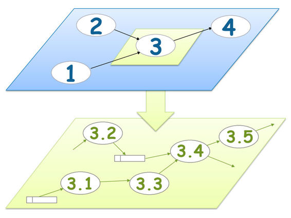
A Fully Balanced DFD
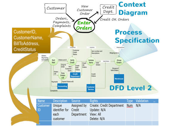
To recap, a completely balanced (levelled) data flow diagram starts at the top with a context diagram consisting of one or more processes that are in scope for your project and all external entities with which those processes exchange data.
Each of those Level 1 processes explodes to a Level 2 data flow diagram depicting the detailed processes inside the Level 1 process with all data flows and data stores that are internal to the exploded process. Each process on the Level 2 diagram would either explode further to a Level 3 DFD (and from Level 3 to Level 4, etc.) or be described in detailed process specifications. Each data flow and each data store on the lowest level DFD would explode to a list of the contained data elements.
Creating a DFD Fragment
Although balancing a completely levelled DFD reveals data discrepancies and disconnects, it may not be necessary for your project. Many people (in particular on projects following an Agile approach to delivering technology) only need a small fragment of a DFD to understand the inner workings of a specific process. The time required to create a completely balanced diagram is not justified if a developer only needs to know how the CREDIT DEPARTMENT establishes the credit limit for a new customer. In that case, a DFD fragment might suffice.
The following is an example of a DFD fragment based on an exercise that we use in our instructor-led classes. To test your understanding of the concepts presented, you might want to take this opportunity to draw a DFD fragment using the project Scope Statement and the Interview Notes that follow before peeking at our solution.
Scope Statement: This project will enhance our web-based Policy Maintenance System by allowing policyholders to interact directly with their insurance policies or claims. The system will support web-based policy payments and allow prospects to apply for temporary coverage pending underwriting rate approval. Once the application is received by Underwriting, it will follow standard Underwriting procedures.
Interview Notes: In the future, a prospect will submit his/her application via our website. If the prospect does not yet have a policy with us, the site will request a credit check web service and either reject or approve the application directly. If the request is from one of our current customers in good standing or approved via the credit check, the site will provide a temporary proof of insurance certificate that the prospect can print out and use to register his/her vehicle. In any case, the request will then be forwarded to underwriting for normal processing, which will either lead to acceptance (the norm), modification (overriding a web rejection) or rejection (bad risk). If the request is approved, a policy will be issued and sent to the customer via standard mail.
Here is an example of the diagram that many of our students have produced for this scenario.
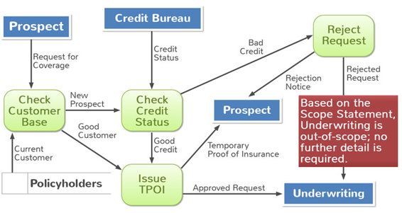
Note that this data flow diagram shows a business process at some indeterminate level of detail. Some of the processes might be very high-level whereas others are very specific. If you need to understand how any of these processes works in detail, you could “explode” it to see its internal processes.
Summary
Creating a Data Flow Diagram is an extremely revealing and rewarding step in the analysis of a business process. I have never used any other tool that is as effective at triggering animated discussions amongst the stakeholders about how a business process works and how it could be improved. Obviously, creating the diagram is just the first step. The diagram opens the door to a series of specific business analysis techniques that will help the business community recognize how their actions impact other downstream processes. You can also identify problem areas, timing anomalies, and error handling issues that can lead to missing requirements.
It is important to note that the diagram is a snapshot in time. Once you present the business community with this versatile visual aid, they may immediately start to make changes. Because of the cumulative effect of those changes, you should never assume that the diagram you created a few months or even years ago is valid. If you really need to understand the current business process, you are best served by starting from scratch as we demonstrated. The problem you face is, of course, the effort required to flush out all of the details presented in the balancing section. Is it really worth the time?
A data flow diagram as a tool that benefits the project or reduces the risk of potential project failure can be worth its weight in gold. We recommend against spending project resources developing one just for the sake of having a picture.
“I think by drawing, so I'll draw or diagram everything from a piece of furniture to a stage gesture. I understand things best when they're in graphics, not words.”
- Robert Wilson
All materials on the site are licensed Creative Commons Attribution-Sharealike 3.0 Unported CC BY-SA 3.0 & GNU Free Documentation License (GFDL)
If you are the copyright holder of any material contained on our site and intend to remove it, please contact our site administrator for approval.
© 2016-2026 All site design rights belong to S.Y.A.