Anonymizing Health Data: Case Studies and Methods to Get You Started (2013)
Chapter 9. Geospatial Aggregation: Dissemination Areas and ZIP Codes
Where patients live, where they get treatments or consultations, where they get their prescription drugs, and where they get lab tests all constitute geospatial information. And most, if not all, of this information is usually found in health databases. Even if location is missing from a data set, it can sometimes be reverse engineered or found elsewhere quite easily. If the name of the health care provider is included but location (i.e., the place of service) is missing, a simple search in the yellow pages can often get an adversary this information. Or the location of service can be found through professional bodies—the address of a physician’s practice is usually available through the college if you know her name or National Provider Identifier (NPI).
WARNING
Location information about patients and their providers can be used to re-identify individuals. In fact, location is often one of the critical pieces of information for a successful re-identification attack. This means that when we de-identify a data set, we need to look at the risks posed by ZIP codes and postal codes and find ways to reduce these risks.
Also keep in mind that location information is often critical for a lot of analytics.[67] Patients showing up at an emergency department with gastrointestinal problems might be from the same neighborhood or school. Maybe they all ate a bad batch of Atlantic herring at the cafeteria. In a public-health context it’s important to know where these patients came from. You can’t identify this cluster and zero in on the possible cause of this spike in the incidence rate of gastro bugs without it. Even researchers looking at this after the fact would want to know that there’s an isolated cluster in the data, to differentiate it from baseline rates of gastro for a larger geographic area.
Where the Wild Things Are
In practice, the most commonly available geographic information is the ZIP or postal code. These characterize areas where a patient lives or receives a service. The main purpose of these codes is to organize the delivery of mail, so they change often as these areas are modified to improve the delivery of mail. More stable areas are used for the census, such as the ZIP Code Tabulation Areas (ZCTAs) in the US and dissemination areas (DAs) in Canada.
NOTE
In some cases exact locations may be available, such as a patient’s address, so that longitude and latitude can then be calculated. The exact location can be selected as the center of the dwelling at that address, or the center of the street. But often the address is in the form of free-form text. Various geocoding methods can be used to standardize, parse, and convert the address to an exact point. But often analysis is performed just on the ZIP or postal code because it’s a field on its own, which makes it very easy to work with. In this chapter we’ll only consider the case where areas are known rather than exact geospatial points.
Location information is a quasi-identifier, so it needs to be de-identified when a data set is used or disclosed for secondary purposes. Like all data elements, we want to have as much detail as possible after the de-identification so that the data is meaningful for analytics. The most common way to de-identify ZIP and postal codes is through cropping, by retaining only the first x number of characters. For example, the Canadian postal code “K1L8H1” could be cropped to its three-character version “K1L,” which makes sense because the “K1L” area is a superset of the “K1L8H1” area. We saw examples of such cropping when we were dealing with the BORN data set in earlier chapters. Similarly, US ZIP codes can be cropped from five digits to, say, three digits.
The biggest problem with cropping is that the cropped area may be so large that any local information is lost. The larger area characterized by the cropped location code may be useless for the type of analysis that is planned. Of even greater concern is that an analysis of the larger area may give the wrong results by hiding important effects. Therefore, it’s important that the larger (de-identified) area is the smallest possible area that will ensure that the risk of re-identification is acceptably small.
So, instead of cropping, we go about this by clustering adjacent areas into larger ones. The advantage of clustering over cropping is that we can get much smaller areas while ensuring that the risk of re-identification is below our threshold. Basically, clustering is more flexible than cropping, because we are grouping areas based on risk rather than the whims of a government service whose goal is optimizing the delivery of standard mail. The potential disadvantage is that we end up with nonstandard groupings of ZIP or postal codes—but we have ways of addressing this as well.
Being Good Neighbors
Geographic areas are represented as polygons. In order to cluster polygons, you need to be able to determine which ones are adjacent. Because the data sets health researchers deal with are quite large, you also have to be able to do this very efficiently. Otherwise it could take days, or maybe even weeks, to cluster areas for a single data set (and we’ve been there before).
The easiest way to determine whether two polygons are adjacent is simply to look at the points they have in common. We’re not interested in two polygons that share only one point in common—what we want are polygons that share a side. So in theory, we can consider polygons that have at least two points in common. If only it were that simple!
We actually want something a bit more specific when we’re looking to compare adjacent areas, because we also want to consider their size and shape. We’re looking for good neighbors. Clustering a large area with a small one will simply drown out the details in the smaller area. We would rather have small areas clustered together. And we don’t want to end up with really thin and long clusters, because then we won’t be able to pinpoint where something interesting has happened when we run our analytics.
Distance Between Neighbors
So, let’s forget about those points in common between polygons and come at this problem from a different angle. A simple way to determine which polygons are close to each other is to compute the shortest distance between them. We would then cluster the polygons that are closest to one another. But this can be misleading.
Polygons A and B in Figure 9-1 are the shortest distance apart, but most of the points in these polygons are quite far apart. Polygons B and C, however, have a lot of points that are close together. If we cluster based on the shortest distance between polygons, A and B become one cluster. But it makes more sense to cluster polygons B and C together, because they have a lot of points that are close together rather than just two. One way to do that is to compute the Hausdorff distance.
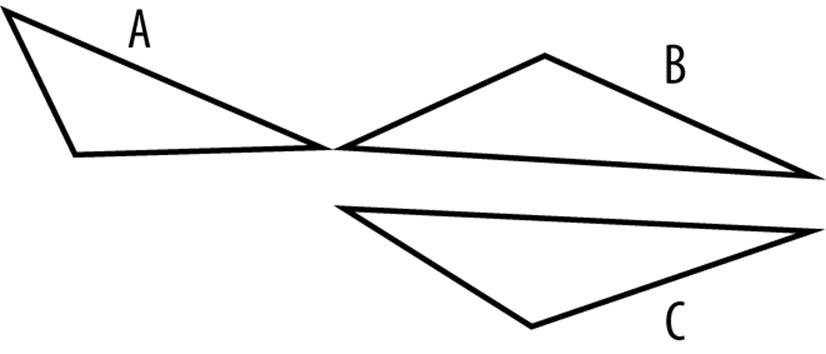
Figure 9-1. Won’t you be my neighbor? Polygons A and B are closer, but B and C have more in common.
The Hausdorff distance from A to B is the distance between the furthest point in A to the closest point in B (d1 in Figure 9-2); the Hausdorff distance from B to A is the distance between the furthest point in B to the closest point in A (d2 Figure 9-2). Obviously the distances d1 and d2 (from A to B or B to A) can be different, so the Hausdorff distance of A and B is the maximum of these two distances (i.e., max(d1, d2)).
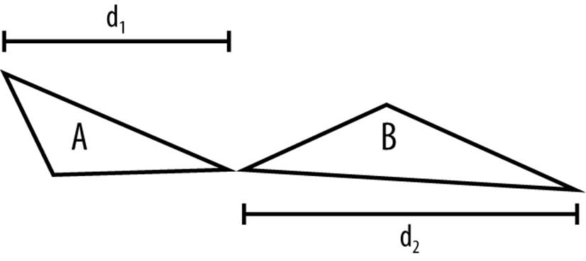
Figure 9-2. The best neighbors are close. This is how we compute the Hausdorff distance in one dimension.
Circle of Neighbors
We need to compute the Hausdorff distances among the vertices in the polygon—but geographic areas tend to be quite irregular and can have many vertices. Determining the Hausdorff distance can therefore be computationally intensive. We need to find a way to improve the approximation, and the way we’ll do that is by generalizing the polygon to a circle of the same area.
The first step is to figure out the “center” of the polygon. The most obvious way to do that is to compute the centroid of the polygon, but that might not be a good representation of the center, in practical terms, because it could be at the top of a mountain or in the middle of a lake. It’s better to use a “representative point,” which adjusts the centroid to be closer to where the majority of the population lives and moves it away from uninhabited areas. In Canada this is quite important because most of the population lives within a short distance from the US border, and therefore a large part of the land mass is not really inhabited. Taking the centroid may result in a point that is far away from where the bulk of the population lives. National statistical agencies often produce tables with the longitude and latitude of the representative points for census areas. If the representative point is not available, we can revert to the centroid.
We can then represent each polygon by a circle of the same area as the original polygon and center it at the representative point. It’s fairly straightforward to compute the area of a polygon, and for census geographies these areas are publicly available. Computing the Hausdorff distance among circles is then relatively simple. The two Ontario DAs in Figure 9-3 seem pretty close, but in Figure 9-4 they’re further apart. Since the Hausdorff distance is the maximum of these two distances, it’s the latter that gives us their distance. In this case, the larger area makes them farther apart, so the use of the Hausdorff distance meets our goal of favoring the clustering of adjacent areas that have similar sizes.
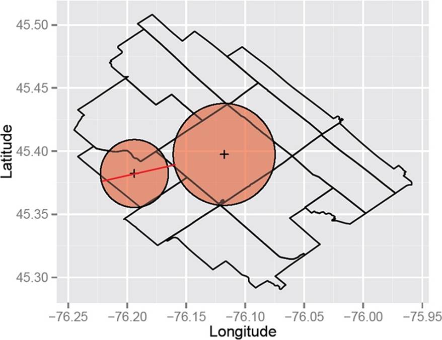
Figure 9-3. From this direction these neighbors seem close
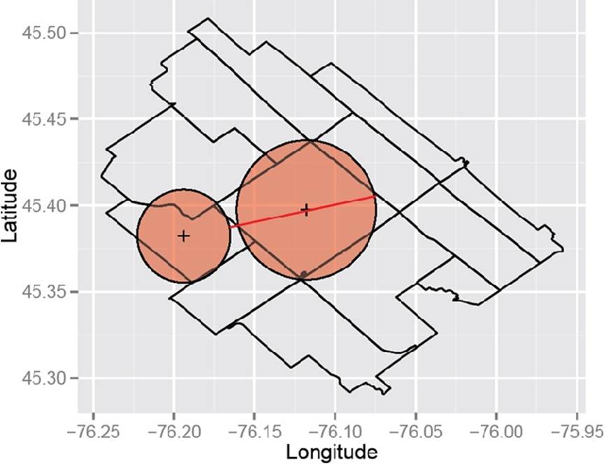
Figure 9-4. But from this direction these neighbors seem a little further apart
Round Earth
We can’t forget that the Earth is round (we’re hoping this isn’t up for debate), and we can improve on our approximation by taking this into account, in a way that won’t affect performance. A circle on the Earth’s surface can be represented as a spherical cap—think of it as a swimmer’s cap on someone’s head. The circle can be calculated as follows:
Radius of spherical cap
r = rearth × arcos(1 – Z / 2π × rearth2)
where Z is the area. While in principle the radius of the Earth depends on latitude, we’ll assume that it’s a constant (rearth). The radius values can be precomputed for all real units beforehand and saved in a database, so the calculation doesn’t affect the computation time when we do the clustering. We precomputed the radius values for all DAs in Canada, and ZCTAs in the US.
If we let our two circles be denoted by A and B, their radiuses by rA and rB (calculated for spherical caps), and the distance between the center of their circles by c, we get a new Hausdorff distance, this time for spherical caps:
Hausdorff for spherical caps
max(c + rA – rB, c + rB – rA)
We haven’t explained yet how to compute c, which is the distance between the two centroids of the circles A and B. Because the Earth is not flat (according to scientific consensus), as a starting point, we don’t calculate the Euclidean distance between areas. Instead we can take into account the spherical nature of the Earth’s surface, which matters more as areas get farther from the Equator.
To calculate the distance between points along the Earth’s surface, we would use something called the Haversine distance. We’ll spare you the details of this equation as it is well known, except to say that it takes the latitude and longitude of two points and calculates the distance between them.
Flat Earth
It just so happens that in practice it’s often much easier to work with the Euclidean distance than the Haversine distance. Being able to use the Euclidean distance would allow us to implement some relatively straightforward efficiencies for large data sets. Our problem is a clustering one, which means that we only need to find the nearest neighbor to a point. We don’t actually care whether the exact distances we compute are correct, as long as their ranking is correct.
The question was whether we would retain the same ranks with the Euclidean distance as with the Haversine distance. So we ran a simulation to compare results between the Euclidean distance and the Haversine distance, to see whether the rankings were similar. We selected 5,000 DAs at random, calculated both distances between each DA and all of the other DAs, and then computed the Spearman correlation between the two and averaged it across the 5,000 DAs. The Spearman correlation tells us how different the rankings are using the two approaches. In total, there are 56,204 DAs in Canada. The correlation was 0.99—almost perfect—so their rankings are quite close.
This correlation may be a bit misleading, though, because when we are looking at nearest neighbors we are often only interested in the k nearest neighbors, where k is often a small number (certainly smaller than 56,204).
Our shortcut was to find the 1.5 × k nearest neighbors using the Euclidean distance and then compute the Haversine distance among those. That way we need to do the more time-consuming Haversine computation only among a small subset of neighbors rather than on the whole data set.Figure 9-5 shows the accuracy of this approach. The graph was generated by evaluating the k nearest neighbors calculation for 5,000 randomly selected DAs for different values of k. For example, if we are looking for the two nearest neighbors, using our Euclidean approach will find the correct two nearest neighbors 94.5% of the time. At the threshold of about five nearest neighbors, the Euclidean approach settles at 98% accuracy. (Note that this approximation may not work as well in other jurisdictions.)
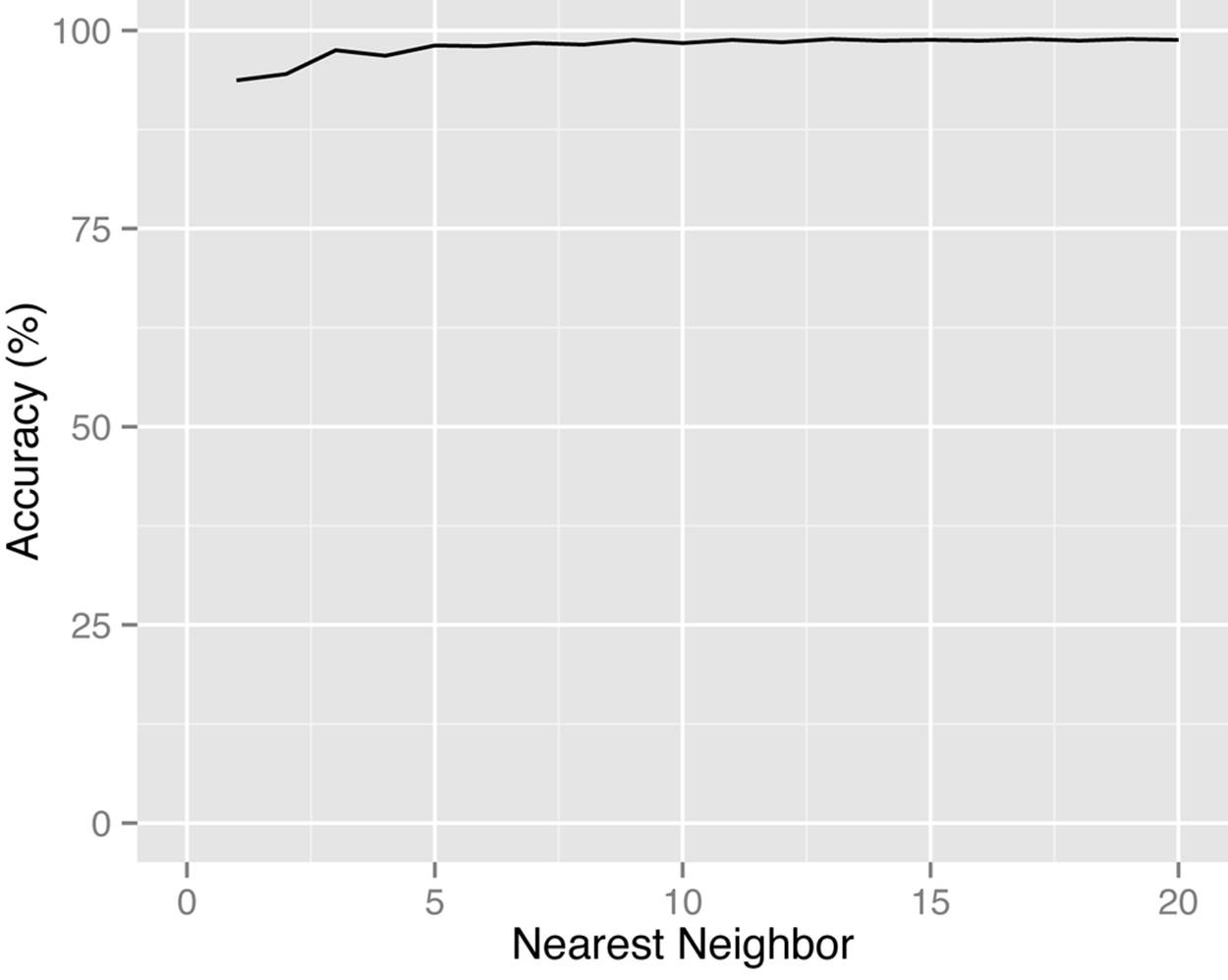
Figure 9-5. In this case the Flat Earth Society gets it close enough—the accuracy of using the Euclidean distance instead of the Haversine distance for Canadian DAs is quite high.
Clustering Neighbors
Now that we’ve figured out who our neighbors are, and we can do so quickly, we need to figure out which to cluster into larger areas. There are many clustering algorithms, from simple hierarchical ones to more complex graph-based ones. We will not discuss clustering in general because there are so many standard tools for doing this; rather, we will focus on some of the techniques needed to do this clustering efficiently for geospatial data.
All clustering approaches that are applicable here need to have some objective function to optimize. This would consist of two criteria: first, that we need to find the smallest cluster; and second, that the overall risk metric, whether maximum or average, needs to be below the threshold (earlier in the book, in Chapter 2, we discussed how to set the re-identification risk threshold). So, if we have two ways to cluster our data that are both below the re-identification risk threshold, we would choose the one that has the smallest cluster sizes.
A good place to start for clustering algorithms is k-means. The k-means algorithm “grows” clusters from the individual observations, and iterates through two steps until it reaches a stopping point: assignment and update. During the assignment step a decision is made about which cluster to group an area into. Then various metrics are calculated. The re-identification risk can be computed as part of the metrics, and that can be used to make a decision during the assignment step about whether to stop growing clusters or not.
Consider the clustering example in Figure 9-6. Here we have a DA (the grey area in the middle) that was clustered with a group of other DAs that were adjacent to it. When this data is released, we would replace the original DA with one of the DAs in that cluster. There were 11 DAs in the cluster, so each one of them (including the original DA) has a 1/11 probability of being selected as the replacement DA. This process effectively shifts the original DA to another close DA within a defined cluster that was created to meet the re-identification risk threshold. The better the clustering algorithm, the smaller this cluster will be and the smaller this shifting will be.
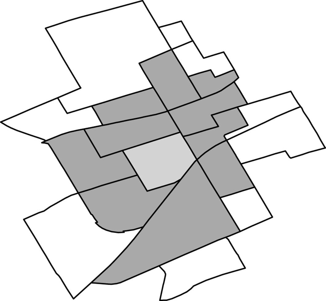
Figure 9-6. A DA is clustered with its neighbors.
We All Have Boundaries
In practice, we need to take into account preexisting boundaries when we cluster areas. Say the data will be used by a regional public health unit. That unit has authority over a particular area with a well-defined boundary. If some outbreak is detected in an adjacent area that it doesn’t have authority over, it won’t be able to intervene. It’s a waste of this public health unit’s time to cluster areas across its boundaries. We’re always striving to ensure de-identified data is of the highest utility to users, and this is just another example of that.
We can also cluster within a cropping region. If we find through de-identification that the appropriate cropping for ZIP codes is to three digits, then the three-digit ZIP codes would define the boundaries we would use. The clustering could then reduce the size of the areas within the three-digit ZIP code boundaries. This way we guarantee that clustering will produce an area that is at most the same size as that produced by cropping, but likely smaller, with the same re-identification risk.
Fast Nearest Neighbor
Finding the nearest neighbor is easy in a small data set. We just compute the distance between each area and all of the other areas, and sort the distances—so we need to construct an adjacency matrix. This won’t work for large data sets, though. The number of distances that need to be computed is n(n–1)/2, where n is the number of unique areas in the data set. This scales quadratically as the data set size increases. For a data set with 10,000 unique areas, this would amount to almost 50 million computations. We need to find a more efficient way to do this!
One simple approach to finding the nearest neighbor is to use a Hilbert curve,[68] like the one in Figure 9-7. This is a fractal space-filling curve that allows us to project two-dimensional x,y values onto a single dimension (the Hilbert curve itself). There are other space-filling curves, but we will only consider this one for simplicity. Points that are close in the multidimensional space should be close on the Hilbert curve as well. Then we just search above and below any point along the Hilbert curve to get its nearest neighbors. This can be very fast as it involves far fewer comparisons than creating a full adjacency matrix. But it isn’t perfect—some points that are physically close to each other will be far apart on the Hilbert curve.
Figure 9-7. Fill it up! This is an example of a third-order Hilbert curve. The higher the order, the more space it fills in.
We evaluated the utility of the Hilbert curve to efficiently find nearest neighbors for geographic areas. We took all DAs in Canada and ZIP codes in the US, and for each compared the nearest neighbors on the Hilbert curve to the true nearest neighbors (taking into account the curvature of the Earth). The results are in Figure 9-8. Within the number of nearest neighbors along the Hilbert curve, we computed the exact distance to find the true nearest neighbors. So if we consider the 50 nearest neighbors along the Hilbert curve to a point, then the exact distance is computed between the point and those other 50 neighbors found using the Hilbert curve. This is much faster than the naive approach because now we only need to compute n × 50 distances instead of n(n–1)/2 distances (although there are fewer when boundaries are considered).
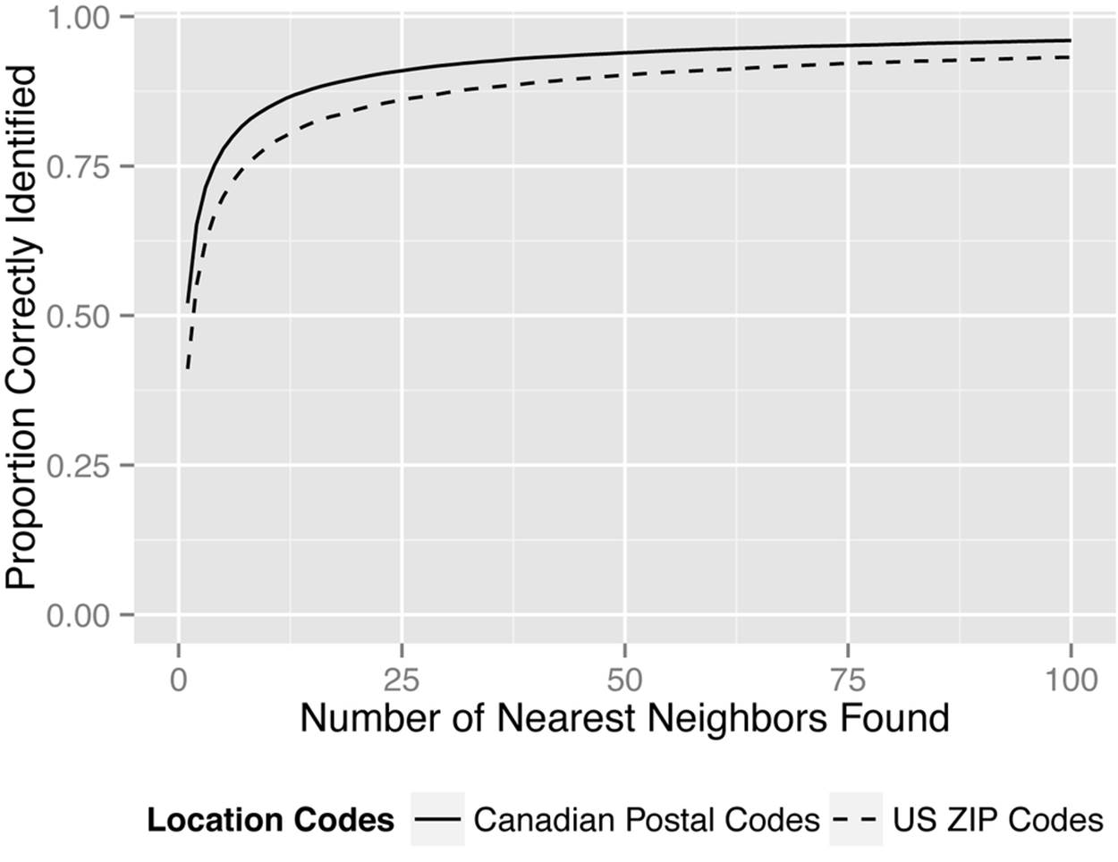
Figure 9-8. Finding the nearest neighbor with a third-order Hilbert curve. The probability of finding the true nearest neighbor increases the more Hilbert nearest neighbors we consider.
Performance-wise, the Hilbert curve approach to clustering is great. The points on the curve can be computed once and stored in a database, so initial distance calculations would just require a very fast lookup. If more accurate results are needed, an r-tree could be used to compute the distances during the clustering process. This has some cost in terms of initially setting up the tree, but the lookups can be quite efficient afterwards.
Too Close to Home
Health data sets often contain multiple variables indicating location. Just as with other kinds of health information, location information tends to be correlated. The patient’s home is probably close to his doctor’s office, and it’s probably close to the local community pharmacy where he gets his drugs. This means that even if we suppress, crop, or cluster data on the patient location (e.g., ZIP codes), an adversary might be able to recover that information from knowledge of where the provider or pharmacy is located. So even though provider and pharmacy location are not considered personal information about the patient, we still need to examine them carefully because they can help an adversary predict personal information about the patient.
When provider or pharmacy information can reveal information about a patient’s location, we call this a geoproxy attack. Many data sets include provider information, in the form of the provider or prescriber’s name or NPI number. Community pharmacy names or ZIP codes can also be used for geoproxy attacks.
There are, of course, exceptions. Sometimes the drugs are dispensed from mailing centers to the providers or to special clinics that perform, say, injections. In those cases the pharmacy information cannot be used for geoproxy attacks because it’s not indicative of patient location.
Levels of Geoproxy Attacks
There are different levels of geoproxy attacks. For example, there can be a geoproxy attack on a record whereby the provider or pharmacy ZIP code in the record can be used to predict the patient’s ZIP code. If we have a claims data set where each record is a claim, then there can be a geoproxy attack on the claims. This is a record geoproxy attack.
Another level of attack is when the adversary uses the information from multiple records. If a patient has 50 claims and these claims cover visits to three different providers, then an adversary can use the ZIP code information from these three providers to predict where the patient lives. This attack would use some form of triangulation strategy to compute the most likely patient location given the visits to providers in these three other locations. This is a patient geoproxy attack. It’s probably more informative than a record-level attack because, at the end of the day, an adversary would want to know the patient’s ZIP code.
Of course, the risks will vary by data set. In some data sets, the ability to predict is quite high, whereas in others it’s much lower (although it’s never zero). It’s something that needs to be evaluated for each data set.
There are at least four variants of a patient geoproxy attack, and each has a different approach for accounting for provider location in the triangulation process:
§ Each claim is kept as a record. This means that if 10 claims are made during the same visit to the same provider, they will show up as 10 records in the data set with the same ZIP code. This causes ZIP codes where the patient has had multiple claims to be weighted more heavily than ZIP codes where only a single claim is made.
§ Each provider visit results in a record for the corresponding patient, no matter how many claims the patient makes in a single visit. This causes ZIP codes where the patient has seen a single provider multiple times to be weighted more heavily than ZIP codes where a provider is seen only once.
§ Each provider results in a single record for the corresponding patient, no matter how many times the patient has visited that provider. This causes ZIP codes where the patient has seen many providers to be weighted more heavily than ZIP codes where only a single provider is seen.
§ Each provider ZIP code results in a single record for the corresponding patient, no matter how many distinct providers in that ZIP code that patient has visited. ZIP codes where the patient has seen many providers are therefore weighted equally to ZIP codes where only a single provider is seen.
To illustrate how to measure geoproxy risk, we’ll look at the third variant, with distinct providers.
Measuring Geoproxy Risk
Let’s measure the geoproxy risk in an insurance claims data set from the state of Louisiana. The data contains patient and provider ZIP codes. We want to determine the probability of using the provider’s location to accurately predict the patient’s location. Because we have patient ZIP codes, we can compute the actual probability.
NOTE
Geoproxy risk can be taken into account during the measurement of re-identification risk. If it’s too high, you might find it necessary to apply transformations to the provider information as well as the patient data.
When measuring geoproxy risk, we need to make an assumption about the adversary—the number of nearest neighbors that the adversary will use. For simplicity, let’s just consider a record geoproxy attack. For example, an adversary can say that the patient’s five-digit ZIP code is exactly the same as the provider’s five-digit ZIP code. In this case, the adversary doesn’t use any neighbors at all to make that prediction (i.e., the adversary uses zero nearest neighbors).
Let’s say that a provider has a practice at ZIP code G. All other ZIP codes can be ranked in terms of how close they are to G. The ZIP code with rank 1 is the closest to G, the one with rank 2 is the second closest, and so on. We saw earlier in this chapter how to measure the distance between two ZIP codes.
An adversary can then say that the patient is in the same ZIP code as the provider, or in the next nearest neighbor (i.e., the ZIP code with rank 1). In this case, the adversary will have two ZIP codes that the patient can live in, and has to guess which one it is. So, the probability of predicting correctly is at most 0.5. Similarly, the adversary can consider the two nearest neighbors, in which case he has to guess which one of three ZIP codes the patient lives in. Therefore, the accuracy of an adversary’s geoproxy attack will depend on how many nearest neighbors are considered. More nearest neighbors means more confusion, and a lower chance of guessing the right one (unless there’s an effective way to weigh those nearest neighbors to pinpoint the right one).
To triangulate the patient ZIP code from multiple provider ZIP codes, we start by finding the 50 nearest ZIP codes for each provider’s ZIP code. Points are then given to each neighbor, equal to 50 minus the rank of its ZIP code with respect to the identified provider’s ZIP code. Therefore, the provider’s ZIP code (0) receives 50 points, the nearest neighbor (1) 49 points, and so on down to 1 point for the 49th-nearest neighbor. This process is repeated for each provider associated with the patient. The sum of the points allocated to each ZIP code is the score for that ZIP code.
To evaluate the effectiveness of our triangulation approach, we need a way to compare the patient’s real ZIP code to the triangulated ZIP codes. We do this by ranking the patient’s real ZIP code based on its score compared to those of the triangulated ZIP codes (i.e., seeing how many ZIP codes have a higher score than the patient’s real one). So, if the patient’s true ZIP code has a score of 240, and there are four other ZIP codes that have been given a higher score, then the patient’s ZIP code has a rank of 4.
In reality, we would be releasing the data set with ZIP codes that are correct to within a certain number of digits. Recall that a common way to release ZIP code information is to crop it. But even if geospatial clustering is used, the clusters are created within some predefined political or service delivery boundaries. When scoring the ZIP codes closest to a provider, an adversary can just assign zero points to those that are not in the same cropped ZIP code.
We computed the average geoproxy risk for predicting patient location from provider location, using the triangulation approach just described, for the claims data from the state of Louisiana. The results are shown in the graph in Figure 9-9. We considered different boundaries, from four-digit ZIP codes down to no known boundaries at all (zero-digit ZIP codes). We implemented this by just dropping the ZIP codes that were not within the boundary from the score calculation. As expected, the adversary’s best guess is the highest-ranked location, and tighter boundaries lead to a higher probability of predicting the patient’s real ZIP code.
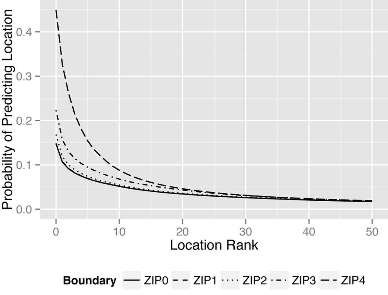
Figure 9-9. The average geoproxy risk for the claims data set from the state of Louisiana
Final Thoughts
Geospatial information is critical for data analytics. However, geospatial information can also increase the risk of re-identification significantly. Traditionally, basic cropping is used to generalize geographic areas, such as cropping the five-digit ZIP code to a three-digit one. This is a rather crude approach that results in losing a lot of geographic detail.
A better way is to cluster adjacent areas. This produces areas that are much smaller, and data sets that are quite realistic in comparison to the original data sets.
One last thing to consider when dealing with geospatial information is geoproxy attacks. These are instances where patient location information can be inferred from provider or pharmacy information. If the geoproxy risk has a significant impact on the overall risk of re-identification, additional transformations may need to be performed on the provider (or pharmacy) information.
[67] K. El Emam and E. Moher, “Biomedical Data Privacy: Problems, Perspectives, and Recent Advances,” Journal of Law, Medicine & Ethics 41:1 (2013): 37-41
[68] H. Sagan, Space-Filling Curves (New York: Springer-Verlag, 1994).