JMP Essentials: An Illustrated Guide for New Users, Second Edition (2014)
Chapter 3. Index of Graphs
This chapter is a quick reference to commonly used graphs in JMP. The format of this chapter differs from other chapters for good reason. In this chapter, you can peruse the graphs much like you’d look through a cookbook—find what you want and follow the recipe. A picture of the graph, brief description, required data conditions, usage description, and the steps required to generate the graph immediately follow. This chapter is not intended to be a complete index of graphs available in JMP, but we have tried to pick out those that we see used most often. This chapter is for the user who knows what graph they want and can pick it out by how it looks or what it’s called.
You will find that many graph windows have additional options that allow you to further enhance your graphical result. However, we have focused on the steps to generate the base case of each graph, which are illustrated in the figures that accompany each graph.
Some of the graphs illustrated in this chapter are accessed from the Graphs menu, while others are accessed from the Analyze menu.
Statistical output is provided with graphs generated from the Analyze menu. For instructions on sharing or printing graphs and on surfacing graphs into other applications such as Microsoft Word or PowerPoint or interactive HTML, see Chapter 7, sections 3 and 4.
There is more than one way to generate many of the graphs in this chapter. A selection of graphing methods will be presented including newer methods available in the more intuitive Graph Builder and Control Chart Builder platforms, as well as instructions for the legacy Chart and legacy Control Chart platforms. You can decide which method works best for you. The preferred method is presented first.
You can customize the appearance of any graph (including colors, markers, axes, legends, and fonts) by interacting with simple palettes and controls or by simply right-clicking on the area or item you want to change. See Chapter 2, sections 5 and 6, for more details on customizing the appearance of your graphs.
3.1 Basic Charts
The Graph Builder platform produces dozens of charts for general purposes. The platform responds differently depending on the modeling types of the data and the roles of the columns you select. In the context of those modeling types, it visually alerts you to charting options that come with your selections. This section is designed to help you understand some of the more commonly used charts that can be produced with this multi-purpose platform and how to produce them.
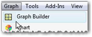
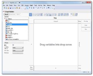
The Graph Builder platform is accessed from the Graph menu (see Figure 3.1).
Figure 3.1 Graph Builder Menu
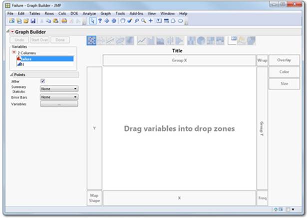
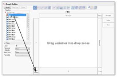
It produces appropriate graphs for each continuous nominal or ordinal column that you drag and release into a drop zone (see Figure 3.2).
Figure 3.2 Graph Builder Drop Zones
You can also learn more about using the Graph Builder platform to assist you in problem-solving in Chapters 5 and 6.
Graphs appear in the center area framed by X and Y drop zones. When columns are dragged to the drop zones, graphs instantly appear, and additional options become enabled (see Figure 3.3).
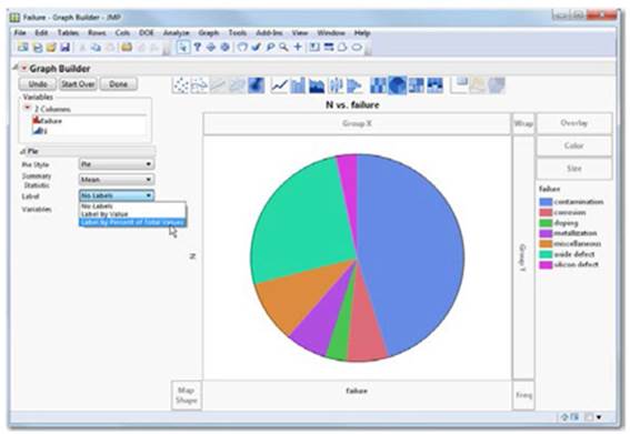
Figure 3.3 Graph Builder Pie Chart
If column modeling types like continuous and nominal and ordinal are unfamiliar to you, see Section 2.3.
By default, a point chart is generated for any column type when dragged to the X or Y drop zones.
Charting choices are revealed in the element icon palette at the top of the Graph Builder window (see Figure 3.4).
Figure 3.4 Element Icon Palette
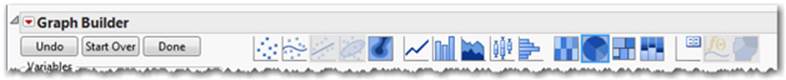
As columns are dragged to drop zones, graphing options become enabled and their icons are highlighted in the palette. Unavailable graphing options for the column combinations selected are automatically disabled and appear to be grayed out. Graphing options respond to the modeling types of the columns and the drop zones selected. You can use the SHIFT key to apply multiple elements at once. If you are unfamiliar with the graphs depicted in the element type icon palette, experiment by clicking on them when they are enabled. You can also click Undo if you don’t like the result.
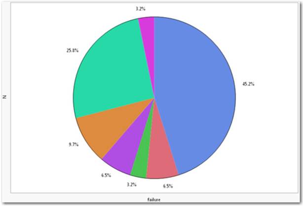
Pie Chart
A circular chart divided into areas proportional to the percentages of the whole or total.
Figure 3.5 Pie Chart
Data Table Access
To access the data table used for the above pie chart example, follow Help ▶ Sample Data ▶ Control Charts ▶ Failure.
Usage
Used when representing proportions, percentages, or fractions of any measured quantity. Some examples are market share, customer preferences, and percent of any kind of category or group. As shown, pie charts can display percentages of seven different failure types (see Figure 3.5).
Required
One ordinal or nominal column for labels and a continuous column to define the size of the pie chart sections.
Other column combinations are supported. See Help ▶ Search. Type Pie Chart in the search field.
Using the Graph Builder method, select Graph ▶ Graph Builder. Drag a continuous column with count data to the Y drop zone and drag a nominal variable with the group identifier to the X drop zone. From the element palette, choose the pie element.![]() To add percentages to the pie slices as depicted in Figure 3.5, choose Label by Percent to Total Values from the Element Properties Panel on the left.
To add percentages to the pie slices as depicted in Figure 3.5, choose Label by Percent to Total Values from the Element Properties Panel on the left.
Using the legacy Chart platform, select Graph ▶ Chart. Then select Pie Chart from the Options drop-down menu. Select a continuous column, and then from the Statistics drop-down menu, select a summary such as Sum. Select a nominal column, move it to the Categories, X, Levelsrole, and click OK. To add percentages to the pie slices as depicted, select the red triangle, and then select Label Options ▶ Label by Percent of Total Values.
Bar Chart, Line Chart, and Scatter Chart
Charts with bars, lines, and points showing lengths or positions proportional to quantities.
Figure 3.6a Bar Chart with Values
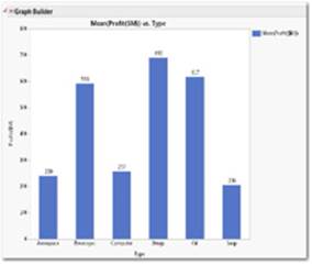
Figure 3.6b Line Chart
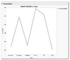
Figure 3.6c Point Chart
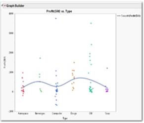
Figure 3.6d Graph Builder Pallette
Data Table Access
To access the data table used for the above chart examples, follow Help ▶ Sample Data ▶ Business and Demographic ▶ Financial.
Usage
Similar to pie charts representing individual values, proportions, percentages, or depictions of any measured quantity. Some examples are market share proportions and customer preferences expressed as percentages of any kind of category or group. As shown, these charts display profits for six company types in three different chart styles (see Figures 3.6a, 3.6b and 3.6c).
Required
One continuous column for the Y drop zone and one nominal or ordinal column for the X drop zone.
Using the Graph Builder method, select Graph ▶ Graph Builder. Then drag a continuous column to the Y drop zone and drag a nominal or ordinal column to X drop zone (see Figure 3.6d). For a bar chart, choose the bar element![]() . To add value totals to the bars as depicted, chooseLabel ▶ Value from the Bar Element Properties Panel on the left. Additional elements like Summary Statistic, Error Bars, and labeling are available from the Bar Element Properties Panel on the left. To generate a line chart, choose the line element
. To add value totals to the bars as depicted, chooseLabel ▶ Value from the Bar Element Properties Panel on the left. Additional elements like Summary Statistic, Error Bars, and labeling are available from the Bar Element Properties Panel on the left. To generate a line chart, choose the line element![]() . To generate a scatter chart with a smoother, choose both elements (scatter chart and smoother)
. To generate a scatter chart with a smoother, choose both elements (scatter chart and smoother) ![]() . Many other charts are supported. Experiment!
. Many other charts are supported. Experiment!
Using the legacy Chart platform, select Graph ▶ Chart. Then select Bar Chart, Line Chart, Needle Chart, or Point Chart from the Options drop-down menu for the chart listed. Select a continuous column and then from the Statistics drop-down menu, select a summary such as Sumor Mean. Optionally select a nominal or ordinal column for the Categories, X, Levels role. To add percentages as shown, select the red triangle, and then select Label Options ▶ Label by Percent of Total Values.
3.2 Thematic Maps
The Graph Builder platform can be used to create interactive maps with boundaries such as states, provinces, or county boundaries, and in JMP 11, street level mapping. These mapping tools are included in JMP and stored as shape files, background maps, or as a link to a street map server. Other sources of shape files (for example, ESRI) or map shapes you create yourself can be utilized in JMP. See the JMP.com website for add-in utilities to make your own map shapes.
To create thematic maps such as those in Figure 3.7a or 3.7b, your data needs to contain boundary names or abbreviations in a column that match those that appear in the shape file e.g., “California”, “CA” or “Calif”. That column is dragged to the Map Shape drop zone (Figure 3.7d).
Figure 3.7a SAT Score Math Map
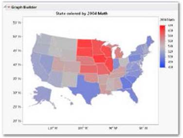
Figure 3.7b SAT Math Percent Taking Overlay
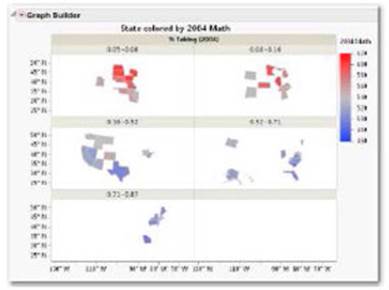
Figure 3.7c San Francisco Crime Map
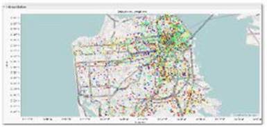
Figure 3.7d Graph Builder Map Shape Drop Zone with Arrow
Data Table Access
To access the data table used using a map shape file, select Help ▶ Sample Data ▶ Graph Builder ▶ SAT.
To access the data table used using latitude and longitude, select Help ▶ Sample Data ▶ Graph Builder ▶ San Francisco Crime.
If you have latitude and longitude columns, you may plot points on a background map as those in Figure 3.7c. (see section 2.7 for more information about these file types).
Usage
A method to graphically visualize data in a spatial system. Some examples are socio-economic indicators overlaid on political boundaries, crime incidents overlaid on street maps, or where boundaries can be defined in two dimensions.
Required for thematic maps (with a shape file)
One column recognized as a map shape to provide map boundaries and one continuous column to provide a color range.
Optional
A continuous, nominal, or ordinal column for the additional visualizations. See Appendix B for descriptions of these terms. As shown in Figures 3.7a and 3.7b, the maps display US State boundaries for 2004 SAT Scores for Math and percentage of students taking the SAT in that year.
Select Graph ▶ Graph Builder. Then, drag a map shape column from the Variables list (for example, State) to the map shape drop zone (Figure 3.7d). The states can be whole names or two-letter abbreviations.
Required for thematic maps (with latitude and longitude)
One column with latitude coordinates in the Y drop zone and one column with longitude coordinates in the X drop zone. Optional: A continuous, nominal, or ordinal column for the additional visualizations. As shown in Figure 3.7c, San Francisco crime incidents are displayed by type overlaid upon a street level map.
Select Graph ▶ Graph Builder. Then, drag the longitude column from the Variables list to the Y drop zone. Then, drag the latitude column from the Variables list to the X drop zone. Right click in the map and select Graph ▶Background Map ▶ Street Map Service ▶ OK.
3.3 Control Charts, Pareto, Variability and Overlay Plots
This section groups typical graphs used to measure product or service quality. The graphs are common in quality improvement scenarios.
Control charts are graphical and analytic tools for deciding whether a process is in a state of statistical control and for monitoring an in-control process. Control charts help determine if variations in measurement of a product are caused by small, normal variations that cannot be controlled or by some larger, special cause that can be controlled. The type of chart to use is based on the nature of the data.
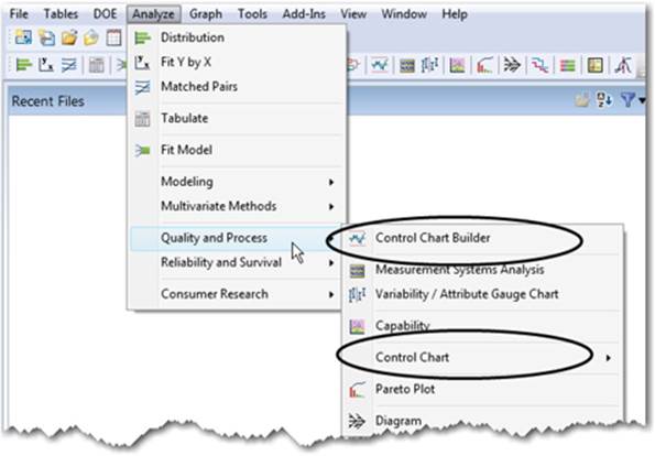
Control charts are broadly classified into control charts for variables and control charts for attributes. Control charts for variables and control charts for attributes come in several varieties with names or letters attached to them. Control charts can be generated from either the Control Chart Builder or the legacy Control Chart menu under Analyze ▶ Quality and Process (see Figure 3.8).
Figure 3.8 Quality and Process Control Chart Builder and Control Chart
Important Note: In a few of the graph instructions that follow, we use the term “numeric” -which refers to the nature of the data- in place of modeling type (continuous, nominal, ordinal). We use this term as some of the legacy platforms, like Control Chart, allow you to use either continuous or nominal/ordinal columns provided that the data is numeric. While newer platforms and their options in JMP are tied more closely to modeling type, you will find that your numeric data is likely to be continuous most of the time.
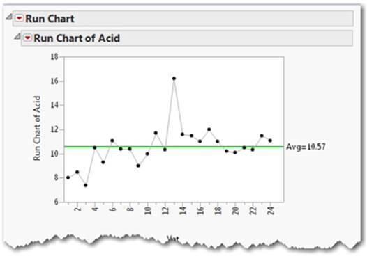
Run Chart
Displays a column of data as a connected series of points (see Figure 3.9a).
Figure 3.9a Control Chart Builder Individual Moving Range Chart
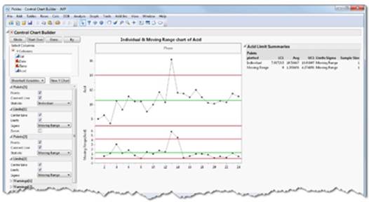
Figure 3.9b Classic Control Chart Run Chart
Data Table Access
To access the data table used for this example, follow Help ▶ Sample Data ▶ Control Charts ▶ Pickles.
Usage
Displays data from a column. Frequently used as a first visualization of quality data and to assess ranges of variability. Examples include delay times, counts of rejected items, or measurement of variability in a product or service. As shown, the run chart displays Acid measurements over 24 Pickle Vats with an average shown as a green center line.
Required
One or more continuous columns.
Optional
Nominal, ordinal, or continuous columns for the Sample Label and By and X roles.
If data in a column is sorted by ascending values of time, then the x-axis will display in the time-sorted order.
Using the Control Chart Builder method, select Analyze ▶ Quality and Process ▶ Control Chart Builder. Drag a continuous column to the Y drop zone. Use the options panel on the left to add or remove chart elements (see Figure 3.9a).
Using the legacy Control Chart platform, select Analyze ▶ Quality and Process ▶ Control Chart ▶ Run Chart (see Figure 3.9b).
Individual & Moving Range Chart
A process behavior chart that displays individual measurements. Individual measurement charts are appropriate when only one measurement is available for each subgroup sample.
The accompanying moving range chart displays moving ranges of two or more successive measurements. Moving ranges are computed using the number of consecutive measurements entered in the Range Span box. The default range span is 2.
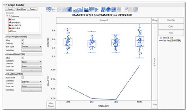
Figure 3.10a Control Chart Builder IR Chart with Phases
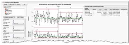
Figure 3.10b Classic Control Chart IR Chart with Phases
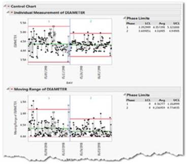
Data Table Access
To access the data table used for the above chart examples, follow Help ▶ Sample Data ▶ Control Charts ▶ Diameter.
Usage
Used when only one measurement is available for each subgroup. An example would include samples of part diameters from various lots. Individual & Moving Range charts are efficient at detecting relatively large shifts in the process average. As shown, the charts display the contrasting control limits and process performance before and after a quality improvement as phases 1 and 2 (see Figure 3.10a and Figure 3.10b).
Required
One or more numeric columns for the Process or Y role.
Optional
Continuous, nominal, or ordinal columns for the Sample Label, Phase, and By roles.
Using the Control Chart Builder method, select Analyze ▶ Quality and Process ▶ Control Chart Builder. Drag a continuous column to the Y drop zone. Drag a nominal or ordinal column to the Phase drop zone. Use the options panel on the left to add or remove chart elements (seeFigure 3.10a). To add phases as shown, select a nominal or ordinal column for the Phase drop zone near the chart top.
Using the legacy Control Chart platform, select Analyze ▶ Quality and Process ▶ Control Chart ▶ IR (see Figure 3.10b). To add phases as shown, select a nominal or ordinal column for the Phase role in the dialog box.
X-Bar/R-Charts
Displays quality characteristics measured on a continuous scale. A typical analysis shows both the process mean and its variability, aligned above a corresponding range or standard deviation chart, respectively.
Figure 3.11a Control Chart Builder XBar and R chart
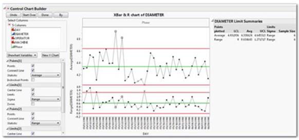
Data Table Access
To access the data table used for these chart examples, follow Help ▶ Sample Data ▶ Control Charts ▶ Diameter.
Usage
Normally used for numerical data that is recorded in subgroups in some logical manner (for example, three production parts measured every hour). A special cause, such as a broken tool, will then appear as an abnormal pattern of points on the chart. As shown, the chart displays several part diameters outside of the control limits (see Figure 3.11a).
Required
One or more numeric columns for the Process role.
Optional
Nominal, ordinal, or continuous columns for the Sample Label and By roles.
Using the Control Chart Builder method, select Analyze ▶ Quality and Process ▶ Control Chart Builder. Drag a continuous column to the Y drop zone. Drag a nominal column to the X drop zone (see Figure 3.11a).
Using the legacy Control Chart method, select Analyze ▶ Quality and Process ▶ Control Chart ▶ XBar (see Figure 3.11b).
Figure 3.11b Classic Control Chart XBar and R
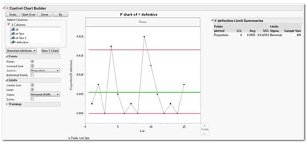
P Chart
An attribute chart that displays the proportion of nonconforming (defective) items in subgroup samples, which can vary in size. Because each subgroup for a P chart consists of N items, and an item is judged as either conforming or nonconforming, the maximum number of nonconforming items in a subgroup is N. The P Chart assumes a binomial distribution.
Figure 3.12a Control Chart Builder P chart of defective
Data Table Access
To access the data table used for these chart examples, follow Help ▶ Sample Data ▶ Control Charts ▶ Washers.
Usage
Used when one or more errors might propagate within the same sample (for example, loan transactions where more than one error may occur or where one or more errors may be present in the same unit such as on the surface of a DVD). As shown, the chart displays the proportion of defective washers across many sub-groups of washers within and outside the control limits (see Figure 3.12a).
Required
One or more numeric columns for the Process role.
Optional
Continuous, nominal, or ordinal columns for the Sample Label, Phase, and By roles. Sample Size must be a numeric column. A constant or variable sample size can be specified and must be numeric.
Using the Control Chart Builder method, select Analyze ▶ Quality and Process ▶ Control Chart Builder. Select Shewhart Attribute from the chart type drop-down. Drag a column to the Y drop zone. Drag a column to X drop zone to represent subgroups. Drag a continuous column to the n Trial drop zone. From the Points Control, select Statistic ▶ Proportion (see Figure 3.12a).
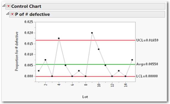
Using the legacy Control Chart method, select Analyze ▶ Quality and Process ▶ Control Chart ▶ P (see Figure 3.12b).
Figure 3.12b Classic Control Chart P Chart
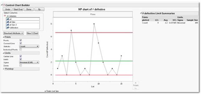
NP Chart
An attribute chart that displays the number of nonconforming (defective) items in fixed-sized subgroup samples. Because each subgroup for an NP chart consists of Ni items, and an item is judged as either conforming or nonconforming, the maximum number of nonconforming items in subgroup i is Ni. The NP Chart assumes a Binomial distribution.
Figure 3.13a Control Chart Builder NP Chart of Defective
Data Table Access
To access the data table used for the above chart examples, follow Help ▶ Sample Data ▶ Control Charts ▶ Washers.
Usage
A fixed sample is taken from an established number of transactions or manufactured items each month. From this sample, the number of transactions or items that had one or more errors is counted. The control chart then tracks the number of errors per group or lot. As shown, the chart displays the number of defective washers across many lots of washers within and outside the control limits (see Figure 3.13a).
Required
One or more numeric columns for the Process role.
Optional
Continuous, nominal, or ordinal columns for the Sample Label role, Phase, and By roles. Sample Size must be a numeric column. A constant or variable sample size can be specified and must be numeric.
Using the Control Chart Builder method, select Analyze ▶ Quality and Process ▶ Control Chart Builder. From the drop-down menu, select Shewhart Attribute. Drag a continuous column to the Y drop zone. Drag a column representing subgroups to the X drop zone. Drag a column representing lot size to the n Trials drop zone. From the Limits menu, choose Sigma, Binomial (P, NP).
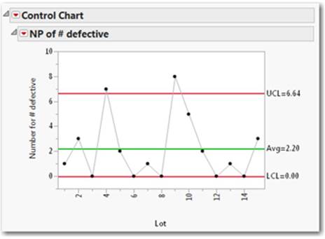
Using the legacy Control Chart method, select Analyze ▶ Quality and Process ▶ Control Chart ▶ NP (see Figure 3.13b).
Figure 3.13b Classic Control Chart NP of Defective
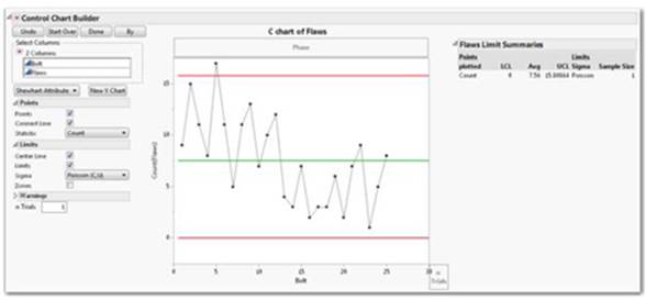
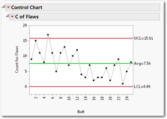
C Chart
An attribute chart that displays the number of nonconformities (defects) in a subgroup. The C Chart assumes a Poisson distribution.
Figure 3.14a Control Chart Builder C Chart of Flaws
Data Table Access
To access the data table used for the above chart examples, follow: Help ▶ Sample Data ▶ Control Charts ▶ Fabric.
Usage
The values of C computed from each subgroup are plotted on the vertical axis and can then be used to control the quality of the subgroup. As shown, the chart displays the number of flaws in each bolt of fabric within and outside the control limits (see Figure 3.14a).
Required
One or more numeric columns for the Process role.
Optional
Continuous, nominal, or ordinal columns for the Sample Label, Phase, and By roles. Sample Size must be a numeric column. A constant or variable sample size can be specified and must be numeric.
Using the Control Chart Builder method, select Analyze ▶ Quality and Process ▶ Control Chart Builder. From the drop-down menu, select Shewhart Attribute. Drag a continuous column representing defects to the Y drop zone. Drag a column representing the subgroups to the Xdrop zone.
Using the legacy Control Chart method, select Analyze ▶ Quality and Process ▶ Control Chart ▶ C (see Figure 3.14b).
Figure 3.14b Classic Control Chart C of Flaws
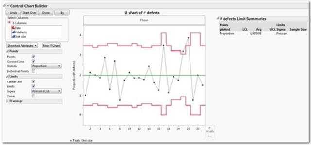
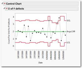
U Chart
An attribute chart that displays the number of nonconformities (defects) per unit in subgroup samples that can have a varying number of inspection units. The U Chart assumes the Poisson distribution.
Figure 3.15a Control Chart Builder U Chart Defects
Data Table Access
To access the data table used for the above chart examples, follow Help ▶ Sample Data ▶ Control Charts ▶ Braces.
Usage
To count the number of defective units in subgroups of varying numbers. As shown, the chart counts the number of defective braces in groups of braces of varying size on specific dates and indicates if the count is within or outside of the control limit (see Figure 3.15a).
Required
One or more numeric columns for the Process role.
Optional
Continuous, nominal, or ordinal columns for the Sample Label, Phase, and By roles. Sample Size must be a numeric column.
Using the Control Chart Builder method, select Analyze ▶ Quality and Process ▶ Control Chart Builder. From the drop-down menu, select Shewhart Attribute. Drag a continuous column representing defects to the Y drop zone. Drag a continuous column representing the number of units to the n Trials drop zone. From the Points menu, choose the Statistic drop-down, then choose Proportion.
Using the legacy Control Chart method, select Analyze ▶ Quality and Process ▶ Control Chart ▶ U (see Figure 3.15b).
Figure 3.15b Classic Control Chart U Defects
Variability Chart
A chart that illustrates how numeric values vary across a hierarchy of categories. Along with the data, you can view the mean, range, and standard deviation of the data in each category. The analysis options assume that the primary interest is in how the mean, range, and variance change across the categories.
Figure 3.16a Control Chart Builder Variability Chart of Diameter
Data Table Access
To access the data table used for these chart examples, follow Help ▶ Sample Data ▶ Control Charts ▶ Diameter.
Usage
For viewing the ranges, standard deviation, and means of a measured column across groups and subgroups. As shown, part diameter variability is displayed across different operators (see Figure 3.16a).
Required
At least one numeric column for the Y, Response role and at least one nominal, ordinal, or continuous column for the X, Grouping role.
Using the Graph Builder method, select Graph ▶ Graph Builder. Drag a continuous column to the Y drop zone. Drag one or more nominal or ordinal columns to the X drop zone for groups nested in hierarchies. Use selections on the element palette and line and point controls to modify the graph.
Using the legacy approach, select Analyze ▶ Quality and Process ▶ Variability / Attribute Gauge Chart (see Figure 3.16b).
Figure 3.16b Classic Variability Chart
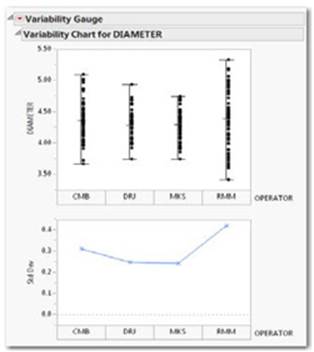
Select one column for the Y, Response role and one column for the X, Grouping role. An optional nominal column for the X, Grouping role produces horizontally nested results by the subgroup, overlaid. Click the Help button for many additional options.
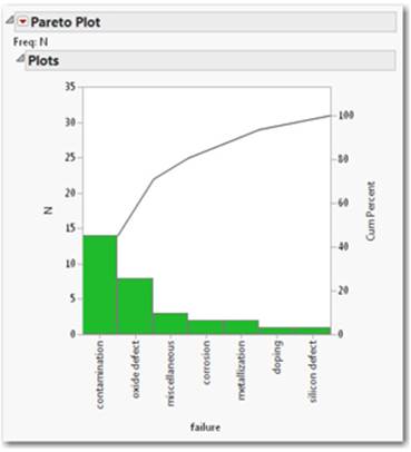
Pareto Plot
A chart often included as a quality metric for processes and products. The Pareto Plot produces charts to display the relative frequency of problems in a quality-related process or operation. A Pareto plot is a bar chart that displays the classification of problem occurrences, arranged in decreasing order. The column with values that are the cause of a problem is displayed as X in the plot. An optional column with values assigning the frequencies is assigned as Freq. An optional column whose value holds a weighting value is assigned as Weight.
Figure 3.17 Pareto Plot of Failure
Data Table Access
To access the data table used for the above chart example, follow Help ▶ Sample Data ▶ Control Charts ▶ Failure.
Usage
For counts of defects by occurrence of defect causes. The plot can be used to target improvement efforts toward those failures that are most serious or common. As shown, the chart displays defect counts and cumulative percents of seven types of semiconductor defects (see Figure 3.17).
Required
At least one continuous or nominal column for the Cause role. Additional options for Grouping, Frequency and Weight roles.
Select Help ▶ Search ▶ Pareto Plot for more information.
To generate the plot, select Analyze ▶ Quality and Process ▶ Pareto Plot.
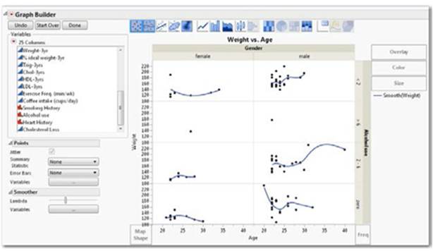
Overlay Plots
Like the variability chart presented earlier, the overlay plot allows you to visualize values over any specified times or groups. A key difference, however, is that it allows you to specify multiple Y columns and group those values in a meaningful way. An example of an overlay plot with more than one Y value is shown for reference here (see Figure 3.18a).
Figure 3.18a Overlay of Lipid Data Weight by Age by Gender by Alcohol Use
Data Table Access
To access the data table used for the above chart example, follow Help ▶ Sample Data ▶ Medical Studies ▶ Lipid Data.
Many overlay plots can be generated with Graph Builder. Some overlay plots are supported in the legacy Chart Platform. A couple of examples of overlay plots with Graph Builder follow.
To generate an overlay plot like the one pictured (see Figure 3.18a), select Graph ▶ Graph Builder. Drag a continuous column to the Y drop zone. Drag a continuous column to the X drop zone. Drag a nominal column to the Group X drop zone. Drag a nominal column to theGroup Y drop zone.
Alternate Overlay Plot
The overlay plot produces overlays of columns or groups on a single bivariate plot (see Figure 3.18b).
Figure 3.18b Alternate Overlay DJI High Close Low with Smoother by Date
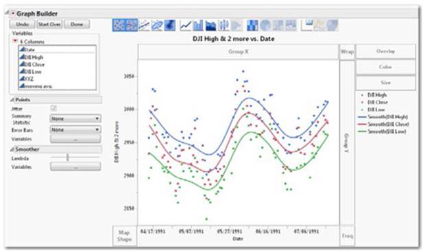
Data Table Access
To access the data table used for the above chart examples, follow Help ▶ Sample Data ▶ Business and Demographic ▶ XYZ Stock Averages (Plots).
Usage
You want to overlay multiple groups of data into one graph when there is a single x axis. The chart shows the Dow Jones High, Low, and Close index for a period of time with contrasting colors for High, Low, and Close (see Figure 3.18b).
Required
At least two numeric columns for the Y role. Optional: Continuous, nominal, or ordinal columns for the X and Grouping roles.
Select Graph ▶ Graph Builder. Select at least two numeric columns simultaneously and drag them to the Y drop zone and drag at least one continuous column to the X drop zone.
Note: When the overlay chart appears, additional customizations are available on the element icon palette and by a right mouse click inside the chart frame.
3.4 Graphs of One Column
Unlike the charts introduced so far, graphs in this section are accompanied by statistical results. These graphs depict the distribution of values for one column of data (a.k.a. univariate) and provide appropriate tools to assess their properties.
These graphs help you understand the nature of a column, such as how widely the values vary or whether there are any curious qualities to the data.
Most of these graphs are found within the Distribution platform from the Analyze menu. We also briefly cover time series in this section.
Many JMP graphs can be saved as interactive HTML and retain their interactivity when opened in a web browser.
Note: You can choose more than one column with these graphs, but each column will be graphed and independently analyzed side-by-side. When you are looking at more than one column, know that the graphs are linked, which allows you to click on any part of the graph to see and explore those values represented in the graphs of other selected columns. See Chapter 2 for more information on how graphs and data are linked.
Distribution Plot
Examines properties of a continuous, nominal, or ordinal column individually or in a univariate fashion.
Figure 3.19a Distribution of Profit($M)
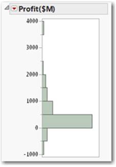
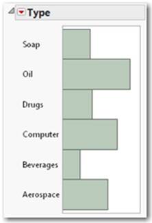
Figure 3.19b Distribution of Company Type
Data Table Access
To access the data table used for the above distribution chart examples, follow Help ▶ Sample Data ▶ Business and Demographic ▶ Financial.
Continuous Usage
To view the properties of a continuous distribution such as shape, range, and data density. As shown in Figure 3.19a, the chart displays the profits (or losses) of a selection of technology companies from the late 1990s.
Continuous Distribution Requires: One or more continuous columns for the Y, Columns role.
Nominal, Ordinal Usage
The Distribution platform is similar to a bar chart and allows you to view the properties of a frequency distribution such as the relative counts or percentages of fixed groups. As shown in Figure 3.19b, the chart displays the frequency of company types as bars for a selection of technology companies from the late 1990s. The nominal and ordinal distribution plots are related to the mosaic plot in the next section.
Frequency Distribution Requires
One or more nominal or ordinal columns for the Y, Columns role.
Select Analyze ▶ Distribution. Select a column and place it in the Y, Columns role, and click OK.
Optional
To generate a distribution plot like the ones pictured using Graph Builder select Graph ▶ Graph Builder. Drag a continuous or nominal column to the Y drop zone. Select the histogram element ![]() from the elements palette.
from the elements palette.
Outlier Box Plot
A chart for detecting extreme values and properties of a distribution, sometimes called a Tukey Box Plot. See Appendix B for a description of this term.
Figure 3.20 Tukey box plot of Profits
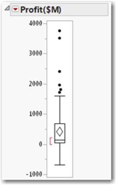
Data Table Access
To access the data table used for the above chart example, follow Help ▶ Sample Data ▶ Business and Demographic ▶ Financial.
Usage
To view the properties of a continuous distribution such as quartiles, moments, and outliers. See Appendix B for a description of these terms.
As shown, the plot displays a few very profitable companies as points that are well beyond the main body of companies, the middle half of which are contained in the box (see Figure 3.20).
Required
One or more continuous columns for the Y, Columns role.
Select Analyze ▶ Distribution. Select a continuous column and place it in the Y, Columns role, and click OK. Then click the red triangle and select Outlier Box Plot. (Program preferences might automatically generate the plot when running the Distribution platform.)
Optional
To generate an outlier box plot like the one pictured using Graph Builder select Graph ▶ Graph Builder. Drag a continuous column to the Y drop zone. Select the Box Plot element ![]() from the elements palette.
from the elements palette.
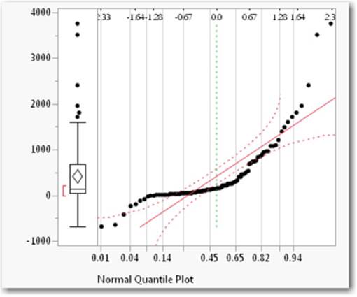
Normal Quantile Plot
A chart for visualizing the extent to which a column is consistent with a normal distribution. In a symmetrical distribution, the points would fall about the solid red line in the display and not beyond the confidence curves.
Figure 3.21 Normal Quantile Plot of Profits
Data Table Access
To access the data table used for the above chart example, follow Help ▶ Sample Data ▶ Business and Demographic ▶ Financial.
Usage
To view the properties and visually assess the extent to which the data is normally distributed (see Figure 3.21).
In this example, the plot displays the profits from a sample of companies. The data do not follow the solid red line; some fall beyond the dotted red confidence bands. The data are not consistent with a normal distribution; they are more consistent with a skewed distribution.
Required
One or more continuous columns for the Y, Columns role.
Select Analyze ▶ Distribution. Drag a continuous column into the Y, Columns role, and click OK. Click the red triangle, and select Normal Quantile Plot.
Mosaic Plot
A stacked bar chart where each segment is proportional to its group’s frequency count.
Figure 3.22 Mosaic Plot of Type
Data Table Access
To access the data table used for the above chart examples, follow Help ▶ Sample Data ▶ Business and Demographic ▶ Financial.
Usage
To view the properties of a nominal or ordinal distribution, or to visually assess the proportions of data that fall within each group. These charts are especially useful when comparing groups. Dynamic linking allows you to select a group and see if the proportion of the selection in each level remains even. If not, you have evidence of an association between the variables. As shown, the chart displays the proportions or counts of each type of company from a stock portfolio (see Figure 3.22).
Required
One or more nominal or ordinal columns for the Y, Columns role.
Select Analyze ▶ Distribution. Drag a nominal or ordinal column into the Y, Columns role, and click OK. Click the red triangle, and select Mosaic Plot.
Optional
To generate a mosaic plot like the one pictured using Graph Builder, select Graph ▶ Graph Builder. Drag a nominal column to the Y drop zone. Select the Mosaic element ![]() from the elements palette.
from the elements palette.
Time Series
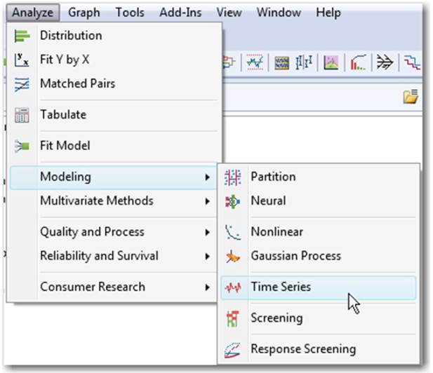
Time Series is a separate platform that generates a graph of a numeric value over time. It also serves as a platform to employ forecasting techniques and produces statistical results. For more information on these techniques, see the JMP Statistics and Graphics Guide (Help > Books > Specialized Models). The Time Series platform is available from the Analyze menu and the Modeling submenu (see Figure 3.23).
Figure 3.23 Analyze Modeling Time Series
Data Table Access
To access the data table used for these chart examples, follow Help > Sample Data > Time Series > Raleigh Temps.
Time Series Plot
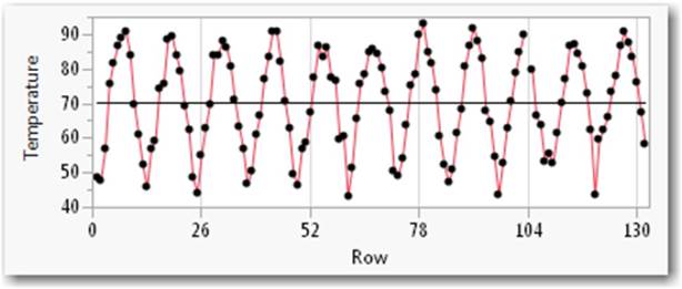
A graph of numeric values, Y, over a time order, X.
Usage
To view and fit the variability and potential seasonality of a measured value over time. For example, the chart displays the average monthly temperatures with a clear seasonal trend in Raleigh, North Carolina, over a 130-month period (see Figure 3.24).
Figure 3.24 Time Series
Required
One numeric column for the Y, Time Series role. Options include a numeric Time column (X, Time ID) with corresponding values and an input column. If an X, Time ID column is not specified, JMP orders the data over the rows sequentially. It is assumed that the time interval is constant between every pair of time points.
Select Analyze ▶ Modeling ▶ Time Series, drag a continuous measured column to the Y, Time Series role, and click OK. Select a numeric column for the Time, ID role.
3.5 Graphs Comparing Two Columns
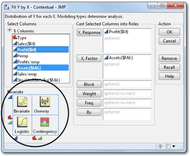
The Fit Y by X command studies the relationship of two columns (a.k.a. bivariate). This command is available from the Analyze menu and shows graphs with statistical results for each pair of x and y columns. The type of graph generated by JMP is determined by the modeling types (continuous, nominal, or ordinal) of the columns that are cast into the X and Y roles. JMP always creates the right graphs based on the modeling type for any function from the Analyze menu. In important ways, Fit Y by X is four sets of graphs and analyses in one!
The matrix circled in the Fit Y by X window (see Figure 3.25) provides a visual preview of the graphs that will be generated depending on the modeling type of the Y (the vertical axis) and the X (the horizontal axis), which can be altered to obtain the desired analysis or plot.
Note: If the column modeling types nominal, ordinal, and continuous are unfamiliar to you, see Section 2.3.
Figure 3.25 Fit Y by X Contextual
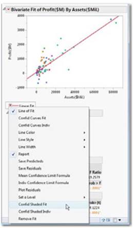
Scatterplot
A graph of the continuous-by-continuous personality within the Fit Y by X command. The analysis begins as a scatterplot of points to which you can interactively add a linear fit and confidence curves.
Figure 3.26a Bivariate Profit by Assets
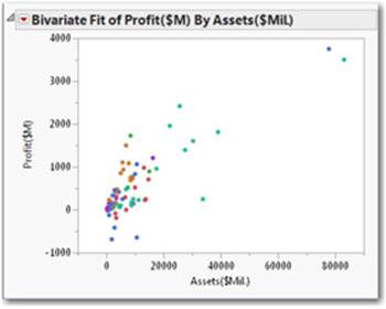
Figure 3.26b Bivariate Profit by Assets Fit Line
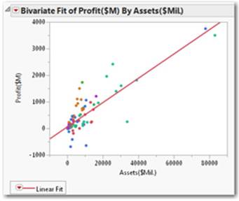
Figure 3.26c Bivariate Profit by Assets Fit Line Conf Shaded Fit
Data Table Access
To access the data table used for the above chart examples, follow Help ▶ Sample Data ▶ Business and Demographic ▶ Financial.
Usage
To view the relationship of a continuous column to another continuous column. An example might be graphing the relationship of profits to assets for a selection of Fortune 500 companies and then fitting a regression line with 95% confidence curves, as shown (see Figures 3.26a,3.26b, and 3.26c).
Required
One continuous column for the Y, Response role and one continuous column for the X, Factor role.
Select Analyze ▶ Fit Y by X, select a continuous Y, Response column and a continuous X, Factor column, and click OK (see Figure 3.26a).
To add the simple linear least squares fit: From the red triangle next to Bivariate Fit, select Fit Line (see Figure 3.26b).
To add the confidence shaded curves to the fit: From the red triangle on the Linear Fit item, select Confid Shaded Fit (see Figure 3.26c).
Optional
Using the Graph Builder method, select Graph ▶ Graph Builder and drag a continuous column to the Y drop zone and a continuous column to the X drop zone. Select the Line of Fit ![]() element from the elements palette.
element from the elements palette.
Note: Bivariate and scatter plots with fitting are also supported in the Graph Builder Platform. These graphs show colored markers. For more information on how to color or mark rows, see Section 2.6.
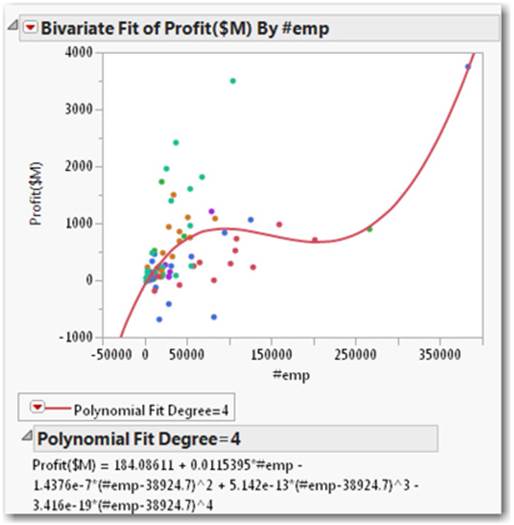
Scatterplot (with Polynomial Fit)
A graph that fits a polynomial curve to the degree you select from the Fit Polynomial submenu. After you select the polynomial degree, the curve is fit to the data points using least squares regression.
Figure 3.27 Bivariate 4th Order Fit
Data Access Table
To access the data table used for the above chart example, follow Help ▶ Sample Data ▶ Business and Demographic ▶ Financial.
Usage
To view the relationship of a continuous column to another continuous column using a linear polynomial fit where curves produce the best fit of the data. The chart displays the fourth-order polynomial fit showing the relationship of profits to number of employees for a selection of companies (see Figure 3.27).
Required
One continuous column for the Y, Response column and one continuous column for the X, Factor role.
Select Analyze ▶ Fit Y by X, select a continuous Y, Response column and a continuous X, Factor column, and click OK. From the red triangle, select Fit Polynomial and select a degree number from the submenu.
Optional
Using the Graph Builder method, select Graph ▶ Graph Builder and drag a continuous column to the Y drop zone and a continuous column to the X drop zone. Select the Line Of Fit ![]() element from the elements palette, then adjust the degree of fit in the Line Of Fit panel.
element from the elements palette, then adjust the degree of fit in the Line Of Fit panel.
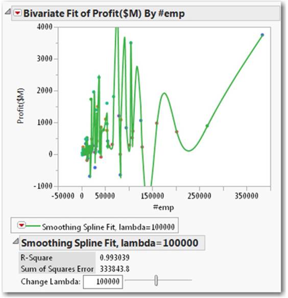
Scatterplot (with Spline Fit)
A chart that fits a smoothing spline that varies in smoothness (or flexibility) according to a tuning parameter in the spline formula. Splines contrast the polynomial fit using least squares regression. You can use a spline of varying smoothness to highlight the overall trends in the data without using a linear function to describe the relationship.
Figure 3.28 Bivariate Spline Fit
Data Table Access
To access the data table used for the above chart example, follow Help ▶ Sample Data ▶ Business and Demographic ▶ Financial.
Usage
To view the relationship of a continuous column to another continuous column. For example, the chart illustrates that limited profit variation is present in companies with lower numbers of employees. The plot also shows that fewer companies have higher numbers of employees and higher profit variation (see Figure 3.28).
Required
One continuous column for the Y, Response role and one continuous column for the X, Factor role.
Select Analyze ▶ Fit Y by X. Select a continuous column and place it in the Y, Response role. Select a continuous column, place it in the X, Factor role, and click OK. From the red triangle, select Fit Spline, and from the submenu, select the degree of flexibility you want in the spline fit by changing the lambda value.
Optional
Using the Graph Builder method, select Graph ▶ Graph Builder and drag a continuous column to the Y drop zone and drag a continuous column to the X drop zone. Adjust lambda to the value desired.
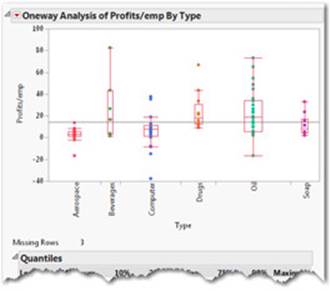
Oneway Plots
The Oneway platform analyzes how the distribution of a continuous Y column differs across groups defined by a categorical X column. Group means, as well as other statistics and tests, can be calculated and tested. The Oneway platform is the continuous (placed as Y) by nominal/ordinal (placed as X) personality of the Fit Y by X command.
Figure 3.29a Oneway Profits emp by Type
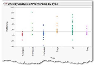
Figure 3.29b Oneway Profits emp by Type
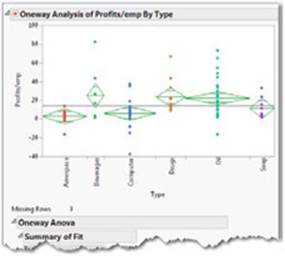
Figure 3.29c Oneway Profits emp by Type ANOVA
Data Table Access
To access the data table used for these chart examples, follow Help ▶ Sample Data ▶ Business and Demographic ▶ Financial.
Usage
To view the relationship of a continuous column across the groups (nominal/ordinal) in another column. For example, the chart displays the difference in means and variation in profits and employees across six company types (see Figures 3.29a, 3.29b, and 3.29c).
Required
One continuous column for the Y, Response column and one nominal or ordinal column for the X, Factor role.
Select Analyze ▶ Fit Y by X. Select a continuous column for the Y, Response role and a nominal or ordinal column for the X, Factor role, then click OK (see Figure 3.29a).
From the red triangle, select Means/Anova (see Figure 3.29b).
From the red triangle, select Quantiles (see Figure 3.29c).
Optional
Using the Graph Builder method, select Graph ▶ Graph Builder, drag a continuous column to the Y drop zone and a nominal column to the X drop zone. Select the box plot ![]() element from the elements palette. Right-click in the graph frame to choose additional box plot options.
element from the elements palette. Right-click in the graph frame to choose additional box plot options.
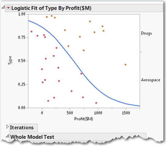
Logistic Fit
A chart that estimates the probability of choosing one of the Y response levels as a smooth function of the X factor. The fitted probabilities must be between 0 and 1 and must sum to 1 across the response levels for a given factor value.
In a logistic probability plot, the y-axis represents probability.
Figure 3.30 Fit Y by X Logistic
Data Table Access
To access the data table used for the above example, follow Help ▶ Sample Data ▶ Business and Demographic ▶ Financial.
Usage
To predict a group or groups by some continuous column. The chart displays a prediction separation (as a probability/percentage) of the type of company (Drugs or Aerospace) by its profits (see Figure 3.30).
Required
One nominal or ordinal column for the Y, Response column and one continuous column for the X, Factor role.
Select Analyze ▶ Fit Y by X. Select a nominal or ordinal column for the Y, Response role and a continuous column for the X, Factor role, then click OK.
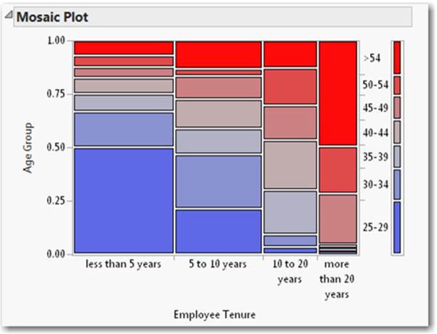
Mosaic Plot
A chart that is divided into small rectangles such that the area of each rectangle is proportional to a frequency count of interest.
The Mosaic Plot appears in the Contingency Platform and is the personality of the Fit Y by X command when both the Y and X columns are nominal or ordinal. Mosaic examines the distribution of a categorical Y column by the values of a categorical X column.
Figure 3.31 Fit Y by X Contingency Mosaic Plot
Data Access Table
To access the data table used for the above chart example, follow Help ▶ Sample Data ▶ Psychology and Social Science ▶ Consumer Preferences.
Usage
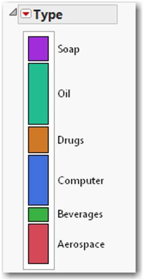
Group-by-group counts are shown as proportional colored rectangles in a two-by-two arrangement. As shown, the graph displays a simple color chart of the proportion of seven age groups displayed by four employee tenure groups in a large company. Older employees are represented in red shades while younger employees are represented in blue shades (see Figure 3.31).
Required
One nominal or ordinal column for the Y, Response column and at least one nominal or ordinal column for the X, Factor role.
Select Analyze ▶ Fit Y by X. Select a nominal or ordinal column for the Y, Response role and a nominal or ordinal column for the X, Factor role, and click OK.
Optional
Using the Graph Builder method, select Graph ▶ Graph Builder and drag a nominal or ordinal column to the Y drop zone and a nominal or ordinal column to the X drop zone. Select the mosaic icon ![]() from the elements palette.
from the elements palette.
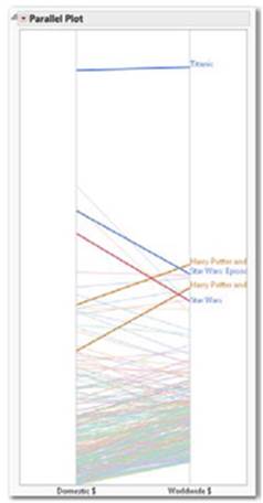
Parallel Plot
A plot that displays lines representing differences among specified row values. The strength of a parallel plot is that major differences show up easily as crossed lines. The columns often represent a related measured quantity across time or location.
Figure 3.32 Parallel Plot of Movies Domestic Worldwide
Data Access Tables
To access the data table used for this chart example, follow Help ▶ Sample Data ▶ Business and Demographic ▶ Movies.
Usage
To visually detect measurement differences across many rows of data. The chart displays which movies performed better in worldwide revenues relative to domestic revenues and vice-versa (see Figure 3.32).
Required
At least one column of any type; two are recommended.
Select Graph ▶ Parallel Plot. Select at least two columns, drag them to the Y, Response role, and click OK.
To produce the row labels, add a label attribute to the Movie column, select the line in the plot and select row label. To produce the row colors, select Type and select Rows ▶ Color or Mark by Column. See Section 2.5 for details on row labels.
3.6 Graphs Displaying Multiple Columns
Sometimes it is valuable to see a problem in more than two dimensions. This section uses JMP to visualize three or more columns at once. With the exception of the profiler, which concludes this section, these graphs appear under the Graph menu and contain only a few built-in analytic procedures (see Figure 3.33).
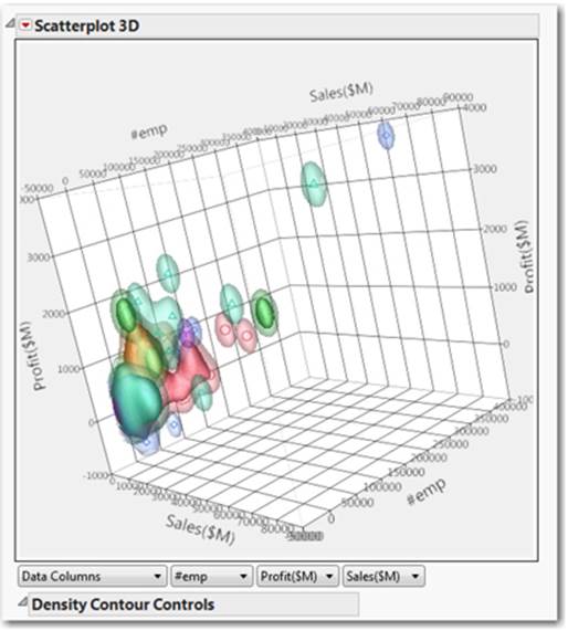
Figure 3.33 Graph Scatterplot 3D
Like most JMP graphs, these multi-dimensional (or multi- column) graphs are interactive and allow you to select, rotate, and animate them. You can copy and paste these into other documents. Two of them, the bubble plot and the profiler, allow you to create exportable Flash files that retain their interactivity and animation. At this book’s release, many graphs can be saved as interactive HTML and retain their interactivity when opened in a web browser.
Scatterplot 3D
Accessible from the Graph menu, this chart displays a three-dimensional scatterplot that can be rotated with your mouse. The Scatterplot 3D platform displays three columns at a time from the columns you select.
Figure 3.34 Scatterplot 3D
Data Access Table
To access the data table used for the above chart example, follow Help ▶ Sample Data ▶ Business and Demographic ▶ Financial.
Usage
To view patterns among any two or three columns of data. This plot is very useful for exploring data in three dimensions. The chart displays sales (y-axis) by number of employees (x-axis) by profits (z-axis) with colored 3D density contours by company type (see Figure 3.34). The eye can detect possible differences among company types across the three columns. This is an interactive plot and can be rotated on any axis. To rotate the graph, click and hold the graph and move the mouse.
Required
Two or more columns of any modeling type (can be continuous, nominal, or ordinal). Three columns are required for a three-dimensional plot.
Select Graph ▶ Scatterplot 3D. Select at least two columns (three are recommended), place them in the Y, Columns role, and click OK. To include surfaces as displayed, from the red triangle, select Nonpar Density Contour.
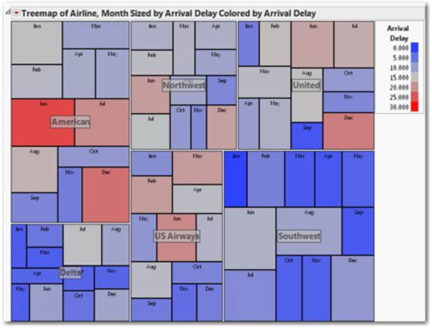
Tree Map
A graphical technique of observing patterns among groups that have many levels. Tree maps are especially useful in cases where histograms are ineffective because there are so many bars.
Figure 3.35 Tree Map Airline Delays
Data Table Access
To access the data table used for the above chart example, follow Help ▶ Sample Data ▶ Open Sample Data Directory ▶ Airline Delays.
Usage
For example, the chart displays airline arrival delays by month, where hot colors represent longer delays and cold colors represent shorter delays by airline. Larger squares are longer delays as well (see Figure 3.35). These maps produce convenient visual rankings or groups within groups.
Required
At least one continuous, nominal, or ordinal column for the Categories role.
Using the legacy method, select Graph ▶ Tree Map.
Select one nominal or ordinal column for the Categories role and click OK. Optionally, select numeric columns and place them in the Sizes and Ordering roles. Also optionally, select a column and place it in the Coloring role, and click OK.
To generate a legend as shown, a Coloring column must be set. Then from the red triangle, select Legend.
Option
Using the Graph Builder method, select Graph ▶ Graph Builder and drag a nominal or ordinal column to the Y drop zone and a nominal or ordinal column to the X drop zone. Select the tree map icon ![]() from the elements palette. Drag additional columns to drop zones. Experiment!
from the elements palette. Drag additional columns to drop zones. Experiment!
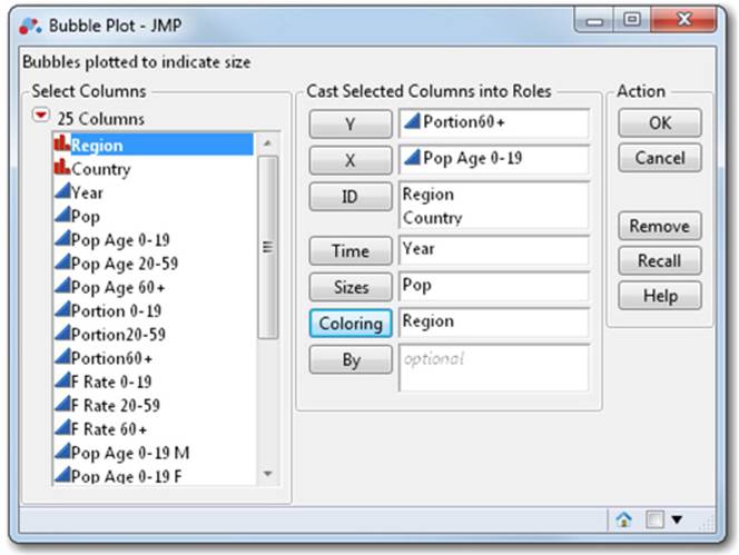
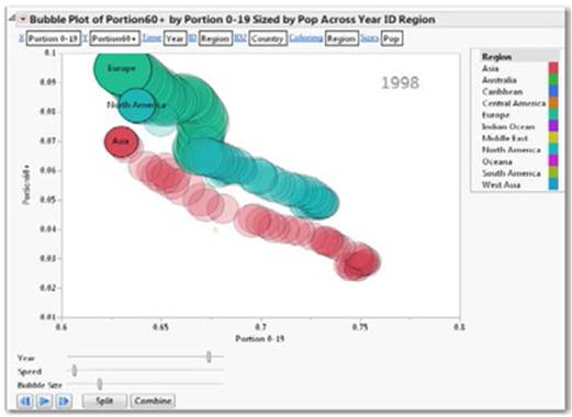
Bubble Plot
An interactive scatterplot that represents its points as circles (bubbles). Optionally, the bubbles can be sized according to another column, colored by yet another column, and dynamically indexed by a time column. With the opportunity to see up to five dimensions at once (x position, y position, size, color, and time), bubble plots can produce dramatic animated visualizations and are effective at communicating complex relationships.
Figure 3.36 Bubble Plot Window with Vars
Data Table Access
To access the data table used for these chart examples, follow Help ▶ Sample Data ▶ Open the Sample Data Directory ▶ PopAgeGroup.
Usage
Summarizing multi-column data in an interactive two-dimensional display. Frequently used where time is one of the columns. The bubble plot in this example displays the relationship of the portion of the population over 60 years old related to the portion of the population between 0 and 19 years old, colored by continent over a 55-year time span (see Figure 3.36). Sizes of bubbles show population size (see Figure 3.37).
Figure 3.37 Bubble Plot Portion 60plus vs Portion 0 to 19
Required
One X column and one Y column of any type (continuous, nominal, or ordinal). For time animation, select a column for the Time role.
Select Graph ▶ Bubble Plot. Select one column and place it in the Y role. Select one column and place it in the X role. For an animated time series plot, specify a Time column. The ID column produces a label for each bubble. The Sizes and Coloring columns can be specified to increase information density (see Figure 3.36).
To generate trail lines (as shown), select the Trail Lines and Trail Bubbles options from the red triangle. To save a Flash file of this plot for viewing in a Web browser or PowerPoint. From the red triangle, select Save As Flash (SWF) and specify a location for the Flash file.
To turn on the legend, select the red triangle, then select Legend.
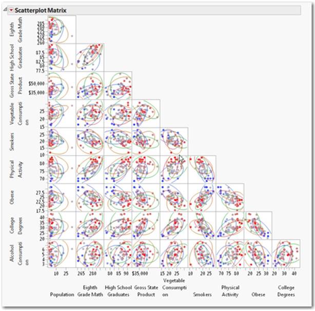
Scatterplot Matrix
A chart that provides quick and orderly production of many bivariate graphs. These are assembled so that comparisons among many columns can be conducted visually and that correlation and data pattern can be easily detected. In addition, the plots can be customized and employ advanced features (such as density ellipses) to provide for further analysis.
Figure 3.38 Scatterplot Matrix with Density Elipses
Data Access Table
To access the data table used for the above chart example, follow Help ▶ Sample Data ▶ Open the Sample Data Directory ▶ US Demographics.
Usage
In this example, the scatterplot matrix provides every bivariate combination of nine columns of US States demographic data (see Figure 3.38). This chart quickly produces many correlation plots of all variables specified for easy identification of interesting groups and patterns.
Required
Two or more columns of any type (continuous, nominal, or ordinal) for the Y, Columns role. More than two columns are recommended.
Select Graph ▶ Scatterplot Matrix.
Select at least one column for the Y, Columns role. Select multiple Y and X columns for a matrix of graphs. Optionally, select a column and place it in the X role. Select a nominal or an ordinal column and place it in the Group role.
To include grouped ellipses as shown, include a column for the Group role in the window. Then for the plot, select Density Ellipses from the red triangle.
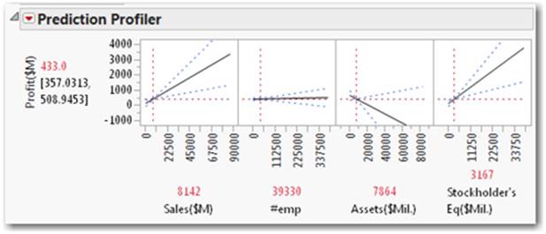
Profiler
An interactive graph that provides a simple way to view complex relationships within a model. It lets you visualize what-if scenarios quickly and easily by allowing you to see the effect that changes in one column have on the remaining columns. This tool is especially useful when describing multiple variable models by demonstrating the sensitivity of changes in one or more X columns on the predicted Y.
The profiler displays profile traces for each X column. A profile trace is the predicted response as one column is changed (by dragging the vertical red dotted line in the graphs) while the others are held constant at the current values. The profiler recalculates the predicted responses (in real time) as you vary the value of an X column.
Figure 3.39 Prediction Profiler
Data Table Access
To access the data table used for the above example, follow Help ▶ Sample Data ▶ Business and Demographic ▶ Financial.
Usage
In this example, the chart displays the relationship between a continuous column Profits($M) and four predictors: sales [Sales($M)], number of employees (#emp), assets [Assets($Mil.)], and stockholder’s equity [Stockholder’s Eq($Mil.)] (see Figure 3.39).
The profiler shows that as sales increase, predicted profits increase, and as assets increase, profits decrease. To generate interactive, real-time predictions for profits, drag the vertical red trace lines in the profiler in JMP (or in the saved Flash file).
Required
A formula column. Can be created in one of two ways: from Fit Model (which generates a formula), or from a formula column either saved from Fit Model or entered in a data table by hand.
To create a formula in a column manually, see Section 2.4.
Create a Profiler from Fit Model
Select Analyze ▶ Fit Model, and select one or more columns for the Y role and one or more columns for the Construct Model Effects. Select the Emphasis pop-down menu, select Effect Screening, and click Run Model. The profiler appears at the bottom of the report.
Create a Profiler for Use Outside of JMP (Flash File)
From the Fit Model report window from the previous step, select the red triangle and select Save Columns ▶ Prediction Formula. This action saves a prediction formula to a JMP data table column as the last column in the table.
Once you have a prediction formula in a column, select Graph ▶ Profiler from the top menu. Select the prediction formula column that has appeared in the data table, place it in the Y, Prediction Formula role, and click OK. This implementation allows you to save the profiler as a Flash file by selecting Save as Flash (swf) from the red triangle in the profiler report.
3.7 Summary
This chapter presented a series of the most frequently used graphs and their step-by-step recipes. They are presented in a cookbook style so that each can be recognized by its picture, name, or definition and easily replicated with simple steps. These charts represent the first tier of commonly used graphs. You can find additional graphs and instructions on how to create them in the JMP documentation, including The Essential Graphing. Go to Help ▶ JMP▶ Books ▶ Essential Graphing for more information.
All materials on the site are licensed Creative Commons Attribution-Sharealike 3.0 Unported CC BY-SA 3.0 & GNU Free Documentation License (GFDL)
If you are the copyright holder of any material contained on our site and intend to remove it, please contact our site administrator for approval.
© 2016-2026 All site design rights belong to S.Y.A.