JMP Essentials: An Illustrated Guide for New Users, Second Edition (2014)
Chapter 5. Problem Solving with One and Two Columns
In contrast to earlier chapters that have focused on describing data and producing graphs and maps, this chapter is about getting answers to your questions and making sense of your data in a condensed and rapid way. This problem-solving activity is often a process of trial and error, and it does not lend itself to brief descriptive steps. It takes thought and practice to do this well, but JMP is the perfect companion on this journey. This chapter helps you develop some appreciation and basic JMP skills in this problem-solving process.
Just as we discussed in the first chapter, JMP provides a navigation framework that is designed around the workflow of the problem solver. So what do we mean by, “the workflow of the problem solver?” First, we are talking about the class of problems that are measurable or countable or that already have data that is written down. If you need assistance importing or accessing your data, see Chapter 2. By workflow, we are referring to the process by which you analyze data to arrive at some understanding or insight. This involves thinking about the questions you may have of the data and recognizing how the questions translate to the menu items. Users who learn this find JMP to be a very intuitive partner in that problem-solving process.
In the problem solving process, the answer to one question often prompts other questions. JMP is designed to help you answer these follow-up questions quickly, resulting in more rapid learning. Throughout this chapter, we use simple examples with scenarios that prompt questions you might want to answer. We show you how JMP’s menus translate to these questions and how the results help you answer them. Just as many real-world problems start with basic questions and understanding and evolve into more complex ones, we start off with the basics here as well.
5.1 Introduction
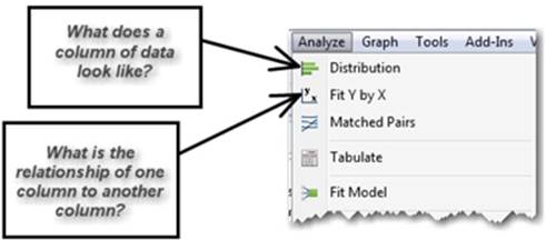
The transformation of data into information is a process that involves a few basic JMP platforms that we introduce in this chapter, including Distribution and Fit Y by X. Distribution and Fit X by Y correspond to analyzing the characteristics of one and two columns, respectively, which is the scope of this chapter. The tools are found in the Analyze menu. Table 5.1 outlines the tool name, how many columns it supports, and its statistical terms. Don’t worry if you don’t recognize the statistical terms and acronyms; we’ll present the basic ideas as we go. Appendix Bdescribes the statistical terms and concepts in this chapter.
The organization of the items on the Analyze menu is the same framework discussed in Section 1.3. Within this framework, we cover just a few menu items but in the process give you access to over 100 statistical methods.
Table 5.1 Tool Name, Columns Supported, and Statistical Terms
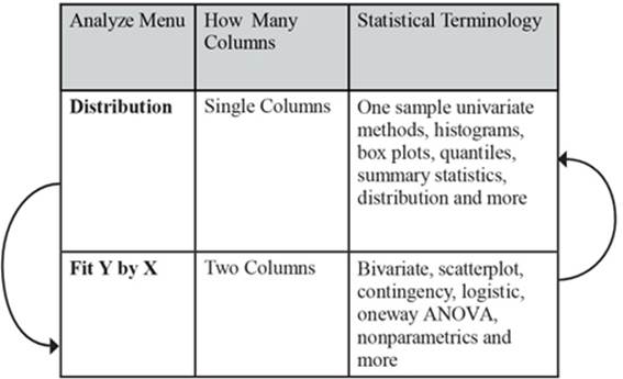
Note: If there is magic to JMP, this is it. The arrows above indicate how the Analyze menu works. First and simple questions are answered with the Distribution platform and then further questions are often addressed with items further down the menu like Fit Y by X until you get the answers you need to solve your problem. Thus, you proceed from the simple to just the level of complexity you need to answer your questions as you work your way down the Analyze menu. Sometimes a discovery is made with a more complex method farther down the Analyzemenu that leads you to confirm it with a simpler method back up the Analyze menu.
5.2 Analyzing One Column
JMP’s goal in using this menu framework is to expose you to powerful methods in a logical order that allows you to learn about your data progressively and rapidly. The order is built into the menu structure.
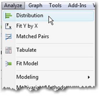
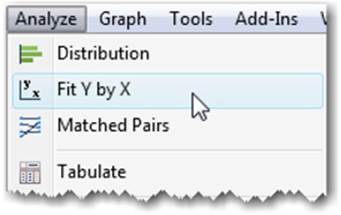
Figure 5.1 displays the first item on the Analyze menu. It is the Distribution platform. It’s first on the menu because this platform answers many basic questions that you should ask at the beginning of analysis of data.
Figure 5.1 Analyze Distribution
Another way to remember Distribution as a starting point is that the platform allows you to look at one column at a time and produces results for those individual columns. In fact, a group of statistics is called one sample univariate, meaning analysis of the properties of one variable represented as a sample. (In JMP variables are referred to as columns as we’ve mentioned in earlier chapters.) There are dozens of one sample univariate statistics, and most are conveniently arranged in the Distribution platform.
Example 5.1: Financial
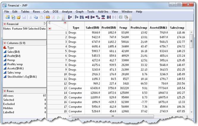
We will be using the Financial.jmp data file to illustrate the steps in this chapter. The data are from the Fortune 500 selected from the April 23, 1990 Fortune magazine issue. You can find the data set at Help ▶ Sample Data ▶Business & Demographic ▶ Financial.
This data file includes columns for:
Type type of company
Sales($M) yearly sales in millions of dollars
Profit($M) yearly profits in millions of dollars
#emp number of employees at time of measurement
Profits/emp profits per employee in thousands of dollars
Assets($Mil.) assets in millions of dollars
Sales/emp sales per employee in thousands of dollars
Stockholder’s Eq($Mil.) stockholder’s equity in millions of dollars
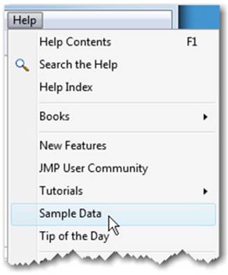
Let’s start working our way through an analysis using this process. We’ll use this exercise to practice asking the early questions of unknown data using the Distribution platform in JMP. Let’s open a data table on which to base some analysis:
1. Select Help ▶ Sample Data (see Figure 5.2).
Figure 5.2 Help Sample Data
2. Then select Business and Demographic ▶ Financial (see Figure 5.3). Some financial performance data are displayed (see Figure 5.4).
Figure 5.3 Select Business and Demographic, then Financial
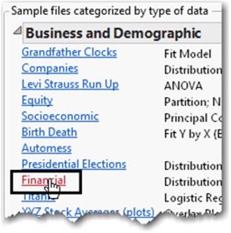
Figure 5.4 Financial Performance Data
Let’s assume that your objective is to use this financial data to help you select company stocks to add to your portfolio. Your goal is to select stocks that will maximize the likelihood of positive returns and to use those returns to fund your favorite charity. We assume that:
• The most profitable companies will also tend to have the highest positive returns.
• You have sufficient data to make a reasonable prediction.
• Each row represents a company stock. You will need to select about 10 company stocks to sufficiently diversify your portfolio.
• Market conditions for the next 6 months will remain mostly the same for all sectors.
What kinds of questions will you ask in order to pick company stocks?
Note: Time is an important variable to consider with financial data in particular. For the purposes of illustration, however, we have omitted this variable.
Questions That Involve One Column
In this example, you might ask what range of company profits has existed for these stocks. Or, what has been the average (the mean) profit for the companies? How much variability (standard deviation) has there been? Are there some companies whose profits or losses are very extreme (outliers) relative to others? Are these extremes genuine or did someone make a mistake when entering the data (data quality)?
These are the types of questions you might ask of any set of data. These initial questions and many more are all answered with the Distribution platform from the Analyze Menu.
Using Distribution to Understand a Column of Data
Let’s perform a distribution analysis to answer these early questions for company performance.
1. Select Analyze ▶ Distribution.
2. Select Type and Profits($M) and click Y, Columns. A fully populated window now appears (see Figure 5.5).
Figure 5.5 Distribution Window
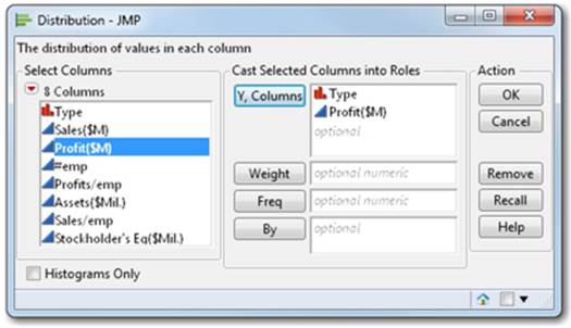
3. Click OK.
You are presented with a result (see Figure 5.6). In this example, you can see several things that might capture your attention. There are six black dots at the high end of the range. There are the highly profitable companies.
Figure 5.6 Distribution Report
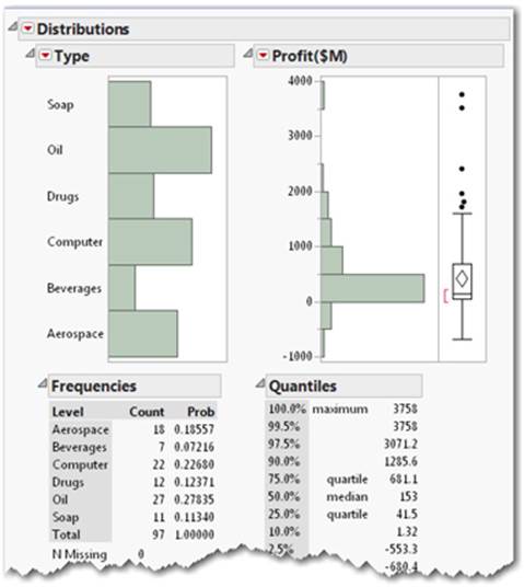
You might also notice that some company types in the portfolio are more heavily represented than others. The size of the bars in the Type distribution graph indicates that Oil has the most companies and Beverages the least.
Note: Did you know that graphs and tables of numerical results appear together in report windows by design? People can learn faster when both graphs and numerical results appear together in the same context. This is a guiding principle of all JMP reports.
Now, let’s try something new to help us answer some important questions:
4. Draw a box with your pointer around some of the highest profit entries (see Figure 5.7). Just take the pointer, left-click and drag down over the dots in the profit graph, and a rectangle appears.
Figure 5.7 Draw a Box to Show Highest Profits
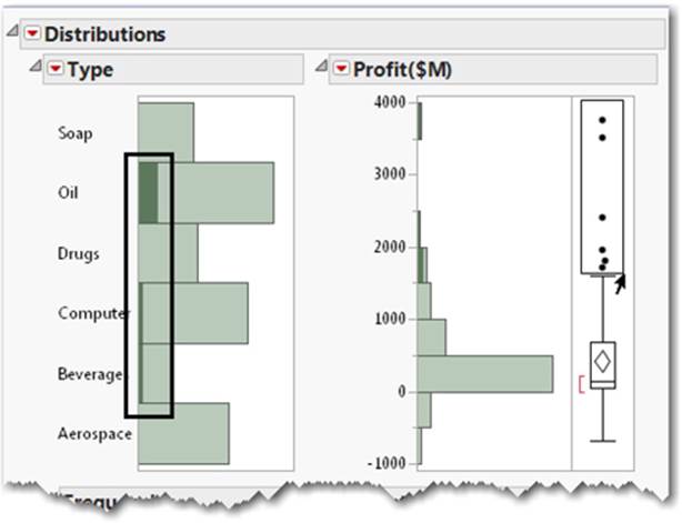
5. Notice that as you draw the box, the round dots become dark.
6. Notice also the graph bars on the left for company type, where certain types of company bars have started to turn dark green, including Oil, Computer, and Beverages. This means that companies with the greatest profits are also those mostly associated with the oil sector. Notice the tiny slivers of Computer and Beverages are turning dark green, which indicates a small number of highly profitable companies are in these two business sectors.
7. Now select the Window menu from the top and select Financial.
This brings the data table to the foreground. You can also select the data table icon from the lower right corner in the associated report window to bring the data table to the foreground (see Figure 5.8).
Figure 5.8 Select the Report Icon to Bring Data Table to the Foreground

Note: Color references used in this chapter indicate what you will see on your screen using the standard default settings in JMP.
Key Concept: Dynamic Linking of Graphs and Data. Nearly all graphs that appear in report windows in JMP are tied directly to any other displayed graphs AND to rows in the corresponding data table. By selecting graphical attributes, you see those corresponding values represented in other graphs AND highlighted in the data table.
8. Now scroll down to around row 35 (see Figure 5.9).
Figure 5.9 Rows Selected
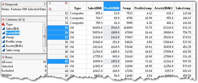
Do you see how the highlighted rows match those same points you highlighted by drawing the box in the Distribution window?
Note: The highlighting is what we refer to as JMP’s dynamic linking, which allows you to link graphs to data, data to graphs, and graphs to other graphs.
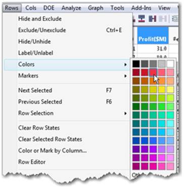
Because these highlighted rows show high profits, let’s mark them so we can always find them.
9. Select Rows ▶ Colors, and then select the color red from the color palette (see Figure 5.10).
Figure 5.10 Select Red for Row Color
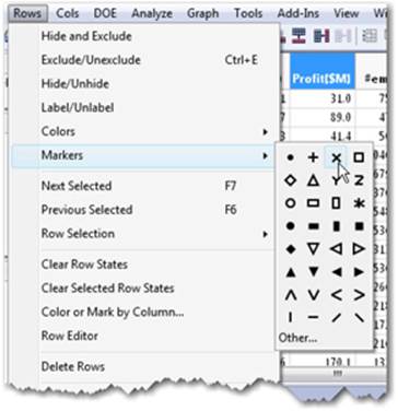
10. Select Rows ▶ Markers, and select the marker type X (see Figure 5.11).
Figure 5.11 Select Marker Type X for Rows
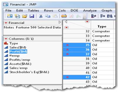
These rows in the data table are now marked red and appear with a marker type of X, as shown in the row number column of the data table (see Figure 5.12).
Figure 5.12 Rows Colored Red and Marked with X
11. Now select Window and bring the Financial – Distributions of Profit($M), Type result to the foreground. Focus on the Distributions result for Profit($M) (see Figure 5.13).
Figure 5.13 Top Profit Marked with Red Xs
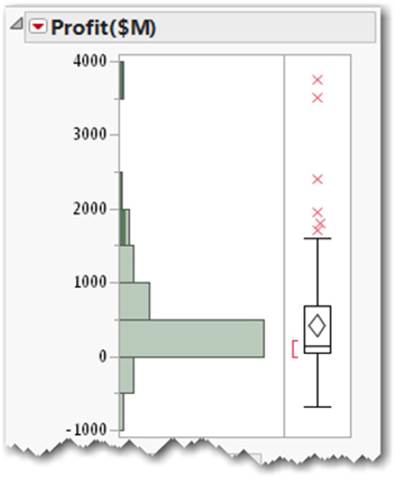
The distribution graph for profit also shows the red X markers as well as a box plot. The top X represents a company with over $3.7 billion in profits (see Figure 5.13). On the bottom of the range is a very unprofitable company at approximately -$1 billion (Figure 5.13).
If a box plot or any graphical or numerical result is unfamiliar to you, use the question mark tool (?) from the Tools menu to identify the item in question and locate the corresponding documentation about the item.
12. Select the question mark (?) from the toolbar. The pointer changes to a question mark (see Figure 5.14).
Figure 5.14 Question Mark Tool from Tool Bar

13. Then, move the question mark on top of the item you’re unfamiliar with and click on that item (see Figure 5.15). In this example, it is the item next to the distribution graph.
Figure 5.15 Question Mark on Distribution
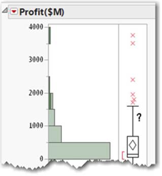
The section of the documentation associated with the outlier box plot appears automatically (see Figure 5.16). Don’t forget to scroll down, because sometimes the topic of interest is a little below where you landed in the documentation.
Figure 5.16 Help for Box Plots
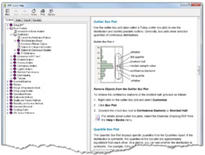
Key Concept: Unfamiliar graphics, geometric shapes, and results are explained using the context-sensitive question mark tool. Just select the question mark tool (?) from the Tools menu and click on the part of the result you want to learn about. You can learn statistics while you explore your data!
Summary of 5.2: Answers the Distribution Platform Provides
By observing the distribution, you found that the range of profits for the companies was mostly on the profitable side, topping out with a highly profitable company at over $3.7 billion. On the bottom of the range was a very unprofitable company at approximately -$1 billion (Figure 5.13).
You may have noticed that the average, or mean, profits for all companies was $426 million.
The distribution results indicated that the variability, or standard deviation, of profits was about $717 million. Most of the profitable companies fall within this range around the mean.
You found that most of the extreme values were on the high side. By identifying them, you determined that most of these companies came from the oil sector and a couple of other industry types.
5.3 Comparing One Column to Another
Building upon the Distribution platform, the answers to questions you asked about one column have motivated you to ask further questions about the relationship between two columns. For example, what might be the relationship of profits to other columns in the data table? In fact, you have already identified an interesting relationship between the company type and its profits using dynamic linking as some types of companies are associated with higher profits. This visual relationship implies something is happening with profits that includes more than just one column. This implies that there may be a relationship between at least two columns that we’ll explore in this section.
The second item under the Analyze menu is Fit Y by X. It is designed to explore relationships between one column and another column. These are sometimes called bivariate relationships (meaning two variables). You might have noticed a pattern developing for items under the Analyze menu. The first item is Distribution and is useful for looking at one column at a time. The second item is Fit Y by X for looking at the relationship between two columns. Figure 5.17 provides a description of each menu item.
Figure 5.17 Analyze Menu Item Descriptions
Let’s continue with our example and perform a Fit Y by X analysis. We already suspect that there are interesting profit differences among the different company types, and we’ve discovered a few by just looking at one column at a time using the Distribution platform and dynamic linking. We’ll now formalize that inference.
The relationship we want to explore includes the Profit($M) column and the Type column:
1. Select Analyze ▶ Fit Y by X (see Figure 5.18).
Figure 5.18 Select Fit Y by X
2. In the window (see Figure 5.19), select Profit($M) and click Y, Response.
Figure 5.19 Fit Y by X Profit by Type Oneway Analysis
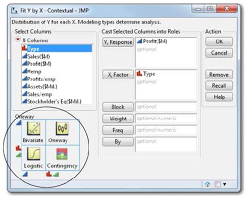
3. Select Type and click X, Factor.
4. Click OK.
Before we continue with the example, let’s examine that last Fit Y by X window. We’ll focus on the preview or circled area (see Figure 5.19).
Notice that each modeling type has its corresponding icon (continuous, nominal, ordinal which are described in section 2.3). The modeling type of the column that you cast into a role determines the type of analysis that is produced (see Figure 5.20). In this case, we have selectedProfit($M) for the Y, Response (the vertical axis), which is continuous, and Type for the X, Factor (the horizontal axis), which is nominal. The arrows in Figure 5.20 show these selections and where they intersect on the matrix indicates the type of analysis that will be produced; in this case, a Oneway.
Figure 5.20 Oneway Analysis Illustration
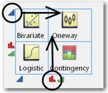
For now, don’t worry about terms like Oneway in the preview. If you want to learn about the result, you can place the question mark tool on the result after generating it. Just note that the picture previews are there so you can get an idea of what kinds of analyses will be produced when you cast certain types of columns into Y and X roles within the platform.
When you click OK, a Oneway analysis appears (see Figure 5.21).
Figure 5.21 Oneway Analysis Graph
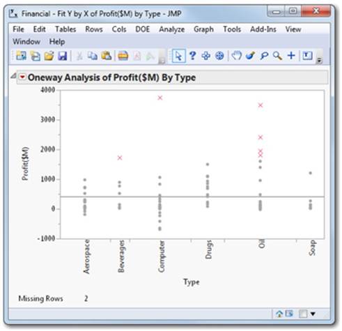
The Fit Y by X (two-column) analysis confirms what we started to observe earlier. We see that the highest profits have come from a mix of mostly oil companies, one computer company, and one beverage company. These are conveniently marked by X’s from a previous step.
Note: Your selection of the most profitable companies might differ slightly from the selection shown here. This is ok.
Based on the observed best performers among the company types, we might start asking more complex questions like these:
Questions Answered with Two Column Analysis
• Are there differences in profits among the company types?
• How big and in what direction (negative or positive) are these differences?
• Should I choose more companies from one particular company type than from another type?
These questions and others can be answered using Fit Y by X because they involve two columns. How? As you make selections from the choices in the Analyze menu, the types of questions you start asking at each step are anticipated for you.
You might notice the red triangle associated with the results you have generated (see Figure 5.22).
Figure 5.22 Red Triangle
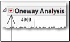
As we introduced earlier, red triangles anticipate questions you might have at any stage of analysis and have been carefully placed on the report in the context of your analysis.
Let’s use the choices on the menu for the oneway analysis to find out if there are differences in profits among company types.
You can already see some of these differences in the graph. Let’s further quantify the differences in profits by company type.
From the red triangle, select Means and Std Dev (see Figure 5.23).
Figure 5.23 Select Means and Std Dev
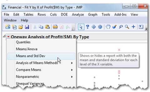
An additional table appears below your graph and blue mean error bars and standard deviation lines appear on your graph. The blue lines on the graph correspond to Mean Lines, Mean Error Bars, and Std Dev Lines. These values also appear in the table as numbers (see Figure 5.24).
Figure 5.24 Means for Drugs and Oil
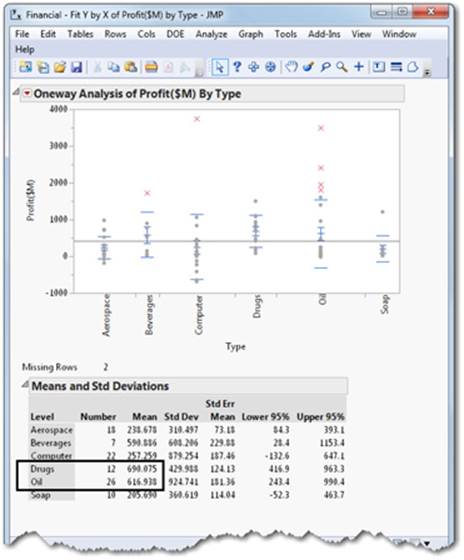
Using the table, we can now see that the highest average profits (mean) were obtained from the 12 companies represented in the drugs category. The second highest average profits were obtained from the oil category, and there were 26 companies represented.
Let’s review what we have learned so far. In Distribution, we learned that companies with the highest profits are likely to be in the oil category. From Fit Y by X, we learned that the highest average profits are found in the drug category and the next highest average profits are found in the oil category. Remember, you are trying to accumulate just enough knowledge to make your decisions. If you are keeping score, Oil is showing up as a good performer by at least two measures. The most extreme profits are coming from some of these oil companies and overall averages are also high for Oil.
Did you also notice the number of oil companies represented? This is another vote for Oil to be represented in our selection of company stocks because many highly profitable stocks are from this category. The risk associated with one oil company going down is hedged by having many profitable ones in the oil category. Note: This is true when the companies in the category are not highly correlated on the fundamentals. Seek professional advice when making investment decisions. If you are still keeping score, Oil looks better by three measures now.
We don’t really have numerical measurements of range yet to help answer the question: “How big and in what direction (negative and positive) do these differences go?”
Where might we go to answer this question? Yes, it’s in the red triangle for the oneway result.
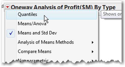
1. Select the red triangle next to Oneway.
2. Select Quantiles (see Figure 5.25). Quantiles are values that divide an order set of continuous data (from smallest to largest) into equal proportions. See “Quantiles” in Appendix B for more information.
Figure 5.25 Select Quantiles
A Quantiles table appears. This table appears in the context of your initial analysis, and box plots are added to your graph illustrating the quantiles (see Figure 5.26).
Figure 5.26 Oneway Means and Quantiles
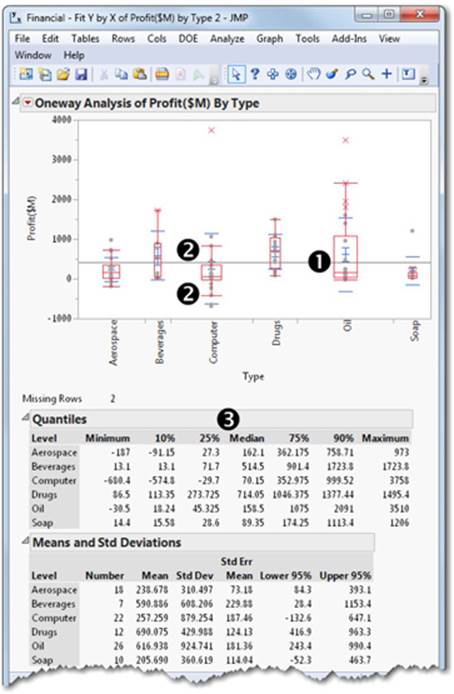
➊ The box encompasses the 25th through 75th percentiles.
➋ The whisker lines stretch out to the 10th and 90th percentiles on the corresponding sides of the box.
➌ What type of company has the worst profit by examining the Minimum column? What type of company has the best profit in the Maximum column? Which has the lowest value for the Maximum column?
You can make the differences easier to see. Try this:
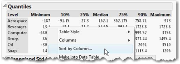
1. Right-click on the Quantiles table.
2. From the submenu, select Sort by Column (see Figure 5.27).
Figure 5.27 Sort by Column
3. Select Minimum and click OK (see Figure 5.28).
Figure 5.28 Sort Column by Minimum
4. The Profit table now appears sorted by the Minimum column (see Figure 5.29).
Figure 5.29 Quantiles Sorted by Minimum
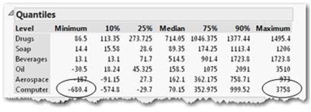
You can now see that the worst loss (or least profitable) is in the Computer category at -680.4. Can you find the biggest profits in the Maximum column? Yes, it’s also in the Computer category at 3758. They are circled for you (see Figure 5.29).
Now you can start asking yourself about your risk tolerance. Review the oneway graph you produced, the mean and standard dev, and the Quantiles table. If you are conservative, what types of companies would you pick to assure profits? Wouldn’t you choose only companies that show no negative profits?
Which ones are those? They are Drugs, Soap, and Beverages.
Higher profits appear in other categories, but more of those companies show higher variability and losses and, therefore, present more risk.
5. Finally, save the data table Finance.jmp. You will need this data table for the next chapter.
Note: The “Soap” company type above includes a group of diversified consumer products companies.
Summary of 5.3: What You Learned by Comparing One Column to Another
You may have noticed that the highest mean (average) profits are found overall in the 12 companies in the drug category and the next highest mean profits are found in the 26 companies in the oil category.
You found that the biggest losers were in the computer category as well as the most profitable ones.
You found that picking companies depends on risk tolerance. If you are conservative, you might pick Drugs, Soap, and Beverages. Higher profits might be achieved elsewhere, but they are in company types where there is higher variability or risk.
5.4 Summary
This chapter has presented an approach to problem-solving that is unique to JMP. The approach underscores the progressive nature of problem solving that tends to build from simple descriptions of one column of data to relationships between two columns of data, leading to a better understanding of the data.
Learning about data using JMP tends to start slowly, increase rapidly, and then reach understanding. Also, the process does not go simply in one direction as you move from one column to two columns. As discoveries are made between two columns, confirmation and further analysis can be made with simple one-column tools like Distribution from which our journey began.
Marking rows with colors and markers helps certain groups stand out in subsequent analyses. Visual identification with markers and colors speeds discovery and the effective communication of results.
Because many real-world problems involve multiple variables or columns, you will learn in the next chapter that JMP easily handles this increased complexity. We will build upon our example and the basic analyses introduced in this chapter to explore multivariable relationships. In the next chapter, we introduce several tools including the Partition platform, the Data Filter, and the Prediction Profiler to help you explore and discover deeper insights in your data.
All materials on the site are licensed Creative Commons Attribution-Sharealike 3.0 Unported CC BY-SA 3.0 & GNU Free Documentation License (GFDL)
If you are the copyright holder of any material contained on our site and intend to remove it, please contact our site administrator for approval.
© 2016-2026 All site design rights belong to S.Y.A.