Minitab Cookbook (2014)
Chapter 10. Time Series Analysis
In this chapter, we will be covering the following recipes:
· Fitting a trend to data
· Fitting to seasonal variation
· Time series predictions without trends or seasonal variations
Introduction
With time series, we will observe the variation in our data over time. We will also look at forecasting data from these techniques.
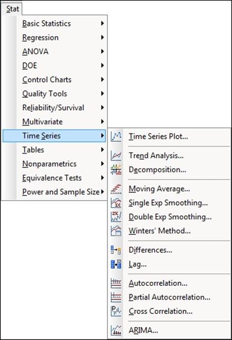
The Time Series tools are found in the Stat menu, as shown in the following screenshot. It is worth pointing out that the Time Series Plot option in the Stat menu is the same as the Time Series Plot in the Graph menu. We will not use this option here as it has already been covered in Chapter 2, Tables and Graphs.
In this chapter, we will focus on the tools that help us smooth the data over time or fit trends and seasonality.
To fit trends, we will use trend analysis and double exponential smoothing; seasonality will use the Winters method and Decomposition. Finally, when no trend or seasonality is apparent, we will use single exponential smoothing and moving average tools to smooth the series.
The datasets used in this chapter are provided as support files on the Packt website.
Fitting a trend to data
There are two tools for fitting trends in Minitab: Trend analysis and double exponential smoothing. Both of these are used to look at the trends in healthcare expenditure in the U.S. The dataset we will look at runs from 1995 to 2011. The values each year are given as a percentage of the GDP and per capita values in dollars.
We will compare the results of a trend analysis plotting a linear trend with double exponential smoothing and produce forecasts for the next three years.
This data was obtained from www.quandl.com.
How to do it…
The following steps will plot the trend and double exponential smoothing results with three years of future forecasts.
1. Open the Healthcare.mtw worksheet.
2. For the trend analysis, go to the Stat menu, then Time Series option and select Trend Analysis.
3. Enter 'Value (%)' in the Variable section.
4. Check the box for Generate forecasts, and in Number of forecasts, enter 3.
5. Click on the Time button. Select the radio button for the Stamp section and enter Year into the Stamp section.
6. Click on OK.
7. Click on the Graphs button and select the Four in one residuals option. Click on OK in each dialog box.
8. For double exponential smoothing, go back to the Time Series menu and select Double Exp Smoothing.
9. Enter 'Value (%)' in the Variable: section.
10. Follow steps 3 to 6 to stamp the axis with the year and generate residual plots.
How it works…
Trend analysis can fit trends for Linear, Quadratic, Exponential, and S-Curve models, and works work best when there is a constant trend of the previous types to model in the data. The trend analysis tools use a regression model to fit our data over time.
Double exponential smoothing is best used when the trend varies over time. With the 'Value (%)' data, we should see a change in the trend slope for the period from 2000 to 2003. Because of this, the trend analysis models will not provide an adequate fit to the varying trends in our data.
Double exponential smoothing will use a trend component and a level component to fit to the data. The level is used to fit to the variation around the trend, and the trend is used to fit to the trend line. The fitted line is generated from two exponential formulas. The fitted value at time t is given by the addition of the level and trend components as shown in the following equation:
![]()
Here, the level at time t is given as follows:
![]()
Also, the trend at time t is given as follows:
![]()
Higher values of weight for the level will, therefore, place more emphasis on the most recent results. This makes the double exponential smoothing react more quickly to variations in the data.
Higher trend values will make the trend line react more quickly to changes in the trend; lower values will give a smoother trend line. Lower values for trend will approach the linear trend.
Minitab will calculate the optimal ARIMA weights from an ARIMA (0,2,2) model looking to minimize the sum of squared errors.
For both trend analysis and double exponential smoothing, it is appropriate to check residual plots to verify the assumptions of the analysis.
The accuracy measures in the output form a useful way of comparing the models to each other The measures shown in the output form are as follows:
· Mean Absolute Percentage Error (MAPE): This represents the error as a percentage
· Mean Absolute Deviation (MAD): This allows us to observe the error in the units of the data
· Mean Squared Deviation (MSD): This gives the variance of the study
When comparing different models, the lower these figures, the better the fit to the data.
There's more…
Here, we should see that double exponential smoothing provides a better fit as we have changes in the trend of the data. We can compare the percentage results to the per capita data and check whether the double exponential or the trend analysis provides a better approach for this new column.
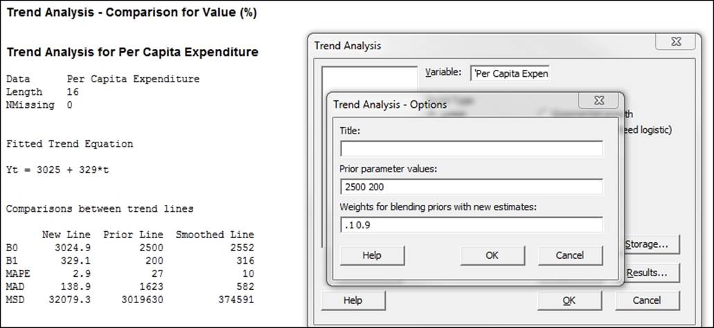
With trend analysis, we can enter historical parameter estimates in options. This will generate a comparison of the new trend and the prior values. The prior and new values can also be blended with each other by specifying a weight for the blending. Parameters and weights must be entered in the order displayed in the trend analysis. If in a previous study, we had obtained a trend of ![]() , then this would be entered into the Prior parameter values section as shown in the following screenshot. The weights for blending each term can be entered as well; these values should be between 0 and 1.
, then this would be entered into the Prior parameter values section as shown in the following screenshot. The weights for blending each term can be entered as well; these values should be between 0 and 1.
See also
· The Fitting to seasonal variation recipe
· The Time series predictions without trends or seasonal variations recipe
Fitting to seasonal variation
We can use the Decomposition or the Winters' method in Minitab to fit to the trends and seasonality in our data. It is generally recommended that we have at least four to five seasons in our data to be able to estimate seasonality.
Here, we will look at the results for temperature from the Oxford weather station. The data can be obtained from the Met Office website:
http://www.metoffice.gov.uk/climate/uk/stationdata/.
The data is also provided in the Oxford weather (cleaned).mtw worksheet. We should expect a strong seasonal pattern for temperature. As the complete dataset starts in 1853, we will use a small subset for the period 2000 to 2013 for our purposes.
While we know that the seasonal variation has a 12 month pattern, we are going to verify this with autocorrelation. We will then compare the results using the Decomposition and Winters' method tools.
In earlier examples, we obtained the data directly from the Met Office website. For our convenience, we will open a prepared dataset in a Minitab worksheet.
How to do it…
1. Open the Oxford weather (cleaned).mtw worksheet by using Open Worksheet from the File menu. To subset the worksheet, go to the Data menu and select Subset Worksheet.
2. Enter 2000 onwards in the Name section of the worksheet.
3. Select Condition and set the condition to include rows as shown in the following screenshot:
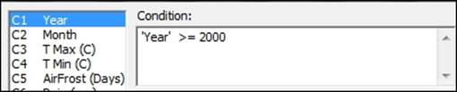
4. Click on OK in each dialog box.
5. To run autocorrelation, go to the Stat menu, then to Time Series, and select Autocorrelation.
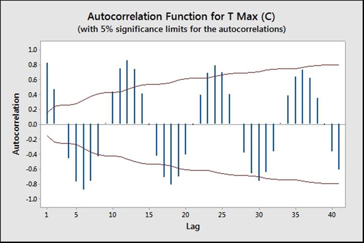
6. Enter 'T Max' in the Series section and click on OK.
The chart for the autocorrelation should show strong positive correlations at every 12 month interval and negative correlations at each 6-month interval. Next, we will run Decomposition.
7. To run Decomposition, return to the Time Series menu and select Decomposition.
8. Enter 'T Max' in the Variable section and 12 in the Seasonal length: section.
9. Check the Generate forecasts option and enter 12 to run forecasts for the next 12 months.
10. Click the Time button and select the Stamp option; enter Year and Month into the space available.
11. Click on OK to run Decomposition. Next, run the Winters' method.
12. To run the Winters' method, return to the Time Series menu and select Winters' Method.
13. Enter 'T Max' in the Variable section and enter 12 in the Seasonal length: section.
14. Click on the Time button.
15. Select the Calendar option and choose Month Year.
16. In Start value, enter 1 2000.
17. Click on OK in each dialog box.
How it works…
Autocorrelation can be a useful step in identifying seasonality in data. Peaks in the autocorrelation identify where the dataset correlates with itself after a number of lags. In the weather data, we can see peaks regularly at 12-month intervals and negative peaks at 6 month intervals.
This identifies a 12 month long seasonal pattern. Entering the seasonal length into either Decomposition or Winter's method allows us to fit both trends and seasonality.
High positive peaks at one lag would tend to indicate a dataset that trends in one direction or follows a previous value. For example, if we see a result that decreases, we may expect its resultant values to be decreased.
Decomposition will fit a trend line to the data and use either an additive or multiplicative model to find the seasonal value. The additive model gives each month a value to add or remove from the trend line as a fit to the data.
The multiplicative model gives each period, or month in this case, a multiplier to be used on the trend line. Multiplicative models are best used when seasonal variation is expected to scale with the trend. If the seasonal variation remains constant, then the additive model would be mode applicable.
Decomposition will also generate a panel of charts to investigate the seasonal effects and one to reveal the data after trends or seasonality have been removed. Both the Component Analysis page and the Seasonal Analysis page can help identify problems with fitting to the model and give us similar outputs to the residuals plots.
As with fitting to trends, MAPE, MAD, and MSD are used to evaluate the closest fitting model. Again, we would want to find a model with the lowest values for these measures.
The Winters' method, which is sometimes referred to as the Holt-Winters method, uses a triple exponential smoothing formula. We include a seasonality component along with level and trend for exponential smoothing. Fitted values are generated in a similar manner to the double exponential smoothing function, but with the additional seasonal component. Additive or multiplicative models can be selected, as was done in Decomposition, and they function in the same manner.
Smoothing constants can be selected to have values between 0 and 1, although they tend to be between 0.02 and 0.2. Ideally, we want to obtain a model where the weights for level, trend, and seasonality give the smallest square errors across the time series. Minitab does not offer a fitting method to estimate the values of the smoothing constants, and it can be difficult to settle on a unique solution for the weightings. We can expect several possible combinations of weights to give reasonable results.
As with double exponential smoothing, weights that tend to zero give less value to recent observations; weights approaching one increase the emphasis of recent results, reducing the influence of past values.
There's more…
While looking at the data for Oxford from 2000 onwards, we appear to reveal a negative trend. I am sure that, given the nature of the data, this may elicit some response from the reader. Before declaring a statement about climate change, we should examine data from other weather stations globally, and look for other influencing factors.
For instance, try running the same study on the complete dataset. Then, look at the result for the trends. We may want to run the study with the trend component removed and only fit to seasonality. We can then look at the residual plots to see if there is evidence that we need to include in the trend component.
See also
· The Fitting a trend to data recipe
Time series predictions without trends or seasonal variations
When we observe no clear trend or seasonality in the data, we can use either moving average or single exponential smoothing tools for forecasting.
The data we will use in this example are the GDP figures for the UK from 2009 to 2013. The data is provided for us in the GDP figures all.mtw worksheet and is available in the code bundle; it contains data from 1955 to 2013. We will initially subset the data for results from 2009 onwards. Then, we will use quarterly growth percentage, comparing the results from both moving average and single exponential smoothing.
The data was originally obtained from the Guardian website and is available at
http://www.theguardian.com/news/datablog/2009/nov/25/gdp-uk-1948-growth-economy .
How to do it…
The following steps will generate a moving average chart and a single exponential smoothing chart:
1. Open the GDP figures all.mtw worksheet.
2. Go to the Data menu and select Subset Worksheet.
3. Enter 2009 onwards in the Name section.
4. Click on the Condition button.
5. Enter Year >= 2009 in the Condition section.
6. Click on OK in each dialog box.
7. Create the moving average chart first by going to the Stat menu, then to Time Series, and selecting Moving Average.
8. Enter GDP, Quarterly growth in the Variable section and 2 in the MA length section.
9. Check the button for Generate forecasts and enter 4 for the Number of forecasts:.
10. Click on the Time button.
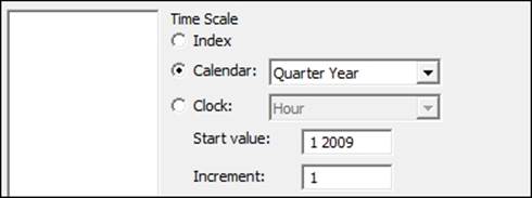
11. For Time Scale, choose the Calendar option and select Quarter Year from the drop-down list.
12. For the start value, type 1 2009, the dialog box for which should appear as follows:
13. Click on OK.
14. Click on the Graphs button and select the option for the Four in one residual plots.
15. Click on OK in each dialog box.
16. For the single exponential smoothing, go back to the Time Series menu and select Single Exp Smoothing.
17. For the Variable section, enter GDP, Quarterly growth.
18. Follow steps 8 to 14 to select residual plots and enter the quarter and year on the x axis of the chart.
How it works…
On the moving average chart, the fits are the average of the previous n data points, where n is the moving average length. The length of the moving average can be used to specify how smoothed or how responsive the fitted values are. The higher the moving average, the greater the smoothing on the fitted values. Here, we used a moving average length of 2, and the fitted values are then the mean of the previous two values.
Single exponential smoothing uses the level component to generate fitted values. As with the moving average, by using the weight, we control how responsive or smoothed the results are. The weight can be between 0 and 2. Low weights result in smoothed data; higher weights can react more quickly to changes in the series.
Forecasting for both the techniques takes the value of the fitted result at the origin of the time point and continues this value forward for the number of forecasts. The default origin for fitted values is the last time point of the data. It is possible to reset the origin for the forecasted results, and by resetting the origin to a specific time point within the series, we can compare how useful the forecasts would have been for our data.
We should note that forecasts are an extrapolation, and the further ahead the forecasts, the less reliable they are. Also, forecasting only sees the data in the period we have been studying; it does not know about any unusual events that may occur in the future.
The time options within both tools allow us to change the display on the time scale. Here, we used the calendar to set the scale to quarter and year. By indicating the start value at 1 2009, we tell the charts to start at quarter 1 in 2009. A space is all that is needed to separate the values. We could have also used the Year/Quarter column in C1 by using the Stamp option instead. The trend analysis example illustrates using a column to stamp the Time axis.
See also
· The Fitting a trend to data recipe
All materials on the site are licensed Creative Commons Attribution-Sharealike 3.0 Unported CC BY-SA 3.0 & GNU Free Documentation License (GFDL)
If you are the copyright holder of any material contained on our site and intend to remove it, please contact our site administrator for approval.
© 2016-2026 All site design rights belong to S.Y.A.