Minitab Cookbook (2014)
Chapter 4. Using Analysis of Variance
In this chapter, we will cover the following recipes:
· Using a one-way ANOVA with unstacked columns
· Calculating power for the one-way ANOVA
· Using Assistant to run a one-way ANOVA
· Testing for equal variances
· Analyzing a balanced design
· Entering random effects model
· Using GLM for unbalanced designs
· Analyzing covariance
· Analyzing a fully nested design
· The repeated measures ANOVA – using a mixed effects model
· Finding the critical F-statistic
Introduction
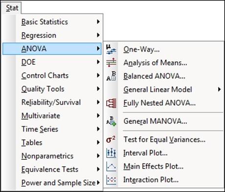
The Analysis of Variance (ANOVA) tools generalize the ideas of T-tests by checking the difference across means of many groups of data. Most of the tools used in this section are found in the ANOVA section, under the Stat menu. The following screenshot shows the route to the tools that we will use:
Most of the recipes here use the General Linear Model option. This option can use 31 factors, 50 covariates, and up to 50 response variables, making this a quick one-stop shop for use. The General Linear Model option can run a one-way ANOVA, two-way, balanced ANOVA, and fully nested ANOVA.
In the Minitab Version 17, the General Linear Model tools have been updated to store fitted models back into the worksheet. The fitted models then allow the use of contour plots, surface plots, response optimizer, and more.
One-way ANOVA tools offer the use of data in an unstacked format and can be found in the assistant as well.
The options for interval plots, main effects plots, and interactions plots offer useful graphical tools to display the results after analysis.
The datasets used in this chapter come from a number of sources. We will copy data and in some examples, the data can be typed into the worksheet.
Using a one-way ANOVA with unstacked columns
In the first activity, we will use the one-way ANOVA to check the differences between population means across several groups of data. We will be using atmospheric data for the North Atlantic Oscillation (NAO). The NAO is an important climatic phenomenon that affects the North Atlantic. Variations in the NAO affect the weather across Europe. Measurements of the pressure difference between the northern weather station in Iceland and more southerly stations are an important measure of this phenomenon.
Here, we will use the one-way ANOVA to investigate the effect of the pressure difference across months.
This data was obtained from the Climactic Research Unit and is located at http://www.cru.uea.ac.uk/cru/data/nao/; this can be opened in Minitab by opening the DAT file using Open Worksheet or by can copying and pasting the results directly. Within the DAT file, missing data is indicated as -99. These will need to be converted to a * symbol for Minitab to recognize as missing values.
We will open the data into Minitab, identify missing values in the worksheet, and then use the one-way ANOVA to study the pressure difference by month.
Getting ready
Either open the nao.dat file using the Open Worksheet option in Minitab or copy the data to Minitab from the NAO website. On opening the worksheet, set the file type to *.dat. Then use the Options file to set Variable Names to None and Field Definition to Free format.
This file is available on the Packt Publishing website.
How to do it…
The following steps will recode the value -99 as missing data, and then study the effect of a month of the year on pressure difference:
1. With the data in Minitab, we need to rename the columns. Enter the column names for C1 to C14 as Year, Jan, Feb, Mar, Apr, May, Jun, Jul, Aug, Sep, Oct, Nov, Dec, Annual.
2. Next, go to the Editor menu and click on Replace. Enter -99.99 in the section for Find what: and in the Replace with: section, enter *. Click on Replace All.
3. Navigate to Stat | ANOVA and then click on One-Way….
4. From the drop-down selection, change the option for the data setup to Response data are in a separate column for each factor level.
5. Select the columns for the monthly results and enter Responses: as shown in the following screenshot. They can be entered in one group by highlighting the columns in the left-hand selection and then clicking on the Select button.
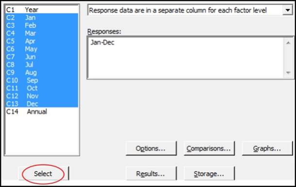
6. Click on the Graphs button; choose Boxplots of data and Three in one residual plots.
7. Click on OK in each dialog box.
How it works…
Rather than needing to stack the columns of data, we can use the unstacked one-way ANOVA. The same results could be obtained using the general linear model but we would need to stack the data first. For more on stacking columns, see the Stacking several columns together recipe in Chapter 1, Worksheet, Data Management, and the Calculator.
The one-way ANOVA options have changed slightly in Minitab v17, compared to previous releases. The separate dialog boxes for unstacked or stacked data have been combined into one selection. The one-way ANOVA can also run Welch's test now. UnderOptions, there is a tick box to select Assume equal variances. When this is unselected, we would run Welch's ANOVA.
Another change for Minitab v17 is the move of the character graph that displays means and confidence intervals into an interval plot.
Multiple columns can be selected in the dialog boxes by left-clicking and selecting the top item and dragging it down in the list. Using Shift or Ctrl for selection will work too. When selecting multiple columns, they will be identified in the column list as C1-C5—where the dash indicates the range of columns between the first and last.
The comparison options allow the use of Tukey's, Fisher's, Dunnett's, Hsu's multiple comparisons. Also included is the Games-Howell comparison for when we cannot assume equal variances.
The output from the one-way ANOVA will generate the sum of square values for the months, F-statistics, and the p-value for the test. The null hypothesis for the one-way ANOVA means that there is no difference between means or has no effect on the variation.
The three-in-one residual plots that are generated allow us to check the assumptions of normality of the residuals and homoscedasticity, equal variance, or the residual error. If the residuals show unequal variances, then the p-value of the one-way ANOVA test can be inaccurate. When we cannot assume equal variances, we can choose to use Welch's ANOVA as indicated previously.
The Assistant menu also provides a one-way ANOVA test. This will always use Welch's ANOVA for unequal variance.
Residuals over time are not produced for unstacked data as the results may not follow a logical time order. With the results of pressure difference, we do have a time component and this should be checked with time series plots to look for any patterns in the results.
See also
· The Stacking several columns together recipe in Chapter 1, Worksheet, Data Management, and the Calculator
· The Testing for equal variances recipe
· The Calculating power for the one-way ANOVA recipe
· The Using Assistant to run a one-way ANOVA recipe
Calculating power for the one-way ANOVA
Here, we will look at the number of samples needed in a one-way ANOVA to detect differences of 1, 2, or 3 standard deviations in size for 80 or 90 percent power. When we do not have a historical standard deviation, we can use a figure of one in the dialog box. The differences are then referred to as multiples of the standard deviation.
How to do it…
The following steps will generate the sample sizes required to find differences of 1, 2, or 3 standard deviations with at least 80 or 90 percent power:
1. Navigate to Stat | Power and Sample Size. Then click on One Way ANOVA.
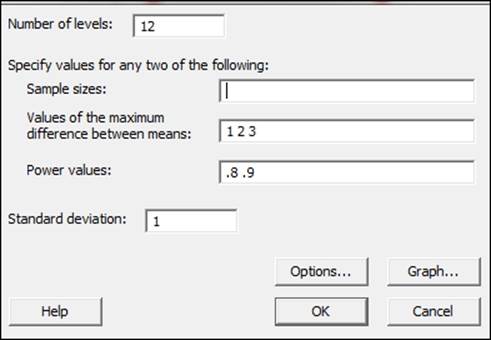
2. In the Number of levels: field, enter 12.
3. In Values of the maximum difference between means:, enter 1 2 3.
4. In Power values:, enter .8 .9.
5. In Standard deviation:, enter 1. The dialog box should look like the following screenshot:
6. Click on OK.
How it works…
Most typically, we would use this tool to assess the power of results where we have a known standard deviation. This could then be run after a study to verify if the results have enough power to identify a difference of interest for us.
When the historical standard deviation is unknown to us and we are planning on samples to take, we can refer to the differences as a ratio of the standard deviations. We should note that we will obtain the same sample sizes when using a standard deviation of 2 and differences of 2, 4, and 6.
The results here indicate that in a study with 12 groups, we need 10 samples per group to have an 80 percent chance of identifying a difference of a two-standard deviation between the means of the levels. If this is a study looking at differences across 12 months of the year, we would need 10 samples from each month to achieve the power stated previously.
As a general note on the entry of values into dialogs, Minitab uses spaces to identify separate values. Entering the differences as 1 2 3 with a space will tell the software to find sample sizes for each difference. Entering multiple power values will give us sample sizes for each difference and power. This is presented on a power curve and in the session window.
See also
· The Using a one-way ANOVA with unstacked columns recipe
· The Using Assistant to run a one-way ANOVA recipe
Using Assistant to run a one-way ANOVA
The Assistant tools will also run a one-way ANOVA. This provides a simpler route to generate the test and is presented as a series of graphical report pages.
For this recipe, we will compare the different mean times between failures of pressure sensors. The response is the number of weeks in service; the category is the failure mode of the circuit. The dataset we will open is circuit.mtw and is one of the example datasets that are installed with Minitab.
How to do it…
The following steps will run a one-way ANOVA and display the graphical reports:
1. Go to the File menu and click on Open Worksheet.
2. Click on the button for Look in Minitab Sample Data folder.
3. Open the circuit.mtw file.
4. Go to the Assistant menu and then click on Hypothesis tests.
5. From the Compare more than two samples heading, select One-Way ANOVA.
6. From the drop-down box, make sure that the choice for data is selected as Y data are in one column, X values are in another column.
7. In Y data column:, enter Weeks.
8. In X values column:, enter Failure.
9. Click on OK.
How it works…
The assistant tools are a great way to obtain guidance on the test to run and the results of that test. They give the user a simpler dialog box by limiting the options available.
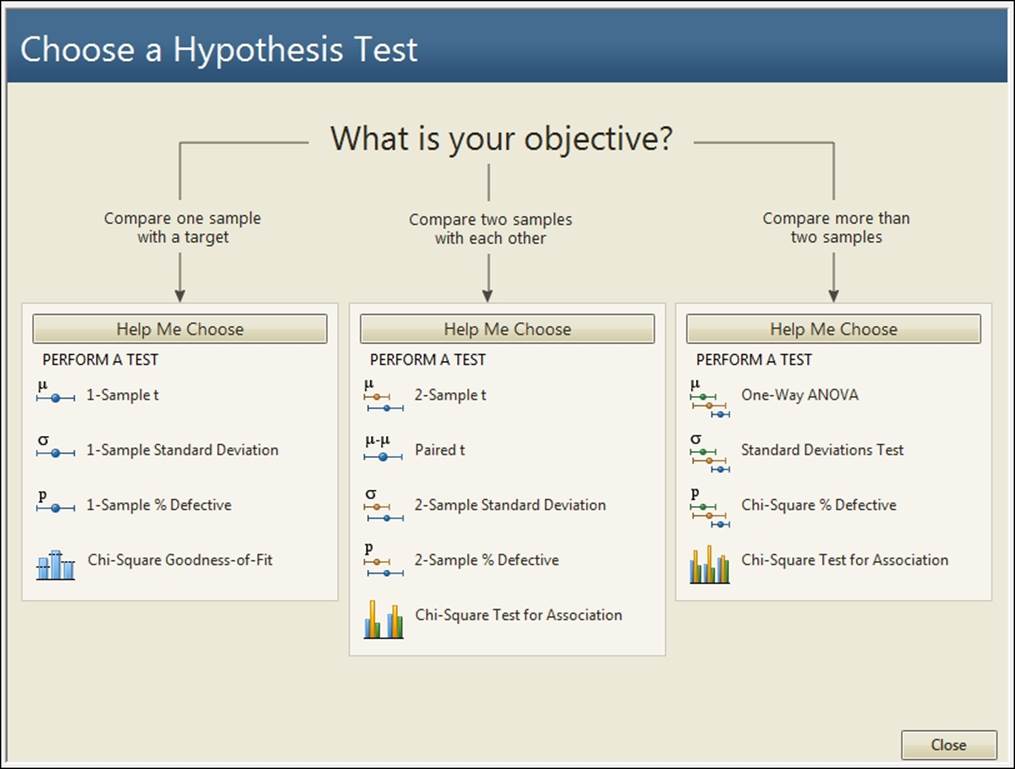
We can select a tool directly from the objective's screen or use the Help Me Choose option. The following screenshot shows the three objectives that we can select. By clicking on the Compare more than two samples title, we are taken to a decision tree to choose between One-Way ANOVA, Standard Deviations Test, or Chi-Square Test for Association:
The results from the one-way ANOVA will generate four graphical report pages.
The first page is the report card; here, we will find information or warnings about outliers, normality, and sample size. This will also inform us if the test has enough power to detect the difference that can be specified in the dialog power.
The second page is a power report of the study. When entering a value for the difference between the means, then we would obtain the power for that difference; this page will also provide alternative sample sizes or the differences that can be detected for a given power value.
The third page is a diagnostic report on the results. Time series plots are shown for each level, and outliers will be highlighted in red. The distribution of the results in each level will also be given as boxplots, individual value plots, or histograms. The type of chart that is displayed depends on the number of levels and the number of subgroups.
The last page is the summary report. This shows the p-value of the ANOVA. To help make the interpretation of the results easier, the null hypothesis is rephrased as the question. Do the means differ? The results of the p-value are plotted on a decision bar underneath. A means comparison chart is plotted to help identify the means that differ from each other, and comments are completed for us as well.
It is worth noting that the Assistant menu uses Welch's one-way ANOVA. Welch's method provides a correction for unequal variances across groups. It is used in the Assistant menu to provide a more conservative estimate of the p-value.
See also
· The Using a one-way ANOVA with unstacked columns recipe
Testing for equal variances
In this recipe, we will return to the topic of atmospheric pressure data. The data was obtained from the Climactic Research Unit. We will look at the atmospheric pressure recorded at the Gibraltar weather station. The test for equal variances will be used to check for differences in variance by month.
As with the data for the pressure difference used in the example, using the one-way ANOVA with unstacked columns' missing values is coded as -10. We will recode these to *. We will also need to stack the data before checking for differences in variation between the months.
Getting ready
Either open the file nao_gib.dat using the Open Worksheet command in Minitab or copy the data to Minitab from the NAO website. If opening the worksheet, set the file type to *.dat. Then use the Options file to set the Variable Names option to None and the Field Definition option to Free Format.
This nao_gib.dat file is also available on the Packt Publishing website.
How to do it…
The following steps will recode the value -10 to * and then stack the results before running a test for equal variance:
1. Name the columns C1 to C14 as Year, Jan, Feb, Mar, Apr, May, Jun, Jul, Aug, Sep, Oct, Nov, Dec, Annual.
2. Next, go to the Editor menu and click on Replace. Enter -10 in the Find what: field and in Replace with:, enter *. Click on Replace All.
3. Navigate to Data | Stack, and click on Stack columns.
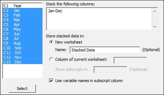
4. Select the month columns to stack the data by highlighting them and clicking on the Select button. In the Store stacked data in: field, enter the name for the New worksheet field as Stacked Data. The dialog should appear as shown in the following screenshot:
5. Name the datasets in the new worksheet: column 1 as Month and column 2 as Pressure.
6. Navigate to Stat | ANOVA and then click on Test for Equal Variances.
7. Enter Pressure in the Response field.
8. Enter Month in the Factors field.
9. Click on OK.
How it works…
We could also have used the data without stacking the results. In Minitab v17, we can choose between the data in separate columns or in stacked ones. If we are using a previous version, we need to use the stack data command to put the results into one column.
The stack data commands will quickly create one column with all the numeric responses and a subscript column. Here, this subscript column identifies the month based on the column names of the unstacked data.
As stacked columns will not keep the information about a year in the new worksheet, there are two options to ensure that we keep this information. Use Stack Blocks of Columns or alternatively, we could create a new column for the year using the calculator tools of Make Patterned Data.
The results that we have generated plot the standard deviations of pressure for each month. They also include a confidence interval for the value of the population standard deviation—sigma. The degree of overlap between confidence intervals can give us an indication of how similar sigma is between categories. Note that it is not always the case that intervals which overlap the standard deviation of another category are similar.
On the right-hand side of the chart, we obtain the results of Bartlett's test and Levene's test. We will use the p-value for Bartlett's test when we expect each category to be distributed normally. Levene's test is not as sensitive to departures from a normal distribution and may be used for any continuous distribution. The results of Levene's test do not provide as accurate a figure for the p-value when the data is normal.
There's more…
The Assistant option can also be used to run a standard deviations test. This can accept results as stacked or unstacked. The assistant output will give only the p-value for Levene's test, and it can be used only for one factor.
See also
· The Using a one-way ANOVA with unstacked columns recipe
· The Using Assistant to run a one-way ANOVA recipe
· The Stacking several columns together recipe in Chapter 1, Worksheet, Data Management, and the Calculator
· The Stacking blocks of columns at the same time recipe in Chapter 1, Worksheet, Data Management, and the Calculator
Analyzing a balanced design
A balanced ANOVA is one where all combinations of factors have the same number of observed results.
Here, we will look at the analysis of a designed experiment. The study is on an automobile filter to reduce pollution. This study looks at the noise properties of the filter. The response of the noise level is in decibels. The factors include vehicle size—1 2 3, representing small to large, type of filter—1 representing standard and 2 representing octel, and side—1 representing right and 2 representing left.
We will use a balanced ANOVA to study the effect on the results as all treatment conditions have the same number of observations. The terms in the model will be checked for significance using an alpha of 0.05. All main effects and interactions will be included in the model and we will produce residual plots to check the assumptions of using ANOVA.
Getting ready
The data and story behind this example are available from StatLib at http://lib.stat.cmu.edu/DASL/Stories/airpollutionfilters.html.
Copy the data into Minitab and label the columns appropriately.
The filter noise.mtw file is also provided on the Packt Publishing website.
How to do it…
The following steps will run the balanced ANOVA with all the main effects and interactions:
1. Navigate to Stat | ANOVA and click on Balanced ANOVA.
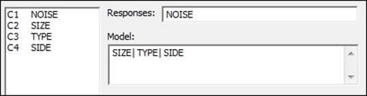
2. Enter Noise into the Responses field and Size, Type, and Side as Factors. Place the pipe symbol (|) between the factors, as indicated in the following screenshot:
3. Click on OK to run the analysis.
4. Go to the results in the session window. From the analysis of the variance table, check the terms that are significant. Use a decision of 0.05 for the p-value.
5. The three-way interaction term Size*Type*Side is significant. The model must be hierarchical, therefore we need to include all the two-way and main effects terms to calculate the model. Use Ctrl + E to return to the last dialog box to select the residual plots.
6. Click on the Graphs button.
7. Click on the radio button for Four in One residuals.
8. Click on OK in each dialog.
How it works…
The balanced ANOVA and general linear model tools can be used with up to 31 factors. The model must be hierarchical; this means that the inclusion of the three-way Size*Type*Side interaction needs to include all the two-way interactions between Size, Type, andSide.
The residual plots can be generated as individual pages or as the Four in one option, as used here. This produces the four residuals on one page as a diagnostic plot. This allows us to check the assumptions of the residual error, which are normally distribution and homoscedasticity.
If we include random factors, these must be entered into the model and then declared as a random factor in the section for Random Factors:. They must be included in both sections for the model to work.
The following information illustrates the use of the notation of pipe, exclamation, and star to specify the model terms. The pipe symbol or exclamation mark can be used as a shortcut to run all interactions between the factors. The | and ! marks can be used interchangeably.
For example, if we use factors of A, B, and C, then enter the factors as A!B!C into the design, this will specify a model using the A B C AB AC BC ABC terms. If we had just used A!B C, the model would be A B C AB.
Interactions can be entered with the use of a * symbol between factors. Entering A B C A*B B*C will generate a model of A B C AB BC.
Terms can be excluded in a model by the use of a minus sign. By specifying the model as A|B|C – A*B*C, we would have a model of A B C AB AC BC.
The general linear model tool from ANOVA can also be used for balanced designs, one-way ANOVA, two-way ANOVA, and to define nested designs. The only option that balanced designs offer us over the general linear model is the option to run a restricted model. The restricted model can be used when both fixed and random terms are included in the design.
See also
· The Using GLM for unbalanced designs recipe
Entering random effects model
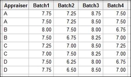
In the random effects model, both factors are declared as random factors. This recipe looks at a study on taste from a panel of professional taste testers. Different batches of a food product are tested to check the consistency of taste. Each appraiser tastes each batch twice. This way we can observe the consistency of scores from within the appraiser.
As the product is a selection of batches from a much larger population of batches, the samples represent a random selection from all product batches. The taste testers are a sample of appraisers from a group of tasters, representing a random selection as well; we will use the appraiser as a random factor to represent the variation across appraisers.
The scores are a mean figure from four attributes: taste, aroma, texture, and appearance.
The data will be provided later to type into Minitab; for ease of entry, it is set out as a table. We will stack this into columns to run the general linear model with both factors defined as random factors.
Getting ready
Enter the data shown in the following screenshot into Minitab:
How to do it…
The following steps will stack the data into a new worksheet. After renaming the stacked data, we will look at the effects of the batch and the appraiser on the taste scores using a general linear model:
1. Navigate to Data | Stack and click on Blocks of Columns.
2. Enter the columns into the dialog as shown in the following screenshot:
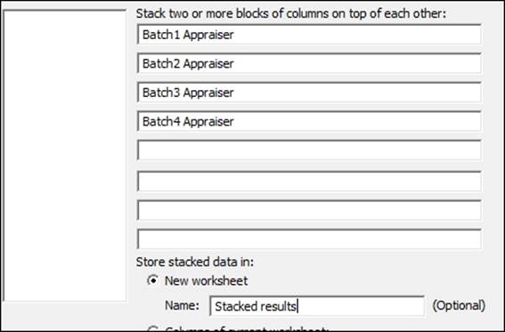
3. Click on OK to create a new worksheet with the stacked data.
4. Rename column 1 as Batch, column 2 as Score, and column 3 as Appraiser.
5. Navigate to Stat | ANOVA and click on Fit General Linear Model.
6. Enter Score in the Responses: field and in the Factors: field, enter Batch Appraiser.
7. Select the Random/Nest… button.
8. Change Factor type: to Random for both the Batch and Appraiser columns, as shown in the following screenshot:
9. Click on OK.
10. Next, click on the Model… button.
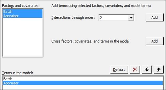
11. Highlight Batch and Appraiser in the Factors and covariates: section and then click on the Add button next to the Interactions through order: field. As shown in the following screenshot, add the interaction of Batch and Appraiser to the model:
12. Click on OK in each dialog box to run the analysis.
13. Check the results in the session window. Use a decision level of 0.05 for the p-value.
14. As the interaction between Batch and Appraiser is significant, we will leave all terms in the model. To check the assumptions of using the general linear model, we will generate residual plots. Press Ctrl + E to return to the last dialog box.
15. Click on the Graphs button and select the Four in one option.
16. Click on OK in each dialog box to run the study.
How it works…
The random effects model from the general linear model will find the F-statistics for the factors of Batch and Appraiser from the following expression: ![]() . As both factors are random, the error for these terms is found from the interaction term.
. As both factors are random, the error for these terms is found from the interaction term.
To define the model that we are fitting, we enter all the factors into the factors section within Minitab, and any covariates would be entered into the separate covariate section. Then we use the Random/Nest… button to identify nesting and random factors in the design.
The Terms… button gives us the options to identify the terms to be included in the model. We select the factors from the Factors and covariates: section and then by selecting the Interactions through order: field, all interactions for the highlighted factors up to the stated order would be included.
For example, if we have the three factors A B C and the D covariate, we could highlight A and B and select interactions up through order 2 to include the A*B interaction. Alternatively, we could highlight A through D and select order 3 and then we could include the interactions AB AC AD BC BD CD and the three-way interactions.
Quadratic or cubic effects on covariates can be included in the Terms through order: option. Note that this will be available only when covariates are included in the model.
This change for Minitab v17 makes the inclusion and removal of terms much simpler than it previously was. When reducing a model, we only need to highlight the terms that would be removed from the model and click on the X button to remove them.
The data supplied here was provided in a tabular format. Instructions 1 to 3 stack the data to be used in the general linear model tools. If our data was provided in this format, then we could skip these steps.
The GLM is run first with all the terms included. We check the results of the p-values and if the interaction cannot be proved as significant, then we would remove this term. At this point, we would return to the GLM and remove the interaction from the study. Without any interactions in a study with random factors, then the F-statistic for the main effects returns to mean square divided by the mean square error.
Finally, when only the significant terms are left in the model, we include the residual plots in the response, so we can verify the assumptions of using the analysis of variance. With the results of this study, we should notice an odd effect on the probability plot of the residuals. This is because the results are very discrete in nature.
The general linear model tool in Minitab will fit the unrestricted form of the ANOVA. For the restricted model, use the balanced ANOVA and select the restricted model from options.
There's more…
For more on random effects models, see, Applied Linear Statistical Models, Fourth Edition, by Neter, Kutner, Nachtsheim, and Wasserman, page 1005.
The GLM tools have changed a lot for Minitab v17. With the previous version of Minitab, the dialog box will follow the same setup as the balanced ANOVA tools. This has changed how we enter terms into the model and also how we define nested or random factors.
The Fit General Linear Model option also stores the model in the response column of the worksheet. When returning to the worksheet, there will be a green tick in the Score column to indicate that we have a model fitted to Score.
This model can be used to run multiple comparisons and generate plots based on predicted values of the model.
Users of previous versions of Minitab will also notice that the output of the GLM tools has been greatly expanded. The Results… button gives us a lot of control over the amount of output we can choose to display. Everything from the model summaries, regression equations, variance components, and much more can be expanded from here.
Other new options for GLM with Minitab v17 include the ability to standardize the covariates. We have five options to help standardize the covariates:
· Low and high levels standardized to -1, +1
· Subtract the mean and divide by the standard deviation
· Subtract the mean
· Divide by standard deviation
· Subtract by a value and divide by another specified value
See also
· The Analyzing a balanced design recipe
· The Stacking blocks of columns at the same time recipe in Chapter 1, Worksheet, Data Management, and the Calculator
· The Using GLM for unbalanced designs recipe
Using GLM for unbalanced designs
GLM or General Linear Model is a general tool for ANOVA. As such, we see that it will run studies from factors 1 to 31, and can include nesting or random factors.
For this example, we will look at a larger dataset. The data is for crash test dummies that have been used to look at forces in controlled crash environments. The National Transportation Safety Board collected data from crashing vehicles into a wall at 35 mph. Columns contain information on the make and model of the car. Head injury criterion, chest deceleration, left femur load, right femur load, D/P (whether the dummy was in the driver or passenger seat), protection, doors, year of the car, weight in pounds, and size of the vehicle.
We will look at a few of the factors to study the effect on chest deceleration. It is not possible to investigate all interactions in the data. This is due to some missing values in the results, and not all combinations of levels are possible. We will start by focusing on just a few.
The instructions will reduce the model step-by-step, removing the interactions in the model. Alpha for the decision level is used as 0.05 in this data.
As a note, the recipe is meant to be indicative of how such a study can be run and is not an exclusive study into a full model. We should build on these instructions and use the example as a base for a more in-depth study. We should also be careful of associations as a cause until we can discount other reasons. This data was also used in support of legal arguments over safety.
Getting ready
The crash test data can be found at the following link:
http://lib.stat.cmu.edu/DASL/Datafiles/Crash.html
The results can be copied and pasted directly into Minitab.
How to do it…
The following instructions will specify a model with several interactions and then reduce the design by removing steps highest p-values:
1. Navigate to Stat | ANOVA | General Linear Model and click on Fit General Linear Model.
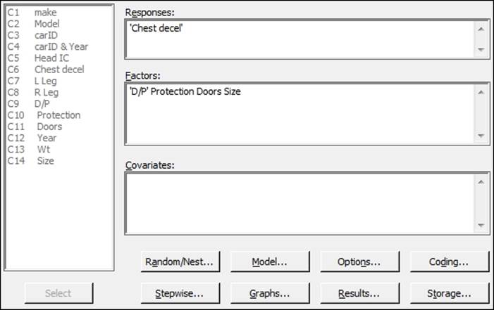
2. Enter 'Chest decel' in the Responses: field and enter 'D/P' Protection Doors and Size into the Factors: field as shown in the following screenshot:
3. To enter interactions for the factors, click on the Model… button.
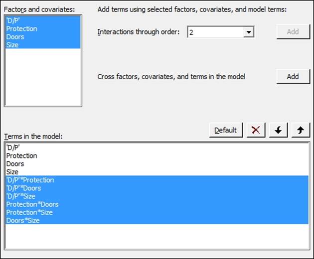
4. Highlight the factors within the Factors and covariates: section and click on the Add button next to Interactions through order:, as shown in the following screenshot:
5. Click on OK and return to the session window to check the results. Look for interactions with a p-value above the decision level.
6. Check for the interaction with the highest p-value. From the results shown in the following screenshot, D/P*Size has the highest p-value. Press Ctrl + E to return to the last dialog box:
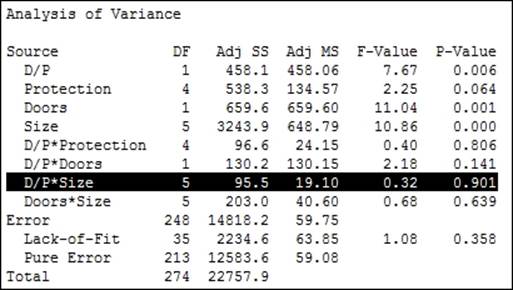
7. Click on the Model… button. Then, select the interaction of 'D/P'*Size from the Terms in the model: field and click on the red X to remove this term. Also, remove the terms of Protection*Doors and Protection*Size. These cannot be estimated, as indicated in the session window.
Note
Double-clicking on a term in the list will remove it from the model as well. Click on OK in each dialog to rerun the model.
8. Return to the session window and look for interactions with a p-value greater than 0.05. As in the previous step, look for the interaction with the highest p-value. Press Ctrl + E to return to the GLM and remove this term from the dialog.
9. Repeat steps 6 and 7 until only the interactions with p-values below 0.05 remain in the model.
10. Steps 6 and 7 should then be repeated for the main effects, removing each term one by one. Main effects must be included, which are part of an interaction or have a p-value less than 0.05.
11. When only the significant terms are left in the model, return to the Fit General Linear Model dialog box and run residual plots. Click on the Graphs button and select the Four in one residuals.
12. Click on OK in each dialog box.
13. To create main effects plots, navigate to Stat | ANOVA | General Linear Model and click on Factorial Plots.
14. The Response: field of Chest decel should already have been included and to create charts of the terms included in the model, click on OK.
How it works…
The data has several missing values in different columns and is unbalanced due to incomplete cells of the study having the same number of results. For example, there are 59 results with two-door vehicles and 84 results with four-door vehicles. The number of doors for vans and pickup trucks are not recorded and are shown as missing. We should be careful of these missing results as they will be left out of the model.
Using the descriptive statistics tables under the Tables menu, we can show the number of observations for each level within each factor. Entering Protection and Size columns in this tool would show us that the driver and passenger airbags are present only in the size group hev, and driver airbags are not present in mini, mpv, pu, and van. This prevents us from looking at interactions between Protection and Size.
As the design is not balanced, the values of the sequential sum of squares and the adjusted sum of squares will be different. The order of the data in the results could change the estimation of the sequential sum of squares. By default, the adjusted sums of squares are used to calculate the significance of the terms. The button for options allows us to change the calculations to use the sequential sum of squares, if required.
We reduce the model one term at a time, starting with the highest order interactions due to the design being unbalanced. At each step, we look for the term with the highest p-value and remove that term. When all two-way interactions are removed or we are left with interactions that are significant, we move to reducing main effects in the same manner. Main effects must still be included even if they are not significant when they are used in an interaction.
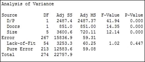
The final model that we should reduce down to when using a p-value of 0.05 as a decision is D/P (Doors and Size), as shown in the following screenshot:
Differences between the levels can be investigated with the use of the comparisons tool in GLM. Pairwise comparisons, or comparisons versus control can be selected. In Minitab v16, this is found within the GLM dialog box.
In Minitab v17, this is accessed from the General Linear Model menu and is available after we have fitted a model.
There's more…
The results here have only investigated the effects of the factors. The weight of the vehicle will be found as significant when entered as a covariate. In Minitab v17, to identify a covariate, this is added into the Covariates: section of the general linear model dialog box. Interactions with covariates, quadratic or cubic terms for the covariates can be included from the Model section of the General Linear Model dialog box.
The worksheet can be subset to focus on a few results rather than the total. This is useful when a level for a factor is creating a lot of missing cells in the design. For example, removing the vans and pickup trucks from the dataset will mean that we can look at the interaction for Doors*Size for the size of vehicles that we have left in the worksheet.
We should check the residual plots after the study has focused on the significant terms. This is to verify the assumptions of using the analysis of variance on the final model. In this example, a couple of results appear to have high residuals. See the graph in the following screenshot:
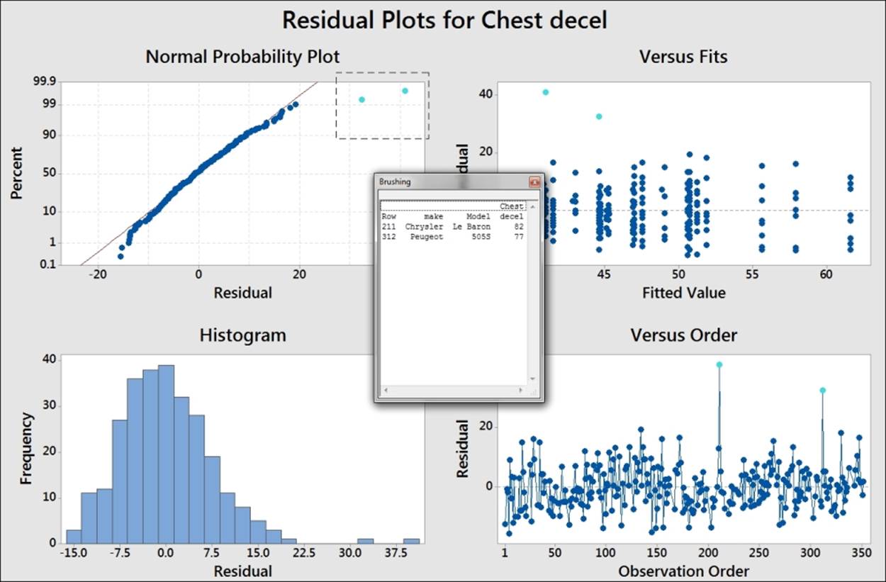
This graph uses the brushing tool to highlight the high values on the probability plot. Its make and model is included to identify the cars associated with these results.
To use the brushing tool, right-click on the chart and select brush from the right-click menu. Highlight the two high residual points by dragging a box around them. Right-click on the graph again and click on Set ID Variables. Enter the make and model columns into the brushing variables to add this information into the Brushing box.
The residuals for the chest deceleration appear to show a slight right-hand skew. The assumptions to run an analysis of variance are that the residuals are distributed normally. For an underlying distribution that is expected to not be distributed normally, the response can be transformed. A lognormal transformation of the results can be used in some cases. The calculator tool in the Calc menu can be used to find the lognormal transformation of chest deceleration. The function is Ln(column) and can be found in the function list of the calculator.
You should take care with transformation of the data to ensure that the reasons for transformation are justified and a logical explanation exists for the shape of the data. Note that in this recipe, using a lognormal transformation of the chest deceleration force will result in residuals that appear more normally distributed. The resultant model from the lognormal results will not be appreciably better than using the untransformed data.
The residuals are produced as regular by default and there are options for standardized or deleted residuals as well.
See also
· The Finding correlation between multiple variables recipe in Chapter 3, Basic Statistical Tools
· The Analyzing covariance recipe
· The Calculator - basic functions recipe in Chapter 1, Worksheet, Data Management, and the Calculator
Analyzing covariance
With the analysis of covariance, we are going to investigate the effect of a continuous variable alongside a categorical response. The dataset used in this example is of the average salary paid to teachers and expenditures per pupil in the U.S.. We will look for effects on pupil expenditure by state and by average salary of teachers.
Getting ready
The data is available at the data and story library. Copy the data in the following link into Minitab: http://lib.stat.cmu.edu/DASL/Datafiles/EducationalSpending.html.
How to do it…
The following steps will use Pay as a covariate in a general linear model and reduce the model by removing terms with a p-value above 0.05:
1. Navigate to Stat | ANOVA | General Linear Model and select Fit General Linear Model….
2. In the Responses: field, enter Spend.
3. In the Factors: field, enter Region and in Covariates:, enter Pay.
4. Click on the Model… button and then highlight both Region and Pay and select the Add button next to Interactions through order:.
5. Click on OK in each dialog box.
6. Go to the session window and check the Analysis of Variance table:
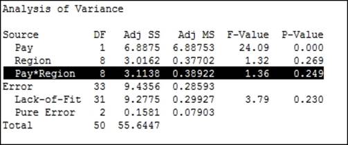
7. The p-value for the interaction of Region*Pay is above our decision of 0.05. Press Ctrl + E to return to the last dialog box. Go to the Model… section and double-click on the term of Pay*Region to remove the interaction from the Terms in the model: field.
8. Click on the Graph button and select the Four in one residual plots.
9. Click on OK in each dialog.
How it works…
We could run the same data as a one-way ANOVA without including Pay as a covariate. Just using region as the factor and Spend as the response, we will obtain a significant effect for Region on Spend. This is because the regions that pay higher wages to teachers also spend more per pupil on education. The effect of region on Pay and Spend can be visualized using boxplots. Use Pay and Spend as variables and Region as the grouping variable.
By viewing the data with a scatterplot, we can show the correlation between Pay and Spend. Using the scatterplot With Regression and Groups, we can display the relationship between Pay and Spend alongside the differences between regions.
Covariates can also include quadratic and cubic terms. These are specified in the Model section of Fit General Linear Model using the Terms through order: selection.
Four in one residual plots produce a normal probability plot, histogram of residuals, residuals versus fitted values, and residuals versus order of the data on one page. They can be generated on separate graphs by checking the boxes for each one individually.
There's more…
The same study on Pay and Spend could be run from the General Regression tool. General regression and general linear model tools are very similar in approach. General regression can be used to display variance inflation factors for the terms. After running the Fit General Linear Model tool, we can use Comparisons from inside the General Linear Model menus to use tests such as Tukey's pairwise comparisons.
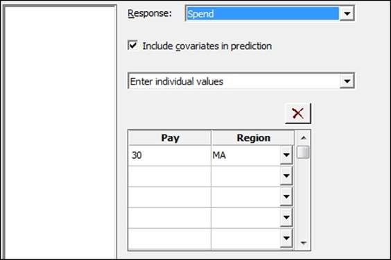
Minitab v17 also includes a Predict tool from the General Linear Model menu. The Predict dialog box allows a simple method to generate fitted values, confidence intervals, and prediction intervals for stated levels of factors and values of the covariates. The following screenshot shows us the setup of the dialog box. We can enter values for the predictors individually or as columns in the worksheet:
The Main Effects Plot and Interactions Plot options can be generated from the ANOVA menu or from Factorial plots within the General Linear Model submenu. The Factorials Plot option will generate graphs based on the fitted model values. Main effects and interaction plots from the ANOVA menu will generate charts based on the data means in the worksheet.
See also
· The Analyzing a balanced design recipe
· The Using the Assistant tool to run a regression recipe in Chapter 5, Regression and Modeling the Relationship between X and Y
· The Creating a scatterplot of two variables recipe in Chapter 2, Tables and Graphs
· The Generating a paneled boxplot recipe in Chapter 2, Tables and Graphs
Analyzing a fully nested design
With this recipe, we will look at the readability advertisement in different magazines. The data was collected from nine magazines covering different reader demographics. The responses include the number of words, number of sentences, and number of three plus-syllable words in the advertising copy. The first factor is the selected magazine. The second factor, group, is an educational level of the magazines readers, 1 being the highest and 3 being the lowest.
Magazines are randomly selected from a group of magazines at each readership educational level. The magazines in the study are nested under the group.
Getting ready
The data is from the magazine dataset at The Data and Story Library. Copy the data from the following link into Minitab:
http://lib.stat.cmu.edu/DASL/Datafiles/magadsdat.html
When copying the data in to Minitab, there is a blank line under the column headers. This can cause the column names to copy incorrectly. Copy just the Data section in to Minitab and then rename the columns. In the following instructions, the columns have been named Words, Sentences, 3+Syllables, Magazine, and Group.
How to do it…
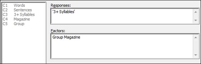
1. Navigate to Stat | ANOVA | General Linear Model and click on Fit General Linear Model.
2. Enter 3+ Syllables in the Responses field.
3. Enter Group and Magazine as the Factors, as shown in the following screenshot:
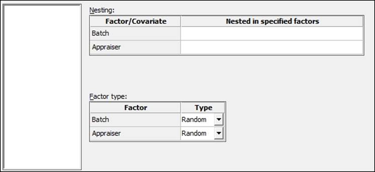
4. Click on the Random/Nest button. In the Factor type: section, change Magazine to Random. Then, in the Nesting: section, enter Group in the row for Magazine. Click on OK.
5. Click on the Graphs button and choose Four in one residuals.
6. Click on OK in each dialog to run the study.
How it works…
The results of the nested design should show us that the main component of variation is the magazine rather than the group the magazine belongs to. This asks some interesting questions about the grouping by education level and what this means.
The Random/Nest… section of the General Linear Model menu allows us to define factors as either Fixed or Random and the nesting structure of the factors.
Magazine is defined as a random factor as the magazines are selected at random from a larger population of publications within each group.
The Fully Nested ANOVA tool can also be used to run the same results. The order of factors being entered into the model defines the nesting structure. For instance, A B would nest B within factor A. All factors within the Fully Nested ANOVA tool would be considered random.
The repeated measures ANOVA – using a mixed effects model
These studies use repeated measurements on a subject. Typically, they are used to assess the change over time, or the same observation under different conditions. In this recipe, the results of a blind wine tasting are studied. Three types of wine are tested by three judges; a third factor is included for the type of glass the wine is being tested in. The score is accumulated across several responses and the maximum score is 40.
We will stack the data first before using the general linear model to study the effect of Judge, Wine, and Glass type on the score. The Judge factor can be considered a random factor in the design. Wine and Glass become our fixed factors.
We will use a decision level of 0.05 for the p-value.
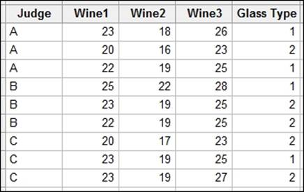
Getting ready
Type the data into Minitab from the following screenshot:
How to do it…
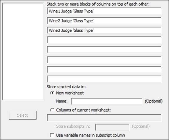
The following steps will stack the data in one column before using the general linear model. We then reduce the model by removing the terms by hierarchy and p-value:
1. Navigate to Data | Stack and click on Blocks of Columns.
2. Enter the columns in the dialog box as shown in the following screenshot. Uncheck the Use variable names in subscript column option.
3. Click on Ok to create the new worksheet.
4. Name the new columns as Wine, Score, Judge, Glass type.
5. Navigate to Stat | ANOVA | General Linear Model and click on Fit General Linear Model.
6. Enter Score in the Responses: field.
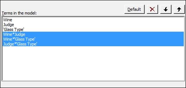
7. In the Factors: field, enter Wine Judge 'Glass type'.
8. Click on the Random/Nest… button and in the section for Factor type:, change Judge to Random.
9. Click on OK and click on the Model… button.
10. Highlight all three factors in the Factors and covariates: section and change Interactions through order: to 3. Then click on the Add button to add all two-way interactions and the three-way interaction to the model terms. Click on OK in each dialog box to run the analysis.
11. Check the p-value of the three-way interaction. As this is above 0.05, press Ctrl + E to return to the General linear Model tool.
12. Click on the Model… button and double-click on the three-way interaction in the Terms in the model: section to remove it from the study. Click on OK in each dialog to rerun the study.
13. Return to the session window and check the results. Check the interactions for significance. Look for p-values less than 0.05; press Ctrl + E to return to the last dialog box.
14. As all two-way interactions are not significant, remove these by clicking on the Model… button. Highlight the two-way interactions as shown and click on the red X to remove these from the model. Click on OK in each dialog to rerun the study.
15. Return to the session window and check the main effects for their significance. Use the decision level of 0.05 for the p-value.
16. As all the terms are significant, press Ctrl + E to return to the last dialog and click on the Graphs… button. Select the Four in one residual plots. Click on OK in each dialog.
17. To run comparisons of the wines on each other, navigate to Stat | ANOVA | General Linear Model and click on Comparisons. Double-click on Wine in the list under Choose terms for comparisons:. Wine should now be noted with C to indicate that this is selected.
18. Click on the Results… button and check the Tests and confidence intervals box.
19. Click on OK in each dialog to generate the Tukey pairwise comparisons.
20. To generate factor plots, navigate to Stat | ANOVA | General Linear Model and click on Factorials Plot.
21. Click on OK to generate the main effects plots.
How it works…
Judge is identified as a random factor as it is a random selection of Judge from a population of Wine tasters. The Wine column is a fixed factor as we wish to assess which wine has the greatest or lowest score. The glass type in the trial forms a fixed factor because we want to know how the glass type affects the score.
The section within the Fit General Linear Model tool for Random/Nest… allows us to identify factors as random, fixed, or nesting in the model. The Model… section gives us the ability to quickly add interaction terms to a study.
When entering columns, they can be typed in by name or column number, double-clicked to move across, or highlighted and then moved across by clicking on Select. If we are typing the names of the columns, we must use ' ' to identify any column name with spaces or special characters, a in 'Glass type'. Double-clicking or selecting columns into the model will automatically place single quotes where appropriate.
We specified a pairwise comparison of the wine results. Without changing the options, we obtain a grouping information table. This identifies the comparison levels by placing them into separate letter groups. This is generated for the selected comparison method. By selecting the option for Tests and confidence intervals, we output the results of the comparison as tables of t-values and p-values.
The interval plot for comparisons shows us the 95 percent confidence intervals for the differences between each pair of groups. Here, we should see that as all wine differences do not overlap the zero; we can prove a difference in score by wine.
The interval plot shows comparisons between pairs of wines. The x-axis displays the differences between the means of each pair of wines. A line at 0 is drawn to indicate 0 differences. Wine2 to Wine1 for instance shows a mean difference of -3.66 and a 95 percent confidence interval of -4.9 to -2.4. A confidence interval that crosses the zero line would indicate that there could be no difference between the means of that pair. Here none of the confidence intervals cross the zero line and all wines can be proved to be different to each other.
Finding the critical F-statistic
The critical F-statistic is the point at which the F-statistic has a proportion in the tails of the distribution equal to the decision level of the test. Usually, these figures are referred to in tables. Such a table can be found in the Index of Applied Linear Statistical Models, Fourth Edition, by Neter, Kutner, Wasserman, and Nachtsheim.
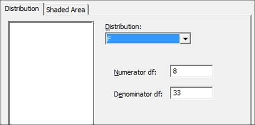
Here we will use a significance level of 0.05, and find the critical F-statistic for 8 df in the numerator and 33 df in the denominator. These figures come from the example of Teacher Pay in the analysis of covariance in the model with the included interactions. We will derive this graphically from the probability distribution plot and from the probability distributions from the Calc menu.
How to do it…
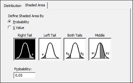
The following steps will graphically plot the F-distribution shading the right-hand tail for an area of 0.05:
1. Go to the Graph menu and select Probability distribution plot.
2. Select the View probability option.
3. Change the distribution to F and complete the dialog as shown in the following screenshot:
4. Click on the tab for Shaded Area.
5. Make sure that the choice for Probability is selected and Right Tail is chosen from the graphs, as shown in the following screenshot:
6. Click on OK in each dialog.
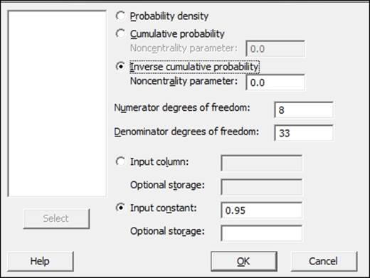
7. To calculate the critical F-statistic from the calculator tools, navigate to Calc | Probability distributions | F....
8. Complete the dialog as shown in the following screenshot:
9. Click on OK.
How it works…
The chart that is created will show us the right-hand tail with an area of 0.05. This occurs at 2.235 for the numerator and denominator degrees of the specified freedom. This is then our critical F-statistic, the point at which the p-value for the analysis of variance would equal 0.05.
The probability distribution plot can be used to shade areas of distribution curves as well as to plot the distribution curve. By selecting the right tail of the distribution and 0.05 in the tail of the curve, we ask Minitab to shade the right 0.05 proportion of the distribution, our critical F-statistic.
We could also have found the p-value for a result using the X-value instead of probability and entering the F-statistic that was calculated.
Probability distribution from the Calc menu can be used to return values for probability density, cumulative, or inverse cumulative probability for different distributions. Using the inverse cumulative probability to 0.95, we find the point at which we cover 95 percent of the F-distribution—again, the critical F-statistic.
The p-value can be found from the cumulative probability using the F-statistic obtained as the input value. The result is the cumulative probability up to the entered value. The p-value is 1.
See also
· The Analyzing covariance recipe
All materials on the site are licensed Creative Commons Attribution-Sharealike 3.0 Unported CC BY-SA 3.0 & GNU Free Documentation License (GFDL)
If you are the copyright holder of any material contained on our site and intend to remove it, please contact our site administrator for approval.
© 2016-2026 All site design rights belong to S.Y.A.