Minitab Cookbook (2014)
Chapter 6. Understanding Process Variation with Control Charts
In this chapter, we will cover the following recipes:
· Xbar-R charts and applying stages to a control chart
· Using an Xbar-S chart
· Using I-MR charts
· Using the Assistant tool to create control charts
· Attribute charts' P (proportion) chart
· Testing for overdispersion and Laney P' chart
· Creating a u-chart
· Testing for overdispersion and Laney U' chart
· Using CUSUM charts
· Finding small shifts with EWMA
· Control charts for rare events – T charts
· Rare event charts – G charts
Introduction
Control charts are very simple graphical tools which show us if measurements/results are stable over time. They look at the mean and variation of the data and check to see whether the observed data shows any patterns that would not be expected to occur if the data was purely random. This special cause variation is indicated by tests that look for these patterns. They are based on there being a low probability of these patterns occurring randomly.
Minitab provides a wide range of control charts for different scenarios. These include the standard control charts for monitoring a process over time such as Xbar-R or I-MR charts as well as multivariate control charts and charts to plot rare events. Now, we will look at using some of the more traditional charts, but also show the use of some of the newer charts in Minitab.
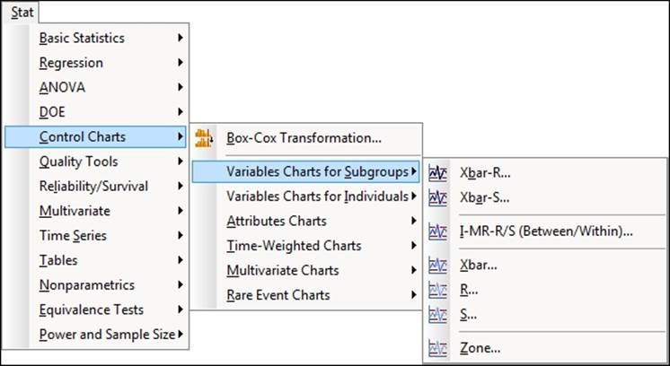
The Control Charts menu is separated into different submenus to make it easier for the user to select the correct chart. The following screenshot shows us where to find the Control Charts section within the Stat menu and the choices presented by the sub menus:
Xbar-R charts and applying stages to a control chart
As with all control charts, the Xbar-R charts are used to monitor process stability. Apart from generating the basic control chart, we will look at how we can control the output with a few options within the dialog boxes. Xbar-R stands for means and ranges; we use the means chart to estimate the population mean of a process and the range chart to observe how the population variation changes.
For more information on control charts, see Understanding Statistical Process Control by Donald J. Wheeler and David S. Chambers.
As an example, we will study the fill volumes of syringes. Five syringes are sampled from the process at hourly intervals; these are used to represent the mean and variation of that process over time.
We will plot the means and ranges of the fill volumes across 50 subgroups. The data also includes a process change. This will be displayed on the chart by dividing the data into two stages.
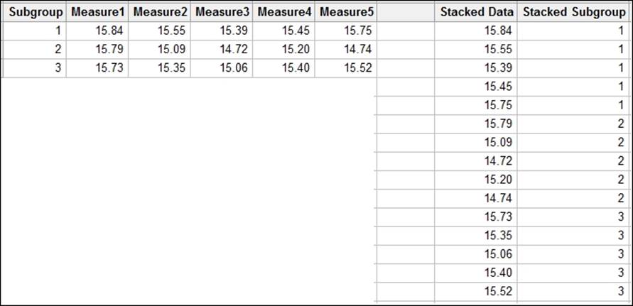
The charts for subgrouped data can use a worksheet set up in two formats. Here the data is recorded such that each row represents a subgroup. The columns are the sample points. The Xbar-S chart will use data in the other format where all the results are recorded in one column.
The following screenshot shows the data with subgroups across the rows on the left, and the same data with subgroups stacked on the right:
How to do it…
The following steps will create an Xbar-R chart staged by the Adjustment column with all eight of the tests for special causes:
1. Use the Open Worksheet command from the File menu to open the Volume.mtw worksheet.
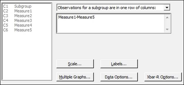
2. Navigate to Stat | Control Charts | Variables charts for subgroups. Then click on Xbar-R….
3. Change the drop down at the top of the dialog to Observations for a subgroup are in one row of columns:.
4. Enter the columns Measure1 to Measure5 into the dialog box by highlighting all the measure columns in the left selection box and clicking on Select.
5. Click on Xbar-R Options and navigate to the tab for Tests.
6. Select all the tests for special causes.
7. Select the Stages tab.
8. Enter Adjustment in the Define Stages section.
9. Click on OK in each dialog box.
How it works…
The R or range chart displays the variation over time in the data by plotting the range of measurements in a subgroup. The Xbar chart plots the means of the subgroups.
The choice of layout of the worksheet is picked from the drop-down box in the main dialog box. The All observations for a chart are in one column: field is used for data stacked into columns. Means of subgroups and ranges are found from subgroups indicated in the worksheet. The Observations for a subgroup are in one row of columns: field will find means and ranges from the worksheet rows.
The Xbar-S chart example shows us how to use the dialog box when the data is in a single column. The dialog boxes for both Xbar-R and Xbar-S work the same way.
Tests for special causes are used to check the data for nonrandom events. The Xbar-R chart options give us control over the tests that will be used. The values of the tests can be changed from these options as well. The options from the Tools menu of Minitab can be used to set the default values and tests to use in any control chart.
By using the option under Stages, we are able to recalculate the means and standard deviations for the pre and post change groups in the worksheet. Stages can be used to recalculate the control chart parameters on each change in a column or on specific values. A date column can be used to define stages by entering the date at which a stage should be started.
There's more…
Xbar-R charts are also available under the Assistant menu. For more on how to use the Assistant menu to generate a control chart, see the Using the Assistant tool to create control charts recipe.
The default display option for a staged control chart is to show only the mean and control limits for the final stage. Should we want to see the values for all stages, we would use the Xbar-R Options and Display tab. To place these values on the chart for all stages, check the Display control limit / center line labels for all stages box. See Xbar-S charts for a description of all the tabs within the Control Charts options.
For more information on changing the values of the tests for special causes, see the Using I-MR charts recipe.
See also
· The Using an Xbar-S chart recipe
· The Using I-MR charts recipe
· The Using the Assistant tool to create control charts recipe
Using an Xbar-S chart
Xbar-S charts are similar in use to Xbar-R. The main difference is that the variation chart uses standard deviation from the subgroups instead of the range. The choice between using Xbar-R or Xbar-S is usually made based on the number of samples in each subgroup. With smaller subgroups, the standard deviation estimated from these can be inflated. Typically, with less than nine results per subgroup, we see them inflating the standard deviation, and which increases the width of the control limits on the charts.Automotive Industry Action Group (AIAG) suggests using the Xbar-R, which is greater than or equal to nine times the Xbar-S.
Now, we will apply an Xbar-S chart to a slightly different scenario. Japan sits above several active fault lines. Because of this, minor earthquakes are felt in the region quite regularly. There may be several minor seismic events on any given day. For this example, we are going to use seismic data from the Advanced National Seismic System. All seismic events from January 1, 2013 to July 12, 2013 from the region that covers latitudes 31.128 to 45.275 and longitudes 129.799 to 145.269 are included in this dataset. This corresponds to an area that roughly encompasses Japan.
The dataset is provided for us already but we could gather more up-to-date results from the following link:
http://earthquake.usgs.gov/monitoring/anss/
To search the catalog yourself, use the following link:
http://www.ncedc.org/anss/catalog-search.html
We will look at seismic events by week that create Xbar-S charts of magnitude and depth. In the initial steps, we will use the date to generate a column that identifies the week of the year. This column is then used as the subgroup identifier.
How to do it…
The following steps will create an Xbar-S chart for the depth and magnitude of earthquakes. This will display the mean and standard deviation of the events by week:
1. Use the Open Worksheet command from the File menu to open the earthquake.mtw file.
2. Go to the Data menu, click on Extract from Date/Time, and then click on To Text.
3. Enter Date in the Extract from Date/time column: section.
4. Type Week in the Store text column in: section.
5. Check the selection for Week and click on OK to create the new column.
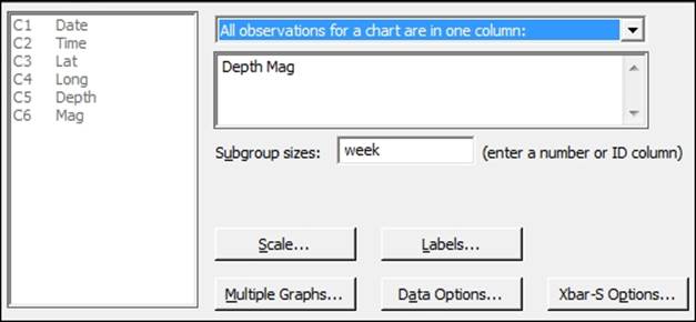
6. Navigate to Stat | Control Charts | Variable charts for Subgroups and click on Xbar-S.
7. Enter Depth and Mag into the dialog box as shown in the following screenshot and Week into the Subgroup sizes: field.
8. Click on the Scale button, and select the option for Stamp.
9. Enter Date in the Stamp columns section.
10. Click on OK.
11. Click on Xbar-S Options and then navigate to the Tests tab.
12. Select all tests for special causes.
13. Click on OK in each dialog box.
How it works…
Steps 1 to 4 build the Week column that we use as the subgroup. The extracts from the date/time options are fantastic for quickly generating columns based on dates. Days of the week, week of the year, month, or even minutes or seconds can all be separated from the date.
Multiple columns can be entered into the control chart dialog box just as we have done here. Each column is then used to create a new Xbar-S chart. This lets us quickly create charts for several dimensions that are recorded at the same time. The use of the week column as the subgroup size will generate the control chart with mean depth and magnitude for each week.
The scale options within control charts are used to change the display on the chart scales. By default, the x axis displays the subgroup number; changing this to display the date can be more informative when identifying the results that are out of control. Options to add axes, tick marks, gridlines, and additional reference lines are also available. We can also edit the axis of the chart after we have generated it by double-clicking on the x axis.
The Xbar-S options are similar for all control charts; the tabs within Options give us control over a number of items for the chart. The following list shows us the tabs and the options found within each tab:
· Parameters: This sets the historical means and standard deviations; if using multiple columns, enter the first column mean, leave a space, and enter the second column mean
· Estimate: This allows us to specify subgroups to include or exclude in the calculations and change the method of estimating sigma
· Limits: This can be used to change where sigma limits are displayed or place on the control limits
· Tests: This allows us to choose the tests for special causes of the data and change the default values. The Using I-MR charts recipe details the options for the Tests tab.
· Stages: This allows the chart to be subdivided and will recalculate center lines and control limits for each stage
· Box Cox: This can be used to transform the data, if necessary
· Display: This has settings to choose how much of the chart to display. We can limit the chart to show only the last section of the data or split a larger dataset into separate segments. There is also an option to display the control limits and center lines for all stages of a chart in this option.
· Storage: This can be used to store parameters of the chart, such as means, standard deviations, plotted values, and test results
There's more…
The control limits for the graphs that are produced vary as the subgroup sizes are not constant; this is because the number of earthquakes varies each week. In most practical applications, we may expect to collect the same number of samples or items in a subgroup and hence have flat control limits.
If we wanted to see the number of earthquakes in each week, we could use Tally from inside the Tables menu. This will display a result of counts per week. We could also store this tally back into the worksheet.
The result of this tally could be used with a c-chart to display a count of earthquake events per week.
If we wanted to import the data directly from the Advanced National Seismic System, then the following steps will obtain the data and prepare the worksheet for us:
1. Follow the link to the ANSS catalog search at http://www.ncedc.org/anss/catalog-search.html.
2. Enter 2013/01/01 in the Start date, time: field.
3. Enter 2013/06/12 in the End date, time: field.
4. Enter 3 in the Min magnitude: field.
5. Enter 31.128 in the Min latitude field and 45.275 in the Max latitude field.
6. Enter 129.799 in the Min longitude field and 145.269 in the Max longitude filed.
7. Copy the data from the search results, excluding the headers, and paste it into a Minitab worksheet.
8. Change the names of the columns to, C1 Date, C2 Time, C3 Lat, C4 Long, C5 Depth, C6 Mag. The other columns, C7 to C13, can then be deleted.
9. The Date column will have copied itself into Minitab as text; to convert this back to a date, navigate to Data | Change Data Type | Text to Date/Time.
10. Enter Date in both the Change text columns: and Store date/time columns in: sections.
11. In the Format of text columns: section, enter yyyy/mm/dd.
12. Click on OK.
13. To extract the week from the Date column, navigate to Data | Date/Time | Extract to Text.
14. Enter 'Date' in the Extract from date/time column: section.
15. Enter 'Week' in the Store text column in: field.
16. Check the box for Week and click on OK.
See also
· The Using I-MR charts recipe
· The Xbar-R charts and applying stages to a control chart recipe
· The Using the Assistant tool to create control charts recipe
Using I-MR charts
I-MR charts are used to plot single values over time. Individuals charts are typically used when we have single measurements at a point of time or at every result. Examples might include be related to the production of smaller volumes such as aircraft or perhaps aircraft engines. Other scenarios might include situations where data collection is automated and all results are captured. The individual values are plotted against the overall mean and the moving range tracks variation by looking at differences between the results. Unlike Xbar-R or Xbar-S, which use a sample or subgroup to estimate the mean and variation, an I-MR chart estimates the short term variation from the average moving range. This is based on the successive differences between the individual values.
Here, we will use the values of temperature from the Oxford weather station to check the stability of temperature. Temperature is a seasonal value and we will look at the measurements separately by month. As the temperature data has been given to us in the form of the mean maximum daily temperature for each month, there are no logical subgroups into which to divide the data. We will therefore plot the temperature as individual values.
As temperatures show a high degree of seasonality across the year, it would not be sensible to plot all of the original temperature data as a control chart. Therefore, we will plot the temperature for a single month instead. In this recipe, we will plot the temperature for January from every year from the start of record keeping to the present day.
We will first split the worksheet by month, before running the I-MR chart on the results for January.
Getting ready
The data for this example can be found on the MET office website at the following address:
http://www.metoffice.gov.uk/climate/uk/stationdata/oxforddata.txt
Copy the data into Minitab and label the columns Year, Month, T Max, T Min, AirFrost(days), Rain(mm), and Sun(Hours).
This data is also available from the Oxford weather.txt file or the Oxford Weather (Cleaned).mtw file.
How to do it...
The following steps will create a new worksheet for each month and then generate an I-MR chart for mean maximum and minimum January temperatures:
1. Go to the Data menu and click on Split Worksheet.
2. Enter the Month column as By variables:.
3. Click on OK.
4. Select the worksheet for Month = 1 for the January temperatures.
5. Navigate to Stat | Control Charts | Variables Charts for Individuals and click on I-MR.
6. Enter the columns for 'T Max' and 'T Min' as Variables.
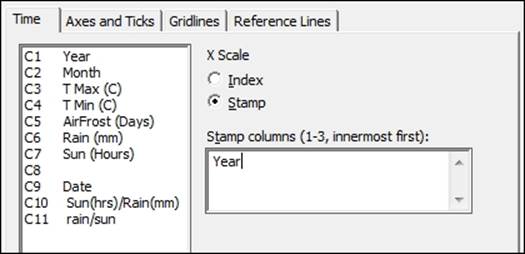
7. Click on the Scale button and enter Year in the Stamp columns field by selecting the options as shown in the following screenshot:
8. Click on OK.
9. Select the I-MR options button, then choose the tab labeled Tests, and select Perform all tests for Special causes.
10. Click on OK in each dialog box.
How it works…
Each column entered into the variables section for I-MR charts will create a separate control chart. We have created charts for both the mean maximum temperatures and the mean minimum temperatures for January from the start of the data in 1853.
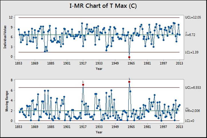
Results that break the rules for identifying special causes or unusual variation are flagged in red with the test that has been broken. In the results shown in the preceding screenshot, Test 1 is flagged up for years 1917 and 1963 on the moving range chart. This seems to indicate a large change in temperatures from 1916 to 1917 and 1962 to 1963. Notice the result in the individuals' chart for 1963. This corresponds to one of the coldest winters in the UK since records began.
Some care should be taken with the interpretation of the previous results as adjacent points are one year apart.
The use of the Scale option, Stamp, allows us to use a column in the worksheet for the x axis labels. By displaying the year instead of the row number as the index, we can identify the years which contain unusual results. If the graph is the active window pop up, text highlighting the year will be displayed when we hover the cursor over a point.
I-MR charts, like most control charts, are an updating graph within Minitab. We can right-click on the chart and click on Update Graph Now when new data is entered or click on Update Graph Automatically.
Time-weighted charts are more appropriate than I-MR charts if we are interested in observing small changes. Advanced charts such as CUSUM or EWMA can be used to pick up on these smaller shifts in the process. See the example of the EWMA chart later as a comparison.
There's more…
As the dialog boxes in Minitab remember previous settings, we can easily generate the charts for the other months by selecting one of the other worksheets. Go back to the previous dialog box using Ctrl + E, and all we need to do is click on OK to run the same settings on the new worksheet. This can be automated by the use of macros. The macro command Worksheet can be used to specify a worksheet to make it active.
Defaults for the tests used in control charts can be specified from Tools and Options, as shown in the following screenshot
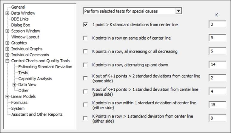
The preceding screenshot shows the location of the options. Here it is possible to pick the tests to be used by default and the values of those tests. While Minitab uses the most common values of these tests, often test 2 is set at 7 or 8 points in a row rather than 9. This would make the test more sensitive to a process shift at the cost of increasing the risk of a false alarm.
An alternative method of selecting the results of January for the I-MR chart would be to use the Data Options button from the dialog box.
Here we can specify which rows to include or exclude from the study in the same manner as in the Subset Worksheet option.
See also
· The Using CUSUM charts recipe
· The Finding small shifts with EWMA recipe
Using the Assistant tool to create control charts
The Assistant menu first appeared in Minitab v16 to make the use of statistics and their interpretation more accessible. As such, this menu helps us select a control chart, before giving us some advice on our results. The Assistant menu does not offer all the control charts that are found under the Stat menu; it offers us only the most commonly used ones.
We will not look at any data but we will step through the decisions offered by the assistant in selecting a chart. Try the steps with your own data. The steps here follow the choices for an Xbar-R chart. This is to illustrate the choices given at each step of theAssistant menu.
How to do it...
The following steps will guide us through the Assistant tool decision tree to an Xbar-R chart:
1. Go to the Assistant menu and select Control Charts….
2. From the decision tree, select the top decision diamond Data type as shown in the following screenshot:
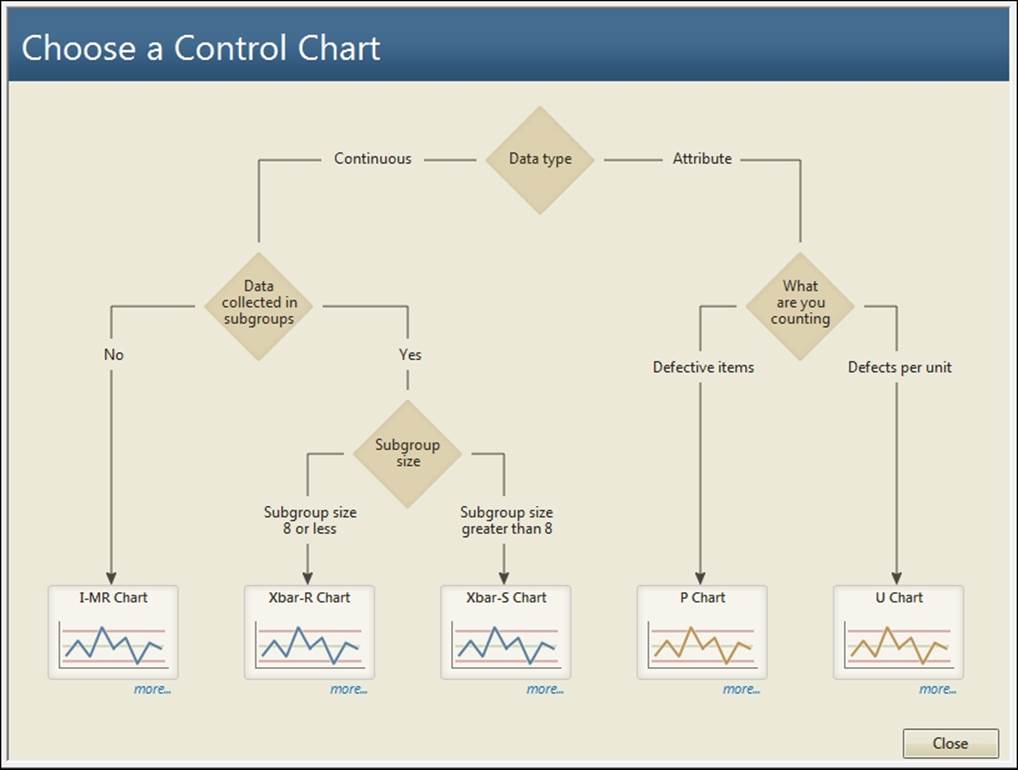
3. Read the description about the data type choice and then click on Back.
4. Read the description for Data collected in Subgroups then, click on Back to continue.
5. Click on the more… label beneath Xbar-R Chart.
6. We are presented with guidelines on collecting data for an Xbar-R chart and guidelines on using the chart. Select the section about collecting data in rational subgroups.
7. After reading the guidelines, click on the Back button and select an appropriate chart.
8. If you have data to be used with this recipe, enter the column and subgroup size.
9. Under Control limits and center line, choose from Estimate from the data or Use known values.
10. Click on OK to generate the reports.
How it works…
The Assistant tool control charts will generate three report cards. The first report card will inform us about stability, the amount of data, and check for correlated data in the response. The second page will present the control chart, highlighting out of control points. The third page is a summary report with comments. This is shown in the following screenshot:
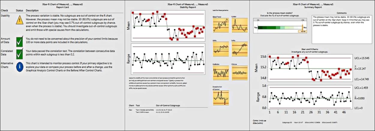
Each page gives us useful information, helping us build conclusions about the study.
All the assistant tools present us with a simpler-to-use dialog box to make it easier to run the study. They also give us guidance to help direct us to the correct tool to be used.
To make the use of the tools and interpretation of the output easier, Minitab does not have all the options available under the Stat menu. If we wanted to change the scale on the axis from an index or subgroup number to a date column, we would need to use the control charts in the Stat menu.
Not all tests for special causes are used. The Assistant will use Test 1, which is one point more than three standard deviations from the center line. Test 2 is nine points in a row on one side of the center line and Test 7 is 15 points in a row that are within +/- 1 standard deviation. For ease of use and interpretation of the results, we cannot change these rules. If we wanted to specify other tests for special causes or change the values used, we would need to go back to the control charts under the Stat menu.
Minitab can be a powerful aid for many users and is excellent for presentations to any audience, because of its assistant tools and the clarity with which it presents data. It is worth pointing out that although the Assistant menu provides a very quick and powerful start to using control charts, it does not have as many options as the Stat menu control charts. More advanced use of control charts can only be run from the Stat menu.
As an example, the Assistant tool will allow us to stage control charts from the Before/After Control Charts tool; if we wish to plot more than two stages, we need to use the control charts in the Stat menu.
Note
Before/After control charts are new to the Assistant menu in release 17.
See also
· The Xbar-R charts and applying stages to a control chart recipe
· The Using an Xbar-S chart recipe
· The Using I-MR charts recipe
· The Creating a u-chart recipe
· The Attribute charts' P (proportion) chart recipe
Attribute charts' P (proportion) chart
In this recipe, we will use a proportion chart to track events or defective items out of a total.
This data looks at the number of breaches within an accident and emergency department. The hospital has a target, according to which patients arriving at the accident and emergency ward must be seen by a doctor within four hours. A breach is classified as a patient who has not been attended to within this time. The dataset that we are using is organized into columns for ease of entry. Total attendance at accident and emergency is listed in row 1 and breaches are listed in row 2.
We will need to transpose the data into a new worksheet to put it back into a column format, before generating the P chart.
Getting ready
Enter the data in the following screenshot into a worksheet in Minitab. Label the columns of the data as 1 through to 9.

How to do it...
The following steps will transpose the data into a new worksheet before generating a P chart:
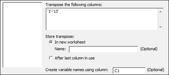
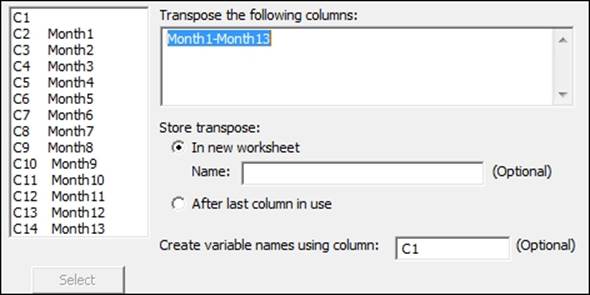
1. Go to the Data menu and click on Transpose columns….
2. Highlight the columns 1 to 13 and click on the Select button to move them into the top section and enter C1 into the space for creating variable names, as shown in the following screenshot:
3. Click on OK.
4. Navigate to Stat | Control charts | Attributes Charts and then select the P… chart.
5. Enter Breaches in the Variables: field.
6. Enter 'A&E attendance' in the Subgroup sizes: field.
7. Click on the P Chart Options… button.
8. Select the tab labeled Tests.
9. Select Perform all tests for special causes in the drop down.
10. Click on OK in each dialog box.
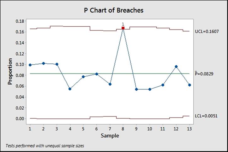
How it works…
The proportion chart plots the mean proportion of all of the data data and the proportion for each subgroup. The control limits are set based on the binomial distribution at +/- 3 standard deviations.
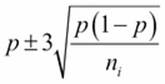
Lower control limits that are calculated as negative are fixed at 0 and by the same token, limits that exceed one are fixed at 1. As the control limits depend on the subgroup sample size, ![]() , we will observe control limits that vary in width for this result as the number of occupied beds differs per month. For the data plotted here, they appear as shown in the following screenshot:
, we will observe control limits that vary in width for this result as the number of occupied beds differs per month. For the data plotted here, they appear as shown in the following screenshot:
We can set the control limits for the P chart to a constant value using the S Limits tab within the P Chart options…. The following screenshot shows where to fix the control limits to use an assumed subgroup size:
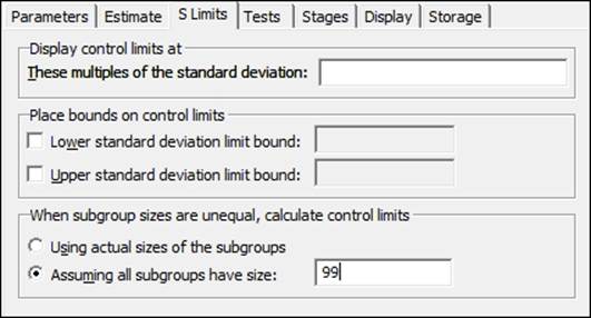
AIAG suggests that the mean subgroup size can be used for the control limits as long as the minimum subgroup size is no more than 0.75 of the maximum subgroup size.
There's more…
The P chart sets control limits based on the data following a binomial distribution. This can be a problem as subgroup sizes increase. When subgroups become larger, it is possible that group variation can be seen as different from the binomial variation. This is known as overdispersion. See Laney P' charts for correcting group variation in the P chart.
When selecting multiple columns for dialog boxes, we can drag down the list of available columns and click on the Select button. All selected columns are entered into the dialog box. A range of columns is indicated by a hyphen between them. C1-C10 would indicate all columns from 1 to 10.
See also
· The Testing for overdispersion and Laney P' chart recipe
Testing for overdispersion and Laney P' chart
We will use a Laney P' chart to correct the overdispersion in our data. The P chart in the previous example calculates the control limits on the binomial distribution. If the process being studied has a natural variation in the proportion that has a variation larger than the binomial distribution, then a P chart can show many more out of control points than it should. The P chart uses the variation between groups to estimate the position of the control limits.
Minitab has a P chart diagnostic tool to look for overdispersion or underdispersion in the data.
Initially, we will run the P chart diagnostic to check our data and then run the P' chart.
How to do it...
The following steps will check for overdispersion in the data and then generate a P' chart:
1. Use Open Worksheet… from the File menu to open the Calls Lost.mtw worksheet.
2. Navigate to Stat | Control Charts | Attributes Charts and select P Chart Diagnostic.
3. Enter Hung up in the Variables: field.
4. In Subgroup sizes: field, enter Calls.
5. Click on OK.
6. Check the results of the P chart diagnostic to see if there is evidence of overdispersion.
7. Navigate to Stat | Control Charts | Attribute Charts and click on Laney P', as suggested from the diagnostic tool.
8. Enter Hung up in the Variables: field.
9. Enter Calls in the Subgroups sizes field.
10. Click on P' Chart Options.
11. Navigate to the tab for Tests and select Perform all tests for special causes.
12. Click on OK in each dialog box.
How it works…
The traditional P chart assumes that the variation exhibited in the process is all part of the within variation or rather the variation from a binomial distribution. In most cases, the variation in P over time and the variation between groups is usually smaller than the variation that is observed due to the within variation. If the subgroup sizes are very large, then the between variation can be a significant component of the variation in the study.
This results in overdispersion—a P chart where the control limits are too narrow. As the control limits are too narrow, they cause an elevated false alarm rate. The Laney P' charts account for the variation between groups and use it to plot the control limits.
The diagnostic charts for P and U check to see if the variation observed in the proportion or per-unit values is higher or lower than expected from a binomial or Poisson distribution. The diagnostic tool will then tell us if we need to use the P' chart instead of the traditional P chart.
The results here can be checked for comparison against the P chart.
There's more…
The traditional approach to overdispersion is to use I-MR charts. The problem with individual charts is that while they plot the variation between groups, they do not see the subgroup size for the proportion. The control limits remain flat and do not vary with the subgroup size. The P' chart allows for variable control limits with subgroup size.
When subgroup sizes are constant, the P' chart will be the same as the I-MR chart. Also, P' charts will be the same as P charts when the data follows a binomial distribution.
For more on Laney control charts see the paper Improved Control Charts for Attributes, David B. Laney.
See also
· The Attribute charts' P (proportion) chart recipe
· The Creating a u-chart recipe
· The Testing for overdispersion and Laney U' chart recipe
Creating a u-chart
U-charts and c-charts are used for Poisson data rather than binomial. U is for defects per unit and c for counts. While similar to the P or NP charts, the control limits are based on a Poisson distribution.
In this recipe, we will type data for falls and beds occupied per month at a hospital into the worksheet. We will then use the u-chart to plot the number of falls in a hospital per occupied bed. The results are displayed as a per-unit figure.
This data is loosely based on an example discussed in the paper, Plotting basic control charts: tutorial notes for healthcare practitioners, by M.A. Mohammed, P. Worthington, and W. H. Woodall.
This paper is available at the following location:
http://medqi.bsd.uchicago.edu/documents/ControlchartsmohammedQSHC4_08.pdf
The data is given with monthly results in separate columns for ease of data entry. We will first transpose the data before plotting it on a u-chart. As the minimum number of occupied beds is within 75 percent of the maximum number occupied, we can use options to set the limits to use the mean value.
Getting ready
Enter the data shown in the following screenshot into a new worksheet within Minitab:

How to do it...
The following steps will transpose the worksheet before generating a u-chart.
1. Go to the Data menu and click on Transpose Columns….
2. Enter the results into the dialog box, as shown in the following screenshot:
3. Click on OK.
4. Navigate to Stat | Control Charts | Attributes Charts and select the U… option.
5. Enter the column for falls into the Variables: field.
6. Enter the column for the occupied beds into the Subgroup sizes: field.
7. Click on U Chart Options….
8. Select the S Limits tab.
9. In the When subgroup sizes are unequal, calculate control limits section, select the Assuming all subgroups have size: option and enter 904 for the mean number of occupied beds.
10. Click on OK in each dialog box.
How it works…
The control limits for the u-chart are based on the Poisson distribution and use the following formula:

The control limits are set by default at the value of +/- 3 around the mean. As with the P chart, values of the control limit that are less than zero will be fixed to 0.
By setting the option to use the mean number of beds occupied we fix the control limits to be constant. The default will generate a chart with control limits that vary with the subgroup size.
As long as the minimum subgroup size is greater than 75 percent of the maximum subgroup size it is reasonable to fix the control limits to be constant. This will not affect the per-unit figure.
The Display Descriptive Statistics option in the Basic statistics menu can be used to generate the mean, maximum and minimum values of the Beds Occupied column.
Four tests for special causes can be used with attribute control charts: tests 1, 2, 3, and 4. By default, only test 1 is selected. The other tests can be selected from within the u-chart options and the tab for tests.
Using the options for Minitab under the Tools menu, the default tests and rules for the tests can be chosen.
See the I-MR charts for more details of where to find these settings.
See also
· The Using I-MR charts recipe
· The Testing for overdispersion and Laney U' chart recipe
Testing for overdispersion and Laney U' chart
The Laney U' chart is similar to the Laney P' chart in its use. We use this chart when we have the Poisson data that shows evidence of overdispersion or underdispersion. As the steps for use of the Laney U' chart are very similar to the P' chart, we will not use an example dataset.
How to do it...
The following steps will show us how to check for overdispersion, after which we will use a Laney U' chart:
1. Navigate to Stat | Control Charts | Attributes Charts and select U Chart Diagnostic….
2. Enter the data from the column containing the counts of events in the Variables: field.
3. Enter the data from the subgroup size column in the Subgroups sizes: field.
4. Click on OK.
5. Check the results of the U Chart Diagnostic… option. If the u-chart diagnostic indicates overdispersion or underdispersion, proceed to step 6. If not, use the u-chart (see the previous example).
6. Navigate to Stat | Control Charts | Attributes charts and select Laney U' Chart.
7. Enter the column containing the counts of events in the Variables: field.
8. Enter the column containing the subgroups sizes in the Subgroup sizes: field.
9. Click on U' Chart Options.
10. Select the Tests tab.
11. Select All tests for special causes.
12. Click on OK in each dialog box.
How it works…
The U' chart works in a manner that is similar to the P' chart. Control limits are set based on variation between groups.
See also
· The Testing for overdispersion and Laney P' chart recipe
· The Creating a u-chart recipe
· The Using I-MR charts recipe
Using CUSUM charts
A CUSUM chart is used to look for small shifts from a target. There are two types of CUSUM chart that Minitab will generate: One-sided CUSUM charts, which we will use here, or the two-sided or V-mask CUSUM.
CUSUM charts like EWMA charts can be useful when subgrouping of the data for an Xbar chart is not feasible and the I-MR chart is not sensitive enough. These may include scenarios where we have low production volumes, or where sampling can be prohibitively expensive or potentially destructive.
The data in this example looks at the fill volumes of syringes. There is a target volume of 15 ml. We will plot the CUSUM using a subgroup size of one to identify deviations from this target.
How to do it...
The following steps will generate a CUSUM for a target of 15 and a subgroup size of 1:
1. Use Open Worksheet… from the File menu to open the Volume2.mtw worksheet.
2. Navigate to Stat | Control Charts | Time-Weighted Charts and select CUSUM….
3. Enter Volume and enter Subgroup size: as 1 and the target as 15.
4. Click on OK to create the CUSUM.
How it works…
The default plan type is the one-sided CUSUM. This plots two lines. The top line detects upwards shifts from the target and the lower CUSUM detects downward shifts. The type of CUSUM can be changed in CUSUM Options and the Plan/Type tab.
The values of h and k for the CUSUM plan affect the sensitivity of the CUSUM. In a one-sided CUSUM, h, the decision interval is the number of standard deviations between the center line and the control limits. The value of k affects the drift to be detected. Default figures of h and k are 4 and 0.5.
The Plan/Type tab also has options to select Fast Initial Response (FIR) and the two-sided CUSUM can be centered on a given subgroup.
The results can be compared with an I-MR chart using a historical mean of 15. By looking at the cumulative sum away from target, the CUSUM becomes more sensitive at identifying the small shifts away from target.
See also
· The Using I-MR charts recipe
Finding small shifts with EWMA
Exponentially weighted moving average charts are useful for finding small shifts in the mean in a process. Here, we will use the EWMA chart to study the temperature data from the Oxford weather station. We will look at the results for January to investigate whether we have a change in mean monthly maximum and minimum temperatures across the data from 1853.
Both EWMA and CUSUM charts are useful in scenarios where we cannot collect rational subgroups for an Xbar chart. As with the temperature data from the Oxford weather station, we have a mean maximum temperature for a month; there are no subgroups. We can use the EWMA to be more sensitive to smaller scale shifts than the I-MR chart.
We will start by splitting the worksheet into months, selecting the worksheet for January, and then plotting the EWMA for maximum and minimum temperatures.
Getting ready
The data for this example can be found on the MET office website at the following address:
http://www.metoffice.gov.uk/climate/uk/stationdata/oxforddata.txt
Copy the data into Minitab but do not copy the headers or column names. The text file uses two rows of headers: name and units. Minitab will only accept one column header; copying and pasting both headers will convert all columns to text.
Label the columns Year, Month, T Max, T Min, AirFrost(days), Rain (mm), and Sun(Hours).
This data is also available from the Oxford Weather.txt file or the Oxford Weather (Cleaned).mtw file.
How to do it...
1. Go to the Data menu and select Split Worksheet.
2. Enter Month in the By Variables: field.
3. Click on OK.
4. Select the worksheet for Month = 1 for the January temperatures.
5. Navigate to Stat | control charts | Time weighted charts and select EWMA….
6. Enter the columns for temperature into the dialog box, as shown in the following screenshot:
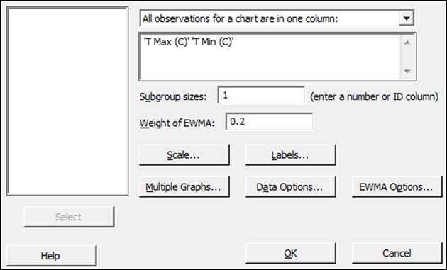
7. Click on the Scale button and select the Stamp option.
8. Enter Year in the section labeled Stamp Columns.
9. Click on OK in each dialog box.
How it works…
EWMA charts plot the value of the EWMA of a subgroup at time i as ![]() , where w is the weight of the exponentially weighted moving average and
, where w is the weight of the exponentially weighted moving average and ![]() is the mean of the ith subgroup. A value of w can be selected to tune the graph to detect shifts of different sizes. Lower values of the weight place less emphasis on the current result and more emphasis on previous values; higher values will mean that the graph can react more quickly to changes in the data.
is the mean of the ith subgroup. A value of w can be selected to tune the graph to detect shifts of different sizes. Lower values of the weight place less emphasis on the current result and more emphasis on previous values; higher values will mean that the graph can react more quickly to changes in the data.
Subgroup sizes for this data are 1 as each value indicates the results for one year. We could, as an alternative, run the same chart for a study looking at mean yearly temperatures rather than the temperatures from a month. To run this, return to the complete data worksheet. Use the Year column to specify the subgroup. The chart will then plot the EWMA of mean yearly temperatures.
The data that we obtain from the MET office website may generate an error when using it. The following error indicates that data is missing in the worksheet and a subgroup has no data. The EWMA chart cannot be produced with a subgroup that has no values or consists only of missing values:
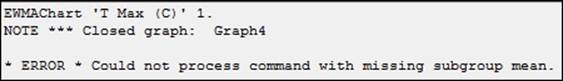
Some of the data from the MET office may be given as provisional or estimated. This is indicated by the use of * in the source document at the MET office website. When copying this data into Minitab, a value of 21.8* will be pasted into Minitab as a missing value, *. need to correct these figures manually. The latest results are indicated as provisional; when copied into Minitab, we will see that these are missing. Also notice that in 1860, there was no recorded mean minimum temperature for December.
The Oxford weather (cleaned).mtw worksheet provides a set of data with all the provisional figures entered.
See also
· The Using CUSUM charts recipe
· The Using I-MR charts recipe
Control charts for rare events – T charts
Rare event charts are used to plot intervals between events. Time between events tends to follow a Weibull distribution. The T chart is used to track whether the intervals between events are changing or remain stable.
If we were to plot the number of events in a day or week, it may be possible to use this data as a c-chart that displays a count of events. The problem with this technique is that rare events tend to have a rate that is very close to zero. Any event that occurs will be flagged up as unusually high.
Here we use the T chart to plot the time between eruptions of Vesuvius. Vesuvius is historically a very active and dangerous volcano, which was responsible for the destruction of Pompeii and Herculaneum in 79 AD. The dataset that we are using tracks the start dates of the eruptions from the year 1000 onwards.
How to do it...
The following steps open the dataset for the eruptions of Vesuvius and then produce the T chart of days between eruptions:
1. The data is in the Vesuvius eruptions.mtw worksheet. Use File and Open Worksheet… to navigate to the vesuvius eruptions.mtw file.
2. Navigate to Stat | Control Charts | Rare Event Charts and click on T….
3. Enter Year in the Variables: field.
4. Click on T Chart Options… and navigate to the tab labeled Tests.
5. Select Perform all the tests for special causes.
6. Click on OK.
7. Click on the Scale… button.
8. Select the Stamp option and enter Year in the Stamp columns field.
9. Click on OK in each dialog box.
How it works…
The T chart plots the number of days between events and uses a Weibull distribution for the time between events. The plotted data points are the time between events or in this case, eruptions. High values equate to more time between events, and in the case of Vesuvius, a long quiet time between eruptions. Lower values indicate shorter times between events. See the following chart where we get long intervals around 1500 AD.
Tests 1, 5, 6, 7, and 8 use probability zones on the Weibull distribution instead of the usual rules for an Xbar-R or individuals chart.
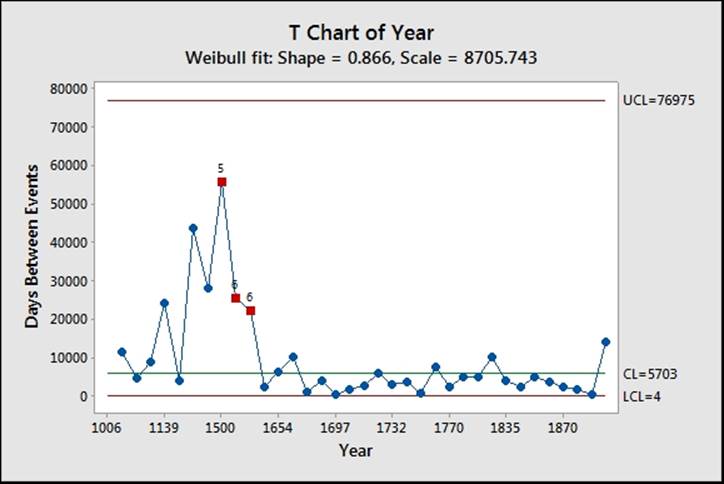
The results of the T chart should reveal a larger interval between eruptions flagged up at 1500. This interval has a value of 55882 days or roughly 153 years between the eruption in 1347 and the eruption in 1500.
The data was plotted only for the years in which an eruption occurred. This could also be constructed as a number of intervals, days, or hours between events. For this option, we would record the number of days between eruptions in the worksheet and then set the form of data in the dialog box as the number of intervals between events. See the example for G charts for data in this format.
There's more…
T charts are very similar to G charts. The G chart in the next recipe uses a geometric distribution. The choice between T and G charts is made on whether the data represents the time between occurrence of events or the number of opportunities between events.
The T Chart Options will also allow us to choose between using the Weibull or the exponential distribution.
See also
· The Rare event charts – G charts recipe
Rare event charts – G charts
G charts, like T charts, are used to plot rare events. The G chart uses the geometric distribution of the number of opportunities between events.
The data for this recipe uses the number of days between incidents at a factory. The worksheet lists this information as days until an incident has occurred. We will plot the number of days between accidents to look for unusually high or low numbers of days.
How to do it...
The following steps will create a G chart of the number of days between accidents at a factory:
1. Open the Accidents.mtw worksheet using Open Worksheet… from the File menu.
2. Navigate to Stat | Control Charts | Rare Event Charts and select the G… option.
3. Change the drop down for Form of data to Number of opportunities and the Method of counting opportunities drop down to Opportunities between events.
4. In the Variables: field, enter Days.
5. Select G Chart Options… and navigate to the Tests tab.
6. Select Perform all tests for special causes.
7. Click on OK in each dialog box.
How it works…
The G chart is named for the geometric distribution. This produces a chart that is similar to the T chart. T charts are typically used for time between events where a Weibull distribution would be fitted to the data. The G chart plots discrete intervals or the number of opportunities until an event. It would be more accurate to plot the total number of employee days between events but in most cases, it is simpler to list the number of actual days.
Other examples of when a G chart might be used could include the number of days at a hospital until an infection in a patient is observed. Again, while it would be more accurate to give out the total number of beds occupied until an infection, this would more typically be replaced by days.
Like the T chart, higher values on the chart indicate an increase in the number of opportunities until an event occurs. In the used data here for incidents at a factory, higher results are better.
The first test for special causes has an interesting problem with this chart. The lower control limit often sits at 0. Test 1 looks for data that falls outside the control limits to indicate a result that is unusually high or low. As negative days between events can never happen, we would not cross the lower control limit. This makes it difficult to find events that show unusually short days between events.
The Benneyan test is used for test 1 on the lower control limit. This looks for a number of consecutive plotted points that lie on the lower control limit. The number of points that will be highlighted as unusual is based on the mean of the data.
See also
· The Control charts for rare events – T charts recipe
All materials on the site are licensed Creative Commons Attribution-Sharealike 3.0 Unported CC BY-SA 3.0 & GNU Free Documentation License (GFDL)
If you are the copyright holder of any material contained on our site and intend to remove it, please contact our site administrator for approval.
© 2016-2026 All site design rights belong to S.Y.A.