Learning Pentaho CTools (2016)
Chapter 5. Applying Filters to the Dashboard
Now that you are able to build a dashboard using CDE on your own, you now should see how to take advantage of the most important components. After building some fancy dashboards, you will notice that you are not using all the components, just a subset of them. We will cover these components now.
We've split the chapter into two. The first part covers the filters and the other part covers the data being displayed. Filters, or selectors, can be applied to the dashboard as one way to create an interaction and filter the data you want to be displayed on the dashboard. If you deliver a dashboard with too much information, it will be hard for the final user to understand it at first glance. We already said that a dashboard should be easy to understand and get results from at first look, so by filtering the information, the user will be able to access all the information and it will be simple to understand.
Firstly, you need to know that there is a difference between filters and selectors. A filter component only applies a selection when at least one option is selected, and it will not filter anything if there is no selection, the same as if everything was selected. A selector will always apply a selection on data because it will always have something selected.
In this chapter, you will learn how to work with the select components, at least the ones I consider as the most important and powerful ones. We will also give you some tricks and tips for each of the components and some customizations that will enable you to create even greater dashboards. There is a big focus on the new filter component, which was desired previously and is a long-awaited improvement.
By the end of the chapter, you will be able to apply and customize the filters on a dashboard. You will know what properties are available for each one of the select components covered, and will be able to improve the look and feel of dashboard as well as the user experience. The components that are covered are listed as follows:
· Select and select-multi components
· The filter component
· The multi-button component
· The date range component
The select component
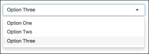
The select component is part of the input components group. Based on the results of a query or based on a values array, it can be set on the properties or on the pre-execution of the component, and the user will be able to select an option from a dropdown. A select component can look like the following image:
To have a select component properly working, the first step is to create a placeholder for the filter, using the layout perspective. The following step is used to set up the query, but it is not needed when you want to set the values on the values array. Another step, and an important one, is to create the dashboard parameter to store the value that is selected by default, and to set the name of the parameter on the corresponding property. The last step is to add the component to the dashboard and set all the properties needed.
By clicking on Select Component inside the Select group, the component will become available. Once available, you will need to set: the name, the data source and the placeholder (the layout element where the component will be rendered).
Among the properties that are available for the component, some of them are common to all the components, and you already know them from the last two chapters. For these components, there are some properties that you need to be aware of:
· Value as array: When we don't want or need to have a query, it's possible to make use of the values array property, setting the ID and value to be used. When using a data source, it will ignore the values array that might be set. The values array accepts a multidimensional array, where each array will be a pair of ID and value.
· Value as ID: When you are setting the values array or defining the data source, you may use two columns: one for the ID and another one for the values/description. The first one is used as the ID and the second one is used as the value. If you need to have the value also as the ID, you can set this property to true; otherwise, if you want to display a value but write the ID for the parameter, you should set this property to false. Let's suppose you need to have the following options to be used in the select component:
|
ID |
Value |
|
1 |
Option One |
|
2 |
Option Two |
|
3 |
Option Three |
· The code to apply such options would be as follows:
· function(){
· this.valuesArray = [
· ["1","Option One"],
· ["2","Option Two"],
· ["3","Option Three"]
· ];
· }
· When setting false on the Value as ID option, you are telling the component that you want to display Option One, Option Two, and Option Three in the dropdown list, but when selecting a choice, you will get the corresponding ID and not the value itself. If you choose Option Two, the parameter that stores the value is written with the ID that for this case, would be 2. This is because you just said that you don't want to have the value as the ID.
· When setting the property to true, you will still see in the dropdown the options: Option One, Option Two, and Option Three. If you choose Option Two, the parameter will be written with the value and not the ID. If that's the case, the parameter would have Option Two. This is because you said in the property that you want to use the value as the ID. When applying a filter and working with an MDX query, you can set the ID as the unique name of the member. When selecting one option, the ID will be written to the parameters that can be used in a query. This can be achieved by setting the values array or using a query that returns the following result:
|
ID |
Value |
|
[Markets].[APAC].[Australia] |
Australia |
|
[Territory].[EMEA].[Portugal] |
Portugal |
|
[Territory].[EMEA].[Spain] |
Spain |
· JQuery plugin: This is used to set the JQuery plugin, which will be used to generate a fancy selector that will be similar from browser to browser, not like the traditional select HTML, that will have a different look depending on the browser that is being used. Here, you can select from the list of available plugins, or write the available values: Select2, Chosen, and Hynds. No option is selected by default, and a traditional dropdown will be used. You will find more information about the components on the following sites:
· Select2: https://select2.github.io/
· Chosen: https://harvesthq.github.io/chosen/
· Hynds: http://www.erichynds.com/examples/jquery-ui-multiselect-widget/demos
Now let's suppose you want to make use of another JQuery plugin that's not available on the list; are you still able to use it? The answer is yes. You should remember that you are able to manipulate the DOM on postExecution of the component. That's the place to do it. For example, if you are trying to set the bootstrap-select plugin, available at https://silviomoreto.github.io/bootstrap-select/, you just need to download the plugin and add it as a resource using the layout perspective.
Tip
Don't forget to also include the CSS files when needed
You should not forget that sometimes, plugins and libraries are not just .js files; they may also need some styling, so do not forget to include these CSS files when you want to customize the styling of your dashboard.
When applying a plugin as shown in this example, we should not specify or set an available plugin, so the JQuery plugin property must be empty.
After including the plugin as a resource, it will become available to be used. On postExecution, place the following lines of code:
function() {
var opts = { plugins: ['remove_button'] };
var selector = this.placeholder('select');
selector.attr('placeholder','Select your option...');
selector.selectpicker(opts);
}
In the previous code, we are setting an object to pass to the select-bootstrap plugin, which contains the options and customizations for the filter, as you can see in the documentation and samples provided on the plugin website. We are setting one option, which won't be used for this example, but that we need for the following component/example.
The second line of the function is grabbing the select HTML that was created by this component, and it returns the JQuery element that we need to add a property. The last line of the function code is just applying the plugin.
Tip
Add the minified version of the libraries and plugins when in production
You can add the non-minified version of the plugins or libraries when you are developing the dashboard, which makes debugging easier or even possible. Change to minified files for quality analysis and production. If you are adding the resource as an external file, copy the imported file to the minified and non-minified files to the same resources folder. Later, to change from non-minified to minified, you just need to change the name of the file.
To have a selector working besides the name and layout element where to render it, you need to set the values array or make use of a data source. When a data source is used, the values array will be ignored, even if it was defined. After this, you need also to specify whether the component should make use of one or two columns, to get an id and a value, or just a value that will be used also as the id.
Of course, the visual impact and usability is very important, so you should change the plugin and apply the best setting, depending on your case.
The multi-select component
The multi-select component, identified by the name MultiSelect, is very similar to the select component. The big difference is that we may select multiple options in the selector. When we need to provide the ability to choose multiple values from the selector, this is the component to use.
For you to be able to test it and see how it works, you can create a component with a values array that will display more than the four rows in the preceding example. Render the component and check that you now have multiple selections. The properties that are available are the same as those for the select component.
One important feature that is common to all the components inside the Selectors group is that they can be nested, so the selection of one can depend on the selection of another and so on. The concept behind this is the same as for the remaining components: having to pass parameters to the data sources and listening to the parameters that trigger this update to fetch new data.
Let's build a quick example here. Start by creating two data sources using MDX over JNDI and the Steel Wheels sample data, as follows:
|
Name |
territoryQuery |
|
Jndi |
SampleData |
|
Mondrian schema |
SteelWheels |
|
Query |
WITH MEMBER [Measures].[UID] AS [Markets].CURRENTMEMBER.UNIQUENAME SELECT FILTER(DESCENDANTS([Markets].[All Markets], [Markets].[Territory]), [Markets].CURRENTMEMBER.NAME <> '#null' ) on ROWS, {[Measures].[UID]} on COLUMNS FROM [SteelWheelsSales] |
|
Output options |
1,0 |
|
Name |
countryQuery |
|
Jndi |
SampleData |
|
Mondrian schema |
SteelWheels |
|
Query |
WITH MEMBER [Measures].[UID] AS [Markets].CURRENTMEMBER.UNIQUENAME SELECT DESCENDANTS({${territoryParam}}, [Markets].[Country]) on ROWS, {[Measures].[UID]} on COLUMNS FROM [SteelWheelsSales] |
|
Parameters |
[['territoryParam', '[Markets].[APAC]']] |
|
Output options |
1,0 |
Using the layout perspective, add one row, with two columns named territory and country, and using the components perspective, create the parameters and the components.
Two of the parameters should be like the following:
|
Terriotoy parameter |
Country parameter |
|
|
Name |
territoryParam |
countryParam |
|
Property value |
territorySelector |
Two of the components should be like the following:
|
Territory component |
Country component |
|
|
Name |
territoryComp |
countryComp |
|
Parameter |
territoryParam |
countryParam |
|
Listeners |
territoryParam |
|
|
Parameters |
[['territoryParam', 'territoryParam']] |
|
|
Datasource |
territoryQuery |
countryQuery |
|
Value as ID |
False |
False |
|
HTML object |
territory |
country |
|
postExecution |
function() { var opts = {}; var selector = this.placeholder('select'); selector.addClass('selectpicker'); selector.attr({'placeholder':'Select your option...', 'data-width': '100%'}); selector.selectpicker(opts); } |
After creating all the layout, components, parameters, and queries, save and render the dashboard so that you can see the results, as shown in the next image:
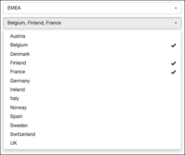
You should see two selectors, one below the other, and on the top you will be able to select the territory; depending on the selected territories, you will be able to select the countries. If you have any trouble, you may import, render, and edit the sample provided in the chapter folder.
The filter component
The filter component is a new and recent component, with more advanced options that will make the interaction of the dashboard even better. It is used as a simple selector or as a more advanced selector with multiple choices. The selection of all or none options is also available and achievable by setting some properties. The component also provides server-side capabilities that can be used when the number of elements to be displayed is too high.
I would dare to say that it's replacing the select and multi-select components. It's more powerful, able to provide single and multiple selections, and has a lot more improvements, besides the fact that it is even more user-friendly when using a select component with a plugin. If you also need to extend its capabilities, you are able to. Do not hesitate—just use it.
As with any other component, you need to at least set the Name and the HTML Object property where the component should be rendered, and if it's a select component being used, you also need to set the data source/parameters, or the values array. Depending on whether the value and the ID should or should not be different, you should also set the Values as ID property.
To have a proper knowledge of how to work with the component, we need to cover some topics such as the expected data format, specific properties, and also how to extend the functionality by making use of add-ins.
Expected data layout
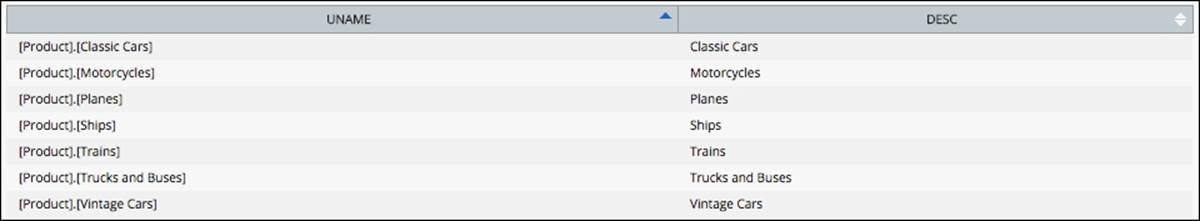
First, we need to bring the data to populate the selector. To populate the selector with values, you need to at least return two columns, the first one for the ID and the second one for the value. The following image is an example of the results of a query that should be used. You can see in the first column that we have the unique name of the members that we use to filter the data using MDX queries, and in the second column, the names that are displayed:
The filter also provides grouping for the options. Let's suppose that you want to be able to select Product Vendor, but you want to display them by the product line. If you need to use the grouping, you just need to return four or more columns, and the component will automatically take care of it. The following image is an example of a query that would be needed:
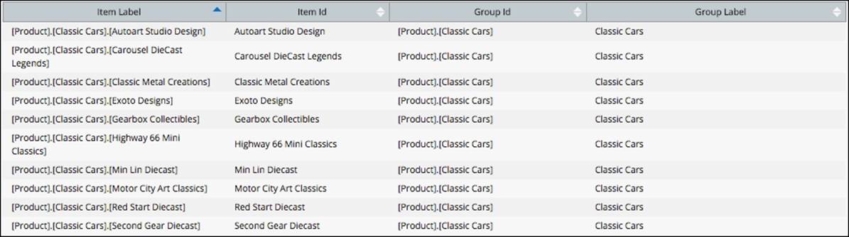
We should respect the order of the columns; there is a way to customize them, but for now, let's focus on the default configuration. First, you should return the columns for the items and next, the columns with the information about the groups. You should have noticed that first, on the left-hand side of the image, there are two columns that represent the id and the value to be used as options on the filter, and only after that are the two columns for the group with the id and value.
Specific properties
After setting the mandatory properties, you will be able to use the selectors. Let's jump now to the specific properties of this component:
· Title: This is the label to display on top of the filter.
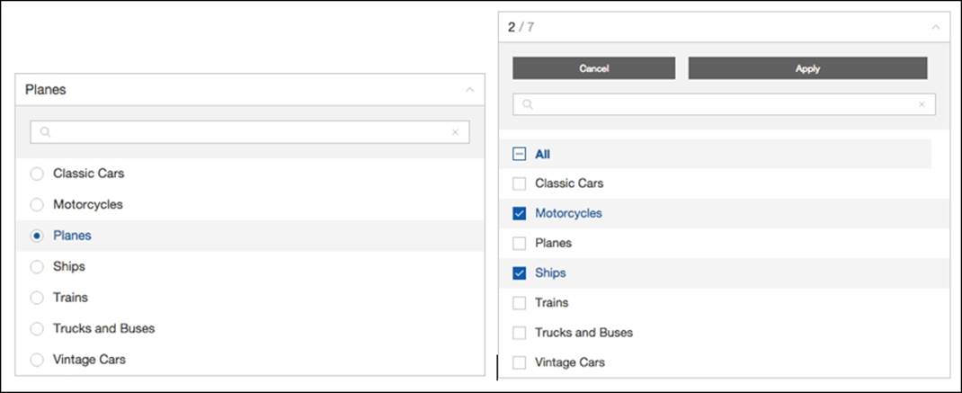
· Multiple selection: This is whether the component should accept multiple selections or not. This property will also change its behavior. If a single selection is selected, when clicking on an option, it immediately closes the filter and writes the selection to a parameter. If a multiple selection is set, the filter only closes if the user clicks outside, cancels, or commits the current selection, and the parameter is only updated when the user presses the Apply button. The default value is set to True, so a multiple selection is set. The following images are an example of a single selection on the left and a multiple selection on the right:
· Output format: This determines how the selection is written to the parameter upon commit. If it is set to Group and Item Ids, the filter attempts to write the group's IDs when all of its members are selected. When using groups, we should use Group and Item Ids because this will generate a compact array to be written to the parameter. The default value is Item Ids, and if this is selected, the group's IDs will not be used.
· Always expanded: This accepts true or false, and it's used to keep the filter expanded. When set to true, and an option or the Apply button is clicked, the filter will still be opened. The default value is false, so the filter will collapse when the options are selected.
· Selection limit: This accepts an integer that represents the maximum number of options that can be selected. You should not use a high value, because depending on some other factors, it can affect the performance of the queries that the selection will trigger. This value is valid for all the options selected, independently of the group they belong to. When you have more options than the limit, the All selection button will not work.
· Page length: This is used to sequentially load pages of items from the server. By default, the filter attempts to load the entire dataset defined by a data source, but sometimes, the list of options might be quite large. For this case, you may want to take advantage of CDA's support for pagination and server-side searching, and you can set the property to true so that the component takes care of it for you. This property option accepts an integer value with the number of rows for each load from the server, so when the user reaches the bottom of the scrollbar, a new page is loaded and added to the list of items. We can view this as lazy loading. If no value is set, the component tries to load the entire dataset. When you have a huge number of options, for performance reasons, you might want set a value to activate it.
· Show icons: By default, this is set to true and an icon, checkbox, or radio button will be displayed next to each item.
· Show only button: This is used to specify that for each option, you also want to see a link/button where you can click and unselect all the other options and select only the one that you are clicking on.
· Show search filter: This is used to specify whether the search box should or should not be available. This option accepts a Boolean value. When set to true, the search will be available. The default value is set to true.
Making use of add-ins
Add-ins are an advanced option that you will not need if the standard behavior of the filter is enough for your use case. Either way, you won't lose anything if you learn some more advanced concepts, such as how to do some customizations here.
This component also has some properties that are related to the use of the add-ins. If you check the properties, you will find some where the name ends with Addin, and these are the properties we will be covering now. In some ways, they are similar to the add-ins that you will see in the next chapter for the table and template components. Here, they are used to customize the default behavior of the component by associating them to slots.
An add-in is basically a snippet of reusable code capable of modifying a component, so let's start to check the add-ins that are available:
· notificationSelectionLimit: This is used to show a notification that the selection limit has been reached
· sumSelected: This is used to calculate the sum value for the list of the selected items
· selectedOnTop: This is used to keep selected items on top
· insertionOrder: This is used to keep the insertion order
· sortByLabel: This is used to sort items alphabetically, using their labels
· sortByValue: This is used to sort items by their values
· sumValues: This is used to sum the values of the items
· template: This is used to apply a mustache template, so that the HTML of the item can be customized
· accordion: This makes the filters of a particular group behave as an accordion
To get an add-in working, we should apply it to a slot, but what's a slot? A slot is a part of the processing of a filter that can go from data loading to rendering. Slots are being processed between the postFetch and postExecution functions, at the end of postFetchand just before postExecution. Let's see what available slots there are:
· Post update add-ins: This is used to perform some action when data is added to the model. The identifier of the slot is postUpdate.
· Root header add-ins: This is used to perform an action on every update of the root header. The identifier of the slot is renderRootHeader.
· Root selection add-ins: This is used to perform an action when the selection is changed. The identifier of the slot is renderRootSelection.
· Group selection add-ins: This is used to perform an action when the group selection is changed. The identifier of the slot is renderGroupSelection.
· Item selection add-ins: This is used to perform an action when the item selection is changed. The identifier of the slot is renderItemSelection.
· Root footer add-ins: This is used to perform an action when the root footer is changed, and it can be used for notifications. The identifier of the slot is renderRootFooter.
· Group sorting add-ins: This is used to determine the visual order of the groups where the items will be. The identifier of the slot is sortGroup.
· Item sorting add-ins: This is used to determine the visual order of the items. The identifier of the slot is sortItem.
So, the slots are parts of the code of the component where we can make use of add-ins, but not all add-ins are available for all the slots, so I have compiled the following matrix, where you can see the slots where we can apply each one of the add-ins:
|
Post Update |
Root Header |
Root Selection |
Group Selection |
Item Selection |
Root Footer |
Group Sorting |
Item Sorting |
|
|
Notification |
X |
|||||||
|
Sum selected |
X |
X |
||||||
|
Select on top |
X |
X |
||||||
|
Insertion order |
X |
X |
||||||
|
Sort by label |
X |
X |
||||||
|
Sort by value |
X |
X |
||||||
|
Sum value |
X |
X |
||||||
|
Template |
X |
X |
X |
X |
X |
|||
|
Accordion |
X |
The way to apply an add-in to a slot is to to set the right properties on the component. In the layout perspective, in the component, you can click on the property with the name of the slot ending with Addin, and you will get a dialog, where you can start adding the add-ins names. This operation must be done for each row and each add-in. This way, during the execution of the component and for each one of the slots, the add-ins that were added will also be processed.
Add-ins are great, but even greater when we can modify the options of the add-in. The way to do this is by making a call via setAddInOptions on the preExecution callback of the component itself. The following code is an example of this:
this.dashboard.setAddInOptions('postUpdate', 'accordion', {
group: 'myGroup' //Name of the group who this filter belongs to
});
In the preceding code, we are applying options for the add-in accordion that will be used in the slot postUpdate, which runs when data is imported into a filter's model. The add-in works by hooking a callback to an event emitted by a model whenever the filter is expanded/collapsed. Whenever the user expands a filter, a global event is triggered, so that the remaining filters configured to use this add-in will listen that event. If they share the same group, the same as we set in the earlier options, they will close themselves accordingly. When applying this code, we are setting the group that the filter belongs to, and acts as an accordion, along with the remaining filters that also belong to this group. The group is the only property that we may need to set. The default value here is group and if it is not changed, the filter will belong to the group group.
For the accordion add-in to work as expected, you will also need to apply the following CSS to the dashboard:
.filter-accordion .filter-root-body{
position: relative;
}
For some of the add-ins, you just need to apply them, but when using others, you also are able to change their behavior. For example, for the sortByLabel and sortByValue add-ins, you can change an option, that is, ascending. Setting this option to false would be like the following:
this.dashboard.setAddInOptions('sortGroup', 'sortByLabel', {
ascending: false
});
Just don't forget that the add-in should be applied on the Group Sorting AddIns property and the name of the add-in, sortByLabel, should be added to the list of add-ins to be applied. By default, the list of add-ins is empty.
The add-in sumValues can be applied per instance to the render of the root selection slot, and here, the property we have to apply is formatValue. This needs to be a function that receives one argument that is the number of selected values and should return the string/value/HTML to be displayed. The name of the option/function is formatValue. If you were applying the code, to get it working as the default, you would write the following.
this.dashboard.setAddInOptions('renderRootSelection', 'sumValues', {
formatValue: function(total) {
return Mustache.render('{{total}}', {
total: total
});
}
});
The template add-in has two main properties that can be overwritten, which are template and postRender. For template, we should provide a valid string containing the mustache template, but we will get back to the templates later. For postRender, it should be defined as a function that will execute/perform some action after the elements appear on the page. The following code is a small example of this:
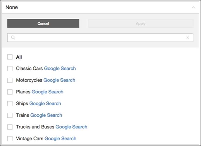
this.setAddInOptions('renderItemSelection', 'template', {
template:'{{label}}' +
'<a url="https://www.google.com/#q={{label}}">Google Search</a>',
postRender: function($tgt, st, opt){
tgt.find('.filter-item-label a').click(function(event){
window.open(event.target.attributes.url.value, '_blank');
event.stopPropagation();
});
}
});
We are appending a link that, when pressed, will open a new tab in the browser with a Google search about the item clicked on. The postRender function will add a click event handler that will open the link in a new tab, and will stop propagation of the event, so that the item does not become selected when only the link is pressed. If the stop propagation was not there, then the item would become selected. The following image is one example of the result:
We have already covered the options for the accordion add-in.
You can see and check the properties, options, and code in the samples provided for this chapter and component.
Advanced options and configurations
There are more advanced options you can use, and among others, we can customize the strings/messages that are used inside the component. These options are changed in the advanced options property of the component. A function must be defined, and it should return a component object with the options inside.
Changing default messages
To change the default messages, you can use the following function in the advanced options property:
function options(){
return {
component:{
Root: {
strings:{
isDisabled: 'No available data'
}
}
}
};
}
The returned JSON structure is changing the string that is applied when there is no data and the component is disabled. Other messages/strings that can be customized are as follows:
· title: This overrides the value in the title component property
· allItems: This message is displayed when all the items are selected
· noItems: This message is displayed when no items are selected
· btnApply: This label is displayed for the Apply button
· btnCancel: This label is displayed for the Cancel button
This makes it possible and very easy to make the internationalization and localization of the dashboards, but this we will cover in another chapter.
Showing values
It is also possible to show the values related to the available items. The next example will makes it possible:
Function options(){
return {
component: {
Item: {
options: {
showValue: true
}
}
}
};
}
You will be able to perform the same operation for the Root and Group elements; you just need to add a similar structure at the same level as for the Item in the previous example.
Now you should be able to make use of the filter component, for single and multiple selections, or even to show the items grouped, using server-side functionality, and apply the add-ins. You should also be able to customize the messages/strings that will be shown. When covering internationalization and localization, you will understand how to apply it here.
Date range input component
With the date range selector, you can select dates within a range of dates. For instance, you can select the last seven days, the last month, or even an interval of dates. Besides the common properties, there are the following ones available:
· Today: This option will select today's date as the start and end date.
· Last 7 days: This will select the last seven days by setting today's date. The end date will be today's date and the start date will be today's date less seven days.
· Month to date: This will select the period starting at the beginning of the current month and ending at the current date.
· Previous month: This will select the last day of the last month as the end date and the first day of the last month as the start date.
· Specific date: This will let the user select one specific date. The start and end date will be the same.
· All dates before: This will select all dates before the selected day. When setting the component, we need to specify the earliest date, starting from today, which can be selected. The start date will always be the start date of the interval specified on the earliest date property. The end date will be the selected day.
· All dates after: This will be the opposite of the last one, where we will get all the dates after the selected day until the last date of the interval that is specified as being the latest date. When setting the component, we need to specify the latest date property. The start date will always be the selected day and the end date will be the latest day of the specified interval.
· Date range: This lets you select two dates, which will be the start and end date. We need to be cautious when using open dates, as we may get poor performance when making this kind of selection in the MDX queries.
Besides the usual and common properties, we also have available the following:
· Earliest date: This can be used to set the date or specific interval to set the earliest date that it is possible to select. The default value is -1 years.
· Latest date: This can be used to set the date or specific interval to set the latest date that it is possible to select. The default value is +1 years.
When setting the earliest and latest date, we can specify a value that can be accepted by the Date.parse(…) function. For instance, you can specify a specific date. You can also specify the interval that you want to be calculated, starting from today, such as -1 years or +1 years. You need to specify the operator -/+, the number, and the time period, such as days, weeks, months, and years.
Tip
Default JavaScript date parsing can be different from browser to browser
When parsing dates using different browsers, you will notice that you can and may get different results. On some browsers, you may get a date as expected, but when using another browser, you may not get a date at all. This is because the parsing is done at the browser level and there is not a standard between them.
The available properties to be used besides the common ones are:
· Single input: When set to true, this will use one input box to show or specify the time interval. When set to false, it will use two separated boxes for the start and end dates. The default value is true.
· Input separator: Used only when a single input is set to true. This is used to specify the separator when showing the start and end dates. The default value is >.
· Can click outside popup: This is used to specify whether the popup will be closed when clicked outside. The default value is false.
· On open / On close: This is used to define a function that will be called when the popup opens or closes.
You will notice that on parameters, there is a list of the available parameters, and you must select two of them as being the start and end date. In our example, which you may find in the samples provided, there are two parameters selected, startDateParamand endDateParam. The first one to be selected will be the start date and the last one will be the end date.
You may have found that there is not a date format property in the date input component. This is not a problem because we can format the dates in preChange, after fireChange to the parameters. You can specify the format by using the values in the start and end date parameters, and write them to the input box. For instance, you can use the following code:
function(start, end) {
var formatted = Utils.dateFormat(start, 'DD MMM YY') +
" " + this.inputSeparator + " " +
Utils.dateFormat(end, 'DD MMM YY');
this.placeholder('input').val(formatted);
});
You can see that I am using the Utils module, which is automatically included in the dashboard by CDE, to customize the output of the selected dates.
The multi-button component
From my perspective, the multi-button component can and should be seen as a selector. I have also used it as a tab selector and/or as a radio and checkbox selector, and that's because it's simple to style, and has the same look and feel on all the browsers:
· Datasource: When setting a data source, the options available will be the ones from the result of the execution of the query.
· Values array: This is used if we want to have to set fixed values without the use of a datasource. It accepts a multidimensional array. Each option should be set using an ID and a value to be displayed.
· Value as ID: This was already covered for other selectors. It tells you whether the values and id should be considered as the same.
· Multiple selection: This is used to allow or not allow multiple selections. The default value is false, so it will not accept multiple options selected at the same time. Set the value to true if you want to make it possible.
Tip
Values array set dynamically inside preExecution
When setting a select component, we should specify one of the properties: data source or values array. This will set the options that will become available in the dashboard. The values array can be set dynamically in preExecution, but for this to be possible, we always need to have a dummy value set using CDE. The preExecution function will only be executed when one of these properties is defined.
Don't forget that you need to set a parameter so that it's possible to notify another component of the changes. This may also be needed for some other queries.
Please refer to the samples provided with this book, as you will find filters, selectors, and date pickers among the samples. Also, don't forget that you have the samples provided with CDE, where you have a description of the properties that can be used.
Summary
By reading this chapter, you learned about using selectors on a dashboard built with CDE. You should know which components are the most useful and are used to filter data in the dashboard, which does not mean that you can use only components from the selectors group. You will see in the next two chapters that we can also use a table, a chart, or a template component to create interaction on the dashboard.
You should be aware that you can replace the use of the select and multi-select components and make use of the filter component instead. Button and multi-button components can be used to filter data, but can also be used to create interaction on the dashboard, and you can use the multi-button component to replace selections using radio buttons and checkboxes. This is the reason why we didn't cover the radio-button and checkbox components. The multi-button component is much easier to style, and with the knowledge you have gained about the use of other selectors/filters, you should also be able to use them.
All materials on the site are licensed Creative Commons Attribution-Sharealike 3.0 Unported CC BY-SA 3.0 & GNU Free Documentation License (GFDL)
If you are the copyright holder of any material contained on our site and intend to remove it, please contact our site administrator for approval.
© 2016-2026 All site design rights belong to S.Y.A.