Learning Pentaho CTools (2016)
Chapter 6. Tables, Templates, Exports, and Text Components
So, I have told you that we needed to split the last chapter into two. The first one contained components usually used to filter data on the dashboard, and now it's time to present the most important and flexible components to represent data on the dashboard. This is one of the most detailed chapters where you get all the details I could think of.
One important part of building a dashboard is to find the best way to represent data on the dashboard. We should not only focus on showing a table, a chart, or any other component, but also on how to represent the data using that same component. Besides learning how to use some valuable components, you will get a full understanding of the capabilities of those components. I usually see people using few of these capabilities; of components, I believe this is because they don't really know the capabilities and how to apply small changes that can have a huge impact. While reading this chapter, just release your creativity and start thinking about what you could do to with it.
You will learn how to use the table component. It is easy to use, but also very flexible and powerful with some options that allow a lot of customization. The table also allows interaction on the dashboard, by using custom code or expanding the rows to display details. We will also be covering a new component that allows a great level of customization, and all data driven, the template component. The template component leverages the necessary work to repeat some content based on the response of a query. Finally, we will talk about how to export the results to different formats.
There are some more components that can be used, such as queries, freeform, and charts, which will be covered in later chapters, but it's not possible to cover them all. So once again let's focus on the components that are useful for all or most parts of the dashboard.
The components that are covered are listed as follows:
· Table component
· Template component
· Export button component
· Export Popup button component
· Text component
Table component
Besides charts and the template component, the table component is one of the most complete and useful components that we can have on a dashboard. It's very simple to use and we should not think of a table in CDE like traditional tables that we are used to. With the use of add-ins and expanded content we have the ability to create amazing dashboards, which really don't look like a table.
To create tables, CDF uses the JQuery plugin DataTables (http://datatables.net/), which also makes this component exceptional for most parts of the sections on a dashboard. We can extend the capability of DataTables itself by using plugins; we just need to know how to use the plugin and the best way to extend the capabilities of the component.
Like any other component, when using it you should set its name, the htmlObject where it will be rendered, the data source (in this case it's not an option) and, if needed, parameters and listeners. When setting valid values for the previous properties you can render the dashboard and take a look at the results coming from the query. By default, you will get as many columns on the table as columns on the query results, and the names of the columns will be the names that you have just used on the query or when defining the dashboard data source used for the table.
Besides common properties such as name, parameters, listeners, htmlObject, and others that you should already be used to, there are the following properties for the table component. The properties that are available and their usage are explained as follows:
· Show filter: It will show a filter at the top right of the table that will allow you to filter the records of the table. The default value is true.
· Searchable cols: You need to specify the index of the columns that will be searchable when Show filter is set to true.
· Info filter: This is displayed at the bottom right of the table, showing some information about the amount of rows that are being shown.
· Length change: This will show a drop-down with some values such as 10, 25, 50, and 100, which when changed will update the number of rows being displayed on the table. The default value is true.
· Page length: The number of rows to show on. This will be applied once if Length change is set to true, because later, when changing the size, this value will change. If Length change is set to false then the table will show exactly the number (integer) of rows that we set in this property.
· Sort data: Shows whether the table should allow sorting of data or not. This should to be set to false if you don't want your columns to be sortable. The default value is true.
· Sortable columns: If you set Sort data to true, you may also specify the column index and the default sort function, which can be ASC or DESC. This can also be set in the preExecution or postFetch of the component by using a multidimensional array such as [[0, "ASC"], [1, "ASC"]].
· Style: The style to use on the table, one of the following options: New, Classic, Bootstrap. The default value is Bootstrap.
· Paginate: Determines whether the table should be paginated. The page length will only work when paginate is activated. The default value is true
· Paginate on server-side: We can also activate the pagination on the server-side where you are specifying whether you want the pagination to be handled by CDA. The default value is true.
· Pagination type: The pagination type that will be used by the final user and that will be displayed below the table. There are some predefined options you can use, or you can set a custom pagination, but of course you need to add the code that needs to be used. The predefined options are:
· Here it shows how it appears:
· Here it shows how it appears as simple numbers:
· Here it shows how it appears in full:
· Here it shows how it appears as full numbers:
· Here it shows how it appears as two numbers:
Table pagination
You will get the same rows on the table as rows on the resultset of the query, but they will all be displayed on the page, or not, depending on some of the property definitions. There are two properties, Length Change and Page Length, which will change the number of rows to display. If Length Change is set to true it will be possible for the user to change the number of rows that the dashboard is displaying. Page Length is used to define the number of rows to display at the execution of the component. Of course this can also change the number of available pages.
Depending on the number of pages and elements on the table, you can give the user a better experience when navigating through the pages, so choose the pagination type that better adapts to the user experience.
The pagination on the server-side is really useful if you have lots of records that are returned back to the component. Let's suppose you are rendering 100,000 of rows on the dashboard. This will not perform because there are a lot of elements that should be rendered on the page. It will be even worse when using add-ins as they will need some extra code and possibly more elements will need to be displayed. Anyway, it's also not good practice to display rows that the user will not look at and will just make them lose focus on the important aspects.
If you are not trying to display that number of rows but you want to have pagination on the dashboard so as not to display more than 20 rows, per instance, and your query is not very well performed, just use the pagination on the server-side.
Internationalization and localization
The DataTables plugin provides a way to implement the internationalization and localization of the table elements, not the content because that's the responsibility of the query. We might or not get the results of the query already translated, but we can specify the translation of the elements that are part of the table it self, such as the pagination and other text that may be in buttons or other elements. The following properties are available for internationalization and localization:
· oLanguage: Used to set the language information presented by DataTables. Should use a JSON object such as https://www.datatables.net/plug-ins/i18n/English.
· Language: Used to set the language information presented by DataTables. Should specify the file where the JSON object containing the translation is available.
You can download or make use of Content Delivery Network (CDN) files that are available as alternatives to the static files on your server. The property oLanguage overwrites the Language property. So when setting oLanguage, CDF will not look to Language.
When setting the object without using an external file, we should set oLanguage as:
{
"emptyTable": "No data available in table",
"info": "Showing _START_ to _END_ of _TOTAL_ entries",
…
"search": "Search:",
"zeroRecords": "No matching records found"
}
An example of the Language property is:
{ "url":"//cdn.datatables.net/plug-ins/1.10.7/i18n/English.json" }
Another, more dynamic, option to use is preExecution, which defines the language to use. The code should be similar to the following:
function() {
var cd = this.chartDefinition;
var languages = {
'en_US': "//cdn.datatables.net/plug-ins/1.10.7/i18n/English.json",
'pt_PT': "//cdn.datatables.net/plug-ins/1.10.7/i18n/Portuguese.json"
};
delete cd.oLanguage;
cd.language = {
"url": languages[this.dashboard.context.locale]
};
}
Draw function
|
Property |
Default Value |
Description |
|
Draw Function |
Used to place a function that will be executed every time we change the table, when rendering, sorting, filtering, changing the page, and changing the number of visible rows. This can be used to manipulate the DOM of the table each time the table suffers a change. Those kinds of change will not trigger postExecution, so we can't use it for this case. |
The use of drawFunction is pretty much the same as postExecution except for the fact that it will be triggered almost every time any change happens to the table. We should therefore avoid using it, and when doing so, we should be very cautious with the code so that performance does not suffer.
Column formats, types, width, and headers
|
Property |
Default Value |
Description |
|
Column Format |
Here we can set the column format and specify the format for the content of the cells of each column. The format should be specified as the sprintf options already covered in Chapter 3, Building the Dashboard Using CDF. |
|
|
Column Types |
Column Types are to specifies the behavior of the cells for each one of the columns or even for the rows. |
|
|
Column Widths |
Column Widths is used to specify the width of each one of the columns. Don't forget that you should avoid absolute values such as px and instead use relative values such as %. This is very important when building a dashboard that needs to be responsive and/or adaptive. |
|
|
Columns Headers |
The table component will use the names that are coming from the query or the column names that you just defined on the data source being used. |
If you are building a more advanced and dynamic dashboard, you could set the properties in a dynamic way by using preExecution or, even better, using postFetch, making use of the results of the query to define what the user will get.
On the sample provided for this chapter, you will find that on the desktop we display all the columns, totals, and values for each territory, but when shifting to a mobile dashboard, we will only get the columns for the totals. This is because there is no space to display all the columns when on a mobile dashboard, like when using a mobile phone. This is done during execution time, so we need to be able to make those changes during the size change of the window. We can make the properties on preExecution or even on postFetch before rendering the table, but first we need to define the handler when the table should be updated. The first part is to create some code on the preInit of the dashboard. Let's forget, for now, the part about responsive charts. We already covered this earlier. Let's focus on the table changes, depending on whether you are using a mobile or another device:
dashboard.postInit = function(e) {
var self = this;
var resizeTable = function() {
var screenSize = '';
if (matchMedia('only screen and (max-width: 992px)').matches) {
screenSize = 'mobile';
} else {
screenSize = 'desktop';
}
if (screenSize != dashboard.getParameterValue('changeTable')) {
dashboard.fireChange('changeTable', screenSize);
}
};
var throttle = _.throttle(resizeTable, 100, {leading: false});
$(document).ready(function() {
$(window).resize(throttle);
});
};
The previous code is used on the postInit of the dashboard. The trick is to listen to the changes on the resize of the window, but only notify the table to be updated just when we change from or to mobile. The only change we want on the table is to change the columns to be displayed, because the table will already respond to changes on the size, if we are using Bootstrap as the grid layout system for the dashboard. Of course you may consider a better validation than the one I am using to check whether we are using a mobile version. Here we are just checking the max-width of the screen and changing the behavior based on that.
So, the preExecution of the chart should look like this:
function() {
this.lifecycle = {silent: true};
var screenSize = this.dashboard.getParameterValue('changeTable');
if (screenSize=='desktop') {
cd.colFormats = ["%s","%d","%.0f","%.1f","%d","%.0f","%.1f","%d","%.0f","%.1f","%d","%.0f","%.1f","%d","%.0f","%.1f"];
cd.colTypes = ["string","numeric","numeric","trendArrow","numeric","numeric","trendArrow","numeric","numeric","trendArrow","numeric","numeric","trendArrow","numeric","numeric","trendArrow"];
} else {
cd.colFormats = ["%s","%d","%.0f","%.1f","%d","%.0f","%.1f","%d","%.0f","%.1f","%d","%.0f","%.1f","%d","%.0f","%.1f"];
cd.colTypes = ["string","numeric","numeric","trendArrow","hidden","hidden","hidden","hidden","hidden","hidden","hidden","hidden","hidden","hidden","hidden","hidden"];
}
}
On the previous block of code, in the preExecution of the table, we can see that the first line of the table is this.lifecycle={silent:true}, and it's used to silent the lifecycle by setting its value to true, so we won't see spinning when updating the table. The remaining code is used to check whether we are displaying the table on a desktop or on a mobile screen. If not on the desktop, we hide most parts of the columns because they will not fit.
Tip
You can avoid the spinning wheel that blocks the UI
When a component is updated, you will get dashboard interactivity blocked, showing a spinning wheel. This means that components are waiting for queries to be executed while rendering the elements on the dashboard. This is useful to notify the user that we are still waiting for results and avoids the user having to change the selector again. If, for some reason, you want to disable it for a particular component, you just need to apply the following code on the preExcution or postExecution of a component:this.lifecycle={silent:true}.
We still have a problem because, the first time the components are rendered, the parameter screenSize is still not filled with a value, because this is only done when the document is finally ready and when the code in the preInit function is executed. The previous code, show how we are able to do this validation on the preExeution of the table component. We should also place some code on the preInit of the dashboard. The following block of code shows exactly what we need. To check the screen size and set the value using a parameter that we can later use in the components, use the following:
dashboard.preInit = function(e) {
this.addParameter('changeTable', '');
var screenSize = '';
if (matchMedia('only screen and (max-width: 992px)').matches) {
screenSize = 'mobile';
} else {
screenSize = 'desktop';
}
if (screenSize != dashboard.getParameterValue('changeTable')) {
dashboard.fireChange('changeTable', screenSize);
}
};
You should be conscious that there are multiple ways to achieve this, and it's a good exercise to think of another way to do it. The first thing to do would be to create a function to involve the repeated code on the preInit and postInit functions. Another way would be to place all the code in preInit. It should work because the code that will be executed will only be executed when the document is ready.
When resizing the dashboard, we are requesting it to be updated, so on the postExecution we can check whether we have a windows size capable of displaying the full set of columns. If not, we will just stick with the totals by changing the column types and changing some of the columns to c hidden type.
Expanding content
There is another great functionality on table components: the expanded content, or the ability to show content below the row that was clicked. This way we can display details for a particular row on a table. The content to be displayed inside the tables is defined by the developer, as with any other content to be displayed on the dashboard. The difference is that, at the start of the dashboard, these elements will not be available. The following are the properties that you define when you want to create expandable content:
· Expand On-Click: Expand allows you to have a container inside a table row the table. When clicking on a row of the table, you can get content below the row. This property enables this feature. The default value is false.
· Expand Parameters: Parameters that will target a fireChange. We need to specify the parameter(s) and column(s) index(es) of the table. The index will be used to get the value that will be filling the parameter. Index(es) start from 0, as the first column. It accepts an array of arrays, where each array is a pair of parameter and column indexes. This will only be used when Expand on-click is set to true.
· Expand Container: This is the parent container, with the layout elements that will be displayed below the clicked column. This will only be used when Expand On-Click is set to true.
Let's suppose that we wanted to show some details about a row on the table. The following screenshot is an example. You can see three charts inside the row that was clicked; the example we are going to build just uses one chart. The options that you need to apply for one chart are the same as for the others.
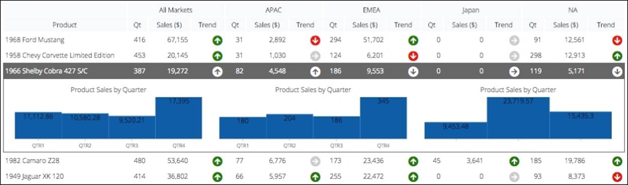
To achieve this result, you need to start by enabling the Expand On-Click option on the table, so the very first step is to change the value of this property to true. The second step is to create the layout, queries, and components that we want to be displayed as details. For that we need to specify a parent container that will be hidden, and that table component will make it visible below the row that has been clicked.
On the layout perspective, create a row and a column to be the placeholder for the table. You should also create another row and as many rows inside as components to display. The names could be salesByProduct and prodSalesByTerritory.
The second row should have a name, as we need to use it to specify to the parent container where all the HTML will be displayed when we click on the row. So, set a second row with the name tableDetailsContainer.
On the components perspective you should create a parameter such as productParam with the default value of 1968 Ford Mustang. Using the data source perspective, create two queries using the steel wheels connection and Mondrian schema. The query should be:
WITH
MEMBER [Measures].[Trend] as IIF(ISEMPTY(([Time].CURRENTMEMBER.lag(1), [Measures].[Sales])) OR [Measures].[Sales]=0, 0, ([Measures].[Sales]-([Time].CURRENTMEMBER.lag(1), [Measures].[Sales])) /[Measures].[Sales])+0
MEMBER [Measures].[Sales ($)] as [Measures].[Sales]+0
MEMBER [Measures].[Qt] as [Measures].[Quantity]+0
SELECT
NON EMPTY {[Measures].[Qt], [Measures].[Sales ($)], [Measures].[Trend]} ON COLUMNS,
NON EMPTY {[Product].[Product].Members} ON ROWS
FROM [SteelWheelsSales]
Where [Time].[2004]
And another query should be:
WITH
MEMBER [Measures].[Sales in Time] AS [Measures].[Sales]
SET PRODUCTFILTER AS FILTER([Product].[Product].MEMBERS, [Product].CURRENTMEMBER.NAME = '${productParam}')
Select
{ [Markets].[APAC] , [Markets].[EMEA] , [Markets].[NA] } on COLUMNS,
{ PRODUCTFILTER } on ROWS
FROM [SteelWheelsSales]
Where [Measures].[Sales in Time]
For this last one you will need to specify a parameter with the name productParam that can also have a default value of 1968 Ford Mustang. The names for the queries are salesByProductQuery and prodSalesByTerritoryQuery.
The first one will be used in the table, and the second will be used to get details about the selected product when selecting a row on the table. The next step is to create a table with have the following properties.
|
Property |
Value |
|
name |
products |
|
datasource |
salesByProductQuery |
|
htmlObject |
salesByProduct |
|
paginate |
True |
|
Expand On-click |
True |
|
Expand parameters |
[[0, 'productParam']] |
|
Expand Container Object |
tableDetailsContainer |
|
Execute at start |
True |
The table has some common properties such as Name, Datasource, and htmlObject but we also have Expand On-Click activated. The Expand Container Object is used to specify the parent container where all the HTML to be presented below the row is clicked, andExpand Parameters to specify which parameter is needed to be a target for a fireChange using the index value of the columns from where we need to extract the value to be set in the parameter. Looking to the second query, you will notice that we are using it to filter the product that the user has selected. On the table component, we are specifying that the first column should be used, so the name of the product will be set to the parameter productParam, so that the table can be updated each time we click on a row. This way, the components with the details will be notified that they need to update and be rendered below a row of the table.
There is a need to have a second component to display the details, so let's have a chart. It can be a pie chart or whatever. For now, you can use a bar chart with the following properties:
|
Property |
Value |
|
name |
products |
|
datasource |
prodSalesByTerritoryQuery |
|
htmlObject |
prodSalesByTerritory |
|
listerners |
productParam |
|
parameters |
[['productParam','productParam']] |
|
Execute at start |
False |
Here we are creating the components where the details for the selected product will be displayed. The properties are already well known, so you just want to make a quick note about Execute at start. This property is set to false because, the first time we render the dashboard, the user hasn't yet selected/clicked a product so we don't want to show the chart with details for a product. Once the user clicks on a row/product, a fireChange will be triggered and the chart component will be notified, because it's listening to the parameter and will be updated with the right values for the selected product. At that time, the component will be rendered inside the htmlObject that is inside the parent container, which has already been placed below the table that was selected.
Making use of add-ins
There are different column types or add-ins, which can change what's displayed as the content of each cell of a column. Inside the community and at Webdetails, the column types are usually referred to as add-ins, and the way to apply them is just by changing the property Column Types and setting the type for each one of the columns that will be available on the table.
By default, the Datatables plugin provides three types:
· string: To display the text in the cell
· numeric: To display a number in the cell
· hidden: When using this type, the column will not be displayed
CDF also extends the column types we can use inside the component. The following image shows the column types or add-ins:
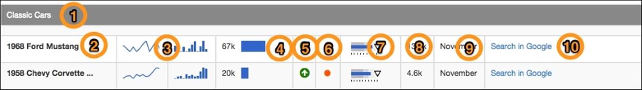
The numbers on the previous image correspond to the column types or add-ins that we are covering using the following numbered list. The ones that are available are:
1. groupHeaders
2. clippedText
3. sparklines
4. dataBar
5. trendArrow
6. circle
7. cccBulletChart
8. formattedText
9. localizedText
10. hyperlink
There is another add-in that is not displayed in the image: the template add-in. We will be covering this in the next chapter.
When you select one add-in just by setting the column type, you will get a result using the default options. If you need to give them a different aspect or behavior, you can customize them by changing the add-in options.
As already explained, we need to change the add-in by setting the type on the column types property. The way to extend the options is to add some code on the preExecution or postFetch functions of the component. Let's see an example using the sparklinesadd-in.
A Sparkline is a very small line chart that is typically drawn without any axes or coordinates. One use case is to use the variation of a measurement over time, for example for the temperature over the last 12 months.
Just by including the following line inside preExecution, we change the Sparkline type from line to bar:
this.setAddInOptions("colType","sparkline", {"type":"bar"});
I always like to have the options on a variable as it makes the code more readable. The previous example is not ideal, but we will see in the following example code where the code is so readable at first glance.
Among the properties that are applied to the Sparkline add-in, we have the type, which can be, line, bar, pie, and others, but let's cover that later when we go over the properties for this add-in. Using the previous code inside the preExecution function will change the representation of the values using bars in place of a line, which is the default value for the type when using this add-in.
This applies to the options for all the columns that use the column type sparkline, but what if we want to have a column where the values should be represented by bars and another one by a bar and a line? That's also possible by using a function that, depending on the column that is being processed, returns one object of properties, with the type set to bar, and another one using a line. The following code is one example of this:
var options = function(state){
if(state.colIdx == "3"){
return {type:'bar'};
}
};
this.setAddInOptions("colType","sparkline", options);
First, we have a variable that will be a function that receives one argument represented with the name state. This function will be executed for all the cells of the columns that have the column type Sparkline, so inside the function and using the state variable we will get access to one object that represents its context. For each cell, we will have access to colIdx, rowIdx, value, the target element on the DOM, and all the table data returned from the query. We can also have access to colFormat, if we have defined one using the property column Formats of the table component.
Having all the information mentioned previously, we can change the behavior of the add-in, for each instance, and also have a condition that will return the options for an add-in depending on the row that we are processing, or even the value of a previous row or column.
Now that you know how to change the option to pass to change the defaults and options of an add-in, let's cover add-ins and their options.
The way to apply options to each add-in is always the same; it is just the options that are applied that are different. Let's cover each one of the available add-ins.
groupHeaders
Based on the value of the cell being rendered on a column, the rows can be grouped. In the same columns, if the values of the rows are similar from one row to another, a group can be created. If that's the case, a group header is created and inserted under any of the following circumstances:
· On the first row of all records
· After a higher-level group header, when using group headers for more than one column
· When the value for the current cell differs from the one immediately before it
To be able to create groups, rows must be sorted on the columns where groups should be created. In the CDE samples, there is a great example on how to use the aoSortingFixed option of the Datatables JQuery plugin, which is provided when you install it and is also available under /public/plugin-samples/CDE/Require Samples/CDE References/Addins.
We have already seen that all add-ins have defaults that can be overwritten by passing the options to the add-in. The defaults are:
· hide: Its default value is true and will hide the column from the table, because the value is already on the header that identifies the group. If, for some reason, you want to display the column, you just need to set the option to false.
· columnHeadersInGroups: Repeats the column headers for each one of the groups, meaning that for each group the final user will also see the headers of the columns. The default value is false.
· textFormat: This is a function that receives three arguments, as follows:
· The value: The value being processed
· The status: A Json object where you can find:
The row and column being processed or get access to all datasets returned from the query
· The option: The last argument is the option used on the add-in
The function should return a string that will be the name of the group. You can overwrite this function and, based on the value, status, and options passed to the add-in, return a custom string that will be the header for the group. See the following default function:
textFormat: function(v, st, opt) {
return st.colFormat ? sprintf(st.colFormat,v) : v;
}
clippedText
The clippedText add-in can be used when the text to be displayed inside a cell is bigger than the space that is available. The part of the text that cannot to be displayed on the same line will be hidden and ellipses will be shown.
The options available for this add-in are:
· showTooltip: This is for, when hovering over the text, you want to display a tooltip with the full text. The default value is true.
· useTipsy: This is if the tooltip shown is not the default HTML tooltip but instead you want to use the Tipsy JQuery plugin to display the tooltip. When set to true it will show a fancier tooltip. The default value is false, so if you want to use it, you will need to set it to true.
· style: This is the style to apply to the element inside the cell of the table. The style is an object with CSS.
The following code is one example of how to apply the style to bold text and activate the Tipsy JQuery plug-in:
var options = {
showTooltip: true,
useTipsy: true,
style: {'font-weight': 'bold'}
};
this.setAddInOptions("colType", "clippedText", options);
sparkline
This add-in is based on the JQuery sparklines, which generates small inline charts using the data returned by the query. It allows using the properties of the sparklines plugin itself and generating different types of inline chart. It can generate inline charts such as line, bar, stacked bar, pie, bullet, composite, discrete, and box plot.
It is a really simple but powerful add-in, which gives the final user a great understanding of the data, and also gives multiple options to the developer. It's a great way to give the final user a distribution of the values over time, or to provide insights if the user needs to get into the details of the values he is looking at.
You can go to the Try It Out section at http://ominipotent.net/jquery.sparkline. Select the type of chart, change the necessary properties to get the result you expect, and copy the code that is automatically generated, because those are the properties to send to the add-in.
When using this add-in, you need to return from the query, and for the cell you want to have the add-in displayed, a column containing a string with all the values separated by a comma. For each instance, sales by month for a particular year would be:
"7498.9,4517.9,0.0,5774.7,0.0,3922.6,9160.4,13063.2,0.0,6934.6,13390.6,2891.7"
There are multiple ways to achieve this result and this will depend on the query type you are using in CDA. If using Kettle, there are also multiple ways to do it. It may be you just need to use one or more steps to join all the values into a string column type; just don't forget to separate them by commas. When using SQL you may need to concatenate all the values but by always combining single values with a comma. When using MDX, it's very simple; you can make use of the Generate function like this:
GENERATE(
DESCENDANTS([Time].[2004], [Time].[Months]),
CAST(([Measures].[Sales]+0) AS STRING),
',')
You can also get a complete query example on the samples provided for the table component inside the Chapter 6 folder, available in the samples supplied with this book. You will find a subfolder where you will find three samples for the table component.
The only property that is mandatory is the following:
· type: It's the type of the chart and also a property that is passed from the add-in to the Sparkline Plugin. The default value is line, which will generate a line chart with the remaining default values for the line chart of the Sparkline Plugin.
By going to the Try It Out section of the Sparkline Plugin you can check that the properties will differ from chart type to chart type. There are also some advanced options that the Sparkline Plug-in has, which are perfectly usable inside the add-in, and that's because what the add-in does is make a call to the plugin, and passing the options you have set. For each instance, if you want to generate one bar chart and change some of the properties, you would use code such as:
var options = { type: 'bar', barWidth: 6};
this.setAddInOptions("colType", "sparkline", options);
dataBar
This add-in is used to display a horizontal bar that represents the values returned from the query. The size of the bar is the relation between the value and the minimum and maximum values for all the rows on that same column. The add-in makes use of the Raphael JavaScript library to draw the bar, which is an SVG element, and the available options for the add-in are:
· width: Used to define the size of the parent container, the element that will contain the SVG representing the bar. The default value is 98%.
· widthRatio: This is the ratio of the bar to the parent element. The size of its parent is set by the width option. The default value is 1.
· height: Used to define the height in pixels of the bar.
· align: Used to define the alignment of the bar. Can be left or right. By default, it will be aligned at the left.
· startColor: The color of the bar can be a gradient. This option is used to define the color to the top part of the bar. The default is #55A4D6.
· endColor: Used to define the color to the bottom part of the bar. The default is #448FC8.
· stroke: Used to specify the color of the border.
· max: The maximum and minimum values are used to calculate the size and left and right position of the bar. This option is used to specify a fixed value or a function that returns a value. When it is not set, the value will be the max value for all the rows for that same column.
· min: The same as previous, but for the minimum value.
· includeValue: Used to specify whether the value should be visible or not. The default is false. Change it to true to also see the value.
· absValue: Used to tell the add-in whether it should apply the absolute value of the number to represent.
· valueFormat: This function accepts four arguments: the value, format, status, and options.
One example of the code needed to change the options would be as follows:
var myself = this;
require(['cdf/dashboard/Sprintf'], function(sprintf) {
var options = {
widthRatio:0.6,
height: 15,
align: 'left',
startColor: "#3366cc",
endColor: "#3366cc",
stroke: null,
absValue: true,
includeValue: true,
valueFormat: function(v, format, st, opt) {
return "" + sprintf(format || "%.1f", v);
}
};
myself.setAddInOptions("colType", "dataBar", options);
});
The previous code is wrapped by a require function, because we need to use a sprint function that's not available in the scope of the preExecution of the component.
trendArrow
The trendArrow add-in is very simple, it presents an up or down arrow depending on whether we have a value below the threshold, which by default, is set to zero. This means that values above the value defined as the up threshold will be represented with a green and upper arrow, and values below the value defined as the down threshold will be represented with a red arrow pointing down. Values that are between the ranges defined as the threshold are represented by a yellow equals symbol.
There is also the chance that values below the threshold are good values, so the add-in is also able to handle that. Values above the threshold are shown with a red arrow pointing up, and when below the threshold will be represented by a green arrow pointing down. To achieve this, we only need to set the good option to false, that means that upper values are considered bad, and lower values are considered good. Setting this option will change the color witch upper or lower values are represented. The threshold is also configurable, so it's better to cover now the options that are available:
· good: Used to define whether values above the thresholds are considered good or bad values. By default, it's set to true meaning that the values above the thresholds are good values. When set to false it will set the opposite.
· threshold: It sets the upper and lower thresholds. The threshold accepts an object with two keys, up and down, to set both threshold values. For each instance setting a range would be like {up: 30, down: 60}. You can see in the following sample code, where the valueFormat property is explained.
· includeValue: Used to set whether the value will be shown together with the trend arrows. By default, it is set to false. If you need the value to be displayed, just set it to true.
· valueFormat: Is a function used to format the value to be displayed together with trend arrows when the option includeValue is set to true. The function accepts four arguments: the value, format, status, and options. The value is the value that comes from the query to that same cell of the table. The format is the format specified in the columns format of the table component. The status is where you can get to know what columns and row is being processed at the time, or where you can get access to the full dataset returned from the query. Finally, the options parameter, is where you can find the options that were set to be used by the add-in. The code to apply the options would be as follows:
· var myself = this;
· require(['cdf/dashboard/Sprintf'], function(sprintf) {
· var options = {
· good: true,
· includeValue: false,
· valueFormat: function(v, format, st, opt) {
· return sprintf(format || "%.1f", v);
· },
· thresholds: {up: 0, down: 0}
· };
· myself.setAddInOptions("colType", "trendArrow", options);
});
It's possible to change the CSS to change the arrows, showing other symbols and/or colors. To be honest I don't like the default ones, so I always change them.
For each instance, if you have some images that you want to use, you may do so by changing the CSS. You may add the following CSS to your dashboard and the defaults will be overwritten; you just need to change the path and filename of the image. Do not forget that, if the images have a different size, you may also need to change a few more rules:
.trend.up.good { background: url("img/up-good.png"); }
.trend.neutral { background: url("img/neutral.png"); }
.trend.down.good { background: url("img/down-good.png"); }
.trend.up.bad { background: url("img/up-bad.png"); }
.trend.down.bad { background: url("img/down-bad.png"); }
I always avoid using images on the dashboards as using icon fonts has more advantages. You can change the size (without losing any definition), change the colors, or apply a shadow just by using CSS. Besides that, your page becomes lighter.
To apply an icon font, perform the following:
table .trend {
position: relative;
}
table .trend:after {
position: absolute;
background: none;
font: normal normal normal 20px/1 FontAwesome;
top: -5px;
left: -3px;
}
table .trend.down.good {
background: none;
}
table .trend.down.good:after {
content: "\f0ab";
color: red;
}
table .trend.up.good {
margin-top: 5px;
background: none;
}
table .trend.up.good:after {
content: "\f0aa";
color: green;
}
table .trend.neutral.good {
background: none;
}
table .trend.neutral.good:after {
content: "\f0a9";
color: #ccc;
}
You can find more information about using icon fonts by looking at: https://fortawesome.github.io/Font-Awesome/icons/.
You will find the code inside the table samples of this book. Notice that this example was only set when values upper of the threshold are good. Otherwise you would need to make similar rules but using bad besides good.
circle
This add-in can be used to represent values as circles. The circles are represented through an SVG, which is the result of the use of the Raphael JavaScript Library. Here we always need to set some options, otherwise you would always get the same size and color that, by default, have default values of four for the size and black for the color. The options are:
· canvasSize: Used to set the size, width, and height of the SVG element. By default, its value is set to 10. It accepts a fixed value or a function that can return the value to use as the size. The same value will be used for the width and height.
· radius: Used to set the radius of the circle. The default value is set to 4, but you can use a function to return the value to use as the radius. The function will receive one argument that is the value, and the value can be a string. Don't forget that, to see a full circle, the radius should not be higher than half of the canvasSize.
· color: Used to set the color for the circle. You can return any value that represents a valid color when representing SVGs. By default, its value is set to black. It accepts a fixed value or a function that can return the string, which represents the color.
· title: Used to set a function that returns the value to display when hovering the circle. The default value is:
title: function(st, opt) { return "Value: " + st.value; }
Let's suppose that you wanted to show a circle where the radius is calculated based on the percentage relative to the maximum value of the quantities sold, where the lowest value will have the smallest radius and the highest value will have the highest radius. The color is calculated based on the values of sales. To be able to achieve this, we need to get two values from the query, quantity, and sales. For this example, the value is a string that will be a concatenation of both values separated by a comma. You can do it the way you want; we just used a member calculated as:
MEMBER [Measures].[circle] AS
CAST(([Time].[2004], [Measures].[Quantity])+0 AS STRING) ||
"," ||
CAST(([Time].[2004], [Measures].[Sales])+0 AS STRING)
The code to apply the options would be as follows:
var options = {
canvasSize: 20,
radius: function(st) {
var values = st.tableData.map(function(e){
return Number(_.first(e[st.colIdx].split(',')));
});
var tblMax = _.max(values),
tblMin = _.min(values),
value = Number(_.first(st.value.split(','))),
size = (value-tblMin)/(tblMax-tblMin);
return (20*size)/2;
},
color: function(st) {
var values = st.tableData.map(function(e){
return Number(_.last(e[st.colIdx].split(',')));
});
var tblMax = _.max(values),
tblMin = _.min(values),
value = Number(_.last(st.value.split(','))),
size = (value-tblMin)/(tblMax-tblMin),
red = Math.min(255, Math.round(510-2*255*size)),
green = Math.min(255, Math.round(2*255*size));
return "rgb(" + red + "," + green + ",0)";
},
title: function(st, opt) {
var sales = Number(_.first(st.value.split(','))),
quant = Number(_.last(st.value.split(',')));
return "(#): " + Utils.numberFormat(sales, "0") + " " +
"($): " + Utils.numberFormat(quant, "0.0");
}
};
this.setAddInOptions("colType", "circle", options);
The inside options we are defining are the size for the SVG element, and functions for the radius, color, and title. The radius function will return the radius to be used based on the calculations using the value, min, and max values for all the rows being displayed. Color is also a function that will return the RGB string with the colors for red and green, also based on the value passed as an argument.
cccBulletChart
This can represent a bullet chart with the values that come from the query for the same cell. Here you need to return all the values to use on the bullet chart, separated by a comma. The options that you have available are all the options for the CCC charts that we are going to cover later, but the following is the code to apply the default options:
var options = {
height: 40,
animate: false,
orientation: "horizontal",
bulletSize: 16,
bulletSpacing: 150,
bulletMargin: 5,
bulletRanges: [30, 80, 100],
extensionPoints: {
"bulletMarker_shape": "triangle",
"bulletTitle_textStyle": "green",
"bulletMeasure_fillStyle": "black",
"bulletRuleLabel_font": "8px sans-serif",
"bulletRule_height": 5
}
};
this.setAddInOptions("colType", "cccBulletChart", options);
formattedText
This add-in is used to specify a custom format to the value that is supposed to appear on the table. The default option is the following:
· textFormat: This is used to return the value to display on the table. The function receives three arguments. The arguments are the value being processed, the status where you can know the row and column being processed or get access to all datasets returned from the query, and the last argument is the options used on the add-in. See the following default function:
· textFormat: function(v, st, opt) {
· return st.colFormat ? sprintf(st.colFormat,v) : v;
}
This is a really simple but useful add-in. We will see later that we can extend and write our own add-ins, but if using this add-in you can almost do whatever you want. Of course, if writing a new add-in, we have the ability to include the JavaScript file. When using this add-in you would need to include some code on the preExecution or postFetch of the component. You can overwrite the textFormat function and, based on the arguments that are passed, the value, status, and options passed to the add-in return a string that will be rendered on the cell of the table being processed. Here you can return a string that is the HTML to be rendered inside the cell, so as you can imagine you have almost no limits here.
Let's see a small example where you need to display the negative value using red. If that's the case, just using the columns format will not be sufficient, so the formatted text add-in is an option, maybe the easiest one. You would need to include the following lines inside the preExecution of the table component:
var myself = this;
require(['cdf/dashboard/Sprintf'], function(sprintf) {
var options = {
textFormat: function(v, st, opt) {
var cssClass = ((v < 0) ? 'negative' : 'positive'),
value = st.colFormat ? sprintf(st.colFormat,v) : v ;
return '<div class='+cssClass+'">'+value+'</div>';
}
};
myself.setAddInOptions("colType", "formattedText", options);
});
We also need to add some CSS similar to the following line:
.formattedText .negative {color: red;}
You will find on the JavaScript code the textFormat function returning a div element with the formatted value, which will use the mask specified on the columns format of the table. We can get the specified format from the st.colFormat from the st object. This way we could execute the sprint function and format the value with that mask. The div element will have a CSS class that will be negative if the value is less than zero, and positive otherwise, so that we can apply some CSS and turn the negative values to red. All of the code is wrapped by a require function because we need the sprintf library to be included and available when executing the code.
localizedText
The localizedText add-in allows the table to display content based on a language that is set for the browser. Using this add-in you may delegate to i18n the translations of the values returned from the query.
If the range of values returned is not too big, and if they are not changing over time, it's fine to use this add-in; otherwise, we have a drawback because you need to have all the translations in one file, and if there is no translation for the current value being displayed, i18n will not be able to do it. When adding new rows in the database, we would also need to add them on the property files that are going to be used by i18n. So, if the range of values is too big and change over time, maybe you should consider doing it on the back end, using a Dynamic Schema Processor, SQL Generator, or any other technique available in Pentaho; but that is not the purpose of this book, so let's skip this option.
So, if you have to meet the requirements to use the add-in, or for any other reason you need to use it, let's see how to do it. We have not yet discussed how to use i18n on the dashboards but we will do it later, but we need to have a brief introduction.
When building a dashboard that needs to handle internationalization and localization, and they all should, you must specify a file with the name messages_supported_languages.properties, which should be in the same folder as the dashboard. That's the way i18n will read the message files and their content will be key/value pairs where:
· key: will be the <language> and/or <language>_<COUNTRY>, where <language> is the lowercase code for the language and <COUNTRY> is the uppercase country code
· value: can be any description of the language/country
One example of the messages_supported_languages.properties file would be:
en=English
en_US=English (United States)
en_UK=English (United Kingdom)
pt=Portuguese
pt_PT=Portuguese (Portugal)
pt_BR=Portugues (Brazil)
Here we don't need to specify the fallback file, it will use the one with the name messages.properties. We can delegate i18n messages to three specific files, which need to be placed in the same folder as the dashboard. The standard in Pentaho is to have the names using the following rules:
· messages_<language>_<COUNTRY>.properties: These files are the ones that contain the translations for a particular country for a language, where <language> should be replaced by the lowercase language code and <COUNTRY> should be replaced by the uppercase country code (per instance: messages_en_US.properties, messages_en_UK.properties, messages_pt_PT.properties, and messages_pt_BR.properties).
· messages_<language>.properties: These files are the ones that will contain the translations for a particular language, not specifying the country, where <language> should be replaced by the lowercase language code (per instance: messages_en.propertiesand messages_pt.properties).
· messages.properties: This is the fallback file, where no language or country is specified. Here we will not need to specify a language or country.
Messages, or translations, can and should be shared by the different files and whenever that happens the following rule applies:
· The messages keys placed at messages_<language>_<COUNTRY>.properties will override similar ones placed at messages_<language>.properties, which in turn will overwrite the messages.properties
If we wanted to display a hierarchical structure of the messages.properties files, it would look as follows:
+ messages.properties
++ messages_en.properties
++++ messages_en_US.properties
++++ messages_en_UK.properties
++ messages_pt.properties
++++ messages_pt_PT.properties
++++ messages_pt_BR.properties
We will need to specify the messages.properties files, which are also a list of key/value pairs where the key will be translated to the values specified. As an example, let's suppose we have a column that reveals which month had the highest value of sales. If the fallback language is English, the messages.properties file should be specified like:
Jan=January
…
Nov=November
Dec=December
The messages_EN.properties files would be similar, but messages_PT.properties would be:
Jan=Janeiro
…
Nov=Novembro
Dec=Dezembro
The previous samples do not specify messages for countries but, as already covered, you would be able to do it, and the content would also be based on key/value pairs. We can avoid repeating key/value pairs that are similar and use the hierarchical priority rules to specify only the key/value pairs that are different from file to file.
Regarding the options available for this add-in, I can't see any advantage to changing the defaults; there is only one option, which is the localize function. The only reason I can see to change this function would be to add a prefix or suffix to the value coming from the query and to match the key of the messages files. In the following code we are applying the same function by default, but it can give you an idea of the code needed to change the function:
var options = {
localize: function(v, st, opt) {
return dashboard.i18nSupport.prop(v);
}
};
this.setAddInOptions("colType", "localizedText", options);
Please refer to the sample provided for this chapter. You will find the example on the add-in's sample dashboard.
hyperlink
The hyperlink is an add-in that can provide links to any URI that is recognized by the HTML and the browser. You need to return a string with a valid URL from the query. It expects a URI string, for example: http://www.pentaho.com. The add-in will create an HTML element that provides a link the user can click in order to interact.
The following are options that we can use to customize the appearance and the 'margin-left:18.0pt;text-indent:-18.0pt;line-height: normal'>· openInNewTab: Used to open the URI on a new tab of the browser. By default, it is set to true. When set to false it will be opened on the same tab.
· prependHttpIfNeeded: Used to tell the add-in to prepend the string http:// to the URL provided when the URI does not include one. We should avoid it when providing an e-mail address as the URI.
· Regexp: We can provide a regular expression to check whether the provided URL is valid. The regular expression is just to check whether it's valid or not. If it's valid then the add-in can create the link. By default, it's set to null, avoiding the validation.
· pattern: This is the regular expression that will extract the strings to use as the label and as the URI.
· urlReference: Used to tell from which group index we get the URI. By default, its value is set to 2.
· labelReference: Used to tell from which group index we get the label. By default, its value is set to 1.
Let's suppose that the query returns something like [Link to Pentaho][http://www.pentaho.com], where we first have the label and finally the URI. We would need to overwrite some of the default options, which would look something like:
var options = {
openInNewTab: true,
prependHttpIfNeeded: true,
regexp: null,
pattern: "/\[(.*?)\]/g",
urlReference: 2,
labelReference: 1
};
this.setAddInOptions("colType", "hyperlink", options);
The previous code defines a pattern, used to extract the label and the URI from the string that's returned from the query. By default, urReference and labelReference have this but, if needed, we could also change it and get those values from other indexes of the resulting application of the regular expression.
We are also able to extend them because CDF provides the capability to create new add-ins, but we need to cover this in a later and more advanced chapter.
Template component
The template component is a component that allows us to create custom visualizations based on templates and models, all based on the data that we have acquired from a data source. The concept of building HTML content is not new, just the fact that we now have a component that allows us to do that. Maybe you don't need them for simple use cases, as using the query or freeform component can be an alternative, but it doesn't take too much complexity before the use of a template component becomes a good decision.
One of the big advantages of using templates is that we can have the same template making use of the same model with different data. So, if the model is the same but just the data has changed, which can be the result of a query, it will leverage the work you need to build a section of a dashboard. It also lets you split the structure of the content to display from the data that needs to be displayed, so your dashboard will have less complexity when building custom visualizations. This is because the alternative would be a custom component, which would take you more time and effort.
You should use this component when you have visualizations that cannot use another component, or if the use of another component becomes hard and you can represent the data coming from a query using HTML. In other words, to be used when you need to loop in data driven HTML representation. We will see later, in this chapter, that it's also possible to use add-ins like we can on tables, handle events for interactions, and create functions for custom formatting, which makes the component even more dynamic.
First of all, you need to understand the concept of templates and how they work. It's not the purpose of this book to get into the details, we will just give you the basic concepts. You should refer to the documentation about template engines (https://github.com/janl/mustache.js and http://underscorejs.org/#template) we can make use of inside a CDF/CDE dashboard. You will find some examples on the CDE samples or on the samples provided with the book. There are also plenty of examples on the use of templates on the Web, which you may find interesting.
Templates are based on a template itself and the model. The template defines the formatting and structure, while the model provides the data that is going to be used on the template. So, when making use of templates, we can separate the formatting and structure from the content, where the JavaScript template engine makes the JavaScript business logic inject content into the template. The template component specifically uses JavaScript-powered templates and was developed to work with two libraries that provide template capabilities, with the advantage of already being included in CDF. The libraries are: Mustache and Underscore.
To have a better understanding of the differences between them, let's use the same example to create the content for the dashboard based on the template. For both engines, the model will be the sales by territory for a particular year, so the final result we want to get is:
<div class="title"> Sales by territory: </div>
<ul>
<li>EMEA: $168479</li>
<li>APAC: $601606</li>
<li>Japan: $168479</li>
<li>NA: $1821247</li>
</ul>
The model, where data is?, will be represented by a JSON structure such as:
var model = {
territory: [
{ name: 'EMEA', sales: 168479},
{ name: 'APAC', sales: 601606},
{ name: 'Japan', sales: 168479},
{ name: 'NA', sales: 1821247}
]};
Mustache is a logic-less template syntax, because there are no logical conditions, such as if statements, else clauses, or for loops. Mustache makes use of tags that are replaced by either a value, nothing, or a series of values. It can be used for HTML, configuration files, source code, or anything else. Mustache works by expanding tags in a template using values provided in a hash or object, and it's very clean with a small learning curve. It is a very popular template language, which is evident from its many platform implementations.
A Mustache tag begins with two opening braces and ends with two closing braces and, as you might have guessed, the "{{" and "}}" delimiters are where Mustache gets its name from. We can use {{…}} to access a variable and {{#…}}…{{/…}} to display a chunk of markup if a certain condition is true (or false), or to repeat sections, which let you display lists of values. If you have a need to escape HTML, you have the option to use {{{…}}}.
Following the provided example, using Mustache we would need to define a template such as:
var template = '<div class="title"> Sales by territory: </div> ' +
'<ul>' +
' {{#territory}}' +
' <li>{{name}}:{{sales}}</li>' +
' {{/territory}}' +
'</ul>';
And the instruction to get the rendered HTML string is:
Mustache.render(template, model);
Tip
You don't need to run the render when using the component
You won't need to run the render when using a template inside the component; you just need to specify the template engine that you want to use, and the component will take care of it for you.
Underscore is a library that offers functional programming utilities, but it does have an easy template method with a lot of flexibility. By default, it uses more complex delimiters that can easily be modified, and makes use of braces, similar to Mustache. Underscore provides the capability of having logical conditions such as if or for loops, among others. It allows you to make use of JavaScript inside the template, so it's much more flexible than Mustache, but of course its learning curve may be a little harder.
Template functions can both interpolate values, using <%=…%>, and execute arbitrary JavaScript code with <%…%> and this is how all loops will be created. If you wish to interpolate a value, and have it be HTML-escaped, use <%-…%>.
Following the example using Underscore we would need to define a template such as:
var template = '<div class="title"> Sales by territory: </div> ' +
'<ul>' +
'<% _.each(model.territory, function(elem) { %>' +
' <li> <%= elem.name %>: $ <%= elem.sales %> </li>' +
'<% }); %>' +
'</ul>';
Among other options, the way to render the template to an HTML string is:
_.template.render(template, model);
I am used to the syntax, but you may find it harder to understand because of the tags that Underscore uses by default. That can be changed just by placing the following code before using the component:
_.templateSettings = {
evaluate: /\{\{(.+?)\}\}/g,
interpolate: /\{\{=(.+?)\}\}/g,
escape: /\{\{-(.+?)\}\}/g
};
Tip
Make the same changes on the component
It's also possible to apply these changes to the component. We can place this code just before returning the template to use, which should be done on the template component property.
If that's the case we can build a template such as:
var template = '<div class="title"> Sales by territory: </div> ' +
'<ul>' +
'{{ _.each(model.territory, function(elem) { }}' +
' <li> {{=elem.name}}: $ {{=elem.sales}} </li>' +
'{{ }); }}' +
'</ul>';
If the project is relatively simple, you can use Mustache, but when the template must be more complex, you will need to use Underscore.
I tend to think of myself as the father of this component, and I have some great ideas and improvements that will make it even greater, so keep an eye on the updates.
Automatically generated model and root element
When we make use of the template component, we also want to get data from a server. We need to define a data source using the data sources perspective, making use of CDA to get the data back to the dashboard, but when doing it the data is returned to the component using the standard CDA format. The component will automatically generate a model you can use when building your template, but you can also do it by yourself when you need to build a more complex model that fits your requirements.
Let's suppose that the query returns sales by territory, so we will have a row for each territory, and on the columns we will have the name and the sales for that same territory.
The resulting dataset would be something like:
|
APAC |
1281705.9 |
|
EMEA |
5008224.3 |
|
Japan |
503957.6 |
|
NA |
3852061.4 |
The resulting model is based on the result set so the model will be a multidimensional array. I already mentioned that the model should be an object, so a JavaScript object will wrap the multidimensional array with a key that, by default, is items. One example would be:
{
items = [
['EMEA', 168479], ['APAC', 601606],
['Japan', 168479], ['NA', sales: 1821247]
]
};
There is a property that we can cover right away because it will be the key of the root element of the returned model:
· Model root element: Used to change the key of the root element of the model. By default, it's set to items. The template needs to refer to the root element so you can use a name that you feel comfortable with. It's not mandatory to change it.
Template and engine
Besides the properties that are available for other components, and that we need to define, such as the name, data source, parameters, listeners, and the HTML object, we also need to have at least the template and the template type well set:
· Template library: Used to specify the engine that will be used to render the template. There are two options available: Underscore and Mustache, and the default value is Underscore.
· Template: Used to define the template to be used. You need to define a valid template for the selected engine. The property accepts a function that should return a string with the template to be used. An example of the code to create an Underscore template for the automatically generated model sample would be:
· function() {
· var template = '<div class="row">' +
· '<% _.each(items, function(elem) { %>' +
· ' <div class="col-xs-6 col-md-3 single">'+
· ' <b> <%= elem[0] %>:</b> $<%= elem[1] %> '+
· ' <div> <%= addin("3,5,7,3,4,2", "sparkline", "sparkline") %> </div>'+
· ' </div>' +
· '<% }); %>' +
· '</div>';
· return template;
}
The template creates a parent element that will wrap all other elements. Since each row is the same as one element of items, the root key of the model, the template generates a <div> that's going to have the name of the territory and the value. You should have noticed that we are using CSS classes, the bootstrap CSS classes that will make this content responsive to screen size changes.
Model handler
We already covered in earlier chapters and/or sections the fact that we can use Pentaho Data Integration (Kettle) transformations to return data to the dashboard. When using MDX, we may return some more complex value parsed in a string and, when this happens, you may also need to manipulate the model so that it will let you build a really advanced visualization. Let's suppose that you are returning the sales for each territory and country, and you want to display a card by territory where you will include all countries' sales, such as in the following image:
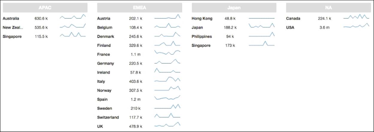
What we need to do is to group the result by territory, because if we can have an object for each one of the territories then we can have all countries inside it. It's easy to build a template that can bring those results to the screen:
function(data){
if (data.queryInfo.totalRows > 0) {
var model = {};
var territories = _.groupBy(data.resultset, function(elem){
return elem[1];
});
model[this.rootElement] = territories;
return model;
} else {
return null;
}
}
On the previous code, first we are checking whether we get results from the query, otherwise we want to return null to notify the component that it will not have data to display. If we have data on the result, then we will use the groupBy function to group all rows based on the second column (index one) that contains the territory. What we are getting is an object where the key will be the territory and the value will be the array of countries/values that belong to that same territory. After getting the result object we also need to put it on a root key, which is represented by this.rootElement, so we are using the property that has been set on the component (default value is items) so that we can iterate on each territory inside of it. An example of the model that is returned to the component is:
{ items: {
APAC: [["Australia", "APAC", 630623, "0,49637,0,…,0,37905"], …,
["New Zealand", "APAC", 535584,"0,0,36409,…,0,102523"]],
EMEA: [[…],…,[…]],
Japan: [[…],…,[…]],
NA: [[…],…,[…]]
}
Based on the model, we can now build the template. We will need to iterate on each element of items, getting each one of the territories, where we will iterate on each one of the arrays inside it. When inside each country we can access the value by using the proper index such as 0 to get the country, 1 to get the territory, or 2 to get the value for sales:
function() {
var template = '<div class="row">' +
'<% _.each(items, function(tVal, tKey) { %>' +
' <div class="col-xs-6 col-md-3 single territoryContainer"> '+
' <div class="category"> <b> <%=tKey%> </b> </div>'+
' <% _.each(tVal, function(cVal, countryKey) { %>' +
' <div class="row countryContainer"> '+
' <div class="col-xs-4 country"> <b> <%=cVal[0]%> </b> </div>'+
' <div class="col-xs-3"><%=formatter(cVal[2],"sales")%></div>'+
' <div class="col-xs-5"><%=addin(cVal[3],"sparkline"%></div>'+
' </div>' +
' <% }); %>' +
' </div>' +
'<% }); %>' +
'</div>';
return template;
}
You will see two loops that are coded using the _.each function. First, iterate for each one of the territories and then for each one of the countries. When on the territory, we are using the key to create an element that will have the category or territory. When on the country, we will build three elements to display the name of country, the sale of the year, and a sparkline that represents the value for each one of the months for that same year.
You will notice two function formatters and add-ins, but don't worry; we are going to cover them now.
Formatters
Formatters are very useful because, most of the time, we can't get the value formatted from the query, as we want it to be displayed on the dashboard. Let's suppose you have a query that can be used to get data to more than one component, taking advantage of the already cached data. If that's the case and if you want to display the values on a different format, then you need to handle it on the client-side. It's also easier changing the format on the client-side than on the queries, which can also be used by another dashboard or application. The template component has the concept of formatters, which are functions that we can define on the component and later use them inside the template. The values here can be numeric, a date, or a string. This can be done using the following property of the component:
· Formatters: Used to define the formats that we may need to apply to the values returned from the dashboard and that will be displayed on the dashboard. When you click on the property you will get a popup where you will have to define the identifier/name for the formatter and the function that receives an argument, the value, and returns the already formatted value. Let's suppose you wanted to display the numbers, not to eight decimal places but just one. For that we would create a formatter with the identifier/name floatFormatter and a function such as:
· function(value, id){
· return Utils.numberFormat(value, '$0.0a')
}
Formatters are defined as a property. When you click on the property, you have the ability to add as many as you want.
To make use of the formatter inside the template, we need to use a function that is a formatter and receives two arguments: the value to be formatted, and the identifier/name of the formatter to use. This is because you can define and use multiple formatters on a template. One example of a template that would make use of the formatter would be as follows:
function() {
var template = '<div class="row">' +
'<% _.each(items, function(elem) { %>' +
' <div class="col-xs-6 col-md-3 single">'+
' <b><%=elem[0]%></b><%=formatter(elem[1],"floatFormatter","")%> '+
' </div>' +
'<% }); %>' +
'</div>';
return template;
}
You can see in the code that this way we are displaying all the sales by territory, but the values of sales are being formatted to have only one decimal place. The formatter function is being used and called from the template.
Add-ins
We already covered the use of add-ins in the table component. They are really useful and easy to create on the tables, and here on the template component this is also very easy. We can create new add-ins or make use of the ones that are already there by default. The way to apply add-ins that already exist is a bit different from tables.
Here on the template component, since we are defining the layout for our visualization you also need to define it on the template. You can make use of it by using the addin function that receives three arguments, the data to be used by the add-in that will create the visualization, the name of the add-in to use, and the name of the column that comes from the query because the add-in may need to access the column. Another reason to specify the ID is because, when using the same add-in on the same template but for a different purpose, you may want to have a different format, as is possible on the table component. Let's suppose you want to display sparklines but using lines and bars for different purposes. By including the id, you may do so. Just don't forget that the id must match the column name that is returned from the query.
Let's suppose you want to display sparklines like you can do on the table component. For that you should have the string with comma-separated values, and let's suppose that the third column of your query is returning it for you. You would need to apply a template as follows:
function() {
var template = '<div class="row card">' +
'<% _.each(items, function(elem) { %>' +
' <div class="col-xs-6 col-md-3 single territory"> '+
' <div class="category"> <b> <%= elem[0] %> </b> </div>'+
' <div class="value"> <%=formatter(elem[1], "sales", "sales")%> </div> '+
' <div class="addin"> <%=addin(elem[2], "sparkline", "sparkline")%> </div>'+
' </div>' +
'<% }); %>' +
'</div>';
return template;
}
You can see the addin function being used, passing as arguments elem[2] where the string containing the values separated by commas is, and another argument with the name of the add-in to use.
We may also want to change the default options for add-ins, and here it's the same as on the table component. We need to use the setAddInOptions function to override the default values. The function should be placed on the preExecution function of the component:
function f(){
var opts = {
type: 'bar',
height: 20,
barWidth: 6
};
this.setAddInOptions("templateType","sparkline", opts);
}
The result of the add-in would be something similar to that displayed in the following image:
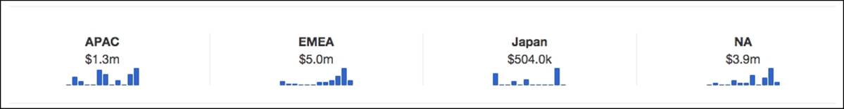
You need to be sure that the add-in that you are using is registered, otherwise it will not work. The add-ins that are available for the template component are not the same; some will be available and others will not. During the writing of this book I also created approximately ten add-ins, some of them almost a copy of add-ins used in the table component. The following image is an example of the add-ins that can already be used inside the template component:
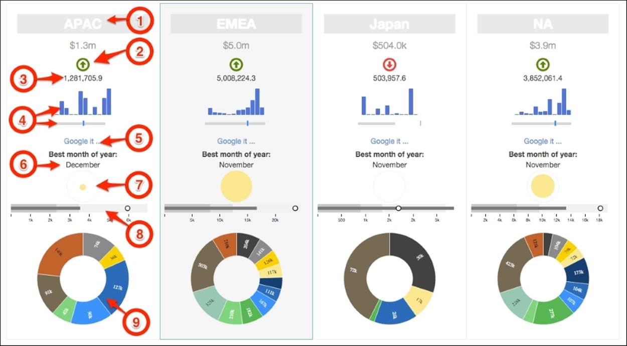
You can see on the image some numbers pointing to the add-ins; let's cover them and use the numbers so that you can easily identify them. The add-ins that we are covering for the template component are very similar to the ones on the table component so you already have most of the information. Don't forget that these options should be set inside the preExecution function of the component:
1. clippedText: The same as the table add-in plugin used when we have text larger than the space we have to display it. It will show the full text when we hover over it. The options available are:
· showTooltip: To show a tooltip when hovering over the text. The default value is true.
· useTipsy: Use the Tipsy JQuery plugin to show a fancy and customizable tooltip. The default value is true.
· applyFormat: This is a function that receives an argument that is the value to show on the tooltip and returns the formatted value. One example would be:
· var options = {
· showTooltip: true,
· useTipsy: true,
· applyFormat: function(value) {
· return value;
· } }
this.setAddInOptions("templateType","clippedText", options);
2. trendArrow: This add-in is very similar to the trend arrow of the table component using the exact same behavior and properties. It will display an arrow up/down and red/green depending on whether it's up/below and whether it's a good/bad value. This is the same behavior as the trendArrow table add-in, so please refer to the documentation. The properties are the same:
· good: This property says that a good value is above the threshold upper interval. The opposite applies if we set a value of false. The default value is true.
· thresholds: Defines the up and down thresholds. The default for up and down thresholds is zero:
{up: 0, down: 0}.
· includeValue: Used to specify that we will also see the value side by side with the arrow. The default value is false. Here the difference to the add-ins available on the table component is that I have used font icons to display the arrow. Color and sizes can be changed just by changing/overriding some CSS. By opening the trendArrow.css file when debugging your dashboard, you will find the CSS classes that you need to override and customize the size, icon, and color. The following image is an example of the template add-in showing the trendArrow pointing down or up depending on a negative or positive trend compared to the sibling period:
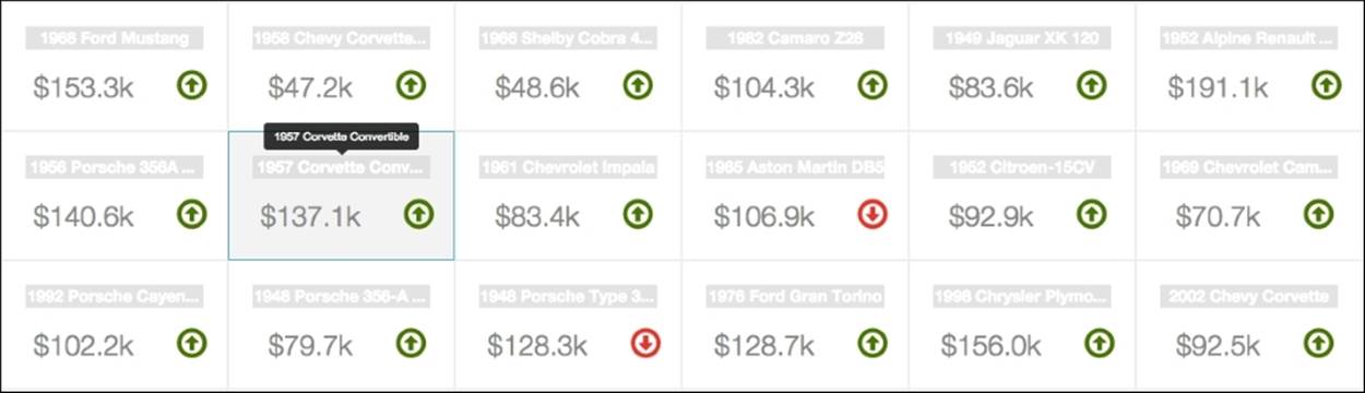
3. formatted: I consider this a multiuse add-in because you can use it to easily apply some formatting or even customize, and have complete control over, what you will display. You can use the add-in to send HTML to the dashboard, so it gives you great flexibility. By default, the add-in format will be applied using one of two functions. You can format numbers and/or dates. This is quite different from the one we have discussed for the table component; it's simpler to use but powerful as well. The three main properties are:
· formatFunction: Here you should specify a string with the name of the function that you want to use from Utils. Use numberFormat to format a number or dateFormat to format a date. The default value is numberFormat.
· formatMask: You should remember from the section where you covered the Utils number and date formatting functions that we also need to specify the format mask, so this property is used to specify it. You should set a string with the format to use on the function that you specified as formatFunction. The default value is #,#.#. To get more information, please refer to the date and number formatting of the CDF chapter, Chapter 3, Building the Dashboard Using CDF.
· applyFormat: By default, the functions used are the formatFunction and formatMask properties, so it will do the formatting based on what you have specified for those properties. But if you want to customize the content to display, you can overwrite this function. If so, you need to define your own function, which needs to receive the value as the argument and return the text/HTML to be presented on the dashboard:
· var options = {
· applyFormat: function(value) {
· return '<div class='customContent'">'+value+'</div>';
· }
· };
this.setAddInOptions("templateType","formatted", options);
The previous code is an example of the code to be placed on the preExecution function of the component to extend the options, if we want to customize the content to return to the dashboard when applying the formatted add-in inside the template component.
4. sparkline: Allows you to use the JQuery Sparkline Plugin just like we covered on the table component. Options should be the ones available on the plugin; just make sure the value returned is a string, represented with comma-separated (,) numbers. This is the only property that you will need to define, but you can use more. You can go to the Try It Out section of the Sparkline Plugin to check that the properties will differ from chart type to chart type:
· type: It's a chart type and also a property that is passed from the add-in to the Sparkline Plugin. Here the default is bar.
Per instance, if you need to display bars to represent the values chart and change some of the properties you would use code such as:
var options = { type: 'bar', barWidth: 6};
this.setAddInOptions("templateType", "sparkline", options);
5. Please refer to the sparkline add-in section of the table component. You will find all the information you need, which will also work on the template component. The following images are also examples of what you can achieve when using the add-in:
6. 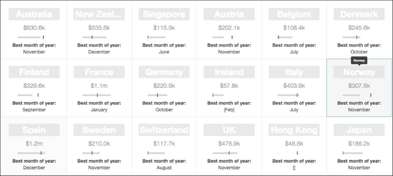
7. The previous image uses the bullet chart options, while the following image uses the bar chart options to represent the values that should be represented:
8. 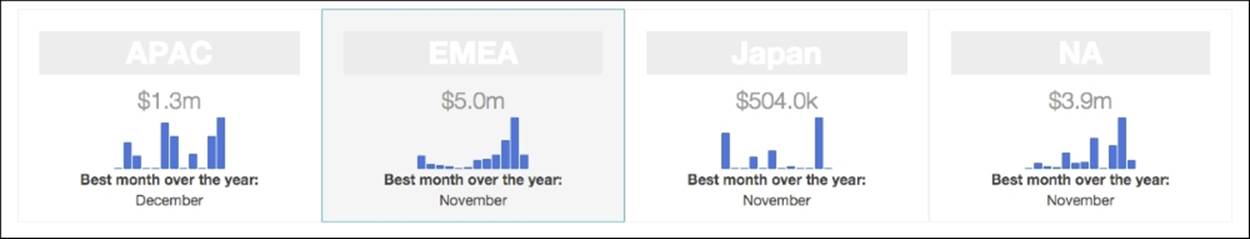
9. hyperlink: hyperlink is an add-in that can provide links to any URI that is recognized by the HTML and the browser. You need to return a string with a valid URL from the query. The use is exactly the same as on the table component, so please refer to that section to get more information. The options are:
· openInNewTab: Used to open the URI on a new tab of the browser. By default, it is set to true. When set to false it will be opened on the same tab.
· prependHttpIfNeeded: Used to tell the add-in to prepend the string http:// to the URL provided when the URI does not include one. We should avoid it when providing an e-mail address as the URI.
· regexp: We can provide a regular expression to check whether the provided URL is valid. The regular expression is just to check whether it's valid or not. If it's valid then the add-in can create the link. By default, it's set to null, avoiding the validation.
· pattern: This is the regular expression that will extract the strings to use as the label and as the URI.
· labelReference: Used to tell from which group index we get the label. By default, its value is set to 0.
· urlReference: Used to tell from which group index we get the URI. By default, its value is set to 1. To use the add-in, the value returned can be something such as: [Pentaho Website][http://www.pentaho.com], and if that's the case you will need to apply the following options to the add-in:
· var options = {
· pattern: /\[(.*?)\]/g
· };
this.setAddInOptions("templateType","hyperlink", options);
10. localized: This is similar to the localizedText add-in on the table component. Please refer to the documentation on the table component section.
11. bubble: This add-in will draw a bubble where the size of the bubble is the relation between the value and the minimum and maximum values for all the rows on that same column, where the biggest bubble will be the highest value of all. The available properties are:
· containerSize: Sets the size of the parent container where the bubble will be. The default value is 30. The size of the bubble should be returned as a percentage, which will be the relative size for the bubble inside the parent container.
· valuesArray: This is the function used to return the array of values where we should be searching for the max and min values, so that we can calculate the size of the bubble. By default, it will use the id passed when applying the add-in on the template, where the id should match the name of the column that we want to use to get the max and min values. Therefore, it's very important to have the id of the column passed when making the call of the add-in on the template. Based on themodelHandler function and the model you are returning to the component, the valuesArray function may need to be changed to get the proper array of values from the returned model. The function receives an argument that is the status but, as it's called from the radius and/or color functions that we also may override, you may include more arguments on it:
· function(st) {
· var colNames = _.map(st.data.metadata, function(elem){
· return elem.colName;
· });
· var colIdx = _.indexOf(colNames, st.id);
· var values = st.data.resultset.map(function(e){
· return Number(e[colIdx]);
· });
· return values;
}
· radius: The default value is a function that will calculate the size based on the value for this same element. It accepts a function that receives the status as an argument. From the status, we can get the value that should be represented by the bubble, the data returned from the query, and the id for the add-in, which should identify the name of the column that should be used to find the min and max values that can be used to calculate the size of the bubble. If there are some add-ins that can work without the id being passed, this is not the case. By default, the following code is applied:
· function(st) {
· var values = this.valuesArray(st);
· var tblMax = _.max(values),
· tblMin = _.min(values);
· var value = Number(st.value),
· size = (value-tblMin)/(tblMax-tblMin);
· return size*100;
},
· color: The color to be used for the bubble. This option accepts a function that receives as an argument the status, where we can find the value, all the data returned from the query, and an id that identifies that unique add-in. The default function is:
· function(st) {
· return "rgba(200, 200, 200 , 0.6)";
}
· showTooltip: To show a tooltip when hovering over the bubble. The default value is true.
· useTipsy: Use the Tipsy JQuery plugin to show a fancy and customizable tooltip. The default value is true.
· applyFormat: This is a function that receives an argument that is the value to show on the tooltip, and returns the formatted value. The default value is:
· function(st, opt) {
· return "Value:" + Utils.numberFormat(st.value, '#,#.#');
}
· tipsyOptions: The options to be passed to the Tipsy JQuery plugin. This way Tipsy can be customized. The default value is:
{ gravity: 's', html: false }
The following image is an example of the result of applying the Bubble add-in:
12. 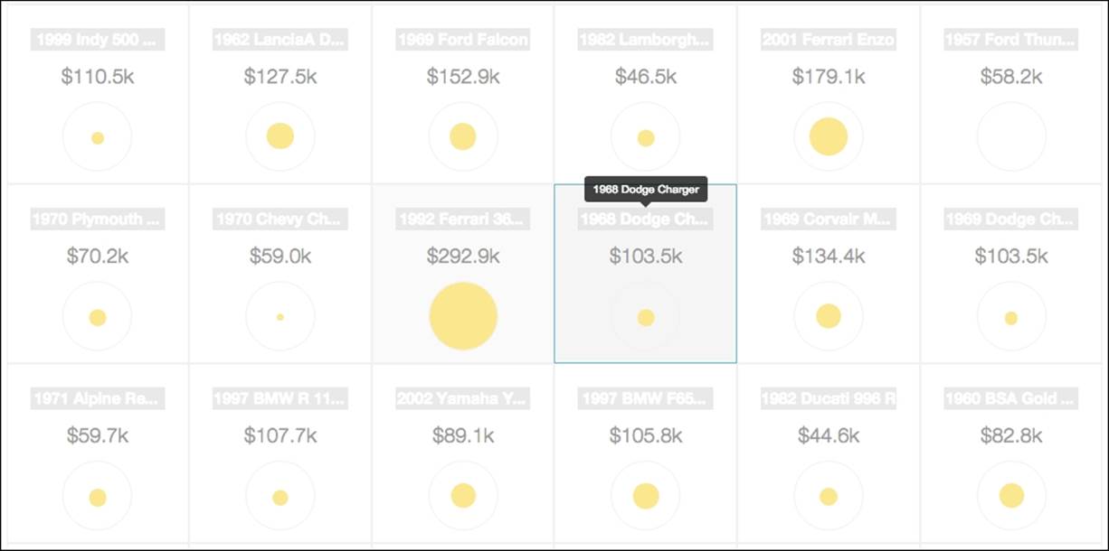
13. bulletChart: This is used to represent a bullet chart with the values that come from the query for that same cell. Here you need to return all the values to use on the bullet chart, separated by a comma. The options that you have available are all those available for CCC charts, which we are going to cover later. The options for the chart should be set inside the chartDefinition object. The following code is an example of how to set the properties:
14.var options = {
15. chartOpts: {
16. compatVersion: 2,
17. height: 60,
18. orientation: "horizontal",
19. }
20.}
this.setAddInOptions("templateType","bulletChart", options);
When using the default properties, you get a bullet chart similar to the ones in the following image:
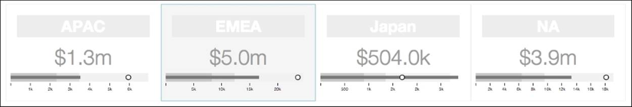
21. cccChart: This add-in allows you to display any CCC chart, but it's tricky. We will see later in this book, when we cover CCC charts, that CCC can receive from the query any result set and still display the chart. You may need to change some properties to have data displayed as expected. This is the tricky part here. What is the best way to represent the data so that we can have it represented correctly? Depending on the chart and on the properties that you set for the chart to represent it, you may need to adapt the result set. It would be easier to set the query, choose the chart to represent it, and then just adapt some of the options to adapt the chart to the data format that is returned. You may be a little bit confused with this, but do not worry, you will get the information to understand it. For now, let's focus on the properties that can be used to customize the behavior of the add-in:
· type: Used to set the kind of chart to represent data. Possible values are: BarChart, LineChart, PieChart, DotChart, StackedLineChart, StackedAreaChart, HeatGridChart, WaterfallChart, BoxplotChart, MetricLineChart, TreemapChart, SunburstChart, andBulletChart. You won't need the last one since you have an add-in capable of doing the same thing. The default value is set to PieChart.
· chartOptions: Used to set the options for the chart; you should take a look at the CCC documentation pages and check what properties are available. You can also directly change some of the properties of the chart and check the results. Those are the options/properties that you can set here. One example would be:
· chartOptions: {
· compatVersion: 2,
· height: 100,
· animate: false,
· crosstabMode: false,
· seriesInRows: false,
· timeSeries: false
}
The crosstabMode, seriesInRows, and timeSeries properties are the ones that will make the difference when CCC is interpreting the results. This will definitely change the data you are displaying. The compatVersion is used to inform CCC that the chart should be rendered using version 2, which has a lot of improvements and fixes. In this case there is a property that's really mandatory, the height for the chart. Without this one the chart will not be rendered.
· transformData: A function that receives the data as an argument and returns the complete result containing the metadata and resultset. Please refer to the Chapter 2, Acquiring Data with CDA to get more information if you can't remember the format expected. You won't need to include the queryInfo:
· function(data) {
· var result = { metadata: [], resultset: []};
· try {
· data = JSON.parse(data);
· var colMetadata = [];
· _.each(data, function(row, index) {
· if (index == 0) {
· _.each(row, function(col, index) {
· result.metadata.push({
· colIndex: index,
· colName: "Col"+index,
· colType: "String"});
· });
· }
· result.resultset.push(row);
· });
· } catch(e) {
· return null;
· }
· return result;
}
The following code accepts as an argument an array of arrays. For each row we need to add it to the new result set, and in the case of the first row, we also need to add the metadata to it.
The following image is one example of a pie chart being displayed inside the template component:
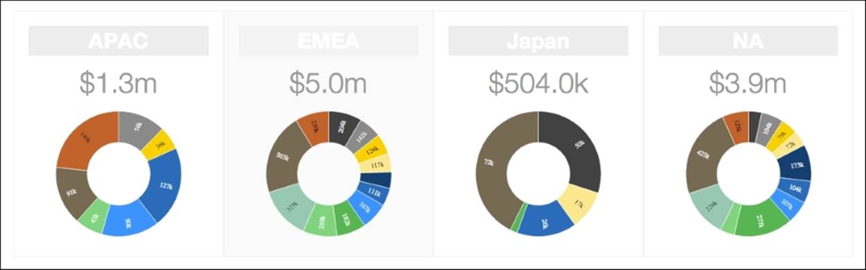
Events
It's also possible to handle clicks on the elements created by the template component. You can use events to expand a particular section, to make a fireChange creating interaction between components, or to get details for the clicked section. Since you are creating a function, you can do whatever you need inside.
To create an event, you need to use the Events property of the component. For the right-most value you will need to define the event that you want to handle, followed by the selector of the element from where you want to handle the event separated by a comma (,). On the left you will need to define the function and write the code (it can only be a fireChange) so that other components can be notified and updated.
Let's suppose that you wanted to get details for a particular territory, the one that is clicked; the template would be like:
function() {
var template = '<div class="row card">' +
'<% _.each(items, function(elem) { %>' +
' <div class="single clickable" data-territory="<%=elem[0]%>"> '+
' <div class="category"> <b> <%=elem[0]%> </b> </div>'+
' <div class="addin"> <%=addin(elem[4],"trendArrow")%> </div>'+
' </div>';
'<% }); %>' +
'</div>';
return template;
}
You can see that for each of the items/territories, we are creating a parent container that includes data-territory attribute with the name of the territory and a CSS class where the value set is the clickable value. The data-territory attribute will be used to get the territory we are clicking on, and the CSS class will be used to get the HTML element where we will attach the event.
To handle the event, we will need to add an event handler on the events property of the component. To do it you will need to use the left field click , .territory and the following function on the right field of the dialog that pops up:
function(event) {
var $elem = $(event.currentTarget);
var selected = $elem.data('territory');
$elem.toggleClass('selected');
this.dashboard.fireChange('selectedParam', selected);
}
Inside the function this will refer to the add-in, so on the first line we are getting the element that we clicked on. After that, we are using the JQuery data function to get the data from the attribute data category from where we will know which value should be used to set the parameter value. But first, we also need to toggle the CSS class to know which territories are selected. At the end we add a fireChange so that the value is written to the parameter, and the components that are listening it can be notified about the change. Don't forget that, for this to work, you will need to create the parameter to store the selected territory name. In our example the name is selectedParam.
Besides fireChange, you can expand the container you are clicking on and display some more information. This doesn't need to be an element outside, as in the samples provided with the book.
Extendable options
On the template component it's possible to customize the messages that you get in the event of an error, and for that we can use the following property:
Extendable options: Accepts a function that returns the JSON object structure with all the messages to override it. The function to return the messages, which is used by default, is the following:
function() {
var opts = {
messages: {
error: {
noData: "No data available.",
invalidTemplate: "Invalid template.",
invalidTemplateType: "Invalid template type.",
generic: "Invalid options defined…."
},
config: {
style: {
error: {icon: "remove-sign", type: "danger"}
},
template: ""+
"<div class='alert alert-<%=type%>' role='alert'>" +
" <span class='glyphicon glyphicon-<%=icon%>' aria-hidden='true'></span> " +
" <span> <%=msg%> </span>" +
"</div>"
}
},
};
return opts;
}
The function will return an object with customized error messages but also the Underscore template that is used to build the error message that will be displayed. If you look deeper into the template, you will find that I used a Bootstrap alert component and also made use of the icons to display on the alert. The alert type to use and the icons are defined inside messages.config.style. It will work as a template model where the template will act as the template and the style as the model. If needed, you can also overwrite the processMessage function that takes care of building the message. The function accepts two arguments, the message and the type, and returns a string with the HTML to be displayed as a message.
If you have no row to display, by default, the following will be shown:

As you can see, the template component needs to be improved, mainly by making it easier to use, but without losing the flexibility to adapt and create new and impacting visualizations. We are in an era where the request to have prescriptive solutions and real-time prescriptive solutions is already a reality. I will be working on a similar component that can have real-time results presented on a dashboard using your custom visualization, so I am expecting to be able to have a real-time template component in the near future.
Export button component
When presenting content on a dashboard, which uses a query to present the content, we can make the export of the data to a specific format. It can be done only for a component, so the results of only a query and not the full dashboard will be exported. When using this component, you can export data to one of two formats, csv or xls; no other format is available on this component.
The properties that you need to set are:
· Label: The label that will be displayed on the button.
· Component name: The name of the component from where to export the data. This should be the name that you gave to the component. Since you need to export the data from a component, you should already have a component set and ready to be used.
· Output type: The format to export data to. Available options are the ones already mentioned, csv or xls.
Export Popup button component
The Export Popup button component is more flexible and will let you have more options. When using this component, the final user will have a link available where he can click to do the exporting. When clicking on the link, the user will get a popup with the options to export to different formats, and one option should be selected to make the export. The formats available are the same that are available in CDA, so you are able to export data to csv, xls, json, and xml. Besides that, if you have a chart, the final user will also be able to export the chart to svg or png format.
The options that you have available are:
· Title: This is the text that will be displayed on the dashboard, where the final user can click.
· Gravity parameter: This is used to set the position where the popup will jump.
· Chart component to export: This is the name of the chart to export. Here you can click on the down arrow key to get the list of values and select the component name.
· Chart export label: This is used to set the text that will be displayed and to make possible the export of the chart.
· Chart export type: Here we need to specify the format to export the chart to. Available options are svg or png.
· Data component to export: This is the name of the component from where data will be exported. Here you can click on the down arrow key to get the list of values and select the component name.
· Data export label: This is used to set the text that will be displayed and to enable exporting the data.
· Data export type: Here we need to specify the format to export the data to. Available options are csv, xls, json, or xml.
· Name for data export attachment: This is name of the file that will be exported. The format will automatically be appended to the name of the file.
· Content linking: This an advanced option to present the options and set the links that will enable the export. Per instance, when you want to be able to export to CSV and XLS. Using the previous properties you can only specify one format. The content linking property will allow you to specify the text to be displayed and a function that will be executed when the respective link is clicked. Inside this function you will be able to define the component from where to export, the format, and the filename to export to.
When using this property, you will get a dialog where you will be able to add options. Each new line will be an option, and for each line you need to specify an argument and a value. On the text more to the left, you need to specify the text to display as the link. On the text more to the right, you will need to specify the function. Per instance, on the text to display you would set Export to CSV and the function would be as follows:
function() {
var comp = dashboard.getComponentByName('${c:myTable}');
var cd = comp.chartDefinition || comp.queryDefinition;
var query = dashboard.getQuery(cd);
query.exportData('csv', {}, {filename: "filename.csv"});
}
The first line of code will get the instance of the component with the name myTable, whereas on the second line we get chartDefinitions or queryDefinitions. Depending on the component, it will return the correct option, because if one is not available we will use the other. The third line gets the information about the query, and by using this last one we can export the data. For that we need to make use of the exportData function that should be available for all the components that run a query. This function accepts three arguments; the first is the export type, the second is the overwrite options, and here you can return an empty object, and finally the third one is an object where we can specify the filename and extension for the file that will be exposed.
The following image is an example of what can be produced, out-of-the-box:
When doing the export, the CDA query will run again, using the same parameters that are selected on the dashboard, and at that time it's already cached. Anyway, you can play around a little with this. It's not unusual to have a request to have quite a different export than we are seeing on the dashboard, so you can imagine a scenario where you will have a component that is hidden and is not executed until an export is requested.
Tip
Referring to component, parameters, and to the layout
If you go to the developer tool of your browser and inspect a CDE dashboard code, you can see that, to the names of the components that we set when editing the dashboard, we always prepend with render_. So when you want to refer to the name of the component, you should refer to the complete name such as render_myComponentName.
When you use code inside the dashboard, which is not valid for code on external files, you can refer to the component as ${c:myComponentName}. This will be translated when the code is sent to the browser, as it's already referring to the correct name of the component.
This is also valid for parameters ${p:myParameterName} and for elements on the layout by using ${h:myPlaceholderName}.
The syntax difference is the letter before the name and inside the {}. You can use c for components, p for parameters, and h for elements on the layout.
Text component
The text component is another component that is really simple to use. It allows you to display text on the dashboard. This component will not trigger a query, but is still executed as part of the lifecycle of the dashboard, so it's very useful. It can be used, per instance, to display the user that is logged in.
Besides the properties that you already know and that are common to the remaining components, there can also be:
· Expression: A function that should return the text/HTML to be displayed on the element of the layout associated to this component.
One example would be:
function() {
return this.dashboard.context.user;
}
The previous code is returning the username of the user that is using the dashboard, but we could have returned HTML to display.
Summary
By reading this chapter, you should have learned how to use the table component, template component, export buttons, and text component. You should be able to use the table component to display details for each one of the rows, or just trigger some changes to other components when the user clicks on a row. You also should have learned to apply add-ins and customize tables, understand the capabilities provided by functionality on the server-side, or just customize what we see displayed (and the how of it). You have also learned how to use the template component to display data the way you need to. The template component provides many ways to display the results of a query, customize messages, or just apply some functions to customize formatting.
Besides the fact of learning how to use the components, you should be able to make the most of them and be able to find the best way to present data to the user using these two components. Hopefully you also understand what you should use, or should avoid, so as to not decrease the performance of the dashboard, or even queries triggered. Performance is very important.
At the end of the chapter, besides learning how to use the text component, you also learned how to export data and the way to do it. We have covered the way to export an image from a chart. There is a dedicated chapter for charts, as they are one of the best ways to represent data on the dashboard.
The next chapter will cover some advanced concepts that you can use in both CDF and CDE dashboards.
All materials on the site are licensed Creative Commons Attribution-Sharealike 3.0 Unported CC BY-SA 3.0 & GNU Free Documentation License (GFDL)
If you are the copyright holder of any material contained on our site and intend to remove it, please contact our site administrator for approval.
© 2016-2026 All site design rights belong to S.Y.A.