Learning Pentaho CTools (2016)
Chapter 8. Visualizations Using CCC
The Charts Component Library is not really a Pentaho plugin, but instead is a Chart library that Webdetails created some years ago and that Pentaho started to use on Analyzer visualizations. It allows a great level of customization by changing the properties that are applied to the charts and perfectly integrates with CDF, CDE, and CDA.
The dashboards that Webdetails creates make use of CCC charts, usually with a great level of customization. Customizing them is a way to make them fancy and really good-looking and, even more importantly, it is a way to create a visualization that best fits the customer/end user's needs. We really should be focused on having the best visualizations for the end user, and CCC is one of the best ways to achieve this, but to do this you need to have a very deep knowledge of the library, and know how to get amazing results.
I think I could write an entire book just about CCC, and in this chapter I will only be able to cover a small part of what I like, but I will try to focus on the basics and give you some tips and tricks that could make a difference. I'll be happy if I can give you some directions for you to follow, and then you can keep searching and learning about CCC. An important part of CCC is understanding properties such as series in rows or crosstab mode, because that is where people usually struggle at the start.
When you can't find a property to change chart styling/functionality/behavior, you might find a way to extend the options by using something called extension points, so we will also cover them. I also find interaction within the dashboard to be an important feature. So we will look at how to use it, and you will see that it's very simple.
In this chapter, you will learn how to:
· Understand the properties needed to adapt the chart to your data source results
· Use the properties of a CCC chart
· Create a CCC chat by using the JavaScript library
· Make use of the internationalization of CCC charts
· See how to handle clicks on charts
· Scale the base axis
· Customize tooltips
Some background on CCC
CCC is built on top of Protovis, a JavaScript library that allows you to produce visualizations just based on simple marks, such as bars, dots, and lines, among others, which are created through dynamic properties based on the data to be represented. You can get more information on this at: http://mbostock.github.io/protovis/.
If you want to extend charts with some elements that are not available you can, but it would be useful to have an idea about how Protovis works. CCC has a great website, http://www.webdetails.pt/ctools/ccc/, where you can see some samples including the source code. On the page, you can edit the code, change some properties, and click the Apply button. If the code is valid, you will see your chart update. As well as that, it provides documentation for almost all of the properties and options that CCC makes available.
Making use of the CCC library in a CDF dashboard
As CCC is a chart library, you can use it as you would on any other web page. But CDF also provides components that you can implement to use a CCC chart on a dashboard and fully integrate with the life cycle of the dashboard. To use a CCC chart on the CDF dashboard, the HTML that is invoked from the XCDF file would look like the following (as we have already covered how to build a CDF dashboard, I will not focus on that, and will mainly focus on the JavaScript code):
<div class="row">
<div class="col-xs-12">
<div id="chart"/>
</div>
</div>
<script language="javascript" type="text/javascript">
require(['cdf/Dashboard.Bootstrap',
'cdf/components/CccBarChartComponent'],
function(Dashboard, CccBarChartComponent) {
var dashboard = new Dashboard();
var chart = new CccBarChartComponent({
type: "cccBarChart",
name: "cccChart",
executeAtStart: true,
htmlObject: "chart",
chartDefinition: {
height: 200,
path: "/public/…/queries.cda",
dataAccessId: "totalSalesQuery",
crosstabMode: true,
seriesInRows: false,
timeSeries: false
plotFrameVisible: false,
compatVersion: 2
}
});
dashboard.addComponent(chart);
dashboard.init();
});
</script>
The most important thing here is the use of the CCC chart component that we have covered in an example as a bar chart. We can see by the object that we are instantiating, CccBarChartComponent, and also by the type, cccBarChart.
The previous dashboard will execute the query specified as dataAccessId for the CDA file set on the property path, and render the chart on the dashboard. The dashboard code also refers to the crosstab mode for the result set, but the base axis should not be a timeSeries. There are series in the columns, but don't worry about this as we'll be covering this topic later.
The existing CCC components that you are able to use out of the box inside CDF dashboards are as follows. Don't forget that CCC has plenty of charts, so the sample images that you will see in the following table are just one example of the type of charts you can achieve.
|
CCC Component |
Chart Type |
Sample Chart |
|
CccAreaChartComponent |
cccAreaChart |
Not available |
|
CccBarChartComponent |
cccBarChart |
http://www.webdetails.pt/ctools/ccc/#type=bar |
|
CccBoxplotChartComponent |
cccBoxplotChart |
http://www.webdetails.pt/ctools/ccc/#type=boxplot |
|
CccBulletChartComponent |
cccBulletChart |
http://www.webdetails.pt/ctools/ccc/#type=bullet |
|
CccDotChartComponent |
cccDotChart |
http://www.webdetails.pt/ctools/ccc/#type=dot |
|
CccHeatGridChartComponent |
cccHeatGridChart |
http://www.webdetails.pt/ctools/ccc/#type=heatgrid |
|
CccLineChartComponent |
cccLineChart |
http://www.webdetails.pt/ctools/ccc/#type=line |
|
CccMetricDotChartComponent |
cccMetricDotChart |
http://www.webdetails.pt/ctools/ccc/#type=metricdot |
|
CccMetricLineChartComponent |
cccMetricLineChart |
Not available |
|
CccNormalizedBarChartComponent |
cccNormalizedBarChart |
Not available |
|
CccParCoordChartComponent |
cccParCoordChart |
Not available |
|
CccPieChartComponent |
cccPieChart |
http://www.webdetails.pt/ctools/ccc/#type=pie |
|
CccStackedAreaChartComponent |
cccStackedAreaChart |
http://www.webdetails.pt/ctools/ccc/#type=stackedarea |
|
CccStackedDotChartComponent |
cccStackedDotChart |
Not available |
|
CccStackedLineChartComponent |
cccStackedLineChart |
http://www.webdetails.pt/ctools/ccc/#type=stackedline |
|
CccSunburstChartComponent |
cccSunburstChart |
http://www.webdetails.pt/ctools/ccc/#type=sunburst |
|
CccTreemapAreaChartComponent |
cccTreemapAreaChart |
http://www.webdetails.pt/ctools/ccc/#type=treemap |
|
CccWaterfallAreaChartComponent |
cccWaterfallAreaChart |
http://www.webdetails.pt/ctools/ccc/#type=waterfall |
In the sample code, you will find a property called compatMode that has a value of 2 set. This will make CCC work as a revamped version that delivers more options and a lot of improvements, and makes it easier to use.
Mandatory and desirable properties
Among other properties such as name, datasource, and htmlObject, other chart properties are mandatory. The height is really important, because if you don't set the height of the chart, you will not fit the chart in the dashboard. The height should also be specified in pixels.
If you don't set the width of the component, or to be more precise, then the chart will grab the width of the element where it's being rendered it will grab the width of the HTML element with the name specified in the htmlObject property.
The seriesInRows, crosstabMode, and timeseries properties are optional but, depending on the kind of chart you are generating, you might want to specify them. The use of these properties becomes clear if we can also see the output of the queries we are executing. We need to go deeper into the properties that are related to the data mapping to visual elements.
Mapping data
We need to be aware of the way that data mapping is done in the chart. You can understand how it works if you can imagine data input as a table. CCC can receive the data as two different structures: relational and crosstab. If CCC receives data as a crosstab query, it will translate it to a relational structure. You can see this in the following examples.
Crosstab
The following table is an example of the crosstab data structure:
|
Column Data 1 |
Column Data 2 |
|
|
Row Data 1 |
Measure Data 1.1 |
Measure Data 1.2 |
|
Row Data 2 |
Measure Data 2.1 |
Measure Data 2.2 |
Tip
Creating crosstab queries
To create a crosstab query, usually you can do this with the group when using SQL; or just use MDX, which allows us to easily specify a set for the columns and for the rows.
Just by looking at the previous and following examples, you should be able to understand that, in the crosstab structure (the previous example), columns and rows are part of the result set, while in the relational format (the following example), column headers or headers are not part of the result set, but are part of the metadata returned from the query.
The relational format is as follows:
|
Column |
Row |
Value |
|
Column Data 1 |
Row Data 1 |
Measure Data 1.1 |
|
Column Data 2 |
Row Data 1 |
Measure Data 2.1 |
|
Column Data 1 |
Row Data 2 |
Measure Data 1.2 |
|
Column Data 2 |
Row Data 2 |
Measure Data 2.1 |
The preceding two data structures represent the options when setting the crosstabMode and seriesInRows properties.
The crosstabMode property
To better understand these concepts, we will make use of a real example. This property, crosstabMode, is easy to understand when comparing the results of two queries.
|
Non-crosstab (Relational): |
Crosstab: |
||||
|
Markets |
Sales |
Markets |
2003 |
2004 |
2005 |
|
APAC |
1281705 |
APAC |
3529 |
5938 |
3411 |
|
EMEA |
50028224 |
EMEA |
16711 |
23630 |
9237 |
|
Japan |
503957 |
Japan |
2851 |
1692 |
380 |
|
NA |
3852061 |
NA |
13348 |
18157 |
6447 |
In the previous tables, you can see that on the left-hand side you can find the values of sales from each of the territories. The only relevant information is relative to the values presented are the territories. We can say that we are able to get all the information just by looking at the rows, where we can see a direct connection between markets and the sales value.
In the table presented on the right, you will find a value for each territory/year, meaning that the values presented, and in the sample provided in the matrix, are dependent on two variables, which are the territory in the rows and the years in the columns. Here we need both the rows and the columns to know what each one of the values represents. Relevant information can be found in the rows and the columns, so this is a crosstab. Crosstabs display the joint distribution of two or more variables, and are usually represented in the form of a contingency table in a matrix.
When the result of a query is dependent only on one variable, then you should set the crosstabMode property to false. When it is dependent on two or more variables, you should set the crosstabMode property to false, otherwise CCC will just use the first two columns like in the non-crosstab example.
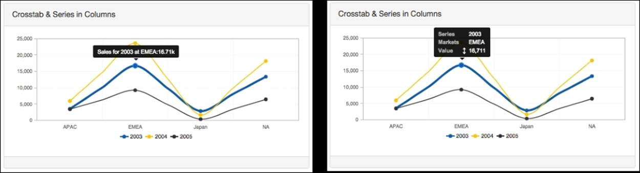
The seriesInRows property
Now let's use the same two where we have a crosstab:
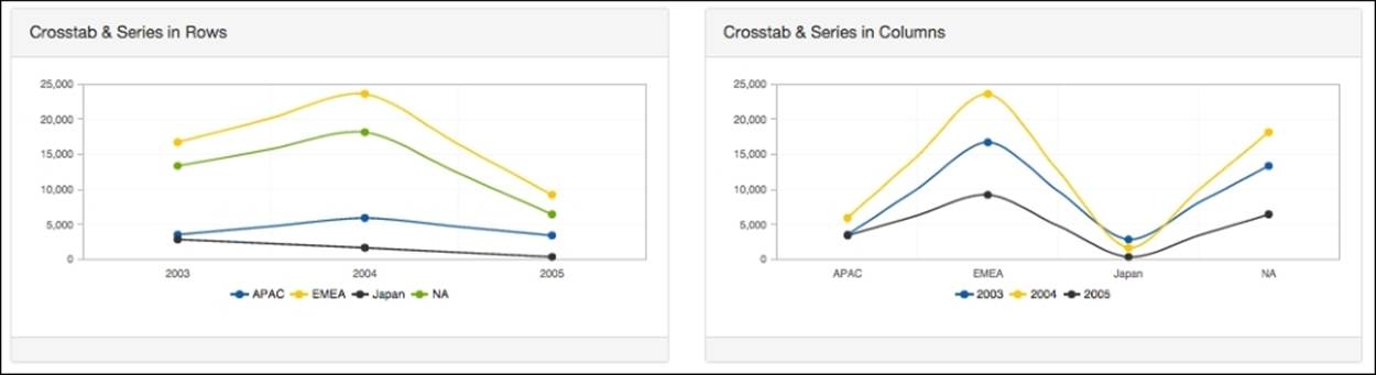
The previous figure shows two charts: the one on the left is a crosstab with the series in the rows, and the one on the right is also crosstab but the series are not in the rows (the series are in the columns). When the crosstab is set to true, it means that the measure column title can be translated as a series or a category, and that's determined by the property seriesInRows. If this property is set to true, then it will read the series from the rows, otherwise it will read the series from the columns.
If the crosstab is set to false, the community chart component is expecting a row to correspond exactly to one data point, and two or three columns can be returned. When three columns are returned, they can be a category, series and data, or series, category and data and that's determined by the seriesInRows property. When set to true, CCC will expect the structure to have three columns such as category, series, and data. When it is set to false, it will expect them to be series, category, and data.
A simple table should give you a quicker reference:
|
crosstabMode |
seriesInRows |
Description |
|
true |
true |
The column titles will act as category values while the series values are represented as data points of the first column. |
|
true |
false |
The column titles will act as series value while the category/category values are represented as data points of the first column. |
|
false |
true |
The column titles will act as category values while the series values are represented as data points of the first column. |
|
false |
false |
The column titles will act as category values while the series values are represented as data points of the first column. |
The timeSeries and timeSeriesFormat properties
The timeSeries property defines whether the data to be represented by the chart is discrete or continuous. If we want to present some values over time, then the timeSeries property should be set to true. When we set the chart to be timeSeries, we also need to set another property to tell CCC how it should interpret the dates that come from the query. Check out the following image for timeSeries and timeSeriesFormat:
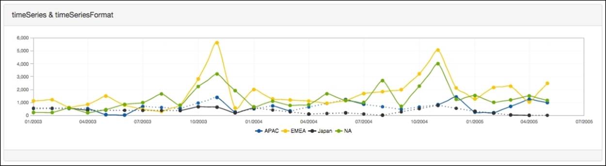
In the example provided with the book, you will find a dashboard that presents data as a timeSeries property. The result of one of the queries has the year and the abbreviated month name separate by -, such as 2015-Nov. For the chart to understand it as a date, we need to specify the format by setting the property timeSeriesFomart, which in our example would be %Y-%b, where %Y is the year is represented by four digits, and %b is the abbreviated month name.
The format should be specified using the Protovis format, which follows the same format as strftime in the C programming language, aside from some unsupported options. To find out what options are available, you should take a look at the documentation, which you will find at: https://mbostock.github.io/protovis/jsdoc/symbols/pv.Format.date.html.
Making use of CCC in CDE
There are a lot of properties that will use a default value, and you can find out about them by looking at the documentation or inspecting the code that is generated by CDE when you use chart components. By looking at the console log of your browser, you should also able to understand and get some information about the properties being used by default and/or see whether you are using a property that does not fit your needs.
The use of CCC charts in CDE is simpler, just because you may not need to code. I am only saying may because, to achieve quicker results, you may apply some code and make it easier to share properties among different charts or type of chart. To use a CCC chart, you just need to select the property that you need to change and set its value by using the drop-down or by just setting the value:
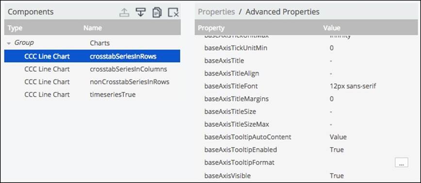
The previous screenshot shows a group of properties with the respective values on the right.
One of the best ways to start to get used to CCC properties is to use the CCC page available as part of the Webdetails page: http://www.webdetails.pt/ctools/ccc. There you will find samples and the properties that are being used for each of the chart. You can use the dropdown to select different kinds of charts from all those that are available inside CCC. You also have the ability to change the properties and update the chart to check the result immediately.
What I usually do, as it's easier and faster, is to change the properties here, check the results, and then apply the necessary values for each of the properties in the CCC charts inside the dashboards. In the following samples, you will also find documentation about the properties, see where the properties are separated by sections of the chart, and after that you will find the extension points.
On the site, when you click on a property/option you will be redirected to another page where you will find the documentation and how to use it.
Changing properties in preExecution or postFetch
We are able to change the properties for the charts, as with any other component. Inside preExecution, the keyword this, refers to the component itself, so we will have access to the chart's main object, which we can also manipulate and add, remove, and change options.
For instance, you can apply the following code:
function() {
var cdProps = {
dotsVisible: true,
plotFrame_strokeStyle: '#bbbbbb',
colors: ['#005CA7', '#FFC20F', '#333333', '#68AC2D']
};
$.extend(true, this.chartDefinition, cdProps);
}
What we are doing is creating an object with all the properties that we want to add or change for the chart, and then extending the chartDefinitions (where the properties or options are). This is what we are doing with the JQuery function.
Tip
Use the CCC website and make your life easier
This way to apply options makes it easier to set the properties. Just change or add the properties that you need, test it, and, when you're happy with the result, you just need to copy them into the object that will extend/overwrite the chart options. Just keep in mind that the properties you change directly in the editor will be overwritten by the ones defined in the preExecution function, if they match each other of course.
Why is this important? It's because not all the properties that you can apply to CCC are exposed in CDE, so you can use preExecution to use or set those properties.
Handling the click event
One important thing about charts is that they allow interaction. CCC provides a way to handle some events in the chart and click is one of those events. To have it working, we need to change two properties: clickable, which needs to be set to true, andclickAction where we need to write a function with the code to be executed when a click happens. The function receives one argument that usually is referred to as a scene. The scene is an object that has a lot of information about the context where the event happened. From the object you will have access to vars, another object where we can find the series and the categories where the click happened.
We can use the function to get the series/categories being clicked and perform a fireChange that can trigger updates on other components:
function(scene) {
var series = "Series:"+scene.atoms.series.label;
var category = "Category:"+scene.vars.category.label;
var value = "Value:"+scene.vars.value.label;
Logger.log(category+" & "+value);
Logger.log(series);
}
In the previous code example, you can find the function to handle the click action for a CCC chart. When the click happens, the code is executed, and a variable with the click series is taken from scene.atoms.series.label. As well as this, the clicked categoryscene.vars.category.label and the value that crosses the same series/category in scene.vars.value.value. This is valid for a crosstab, but you will not find the series when it is a non-crosstab.
You can think of a scene as describing one instance of visual representation. It is generally local to each panel or section of the chart and it's represented by a group of variables that are organized hierarchically. Depending on the scene, it may contain one or many datums. And you must be asking what a a datum is. A datum represents a row, so it contains values for multiple columns.
We also can see from the example that we are referring to atoms, which hold at least a value, a label, and the key of a column. To get a better understanding of what I am talking about, you should perform a breakpoint anywhere in the code of the previous function and explore the object scene.
In the previous example, you would be able to access the category, series labels, and value, as you can see in the following table:
|
Corosstab |
Non-crosstab |
|
|
Value |
scene.vars.value.label or scene.getValue(); |
scene.vars.value.label or scene.getValue(); |
|
Category |
scene.vars.category.label or scene.getCategoryLabel(); |
scene.vars.category.label or scene.getCategoryLabel(); |
|
Series |
scene.atoms.series.label or scene.getSeriesLabel() |
For instance, if you add the previous function code to a chart that is a crosstab where the categories are the years and the series are the territories, if you click on the chart, the output would be something like:
[info] WD: Category:2004 & Value:23630
[info] WD: Series:EMEA
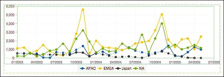
This means that you clicked on the year 2004 for the EMEA. EMEA sales for the year 2004 were 23,630.
If you replace the Logger functions with fireChange as follows, you will be able to make use of the label/value of the clicked category to render other components and some details about them:
this.dashboard.fireChange("parameter", scene.vars.category.label);
Internationalization of CCC Charts
We already saw that all the values coming from the database should not need to be translated. There are some ways in Pentaho to do this, but we may still need to set the title of a chart, where the title should be also internationalized. Another case is when you have dates where the month is represented by numbers in the base axis, but you want to display the month's abbreviated name. This name could be also translated to different languages, which is not hard.
For the title, sub-title, and legend, the way to do it is to use the instructions on how to set properties on preExecution and the instructions that we already covered in an earlier Chapter 6, Tables, Templates, Exports, and Text Components about i18n. First, you will need to define the properties files for the internationalization and set the properties/translations:
var cd = this.chartDefinition;
cd.title = this.dashboard.i18nSupport.prop('BOTTOMCHART.TITLE');
To change the title of the chart based on the language defined, we will need to define a function, but we can't use the property on the chart because that will only allow you to define a string, so you will not be able to use a JavaScript instruction to get the text. If you set the previous example code on the preExecution of the chart, you will be able to do so.
It may not only make sense to change not only the titles, but for instance it may also be advisable to internationalize the month names. If you are getting data such as 2004-02, this may correspond to a time series format as %Y-%m. If that's the case and you want to display the abbreviated month name, then you may use the baseAxisTickFormatter and the dateFormat function from the dashboard utilities, also known as Utils. The code to write inside the preExecution would be:
var cd = this.chartDefinition;
cd.baseAxisTickFormatter = function(label) {
return Utils.dateFormat(moment(label, 'YYYY-mmm'), 'MMM/YYYY');
};
The preceding code uses baseAxisTickFormatter, which allows you to write a function that receives an argument, identified on the code as a label, because it will store the label for each one of the base axis tick marks. We are using the dateFormat method andmoment library function to format and return the year followed by the abbreviated month name.
You can get information about the language defined and being used by running the following instruction
moment.locale();
If you need to, you can change the language. If so, please refer to the CDF chapter, as we already covered it there.
What are extension points and how do you use them?
One great thing about the options that you can use is that they are are already implemented. If not, and if they are available as part of Protovis but just not in CCC, you are able can make use of the extension points. So, with extension points you are able to use properties/options that are not implemented directly in CCC. They are one of the great features of CCC charts, because they provide almost direct access to the underlying Protovis marks.
When setting an extension point, we should specify its name and value. The name is a combination of a CCC identification and the Protovis property name separated by an underscore (_). For instance, to define the fill style for the legend, you would need to define legendArea_fillStyle and set a color. First you need to set the visual element, followed by (_) and by the extension point property.
There are no ways to handle the right-click action in CCC, nor is there the possibility to directly listen to the context menu in a Protovis mark, so we can make use of extension points. A good example is:
bar_event: [
['contextmenu', function(s) { … }],
['mouseover', function(s) { … }],
['mouseover', function(s) { … }]
]
For each chart type, you will find at the bottom of each chart type the extension points that are available. For instance, the extension points that are available for line charts can be found at: http://www.webdetails.pt/ctools/ccc/#type=dot&anchor=extension-points. The image on the left is an example of it.
When you click on a visual element name such as baseAxisGrid_, you will be redirected to another page where you can select the mark, which is the image at the center. Let's suppose that you choose to change the label, you need to add the mark to the visual element like baseAxisGrid_label. Finally, after clicking on the marker, you get a list of extension points, which is the image on the right, where you can select the extension point. Let's suppose you have chosen to change the font. It will also need to be added to the property and will end up as baseAxisGrid_labelFont.
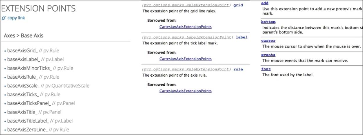
For the provided extension point, we would need to specify the font and size, as specified at: http://www.w3.org/TR/CSS2/fonts.html#font-shorthand.
Formatting a basis axis label based on the scale
When you are working with a time series chart, you may want to set a different format for the base axis labels. Let's suppose you want to have a chart that is listening to a time selector. If you select one-year old data to be displayed on the chart, certainly you are not interested in seeing the minutes on the date label. However, if you want to display the last hour, the ticks of the base axis need to be presented in minutes.
There is an extension point we can use to get a conditional format based on the scale of the base axis. The extension point is baseAxisScale_tickFormatter, and it can be used like in the code as follows:
baseAxisScale_tickFormatter: function(value, dateTickPrecision) {
switch(dateTickPrecision) {
case pvc.time.intervals.y:
return format_date_year_tick(value);
break;
case pvc.time.intervals.m:
return format_date_month_tick(value);
break;
case pvc.time.intervals.H:
return format_date_hour_tick(value);
break;
default:
return format_date_default_tick(value);
}
}
It accepts a function with two arguments: the value to be formatted and the tick precision, and should return the formatted label to be presented on each label of the base axis.
The previous code shows how the function is used. You can see that a switch based on the base axis scale will perform a different format, calling a function. The functions in the code are not pre-defined—we need to write the functions or code to create the formatting. One example of a function to format the date is using the utils dateFormat function to return the formatted value to the chart.
The following table shows the intervals that can be used when verifying which time intervals are being displayed on the chart:
|
Interval |
Description |
Number representing the interval |
|
y |
Year |
31536e6 |
|
m |
Month |
2592e6 |
|
d30 |
30 days |
2592e6 |
|
d7 |
7 days |
6048e5 |
|
d |
Day |
864e5 |
|
H |
Hour |
36e5 |
|
m |
Minute |
6e4 |
|
s |
Second |
1e3 |
|
ms |
Milliseconds |
1 |
Customizing tooltips
CCC provides the ability to change the default tooltip format, and can be changed using the tooltipFormat property. We can change it, making it look like the following image, on the right. You can also compare it to the one on the left, which is the default one:
The tooltip default format might change depending on the chart type, but also on some options that you apply to the chart, mainly crosstabMode and seriesInRows. The property accepts a function that receives one argument, the scene, which will be a similar structure as already covered for the click event. You should return the HTML to be shown on the dashboard when we hover the chart.
In the previous image, you will see on the chart on the left side the defiant tooltip, and on the right a different tooltip. That's because the following code was applied:
tooltipFormat: function(scene){
var year = scene.atoms.series.label;
var territory = scene.atoms.category.value;
var sales = Utils.numberFormat(scene.vars.value.value, "#.00A");
var html = '<html>' +
<div>Sales for '+year+' at '+territory+':'+sales+'</div>' +
'</html>';
return html;
}
The code is pretty self-explanatory. First we are setting some variables such as year, territory, and the sales values, which we need to present inside the tooltip. Like in the click event, we are getting the labels/value from the scene, which might depend on the properties we set for the chart. For the sales, we are also abbreviating it, using two decimal places. And last, we build the HTML to be displayed when we hover over the chart.
Tip
You can also change the base axis tooltip
Like we are doing to the tooltip when hovering over the values represented in the chart, we can also use baseAxisTooltip; just don't forget that use the baseAxisTooltipVisible property must be set to true (the value by default). Getting the values to show will be pretty similar.
It can get more complex, though not much more, when we also want, for instance, to display the total value of sales for one year or for the territory. Based on that, we could also present the percentage relative to the total. We should use the property as explained earlier.
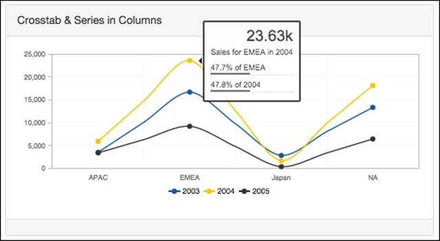
The previous image is one example of how we can customize a tooltip. In this case, we are showing the value but also the percentage that represents the hovered over territory (as the percentage/all the years) and also for the hovered over year (where we show the percentage/all the territories):
tooltipFormat: function(scene){
var year = scene.getSeriesLabel();
var territory = scene.getCategoryLabel();
var value = scene.getValue();
var sales = Utils.numberFormat(value, "#.00A");
var totals = {};
_.each(scene.chart().data._datums, function(element) {
var value = element.atoms.value.value;
totals[element.atoms.category.label] =
(totals[element.atoms.category.label]||0)+value;
totals[element.atoms.series.label] =
(totals[element.atoms.series.label]||0)+value;
});
var categoryPerc = Utils.numberFormat(value/totals[territory], "0.0%");
var seriesPerc = Utils.numberFormat(value/totals[year], "0.0%");
var html = '<html>' +
'<div class="value">'+sales+'</div>' +
'<div class="dValue">Sales for '+territory+' in '+year+'</div>' +
'<div class="bar">'+
' <div class="pPerc">'+categoryPerc+' of '+territory+'</div>'+
' <div class="partialBar" style="width:'+cPerc+'"></div>'+
'</div>' +
'<div class="bar">'+
' <div class="pPerc">'+seriesPerc+' of '+year+'</div>'+
' <div class="partialBar" style="width:'+seriesPerc+'"></div>'+
'</div>' +
'</html>';
return html;
}
The first lines of the code are pretty similar except that we are using scene.getSeriesLabel() in place of scene.atoms.series.label. They do the same, so it's only different ways to get the values/labels, and then the total calculations that are calculated by iterating in all the elements of scene.chart().data._datums, which return the logical/relational table, a combination of the territory, years, and value. The last part of code is just to build the HTML with all the values and labels that we already got from the scene.
There are multiple ways to get the values you need; for instance to customize the tooltip, you just need to explore the hierarchical structure of the scene and get used to it.
The image that you are seeing also presents a different style, and that should be done using CSS. You can add CSS for your dashboard and change the style of the tooltip, not just the format.
Tip
Styling tooltips
When we want to style a tooltip, we may want to use the developer tools to check the classes or names and CSS properties already applied, but it's hard because the popup does not stay still. We can change the tooltipDelayOut property and increase its default value from 80 to 1000 or more, depending on the time you need.
When you want to apply some styles to the tooltips for a particular chart you can do by setting a CSS class on the tooltip. For that you should use the property tooltipClassName and set the class name to be added and later used on the CSS.
Pie chart showing the value in the center
There are features that CCC presents and that we don't yet know about, so you should keep an eye on the CCC forum (http://forums.pentaho.com/showthread.php?161089-CCC-FAQ-Frequently-Asked-Questions-About-CCC) and Duarte Cunha fiddles (http://jsfiddle.net/user/duarteleao/fiddles). The following example has been generated with some simple options that can make a difference. Of course, you also could achieve this with CSS, but it would make your life harder.
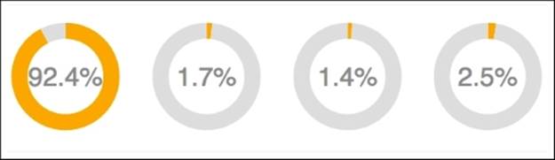
To get the result just shown, for each one of the charts we could apply the following options:
function() {
var cd = this.chartDefinition;
var options = {
valuesVisible: true,
valuesLabelStyle: 'inside',
valuesFont: '35px sans-serif',
valuesMask: '{value.percent}',
label_visible: function() { return !this.index; },
label_left: null,
label_top: null,
label_textAngle: 0,
label_textAlign: 'center',
label_textBaseline: 'middle',
slice_innerRadiusEx: '70%',
legend: false
}
$.extend(true, cd, options);
}
Dimensions
It's important to know that a dimension in CCC is not an MDX dimension. Here it is represented by a subset of atoms. When you want to achieve more advanced results, you can change the behavior of CCC. Well maybe I shouldn't say change the behavior, but help CCC behave in a different way than the default behavior. What we can do is change one dimension, but not change the rest of them; CCC will apply the default options to just those dimensions. Don't forget that these changes are optional and you only want to apply them to change the default behavior of CCC.
When dimensions are not defined, the default dimensions, with the default options, are generated to satisfy the needs of the chart. Anyhow, the data dimensions can be explicitly defined. When defining dimensions, you can define them partially. You will be able to define just one and let the others be automatically generated.
The list of dimension options is defined at: http://www.webdetails.pt/ctools/ccc/charts/jsdoc/symbols/pvc.options.DimensionType.html, where you can also get more details.
We have made a table with a complete list and default values and a brief description of them:
|
Name |
Type |
Short description (from the CCC website) |
|
label |
string |
The name of the dimension type as it is shown to the user. |
|
format |
string function object |
The dimension type's format provider. |
|
isHidden |
Boolean |
This indicates whether the values of this dimension type should be hidden from the user. |
|
isDiscrete |
Boolean |
This indicates whether a dimension type should be considered discrete or continuous. |
|
valueType |
function |
This is the type of value that dimensions of this type will hold. |
|
rawFormat |
string |
This is a Protovis format string that is to parse the raw value. |
|
comparer |
function |
This is a function that compares two different and non-null values of the dimension's valueType. |
|
converter |
any |
This converts a non-null raw value, as read from the data source, into a value of the dimension's valueType. |
|
key |
string |
This is a function that converts a non-null value of the valueType into a string that (uniquely) identifies the value in the dimension. |
|
formatter |
function |
This is a function that formats a value, possibly null, of the dimension's valueType. |
For instance, if we want to have the dimension, category to be a date, but represented on a discrete and not continuous axis, we would need to specify the following options:
dimensions: {
category: {valueType: Date, isDiscrete: true}
}.
Readers
One of the options that we have to apply to the dimension is readers. Readers allow you to declare the mapping of columns to dimensions. As it was not always possible to use colName, there was a need to invent readers. This will only happen after parsing the data structure and when CCC is already making use of a relational data structure (this could be the result of a data structure parsing from a crosstab).
We can set readers using two different approaches:
· Using visual role names or visual row prefix names: category, series, measure, value, and multiChart. Depending on the chart type, there might be other dimension types available such as median, lowerQuartil, upperQuartil, minimum, and maximum. They are applied on the box plot chart.
· For instance: readers: ['category', 'series', 'value']: this would make CCC interpret the columns as specified, the measure, series, category and at least the value, slightly changing the way it interprets the columns by default
· By using business names instead of defining measures, series, categories, and value.
· For instance: readers: ['Markets', 'Years', 'Sales']
· When doing this, we also need to define the mapping for the visual roles:
· visualRoles: {
· value: 'Sales', // <-- mapping defined here
· series: 'Years', // <-- mapping defined here
· category: 'Markets' // <-- mapping defined here
}
When defining readers, we might use the same visual role names or visual row prefix names that are not defined. These column values will not be mapped to visual roles automatically, but we are still able to use them on, for instance, tooltip customization or event handling. It can be very.
Another way to define readers is using the indexes of the columns being mapped:
readers: [
{names: 'Sales', indexes: 2},
{names: 'Years', indexes: 1},
{names: 'Markets', indexes: 0}
]
visualRoles: {
value: 'Sales',
series: 'Years',
category: 'Markets'
}
In the previous example, the first column (index 0) of the data source feeds the Markets dimension, while the second column (index 1) feeds the Years dimension and so on.
Visual roles
You might use visual roles even if you are not using the business names as readers. For instance, they might be used to represent a second plot in the chart. Anyhow, the visualRoles option allows you to declare the mapping from CCC dimensions to visual roles.
If you want to represent a second plot that should be a boxplot, then you will the code as follows:
plots: [
// Main plot - bars
{
name: 'main',
dotsVisible: true
},
// Second plot - boxes
{
type: 'box',
visualRoles: {
// Comment the ones you don't want represented
median: 'value',
lowerQuartil: 'value2',
upperQuartil: 'value3',
minimum: 'value4',
maximum: 'value5'
}
}
]
You can see that we are mapping the visual roles median, lowerQuartil, upperQuartil, minimum, and maximum, using the row prefix names value, value2, value3, value4, and value5. This will make it possible to have a second chart using box plot representations foreach of the categories.
You are able to check the example provided on the CCC web page at the following link: http://www.webdetails.pt/ctools/ccc/#type=line&anchor=line-with-5-number-statistics.
The available visual roles are: category, series, multiChart, value, dataPart, and measures.
Debugging the CCC charts
When you want to customize your options a bit more, you may be entering some advanced features, where it's hard to understand what's being done or what changes we should apply. CCC provides some debugging modes that allow you to have a better understanding and knowledge of what these advanced features are doing.
We will cover how to use developer tools to perform debugging later, but for now just be aware that you have specific debugging levels for CCC. You will see later that you can perform debugging on a dashboard if you add a parameter of your URL (debug=true).
If you have a URL that is http://localhost:8080/pentaho/api/repos/%3Apublic%3Asample.wcdf/generatedContent, you need change it to: http://localhost:8080/pentaho/api/repos/%3Apublic%3Asample.wcdf/generatedContent?debug=true. Or if you havehttp://localhost:8080/pentaho/api/repos/%3Apublic%3Asample.wcdf/generatedContent?paramcountry=Portugal, you need to change it to: http://localhost:8080/pentaho/api/repos/%3Apublic%3Asample.wcdf/generatedContent?paramcountry=Portugal&debug=true.
To debug a CCC chart and get extra information you can add &debugLevel=5. You need to use it like: http://localhost:8080/pentaho/api/repos/%3Apublic%3Asample.wcdf/generatedContent?paramcountry=Portugal&debug=true&debugLevel=5.
When you do this, you will get a lot more information that is really important. This information will be available on the console in the developer tools of the browser you are using. The following examples are screenshots taken from Chrome for Mac OS X, version 46.0.2490.80 (64-bit). The image to the left shows the output on the console regarding the options being used to render the chart. The one to the right shows one example of the data source summary that CCC provides. Some examples are as follows:
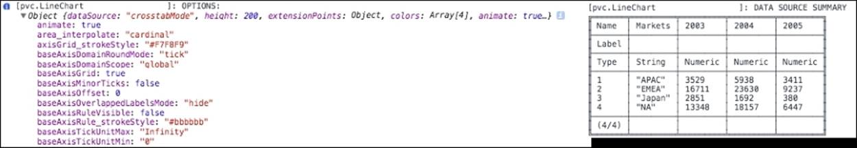
The following image is also part of the output that we get from debugging CCC. The image on the left gives you information about the Logical Table and how CCC parses the result set of the query seriesInRows and crosstabMode, or for readers:
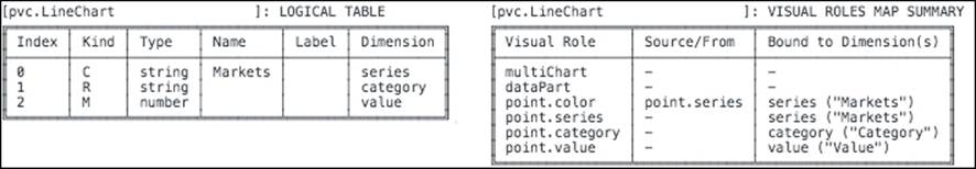
Looking at the table on the right, you will find the Visual Roles Mapping that is being used as the default for the options used or as set by you, as explained earlier in this chapter.
If, instead of using a value of 5 for the CCC debugging level, you use a value of 16 (&debugLevel=16), when displaying the chart you will be able to see some borders that identify all the panels of the chart. The following screenshot is an example of this. Among other things, it's useful to check whether it's being used as padding or margins for the panels. You can see those margins in the following image:
CGG – Community Graphics Generator
CGG is a plugin that allows you to export CCC charts in CDE dashboards as images. CGG will generate the image on the server side, and that's the reason why you will see some JavaScript files related to the charts to be exported. Every time you set a chart to be exportable, it will be provided with a URL that you can use to export the image. This means you can see the generated images of the charts you can embed inside any other dashboard/report/page.
When editing a CDE dashboard, you can press Shift + G, which is a shortcut to get to a dialog with a list of charts in the dashboard. By selecting a chart, you will be enabling the option to export the chart using CGG. You can see this in the following image:
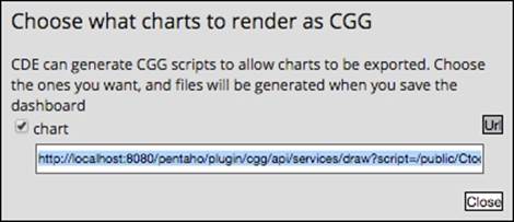
The previous image also shows the URL button, which you can click to get the link to use for the export. For example, for one of the examples provided with the book, the link to the chart will be: http://<server>:<port>/pentaho/plugin/cgg/api/services/draw?script=/public/Ctools+Book+Samples/Chapter+8/CGGSample/CGGSample_chart.js&outputType=png.
This URI uses two parameters, the script and the output type. The first one is used to point to where the script to generate the chart is located. This script is only generated when you enable the checkbox in the CGG dialog box and just after saving the dashboard. When you save the dashboard, the script is generated and you can make use of it.
Using CGG, charts can be exposed as a PNG or SVG image. Let's see how we can make this happen. We can change the outputType parameter and set the string png to get a PNG image or set svg to get an SVG image. I always prefer to use SVG but, if you have some incompatibilities, you can use the other option. By default, CGG uses PNG.
References
Other good sources of additional information and examples are the following links:
· http://jsfiddle.net/user/duarteleao/fiddles/
· http://forums.pentaho.com/showthread.php?161089-CCC-FAQ-Frequently-Asked-Questions-About-CCC
Summary
In this chapter, we provided a quick overview of how to use CCC in CDF and CDE dashboards and showed you what kinds of chart are available. We covered some of the base options as well as some advanced options that you might use to get almost a fully custom visualization. Might be that some of the properties are not available in the CDE GUI, but the properties and respective values might be used in the preExecution or postFetch function of the CCC component being used.
You should now know about internationalization and how to customize tooltips, and even how to deal with the click event, creating interaction with new components. When starting out using CCC, you might not be interested in debugging, but if you are or are intending to be an advanced user, you should start looking into it. We also covered what an extension point is and how to use it.
In the next chapter, we are going to cover the Pentaho App Builder and you'll see how to build a Pentaho plugin with it.
All materials on the site are licensed Creative Commons Attribution-Sharealike 3.0 Unported CC BY-SA 3.0 & GNU Free Documentation License (GFDL)
If you are the copyright holder of any material contained on our site and intend to remove it, please contact our site administrator for approval.
© 2016-2026 All site design rights belong to S.Y.A.