Splunk Essentials (2015)
Chapter 4. Reports in Splunk
In the previous chapter, we learned how to use further search techniques, use the stats, eval, and top commands, create visualizations, and also use timecharts. In this chapter, we will go on to learn more about how to further use these skills to create reports and dashboards. The topics covered in this chapter include the following:
· Getting data ready for reporting
· The Report Builder and how to use it
· Using the Report Builder to create a rare values reports
· Creating a dashboard panel with a report
· Creating a pivot
· Adding a pivot to a report
Getting data ready for reporting
Before you prepare a report, you often want to manipulate the data first to get it ready. In other words, if you know the categories you want to end up with, you should group it the way you want before processing. Splunk has two important ways to do this: tagging and setting event types.
Tagging
Tags are used to label specific values of a field. For example, many names of servers may not be immediately recognized, and using a tag format can help them be more easily recognizable or distinguishable from each other.
To tag the value of a field, use the following steps:
1. Go to Settings | Tags. A window will open, as shown in the following screenshot:
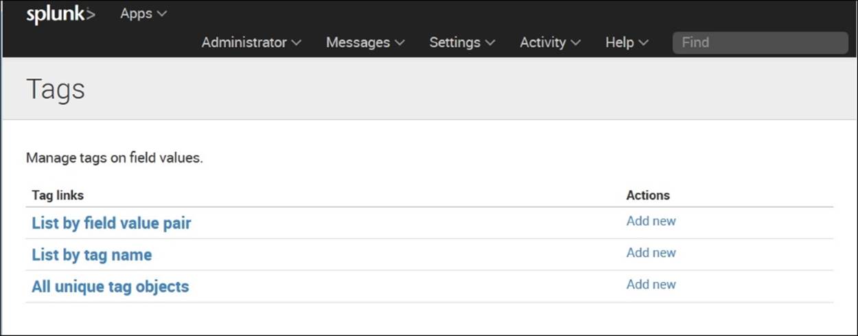
Adding Tags
2. Under List by tag name, click Add new.
3. Here we want to tag an item as ITEM14 whenever the value of itemId=EST-14, as shown in the following screenshot:

Naming Tags and Specifying Field Value Pairs
4. You will now see your tag listed as shown in the following screenshot:
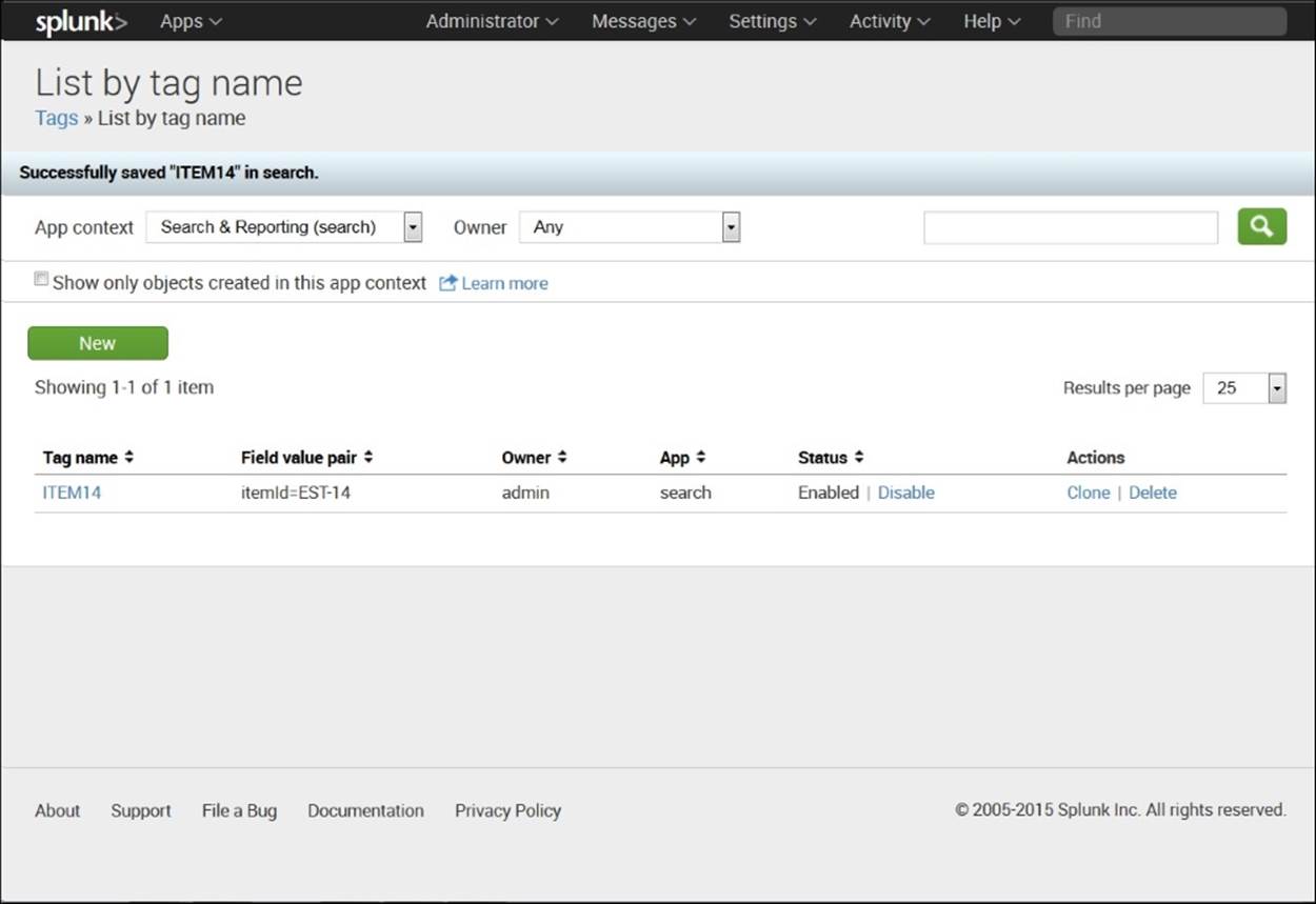
List by Tag Name
5. Go back to the event list and click the > sign next to an event. You will see details of the event open up in a way similar to that presented in the following screenshot. You can see here that itemid=EST-14 has been tagged as ITEM14. Now everywhere thatEST-14 occurs, it will be tagged as ITEM14.

Note that itemid=EST-14 has been tagged as ITEM14
Tags enable you to search more easily and to convey meaning about the field values. When you search tag=ITEM14, all the cases where itemid=EST-14 show up. By using tags in this manner, you can facilitate your analysis.
Setting event types
Another way of preparing data to be reported is to set event types, which let you put events into categories. When setting event types, you can use wildcards, field values, and Boolean expressions. This capability makes event types more versatile and powerful than tags, for which you can only use field values. As with tags, you can choose the categories you like.
When setting event types, be aware of the following:
1. You can't do a sub-search to create an Event type.
2. You can't use pipes in a search that create an Event type.
As an example of how to create an Event type, take the following steps using the buttercupgames file:
· Enter this into the search bar:
· sourcetype="access_*" status=200 action=purchase
· This creates a search for events where the sourcetype is an accessed web page, the access was successful (status=200), and it ended in a purchase:

Search that will be saved as an Event Type
3. Click Save As | Event Type in the upper-right corner of the screen and create a name for the event type. In this case, we have used the name success.
4. In this screenshot, when we enter buttercupgames | stats count by eventtype, we get a count of each event type. In this case, we have only one event type, so we get only one count in our table, but we could easily put other event types in:

Shows Count by Eventtype
5. If you want to remove an event type, go to Settings | Event types, and you will get a screen similar to what is shown in the following screenshot. Just find the event type you want to remove and click on Delete:

Event Types (Notice that you can Delete the one you just made.)
The field extractor
In all of the examples in this book, we will use fields that have been set up automatically or previously set up. One of the primary advantages of Splunk is that it can easily recognize many types of fields. But users can also make use of the field extractor if they want to set up fields in a certain way. This can be accessed by clicking on > next to an event, then clicking Event Actions as shown in the following screenshot. If you then click Extract Fields, you can choose how you would like to pull out fields from the events. This gets complicated quickly though, and, for that reason, is beyond the scope of this book. For a discussion of regular expressions, go to http://docs.splunk.com/Documentation/Splunk/6.2.1/Knowledge/AboutSplunkregularexpressions. We'll be going on to learn how to create reports instead:

Event Actions
The Report Builder
The report builder can create reports that can be used as needed, or from which you can get regular updates. You can create these reports by running searches or pivots. Below we will show how to create a report using a search you have done on the same sample data that we have been using.
To create a simple report of the counts in each category, take the following steps:
1. In the search box, type the following:
2. buttercupgames | stats count by categoryId
3. You will see a chart on the screen.
4. Click Save As and select Report as shown in the upper right-hand corner of the following screenshot:

Save a Search as Report
5. Give the report a title, such as CategoryID Counts.
6. Insert a description if you like.
7. Select a visualization if you wish. If not, just leave it as None. (We decided to choose a column chart here.)
8. Choose a time range from the time range picker if you like, by choosing Yes or No.
9. When you are done, click Save.
10. You will see a box that says Your Report Has Been Created and will give you additional options:

Box Showing Your Report Has Been Created
You now have the following options:
· You can set permissions to view, edit, and delete the report.
· You can schedule the report to be run (every hour, day, week, or month) at a certain time to process data for a specific range of time. You can also schedule an e-mail to alert you when the report runs or can give instructions for a script to be run.
· You can accelerate the development of the report.
· You can embed the report in a web page. (However, the report has to be scheduled to do this.)
Once you have created the report, you can click Edit to do one of the following things to the report:
· Change the description
· Edit permissions
· Edit the schedule
· Edit acceleration
· Clone
· Embed the report in a website
· Delete the report
You can also go to the other columns listed after Actions and change the following:
· The Owner
· The App used
· The properties associated with sharing the report
· Whether or not the report is embedded in a website
You will thus be able to generate a report as shown in the following screenshot:

Ways to Edit Your Report
As you can see, there are many options you can take to create useful reports that can be customized, run, and made available by different methods. Reports showcase the flexibility and capabilities that make Splunk useful.
Creating a dashboard
Dashboards are important because they enable decision-makers to have visualizations of several metrics in front of them at a time. They can also be used to drill down in terms of time or other measures.
To create a dashboard, take the following steps:
1. On the home page, under Search and Reporting, click Dashboards in the upper-left corner of the Splunk home page.
2. Click Create New Dashboard in the upper-right of the Dashboards page.
3. Fill in the Title (optional), ID, Description (optional), and any Permissions (we use the defaults here). Click on the Create Dashboard tab:
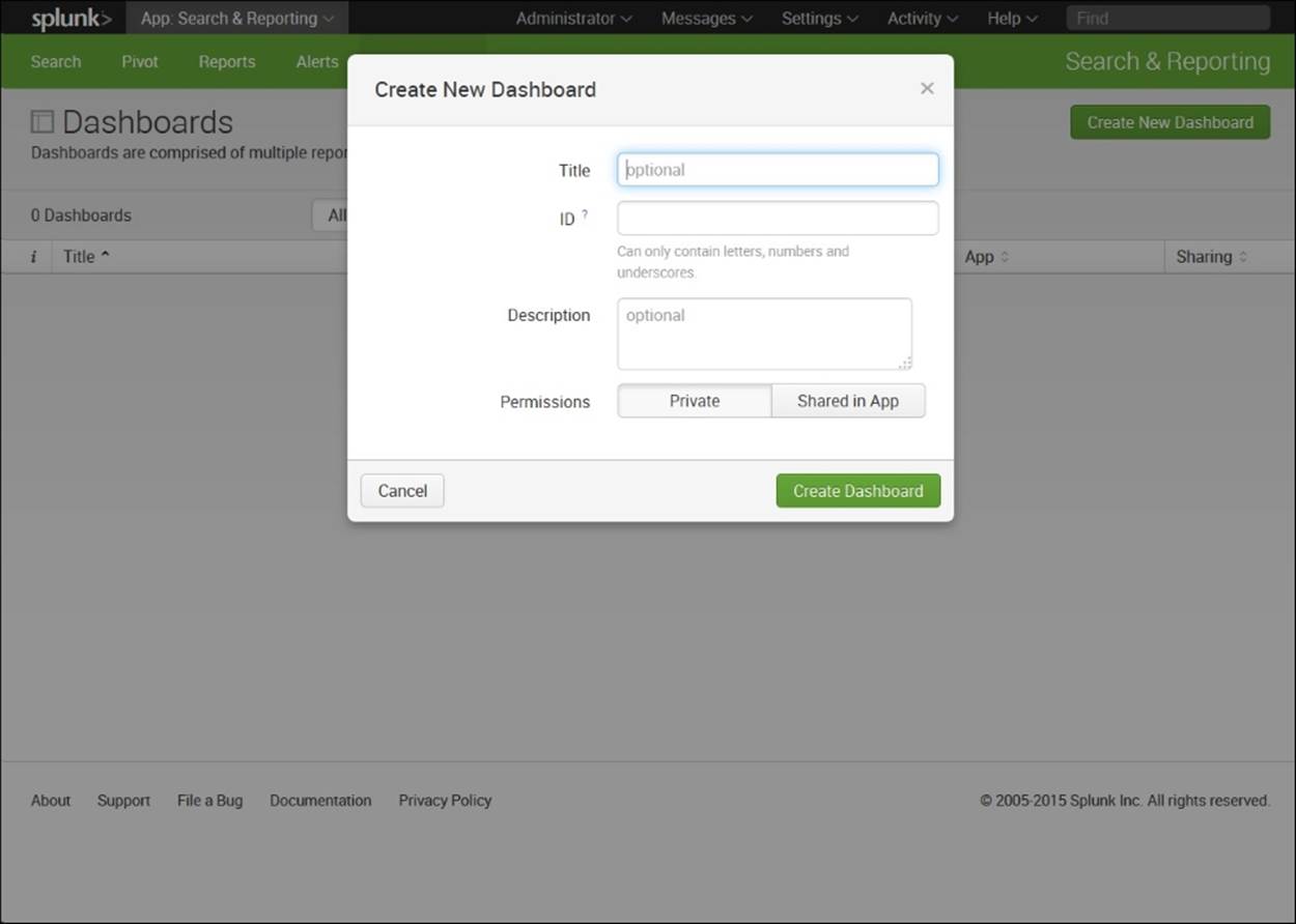
Create New Dashboard
4. We called our dashboard Main1 in Title, which has defaulted to main1 in the ID field.
5. Click on the Create Dashboard tab.
6. Click Add Panel in the upper right-hand corner as shown in the following screenshot:

Add Panel
7. You can choose whether your panel will come from Inline Search, Inline Pivot, or Report. In our case, we decided to use the report we just created, that is, CategoryID Counts. Under Content Type, click on the Report icon (the figure that looks like a report in the previous screenshot).
8. Click on Add Panel. The statistics panel appears in the dashboard called Main1 as shown in the following screenshot:
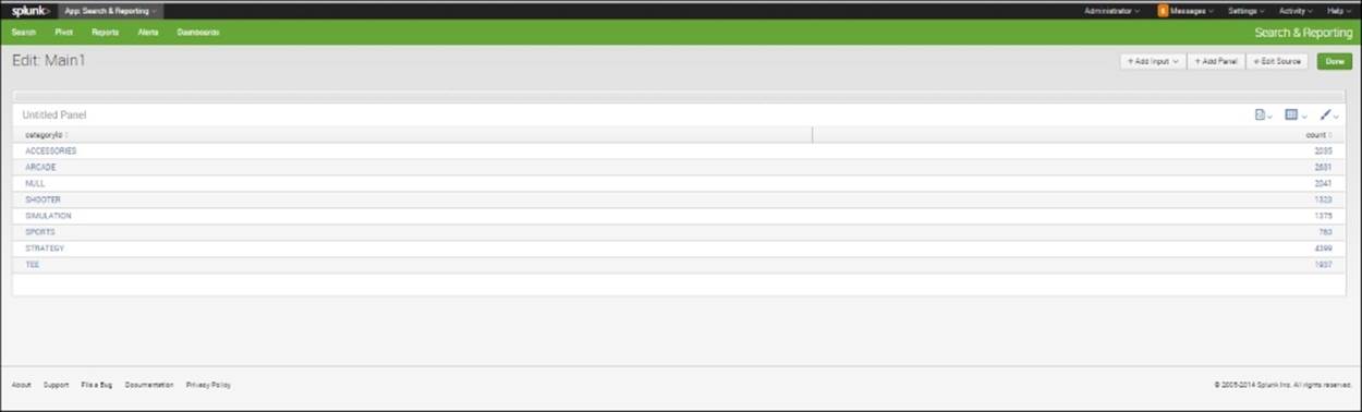
Statistics Panel is Added
9. We change it to a pie chart by clicking the second icon in the upper right-hand corner and selecting the pie chart icon. Now our screen looks like what is shown in the following screenshot:

Pie Chart Panel
We can edit the title from this screen by going to the first icon in the upper-right corner and select Edit Title.
Adding a panel with a search string
It is also easy to add a panel to a dashboard just by adding it and putting in a search string. To create a dashboard and then put in a panel with a pie chart, take the following steps:
1. Under Search and Reporting, click Dashboards.
2. Enter in the information for a pie chart, as shown in the following screenshot:
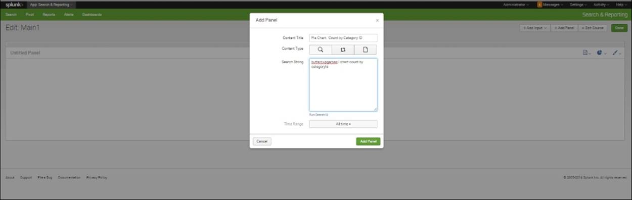
Add a Panel Using a Search String
3. Click Add Panel.
4. If the visualization that appears is not a pie chart, click on the chart icon in the upper-right corner and select Pie.
You should see a chart like the one shown in the following screenshot:

Pie Chart Created Using Search String
In the following examples of more charts, you can find different visualizations that can be put in as panels in a dashboard.
Built-in search dashboards
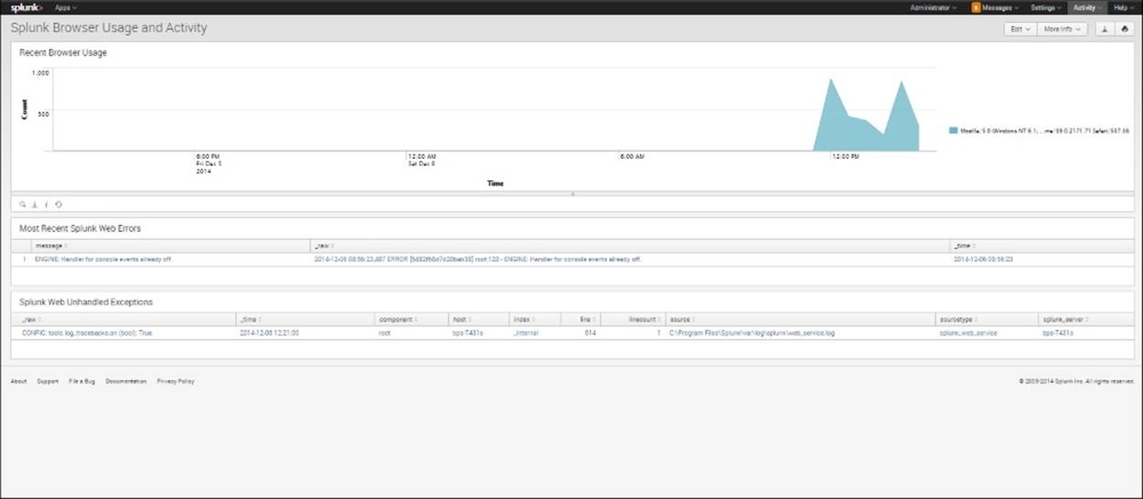
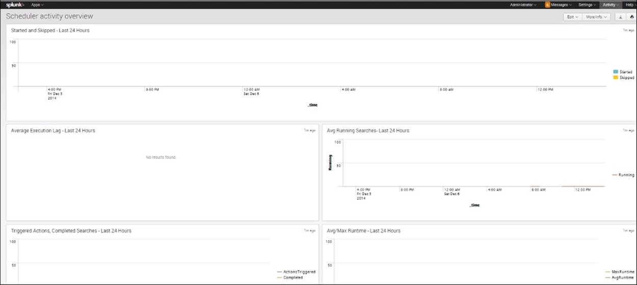
You may not be aware that Splunk has its own built-in visualizations of search activity. If you go to Activity menu, then go to System Activity, you will see that you can choose to look at search activity, server activity, or scheduler activity. Screenshot a each are shown as follows:
1. First, under Search, click Search activity overview to see the various panels showing how the search is evaluated:
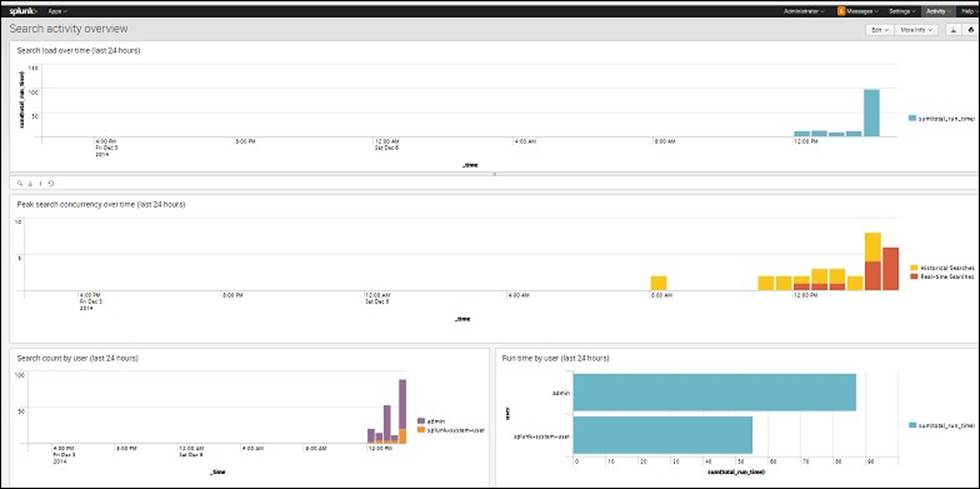
Search Activity Dashboard
2. Under Server, click Splunk Browser Usage and Activity, and you will get a window like the one shown the following screenshot:
Splunk Browser Usage and Activity Dashboard for Server
3. And under Scheduler, click Scheduler activity overview. There you will see the following dashboard:
Scheduler Activity Overview Dashboard
All of these dashboards are helpful not only because they measure the internal workings of Splunk, but also because they exhibit different ways to make panels. To view the SPL behind each panel, click on the magnifying glass icon in the lower left-hand corner of each panel.
Creating a bar chart
Another common way to view data like this is to use a bar chart. For example, such a chart can be used to show the viewer the relative proportions of those who use method=POST, and those who make purchases.
1. To create a bar chart, you can enter the following code in the search bar:
sourcetype=access* | timechart per_minute(eval(method="POST")) AS Views per_minute(eval(action="purchase")) AS Purchases
2. Let's go through this next step carefully. We begin by searching for all events with a sourcetype that begins with access are collected. Then we use the timechart command and the per_minute function to first give us a figure for the number of events per minute that use method="POST", and then label it as Views. In addition, we use the per_minute function to find the number of events per minute that have action="purchase", and then label the results as Purchases.
3. Go to the Visualizations tab and select Bar.
You should see a chart like the one shown in the following screenshot:

Timechart in Bar Format Showing Purchases
Creating a stacked bar chart
Sometimes, it is useful to see how the different products on a website are selling over time at the same time as you track overall sales. A stacked bar chart can be helpful here. To create a stacked bar chart, take the following steps:
1. Insert the following code into the search bar:
sourcetype=access* | timechart count(eval(action="purchase")) by categoryId usenull=f
2. In the code, nothing should seem that new, except usenull=f piece, which indicates that you want to get rid of nulls for this analysis.
3. When you create a chart, it should look like what is shown in the following screenshot:

Timechart in Bar Format
4. Click on the Format icon in the upper-left corner of the screen.
5. You will see a window like the one shown in the following screenshot. Under General, select Stack Mode, then select Stacked:

Select Stack Mode as Stacked, Multi-Series as No, Drilldown as Yes
6. Click on the Apply button.
Your resulting chart should look like the one shown in the following screenshot:
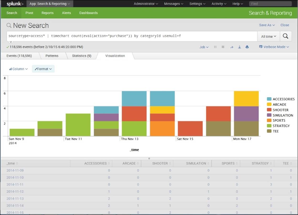
Stacked Chart
Changing the placement of a legend
In the previous stacked bar chart, the legend is on the right. If you want to change this, you can do it via the same drop-down window that we used to change the bar chart into a stacked bar chart:
1. Go to the Format icon in the top-left corner of the Visualizations tab.
2. Select the drop-down window.
3. Click on Legend.
4. Under Position, click Bottom.
Your resulting chart will now look like the one shown in the following screenshot:

Legend is Shown at Bottom of Chart
Creating an area chart across time
The timechart command can be used to put together a useful chart of items bought over time. Let's look at the following code and then put it into the search bar:
sourcetype=access* | timechart per_minute(eval(method="POST")) AS Views per_minute(eval(action="purchase")) AS Purchases
If you need to review what the code means here, go back to the bar chart shown in the following screenshot. To create an area chart from this search, take the following steps:
1. Run the search.
2. Make sure that your tabulations look reasonable and that you have Views and Purchases as column headings, and days on the side.
3. Click the Visualizations tab.
4. Click on the top-left icon to select Area.
Your chart should look like what is shown in the following screenshot. Such as chart is useful as it shows the proportion of purchases that use method ="POST" and how they change over time:

Area Chart of Percentage of Views as Purchases over Time
How to make a sparkline panel
Sometimes, it is interesting to be able to easily compare the ups and downs of various categories of an indicator field in one visualization. Sparklines allow you to do this, as they can easily track trends. They are very small line charts.
To create a sparkline panel, take the following steps:
1. Using the buttercupgames data, type the following code into the search bar:
sourcetype=access* | chart sparkline(count(eval(action="purchase"))) AS "Purchase Trends" count(eval(action="purchase")) AS Total by categoryId
Note
It is very important that you spell categoryId exactly as it is written, with one capital I and no other capitals. Otherwise, this code will not run.
2. For each categoryId type, you will see a sparkline showing purchases over time that has been renamed Purchase Trends, and a count of the subtotal labeled as Total, as shown in the following screenshot:

Sparkline Chart
Creating a scattergram
A scattergram is useful for comparing values for two fields. It can sometimes pick up correlations between fields. A positive correlation can be seen when a scattergram goes from the bottom left to the top right; a negative correlation from top left to bottom right. A scattergram can also show the spread of variation. If points are tightly clustered around an imaginary line in a positive direction, we can intuit a strong positive correlation. Likewise, if they are tightly clustered around an imaginary line in a negative direction, we suspect a strong negative correlation in the underlying data. In our example here, we are not looking for a correlation, but just observing a pattern in the data.
To create a scattergram, take the following steps:
1. Put the following code in the search bar:
buttercupgames | stats count(eval(action="purchase")) as Purchase by date_minute
2. Look at your results on the Statistics tab. It is hard to see a relationship between the counts of purchases and minutes.
3. Click the Visualizations tab.
4. Click the icon in the upper-left corner and select the Scattergram chart.
5. Your chart will now show each purchase by minute over time.

Scattergram Chart
Creating a transaction
You can group events as a transaction. The transaction command creates two fields:
· Duration, which is the difference between timestamps for the first and last events
· Eventcount, which is the number of events in the transaction
For example, you can use the transaction command to create a chart to show the number of transactions based on client IP address, a maximum pause of 1 hour, output evicted transactions (keepevicted=true), and output original events in the order they arrived (mvlist=true). The case function sets the name of transactions where eventcount=1 to "Bounced", 2-5 pages to "2-5 pages", and where it is <=10 to "6-10 pages". It places a top limit on these transactions of 4,000 and distinguishes these bins of eventcounts asuser_type. The steps used are shown here:
1. Insert the following code in the search bar:
sourcetype=access* | transaction clientip maxpause=1h keepevicted=t mvlist=t | eval user_type=case(eventcount=1, "Bounced", eventcount<5, "2-5 pages", eventcount<=10, "6-10 pages") | top limit=4000 user_type
2. Change the type to Pie by clicking on the icon in the upper-left corner of the Visualizations tab.
Your chart should look like what is shown in the following screenshot:
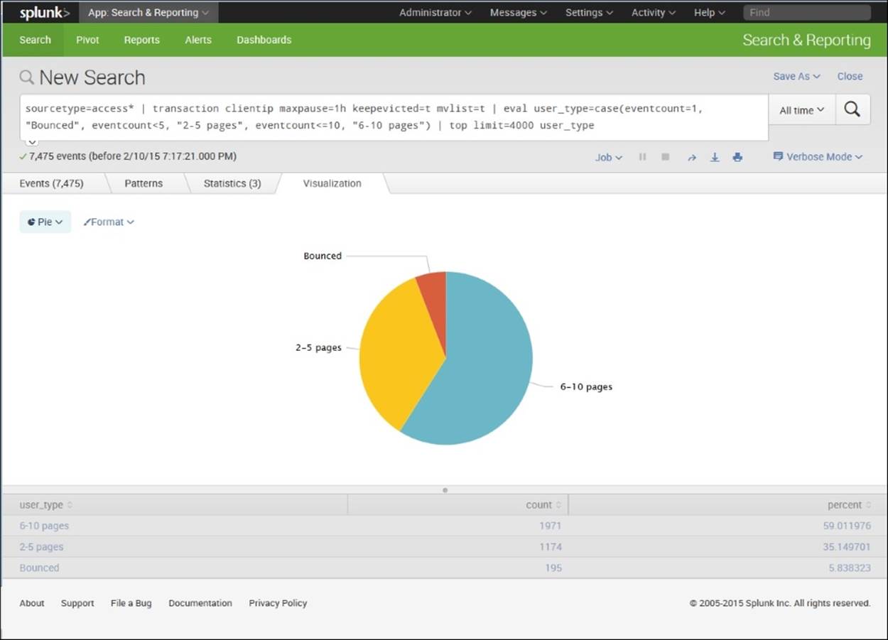
Pie Chart Showing Events by user_type
Radial Gauge
A radial gauge is an effective visualization and is easy to create in Splunk. A radial gauge can be created by carrying out these steps:
1. Type in the following code:
buttercupgames | stats avg(timeendpos) AS mytime | gauge mytime 0 20 40 100
You should get a result like the one shown in the following screenshot:

Radial Gauge Chart
2. Note that you are searching the buttercupgames events, and wanting to measure the average end time position or length of event in seconds. Since you are interested in drawing attention whenever the average event time goes over 40 seconds, you create a gauge that marks anything over 40 as red, and one that also has two categories for 0 to 20 and 20+ to 40.
Your chart should look like what is shown in the following screenshot:

Radial Gauge Chart Showing Changed Category Ranges
Creating a Marker Gauge
You can also use a different type of measure, a Marker Gauge, for the same data as in the previous radial gauge example. To create one, simply take the following steps:
1. Type in the following code:
buttercupgames | stats avg(timeendpos) AS mytime
2. Click the Visualizations tab and select Format | Marked Gauge.
3. Click Color Ranges, Manual, as shown in the following screenshot:

4. Type in 20, 40, and 100 for the three colors, as we did in the previous Radial Gauge.
Your chart will look like the one shown in the following screenshot:

Marker Gauge
Creating a pivot table
Pivot tables allow you to view the data in many different ways. Splunk has many shortcuts that users can take advantage of to create pivots easily. We will create a simple pivot table here, using the following steps:
1. We want to open the pivot table interface, so we go to Home Page, and then, under Search and Reporting, select Pivot.
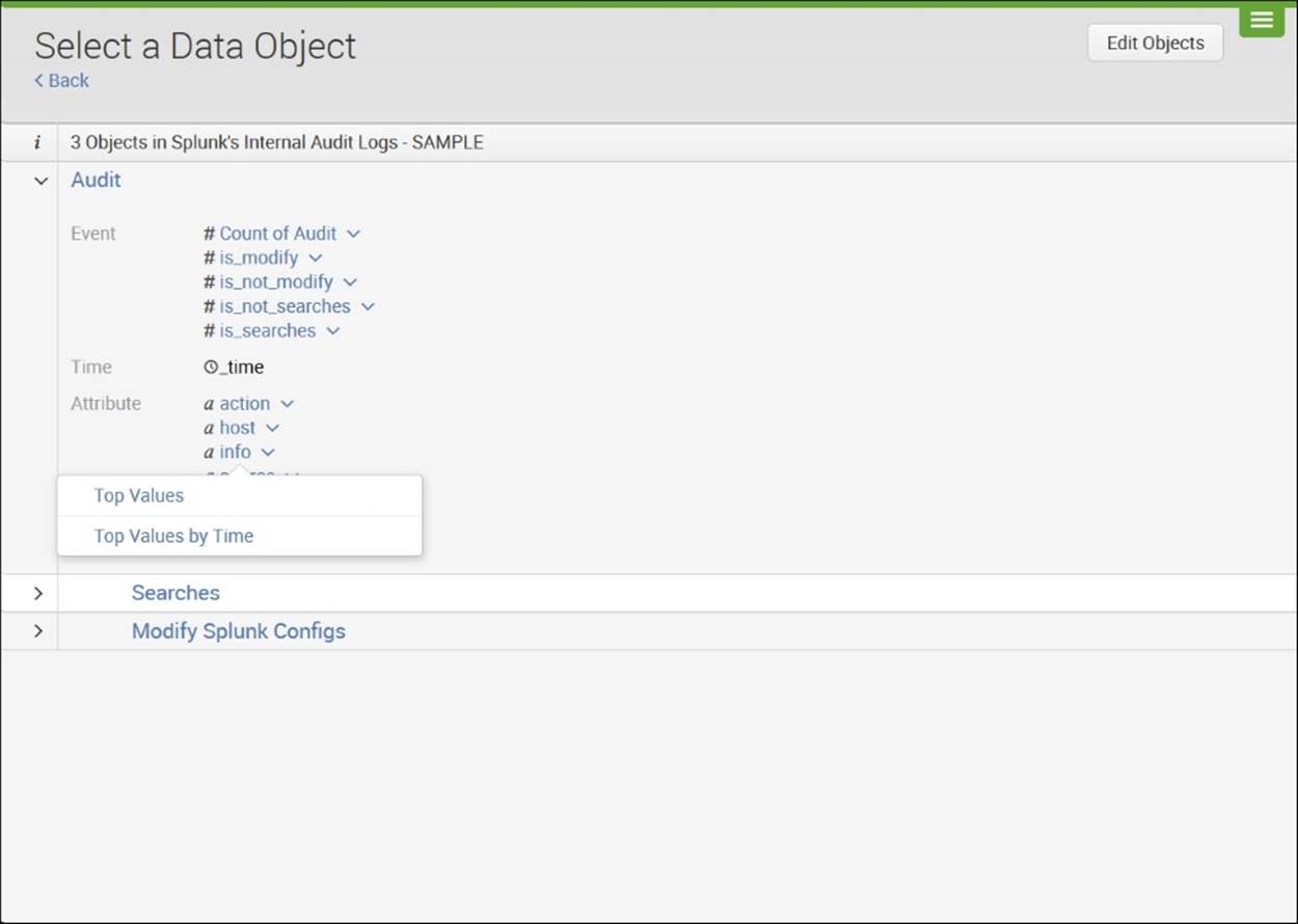
2. To create a pivot table, you use a model. Data models allow you to structure the fields in objects that are easy to pull data from. You should see a short list of models. A model is set up by someone who has detailed knowledge of the data and its properties. Here, we will use a model that is downloaded when you download Splunk. Click on Splunk's Internal Audit Logs—SAMPLE. After you select the model, you will see a screen that shows the objects in the model:

Select a Data Object
3. In the screenshot, you can see that there is one root object (Audit) and two child objects (Searches and Modify Splunk Configs). If you click the > icon by each object or child object, you can see the fields that are included in each of them, as shown in the following screenshot:

Select a Data Object
4. If you click on the downward V icon next to each field, you can see the options that are available to view the field in a pivot—Top Values or Top Values by Time.
5. Click the downward V icon next to info and select Top Values by Time:
Select Top Values by Time
6. A pivot is created that shows time (in days) by categories of the field info: NULL, canceled, completed, failed granted, n/a, succeeded.

New Pivot Showing Time by Top Values of Field info
7. Save your pivot by clicking Save As and select Dashboard Panel.
8. Create a new dashboard and name it:
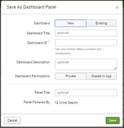
Save as Dashboard Panel
9. Select New and put in Dashboard Title and Panel Title. You now have a dashboard with one panel.
10. Create another panel of your own choosing by using some other fields in a pivot table. Add the panel to your dashboard.
Summary
In this chapter, we have learned more about how to use Splunk to create reports, dashboards, and pivot tables. We have covered various ways that Splunk's data visualization capabilities can be used to create charts and graphs for dashboard panels or reports, including bar charts, stacked bar charts, pie charts, scattergrams, sparklines, area charts, radial gauges, and marker gauges. Additionally, we have learned about transactions and pivot tables, as well as their usefulness. We will now go on to Chapter 5, Splunk Applications, and explore the many different types of applications that are available to be used with Splunk.
All materials on the site are licensed Creative Commons Attribution-Sharealike 3.0 Unported CC BY-SA 3.0 & GNU Free Documentation License (GFDL)
If you are the copyright holder of any material contained on our site and intend to remove it, please contact our site administrator for approval.
© 2016-2026 All site design rights belong to S.Y.A.