The DSLR Filmmaker’s Handbook: Real-World Production Techniques, Second Edition (2015)
Chapter 14. Post-Production Looks
Once upon a time, filmmakers avoided common camera artifacts such as lens flares and vignettes at all costs, but now we seek out lenses that give us beautiful artifacts—or even resort to creating those artifacts in post-production. Embracing the imperfect is a great way to break free from the bonds of digital sterility, so consider this chapter a recipe book for eliminating or dealing with some of the most common problems or even crafting a few new ones of your own.
This chapter on fixing in post was graciously contributed by Michael Heagle.
Primary Color Correction
We take the recorded image for granted, because when it comes to exposure and color, our own eyes are adaptive. We close down our irises when the light is too bright, and a white piece of paper looks equally white to us whether we’re indoors or out. No special filters are required for this trick; the human eye has “auto white balance” and “auto exposure” as standard features. But a DSLR camera is only as smart as its operator.
If you’re hoping to do a lot of overall exposure correction for broken shots, we warned you before: in a video environment, there’s not much you can do to recover clipped blacks and blown highlights. They are gone, gone, gone, in the same way that a person standing on the side of the freeway didn’t record the license plate of every car that drove by because you didn’t tell him to. That’s data, and it’s no longer available to decode and display.
If you try to lower the values of a shot to resurrect missing information from the overexposed top end, a dull gray is introduced where the white used to be. All you’re doing is lowering white, not retrieving information. Likewise for the underexposed blacks: when you raise them, very little new picture information is introduced, and what you see may be made up mostly of unsightly noise or grain. That being said, begin by working with the midtones of a shot, and you may find that the ensuing contrast change takes some of the heat off the problem. It’s amazing to find what is lurking just around the corner, waiting to be coaxed out of a shot with gentle color correction. If you need a bad shot to cut with other properly exposed shots in the same sequence, however, the challenge increases.
If you overlooked color temperature settings, fear not: color correction tools are great, and all will do corrective fixes like these quite easily.
Primary fixes happen in three places: shadows, midtones, and highlights. Luckily, most good color correctors are called “three-way” because they offer independent control over these discrete but overlapping areas of a picture (Figure 14-1). These discrete regions don’t own an equal amount of picture real estate, and the borders of where one ends and the next begins are vague. What’s more, as you change one area, you’re likely to undo another.
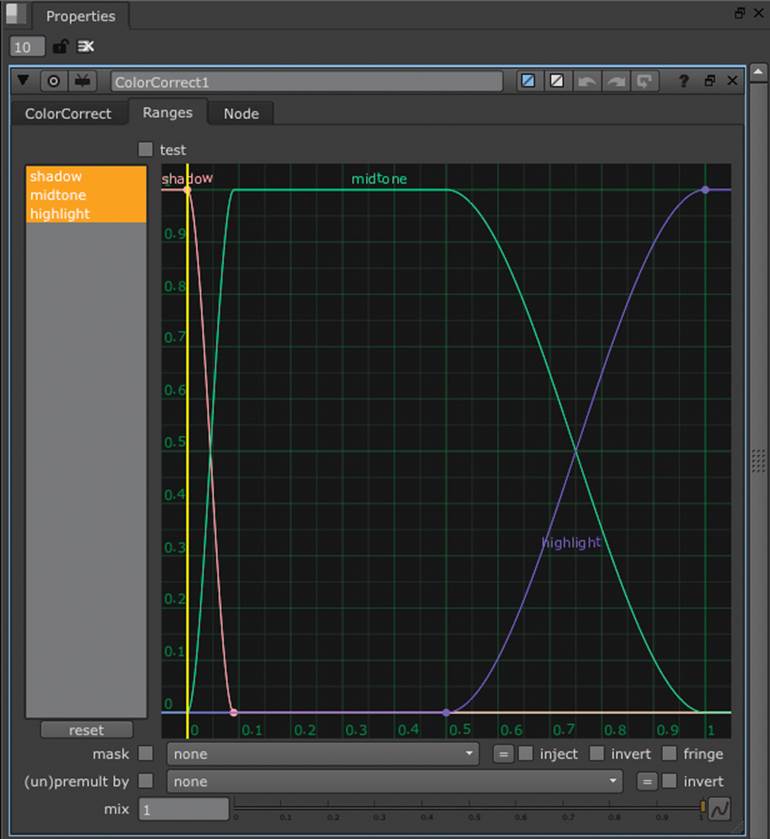
Figure 14-1: In some applications, such as The Foundry’s Nuke, the discrete areas of color correction are more accurately depicted as overlapping curves.
Professional color correction homes in on the black and white levels of a shot first. One great way to make shots match in these areas is to look at a grayscale version of the footage, keeping color out of the equation completely until you’re ready to deal with it. Find the blackest black in the incorrect shot, and make sure it is the same value as the blacks in the target or destination shot by dialing the shadow levels up and down. Then repeat for the whitest white in the shot. A shot with good dynamic range will have some of each in the frame, but not all shots are created equal here, and some guesswork is inevitable.
Lastly, you can tune color in the same way. Some people are born with an innate ability to see color problems and fix them by eye, and a good understanding of traditional color theory goes a long way here. Just remember that this isn’t your art-class, paint-mixing, subtractive-color space; it’s RGB additive color land.
If you are one of the regular people who lack this natural ability and need to make two shots look the same, try analyzing the problem one color channel at a time—red, green, and blue individually—and treat each picture like a grayscale shot where you are trying to match overall exposure. Look at the green channel on the good shot, and compare it to the green channel on the bad shot. Is the bad shot brighter? If so, darken it by adjusting the levels of the green channel until it matches the target shot. Then repeat for the other channels and see what you end up with. If you’ve set your black and white points, leave them where they’re at and work only the midtones until the two pictures look like they’re the same. Switch it back to full color to see whether you were right. This trick works like magic most of the time.
Micromanaging with Regional Color Corrections
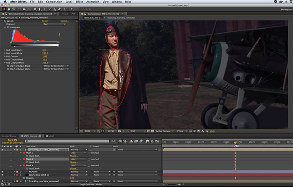
Most regional color corrections can be accomplished via simple masks. The trick is to make sure the masks don’t move independently of the footage and don’t have obvious borders. In a shot like the one in Figure 14-2 where the actor stepped into an unsightly shadow, you can fix it in post with the “power windows” method. This trick gets its name from the first digital color-correction suites, whose masks were limited to geometric shapes like rectangles and ovals. What sounds like a gross limitation is actually a benefit: there are few problems that can’t be solved with one or two of these simple shapes, provided you soften the mask edge to hide your tracks. This means no extensive frame-by-frame rotoscoping, which is a huge time-saver.
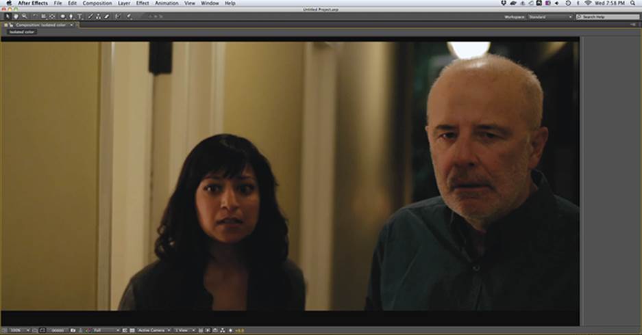
Figure 14-2: Though he walked through the valley of shadow, he can be saved through regional color correction.
Rotoscoping gets its name from its similarity to the old hand-animation techniques pioneered by Max Fleischer in the early 20th century.
Some editing software and all compositing software should have this capability. We’ll use Adobe After Effects for its added ability to use 2D tracking to affix masks to a moving subject, but a lockdown shot wouldn’t need much animation and could be manually animated to change over time. In classical movie F/X parlance, this was called a traveling matte. Nowadays we call this rotoscoping, and the simpler the mask, the quicker the task.
In off-the-shelf software, the trick is accomplished by having two layers stacked on top of one another, one for each version of the color correction. In this scene, we will use two copies of the footage: the original, shadowed copy below and a brightened copy above. The top layer is masked to include only the problem areas, and it is softened or “feathered” liberally to hide the mask’s edges.
1. Import the shot. Make a new composition from it.
2. Select the layer in the comp and duplicate it by pressing Cmd+D (Mac)/Ctrl+D (Windows).
3. On the topmost layer, start masking the areas of the shot that need to be brightened. We opted for two elliptical masks, rotating them to better fit the shape of the problem area (Figure 14-3). (A useful shortcut for this is to create the mask and then immediately hit Cmd+T/Ctrl+T to transform the mask. You can then move it as a whole or scale and rotate it from the corners.)
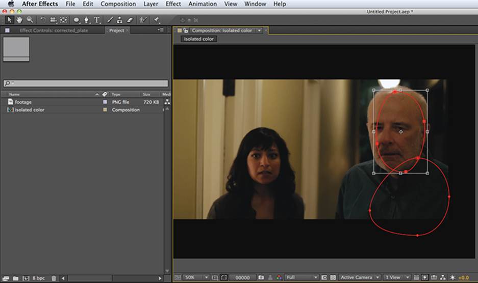
Figure 14-3: Elliptical masks are all you need for subtle color corrections. The mask on the right is being rotated via Cmd+T/Ctrl+T.
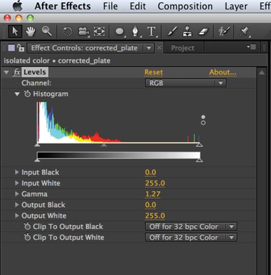
Figure 14-4: A simple Gamma adjustment leaves the black and the white values of the shot intact and usually fixes the problem.
4. Feather the masks substantially by twirling down the Mask properties on the layer and increasing the Mask Feather value. Depending on the size of the mask and the resolution of your footage, these can be big numbers—in our case we feathered it to a value of 40 (the distance of the soft edge in pixels). This makes for a really soft mask and tapers off the effect of color correction just as actual photographed light would fall off.
5. All that remains is to color correct the top layer, bringing it up to the level of the unshadowed side of the face. We did this with a simple Levels effect, raising the Gamma by dragging the middle gray triangle to the left until the images matched satisfactorily (Figure 14-4).
Figure 14-5 shows the before and after versions.
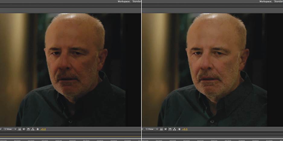
Figure 14-5: Before and after the regional color correction
If the character moves only a little, animating these masks is probably unnecessary and may in fact be more distracting. But if the camera or subject moves substantially, consider using the software’s 2D tracking tools to stick the mask to the footage. In 2D tracking, software looks at a point on the footage (usually one selected by the user that is unique and high contrast) and then follows that feature through the shot on a frame-by-frame basis. The information it gleans from this analysis is then applied, either to the shot itself to remove the camera movement (stabilizing) or to another layer to parent it to the original footage (match moving).
There are some great resources out there for how to do more complicated tricks like this in After Effects. A popular one is Andrew Kramer’s Video Copilot (www.videocopilot.net), which features After Effects tutorials for virtually every function in the software.
When it comes time to manually mask a moving subject, remember the following rules:
· Use as few keyframes as possible. Keyframes, those increments of animation necessary to change the mask’s shape over time, are generated first when you click a property’s stopwatch icon in After Effects and then every time you move the mask thereafter. Remember that you need to advance the current time indicator to a new spot in the timeline, chosen based on the change or movement that has occurred, in order for animation to take place. Without differing keyframes in differing spots in the timeline, there is no movement.
· Keep your shape as simple as possible.
· Move the shape as a unit, not the individual keypoints. Keypoints are created every time you click the mouse during the mask-drawing process. Select them all by drawing a marquee over them, or select one point and press Cmd+A/Ctrl+A to select all the keypoints on the shape.
· Think like an animator and use key poses to drive your keyframes. Extremes of motion (foot rises, foot falls) are key poses and are natural spots of movement to base the animation around.
· Break the object into manageable pieces instead of outlining the whole object.
Secondary Color Correction
Filmmaking in the 21st century no longer takes the latent image for granted. Many filmmakers are satisfied with the technically correct image, but some aspects of color correction go beyond mere black-and-white point management and into full creative expression.
As digital effects rose in prominence in the 1990s, the need to scan images into the computer increased and became commonplace. When the storage size of that image was no longer a deal breaker, entire movies could be stored at high resolution. Enter the digital intermediate, which replaces the old photochemical method of placing colored filters in front of an optical printer to correct the image. In the digital arena, new looks could be auditioned quickly and inexpensively.
Filmmakers saw the potential here for a new level of expression, no longer bound by what was captured on set or even by reality itself. Whether it was the cold machine world of The Matrix or the Dust Bowl sepia of O Brother, Where Art Thou?, the age of the color grade had arrived. Since then, cinematic looks have trickled down to the desktop in the shape of easy-to-use plug-ins like Magic Bullet Looks (from www.redgiantsoftware.com), designed to give the budget-conscious filmmaker Plug and Play access to cinematic styles that mimic everything from Saving Private Ryan (itself a photochemical look, not a digital one, ironically enough) to Amélie. But third-party plug-ins like this are merely brilliantly conceived time-savers, and the stock tools in most good editing and all good compositing software can get you there at no additional charge for those artists willing to do the legwork.
Creating a Hard-Hitting Action Movie Look
Color and contrast are a huge part of what makes modern movies look the way they do, and missing out on this post-production opportunity can be the tipping point between making your movie look incomplete and finished. What follows is a recipe for a dramatic, hard-hitting “action movie” look, but if you carefully analyze some images from a film, you should be able to reverse engineer what’s going on and replicate a favorite style. We begin by breaking the “action movie” problem into component parts: we want to make the footage “contrasty” but not crush the blacks beyond recognition or lose the skin values, we want to grain it up, and we’ll favor a blue color palette.
The method for adding realistic grain is outlined later in this chapter, so let’s work on secondary color correction with an emphasis on color and contrast here.
Saturation
The saturation of your footage is one of the prime mood-generating devices available to the filmmaker. Look no further than 1939’s The Wizard of Oz to see how desaturation (black-and-white Kansas) and super-saturation (three-strip Technicolor Oz) establish mood and locale and can even work in concert. In the old days, the photochemical process was the closest thing to alchemy, and experienced lab technicians mixed dyes and solutions to produce a specific effect, often resorting to trial and error. You have it easy; in every software program there are controls to get virtually any effect.
Thinking as an art director, you have probably already decided what the primary color palette for your movie looks like. Maybe it’s warm and nostalgic or cold and oppressive. The principle behind a lot of these post looks is the systematic desaturation of anythingthat doesn’t fit in the color scheme. A cool scheme has the warms dropped down and vice versa. So if you want a police-procedural, cold, urban look here, you should remove reds and yellows. Think of movies like the Underworld series, where everything exists in a tight color palette of black and blue—colors of death. It’s likely that you would have costumed your characters to fit this scheme from the beginning, but there is some recourse for the post-production artist to remove unwanted hues from the footage (Figure 14-6), especially in locations where you don’t have complete control over the art direction.
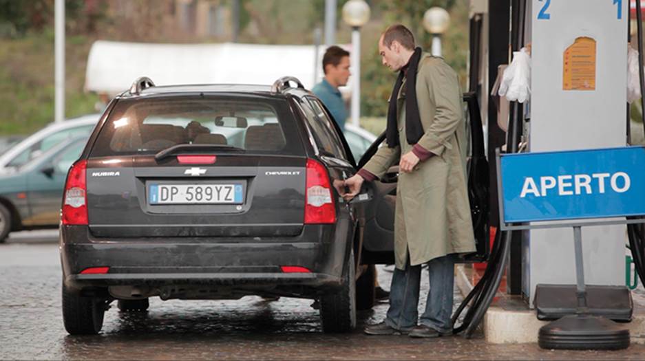
Figure 14-6: Unmodified raw footage before any color adjustments
1. In After Effects, with the shot in a new composition, choose Effect ⇒ Color Correction ⇒ Hue/Saturation.
2. Underneath the Channel Control drop-down, you will find options for something other than the Master saturation. If you decided to leave the blues and kill the warms, you would start with desaturation of the reds and yellows. The Channel Range slider shows exactly what portion of the color spectrum will be affected, and this range can be expanded. The innermost squares indicate full selection, and the triangles on either side show the slow falloff of this effect. On this one, there’s only a little bit of red in the taillights, and it disappears quickly; set this to taste depending on how far you’re pushing the look.
3. Now you can add a contrast change to make the scene more severe. Instead of the obvious Brightness & Contrast, you can do the same with Effect ⇒ Color Correction ⇒ Levels.
4. The “mountain range” that you see is the Histogram display, a very useful image-analysis tool if you know how to read it (Figure 14-7). On the left side of the mountains are the black values, the midtones are in the center of the display, and everything to the right is highlights. There are 255 discrete spikes on this display; the height of those spikes indicates how much of a particular value is present in the shot. According to this, we have a properly exposed shot with not a lot of pure black but a good midrange and a moderate number of highlights. That certainly agrees with what the image looks like to the eye, and we now know where to begin.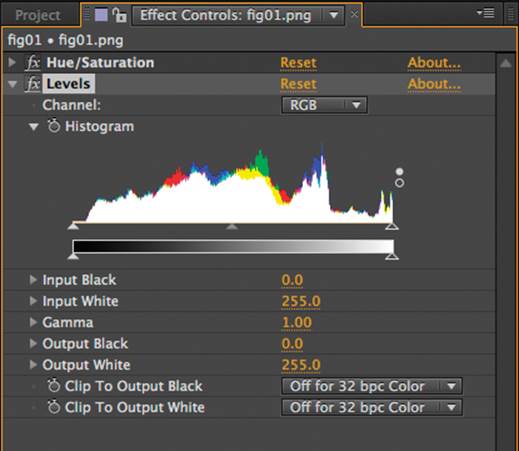
Figure 14-7: “There’s gold in them thar hills!” The histogram in Adobe After Effects.
5. The first triangle beneath the histogram is the Input Black level. If you raise this (dragging it to the right), you cause values that were formerly almost black to become totally black. This is also referred to as crushing the blacks and is something you want to do only with caution. Some information will be lost in these areas, and although it is limited to grain, there may be shadow detail that can be flattened in the process. To keep this data, don’t push the slider past the start of the “foothills” at the left of the histogram.
6. When the triangle is aligned with the beginning of those mountains, a value of about 8.0 appears in the Input Black option. Anything more than that on this shot and you are losing data. On the top (right side), you also don’t want to risk losing detail in the highlights. On this clip, you have nowhere to go without washing out something in the top end. What to do? If you are willing to lose some detail, you can push it, but raising contrast is about lowering the range of values, and you haven’t touched the midrange yet.
7. Gamma describes the middle of the video value and is represented by the gray triangle in the middle of the histogram. Move the Gamma slider to the right, and the contrast increases. The closer together the gray and white sliders are, the more contrast there is. If this has changed your exposure and you want to push the effect further, grab the right triangle (Input White) now and drag it in toward the gray. The gray keeps its distance, and the shot gets brighter and crunchier still (at the cost of some detail) (Figure 14-8).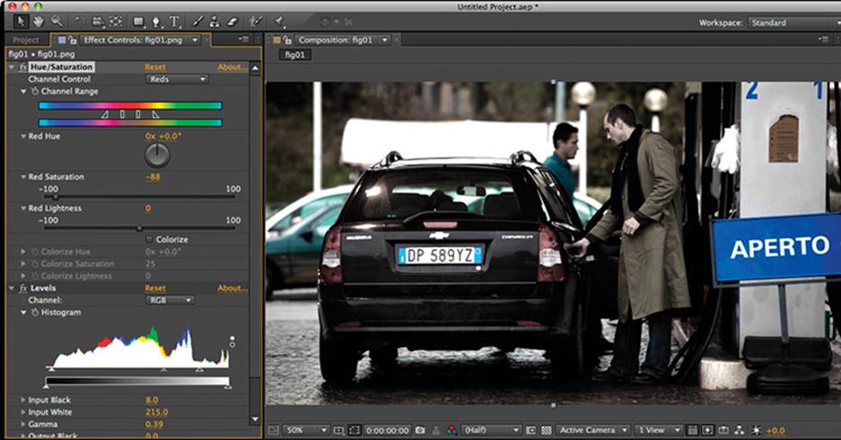
Figure 14-8: The crunchy version of the shot, stripped of warm colors…
You could finish this off with a tint (Figure 14-9) and really cool off the shot, making it more stylized yet.
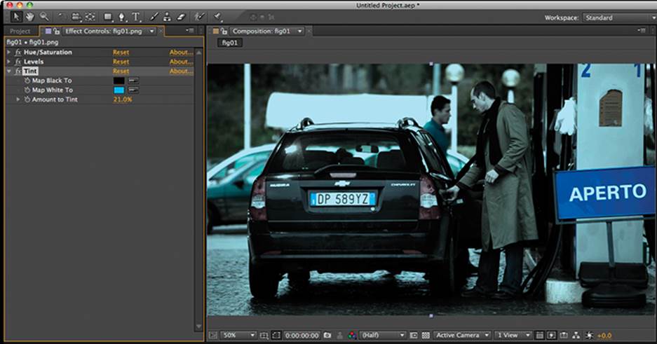
Figure 14-9: …and tinted a cold steel blue
Faux Lens Effects
The wise DSLR shooter has been warned about keeping a flat picture profile to expand creative options in post. (This means you, because you read Chapter 3, “Testing and Custom Settings,” where we recommended this.) Besides mimicking the traditional film process, this expands your creative options. Nowhere is this more evident than when you try to replicate the types of attenuation that cinematographers have traditionally stuck in front of their lens.
Diffusing Your Footage
Placing diffusion filters in front of the lens is a time-honored technique to soften the image, bloom the highlights, and otherwise impart an otherworldly or heavenly character to the shot. Check out the classic Star Trek TV series to see how it was conventionally used to soften the close-ups, especially on the female crew members. Hollywood myth suggests that some actresses even required it in their contracts, and numerous films from the 1970s and 1980s relied on Pro-Mist and Fog filters to create their low-contrast look. With the DSLR look firmly entrenched in today’s digital films, some shooters may be looking for a way to distance themselves from their off-the-shelf colleagues. Diffusion can quickly take your image out of that thick-blacks/high-contrast HD look and into a more retro filmic space.
Digital compositing has made it possible to save this trick until post-production, where it can be fine-tuned infinitely. If you shoot with diffusion on the lens, you are married to it—this effect is not reversible. Creating a mist or fog filter style with software is a simple and infinitely adjustable effect but can be very render intensive and will take time to produce.
The principle is the same in all software: take a second, blurred copy of the footage and layer it atop the original. From here, the opacity of the soft copy is attenuated, either with a dip in transparency or by using a compositing mode or “transfer mode” that best replicates the filter experience. Since the effect of fog filters was seen most clearly in the highlights of the picture, this means using a “screen” or “add” compositing mode on the top layer. The power of the effect is controlled by the amount of blur or the opacity of the top layer. The brightness of the effect is determined by the compositing mode—“screen” is less overpowering than “add.”
1. Regardless of software platform, the principle here is the same. Import your footage and place it in a composition.
2. Duplicate the layer (Cmd+D in After Effects) and set the compositing mode to Screen (Figure 14-10). At this point, the luminance of the image increases, because the color values of the top layer are being added to those of the bottom layer.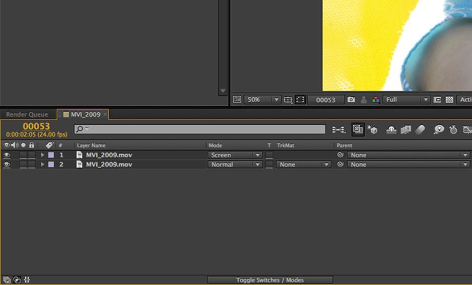
Figure 14-10: Two layers are better than one when replicating a diffusion filter.
3. To the top layer, add a Gaussian blur (Effect ⇒ Blur & Sharpen ⇒ Gaussian Blur). Depending on the resolution of your footage and the level of diffusion you want, you can crank the Blurriness value fairly high. In Figure 14-11, a value of 20 creates a classic gauzy filter look; you can see the luminance jump in the before and after comparison (Figure 14-12).
4. If you don’t want this trick forcing your exposure up, experiment with color correction before the blur operation on the top layer; this is a way to control what part of the image blooms. A Levels adjustment like the one illustrated shows a way to clamp the effect and get it out of the dark parts of the image by raising the Input Black and lowering the Input White on the diffusion layer. This version lacks the great equalizing effect on the midtones, particularly on skin, but gets your exposure back in the intended ballpark (Figure 14-13).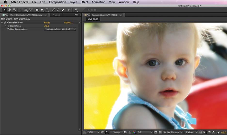
Figure 14-11: Hazy, fuzzy goodness is a click away.
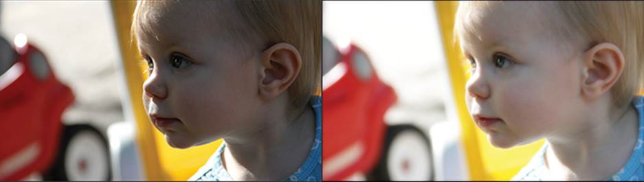
Figure 14-12: Before and after, you can see the luminance leap, thanks to the “screen” compositing mode.
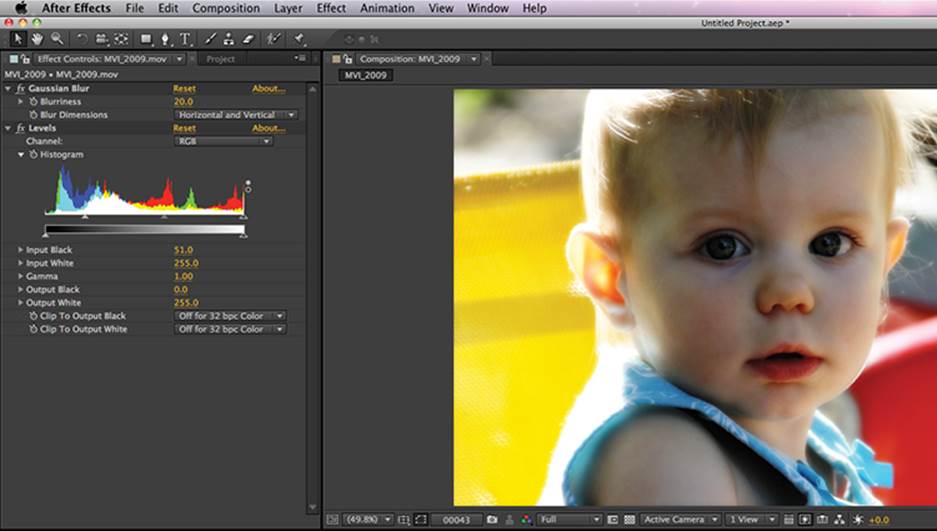
Figure 14-13: Crushing the blacks on the top layer is legal, because you’re using only the brightness information from that layer.
Applying Color, Filters, or Tints
Another piece of photographic attenuation that can be simulated in the post process is color filters. If you are shooting as raw and as flat as you can in production, it is likely you didn’t put one of these between you and your subject. No matter, because with the digital realm, you instantly have every color of filter imaginable, at a fraction of the cost, each with infinite control.
The shot of the actor in the field in Figure 14-14 could go a number of ways. Let’s say for story purposes that this is dawn, which the soft light suggests. You can use color to up the romance factor in a shot like this, when nature fails to deliver on a spectacular sunrise, for example.
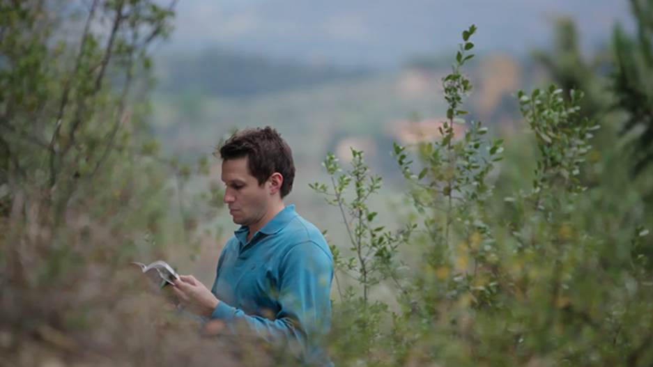
Figure 14-14: The original misty morning plate
1. Start with a tint and add color correction to enhance it. In After Effects, selecting Effect ⇒ Color Correction ⇒ Tint is similar to most programs, in that you have a color swatch and some value sliders to indicate the percentage of dial back between original (no tint) and 100 percent (totally tinted). Typically, the white value is changed to a color, which can be oversaturated and brighter than you might need, and then the percentage is dialed back. Using the Hue picker in the ensuing prompt allows you to audition new looks quickly; just move the slider up and down through the options until you see something you like (Figure 14-15).
2. Dialing the percentage back to 20 percent on this shot makes the pre-dawn color more believable.
3. Finally, a gentle midtone adjustment with a Curves effect tunes the exposure to something more appealing (Figure 14-16). Try some other color variations here for a different effect, or home in on the ones that are typically used in cinema.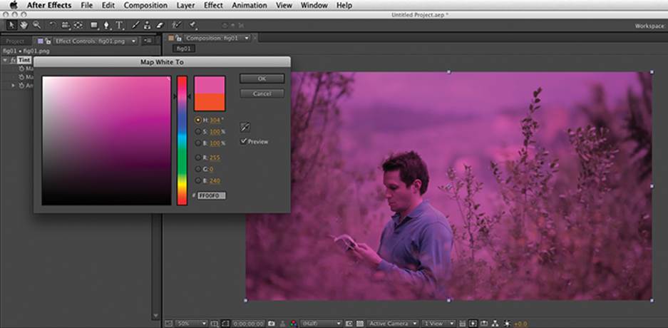
Figure 14-15: The Color Picker in After Effects. It’s like owning every single color filter they make!
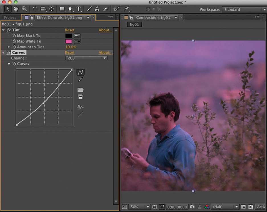
Figure 14-16: A dip in the Gamma via a Curves effect. Just click the line to add more controls; one or two is all it takes.
Need a graduated filter, such as for a sky? Apply the tint on an adjustment layer, and mask the layer with a heavily feathered mask at the top of the shot (Figure 14-17). Bam, instant Michael Bay!
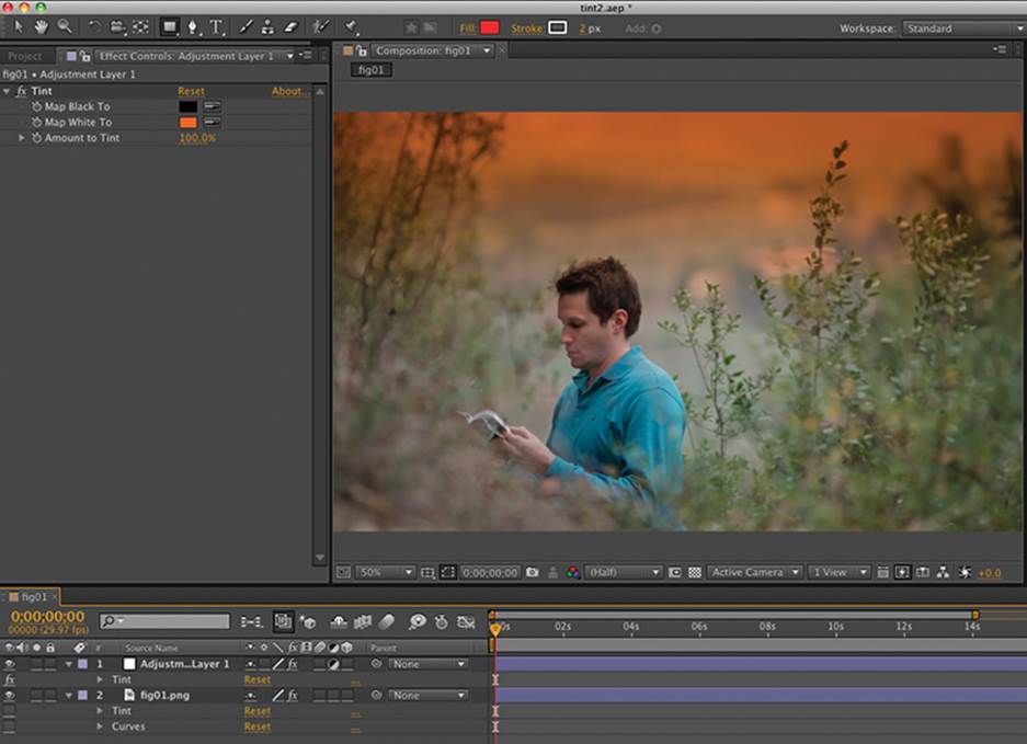
Figure 14-17: Miami Vice? Duran Duran video? Adding a feathered mask to a Tint filter.
Behind-the-Lens Fakery
In addition to the traditional filters in front of the lens, you can also replicate the artifacts that happen in or behind the lens.
Adding Vignettes
Let’s add some additional photographic artifacts to the existing shot. Since a vignette occurs at the edge of the frame, it can be overlooked by most people. The traditional and compelling reason to use one is that it helps push the eye into the shot. As with most of our tricks, you can attenuate the amount of the effect to taste, unlike the real thing.
1. For this, use a solid layer set to a suitable dark color, such as a dark gray (Figure 14-18). Vignettes occur in real life when elements of the lens shadow the image plane, so this should be black or dark gray, but you can introduce color here for artistic purposes to, say, warm it up.
2. Switch the compositing mode to Multiply.
3. Create a new mask by using the Rounded Rectangle mask tool (click and hold the mask icon to see other shape options). Click and drag a mask slightly smaller than the frame, but before you release the mouse button, use the up/down arrow buttons to increase/decrease the roundness of the corners (Figure 14-19). A big round corner here is good.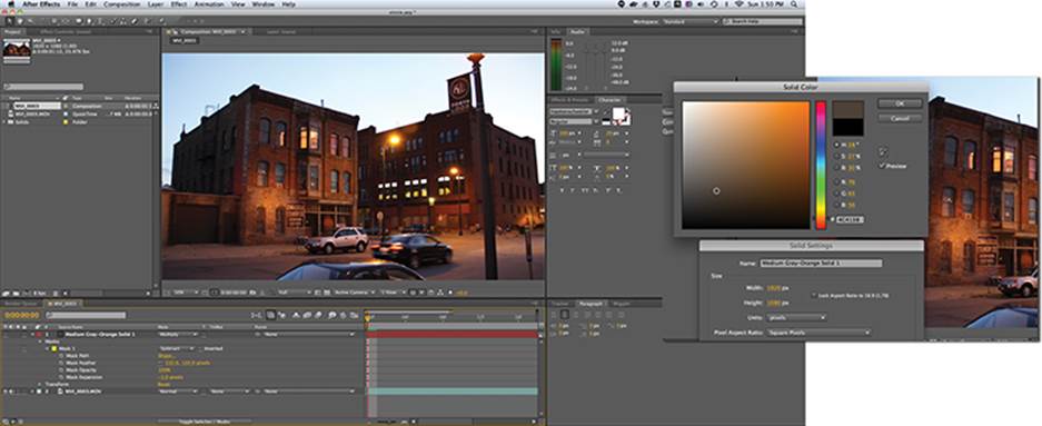
Figure 14-18: Original shot without any effect applied (top). A warm gray solid layer is chosen to complement the shot (bottom).
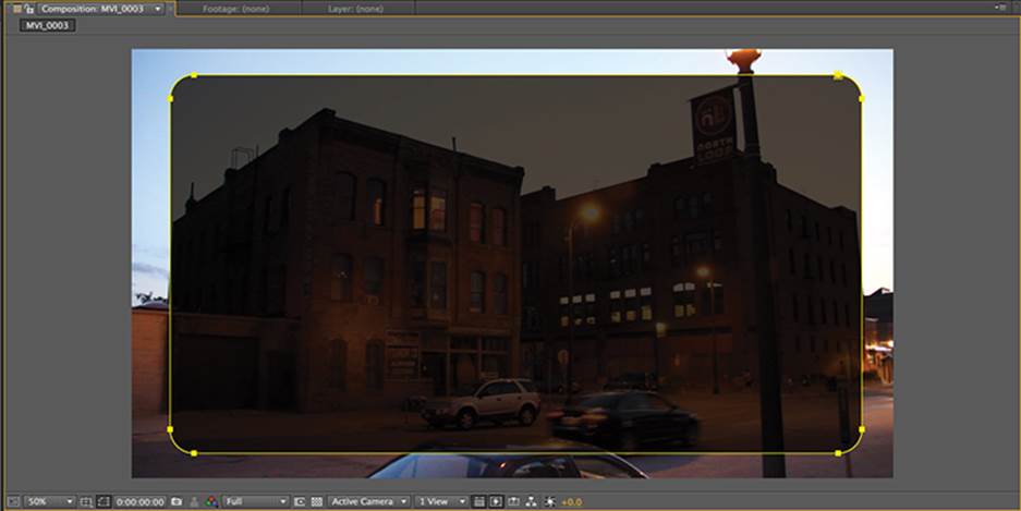
Figure 14-19: By default, the mask defines what is kept. The Rounded Rectangle mask is used to describe the vignette’s shape.
4. The default for masks is to add, meaning the selection is kept and the outside is thrown away, so you need to switch the mask mode to Subtract, which will create a gray border in the shot (Figure 14-20).
5. Now feather that mask to taste. If the effect is too strong, you can either dial down the opacity of the layer or use the Mask Expansion parameter to dial it away from the edge, which should appear as though you are scaling the vignette (Figure 14-21). Useful hint: hit the M key twice to reveal all the properties of the mask.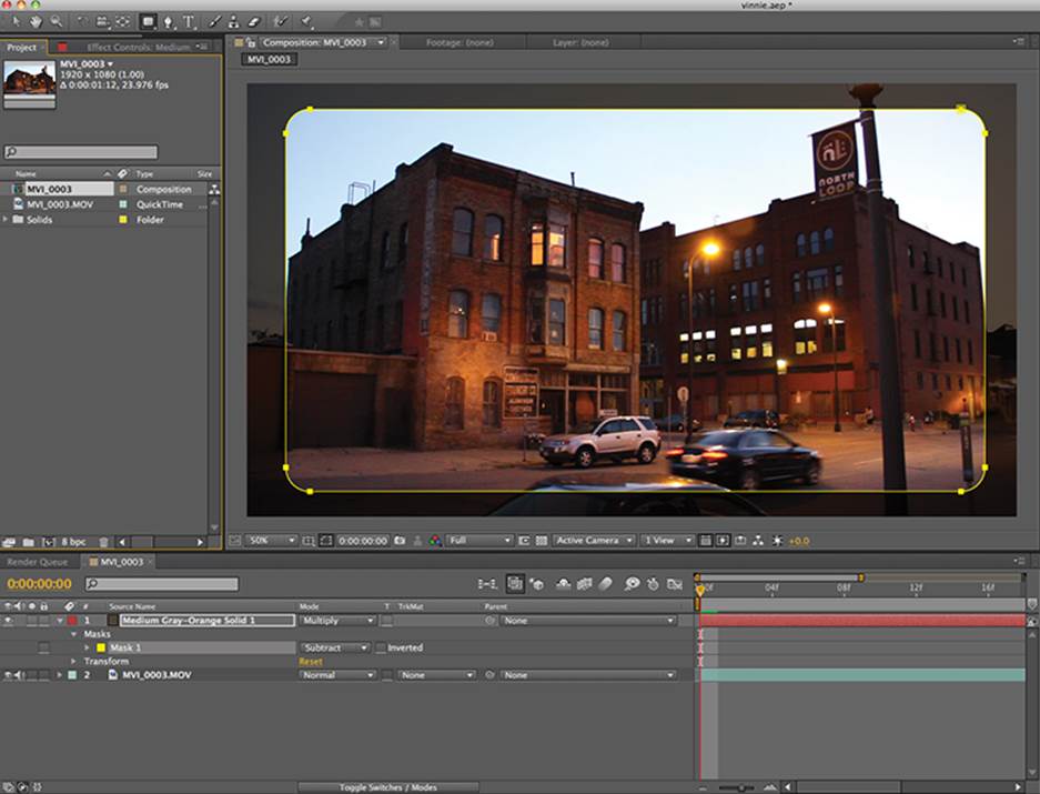
Figure 14-20: Invert the selection by choosing Subtract in the mask parameters. Note the use of Multiply as the compositing mode.
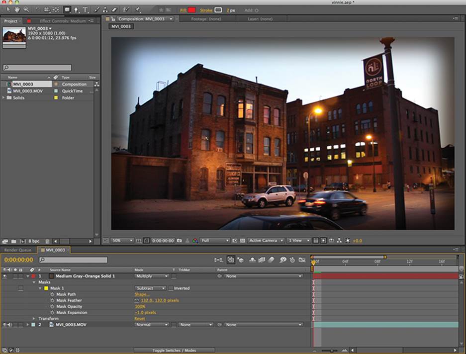
Figure 14-21: The Mask Feather and Expansion controls now give you a perfectly adjustable vignette.
Understanding Grain
We are in the age of high-fidelity moviemaking. Our picture is bigger and clearer, and our sound is bigger and clearer. The rise of high-resolution digital acquisition and distribution on Blu-ray and HDTV has made picture clarity and sharpness a priority. Technically, the DSLR user is on the bottom end of the high end in terms of resolution, but we’ve already come to grips with that. What we haven’t faced yet is the threat of grain and noise.
If you’re shooting film, that minute hairy, fuzzy, sandy particle stuff in every frame is called grain, and it’s a by-product of the photochemical process. Film grain varies in size and shape and is substantially different on each color layer of the celluloid. In the DSLR image sensor the equivalent is noise, which is most noticeable on high ISO footage but present everywhere. Noise varies in amplitude based on subtle variations in the image-generating device. Noise is assumed to be 1 pixel in size, although you can get noise of similar values in adjacent pixels, which gives the illusion of bigger blocks of noise.
Some high-end digital formats are so devoid of grain that filmmakers were initially unprepared to deal with it. The 2008 film Speed Racer was shot on a system (the Sony F23 camera) whose spotless image had to be specially treated when it was discovered that skin complexion problems normally hidden by the film grain were undesirably amplified.
For the DSLR user in post, grain is an opportunity to make their digital movie look more like a celluloid film. In an age of super clarity, a grainy movie can stand out or provide a gritty texture for a subject matter that benefits from it. Want to really get out of the commonplace DSLR look fast? Imagine a black-and-white picture grained to the gills like Darren Aronofsky’s Pi. Film grain effects often ship with software or are available as a third-party plug-in, and many of these even faithfully replicate the look of specific commercial 35 mm film stock by Kodak or Fuji. While these are great, here’s a recipe that renders faster and looks just as good because it’s made from the real thing.
Making Genuine Film-Grained Footage
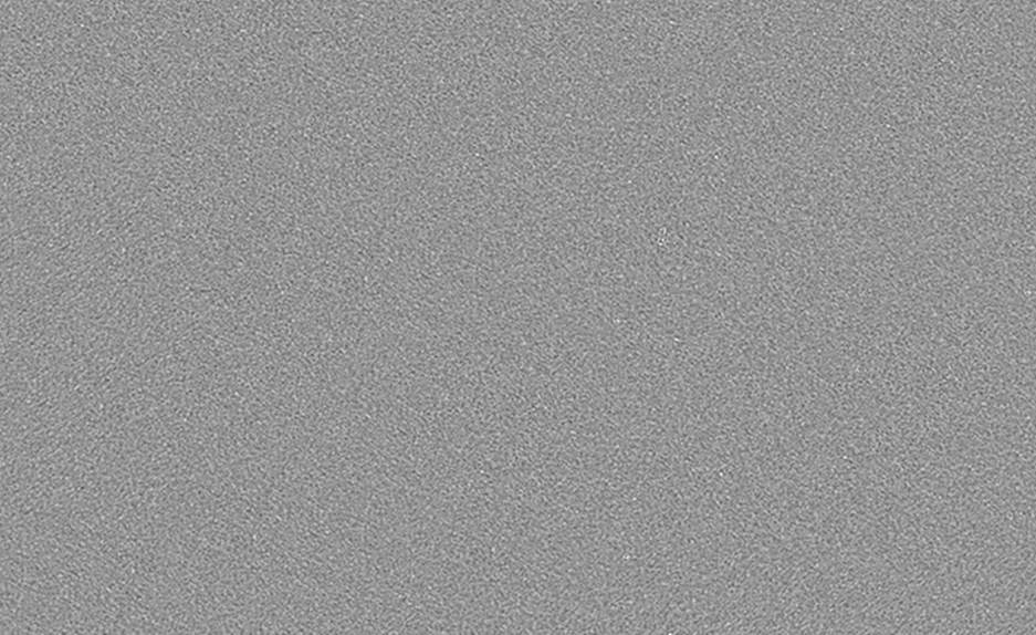
Figure 14-22: Example of scanned film grain, 2X enlarged
For this ultrarealistic film grain recipe, you need a large still image of film grain. The best type is scanned from real film, at which point you will see truly organic variation in size and amplitude. The bigger it is, the easier it will be to vary the effect from frame to frame, because you’re going to be rapidly moving it in front of your footage (Figure 14-22). Search film grain or scanned film grain on the Web, and you might find some good high-resolution examples. The important thing is that the average luminance value is 50 percent gray or thereabouts. Anything darker or lighter will not have the same effect. If you need to alter the characteristics of the grain, you can do so in Photoshop prior to compositing with a simple Levels or Curves adjustment.
Can’t find a real film grain plate? Here’s a decent facsimile that can be produced in Adobe Photoshop. Create a new document that is 4096 pixels by 2294 pixels. Fill the background with 50 percent gray. Apply a noise filter (Filter ⇒ Noise ⇒ Add Noise). Set the Amount to 7 percent and the Distribution to Gaussian. Be sure to hit the Monochromatic button at the bottom of the prompt and hit OK. This is close enough to the real thing to fool most people, but because it is procedurally generated by the computer, it lacks the organic flaws of the real thing.
1. Import your video and grain plate into After Effects.
2. Create a new composition based exactly on the video footage settings by dragging it to the Create A New Composition button located at the bottom of the Project window.
3. Put the grain layer on top of the video in the timeline. The grain should cover and obscure the picture beneath entirely; in the example shown (Figure 14-23), the grain plate is 4K in size, so there is a lot of room to wiggle it in front of the picture.
Figure 14-23: This grain plate is about twice the size of the original HD picture, and that’s good.
4. At the bottom of the timeline, click the Toggle Switches/Modes button, which will reveal the layer’s mode of compositing. By default it is set to Normal. We will use Soft Light for a natural, realistic film grain (Figure 14-24). Feel free to experiment with other looks, such as Overlay for a slightly crunchier grain.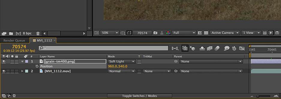
Figure 14-24: The Soft Light blending mode composites the grain over the footage in a subtle and realistic way.
5. Twirl the down arrow to reveal the grain plate’s Position parameter.
6. We will use a simple expression to drive an infinite amount of animation in After Effects. Expressions are very powerful formulas that can make life easier in After Effects, but they come with a learning curve that is steep for many. To enable expressions on any parameter (Figure 14-25), simply Alt-click the stopwatch normally reserved for animation. Upon doing so, the parameter’s values turn red and the default expression “transform.position” appears just to the right in the Expression field of the timeline. Single-click the words to open the field, and type wiggle(24,1000). With expressions, the spacing and case are essential. Lowercase letters and no spaces are correct here. The first number tells the software how often to move the grain plate per second, in this case once per frame of our 24 frames per second. The second number tells us how many pixels it’s going to move it on both the X (horizontal) and Y (vertical) axes. Hit the Enter key, not the Return key, to accept the value. Experiment with the values if needed to make the plate fit the shot; remember that it needs to cover the whole image to work.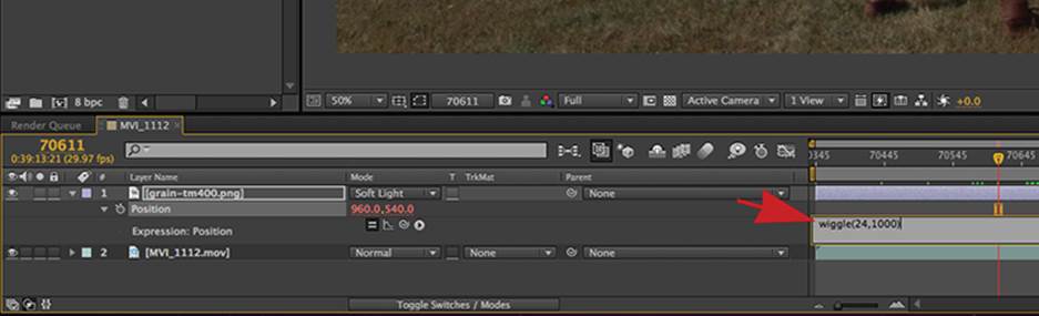
Figure 14-25: A wiggle expression makes short work of random animation in After Effects.
7. If you scrub through the timeline, you can see the grain plate bouncing rapidly from position to position. As you can see here, this has a good random scatter going on (Figure 14-26). Preview the grain by itself by soloing the layer and see whether it looks like random noise or a picture being shaken wildly. If you can see it reposition, you need a higher value in your expression.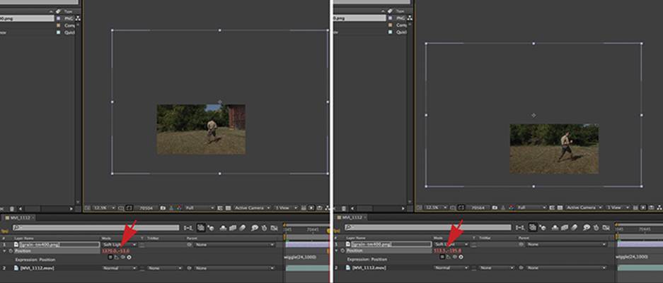
Figure 14-26: The wiggled grain: infinite, random animation at a fraction of the cost of hand animation
8. Compare the before and after pictures. You’ll love what this does to skin tones and motion-blurred footage, and though the results will be subtle down the road (compression and distribution media will seem to eat this stuff up), if you’re taking care of your data, this will lend a timeless analog look to your footage (Figure 14-27).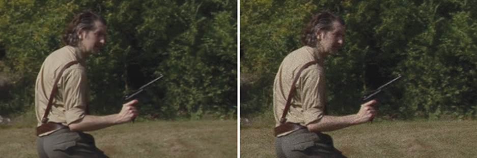
Figure 14-27: Subtly filmic, without the lab costs
Removing Banding
Let’s say you’ve discovered that the incredible shot of the character emerging from the morning mist, which looked so brilliant in person and on the monitor, now looks like something from a low-resolution video game. Guess what, you got dithered!
When a highly compressed 8-bit system like DSLR meets a smooth gradient, it must make a choice about the fidelity, and it always chooses to emphasize luminance and detail over large, slowly attenuated patches of color. And that’s great, because most of your image is fine detail. But you can run into this banding in any gradient, everything from a soft shadow on a wall to a clear blue sky. The fix is simple but requires that you be working in a color space higher than the conventional 8-bit.
Check your software’s documentation about working in 10-bit or 16-bit color before proceeding. Banding can be eliminated by up-converting your shot to 16-bit and then adding a small amount of grain to the shot. The grain keeps the fine detail but breaks up the borders of the offensive banding, restoring a semblance of the original fidelity.
Remember that almost every post-production trick takes your footage out of the first generation and requires that it be re-rendered. Re-rendering already-compressed footage can have deleterious effects that may be detected by seasoned professionals and obsessive-compulsive people (and in most cases these are the same folks). But the benefit of changing something that is plain wrong always outweighs a few compression artifacts that the average moviegoer is unaware of.
All materials on the site are licensed Creative Commons Attribution-Sharealike 3.0 Unported CC BY-SA 3.0 & GNU Free Documentation License (GFDL)
If you are the copyright holder of any material contained on our site and intend to remove it, please contact our site administrator for approval.
© 2016-2026 All site design rights belong to S.Y.A.