Android Application Development: A Beginner's Tutorial (2015)
Chapter 10. Styles and Themes
The look and feel of an application are governed by the styles and themes it is using. This chapter discusses these two important topics and shows you how to use them.
Overview
A view declaration in a layout file can have attributes, many of which are style-related, including textColor, textSize, background, and textAppearance.
Style-related attributes for an application can be lumped in a group and the group can be given a name and moved to a styles.xml file. A styles.xml file that is saved in the res/values directory will be recognized by the application as a styles file and the styles in the file can be used to style the views in the application. To apply a style to a view, use the style attribute. The advantage of creating a style is to make the style reusable and shareable. Styles support inheritance so you can extend a style to create a new style. Here is an example of a style in a styles.xml file.
<style name="Style1">
<item name="android:layout_width">wrap_content</item>
<item name="android:layout_height">wrap_content</item>
<item name="android:textColor">#FFFFFF</item>
<item name="android:textStyle">bold</item>
<item name="android:textSize">25sp</item>
</style>
To apply the style to a view, assign the style name to the style attribute.
<TextView
android:id="@+id/textView1"
style="@style/Style1"
android:text="Style 1"/>
Note that the style attribute, unlike other attributes, does not use the android prefix. So, it’s style and not android:style.
The TextView element declaration above is equivalent to the following.
<TextView
android:id="@+id/textView1"
android:layout_width="wrap_content"
android:layout_height="wrap_content"
android:textColor="#FFFFFF"
android:textStyle="bold"
android:textSize="25sp"
android:text="Style 1"/>
The following is a style that extends another style.
<style name="Style2" parent="Style1">
<item name="android:background">
@android:color/holo_green_light
</item>
</style>
The system provides a vast collection of styles you can use in your applications. You can find a reference of all available styles in the android.R.style class. To use the styles listed in this class in your layout file, replace all underscores in the style name with a period. For example, you can apply the Holo_ButtonBar style with @android:style/Holo.ButtonBar.
<Button
style="@android:style/Holo.ButtonBar"
android:text="@string/hello_world"/>
Prefixing the value of the style attribute with android indicates that you are using a system style.
A copy of the system styles.xml file can be viewed here:
https://android.googlesource.com/platform/frameworks/base/+/refs/
heads/master/core/res/res/values/styles.xml
Using Styles
The StyleDemo1 application shows how you can create your own styles.
Listing 10.1 shows the application’s styles.xml file in the res/values directory.
Listing 10.1: The styles.xml file
<resources
xmlns:android="http://schemas.android.com/apk/res/android">
<!-- Base application theme, dependent on API level. This theme
is replaced by AppBaseTheme from res/values-vXX/styles.xml
on newer devices.
-->
<style name="AppBaseTheme" parent="android:Theme.Light">
<!-- Theme customizations available in newer API levels can
go in res/values-vXX/styles.xml, while customizations
related to backward-compatibility can go here.
-->
</style>
<!-- Application theme. -->
<style name="AppTheme" parent="AppBaseTheme">
<!-- All customizations that are NOT specific to a
particular API-level can go here. -->
</style>
<style name="WhiteOnRed">
<item name="android:layout_width">wrap_content</item>
<item name="android:layout_height">wrap_content</item>
<item name="android:textColor">#FFFFFF</item>
<item name="android:background">
@android:color/holo_red_light
</item>
<item name="android:typeface">serif</item>
<item name="android:textStyle">bold</item>
<item name="android:textSize">25sp</item>
<item name="android:padding">30dp</item>
</style>
<style name="WhiteOnRed.Italic">
<item name="android:textStyle">bold|italic</item>
</style>
<style name="WhiteOnGreen" parent="WhiteOnRed">
<item name="android:background">
@android:color/holo_green_light
</item>
</style>
</resources>
There are five styles defined in the styles.xml file in Listing 10.1. The first two are added by Android Studio when the application was created. They will be explained in the “Themes” section later in this chapter.
The other three styles are used by the main activity of the application in the layout file for that activity. The layout file is shown in Listing 10.2.
Listing 10.2: the activity_main.xml layout file
<RelativeLayout
xmlns:android="http://schemas.android.com/apk/res/android"
xmlns:tools="http://schemas.android.com/tools"
android:layout_width="match_parent"
android:layout_height="match_parent"
android:paddingBottom="@dimen/activity_vertical_margin"
android:paddingLeft="@dimen/activity_horizontal_margin"
android:paddingRight="@dimen/activity_horizontal_margin"
android:paddingTop="@dimen/activity_vertical_margin"
tools:context=".MainActivity" >
<TextView
android:id="@+id/textView1"
style="@style/WhiteOnRed"
android:text="Style WhiteOnRed" />
<TextView
android:id="@+id/textView2"
android:layout_below="@id/textView1"
android:layout_marginLeft="20sp"
android:layout_marginTop="10sp"
style="@style/WhiteOnRed.Italic"
android:text="Style WhiteOnRed.Italic" />
<TextView
android:id="@+id/textView3"
android:layout_below="@id/textView2"
android:layout_toEndOf="@id/textView2"
style="@style/WhiteOnGreen"
android:text="Style WhiteOnGreen" />
<TextView
android:id="@+id/textView4"
android:text="Style TextAppearance.Holo.Medium.Inverse"
android:layout_below="@id/textView2"
android:layout_width="wrap_content"
android:layout_height="wrap_content"
style="@android:style/TextAppearance.Holo.Medium"/>
</RelativeLayout>
Listing 10.3 shows the activity that uses the layout file in Listing 10.2.
Listing 10.3: The MainActivity class
package com.example.styledemo1;
import android.os.Bundle;
import android.app.Activity;
import android.view.Menu;
public class MainActivity extends Activity {
@Override
protected void onCreate(Bundle savedInstanceState) {
super.onCreate(savedInstanceState);
setContentView(R.layout.activity_main);
}
@Override
public boolean onCreateOptionsMenu(Menu menu) {
// Inflate the menu; this adds items to the action bar if it
// is present.
getMenuInflater().inflate(R.menu.menu_main, menu);
return true;
}
}
Figure 10.1 shows the StyleDemo1 application.
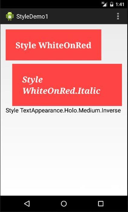
Figure 10.1: Using styles
Using Themes
A theme is a style that is applied to an activity or all the activities in an application. To apply a theme to an activity, use the android:theme attribute in the activity element in the manifest file. For example, the following activity element uses the Theme.Holo.Light theme.
<activity
android:name="..."
android:theme="@android:style/Theme.Holo.Light">
</activity>
To apply a theme to the whole application, add the android:theme attribute in the application element in the Android manifest file. For instance,
<application
android:icon="@drawable/ic_launcher"
android:label="@string/app_name"
android:theme="@android:style/Theme.Black.NoTitleBar">
...
</application>
Android provides a collection of themes you can use in your application. A copy of the theme file can be found here:
https://android.googlesource.com/platform/frameworks/base/+/refs/
heads/master/core/res/res/values/themes.xml
Figure 10.2 to 10.4 show some of the themes that comes with Android.
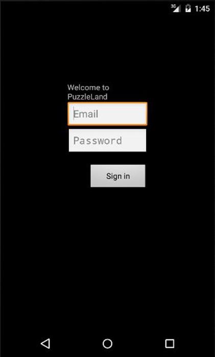
Figure 10.2: Theme.Holo.Dialog.NoActionBar
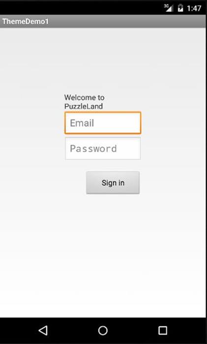
Figure 10.3: Theme.Light
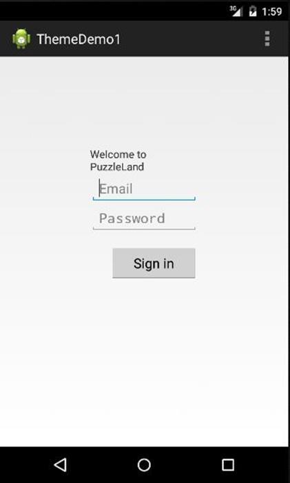
Figure 10.4: Theme.Holo.Light.DarkActionBar
Summary
A style is a collection of attributes that directly affect the appearance of a view. You can apply a style to a view by using the style attribute in the view’s declaration in a layout file. A theme is a style that is applied to an activity or the entire application.
All materials on the site are licensed Creative Commons Attribution-Sharealike 3.0 Unported CC BY-SA 3.0 & GNU Free Documentation License (GFDL)
If you are the copyright holder of any material contained on our site and intend to remove it, please contact our site administrator for approval.
© 2016-2026 All site design rights belong to S.Y.A.