Android Application Development: A Beginner's Tutorial (2015)
Chapter 3. UI Components
One of the first things you do when creating an Android application is build the user interface (UI) for the main activity. This is a relatively easy task thanks to the ready-to-use UI components that Android provides.
This chapter discusses some of the more important UI components.
Overview
The Android SDK provides various UI components called widgets that include many simple and complex components. Examples of widgets include buttons, text fields, progress bars, etc. In addition, you also need to choose a layout for laying out your UI components. Both widgets and layouts are implementations of the android.view.View class. A view is a rectangular area that occupies the screen. View is one of the most important Android types. However, unless you are creating a custom view, you don’t often work with this class directly. Instead, you often spend time choosing and using layouts and UI components for your activities.
Figure 3.1 shows some Android UI components.
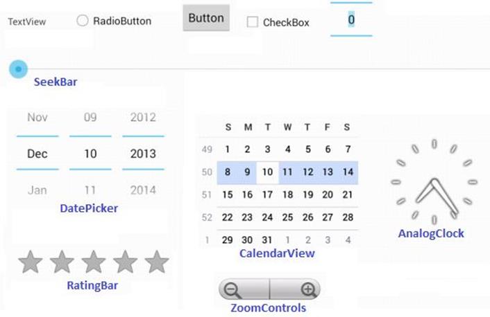
Figure 3.1: Android UI components
Using the Android Studio UI Tool
Creating a UI is easy with Android Studio. All you need is open the layout file for an activity and drag and drop UI components to the layout. The activity files are located in the res/layout directory of your application.
Figure 3.2 shows the UI tool for creating Android UI. This is what you see when you open an activity file. The tool window is divided into three main areas. On the left are the widgets, which are grouped into different categories such as Layouts, Widgets, Text Fields, Containers, etc. Click on the tab header of a category to see what widgets are available for that category.
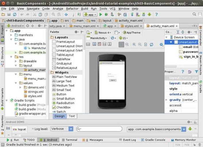
Figure 3.2: Using the UI tool
To choose a widget, click on the widget and drag it to the activity screen at the center. The screen in Figure 3.2 shows two text fields and a button. You can also view how your screen will look like in different devices by choosing a device from the Devices drop-down.
Each widget and layout has a set of properties derived from the View class or added to the implementation class. To change any of these properties, click on the widget on the drawing area or select it from the Outline pane in the Structure window on the right. The properties are listed in the small pane under the Layout pane.
What you do with the UI tool is reflected in the layout file, in the form of XML elements. To see what has been generated for you, click the XML view at the bottom of the UI tool.
Using Basic Components
The BasicComponents project is a simple Android application with one activity. The activity screen contains two text fields and a button.
You can either open the accompanying application or create one yourself by following the instructions in Chapter 1, “Getting Started.” I will explain this project by presenting the manifest for the application, which is an XML file named AndroidManifest.xml located directly under the root directory.
Listing 3.1 shows the AndroidManifest.xml for the BasicComponents project.
Listing 3.1: The manifest for BasicComponents
<?xml version="1.0" encoding="utf-8"?>
<manifest xmlns:android="http://schemas.android.com/apk/res/android"
package="com.example.basiccomponents"
android:versionCode="1"
android:versionName="1.0">
<uses-sdk
android:minSdkVersion="8"
android:targetSdkVersion="17" />
<application
android:allowBackup="true"
android:icon="@drawable/ic_launcher"
android:label="@string/app_name"
android:theme="@style/AppTheme" >
<activity
android:name="com.example.basiccomponents.MainActivity"
android:label="@string/app_name" >
<intent-filter>
<action android:name="android.intent.action.MAIN"/>
<category
android:name="android.intent.category.LAUNCHER"/>
</intent-filter>
</activity>
</application>
</manifest>
The first thing to note is the package attribute of the manifest tag, which specifies com.example.basiccomponents as the Java package for the generated classes. Also note that the application element defines one activity, the main activity. The application element also specifies the icon, label, and theme for this application.
android:icon="@drawable/ic_launcher"
android:label="@string/app_name"
android:theme="@style/AppTheme">
It is good practice to reference a resource (such as an icon or a label) indirectly, like what I am doing here. @drawable/ic_launcher, the value for android:icon, refers to a drawable (normally an image file) that resides under the res/drawable directory. ic_launcher can mean anic_launcher.png or ic_launcher.jpg file.
All string references start with @string. In the example above, @string/app_name refers to the app_name key in the res/values/strings.xml file. For this application, the strings.xml file is given in Listing 3.2.
Listing 3.2: The strings.xml file under res/values
<?xml version="1.0" encoding="utf-8"?>
<resources>
<string name="app_name">BasicComponents</string>
<string name="action_settings">Settings</string>
<string name="prompt_email">Email</string>
<string name="prompt_password">Password</string>
<string name="action_sign_in"><b>Sign in</b></string>
</resources>
Let’s now look at the main activity. There are two resources concerned with an activity, the layout file for the activity and the Java class that derives from android.app.Activity. For this project, the layout file is given in Listing 3.3 and the activity class (MainActivity) in Listing 3.4.
Listing 3.3: The layout file
<LinearLayout
xmlns:android="http://schemas.android.com/apk/res/android"
xmlns:tools="http://schemas.android.com/tools"
android:layout_width="match_parent"
android:layout_height="match_parent"
android:layout_gravity="center"
android:gravity="center_horizontal"
android:orientation="vertical"
android:padding="120dp"
tools:context=".MainActivity" >
<EditText
android:id="@+id/email"
android:layout_width="match_parent"
android:layout_height="wrap_content"
android:hint="@string/prompt_email"
android:inputType="textEmailAddress"
android:maxLines="1"
android:singleLine="true" />
<EditText
android:id="@+id/password"
android:layout_width="match_parent"
android:layout_height="wrap_content"
android:hint="@string/prompt_password"
android:imeActionId="@+id/login"
android:imeOptions="actionUnspecified"
android:inputType="textPassword"
android:maxLines="1"
android:singleLine="true" />
<Button
android:id="@+id/sign_in_button"
android:layout_width="wrap_content"
android:layout_height="wrap_content"
android:layout_gravity="right"
android:layout_marginTop="16dp"
android:paddingLeft="32dp"
android:paddingRight="32dp"
android:text="@string/action_sign_in" />
</LinearLayout>
The layout file contains a LinearLayout element with three children, namely two EditText components and a button.
Listing 3.4: The MainActivity class of Basic Components
package com.example.basiccomponents;
import android.os.Bundle;
import android.app.Activity;
import android.view.Menu;
public class MainActivity extends Activity {
@Override
protected void onCreate(Bundle savedInstanceState) {
super.onCreate(savedInstanceState);
setContentView(R.layout.activity_main);
}
@Override
public boolean onCreateOptionsMenu(Menu menu) {
// Inflate the menu; this adds items to the action bar if it
// is present.
getMenuInflater().inflate(R.menu.menu_main, menu);
return true;
}
}
The MainActivity class in Listing 3.4 is a boilerplate class created by Android Studio. It overrides the onCreate and onCreateOptionsMenu methods. onCreate is a lifecycle method that gets called when the application is created. In Listing 3.4, it simply sets the content view for the activity using the layout file. onCreateOptionsMenu initializes the content of the activity’s options menu. It must return true for the menu to be displayed.
Run the application and you’ll see the activity as shown in Figure 3.3.
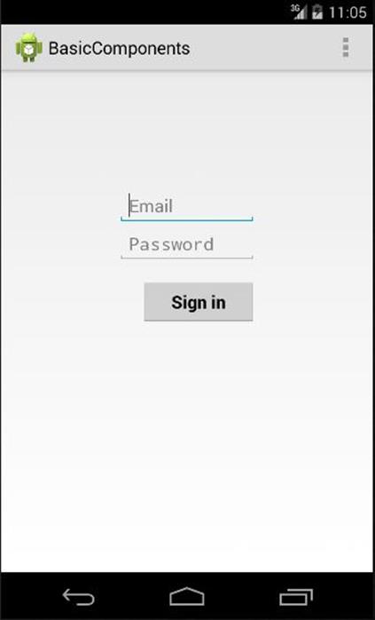
Figure 3.3: The BasicComponents project
Toast
A Toast is a small popup for displaying a message as feedback for the user. A Toast does not replace the current activity and only occupies the space taken by the message.
Figure 3.4 shows a Toast that says “Downloading file...” The Toast disappears after a prescribed period of time.
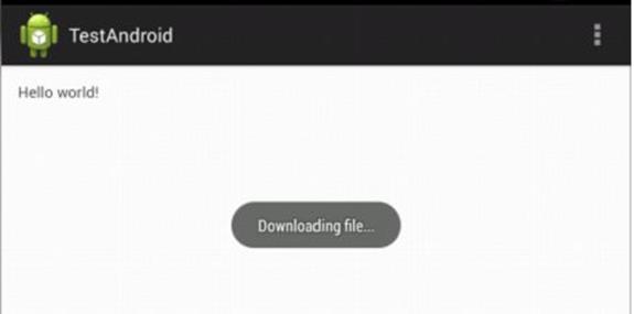
Figure 3.4: A Toast
The android.widget.Toast class is the template for creating a Toast. To create a Toast, call its only constructor that takes a Context as an argument:
public Toast(android.content.Context context)
Toast also provides two static makeText methods for creating an instance of Toast. The signatures of both method overloads are
public static Toast makeText (android.content.Context context,
int resourceId, int duration)
public static Toast makeText (android.content.Context context,
java.lang.CharSequence text, int duration)
Both overloads require that you pass a Context, possibly the active activity, as the first argument. In addition, both overloads take a string, which may come from a strings.xml file or a String object, and the duration of the display for the Toast. Two valid values for the duration are theLENGTH_LONG and LENGTH_SHORT static finals in Toast.
To display a Toast, call its show method. This method takes no argument.
The following code snippet shows how to create and display a Toast in an activity class.
Toast.makeText(this, "Downloading...", Toast.LENGTH_LONG).show();
By default, a Toast is displayed near the bottom of the active activity. However, you can change its position by calling its setGravity method before calling its show method. Here is the signature of setGravity.
public void setGravity(int gravity, int xOffset, int yOffset)
The valid value for gravity is one of the static finals in the android.view.Gravity class, including CENTER_HORIZONTAL and CENTER_VERTICAL.
You can also enhance the look of a Toast by creating your own layout file and passing it to the Toast’s setView method. Here is an example of how to create a custom Toast.
LayoutInflater inflater = getLayoutInflater();
View layout = inflater.inflate(R.layout.toast_layout,
(ViewGroup) findViewById(R.id.toast_layout_root));
Toast toast = new Toast(getApplicationContext());
toast.setView(layout);
toast.show();
In this case, R.layout.toast_layout is the layout identifier for the Toast and R.id.toast_layout_root is the id of the root element in the layout file.
AlertDialog
Like a Toast, an AlertDialog is a window that provides feedback to the user. Unlike a Toast that fades by itself, however, an AlertDialog shows indefinitely until it loses focus. In addition, an AlertDialog can contain up to three buttons and a list of selectable items. A button added to anAlertDialog can be connected to a listener that gets triggered when the button is clicked.
Figure 3.5 shows a sample AlertDialog.
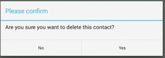
Figure 3.5: An AlertDialog
The android.app.AlertDialog class is the template for creating an AlertDialog. All constructors in this class are protected, so you cannot use them unless you are subclassing the class. Instead, you should use the AlertDialog.Builder class to create an AlertDialog. You can use one of the two constructors of AlertDialog.Builder.
public AlertDialog.Builder(android.content.Context context)
public AlertDialog.Builder(android.content.Context context,
int theme)
Once you have an instance of AlertDialog.Builder, you can call its create method to return an AlertDialog. However, before calling create you can call various methods of AlertDialog.Builder to decorate the resulting AlertDialog. Interestingly, the methods in AlertDialog.Builder return the same instance of AlertDialog.Builder, so you can cascade them. Here are some of the methods in AlertDialog.Builder.
public AlertDialog.Builder setIcon(int resourceId)
Sets the icon of the resulting AlertDialog with the Drawable pointed by resourceId.
public AlertDialog.Builder setMessage(java.lang.CharSequence message)
Sets the message of the resulting AlertDialog .
public AlertDialog.Builder setTitle(java.lang.CharSequence title)
Sets the title of the resulting AlertDialog.
public AlertDialog.Builder setNegativeButton(
java.lang.CharSequence text,
android.content.DialogInterface.OnClickListener listener)
Assigns a button that the user should click to provide a negative response.
public AlertDialog.Builder setPositiveButton(
java.lang.CharSequence text,
android.content.DialogInterface.OnClickListener listener)
Assigns a button that the user should click to provide a positive response.
public AlertDialog.Builder setNeutralButton(
java.lang.CharSequence text,
android.content.DialogInterface.OnClickListener listener)
Assigns a button that the user should click to provide a neutral response.
For instance, the following code produces an AlertDialog that looks like the one in Figure 3.5.
new AlertDialog.Builder(this)
.setTitle("Please confirm")
.setMessage(
"Are you sure you want to delete " +
"this contact?")
.setPositiveButton("Yes",
new DialogInterface.OnClickListener() {
public void onClick(
DialogInterface dialog,
int whichButton) {
// delete picture here
dialog.dismiss();
}
})
.setNegativeButton("No",
new DialogInterface.OnClickListener() {
public void onClick(
DialogInterface dialog,
int which) {
dialog.dismiss();
}
})
.create()
.show();
Pressing the Yes button will execute the listener passed to the setPositiveButton method and pressing the No button will run the listener passed to the setNegativeButton method.
Notifications
A notification is a message on the status bar. Unlike a toast, a notification is persistent and will keep showing until it is closed or the device is shut down.
A notification is an instance of android.app.Notification. The most convenient way to create a notification is by using a nested class called Builder, which can be instantiated by passing a Context. You can then call the build method on the builder to create a Notification.
Notification n = new Notification.Builder(context).build();
The Notification.Builder class has methods to decorate the resulting notification. These methods include addAction, setAutoCancel, setColor, setContent, setContentTitle, setContentIntent, setLargeIcon, setSmallIcon and setSound.
Many of these methods are self-explanatory, but addAction and setContentIntent are of particular importance because you can use them to add an action that will be performed when the user touches the notification. In this case, a notification action is represented by a PendingIntent. Here are the signatures of addAction and setContentIntent, both of which take a PendingIntent.
public Notification.Builder addAction(int icon,
java.lang.CharSequence title,
android.app.PendingIntent intent)
public Notification.Builder setContentIntent(
android.app.PendingIntent intent)
When the user touches the notification, the send method of the PendingIntent will be invoked. See the sidebar for a description of PendingIntent.
setAutoCancel is also important and passing true to it allows the notification to be dismissed when the user touches it on the notification drawer. The notification drawer is an area that opens when you slide down the status bar. The notification drawer shows all notifications that the system have received and have not been dismissed.
The methods in Notification.Builder return the same Builder object, so they can be cascaded:
Notification notification = new Notification.Builder(context)
.setContentTitle("New notification")
.setContentText("You've got one!")
.setSmallIcon(android.R.drawable.star_on)
.setContentIntent(pendingIntent)
.setAutoCancel(false)
.addAction(android.R.drawable.star_big_on,
"Open", pendingIntent)
.build();
To sound a ringtone, flash lights and make the device vibrate, you can OR the defaults flags like so:
notification.defaults|= Notification.DEFAULT_SOUND;
notification.defaults|= Notification.DEFAULT_LIGHTS;
notification.defaults|= Notification.DEFAULT_VIBRATE;
In addition, to make repeating sound, you can set the FLAG_INSISTENT flag.
notification.flags |= Notification.FLAG_INSISTENT;
The PendingIntent Class
A PendingIntent encapsulates an Intent and an action that will be carried out when its send method is invoked. Since a PendingIntent is a pending intent, the action is normally an operation that will be invoked some time in the future, most probably by the system. For example, aPendingIntent can be used to construct a Notification so that something can be made happen when the user touches the notification.
The action in a PendingIntent is one of several methods in the Context class, such as startActivity, startService or sendBroadcast.
You have learned that to start an activity you can pass an Intent to the startActivity method on a Context.
Intent intent = ...
context.startActivity(intent);
The equivalent code for starting an activity using a PendingIntent looks like this:
Intent intent = ...
PendingIntent pendingIntent = PendingIntent.getActivity(context, 0, intent, 0);
pendingIntent.send();
The static method getActivity is one of several methods that returns an instance of PendingIntent. Other methods are getActivities, getService and getBroadcast. These methods determine the action that the resulting PendingIntent can perform. Constructing a PendingIntent by callinggetActivity returns an instance that can start an activity. Creating a PendingIntent using getService gives you an instance that can be used to start a service. You call getBroadcast if you want a PendingIntent for sending a broadcast.
To publish a notification, use the NotificationManager, which is one of the built-in services in the Android system. As it is an existing system service, you can obtain it by calling the getSystemService method on an activity, like so:
NotificationManager notificationManager = (NotificationManager)
getSystemService(NOTIFICATION_SERVICE);
Then, you can publish a notification by calling the notify method on the NotificationManager, passing a unique ID and the notification.
notificationManager.notify(notificationId, notification);
The notification ID is an integer that you can choose. This ID is needed just in case you want to cancel the notification, in which case you pass the ID to the cancel method of the NotificationManager:
notificationManager.cancel(notificationId);
The NotificationDemo project is an application that shows how to use notifications. The main activity of the app contains two buttons, one for publishing a notification and one for cancelling it. After the notification is published, opening it will invoke a second activity.
Listing 3.5 shows the layout file and Listing 3.6 the activity class.
Listing 3.5: The layout file of the main activity of NotificationDemo
<LinearLayout
xmlns:android="http://schemas.android.com/apk/res/android"
xmlns:tools="http://schemas.android.com/tools"
android:layout_width="wrap_content"
android:layout_height="wrap_content"
android:orientation="horizontal">
<Button
android:layout_width="wrap_content"
android:layout_height="wrap_content"
android:onClick="setNotification"
android:text="Set Notification" />
<Button
android:layout_width="wrap_content"
android:layout_height="wrap_content"
android:onClick="clearNotification"
android:text="Clear Notification" />
</LinearLayout>
Listing 3.6: The main activity class
package com.example.notificationdemo;
import android.app.Activity;
import android.app.Notification;
import android.app.NotificationManager;
import android.app.PendingIntent;
import android.content.Intent;
import android.os.Bundle;
import android.view.Menu;
import android.view.View;
public class MainActivity extends Activity {
int notificationId = 1001;
@Override
protected void onCreate(Bundle savedInstanceState) {
super.onCreate(savedInstanceState);
setContentView(R.layout.activity_main);
}
@Override
public boolean onCreateOptionsMenu(Menu menu) {
getMenuInflater().inflate(R.menu.menu_main, menu);
return true;
}
public void setNotification(View view) {
Intent intent = new Intent(this, SecondActivity.class);
PendingIntent pendingIntent =
PendingIntent.getActivity(this, 0, intent, 0);
Notification notification = new Notification.Builder(this)
.setContentTitle("New notification")
.setContentText("You've got a notification!")
.setSmallIcon(android.R.drawable.star_on)
.setContentIntent(pendingIntent)
.setAutoCancel(true)
.addAction(android.R.drawable.ic_menu_gallery,
"Open", pendingIntent)
.build();
NotificationManager notificationManager =
(NotificationManager) getSystemService(
NOTIFICATION_SERVICE);
notificationManager.notify(notificationId, notification);
}
public void clearNotification(View view) {
NotificationManager notificationManager =
(NotificationManager) getSystemService(
NOTIFICATION_SERVICE);
notificationManager.cancel(notificationId);
}
}
When you run the application, you will see the main activity with two buttons, like the one shown in Figure 3.6.
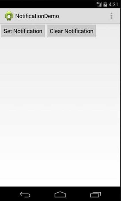
Figure 3.6: The NotificationDemo project
If you click the Set Notification button, the notification icon (an orange star) will be shown on the status bar.
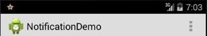
Figure 3.6: The notification icon on the status bar
Now drag down the status bar right to the bottom of the screen to open the notification drawer (See Figure 3.7).
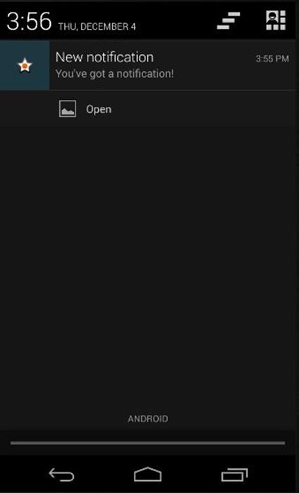
Figure 3.7: The notification in the notification drawer
The notification drawer in Figure 3.7 has one notification. The upper part of the notification UI has a title that screams “New notification.” The text “You’ve got a notification” is the notification content. The lower part is a UI component that represents an action. With its autoClose set to true, the notification will be canceled if the user touches on the content. However, it will not close if the user touches on the action UI. Unfortunately, it is not straightforward to make both areas cancel the notification drawer when touched. To remedy this situation you can use a broadcast receiver, as explained in Chapter 25, “Broadcast Receivers.”
In this example, touching on the notification starts the SecondActivity, as shown in Figure 3.8.
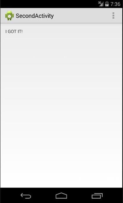
Figure 3.8: The second activity activated by the notification
Summary
In this chapter you learned about the UI components available in Android. You also learned how to use the toast, dialogs and notifications.
All materials on the site are licensed Creative Commons Attribution-Sharealike 3.0 Unported CC BY-SA 3.0 & GNU Free Documentation License (GFDL)
If you are the copyright holder of any material contained on our site and intend to remove it, please contact our site administrator for approval.
© 2016-2026 All site design rights belong to S.Y.A.