Android Application Development: A Beginner's Tutorial (2015)
Chapter 6. The Action Bar
The action bar is a rectangular window area that contains the application icon, application name, menus and other navigation buttons. The action bar normally appears at the top of the window.
This chapter explains how to decorate the action bar on Android with API level 11 (Android 3.0) or higher.
Overview
The action bar is represented by the android.app.ActionBar class. It should look familiar to any Android user. Figure 6.1 shows the action bar of the Messaging application and Figure 6.2 shows that of Calendar.

Figure 6.1: The action bar of Messaging

Figure 6.2: The action bar of Calendar
The application icon and name on the left of the action bar are there by default. They are both optional and no programming is needed to display them. The system will use the values of the application element’s android:icon and android:label attributes in the manifest. Other item types, such as navigation tabs or an options menu, have to be added using code.
The rightmost icon on the action bar (the one with three little dots) is called the (action) overflow button. When pressed, the overflow button displays action items that may do an action if selected. Important action items can be configured to display directly on the action bar instead of hidden in the overflow. An action item shown on the action bar is called an action button. An action button can have an icon, a label, or both. For example, the action bar in Figure 6.1 contains two action buttons, New Message and Search. The New Message action button has both an icon and a label. The Search action button only has an icon. The action bar in Figure 6.2 also contains two action buttons.
In Android 3.0 or higher, the action bar is shown automatically. You can hide the action bar if you wish by adding this code in the onCreate method of your activity.
getActionBar().hide();
To show a hidden action bar, call the show method:
getActionBar().hide();
The next sections show how to add action items and drop-down navigation.
Note
You can download Android’s icon pack that contains icons for your action bar from this site.
http://developer.android.com/downloads/design/
Android_Design_Icons_20131106.zip
Adding Action Items
To add action items to the action overflow, follow these two steps.
1. Create a menu in an xml file and save it under the res/menu directory. Android Studio will add a field to your R.menu class so that you can load the menu in your application. The field name is the same as the XML file minus the extension. If the XML file is calledmain_activity_menu.xml, for example, the field will be called main_activity_menu.
2. In your activity class, override the onCreateOptionsMenu method and call getMenuInflater().inflate(), passing the menu to be loaded and the menu passed to the method, like this.
@Override
public boolean onCreateOptionsMenu(Menu menu) {
getMenuInflater().inflate(R.menu.main, menu);
return true;
}
An action item that does nothing is useless. For an action item to be able to respond to a action item being selected, you must override the onOptionsItemSelected method in your activity class. This method is called every time an item menu is selected and the system will pass the MenuItemselected. The signature of the method is as follows.
public boolean onOptionsItemSelected(MenuItem item);
You can find out which menu item was selected by calling the getItemId on the MenuItem argument. Normally you would use a switch statement like this:
switch (item.getItemId()) {
case R.id.action_1:
// do something
return true;
case R.id.action_2:
// do something else
return true;
...
Now that you know the theory, let’s add some item actions. The ActionBarDemo application shows how to do it. It adds three action items to the action bar.
As usual, let’s start with the manifest, which for this example is shown in Listing 6.1.
Listing 6.1: The manifest for ActionBarDemo
<?xml version="1.0" encoding="utf-8"?>
<manifest xmlns:android="http://schemas.android.com/apk/res/android"
package="com.example.actionbardemo"
android:versionCode="1"
android:versionName="1.0" >
<uses-sdk
android:minSdkVersion="11"
android:targetSdkVersion="18" />
<application
android:allowBackup="true"
android:icon="@drawable/ic_launcher"
android:label="@string/app_name"
android:theme="@style/AppTheme" >
<activity
android:name="com.example.actionbardemo.MainActivity"
android:label="@string/app_name" >
<intent-filter>
<action android:name="android.intent.action.MAIN"/>
<category
android:name="android.intent.category.LAUNCHER" />
</intent-filter>
</activity>
</application>
</manifest>
It is good practice to list action names in a resource file. Listing 6.2 shows the strings.xml file that contains three strings for the action items, action_capture, action_profile and action_about.
Listing 6.2: The res/values/strings.xml
<?xml version="1.0" encoding="utf-8"?>
<resources>
<string name="app_name">ActionBarDemo</string>
<string name="action_capture">Capture</string>
<string name="action_profile">Profile</string>
<string name="action_about">About</string>
<string name="hello_world">Hello world!</string>
</resources>
Next, create an XML file under res/menu. If you used Android Studio to create the Android application, one has been created for you. You just need to add item elements to it. Listing 6.3 shows the menu for the action items.
Listing 6.3: The res/menu/menu_main.xml
<menu xmlns:android="http://schemas.android.com/apk/res/android">
<item
android:id="@+id/action_capture"
android:orderInCategory="100"
android:showAsAction="ifRoom|withText"
android:icon="@drawable/icon1"
android:title="@string/action_capture"/>
<item
android:id="@+id/action_profile"
android:orderInCategory="200"
android:showAsAction="ifRoom|withText"
android:icon="@drawable/icon2"
android:title="@string/action_profile"/>
<item
android:id="@+id/action_about"
android:orderInCategory="50"
android:showAsAction="never"
android:title="@string/action_about"/>
</menu>
The item element may have any of these attributes.
§ android:id. A unique identifier to refer to the action item in the program.
§ android:orderInCategory. The order number for this item. An item with a smaller number will be shown before items with larger numbers.
§ android:icon. The icon for this action item if it is shown as an action button (directly on the action bar).
§ android:title. The action label.
§ android:showAsAction. The value can be one or a combination of these values: ifRoom, never, withText, always, and collapseActionView. Populating this attribute with never indicates that this item will never be shown on the action bar directly. On the other hand, always forces the system to always display this item as an action button. However, be cautious when using this value as if there is not enough room on the action bar, what will be displayed will be unpredictable. Instead, use ifRoom to display an item as an action button if there is room. The withTextvalue will display this item with a label if this item is being displayed as an action button.
The complete list of attributes for the item element can be found here.
http://developer.android.com/guide/topics/resources/menu-
resource.html
Finally, Listing 6.4 presents the MainActivity class for the application.
Listing 6.4: The MainActivity class
package com.example.actionbardemo;
import android.app.Activity;
import android.app.AlertDialog;
import android.os.Bundle;
import android.view.Menu;
import android.view.MenuItem;
public class MainActivity extends Activity {
@Override
protected void onCreate(Bundle savedInstanceState) {
super.onCreate(savedInstanceState);
setContentView(R.layout.activity_main);
}
@Override
public boolean onCreateOptionsMenu(Menu menu) {
getMenuInflater().inflate(R.menu.menu_main, menu);
return true;
}
@Override
public boolean onOptionsItemSelected(MenuItem item) {
// Handle presses on the action bar items
switch (item.getItemId()) {
case R.id.action_profile:
showAlertDialog("Profile", "You selected Profile");
return true;
case R.id.action_capture:
showAlertDialog("Settings",
"You selected Settings");
return true;
case R.id.action_about:
showAlertDialog("About", "You selected About");
return true;
default:
return super.onOptionsItemSelected(item);
}
}
private void showAlertDialog(String title, String message) {
AlertDialog alertDialog = new
AlertDialog.Builder(this).create();
alertDialog.setTitle(title);
alertDialog.setMessage(message);
alertDialog.show();
}
}
Noticed that the activity class overrides the onOptionsItemSelected method? Selecting an item will invoke the showAlertDialog method that shows an AlertDialog.
Figure 6.3 shows three action items in ActionBarDemo. Two of the items are displayed as action buttons.

Figure 6.3: The ActionBarDemo application
Adding Dropdown Navigation
A dropdown list can be used as a navigation mode. The visual difference between a dropdown list and an options menu is that a dropdown list always displays the selected item on the action bar and hide the other options. On the other hand, an options menu may hide all of the items or show all or some of them as action buttons. Figure 6.4 shows dropdown navigation in Calendar.
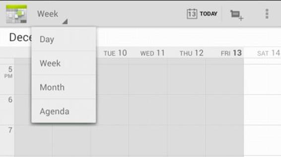
Figure 6.4: Drop down navigation in Calendar
To add drop-down navigation to the action bar, follow these three steps.
1. Declare a string array in your strings.xml file under res/values.
2. In your activity class, add an implementation of ActionBar.OnNavigationListener to respond to item selection.
3. Create a SpinnerAdapter in the onCreate method of your activity, pass ActionBar.NAVIGATION_MODE_LIST to the ActionBar’s setNavigationMode method, and pass the SpinnerAdapter and OnNavigationListener to the ActionBar’s setListNavigationCallbacks method.
SpinnerAdapter spinnerAdapter =
ArrayAdapter.createFromResource(this,
R.array.colors,
android.R.layout.simple_spinner_dropdown_item);
ActionBar actionBar = getActionBar();
actionBar.setNavigationMode(
ActionBar.NAVIGATION_MODE_LIST);
actionBar.setListNavigationCallbacks(spinnerAdapter,
onNavigationListener);
As an example, the DropDownNavigationDemo application shows how to add dropdown navigation to the action bar. The application adds a list of five colors to the action bar. Selecting a color changes the window background color with the selected color.
Listing 6.5 shows the manifest for the application.
Listing 6.5: The DropDownNavigationDemo manifest
<?xml version="1.0" encoding="utf-8"?>
<manifest xmlns:android="http://schemas.android.com/apk/res/android"
package="com.example.dropdownnavigationdemo"
android:versionCode="1"
android:versionName="1.0" >
<uses-sdk
android:minSdkVersion="14"
android:targetSdkVersion="18" />
<application
android:allowBackup="true"
android:icon="@drawable/ic_launcher"
android:label="@string/app_name"
android:theme="@style/AppTheme" >
<activity
android:name="com.example.dropdownnavigationdemo.MainActivity"
android:label="@string/app_name"
android:theme="@style/MyTheme">
<intent-filter>
<action android:name="android.intent.action.MAIN"/>
<category
android:name="android.intent.category.LAUNCHER" />
</intent-filter>
</activity>
</application>
</manifest>
Listing 6.6 shows a string-array element that will be used to populate the drop-down. There are five items in the array.
Listing 6.6: The res/values/strings.xml file
<?xml version="1.0" encoding="utf-8"?>
<resources>
<string name="app_name">DropDownNavigationDemo</string>
<string name="action_settings">Settings</string>
<string name="hello_world">Hello world!</string>
<string-array name="colors">
<item>White</item>
<item>Red</item>
<item>Green</item>
<item>Blue</item>
<item>Yellow</item>
</string-array>
</resources>
Listing 6.7 shows the MainActivity class for the application.
Listing 6.7: The MainActivity class
package com.example.dropdownnavigationdemo;
import android.app.ActionBar;
import android.app.ActionBar.OnNavigationListener;
import android.app.Activity;
import android.graphics.Color;
import android.os.Bundle;
import android.view.Menu;
import android.widget.ArrayAdapter;
import android.widget.SpinnerAdapter;
public class MainActivity extends Activity {
@Override
protected void onCreate(Bundle savedInstanceState) {
super.onCreate(savedInstanceState);
setContentView(R.layout.activity_main);
SpinnerAdapter spinnerAdapter =
ArrayAdapter.createFromResource(this,
R.array.colors,
android.R.layout.simple_spinner_dropdown_item);
ActionBar actionBar = getActionBar();
actionBar.setNavigationMode(
ActionBar.NAVIGATION_MODE_LIST);
actionBar.setListNavigationCallbacks(spinnerAdapter,
onNavigationListener);
}
@Override
public boolean onCreateOptionsMenu(Menu menu) {
getMenuInflater().inflate(R.menu.menu_main, menu);
return true;
}
OnNavigationListener onNavigationListener = new
OnNavigationListener() {
@Override
public boolean onNavigationItemSelected(
int position, long itemId) {
String[] colors = getResources().
getStringArray(R.array.colors);
String selectedColor = colors[position];
getWindow().getDecorView().setBackgroundColor(
Color.parseColor(selectedColor));
return true;
}
};
}
Figure 6.5 shows the dropdown navigation.
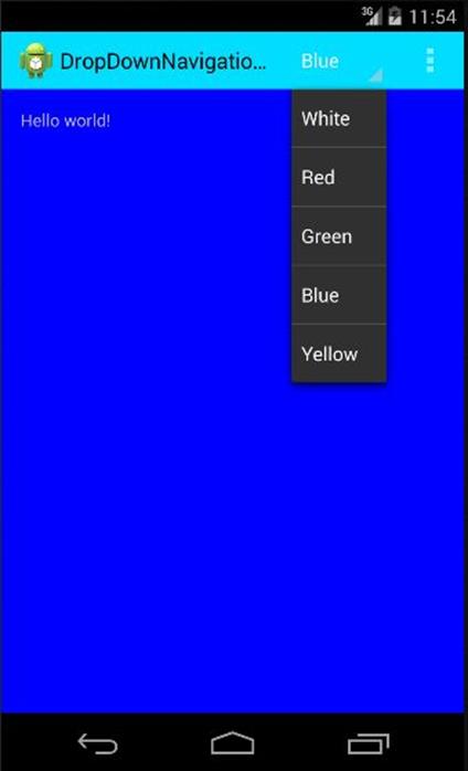
Figure 6.5: Dropdown navigation on the action bar
Note that the action bar has been styled using the styles.xml file in Listing 6.8.
Listing 6.8: The res/values/styles.xml file
<resources>
<style name="AppBaseTheme" parent="android:Theme.Light">
</style>
<style name="AppTheme" parent="AppBaseTheme">
</style>
<style name="MyTheme"
parent="@android:style/Widget.Holo.Light">
<item name="android:actionBarStyle">@style/MyActionBar</item>
</style>
<style name="MyActionBar"
parent="@android:style/Widget.Holo.Light.ActionBar.Solid.Inverse">
<item
name="android:background">@android:color/holo_blue_bright</item>
</style>
</resources>
For more information on styling UI components, see Chapter 10, “Styles and Themes.”
Going Back Up
You can set the application icon and activity label in the action bar of an activity so that the application will go one level back up when the icon is pressed. Figure 6.6 shows an action bar whose displayHomeAsUp property is set to true (indicated by the left arrow to the left of the icon). Compare this with the action bar in Figure 6.7 where its displayHomeAsUp property is set to false.

Figure 6.6: displayHomeAsUp set to true

Figure 6.7: displayHomeAsUp set to false
To enable displayHomeAsUp, you need to set the parentActivityName element in the activity declaration in the Android manifest:
<activity android:name="com.example.d1.ShowContactActivity"
android:parentActivityName=".MainActivity">
</activity>
You must also leave the displayHomeAsUpEnabled property of the action bar to its default value (true). Setting it to false, as shown in the code below, will disable it.
getActionBar().setDisplayHomeAsUpEnabled(false);
Summary
The action bar provides a space for the application icon, application name and navigation modes. This chapter showed how to add action items and dropdown navigation to the action bar.
All materials on the site are licensed Creative Commons Attribution-Sharealike 3.0 Unported CC BY-SA 3.0 & GNU Free Documentation License (GFDL)
If you are the copyright holder of any material contained on our site and intend to remove it, please contact our site administrator for approval.
© 2016-2026 All site design rights belong to S.Y.A.