Introduction to Android Application Development, Fourth Edition (2014)
Part III. Android User Interface Design Essentials
Chapter 8. Designing with Layouts
In this chapter, we discuss how to design user interfaces for Android applications. Here, we focus on the various layout controls you can use to organize screen elements in different ways. We also cover some of the more complex View controls we call container views. These are View controls that can contain other View controls.
Creating User Interfaces in Android
Application user interfaces can be simple or complex, involving many different screens or only a few. Layouts and user interface controls can be defined as application resources or created programmatically at runtime.
Although it’s a bit confusing, the term layout is used for two different but related purposes in Android user interface design:
 In terms of resources, the /res/layout directory contains XML resource definitions often called layout resource files. These XML files provide a template for how to draw controls on the screen; layout resource files may contain any number of controls.
The term is also used to refer to a set of ViewGroup classes, such as LinearLayout, FrameLayout, TableLayout, RelativeLayout, and GridLayout. These controls are used to organize other View controls. We talk more about these classes later in this chapter.
Creating Layouts Using XML Resources
As discussed in previous chapters, Android provides a simple way to create layout resource files in XML. These resources are stored in the /res/layout project directory hierarchy. This is the most common and convenient way to build Android user interfaces and is especially useful for defining screen elements and default control properties that you know about at compile time. These layout resources are then used much like templates. They are loaded with default attributes that you can modify programmatically at runtime.
You can configure almost any ViewGroup or View (or View subclass) attribute using the XML layout resource files. This method greatly simplifies the user interface design process, moving much of the static creation and layout of user interface controls, and basic definition of control attributes, to the XML instead of littering the code. Developers reserve the ability to alter these layouts programmatically as necessary, but they should set all the defaults in the XML template whenever possible.
You’ll recognize the following as a simple layout file with a LinearLayout and a single TextView control. Here is the default layout file provided with any new Android project in the Android IDE, referred to as /res/layout/activity_main.xml:
<?xml version="1.0" encoding="utf-8"?>
<LinearLayout xmlns:android=
"http://schemas.android.com/apk/res/android"
android:orientation="vertical"
android:layout_width="match_parent"
android:layout_height="match_parent" >
<TextView
android:layout_width="match_parent"
android:layout_height="wrap_content"
android:text="@string/hello" />
</LinearLayout>
This block of XML shows a basic layout with a single TextView control. The first line, which you might recognize from most XML files, is required with the android layout namespace, as shown. Because it’s common across all the files, we do not show it in any other examples.
Next, we have the LinearLayout element. LinearLayout is a ViewGroup that shows each child View either in a single column or in a single row. When applied to a full screen, it merely means that each child View is drawn under the previous View if the orientation is set to vertical or to the right of the previous View if the orientation is set to horizontal.
Finally, there is a single child View—in this case, a TextView. A TextView is a control that is also a View. A TextView draws text on the screen. In this case, it draws the text defined in the “@string/hello” string resource.
Creating only an XML file, though, won’t actually draw anything on the screen. A particular layout is usually associated with a particular Activity. In your default Android project, there is only one Activity, which sets the activity_main.xml layout by default. To associate theactivity_main.xml layout with the Activity, use the method call setContentView() with the identifier of the activity_main.xml layout. The ID of the layout matches the XML filename without the extension. In this case, the preceding example came from activity_main.xml, so the identifier of this layout is simply activity_main:
setContentView(R.layout.activity_main);
 Warning
The Android tools team has made every effort to make the Android IDE graphical layout designer feature complete, and this tool can be helpful for designing and previewing how layout resources will look on a variety of different devices. However, the preview can’t replicate exactly how the layout appears to end users. For this, you must test your application on a properly configured emulator and, more important, on your target devices.
Creating Layouts Programmatically
You can create user interface components such as layouts at runtime programmatically, but for organization and maintainability, it’s best to leave this for the odd case rather than the norm. The main reason is that the creation of layouts programmatically is onerous and difficult to maintain, whereas the XML resources are visual and more organized and could be used by a separate designer with no Java skills.
 Tip
Tip
The code examples provided in this section are taken from the SameLayout application. The source code for the SameLayout application is provided for download on the book’s website.
The following example shows how to programmatically have an Activity instantiate a LinearLayout and place two TextView controls within it as child controls. The same two string resources are used for the contents of the controls; these actions are done at runtime instead.
public void onCreate(Bundle savedInstanceState) {
super.onCreate(savedInstanceState);
TextView text1 = new TextView(this);
text1.setText(R.string.string1);
TextView text2 = new TextView(this);
text2.setText(R.string.string2);
text2.setTextSize(TypedValue.COMPLEX_UNIT_SP, 60);
LinearLayout ll = new LinearLayout(this);
ll.setOrientation(LinearLayout.VERTICAL);
ll.addView(text1);
ll.addView(text2);
setContentView(ll);
}
The onCreate() method is called when the Activity is created. The first thing this method does is some normal housekeeping by calling the constructor for the base class.
Next, two TextView controls are instantiated. The Text property of each TextView is set using the setText() method. All TextView attributes, such as TextSize, are set by making method calls on the TextView control. These actions perform the same function of setting the properties Text andTextSize as when using the Android IDE layout resource designer, except these properties are set at runtime instead of defined in the layout files compiled into your application package.
Tip
The XML property name is usually similar to the method calls for getting and setting that same control property programmatically. For instance, android:visibility maps to the methods setVisibility() and getVisibility(). In the preceding sample TextView, the methods for getting and setting the TextSize property are getTextSize() and setTextSize().
To display the TextView controls appropriately, we need to encapsulate them within a container of some sort (a layout). In this case, we use a LinearLayout with the orientation set to VERTICAL so that the second TextView begins beneath the first, each aligned to the left of the screen. The twoTextView controls are added to the LinearLayout in the order we want them to display.
Finally, we call the setContentView() method, part of the Activity class, to draw the LinearLayout and its contents on the screen.
As you can see, the code can rapidly grow in size as you add more View controls and you need more attributes for each View. Here is that same layout, now in an XML layout file:
<?xml version="1.0" encoding="utf-8"?>
<LinearLayout
xmlns:android="http://schemas.android.com/apk/res/android"
android:orientation="vertical"
android:layout_width="match_parent"
android:layout_height="match_parent">
<TextView
android:id="@+id/TextView1"
android:layout_width="match_parent"
android:layout_height="wrap_content"
android:text="@string/string1" />
<TextView
android:id="@+id/TextView2"
android:layout_width="match_parent"
android:layout_height="wrap_content"
android:textSize="60sp"
android:text="@string/string2" />
</LinearLayout>
You might notice that this isn’t a literal translation of the code example from the previous section, although the output is identical, as shown in Figure 8.1.
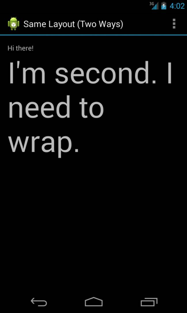
Figure 8.1 Two different methods of creating a screen have the same result.
First, in the XML layout files, layout_width and layout_height are required attributes. Next, you see that each TextView control has a unique id property assigned so that it can be accessed programmatically at runtime. Finally, the textSize property needs to have its units defined. The XML attribute takes a dimension type.
The end result differs only slightly from the programmatic method. However, it’s far easier to read and maintain. Now you need only one line of code to display this layout view. Again, the layout resource is stored in the /res/layout/resource_based_layout.xml file:
setContentView(R.layout.resource_based_layout);
Organizing Your User Interface
In Chapter 7, “Exploring User Interface Building Blocks,” we talked about how the class View is the building block for user interfaces in Android. All user interface controls, such as Button, Spinner, and EditText, derive from the View class.
Now we talk about a special kind of View called a ViewGroup. The classes derived from ViewGroup enable developers to display View controls such as TextView and Button controls on the screen in an organized fashion.
It’s important to understand the difference between View and ViewGroup. Like other View controls, including the controls from the previous chapter, ViewGroup controls represent a rectangle of screen space. What makes a ViewGroup different from a typical control is that ViewGroup objects contain other View controls. A View that contains other View controls is called a parent view. The parent View contains View controls called child views, or children.
You add child View controls to a ViewGroup programmatically using the method addView(). In XML, you add child objects to a ViewGroup by defining the child View control as a child node in the XML (within the parent XML element, as we’ve seen various times using the LinearLayoutViewGroup).
ViewGroup subclasses are broken down into two categories:
Layout classes
View container controls
Using ViewGroup Subclasses for Layout Design
Many of the most important subclasses of ViewGroup used for screen design end with “Layout.” For example, the most common layout classes are LinearLayout, RelativeLayout, TableLayout, FrameLayout, and GridLayout. You can use each of these classes to position other View controls on the screen in different ways. For example, we’ve been using the LinearLayout to arrange various TextView and EditText controls on the screen in a single vertical column. Users do not generally interact with the layouts directly. Instead, they interact with the View controls they contain.
Using ViewGroup Subclasses as View Containers
The second category of ViewGroup subclasses is the indirect “subclasses”—some formal, and some informal. These special View controls act as View containers like Layout objects do, but they also provide some kind of active functionality that enables users to interact with them like other controls. Unfortunately, these classes are not known by any handy names; instead, they are named for the kind of functionality they provide.
Some of the classes that fall into this category include GridView, ImageSwitcher, ScrollView, and ListView. It can be helpful to consider these objects as different kinds of View browsers, or container classes. A ListView displays each View control as a list item, and the user can browse the individual controls using vertical scrolling capability.
Using Built-in Layout Classes
We have talked a lot about the LinearLayout layout, but there are several other types of layouts. Each layout has a different purpose and order in which it displays its child View controls on the screen. Layouts are derived from android.view.ViewGroup.
The types of layouts built into the Android SDK framework include the following:
LinearLayout
RelativeLayout
FrameLayout
TableLayout
GridLayout
Tip
Many of the code examples provided in this section are taken from the SimpleLayout application. The source code for the SimpleLayout application is provided for download on the book’s website.
All layouts, regardless of their type, have basic layout attributes. Layout attributes apply to any child View control within that layout. You can set layout attributes at runtime programmatically, but ideally you set them in the XML layout files using the following syntax:
android:layout_attribute_name="value"
There are several layout attributes that all ViewGroup objects share. These include size attributes and margin attributes. You can find basic layout attributes in the ViewGroup.LayoutParams class. The margin attributes enable each child View within a layout to have padding on each side. Find these attributes in the ViewGroup.MarginLayoutParams class. There are also a number of ViewGroup attributes for handling child View drawing bounds and animation settings.
Some of the important attributes shared by all ViewGroup subtypes are shown in Table 8.1.
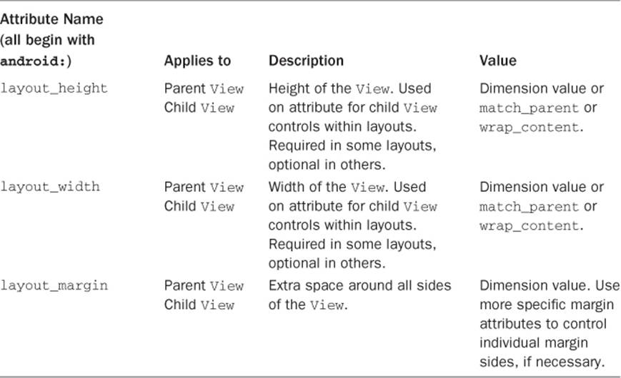
Table 8.1 Important ViewGroup Attributes
Here is an XML layout resource example of a LinearLayout set to the size of the screen, containing one TextView that is set to its full height and the width of the LinearLayout (and therefore the screen):
<LinearLayout xmlns:android=
"http://schemas.android.com/apk/res/android"
android:layout_width="match_parent"
android:layout_height="match_parent">
<TextView
android:id="@+id/TextView01"
android:layout_height="match_parent"
android:layout_width="match_parent" />
</LinearLayout>
Here is an example of a Button object with some margins set via XML used in a layout resource file:
<Button
android:id="@+id/Button01"
android:layout_width="wrap_content"
android:layout_height="wrap_content"
android:text="Press Me"
android:layout_marginRight="20dp"
android:layout_marginTop="60dp" />
Remember that a layout element can cover any rectangular space on the screen; it doesn’t need to fill the entire screen. Layouts can be nested within one another. This provides great flexibility when developers need to organize screen elements. It is common to start with a FrameLayout orLinearLayout as the parent layout for the entire screen and then organize individual screen elements inside the parent layout using whichever layout type is most appropriate.
Now let’s talk about each of the common layout types individually and how they differ from one another.
Using LinearLayout
A LinearLayout view organizes its child View controls in a single row, as shown in Figure 8.2, or a single column, depending on whether its orientation attribute is set to horizontal or vertical. This is a very handy layout method for creating forms.
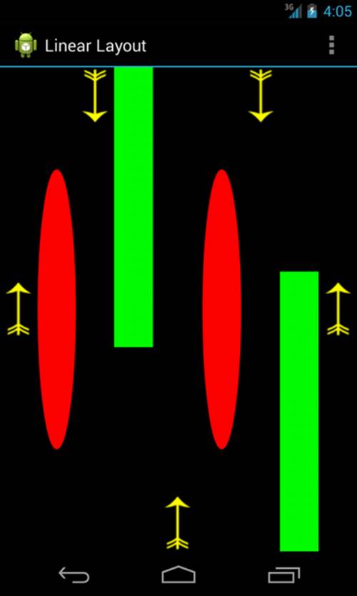
Figure 8.2 An example of LinearLayout (horizontal orientation).
You can find the layout attributes available for LinearLayout child View controls in android.widget.LinearLayout.LayoutParams. Table 8.2 describes some of the important attributes specific to LinearLayout views.
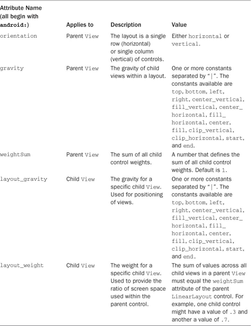
Table 8.2 Important LinearLayout View Attributes
 Note
Note
To learn more about LinearLayout, see the Android API Guides discussion at http://d.android.com/guide/topics/ui/layout/linear.html.
Using RelativeLayout
The RelativeLayout view enables you to specify where the child View controls are in relation to each other. For instance, you can set a child View to be positioned “above” or “below” or “to the left of” or “to the right of” another View, referred to by its unique identifier. You can also align childView controls relative to one another or to the parent layout edges. Combining RelativeLayout attributes can simplify creating interesting user interfaces without resorting to multiple layout groups to achieve a desired effect. Figure 8.3 shows where the Button controls are relative to each other.
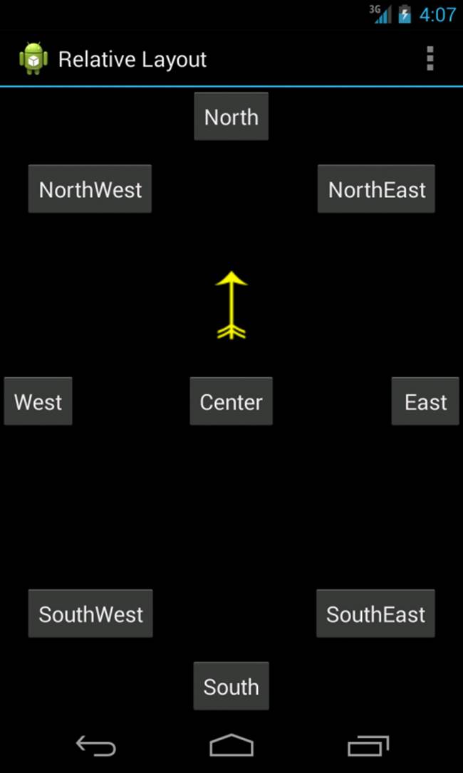
Figure 8.3 An example of RelativeLayout usage.
You can find the layout attributes available for RelativeLayout child View controls in android.widget.RelativeLayout.LayoutParams. Table 8.3 describes some of the important attributes specific to RelativeLayout views.
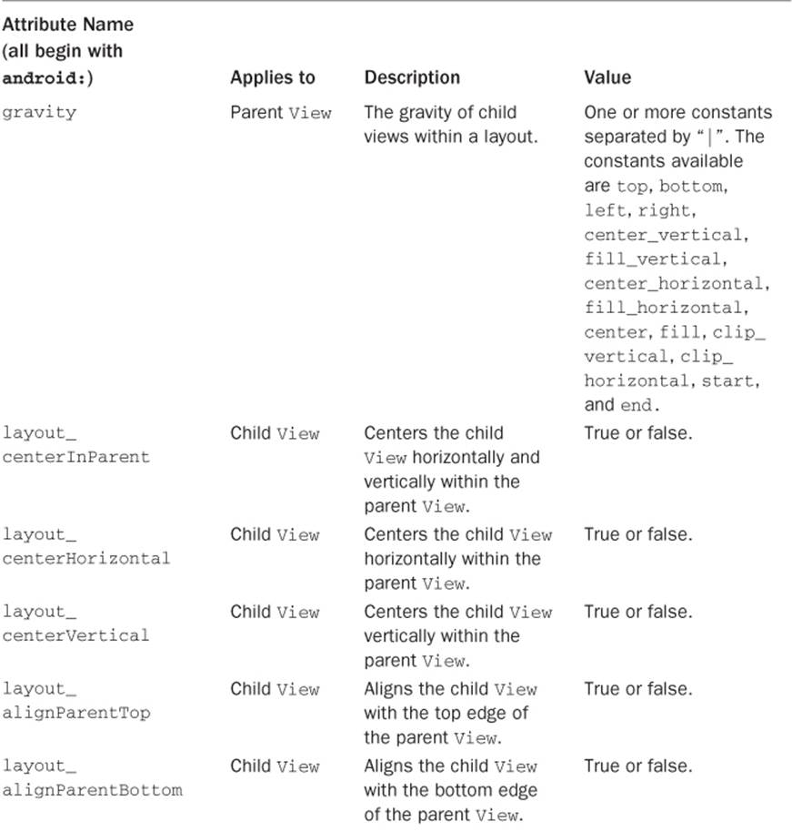
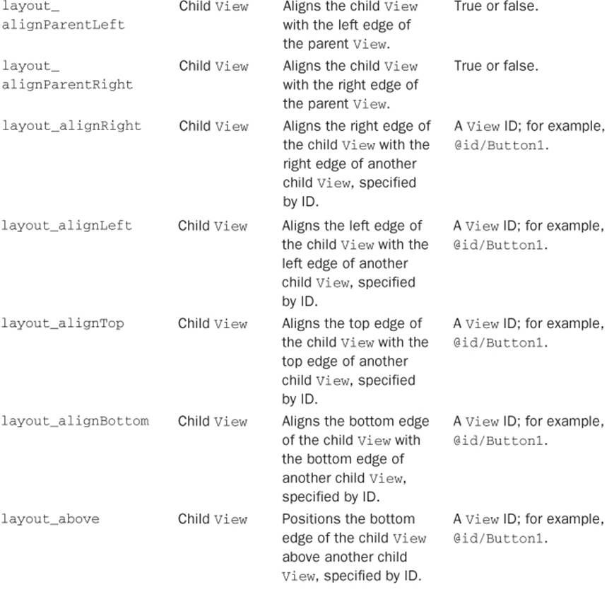
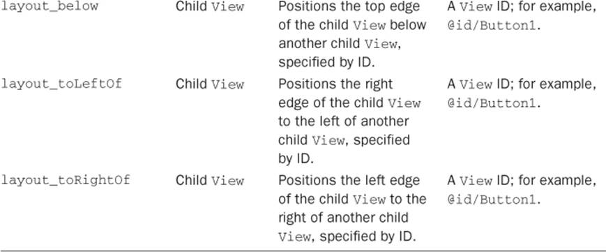
Table 8.3 Important RelativeLayout View Attributes
Here is an example of an XML layout resource with a RelativeLayout and two child View controls—a Button object aligned relative to its parent, and an ImageView aligned and positioned relative to the Button (and the parent):
<?xml version="1.0" encoding="utf-8"?>
<RelativeLayout xmlns:android=
"http://schemas.android.com/apk/res/android"
android:id="@+id/RelativeLayout01"
android:layout_height="match_parent"
android:layout_width="match_parent">
<Button
android:id="@+id/ButtonCenter"
android:text="Center"
android:layout_width="wrap_content"
android:layout_height="wrap_content"
android:layout_centerInParent="true" />
<ImageView
android:id="@+id/ImageView01"
android:layout_width="wrap_content"
android:layout_height="wrap_content"
android:layout_above="@id/ButtonCenter"
android:layout_centerHorizontal="true"
android:src="@drawable/arrow" />
</RelativeLayout>
Note
To learn more about RelativeLayout, see the Android API Guides discussion at http://d.android.com/guide/topics/ui/layout/relative.html.
Using FrameLayout
A FrameLayout view is designed to display a stack of child View items. You can add multiple views to this layout, but each View is drawn from the top-left corner of the layout. You can use this to show multiple images within the same region, as shown in Figure 8.4 on page 223, and the layout is sized to the largest child View in the stack.
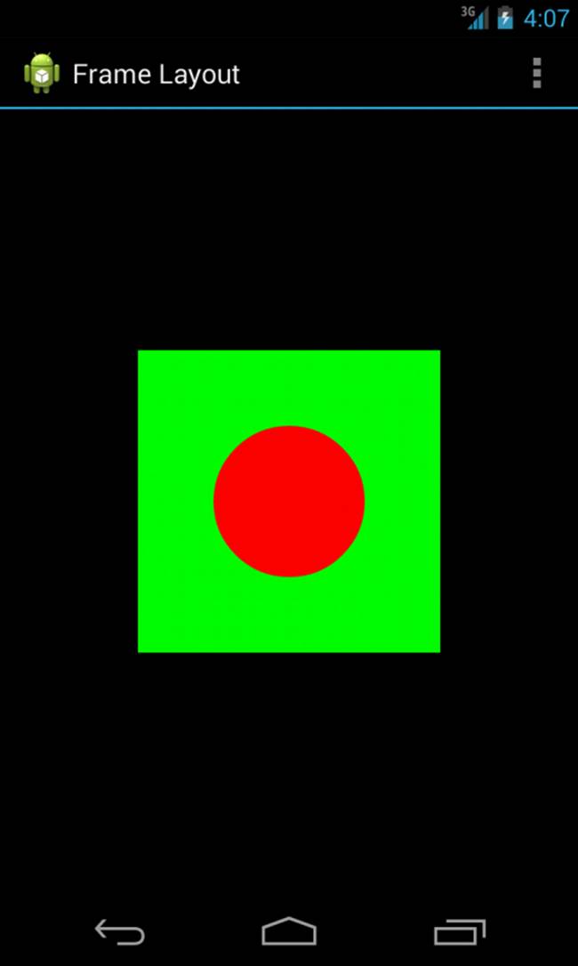
Figure 8.4 An example of FrameLayout usage.
You can find the layout attributes available for FrameLayout child View controls in android.widget.FrameLayout.LayoutParams. Table 8.4 on page 225, describes some of the important attributes specific to FrameLayout views.
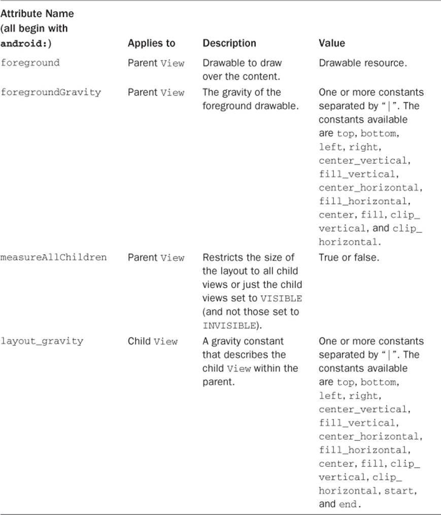
Table 8.4 Important FrameLayout View Attributes
Here is an example of an XML layout resource with a FrameLayout and two child View controls, both ImageView controls. The green rectangle is drawn first and the red oval is drawn on top of it. The green rectangle is larger, so it defines the bounds of the FrameLayout:
<FrameLayout xmlns:android=
"http://schemas.android.com/apk/res/android"
android:id="@+id/FrameLayout01"
android:layout_width="wrap_content"
android:layout_height="wrap_content"
android:layout_gravity="center">
<ImageView
android:id="@+id/ImageView01"
android:layout_width="wrap_content"
android:layout_height="wrap_content"
android:src="@drawable/green_rect"
android:contentDescription="@string/green_rect"
android:minHeight="200dp"
android:minWidth="200dp" />
<ImageView
android:id="@+id/ImageView02"
android:layout_width="wrap_content"
android:layout_height="wrap_content"
android:src="@drawable/red_oval"
android:contentDescription="@string/red_oval"
android:minHeight="100dp"
android:minWidth="100dp"
android:layout_gravity="center" />
</FrameLayout>
Using TableLayout
A TableLayout view organizes children into rows, as shown in Figure 8.5. You add individual View controls within each row of the table using a TableRow layout View (which is basically a horizontally oriented LinearLayout) for each row of the table. Each column of the TableRow can contain one View (or layout with child View controls). You place View items added to a TableRow in columns in the order they are added. You can specify the column number (zero based) to skip columns as necessary (the bottom row shown in Figure 8.5 demonstrates this); otherwise, the View control is put in the next column to the right. Columns scale to the size of the largest View of that column. You can also include normal View controls instead of TableRow elements, if you want the View to take up an entire row.
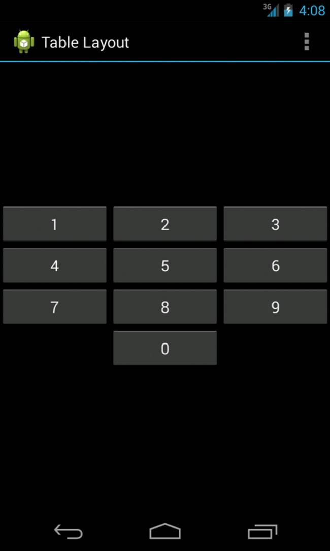
Figure 8.5 An example of TableLayout usage.
You can find the layout attributes available for TableLayout child View controls in android.widget.TableLayout.LayoutParams. You can find the layout attributes available for TableRow child View controls in android.widget.TableRow.LayoutParams. Table 8.5 describes some of the important attributes specific to TableLayout controls.
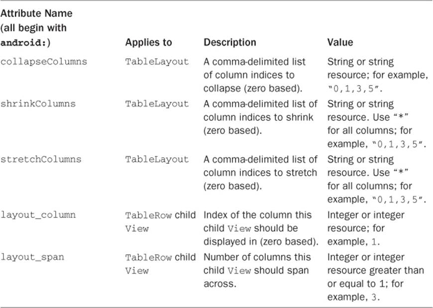
Table 8.5 Important TableLayout and TableRow View Attributes
Here is an example of an XML layout resource with a TableLayout with two rows (two TableRow child objects). The TableLayout is set to stretch the columns to the size of the screen width. The first TableRow has three columns; each cell has a Button object. The second TableRow puts only one Button control into the second column explicitly:
<TableLayout xmlns:android=
"http://schemas.android.com/apk/res/android"
android:id="@+id/TableLayout01"
android:layout_width="match_parent"
android:layout_height="match_parent"
android:stretchColumns="*">
<TableRow
android:id="@+id/TableRow01">
<Button
android:id="@+id/ButtonLeft"
android:text="Left Door" />
<Button
android:id="@+id/ButtonMiddle"
android:text="Middle Door" />
<Button
android:id="@+id/ButtonRight"
android:text="Right Door" />
</TableRow>
<TableRow
android:id="@+id/TableRow02">
<Button
android:id="@+id/ButtonBack"
android:text="Go Back"
android:layout_column="1" />
</TableRow>
</TableLayout>
Using GridLayout
Introduced in Android 4.0 (API Level 14), the GridLayout organizes its children inside a grid. But don’t confuse it with GridView; this layout grid is dynamically created. Unlike a TableLayout, child View controls in a GridLayout can span rows and columns and are flatter and more efficient in terms of layout rendering. In fact, it is the child View controls of a GridLayout that tell the layout where they are to be placed. Figure 8.6 shows an example of a GridLayout with five child controls.
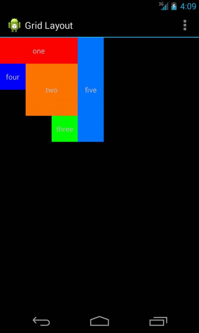
Figure 8.6 An example of GridLayout usage.
You can find the layout attributes available for GridLayout child View controls in android.widget.GridLayout.LayoutParams. Table 8.6 describes some of the important attributes specific to GridLayout controls.
Table 8.6 Important GridLayout View Attributes
The following is an example of an XML layout resource with a GridLayout view resulting in four rows and four columns. Each child control occupies a certain number of rows and columns. Because the default span attribute value is 1, we only specify when the element will take up more than one row or column. For instance, the first TextView is one row high and three columns wide. The height and width of each of the View controls are specified to control the look of the result; otherwise, the GridLayout control will automatically assign sizing.
<?xml version="1.0" encoding="utf-8"?>
<GridLayout xmlns:android="http://schemas.android.com/apk/res/android"
android:id="@+id/gridLayout1"
android:layout_width="match_parent"
android:layout_height="match_parent"
android:columnCount="4"
android:rowCount="4" >
<TextView
android:layout_width="150dp"
android:layout_height="50dp"
android:layout_column="0"
android:layout_columnSpan="3"
android:layout_row="0"
android:background="#ff0000"
android:gravity="center"
android:text="one" />
<TextView
android:layout_width="100dp"
android:layout_height="100dp"
android:layout_column="1"
android:layout_columnSpan="2"
android:layout_row="1"
android:layout_rowSpan="2"
android:background="#ff7700"
android:gravity="center"
android:text="two" />
<TextView
android:layout_width="50dp"
android:layout_height="50dp"
android:layout_column="2"
android:layout_row="3"
android:background="#00ff00"
android:gravity="center"
android:text="three" />
<TextView
android:layout_width="50dp"
android:layout_height="50dp"
android:layout_column="0"
android:layout_row="1"
android:background="#0000ff"
android:gravity="center"
android:text="four" />
<TextView
android:layout_width="50dp"
android:layout_height="200dp"
android:layout_column="3"
android:layout_row="0"
android:layout_rowSpan="4"
android:background="#0077ff"
android:gravity="center"
android:text="five" />
</GridLayout>
Tip
You may add a GridLayout to legacy applications all the way back to Android 2.1 (API Level 7) using the v7 Support Library (Revision 13+). To learn more about the support version of this layout, see the following:http://d.android.com/reference/android/support/v7/widget/GridLayout.html.
Using Multiple Layouts on a Screen
Combining different layout methods on a single screen can create complex layouts. Remember that because a layout contains View controls and is, itself, a View control, it can contain other layouts.
Tip
Want to create a certain amount of space between View controls without using a nested layout? Check out the Space view (android.widget.Space).
Figure 8.7 demonstrates a combination of layout views used in conjunction to create a more complex and interesting screen.
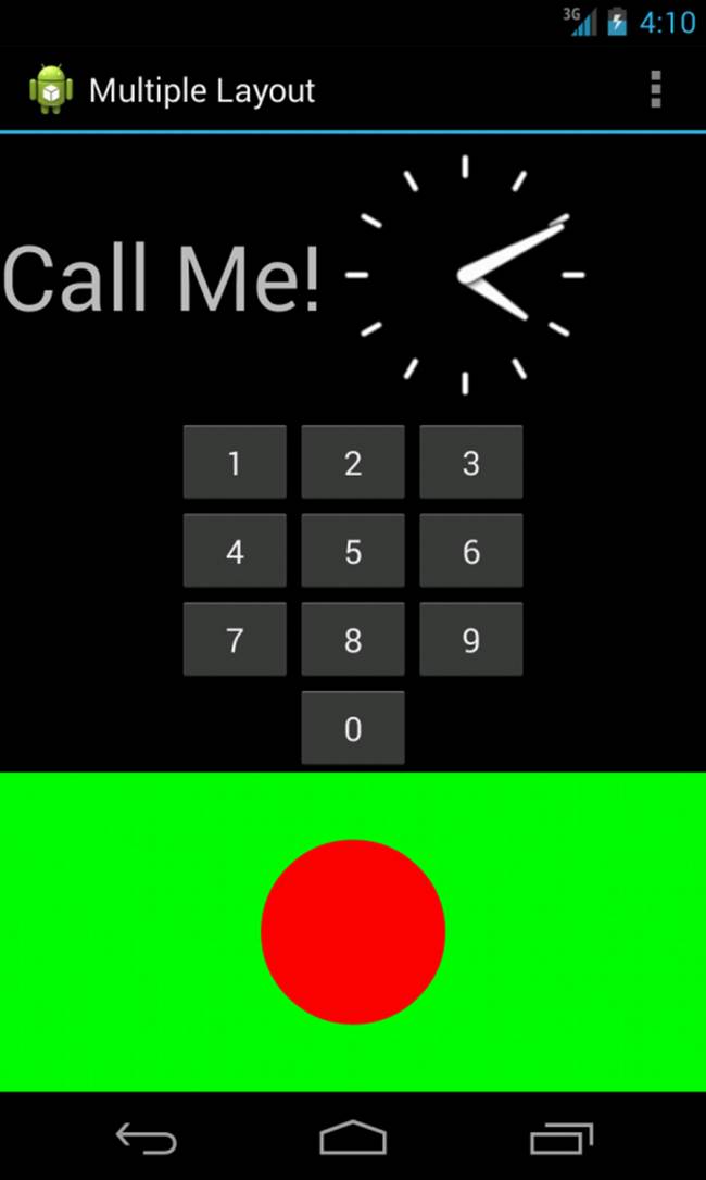
Figure 8.7 An example of multiple layouts used together.
Warning
Keep in mind that individual screens of mobile applications should remain sleek and relatively simple. This is not just because this design results in a more positive user experience; cluttering your screens with complex (and deep) View hierarchies can lead to performance problems. Use the Hierarchy Viewer to inspect your application layouts; you can also use the lint tool to help optimize your layouts and identify unnecessary components. You can also use <merge> and <include> tags in your layouts for creating a common set of reusable components instead of duplicating them. ViewStub can be used to add more complex views to your layouts during runtime as they are needed, rather than building them directly into your layouts.
Using Container Control Classes
Layouts are not the only controls that can contain other View controls. Although layouts are useful for positioning other View controls on the screen, they aren’t interactive. Now let’s talk about the other kind of ViewGroup: the containers. These View controls encapsulate other, simpler View types and give the user the ability to interactively browse the child View controls in a standard fashion. Much like layouts, each of these controls has a special, well-defined purpose.
The types of ViewGroup containers built into the Android SDK framework include
Lists and grids
ScrollView and HorizontalScrollView for scrolling
ViewFlipper, ImageSwitcher, and TextSwitcher for switching
Tip
Many of the code examples provided in this chapter are taken from the AdvancedLayouts application. The source code for the AdvancedLayouts application is provided for download on the book’s website.
Using Data-Driven Containers
Some of the View container controls are designed for displaying repetitive View controls in a particular way. Examples of this type of View container control include ListView and GridView:
ListView: contains a vertically scrolling, horizontally filled list of View controls, each of which typically contains a row of data. The user can choose an item to perform some action upon.
GridView: contains a grid of View controls, with a specific number of columns. This container is often used with image icons; the user can choose an item to perform some action upon.
These containers are all types of AdapterView controls. An AdapterView control contains a set of child View controls to display data from some data source. An Adapter generates these child View controls from a data source. Because this is an important part of all these container controls, we talk about the Adapter objects first.
In this section, you learn how to bind data to View controls using Adapter objects. In the Android SDK, an Adapter reads data from some data source and generates the data for a View control based on some rules, depending on the type of Adapter used. This View is used to populate the childView controls of a particular AdapterView.
The most common Adapter classes are the CursorAdapter and the ArrayAdapter. The CursorAdapter gathers data from a Cursor, whereas the ArrayAdapter gathers data from an array. A CursorAdapter is a good choice when using data from a database. The ArrayAdapter is a good choice when there is only a single column of data or when the data comes from a resource array.
You should know some common elements of Adapter objects. When creating an Adapter, you provide a layout identifier. This layout is the template for filling in each row of data. The template you create contains identifiers for particular controls to which the Adapter assigns data. A simple layout can contain as little as a single TextView control. When making an Adapter, refer to both the layout resource and the identifier of the TextView control. The Android SDK provides some common layout resources for use in your application.
Using ArrayAdapter
An ArrayAdapter binds each element of the array to a single View control within the layout resource. Here is an example of creating an ArrayAdapter:
private String[] items = {
"Item 1", "Item 2", "Item 3" };
ArrayAdapter adapt =
new ArrayAdapter<String>
(this, R.layout.textview, items);
In this example, we have a string array called items. This is the array used by the ArrayAdapter as the source data. We also use a layout resource, which is the View that is repeated for each item in the array. This is defined as follows:
<TextView xmlns:android=
"http://schemas.android.com/apk/res/android"
android:layout_width="match_parent"
android:layout_height="wrap_content"
android:textSize="20sp" />
This layout resource contains only a single TextView. However, you can use a more complex layout with constructors that also take the resource identifier of a TextView within the layout. Each child View within the AdapterView that uses this Adapter gets one TextView instance with one of the strings from the string array.
If you have an array resource defined, you can also directly set the entries attribute for an AdapterView to the resource identifier of the array to automatically provide the ArrayAdapter.
Using CursorAdapter
A CursorAdapter binds one or more columns of data to one or more View controls within the layout resource provided. This is best shown with an example. We also discuss Cursor objects in Chapter 13, “Leveraging Content Providers,” where we provide a more in-depth discussion of content providers.
The following example demonstrates creating a CursorAdapter by querying the Contacts content provider. The CursorAdapter requires the use of a Cursor.
CursorLoader loader = new CursorLoader(
this, ContactsContract.CommonDataKinds.Phone.CONTENT_URI,
null, null, null, null);
Cursor contacts = loader.loadInBackground();
ListAdapter adapter = new SimpleCursorAdapter(
this, R.layout.scratch_layout,
contacts, new String[] {
ContactsContract.CommonDataKinds.Phone.DISPLAY_NAME,
ContactsContract.CommonDataKinds.Phone.NUMBER
}, new int[] {
R.id.scratch_text1,
R.id.scratch_text2
}, 0);
In this example, we present a couple of new concepts. First, you need to know that the Cursor must contain a field named _id. In this case, we know that the ContactsContract content provider does have this field. This field is used later when we handle the user selecting a particular item.
 Note
Note
The CursorLoader class was introduced in Android 3.0 (API Level 11). If you need to support applications prior to Android 3.0, you can use the Android Support Library to add the CursorLoader class (android.support.v4.content.CursorLoader) to your application. We talk more about the Android Support Library in Chapter 14, “Designing Compatible Applications.”
We instantiate a new CursorLoader to get the Cursor. Then, we instantiate a SimpleCursorAdapter as a ListAdapter. Our layout, R.layout.scratch_layout, has two TextView controls in it, which are used in the last parameter. SimpleCursorAdapter enables us to match up columns in the database with particular controls in our layout. For each row returned from the query, we get one instance of the layout within our AdapterView.
Binding Data to the AdapterView
Now that you have an Adapter object, you can apply this to one of the AdapterView controls. Either of them will work. Here is an example of this with a ListView, continuing from the previous sample code:
((ListView)findViewById(R.id.scratch_adapter_view)).setAdapter(adapter);
The call to the setAdapter() method of the AdapterView, a ListView in this case, should come after your call to setContentView(). This is all that is required to bind data to your AdapterView. Figure 8.8 shows the same data in a GridView and ListView.
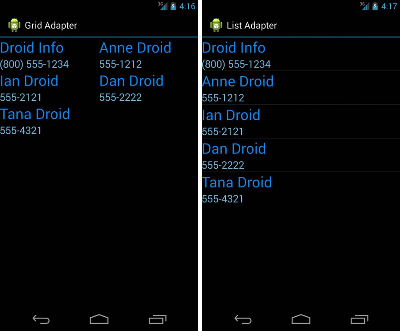
Figure 8.8 GridView and ListView: same data, same list item, different layout views.
Handling Selection Events
You often use AdapterView controls to present data from which the user should select. Both of the discussed controls—ListView and GridView—enable your application to monitor for click events in the same way. You need to call setOnItemClickListener() on your AdapterView and pass in an implementation of the AdapterView.OnItemClickListener class. Here is a sample implementation of this class:
av.setOnItemClickListener(
new AdapterView.OnItemClickListener() {
@Override
public void onItemClick(
AdapterView<?> parent, View view,
int position, long id) {
Toast.makeText(Scratch.this, "Clicked _id="+id,
Toast.LENGTH_SHORT).show();
}
});
In the preceding example, av is our AdapterView. The implementation of the onItemClick() method is where all the interesting work happens. The parent parameter is the AdapterView where the item was clicked. This is useful if your screen has more than one AdapterView on it. The Viewparameter is the specific View within the item that was clicked. The position is the zero-based position within the list of items that the user selects. Finally, the id parameter is the value of the _id column for the particular item that the user selects. This is useful for querying for further information about the particular row of data that the item represents.
Your application can also listen for long-click events on particular items. Additionally, your application can listen for selected items. Although the parameters are the same, your application receives a call as the highlighted item changes. This can be in response to the user scrolling with the arrow keys and not selecting an item for action.
Using ListActivity
The ListView control is commonly used for full-screen menus or lists of items from which a user selects. Thus, you might consider using ListActivity as the base class for such screens. Using the ListActivity can simplify these types of screens.
First, to handle item events, you now need to provide an implementation in your ListActivity. For instance, the equivalent of onListItemClickListener is to implement the onListItemClick() method within your ListActivity.
Second, to assign an Adapter, you need a call to the setListAdapter() method. You do this after the call to the setContentView() method. However, this hints at some of the limitations of using ListActivity.
To use ListActivity, the layout that is set with the setContentView() method must contain a ListView with the identifier set to android:list; this cannot be changed. Second, you can also have a View with an identifier set to android:empty to have a View display when no data is returned from the Adapter. Finally, this works only with ListView controls, so it has limited use. However, when it does work for your application, it can save some coding.
Tip
You can create ListView headers and footers using ListView.FixedViewInfo with the ListView methods addHeaderView() and addFooterView().
If you need a two-level list, you should use an ExpandableListActivity. You then use an ExpandableListView for presenting your View data. ExpandableListActivity allows an item within your list to expand and present a sublist of items. To create a sublist of items, you need to create anExpandableListAdapter to associate with your ExpandableListView.
Adding Scrolling Support
One of the easiest ways to provide vertical scrolling for a screen is by using the ScrollView (vertical scrolling) and HorizontalScrollView (horizontal scrolling) controls. Either control can be used as a wrapper container, causing all child View controls to have one continuous scroll bar. TheScrollView and HorizontalScrollView controls can have only one child, though, so it’s customary to have that child be a layout, such as a LinearLayout, which then contains all the “real” child controls to be scrolled through.
Tip
The code examples of scrolling in this section are provided in the SimpleScrolling application. The source code for the SimpleScrolling application is available for download on the book’s website.
Figure 8.9 shows a screen with and without a ScrollView control.
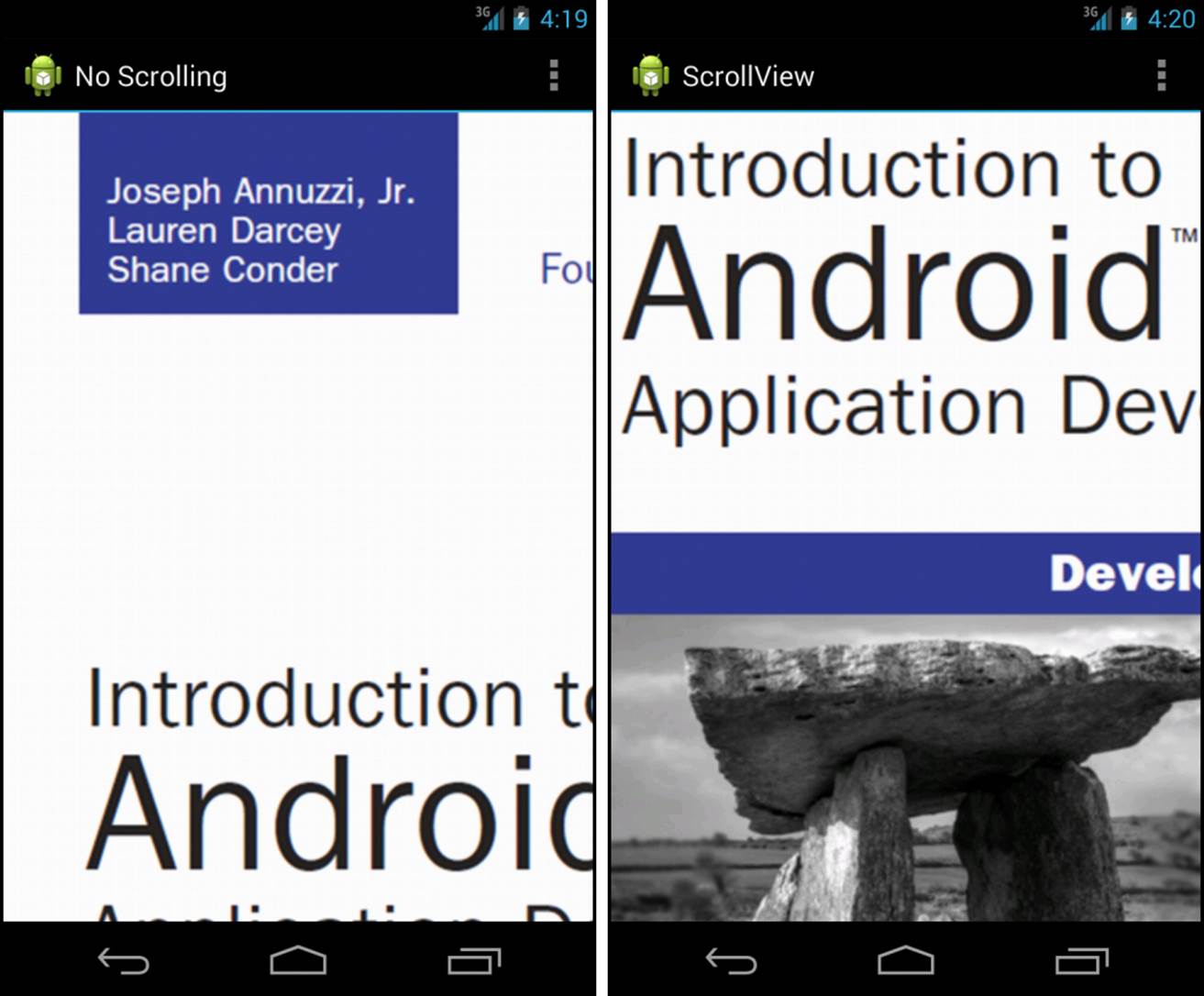
Figure 8.9 A screen without (left) and with (right) a ScrollView control.
Exploring Other View Containers
Many other user interface controls are available within the Android SDK. Some of these controls are listed here:
Switchers: A ViewSwitcher control contains only two child View controls, and only one of those is shown at a time. It switches between the two, animating as it does so. Primarily, the ImageSwitcher and TextSwitcher objects are used. Each one provides a way to set a new child View, either a Drawable resource or a text string, and then animates from what is displayed to the new contents.
ViewPager: A ViewPager is a useful View container for when your application has many different pages of data and you need to support swiping left and right through that data. To use a ViewPager, you must create a PagerAdapter that provides the data for the ViewPager. Fragments are typically used for paging data with ViewPager; we talk about fragments more in Chapter 9, “Partitioning the User Interface with Fragments.”
DrawerLayout: A new layout pattern that has been embraced by the Android team is the DrawerLayout. This layout is especially useful for providing a list of navigation items that are hidden off the screen but presented when users swipe from the left or the right, or when they press theHome button from the action bar if the DrawerLayout resides to the left. DrawerLayout should really be used only for navigation and only when there are more than three top-level views within your application.
Summary
The Android SDK provides a number of powerful methods for designing usable and great-looking screens. This chapter introduced you to many of these. You first learned about many of the Android layout controls that can manage the placement of your controls on the screen. LinearLayoutand RelativeLayout are two of the most common, but others such as FrameLayout, GridLayout, and TableLayout provide great flexibility for your layouts. In many cases, these enable you to have a single screen design that works on most screen sizes and aspect ratios.
You then learned about other objects that contain views and how to group or place them on the screen in a particular way. These included a variety of different controls for placing data on the screen in a readable and browsable way. In addition, you have learned how to use ListView andGridView as data-driven containers for displaying repetitive content. You now have all the tools you need to develop applications with usable and exciting user interfaces.
Quiz Questions
1. True or false: LinearLayout, FrameLayout, TableLayout, RelativeLayout, and GridLayout refer to a set of ViewControl classes.
2. True or false: A LinearLayout is used for showing each child View either in a single column or in a single row.
3. What is the method name for associating an XML layout resource file with an Activity?
4. True or false: The only way to create an Android user interface is by defining one in a layout resource XML file.
5. What is the syntax for assigning values to attributes within a layout resource XML file?
6. True or false: A FrameLayout is used for wrapping images within a picture frame.
7. True or false: The android.widget.SlidingDrawer class was added in API Level 17.
8. What is the name of the control for adding horizontal or vertical scrolling?
Exercises
1. Use the Android documentation to determine the difference between a CursorAdapter and a SimpleCursorAdapter, and provide an explanation of that difference.
2. Use the Android documentation to determine the difference between a GridView and a GridLayout, and provide an explanation of that difference.
3. Create a simple Android application demonstrating how to use the ViewSwitcher control. In the ViewSwitcher, define two layouts. The first is a GridLayout defining a login form with a Login button; when the Login button is clicked, switch to a LinearLayout displaying a welcome message. The second layout has a Logout button; when the Logout button is clicked, switch back to the GridLayout.
References and More Information
Android SDK Reference regarding the application ViewGroup class:
http://d.android.com/reference/android/view/ViewGroup.html
Android SDK Reference regarding the application LinearLayout class:
http://d.android.com/reference/android/widget/LinearLayout.html
Android SDK Reference regarding the application RelativeLayout class:
http://d.android.com/reference/android/widget/RelativeLayout.html
Android SDK Reference regarding the application FrameLayout class:
http://d.android.com/reference/android/widget/FrameLayout.html
Android SDK Reference regarding the application TableLayout class:
http://d.android.com/reference/android/widget/TableLayout.html
Android SDK Reference regarding the application GridLayout class:
http://d.android.com/reference/android/widget/GridLayout.html
Android SDK Reference regarding the application ListView class:
http://d.android.com/reference/android/widget/ListView.html
Android SDK Reference regarding the application ListActivity class:
http://d.android.com/reference/android/app/ListActivity.html
Android SDK Reference regarding the application ExpandableListActivity class:
http://d.android.com/reference/android/app/ExpandableListActivity.html
Android SDK Reference regarding the application ExpandableListView class:
http://d.android.com/reference/android/widget/ExpandableListView.html
Android SDK Reference regarding the application ExpandableListAdapter class:
http://d.android.com/reference/android/widget/ExpandableListAdapter.html
Android SDK Reference regarding the application GridView class:
http://d.android.com/reference/android/widget/GridView.html
Android SDK Reference regarding the application ViewPager class:
http://d.android.com/reference/android/support/v4/view/ViewPager.html
Android SDK Reference regarding the application PagerAdapter class:
http://d.android.com/reference/android/support/v4/view/PagerAdapter.html
Android SDK Reference regarding the application DrawerLayout class:
http://d.android.com/reference/android/support/v4/widget/DrawerLayout.html
Android Design: “Navigation Drawer”:
http://d.android.com/design/patterns/navigation-drawer.html
Android Training: “Creating a Navigation Drawer”:
http://d.android.com/training/implementing-navigation/nav-drawer.html
Android API Guides: “Layouts”:
http://d.android.com/guide/topics/ui/declaring-layout.html
All materials on the site are licensed Creative Commons Attribution-Sharealike 3.0 Unported CC BY-SA 3.0 & GNU Free Documentation License (GFDL)
If you are the copyright holder of any material contained on our site and intend to remove it, please contact our site administrator for approval.
© 2016-2026 All site design rights belong to S.Y.A.