The Android Developer’s Cookbook: Building Applications with the Android SDK, Second Edition (2013)
Chapter 7. Advanced User Interface Techniques
The landscape of Android-powered devices has changed drastically in the last few years. Where phones powered by Android once dominated, the advent of high-resolution small screens, watches, tablets, and even TV screens (through the use of Google TV) have taken applications and their layouts to new heights. This chapter describes creating a custom view, animation, accessing the accessibility features, using gestures, and drawing 3D images. It then discusses tablets and how to display multiple fragments, using an activity wrapper, and using dialog fragments.
Android Custom View
As discussed in Chapter 5, “User Interface Layout,” Android has two types of views: View objects and ViewGroup objects. A custom view can be created by either starting from scratch or inheriting an existing view structure. Some standard widgets are defined by the Android Framework under the View and ViewGroup classes, and if possible, the customization should start with one of these:
 Views—Button, EditText, TextView, ImageView, and so on
ViewGroups—LinearLayout, ListView, RelativeLayout, RadioGroup, and so on
Recipe: Customizing a Button
This recipe customizes a button using a class called MyButton. It extends the Button widget so that the component inherits most of the Button features. To customize a widget, the most important methods are onMeasure() and onDraw().
The onMeasure() method determines the size requirements for a widget. It takes two parameters: the width and height measure specifications. Customized widgets should calculate the width and height based on the contents inside the widget and then call setMeasuredDimension() with these values. If this is not done, an illegalStateException is thrown by measure().
The onDraw() method allows customized drawing on the widget. Drawing is handled by walking down the tree and rendering view by view. All parents are drawn before the children get drawn. If a background drawable is set for a view, the view draws that before calling back to itsonDraw() method.
Inside the MyButton class, eight member methods and two constructors are implemented. The member functions are:
setText()—Sets the text that is drawn on the button
setTextSize()—Sets the text size
setTextColor()—Sets the text color
measureWidth()—Measures the width of the Button widget
measureHeight()—Measures the height of the Button widget
drawArcs()—Draws arcs
onDraw()—Draws the graphics on the Button widget
onMeasure()—Measures and sets the boundary of the Button widget
The methods setText(), setTextSize(), and setTextColor() change the text attributes. Every time the text is changed, the invalidate() method needs to be called to force the view to redraw the button widget and reflect the change. The method requestLayout() is called in the setText()and setTextSize() methods but not in the setTextColor() method. This is because the layout is needed only when the boundary of the widget changes, which is not the case with text color changes.
Inside onMeasure(), the setMeasuredDimension() method is called with measureWidth() and measureHeight(). It is an important step for customizing the View.
The methods measureWidth() and measureHeight() are called with the size of the parent view and need to return the proper width and height values of the custom view based on the requested mode of measurement. If the EXACTLY mode of measurement is specified, the method needs to return the value given from the parent View. If the AT_MOST mode is specified, the method can return the smaller of the two values—content size and parent view size—to ensure that the content is sized properly. Otherwise, the method calculates the width and height based on the content inside the widget. In this recipe, the content size is based on the text size.
The method drawArcs() is a straightforward function that draws arcs on the button. This is called by onDraw() as the text is drawn. Animation of the arcs also takes place here. Every time the arc is drawn, its length is incremented a little and the gradient is rotated, making a nice animation.
The class for the custom button is shown in Listing 7.1. A constructor method is required, and here, two MyButton() methods are shown depending on arguments. Each initializes the label view with the custom attributes. The android.graphics.* libraries are similar in format to Java for graphics manipulations, such as Matrix and Paint.
Listing 7.1. src/com/cookbook/advance/MyButton.java
package com.cookbook.advance.customcomponent;
import android.content.Context;
import android.graphics.Canvas;import android.graphics.Color;import android.graphics.Matrix;import android.graphics.Paint;import android.graphics.RectF;import android.graphics.Shader;import android.graphics.SweepGradient;import android.util.AttributeSet;
import android.util.Log;
import android.widget.Button;
public class MyButton extends Button {
private Paint mTextPaint, mPaint;
private String mText;
private int mAscent;
private Shader mShader;
private Matrix mMatrix = new Matrix();
private float mStart;
private float mSweep;
private float mRotate;
private static final float SWEEP_INC = 2;
private static final float START_INC = 15;
public MyButton(Context context) {
super(context);
initLabelView();
}
public MyButton(Context context, AttributeSet attrs) {
super(context, attrs);
initLabelView();
}
private final void initLabelView() {
mTextPaint = new Paint();
mTextPaint.setAntiAlias(true);
mTextPaint.setTextSize(16);
mTextPaint.setColor(0xFF000000);
setPadding(15, 15, 15, 15);
mPaint = new Paint();
mPaint.setAntiAlias(true);
mPaint.setStrokeWidth(4);
mPaint.setAntiAlias(true);
mPaint.setStyle(Paint.Style.STROKE);
mShader = new SweepGradient(this.getMeasuredWidth()/2,
this.getMeasuredHeight()/2,
new int[] { Color.GREEN,
Color.RED,
Color.CYAN,Color.DKGRAY },
null);
mPaint.setShader(mShader);
}
public void setText(String text) {
mText = text;
requestLayout();
invalidate();
}
public void setTextSize(int size) {
mTextPaint.setTextSize(size);
requestLayout();
invalidate();
}
public void setTextColor(int color) {
mTextPaint.setColor(color);
invalidate();
}
@Override
protected void onMeasure(int widthMeasureSpec, int heightMeasureSpec){
setMeasuredDimension(measureWidth(widthMeasureSpec),
measureHeight(heightMeasureSpec));
}
private int measureWidth(int measureSpec) {
int result = 0;
int specMode = MeasureSpec.getMode(measureSpec);
int specSize = MeasureSpec.getSize(measureSpec);
if (specMode == MeasureSpec.EXACTLY) {
// We were told how big to be
result = specSize;
} else {
// Measure the text
result = (int) mTextPaint.measureText(mText)
+ getPaddingLeft()
+ getPaddingRight();
if (specMode == MeasureSpec.AT_MOST) {
result = Math.min(result, specSize);
}
}
return result;
}
private int measureHeight(int measureSpec) {
int result = 0;
int specMode = MeasureSpec.getMode(measureSpec);
int specSize = MeasureSpec.getSize(measureSpec);
mAscent = (int) mTextPaint.ascent();
if (specMode == MeasureSpec.EXACTLY) {
// We were told how big to be
result = specSize;
} else {
// Measure the text (beware: ascent is a negative number)
result = (int) (-mAscent + mTextPaint.descent())
+ getPaddingTop() + getPaddingBottom();
if (specMode == MeasureSpec.AT_MOST) {
Log.v("Measure Height", "At most Height:"+specSize);
result = Math.min(result, specSize);
}
}
return result;
}
private void drawArcs(Canvas canvas, RectF oval, boolean useCenter,
Paint paint) {
canvas.drawArc(oval, mStart, mSweep, useCenter, paint);
}
@Override protected void onDraw(Canvas canvas) {
mMatrix.setRotate(mRotate, this.getMeasuredWidth()/2,
this.getMeasuredHeight()/2);
mShader.setLocalMatrix(mMatrix);
mRotate += 3;
if (mRotate >= 360) {
mRotate = 0;
}
RectF drawRect = new RectF();
drawRect.set(this.getWidth()-mTextPaint.measureText(mText),
(this.getHeight()-mTextPaint.getTextSize())/2,
mTextPaint.measureText(mText),
this.getHeight()-(this.getHeight()-mTextPaint.getTextSize())/2);
drawArcs(canvas, drawRect, false, mPaint);
mSweep += SWEEP_INC;
if (mSweep > 360) {
mSweep -= 360;
mStart += START_INC;
if (mStart >= 360) {
mStart -= 360;
}
}
if(mSweep >180){
canvas.drawText(mText, getPaddingLeft(),
getPaddingTop() -mAscent, mTextPaint);
}
invalidate();
}
}
This custom Button widget can then be used in a layout as shown in Listing 7.2.
Listing 7.2. res/layout/main.xml
<?xml version="1.0" encoding="utf-8"?>
<LinearLayout xmlns:android="http://schemas.android.com/apk/res/android"
android:orientation="vertical"
android:layout_width="match_parent"
android:layout_height="match_parent"
android:gravity="center_vertical"
>
<com.cookbook.advance.customComponent.MyButton
android:layout_width="wrap_content"
android:layout_height="wrap_content"
android:id="@+id/mybutton1"
/>
</LinearLayout>
The layout XML has only one ViewGroup (LinearLayout) and one View, called by its definition location com.cookbook.advance.customComponent.myButton. This can be used in an activity, as shown in Listing 7.3.
Listing 7.3. src/com/cookbook/advance/ShowMyButton.java
package com.cookbook.advance.customComponent;
import android.app.Activity;
import android.os.Bundle;
public class ShowMyButton extends Activity{
@Override
protected void onCreate(Bundle savedInstanceState) {
super.onCreate(savedInstanceState);
setContentView(R.layout.main);
MyButton myb = (MyButton)findViewById(R.id.mybutton1);
myb.setText("Hello Students");
myb.setTextSize(40);
}
}
This shows that the custom button is used the same way as a normal Button widget. The resulting custom button is shown in Figure 7.1.
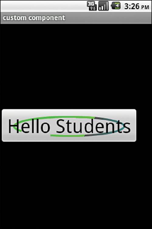
Figure 7.1 An example of a custom button
Android Animation
Android provides two types of animation: frame-by-frame and tween. Frame-by-frame animation shows a sequence of pictures in order. It enables developers to define the pictures to display and then show them like a slide show.
Frame-by-frame animation first needs an animation-list element in the layout file containing a list of item elements specifying an ordered list of the different pictures to display. The oneshot attribute specifies whether the animation is played only once or repeatedly. The animation list XML file is shown in Listing 7.4.
Listing 7.4. res/anim/animated.xml
<?xml version="1.0" encoding="utf-8"?>
<animation-list xmlns:android="http://schemas.android.com/apk/res/android"
android:oneshot="false">
<item android:drawable="@drawable/anddev1" android:duration="200" />
<item android:drawable="@drawable/anddev2" android:duration="200" />
<item android:drawable="@drawable/anddev3" android:duration="200" />
</animation-list>
To display the frame-by-frame animation, set the animation to a view’s background:
ImageView im = (ImageView) this.findViewById(R.id.myanimated);
im.setBackgroundResource(R.anim.animated);
AnimationDrawable ad = (AnimationDrawable)im.getBackground();
ad.start();
After the view background is set, a drawable can be retrieved by calling get Background() and casting it to AnimationDrawable. Then, calling the start() method starts the animation.
Tween animation uses a different approach that creates an animation by performing a series of transformations on a single image. In Android, it provides access to the following classes that are the basis for all the animations:
AlphaAnimation—Controls transparency changes
RotateAnimation—Controls rotations
ScaleAnimation—Controls growing or shrinking
TranslateAnimation—Controls position changes
These four animation classes can be used for transitions between activities, layouts, views, and so on. All these can be defined in the layout XML file as <alpha>, <rotate>, <scale>, and <translate>. They all have to be contained within an AnimationSet <set>:
<alpha> attributes:
android:fromAlpha, android:toAlpha
The alpha value translates the opacity from 0.0 (transparent) to 1.0 (opaque).
<rotate> attributes:
android:fromDegrees, android:toDegrees,
android:pivotX, android:pivotY
The rotate specifies the angle to rotate an animation around a center of rotation defined as the pivot.
<scale> attributes:
android:fromXScale, android:toXScale,
android:fromYScale, android:toYScale,
android:pivotX, android:pivotY
The scale specifies how to change the size of a view in the x axis or y axis. The pivot location that stays fixed under the scaling can also be specified.
<translate> attributes:
android:fromXDelta, android:toXDelta,
android:fromYDelta, android:toYDelta
The translate specifies the amount of translation to perform on a view.
Recipe: Creating an Animation
This recipe creates a new mail animation that can be used when mail is received. The main layout file is shown in Listing 7.5, and the new mail animation is shown in Figure 7.2.
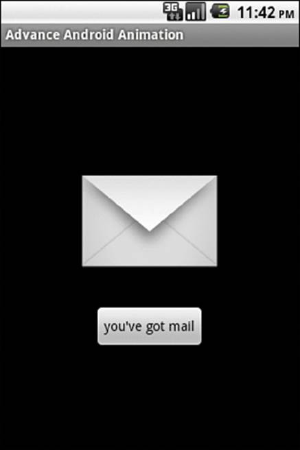
Figure 7.2 Basic layout for the animation
Listing 7.5. res/layout/main.xml
<?xml version="1.0" encoding="utf-8"?>
<LinearLayout xmlns:android="http://schemas.android.com/apk/res/android"
android:orientation="vertical"
android:layout_width="match_parent"
android:layout_height="match_parent"
android:gravity="center"
>
<ImageView
android:id="@+id/myanimated"
android:layout_width="wrap_content"
android:layout_height="wrap_content"
android:src="@drawable/mail"
/>
<Button
android:id="@+id/startanimated"
android:layout_width="wrap_content"
android:layout_height="wrap_content"
android:text="you've got mail"
/>
</LinearLayout>
To animate this view, an animation set needs to be defined. In Eclipse, right-click the res/ folder and select New → Android XML File. Then, fill in the filename as animated.xml and select the file type as Animation. Then, the file can be edited to create the content shown in Listing 7.6.
Listing 7.6. res/anim/animated.xml
<?xml version="1.0" encoding="utf-8"?>
<set xmlns:android="http://schemas.android.com/apk/res/and-
roid" android:interpolator="@android:anim/accelerate_interpolator">
<translate android:fromXDelta="100%p" android:toXDelta="0"
android:duration="5000" />
<alpha android:fromAlpha="0.0" android:toAlpha="1.0" android:duration="3000" />
<rotate
android:fromDegrees="0"
android:toDegrees="-45"
android:toYScale="0.0"
android:pivotX="50%"
android:pivotY="50%"
android:startOffset="700"
android:duration="3000" />
<scale
android:fromXScale="0.0"
android:toXScale="1.4"
android:fromYScale="0.0"
android:toYScale="1.0"
android:pivotX="50%"
android:pivotY="50%"
android:startOffset="700"
android:duration="3000"
android:fillBefore="false" />
</set>
The main activity is shown in Listing 7.7. It is a simple activity that creates an Animation object by using AnimationUtils to load the animationSet defined in the animation. Then, every time the user clicks on the button, it uses the ImageView object to run the animation by calling thestartAnimation() method using the Animation object already loaded.
Listing 7.7. src/com/cookbook/advance/MyAnimation.java
package com.cookbook.advance;
import android.app.Activity;
import android.os.Bundle;
import android.view.View;
import android.view.View.OnClickListener;
import android.view.animation.Animation;import android.view.animation.AnimationUtils;
import android.widget.Button;
import android.widget.ImageView;
public class MyAnimation extends Activity {
/** called when the activity is first created */
@Override
public void onCreate(Bundle savedInstanceState) {
super.onCreate(savedInstanceState);
setContentView(R.layout.main);
final ImageView im
= (ImageView) this.findViewById(R.id.myanimated);
final Animation an
= AnimationUtils.loadAnimation(this, R.anim.animated);
im.setVisibility(View.INVISIBLE);
Button bt = (Button) this.findViewById(R.id.startanimated);
bt.setOnClickListener(new OnClickListener(){
public void onClick(View view){
im.setVisibility(View.VISIBLE);
im.startAnimation(an);
}
});
}
}
Recipe: Using Property Animations
Starting with Honeycomb (API Level 11), objects such as buttons can also be animated by changing their properties. In this recipe, there are three buttons that when clicked will perform various animations based on property value changes.
Changes to property values can be done either directly in the activity code or loaded in a separate XML file. When choosing an animation style, it is important to remember that coding the animations in the activity allows for greater control over dynamic data, whereas XML files make complex animations easier to implement.
An important note regarding change with animations is that XML files that use ValueAnimator, ObjectAnimator, and AnimatorSet tags should put resources in the res/animator folder to distinguish between legacy animation XML files that are stored in the res/anim folder.
Listing 7.8 shows the code for an activity that uses both inline animation code and references to an XML file. OnClickListener is used to bind each button to a function that animates the button.
btnShift uses ValueAnimator along with ObjectAnimator to set the values that will be applied to the button when clicked.
btnRotate has commented-out code that displays a rotation animation using inline code. It also shows how to use an XML file, located in the res/animator directory and shown in Listing 7.9, to perform the same animation.
btnSling also uses an XML file, shown in Listing 7.10, for animation but contains two animations instead of one. Multiple animations can be included in the XML file and will run simultaneously. The property of android:startOffset is used to delay the start of animations. This will “queue” animations to run in order.
Listing 7.8. src/com/cookbook/propertyanimation/MainActivity.java
package com.cookbook.propertyanimation;
import android.animation.ArgbEvaluator;
import android.animation.ObjectAnimator;
import android.animation.ValueAnimator;
import android.app.Activity;
import android.graphics.Color;
import android.os.Bundle;
import android.view.View;
import android.view.animation.AnimationUtils;
import android.widget.Button;
public class MainActivity extends Activity {
Button btnShift;
Button btnRotate;
Button btnSling;
@Override
protected void onCreate(Bundle savedInstanceState) {
super.onCreate(savedInstanceState);
setContentView(R.layout.activity_main);
btnShift = (Button)this.findViewById(R.id.button);
btnRotate = (Button)this.findViewById(R.id.button1);
btnSling = (Button)this.findViewById(R.id.button2);
btnShift.setOnClickListener(new Button.OnClickListener() {
public void onClick(View v) {
int start = Color.rgb(0xcc, 0xcc, 0xcc);
int end = Color.rgb(0x00, 0xff, 0x00);
ValueAnimator va =
ObjectAnimator.ofInt(btnShift, "backgroundColor", start, end);
va.setDuration(750);
va.setRepeatCount(1);
va.setRepeatMode(ValueAnimator.REVERSE);
va.setEvaluator(new ArgbEvaluator());
va.start();
}
});
btnRotate.setOnClickListener(new Button.OnClickListener() {
public void onClick(View v) {
// Use ValueAnimator
/*
ValueAnimator va = ObjectAnimator.ofFloat(btnRotate, "rotation", 0f, 360f);
va.setDuration(750);
va.start();
*/
// Or use an XML-defined animation
btnRotate.startAnimation(AnimationUtils.loadAnimation(MainActivity.this,
R.animator.rotation));
}
});
btnSling.setOnClickListener(new Button.OnClickListener() {
public void onClick(View v) {
btnSling.startAnimation(AnimationUtils.loadAnimation(MainActivity.this,
R.animator.sling));
}
});
}
}
Listing 7.9. res/animator/rotation.xml
<?xml version="1.0" encoding="utf-8"?>
<rotate
xmlns:android="http://schemas.android.com/apk/res/android"
android:fromDegrees="0"
android:toDegrees="360"
android:pivotX="50%"
android:pivotY="50%"
android:duration="500" android:fillAfter="true">
</rotate>
Listing 7.10. res/animator/sling.xml
<?xml version="1.0" encoding="utf-8"?>
<set xmlns:android="http://schemas.android.com/apk/res/android">
<scale
android:interpolator="@android:anim/accelerate_decelerate_interpolator"
android:fromXScale="0.0"
android:toXScale="1.8"
android:fromYScale="0.0"
android:toYScale="1.4"
android:pivotX="50%"
android:pivotY="50%"
android:fillAfter="false"
android:duration="1000" />
<scale
android:fromXScale="1.8"
android:toXScale="0.0"
android:fromYScale="1.4"
android:toYScale="0.0"
android:pivotX="50%"
android:pivotY="50%"
android:startOffset="1000"
android:duration="300"
android:fillBefore="false" />
</set>
Accessibility
Android comes with several accessibility features baked into the platform. TalkBack is a service that is installed on most Android devices. It works by using voice synthesis to read what is displayed on the screen. If a device does not have TalkBack installed, it can be downloaded from Google Play.
TalkBack can be enabled by navigating to the settings section of the device and to the item named “Accessibility.” When TalkBack is installed, a toggle for TalkBack can be enabled. When it is turned on, the way a user interacts with the Android device is changed. The entire screen becomes an input surface that allows gestures and swipes to navigate between various applications and screens. An application must first be selected, and then the screen must be double-tapped to open it.
Soft keys such as the Back or Home key must be selected and then double-tapped.
Recipe: Using Accessibility Features
Google recommends the following checklist for creating accessible applications:
Make sure that the component is described. This can be done with android:contentDescription in the layout XML file.
Make sure that the components used are focusable.
Take advantage of the accessibility interfaces if using any custom controls.
Do not use audio only for interaction. Always add a visual cue or even haptic feedback to applications.
Test applications without looking at the screen using TalkBack.
When adding descriptions to interface components, the editText field uses android:hint instead of android:contentDescription. When the field is empty, the value of android:hint will be read out loud. If the field contains text that has been entered by the user, that will be read out loud in place of the hint. Listing 7.11 shows a layout file with the fields populated.
Listing 7.11. res/layout/activity_main.xml
<RelativeLayout xmlns:android="http://schemas.android.com/apk/res/android"
xmlns:tools="http://schemas.android.com/tools"
android:layout_width="match_parent"
android:layout_height="match_parent"
tools:context=".MainActivity" >
<EditText
android:id="@+id/edittext1"
android:layout_width="wrap_content"
android:layout_height="wrap_content"
android:layout_alignParentTop="true"
android:layout_centerHorizontal="true"
android:ems="10"
android:hint="Enter some text here"
android:nextFocusDown="@+id/button1" >
<requestFocus />
</EditText>
<TextView
android:id="@+id/textview1"
android:layout_width="wrap_content"
android:layout_height="wrap_content"
android:layout_below="@+id/editText1"
android:layout_centerHorizontal="true"
android:layout_marginTop="35dp"
android:contentDescription="Text messages will appear here"
android:text="This is a TextView" />
<RadioGroup
android:id="@+id/radiogroup1"
android:layout_width="wrap_content"
android:layout_height="wrap_content"
android:layout_below="@+id/textView1"
android:layout_centerHorizontal="true"
android:layout_marginTop="21dp" >
<RadioButton
android:id="@+id/radio0"
android:layout_width="wrap_content"
android:layout_height="wrap_content"
android:checked="true"
android:contentDescription="Select for a banana"
android:text="Banana" />
<RadioButton
android:id="@+id/radio1"
android:layout_width="wrap_content"
android:layout_height="wrap_content"
android:contentDescription="Select for a coconut"
android:text="Coconut" />
<RadioButton
android:id="@+id/radio2"
android:layout_width="wrap_content"
android:layout_height="wrap_content"
android:contentDescription="Select for a grape"
android:text="Grape" />
</RadioGroup>
</RelativeLayout>
Fragments
On large-screen devices, how the application will display information in a pleasing and easy-to-use manner must be considered. Knowing that tablets have a larger physical viewing area than most phones, developers can plan on having their applications display data differently from the way they do on a small-screen device.
Some great examples of this are applications that are already built into both phones and tablet devices such as the Contacts or People application. When one of those applications is opened on a phone, users are treated to a list view that allows them to scroll through their contacts and then tap contacts to open information about them. On a tablet, the list view is smaller and displayed on the left side of the screen; the right side of the screen shows the extended information about the contact.
The Calendar application has a similar function, showing a small and precise amount of data on a phone while showing extended information on the bottom portion of the screen on a tablet.
The ability to display extended data is done through the use of fragments. Fragments are modular portions of an activity that can be used to change the presentation of an application. A fragment acts similarly to an activity, but it has a different lifecycle and way of processing logic. The recipes in this section focus on using fragments to optimize the display of content across devices with various screen sizes.
Recipe: Displaying Multiple Fragments at Once
This recipe includes two fragments to display a list using a ListFragment and to display a TextView using a fragment. On small-screen devices, the list is best displayed in one window and the text in a separate window. On large-screen devices, both the list and the text can be displayed in the same window.
To start, the XML layout files are defined using two XML files in the res/layout folder for small-screen devices, and a layout file in the res/layout-large folder for large-screen devices.
Listing 7.12 shows the activity_main.xml file. The layout file is rather minimal, as the ListFragment that will be loaded into the FrameLayout will provide most of the layout needed.
Listing 7.12. res/layout/activity_main.xml
<?xml version="1.0" encoding="utf-8"?>
<FrameLayout xmlns:android="http://schemas.android.com/apk/res/android"
android:id="@+id/fragment_container"
android:layout_width="match_parent"
android:layout_height="match_parent" />
To continue the layout for small-screen devices, another layout that can be used to display text values is needed. Listing 7.13 shows the contents of text_view.xml.
Listing 7.13. res/layout/text_view.xml
<?xml version="1.0" encoding="utf-8"?>
<TextView xmlns:android="http://schemas.android.com/apk/res/android"
android:id="@+id/text"
android:layout_width="match_parent"
android:layout_height="match_parent"
android:padding="16dp"
android:textSize="18sp" />
For large-screen devices, a folder named layout-large will need to be created inside the res directory. Once that folder has been created, another layout XML file is needed. In this instance, another activity_main.xml file is added. Listing 7.14 shows the contents of the file that will be used for the large-screen layout.
Listing 7.14. res/layout-large/activity_main.xml
<LinearLayout xmlns:android="http://schemas.android.com/apk/res/android"
android:orientation="horizontal"
android:layout_width="match_parent"
android:layout_height="match_parent">
<fragment android:name="com.cookbook.fragments.ItemFragment"
android:id="@+id/item_fragment"
android:layout_weight="1"
android:layout_width="0dp"
android:layout_height="match_parent" />
<fragment android:name="com.cookbook.fragments.TextFragment"
android:id="@+id/text_fragment"
android:layout_weight="2"
android:layout_width="0dp"
android:layout_height="match_parent" />
</LinearLayout>
The fragment elements inside Listing 7.15 reference a class file that holds the logic used for each fragment. The listing shows the contents of a fragment element that references src/com/cookbook/fragments/ItemFragment.java. The ItemFragment.java file uses getFragmentManager to determine if the device should use the large layout or not. Also note that ItemFragment references Strings.Items, which is an array created in Strings.java that is imported in TextFragment.java.
Listing 7.15. src/com/cookbook/fragments/ItemFragment.java
package com.cookbook.fragments;
import android.app.Activity;
import android.os.Build;
import android.os.Bundle;
import android.support.v4.app.ListFragment;
import android.view.View;
import android.widget.ArrayAdapter;
import android.widget.ListView;
public class ItemFragment extends ListFragment {
OnItemSelectedListener mCallback;
public interface OnItemSelectedListener {
public void onItemSelected(int position);
}
@Override
public void onCreate(Bundle savedInstanceState) {
super.onCreate(savedInstanceState);
// Older than Honeycomb requires a different layout
int layout = Build.VERSION.SDK_INT >= Build.VERSION_CODES.HONEYCOMB ?
android.R.layout.simple_list_item_activated_1 :
android.R.layout.simple_list_item_1;
setListAdapter(new ArrayAdapter<String>(getActivity(), layout,
Strings.Items));
}
@Override
public void onStart() {
super.onStart();
if (getFragmentManager().findFragmentById(R.id.item_fragment) != null) {
getListView().setChoiceMode(ListView.CHOICE_MODE_SINGLE);
}
}
@Override
public void onAttach(Activity activity) {
super.onAttach(activity);
try {
mCallback = (OnItemSelectedListener) activity;
} catch (ClassCastException e) {
throw new ClassCastException(activity.toString()
+ " must implement OnItemSelectedListener");
}
}
@Override
public void onListItemClick(ListView l, View v, int position, long id) {
mCallback.onItemSelected(position);
getListView().setItemChecked(position, true);
}
}
Listing 7.16 shows the contents of the fragment element that references src/com/cookbook/fragments/TextFragment.java.
Listing 7.16. src/com/cookbook/fragments/TextFragment.java
package com.cookbook.fragments;
import com.cookbook.fragments.Strings;
import com.cookbook.fragments.R;
import android.os.Bundle;
import android.support.v4.app.Fragment;
import android.view.LayoutInflater;
import android.view.View;
import android.view.ViewGroup;
import android.widget.TextView;
public class TextFragment extends Fragment {
final static String ARG_POSITION = "position";
int mCurrentPosition = -1;
@Override
public View onCreateView(LayoutInflater inflater,
ViewGroup container, Bundle savedInstanceState) {
return inflater.inflate(R.layout.text_view, container, false);
}
@Override
public void onStart() {
super.onStart();
Bundle args = getArguments();
if (args != null) {
updateTextView(args.getInt(ARG_POSITION));
} else if (mCurrentPosition != -1) {
updateTextView(mCurrentPosition);
} else {
TextView tv = (TextView) getActivity().findViewById(R.id.text);
tv.setText("Select an item from the list.");
}
}
public void updateTextView(int position){
TextView tv = (TextView) getActivity().findViewById(R.id.text);
tv.setText(Strings.Text[position]);
mCurrentPosition = position;
}
@Override
public void onSaveInstanceState(Bundle outState) {
super.onSaveInstanceState(outState);
outState.putInt(ARG_POSITION, mCurrentPosition);
}
}
Now that the layout has been set up and the fragments have been created, Listing 7.17 shows the contents of MainActivity.java. The fragments are handled by the FragmentManager by means of a FragmentTransaction. The FragmentTransaction keeps track of what fragments are available in the view. Whenever FragmentTransaction is used to add, remove, or replace fragments, the commit() method must be called.
Listing 7.17. src/com/cookbook/fragments/MainActivity.java
package com.cookbook.fragments;
import android.os.Bundle;
import android.support.v4.app.FragmentActivity;
import android.support.v4.app.FragmentTransaction;
// When using the support lib, use FragmentActivity
public class MainActivity extends FragmentActivity implements
ItemFragment.OnItemSelectedListener {
@Override
protected void onCreate(Bundle savedInstanceState) {
super.onCreate(savedInstanceState);
setContentView(R.layout.activity_main);
//If using large layout, use the Support Fragment Manager
if (findViewById(R.id.fragment_container) != null) {
if(savedInstanceState != null){
return;
}
ItemFragment firstFragment = new ItemFragment();
firstFragment.setArguments(getIntent().getExtras());
getSupportFragmentManager().beginTransaction().add(R.id.fragment_container,
firstFragment).commit();
}
}
public void onItemSelected(int position) {
TextFragment textFrag =
(TextFragment) getSupportFragmentManager()
.findFragmentById(R.id.text_fragment);
if (textFrag != null) {
textFrag.updateTextView(position);
} else {
TextFragment newFragment = new TextFragment();
Bundle args = new Bundle();
args.putInt(TextFragment.ARG_POSITION, position);
newFragment.setArguments(args);
FragmentTransaction transaction =
getSupportFragmentManager().beginTransaction();
transaction.replace(R.id.fragment_container, newFragment);
transaction.addToBackStack(null);
transaction.commit();
}
}
}
Recipe: Using Dialog Fragments
In addition to changing the layout of a page, a DialogFragment can be used to display a dialog window that contains a fragment. A DialogFragment is exactly what it sounds like: a dialog that is contained inside a fragment. It is recommended to always build dialogs with DialogFragments; the support library can help with porting code to previous versions of Android. Listing 7.18 shows how the activity is set up to use DialogFragment. Note that because it is using a fragment, it must extend FragmentActivity.
Listing 7.18. src/com/cookbook/dialogfragment/MainActivity.java
package com.cookbook.dialogfragment;
import android.os.Bundle;
import android.support.v4.app.FragmentActivity;
import android.view.View;
import android.widget.Button;
import android.widget.Toast;
public class MainActivity extends FragmentActivity {
@Override
public void onCreate(Bundle savedInstanceState) {
super.onCreate(savedInstanceState);
setContentView(R.layout.activity_main);
Button buttonOpenDialog = (Button) findViewById(R.id.opendialog);
buttonOpenDialog.setOnClickListener(new Button.OnClickListener() {
@Override
public void onClick(View arg0) {
openDialog();
}
});
}
void openDialog() {
MyDialogFragment myDialogFragment = MyDialogFragment.newInstance();
myDialogFragment.show(getSupportFragmentManager(), "myDialogFragment");
}
public void protestClicked() {
Toast.makeText(MainActivity.this, "Your protest has been recorded", Toast.LENGTH_LONG).show();
}
public void forgetClicked() {
Toast.makeText(MainActivity.this,
"You have chosen to forget", Toast.LENGTH_LONG).show();
}
}
Listing 7.19 shows the logic for DialogFragment. Here, the class MyDialogFragment extends DialogFragment. The onCreateDialog method is overridden, and a new Dialog is built along with some onClick logic.
Listing 7.19. src/com/cookbook/dialogfragment/MyDialogFragment.java
package com.cookbook.dialogfragment;
import android.app.AlertDialog;
import android.app.Dialog;
import android.content.DialogInterface;
import android.os.Bundle;
import android.support.v4.app.DialogFragment;
public class MyDialogFragment extends DialogFragment {
static MyDialogFragment newInstance() {
MyDialogFragment mdf = new MyDialogFragment();
Bundle args = new Bundle();
args.putString("title", "Dialog Fragment");
mdf.setArguments(args);
return mdf;
}
@Override
public Dialog onCreateDialog(Bundle savedInstanceState) {
String title = getArguments().getString("title");
Dialog myDialog = new AlertDialog.Builder(getActivity())
.setIcon(R.drawable.ic_launcher)
.setTitle(title)
.setPositiveButton("Protest", new DialogInterface.OnClickListener() {
@Override
public void onClick(DialogInterface dialog, int which) {
((MainActivity) getActivity()).protestClicked();
}
})
.setNegativeButton("Forget", new DialogInterface.OnClickListener() {
@Override
public void onClick(DialogInterface dialog, int which) {
((MainActivity) getActivity()).forgetClicked();
}
}).create();
return myDialog;
}
}