Hello App Inventor!: Android programming for kids and the rest of us (2015)
Chapter 3. Using the screen: layouts and the canvas
Getting objects to appear in the right place onscreen can be tricky—especially because Android devices come in all shapes and sizes. Also, you never know when a user will tip the screen and the display will change from portrait to landscape. In the Ewe Scared Her! app in chapter 2, you used a basic vertical layout to make sure items appeared in the right order top to bottom; you also used an invisible spacer to separate the sheep from the button. In this chapter, we’ll take these ideas further by looking at more screen properties and also layout components in the Palette. You’ll practice these skills by making a Spooky Sound FX app.
In the second half of the chapter, we’ll begin to look at the canvas, a powerful tool for organizing graphical elements anywhere onscreen. You’ll also see that the canvas lets you interact with the screen in ways other than just the single touch you’ve used so far with buttons. In the Graffiti Artist app, you’ll be dragging paint all over the screen (coveralls optional).
Layout
In this section, you’ll take control of the screen, organizing eight elements in a grid to make a Sound FX app that plays spooky noises. It looks simple, but you need to make sure that
· The app copes with the user tilting or rotating the phone. If the layout also rotates, then some buttons will disappear off the bottom of the app.
· The buttons appear in a centered grid and are sized correctly.
Dealing with phone rotation is easy—there’s an option to allow or stop rotation in the screen’s properties. For this app, you won’t allow the display to rotate (see the section “1. Set the screen properties” for the Spooky Sound FX app for how to do this).
Arranging elements in a grid is trickier. Unless you tell it what to do, App Inventor defaults to piling components on top of each other. Drag three objects onto the screen in the App Inventor Designer, and they pile up like a stack of pancakes. You can change the order, but if you want the objects next to each other, what do you do?
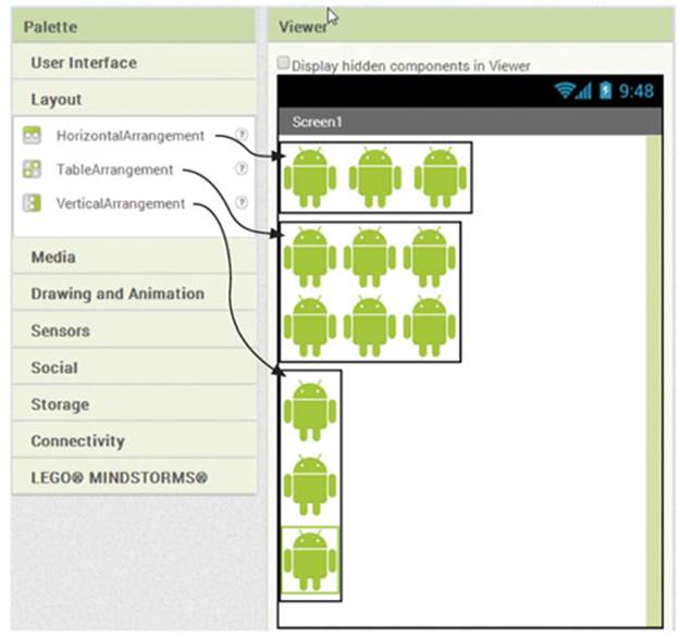
You can choose from three components to help you, in the Layout section of your Palette:
· HorizontalArrangement should be used when you want components placed left to right across the screen.
· TableArrangement lets you arrange components in a grid. You can put only one component in each cell—if you squash a couple or more in, only the last component will be displayed.
· VerticalArrangement lets you stack components on top of each other.
Learning Point: Testing layouts
Always test layouts on the emulator or a phone. In all the apps in this chapter, you’ll see differences such as lines around the layout components that are invisible on the phone.
Layout: mini-project

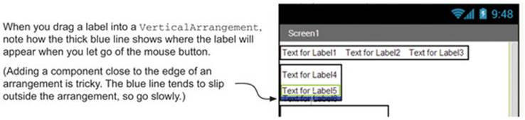
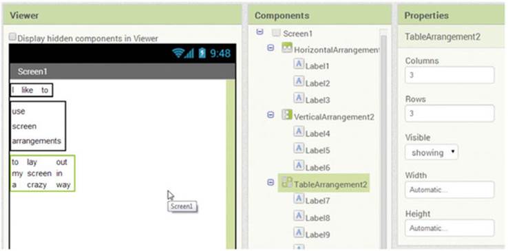
Try to reproduce the sentence layout above using the HorizontalArrangement, VerticalArrangement, and TableArrangement components. Each word should be created on a separate label—so you’ll end up with 15 labels in your project. For Horizontal-Arrangement andVerticalArrangement, you can drag and drop labels into the correct place using the blue indicator to help see where the label will appear.
When you create the TableArrangement, you specify the number of columns and rows in Properties. In this case, you want three columns and three rows. Then drag in components just like with HorizontalArrangement and VerticalArrangement.
When you’re finished, your screen should look like this:
Warning: quirky graphical effects
TABLES
At the time of writing, the Layout component in App Inventor can be a little quirky because empty cells are ignored. For example, if you create a 3 x 3 table and put something in the top-middle cell and something else in the bottom-middle cell, they will be spaced apart in the Designer—but on your phone, the space in the center will be ignored.
In addition, image elements in a table try to match the width of the widest element. So if an image at the top is wide and another at the bottom is narrow, the bottom image will appear stretched—or disappear. You can fix these image issues by manually setting the Height and Widthproperties of each image.
TRANSPARENCY
While we’re on the subject of quirky graphical effects, transparency can sometimes misbehave. For example, if you set your screen’s BackgroundColor property to a color (rather than None) and then insert a background image and a component with some transparency (like the sheep inchapter 1), then on the phone the transparent areas will be a solid block of color (whatever the original screen background was). Change the screen’s BackgroundColor property back to None to restore image transparency.
Now that you understand the three layout components, you’ll put the table component to practical use in a Spooky Sound FX app. Then, in the Graffiti Artist app, you’ll use a horizontal arrangement to give the user a neat bar of buttons for picking colors.
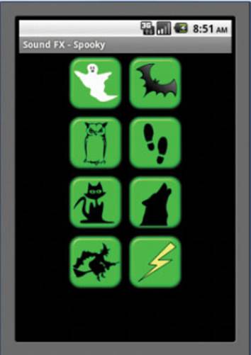
Spooky Sound FX app

PURPOSE OF THIS APP
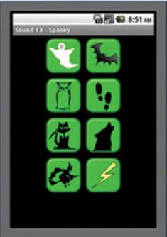
This is a sound-board app that lets you play eight spooky sound effects by touching an icon. You could use the app to scare your friends (or your computer teacher). It could also provide sound effects for a ghost story, play, or movie that you record.
APP RATING
ASSETS YOU’LL NEED
Eight spooky button images and sounds. Rumors that Paula provided the witch’s cackle are entirely unfounded.
In previous chapters, we showed you every single app-building step. We figure you’re getting the hang of things by now. To help you build apps quickly from this point on, we’ll give you a summary of the components you need to drag onscreen and then concentrate on the tricky parts in the explanations. If you’re feeling adventurous, you can try setting up the app from just the following table and see how far you get before reading further. It’s important that each new app start as a new project with a sensible name (for example, SoundFx). If you don’t name your projects something meaningful, then later on you’ll be left with a list of projects that you’ll have to open one by one to find out what they do. This quickly becomes tedious—so get into the habit of naming things properly now.
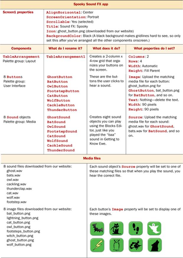
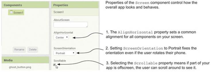
1. Setting the screen properties: alignment, orientation, and scrolling
Sometimes you want an app to change its orientation when the phone is rotated (you’ll see examples in later chapters). But for this app, you want to make sure the app stays in portrait alignment (even if the user tips the phone). You also want the user to be able to scroll around and see all the icons if they have a very small Android screen. Finally, you want the table and buttons to be centrally aligned. All this is controlled in the Screen component’s properties. Use the table at the start of this section to set all the properties for Screen1 except BackgroundColor. The properties you haven’t come across before are as follows:
2. Setting up the table arrangement and eight buttons
Once you’ve added the TableArrangement component to the screen, make sure its properties are set exactly as described in the app table at the start of this section. You should see an empty box with a green outline appear. Add the eight buttons, placing one in each section of the table. Don’t forget to delete the buttons’ text and set their width and height to 90 pixels as you did in chapter 2.
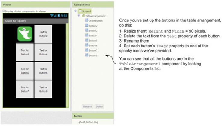
When the layout is complete, set Screen1’s BackgroundColor property to Black. Now you should see a black screen with eight green icons, as shown in the screenshot in the next section.
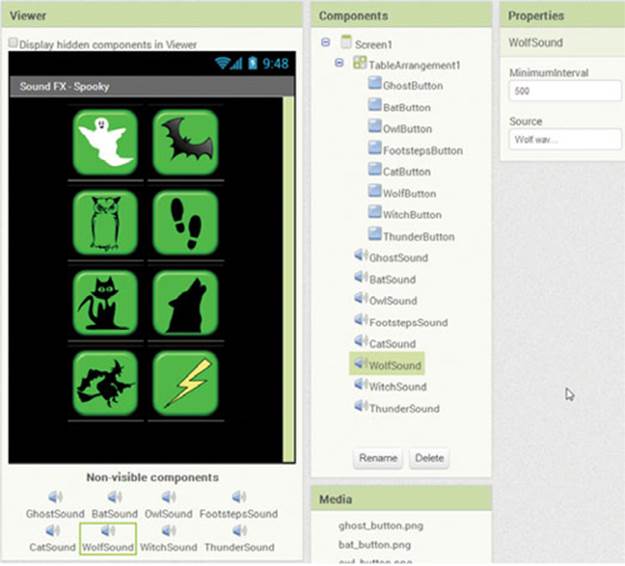
3. Adding the eight Sound components and their source files
The final part of this setup is to add eight Sound components (remember that these are found in the Media section of the Palette and that you drag-and-drop them anywhere on the screen). Rename them, and set their Source properties to match their names—for example, the WolfSoundcomponent’s source file is called wolf.wav. Your Spooky Sound FX app design is complete and should look like this.
4. Coding the blocks
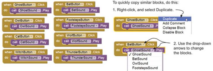
You already know the code you need here—it’s exactly the same as for the baaing sheep in Getting to Know Ewe. The difference is that instead of choosing SheepButton.Click, you’ll need eight Button.Click events—one for each spooky sound. When you’ve added the eightButton.Click events and the eight Sound.Play functions, the final result should look something like this:
Taking it further
Here are some creative ways you could change or rebuild this app:
· Add more rows and columns of buttons—and find your own favorite button images and sounds.
· Create a sound board using sound effects from your favorite movie or videogame genre, such as sci-fi, action, or comedy.
· Create a sound board of your favorite movie quotes and snippets.
· Make a friends and family sound board with recorded messages and photos.
· Make a beatbox app with your favorite drum loops and instrument hits. What happens if you click the same button multiple times? What happens if you click one button right after another?
· Make a sound board of your favorite jokes—don’t forget to include an Applause button and a Canned Laughter button just in case nobody gets them!
Tip
In addition to finding sound clips on the web, you could record yourself using a microphone.
There are lots of internet sites where you can download sound effects and clip art for your buttons. For the Spooky Sound FX app, we used mainly www.clker.com for the graphics and www.freesound.org for the sound clips. We edited the sound clips using the brilliant and free Audacity software: http://audacity.sourceforge.net.
Learning Point: Copyright, Creative Commons, and public domain
Copying and using images and sounds from the internet is easy to do, but you need to be careful that you aren’t stealing someone else’s work. This becomes especially important if you plan to make your apps widely available—that is, sharing them through your own website or the Play Store rather than creating apps for your personal use or to share with a few friends. Broadly speaking, images and sounds usually fall into one of three categories:
· Copyrighted material© —When you see the copyright symbol, it means you need to seek permission from the copyright owner before you can copy or use the item. You may find that the original creator is happy for you to use their work—particularly when it’s an individual rather than a large corporation. They may ask that you don’t change it and that you make it clear that they created the original (this is called attribution).
· Public domain —Items in the public domain are copyright free and can be freely copied and reused without attribution or payment.
· Creative Commons  —Content marked with the double CC logo has a Creative Commons license. Creative Commons is a way content creators can easily license their work so that other people can use it. Content creators can choose
o Whether their work may be changed or just copied (called derivative)
o Whether their work can be sold as part of something else (called commercial)
o Whether you have to state who made the original (called attribution)
Creative Commons uses symbols to say which of these things are allowed. You can find out more here: http://creativecommons.org.
When you’ve created your own apps, Creative Commons is a good way to make it clear to others what they’re allowed to do with them.
Warning: sound and graphics file formats
App Inventor’s Sound component generally likes sounds in WAV or MP3 format. It sometimes has a problem with audio files that are large or that have embedded tags. So if you have problems with an audio file, try these things:
· Check that it’s short—say, less than 30 seconds.
· Convert it to a different format. For example, if it’s an MP3, convert it to a WAV. You can use Audacity or a free online service to do this, like http://media.io.
· Use Audacity to make the file smaller by reducing its bit rate (quality). You’ll find this setting at bottom right on the screen. 11,025 Hz or lower is fine.
· Close your App Inventor windows, disconnect your phone, and then restart everything. (You’ll be surprised how often this works!)
For graphics files, we usually stick to JPEGs or PNGs. Resizing them in a graphics editor before uploading is usually better than uploading a large image and then reducing it in App Inventor.
Now that you know how to make grid layouts, we’ll look at the Canvas component. It deals with screen layout and interaction in a much more flexible fashion.
Introducing the Canvas component
Canvas is a component that provides more advanced graphical components, animations, and user interactions. What are the differences between the canvas and the screen?
Each app has a screen that is generated as soon as you select New Project. You can’t change the name of Screen1. This screen is a container for all the components the user interacts with—it’s essentially a box for putting things into.
The canvas is both a container for things and a two-dimensional touch-sensitive rectangular panel. It can detect events like touching, dragging, and flinging (more on this in chapter 4). You can draw on a canvas, and sprites (animated figures) can move around on it. In fact, if you want any animation in your app, you have to include a Canvas component. In addition to the usual color, width, height, and background image properties, Canvas also allows you to set a default paint color and line width.
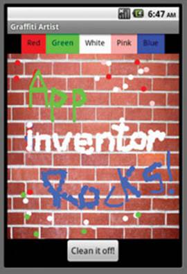
Graffiti Artist app
PURPOSE OF THIS APP
When the user drags their finger (or the mouse, in the emulator) across the wall, they draw lines. The user can also touch the screen to make dots. They can choose the paint color by tapping a color button. Clicking Clean It Off! clears all the graffiti.
APP RATING
ASSETS YOU’LL NEED
Image: Wall.png.

Create a new app called Graffiti Artist.
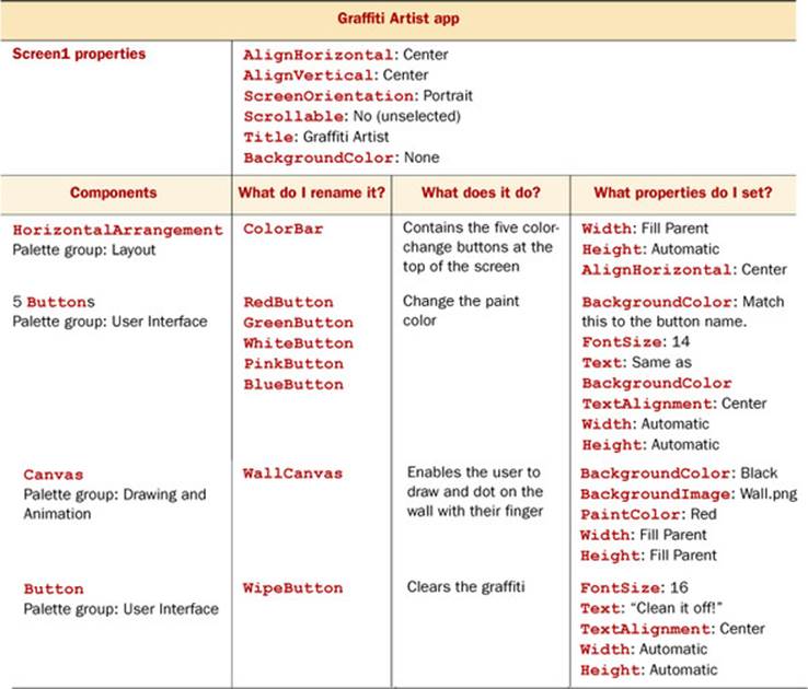
1. Setting up the user interface
In this app, it’s important that the graffiti wall fill as much of the screen as possible. A current working standard size for a small phone is 320 pixels x 480 pixels (width x height). But the screen size of the devices (phones, tablets, and so on) that you might want to use your app on will vary. Generally, experimenting with the Fill Parent and Automatic options for width and height is a good idea. This means the Layout component will attempt to fill the screen space available. You can see from the table that you use these settings for most of the components. The other tricky part of this arrangement is making sure the five buttons at the top go into the HorizontalArrangement and everything else sits below it.
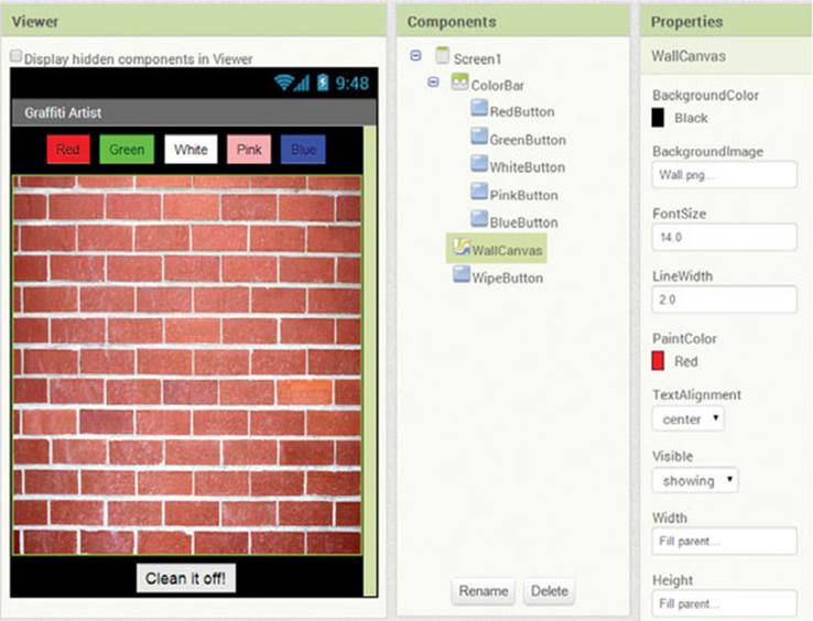
Follow the table to design your screen. It should end up looking like this.
2. Coding the blocks
Now that you have your user interface set up with your canvas, arrangement, and buttons, it’s time to think about how the user will interact with the app. A user can trigger four types of events in your app:
· They touch the wall in a single spot and then let go, drawing a dot.
· They drag their finger across the wall, drawing a line.
· They change the paint color by clicking one of the color buttons.
· They click the Clean It Off! button to clear the wall of graffiti.
Drawing: making dots
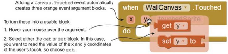
When the application is complete, you want users to be able to draw dots on the screen. In order to make this work in the app, you use the Touched event trigger. It works just like the Click event for buttons, but it also tells the program where the user touched the screen. That’s useful here because you can tell where the user touched and then draw a dot at that location. When an event gives you extra information like this, it’s called an event argument. Event arguments are local variables—only that event can see them. We’ll discuss these ideas more in chapter 6.
Switch to the Blocks Editor. From WallCanvas, select the WallCanvas.Touched event-handler block. Did you notice that the block has three additional orange rectangles just under its name? These are the event arguments—useful pieces of information about the location on the canvas that the user touched. In Graffiti Artist, the event arguments you’re interested in are x and y coordinates—knowing these means you can draw a dot at a specific position. To use these orange block values in other parts of your program, you need to hover your mouse pointer over them (don’t click yet) and then click the get option. You’re probably wondering about the third orange block, touchedSprite. This would tell you the name of any sprite the user touched, but you don’t have any sprites in this app—so it isn’t something you need to worry about until chapter 4.
To draw a dot (called a circle in App Inventor) at the position where the user touched, follow these steps:
1. From WallCanvas, select the WallCanvas.DrawCircle block, and plug it into the WallCanvas.Touched event handler.
2. Select the get x and get y blocks from the WallCanvas.Touched orange event arguments, and drop them into the x and y slots in the purple WallCanvas.DrawCircle block.
3. There is still one gap to fill: the r (radius) of the dot or circle you’re drawing.
Add a number block with the value 5. You can either click WallCanvas.Touched, type 5, and press Enter; or, from the Built-in blocks, choose Math (the blue zero block) and then change the value to 5.
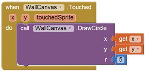
The finished dotting block should look like this.
Learning Point: Math terms—coordinates and radius
X,Y COORDINATES
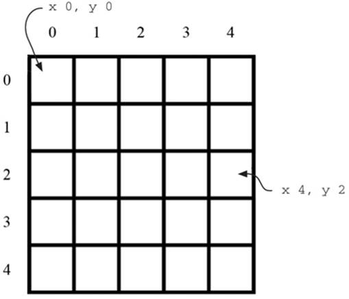
The canvas is a table of pixels. A pixel is the smallest dot that can appear on the phone. Each of these pixels has a location on the canvas, which is set using an x,y coordinate system. The x tells you where the dot is in the left-right plane (horizontal), and the y tells you where it is on the up-down plane (vertical).
RADIUS
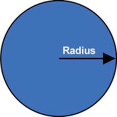
A bit of math! The radius of a circle is the distance from the center of the circle to the edge of the circle. In this case, it’s measured in pixels.
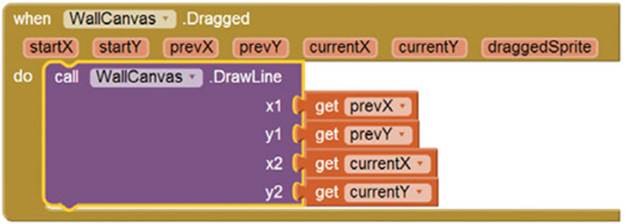
Drawing: dragging lines
When you use your finger to draw lines or curves on a screen, you’re actually drawing lots of small straight lines. To do this, you use the Dragged event trigger. The event is triggered when a user moves their finger across the screen. From the WallCanvas blocks, select theWallCanvas.Dragged event handler:
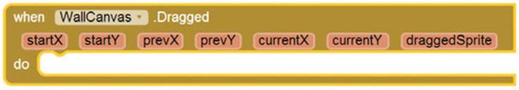
Just like the Touched event, you’ll see it has created lots of new event arguments. It’s a bit tricky to understand these, because doing a drag on your phone is easy, but describing it in a programming language (or even in English) isn’t!
A Dragged event is triggered whenever the user moves their finger over the screen. Unlike a button, which registers once per click, a Dragged event keeps triggering as the user moves their finger around—right up until the moment they lift their finger off the screen.
In the orange event arguments, you’ll see startX and startY—these are special because they only change when a user starts a new drag. The current position of your finger is always stored in currentX,currentY. When your finger pauses or changes direction (even for a moment), its position is stored in prevX,prevY.
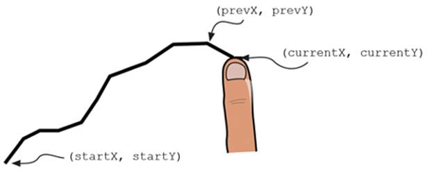
A dragged line is made up of lots of tiny straight lines, with the values of prevX,prevY and currentX,currentY constantly changing.
To draw a line at the place where the user is dragging, follow these steps:
1. From the WallCanvas block, choose the call WallCanvas.DrawLine block and plug it into the WallCanvas.Dragged block.
2. From the WallCanvas.Dragged event arguments, insert prevX, prevY, currentX, and currentY into the matching gaps on the WallCanvas.DrawLine block.
3. Your blocks should now look like this:
Learning Point: Arguments
Arguments (in computer science) are special values that a function must know before it can work. In this app, the arguments for dotting and dragging are the screen coordinates of the user’s finger when they touch or drag the screen.
Changing the paint color
The current color that is painted on the canvas is a property of the canvas that can be set to any color:
1. From the BlueButton block, select the BlueButton.Click event.
2. From the WallCanvas block, select the WallCanvas.PaintColor block and insert it into the BlueButton.Click event handler.
3. From the built-in colors, select the blue block and insert it into the set Wall-Canvas.PaintColor block.
4. Repeat this for all the colors to enable the user to change the paint color. A quick way of doing this is to duplicate the block you’ve just created (right-click and choose Duplicate) and then change the button name and color.
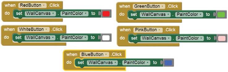
We chose red, green, white, pink, and blue, but of course you can change these—or add more.
Clearing the wall
After the user has written graffiti all over the wall, they’re going to want a way to clear it and start again. Clearing a canvas is easy—you just need to call a Canvas.Clear function. In this case, call WallCanvas.Clear when the user clicks WipeButton. Put them together as shown here.
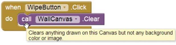
Notice how hovering over a block gives you useful information about what that block does.
What did you learn?
In this chapter, you learned the following:
· VerticalArrangement, HorizontalArrangement, and TableArrangement help you organize elements onscreen.
· You can prevent the phone display from rotating when the device is rotated.
· A canvas is a touch-sensitive drawing area that can detect different user actions like touching and dragging.
· The Touched and Dragged events store the location the user last touched in a set of automatically created event arguments.
That’s a fantastic amount to learn in a short time—well done! Can you feel your App Inventor powers growing?
Test your knowledge
1
What will happen if you put two buttons in the same TableArrangement cell?
2
What is the difference between a Dragged and a Touched event?
3
Why does the Dragged event need start, previous, and current coordinates?
Try it out
Q1:
Experiment with different dot radiuses and line thicknesses in the Graffiti Artist app (hint: add a set WallCanvas.LineWidth block).
All materials on the site are licensed Creative Commons Attribution-Sharealike 3.0 Unported CC BY-SA 3.0 & GNU Free Documentation License (GFDL)
If you are the copyright holder of any material contained on our site and intend to remove it, please contact our site administrator for approval.
© 2016-2026 All site design rights belong to S.Y.A.