Programming Android (2011)
Part II. About the Android Framework
Chapter 9. Drawing 2D and 3D Graphics
The Android menagerie of widgets and the tools for assembling them are convenient and powerful, and cover a broad variety of needs. What happens, though, when none of the existing widgets offer what you need? Maybe your application needs to represent playing cards, phases of the moon, or the power diverted to the main thrusters of a rocket ship. In that case, you’ll have to know how to roll your own.
This chapter is an overview of graphics and animation on Android. It’s directed at programmers with some background in graphics, and goes into quite a bit of depth about ways to twist and turn the display. You will definitely need to supplement the chapter with Android documentation, particularly because, especially with the advent of Honeycomb, the interfaces are still undergoing changes. But the techniques here will help you dazzle your users.
Rolling Your Own Widgets
As mentioned earlier, widget is just a convenient term for a subclass of android.view.View, typically a leaf node in the view tree. Internal nodes in the view tree, though they may contain complex code, tend to have simpler user interactions. The term widget, although informal, is useful for discussing the workhorse parts of the user interface that have the information and the behavior users care about.
You can accomplish a lot without creating a new widget. In this book, we have already constructed several applications consisting entirely of existing widgets or simple subclasses of existing widgets. The code in those applications just built trees of views, laying them out in code or through layout resources in XML files.
The nontrivial MicroJobs application, which we’ll cover in Chapter 10, has a view that contains a list of names corresponding to locations on a map. As additional locations are added to the map, new name-displaying widgets are added dynamically to the list. Even this dynamically changing layout is just a use of preexisting widgets; it is not creating new ones. The techniques in MicroJobs are, figuratively, adding or removing boxes from a tree like the one illustrated in Figure 7-3 of Chapter 7.
In contrast, this chapter shows you how to roll your own widget, which involves looking under the View hood. TextView, Button, and DatePicker are all examples of widgets provided by the Android UI toolkit. You can implement your own widget as a subclass of one of these, or as a direct subclass of View.
A more complex widget—one that can nest other widgets—will have to subclass ViewGroup, which is itself a subclass of View. A very complex widget, perhaps used as an interface tool implemented in several places (even by multiple applications), might be an entire package of classes, only one of which is a descendant of View.
This chapter is about graphics, and therefore about the View part of the Model-View-Controller (MVC) pattern. Widgets also contain Controller code, which is good design because it keeps together all the code relevant to a behavior and its representation on the screen. This part of this chapter discusses only the implementation of the View. The implementation of the Controller was discussed in Chapter 7.
Concentrating on graphics, then, we can break the tasks of this chapter into two essential parts: finding space on the screen and drawing in that space. The first task is known as layout. A leaf widget can assert its space needs by defining an onMeasure method that the Android UI framework will call at the right time. The second task, actually rendering the widget, is handled by the widget’s onDraw method.
Layout
Most of the heavy lifting in the Android Framework layout mechanism is implemented by container views. A container view is one that contains other views. It is an internal node in the view tree and in the subclasses of ViewGroup. The framework toolkit provides a variety of sophisticated container views that offer powerful and adaptable strategies for arranging a screen. LinearLayout and RelativeLayout, to name some common ones, are container views that are both relatively easy to use and fairly hard to reimplement correctly. Since convenient, powerful container views already exist, you will probably never have to implement one or the layout algorithm discussed here. Understanding how it works, though—how the Android UI framework manages the layout process—will help you build correct, robust widgets.
Example 9-1 shows what is perhaps the simplest working widget one could design. If added to some Activity’s view tree, this widget will fill in the space allocated to it with the color cyan. Not very interesting, but before we move on to create anything more complex, let’s look carefully at how this example fulfills the two basic tasks of layout and drawing. We’ll start with the layout process; we’ll describe drawing later in Canvas Drawing.
Example 9-1. A trivial widget
public class TrivialWidget extends View {
public TrivialWidget(Context context) {
super(context);
setMinimumWidth(100);
setMinimumHeight(20);
}
@Override
protected void onMeasure(int widthMeasureSpec, int heightMeasureSpec) {
setMeasuredDimension(
getSuggestedMinimumWidth(),
getSuggestedMinimumHeight());
}
@Override
protected void onDraw(Canvas canvas) {
canvas.drawColor(Color.CYAN);
}
}
Dynamic layout is necessary because the space requirements for widgets change dynamically. Suppose, for instance, that a widget in a GPS-enabled application displays the name of the city in which you are currently driving. As you go from “Ely” to “Post Mills,” the widget receives notification of the change in location. When it prepares to redraw the city name, though, it notices that it doesn’t have enough room for the whole name of the new town. It needs to ask the display to redraw the screen in a way that gives it more space, if that is possible.
Layout can be a surprisingly complex task and very difficult to get right. It is probably not very hard to make a particular leaf widget look right on a single device. It can be very tricky, on the other hand, to get a widget that must arrange children to look right on multiple devices, even when the dimensions of the screen change.
The layout process is initiated when the requestLayout method is invoked on some view in the view tree. Typically, a widget calls requestLayout on itself, when it needs more space. The method could be invoked, though, from any place in an application, to indicate that some view in the current screen no longer has the right amount of room.
The requestLayout method causes the Android UI framework to enqueue an event on the UI event queue. When the event is processed, in order, the framework gives every container view an opportunity to ask each of its child widgets how much space it would like for drawing. The process is separated into two phases: measuring child views and then arranging them in their new positions. All views must implement the first phase, but the second is necessary only in the implementations of container views that must manage the layout of child views.
Measurement
The goal of the measurement phase is to provide each view with an opportunity to dynamically request the space it would like, ideally, for drawing. The UI framework starts the process by invoking the measure method of the view at the root of the view tree. Starting there, each container view asks each of its children how much space it would prefer. The call is propagated to all descendants, depth first, so that every child gets a chance to compute its size before its parent. The parent computes its own size based on the sizes of its children and reports that to its parent, and so on, up the tree.
In Assembling a Graphical Interface, for instance, the topmost LinearLayout asks each nested LinearLayout widget for its preferred dimensions. They, in turn, ask the Buttons or EditText views they contain for theirs. Each child reports its desired size to its parent. The parents then add up the sizes of the children, along with any padding they insert themselves, and report the total to the topmost LinearLayout.
Because the framework must guarantee certain behaviors for all Views during this process, the measure method is final and cannot be overridden. Instead, measure calls onMeasure, which widgets may override to claim their space.
The arguments to the onMeasure method describe the space the parent is willing to make available: a width specification and a height specification, measured in pixels. The framework assumes that no view will ever be smaller than 0 or bigger than 230 pixels in size and, therefore, uses the high-order bits of the passed int parameter to encode the measurement specification mode. It is as though onMeasure were actually called with four arguments: the width specification mode, the width, the height specification mode, and the height. Do not be tempted to do your own bit shifting to separate the pairs of arguments! Instead, use the static methods MeasureSpec.getMode and MeasureSpec.getSize.
The specification modes describe how the container view wants the child to interpret the associated size. There are three of them:
MeasureSpec.EXACTLY
The calling container view has already determined the exact size of the child view.
MeasureSpec.AT_MOST
The calling container view has set a maximum size for this dimension, but the child is free to request less.
MeasureSpec.UNSPECIFIED
The calling container view has not imposed any limits on the child; the child may request anything it chooses.
A widget is always responsible for telling its parent in the view tree how much space it needs. It does this by calling setMeasuredDimensions to set its height and width properties. The parent can later retrieve these properties through the methods getMeasuredHeight and getMeasuredWidth. If your implementation overrides onMeasure but does not call setMeasuredDimensions, the measure method will throw IllegalStateException instead of completing normally.
The default implementation of onMeasure, inherited from View, calls setMeasuredDimensions with one of two values in each direction. If the parent specifies MeasureSpec.UNSPECIFIED, the child’s setMeasuredDimensions method uses the default size of the view: the value supplied by eithergetSuggestedMinimumWidth or getSuggestedMinimumHeight. If the parent specifies either of the other two modes, the default implementation uses the size that was offered by the parent. This is a very reasonable strategy and allows a typical widget implementation to handle the measurement phase completely by simply setting the values returned by getSuggestedMinimumWidth and getSuggestedMinimumHeight. We used that minimal strategy in Example 9-1.
Your widget may not actually get the space it requests. Consider a view that is 100 pixels wide and that has three children. It is probably obvious how the parent should arrange its children if the sum of the pixel widths requested by the children is 100 or less. If, however, each child requests 50 pixels, the parent container view is not going to be able to satisfy them all.
A container view has complete control of how it arranges its children. It might, in the circumstances just described, decide to be “fair” and allocate 33 pixels to each child. It might, just as easily, decide to allocate 50 pixels to the leftmost child, and 25 to each of the other two. In fact, it might decide to give one of the children the entire 100 pixels and nothing at all to the others. Whatever its method, though, in the end the parent determines a size and location for the bounding rectangle for each child.
Another example of a container view’s control of the space allocated to a widget comes from the example widget in Example 9-1. It always requests the amount of space it prefers, regardless of what it is offered (unlike the default implementation). This strategy is handy to remember for widgets that will be added to toolkit containers, notably LinearLayout, that implement gravity. Gravity is a property that some views use to specify the alignment of their subelements. You may be surprised, the first time you use one of these containers, to find that, by default, only the first of your custom widgets gets drawn! You can fix this either by using the setGravity method to change the property to Gravity.FILL, or by making your widgets insistent about the amount of space they request.
It is also important to note that a container view may call a child’s measure method several times during a single measurement phase. As part of its implementation of onMeasure, a clever container view, attempting to lay out a horizontal row of widgets, might, for instance, call each child widget’s measure method with mode MEASURE_SPEC.UNSPECIFIED and a width of 0 to find out what size the widget would prefer. Once it has collected the preferred widths for each of its children, it could compare the sum to the actual width available (which was specified in its parent’s call to itsmeasure method). Now it might call each child widget’s measure method again, this time with the mode MeasureSpec.AT_MOST and a width that is an appropriate proportion of the space actually available. Because measure may be called multiple times, an implementation of onMeasure must be idempotent and must not change the application state.
NOTE
An action is said to be “idempotent” if the effect of performing it once is the same as the effect of performing it multiple times. For instance, the statement x = 3 is idempotent because no matter how many times you do it, x always ends up as 3. x = x + 1, however, is not idempotent because the value of x depends on how many times the statement is executed.
A container view’s implementation of onMeasure is likely to be fairly complex. ViewGroup, the superclass of all container views, does not supply a default implementation. Each Android UI framework container view has its own. If you contemplate implementing a container view, you might consider basing it on one of them. If, instead, you implement measurement from scratch, you are still likely to need to call measure for each child and should consider using the ViewGroup helper methods: measureChild, measureChildren, and measureChildWithMargins. At the conclusion of the measurement phase, a container view, like any other widget, must report the space it needs by calling setMeasuredDimensions.
Arrangement
Once all the container views in the view tree have had a chance to negotiate the sizes of each of their children, the framework begins the second phase of layout, which consists of arranging the children. Again, unless you implement your own container view you will probably never have to implement your own arrangement code. This section describes the underlying process so that you can better understand how it might affect your widgets. The default method, implemented in View, will work for typical leaf widgets, as demonstrated by Example 9-1.
Because a view’s onMeasure method might be called several times, the framework must use a different method to signal that the measurement phase is complete and that container views must fix the final locations of their children. Like the measurement phase, the arrangement phase is implemented with two methods. The framework invokes a final method, layout, at the top of the view tree. The layout method performs processing common to all views and then invokes onLayout, which custom widgets override to implement their own behaviors. A custom implementation ofonLayout must, at least, calculate the bounding rectangle that it will supply to each child when it is drawn and, in turn, invoke the layout method for each child (because that child might, in turn, be a parent to other widgets). This process can be complex. If your widget needs to arrange child views, you might consider basing it on an existing container, such as LinearLayout or RelativeLayout.
It is worth reiterating that a widget is not guaranteed to receive the space it requests. It must be prepared to draw itself in whatever space is actually allocated to it. If it attempts to draw outside the space allocated to it by its parent, the drawing will be clipped by the clip rectangle (discussed later in this chapter). To exert fine control—to exactly fill the space allocated to it, for instance—a widget must either implement onLayout and record the dimensions of the allocated space, or inspect the clip rectangle of the Canvas that is the parameter to onDraw.
Canvas Drawing
Now that we’ve explored how widgets allocate the space on the screen in which they draw themselves, we can turn to coding some widgets that actually do some drawing.
The Android UI framework handles drawing in a way that should seem familiar, now that you’ve read about measurement and arrangement. When some part of the application determines that the current screen drawing is stale because some state has changed, it calls the View methodinvalidate. This call causes a redraw event to be added to the event queue.
When, eventually, that event is processed, the framework calls the draw method at the top of the view tree. This time the call is propagated preorder, each view drawing itself before it calls its children. This means that leaf views are drawn after their parents, which are, in turn, drawn after their parents. Views that are lower in the tree appear to be drawn on top of those nearer the root of the tree.
The draw method calls onDraw, which each subclass overrides to implement its custom rendering. When your widget’s onDraw method is called, it must render itself according to the current application state and return. It turns out, by the way, that neither View.draw nor ViewGroup.dispatchDraw(responsible for the traversal of the view tree) is final. But override them at your peril!
In order to prevent extra painting, the Android UI framework maintains some state information about the view, called the clip rectangle. A key concept in the framework, the clip rectangle is part of the state that is passed in calls to a component’s graphical rendering methods. It has a location and size that can be retrieved and adjusted through methods on the canvas. It acts like a stencil through which a component does all its drawing: the component can only draw on the portions of the canvas visible through the clip rectangle. By correctly setting the size, shape, and location of the clip rectangle aperture, the framework can prevent a component from drawing outside its boundaries or redrawing regions that are already correctly drawn.
Before proceeding to the specifics of drawing, let’s again put the discussion in the context of Android’s single-threaded MVC design pattern. There are two essential rules:
§ Drawing code should be inside the onDraw method. Your widget should draw itself completely, reflecting the program state, when onDraw is invoked.
§ A widget should draw itself as quickly as possible when onDraw is invoked. The middle of the call to onDraw is no time to run a complex database query or to determine the status of some distant networked service. All the state you need to draw should be cached and ready for use, at drawing time. Long-running tasks should use a separate thread and one of the mechanisms described in Advanced Wiring: Focus and Threading. Model state information cached in the view is sometimes called the view model.
The Android UI framework uses four main classes in drawing. If you are going to implement custom widgets and do your own drawing you will want to become very familiar with them:
Canvas (a subclass of android.graphics.Canvas)
The canvas has no clear analog in real-life materials. You might think of it as a complex easel that can orient, bend, and even crumple the paper on which you are drawing, in interesting ways. It maintains the clip rectangle, the stencil through which you paint. It can also scale drawings as they are drawn, like a photographic enlarger. It can even perform other transformations for which material analogs are more difficult to find: mapping colors and drawing text along paths.
Paint (a subclass of android.graphics.Paint)
This is the medium with which you will draw. It controls the color, transparency, and brush size for objects painted on the canvas. It also controls font, size, and style when drawing text.
Bitmap (a subclass of android.graphics.Bitmap)
This is the paper you are drawing on. It holds the actual pixels that you draw.
Drawable (likely a subclass of android.graphics.drawable.Drawable)
This is the thing you want to draw: a rectangle or image. Although not all the things that you draw are Drawables (text, for instance, is not), many, especially the more complex ones, are.
Example 9-1 accomplished its drawing by using only the Canvas, passed as a parameter to onDraw. In order to do anything more interesting, we will need, at the very least, Paint. Paint provides control over the color and transparency (alpha) of the graphics drawn with it. It also controls the width of the brush used for drawing. When used in connection with text drawing methods, it controls the font, size, and style of the text. Paint has many, many other capabilities, some of which are described in Bling. Example 9-2, however, is enough to get you started. It sets two of the many parameters Paint controls (color and line width) before drawing a thick vertical line, followed by a series of horizontal lines. The alpha value (which plays the same role as the fourth value in RGB web colors) is reduced for each green line to make it more transparent than the previous one. Explore the class documentation for other useful attributes.
Example 9-2. Using Paint
@Override
protected void onDraw(Canvas canvas) {
canvas.drawColor(Color.WHITE);
Paint paint = new Paint();
canvas.drawLine(33, 0, 33, 100, paint);
paint.setColor(Color.RED);
paint.setStrokeWidth(10);
canvas.drawLine(56, 0, 56, 100, paint);
paint.setColor(Color.GREEN);
paint.setStrokeWidth(5);
for (int y = 30, alpha = 255; alpha > 2; alpha >>= 1, y += 10) {
paint.setAlpha(alpha);
canvas.drawLine(0, y, 100, y, paint);
}
}
The graphic created by the code in the example is shown in Figure 9-1.
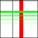
Figure 9-1. Output using Paint
With the addition of Paint, we are prepared to understand most of the other tools necessary to draw a useful widget. The code in Example 9-3, for instance, is the widget used in Example 7-7. While still not very complex, it demonstrates all the pieces of a fully functional widget. It handles layout, uses highlighting (whether the view has the user’s focus), and reflects the state of the model to which it is attached. The widget draws a series of dots whose information is stored in a private array. Each dot specifies its own x and y location as well as its diameter and color. The onDrawfunction resets the color of its Paint for each, and uses the other parameters to specify the circle being drawn by the canvas’s drawCircle method.
Example 9-3. Dot widget
package com.oreilly.android.intro.view;
import android.content.Context;
import android.graphics.Canvas;
import android.graphics.Color;
import android.graphics.Paint;
import android.graphics.Paint.Style;
import android.view.View;
import com.oreilly.android.intro.model.Dot;
import com.oreilly.android.intro.model.Dots;
public class DotView extends View {
private final Dots dots;
/**
* @param context the rest of the application
* @param dots the dots we draw
*/
public DotView(Context context, Dots dots) {
super(context);
this.dots = dots;
setMinimumWidth(180);
setMinimumHeight(200);
setFocusable(true);
}
/** @see android.view.View#onMeasure(int, int) */
@Override
protected void onMeasure(int widthMeasureSpec, int heightMeasureSpec) {
setMeasuredDimension(
getSuggestedMinimumWidth(),
getSuggestedMinimumHeight());
}
/** @see android.view.View#onDraw(android.graphics.Canvas) */
@Override protected void onDraw(Canvas canvas) {
canvas.drawColor(Color.WHITE);
Paint paint = new Paint();
paint.setStyle(Style.STROKE);
paint.setColor(hasFocus() ? Color.BLUE : Color.GRAY);
canvas.drawRect(0, 0, getWidth() - 1, getHeight() - 1, paint);
paint.setStyle(Style.FILL);
for (Dot dot : dots.getDots()) {
paint.setColor(dot.getColor());
canvas.drawCircle(
dot.getX(),
dot.getY(),
dot.getDiameter(),
paint);
}
}
}
As with Paint, we have only enough space to begin an exploration of Canvas methods. There are two groups of functionality, however, that are worth special notice.
Drawing text
Among the most important Canvas methods are those used to draw text. Although some Canvas functionality is duplicated in other places, text rendering capabilities are not. In order to put text in your widget, you will have to use Canvas (or, of course, subclass some other widget that uses it).
Canvas provides several methods for rendering text that give you various amounts of flexibility over the placement of each character in the text. The methods come in pairs: one taking a String and the other taking a char[] array. In some cases, there are additional convenience methods. For instance, the simplest way to draw text passes the x and y coordinates where the text starts and Paint that specifies its font, color, and other attributes (see Example 9-4).
Example 9-4. A pair of text drawing methods
public void drawText(String text, float x, float y, Paint paint)
public void drawText(char[] text, int index, int count, float x,
float y, Paint paint)
While the first method passes text through a single String parameter, the second method uses three parameters: an array of char, an index indicating the first character in that array to be drawn, and the number of total characters in the text to be rendered.
If you want something fancier than a simple horizontal text, you can lay it out along a geometric path or even place each character precisely where you want. Example 9-5 contains an onDraw method that demonstrates the use of each of the three text rendering methods. The output is shown inFigure 9-2.
Example 9-5. Three ways of drawing text
@Override
protected void onDraw(Canvas canvas) {
canvas.drawColor(Color.WHITE);
Paint paint = new Paint();
paint.setColor(Color.RED);
canvas.drawText("Android", 25, 30, paint);
Path path = new Path();
path.addArc(new RectF(10, 50, 90, 200), 240, 90);
paint.setColor(Color.CYAN);
canvas.drawTextOnPath("Android", path, 0, 0, paint);
float[] pos = new float[] {
20, 80,
29, 83,
36, 80,
46, 83,
52, 80,
62, 83,
68, 80
};
paint.setColor(Color.GREEN);
canvas.drawPosText("Android", pos, paint);
}
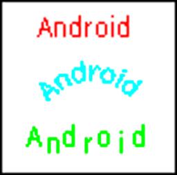
Figure 9-2. Output from three ways of drawing text
As you can see, the most elementary of the pairs, drawText, simply starts text at the passed coordinates. With DrawTextOnPath, on the other hand, you can draw text along any Path. The example path is just an arc. It could just as easily have been a line drawing or Bezier curve.
For those occasions on which even DrawTextOnPath is insufficient, Canvas offers DrawPosText, which lets you specify the exact position of each character in the text. Note that the character positions are specified by alternating array elements: x1,y1,x2,y2...
Matrix transformations
The second interesting group of Canvas methods are the Matrix transformations and their related convenience methods, rotate, scale, and skew. These methods transform what you draw in ways that are immediately recognizable to those familiar with 3D graphics in other environments. The methods allow a single drawing to be rendered in ways that can make it appear as though the viewer were moving with respect to the objects in the drawing.
The small application in Example 9-6 demonstrates the Canvas’s coordinate transformation capabilities.
Example 9-6. Using a transformation in a canvas
import android.app.Activity;
import android.content.Context;
import android.graphics.Canvas;
import android.graphics.Color;
import android.graphics.Paint;
import android.graphics.Rect;
import android.os.Bundle;
import android.view.View;
import android.widget.LinearLayout;
public class TranformationalActivity extends Activity {
private interface Transformation {
void transform(Canvas canvas);
String describe();
}
private static class TransformedViewWidget extends View {
private final Transformation transformation;
public TransformedViewWidget(Context context, Transformation xform) {
super(context);
transformation = xform;
setMinimumWidth(160);
setMinimumHeight(105);
}
@Override
protected void onMeasure(int widthMeasureSpec, int heightMeasureSpec) {
setMeasuredDimension(
getSuggestedMinimumWidth(),
getSuggestedMinimumHeight());
}
@Override
protected void onDraw(Canvas canvas) {
canvas.drawColor(Color.WHITE);
Paint paint = new Paint();
canvas.save();
transformation.transform(canvas);
paint.setTextSize(12);
paint.setColor(Color.GREEN);
canvas.drawText("Hello", 40, 55, paint);
paint.setTextSize(16);
paint.setColor(Color.RED);
canvas.drawText("Android", 35, 65, paint);
canvas.restore();
paint.setColor(Color.BLACK);
paint.setStyle(Paint.Style.STROKE);
Rect r = canvas.getClipBounds();
canvas.drawRect(r, paint);
paint.setTextSize(10);
paint.setColor(Color.BLUE);
canvas.drawText(transformation.describe(), 5, 100, paint);
}
}
@Override
public void onCreate(Bundle savedInstanceState) {
super.onCreate(savedInstanceState);
setContentView(R.layout.transformed);
LinearLayout v1 = (LinearLayout) findViewById(R.id.v_left);
v1.addView(new TransformedViewWidget(
this,
new Transformation() {
@Override public String describe() { return "identity"; }
@Override public void transform(Canvas canvas) { }
} ));
v1.addView(new TransformedViewWidget(
this,
new Transformation() {
@Override public String describe() { return "rotate(-30)"; }
@Override public void transform(Canvas canvas) {
canvas.rotate(-30.0F);
} }));
v1.addView(new TransformedViewWidget(
this,
new Transformation() {
@Override public String describe() { return "scale(.5,.8)"; }
@Override public void transform(Canvas canvas) {
canvas.scale(0.5F, .8F);
} }));
v1.addView(new TransformedViewWidget(
this,
new Transformation() {
@Override public String describe() { return "skew(.1,.3)"; }
@Override public void transform(Canvas canvas) {
canvas.skew(0.1F, 0.3F);
} }));
LinearLayout v2 = (LinearLayout) findViewById(R.id.v_right);
v2.addView(new TransformedViewWidget(
this,
new Transformation() {
@Override public String describe() { return "translate(30,10)"; }
@Override public void transform(Canvas canvas) {
canvas.translate(30.0F, 10.0F);
} }));
v2.addView(new TransformedViewWidget(
this,
new Transformation() {
@Override public String describe() {
return "translate(110,-20),rotate(85)";
}
@Override public void transform(Canvas canvas) {
canvas.translate(110.0F, -20.0F);
canvas.rotate(85.0F);
} }));
v2.addView(new TransformedViewWidget(
this,
new Transformation() {
@Override public String describe() {
return "translate(-50,-20),scale(2,1.2)";
}
@Override public void transform(Canvas canvas) {
canvas.translate(-50.0F, -20.0F);
canvas.scale(2F, 1.2F);
} }));
v2.addView(new TransformedViewWidget(
this,
new Transformation() {
@Override public String describe() { return "complex"; }
@Override public void transform(Canvas canvas) {
canvas.translate(-100.0F, -100.0F);
canvas.scale(2.5F, 2F);
canvas.skew(0.1F, 0.3F);
} }));
}
}
The results of this protracted exercise are shown in Figure 9-3.
Here are some of the highlights of the code:
This is the definition of the new widget, TransformedViewWidget.
Gets the actual transformation to perform from the second argument of the constructor.
This is the onDraw method of TransformedViewWidget.
Pushes the current drawing state on the stack using save before performing any transformation.
Performs the transformation passed as constructor argument 2.
Restores the old state saved in item 4, in preparation for drawing the bound box and label.
This is the Activity’s onCreate method.
Creates the container view for the left-hand column of widgets.
These are instantiations of TransformedViewWidget, added to the left-hand column.
Creates a transformation as part of the parameter list to the constructor of TransformedViewWidget.
Creates the container view for the right-hand column of widgets.
These are instantiations of TransformedViewWidget, added to the right-hand column.
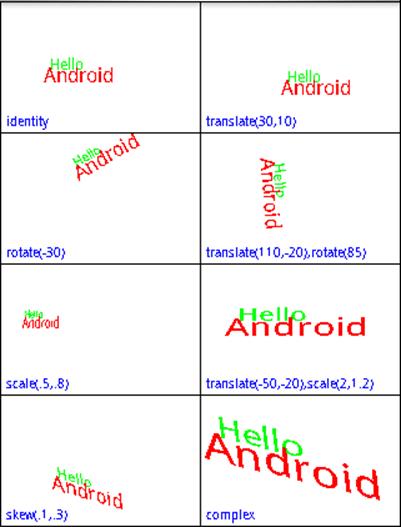
Figure 9-3. Transformed views
This small application introduces several new ideas. In terms of views and widgets, the application defines a single widget, TransformedViewWidget, of which it creates eight instances. For layout, the application creates two views named v1 and v2, retrieving their parameters from resources. Then it adds four instances of TransformedViewWidget to each LinearLayout view. This is an example of how applications combine resource-based and dynamic views. Note that the creation of the layout views and the constructors of the new widgets take place within the Activity’s onCreatemethod.
This application also makes the new widget flexible through a sophisticated division of labor between the widget and the parent view. Several simple objects are drawn directly within the definition of TransformedViewWidget, in its onDraw method:
§ A white background
§ The word Hello in 12-point green type
§ The word Android in 16-point red type
§ A black frame
§ A blue label
In the middle of this, the onDraw method performs a transformation that is specified by the caller. The application defines its own interface called Transformation, and the constructor for TransformedViewWidget accepts a Transformation as a parameter. We’ll see in a moment how the caller actually codes a transformation.
It’s important first to see how onDraw preserves it own text while allowing the transformation. In this example, we want to make sure the frame and label are drawn last so that they are drawn over anything else drawn by the widget, even if they might overlap. We do not want the transformation to affect either the frame or the label.
Fortunately, the Canvas maintains an internal stack onto which we can record and recover the translation matrix, clip rectangle, and all other elements of mutable state in the Canvas. Taking advantage of this stack, onDraw calls Canvas.save to save its state before the transformation, andCanvas.restore afterward to restore the saved state.
The rest of the application controls the transformation applied to each of the eight instances of TransformedViewWidget. Each new instance of the widget is created with its own anonymous instance of Transformation. The image in the area labeled “identity” has no translation applied. The other seven areas are labeled with the transformations they demonstrate.
The base methods for Canvas translation are setMatrix and concatMatrix. These two methods allow you to build any possible transformation. The getMatrix method allows you to recover a dynamically constructed matrix for later use. The methods introduced in the example—translate, rotate,scale, and skew—are convenience methods that compose specific, constrained matrices into the current Canvas state.
While it may not be obvious at first, these transformation functions can be tremendously useful. They allow your application to appear to change its point of view with respect to a 3D object! It doesn’t take too much imagination, for instance, to see the scene in the square labeled “scale(.5,.8)” as the same as that seen in the square labeled “identity”, but viewed from farther away. With a bit more imagination, the image in the box labeled “skew(.1,.3)” could be the untransformed image, again, but this time viewed from above and slightly to the side. Scaling or translating an object can make it appear to a user as though the object has moved. Skewing and rotating can make it appear that the object has turned.
When you consider that these transform functions apply to everything drawn on a canvas—lines, text, and even images—their importance in applications becomes even more apparent. A view that displays thumbnails of photos could be implemented trivially, though perhaps not optimally, as a view that scales everything it displays to 10% of its actual size. An application that displays what you see as you look to your left while driving down the street might be implemented, in part, by scaling and skewing a small number of images.
Drawables
A Drawable is an object that knows how to render itself on a Canvas. Because a Drawable has complete control during rendering, even a very complex rendering process can be encapsulated in a way that makes it fairly easy to use.
Examples 9-7 and 9-8 show the changes necessary to implement the example shown in Figure 9-3, using a Drawable. The code that draws the red and green text has been refactored into a HelloAndroidTextDrawable class, used in rendering by the widget’s onDraw method.
Example 9-7. Using a TextDrawable
private static class HelloAndroidTextDrawable extends Drawable {
private ColorFilter filter;
private int opacity;
public HelloAndroidTextDrawable() {}
@Override
public void draw(Canvas canvas) {
Paint paint = new Paint();
paint.setColorFilter(filter);
paint.setAlpha(opacity);
paint.setTextSize(12);
paint.setColor(Color.GREEN);
canvas.drawText("Hello", 40, 55, paint);
paint.setTextSize(16);
paint.setColor(Color.RED);
canvas.drawText("Android", 35, 65, paint);
}
@Override
public int getOpacity() { return PixelFormat.TRANSLUCENT; }
@Override
public void setAlpha(int alpha) { }
@Override
public void setColorFilter(ColorFilter cf) { }
}
Using the new Drawable implementation requires only a few small changes to the onDraw method from our example.
Example 9-8. Using a Drawable widget
package com.oreilly.android.intro.widget;
import android.content.Context;
import android.graphics.Canvas;
import android.graphics.Color;
import android.graphics.Paint;
import android.graphics.Rect;
import android.graphics.drawable.Drawable;
import android.view.View;
/**A widget that renders a drawable with a transformation */
public class TransformedViewWidget extends View {
/** A transformation */
public interface Transformation {
/** @param canvas */
void transform(Canvas canvas);
/** @return text description of the transform. */
String describe();
}
private final Transformation transformation;
private final Drawable drawable;
/**
* Render the passed drawable, transformed.
*
* @param context app context
* @param draw the object to be drawn, in transform
* @param xform the transformation
*/
public TransformedViewWidget(
Context context,
Drawable draw,
Transformation xform)
{
super(context);
drawable = draw;
transformation = xform;
setMinimumWidth(160);
setMinimumHeight(135);
}
/** @see android.view.View#onMeasure(int, int) */
@Override
protected void onMeasure(int widthMeasureSpec, int heightMeasureSpec) {
setMeasuredDimension(
getSuggestedMinimumWidth(),
getSuggestedMinimumHeight());
}
/** @see android.view.View#onDraw(android.graphics.Canvas) */
@Override
protected void onDraw(Canvas canvas) {
canvas.drawColor(Color.WHITE);
canvas.save();
transformation.transform(canvas);
drawable.draw(canvas);
canvas.restore();
Paint paint = new Paint();
paint.setColor(Color.BLACK);
paint.setStyle(Paint.Style.STROKE);
Rect r = canvas.getClipBounds();
canvas.drawRect(r, paint);
paint.setTextSize(10);
paint.setColor(Color.BLUE);
canvas.drawText(
transformation.describe(),
5,
getMeasuredHeight() - 5,
paint);
}
}
This code begins to demonstrate the power of using a Drawable. This implementation of TransformedViewWidget will transform any Drawable, no matter what it happens to draw. It is no longer tied to rotating and scaling our original, hardcoded text. It can be reused to transform both the text from the previous example and a photo captured from the camera, as Figure 9-4 demonstrates. It could even be used to transform a Drawable animation.
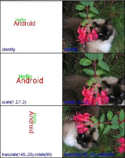
Figure 9-4. Transformed views with photos
Drawables make complex graphical techniques like 9-patches and animation tractable. In addition, since they wrap the rendering process completely, Drawables can be nested to decompose complex rendering into small reusable pieces.
Consider for a moment how we might extend the previous example to make each of the six images fade to white over a period of a minute. Certainly, we might just change the code in Example 9-8 to do the fade. A different—and very appealing—implementation involves writing one newDrawable.
The constructor of this new Drawable, which we’ll call FaderDrawable, will take as an argument a reference to its target, the Drawable that it will fade to white. In addition, it must have some notion of time, probably an integer—let’s call it t—that is incremented by a timer. Whenever the drawmethod of FaderDrawable is called, it first calls the draw method of its target. Next, however, it paints over exactly the same area with the color white, using the value of t to determine the transparency (alpha value) of the paint (as demonstrated in Example 9-2). As time passes, t gets larger, the white gets increasingly opaque, and the target Drawable fades to white.
This hypothetical FaderDrawable demonstrates some of the important features of Drawables. Note, first of all, that FaderDrawable is eminently reusable. It will fade just about any Drawable. Also note that, since FaderDrawable extends Drawable, we can use it anywhere we would have used its target, the Drawable that it fades to white. Any code that uses a Drawable in its rendering process can use a FaderDrawable, without change.
Of course, a FaderDrawable could, itself, be wrapped. In fact, it is possible to achieve very complex effects, simply by building a chain of Drawable wrappers. The Android toolkit provides Drawable wrappers that support this strategy, including ClipDrawable, RotateDrawable, and ScaleDrawable.
At this point, you may be mentally redesigning your entire UI in terms of Drawables. While they are a powerful tool, they are not a panacea. There are several issues to keep in mind when considering the use of Drawables.
You may well have noticed that they share a lot of the functionality of the View class: location, dimensions, visibility, and so on. It’s not always easy to decide when a View should draw directly on the Canvas, when it should delegate to a subview, and when it should delegate to one or moreDrawable objects. There is even a DrawableContainer class that allows the grouping of several child Drawables within a parent. It is possible to build trees of Drawables that parallel the trees of Views we’ve been using so far. In dealing with the Android UI framework, you just have to accept that there is more than one way to scale a cat.
One difference between the two choices is that Drawables do not implement the View measure/layout protocol, which, you’ll recall, allows a container view to negotiate the layout of its components in response to changing view size. When a renderable object needs to add, remove, or lay out internal components, it’s a pretty good indication that it should be a full-fledged View instead of a Drawable.
A second issue to consider is that, because Drawables completely wrap the drawing process, they are not drawn like String or Rect objects. There are, for instance, no Canvas methods that will render a Drawable at specific coordinates. You may find yourself deliberating over whether, in order to render a certain image twice, a View.onDraw method should use two different, immutable Drawables or a single Drawable twice, resetting its coordinates.
Perhaps most important, though, is a more generic problem. The reason the idea of a chain of Drawables works is that the Drawable interface contains no information about the internal implementation of the Drawable. When your code is passed a Drawable, there is no way for it to know whether it is something that will render a simple image or a complex chain of effects that rotates, flashes, and bounces. Clearly this can be a big advantage. It can also be a problem, though.
Quite a bit of the drawing process is stateful. You set up Paint and then draw with it. You set up Canvas clip regions and transformations and then draw through them. When cooperating in a chain, Drawables must be very careful, if they change state, that those changes never collide. The problem is that, when constructing a Drawable chain, the possibility of collision cannot, by definition (they are all just Drawables), be explicit in the object’s type. A seemingly small change might have an effect that is not desirable and is difficult to debug.
To illustrate, consider two Drawable wrapper classes, one that is meant to shrink its contents and another that is meant to rotate them by 90 degrees. If either is implemented by setting the transformation matrix to a specific value, composing the two may not have the desired effect. Worse, it might work perfectly if A wraps B, but not if B wraps A! Careful documentation of how a Drawable is implemented is essential.
Bitmaps
The Bitmap is the last member of the four essentials for drawing: something to draw (a String, Rect, etc.), a Paint with which to draw, a Canvas on which to draw, and the Bitmap to hold the bits. Most of the time, you don’t have to deal directly with a Bitmap, because the Canvas provided as an argument to the onDraw method already has one behind it. There are circumstances, though, under which you may want to use a Bitmap directly.
A common use for a Bitmap is to cache a drawing that may be time-consuming to draw but unlikely to change frequently. Consider, for example, a drawing program that allows the user to draw in multiple layers. The layers act as transparent overlays on a base image, and the user turns them off and on at will. It might be very expensive to actually draw each individual layer every time onDraw gets called. Instead, it might be faster to render the entire drawing upon first appearance, with all visible layers, and then redraw the single layer that needs changing only when the user makes a visible change to it.
The implementation of such an application might look something like Example 9-9.
Example 9-9. Bitmap caching
private class CachingWidget extends View {
private Bitmap cache;
public CachingWidget(Context context) {
super(context);
setMinimumWidth(200);
setMinimumHeight(200);
}
public void invalidateCache() {
cache = null;
invalidate();
}
@Override
protected void onDraw(Canvas canvas) {
if (null == cache) {
cache = Bitmap.createBitmap(
getMeasuredWidth(),
getMeasuredHeight(),
Bitmap.Config.ARGB_8888);
drawCachedBitmap(new Canvas(cache));
}
canvas.drawBitmap(cache, 0, 0, new Paint());
}
// ... definition of drawCachedBitmap
}
This widget normally just copies the cached Bitmap, cache, to the Canvas passed to onDraw. Only if the cache is marked stale, by calling invalidateCache, will drawCachedBitmap be called to actually render the widget.
The most common way to encounter a Bitmap is as the programmatic representation of a graphics resource. Resources.getDrawable returns a BitmapDrawable when the resource is an image.
Combining these two ideas, caching an image and wrapping it in a Drawable, opens yet another interesting window. It means anything that can be drawn can also be post-processed! An application that used all the techniques demonstrated in this chapter could allow a user to draw furniture in a room (creating a bitmap) and then to walk around it (using the matrix transforms).
NOTE
With Honeycomb, there have been substantial changes in Android’s rendering architecture. These changes take advantage of the increasing power of GPUs and create a whole new set of rules for optimizing the way your UI is drawn. Consider View.setLayerType before creating new bitmaps.
Bling
The Android UI framework is a lot more than just an intelligent, well-put-together GUI toolkit. When it takes off its glasses and shakes out its hair, it can be downright sexy! The tools mentioned here certainly do not make an exhaustive catalog. They might get you started, though, on the path to making your application Filthy Rich.
WARNING
Several of the techniques discussed in this section are close to the edges of the Android landscape. As such, they are less well established than the classes we discussed earlier in the chapter: the documentation is not as thorough, some of the features are clearly in transition, and you may even find bugs. If you run into problems, the Google Group “Android Developers” is an invaluable resource. Questions about a particular aspect of the toolkit have sometimes been answered by the very person responsible for implementing that aspect.
Be careful about checking the dates on solutions you find by searching the Web. Some of these features are changing rapidly. Code that worked as recently as six months ago may not work now. A corollary, of course, is that any application that gets wide distribution is likely to be run on platforms that have differing implementations of the features discussed here. By using these techniques, you may limit the lifetime of your application, and the number of devices that it will support.
The rest of this section considers a single application, much like the one used in Example 9-6: a couple of LinearLayouts that contain multiple instances of a single widget, each demonstrating a different graphics effect. Example 9-10 provides the key parts of the widget, with code discussed previously, elided for brevity. The widget simply draws a few graphical objects and defines an interface through which various graphics effects can be applied to the rendering.
Example 9-10. Effects widget
public class EffectsWidget extends View {
/** The effect to apply to the drawing */
public interface PaintEffect { void setEffect(Paint paint); }
// ...
// PaintWidget's widget rendering method
protected void onDraw(Canvas canvas) {
Paint paint = new Paint();
paint.setAntiAlias(true);
effect.setEffect(paint);
paint.setColor(Color.DKGRAY);
paint.setStrokeWidth(5);
canvas.drawLine(10, 10, 140, 20, paint);
paint.setTextSize(26);
canvas.drawText("Android", 40, 50, paint);
paint = new Paint();
paint.setColor(Color.BLACK);
canvas.drawText(String.valueOf(id), 2.0F, 12.0F, paint);
paint.setStyle(Paint.Style.STROKE);
paint.setStrokeWidth(2);
canvas.drawRect(canvas.getClipBounds(), paint);
}
}
The application that uses this widget (Example 9-11) should also feel familiar. It creates several copies of the EffectsWidget, each with its own effect. There are two special widgets. The bottom widget in the left-hand column uses OpenGL animation. In the right column the bottom widget is empty, but the one above it shows a button with an animated background.
Example 9-11. Effects application
private void buildView() {
setContentView(R.layout.main);
LinearLayout view = (LinearLayout) findViewById(R.id.v_left);
view.addView(new EffectsWidget(
this,
1,
new EffectsWidget.PaintEffect() {
@Override public void setEffect(Paint paint) {
paint.setShadowLayer(1, 3, 4, Color.BLUE);
} }));
view.addView(new EffectsWidget(
this,
3,
new EffectsWidget.PaintEffect() {
@Override public void setEffect(Paint paint) {
paint.setShader(
new LinearGradient(
0.0F,
0.0F,
160.0F,
80.0F,
new int[] { Color.BLACK, Color.RED, Color.YELLOW },
null,
Shader.TileMode.REPEAT));
} }));
view.addView(new EffectsWidget(
this,
5,
new EffectsWidget.PaintEffect() {
@Override public void setEffect(Paint paint) {
paint.setMaskFilter(
new BlurMaskFilter(2, BlurMaskFilter.Blur.NORMAL));
} }));
// Not an EffectsWidget: this is the OpenGL Animation widget.
glWidget = new GLDemoWidget(this);
view.addView(glWidget);
view = (LinearLayout) findViewById(R.id.v_right);
view.addView(new EffectsWidget(
this,
2,
new EffectsWidget.PaintEffect() {
@Override public void setEffect(Paint paint) {
paint.setShadowLayer(3, -8, 7, Color.GREEN);
} }));
view.addView(new EffectsWidget(
this,
4,
new EffectsWidget.PaintEffect() {
@Override public void setEffect(Paint paint) {
paint.setShader(
new LinearGradient(
0.0F,
40.0F,
15.0F,
40.0F,
Color.BLUE,
Color.GREEN,
Shader.TileMode.MIRROR));
} }));
// A widget with an animated background
View w = new EffectsWidget(
this,
6,
new EffectsWidget.PaintEffect() {
@Override public void setEffect(Paint paint) { }
});
view.addView(w);
w.setBackgroundResource(R.drawable.throbber);
w.setOnClickListener(new OnClickListener() {
@Override public void onClick(View v) {
((AnimationDrawable) v.getBackground()).start();
} });
}
Figure 9-5 shows what the code looks like when run. Widgets 6 and 7 are animated. Widget 6 has a background that pulses red when clicked, and the green checkerboard moves from left to right across widget 7. Widget 8 is unused.
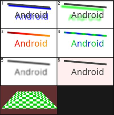
Figure 9-5. Graphics effects
Shadows, Gradients, and Filters
PathEffect, MaskFilter, ColorFilter, Shader, and ShadowLayer are all attributes of Paint. Anything drawn with Paint can be drawn under the influence of one or more of these transformations. The top five widgets in Figure 9-5 give examples of several of these effects.
Widgets 1 and 2 demonstrate shadows. Shadows are currently controlled by the setShadowLayer method. The arguments, a blur radius and x and y displacements, control the apparent distance and position of the light source that creates the shadow with respect to the shadowed object.
The second row of widgets demonstrates Shaders. The Android toolkit contains several prebuilt shaders. Widgets 3 and 4 demonstrate one of them, the LinearGradient shader. A gradient is a regular transition between colors that can be used, for instance, to give a page background a bit more life without resorting to expensive bitmap resources.
A LinearGradient is specified with a vector that determines the direction and rate of the color transition, an array of colors through which to transition, and a mode. The final argument, the mode, determines what happens when a single complete transition through the gradient is insufficient to cover the entire painted object. For instance, in widget 4, the transition is only 15 pixels long, whereas the drawing is more than 100 pixels wide. Using the mode Shader.TileMode.Mirror causes the transition to repeat, alternating direction across the drawing. In the example, the gradient transitions from blue to green, in 15 pixels, then from green to blue in the next 15, and so on, across the canvas.
Animation
The Android UI toolkit offers several different animation tools. Transition animations—which the Google documentation calls tweened animations—are subclasses of android.view.animation.Animation: RotateAnimation, TranslateAnimation, ScaleAnimation, and so on. These animations are used as transitions between pairs of views. A second type of animation, subclasses of android.graphics.drawable.AnimationDrawable.AnimationDrawable, can be put into the background of any widget to provide a wide variety of effects. Finally, there is a full-on animation class on top of a SurfaceViewthat gives you complete control to do your own seat-of-the-pants animation.
Because both of the first two types of animation, transition and background, are supported by View, either can be used in nearly any widget.
Transition animation
A transition animation is started by calling the View method startAnimation with an instance of Animation (or, of course, your own subclass). Once installed, the animation runs to completion: transition animations have no pause state.
The heart of the animation is its applyTransformation method. This method is called to produce successive frames of the animation. Example 9-12 shows the implementation of one transformation. As you can see, it does not actually generate entire graphical frames for the animation. Instead, it generates successive transformations to be applied to a single image being animated. You will recall, from Matrix transformations, that matrix transformations can be used to make an object appear to move. Transition animations depend on exactly this trick.
Example 9-12. Transition animation
@Override
protected void applyTransformation(float t, Transformation xf) {
Matrix xform = xf.getMatrix();
float z = ((dir > 0) ? 0.0f : -Z_MAX) - (dir * t * Z_MAX);
camera.save();
camera.rotateZ(t * 360);
camera.translate(0.0F, 0.0F, z);
camera.getMatrix(xform);
camera.restore();
xform.preTranslate(-xCenter, -yCenter);
xform.postTranslate(xCenter, yCenter);
}
This particular implementation makes its target appear to spin in the screen plane (the rotate method call) and, at the same time, to shrink into the distance (the translate method call). The matrix that will be applied to the target image is obtained from the Transformation object passed in that call.
This implementation uses camera, an instance of the utility class Camera. This Camera class—not to be confused with the camera in the phone—is a utility that makes it possible to record rendering state. It is used here to compose the rotation and translation transformations into a single matrix, which is then stored as the animation transformation.
The first parameter to applyTransformation, named t, is effectively the frame number. It is passed as a floating-point number between 0.0 and 1.0, and might also be understood as the percent of the animation that is complete. This example uses t to increase the apparent distance, along the z-axis (a line perpendicular to the plane of the screen), of the image being animated, and to set the proportion of one complete rotation through which the image has passed. As t increases, the animated image appears to rotate further and further counterclockwise and to move farther and farther away, along the z-axis, into the distance.
The preTranslate and postTranslate operations are necessary in order to translate the image around its center. By default, matrix operations transform their target around the origin (upper-left corner). If we did not perform these bracketing translations, the target image would appear to rotate around its upper-left corner. preTranslate effectively moves the origin to the center of the animation target for the translation, and postTranslate causes the default to be restored after the translation.
If you consider what a transition animation must do, you’ll realize that it is actually likely to compose two animations: the previous screen must be animated out and the next one animated in. Example 9-12 supports this using the remaining, unexplained variable, dir. Its value is either 1 or –1, and controls whether the animated image seems to shrink into the distance or grow into the foreground. We need only find a way to compose a shrinking and a growing animation.
This is done using the familiar Listener pattern. The Animation class defines a listener named Animation.AnimationListener. Any instance of Animation that has a non-null listener calls that listener once when it starts, once when it stops, and once for each iteration in between. A listener that notices when the shrinking animation completes and spawns a new growing animation will create exactly the effect we desire. Example 9-13 shows the rest of the implementation of the animation.
Example 9-13. Transition animation composition
public void runAnimation() {
animateOnce(new AccelerateInterpolator(), this);
}
@Override
public void onAnimationEnd(Animation animation) {
root.post(new Runnable() {
public void run() {
curView.setVisibility(View.GONE);
nextView.setVisibility(View.VISIBLE);
nextView.requestFocus();
new RotationTransitionAnimation(-1, root, nextView, null)
.animateOnce(new DecelerateInterpolator(), null);
} });
}
void animateOnce(
Interpolator interpolator,
Animation.AnimationListener listener)
{
setDuration(700);
setInterpolator(interpolator);
setAnimationListener(listener);
root.startAnimation(this);
}
The runAnimation method starts the transition. The overridden AnimationListener method, onAnimationEnd, spawns the second half. Called when the target image appears to be far in the distance, it hides the image being animated out (the curView) and replaces it with the newly visible image,nextView. It then creates a new animation that, running in reverse, spins and grows the new image into the foreground.
The Interpolator class represents a nifty attention to detail. The values for t, passed to applyTransformation, need not be linearly distributed over time. In this implementation the animation appears to speed up as it recedes, and then to slow again as the new image advances. This is accomplished by using the two interpolators, AccelerateInterpolator for the first half of the animation and DecelerateInterpolator for the second. Without the interpolator, the difference between successive values of t, passed to applyTransformation, would be constant. This would make the animation appear to have a constant speed. The AccelerateInterpolator converts those equally spaced values of t into values that are close together at the beginning of the animation and much farther apart toward the end. This makes the animation appear to speed up. DecelerateInterpolatorhas exactly the opposite effect. Android also provides a CycleInterpolator and LinearInterpolator for use as appropriate.
Animation composition is actually built into the toolkit, using the (perhaps confusingly named) AnimationSet class. This class provides a convenient way to specify a list—fortunately not a set: it is ordered and may refer to a given animation more than once—of animations to be played, in order. In addition, the toolkit provides several standard transitions: AlphaAnimation, RotateAnimation, ScaleAnimation, and TranslateAnimation. Certainly, there is no need for these transitional animations to be symmetric, as they are in the previous example. A new image might alpha-fade in as the old one shrinks into a corner, or slide up from the bottom as the old one fades out. The possibilities are endless.
Background animation
Frame-by-frame animation, as it is called in the Google documentation, is completely straightforward: a set of frames, played in order at regular intervals. This kind of animation is implemented by subclasses of AnimationDrawable.
As subclasses of Drawable, AnimationDrawable objects can be used in any context that any other Drawable is used. The mechanism that animates them, however, is not a part of the Drawable itself. In order to animate, an AnimationDrawable relies on an external service provider—an implementation of the Drawable.Callback interface—to animate it.
The View class implements this interface and can be used to animate an AnimationDrawable. Unfortunately, it will supply animation services only to the one Drawable object that is installed as its background.
The good news, however, is that this is probably sufficient. A background animation has access to the entire widget canvas. Everything it draws will appear to be behind anything drawn by the View.onDraw method, so it would be hard to use it to implement full-fledged sprites. Still, with clever use of the DrawableContainer class (which allows you to animate several different animations simultaneously), and because the background can be changed at any time, it is possible to accomplish quite a bit without resorting to implementing your own animation framework.
An AnimationDrawable in a view background is entirely sufficient to do anything from, say, indicating that some long-running activity is taking place—maybe winged packets flying across the screen from a phone to a tower—to simply making the background to a button pulse.
The pulsing button example in widget 6 is illustrative and surprisingly easy to implement. Examples 9-14 and 9-15 show all you need. The animation is defined as a resource, and code applies it to the button. You can set a Drawable as a background using either setBackgroundDrawable orsetBackgroundResource.
Example 9-14. Frame-by-frame animation (resource)
<animation-list
xmlns:android="http://schemas.android.com/apk/res/android"
android:oneshot="false">
<item android:drawable="@drawable/throbber_f0" android:duration="70" />
<item android:drawable="@drawable/throbber_f1" android:duration="70" />
<item android:drawable="@drawable/throbber_f2" android:duration="70" />
<item android:drawable="@drawable/throbber_f3" android:duration="70" />
<item android:drawable="@drawable/throbber_f4" android:duration="70" />
<item android:drawable="@drawable/throbber_f5" android:duration="70" />
<item android:drawable="@drawable/throbber_f6" android:duration="70" />
</animation-list>
Example 9-15. Frame-by-frame animation (code)
// w is a button that will "throb"
button.setBackgroundResource(R.drawable.throbber);
button.setOnClickListener(new OnClickListener() {
@Override public void onClick(View v) {
AnimationDrawable animation
= (AnimationDrawable) v.getBackground();
if (animation.isRunning()) { animation.stop(); }
else { animation.start(); }
// button action.
} });
There are a couple gotchas here, though. First of all, there does not appear to be any way to start a background animation from an Activity.onCreate method: ((AnimationDrawable) view.getBackground()).start() won’t do it. If your application’s background should be animated whenever it is visible, you’ll have to use trickery to start it. The example implementation uses an onClick handler to start the animation. There are suggestions on the Web that the animation can also be started successfully from a thread that pauses briefly before calling AnimationDrawable.start.
Also, if you have worked with other UI frameworks, especially mobile UI frameworks, you may be accustomed to painting the view background in the first couple of lines of the onDraw method (or equivalent). If you do that here, you will paint over your animation! It is, in general, a good idea to get into the habit of using setBackground to control the View background, whether it is a solid color, a gradient, an image, or an animation.
Specifying a DrawableAnimation by resource is very flexible. You can specify a list of drawable resources—any images you like—that comprise the animation. If your animation needs to be dynamic, AnimationDrawable is a straightforward recipe for creating a dynamic drawable that can be animated in the background of a View.
Surface view animation
Full-on animation requires a SurfaceView. The SurfaceView provides a node in the view tree—and, therefore, space on the display—on which any process at all can draw. After you lay out and size the SurfaceView node, it receives clicks and updates, just like any other widget. Instead of drawing, however, it simply reserves space on the screen, preventing other widgets from affecting any of the pixels within its frame.
Drawing on a SurfaceView requires implementing the SurfaceHolder.Callback interface. The two methods surfaceCreated and surfaceDestroyed inform the implementor that the drawing surface is available for drawing, and that it has become unavailable, respectively. The argument to both calls is an instance of yet a third class, SurfaceHolder. In the interval between these two calls, a drawing routine can call the SurfaceView methods lockCanvas and unlockCanvasAndPost to edit the pixels there.
If this seems complex, even alongside some of the elaborate animation discussed previously—well, it is. As usual, concurrency increases the likelihood of nasty, hard-to-find bugs. The client of a SurfaceView must be sure, not only that access to any state shared across threads is properly synchronized, but also that it never touches the SurfaceView, Surface, or Canvas except in the interval between the calls to surfaceCreated and surfaceDestroyed. The toolkit could, clearly, benefit from a more complete framework support for SurfaceView animation.
If you are considering SurfaceView animation, you are probably also considering OpenGL graphics. As we’ll see, an extension is available for OpenGL animation on a SurfaceView. It will turn up in a somewhat out-of-the-way place, though.
OpenGL Graphics
The Android platform supports OpenGL graphics in roughly the same way that a silk hat supports rabbits. While this is certainly among the most exciting technologies in Android, it is definitely at the edge of the map. It also appears that, just before the final beta release, the interface underwent major changes. Much of the code and many of the suggestions found on the Web are obsolete and no longer work.
The API V1_r2 release is an implementation of OpenGL ES 1.0 and much of ES 1.1. It is essentially a domain-specific language embedded in Java. Someone who has been doing gaming UIs for a while is likely to be much more comfortable developing Android OpenGL programs than a Java programmer, even a Java UI expert.
Before discussing the OpenGL graphics library itself, we should take a minute to consider exactly how pixels drawn with OpenGL appear on the display. Thus far, this chapter has discussed the intricate View framework that Android uses to organize and represent objects on the screen.OpenGL is a language in which an application describes an entire scene that will be rendered by an engine that is not only outside the JVM, but probably running on another processor altogether (the Graphics Processing Unit, or GPU). Coordinating the two processors’ views of the screen is tricky.
The SurfaceView, discussed earlier, is nearly sufficient. Its purpose is to create a surface on which a thread other than the UI graphics thread can draw. The tool we’d like is an extension of SurfaceView that has a bit more support for concurrency combined with support for OpenGL.
It turns out that there is exactly such a tool. All the demo applications in the Android SDK distribution that do OpenGL animation depend on the utility class GLSurfaceView. Since the demo applications, written by the creators of Android, use this class, considering it for your applications seems advisable.
GLSurfaceView defines an interface, GLSurfaceView.Renderer, which dramatically simplifies the otherwise overwhelming complexity of using OpenGL and GLSurfaceView. GLSurfaceView calls the getConfigSpec rendering method to get its OpenGL configuration information. Two other methods,sizeChanged and surfaceCreated, are called by the GLSurfaceView to inform the renderer that its size has changed or that it should prepare to draw, respectively. Finally, drawFrame, the heart of the interface, is called to render a new OpenGL frame.
Example 9-16 shows the important methods from the implementation of an OpenGL renderer.
Example 9-16. Frame-by-frame animation with OpenGL
// ... some state set up in the constructor
@Override
public void surfaceCreated(GL10 gl) {
// set up the surface
gl.glDisable(GL10.GL_DITHER);
gl.glHint(
GL10.GL_PERSPECTIVE_CORRECTION_HINT,
GL10.GL_FASTEST);
gl.glClearColor(0.4f, 0.2f, 0.2f, 0.5f);
gl.glShadeModel(GL10.GL_SMOOTH);
gl.glEnable(GL10.GL_DEPTH_TEST);
// fetch the checker-board
initImage(gl);
}
@Override
public void drawFrame(GL10 gl) {
gl.glClear(GL10.GL_COLOR_BUFFER_BIT | GL10.GL_DEPTH_BUFFER_BIT);
gl.glMatrixMode(GL10.GL_MODELVIEW);
gl.glLoadIdentity();
GLU.gluLookAt(gl, 0, 0, -5, 0f, 0f, 0f, 0f, 1.0f, 0.0f);
gl.glEnableClientState(GL10.GL_VERTEX_ARRAY);
gl.glEnableClientState(GL10.GL_TEXTURE_COORD_ARRAY);
// apply the checker-board to the shape
gl.glActiveTexture(GL10.GL_TEXTURE0);
gl.glTexEnvx(
GL10.GL_TEXTURE_ENV,
GL10.GL_TEXTURE_ENV_MODE,
GL10.GL_MODULATE);
gl.glTexParameterx(
GL10.GL_TEXTURE_2D,
GL10.GL_TEXTURE_WRAP_S,
GL10.GL_REPEAT);
gl.glTexParameterx(
GL10.GL_TEXTURE_2D,
GL10.GL_TEXTURE_WRAP_T,
GL10.GL_REPEAT);
// animation
int t = (int) (SystemClock.uptimeMillis() % (10 * 1000L));
gl.glTranslatef(6.0f - (0.0013f * t), 0, 0);
// draw
gl.glFrontFace(GL10.GL_CCW);
gl.glVertexPointer(3, GL10.GL_FLOAT, 0, vertexBuf);
gl.glEnable(GL10.GL_TEXTURE_2D);
gl.glTexCoordPointer(2, GL10.GL_FLOAT, 0, textureBuf);
gl.glDrawElements(
GL10.GL_TRIANGLE_STRIP,
5,
GL10.GL_UNSIGNED_SHORT, indexBuf);
}
private void initImage(GL10 gl) {
int[] textures = new int[1];
gl.glGenTextures(1, textures, 0);
gl.glBindTexture(GL10.GL_TEXTURE_2D, textures[0]);
gl.glTexParameterf(
GL10.GL_TEXTURE_2D,
GL10.GL_TEXTURE_MIN_FILTER,
GL10.GL_NEAREST);
gl.glTexParameterf(
GL10.GL_TEXTURE_2D,
GL10.GL_TEXTURE_MAG_FILTER,
GL10.GL_LINEAR);
gl.glTexParameterf(
GL10.GL_TEXTURE_2D,
GL10.GL_TEXTURE_WRAP_S,
GL10.GL_CLAMP_TO_EDGE);
gl.glTexParameterf(
GL10.GL_TEXTURE_2D,
GL10.GL_TEXTURE_WRAP_T,
GL10.GL_CLAMP_TO_EDGE);
gl.glTexEnvf(
GL10.GL_TEXTURE_ENV,
GL10.GL_TEXTURE_ENV_MODE,
GL10.GL_REPLACE);
InputStream in
= context.getResources().openRawResource(R.drawable.cb);
Bitmap image;
try { image = BitmapFactory.decodeStream(in); }
finally {
try { in.close(); } catch(IOException e) { }
}
GLUtils.texImage2D(GL10.GL_TEXTURE_2D, 0, image, 0);
image.recycle();
}
The method surfaceCreated prepares the scene. It sets several OpenGL attributes that need to be initialized only when the widget gets a new drawing surface. In addition, it calls initImage, which reads in a bitmap resource and stores it as a 2D texture. When, finally, drawFrame is called, everything is ready for drawing. The texture is applied to a plane, whose vertices were set up in vertexBuf by the constructor; the animation phase is chosen; and the scene is redrawn.
NOTE
It appears that, with the Honeycomb release, OpenGL has been fully integrated into Android graphics. According to the documentation, Honeycomb not only supports OpenGL 2.0, but also uses it as the basis for rendering View objects.
All materials on the site are licensed Creative Commons Attribution-Sharealike 3.0 Unported CC BY-SA 3.0 & GNU Free Documentation License (GFDL)
If you are the copyright holder of any material contained on our site and intend to remove it, please contact our site administrator for approval.
© 2016-2025 All site design rights belong to S.Y.A.