Android Wearables (2015)
Part II. Basic Building Blocks
Chapter 4. Notifications on Small Screens
WHAT’S IN THIS CHAPTER?
· ➤ Notification overview
· ➤ How to build notifications
· ➤ How to build Wear-enabled notifications
WROX.COM CODE DOWNLOADS FOR THIS CHAPTER
The wrox.com code downloads for this chapter are found at www.wrox.com/go/androidwearables on the Download Code tab. The code is in the Chapter 4 download and the files are named according to the Listing numbers noted throughout the chapter.
ABOUT NOTIFICATIONS
Notifications are one of two essential ways of telling the user what is currently going on. Since its release, Android has seen the Notifications grow from displaying simple messages onscreen to becoming core interactive elements of the Android app.
Starting somewhere around Android version 4.1, you could build large custom notifications with multiple optional actions that link directly to your underlying application. This makes interactions with your application short and simple. Your users no longer need to open your application to interact with it.
With Android Wear, Google has kept this strategy. Notifications play a large role in how the user interacts with your application, through what Google calls microinteractions. Each notification in Wear can consist of many subnotifications called pages. Each page is a small part of the whole notification experience, such as information, interactions, or feedback.
Pre-Wear Notification API
Since Android 3.0 (or API 11, depending on your preference), you have been able to use the Notification.Builder class to create notifications. Table 4.1 describes some of the options used most frequently to build notifications for Android handheld devices.
Table 4.1 Notification Options for Handheld Devices
|
METHOD |
DESCRIPTION |
REQUIRED? |
|
setContent(RemoteViews) |
Selects a custom layout object using a RemoteViews object, similar to a normal View object. In Wear these RemoteViews simply show the notification’s content, ignoring any custom layout you may have created. |
No |
|
setContentInfo(CharSequence) |
Conveys a minor piece of extra information, such as the number of new messages in your app |
No |
|
setContentIntent(CharSequence) |
Sets a specific action to take when the user clicks your notification |
No |
|
setContentText(CharSequence) |
Sets a detailed message for your notification |
No |
|
setContentTitle(CharSequence) |
Sets the title of your notification |
No |
|
setLargeIcon(Bitmap) |
Sets a large icon for your notification |
No |
|
setPriority(int) |
Sets the priority for your notification and tells the system how to display or not display your notification |
No |
|
setSmallIcon(int) |
Sets the small icon that should be displayed in the status bar when your notification is active |
Yes |
|
setStyle(Notification.Style) |
Let’s you further customize your notification with predefined styles |
No |
|
setWhen(long) |
Sets a timestamp that is important to your notification, such as when a message was sent or received |
No |
As the table shows, only one item is required to show a notification—the small icon. Everything else is (technically) optional. A message and title are highly recommended. The same requirements are true for Wear notifications.
Wear Notifications
Notifications on Wear devices work much like notifications on handheld devices. However, instead of presenting all notifications in a ListView, Wear takes a different approach. It uses a GridView, as shown in Figure 4.1. In this Wear startup tutorial, each card or notification takes up a full screen. Navigating the grid is easy using swipe gestures.
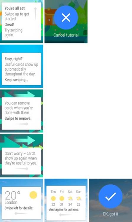
FIGURE 4.1 Wear navigation
As Figure 4.1 also shows, each notification can consist of multiple messages. In Android each of these is called a page and can be either purely informative or an action the user can take from the watch. Examples include instantly replying to a message and opening an application on the handheld device.
Wear notifications use the standard API but also add extra features for Wear-specific notifications through the NotificationCompat.WearableExtender class. Table 4.2 describes some of the new wearable notification features.
Table 4.2 New Features in Wear Notifications
|
Method |
Description |
Required? |
|
addAction(Action) |
Lets you add actions that are accessible only on Wear devices |
No |
|
addPage(Notification) |
Adds extra pages to your main notification |
No |
|
setBackground(Bitmap) |
Lets you add a background image for the Wear notification |
No |
|
setContentAction(int) |
Lets you link an action directly to the notification |
No |
|
setGravity(int) |
Sets the notification’s location on the screen |
No |
|
setHintHideIcon(boolean) |
Hides the application icon for the Wear notification |
No |
You use wearable features by instantiating the WearableExtender class, applying each feature you want your notification to have, and then extending the Notification.Builder instance with the new Wear-specific features. This process is detailed in Listing 4-1.
LISTING 4-1: Applying Wear-specific features to your notifications
NotificationCompat.WearableExtender wearFeatures = new
NotificationCompat.WearableExtender();
Notification notification = new NotificationCompat.Builder(this)
.setContentTitle("My first notification")
.setContentText("My first wear notification!")
.extend(wearFeatures)
.build();
You’ll read more details on all the new wearable features as you progress through the chapter, building all the different types of notifications available in Wear.
BUILDING NOTIFICATIONS
There is no tangible difference between displaying notifications in Android Mobile or Android Wear. The only difference is the classes you use. As you know, you can use the NotificationManager class to launch notifications on handheld devices. However, it is always recommended that you use NotificationManagerCompat instead of the NotificationManager as it provides support on older devices as well as receives bug-fixes and updates that don’t require firmware updates. Since Wear introduces new features for the Wear-enabled notifications, you need to use the NotificationsManagerCompat class found in the support libraries (v4 or above). Listing 4-2 shows how to acquire the handle for the new NotificationManagerCompat service.
LISTING 4-2: Storing a reference to the NotificationManager
public class MyActivity extends Activity {
NotificationManagerCompat mNotificationManager;
@Override
protected void onCreate(Bundle savedInstanceState) {
super.onCreate(savedInstanceState);
setContentView(R.layout.activity_my);
mNotificationManager = NotificationManagerCompat.from(this);
}
}
To show a notification you use the notify(int, Notification) method from the NotificationManagerCompat handle, passing a unique ID (and optionally a tag as well) of the notification you want to show and the notification itself. Listing 4-3 and Listing 4-4 demonstrate this.
LISTING 4-3: Showing a notification with a unique identifier
int NOTIFICATION_ID = 1;
mNotificationManager.notify(NOTIFICATION_ID, notification);
LISTING 4-4: Showing a notification with a unique tag and identifier
String NOTIFICATION_TAG = "My notification";
int NOTIFICATION_ID = 1;
mNotificationManager.notify(NOTIFICATION_TAG, NOTIFICATION_ID, notification);
If you need different kinds of notifications in your app, use multiple notification identifiers to separate each notification. If you’re using tags, it’s sufficient to change the combination of tag and identifier.
The Simple Notification
Building the most basic notification is easy. You pass the notification’s core information to the NotificationCompat.Builder class and launch it using NotificationManagerCompat. The core information is the small icon, the content title, and the content text. Anything more is just icing on the cake.
NOTE
You’ll notice that in the examples I tend to use the standard Android icons. I do this because it’s easy and the launcher icon ic_launcher.png is automatically created for you when you make a new project in both Eclipse and Android Studio. When building a “live” project, you should use a custom icon that follows the icon design guidelines. For example, the notification icon must be 24-by-24 dp and use only flat white color. Read more about the icon design guidelines athttp://developer.android.com/design/style/iconography.html.
Listing 4-5 shows how to build the simple notification.
LISTING 4-5: The basic notification
Notification notification = new NotificationCompat.Builder(this)
.setSmallIcon(R.drawable.wrox_logo_small)
.setContentTitle("My notification")
.setContentText("My first wear notification!")
.build();
This notification is generally used to display short messages that never stack. It is not generally used to notify users about new e-mails or chat messages. Figure 4.2 shows the simple notification.
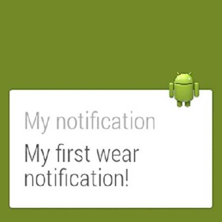
FIGURE 4.2 Basic text notification
WARNING
If the notification doesn’t show up on your device or emulator, be sure to enable notification access for Android Wear. On your mobile, open Settings and navigate to Sound & Notifications ➢ Notification Access and select Android Wear from the list.
You need to have the Wear Companion app installed. You can find it at https://play.google.com/store/apps/details?id=com.google.android.wearable.app. You must be logged in to your Google Play account to access this app.
Adding a Large Icon
Wear notifications draw the application’s icon, defined in AndroidManifest.xml, in the upper-right corner of the notification. So far you’ve seen the standard droid icon being used. To change this to something more intriguing, you need to add a new icon to your application. Listing 4-6 shows how to add a custom icon to your manifest.
LISTING 4-6: Adding a custom icon to your Wear notifications
<?xml version="1.0" encoding="utf-8"?>
<manifest xmlns:android="http://schemas.android.com/apk/res/android"
package="com.wrox.wear.chapter4">
<application
android:allowBackup="true"
android:icon="@drawable/wrox_logo_big"
android:label="@string/app_name"
android:theme="@style/AppTheme">
<activity
android:name=".MyActivity"
android:label="@string/app_name">
<intent-filter>
<action android:name="android.intent.action.MAIN"/>
<category android:name="android.intent.category.LAUNCHER"/>
</intent-filter>
</activity>
</application>
</manifest>
This example uses the Wrox logotype as the application icon, as shown in Figure 4.3. When selecting your icon, you should consider the Android design guidelines.
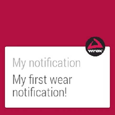
FIGURE 4.3 Using the Wrox logotype for Wear notifications
You may have noticed that the color changes when you switch the application icon. Wear does this automatically to adjust your notifications background if you haven’t set it manually.
Big Text Notification
If you want to build a notification where a larger message is displayed, such as the first few lines of a chat message, use the NotificationCompat.BigTextStyle()class. This gives you the option of setting long text and a summary, as shown in Figure 4.4. Android automatically adjusts the amount of space for your notification. You may notice that the notification can grow larger than the space available on the tiny screen. Therefore, be careful not to build notifications that are too large.
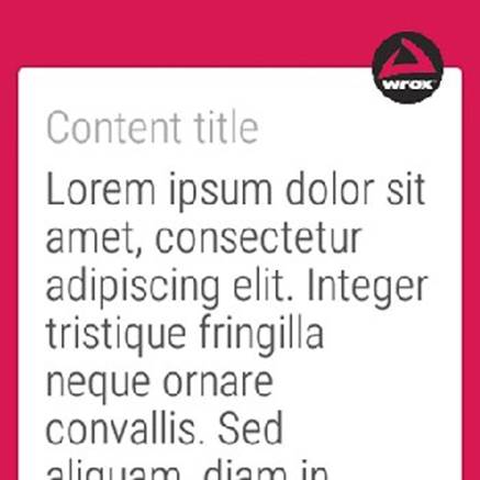
FIGURE 4.4 Big text notification
Listing 4-7 shows how to use the BigTextStyle class for Wear notifications.
LISTING 4-7: Showing long text in a notification
NotificationCompat.Style style = new NotificationCompat.BigTextStyle()
.setBigContentTitle("My big title")
.setSummaryText("My summary")
.bigText("Lorem ipsum dolor sit amet, consectetur adipiscing elit. " +
"Integer tristique fringilla neque ornare convallis. Sed aliquam, " +
"diam in elementum aliquet, odio massa adipiscing ligula, " +
"at pretium justo velit et arcu.");
Notification notification = new NotificationCompat.Builder(this)
.setSmallIcon(R.drawable.wrox_logo_small)
.setContentTitle("Content title")
.setContentText("Content text")
.setStyle(style)
.build();
You probably noticed that the number of details in the notification don’t change when the new style is applied. For example, the content text is overwritten by the BigTextStyle values. The summary is also hidden on the Wear device. However, on the mobile device these details remain visible, as shown in Figure 4.5. Wear hides as much information as possible to keep the notifications easy to read at a glance.
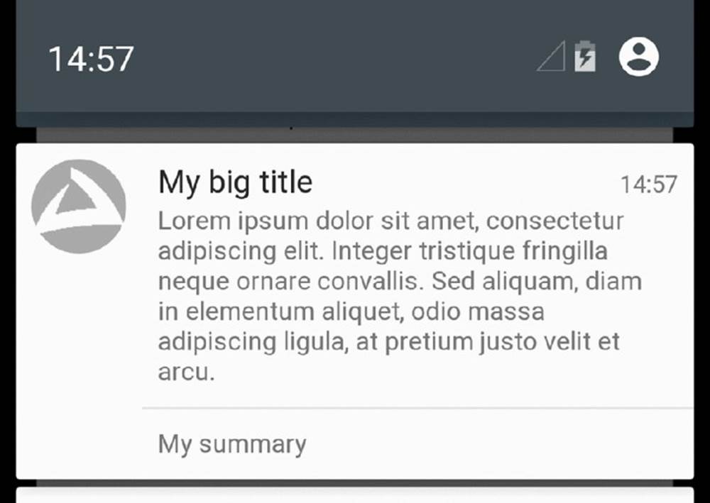
FIGURE 4.5 Big text notification on mobile
Don’t forget to include this data when building your notifications. It is still used for large notifications that are collapsed on your mobile device, as shown in Figure 4.6.
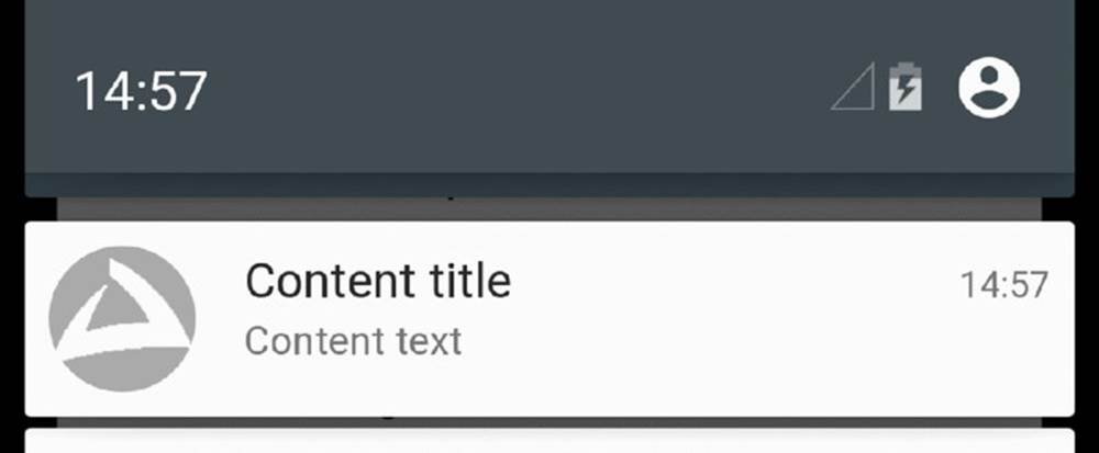
FIGURE 4.6 Big text notification, collapsed
Big Picture Notification
Similar to the extended text notification, the large image notification uses a special style called NotificationCompat.BigPictureStyle to build. Figure 4.7 shows an example of the large image notification.

FIGURE 4.7 Big picture notification
When building the large image notification, be sure to use an image that is the proper size. An image that is too small might not fill the entire notification space, and an image that is too big may take too long to load and cause your application to be unresponsive. On Wear devices the big picture is used as both a background and a new page for the notification. The summary is, again, not used on Wear devices but is displayed on mobile.
Listing 4-8 shows how to build a simple notification with a large image.
LISTING 4-8: Including large images in notifications
NotificationCompat.Style style = new NotificationCompat.BigPictureStyle()
.setBigContentTitle("Balloons!")
.setSummaryText("My summary")
.bigPicture(BitmapFactory.decodeResource(getResources(), R.drawable.balloons));
Notification notification = new NotificationCompat.Builder(this)
.setSmallIcon(R.drawable.wrox_logo_small)
.setContentTitle("Balloons!")
.setContentText("Content text")
.setStyle(style)
.build();
You can achieve a similar effect in Wear only by using the WearableExtender feature setBackground(). The difference is that setting the background works with all notifications, not just the BigPictureStyle notification. Listing 4-9 shows how to do this.
LISTING 4-9: Setting the background for your notification
NotificationCompat.WearableExtender extender = new NotificationCompat
.WearableExtender()
.setBackground(BitmapFactory.decodeResource(getResources(),
R.drawable.balloons));
Notification notification = new NotificationCompat.Builder(this)
.setSmallIcon(R.drawable.wrox_logo_small)
.setContentTitle("Background notification")
.setContentText("Using a custom background for a normal notification")
.extend(extender)
.build();
Updating a Notification
When you want to update the information in a notification, you need the unique identifier and tag, depending on how you launched the notification. If the unique identifier already exists for your package, the system knows to update that notification. If the unique identifier doesn’t exist, the system launches a new notification. Listing 4-10 shows how to create and update a simple notification.
LISTING 4-10: Updating a notification
Notification notification = new NotificationCompat.Builder(this)
.setSmallIcon(R.drawable.wrox_logo_small)
.setContentTitle("A simple notification")
.setContentText("A short text")
.build();
mNotificationManager.notify(NOTIFICATION_ID, notification);
Handler handler = new Handler();
handler.postDelayed(new Runnable() {
@Override
public void run() {
Notification updatedNotif = new NotificationCompat.Builder(MyActivity.this)
.setSmallIcon(R.drawable.wrox_logo_small)
.setContentTitle("A simple notification")
.setContentText("An updated, slightly longer, text")
.build();
mNotificationManager.notify(NOTIFICATION_ID, updatedNotif);
}
}, 5000);
This example creates a new notification and then launches it. Then it uses the feature postDelayed() in the handler to update the same notification after 5 seconds. Figure 4.8 shows the notification before and after the update.
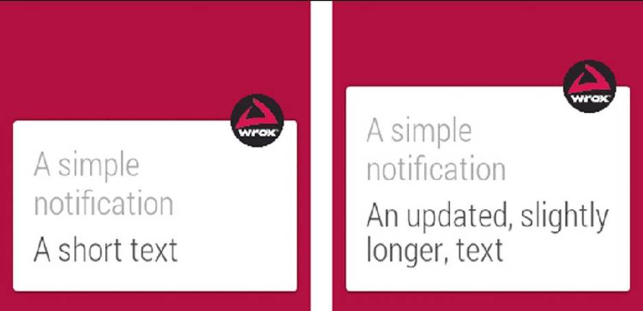
FIGURE 4.8 Updating a notification
Adding Pages to Your Notifications
Pages are a core part of Wear notifications. These are notifications that exist to the right of the initial notification. They are visible only to the Wear device, so be sure to plan the content of each page carefully.
To build the multipage notification, you need a list of pages (actually, they’re notifications, but they’re called pages). Then you need the WearableExtender to add the list of pages to your notification. Listing 4-11 shows how to add multiple pages to a notification.
LISTING 4-11: Adding multiple pages to your notification
List<Notification> pages = new ArrayList<Notification>();
for( int i = 1; i <= 3; i++ ){
Notification notification = new NotificationCompat.Builder(this)
.setContentTitle("Page " + i)
.setContentText("Text for page " + i)
.build();
pages.add(notification);
}
NotificationCompat.WearableExtender extender = new NotificationCompat
.WearableExtender()
.addPages(pages);
Notification notification = new NotificationCompat.Builder(this)
.setSmallIcon(R.drawable.wrox_logo_small)
.setContentTitle("Multi page notification")
.setContentText("This is the first of many pages")
.extend(extender)
.build();
Figure 4.9 shows the resulting notification structure.
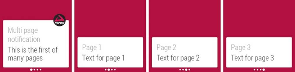
FIGURE 4.9 A simple multipage notification
Adding Actions to Your Notifications
When tapping a notification, you always have the option of performing an action, usually opening the application. Wear is no different. You have at least two ways to add actions to your notifications in Wear.
Adding a Standard Action
To have your notification, open the linked activity for your app on your mobile. Listing 4-12 shows how to add a standard action to your notification.
LISTING 4-12: Standard open action
Intent action = new Intent(this, MyActivity.class);
PendingIntent pendingIntent = PendingIntent.getActivity(this, 0, action,
PendingIntent.FLAG_UPDATE_CURRENT);
Notification notification = new NotificationCompat.Builder(this)
.setSmallIcon(R.drawable.wrox_logo_small)
.setContentTitle("Standard action")
.setContentText("This is the standard action notification")
.setContentIntent(pendingIntent)
.build();
Notice that the action appears on a separate action page on the Wear device, as shown in Figure 4.10.
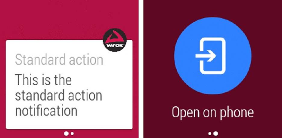
FIGURE 4.10 Adding a standard action to Wear notifications
You can avoid launching multiple instances of your activity by setting the launch mode to single top. Listing 4-13 shows how to edit your manifest to allow only one instance of your activity.
LISTING 4-13: Setting activity launch mode to single top
...
<activity
android:name=".MyActivity"
android:label="@string/app_name"
android:launchMode="singleTop">
<intent-filter>
<action android:name="android.intent.action.MAIN"/>
<category android:name="android.intent.category.LAUNCHER"/>
</intent-filter>
</activity>
...
NOTE
Using the launch mode single top for your main activity as done here is not the recommended way of preventing the creation of multiple instances. Instead, you should create a separate Activity that handles whatever action your notification is pointing to, or deal with this in Activity.onNewIntent().
Adding Multiple Actions
Adding more actions is just as easy as setting the content intent. The difference is you can set the desired icon and text to go along with them. Listing 4-14 shows how to add two actions—one to open the application, and another to open the standard dialer.
LISTING 4-14: Adding multiple actions
Intent act1 = new Intent(this, MyActivity.class);
PendingIntent pendingIntent1 = PendingIntent.getActivity(this, 0, act1,
PendingIntent.FLAG_UPDATE_CURRENT);
Intent act2 = new Intent(Intent.ACTION_DIAL);
PendingIntent pendingIntent2 = PendingIntent.getActivity(this, 0,
act2, PendingIntent.FLAG_UPDATE_CURRENT);
Notification notification = new NotificationCompat.Builder(this)
.setSmallIcon(R.drawable.wrox_logo_small)
.setContentTitle("Action notification")
.setContentText("This notification has multiple actions")
.addAction(R.drawable.wrox_logo_big, "Open app", pendingIntent1)
.addAction(R.drawable.ic_launcher, "Call the droid", pendingIntent2)
.build();
These actions display on both the handheld and the Wear device. If you want to add actions that display on only Wear devices, keep reading.
Adding Wear-Only Actions
To display actions on only the Wear device, you use the WearableExtender class and then add actions to the extender, as shown in Listing 4-15.
LISTING 4-15: Adding Wear-only actions
Intent act1 = new Intent(this, MyActivity.class);
PendingIntent pendingIntent1 = PendingIntent.getActivity(this, 0, act1,
PendingIntent.FLAG_UPDATE_CURRENT);
NotificationCompat.Action action1 = new NotificationCompat.Action.Builder(R
.drawable.wrox_logo_big, "Open app", pendingIntent1)
.build();
Intent act2 = new Intent(Intent.ACTION_DIAL);
PendingIntent pendingIntent2 = PendingIntent.getActivity(this, 0,
act2, PendingIntent.FLAG_UPDATE_CURRENT);
NotificationCompat.Action action2 = new NotificationCompat.Action.Builder(R
.drawable.ic_launcher, "Call the droid", pendingIntent2)
.build();
NotificationCompat.WearableExtender extender = new NotificationCompat
.WearableExtender()
.addAction(action1)
.addAction(action2);
Notification notification = new NotificationCompat.Builder(this)
.setSmallIcon(R.drawable.wrox_logo_small)
.setContentTitle("Action notification")
.setContentText("This notification has wear-only actions")
.extend(extender)
.build();
The result is a normal notification on handheld devices. Wear devices, however, display actions, each on a separate page, as shown in Figure 4.11.
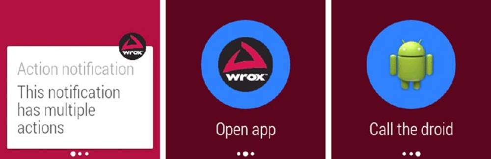
FIGURE 4.11 Standard actions on Wear notifications
Adding an Action without the Extra Page
In some cases you might want to add an action directly to your notification instead of creating another page for the action. You do this by defining which of the notification’s actions should be connected directly to the notification content. This works for both normal actions and Wear-only actions.
Wear first checks to see if any wearable actions have been added. If so, it uses that list. If no wearable actions exist for the notification, Wear uses the standard list of actions. When the action is added to the notification content, Wear no longer creates an extra page for that action. Figure 4.12 shows the resulting notification.
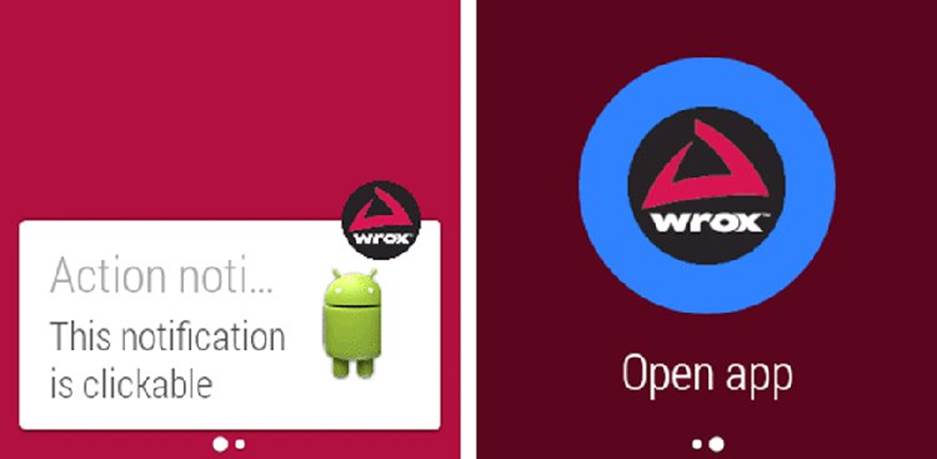
FIGURE 4.12 Interactive Wear notification
Listing 4-16 shows how to add actions to the content of a Wear notification.
LISTING 4-16: Adding content action to Wear notifications
Intent act1 = new Intent(this, MyActivity.class);
PendingIntent pendingIntent1 = PendingIntent.getActivity(this, 0, act1,
PendingIntent.FLAG_UPDATE_CURRENT);
Intent act2 = new Intent(Intent.ACTION_DIAL);
PendingIntent pendingIntent2 = PendingIntent.getActivity(this, 0,
act2, PendingIntent.FLAG_UPDATE_CURRENT);
NotificationCompat.WearableExtender ext = new NotificationCompat
.WearableExtender()
.setContentAction(1);
Notification notification = new NotificationCompat.Builder(this)
.setSmallIcon(R.drawable.wrox_logo_small)
.setContentTitle("Action notification")
.setContentText("This notification is clickable")
.addAction(R.drawable.wrox_logo_big, "Open app", pendingIntent1)
.addAction(R.drawable.ic_launcher, "Call the droid", pendingIntent2)
.extend(ext)
.build();
Extra Options
Wear includes other options that help you add detail to and customize your notifications.
Hiding the Application Icon
If you want to hide the application icon that usually is found in the top-right corner of your Wear notifications, you can do so using the WearableExtender class. Figure 4.13 shows a Wear notification without an icon.
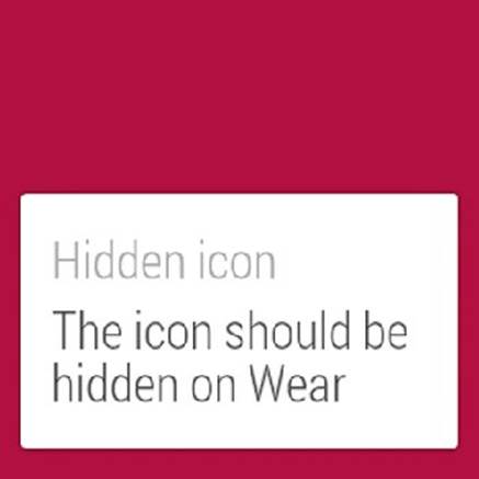
FIGURE 4.13 Hidden icon for Wear notifications
Listing 4-17 shows how to hide the application icon.
LISTING 4-17: Hiding the application icon
NotificationCompat.WearableExtender extender = new NotificationCompat
.WearableExtender()
.setHintHideIcon(true);
Notification notification = new NotificationCompat.Builder(this)
.setSmallIcon(R.drawable.wrox_logo_small)
.setContentTitle("Hidden icon")
.setContentText("The icon should be hidden on Wear")
.extend(extender)
.build();
Moving the Notification
You can also move the notification on the Wear screen using the setGravity() method. Table 4.3 shows the options for Wear notifications.
Table 4.3 Gravity Options for Wear Notifications
|
Option |
Description |
|
Gravity.BOTTOM |
Places the notification at the bottom of its parent container. This is the default option. |
|
Gravity.CENTER_VERTICAL |
Places the notification in the middle of the parent container. This does not affect the horizontal alignment, because notifications always take up the full width of the Wear display. |
|
Gravity.TOP |
Places the notification at the top of its parent container. |
Listing 4-18 shows how to set the gravity to Gravity.TOP for your notification.
LISTING 4-18: Moving the notification to the top
NotificationCompat.WearableExtender extender = new NotificationCompat
.WearableExtender()
.setGravity(Gravity.TOP);
Notification notification = new NotificationCompat.Builder(this)
.setSmallIcon(R.drawable.wrox_logo_small)
.setContentTitle("At the top")
.setContentText("This should be placed at the top")
.extend(extender)
.build();
This example should give you a result similar to the one shown in Figure 4.14.
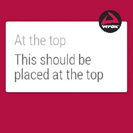
FIGURE 4.14 A notification that sticks to the top of the screen
Setting the Scroll to the Bottom
For long text notifications, you can also let the user start reading at the end of the text instead of the beginning. Use the setStartScrollBottom() method, as shown in Listing 4-19. The default value is false.
LISTING 4-19: Scrolling from the bottom
NotificationCompat.Style style = new NotificationCompat.BigTextStyle()
.setBigContentTitle("My big title")
.setSummaryText("My summary")
.bigText("Lorem ipsum dolor sit amet, consectetur adipiscing elit. " +
"Integer tristique fringilla neque ornare convallis. Sed aliquam, " +
"diam in elementum aliquet, odio massa adipiscing ligula, " +
"at pretium justo velit et arcu.");
NotificationCompat.WearableExtender extender = new NotificationCompat
.WearableExtender()
.setStartScrollBottom(true);
Notification notification = new NotificationCompat.Builder(this)
.setSmallIcon(R.drawable.wrox_logo_small)
.setContentTitle("Content title")
.setContentText("Content text")
.setStyle(style)
.extend(extender)
.build();
Removing a Notification
You have two ways to remove a notification. You can refer to the notification’s unique identifier, or you can combine a unique identifier and a tag. Listing 4-20 and Listing 4-21 show how to remove notifications.
LISTING 4-20: Removing a notification by identifier
mNotificationManager.cancel(NOTIFICATION_ID);
LISTING 4-21: Removing a notification by tag and identifier
mNotificationManager.cancel(NOTIFICATION_TAG, NOTIFICATION_ID);
STACKING NOTIFICATIONS
You also can group notifications in a stack, rather than a collection of pages. This is useful when you have several similar notifications that don’t necessarily belong to the same message. For example, if you have multiple e-mail conversations, you may want to stack the notifications to show that the user has multiple e-mails waiting.
Listing 4-22 shows how to create a simple stack of notifications.
LISTING 4-22: Stacking notifications
String MY_STACK = "my_custom_stack";
for( int i = 0; i < 3; i++ ){
Notification notification = new NotificationCompat.Builder(this)
.setSmallIcon(R.drawable.wrox_logo_small)
.setContentTitle("Title " + i)
.setContentText("Content for " + i)
.setGroup(MY_STACK)
.build();
mNotificationManager.notify(NOTIFICATION_ID + i, notification);
}
This example creates three notifications in a loop; attaches them to the same group, called MY_STACK; and then displays them one after the other. You can attach more notifications to the same group later by reusing the stack name.
Remember that the notification identifier is unique to the notification. If you use the same identifier for multiple notifications, the system creates only one notification. In essence, the stack contains just one notification if you don’t change the identifier.
Figure 4.15 shows the resulting stack of notifications built by Listing 4-22. The stack is sorted before the notification is launched. If you want to use different sorting for your stack, you can use the setSortKey() method, as shown in Listing 4-23.
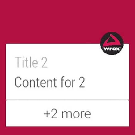
FIGURE 4.15 Default sorted stack of notifications
LISTING 4-23: Sorting the stacked notifications
String MY_STACK = "my_custom_stack";
for( int i = 3; i >= 0; i-- ) {
Notification notification = new NotificationCompat.Builder(this)
.setSmallIcon(R.drawable.wrox_logo_small)
.setContentTitle("Title " + i)
.setContentText("Content for " + i)
.setGroup(MY_STACK)
.setSortKey(Integer.toString(i))
.build();
mNotificationManager.notify(NOTIFICATION_ID + i, notification);
}
This example sorts on the notification’s index. However, you can use any string to sort these notifications. You could use the sender’s name or the message’s length, or perhaps a custom priority string for a To-Do application. Figure 4.16 shows the stacked notifications sorted by a custom key.

FIGURE 4.16 Custom-sorted stack of notifications
By default, the stacked notification doesn’t appear on a normal handheld device, so it’s important that you provide a summary notification to be displayed on those devices. Listing 4-24 shows a simple summary notification.
LISTING 4-24: Summary of stacked notifications
String MY_STACK = "my_custom_stack";
int index = 0;
// Create summary notifications for handheld
NotificationCompat.InboxStyle list = new NotificationCompat.InboxStyle();
for( index = 1; index <= 3; index++ ){
Notification notification = new NotificationCompat.Builder(this)
.setSmallIcon(R.drawable.wrox_logo_small)
.setContentTitle("Title " + index)
.setContentText("Content for " + index)
.setGroup(MY_STACK)
.build();
// For the handheld summary
list.addLine("Title " + index);
mNotificationManager.notify(NOTIFICATION_ID + index, notification);
}
list.setBigContentTitle(index + " new notifications")
.setSummaryText("Many notifications...");
Notification stackedWithSummary = new NotificationCompat.Builder(this)
.setSmallIcon(R.drawable.wrox_logo_small)
.setContentTitle(index + " new notifications")
.setLargeIcon(BitmapFactory.decodeResource(getResources(),
R.drawable.wrox_logo_big))
.setStyle(list)
.setGroup(MY_STACK)
.setGroupSummary(true)
.build();
The resulting summary notification should look like Figure 4.17.
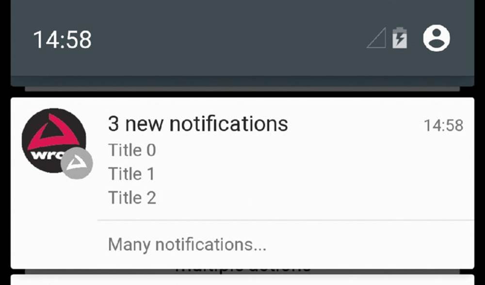
FIGURE 4.17 Handheld summary for stacked notifications
SUMMARY
This chapter has introduced the most commonly used notification features ported to a Wear device. You explored the new features that Wear has introduced to notifications, including Wear-specific actions, stacked notifications, and pages. You also learned that some of the standard notification APIs do not apply on Wear devices because of how users interact with the new form factor of Wear devices. You should keep this in mind when designing your applications experience—you probably want a similar look and feel for your app regardless of what kind of device the user has.
The next chapter dives further into the Wear APIs, discussing how to create custom Wear-enabled activities and applications.
RECOMMENDED READING
1. UI Patterns for Android Wear, http://developer.android.com/design/wear/patterns.html.