HTML5, 20 Lessons to Successful Web Development (2015)
PART III Advanced HTML5
LESSON 16 Building Advanced Forms

To view the accompanying video for this lesson, please visit mhprofessional.com/nixonhtml5/.
If you’ve ever used HTML forms, you’ll be aware of how limiting they can be. Yes, they do provide the facility to create different types of fields and buttons, but that’s about it.
There are no date pickers for easy selection of dates from pop-up menus. There’s no built-in verification of data types such as numbers, strings, or e-mail addresses, and there’s no built-in ability to match patterns in regular expressions.
But with HTML5 all these problems and several more have been addressed, making completing forms easier than ever for users, and also much simpler for web developers to create.
New Form Attributes
HTML5 is still very much an evolving specification that browsers are implementing only piecemeal. Therefore some features are available in some browsers, and others in different ones.
And it’s not always the same browsers that haven’t yet caught up with the spec because, as of this writing, all of the latest versions of all the main browsers omit at least three of these attributes, and some omit as many as ten.
Nevertheless, as time passes, browsers will implement more and more of the HTML5 spec, and therefore this lesson provides the information you need for using these features.
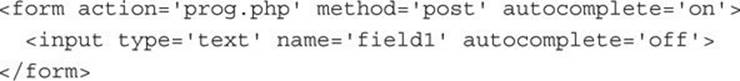
The autocomplete Attribute
The autocomplete attribute can be applied to the <form> tag or any of the color, date, email, password, range, search, telephone, text, or url types of the <input> tag. Valid arguments for this attribute are on (the default) and off.
When autocomplete is on, any field with an id that has previously had an input entered will remember its value and offer it as a suggested value, saving you from having to enter it again.
When autocomplete is off, this behavior is disabled. When applied to a <form> tag, the attribute affects all relevant fields within a form. When applied to an <input> tag, only that field is affected. Here are two examples of using the attribute:
The autofocus Attribute
The autofocus attribute can be applied to any <input> tag to give its field automatic focus when a page loads. This has the effect of placing the cursor in an input field ready to type, or selecting any other type of field ready to change it, and is activated like this:
<input type=’text’ name=’field’ autofocus=’autofocus’>

This feature is supported by the latest versions of all major browsers, but not mobile browsers, as it would be a distraction calling up the onscreen keyboard when often it wouldn’t be wanted.
To achieve the same effect in older browsers, you can add some JavaScript to the <body> tag of your web page, like this:
<body onload=’document.forms.myform.myfield.focus()’<
Then make sure your form looks something like this:

To make this work, both the <form> and the <input> tags must each be given a unique id. In this case I chose the name myform for the form and myfield for the field. These are then easily referenced in the argument to the onload event of the <body> tag, which calls the focus() function on the field when the web page has loaded.
The form Attribute
With the form attribute, it is not necessary for you to place <input> tags within the form to which they apply. Instead, as long as you give a form an id, you can specify that value as the argument for a form attribute.
For example, the following code opens and then closes a form with the id of myform, and the <input> tag field is attached to it only after the form is closed:
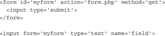
This feature is not supported by Internet Explorer at the time of writing.
Form Overrides
Several new attributes have been added to HTML in version 5 that allow you to override various form settings such as the action and enctype properties, but so far only a few browsers have implemented them.
Form overrides work with either of the submit or image types of the <input> tag, and are supported in the latest versions of all major browsers.
The formaction Attribute
The formaction attribute is a form override that lets you change the action attribute to a different destination. For example, in the following code, the form will not post to the program prog.php as specified in the <form> tag, and will instead post to prog2.php:
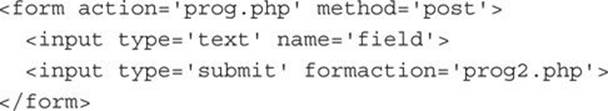
This attribute can be particularly useful when you wish to provide more than one submit button, each with a different destination program to which the form should submit.
The formenctype Attribute
The formenctype attribute is a form override that lets you change the encoding type of a form (the enctype attribute), in a similar manner to the formaction override.
The formmethod Attribute
The formmethod attribute is a form override that lets you change the posting method (the post or get value of the method attribute), in a similar manner to the formaction override.
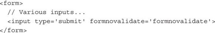
The formnovalidate Attribute
The formnovalidate attribute is a form override that lets you change the novalidate attribute, in a similar manner to the formaction override.
The formtarget Attribute
The formtarget attribute is a form override that lets you change the target attribute, in a similar manner to the formaction override.
The height and width Attributes
The height and width attributes can be applied to the image type of the <input> tag to change its height and width. You use the attributes like this, with a result such as that in Figure 16-1:
<;input type=’image’ src=’finger.png’ width=’117’ height=’100’>
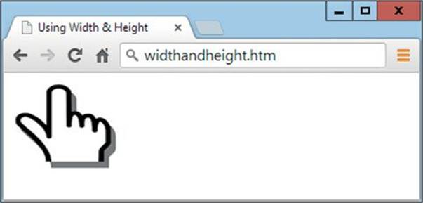
FIGURE 16-1 Resizing an image used in an input
The list Attribute and <datalist> and <option> Tags
Some input fields support lists and the list attribute can be used to reference them. For example, the following HTML uses this attribute, along with the new <datalist> tag, to offer a selection of URLs from which to choose:
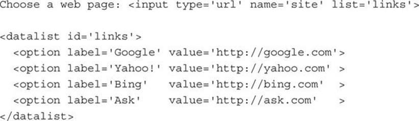
The value supplied to the list attribute should be the id name of a <datalist> tag. This feature works a bit like the autocomplete attribute, except that you define the list of suggested choices that appear when the input is given focus.
Currently this feature is not supported in Safari, but you can still use it in your web pages (as shown in Figure 16-2) because Safari will simply not display the list of suggestions, but for other browsers, your web forms that use it will be quicker to fill in.
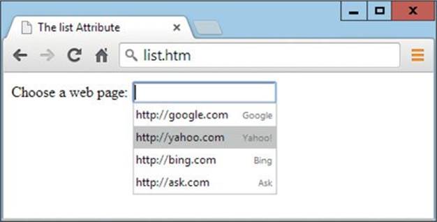
FIGURE 16-2 Prepopulating input using the list attribute and <datalist> tag
The min and max Attributes
The min and max attributes are used to specify minimum and maximum value for input types that contain numbers or dates. Here is an example (the result of which can be seen in Figure 16-3, in which the up and down selectors can be seen to the right of the input):
<input type=’time’ name=’deliver’ value=’09:00’ min=’09:00’ max=’17:00’>
FIGURE 16-3 Using the min and max properties
In addition to using the mouse to change the input up or down (within the minimum and maximum values), a valid input between these values can be directly entered, or the up and down keyboard buttons can be used to scroll through the supported values.
I don’t recommend you rely on this type of validation yet, though, since neither Firefox nor Internet Explorer support its use (the attributes will be ignored).
The multiple Attribute
The multiple attribute allows you to accept multiple values for an <input> tag that uses any of the email, range, or file types. It works in the latest versions of all major browsers except for Internet Explorer and Opera. You will enable it like this:
<input type=’file’ name=’images’ multiple=’multiple’>
Then, when the browse box pops up, multiple files can be selected at a time (normally in conjunction with the ctrl key). On browsers that don’t yet support this feature, only single files can be selected.
Because browsers that don’t support this feature will only allow single items to be selected, until all browsers support it, this feature is not safe to use if you are requiring multiple inputs (rather than simply allowing them).
The novalidate and formnovalidate Attributes
These Boolean attributes specify that a form should not be validated when it is submitted. The novalidate attribute is applicable to the <form> tag and the formnovalidate attribute is applicable to only the submit and image types of the <input> tag. You use novalidate like this:
And you use formnovalidate like this:
At the time of writing Safari does not yet support this feature, but once it is implemented across all browsers, you may well choose to use it all the time, at least until the validation features in HTML5 are much better than those currently offered. If you are looking for reliable in-browser form validation, there are many libraries available, such as the open source tool at livevalidation.com.
The pattern Attribute
The pattern attribute lets you specify a regular expression with which an input field should be evaluated. It can be applied to any <input> tag that uses any of the email, password, search, telephone, text, or url types. For example, to allow only alphanumeric characters, the dash, and underline in a field, you might use the following HTML:
<input type=’text’ name=’username’ pattern=’[\w\-]{6,16}’>
The pattern ’[\w\-]{6,16}’ tells the browser to accept only the following:
• \w The letters a-z and A-Z, the digits 0-9, and the underline character
• \- The dash character
• {6,16} Between 6 and 16 characters inclusive
Currently this feature is not supported by Safari, and therefore it cannot be relied upon for reliable in-browser validation. I would also add that Chrome simply refuses to submit a form when a pattern doesn’t match—giving you no idea why, while Opera says “[input] is not in the format this page requires!” Therefore I recommend ignoring this feature until such time as it is available on all browsers, and has matured to the point of actually informing users what they need to enter.
The placeholder Attribute
The placeholder attribute lets you place a helpful hint in any blank input field, with which you can help explain to users what they should enter. You use it like this:

The size attribute value of 35 ensures that there’s enough room for the placeholder text which, as long as nothing has yet been entered into a field, is displayed in a light color, as shown in Figure 16-4.
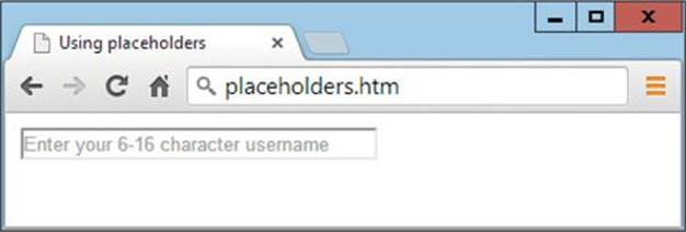
FIGURE 16-4 Displaying a placeholder
As soon as the field is given focus and a user starts typing, the prompt disappears. This attribute can be applied to any of the email, password, search, telephone, text, and url types of the <input> tag.
The required Attribute
The required attribute is used to ensure that a field has been completed before a form is submitted. You use it like this:
<input type=’number’ name=’age’ required=’required’>
The step Attribute
The step attribute is used to specify a step value for input types that contain numbers or dates. Here’s how you might use it in conjunction with the min and max attributes:

The value can be any positive integer and, in the case of times, its value is in seconds. The result of using the preceding HTML is shown earlier in Figure 16-3. By clicking on the up and down icons, or by using the up and down cursor keys, it is possible to scroll through the hours to make a selection.
At the time of writing, this feature is not yet supported by Firefox or Internet Explorer.
New Form Input Types
Over the years, it has been discovered that there are many more types of input a website might ask for than the simple selection types supported by HTML 4.01. In fact, there are now 16 new types of input available in HTML5.
What they provide is tighter control over user input, along with built-in validation. The only drawback is that these input types are not widely implemented. Nevertheless, you can still use all of them, even on unsupported browsers, as they will fall back to being regular text fields. If you use these types over time, then as other browsers catch up, your forms will automatically become easier to complete.
Mobile devices should generally be aware of some of these input types in the sense that they will change the keyboard type presented to you accordingly. For example, the email input type will ensure that an @ symbol is included in the main set of characters, the number type ensures that number keys are visible, and the tel type displays a telephone keypad.
The color Input Type
The color input type calls up a color picker so you can simply click on the color of your choice. You use it like this:
Enter your preferred color <input type=’color’ name=’favcolor’>
This feature is only available in Chrome and Opera at the time of writing.
Date and Time Pickers
Date and time pickers are similar to the color input type in that eventually you’ll be able to click on one and a calendar will pop up, from which you can select a date or time, as shown in Figure 16-5.
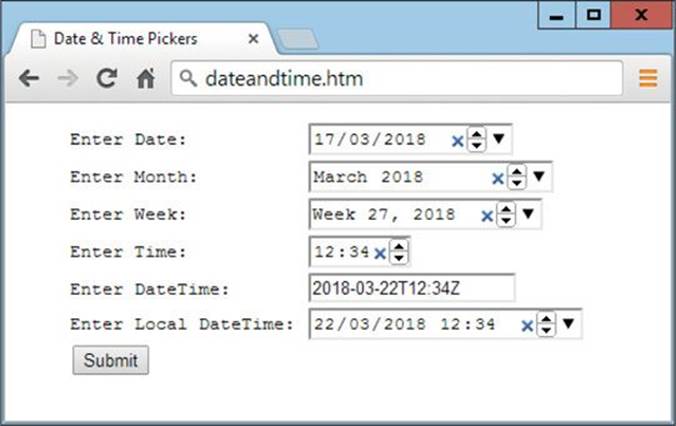
FIGURE 16-5 Date pickers in Google Chrome
Currently these pickers do not work in Firefox or Internet Explorer, so my advice is to ignore these features until they mature and work properly on all the main browsers; in the meantime, there are plenty of JavaScript date picker libraries you can find via search engines.
The date Input Type
The date input type selects a date and is used like this:
<input type=’date’ name=’thedate’>
The returned value will be of the form YYYY-MM-DD.
The month Input Type
The month input type selects a month and is used like this:
<input type=’month’ name=’themonth’>
The value returned is of the form YYYY-MM.
The time Input Type
The time input type returns a time in the 24-hour form HH:MM. You use it like this:
<input type=’time’ name=’thetime’>
The week Input Type
The week input type returns the week in the form YYYY-WNN (for example 2018-W06). You use it like this:
<input type=’week’ name=’theweek’>
The datetime Input Type
The datetime input type returns the date and time in UTC (Coordinated Universal Time), which will be almost the same as Greenwich Mean Time, give or take a second. The returned value will be of the form YYYY-MM-DDTHH:MMZ (for example 2018-10-15T15:35Z). You use it like this:
<input type=’datetime’ name=’dateandtime’>
This type is not supported in Chrome.
The datetime-local Input Type
The datetime-local input type returns the user’s local date and time. The returned value will be of the form YYYY-MM-DDTHH:MM (for example, 2018-10-15T15:35) and will contain no time zone information. You use it like this:
<input type=’datetime-local’ name=’localdateandtime’>
The email Input Type
The email validation type ensures that the browser knows an e-mail address is expected and if necessary can cater to it (for example, by including the @ character on the pop-up keyboard of a mobile phone):
<input type=’email’ name=’emailaddress’>
This type is not supported by Safari.
The number Input Type
The number validation type ensures that only numbers can be entered. You use it like this:
<input type=’number’ name=’age’>
Small up and down icons appear next to the input to allow changing a default value by clicking them, or by using the up and down cursor keys.
The range Input Type
The range input type causes a range widget to be displayed that you can slide to select any value between a minimum and maximum, and with a specified start and step value.
It is used like this, and the result is shown in Figure 16-6.
<input type=’range’ name=’num’ min=’0’ max=’255’ value=’128’ step=’1’>
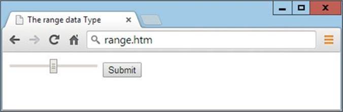
FIGURE 16-6 A range widget in Google Chrome
The search Input Type
When you specify the search type, browsers are supposed to tailor the input box to provide features that might include search suggestions (in a similar way to Google Search), an icon with which to empty the field, and possibly styling changes to alert you to the type of input.
The only enhancements are an X icon for clearing the input, and a rounded input field (on Mac Safari only). But there’s no harm in you using this input type right now, as other browsers simply display the default text field, and when they support the feature, your web pages will already be enhanced for it.
You use the attribute like this:
<input type=’search’ name=’searchphrase’>
As of writing, this has been implemented only on Safari and Chrome.
The tel Input Type
The tel input type informs the browser that a telephone number is to be expected. Currently it is used by iOS devices when the field is selected to bring up a telephone number keypad in place of a keyboard:
<input type=’tel’ name=’phone’>
The url Input Type
As with the tel input type, the url type is also there to tell the browser about the type of data to be expected. In the case of the iPhone and other iOS devices, this ensures that the ., / and .com buttons are displayed.
Other browsers may also offer enhancements for this type in the future, which is created with the following HTML:
<input type=’url’ name=’webpage’>
Summary
As you will have noticed, forms are probably the subsection of the HTML5 specification that have been the least worked on by the browser developers. This is a shame because submitting data is one of the most common and important tasks people do on the web. Still, HTML5 browser support is improving, and you can keep up with the latest developments at tinyurl.com/h5forms. In the next lesson we’ll take a look at local storage and cross document messaging.
Self-Test Questions
Test how much you have learned in this lesson with these questions. If you don’t know an answer, go back and reread the relevant section until your knowledge is complete. You can find the answers in the appendix.
1. How can you provide access to typing into an input field without the user first having to click it?
2. With which attribute can you allow previous values that have been entered for the current input field’s name to be selected by the user?
3. What is the purpose of the list attribute?
4. How can you set minimum and maximum limits for an input?
5. Which attribute enables uploading of more than one file at a time via a form?
6. How can you place text in an empty input field to prompt the user for the type of input expected?
7. Which attribute can you use to ensure that an input must be completed before a form is submitted?
8. What does the attribute pattern=’[\w]{5,10}’ do to the input to which it is applied?
9. How can you offer a color picker in an input (to browsers that support it)?
10. How can you call up a calendar date picker in an input (for browsers that support it)?
All materials on the site are licensed Creative Commons Attribution-Sharealike 3.0 Unported CC BY-SA 3.0 & GNU Free Documentation License (GFDL)
If you are the copyright holder of any material contained on our site and intend to remove it, please contact our site administrator for approval.
© 2016-2026 All site design rights belong to S.Y.A.