HTML5, JavaScript and jQuery (Programmer to Programmer) - 2015
Part I HTML and CSS
Lesson 5 Structuring Pages with CSS
In the previous lesson, you looked at how individual elements could be styled with CSS. This lesson builds on this knowledge and looks at how elements come to occupy the screen position that they do, how this can be manipulated, and how this impacts other elements around them.
The Box Model
The box model is one of the most important CSS concepts and dictates the width and height each element will occupy onscreen. The box model starts from the observation that all elements in the document occupy rectangular boxes, but the rules for calculating their height and width are not as straightforward as you may think.
For a start, the height and width occupied by an element is greater than the height and width required for the content of the element for several reasons. For instance, the element may have a border that occupies additional space. In the previous lesson, you created borders that were 1 pixel in size. Thus, these borders added 2 pixels to the height and width required for the element.
Padding may also be added between the content and the border, as with the table cells in the previous lesson. Finally, it may also be necessary to add additional margin between the element and its neighboring elements.
The total space occupied by the element's box can therefore be visualized in Figure 5.1.
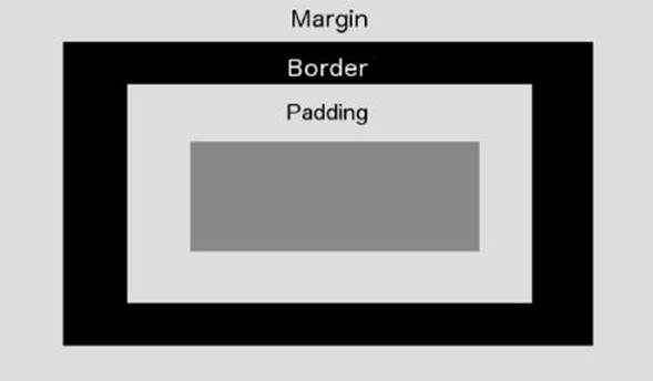
Figure 5.1
In order to see this in action, create a web page as follows:
<!DOCTYPE html>
<html lang="en">
<head>
<meta charset="utf-8">
<style>
h1 {
width:400px;
height:30px;
padding:10px;
border:2px solid #999999;
background:#dddddd;
margin: 10px 20px 20px 10px;
}
</style>
</head>
<body>
<h1>This is a header</h1>
</body>
</html>
This code declares an h1 element with the following sizes (working from the inside of the box to the outside):
· A width of 400 pixels and a height of 30 pixels. If these were omitted, the element would have a default height and width calculated from the content of the element.
· Ten pixels of padding between the content and the border. When specifying a single value, the value is automatically applied to the top, right, left, and right of the box.
· A 2-pixel border.
· A margin between itself and its neighbors, but this has different values on each side. Therefore, four values are provided. You can remember which side these apply to with the acronym TRouBLe (Top, Right, Bottom, Left). For instance, in this case the left margin is
10 pixels.
It is also possible to specify the border, padding, or margin for any side individually by using properties such as margin-left, border-top, and padding-right.
Open this web page and view it in Chrome. Right-click on the h1 element, and select Inspect Element. Ensure the element is selected in the Elements tab, and then take a look to the bottom right of the console. It should show a box like the one in Figure 5.2, which is a visualization of the box model for the element.
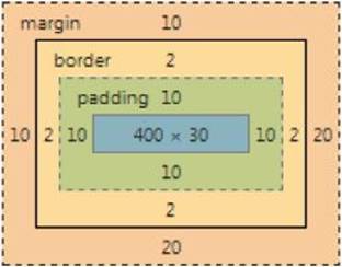
Figure 5.2
You can therefore use this to determine how much height and width the element will need onscreen:
· The width will need 10 + 2 + 10 + 400 + 10 + 2 + 20 = 454 pixels.
· The height will need 10 + 2 + 10 + 30 + 10 + 2 + 20 = 74 pixels.
One other interesting aspect you may notice about the box model is the scope of the background color. The background color fills the content and the padding, but not the margin or border.
If you add two more h1 elements to the document and then refresh the web page, you will notice that there is a margin between the elements, as shown in Figure 5.3.
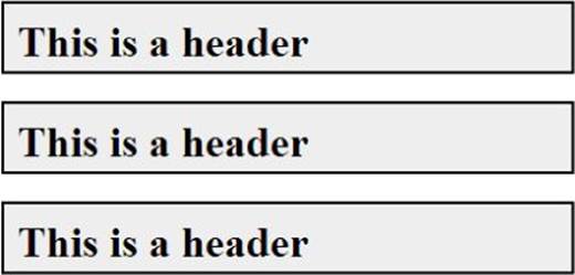
Figure 5.3
You may notice something unusual here however. Each of the headers has a top margin of 10 pixels and a bottom margin of 20 pixels. You might therefore expect that there would be 30 pixels between each element.
If you select the top element in Chrome, however, you will notice that the bottom margin is only 20 pixels (as demonstrated by the fact the space taken by the element extends down to the top of the next element). You can see this in Figure 5.4. The top margin for the second header has been ignored.
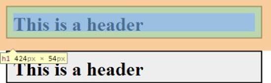
Figure 5.4
This is referred to as collapsed margins. The top and bottom margin of block elements are collapsed into a single margin that is calculated as the greatest of the top and bottom margin: 20 pixels in this case. Working around collapsing margins can be a headache; therefore, it is often better to rely on only top or bottom margins, not both.
Display Type
I have alluded to display types several times already in this book, but now is the time to look at this property in more depth. Every element has a display type and is initially defaulted to the appropriate type for each tag. There are quite a number of display types, but you really need to understand only four of them.
By default, h1 elements have a display type of block. As mentioned previously, block elements insert a break in the document meaning the next element will appear below the previous element. It is possible to control both the height and width of a block element, as you saw in the previous section.
The next most widely used block type is inline. Add the following rule to the style section and refresh the web page:
h1 {
display: inline;
}
This will now display as you see in Figure 5.5. As you can see, inline elements sit alongside one another. If they exceed the width of the page, they will then automatically wrap to a new line. Although it is possible to control the width of an inline element, it is not possible to control their height: This is automatically calculated.
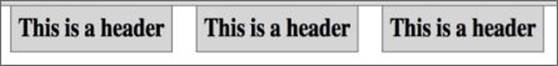
Figure 5.5
Additionally, it is only possible to add margin and padding to the left and right of the element, not to the top and bottom. As you can see, the elements are positioned at the very top of the web page, without any margin between the headers and the address bar.
The third major category of display type is inline-block. When elements are assigned this display type, they sit alongside one another, just like inline elements, but it is possible to specify their height, and add margin and padding to all four sides.
The final display type to understand is none. When an element is assigned this display type the element is hidden from the viewer but remains in the document. Change the second header as follows and then refresh the web page:
<h1 style="display:none">This is a header that is hidden</h1>
If you reload the page, you will see that there is no sign of this element: It does not even leave an empty space for the position it would hold if it had visibility. It is common to dynamically hide and show content with JavaScript by manipulating the display type, as you will see later in this book.
Positioning Elements
Now that you understand the box model, it is possible to start looking at how different elements interact.
Imagine that you want to create a web page split into five sections:
· A 100-pixel high header that spans the width of the page
· A 50-pixel high footer that spans the width of the page
· A content section broken into three sections:
· An area to the left where menus can be positioned: This should occupy 20 percent of the width and have a minimum height of 500 pixels.
· An area on the right for advertising material: This will also occupy 20 percent of the width and have a height of 500 pixels.
· A main content section in the middle occupying as much of the remaining space as it requires.
The screen therefore consists of the five boxes seen in Figure 5.6. The first question you might want to ask yourself is: What type of element is each of these boxes? Essentially, they are just containers for other elements, and you may want to encapsulate many different elements inside each of these containers.
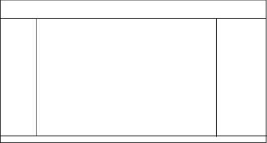
Figure 5.6
HTML supports a tag I have not discussed so far called a div. This is potentially the most widely used tag in HTML: It is a block element with no default presentation itself; it is simply used as a container to group other elements together.
HTML supports a second related tag called a span (perhaps the second most widely used tag in HTML). This is the same as a div, except it is an inline element rather than a block element.
You will start by creating a page called structure.html with the following body:
<body>
<div id="header">This is the header</div>
<div id="sidebar">This is the sidebar</div>
<div id="content">This is the main content</div>
<div id="advertising">These are adverts</div>
<div id="footer">This is the footer</div>
</body>
Because these are block elements, you will notice that the five elements simply sit on top of each other for now. I have added id attributes to the elements to allow them to be styled individually in CSS.
In order to style the header element, add a style element with the following value:
#header {
height:100px;
background:pink;
}
When I am laying out a web page, I find it convenient to give every element a distinctive background color to start—this allows me to see exactly how much space has been allocated to each element.
If you view this web page in Chrome, you will see that the header has a white margin around it. This is the result of a style inherited from the body element; therefore, you should also add the following to the styles section to remove this:
body {
margin: 0;
}
Now, add the following for the sidebar element:
#sidebar {
width:20%;
background:orange;
height:500px;
float:left;
}
Notice that the width element uses a percent for the unit rather than pixels: This means it will utilize 20 percent of the space potentially available to it, which for a top-level element like this is the entire width of the screen. Sizes are also commonly expressed in the following formats:
· mm: Millimeters
· in: Inches
· em: 1 em is the equivalent size of the current font; this measurement therefore allows elements to be sized in relation to the standard font size.
This element also declares a height. This property ensures that the element occupies 500 pixels of vertical space.
The most interesting property here, however, is the float property. Because you need three block elements to sit alongside each other, you need to control how they interact with each other horizontally. The float property can be used to position block elements to either the left or the right of the area available to them, and in addition, this suppresses the break that would normally accompany block elements in the left-to-right flow.
Although using the float property is similar to declaring the display type as inline-block, it has the additional benefit that it is possible to position elements to the left or the right of their available space. By comparison, inline-block elements always float to the left of the available space.
Next, you will add style for the content element. You will leave this without any style, except you will specify that it should float to the left of its available space, which will position the element directly to the right of the sidebar element. Add the following to the styles:
#content {
float:left;
}
With this in place, you want to place the element with the id of advertising on the right side of the screen. The style for this element is therefore virtually identical to sidebar, except you will request that it floats right:
#advertising {
width:20%;
background:blue;
height:500px;
float:right;
}
Notice that this is not sitting directly up against the content element; instead, it is being positioned directly against the right of the screen.
Finally, you come to the footer. It may seem that you can simply add the following:
#footer {
height:50px;
background:pink;
}
If you try loading this page, however, you will see that the footer div sits beside the content div. You need to request that this element drops below the floated elements preceding it with the following property:
clear: both;
In this case, both refers to the fact that this element should drop below both left and right floated elements.
If you load the page, you will see that it looks exactly as expected (see Figure 5.7). Once the page structure is in place, you can then start adding content to each of the divs.
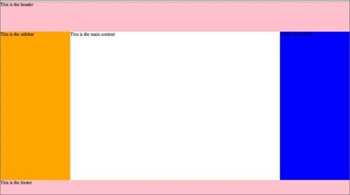
Figure 5.7
Controlling Positions
Up until this point, the position elements that have been placed onscreen have been a product of the elements that appear before them in the DOM and the properties of the element itself. Elements are simply laid out in the order they appear in the web page and take up as much space as they need. This then impacts the position assigned to elements that appear after them in the DOM.
This is technically called static positioning, but it is only one of several ways of positioning elements. This section will briefly look at three other ways of positioning elements.
In order to demonstrate positioning, start by creating the following web page, which consists of three boxes. These three boxes are sufficient to demonstrate the various approaches to positioning:
<!DOCTYPE html>
<html lang="en">
<head>
<meta charset="utf-8">
<style>
.box {
height:200px;
width:200px;
display:inline-block
}
</style>
</head>
<body>
<div class="box" style="background:red"/>
<div id="middleBox" class="box" style="background:green"/>
<div id="lastBox" class="box" style="background:blue"/>
</body>
</html>
If you view the web page, you will see that it consists of three boxes sitting alongside one another (see Figure 5.8).
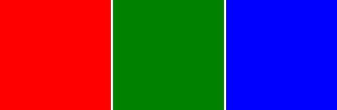
Figure 5.8
Imagine that that we want to move the second box (with the id of middleBox) 50 pixels to the right and 50 pixels down without impacting the third box at all. This is not possible with static positioning because adding 50 pixels of width to the second element would push the third element 50 pixels right.
In order to achieve this, add the following rule to the style section:
#middleBox {
position: relative;
top:50px;
left: 50px;
}
This starts by setting the position of the middleBox element to relative. This means that you want to set its position relative to the default position it would be given on the page.
Once the position property has been set, you can start using the left, right, top, and bottom properties to move the element to a different position on the screen. In this case, you then want to specify that you want 50 pixels of space added to the left and 50 pixels of space added to the top. If you view this, you will see the screen displayed in Figure 5.9.
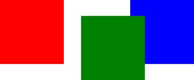
Figure 5.9
Notice that the elements now overlap one another: The third box is simply given the position it would have held if you had not moved the second element to the right.
It is also possible to use a position of absolute to position an element relative its parent. Try changing the preceding style as follows:
#middleBox {
position: absolute;
top: 150px;
left: 150px;
}
Because the parent of middleBox is the body element itself, you are effectively positioning the element relative to the browser window. If you view the page now, it should look like what you see in Figure 5.10.
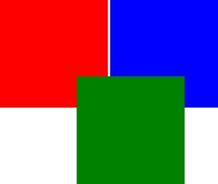
Figure 5.10
Using absolute positioning removes the element from the flow of the page, and therefore the position of the third box is also impacted.
You can also control which of these elements sits in the foreground and which are relegated to the background. This is controlled by a CSS property called z-index. The element with the highest z-index will be placed in the foreground. Therefore, if you add the following to the style of middleBox, it will be relegated to the background:
z-index:-1;
The final main type of positioning is fixed. This is similar to absolute positioning, except elements are positioned relative to the browser window. In the preceding example, fixed and absolute positioning would achieve the same result.
Try It
In this step-by-step, you will pick up the CRM application from the previous lesson and add more structure to the overall web page. This will include adding a header, a footer, and an area for adding new contacts (although we will not populate this until the next lesson).
Lesson Requirements
You will need the CRM application as it stood at the end of Lesson 4. You will also need a text editor and the Chrome web browser.
Step-by-Step
1. Open the contacts.html page and add a div immediately after the opening body tag. In the body of the tag, enter Contacts. Assign the id of header to this tag.
2. Wrap a div tag around the table, and give this the id of contactList. The opening tag should be immediately before the opening table tag, while the closing tag should be immediately after the closing table tag.
3. Add another div immediately before the closing body tag and give this the id of footer. Add a copyright statement to this div.
4. Add one final div immediately after the header div, and give this the id of contactDetails. This is where you will eventually place a new form for adding contacts. Add an h2 element to this with the text Contact Details.
5. Open contacts.css. Start by adding a margin: 0 property to the body rule to ensure you remove white space from around the header.
6. Create a rule for the div with the id of header. This should specify that the background and color are the same as for the thead element rule from the last lesson. Additionally, add a text-align property with a value of center, and a line-height property with a value of 70px.
line-height is similar to height, but it will ensure that the text is vertically aligned. If you had simply specified height, the text would be positioned near the top of the div. Also add a font-size of 3em: three times larger than the standard font.
7. contactDetails and contactList need to share a number of properties, so create a rule that matches both of these elements. Add a border with a 1px solid line and a color of #999999. Also add margin and padding of 15px around all sides.
8. Add a style for the footer div. This should be the same as the header, except the line-height should be 40, and the font-size should be 0.8em.
9. Black font can be quite overpowering, so set the color property of the body to color: #333333, which is a very dark grey.
If you open the page, it should look like the example in Figure 5.11. If you need assistance, the finished version can be downloaded from the Lesson 5 resources, or you can watch the screencast online.
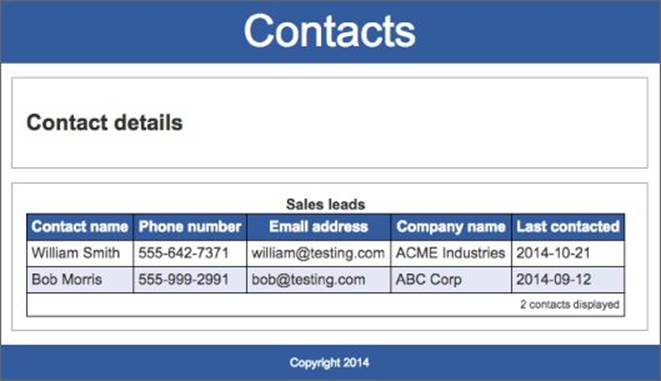
Figure 5.11
Reference
Please select the video for Lesson 5 online at www.wrox.com/go/html5jsjquery24hr. You will also be able to download the code and resources for this lesson from the website.