CSS: The Definitive Guide (2017)
Chapter 11. Animation
CSS transitions, covered in the previous chapter, enabled simple animations. With transitions, an element’s properties change from the values set in one style block to the values set in a different style block as the element changes state over time instead of instantly. With CSS transitions, the start and end states of property values are controlled by existing property values and provide little control over how the property value interpolation progresses over time.
CSS animations are similar to transitions in that values of CSS properties change over time. But transitions only let us animate from an initial value to a destination value and back again. CSS keyframe animations let us decide if and how an animation repeats and give us granular control over what happens throughout the animation.
CSS animation lets us animate the values of CSS properties over time using keyframes. Similar to transitions, animation provides us with control over the delay and duration. With CSS animations, we can control the number of iterations, the iteration behavior, what happens before the first animation commences, and the state of animated properties after the last animation iteration concludes. CSS animation properties allow us to control timing and even pause an animation mid-stream.
While transitions trigger implicit property values changes, animations are explicitly executed when animation keyframe properties are applied.
With CSS animations, you can change property values that are not part of the set pre or post state of the element. The property values set on the animated element don’t necessarily have to be part of the animation progression. For example, with transitions, going from black to white will only display varying shades of gray. With animation, that same element doesn’t have to be black or white or even in-between shades of gray during the animation. While you can transition through shades of gray, you could instead turn the element yellow, then animate from yellow to orange. Alternatively, you could animate through various colors, starting with black and ending with white, but progressing through the entire rainbow  1 if you so choose. With animations, you can use as many keyframes as needed to granularly control an element’s property values to create your desired effect.
The first step in implementing CSS animations is to create a keyframe animation—a reusable @keyframes at-rule defining which properties will be animated and how. The second step is to apply that keyframe animation to one or more elements in your document or application, using various animation properties to define how it will progress through the keyframes.
Keyframes
To animate an element, we need to set the name of a keyframe animation; to do that, we need a named keyframe animation. Our first step is to define this reusable CSS keyframe animation using the @keyframes at-rule.
To define a CSS animation, we declare a reusable keyframe animation using the @keyframes rule, giving our animation a name. The name we create will then be used within a CSS selector’s code block to attach this particular animation to the element(s) and/or pseudo-element(s) defined by the selector(s).
The @keyframes at-rule includes the animation identifier, or name, and one or more keyframe blocks. Each keyframe block includes one or more keyframe selectors with declaration blocks of zero or more property/value pairs. The entire @keyframes at-rule specifies the behavior of one full iteration of the animation. The animation may iterate zero or more times, depending mainly on the animation-iteration-count property value, which we’ll discuss in “The animation-iteration-count Property”.
The @keyframes at-rule keyterm is followed by the animation_identifier (the name you give your animation for future reference), followed by curly braces that encompass the series of keyframe blocks.
Each keyframe block includes one or more keyframe selectors. The keyframe selectors are percentage-of-time positions along the duration of the animation; they are declared either as percentages or with the keyterms from or to:
@keyframes animation_identifier {
keyframe_selectorA {
property1: value1a;
property2: value2b;
}
keyframe_selectorB {
property1: value1b;
property2: value2b;
}
}
Setting Up Your Keyframe Animation
To create our keyframe animation, we start with the @keyframes at-rule keyterm, an animation name, and curly brackets to encompass the animation directives. Within the opening and closing curly brackets, we include a series of keyframe selectors with blocks of CSS in which we declare the properties we want to animate. The keyframes we declare don’t in themselves animate anything. Rather, we must attach the keyframe animations we created via the animation-name property, whose value is the name or animation identifier we provided within our at-rule. We discuss that property in “The animation-name Property”.
Start with the at-rule declaration, followed by the animation name and brackets:
@keyframes nameOfAnimation {
...
}
The name, which you create, is an identifier, not a string. Identifiers have specific rules. First, they can’t be quoted. You can use any characters [a-zA-Z0-9], the hyphen (-), underscore (_), and any ISO 10646 character U+00A0 and higher. ISO 10646 is the universal character set; this means you can use any character in the Unicode standard that matches the regular expression [-_a-zA-Z0-9\u00A0-\u10FFFF].
There are some limitations on the name. As mentioned, do not quote the animation identifier (or animation name). The name can’t start with a digit [0-9] or two hyphens. One hyphen is fine, as long as it is not followed by a digit—unless you escape the digit or hyphen with a backslash.
If you include any escape characters within your animation name, make sure to escape them with a backslash (\). For example, Q&A! must be written as Q\&A\!. ✎ can be left as ✎ (no, that’s not a typo), and ✎ is a valid name as well. But if you are going to use any keyboard characters that aren’t letters or digits, like !, @, #, $, %, ^, &, *, (, ), +, =, ~, \\, ,, ., ', ", ;, :, [, ], {, }, |, \, or /, escape them with a backslash.
Also, don’t use any of the keyterms covered in this chapter as the name of your animation. For example, possible values for the various animation properties we’ll be covering later in the chapter include none, paused, running, infinite, backwards, and forwards, among others. Using an animation property keyterm, while not prohibited by the spec, will likely break your animation when using the animation shorthand property discussed in “The animationShorthand Property”. So, while you can legally name your animation paused (or another keyterm,) I strongly recommend against it:
@keyframes bouncing {
...
}
After declaring the name of our @keyframe animation, in this case bouncing, we enclose all the rules of our at-rule in curly braces, as shown in the last code snippet. This is where we will put all our keyframes.
Keyframe Selectors
Keyframe selectors provide points during our animation where we set the values of the properties we want to animate. In defining animations, we dictate the values we want properties to have at a specific percentage of the way through the animations. If you want a value at the start of the animation, you declare it at the 0% mark. If you want a different value at the end of the animation, you declare the property value at the 100% mark. If you want a value a third of the way through the animation, you declare it at the 33% mark. These marks are defined with keyframe selectors.
Keyframe selectors consist of a comma-separated list of one or more percentage values or the keywords from or to. The keyword from is equal to 0%. The keyword to equals 100%. The keyframe selectors are used to specify the percentage along the duration of the animation the keyframe represents. The keyframe itself is specified by the block of property values declared on the selector. The % unit must be used on percentage values: in other words, 0 is invalid as a keyframe selector:
@keyframes W {
from {
left: 0;
top: 0;
}
25%, 75% {
top: 100%;
}
50% {
top: 50%;
}
to {
left: 100%;
top: 0;
}
}
This @keyframes animation, named W, when attached to a non-statically positioned element, would move that element along a W-shaped path. W has five keyframes, at the 0%, 25%, 50%, 75%, and 100% marks. The from is the 0% mark. The to is the 100% mark.
As the property values we set for the 25% and 75% mark are the same, we put two keyframe selectors together as a comma-separated list. Just as with regular CSS selectors, we can put multiple comma-separated keyframe selectors together in front of a single CSS block. Whether you keep those selectors on one line (as in the example) or put each selector on its own line is up to your own CSS style guidelines:
25%,
75% {
top: 100%;
}
Note that selectors do not need to be listed in ascending order. In the preceding example, we’ve placed the 25% and 75% on the same line, with the 50% mark coming after that declaration. For legibility, it is highly encouraged to progress from the 0% to the 100% mark. However, as demonstrated by the 75% keyframe in this example, which is “out of order,” it is not required.
Omitting from and to Values
If a 0% or from keyframe is not specified, then the user agent (browser) constructs a 0% keyframe using the original values of the properties being animated, as if the 0% keyframe were declared with the same property values that impact the element when no animation was applied. Similarly, if the 100% or to keyframe is not defined, the browser creates a faux 100% keyframe using the value the element would have had if no animation had been set on it.
Assuming we have a background-color change animation:
@keyframes change_bgcolor {
45% { background-color: green; }
55% { background-color: blue; }
}
And the element originally had background-color: red set on it, it would be as if the animation were written as:
@keyframes change_bgcolor {
0% { background-color: red; }
45% { background-color: green; }
55% { background-color: blue; }
100% { background-color: red; }
}
Or, remembering that we can include multiple identical keyframes as a comma-separated list, this faux animation could have also been written as:
@keyframes change_bgcolor {
0%,
100% { background-color: red; }
45% { background-color: green; }
55% { background-color: blue; }
}
Note the background-color: red; declarations are not actually part of the keyframe animation. If the background color were set to yellow in the element’s default state, the 0% and 100% marks would display a yellow background, animating into green, then blue, then back to yellow as the animation progressed:
@keyframes change_bgcolor {
0%, 100% { background-color: yellow; }
45% { background-color: green; }
55% { background-color: blue; }
}
We can include this change_bgcolor animation on many elements, and the perceived animation will differ based on the element’s value for the background-color property in the nonanimated state.
Negative percentages, values greater than 100%, and values that aren’t otherwise percentages or the keyterms to or from are not valid and will be ignored. Noninteger percentage values, such as 33.33%, are valid.
Repeating Keyframe Properties
In the original -webkit- implementation of animation, each keyframe could only be declared once: if declared more than once, only the last declaration would be applied, and the previous keyframe selector block was ignored. This has been updated. Now, similar to the rest of CSS, the values in the keyframe declaration blocks with identical keyframe values cascade. In the standard (nonprefixed) syntax, the preceding W animation can be written with the to, or 100%, declared twice, overriding the value of the left property:
@keyframes W {
from, to {
top: 0;
left: 0;
}
25%, 75% {
top: 100%;
}
50% {
top: 50%;
}
to {
left: 100%;
}
}
Note that in the preceding code block, to is declared along with from as keyframe selectors for the first code block. The left value is overridden for the to in the last keyframe block.
Animatable Properties
Not all properties are animatable. Similar to the rest of CSS, the browser ignores properties and values in a keyframe declaration block that are not understood. Properties that are not animatable, with the exception of animation-timing-function, are also ignored. There is a fairly exhaustive list of animatable properties maintained by the community on the Mozilla Developer Network site.
Note
The animation-timing-function, described in greater detail in “The animation-timing-function Property”, while not an animatable property, is not ignored. If you include the animation-timing-function as a keyframe style rule within a keyframe selector block, the timing function of the properties within that block will change to the declared timing function when the animation moves to the next keyframe.
You should not try to animate between nonnumeric values, with a few exceptions. For example, you can animate between nonnumeric values as long as they can be extrapolated into a numeric value, like named colors, which are extrapolated to hexadecimal color values.
If the animation is set between two property values that don’t have a midpoint, the results may not be what you expect: the property will not animate correctly—or at all. For example, you shouldn’t declare an element’s height to animate between height: auto and height: 300px. There is no midpoint between auto and 300px. The element may still animate, but different browsers handle this differently: Firefox does not animate the element; Safari may animate as if auto is equal to 0; and both Opera and Chrome currently jump from the preanimated state to the postanimated state halfway through the animation, which may or may not be at the 50% keyframe selector, depending on the value of the animation-timing-function. In other words, different browsers behave differently for different properties when there is no midpoint, so you can’t be sure you will get your expected outcome.
The behavior of your animation will be most predictable if you declare both a 0% and a 100% value for every property you animate.
@keyframes round {
100% {
border-radius: 50%;
}
}
For example, if you declare border-radius: 50%; in your animation, you may want to declare border-radius: 0; as well, because there is no midpoint between none and anything: the default value of border-radius is none, not 0:
@keyframes square_to_round {
0% {
border-radius: 0%;
}
100% {
border-radius: 50%;
}
}
The round animation will animate an element using the original border-radius value of that element to a border-radius of 50% over the duration of the animation cycle. The round animation may work as expected if you are turning rounded corner buttons into ovals (but it isn’t likely to look good).
While including a 0% keyframe will ensure that your animation runs smoothly, the element may have had rounded corners to begin with. By adding border-radius: 0%; in the from keyframe, if the element was originally rounded, it will jump to rectangular corners before it starts animating. This might not be what you want. The best way to resolve this issue is to use the round animation instead of square_to_round, making sure any element that gets animated with the round keyframe animation has its border-radius explicitly set.
As long as an animatable property is included in at least one block with a value that is different then the nonanimated attribute value, and there is a possible midpoint between those two values, that property will animate.
Nonanimatable Properties That Aren’t Ignored
Exceptions to the midpoint “rule” include visibility and animation-timing-function.
Visibility is an animatable property, even though there is no midpoint between visibility: hidden and visibility: visible. When you animate from hidden to visible, the visibility value jumps from one value to the next at the keyframe upon which it is declared.
While the animation-timing-function is not, in fact, an animatable property, when included in a keyframe block, the animation timing will switch to the newly declared value at that point in the animation for the properties within that keyframe selector block. The change in animation timing is not animated; it simply switches to the new value.
Dynamically Changing @keyframes Animations
There is an API that enables finding, appending, and deleting keyframe rules. You can change the content of a keyframe block within an @keyframes animation declaration with appendRule(n) or deleteRule(n), where n is the full selector of that keyframe. You can return the contents of a keyframe with findRule(n):
@keyframes W {
from, to {
top: 0;
left: 0;
}
25%, 75% {
top: 100%;
}
50% {
top: 50%;
}
to {
left: 100%;
}
}
The appendRule(), deleteRule(), and findRule() methods takes the full keyframe selector as an argument. Revisiting the W animation, to return the 25% / 75% keyframe, the argument is 25%, 75%:
// Get the selector and content block for a keyframe
var aRule = myAnimation.findRule('25%, 75%').cssText;
// Delete the 50% keyframe rule
myAnimation.deleteRule('50%');
// Add a 53% keyframe rules to the end of the animation
myAnimation.appendRule('53% {top: 50%;}');
The statement myAnimation.findRule('25%, 75%').cssText; where myAnimation is pointing to a keyframe animation, returns the keyframe that matches 25%, 75%. It would not match anything if we had used either 25% or 75% only. If pointing to the W animation, this statement returns 25%, 75% { top: 100%; }.
Similarly, myAnimation.deleteRule('50%') will delete the last 50% keyframe. deleteRule(n) deletes the last keyframe rule that has a keyframe selector n. To add a keyframe, myAnimation.appendRule('53% {top: 50%;}') will append a 53% keyframe after the last keyframe of the @keyframes block.
Animated Elements
Once you have created a keyframe animation, you need to apply that animation to elements and/or pseudo-elements for anything to actually animate. CSS animation provides us with numerous animation properties to attach a keyframe animation to an element and control its progression. At a minimum, we need to include the name of the animation for the element to animate, and a duration if we want the animation to actually be visible.
There are three animation events—animationstart, animationend, and animationiteration—that occur at the start and end of an animation, and between the end of an iteration and the start of a subsequent iteration. Any animation for which a valid keyframe rule is defined will generate the start and end events, even animations with empty keyframe rules. The animationiteration event only occurs when an animation has more than one iteration, as the animationiteration event does not fire if the animationend event would fire at the same time.
There are two ways of attaching animation properties to an element: you can include all the animation properties separately, or you can declare all the properties in one line using the animation shorthand property (or a combination of shorthand and longhand properties). We are going to first learn all the longhand properties. Later in this chapter, we’ll condense all the declarations into one line with the animation shorthand property.
Let’s start with the individual properties:
The animation-name Property
The animation-name property takes as its value the name or comma-separated list of names of the keyframe animation you want to apply to an element or group of elements. The names are the unquoted identifiers you created in your @keyframes rule.
animation-name
|
Values: |
<@keyframes_identifier> | none | inherit | initial |
|
Initial value: |
none |
|
Applies to: |
All elements, ::before and ::after pseudo-elements |
|
Inherited: |
No |
The default value is none, which means there is no animation. The none value can be used to override any animation applied elsewhere in the CSS cascade. (This is also the reason you don’t want to name your animation none, unless you’re a masochist.) To apply an animation, include the @keyframe identifier, which is the animation name.
Using the change_bgcolor keyframe animation defined in “Omitting from and to Values”:
div {
animation-name: change_bgcolor;
}
To apply more than one animation, include more than one comma-separated @keyframe identifier:
div {
animation-name: change_bgcolor, round, W;
}
If one of the included keyframe identifiers does not exist, the series of animations will not fail: rather, the failed animation will be ignored, and the valid animations will be applied. While ignored initially, the failed animation will be applied if and when that identifier comes into existence as a valid animation:
div {
animation-name: change_bgcolor, spin, round, W;
}
In this example, there is no spin keyframe animation defined. The spin animation will be ignored, while the change_bgcolor, round, and W animations are applied. Should a spin keyframe animation come into existence, it will be applied to the element at that time.
In order to include more than one animation, we’ve included each @keyframe animation identifier in our list of comma-separated values on the animation-name property. If more than one animation is applied to an element and those animations have repeated properties, the latter animations override the property values in the preceding animations. For example, if more than two background color changes are applied concurrently in two different keyframe animations, the latter animation will override the background property declarations of the preceding one, but only if the background colors were set to change at the same time. For more on this, see “Animation, Specificity, and Precedence Order”.
While not required, if you include three animation names, consider including three values for all the animation longhand property values, such as animation-duration and animation-iteration-count, so there are corresponding values for each attached animation. If there are too many values, the extra values are ignored. If there are too few comma-separated values, the provided values will be repeated. In other words, while it often makes sense to include the same number of values for each animation property as you do for the animation-name property, including fewer or more valid values will not invalidate the animations.
Note
If an included keyframe identifier doesn’t exist, the animation doesn’t fail. Any other animations attached via the animation-name property will proceed normally. If that nonexistent animation comes into existence, the animation will be attached to the element when the identifier becomes valid, and will start iterating immediately or after the expiration of any animation-delay. See “Setting Up Your Keyframe Animation”.
This is true as long as the keyframe identifier for the nonexistent animation is a valid identifier. change_bgcolor, spin, round, W will work in spite of there being no spin animation, but change_bgcolor, Q&A!, round, W would fail, even if a Q&A! animation is declared, as Q&A! is not a valid identifier.
Simply applying an animation to an element is not enough for the element to visibly animate, but it will make the animation occur. The keyframe properties will be interpolated, and the animationstart and animationend events will fire. A single animationstart event occurs when the animation starts, and a single animationend event occurs when the animation ends, because the property-value interpolation occurs even if there was no perceptible animation.
For an element to visibly animate, the animation must last at least some amount of time. For that we have the animation-duration property.
The animation-duration Property
The animation-duration property defines how long a single animation iteration should take in seconds (s) or milliseconds (ms).
The animation-duration property takes as its value the length of time, in seconds (s) or milliseconds (ms), it should take to complete one cycle through all the keyframes. If omitted, the animation will still be applied with a duration of 0s, with animationstart and animationend still being fired even though the animation, taking 0s, is imperceptible. Negative values are invalid.
When including a duration, you must include the second (s) or millisecond (ms) unit:
div {
animation-name: change_bgcolor;
animation-duration: 200ms;
}
animation-duration
|
Values: |
<time> |
|
Initial value: |
0s |
|
Applies to: |
All elements, ::before and ::after pseudo-elements |
|
Inherited: |
No |
If you have more than one animation, you can include a different animation-duration for each animation by including more than one comma-separated time duration:
div {
animation-name: change_bgcolor, round, W;
animation-duration: 200ms, 100ms, 0.5s;
}
If you have an invalid value within your comma-separated list of durations, like animation-duration: 200ms, 0, 0.5s, the entire declaration will fail, and it will behave as if animation-duration: 0s had been declared. 0 is not a valid time value.
Generally, you will want to include an animation-duration value for each animation-name provided. If you have only one duration, all the animations will last the same amount of time. Having fewer animation-duration values than animation-name values in your comma-separated property value list will not fail: rather, the values that are included will be repeated. If you have a greater number of animation-duration values than animation-name values, the extra values will be ignored. If one of the included animations does not exist, the series of animations and animation durations will not fail: the failed animation, along with its duration, are ignored:
div {
animation-name: change_bgcolor, spin, round, W;
animation-duration: 200ms, 5s, 100ms, 0.5s;
}
In this example, the 5s, or 5 seconds, is associated with spin. As there is no spin @keyframes declaration, spin doesn’t exist, and the 5s and spin are ignored. Should a spin animation come into existence, it will be applied to the divand last 5 seconds.
The animation-iteration-count Property
Simply including the required animation-name will lead to the animation playing once. Include the animation-iteration-count property if you want to iterate through the animation more or less than the default one time.
animation-iteration-count
|
Values: |
<number> | infinite | initial |
|
Initial value: |
1 |
|
Applies to: |
All elements, ::before and ::after pseudo-elements |
|
Inherited: |
No |
By default, the animation will occur once. If animation-iteration-count is included, and there isn’t a negative value for the animation-delay property, the animation will repeat the number of times specified by the value if the property, which can be any number or the keyterm infinite.
If the numeric value is not an integer, the animation will end partway through its last cycle. The animation will still run, but will cut off mid-iteration on the final iteration. For example, animation-iteration-count: 1.25 will iterate through the animation 1.25 times, cutting off 25% through the second iteration. If the value is 0.25 on an 8-second animation, the animation will play about 25% of the way through, ending after 2 seconds.
Negative numbers are not valid. Like any invalid value, a negative value will lead to a default single iteration.
Interestingly, 0 is a valid value for the animation-iteration-count property. When set to 0, the animation still occurs, but zero times. It is similar to setting animation-duration: 0s: it will throw both an animationstart and an animationend event.
If you are attaching more than one animation to an element or pseudo-element, include a comma-separated list of values for animation-name, animation-duration, and animation-iteration-count:
.flag {
animation-name: red, white, blue;
animation-duration: 2s, 4s, 6s;
animation-iteration-count: 3, 5;
}
The iteration-count values (and all other animation property values) will be assigned in the order of the comma-separated animation-name property value. Extra values will be ignored. Missing values will cause the existing values to be repeated. Invalid values will invalidate the entire declaration.
In the preceding example, there are more name values than count values, so the count values will repeat: red and blue will iterate three times, and white will iterate five times. There are the same number of name values as duration values; therefore, the duration values will not repeat. The red animation lasts two seconds, iterating three times, and therefore will run for six seconds. The white animation lasts four seconds, iterating five times, for a total of 20 seconds. The blue animation is six seconds per iteration with the repeated three iterations value, animating for a total of 18 seconds.
If we wanted all three animations to end at the same time, even though their durations differ, we can control that with animation-iteration-count:
.flag {
animation-name: red, white, blue;
animation-duration: 2s, 4s, 6s;
animation-iteration-count: 6, 3, 2;
}
In that example, the red, white, and blue animations will last for a total of 12 seconds each: red animates over 2 seconds, iterating 6 times, for a total of 12 seconds; white lasts 4 seconds, iterating 3 times, for a total of 12 seconds; and blue lasts 6 seconds, iterating 2 times, for a total of 12 seconds. With simple arithmetic, you can figure out how many iterations you need to make one effect last as long as another, remembering that the animation-iteration-count value doesn’t need to be an integer.
The animation-direction Property
With the animation-direction property, you can control whether the animation progresses from the 0% keyframe to the 100% keyframe, or from the 100% keyframe to the 0% keyframe. You can control whether all the iterations progress in the same direction, or set every other animation cycle to progress in the opposite direction.
animation-direction
|
Values: |
normal | reverse | alternate | alternate-reverse |
|
Initial value: |
normal |
|
Applies to: |
All elements, ::before and ::after pseudo-elements |
|
Inherited: |
No |
The animation-direction property defines the direction of the animation’s progression through the keyframes. There are four possible values:
animation-direction: normal
When set to normal (or omitted, which defaults to normal), each iteration of the animation progresses from the 0% keyframe to the 100% keyframe.
animation-direction: reverse
The reverse value sets each iteration to play in reverse keyframe order, always progressing from the 100% keyframe to the 0% keyframe. Reversing the animation direction also reverses the animation-timing-function. This property is described in “The animation-timing-function Property”.
animation-direction: alternate
The alternate value means the first iteration (and each subsequent odd-numbered iteration) should proceed from 0% to 100%, and the second iteration (and each subsequent even-numbered cycle) should reverse direction, proceeding from 100% to 0%.
animation-direction: alternate-reverse
The alternate-reverse value is similar to the alternate value, except the odd-numbered iterations are in the reverse direction, and the even-numbered animation iterations are in the normal direction. alternate-reversealternates the direction of each iteration, beginning with reverse. The first iteration (and each subsequent odd numbered iteration) proceeds from 100% to 0%; the second iteration (and each subsequent even-numbered cycle) reverses direction, going from 100% to 0%:
.ball {
animation-name: bouncing;
animation-duration: 400ms;
animation-iteration-count: infinite;
animation-direction: alternate-reverse;
}
@keyframes bouncing {
from {
transforms: translateY(500px);
}
to {
transforms: translateY(0);
}
}
In this example, we are bouncing our ball, but we want to start by dropping it, not by throwing it up in the air: we want it to alternate between going down and up, rather than up and down, so animation-direction: alternate-reverse is the most appropriate value for our needs.
This is a very rudimentary way of making a ball bounce. When balls are bouncing, they are moving slowest when they reach their apex and fastest when they reach their nadir. We included this example here to illustrate the alternate-reverse animation directions. We’ll revisit the bouncing animation again later to make it more realistic with the addition of timing (see “The animation-timing-function Property”). There we will also discuss how, when the animation is iterating in the reverse direction, the animation-timing-function is reversed.
The animation-delay Property
The animation-delay property defines how long the browser waits after the animation is attached to the element before beginning the first animation iteration. The default value is 0s, meaning the animation will commence immediately when it is applied. A positive value will delay the start of the animation until the prescribed time, listed as the value of the animation-delay property has elapsed. A negative value will cause the animation to begin immediately—but it will start partway through the animation.
The animation-delay property sets the time, defined in seconds (s) or milliseconds (ms), that the animation will wait between when the animation is attached to the element and when the animation begins executing. By default, the animation begins iterating as soon as it is applied to the element, with a 0-second delay.
animation-delay
|
Values: |
<time> |
|
Initial value: |
0s |
|
Applies to: |
All elements, ::before and ::after pseudo-elements |
|
Inherited: |
No |
Unlike animation-duration, a negative value for the animation-delay property is valid. Negative values for animation-delay can create interesting effects. A negative delay will execute the animation immediately but will begin animating the element part way through the attached animation. For example, if animation-delay: -4s and animation-duration: 10s are set on an element, the animation will begin immediately but will start approximately 40% of the way through the first animation.
I say “approximately” because it will not necessarily start at the 40% keyframe block: when the 40% mark of an animation occurs depends on the value of the animation-timing-function. If animation-timing-function: linear is set, then it will be 40% through the animation, at the 40% keyframe, if there is one:
div {
animation-name: move;
animation-duration: 10s;
animation-delay: -4s;
animation-timing-function: linear;
}
@keyframes move {
from {
transform: translateX(0);
}
to {
transform: translateX(1000px);
}
}
In this linear animation example, we have a 10-second animation with a 4-second delay. In this case, the animation will start immediately 40% of the way through the animation, with the div translated 400 pixels to the right of its original position.
If an animation is set to occur 10 times, with a delay of -800 milliseconds and an animation duration of 200 milliseconds, the element will start animating right away, at the beginning of the fifth iteration:
.ball {
animation-name: bounce;
animation-duration: 200ms;
animation-delay: -600ms;
animation-iteration-count: 10;
animation-timing-function: ease-in;
animation-direction: alternate;
}
@keyframes bounce {
from {
transform: translateY(0);
}
to {
transform: translateY(500px);
}
}
Instead of animating for 2,000 milliseconds (200 ms x 10 = 2,000 ms), or 2 seconds, starting in the normal direction, the ball will animate for 1,400 milliseconds with the animation starting immediately—but at the start of the fourth iteration, and in the reverse direction. The animation-direction is set to alternate, meaning every even iteration iterates in the reverse direction from the 100% keyframe to the 0% keyframe. The fourth iteration, which is an even-numbered iteration, is the first visible iteration.
The animation will throw the animationstart event immediately. The animationend event will occur at the 1,400-millisecond mark. The ball will be tossed up, rather than bounced, throwing 6 animationiteration events, after 200, 400, 600, 800, 1,000, and 1,200 milliseconds. While the iteration count was set to 10, we only get 6 animationiteration events because we are only getting 7 iterations; 3 iterations didn’t occur because of the negative animation-delay, and the last iteration concluded at the same time as the animationend event. Remember, when an animationiteration event would occur at the same time as an animationend event, the animationiteration event does not occur.
Let’s take a deeper look at animation events before continuing.
Animation Events
There are three different types of animation events: animationstart, animationiteration, and animationend. For browsers still prefixing animations, these events are supported when written as webkitAnimationStart, webkitAnimationIteration, and webkitAnimationEnd. Each event has three read-only properties of animationName, elapsedTime, and pseudoElement, unprefixed in all browsers.
The animationstart event occurs at the start of the animation: after the animation-delay (if present) has expired, or immediately if there is no delay set. If a negative animation-delay value is present, the animationstart will fire immediately, with an elapsedTime equal to the absolute value of the delay in supporting browsers. In browsers where prefixing is still necessary, the elapsedTime is 0:
.noAnimationEnd {
animation-name: myAnimation;
animation-duration: 1s;
animation-iteration-count: infinite;
}
.startAndEndSimultaneously {
animation-name: myAnimation;
animation-duration: 0s;
animation-iteration-count: infinite;
}
The animationend event occurs when the animation finishes. If the animation-iteration-count is set to infinite as long as the animation-duration is set to a time greater than 0, the event will never fire. If the animation-duration is set or defaults to 0 seconds, even when the iteration count is infinite animationstart and animationend will occur virtually simultaneously, in that order.
The animationiteration event fires between iterations. The animationend event fires at the conclusion of iterations that do not occur at the same time as the conclusion of the animation itself; the animationiteration and animationend events do not fire simultaneously:
.noAnimationIteration {
animation-name: myAnimation;
animation-duration: 1s;
animation-iteration-count: 1;
}
In the .noAnimationIteration example, with the animation-iteration-count set to a single occurrence, the animation ends at the conclusion of the first and only iteration. When the animationiteration event would occur at the same time as an animationend, the animationend event occurs, but the animationiteration event does not. The animationiteration does not fire unless an animation cycle ends and another begins.
When the animation-iteration-count property is omitted, or when its value is 1 or less, no animationiteration event will be fired. As long as an iteration finishes (even if it’s a partial iteration) and the next iteration begins, if the duration is greater than 0s, an animationiteration event will occur.
If the animation-iteration-count is omitted, or has an invalid value, it defaults to animation-iteration-count: 1. Because the animationiteration event does not fire if it would occur at the same time as the animationend, the animationiteration event will not occur when animation-iteration-count is omitted, even though a full cycle of the animation may occur:
.noAnimationIteration {
animation-name: myAnimation;
animation-duration: 1s;
animation-iteration-count: 4;
animation-delay: -3s;
}
When an animation iterates through fewer cycles than listed in the animation-iteration-count because of a negative animation-delay, there are no animationiteration events for the non-occurring cycles. In the preceding example code, there are no animationiteration events, as the first three cycles do not occur (due to the -3s animation-delay), and the last cycle finishes at the same time the animation ends.
In that example, the elapsedTime on the animationstart event is 3, as it is equal to the absolute value of the delay. This is supported in browsers that can handle unprefixed animations.
Animation chaining
You can use animation-delay to chain animations together so the next animation starts immediately after the conclusion of the preceding animation:
.rainbow {
animation-name: red, orange, yellow, blue, green;
animation-duration: 1s, 3s, 5s, 7s, 11s;
animation-delay: 3s, 4s, 7s, 12s, 19s;
}
In this example, the red animation starts after a three-second delay and lasts one second, meaning the animationend event occurs at the four-second mark. This example starts each subsequent animation at the conclusion of the previous animation. This is known as animation chaining.
By including a four-second delay on the second animation, the orange animation will begin interpolating the @keyframe property values at the four-second mark, starting the orange animation immediately at the conclusion of the redanimation. The orange animation concludes at the seven-second mark—it lasts 3 seconds, starting after a four-second delay—which is the delay set on the third, or yellow, animation, making the yellow animation begin immediately after the orange animation ends.
This is an example of chaining animations on a single element. You can also use the animation-delay property to chain the animations for different elements:
li:first-of-type {
animation-name: red;
animation-duration: 1s;
animation-delay: 3s;
}
li:nth-of-type(2) {
animation-name: orange;
animation-duration: 3s;
animation-delay: 4s;
}
li:nth-of-type(3) {
animation-name: yellow;
animation-duration: 5s;
animation-delay: 7s;
}
li:nth-of-type(4) {
animation-name: green;
animation-duration: 7s;
animation-delay: 12s;
}
li:nth-of-type(5) {
animation-name: blue;
animation-duration: 11s;
animation-delay: 19s;
}
If you want a group of list items to animate in order, appearing as if the animations were chained in sequence, the animation-delay of each list item should be the combined time of the animation-duration and animation-delay of the previous animation.
The animation-delay property is an appropriate method of using CSS animation properties to chain animations. There is one caveat: animations are the lowest priority on the UI thread. Therefore, if you have a script running that is occupying the user interface (or UI) thread, depending on the browser and which properties are being animated and what property values are set on the element, the browser may let the delays expire while waiting until the UI thread is available before starting the animations.
Note
Some, but not all, animations in all browsers take place on the UI thread. In most browsers, when opacity or transforms are being animated, the animation takes place on the GPU, instead of the CPU, and doesn’t rely on the UI thread’s availability. If those properties are not part of the animation, the unavailability of the UI thread can lead to jank. Changing the opacity, transforming, or putting an element in 3D space puts the element in its own independent layer to be drawn by the graphics processor, using GPU instead of CPU and the potentially blocked UI thread.
/* Don't do this */
* {
transform: translateZ(0);
}
On devices and browsers that support 3D animation, putting an element into 3D space moves that element into its own layer, allowing for jank-free animations. For this reason, the translateZ hack—the thing I just told you not to do—became overused. While putting a few elements onto their own layers with this hack is OK, some devices have limited video memory. Each independent layer you create uses video memory and takes time to move from the UI thread to the composited layer on the GPU. The more layers you create, the higher the performance cost.
Edge, Chrome, Opera, and Safari can all be optimized this way. Firefox currently can’t. It’s likely that additional animatable properties will be animated on the GPU on composite layers off-thread in the near future.
For improved performance, whenever possible, include transform and opacity in your animations over top, left, bottom, right, and visibility. Not only does it improve performance by using the GPU over the CPU, but when you change box-model properties, the browser needs to reflow and repaint, which is bad for performance. Just don’t put everything on the GPU, or you’ll find different performance issues.
In the preceding scenario in a nonperformant browser, if it took 11 seconds for the browser to download, parse, and execute the document’s JavaScript, the animation delay for the first 3 list items will expire before the UI thread is able to animate the properties. In this case, the first three animations—red, orange, and yellow—will begin simultaneously when the JavaScript finishes executing, with the fourth animation—green—starting a second later, before the orange and yellow animations have finished animating. In this scenario, only the last animation—blue—would start as designed: when the previous animation ended.
For this reason, you may want to attach animations to elements based on an ancestor class that gets added when the document is ready, with JavaScript.
If you are able to rely on JavaScript, another way of chaining animations is listening for animationend events to start subsequent animations:
document.querySelectorAll('li')[0].addEventListener( 'animationend',
function(e) {
document.querySelectorAll('li')[1].style.animationName = 'orange';
},
false );
document.querySelectorAll('li')[1].addEventListener( 'animationend',
function(e) {
document.querySelectorAll('li')[2].style.animationName = 'yellow';
},
false );
document.querySelectorAll('li')[2].addEventListener( 'animationend',
function(e) {
document.querySelectorAll('li')[3].style.animationName = 'green';
},
false );
document.querySelectorAll('li')[3].addEventListener( 'animationend',
function(e) {
document.querySelectorAll('li')[4].style.animationName = 'blue';
},
false );
li:first-of-type {
animation-name: red;
animation-duration: 1s;
}
li:nth-of-type(2) {
animation-duration: 3s;
}
li:nth-of-type(3) {
animation-duration: 5s;
}
li:nth-of-type(4) {
animation-duration: 7s;
}
li:nth-of-type(5) {
animation-duration: 11s;
}
In this example, there is an event handler on each of the first four list items listening for that list item’s animationend event. When the animationend event occurs, the event listeners add an animation-name to the subsequent list item.
This animation chaining method doesn’t employ animation-delay. Instead of using this CSS property, it employs JavaScript event listeners to attach animations to the element by setting the animation-name property when the animationend event is thrown.
In our CSS snippet, you’ll note that the animation-name was only included for the first list item. The other list items only have an animation-duration—with no animation-name, and therefore no attached animations. Adding animation-name is what attaches and starts the animation. To start or restart an animation, the animation name or identifier must be removed and then added back—at which point all the animation properties take effect, including animation-delay.
Instead of writing:
document.querySelectorAll('li')[2].addEventListener( 'animationend',
function(e) {
document.querySelectorAll('li')[3].style.animationName = 'green';
},
false );
document.querySelectorAll('li')[3].addEventListener( 'animationend',
function(e) {
document.querySelectorAll('li')[4].style.animationName = 'blue';
},
false );
li:nth-of-type(4) {
animation-duration: 7s;
}
li:nth-of-type(5) {
animation-duration: 11s;
}
we could have also written:
document.querySelectorAll('li')[2].addEventListener( 'animationend',
function(e) {
document.querySelectorAll('li')[3].style.animationName = 'green';
document.querySelectorAll('li')[4].style.animationName = 'blue';
},
false );
li:nth-of-type(4) {
animation-duration: 7s;
}
li:nth-of-type(5) {
animation-delay: 7s;
animation-duration: 11s;
}
When we added the blue animation name to the fifth list item with JavaScript at the same time we added green, the delay on the fifth element took effect at that point in time and started expiring.
Note
While changing the values of animation properties (other than name) on the element during an animation has no effect on the animation, removing or adding an animation-name does have an impact. You can’t change the animation duration from 100ms to 400ms in the middle of an animation. You can’t switch the delay from -200ms to 5s once the delay has already been applied. You can, however, stop and start the animation by removing it and reapplying it. In this JavaScript example, we started the animations by applying them to the elements.
In addition, setting display: none on an element terminates the animation. Updating the display back to a visible value restarts the animation from the beginning. If there is a positive value for animation-delay, the delay will have to expire before the animationstart event happens and any animations occur. If the delay is negative, the animation will start midway through an iteration, exactly as it would have if the animation had been applied any other way.
Animation iteration delay
While there is no such property as an animation-iteration-delay, you can employ the animation-delay property, incorporate delays within your keyframe declaration, or use JavaScript to fake it. The best method for faking it depends on the number of iterations, performance, and whether the delays are all equal in length.
What is an animation iteration delay? Sometimes you want an animation to occur multiple times, but want to wait a specific amount of time between each iteration.
Let’s say you want your element to grow three times, but want to wait four seconds between each one-second iteration. You can include the delay within your keyframe definition and iterate through it three times:
.animate3times {
background-color: red;
animation: color_and_scale_after_delay;
animation-iteration-count: 3;
animation-duration: 5s;
}
@keyframes color_and_scale_after_delay {
80% {
transform: scale(1);
background-color: red;
}
80.1% {
background-color: green;
transform: scale(0.5);
}
100% {
background-color: yellow;
transform: scale(1.5);
}
}
Note the first keyframe selector is at the 80% mark and matches the default state. This will animate your element three times: it stays in the default state for 80% of the five-second animation (or four seconds) and then moves from green to yellow and small to big over the last one second of the animation before iterating again, stopping after three iterations.
This method works for any number of iterations of the animation. Unfortunately, it is only a good solution if the delay between each iteration is identical and you don’t want to reuse the animation with any other timing, such as a delay of six seconds. If you want to change the delay between each iteration while not changing the duration of the change in size and color, you have to write a new @keyframes definition.
To enable different iteration delays between animations, we could create a single animation and bake in the effect of three different delays:
.animate3times {
background-color: red;
animation: color_and_scale_3_times;
animation-iteration-count: 1;
animation-duration: 15s;
}
@keyframes color_and_scale_3_times {
0%, 13.32%, 20.01%, 40%, 46.67%, 93.32% {
transform: scale(1);
background-color: red;
}
13.33%, 40.01%, 93.33% {
background-color: green;
transform: scale(0.5);
}
20%, 46.66%, 100% {
background-color: yellow;
transform: scale(1.5);
}
}
This method may be more difficult to code and maintain. It works for a single cycle of the animation. To change the number of animations or the iteration delay durations, another @keyframes declaration would be required. This example is even less robust than the previous one, but it does allow for different between-iteration delays.
There’s a solution that currently works in most browsers that is not specifically allowed in the animation specification, but it isn’t disallowed—it’s not currently supported in Edge, but hopefully it will be. The solution is to declare an animation multiple times, each with a different animation-delay value:
.animate3times {
animation: color_and_scale, color_and_scale, color_and_scale;
animation-delay: 0, 4s, 10s;
animation-duration: 1s;
}
@keyframes color_and_scale {
0% {
background-color: green;
transform: scale(0.5);
}
100% {
background-color: yellow;
transform: scale(1.5);
}
}
We’ve attached the animation three times, each with a different delay. In this case, each animation iteration concludes before the next one proceeds.
If animations overlap while they’re concurrently animating, the values will be the values from the last declared animation. As is true whenever there are multiple animations changing an element’s property at the same time, the animation that occurs last in the sequence of animation names will override any animations occurring before it in the list of names. In declaring three color_and_scale animations but at different intervals, the value of the property of the last iteration of the color_and_scale animation will override the values of the previous ones that haven’t yet concluded.
The safest, most robust and most cross-browser-friendly method of faking an animation-iteration-delay property is to use animation events. On animationend, detach the animation from the element, then reattach it after the iteration delay. If all the iteration delays are the same, you can use setInterval; if they vary, use setTimeout:
var iteration = 0;
var el = document.getElementById('myElement');
el.addEventListener('animationend', function(e) {
var time = ++iteration * 1000;
el.classList.remove('animationClass');
setTimeout(function() {
el.classList.add('animationClass');
}, time);
});
This example animates myElement infinitely, adding an additional second between each iteration of the animation.
The animation-timing-function Property
Similar to the transition-timing-function property, the animation-timing-function property describes how the animation will progress over one cycle of its duration, or iteration.
animation-timing-function
|
Values: |
ease | linear | ease-in | ease-out | ease-in-out | step-start | step-end | steps(<integer>, start) | steps(<integer>, end) | cubic-bezier(<number>, <number>, <number>, <number>) |
|
Initial value: |
ease |
|
Applies to: |
All elements, ::before and ::after pseudo-elements |
|
Inherited: |
No |
Other than the step timing functions, described in “The step timing functions”, the timing functions are all Bézier curves. Just like the transition-timing-function, the CSS specification provides for five predefined Bézier curve keyterms, as shown in Figure 11-1 and Table 11-1.
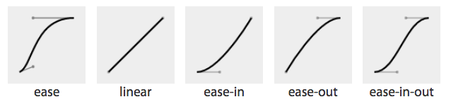
Figure 11-1. Cubic Bézier named functions
|
Table 11-1. Bézier curve keyterms |
|
|
Timing function |
Cubic Bézier value |
|
ease |
cubic-bezier(0.25, 0.1, 0.25, 1) |
|
linear |
cubic-bezier(0, 0, 1, 1) |
|
ease-in |
cubic-bezier(0.42, 0, 1, 1) |
|
ease-out |
cubic-bezier(0, 0, 0.58, 1) |
|
ease-in-out |
cubic-bezier(0.42, 0, 0.58, 1) |
A handy tool to visualize Bézier curves and to create your own is Lea Verou’s cubic Bézier visualizer.
The default ease is equal to cubic-bezier(0.25, 0.1, 0.25, 1), which has a slow start, then speeds up, and ends slowly. This function is similar to ease-in-out at cubic-bezier(0.42, 0, 0.58, 1), which has a greater acceleration at the beginning. linear is equal to cubic-bezier(0, 0, 1, 1), and, as the name describes, creates an animation that animates at a constant speed.
ease-in is equal to cubic-bezier(0.42, 0, 1, 1), which creates an animation that is slow to start, gains speed, then stops abruptly. The opposite ease-out timing function is equal to cubic-bezier(0, 0, 0.58, 1), starting at full speed, then slowing progressively as it reaches the conclusion of the animation iteration.
If none of these work for you, you can create your own Bézier curve timing function by passing four values, such as:
animation-timing-function: cubic-bezier(0.2, 0.4, 0.6, 0.8);
Bézier curves are mathematically defined parametric curves used in two-dimensional graphic applications. See Table 10-3 for examples of curves you can define yourself in CSS.
The Bézier curve takes four values, defining the originating position of the two handles. In CSS, the anchors are at 0, 0 and 1, 1. The first two values define the x and y of the first point or handle of the curve, and the last two are the x and y of the second handle of the curve. The x values must be between 0 and 1, or the Bézier curve is invalid. When creating your own Bézier curve, remember: the steeper the curve, the faster the motion. The flatter the curve, the slower the motion.
While the x values must be between 0 and 1, by using values for y that are greater than 1 or less than 0, you can create a bouncing effect, making the animation bounce up and down between values, rather than going consistently in a single direction:
.snake {
animation-name: shrink;
animation-duration: 10s;
animation-timing-function: cubic-bezier(0, 4, 1, -4);
animation-fill-mode: both;
}
@keyframes shrink {
0% {
width: 500px;
}
100% {
width: 100px;
}
}
This animation-timing-function value makes the property values go outside the boundaries of the values set in the 0% and 100% keyframes. In this example, we are shrinking an element from 500px to 100px. However, because of the cubic-bezier values, the element we’re shrinking will actually grow to be wider than the 500px width defined in the 0% keyframe and narrower than the 100px width defined in the 100% keyframe, as shown in Figure 11-2.
Figure 11-2. Effect of outlandish Bézier curve
In this scenario, with animation-timing-function: cubic-bezier(0, 4, 1, -4); set on an animation that is shrinking an element from from 500px to 100px wide, the snake starts with a width of 500px, defined in the 0% keyframe. It then quickly shrinks down to a width of about 40px, which is narrower than width: 100px; (which was declared in the 100% keyframe) before slowly expanding to about 750px wide, which is larger than the original width of width: 500px declared as the original (and widest) declared width. It then quickly shrinks back down to width: 100px, which is the value defined in the 100% keyframe. You can test this and your own cubic Bézier values.
You may have realized that the curve created by our animation is the same curve as our Bézier curve. Just like our s-curve goes below and above our bounding box, the width of our animation goes narrower than the smaller width we set of 100px and wider than the larger width we set of 500px.
The Bézier curve has the appearance of a snake, going up and down and up again, because one y coordinate is positive and the other negative. If both are positive values greater than 1 or both are negative values less than -1, the Bézier curve is arc-shaped, going above or below one of the values set, but not bouncing out of bounds on both ends like the s-curve above.
The timing function declared for the animation-timing-function is the timing for the normal animation direction, when the animation is progressing from the 0% mark to the 100% mark. When the animation is running in the reverse direction, from the 100% mark to the 0% mark, the animation timing function is reversed:
.ball {
animation-name: bounce;
animation-duration: 1s;
animation-iteration-count: infinite;
animation-timing-function: ease-in;
animation-direction: alternate;
}
@keyframes bounce {
0% {
transform: translateY(0);
}
100% {
transform: translateY(500px);
}
}
If we remember the bouncing ball example , when the ball is dropping it gets faster as it nears its nadir at the 100% keyframe, with the animation-timing-function set to ease-in. When it is bouncing up, it is animating in the reverse direction, from 100% to 0%, so the animating-timing-function is reversed as well, to ease-out, slowing down as it reaches its apex. Our original defaulted to ease. This timing function makes the bouncing ball look a bit more realistic.
The step timing functions
The step timing functions, step-start, step-end, and steps(), aren’t Bézier curves. Rather, they’re tweening definitions.
The steps() timing function divides the animation into a series of equal-length steps. steps() takes two parameters: the number of steps and the direction.
The steps() function is most useful when it comes to character or sprite animation. If you want to animate complex shapes that subtly change, like the drawings or pictures in a flip book, the steps() timing function is the solution.
The number of steps is the first parameter; its value must be a positive integer. The animation will be divided equally into the number of steps provided. For example, if the animation duration is 1 second and the number of steps is 5, the animation will be divided into five 200-millisecond steps, with the element being redrawn to the page 5 times, at 200-millisecond intervals, moving 20% through the animation at each interval.
If an animation were to pass through 5 steps, that means it either draws the animation at the 0%, 20%, 40%, 60%, and 80% keyframes or at the 20%, 40%, 60%, 80%, and 100% keyframes. It will either skip drawing the 100% or the 0% keyframe. That is where the direction parameter comes in.
The direction parameter takes one of two values: either start or end. The direction determines if the function is left- or right-continuous: basically, if the 0% or the 100% keyframe is going to be skipped. Including start as the second parameter will create a left-continuous function, meaning the first step happens when the animation begins, skipping the 0%, but including the 100%. Including end or omitting the second parameter (end is the default direction) will create a right-continuous function. This mean the first step will be at the 0% mark, and the last step will be before the 100% mark. With end, the 100% keyframe will not be seen unless animation-fill-mode of either forwards or both is set. See “The animation-fill-mode Property”.
The direction parameter can be hard to remember. I like to think of it this way: the start value skips the start value of 0%, and the end value skips the ending value of the 100% keyframe.
The step-start value is equal to steps(1, start), with only a single step displaying the 100% keyframe. The step-end value is equal to steps(1, end), which displays only the 0% keyframe.
Consider the flip book. A flip book is a book with a series of pictures. Each page contains a single drawing or picture that changes slightly from one page to the next, like one frame from a movie reel or cartoon stamped onto each page. When the pages of a flip book are flipped through rapidly (hence the name), the pictures appear as an animated motion. You can create similar animations with CSS using an image sprite, the background-position property, and the steps() timing function.
Figure 11-3 shows an image sprite containing several images that change just slightly, like the drawings on the individual pages of our flip book.

Figure 11-3. Sprite of dancing
We put all of our slightly differing images into a single image called a sprite. Each image in our sprite is a frame in the single animated image we’re creating.
We create a container element that is the size of a single image of our sprite and attach the sprite as the container element’s background image. We then animate the background-position, using the steps() timing function so we only see a single instance of the changing image of our sprite at a time. The number of steps in our steps() timing function is the number of occurrences of the image in our sprite. The number of steps defines how many stops our background image makes to complete a single animation.
The sprite in Figure 11-3 has 22 images, each 56 x 100 pixels. The total size of our sprite is 1232 x 100 pixels. We set our container to the individual image size: 56 x 100 pixels. We set our sprite as our background image: the initial or default value of background-position is top left, which is the same as 0 0. Our image will appear at 0 0, which is a good default: older browsers that don’t support CSS animation will simply display the first image from our sprite:
.dancer {
height: 100px;
width: 56px;
background-image: url(../images/dancer.png);
....
}
The trick is to use steps() to change the background-position value so that each frame is a view of a separate image within the sprite. Instead of sliding in the background image from the left, the steps() timing function will pop in the background image in the number of steps we declared.
We declare our animation to simply be a change in the left-right value of the background-position. The image is 1,232 pixels wide, so we move the background image from 0 0, which is the left top, to 0 -1232px, putting the sprite fully outside of our 56 x 100 pixel <div> viewport.
The values of -1232px 0 will move the image completely to the left, outside of our containing block viewport. It will no longer show up as a background image in our 100 x 56 pixel div at the 100% mark unless background-repeat is set to repeat along the x-axis. We don’t want that to happen!
With the steps(n, end) syntax, the 100% keyframe never gets shown as the animation runs. Had we used start instead of end, the 0% keyframe wouldn’t show. With end, the 100% keyframe is skipped instead. Because we used end, the 100% keyframe—when the background image is outside of the border box of our element—doesn’t show. This is what we want:
@keyframes dance_in_place {
from {
background-position: 0 0;
}
to {
background-position: -1232px 0;
}
}
.dancer {
....
background-image: url(../images/dancer.png);
animation-name: dance_in_place;
animation-duration: 4s;
animation-timing-function: steps(22, end);
animation-iteration-count: infinite;
}
We used steps(22, end). We use the end direction to show the 0% keyframe, but not the 100% keyframe. What may have seemed like a complex animation is very simple: just like a flip book, we see one frame of the sprite at a time. Our keyframe animation simply moves the background.
Adding a second animation
Our dancer is dancing in place. Most dancers move around when they dance. We can add a little left-and-right and back-and-forth motion by adding a second animation:
@keyframes move_around {
0%, 100% {
transform: translate(0, -40px) scale(0.9);
}
25% {
transform: translate(40px, 0) scale(1);
}
50% {
transform: translate(0, 40px) scale(1.1);
}
75% {
transform: translate(-40px, 0) scale(1);
}
}
We create a second keyframe animation called move_around and attach it to our dancer element as a second animation with comma-separated animation property declarations:
.dancer {
....
background-image: url(../images/dancer.png);
animation-name: dance_in_place, move_around;
animation-duration: 4s, 16s;
animation-timing-function: steps(22, end), steps(5, end);
animation-iteration-count: infinite;
}
Note that each animation property has two comma-separated values except animation-iteration-count. If you recall, if an animation property doesn’t have enough comma-separated values to match the number of animations declared by the animation-name property, the values present will be repeated until there are enough. We want both animations to continue indefinitely. As the value of infinite is for all the attached animations, we only need a single value for that property. The browser will repeat the list of animation-iteration-count values—in this case, just the single value of infinite—until it has matched an animation-iteration-count value for each animation declared.
Animating the animation-timing-function
The animation-timing-function is not an animatable property, but it can be included in a keyframe to alter the current timing of the animation.
When included within a keyframe, the animation-timing-function doesn’t transition from one value to another over time. Rather, the timing function applies between keyframes, updating the timing function when it reaches a keyframe that has a timing function defined.
While none of the animation properties are animatable, animation-timing-function is the only CSS animation property that has an effect when specified on individual keyframes. Unlike animatable properties, the animation-timing-function values aren’t interpolated over time. When included in a keyframe within the @keyframes definition, the timing function for the properties declared within that same keyframe will change to the new animation-timing-function value when that keyframe is reached, as shown in Figure 11-4:
@keyframes width {
0% {
width: 200px;
animation-timing-function: linear;
}
50% {
width: 350px;
animation-timing-function: ease-in;
}
100% {
width: 500px;
}
}
Figure 11-4. Animation timing function can be changed midanimation
In other words, the rate at which the animation proceeds can be altered mid animation. In the preceding example, as shown in Figure 11-4, halfway through the animation, we switch from a linear animation progression for the widthproperty to one that eases in.
We can include the animation-timing-function within our keyframe animation definitions to override this default inverting behavior or to control the timing in any other way we please. The animation-timing-function property isn’t animated in the sense of changing from one value to another over time. Rather, it changes from one value to the next when it reaches a keyframe selector that declares a change to that value.
Specifying the animation-timing-function within the to or 100% keyframe will have no effect on the animation. When included in the from or 0% keyframe, the animation will follow the animation-timing-function specified in the keyframe definition, overriding the element’s default or declared animation-timing-function.
Note
The specification states explicitly the timing function should only impact the progression of an animation if it is declared in any keyframe other than the to or 100% keyframe values. An animation-timing-function declaration in the 100% or to keyframe has no effect, as per current implementations and the specification.
If the animation-timing-function property is included in a keyframe, only the properties also included in that keyframe block will have their timing function impacted. This is not currently specified in the CSS specification, but it is implemented as such and is expected to be included in the final specification. If we take our W animation as an example:
@keyframes W {
from {
left: 0;
top: 0;
}
25%, 75% {
top: 100%;
}
50% {
top: 50%;
}
to {
left: 100%;
top: 0;
}
}
This follows the idea that conceptually, when an animation is set on an element or pseudo-element, it is as if a set of keyframes is created for each property that is present in any of the keyframes, as if an animation is run independently for each property that is being animated. It’s as if the W animation were made up of two animations that run simultaneously: W_part1 and W_part2.
@keyframes W_part1 {
from, to {
top: 0;
}
25%, 75% {
top: 100%;
}
50% {
top: 50%;
}
}
@keyframes W_part2 {
from {
left: 0;
}
to {
left: 100%;
}
}
The animation-timing-function that is set on any of the keyframes is added to the progression of only the properties that are defined at that keyframe:
@keyframes W {
from {
left: 0;
top: 0;
}
25%, 75% {
top: 100%;
}
50% {
animation-timing-function: ease-in;
top: 50%;
}
to {
left: 100%;
top: 0;
}
}
You can have multiple occurrences of a keyframe value, such as 50%, as the current implementation stands, but the animation-timing-function and property have to be in the same selector block for the animation-timing-functionchange to have an impact. The preceding code will change the animation-timing-function to ease-in for the top property only, not the left property, impacting only the W_part1 section of our W animation.
However, with the following animation, the animation-timing-function (in a keyframe block that has no property/value declarations) will have no effect:
@keyframes W {
from {
left: 0;
top: 0;
}
25%, 75% {
top: 100%;
}
50% {
animation-timing-function: ease-in;
}
50% {
top: 50%;
}
to {
left: 100%;
top: 0;
}
}
How is it useful to change the timing function midanimation? In the bounce animation, we had a frictionless environment: the ball bounced forever, never losing momentum. We had a very simple animation that iterated forever. The ease-in timing function made it speed up as it dropped, when it was in the normal animation direction. We took advantage of timing functions being inverted in the reverse animation direction: in this case, as if it was set to ease-outin the reverse direction. With our infinite animation, the ball sped up as it dropped and slowed as it rose because the timing function was inverted from ease-in to ease-out by default as the animation proceeded from the normal to reverse direction every other iteration.
In reality, friction exists; momentum is lost. Balls will not continue to bounce indefinitely. If we want our bouncing ball to look natural, we have to make it bounce less high as it loses energy with each impact. To do this, we need a single animation that bounces multiple times, losing momentum on each bounce, while switching between ease-in and ease-out at each apex and nadir:
@keyframes bounce {
0% {
transform: translateY(0);
animation-timing-function: ease-in;
}
30% {
transform: translateY(100px);
animation-timing-function: ease-in;
}
58% {
transform: translateY(200px);
animation-timing-function: ease-in;
}
80% {
transform: translateY(300px);
animation-timing-function: ease-in;
}
95% {
transform: translateY(360px);
animation-timing-function: ease-in;
}
15%, 45%, 71%, 89%, 100% {
transform: translateY(380px);
animation-timing-function: ease-out;
}
}
This animation loses height after a few bounces, eventually stopping. This more realistic animation has a single iteration, with the granular control provided via the keyframe blocks.
In the case of a single iteration, we can’t rely on the animation-direction to change our timing function. We need to ensure that while each bounce causes the ball to lose momentum, it still speeds up with gravity and slows down as it reaches its apex. Because we will have only a single iteration, we control the timing by including animation-timing-function within our keyframes. At every apex, we switch to ease-in, and at every nadir, or bounce, we switch toease-out.
The animation-play-state property
The animation-play-state property defines whether the animation is running or paused.
animation-play-state
|
Values: |
running | paused |
|
Initial value: |
running |
|
Applies to: |
All elements, ::before and ::after pseudo-elements |
|
Inherited: |
No |
When set to the default running, the animation proceeds as normal. If set to paused, the animation will be paused. When paused, the animation is still applied to the element, halted at the progress it had made before being paused. When set back to running or returned to the default of running, it restarts from where it left off, as if the “clock” that controls the animation had stopped and started again.
If the property is set to animation-play-state: paused during the delay phase of the animation, the delay clock is also paused and resumes expiring as soon as animation-play-state is set back to running.
The animation-fill-mode Property
The animation-fill-mode property defines what values are applied by the animation before and after the animation iterations are executed. The animation-fill-mode property enables us to define whether or not an element’s property values are applied by the animation outside of the animation execution. The duration of the animation execution is set by the number of iterations multiplied by the duration, less the absolute value of any negative delay.
With animation-fill-mode, we can define how the animation impacts the element on which it is set before the animationstart and after the animationend events are fired. We can define whether the property values set in the 0% keyframe are applied to the element during the expiration of any animation delay, and if the property values that exist when the animationend event is fired continue to be applied to the animated element after the animation’s conclusion, or if the properties revert to the values they had in their initial state prior to the attachment of the animation.
By default, an animation will not affect the property values of the element immediately if there is a positive animation-delay applied. Rather, animation property values are applied when the animation-delay expires, when the animationstart event is fired. By default, the animation property values are applied until the last iteration has completed: at the completion of the animation, when the animationend event is fired. At that time, the element’s property values revert back to its nonanimated values.
The animation-fill-mode property lets us apply the property values of any from or 0% keyframes to an element from the time the animation is applied to that element until the expiration of the animation delay. It also enables us to maintain the property values of the 100% or to keyframe after the last animation cycle is complete, from the time the animationend event has fired until forever—or until the animation is removed from the element.
animation-fill-mode
|
Values: |
none | forwards | backwards | both |
|
Initial value: |
none |
|
Applies to: |
All elements, ::before and ::after pseudo-elements |
|
Inherited: |
No |
The default value is none, which means the animation has no effect when it is not executing: the animation’s 0% keyframe block property values are not applied to the animated element until the animation-delay has expired, when the animationstart event is fired.
When the value is set to backwards, the property values from the 0% or from keyframe (if there is one) will be applied to the element as soon as the animation is applied to the element. The 0% keyframe property values are applied immediately (or 100% keyframe, if the value of the animation-direction property is reversed or reversed-alternate), without waiting for the animation-delay time to expire, before the animationstart event fires.
The value of forwards means when the animation is done executing—has concluded the last part of the last iteration as defined by the animation-iteration-count value—it continues to apply the values of the properties at the values as they were when the animationend event occurred. If the iteration-count has an integer value, this will be either the 100% keyframe, or, if the last iteration was in the reverse direction, the 0% keyframe.
The value of both applies both the backwards effect of applying the property values when the animation is attached to the element and the forwards value of persisting the property values from when the animationend event occurred.
If the animation-iteration-count is a float value, and not an integer, the last iteration will not end on the 0% or 100% keyframe: the animation will end its execution partway through an animation cycle. If the animation-fill-modewas set forwards or both, the element will maintain the property values it had when the animationend event occurred. For example, if the animation-iteration-count is 6.5, and the animation-timing-function is linear, the animationend event fires and the values of the properties at the 50% mark (whether or not a 50% keyframe is explicitly declared) will stick, as if the animation-play-state had been set to pause at that point.
For example, if we take the following code:
@keyframes move_me {
0% {
transform: translateX(0);
}
100% {
transform: translateX(1000px);
}
}
.moved {
animation-name: move_me;
animation-duration: 10s;
animation-timing-function: linear;
animation-iteration-count: 0.6;
animation-fill-mode: forwards;
}
The animation will only go through 0.6 iterations. Being a linear 10-second animation, it will stop at the 60% mark 6 seconds into the animation, when the element is translated 600 pixels to the right. With animation-fill-mode set to forwards or both, the animation will stop animating when it is translated 600 pixels to the right, holding the moved element 600 pixels to the right of its original position, keeping it translated indefinitely, or until the animation is detached from the element.
In Safari 9 and earlier, forwards and both will set the values from the 100% keyframe onto the element, no matter the direction of the last iteration or whether the animation otherwise ended on the 100% keyframe or elsewhere in the animation. In the preceding example, in Safari 9, the .moved element will jump from being translated by 400 pixels to the right to be 1,000 pixels to the right of where it normally would have been and stay there indefinitely or until the animation is detached from the moved element. In Safari 9 and earlier, it doesn’t matter whether the last iteration was normal or reverse, or whether the animation ended 25% or 75% of the way through an animation cycle; animation-fill-mode: forwards; causes the animation to jump to the 100% frame and stay there. This follows an older version of the specification, but we expect it will be updated to match the updated specification and all other evergreen browsers.
The backwards value controls what happens to the element from the time the animation is attached to the element until the time the animation delay expires, the animation starts executing, and the animationstart event is fired. Before the animation starts executing (during the period specified by a positive animation-delay value), the animation applies the values it will have when the animation starts executing. If the animation-direction is normal or alternate, the values specified in the animation’s 0% keyframe are applied immediately when the animation is attached. If the animation-direction is reverse or alternate-reverse, the property values of the 100% keyframe are used.
The value of both simply means that both the forwards and backwards fill modes will be applied. Most times when you set an animation, you will set the animation-fill-mode property to both. This ensures that the animated element’s properties don’t jump from the element’s default state to the animated state at the start of execution, and that the element’s properties don’t jump back to its original property values at the animation’s end. Having properties jump from one value to another before or after a smooth animation is generally the opposite of what you’re trying to do.
With both, as soon as the animation is attached to an element, that element will assume the properties provided in the 0% keyframe (or 100% keyframe if animation-direction is set to reverse or alternate-reverse). When the last iteration concludes, it will be as if the animation-fill-mode were set to forwards: if it was a full iteration in the normal direction, the property values of the 100% keyframe will be applied. If the last cycle was in the reverse direction, the property values of the 0% keyframe will be applied. With forwards and both, whether or not the last iteration was a full iteration, the values that were present when the animationend event occurred will stay in effect.
If the animation-duration is set to 0s and backward or both is set, the animation will stay on the 0% keyframe (or 100% keyframe if animation-direction is set to reverse or reverse-alternate) until the animation delay has expired. With no duration, it will immediately jump to the 100% keyframe (or the 0% keyframe if animation-direction is set to reverse or reverse-alternate). If both or forwards is set, it will stay on that final keyframe in perpetuity or until the animation is removed from the element or generated content. This happens no matter the value of the animation-iteration-count, even if the count is 0. In that case, the animationstart and animationend events will occur in succession at the expiration of the delay, and there will be no animationiteration event.
If the 0% or 100% keyframes are not explicitly defined, the browser uses the implied values for those keyframes: the values set forth on the element itself. If an keyframe animation has neither a 0% or 100% keyframe set, setting animation-fill-mode: backwards will have no impact. Similarly, in the case where the animation-iteration-count is an integer and no 0% or 100% keyframe is set, setting animation-fill-mode to forwards or both has no impact. If the iteration count is a float, even if there are no to or from keyframes, if there is an intermediary keyframe block with property values set, forwards, backwards, and both should have an impact, other than in Safari ≤9.
The animation Shorthand Property
The animation shorthand property enables us to use one line instead of eight to define all the animation properties on an element. The animation property value is a list of space-separated values for the various longhand animation properties. If you are setting multiple animations on an element or pseudo-element, include the multiple space-separated animation shorthands as a comma-separated list of animations.
animation
|
Values: |
none | <series of individual animation properties> <animation-duration> || <animation-timing-function> || <animation-delay> || <animation-iteration-count> || <animation-direction> || <animation-fill-mode> || <animation-play-state> || <animation-name> |
|
Initial value: |
0s ease 0s 1 normal none running none |
|
Applies to: |
All elements, ::before and ::after pseudo-elements |
|
Inherited: |
No |
The animation shorthand takes as its value all the other preceding animation properties, including animation-duration, animation-timing-function, animation-delay, animation-iteration-count, animation-direction, animation-fill-mode, animation-play-state, and animation-name:
#animated {
animation: 200ms ease-in 50ms 1 normal running forwards slidedown;
}
is the equivalent of:
#animated {
animation-name: slidedown;
animation-duration: 200ms;
animation-timing-function: ease-in;
animation-delay: 50ms;
animation-iteration-count: 1;
animation-fill-mode: forwards;
animation-direction: normal;
animation-play-state: running;
}
or:
#animated {
animation: 200ms ease-in 50ms forwards slidedown;
}
We didn’t have to declare all of the values in the animation shorthand; any values that aren’t declared are set to the default or initial values. The first shorthand line was long and three of the properties were set to default, so were not necessary.
It’s important to remember that if you don’t declare all eight values in your shorthand declaration, the ones you don’t declare will get the initial value for that property. The initial or default values are:
animation-name: none;
animation-duration: 0s;
animation-timing-function: ease;
animation-delay: 0;
animation-iteration-count: 1;
animation-fill-mode: none;
animation-direction: normal;
animation-play-state: running;
The order of the shorthand is partially important. For example, there are two time properties: the first is always the duration. The second, if present, is interpreted as the delay.
While the order of all properties that make up a shorthand are important, the order of numeric values with the same unit type are always important, no matter the property. For example, in the flex shorthand, the first unitless number is the flex-grow value; the second is the flex-shrink factor. Similarly, for the animation shorthand, the first time value is always the animation-duration. The second, if present, is always the animation-delay.
The placement of the animation-name can also be important. If you use an animation property value as your animation identifier (which you shouldn’t), the animation-name should be placed as the last property value in the animationshorthand. The first occurrence of a keyword that is a valid value for any of the other animation properties, such as ease or running, will be assumed to be part of the shorthand of the animation property the keyword is associated with rather than the animation-name. Note that none is basically the only word that is not a valid animation name:
#failedAnimation {
animation: paused 2s;
}
This is the equivalent to:
#failedAnimation {
animation-name: none;
animation-duration: 2s;
animation-delay: 0;
animation-timing-function: ease;
animation-iteration-count: 1;
animation-fill-mode: none;
animation-direction: normal;
animation-play-state: paused;
}
paused is a valid animation name. While it may seem that the animation named paused with a duration of 2s is being attached to the element, that is not what is happening. Because words within the shorthand animation are first checked against possible valid values of all animation properties other than animation-name first, paused is being set as the value of the animation-play-state property.
#anotherFailedAnimation {
animation: running 2s ease-in-out forwards;
}
The preceding code snippet is the equivalent to:
#anotherFailedAnimation {
animation-name: none;
animation-duration: 2s;
animation-delay: 0s;
animation-timing-function: ease-in-out;
animation-iteration-count: 1;
animation-fill-mode: forwards;
animation-direction: normal;
animation-play-state: running;
}
The developer probably has a keyframe animation called running. The browser, however, sees the term and assigns it to the animation-play-state property rather than the animation-name property. With no animation-name declared, there is no animation attached to the element.
In light of this, animation: 2s 3s 4s; may seem valid, as if the following were being set:
#invalidName {
animation-name: 4s;
animation-duration: 2s;
animation-delay: 3s;
}
But as we remember from “Setting Up Your Keyframe Animation”, 4s is not a valid identifier. Identifiers cannot start with a digit unless escaped. For this animation to be valid, it would have to be written as animation: 2s 3s \34 s;
To attach multiple animations to a single element or pseudo-element, comma-separate the animation declarations:
.snowflake {
animation: 3s ease-in 200ms 32 forwards falling,
1.5s linear 200ms 64 spinning;
}
Our snowflake will fall while spinning for 96 seconds, spinning twice during each 3-second fall. At the end of the last animation cycle, the snowflake will stay fixed on the 100% keyframe of the falling @keyframes animation. We declared six of the eight animation properties for the falling animation and five for the spinning animation, separating the two animations with a comma.
While you’ll most often see the animation name as the first value—it’s easier to read that way, because of the issue with animation property keywords being valid keyframe identifiers—it is not a best practice. That is why we put the animation name at the end.
It is fine, even a good idea, to use the animation shorthand. Just remember that the placement of the duration, delay, and name within that shorthand are important, and omitted values will be set to their default values. Also, it is a good idea to not use any animation keyterms as your identifier.
Animation, Specificity, and Precedence Order
In terms of specificity, the cascade, and which property values get applied to an element, animations currently supersede all other values in the cascade. When an animation is attached to an element, it takes precedence, as if the specificity was even stronger than if the keyframe animation’s property values were set inline with an !important: as if <div style="keyframe-property: value !important">.
Specificity and !important
In general, the weight of a property attached with an ID selector 1-0-0 should take precedence over a property applied by an element selector 0-0-1. However, if that property value was changed via a keyframe animation, it will be applied as if that property/value pair were added as an inline style. The current behavior in all browsers that support animation is as if the property values were declared inline with an added !important. This is wrong, according to the specifications. The animation specification states “animations override all normal rules, but are overridden by !important rules.” This is a bug in the current implementations and should be resolved eventually.
A property added via a CSS animation, even if that animation was added on a CSS block with very low specificity, will be applied to the element, even if the same property is applied to the same element via a more specific selector, an inline style, or, currently, even the keyterm !important—even on three nested ID selectors. Currently, if an !important is declared on a property value within the cascade, that will not override the style that was added with an animation. The animation is “even more !important.”
That being said, don’t include !important within your animation declaration block; the property/value upon which it is declared will be ignored.
Animation Order
If there are multiple animations specifying values for the same property, the property value from the last animation applied will override the previous animations:
#colorchange {
animation-name: red, green, blue;
animation-duration: 11s, 9s, 6s;
}
In this code example, if red, green, and blue are all keyframe animations that change the color property to their respective names, once the animation-name and animation-duration properties are applied to #colorchange, for the first six seconds, the property values in blue will take precedence, then green for three seconds, then red for two seconds, before returning to its default property values.
The default properties of an element are not impacted before the animation starts, and the properties return to their original values after the animation ends unless an animation-fill-mode value other than the default none has been set. If animation-fill-mode: both were added to the mix, the color would always be blue, as the last animation, or blue, overrides the previous green animation, which overrides the red first animation.
Animation Iteration and display: none;
If the display property is set to none on an element, any animation iterating on that element or its descendants will cease, as if the animation were detached from the element. Updating the display property back to a visible value will reattach all the animation properties, restarting the animation from scratch:
.snowflake {
animation: spin 2s linear 5s 20;
}
The snowflake will spin 20 times; each spin takes 2 seconds, with the first spin starting after 5 seconds. If the snowflake element’s display property gets set to none after 15 seconds, it would have completed 5 spins before disappearing (5-second delay, then 5 spins at 2 seconds each). If the snowflake display property changes back to anything other than none, the animation starts from scratch: a 5-second delay will elapse again before it starts spinning 20 times. It makes no difference how many animation cycles iterated before it disappeared from view the first time.
Animation and the UI Thread
CSS animations have the lowest priority on the UI thread. If you attach multiple animations on page load with positive values for animation-delay, the delays expire as prescribed, but the animations may not begin until the UI thread is available to animate.
If the animations require the UI thread (they aren’t on the GPU as described in “Animation chaining”); if you have 20 animations set with an animation delays to start animating at 1-second intervals over 20 seconds, with the animation-delay property on each set to 1s, 2s, 3s, 4s, and so on; if the document or application takes a long time to load, with 11 seconds between the time the animated elements were drawn to the page and the time the JavaScript finished being downloaded, parsed, and executed; the delays of the first 11 animations will have expired and will all commence when the UI thread becomes available. The remaining animations will each then begin animating at one-second intervals.
Seizure Disorders
While you can use animations to create changing content, dynamically changing content can lead to seizures in some users. Always keep accessibility in mind, ensuring the accessibility of your website to people with epilepsy and other seizure disorders.
Animation Events and Prefixing
Let’s recap animation-related events we can access with DOM event listeners.
animationstart
The animationstart event occurs at the start of the animation. If there is an animation-delay, this event will fire once the delay period has expired. If there is no delay, the animationstart event occurs when the animation is applied to the element. Even if there are no iterations, the animationstart event still occurs. If there are multiple animations attached to an element, an animationstart event will occur for each of the applied valid keyframe animations: generally, one animationstart for each valid animation-name identifier present:
#colorchange {
animation: red, green, blue;
}
In this example, as long as the red, green, and blue keyframe animations are valid, while the animations will not be perceptible (as the default duration of 0s is set on each), there will be three animationstart events thrown: one for each animation name.
If the browser requires the -webkit- prefix for the animation properties—basically, Safari 8 and earlier and Android 4.4.4 and older—the event is written as webkitAnimationStart instead of animationstart. Note the -webkit- prefix and the camelCasing. It is best to default to the unprefixed syntax and fall back to the prefixed version only when the unprefixed is unavailable.
animationend
The animationend event occurs at the conclusion of the last animation. It only occurs once per applied animation: if an element has 3 animations applied to it, like in our #colorchange example, the animationend event will occur three times, at the end of the animation. In the example, there was no duration for any of the animations; however, the animationend event timing is usually equivalent to the result of the following equation:
(animation-duration * animation-iteration-count) + animation-delay = time
Even if there are no iterations, the animationend event still occurs once for each animation applied. If the animation-iteration-count is set to infinite, the animationend event never occurs.
If the browser requires the -webkit- prefix for the animation properties, the event is written as webkitAnimationEnd instead of animationend.
animationiteration
The animationiteration event occurs at the end of each iteration of an animation, before the start of the next iteration. If there are no iterations, or the iteration count is less than or equal to one, the animationiteration event never occurs. If the iteration count is infinite, the animationiteration event occurs ad infinitum, unless there is no duration set or the duration is 0s.
Unlike the animationstart and animationend events, which each occur once for each animation name, the animationiteration event can occur multiple times or no times per animation name, depending on how many iterations occur. Note that the event happens between animation cycles and will not occur at the same time as an animationend event. In other words, if the animation-iteration-count is an integer, the number of animationiteration events that occur is generally one less that the value of the animation-iteration-count property as long as the absolute value of any negative delay is less than the duration.
Other Considerations
Printing Animations
While not actually “animating” on a printed piece of paper, when an animated element is printed, the relevant property values will be printed. Obviously, you can’t see the element animating on a piece of paper, but if the animation caused an element to have a border-radius of 50%, the printed element will have a border-radius of 50%.
1 All of the examples in this chapter can be found at http://standardista.com/css3/animations.
All materials on the site are licensed Creative Commons Attribution-Sharealike 3.0 Unported CC BY-SA 3.0 & GNU Free Documentation License (GFDL)
If you are the copyright holder of any material contained on our site and intend to remove it, please contact our site administrator for approval.
© 2016-2026 All site design rights belong to S.Y.A.