HTML5 APPLICATIONS DEVELOPMENT MANUAL (2016)
16 - Layouts
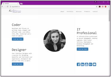
The User Interface (UI)
The portion of a Web page where users interact is called the user interface (UI).
The layout of a user interface will dramatically impact a user experience.
Layouts can range from minimalist with just a few elements, to pages that are jammed full of content. Simple layouts and complex layouts require different models to ensure that content displays properly for users.
To help ensure that CSS3 styles work during this transition phase, many of the major Web browsers offer alternative property names. These workarounds simply add avendor prefix, which is a keyword surrounded by dashes, to the front of a CSS3 property name. Keep the following in mind as you work with CSS3 properties:
- Internet Explorer uses the -ms- prefix.
- Firefox supports the -moz- prefix.
- Opera supports the -o- prefix.
- Chrome and Safari support the -webkit- prefix.
For example, to apply the flexbox style to elements in a browser, like Chrome, you simply add the -webkit-flexbox property to your CSS.
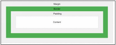
The traditional CSS Box model
The CSS box model is essentially a box that wraps around every HTML element. It consists of: margins, borders, padding, and the actual content.
- Content - The content of the box, where text and images appear
- Padding - Clears an area around the content. The padding is transparent
- Border - A border that goes around the padding and content
- Margin - Clears an area outside the border. The margin is transparent
Block-level and Inline Elements
Within the CSS Box model, there are two categories of elements
- block-level
- inline
Block-level elements create boxes that are a part of a page’s layout. This category includes articles, sections, paragraphs, headers, footers and more.
Examples of block-level elements:
- <div>
- <h1> - <h6>
- <p>
- <form>
Inline elements are used to format content
this category includes emphasis and boldface.
Examples of inline elements:
- <span>
- <a>
- <img>
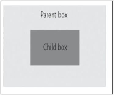
Parent and child boxes
With the CSS Box model, it is possible for a box to contain one or more boxes:
- The outer box is referred to as the parent
- An inner box is referred to as a child
A child inherits CSS styles from a parent, which means that styles applied to a parent will apply to a child as well.
Flexbox
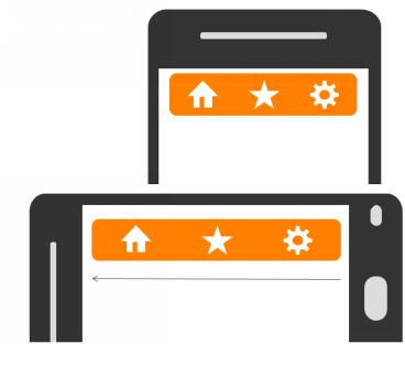
Flexible boxes, or flexbox, is a new layout mode in CSS3. Use of flexbox ensures that elements behave predictably when the page layout must accommodate different screen sizes and different display devices.
For many applications, the flexible box model provides an improvement over the block model in that it does not use floats, nor do the flex container's margins collapse with the margins of its contents.
Elements, navigation bars, forms and pictures will resize and reposition automatically to fill available space.
We use media queries to determine which device is being used. CSS uses this information to automatically adjusts our HTML document to fit a screen.
Flexbox layout is similar to block layout, but flexbox doesn’t use columns or floats. In
addition, whereas block layout typically lays out content vertically (and inline layout tends to lay out content horizontally), a flexbox resizes in either direction.
Flexbox Concepts
Flexbox consists of flex containers and flex items. A flex container is declared by setting the display property of an element to either flex (rendered as a block) or inline-flex (rendered as inline).
Inside a flex container there is one or more flex items. Flex items are positioned inside a flex container along a flex line. By default, there is only one flex line per flex container.
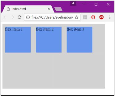
The following example shows three flex items. They are positioned by default: along the horizontal flex line, from left to right:
<!DOCTYPE html>
<html>
<head>
<title></title>
<style>
.flex-container {
display: -webkit-flex;
display: flex;
width: 400px;
height: 250px;
background-color: lightgrey;
}
.flex-item {
background-color: cornflowerblue;
width: 100px;
height: 100px;
margin: 10px;
}
</style>
</head>
<body>
<div class="flex-container">
<div class="flex-item">flex item 1</div>
<div class="flex-item">flex item 2</div>
<div class="flex-item">flex item 3</div>
</div>
</body>
</html>
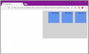
If we set the direction property to rtl(right-to-left), the text is drawn right to left, and the flex line changes direction, which will change the page layout:
<!DOCTYPE html>
<html>
<head>
<style>
body {
direction: rtl;
}
.flex-container {
display: -webkit-flex;
display: flex;
width: 400px;
height: 250px;
background-color: lightgrey;
}
.flex-item {
background-color: cornflowerblue;
width: 100px;
height: 100px;
margin: 10px;
}
</style>
</head>
<body>
<div class="flex-container">
<div class="flex-item">flex item 1</div>
<div class="flex-item">flex item 2</div>
<div class="flex-item">flex item 3</div>
</div>
</body>
</html>
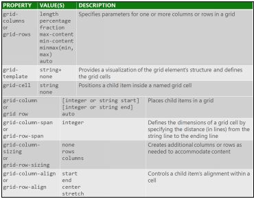
The following table lists the CSS properties used with flexbox:
|
display |
Specifies the type of box used for an HTML element |
|
flex-direction |
Specifies the direction of the flexible items inside a flex container |
|
justify-content |
Horizontally aligns the flex items when the items do not use all available space on the main-axis |
|
align-items |
Vertically aligns the flex items when the items do not use all available space on the cross-axis |
|
flex-wrap |
Specifies whether the flex items should wrap or not, if there is not enough room for them on one flex line |
|
align-content |
Modifies the behavior of the flex-wrap property. It is similar to align-items, but instead of aligning flex items, it aligns flex lines |
|
flex-flow |
A shorthand property for flex-direction and flex-wrap |
|
order |
Specifies the order of a flexible item relative to the rest of the flex items inside the same container |
|
align-self |
Used on flex items. Overrides the container's align-items property |
|
flex |
Specifies the length of a flex item, relative to the rest of the flex items inside the same container |
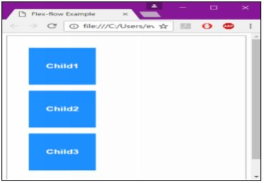
Changing the Direction of Child Items
The flex-direction property allows developers to change the direction of child boxes in a flexbox. It uses the row, row-reverse, column, and column-reverse values.
The flex-wrap property determines if child boxes will wrap onto a new line when a window condenses. It uses the nowrap, wrap, and wrap-reverse values.
The flex-flow property sets the flex-direction and flex-wrap properties at the same time.
<!doctype html>
<html>
<head>
<meta charset="utf-8">
<title>Flex-flow Example</title>
<style>
div {
display: -webkit-flex;
display: flex;
-webkit-flex-direction: column;
flex-direction: column;
height: 400px;
padding: 1em;
outline: 2px solid silver;
color: white;
font-family: sans-serif;
font-weight: bold;
}
p {
width: 100px;
margin: 1em;
height: 100px;
background-color: dodgerblue;
text-align: center;
line-height: 100px;
}
</style>
</head>
<body>
<div>
<p>Child1</p>
<p>Child2</p>
<p>Child3</p>
</div>
</body>
</html>
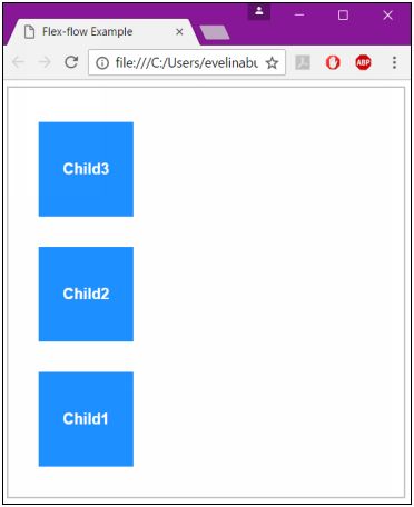
To reverse the order of the child boxes, change each of the flex-direction column values to column-reverse:
display: -webkit-flex;
display: flex;
-webkit-flex-direction: column-reverse;
flex-direction: column-reverse;
Ordering and Arranging Content
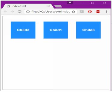
The order property allows you to adjust the order and arrangement of contents inside of a flexbox.
The property groups child boxes to control the order in which they appear in a layout. The default value for the flex-order property is 0.
<!DOCTYPE html>
<html>
<head>
<title></title>
<style>
div {
display: -webkit-flex;
display: flex;
height: 400px;
padding: 1em;
outline: 2px solid silver;
color: white;
font-family: sans-serif;
font-weight: bold;
}
p {
width: 100px;
margin: 1em;
height: 100px;
background-color: dodgerblue;
text-align: center;
line-height: 100px;
}
.first {
-webkit-order: -1;
order: -1;
}
</style>
</head>
<body>
<div>
<p>Child1</p>
<p class="first">Child2</p>
<p>Child3</p>
</div>
</body>
</html>
The Grid Layout Model
When the Flexbox Box model isn’t appropriate, you can use the Grid Layout model.
The Grid Layout model uses CSS to structure content using rows and columns. Grids are extremely flexible and provide an easier to use option for organizing content than HTML tables.
Grid layouts are similar to spreadsheets in that they use columns, rows, and cells, but you can create many different types of layouts that, in the end, don’t look like a spreadsheet at all.
Define a grid layout by using the display property, along with the grid or inline-grid values.
Child elements in a grid are called grid items, which can be positioned according to grid tracks, grid lines, or grid cells.
- Grid tracks:The columns and rows of the grid; you define grid tracks using the grid-rows and grid-columns properties
- Grid lines: The horizontal and vertical lines that divide columns or rows
- Grid cells: The logical space used to lay out grid items, similar to a cell in a spreadsheet
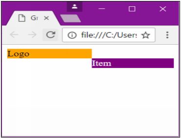
<!doctype html>
<html>
<head>
<meta charset="utf-8">
<title>Grid Example</title>
<style>
#gridded {
display: grid;
grid-columns: 10px 250px 10px 250px 10px 250px 10px 250px 10px;
grid-rows: 1fr;
}
#item1 {
background: orange;
grid-row: 1;
grid-column: 1;
}
#item2 {
background: purple;
grid-row: 2;
grid-column: 2;
color: white;
}
</style>
</head>
<body>
<div>
<div id="gridded">
<div id="item1">Logo</div>
<div id="item2">Item</div>
</div>
</div>
</body>
</html>
All materials on the site are licensed Creative Commons Attribution-Sharealike 3.0 Unported CC BY-SA 3.0 & GNU Free Documentation License (GFDL)
If you are the copyright holder of any material contained on our site and intend to remove it, please contact our site administrator for approval.
© 2016-2026 All site design rights belong to S.Y.A.