HTML5 APPLICATIONS DEVELOPMENT MANUAL (2016)
17 - Managing Text Flow
CSS Regions
CSS Regions are sections of a document where content can flow from one region to another. If there is too much content in one section, then the remaining content automatically flows into another region.
Regions can be placed anywhere on a screen and you can control the order in which the flowed content appears.
Creating a CSS Region, you must specify a content source and content containers. You set up CSS regions with the flow-into and flow-from properties.
A content source is a chunk of text that holds the content you want to flow through the regions.
Content containers are the areas where you want your content to appear.
<div id="content" src="content.html"></div>
<div id="region1" class="region"></div>
<div id="region2" class="region"></div>
<div id="region3" class="region"></div>
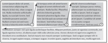
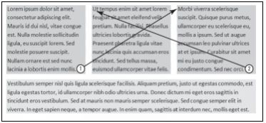
Using an id as a selector, identify the content source using the main value of the flow-into property. This content will require content containers to appear on a Web page. With a specific class as the selector, use the same value used with the flow-into property for the value of the flow-from property to place content into a container. This is how the source and content containers are associated.
#content {
-ms-flow-into: main;
}
.region {
-ms-flow-from: main;
background: #9ACD32;
width: 150px;
height: 200px;
float: left;
margin: 20px;
}
Overflowing Text
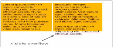
The height of a region won’t automatically adjust to fit all content. Height of regions must be defined.
If there is content available after all regions have been filled, then the last region will:
- be cut off
- visibly overflow
- overflow and be hidden
The overflow and region-fragment properties can be used to control how overflow content is treated.
- set region-fragment to auto or break
- set overflow to visible or hidden
Microsoft’s method of implementing CSS Regions varies a bit from the W3C version described previously. Microsoft uses iframes,which are like mini boxes on a Web page that contain external content embedded in an HTML document, as the content source.
You must also use the -ms- vendor prefix with the flow-into and flow-from properties.
<!DOCTYPE html>
<html lang="en">
<head>
<meta charset="utf-8" />
<link href="StyleSheet.css" rel="stylesheet" type="text/css">
<title>Overflow Examples</title>
<style>
#content {
-ms-flow-into: main;
}
.region {
-ms-flow-from: main;
-ms-region-fragment: auto;
overflow: visible;
background: #0ff;
width: 150px;
height: 200px;
float: left;
margin: 20px;
}
</style>
</head>
<body>
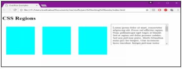
<h1>CSS Regions</h1>
<iframe id="content" src="content.html"></iframe>
<div id="region1" class="region"></div>
<div id="region2" class="region"></div>
<div id="region3" class="region"></div>
</body>
</html>
<!--The code for content.html is located below -->
<!DOCTYPE html>
<html lang="en">
<head>
<meta charset="utf-8" />
<title></title>
</head>
<body>
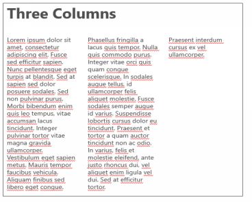
<p>Lorem ipsum dolor sit amet, consectetur adipiscing elit. Fusce sed efficitur sapien. Nunc pellentesque eget turpis at blandit. Sed at sapien sed dolor posuere sodales. Sed non pulvinar purus. Morbi bibendum enim quis leo tempus, vitae accumsan lacus tincidunt. Integer pulvinar tortor vitae magna gravida ullamcorper. Vestibulum eget sapien metus. Mauris tempor faucibus vehicula. Aliquam finibus sed libero eget congue.</p>
<p>Phasellus fringilla a lacus quis tempor. Nulla quis commodo purus. Integer vitae orci quis quam congue scelerisque. In sodales augue tellus, id ullamcorper felis aliquet molestie. Fusce sodales semper augue id varius. Suspendisse lobortis cursus dolor eu tincidunt. Praesent et tortor a quam auctor tincidunt non ac odio. In varius, felis et molestie eleifend, ante justo rhoncus dui, vel aliquet enim ligula vel dui. Sed at efficitur tortor. Praesent interdum cursus ex vel ullamcorper.</p>
</body>
</html>
Columns and Hyphenation
CSS3 enables you to create multi-column layouts that work much like the columns feature in Microsoft Word.
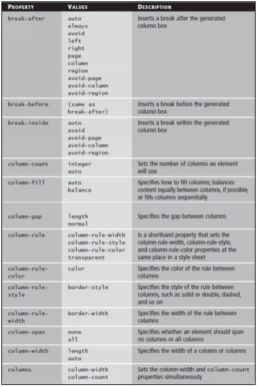
There are three primary CSS properties that you can use to manipulate columns:
- column-count
- column-gap
- column-rule
In the CSS Box, columns are in between the content and the Box.
Column Properties
Hyphenation
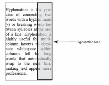
You can also enable hyphenation to properly break words at the end of lines, which avoids the problem of long words wrapping to the next line and leaving a gap on the previous line.
.hyphenized {
-moz-hyphens: auto;
-ms-hyphens: auto;
-webkit-hyphens: auto;
hyphens: auto;
}
The property uses the values none, manual, and auto:
- auto: Enables automatic hyphenation of words based on line-break opportunities within words or by a “language-appropriate hyphenation resource”
- manual: Enables hyphenation of words based only on line-break opportunities within words
- none: Prevents hyphenation
The W3C points out that you must declare a language using the HTML lang or XML xml:lang attributes for correct automatic hyphenation to occur.
That means if your entire HTML document is in the same language (English, for example) and you want to enable automatic hyphenation, add the attribute to your HTML element or doctype declaration, such as:
<!DOCTYPE html>
<html lang="en">
or
<html xmlns=http://www.w3.org/1999/xhtml xml:lang="en" lang="en">
CSS Exclusions
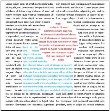
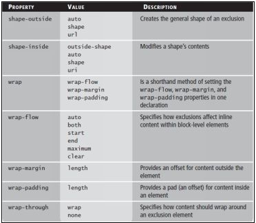
Apositioned float is a CSS construct that enables you to position images, text, and boxes anywhere in an HTML document and then wrap text completely around these elements. Positioned floats are calledCSS Exclusionsin the latest W3C specification.
CSS Exclusions allow you to specify positioning from the top, bottom, left, and right of a container. Exclusions can also be created in a variety of shapes.
Declare an exclusion by using the wrap-flow property with the preferred value. Modify the shape of an exclusion using the shape-outside and shape-inside properties.
CSS Exclusions may not be supported by all the major browsers. Use vendor prefixes and experiment with as many browsers as possible to make sure the content renders properly.
All materials on the site are licensed Creative Commons Attribution-Sharealike 3.0 Unported CC BY-SA 3.0 & GNU Free Documentation License (GFDL)
If you are the copyright holder of any material contained on our site and intend to remove it, please contact our site administrator for approval.
© 2016-2026 All site design rights belong to S.Y.A.