HTML5 APPLICATIONS DEVELOPMENT MANUAL (2016)
34 - Bootstrap
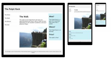
Responsive web design is about creating web sites which automatically adjust themselves to look good on all devices, from small phones to large desktops.
Bootstrap is a free front-end framework for faster and easier web development.
Bootstrap includes HTML and CSS based design templates for typography, forms, buttons, tables, navigation, modals, image carousels and many other, as well as optional JavaScript plugins.
Bootstrap also gives you the ability to easily create responsive designs.
There are two ways to start using Bootstrap on your own web site.
Downloading Bootstrap
If you want to download and host Bootstrap yourself, go to getbootstrap.com, and follow the instructions there.
Bootstrap CDN
If you don't want to download and host Bootstrap yourself, you can include it from a CDN (Content Delivery Network).
MaxCDN provides CDN support for Bootstrap's CSS and JavaScript. You must also include jQuery.
<!-- Latest compiled and minified CSS -->
<link rel="stylesheet" href="https://maxcdn.bootstrapcdn.com/bootstrap/3.3.7/css/bootstrap.min.css">
<!-- jQuery library -->
<script src="https://ajax.googleapis.com/ajax/libs/jquery/3.2.1/jquery.min.js"></script>
<!-- Latest compiled JavaScript -->
<script src="https://maxcdn.bootstrapcdn.com/bootstrap/3.3.7/js/bootstrap.min.js"></script>
Bootstrap 3 is designed to be responsive to mobile devices. Mobile-first styles are part of the core framework.
To ensure proper rendering and touch zooming, add the following <meta> tag inside the <head> element:
<meta name="viewport" content="width=device-width, initial-scale=1">
The width=device-width part sets the width of the page to follow the screen-width of the device (which will vary depending on the device).
The initial-scale=1 part sets the initial zoom level when the page is first loaded by the browser.
Bootstrap also requires a containing element to wrap site contents.
The .container class provides a responsive fixed width container
The .container-fluid class provides a full width container, spanning the entire width of the viewport
In the next chapter, you will see how we will use bootstrap in our application.
All materials on the site are licensed Creative Commons Attribution-Sharealike 3.0 Unported CC BY-SA 3.0 & GNU Free Documentation License (GFDL)
If you are the copyright holder of any material contained on our site and intend to remove it, please contact our site administrator for approval.
© 2016-2026 All site design rights belong to S.Y.A.