Mastering Responsive Web Design with HTML5 and CSS3 (2015)
Chapter 7. Meaningful Typography for Responsive Web Design
As I said in one of my talks at the Dayton Web Developers meeting:
"With a solid typographic scale you might even get away with not using a single image on your website."
The power of typography has got to be one of the most underappreciated assets in web design. Admittedly, we are seeing more and more designs where typography has been strongly considered, playing a major role in creating the intended atmosphere of a website or app.
In this chapter, our focus is going to be on a few aspects, tips, and tricks about the things we need to consider for RWD from a typography stand point.
We're going to talk about:
· Pixels, ems or rems for typography?
· Calculating relative font sizes.
· Creating a Modular Scale for a harmonious typography.
· Using the Modular Scale for typography.
· Web fonts and how they affect RWD.
· Using FitText.js for fluid-size headings.
· Using FlowType.js to improve legibility.
Pixels, ems, or rems for typography?
It is difficult to decide whether to use pixels, ems, or rems for typography. It's a matter of style. Some web designers/developers still use pixels as their unit to declare font sizes. It's just a lot easier to wrap our heads around the sizes.
The issues with setting font sizes in pixels were basically on legacy IEs, where, if the user wanted to zoom in on the page for whatever reason, the text would stay fixed at the pixel size it was given.
Now, that's a thing of the past as far as modern browsers are concerned. When you zoom in any modern browser, if it's zoomed in enough, it will trigger the media queries, hence showing the mobile version of the site.
Another problem with pixel-based font sizing is that it's hard to scale and maintain. What this basically means is that we'd have to declare the font sizes of many more elements in every media query, over and over and over.
On the other hand, we have relative units, ems and rems, which are pretty much the recommended way of setting our font sizes.
However, the problem with ems is that we have to keep track (mentally, in CSS/HTML comments, or in a text file somewhere) of the sizes of the parent containers, which can easily turn into a font management nightmare. A font size in ems depends on the font size of its parent container. So if we have different levels of nested containers, things could get ugly really fast because keeping track of the parent container's font sizes is not easy.
But then rems came along. Rem means root em. The root is the <html> element.
Rems bring pretty much the best of both worlds: we can declare font sizes in rems with the same mental model that we declare pixels, but with the benefit of using relative units like ems. The only problem with using rems is that legacy browsers don't support this unit, so a pixel-based, font size fallback value needs to be accounted for. This is where a short Sass mixin comes and saves the day.
But let's start with the core strategy of this chapter before trying any Sass tricks.
Calculating relative font sizes
Remember the RWD magic formula we mentioned in Chapter 3, Mobile-first or Desktop-first?:
(target ÷ context) x 100 = result %
There's also another similar magic formula to calculate relative font sizes (ems) when the font size has been set in pixels. The only difference is that we don't multiply by 100.
This is that formula:
target ÷ context = result
The target is the font size defined in pixels. The context is the font size defined in the parent container. The result is the value defined in ems.
Here's an example considering that the font size in the parent container, the body in this example, is 16px:
header {
font: 30px Arial, "Helvetica Neue", Helvetica, sans-serif;
}
To calculate the relative font size, we use the following formula:
30px ÷ 16px = 1.875em.
So our CSS rule will look like this:
header {
font: 1.875em Arial, "Helvetica Neue", Helvetica, sans-serif;
}
We would have to do this for every font size in our design.
This is fine in terms of understanding the math. However, the real value is in the thought process that goes into creating those pixel-based values in the first place. This is where the Modular Scale comes in.
Creating a Modular Scale for a harmonious typography
The Modular Scale was created by Tim Brown. There are different ways to create a Modular Scale for typography. In our example, we're going to create a Modular Scale using two base numbers and one ratio. The multiplication of these numbers creates a scale that's harmonious and proportional between all the values.
The most well-known ratio is the golden ratio also known as the golden section, divine proportion, and so on. Its value is 1.618.
Now, to avoid unnecessary mathematics, the golden ratio is based on the Fibonacci sequence: 1, 1, 2, 3, 5, 8, 13, 21, and so on.
These numbers have the following pattern: the next number is the result of adding up the two numbers before it. For example:
0 + 1 = 1 + 1 = 2 + 1 = 3 + 2 = 5 + 3 = 8 + 5 = 13 + 8 = 21…
The idea here is to understand the intent of creating a set of numbers that are harmonious when used together. We are going to do the same to create a typographic scale to use in our projects with the Modular Scale web app and forget about manually calculating the relative font sizes for your project.
So let's check out the Modular Scale web app built by Tim Brown and Scott Kellum: http://www.modularscale.com/.
Once the web app opens, there are three steps we need to do in order to create our Modular Scale:
1. Define the first base number.
2. Define the second base number.
3. Choose a ratio.
Tip
The Modular Scale can be used in anything that uses a value of some sort, not only typography. It can be used for padding, margin, line-height, and so on. Our focus in this chapter is, however, on typography.
Defining the first base number
The recommended way to define this first number is to use the body text size, that is, the font size that is used in the paragraphs. But keep in mind that using the body text size as the first base number is not mandatory. We can use our typeface's x-height, or some other length within that typeface, that we think could be a good starting point.
Although we can choose any font size, let's start with the default one we all know all browsers use, 16px. So we type 16px in the first base field.
Click on the plus icon and add a second base field.
Tip
Don't worry about the font size preview of the app yet, as you can see, as we type numbers for our base values, the font sizes on the right preview pane change. We'll get to that in the next step.
Defining the second base number
The second base field is what I call a magic number because this number is completely subjective and arbitrary, however, it's tightly related to the project we're working on.
When I say tightly related I mean something like using the width of the main container, for example, 960px, 980px, 1140px, and so on. Alternatively, it can also be the number of columns used in the grid, such as 12 or 16. It can also be the width of a column at the maximum width of the site, such as 60px, or even the gutter spacing, say 20px.
This magic number is anything we want it to be, but it's directly related to our project in one way or another. For this example, let's say we're going to target screens at a maximum width of 1280px, so our main container is going to have a maximum width of 1140px. So let's type 1140px in the second base field.
Choosing a ratio
This is where the magic takes place. Choosing a ratio means that this ratio will be multiplied by the base numbers creating a scale of values that are proportionally related.
The ratios are based on musical scales, and in that list is the golden ratio (1.618) as well, if we decide to use it. From the Ratios dropdown, select 1:1.618 – golden section ratio.
That's it! We have now created our first Modular Scale.
The font sizes provided by this Modular Scale are totally harmonious because they are proportionate to each other based on relevant values that are directly related to our project:
· The ideal body font size is 16px
· The maximum width of our main container is 1140px
· The Golden Ratio is 1.618
Our typography now has a solid modular foundation, let's use it.
Using the Modular Scale for typography
If you click on the Table view, all the text is now gone and we're left with a list of font sizes—ranging from ridiculously small values to just as ridiculously large values. But that's ok. That's the power of a modular scale.
This is what we see:
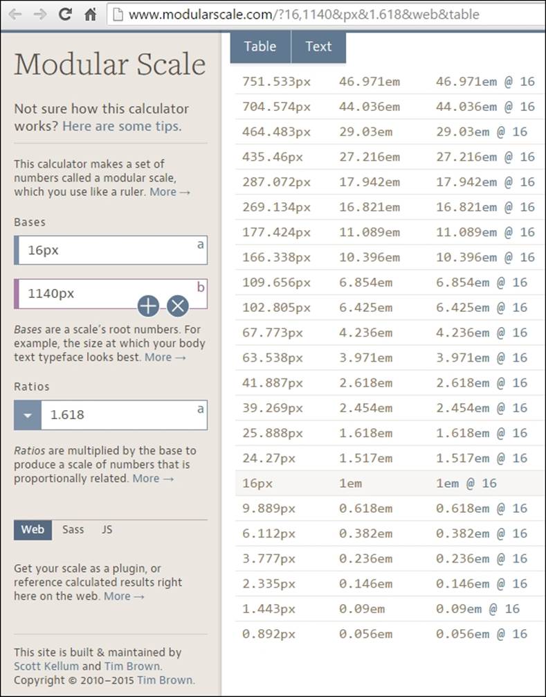
As you can see in the preceding image, there are three columns:
· The first column shows the font size in pixels.
· The second column shows the font size in ems.
· The third column shows the font size if the base was 16px.
What we need to do is focus on the first and second columns only. The highlighted row that says 16px, or 1em, is going to be the font size of our paragraphs. 16px is the default font size in most browsers.
Then, we define our header elements. Let's say we define only h1, h2 and h3. This means that we're going to select the rows above 16px that have larger font sizes:
· <h1>: 39.269px that is 2.454em
· <h2>: 25.888px that is 1.618em
· <h3>: 24.57px that is 1.517em
For the <small> element, if we have any disclaimers on our site, we select the font size right below 16px:
<small>: 9.889px that is 0.618em
That's it! All the numbers in this Modular Scale are harmonious and when used together will provide a clear visual hierarchy, and a relationship difficult to obtain through other methods.
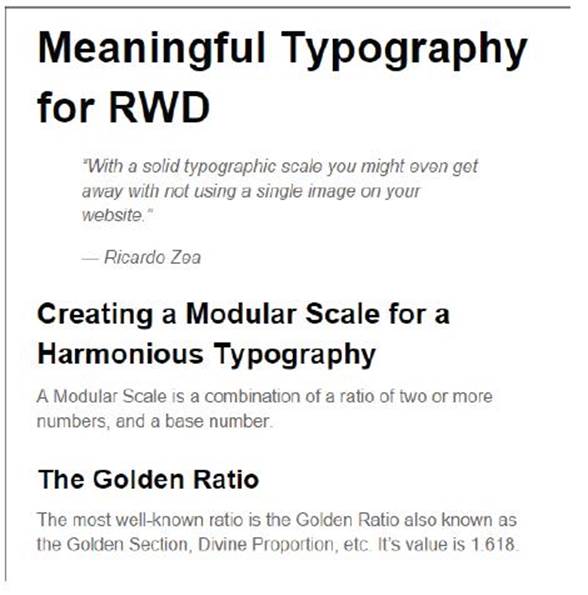
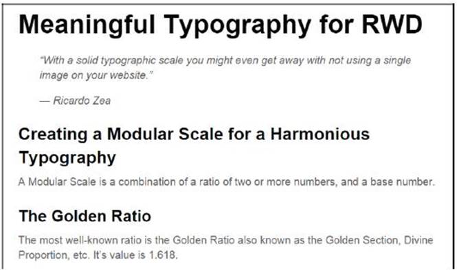
Here's an example.
This is the HTML:
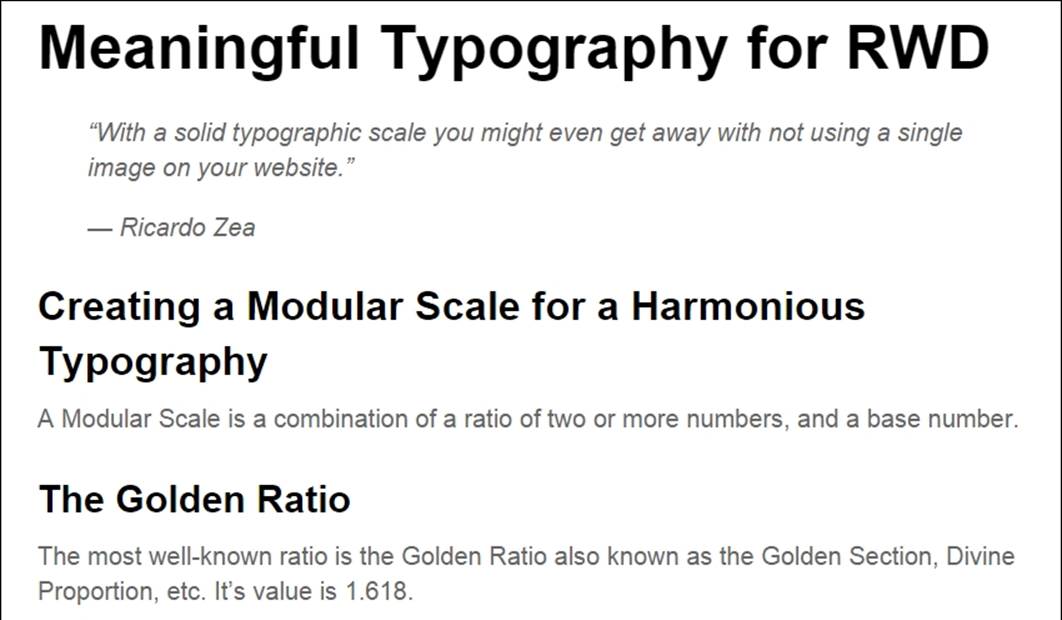
<h1>Meaningful Typography for RWD</h1>
<blockquote>
<p>"With a solid typographic scale you might even get away with not using a single image on your website."</p>
<p>— Ricardo Zea</p>
</blockquote>
<h2>Creating a Modular Scale for a Harmonious Typography</h2>
<p>A Modular Scale is a combination of a ratio of two or more numbers, and a base number.</p>
<h3>The Golden Ratio</h3>
<p>The most well-known ratio is the Golden Ratio also known as the Golden Section, Divine Proportion, etc. It's value is 1.618.</p>
This is the SCSS:
//Mobile-first Media Query Mixin
@mixin forLargeScreens($media) {
@media (min-width: $media/16+em) { @content; }
}
body {
font:16px/1.4 Arial, "Helvetica Neue", Helvetica, sans-serif;
@include forLargeScreens(640) {
font-size: 20px;
}
}
h1 { font-size: 2.454em; }
h2 { font-size: 1.618em; }
h3 { font-size: 1.517em; }
Tip
Notice how I'm including the mobile-first Sass mixin as well.
Here's the compiled CSS:
body {
font: 16px/1.4 Arial, "Helvetica Neue", Helvetica, sans-serif;
}
@media (min-width: 40em) {
body {
font-size: 20px;
}
}
h1 {
font-size: 2.454em;
}
h2 {
font-size: 1.618em;
}
h3 {
font-size: 1.517em;
}
The Modular Scale looks like this on small screens (510px wide):
And like this on large screens (850px wide):
The only potential problem we have here is what I mentioned before about using ems: keeping track of the font size of the parent elements can turn into a font management nightmare.
Using pixels is a no-go because of its scalability issues in legacy browsers. Using rems, however, keeps things in the "relative font size" realm, while providing a pixel-based mentality but without the scalability problems. This allows us to support legacy browsers that do not support rems.
Here's a demo I created for this in CodePen:
http://codepen.io/ricardozea/pen/0b781bef63029bff6155c00ff3caed85
The rems-to-pixels Sass mixin
All we need is a Sass mixin that allows us to set the font values without a specific unit and the mixin takes care of adding the font sizes for both rem-based for modern browsers, and the pixel-based for legacy browsers.
This is the Sass mixin created by Chris Coyer:
//Pixels to Rems Mixin
@mixin fontSize($sizeValue: 1.6) {
font-size: ($sizeValue * 10) + px;
font-size: $sizeValue + rem;
}
Tip
I made a small modification to the original name of the mixin from using dash-separated to camelCase. The reason I did this is because it's easier to spot the name of a mixin from a class name when scanning the document.
The usage is like this:
@include fontSize(2);
This example uses the same markup used in an earlier chapter, so I'm going to show you only the SCSS and some screenshots.
The SCSS is as follows:
//Mobile-first Media Query Mixin
@mixin forLargeScreens($media) {
@media (min-width: $media/16+em) { @content; }
}
//Pixels to Rems Mixin
@mixin fontSize($sizeValue: 1.6) {
font-size: ($sizeValue * 10) + px;
font-size: $sizeValue + rem;
}
//Base-10 model
html { font-size: 62.5%;
@include forLargeScreens(640) {
font-size: 75%;
}
}
h1 { @include fontSize(3.9269); }
h2 { @include fontSize(2.5888); }
h3 { @include fontSize(2.457); }
p { @include fontSize(1.6); }
Consider the following points:
· We're setting the root font size to 62.5 percent, which reduces the font size to 10px. This makes declaring the font values a lot easier. For example, a font size of 1.2rem is the same as 12px, .8rem is 8px, and so on.
· We need to move the decimal dot from the pixel-based values one spot to the left when declaring the font size in rems. For example, according to our Modular Scale the <h1> pixel size is 39.269px, so when declaring the font size in rems, we declare it as 3.9269, without a unit.
The compiled CSS is as follows:
html {
font-size: 62.5%;
}
@media (min-width: 40em) {
html {
font-size: 75%;
}
}
h1 {
font-size: 39.269px;
font-size: 3.9269rem;
}
h2 {
font-size: 25.888px;
font-size: 2.5888rem;
}
h3 {
font-size: 24.57px;
font-size: 2.457rem;
}
p {
font-size: 16px;
font-size: 1.6rem;
}
This is what the Modular Scale using the rems-to-pixels mixin looks like on small screens (510px wide):
This is what it looks like on large screens (850px wide):
Here's a demo I created for this in CodePen:
http://codepen.io/ricardozea/pen/8a95403db5b73c995443720475fdd900
The examples we just saw are using the system font Arial. Let's go ahead and spruce these examples up with some web fonts to give them a bit more character.
Web fonts and how they affect RWD
Web fonts are almost mandatory to use nowadays, and I say almost because we need to be mindful of the implications they bring to our projects, and if necessary, we may actually not use them at all.
Before we get into the nitty gritty of how to work with web fonts, here are a few web font resources that may be helpful for many of you:
· Font Squirrel (http://www.fontsquirrel.com/): I've used this service extensively with great success. To use the fonts, you need to download the file(s) and then use with @font-face in your CSS. They have the best web font generator tool you'll ever find (http://www.fontsquirrel.com/tools/webfont-generator)
· Google Fonts (https://www.google.com/fonts): I can't talk about web font resources without mentioning Google Fonts. If I can't find it on Font Squirrel I come here, and vice versa. You can either download the font file(s) or use JavaScript. The fonts used in the following examples were downloaded from Google Fonts (https://github.com/google/fonts/tree/master/ofl/oswald).
· Adobe Edge Web Fonts (https://edgewebfonts.adobe.com/): This is also a great tool. This service is powered by TypeKit (the first web font service). I've used TypeKit extensively as well. You can't download the fonts though, you have to use JavaScript instead.
Now, let's see the pros and cons of using web fonts:
The advantages are:
· They help accentuate the brand and create consistency across different media.
· When used correctly, they make designs look more appealing.
· There is no need to use image replacement techniques anymore.
· This keeps the text as HTML making the content more accessible and indexable.
· Legacy browsers support web fonts.
· Great resources for free fonts.
· All these in turn help keep the markup cleaner.
The disadvantages are:
· They slow down the website/app due to HTTP requests or their dependency on third-party servers.
· Not all web fonts are legible at small and/or large sizes.
· If legacy browsers are required to support, there are more files to manage.
· Licensing the use of a font requires some sort of payment: monthly, per font family, per font style, and so on.
· Some free fonts are not well built.
· There are rendering side effects:
· Flash Of Unstyled Text (FOUT): On modern browsers, when the page loads, the text is first rendered on the screen with a system font, and then a second later it's swapped and styled with the web font.
· Flash Of Invisible Text (FOIT): On legacy browsers, when the page loads, the text is not visible but a second later it's rendered with the web font.
There are others not worth getting into, such as Flash Of Fallback Text and Flash Of Faux Text (FOFT).
How to tackle all the "flash-of-whatever-texts" is not part of the scope of this section. However, I encourage you to read about Font Load Events in Zach Leatherman's article on the Opera blog called Better @font-face with Font Load Events(https://dev.opera.com/articles/better-font-face/).
Sass mixin for implementing web fonts
To implement web fonts, we need to use the @font-face directive in our CSS… well, SCSS.
The @font-face declaration block looks like this in its vanilla CSS form:
@font-face {
font-family: fontName;
src: url('path/to/font.eot'); /*IE9 Compat Modes*/
src: url('path/to/font.eot?#iefix') format('embedded-opentype'), /*IE6-IE8 */
url('path/to/font.woff') format('woff'), /*Modern Browsers*/
url('path/to/font.ttf') format('truetype'), /*Safari, Android, iOS*/
url('path/to/font.svg#fontName') format('svg'); /*iOS devices*/
font-weight: normal;
font-style: normal;
}
Now, if you're using more than one style or font family, you need to repeat the whole @font-face declaration block for each font file. This is not very DRY (Don't Repeat Yourself).
Tip
Web fonts are expensive in terms of file size and server requests, so please use web fonts moderately. The more you use, the slower your website/web app will become.
Yes that's a pretty hefty piece of CSS to handle web fonts, oh man.
To keep our sanity, let's turn the prior @font-face CSS declaration block to a Sass mixin:
@mixin fontFace($font-family, $file-path) {
@font-face {
font: {
family: $font-family;
weight: normal;
style: normal;
}
//IE9 Compat Modes
src: url('#{$file-path}.eot');
//IE6-IE8
src: url('#{$file-path}.eot?#iefix') format('embedded-opentype'),
//Modern Browsers
url('#{$file-path}.woff') format('woff'),
//Safari, Android, iOS
url('#{$file-path}.ttf') format('truetype'),
//Safari, Android, iOS
url('#{$file-path}.svg') format('svg');
}
}
The usage is a single line of code to call the font file. Let's use the typeface Oswald:
@include fontFace(oswald-light, '../fonts/oswald-light');
Using it on any element is a matter of adding the font name at the beginning of the font stack, as shown here:
p { font: 2.2rem oswald-bold, Arial, "Helvetica Neue", Helvetica, sans-serif; }
If we need to include more than one font file, just add another line calling the mixin but specifying the other font name:
@include fontFace(oswald-light, '../fonts/oswald-light');
@include fontFace(oswald-regular, '../fonts/oswald-regular');
The preceding two lines of code will compile to the following CSS:
@font-face {
font-family: oswald-light;
font-weight: normal;
font-style: normal;
src: url("../fonts/oswald-light.eot");
src: url("../fonts/oswald-light.eot?#iefix") format("embedded-opentype"), url("../fonts/oswald-light.woff") format("woff"), url("../fonts/oswald-light.ttf") format("truetype"), url("../fonts/oswald-light.svg") format("svg");
}
@font-face {
font-family: oswald-regular;
font-weight: normal;
font-style: normal;
src: url("../fonts/oswald-regular.eot");
src: url("../fonts/oswald-regular.eot?#iefix") format("embedded-opentype"), url("../fonts/oswald-regular.woff") format("woff"), url("../fonts/oswald-regular.ttf") format("truetype"), url("../fonts/oswald-regular.svg") format("svg");
}
That's a pretty nifty way of creating all that CSS with a mere two lines of code, eh? However, if we want to make things right, let's analyze what we're doing here:
· We're supporting legacy browsers:
· IE8 and below with a .eot font.
· Old Safari on Android in iOS with a .ttf font.
· Old iOS for the, practically forgotten, iPhone 3 and below with a .svg file.
· Modern browsers only need a .woff font. According to CanIUse.com, .woff font files are 99 percent supported, with the exception of Opera Mini at the time of writing this book (http://caniuse.com/#search=woff).
So the question is: Can we gracefully degrade the experience for legacy browsers and OS's and let them use a system font instead?
Sure we can!
After optimizing the mixin to use only .woff fonts, this is what it looks like:
@mixin fontFace($font-family, $file-path) {
@font-face {
font: {
family: $font-family;
weight: normal;
style: normal;
}
//Modern Browsers
src: url('#{$file-path}.woff') format('woff');
}
}
The usage is exactly the same:
@include fontFace(oswald-light, '../fonts/oswald-light');
@include fontFace(oswald-regular, '../fonts/oswald-regular');
The compiled CSS is much shorter:
@font-face {
font-family: oswald-light;
font-weight: normal;
font-style: normal;
src: url("../fonts/oswald-light.woff") format("woff");
}
@font-face {
font-family: oswald-regular;
font-weight: normal;
font-style: normal;
src: url("../fonts/oswald-regular.woff") format("woff");
}
Using it on a couple of elements looks like this:
h1 { font: 4.1rem oswald-regular, Arial, "Helvetica Neue", Helvetica, sans-serif; }
p { font: 2.4rem oswald-light, Arial, "Helvetica Neue", Helvetica, sans-serif; }
Serving only the .woff font puts a lot less file management on our plate, which helps free our brains from unnecessary tasks and allow us to focus on what matters most: building a memorable experience. Not to mention, it makes our CSS code more streamlined and scalable.
But wait, we're letting legacy browsers gracefully degrade to system fonts, and we still need to define the font sizes in pixels for them!
Pixels-to-rems Sass mixin to the rescue!
Remember to see the base-10 model in the <html> tag for easier calculations:
//Base-10 model
html { font-size: 62.5%; }
Then let's declare the font sizes and font families:
h1 {
@include fontSize(4.1);
font-family: oswald-regular, Arial, "Helvetica Neue", Helvetica, sans-serif;
}
p {
@include fontSize(2.4);
font-family: oswald-light, Arial, "Helvetica Neue", Helvetica, sans-serif;
}
The compiled CSS looks to this:
h1 {
font-size: 41px;
font-size: 4.1rem;
font-family: oswald-regular, Arial, "Helvetica Neue", Helvetica, sans-serif;
}
p {
font-size: 24px;
font-size: 2.4rem;
font-family: oswald-light, Arial, "Helvetica Neue", Helvetica, sans-serif;
}
Tip
We're declaring two separate font sizes in the same rule, therefore we can't use the font shorthand in this case.
Thus, by harnessing the superpowers of two simple Sass mixins, we can easily embed web fonts and use rems for our font-sizes while providing pixel-based font sizes for legacy browsers.
This is a great example of robust scalability.
Here's a demo I created for this in CodePen:
http://codepen.io/ricardozea/pen/9c93240a3404f12ffad83fa88f14d6ef
Without losing any momentum, let's change gears and talk about how to improve the legibility of our pages by accomplishing a minimum line length with the awesome FlowType.js jQuery plugin by Simple Focus.
Using FlowType.js for increased legibility
One of the most compelling editorial principles states that the ideal line length for the most legible typography is between 45 and 75 characters.
That's a pretty decent range if you ask me. However, actually making your paragraphs long enough, or short enough for that matter, is like a "blind leading the blind" game. How can we tell whether the combination of the width of a container and its font size actually meet the 45 to 75 characters recommendation? Also, on small or medium screens, how can you tell this is the case?
Tricky one, eh?
Well, no need to worry because with FlowType.js, we can address these issues.
You can download the plugin from http://simplefocus.com/flowtype/.
The first thing we need is the HTML, so here's the markup we're going to use:
<!DOCTYPE html>
<!--[if IE 8]> <html class="no-js ie8" lang="en"> <![endif]-->
<!--[if IE 9]> <html class="no-js ie9" lang="en"> <![endif]-->
<!--[if gt IE 9]><!--><html class="no-js" lang="en"><!--<![endif]-->
<head>
<meta charset="utf-8">
<meta name="viewport" content="width=device-width, initial-scale=1">
<meta http-equiv="X-UA-Compatible" content="IE=edge">
<title>Meaningful Typography for RWD</title>
<script src="//code.jquery.com/jquery-latest.min.js"></script>
<script src="js/flowtype.js"></script>
</head>
<body>
<main class="main-ctnr" role="main">
<h1>Meaningful Typography for RWD</h1>
<blockquote>
<p>"With a solid typographic scale you might even get away with not using a single image on your website."</p>
<p>— Ricardo Zea</p>
</blockquote>
<p>One of the most compelling editorial principles states that the ideal line length for the most legible typography is between 45 and 75 characters.</p>
</main>
</body>
</html>
Once you get comfortable with FlowType.js, you might actually start thinking, "If FlowType automatically modifies the font size at pretty much any viewport width, I don't think I need to declare any font sizes in my SCSS! After all, they are going to get overwritten by FlowType."
Well, we do need to set the font size regardless, because if FlowType.js doesn't load, we'd be left at the mercy of the browser's default styles, and we designers do not want that.
With that being said, here's the SCSS to declare the necessary font sizes:
//Pixels to Rems Mixin
@mixin font-size($sizeValue: 1.6) {
font-size: ($sizeValue * 10) + px;
font-size: $sizeValue + rem;
}
//Base-10 model
html { font-size: 62.5%; }
h1 { @include fontSize(3.9269); }
p { @include fontSize(1.6); }
This will compile to the following CSS:
html {
font-size: 62.5%;
}
h1 {
font-size: 39.269px;
font-size: 3.9269rem;
}
p {
font-size: 16px;
font-size: 1.6rem;
}
This is where the magic happens. We create a jQuery function where we can specify which element(s) to target. This function can be placed either inside a separate JavaScript file or within the markup.
In our example we're telling FlowType.js to apply the resizing of the font to the <html> element. Since we're using relative font size units, rems, all the text will automatically resize/adjust at any screen width, maintaining the ideal line length.
Here's the jQuery function:
$(function() {
$("html").flowtype();
});
Defining thresholds
There's a potential problem with the solution we just saw: FlowType.js will modify the font size of the paragraphs indefinitely. In other words, on small screens the text will be extremely small and on large screens it will be way too big.
We can solve this issue with two separate threshold approaches or a combination of both.
Now, one thing we need to make clear is that this part will require some tweaking and adjusting in order to get the best results, there aren't specific values that will work for all situations.
We are going to use the following approach:
· Define the minimum and maximum widths of the container or element.
· Define the minimum and maximum font sizes of the container or element.
Threshold widths
Defining the minimum and maximum widths will tell FlowType.js at which points it should stop resizing.
Let's define the width thresholds:
$(function() {
$("html").flowtype({
//Max width at which script stops enlarging
maximum: 980,
//Min width at which script stops decreasing
minimum: 320
});
});
Tip
The thresholds I selected work specifically for this example and it may not necessarily work for other situations. Tweak and test until you get the ideal widths that work with the recommended 45-75 characters per line recommendation.
Threshold font sizes
Just like with the width thresholds, defining the minimum and maximum font sizes will tell FlowType.js what the smallest and largest font sizes it should scale the text to.
We're also going to declare our own font size using the fontRatio variable; the higher the number, the smaller the font, and the lower the number, the larger the font. If this feels counterintuitive, look at it this way: the higher the number, the higher the compression (thus making it small) and the lower the number, the lower the compression (thus making it large).
Adjusting the fontRatio value is an eyeballing exercise, so tweak and test like there's no tomorrow.
Let's take a look at the font sizes values:
$(function() {
$("html").flowtype({
//Max width at which script stops enlarging
maximum: 980,
//Min width at which script stops decreasing
minimum: 320,
//Max font size
maxFont : 18,
//Min font size
minFont : 8,
//Define own font-size
fontRatio : 58
});
});
Tip
There's no need to include a comma after the last value in the list.
FlowType.js just plain rocks man!
Here's a demo I created for this in CodePen:
http://codepen.io/ricardozea/pen/c2e6abf545dbaa82a16ae84718c79d34
Summary
So here we are, levelled up in typography for RWD. Is there more about typography? You bet! This amazing subject is a whole industry in itself, without it we wouldn't be reading this book.
We can now say that we understand why using relative units for typography is a good approach: scalability. Also, using our little magic formula, we can calculate relative font sizes for each of our text elements in our design, but why go through all that trouble? Modular Scale for typography saves the day in that regard, and it injects our projects with awesome typographic harmony. Who knows, maybe we may not need to use images at all!
Brands can now be extended to the web via web fonts, but we need to be careful and consider the impact of using them on our sites/apps. Also, as far as modern browsers go, we only need to use a single file type (WOFF font files), which make things a lot easier to manage—for browsers to download and for users to enjoy.
FlowType.js enhances our headers and body text while maintaining a good level of legibility.
Now, an important part of RWD is (believe it or not) doing things like we did many, many years ago. In the next chapter, we're going to keep things simple and we're going to talk about RWD in e-mail.
Time to go back in time!
All materials on the site are licensed Creative Commons Attribution-Sharealike 3.0 Unported CC BY-SA 3.0 & GNU Free Documentation License (GFDL)
If you are the copyright holder of any material contained on our site and intend to remove it, please contact our site administrator for approval.
© 2016-2026 All site design rights belong to S.Y.A.