Mobile HTML5 (2013)
Chapter 14. Mobile Performance
Whether or not your design or development is mobile first, your development process should always have performance at the top of the list of concerns.
Although the modern mobile landscape has browsers that are generally more advanced than the desktop browsers we must still cater to, the devices themselves may have similar memory and bandwidth constraints to the Pentium III you were using back in 1999. The mobile device itself, rather than the mobile browser, creates various constraints that we must consider during development.
The average website is over 1 MB. While responsive web design is currently the hot mobile topic at most conferences, mobile performance is really more important: who cares what your website looks like on the phone if your users can’t download it or render it on their device?
There’s a lot more to think about than the breakpoints of our adaptive design. We need to worry about feature detection, device APIs, touch events, content strategy, conditional loading of assets, and actual device performance. We need to take battery life, latency, memory, and UI responsiveness into consideration throughout the development process.
Battery Life
Unlike desktop computers that are tethered to the wall at all times, and even laptop computers that are generally used by stationary users, mobile users do not recharge their devices throughout the day. Mobile users expect their devices to last, at a minimum, 24 hours between recharging.
Your users do realize that calls and GPS usage consume battery power. However, if they think they’re just using their browser to surf the Web, they don’t consider that different websites will drain their battery faster than other sites. It is our job, as developers, to manage the power consumption of our code.
You have likely noticed that CPU usage drains the battery on your laptop when unplugged. CPU usage drains the battery on mobile devices just as effectively. Anything that makes your laptop churn, warm up, or turns your computer’s fan on will also drain the battery of mobile devices (if they’re not plugged in). Code defensively: expect that your mobile device users are not plugged in.
To manage the energy consumption of our code, we need to manage CPU usage. Avoid reflows. Minimize both size and activity of your JavaScript. Don’t continuously reawaken the radio with unnecessary AJAX calls. Always use CSS, rather than JavaScript, for animations. And even though the marketing teams of devices that support WebGL insist that their devices are optimized, don’t serve WebGL to mobile devices. At least, not yet. WebGL battery performance is improving.
Use Dark Colors
The brighter the colors in your design, the brighter the screen has to be. For phones with AMOLED screens, the brighter the screen, the more energy is consumed, draining the battery. AMOLED, or active-matrix organic light-emitting diode, screens are made of a thin layer of organic polymers that light up. Because there is no backlight, they can be very thin. Black pixels are actually turned off, saving battery life. For these non-LCD screen devices, lighter shades consume more energy during display than darker shades.
Obviously, there are issues other than battery consumption affecting the decision on what colors are used in application design. Just note that the amount of energy consumed by websites can differ significantly depending on the colors used in the design on certain devices. Colors are by far not the only feature affecting battery consumptions. Media elements like background images, foreground images, video, audio, animations, and JavaScript all contribute to battery drainage. If you can, pick darker colors. If you can’t, optimize energy in your other features.
Use JPEGs
Use JPEG images instead of PNG. JPEG compresses images better and is faster to render, and is therefore more energy efficient.
Rendering images consumes energy. Depending on the number, size, and type of images in your site, rendering images can be responsible for a significant percentage of the energy used. The energy required to render images is proportional to number and size of the images rendered. JPEGs use less energy to render than GIFs and PNGs: according to the study “Who Killed My Battery: Analyzing Mobile Browser Energy Consumption,”[90] JPEG is the most energy efficient format for all image sizes.
By using JPEGs, you’re not only saving battery life, you’re also reducing memory and speeding up repaints. The type of image format you use affects energy consumption during rendering of the image. This impact is replayed when the image is redrawn to a different size. As we noted earlier, lighter colors consume more energy during extended display. When we are talking about image rendering costs, we are talking about the device decoding, resizing, and drawing out the image, not the energy costs once a static image is displayed.
Reduce JavaScript
While raster images are the biggest bandwidth hogs and all images are memory hogs, they’re not the only culprit in memory consumption and battery drainage. JavaScript is too! To conserve battery power and memory usage, minimize both the size and activity of your JavaScript.
When the browser hits a <script> tag, the browser ceases downloading additional assets and rendering the assets it has already downloaded until the JavaScript is downloaded, parsed, and executed. The browser also does not start parsing and executing the script file until it is fully downloaded. Which you already know.
What you may have never thought about is the memory and energy used by JavaScript. Every time an AJAX call is made, the device’s radio reawakens to make the request, draining the battery. Every time JavaScript is parsed, energy is consumed. While a site may cache the JavaScript file, it still parses and executes the JavaScript on every page load. Dynamic JavaScript, like XMLHttpRequest, increases rendering cost and can’t be cached. Every time an event handler handles an event, JavaScript gets executed. Every time a setTimeout iterates, JavaScript gets executed. These all consume energy.
The download, parsing, and execution of JavaScript can be the most energy-consuming web page component. Sometimes the JavaScript isn’t necessary! Only include JavaScript frameworks if you actually need them.
I have seen sites include jQuery just to simply select an element, and other similar things that are easy to do with selectors and/or native JavaScript. For example, to add the class of first to the first list item in every unordered list, you could use jQuery, but you don’t have to:
$('ul li:first').addClass('first');
Which is almost the same as:
var firstLIs = document.querySelectorAll('ul li:first-of-type');
for (var i = 0; i < firstLIs.length; i++) {
firstLIs[i].classList.add('first');[91]
}
... but the latter doesn’t add 34 KB or an extra HTTP request to your site. And while 34 KB is not a huge amount of bytes, especially in comparison to the image size that people are adding to their sites, if you include jQuery, while the jQuery file may be cached, it is still parsed and executed with every page load. While a single page load won’t drain all the power your user has left, wasting four joules[92] of energy with each page load adds up fast. And unlike when your user is using GPS or playing a movie, they aren’t expecting that a website will drain their battery.
I am not saying that you shouldn’t use JavaScript frameworks. I am just arguing that you should make sure you really need to include the framework before doing so because you are not only wasting memory and bandwidth, but you’re also helping drain your user’s battery.
Don’t import a library just to target an element with CSS selectors. We have querySelector() and querySelectorAll() for that. Don’t import a library just to bind events: addEventListener() works fine in all modern browsers. Don’t write a script just to make scrolling work better. Try -webkit-overflow-scrolling: touch instead. And if you must have scrolling down perfect, along with the little bounce, use a script. Don’t reinvent the wheel. You won’t get the physics right. Use a library when you must, but think long and hard about whether you really need the extra bytes, HTTP request, memory usage, and battery drain before doing so.
Eliminate Network Requests
Obviously you need to download the files required to load your web application. This uses battery, but is necessary. However, polling the Facebook, Twitter, and Pinterest servers every 15 seconds to see if your page received more likes is not necessary and a waste of both bandwidth and battery power. In fact, it’s the worst possible waste of both.
Determine if your application needs to poll all the time, or rarely to never. If your application needs to be real time, such as a chat or a sports game, you will want to spend battery power by keeping the connection alive at all times. If your application is not polling for a necessary purpose (Facebook like counts are not necessary, and annoying), let your mobile device terminate the connection to the cell tower.
Establishing and maintaining radio links to cell towers consumes battery power. When the device is not making requests, it shuts down connectivity processes to save battery. This is a good thing.
While most performance arguments revolve around input and output of data, the number one battery drain in a mobile phone is radio. To preserve battery life, mobile devices put the radio in a preserving power mode when the transmissions are complete and into a deep sleep state after a few seconds of network inactivity. After the radio link is idle for 5 seconds, it drops to a state of half power consumption and significantly lowers bandwidth. After another 12 seconds of inactivity it drops to the idle state.
From the idle state it takes time to reach full power and bandwidth. If you are polling your server every 15 seconds, you are waking the radio from a deep sleep. Waking the radio can take up to 2 to 3 seconds, taking multiple round trips just to get to a state where your application can transmit.
If your application needs to keep the connection alive, do so. Realize you’re draining the battery and let your user know this. If you don’t need to poll at regular intervals, to conserve battery power, keep messages as small as possible and limit the number and frequency of network requests after page load.
Hardware Acceleration
Usually when people think of managing CPU usage, they’re thinking of their server. Yes, you should be doing that, too. But when it comes to limited battery life, you want to manage browser CPU usage caused by your web application. Whatever makes your laptop fan turn on will also drain the battery of any device.
One solution is to hardware accelerate all animations. Hardware acceleration means rendering your animations on the GPU instead of the CPU. The graphics chip requires less power than the device’s CPU, resulting in improved battery life. Hardware acceleration carries out all drawing operations that are performed on a View’s canvas using the GPU. Hardware-accelerated images are composited, using four times the memory of the original. Because of the increased resources required to enable hardware acceleration, your application will consume more RAM, but less battery power. With constrained memory and battery life, always consider battery and memory consumption when designing and developing your applications.
Hardware acceleration has both benefits and drawbacks. Your animation will appear less janky on the GPU, and you will lose less battery. However, your memory is limited.
In other words, transform: translatez(0); is not a panacea. Do not do this:
* {
transform: translatez(0);
}
... as you may run out of GPU memory, especially on devices with limited memory. However, don’t be afraid to force hardware acceleration on the elements you are animating. In fact, to reduce the traffic between CPU and GPU, it is recommended that you put all elements that are going to be animated on the GPU on load:
.spinner {
transform: translatez(0);
animation: spin 1s linear infinite;
}
@keyframes spin {
100% {
transform: translatez(0) rotate(360deg);
}
}
Note that in the preceding example, we add the 3D transform even when we are not animating. If you are going to hardware accelerate an element at any time, keep that element hardware-accelerated at all times. You don’t want to have a brief moment where the element disappears as the device moves it to and from the CPU to GPU.
Avoid repaints and reflows
Repaints and reflows are some of the main causes of sluggish JavaScript, and a main cause of janky animation.
A repaint is a redrawing of the screen when an element’s appearance has been altered without affect on layout. Changing an element’s color, visibility, or background image will cause a repaint. Repaints are generally cheap, but can be expensive, as the visibility of all the nodes in the DOM tree and all the layers of each node must be measured. Repaints can be costly when alpha transparency is involved.
Rendering alpha transparent blurs such as shadows or alpha transparent gradients will always take more time to render, as the browser needs to calculate the resulting color of every pixel based on the transparency over the color underneath it. This occurs even if the color, in the end, is not visible because of a design element on top of it, as CSS properties like background image and shadows are drawn from back to front.
The time to paint is really ridiculously fast. Generally, optimizing other areas will give you more bang for your buck. However, if you are repainting repeatedly, such as a non-hardware-accelerated transition or animation, minimizing repaint time is vital. In animating, the browser must repaint the nodes being animated in generally less than 16.67 ms for the animation to not appear janky. These overdrawn pixels can waste a lot of processing time for CPU-based rasterizers.
A reflow is even more critical to performance because it involves changes that affect the layout of a portion of the page (or the whole page). Reflow of an element causes the subsequent reflow of all child and ancestor elements as well as any elements following it in the DOM. A reflow is the browser process for recalculating the size and positions of all the DOM nodes when the browser needs to calculate the size of an element or when it re-renders a part of or an entire document.
When the browser needs to measure or reflow a single element in the document, unless absolutely positioned or in its own render layer, it generally reflows not just that relevant node, but the node’s ancestral elements and all elements that come after it.
NOTE
Some of the nodes that have their own render layer include the document itself, explicitly CSS positioned (relative, absolute, or a transformed) nodes, transparent nodes, nodes with overflow, alpha mask or reflection, WebGL, hardware-accelerated content, and <video> elements.
During a reflow, users are blocked from interacting with the page. It’s therefore important to prevent reflows, and minimize reflow time when they do occur. Scripts and even some CSS can cause a reflow. The DOM tree, styles, and assets can impact reflow speed.
There are many things that can cause a reflow, including adding, removing, updating, or moving DOM nodes, changing the display or box model properties of a node, adding a stylesheet or inline styles, resizing the window or changing the orientation, scrolling, and querying style information via JavaScript.
To reduce the number of reflows, batch your style queries, change styles via changing a CSS class rather than adding inline styles.
Instead of changing individual styles, change the class name. If the styles are dynamic, edit the cssText property rather than the style property:
myNode.style.cssText += "; left: 50p%; top: 0;";
Batch DOM changes and do them off of the live DOM tree. Don’t ask for computed styles unless necessary. And if you do so, batch the queries and cache the results into local variables, working with the copy. Make your updates in a clone of the content, make all your changes offline, then add back when complete.
This can be done in a documentFragment or a copy of the document section you’re editing. If you need to, you can even hide the element with display: none, make your plethora of changes, then reset the element to its default display. This method reflows exactly twice: when you hide and when you show again. This may sound like a lot, but this may be less than would otherwise occur if you’re making hundreds of changes causing reflows on a live node.
To make the reflows that do occur happen faster, you should minimize the number of DOM nodes, eliminate overly complex CSS selectors, and ensure that all animations are hardware-accelerated.
The deeper the DOM, the more time it takes for every reflow. Changes at one level in the DOM tree can cause changes at every level of the DOM tree, from the last of the nodes descendants all the way up to the document root. The more nodes you have, the longer it takes to reflow them all.
If you make complex rendering changes such as animations, do so out of the flow. Create a separate rendering layer with position: absolute;, position: fixed;, or transform: translatez(0); to accomplish this.
Latency
Download and upload speeds are rarely (if ever) equal to the bandwidth marketed by Internet service providers (ISPs). The quoted Mbps is the fastest connection one could possibly ever hope to get, not the speed of the average connection. The speed by which a website, including the markup, stylesheets, media, application scripts, and third-party scripts, makes it onto our devices are affected as much by latency as by the bandwidth of the marketing terms of EDGE or 3G, if not more so.[93]
Latency has a much larger impact on download speeds when a device is on a mobile network compares to devices that are tethered or accessing the Internet via WiFi. Download speed is greatly affected by packet loss and latency. Packets must first travel from your device to the closest cell tower. The air between your device and that tower is the main cause of latency. In other words, your mobile users using 3/4G already have low bandwidth. Latency makes their web-surfing experience that much more painful.
Because mobile devices have terrible latency, reducing the download time is very important. To optimize sites for mobile, reducing the number of HTTP requests and DNS lookups can have the greatest impact on improving performance. If you are testing your device on the local Starbucks WiFi, you will not experience much latency. Try testing your application from the passenger seat of a speeding vehicle on a scenic highway: this will give you a much better sense of the test case you want to optimize for.
Reduce the Number of HTTP Requests
There are several ways you can reduce the number of requests made by your application.
Browser cache
Leveraging your browser cache reduces requests on subsequent page loads and refreshes since, when an asset is cached, your browser doesn’t need to re-retrieve them.
For nonchanging static components, like the corporate logo, set a far future Expires header. For dynamic components such as a JSON response, use an appropriate Cache-Control header to help the browser with conditional requests.
Combined JavaScript file
Concatenating all your JavaScript into a single file is often a good idea. Just note that your device has memory limitations. As such, while reducing your JavaScript into a single file may reduce the HTTP requests the most, it may make more sense to include a couple script files: one for the overall app used on most of your page loads, and separate modularized scripts for the more complex component(s) of your application. There is no right answer: realize that you have both memory constraints and latency issues, and determine what makes the most sense for your applications.
It’s also a good idea to minify and gzip your JavaScript. Using a content delivery network may speed up your download, but may also add an extra DNS lookup.
Single stylesheet
Similarly, you can concatenate all of CSS into a single file. Tools like Sass can help you manage modularized SCSS files, and concatenate them all to a single file for production. But again, remember there are memory constraints. Figure out what makes the most sense in terms of performance for your particular application. Concatenate and cache as much as is appropriate. Minify and gzip as well.
Image sprites
When it comes to developing for the desktop, we’ve also been concatenating images into sprites. Image sprites are a collection of images put into a single image. Image sprites reduce the number of HTTP requests and also help save bandwidth.
While sprites are a very good way of reducing latency, they do have drawbacks. Memory is limited on mobile, and these images are loaded into memory even if only a small part of the image is used. In addition, large images may be tiled in memory. It is generally recommended to keep all images for limited devices to under 1024 px in either dimension.
Image compression
When creating images, you want to compress them as much as possible. While you should gzip your image files too, remember that when they are decoded by the browser, they return to their pre-gzipped file size: so again, compress as much as possible.
Data URIs/inline images
For small images and simple SVG image files, you can reduce the number of HTTP requests for that file down to none by providing a data URI as an inline image or as a data URI for a background image, instead of having the browser download a separate binary file. Inline images use the data URI scheme to embed the image data in the actual page. This can increase the size of your HTML document. Weigh whether saving an HTTP request is worth the increased file size of this method.
In your CSS, to include a data URI, include your images anywhere you would normally include your image, encompassed with url(). For example:
a[href^="mailto"] {
background: url(data:image/gif;base64,R0lGOYLCVDFCrKU-data-uri-code-UhwFUUE1l)
no-repeat right center;
padding-right: 25px;
}
If you were to code it as a foreground image in HTML, it would resemble this:
<img width="16" height="16" alt="email" src="data:image/gif;base64,
R0lGOYLCVDFCrKU-data-uri-code-UhwFUUE1lBavAViFIDlTI0SlBCBMQiB" />
Where the data URI code would really be much, much longer.
Data URI strings can be very long. On average, a data URI is about 33% more bytes than the binary raster equivalent. Both methods can (and should) have the file size reduced by gzipping. Because of the way packets are sent, there is a cost-benefit analysis to be considered. It can be worth sending the extra bytes of a smaller data URI image to save on HTTP requests. It isn’t generally isn’t worth sending a data URI for several high-resolution PNGs—while the actual download time may be just a bit more, the perceived download time may make the extra HTTP request worthwhile. Where that performance sweet spot is depends on device and connection.[94]
Should you use sprites or data URIs? Both work. I find sprites easier to work with than having to export data URIs,[95] but data URIs definitely have other benefits. Data URIs are usable for background patterns[96] and for when you have way too many images or unpredictable image requirements that preclude being able to use a sprite. For example, a star rating system might be a good use case for a sprite, but avatars for a Twitter stream, with the plethora of possibilities, can’t be sprited, making data URI a better solution.
Icons and character sets
As long as you have declared the charset of your files, you can use any characters in your font, including ✉, ⌘, and ✔. Using a font instead of image icons is more robust. You can create icons in any color without Photoshop. You can create icons of any size without pixelation. Using the default font also saves on HTTP requests and memory.
You are likely to find icons for all your needs in the font families preloaded onto your users’ devices. Sometimes your designer wants to have more design control. There are many icon font sets. These require downloading the font face, and so will incur a single HTTP request. That is the same, or fewer, HTTP requests you would have required if you used images instead of fonts.
You can also create your own icon font. A good resource is IcoMoon, which is a set of open source icons and a web app for customizing and downloading optimized icon fonts. You choose just the icons you want and download a minimized set. You can also add icons from different sets or from SVG files.
Inspecting network requests
You can inspect the performance of your site or application by looking at the waterfall chart in the browser developer tools on desktop, using weinre or Adobe Edge Inspect from the mobile device, from the BlackBerry debugger, or from many other tools.
A free waterfall chart can also be obtained from online tools, like WebPageTest.org, as shown in Figure 14-1. The chart shows the number of requests made (34 in this case).
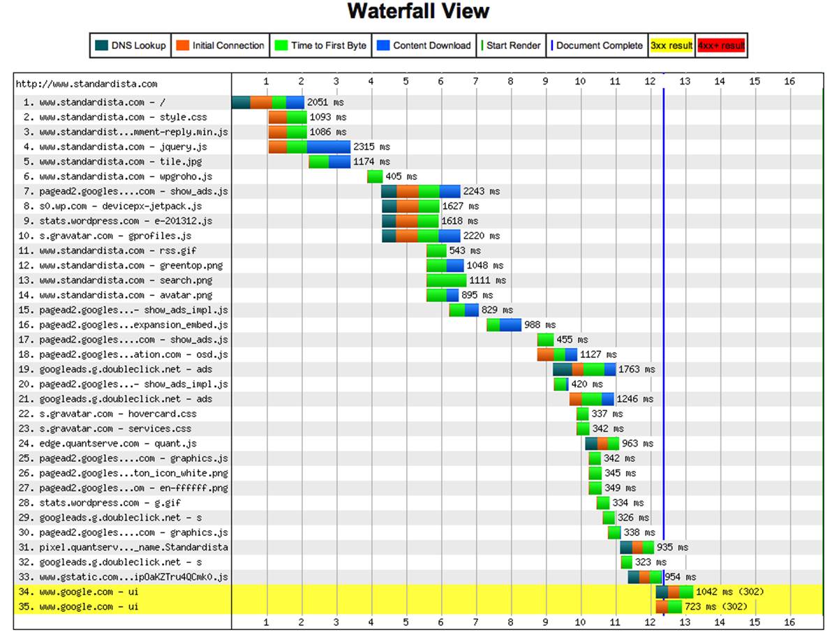
Figure 14-1. Waterfall chart from WebPageTest.org
Each request shows the time allocated for DNS lookup (if any), initial connection, time to first byte (or latency), and content download (bandwidth with latency). The first vertical bar is when the page started rendering, and the last vertical bar (barely visible on the right hand side of the images) is the time until the onload event was fired.
If we look at a single line from the waterfall chart, as in Figure 14-2, we can observe the latency of including a script from an external domain. In this case, to include an external JavaScript file, we first must wait 406 ms just for the DNS lookup, waiting 593 ms until the first byte of the script is downloaded. The loading of assets is halted when a script is called until the script is downloaded, parsed, and executed. This 2,243 ms request for show_ads.js prevented any rendering to our page for over 2 seconds. This demonstrates the need to pay attention to latency, code order, and performance in general, and more specifically to the impact of third-party scripts.
Figure 14-2. Detail of a single request
Your goal is to get the waterfall to be as short as possible and as narrow as possible.
Reduce Size of Requests
Latency is the biggest concern. The biggest culprit in latency is generally the number of requests, rather than the size of requests. However, the larger the size of the requests, the longer they take. And often, the memory consumed by the application is proportional to the size of the application files. The average website is over 1 MB, with the same files sent to the 24-inch monitor and the 3-inch Android. To reduce latency, and positively impact memory, reduce the size of the requests that your application is making.
The smaller the file size, the less time it will take to get from the server to the client once the connection request is made. Minify your CSS. Minify your JavaScript. Create images with the smallest file size possible while maintaining acceptable resolution.
Minify text-based assets
For your text-based assets—your CSS, JavaScript, JSON, and SVG files—minify everything. There are minifying services and tools to make sure text-based assets are as small as possible. If your prefer not to minify during development, I understand. But definitely minify before deploying your code.
Compress binary files
Different image-editing programs provide for different ways to reduce file size. Instead of using GIFs, save your image as a PNG8. If you need animated GIFs, use CSS animation instead. If your color palette is too large for a PNG8, pass your PNG through a tool like ImageAlpha or automate it from the command-line with PNGCrush.
JPEG compression is lossy compression, but compressing down to 40% to 60%, instead of 80% to 99%, can lead to huge byte savings.
Gzip everything
Once you’ve made the files as small as possible, gzip them! Gzipping as many file types as possible reduces page weight, accelerating the download speed. However, it does not reduce the file’s impact on memory. When it comes to memory, the file size in the client will be the same size of the file before you gzipped it. Gzipping saves bandwidth, but the file gets deflated to its pre-gzipped, post-compressed size once it gets to its destination.
Leverage the developer tools to inspect what has and hasn’t been compressed. Start by disabling cache in the inspector via the settings panel. This way you’ll always have a cold cache or baseline on which you can compare your work. This is how your visitors will see your site load the first time they hit your site.
In the Network tab’s waterfall, in the size column, the top number in the size column is the transferred size. The bottom is the real size. The transferred size will reflect your minification and gzipping. The real size will show you how much memory will be allocated, and how much more you can save in terms of bandwidth. If there is only one value showing, you are in “use small resources row.” To see the “large resources row,” click on the expand rows icon at the bottom of the developer tools window, to the right of inspect and left of record, as shown in Figure 14-3.
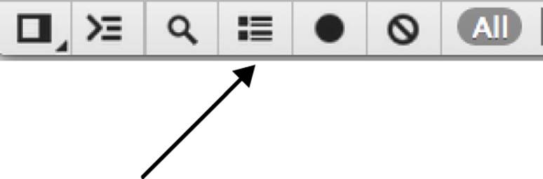
Figure 14-3. Toggle between large and small resources display
At the bottom of the Network tab, there is a gray line with white text: this line shows the total file size and time to download.
Reduce image size
There is no reason to send huge images to tiny devices. Use media queries to send the right size background images. For foreground images, use the Clown Car Technique, libraries like Picturefill, or tools such as Sencha.io Src to send the right size image. More information on these methods and links can be found in the online chapter resources. More details on image sizing is discussed under the section Memory.
Skip the framework
If you can avoid importing a JavaScript framework, do it. As mentioned under the section Battery, frameworks were originally created to normalize JavaScript across browsers. All smartphones have browsers smarter than IE8. If you’re importing frameworks for supported tasks like selectors and event listeners, code vanilla JavaScript. jQuery adds 34 KB, an extra HTTP request, and consumes energy every time it is parsed and executed. It’s not a huge file size. If you need a framework, use a framework. However, if you can avoid importing scripts, do that instead.
Again, don’t reinvent the wheel. Use a library when you must, but think long and hard about whether you really need the extra bytes, HTTP request, memory usage, time to fully parse and execute the code, and battery drain before doing so.
Minimize cookies
Obviously, you need cookies sometimes, like on authentication. Browsers and servers send cookies back and forth with every request. If possible, eliminate unnecessary cookies, such as for static content like images that don’t make use of the cookie. While some may argue that localStorage can reduce the overhead of relaying cookies, localStorage does take time to access, so may not be a better solution.
Defer third-party scripts
Don’t let an external script drain your battery, or become a single point of failure (SPOF). If a script is called, the downloading of all assets ceases until that script is downloaded, parsed, and executed. We saw a 2,243 ms request for show_ads.js in Figure 14-2, which prevented rendering for over two seconds! If your third-party script fails to load when called, your application will fail to load until the script times out, if at all. Defer third-party scripts, or avoid including them at all if possible, to ensure that someone else’s script doesn’t kill your site.
Performance anti-patterns
Because of latency issues, reducing DNS look ups and HTTP requests is vital in the mobile space. In some scenarios, it may make sense to embed stylesheets and scripts. I realize this is a web performance optimization anti-pattern, but bare with me.
Best practices for speeding up your website recommend making your JavaScript and CSS files external and using a content delivery network, or CDN. However, external files mean more HTTP requests, and using CDNs for static content adds both more DNS lookups and more HTTP requests. While embedding CSS and JavaScript in your HTML goes against all best practices I’ve ever espoused, if done correctly, embedding your scripts on first load can help improve performance. Bing’s mobile website is a perfect example.
Currently (as introduced in LocalStorage to enhance mobile performance), when you access m.bing.com for the first time from your mobile device, the entire site loads as a single file. The CSS and JavaScript are embedded. Images are included as data URIs. Bing for mobile puts all of their assets into a single file, necessitating only a single HTTP request. However, that single file is 200 KB. That is huge. However, only the first visit to Bing returns such a large file. By taking advantage of localStorage and cookies, every subsequent request to m.bing.com returns a single file of manageable size. While the first request returns a huge file, every subsequent request produces a response of about 15 KB.
Bing embeds all of the files needed into the single HTML file. Using client-side JavaScript, Bing extracts the CSS, JavaScript, and images from the original download, and saves the CSS, JavaScript, and image data URIs in local storage. Bing saves the names of the stored files in a cookie. With every subsequent page request, the cookie informs the server which files are already saved locally, allowing the server to determine which assets, if any, need to be included in the response. In this way, subsequent responses only include scripts, styles, and images not saved in local storage, if any, along with the HTML.
The steps to reducing the negative effects of latency in a mobile site download by making a web app with a single HTTP request for all HTML, CSS, JavaScript, and images include the following steps:
1. Embed CSS and JavaScript for first page load.
2. Extract and put the above-embedded files in localStorage.
3. Set cookies with the names of the extracted embedded files.
4. On subsequent requests, check the cookies server-side.
5. Only embed new and missing scripts based on cookie values.
6. Load files from localStorage resources on load.
Note: If you’re wondering why this method may be more efficient than simply downloading and caching files, not only does this method improve performance by avoiding the latency of multiple DNS lookups and HTTP requests, but mobile devices have more limited cache, with iOS having no persistent memory.
Pulling data out of localStorage is a performance hit. When it comes to mobile, however, it is usually less of a hit than latency, especially latency with limited bandwidth.
Memory
Most performance recommendations focus on improving I/O speeds. It is not sufficient to only focus on how long it takes for responses to complete in the mobile space. When it comes to mobile and the limited memory on most mobile devices, we have to also manage what happens on the device. As developers, we generally develop on our personal computers where memory is virtually unlimited. Mobile users, however, are running our sites on devices with very limited memory.
Memory on personal computers has increased almost exponentially over the past two decades. 256 MB may have been more than enough to run all software on a Pentium II in 1997. In 2013, however, base model (i.e., slow) computers come with at least 4 GB of RAM. An iPhone 3G has 128 MB of memory. The original iPad has 256 MB. The faster HTC Inspire has 768 MB. The norm for new, high-end smartphones is 512 MB to 1 GB of RAM with 1 GHz processors. Mobile devices have software written in 2013, but run on devices that have the memory of a 1999 desktop.
While 512 MB may seem large enough to run any web application, in managing memory it is important to remember that the browser (and web application) is not the only process consuming the limited RAM. The operating system, background processes, and other open applications (operating system and user-initiated) are all sharing the memory. Mobile devices are generally running many native applications as well as user-installed apps, with or without the user’s knowledge. Running applications are many, including user-initiated apps like Twitter, GPS, Facebook, and apps that came with the device but may be running unbeknownst to the user, like Calendar and Media, and applications downloaded by the user, like Angry Birds. Native OS applications and all apps with user notifications turned on continue to run in the background. A device with 512 MB of RAM likely has less than 200 MB of available memory. In managing memory, remember that your web application’s most active users are likely also the ones using other mobile applications. When testing, test with real-world devices. Run apps like Twitter, Facebook, and Mail with notifications on all your testing devices.
The greater the number of applications running on a device, the less memory is available for your web application. And even if none of those applications are memory hogs, the sheer number of apps running in the background create high memory usage conditions. High memory usage causes a slow UI, and when the browser is out of memory, it is out of memory. The mobile browser will generally close or crash to free up memory. You need to manage the memory requirements of your web applications to ensure they don’t use too much memory, and slow or crash the mobile browser.
Optimize Images
Other than avoiding CSS expressions (YSlow) and optimize images (PageSpeed), the performance optimization guidelines have to do with input/output (I/O) of bytes, and not what happens once the site is on the device.
While gzipping files helps improve download speed, it does not help with memory management. Once the asset is on the device, it is no longer compressed. Images use up memory. Images over 1024 px cause greater memory issues on some devices. Reduce your image files’ memory consumption by serving up the image with the dimensions at which it will be displayed, and by compressing the image at that size.
There are a few tools at your disposal. ImageAlpha and ImageOptim can help convert your large file size transparent PNGs into 8-bit PNGs with full transparency. The Sencha.io proxy determines what size image the user’s device requires and will shrink (not grow) images before sending them to the client.
While reducing image file size has always been important for web performance, when it comes to mobile we can’t just focus on the I/O file size. You have to consider how large the image file is uncompressed, as memory is limited. All images use up memory. Composited images use GPU memory instead of CPU memory. So while that may be a neat trick to free up some memory, composited images use up four times the memory of their noncomposited counterparts, so use this trick sparingly.
As noted earlier, you want to keep the size of all of your assets down to a minimum. There is an answer to “How big is too big?” The answer for today’s devices may not be the same answer for tomorrow’s devices. The answer for my target market may be different from your target audience.
The best advice I can give is to determine what your application limits should be before you begin development. Decide before you design and develop your application what the appropriate size limitations of your assets should be. As you develop, try to stay within the limits you set for yourself. This will help you focus on performance throughout the whole development process. You or someone in your team may want to include a feature that takes you beyond what you have allocated. If you weren’t thinking about your self-imposed limit, you likely wouldn’t have questioned the asset. With the self-imposed limit, you will need to consider the necessity of this component. If you must include it, how can you make it smaller. Once you’ve reduced its memory and bandwidth footprint as much as you are able and you still need it, where else can you reduce to bring you back under your limit. In the end, you may go over your limit. However, your site is now much smaller than it would have been had you not been negotiating with yourself to save bandwidth, memory, and HTTP requests every step of the way.
Weigh the benefits of CSS
CSS can help reduce the number of HTTP requests and reduce the size of the requests that are made. With gradients, border-radius, box and text shadow, and border images, you can greatly reduce the number of HTTP requests.
CSS provides the benefits of fewer HTTP requests, easily updateable and fully scalable effects, and easy and efficient transitions, transforms, and animations.
While CSS is awesome,[97] painting effects to the screen does have costs. Sometimes PNGs and JPEGs use less memory and render faster than CSS effects.
Weigh the benefits of CSS. While CSS images are generally the preferred solution over using Photoshop and uploading exported pictures, some CSS features have hidden costs due to memory usage and rendering slowness.
Some CSS properties are more expensive to render than others. For example, drawing blur shadows over a nonmonotone background involves measuring the resulting pixel color based on the foreground shadow combined with the background color over every pixel. Even if it’s an inset shadow, and not visible since a solid color or image is placed on top of it during repaint, it is still measured, and browsers work from back to front when painting elements to the page.
CSS features that are transformable are generally evaluated at each reflow and repaint, using up memory. PNG, JPEG, and GIF images, unlike CSS generated images, are rendered and transitioned as bitmaps, often using less memory (but more HTTP requests). For example, shadows, especially inset shadows, are recalculated at every repaint even if the shadow ends up being obfuscated by another element, background image, or effect. The combination of every semitransparent pixel with the color of the element or effect behind it needs to be measured for every pixel, for each effect, from back to front, for every repaint.
CSS gradients can take less time and effort than creating the effect in Photoshop. The 140-character linear gradients done with CSS not only take up fewer bytes of bandwidth than the JPEG equivalent, but it also saves you an HTTP request. Linear gradient memory consumption is negligible, and the bitmap created by the browser is generally small and repeated.
On the other hand, the 140-character radial gradient declared in your CSS, which does save bandwidth and an HTTP request, can possibly crash your browser. The browser paints and keeps in memory the entire gradient, not just the section of gradient that is displayed in the viewport. If you are creating a small, opaque circle, then by all means, use native CSS radial gradients. However, if you’re creating a circle with a large radius, the circle will be painted beyond the confines of the viewport, using up memory. If you recall, images that are too large are tiled in memory. I recommend using linear gradients and native rounded corners over images, but weigh the performance of radial gradients and inset shadows against the cost of downloading an image. The latter may actually be more performant.
Combining some CSS properties can result in a longer paint time than the paint time of the individual properties had they been applied to separate DOM nodes.
Paint time is generally fast. Really fast. But paint time becomes a concern when repainting. Every reflow requires a repaint. Animations require repaints. If you are applying 27 different effects to a single element, that will be fine if you are simply painting to the page once. However, if you are animating an element, be aware that some CSS features, especially components that are partially transparent, can take longer to paint than the 16.67 ms allotted for each keyframe. Hardware-accelerating the animation can help, but has its own pitfalls.
GPU benefits and pitfalls
As mentioned earlier, hardware acceleration can greatly improve performance, especially when animating. However, translate3d is not a panacea! Hardware-accelerated elements are composited. Composited elements take up four times the amout of memory. Using GPU instead of CPU will improve performance up to a point. While hardware-accelerated elements use up less RAM, they do use up video memory, so use the transform: translateZ(0); trick sparingly.
Viewport: Out of sight does not mean out of mind
The mobile viewport is the viewable screen area. Unlike your desktop browser where you scroll content, on mobile devices, unless the viewport height and width are set and scaling is disabled, the viewport is fixed and the user moves the content underneath. The viewport is a “port” through which your users view your content. Why is this a performance issue? Most don’t realize that the content that is drawn to the page, even if it is not visible in the current viewport, is still in memory.
Minimize the DOM
Every time there is a reflow, every DOM node is measured. The CPU on your desktop can handle a virtually endless number of nodes. This isn’t so for mobile devices. The memory on mobile devices is limited and garbage collection differs so is not fully reliable. To improve performance, minimize the number of nodes. Instead of allocating DOM nodes and destroying them (or forgetting to destroy them), pool and reuse your nodes. For example, in CubeeDoo, the maximum number of cards per game was 24. Instead of creating new cards for each game, we created 24 cards, and reused the same cards for each game.
CubeeDoo is a simple example of reusing nodes. Infinite scrolling is a more complex and necessary, pooling-and-reusing scenario. A feed will add more and more entries as you scroll down the page. Eventually the browser or device will run out of memory. The user will generally continue scrolling down, not up. Instead of creating new nodes for each new item, limit your application to a certain number of nodes that all devices can handle. As the user scrolls down, pool the nodes that have been moved well off the top of the screen and reuse them for items lower in the feed. If the user scrolls up, take those nodes that have moved out of site off the bottom of the feed and reuse them for newer items.
Most feeds designed for desktop browsers do not pool and reuse. Infinite scrolling without pooling and reusing can and will crash browsers. I was able to get Facebook to use 76 MB of memory by scrolling down my feed. It eventually crashed my desktop browser, though I can’t be sure if it was the memory consumption from the endless nodes or some other issue. It most certainly would have crashed my mobile browser.
Instead of adding more and more nodes as you scroll down for more content, limit the content nodes in your application to a set quantity. Reuse the top nodes as the user scrolls down, and the bottom nodes as the user scrolls up.
Memory management
Developer tools provide us with tools to analyze and explore application memory consumption.
The Timeline panel provides an overview of where time is spent when loading and interacting with a site or web application. All events, from loading resources to parsing JavaScript, calculating styles, and repainting are plotted on a timeline. The events, including calculating styles, reflowing, and painting, JavaScript parsing and execution, etc., are displayed.
You can use the information provided in the Chrome Developer Tools Timeline panel, shown in Figure 14-4, to manage memory usage. To inspect the memory, select memory in the upper lefthand panel area, and then start capturing memory and events by pressing the black circle record icon in the bottom toolbar. The record icon turns red when recording. If you simply want to view current memory usage, simply record. If you want to inspect all the events that cause this memory usage, click the record icon then reload the page.
In the current Chrome Developer tools, times for loading are blue, scripting is yellow, rendering purple, and painting is green. You can toggle visibility of each of these event types using checkboxes in the status line at the bottom. You can also filter out events shorter than 1 ms or 15 ms by selecting from the All drop-down filter button in the status bar to the left of the event checkboxes. I recommend filtering to help reduce the noise when trying to identify performance culprits.
In the Memory view, the narrow section at the very top displays the time, with blue and red vertical lines denoting when DOMContentLoaded and loaded events were fired during page load.
DOMContentLoaded gets fired when the markup, CSS, and blocking JavaScripts are loaded, at which point the browser begins rendering the page. Your performance goal should be to minimize the time to DOMContentLoaded, and perhaps more importantly, to minimize the time between the DOMContentLoaded and onLoad events.
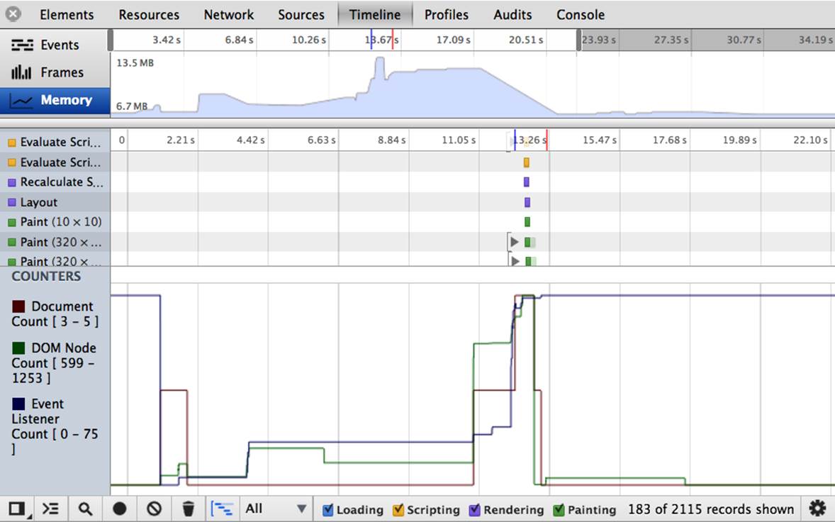
Figure 14-4. Google Chrome Timeline memory panel
If you’re lazy loading, there may be more downloading after the onLoad event. This is fine. The perceived download time, which generally falls between these two events, though closer to the onLoad event, is what is important. This is what scares away potential customers. The actual download time may be a bit longer, but your users don’t know that. Enable them to see your content and interact with it as fast as possible. If your social media icons and page footer lazy load “below the fold,” your users are unlikely to notice.
NOTE
If you choose to include social media icons, try using simple links to these services rather than utilizing the JavaScript APIs provided by the social media site. Many social widgets are performance hogs.
You can save the waterfall as a HAR JSON file for comparing page loads as you progress in optimizing your site.
The rest of the top section provides information on overall memory usage by the currently open site or application. You’ll note that the memory consumption generally increases as DOM nodes increase, and decrease with garbage collection.
The middle part on the main area of the panel lists all the events, including loading, scripts, rendering, and painting. Each entry provides information about the entry, such as the duration, CPU time, and the line of code that called the event. Each event shows the aggregate time of loading, scripting, rendering, and painting. In this way, you can inspect which events are negatively affecting performance.
The counter in the lower part of the main area provides statistics as to the number of DOM nodes, event listeners, and documents in the application at each moment in time.
Touching the DOM with a read or write is expensive in terms of performance. To improve performance, cache DOM lookups and store them in variables. Also, batch DOM queries and DOM manipulations separately, minimizing DOM manipulations by updating content fully outside of the DOM before updating the DOM.
When it comes to managing memory, image optimization, CSS rendering, and DOM node count are not the main points of concern. These are just points that have not necessarily been considered in the desktop space when focusing on performance.
UI Responsiveness
Mobile browsers are single threaded. In that respect, mobile browsers are similar to desktop browsers. There is, however, more to UI responsiveness on mobile than just being single threaded.
Touch Events
Because of latency, the browser may appear to hang after selecting an action because it can take a while for the round trip, to the server. It is important to provide user feedback within 200 ms after an action is taken, preferably sooner.
If you are showing or hiding an element, there’s no need to provide feedback, since the app will be responsive. However, provide feedback to indicate that your site is responding if your user has to wait for a round trip for a UI update. For example, disable the submit button with a disabled appearance on form submission to inform the user that the user interaction has been accepted. If an AJAX request is likely to take over 200 ms, provide a spinner, progress bar, or even an animated bouncing ball. Let your UX team determine what feedback makes sense, but make sure user feedback is provided while the user waits for the response to his or her interaction with your site.
In addition, because the mobile device is a touch device, and “double tap” is a potential user action, mobile devices actually wait for potential double taps before responding to touches. On most touch devices there is a default 300 ms to 500 ms wait after the touchend event before any action is taken. Because of this, you may want to co-opt default events like the tap by adding an event listener to the touchend event to make your application more responsive.
NOTE
When adding touch events, do not remove click events: you want your site to work no matter how your user chooses to interact with it (whether with their fingers, mouse, or other method).
The delay to wait for a possible double tap is not true for all scenarios.[98] In Chrome and Firefox, if zooming is disabled, there is no delay. Just because you can avoid this delay by preventing zooming with a meta tag does not make it good user experience: don’t prevent zooming unless you have a very valid reason that you need to do so, such as interactive games.
Animation
Because the Web is single threaded, and JavaScript takes precedence over CSS animations in that thread, always use CSS instead of JavaScript for nonvital animations.
Because CSS animation has lower precedence, animations will not start until the page is loaded, as the UI thread is busy parsing scripts and rendering. Although the animation may not start, the animation-delay counter does not wait for page load. If you have many animations starting after varying delays, you may note that several animations may begin simultaneously on page load as the elements with an animation delay shorter than the time for page load all start at the same time.
As noted earlier, the smoothest animations animate at 60 frames per second on most devices. To animate at that rate means the page has 16.67 ms to perform all calculations and repaints. For animation to appear smooth, the animation must calculate and repaint the nodes in less than 16.67 ms for the animation to not appear janky.
In Conclusion
This is not an exhaustive list of topics to consider in ensuring good mobile UI performance, but should be a good start. With mobile and desktop browsers updating at a very rapid clip, the topics covered here are likely no longer fully up to date. However, the recommendations are all best practices. While there may be new best practices, and some of the issues mentioned may be resolved, following the recommendations given here will likely be best practices for the foreseeable future.
Remember that mobile is the fastest increasing segment of our users. Don’t ignore them. These recommendations are easy to implement, and don’t harm desktop browsers. So I encourage including the recommendations on all your sites even if your mobile visitor rate is negligible. After all, you never know if your mobile visitor rate is so low because your audience doesn’t do mobile (unlikely) or because your mobile user experience is bad (more likely).
As developers, we’ve tested our websites to make sure we’ve followed the points and goals recommended by Yahoo!’s YSlow and Google’s PageSpeed. We’ve tested and tested using our desktop browsers. We’ve assumed the web performance optimization guidelines improves web application performance for all browsers, whether our users are accessing the site on their laptop, iPad, Android phone, or even their Wii. And to a great extent, it does. But remember that the well known and heeded optimization guidelines aren’t our only concern when it comes to mobile.
Continue testing your website, but make sure to test on mobile devices. Emulators are not simulators. The emulator does not simulate memory constraints and does not simulate the device with 100 apps open. Test with memory and bandwidth capped. Test on real devices in real scenarios: turn off the WiFi and test with many, many unclosed apps hanging in the background. Test. Test. Test.
[90] “Who Killed My Battery?: Analyzing Mobile Browser Energy Consumption.” Narendran Thiagarajan, Gaurav Aggarwal, Angela Nicoara, Dan Boneh, and Jatinder Pal Singh. http://mobisocial.stanford.edu/papers/boneh-www2012.pdf, page 41–50. ACM (2012).
[91] classList is supported mobile browsers, with support starting with IE10, Android 3, iOS 5.
[92] http://mobisocial.stanford.edu/papers/boneh-www2012.pdf
[93] See http://www.igvita.com/2012/07/19/latency-the-new-web-performance-bottleneck/.
[94] See http://davidbcalhoun.com/2011/when-to-base64-encode-images-and-when-not-to.
[95] Compass, the CSS authoring framework, has an inline helper to automate data URIs. There are many such resources available.
[96] Support for displaying only sections of images is in the works, but is not supported yet.
[97] Many people hate CSS. They’re wrong!
[98] Currently, preventing zoom in limited browsers is the only reason touch browsers don’t wait for a possible second tap. This may be expanded in the future.
All materials on the site are licensed Creative Commons Attribution-Sharealike 3.0 Unported CC BY-SA 3.0 & GNU Free Documentation License (GFDL)
If you are the copyright holder of any material contained on our site and intend to remove it, please contact our site administrator for approval.
© 2016-2026 All site design rights belong to S.Y.A.