Mobile HTML5 (2013)
Chapter 4. HTML5 Web Forms
If you’re a web geek like me, perhaps the coolest new features of HTML5 are the new form features. Yes, Canvas is fabulous. SVG is wonderful. JavaScript APIs provide for targeting DOM nodes with selectors; matching with media queries; and easily adding, removing, and toggling class names all without needing to include a JS framework (if you don’t believe me, wait; we’ll cover these topics later). CSS3 enables quick prototyping of any designer’s whimsy. So, why are HTML5 forms my favorite? Because HTML5 web forms provide enhanced usability and reduced reliance on JavaScript validation.
With HTML5, we are able to do form validation and several other tricks in a more declarative way. HTML5 allows developers to provide enhanced form usability features such as validation and error messaging without JavaScript. Reduced reliance on JavaScript can reduce development and maintenance time, making our lives much easier.
For example, instead of adding a setFocus() method on onload to provide focus to a form element, we now have an autofocus attribute (which you still shouldn’t use).[30] Instead of providing multiple JavaScript functions to require, validate, and provide focus on error to email addresses, HTML5 web forms enable labeling form controls as required, provides native validation of multiple input types (both standard types like email format, and formats the developer can define with regular expressions), and provides useful error messaging for the user as to what the error was.
In the past, we’ve been adding a plethora of attributes and event handlers to our form elements. With default values and behaviors provided by HTML5, when universally supported and used, we might just be able to write <form>!
Before, we were very limited with what type of data we could specify. The type attribute of the <input> element was limited—with 'text' used for most data entry form fields no matter what type of data was expected—showing the QWERTY keypad for data entry on mobile devices. With HTML5 web forms, we can tell the browser what data types to accept, dictate the data entry patterns that are acceptable, and provide suggestions or tips to the user. Mobile browsers are providing improved HTML5 web form support, including displaying relevant virtual keyboards based on expected input type (like a phone keypad if the input type expects a phone number), and enhanced UI features, like calendars and color pickers.
Before HTML5, developers used CSS for appearance, JavaScript for validation, and backend code for ensuring a required element was completed. While you should definitely continue separating the three concerns and always validate user data on the backend, with HTML5 we will eventually be able to omit the frontend JavaScript layer, or at least simplify it greatly.
With HTML5, the browser can check that required elements are completed with the correct datatype, in the correct range, with the correct syntax, etc., preventing the form from submitting if data is incorrect. These features are über cool and are nearing full browser support. In this chapter, we’ll discuss all the new features and whether they are already or soon to be supported.
Mobile devices have been supporting some of the HTML5 web form features for a while, and other features are just beginning to get support. On most touch devices with virtual keyboards, browsers will present users with the correct minimal keyboard, showing the keypad most relevant to completing the web form input type. Other mobile browsers handle most of the new web form UI features and native validation. No matter what level of support mobile devices have the day you are coding your forms, you should definitely be using all of the HTML5 web form features, as all the features are progressive enhancements. Newer browsers will have advanced features, but even the oldest of mobile browsers from the mid-1990s would present your HTML5 form elements in an accessible manner.
To indicate that a form control expects a particular type of input, you can specify the types using the type attribute. Before, we were limited to a small group of input types and we had to jump through hoops to validate them client-side before allowing submission to the server. With HTML5, not only are we provided with more input types, but now we also have native validation of many datatypes. Soon, the thousands of JavaScript validation scripts we’ve programmed will be obsolete as we rely on the browser’s native form validation. Until we have full native support of the features described in the next section, we can fake support for all of them with minimal JavaScript. With a little JavaScript—and taking advantage of the new attributes and input types, while still using UI Selectors (see the section Styling to enhance usability), attribute selectors (seeChapter 7), and input-specific dynamic keyboards, we can improve usability in all modern browsers while HTML5 web form support improves.
Attributes of <input> (and Other Form Elements)
Before diving into the old and new input types, you should understand some of the new and old attributes of the <input> element.
The type Attribute
We just discussed the only required input attribute: the type attribute. Although required, it will work if omitted, defaulting to type="text":
<label>Phone: <input type="tel" name="phone"></label>
<label>Website: <input type="url" name="website"></label>
With HTML5, there are 23 possible values of the type attribute. They are covered in the section <input> Types and Attributes. Note that if a browser doesn’t support a new input type, the type defaults to the text type. These new types are an enhancement. Forms are fully accessible if the browser doesn’t understand the new types, so don’t wait for full browser support before implementing the new input types.
The required Attribute
To mark a form field as required, the required attribute can be used. When a user tries to submit a form, if a form field is required and is left empty or contains an invalid value, the form should not submit, and focus will move to the first invalid form element. Supporting browsers provide the user with an error message, such as “You have to specify a value” if left empty or “12-12 is not in the format this page requires” when the pattern is wrong (the pattern attribute is described ), or other similar message.
The required attribute is valid on any input type except buttons, range, color, and hidden:
<label>Email: <input type="email" name="email" required="required" /></label> 
<label>Phone: <input type="tel" name="phone" required /></label>
The syntax is either simply required or required="required" if you are coding with strict XHTML syntax.
Form elements with no value selected do not need to match the appropriate format expected for their type unless they are required controls. An email type with no value selected is empty, and therefore doesn’t need to match any email format. However, if the required attribute is present, it will stop submission for being empty or being of the wrong format.
NOTE
Pro Tip: Browsers that support the required attribute also support the :required and :invalid pseudoclasses. You can provide visual cues to the user to indicate which fields are required, indicating successful data entry with CSS:
input:focus:invalid {
background-color: #CCCCCC;
}
input:valid {
background-color: #00FF33;
}
input:required {
border: 2px solid #0066FF;
}
We discuss CSS3 UI selectors in Chapter 7.
NOTE
Accessibility Tip: For improved accessibility, whenever the required attribute is included, include the ARIA attribute: aria-required="true" (we discuss ARIA, or Accessible Rich Internet Applications, in Chapter 6):
<input type="tel" name="phone" required aria-required="true"/>
Minimum and Maximum Values: The min and max Attributes
To set the range of values that are allowed, the min and max attributes can be used.
The min and max attributes can be applied to the date/time inputs, number and range only. If the browser provides a UI widget for the input type, it disables selecting a value outside the min/max range by not showing values below and above the allowable range set by the min and maxattributes.
On browsers that fully support the number input type, the browser displays a spinner that is limited in range, and will go down to the min and up to the max values. In UIs that provide for free form data entry, like the number input type, if the form element is required, the form will not submit if the value is outside of the range set by min and/or max in supporting browsers.
In the range input type, the leftmost value will be set to the min value and the right value will be set to max if it is larger than min. These attribute features will be discussed with the number and range input types in the next section.
Minimum and maximum values have often been incorporated into form validation, which makes these attributes very helpful for web developers. For example, if you’re writing a reservation system, you already know what times you have available to seat people. You can encode this information in the page’s form itself, so the user never ends up submitting an invalid time, avoiding the dreaded error message. Instead, the page already knows when the available slots are, and only lets the user select a valid time:
<label>Reservation Time:
<input type="time" min="17:00" max="22:00" name="dinner" required>
</label>
In the online restaurant reservation system example, you serve dinner starting at 5:00 p.m., with your last seating at 10:00 p.m. In supporting browsers, without any JavaScript, you can ensure that your system only accepts reservations during those hours.
The step Attribute
The step attribute is implicitly included in date/time input types, range and number, but can also be explicitly defined on those input types. For example, if you have a five-and-dime store, where every price is divisible by 5, and the maximum price is $1.00, you can include the following in your price-setting GUI:
<p>
<label for="cost">Price </label>
<input type="number" min="5" max="100" step="5" name="cost" id="cost"/>
</p>
If the UI provides a widget, such as the range slider, moving the slider will increment the value by the value of the step attribute. Similarly, the number type’s spinner will increase and decrease by the value of the step.
In UIs that provide for freeform data entry, like the number input type, supporting browsers will not submit the form if the value is not a valid step greater than the minimum value. For example, in the preceding example, 7 would not be valid. Had the minimum been 2 and the step 5 (as in the following code sample), 7 would have been valid, but 100 would not have been:
<p>
<label for="cost">Price </label>
<input type="number" min="2" max="100" step="5" name="cost" id="cost" required/>
</p>
In the online chapter resources, the number, range, month, and time examples include examples using the step attribute.
NOTE
In the step examples, I used explicit labels with the for attribute. Prior to this, I employed implicit labels. The for attribute is explained later in this chapter.
The placeholder Attribute
Possibly the most common JavaScript form feature is including placeholder text inside a form control, providing a hint or instruction on expected datatypes. Originally on focus but now on data entry, the placeholder text disappears. On data deletion, if the input is empty, the placeholder text reappears. User-agent stylesheets style the placeholder text as background text so as to make it apparent that the form element is still empty. HTML5 provides us with this functionality natively with improved accessibility. The placeholder attribute does what our oft-coded, rarely accessible placeholder function used to do, greatly improving form accessibility without the need for JavaScript.
One difference between our inaccessible scripts and the accessible placeholder attribute is the placeholder text disappears on change rather than on focus. In most modern browsers, the placeholder text remains in place as long as no text has been entered into the input field.
The placeholder attribute is a short hint for the user about what data should be entered. If a long hint is needed, describe the input type in a title attribute or in text next to the <input> element, but not in place of the <label> or placeholder. To ensure that your forms are accessible, include labels for your form elements: <label>s, not <title>s or <placeholder>s, provide for form accessibility.
While the placeholder attribute is only relevant to the text, search, url, telephone, email, and password types, until all browsers correctly support date and color types, it makes sense to include a placeholder value so the user knows what format to enter, especially if thepattern attribute, described next, is included. We’ve included placeholder values in most of the chapter code examples and online chapter resources.
The :placeholder-shown UI pseudoclass has been added to the CSS Selectors Level 4 specification. When supported, this pseudoclass will enable the styling of <input> elements based on the presence, or lack of presence, of the placeholder text (see Appendix A):
input:placeholder-shown {}
input:not(:placeholder-shown) {}
NOTE
Include the attributes discussed in this chapter even if they aren’t fully supported in all browsers. Attributes that aren’t understood are ignored. These “ignored” attributes are still useful when used in conjunction with JavaScript to fake support for browsers.
You can use JavaScript to capture the contents of the unsupported attributes such as placeholder, min, max, pattern, and unsupported input types to polyfill support.
The pattern Attribute
The pattern attribute is supported wherever the placeholder attribute is allowed, which makes sense. The pattern attribute contains a JavaScript-style regular expression that the <input>’s value must match before the form can be submitted.
The pattern attribute allows for specifying a regular expression against which the control’s value is to be checked. The pattern attribute is currently case-sensitive and must be a complete match. The regular expression language used for this attribute is the same as that used in JavaScript, except that the pattern attribute must match the entire value, not just a subset. If you want to allow the user to add more characters than provided by your regular expression, add * at the end to allow for more characters.
Table 4-1 provides the very basics of regular expressions.
Table 4-1. Some of the metacharacters of regular expressions used in pattern matching for the value of the pattern attribute
|
Metacharacter |
Meaning |
|
? |
Match the preceding character 0 or 1 times only. |
|
* |
Match the preceding character 0 or more times. |
|
+ |
Match the previous character 1 or more times. |
|
{n} |
Match the preceding character n times exactly. |
|
{n,m} |
Match the preceding character at least n times but not more than m times. |
|
[] |
Match anything inside the square brackets for one character position once and only once. [123] will match 1, 2, or 3. |
|
[n-m] |
The dash inside square brackets is the range separator and allows us to define a range; [123] could be written [1-3]. |
|
[^n-m] |
The caret inside the brackets is a negation character, and will match any character except n through m. |
|
\d |
Match any digit. Equivalent to [0-9]. |
|
\D |
Match any nondigit character. Equivalent to [^0-9]. |
|
\s |
Match any whitespace characters (space, tab, etc.). |
|
\S |
Match any nonwhitespace character. |
|
\w |
Match any letter or number. Equivalent to [0-9A-Za-z]. |
|
\W |
Match any character that is not a letter or number. Equivalent to [^0-9A-Za-z]. |
|
() |
Parentheses can be used to group (or bind) parts of the expression together. |
|
| |
The vertical bar or pipe means find the lefthand or righthand values: gr(a|e)y will find “gray” or “grey.” |
Note that explaining regular expressions is beyond the scope of this book, but several code examples in the online chapter resources have regular expressions that you can learn from. Just realize that if you make a mistake (if your pattern is not a valid regular expression), it will be ignored for the purposes of validation, as if it were not specified.
When including a pattern, it’s good practice to include a title attribute to give a description of the pattern. To use our color pattern and credit card number examples:
<label for="col"> Color: </label>
<input pattern="#[0-9A-Fa-f]{6}"
name="col" type="color" placeholder="#ffffff "
id="col" title="A hash sign followed by 6 hexadecimal digits"/>
<label for="cc"> Credit Card: </label>
<input type="text" pattern="[0-9]{13,16}"
name="cc" id="cc" title="13 to 16 digit credit card number"
placeholder="credit card #"/>
Some mobile browsers support the color input type, providing a color widget for color selection. This is covered later in the chapter. Other browsers support the pattern attribute, but have yet to support the color input type. While we wait for full support, we can employ the patternattribute, as shown in the preceding code, to require the correct input format in these semi-supporting browers.
In supporting browsers, if the user’s input does not match the pattern provided via the pattern attribute, the form will not submit and the browser will put focus on the first invalid input type, providing a validation error message, as shown in Figure 4-1, in browsers that already support native validation.
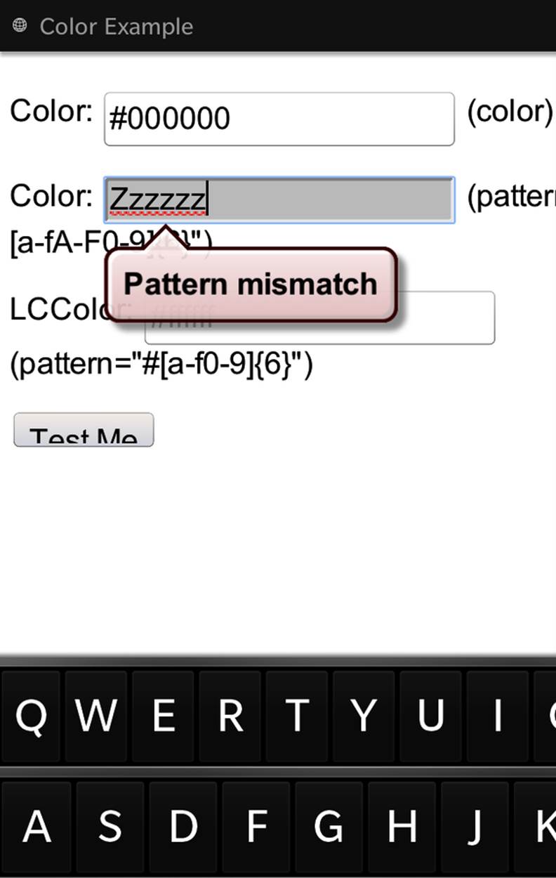
Figure 4-1. Native validation displays an error message when a pattern mismatch occurs (BlackBerry 10)
NOTE
CSS Tip: Use the :invalid pseudoclass to target elements for styling that have content that does not match the pattern attribute, or is otherwise invalid. The :valid pseudoclass will match when the content matches the pattern, or is otherwise a valid entry.
The readonly Attribute
This readonly attribute, when present, makes a form control not editable. The attribute applies to text, password, email, URL, date/time, and number input types, as well as the <textarea> element. It does not apply to radio buttons, checkboxes, file upload controls, range controls, select elements, or any of the button types, since they are not editable anyhow. It’s not a new attribute, so it is supported in all browsers, including older versions of IE. The readonly attribute is Boolean, so can be written either of these two ways:
<input type="text" value="Not Editable" readonly/>
<input type="text" value="Not Editable" readonly="readonly"/>
The disabled Attribute
The disabled attribute disables a form element. It can be applied to any form control except the <output> element. In HTML 4, the disabled attribute did not apply to the <fieldset> element. Now, when applied to a <fieldset> element, it overrides the disabled attributes of any child form controls, even if they are part of a different form (see the section The form Attribute). In other words, a form control will be disabled if it has its disabled attribute set, or if it has a parent <fieldset> that has its disabled attribute set.
NOTE
CSS Tip: Use the :disabled pseudoclass to target disabled elements for styling.
So, what is the difference between readonly and disabled? Neither can be modified, but the readonly attribute can be tabbed to and is submitted along with the form. The disabled form control cannot receive focus, nor is it submitted with the form.
The maxlength Attribute
The maxlength attribute applies to text, password, url, search, telephone, and email input types, and <textarea> elements, but not to date/time or number input types. In HTML 4, this attribute only applied to the text and password types.
While you can include maxlength on email and URLs, I generally recommend that you don’t use maxlength unless necessary for a compelling reason. While supported in all browsers, why should the user interface be allowed to determine that an email address or URL is too long? Understandably used for security reasons and if there are real character limits, for good user experience you should consider the consequences before adding this attribute. Even Twitter doesn’t use it, as users want to enter more than 140 characters sometimes, and then omit words or delete characters where they can to fit into the 140-character limit.
The size Attribute
The size attribute is another older attribute. It historically had two functions: to define the number of options meant to be shown by a form control like a <select>, and to define the number of characters to display in a form control by controlling the width of the control. The size attribute of the <input> element should be deprecated in favor of using CSS to specify the layout of the form.
The size attribute was actually deprecated for a time, but was put back into the draft HTML5 specifications. The size attribute does not determine how many characters can be entered (use maxlength instead) or how many options can be selected (use multiple instead).
The form Attribute
New in HTML5, form controls don’t have to be nested within a form. The new form attribute allows a form element to be associated with any form on the page. They can also be nested in one form but submitted with another.
A form control can have a form attribute with the id of the <form> with which the form control is associated. In this way, you can put form controls anywhere on a page, including outside of the form with which it should be submitted.
This is a bit complex to explain, so let’s take a look at an example:
<form id="form1">
<!-- all nested form content here -->
</form>
<p>
<label for="userid">User ID</label>
<input type="text" id="userid" name="user" form="form1"/>
</p>
The #userid <input> is not a descendant of #form1. In previous versions of HTML, the name and value of #userid would not be sent with the form upon form submission. In browsers that support the HTML5 form attribute, because the id of the form is included as the value of the#userid form attribute, when #form1 is submitted, #userid will be sent along with the form even though it is not a descendant of the form.
Before HTML5 web forms, form controls had to be nested within an ancestor <form>. With HTML5, form controls and fieldsets are associated with the forms given in their form attribute, or, if they don’t have one, with the nearest ancestor <form>.
WARNING
Note that an empty string, form="", will disassociate the element from all forms, even the form for which the form element is a descendant, which can have unintended consequences. Generally, you will want to use removeAttribute('form') rather than setAttribute('form', ''); to avoid disassociating a form field from the <form> element in which it is nested.
The autocomplete Attribute
Autocompletion is a native feature in many browsers.[31] When a browser enables autocomplete functionality, it may store the value entered by the user so that if the user returns to the page, the browser can pre-fill the form. The autocomplete attribute is the method by which the site author (you) can suggest to the user agent that you do or don’t want the autocomplete feature turned on for a particular form field. autocomplete takes one of three values: on, off, or default. The on keyword will map to the on state, and the off keyword maps to the off state.
The off state indicates that the form control’s data is sensitive, like a password, or that it will never be reused, like a CAPTCHA. The user will have to enter the data each time, and the browser should not pre-fill the value. Conversely, the on state indicates that the user can expect to be able to rely on their browser to remember previously entered values for that control. Omitting the value puts the form control in the default state, which means the form control should have the same autocomplete value of the form it is associated with:
<p>Login: </p>
<p>
<label for="user">Username: </label>
<input type="text" name="user" id="user" autocomplete="on"/>
</p>
<p>
<label for="pwd"> Password:</label>
<input type="password" name="pwd" id="pwd" autocomplete="off"/>
</p>
The autofocus Attribute
The autofocus attribute specifies that the form control should have focus when the page loads. Only one form element can have autofocus in any given page. The Boolean autofocus attribute can be included in a single <input> (except type hidden), <button>, <select>, or<textarea> per page. If more than one element is assigned the autofocus attribute, the last element with the autofocus attribute set will get focus.
As mentioned earlier, for usability and accessibility reasons, I recommend against using the autofocus attribute. If you were using jQuery as an exact shim for the attribute, it would read:
$('[autofocus]').last().focus();
That line of code reads, “Find all the elements with the autofocus attribute, get the last one and give that focus.” This is likely not what you would want. For better usability, you want to highlight the first element, not the last, which is the opposite of what this does.
Note that focusing on a text field on onload is disabled in iOS because the keyboard will show up.
HTML5 has added a plethora of very useful input types and attributes. There are now 23 input types, and even more input attributes. As we’ve already seen, some attributes belong to only certain input types. Browsers that don’t support a specific input type attribute may still support other attributes in the <input>. A browser may support attributes on the text input type (such as maxlength or size), and will therefore support those attributes on a type it doesn’t support, as the input will default to text type. For example, as displayed previously, while not all browsers support the color input type, they all support the disabled attribute on all input types.
<input> Types and Attributes
There are now 23 values for input type. Some are old. Some are new in HTML5. We’ll cover them all.
Re-introduction to Input Types You Think You Know
Let’s first recap the input types we’ve been able to use prior to HTML5. While you may think “I’ve been coding HTML for years; I already know this stuff,” most developers haven’t really thought about all the different <input> types. This recap may be helpful even if you’re a pro.
NOTE
Pro Tip: Generally, you will want to style buttons differently than text and other input types. You can use attribute selectors to target form input fields based on their type value. This code snippet makes the borders of all input elements except those of input type submit have a dark gray border:
input:not([type=submit])){
border: 1px solid #666666;
}
We discuss attribute selectors and the :not pseudoclass in Chapter 8.
Text: <input type=“text”>
Displayed as a data entry box, the text input type, type="text", often called “text box” or “text field,” allows the user to input one line of text. This is also the default value for the required type attribute: if the type is omitted or not supported, it will default to text.
NOTE
text is the default value for the <input> element. If the type attribute is missing or the value is misspelled or unsupported, the browser will treat the input as type="text". This means that if a browser does not support a new HTML5 input type, it will display the default text type. So, feel free to use all the HTML5 input types even if you’re still supporting Netscape 4.7. In the worst case, your users will see text boxes.
The value attribute is optional. If included, the value of the value attribute will display inside the text box on page load. Only include a value for the value attribute if you are pre-filling a form for the user using data you would like to receive back.
Other attributes include name, disabled, form, maxlength, readonly, size, autocomplete, autofocus, list, pattern, required, and placeholder. The new attributes we discussed are what make the text input type so interesting and useful in HTML5:
<label for="username">Username</label>
<input type="text" name="username" id="username"/>
NOTE
It is not a good idea to include instructions as the value of the value attribute, as users most likely will submit the instructions you provided instead of filling out the form field. The values submitted on form submit will be whatever is contained in the input box at the time of submission. So, unless the form is pre-populated, do not include the value attribute. The placeholderattribute should be used to provide a hint, supplying the correct solution to this very old problem.
If you want to include instructions as the default value displayed in your text box, do so using the placeholder attribute.
As mentioned earlier, it is a good idea—generally good user experience—to pre-populate the text input boxes with values from a database if your user is registered, the information is available, and the information poses no security issues.
Password: <input type=“password”>
The password input type, type="password" or “password” field, is like the text field just described except the value entered by the user or the default value entered via the value attribute is obfuscated in the UI. Instead of displaying “pAssW0rd,” the user will see “••••••••.” Although hidden from the user interface, the password value is sent to the server as plain text.
NOTE
Note that if you’re requesting a user password, use the form’s POST method over SSL. While the password is obfuscated in the browser window, the password is sent to the server as plain text. If you were to use GET, the URL of your form confirmation page might read:
https://www.website.com/index.php?user=Estelle&password=pAssW0rd
When requesting a password in a form, use the form’s POST method over the HTTPS protocol. While using the POST method still submits the password value in plain text, it is sent behind the scenes so is not as blatant of a security risk:
<label for="password">Password</label>
<input type="password" name="password" id="password"/>
Also note that in WebKit you can make nonpassword types look like password input types with the CSS -webkit-text-security property. Set -webkit-text-security to circle, square, disc, or none to alter the presentation and control the appearance of the icons that are obfuscating the value entered by the user.
By default and for better usability with tiny smartphone keyboards, some mobile devices temporarily display the last character entered in a password field.
Checkbox: <input type=“checkbox”>
The checkbox input type, type="checkbox", better known as a “checkbox,” has as a default presentation a small square: with a checkmark if selected, empty if not selected, or a horizontal line through the middle if the state is indeterminate. Checkboxes are great for yes or no type answers, or when multiple answers can be checked: for example, you have either read and agree to the web form’s associated privacy policy or you haven’t and don’t. On a travel site, you may be willing to fly out of San José or San Francisco, but not Oakland.
Remember to always include a name and value for each of your checkboxes. On form submission, if a checkbox is checked, the name and value attribute values will be submitted as a name/value pair. Unchecked checkboxes are omitted from the data submitted by the form:
<input type="checkbox" name="remember" value="true">
<label for="remember">Remember me</label>
NOTE
Pro Tip: You can style checkboxes based on whether the checkbox is checked or not with the CSS :checked pseudoclass selector. In the following example, the label immediately following a checkbox will turn gray when the checkbox preceding it is checked:
input[type=checkbox]:checked + label {
color: #cccccc;
}
If that CSS doesn’t make sense to you, don’t worry! We discuss attribute selectors, the + adjacent sibling selector, and the :checked pseudoclass in Chapter 8.
Radio: <input type=“radio”>
The radio input type, type="radio", better known as a “radio button,” has as a default presentation a small circle: either filled if selected or empty if not selected.
Radio buttons are generally presented in groups of related values where only one value can be selected, such as multiple-choice questions that accept only one answer. If you have a multiple-choice question that can take more than one answer, use checkboxes. If you only have one option and not a group of buttons, use a checkbox instead of a radio button.
The various radio buttons presented in a related group should all have the same value for the name attribute and differing values for the value attribute. There are a few things to remember about radio buttons:
§ Only one radio button of a group of same named radio buttons can be selected.
§ Upon form submission, only the value of the value attribute of the selected radio button is sent to the server, along with the name. So, remember to include a unique value attribute for each radio button.
§ Users can select radio buttons, but cannot change their values.
§ A radio button can only be deselected by selecting another radio button in the same group. In other words, once a radio button in a same named group is selected, it is impossible to unselect all of the radio buttons in that group: you can click on a different radio button to deselect what was previously selected and select the new radio button instead. However, there is no way outside of JavaScript or resetting the form to bring it back to the state of no radio buttons in that group being selected.
<p>What is your favorite color (pick one):</p>
<ul>
<li>
<label>red:
<input type="radio" name="favoritecolor" value="red"/>
</label>
</li>
<li>
<label>green:
<input type="radio" name="favoritecolor" value="green"/>
</label>
</li>
<li>
<label>blue:
<input type="radio" name="favoritecolor" value="blue"/>
</label>
</li>
</ul>
Note that all of the radio buttons in this group have the same name value. name values should be identical for all radio buttons in a group. IDs, if included, must be unique.
NOTE
Note that we are using implicit labels in this example. For accessibility reasons, always include a label—whether implicit or explicit—for each input. For explicit labels, make the for attribute of the label match the id of the form element. <label> is detailed later in this chapter.
Submit: <input type=“submit”>
The submit input type, type="submit", more commonly known as a “submit button,” submits the form when clicked. The submit button sends the form data unless prevented by having the disabled attribute set or prevented with JavaScript by return false or preventDefault()on its event handler. When the disabled attribute is set, the “disabled” state has the disabled UI and is not clickable by the user. The JavaScript method of preventDefault() or return false does not change the appearance or the clickability:
<input type="submit" value="Submit this Form"/>
NOTE
Note that if included, the onsubmit event should be associated with the <form> element, not the submit button, as it is the form being submitted, not the button.
The default presentation of the submit input type is a button displaying the content of the value attribute, centered. If the name attribute is included, the name/value pair will be submitted along with the rest of the form on submit.
In HTML5, the submit button does not need to be contained within the <form> that it will be submitting. You can associate a form element with a <form> that is not its ancestor with the form attribute: form="id_of_form_to_submit" will submit the form indicated by the value of theform attribute.
And with our submit button, we have covered enough HTML to complete the CubeeDoo sign-in form:
<form>
<ul>
<li>
<label for="username">Username</label>
<input type="text" name="username" id="username"/>
</li>
<li>
<label for="password">Password</label>
<input type="password" name="password" id="password"/>
</li>
<li>
<input type="checkbox" name="remember" value="true"/>
<label for="remember">Remember me</label>
</li>
<li>
<input type="submit" name="submit" value="Sign in"/>
</li>
</ul>
</form>
Reset: <input type=“reset”>
The reset input type, type="reset", is better known as the “reset button.” The reset button restores the form data to the original default values unless prevented by the disabled attribute or through JavaScript. If included, the onreset event should be associated with the <form> element, not the reset button, as it is the form being reset, not the button.
Since accidentally clicking the reset button instead of the submit button on form completion is one of the most annoying user experiences, don’t include a reset button. If you must, place it relatively far from the submit button and far from where user experience design suggests thesubmit button should be located to help avoid accidental resets.
The reset button used to be popular, but you’ll almost never see it anymore due to the horrendous user experience of accidentally obliterating everything you entered:
<input type="reset" value="Reset this Form"/>
The only time that you really do want to use the reset button is if you have radio button groups that you want to enable the user to deselect.
The default presentation of the reset button is a button displaying the content of the value attribute. Unlike the submit button, the name/value pair of the reset button is not sent to the server on form submission.
File: <input type=“file”>
The file input type, type="file", is different from the other input types. Its purpose is to enable the user to upload, attach, or otherwise interact with a local file from their computer or network. The input of file type is disabled on iOS prior to 6.0 (on Safari for iPhone/iPad). Older versions of the iPhone, iPod, and iPad display the input file type as disabled. The file type is also disabled on IE10 on Windows Phone 8, but enabled on Windows 8 RT for tablets.
Most browsers allow for only limited, if any, styling of the input box and button, and don’t allow for styling or text changes of the associated browse/choose button. However, browsers are now beginning to expose the shadow DOM. It is actually possible to style the form elements, including the file input type in some browsers:
input[type="file"] {
/* Style of "choose file" text here */
}
input[type="file"]::-webkit-file-upload-button {
/* style the choose file button here */
}
The file input type’s attributes can include name, disabled, accept, autofocus, multiple, required, and capture. If a value is included, it is ignored.
The accept attribute may be used to specify a comma-separated list of content types that a server processing the form will handle correctly. The file input type doesn’t have the min or max attributes to set the number of files that must be uploaded, but logically it defaults to 0 and 1 respectively, with the ability to overwrite by including the multiple attribute.
In some mobile browsers the accept attribute allows for accessing the camera, microphone, and camcorder on some devices:
<input type="file" name="image" accept="image/*;capture=camera">
<input type="file" name="video" accept="video/*;capture=camcorder">
<input type="file" name="audio" accept="audio/*;capture=microphone">
These are not universally supported, but will work in some browsers, including Android 3.0 browser, Chrome for Android (0.16), FF Mobile 10.0, and Opera Mobile 14.
The specifications have recently been modified.[32] The capture component that used to be part of the accept attribute is now a seperate Boolean attribute. The preceding code has become the following:
<input type="file" name="image" accept="image/*" capture>
<input type="file" name="video" accept="video/*" capture>
<input type="file" name="audio" accept="audio/*" capture>
It is up to the device to decide on which supported media capture mechanism to use, or to act as if no capture attribute had been included if there is no appropriate capture control mechanism available.
Hidden: <input type=“hidden”>
The hidden input type, type="hidden", only needs three attributes: type="hidden", name="somename", and value="some value". The hidden type is not displayed to the user, but rather is used to communicate information to the server. hidden types are often used to maintain session IDs, user IP addresses, or data garnered from previous pages of a multipage form.
Many developers also take advantage of the hidden type to maintain state or otherwise help handle their frontend JavaScript voodoo. HTML5 provides us with alternative options like <output> and localStorage, and good old-fashioned cookies that can make this misuse of hidden types obsolete. I say “misuse” since you only want to use hidden types for name/value pairs that you want to send to the server.
Image: <input type=“image”>
The image type input, type="image", is similar to the submit type in behavior, and takes all the <img> attributes, namely src and alt. If the value and name attributes are included, the name/value pair of the image button will be submitted along with the form.
If you are looking to take a picture or upload a picture, see the section File: <input type=“file”>.
Button: <input type=“button”>
The button input type, type="button", referred to as “button,” does absolutely nothing without event handlers, and therefore should generally only be added to the form with JavaScript as progressive enhancement. The default presentation of the button is a button displaying the content of the value attribute:
<input type="button" value="I do nothing"/>
NOTE
Many people confuse the button input type with the <button> element, which is more easily styled than the input of type="button", and can actually do something, like submit or reset the form, without JavaScript. Use input type="button" if you want to match a form control with the appearance of a submit button. Otherwise, you’ll generally want to use <button>instead, as it is more readily styled.
Styling Input Types
Each browser provides default styling to the various form elements. In WebKit and Mozilla browsers, we can affect the default appearances with the not yet standard appearance property. The vendor prefixes -webkit-appearance and -moz-appearance enable us to change the appearance of buttons and other controls to resemble native controls, and provide us with a better ability to override default appearance of form controls.
There are too many supported values for appearance to mention them all. Just realize that any feature for which the user agent presents a default UI, from checkboxes to buttons to ranges, the default stylesheet will include appearance values such as checkbox, button, and slider-horizontal (nesting a shadow DOM <div> with sliderthumb-horizontal). You can control appearance values with CSS.
Resources on the various values of the appearance property can be found in the online chapter resources.
New Values for <input> Type
Now comes the cool stuff!
In the past, we were using the text input type for everything: dates, email addresses, phone numbers, and URLs. Then we had to validate client-side before sending to the server. No more! (Well, “no more” when HTML5 is fully supported and you implement everything you’ve learned in this chapter.) The <input> element has been greatly expanded. HTML5 defines 13 new values for the type attribute of the HTML <input> element:
§ search
§ tel
§ url
§ datetime
§ date
§ month
§ week
§ time
§ datetime-local
§ number
§ range
§ color
Mobile and desktop browser support for HTML5 forms has greatly improved. Just like with radio, checkbox, and button input types, the graphical representation of these new input types will often reflect the type. In addition, if the browser is on a touch device with a dynamic UI keyboard (rather than a physical keyboard), the keyboard provided will reflect the input type.
For example, when on phones with dynamic keyboards like the BlackBerry 10, if the type is tel, when the user gives focus to the input, the telephone keypad is displayed instead of the full keyboard, as shown later in Figure 4-4.
NOTE
Most browsers support the user interface :invalid pseudoclass CSS selector. Instead of (or in addition to) using JavaScript to do client-side validation and error messaging, you can indicate invalid input values with CSS:
input:focus:invalid {background-color: #CCCCCC;}
Email: <input type=“email”>
The email type displays similar to a text field, and is used for specifying an email address.
On a touchscreen, focusing on this element will bring up a keyboard optimized for email address entry. The email type has been supported on the iPhone since iOS 3.1, providing a keyboard with A–Z, @, period, and a button reading _123 that leads to a modified numeric keyboard, as seen in Figure 4-2:
<p>
<label for="email">Email: </label>
<input id="email" type="email" name="email"
placeholder="name@domain.com" required multiple/>
</p>
The email input type supports the Boolean multiple attribute, allowing for multiple, comma-separated email addresses.
NOTE
To include more than one address, separate email addresses with a single comma, or a comma and space(s).
Other attributes the email input type should support according to the current draft of the spec include name, disabled, form, autocomplete, autofocus, list, maxlength, pattern, readonly, required, size, and placeholder. There are examples in the online chapter resources.
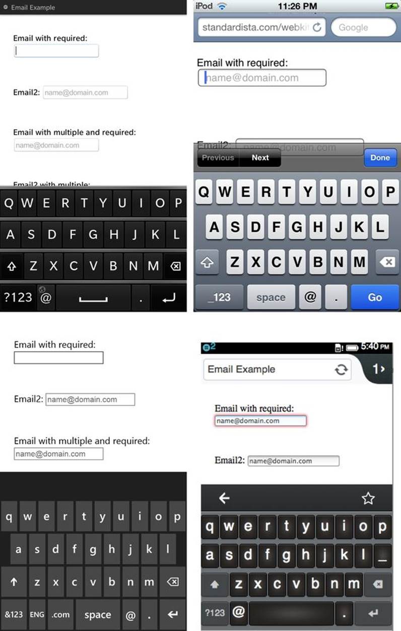
Figure 4-2. An email field in a form with dynamic keyboards on Blackberry 10, iPod, Windows Phone, and Firefox OS
URL: <input type=“url”>
Like the email type, the url type displays similar to a text field, and is used for specifying a web address. On a touchscreen, focusing on this element will bring up a keyboard optimized for web address entry on many devices. On iOS devices, the url type provides the smartphone user with a keyboard with A–Z, period, forward slash, and “.com,” but no colon, as shown in Figure 4-3. The BlackBerry is similar, but with no slash, and no colon either.
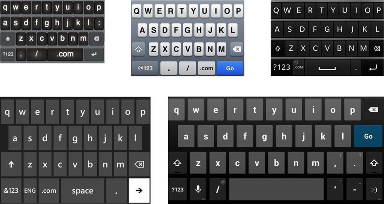
Figure 4-3. Dynamic keyboards for the URL input on Firefox OS, iPod, Blackberry 10, Windows Phone and Chrome on an Android tablet
Browsers supporting the url input type report the input as valid if the URL begins with an Internet Protocol, any Internet Protocol—even made-up ones like Q:. (Q:// works just as well as ftp://.) A web address without a protocol, like www.yahoo.com, will not validate.
Browsers currently do not check the actual URL, as the HTML5 specifications suggest, because there is no code to check for a valid URI/IRI according to the current URL specifications. A bug has been reported for the W3C on this. In the meantime, at least we get a slightly more relevant keyboard (Figure 4-3), though they really should add the colon in the default keyboard state.
To allow only specific protocols, you can employ the pattern attribute:
<p>
<label for="url">Web Address: </label>
<input id="url" type="url"
pattern="^(http|https|ftp)\://[a-zA-Z0-9\-\.]+\.[a-zA-Z]*"
placeholder="http://www.domain.com" required />
</p>
Telephone: <input type=“tel”>
tel is short for telephone. Unlike the url and email types, the tel type does not enforce a particular syntax or pattern. Letters and numbers, or any noncarriage return characters for that matter, are valid. Different countries have different types of valid phone numbers. Different systems prefer different ways of writing the number. For example, in the United States, +1(415)555-1212 is just as well understood as 415.555.1212.
So, why have a tel input type? The default keyboard displayed for the tel input type is a telephone keypad, as shown in Figure 4-4. Use the best input type for the data type you want: your users will thank you for it!
You can encourage a particular phone format by including a placeholder with the preferred syntax and a comment after the form field with an example. You can require a format by using the pattern attribute and you can use the setCustomValidity() method (see the section Form Validation) to provide for custom error messaging during client-side validation:
<p>
<label for="tel">Telephone: </label>
<input id="tel" type="tel" placeholder="XXX-XXX-XXXX"
pattern="[0-9]{3}-[0-9]{3}-[0-9]{4}" required />
</p>
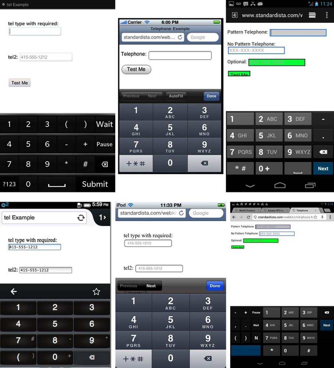
Figure 4-4. The telephone input type and associated keypads
Number: <input type=“number”>
The number type provides a text field for specifying a number. When supported on a touch pad, focusing on an input element of type number will bring up a number pad keyboard like the ones shown in Figure 4-5. The attributes of min, max, and step can be included.
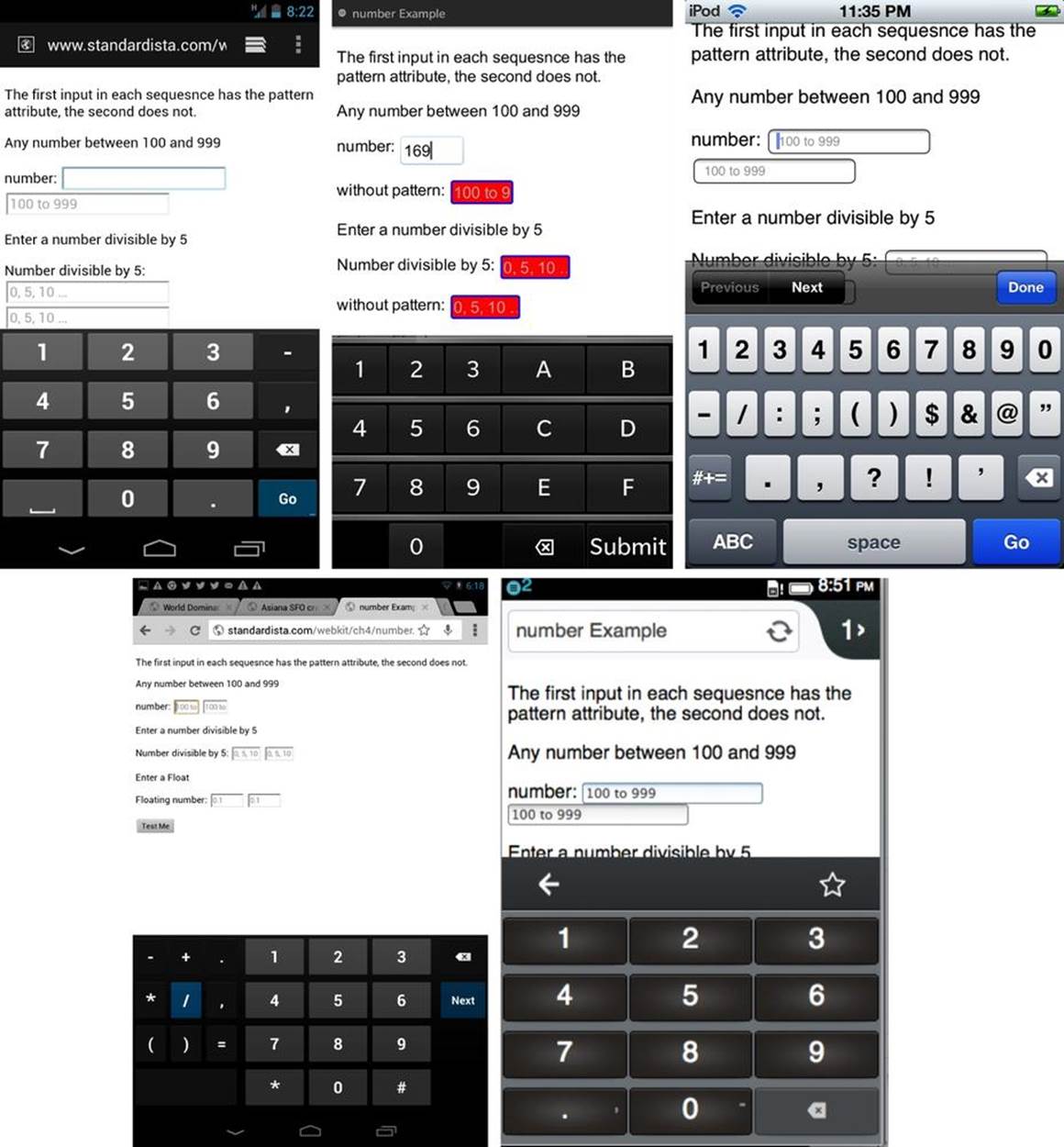
Figure 4-5. Entering numbers into a numeric form field
The min attribute is the minimum value allowed. The max attribute value is the maximum value allowed. The step attribute indicates the step between available values. The default step value is 1, allowing for floats if the min, max, or step attributes have a float set as a value.
The user interface of desktop browsers that fully support this feature provide for incrementing or decrementing the counter without keyboard entry. This spinner is not yet seen on mobile browsers. Even when the number input type provides a spinner UI with up and down arrows, it also accepts freeform keyboard data entry. When using the spinner (currently only supported in some desktop browsers), clicking or touching the arrows steps the number up or down by the value of step, displaying only valid values. If the form element is a required field, the form will not submit if there is a nonvalid entry. Invalid entries include a nonnumber, a number less than the min or greater than the max, or an invalid number of steps above the min. Instead, when an attempt is made to submit the form, the incorrect value gets focus:
<input type="number" min="0" step="5">
To be valid, the value must be a number equal to min + n * step where n is any integer value with a result within the min/max range. For example, if min=2, max=10, and step=5, 7 is valid and 10 is not:
<p>Any number between 100 and 999</p>
<p>
<label for="number">number: </label>
<input id="number" type="number" placeholder="100 to 999"
pattern="[1-9][0-9]{2}" min="100" max="999" required />
</p>
<p>Enter a number between 0 and 1,000 that is divisible by 5</p>
<p>
<label for="even">Number divisible by 5: </label>
<input id="even" type="number" placeholder="0, 5, 10 …"
pattern="[0-9]*[05]" min="0" max="1000" step="5" required />
</p>
<p>Enter a positive Float less than 10.0</p>
<p>
<label for="float">Floating number: </label>
<input id="float" type="number" placeholder="0.1"
pattern="[0-9](?\.[0-9])?" min="0.1" max="9.9" step="0.1"/>
</p>
With the new HTML5 form input types, we also get new APIs. For the step attribute, we have the stepUp() and stepDown() methods:
input.stepUp(x)
input.stepDown(x)
These two methods change the form control’s value by the value given in the step attribute, multiplied by x, or 1 if no parameter is passed, within the values provided by the min and max attributes.
The pattern attribute is not supported in the number type, but I have included it as it is more widely supported than the number input type. The pattern attribute can be considered a graceful degradation for browsers that support the pattern attribute but don’t fully support an input type.[33]
If a browser supports the number type, that supersedes the pattern. A pattern of pattern="[0-9]*" or pattern="\d+|\d+\.\d+" is almost equivalent to the number type, though matching the ability to have min, max, and step can lead to an unwieldy regular expression.
Range: <input type=“range”>
The range input type displays as a slider, like those in Figure 4-6, that lets the user drag or tap along its length to select a value. As with the number type, its minimum value is set with the min attribute, its maximum value with the max attribute, and its discrete step size with the stepattribute. While the range input type has been around since Safari 2.0, only with the release of Safari 5 have min, max, and step been fully supported, so it is finally usable in mobile WebKit. Opera, Blackberry, IE10, and Chrome support range as well. Mobile Firefox began to supportrange with version 23. Android has partial support.
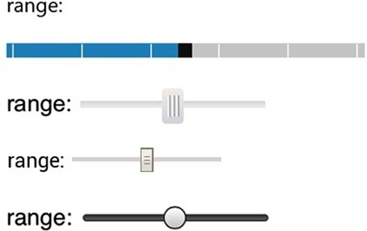
Figure 4-6. Sliders created by a range control on Windows Phone, Blackberry 10, iPhone, and Chrome
The default value of the slider is the midpoint between the minimum and the maximum. You can change where the thumb lands on the slider with the value attribute. If the range is 20 to 30, the default value will be 25. If you don’t set a min, max, or step, they’ll default to 0, 100, and 1, respectively. As there is a default value, when supported, a range input type always returns a value.
One question I get is: “Can you make the slider vertical instead of horizontal?” The answer is: “Yes, in some browsers.” The way to do it in WebKit is:
input[type=range]{-webkit-appearance: slider-vertical;}
You can also declare a height that is a larger value than the width, which will create a vertical range in older Presto-based versions of Opera.
Search: <input type=“search”>
Input type search provides for a search field. While the specifications don’t mandate a particular UI for new form types, the search field often looks like a round-cornered text box. In many browsers, though not all, when the search is nonempty, a search-cancel-button appears in the right of the box that, when clicked, clears the field, as shown in Figure 4-7.
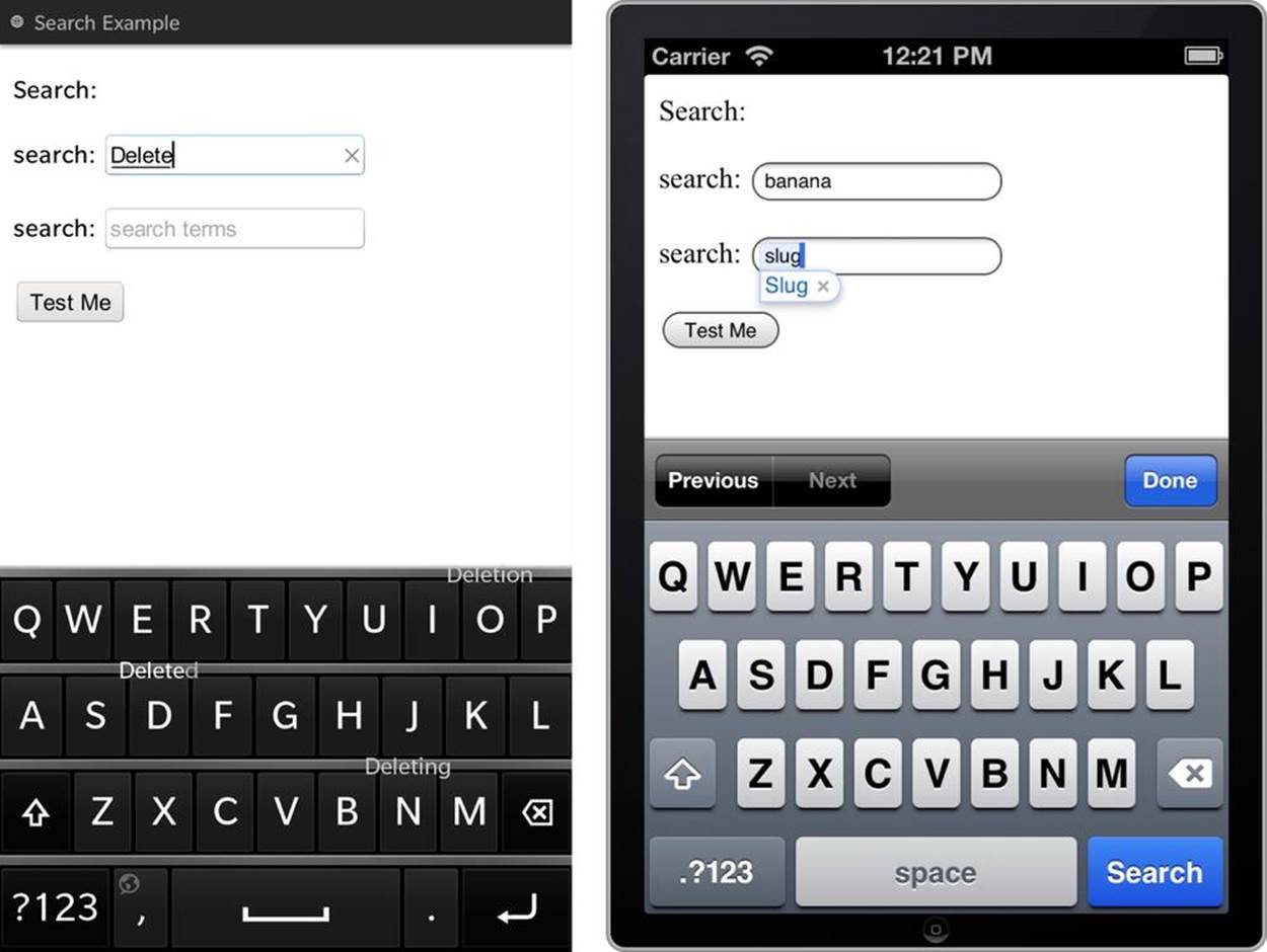
Figure 4-7. The search input type on Blackberry 10 (note the delete icon in the filled out search field) and iOS 6.1 (note the “search” key)
Some devices will display a keyboard with the word “search” or the magnifying glass where the “go” or “enter” button normally is on the keyboard field.
Color: <input type=“color”>
When fully supported, the color input type displays a color picker widget, such as the “color well” shown in Figure 4-8. The color input type, like all new input types, will display as a regular text box when not fully supported. The values of selected colors are submitted in lowercase hexadecimal color format. The default value of color pickers is #000000, which means, when supported, a color input type always returns a value.
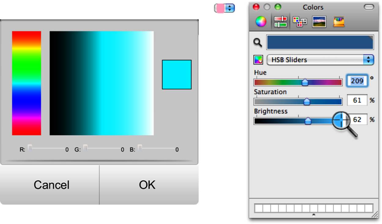
Figure 4-8. Color picker on the BlackBerry 10 and in Opera on Mac
For a while, some browsers supported named colors, such as “indianred.” Named colors support is not in the specifications and support has been removed.
Native color picker UI interfaces in supporting browsers are nifty but not ubiquitous yet. To “fake” support for hex color values, only accept values that match the regular expression #[a-zA-Z0-9]{6} by using the pattern attribute with a placeholder indicating that hexadecimal color values are required. Neither of these attributes is supported by the color input type as per the specifications, but they are simply ignored in browsers that fully support the color input type:
<label for="clr">Color: </label>
<input id="clr" name="clr" type="color" placeholder="#000000"
pattern="#[0-9A-Fa-f]{6}" required />
Date and Time Input Types
There are several new date and time input types including date, datetime, datetime-local, month, time, and week. All times are based on ISO 8601 dates. Supporting browsers provide interactive widgets replicative of the device’s native calendar widget. All of the date/time types have a code sample in the online chapter resources. The value for date is better supported across browsers than any of the other date and time input types.
Date: <input type=“date”>
The date input type provides a date with year, month, and day (no time or day or time zone). The expected user interface presentation is a date control. When supported, the browser provides a calendar control.
Different cultures write their dates differently. While some browser controls put the month first and others put the day first, the date gets converted to the same syntax of YYYY-MM-DD before getting sent to the server:
<p>
<label for="date">Date: </label>
<input id="date" name="date" type="date"
placeholder="YYYY-MM-DD" required />
</p>
<p>
<label for="dob">Date of Birth: </label>
<input id="dob" name="dob" type="date"
placeholder="YYYY-MM-DD" min="1900-01-01" required />
<p>
Until date is supported in all browsers, you can use pattern matching. However, if pattern matching is relied upon, the users won’t get a native calendar widget. Also, you might want to use JavaScript validation to account for leap years and the like, as a regular expression for dates is kind of horrific.
Supporting browsers, as shown in Figure 4-9, provide a date picker and don’t allow direct data entry, ensuring the user submits a valid date (perhaps not the correct date, but a valid date).
The date type is the full date, with no time or time zone. This is the best supported of the various date/time input types. We’ll cover the others briefly for when they are supported.
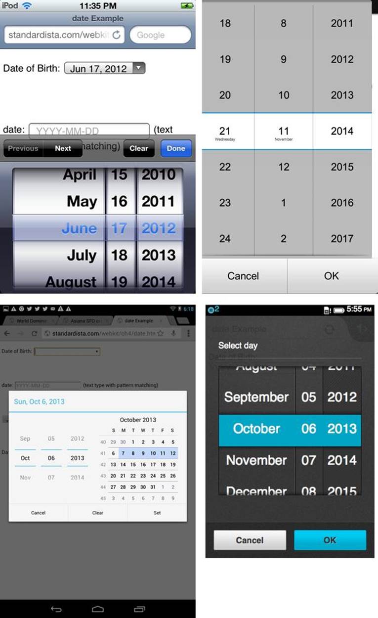
Figure 4-9. The date picker that appears on iOS, BlackBerry, Android, and Firefox OS when the input of date type receives focus
Datetime: <input type=“datetime”>
The datetime input provides two fields: one for the date (year, month, day) and one for the time (hour, minute, second, fraction of a second) with the time zone set to UTC with minutes and seconds, but not fractions of a second. You can include the min, max, and step attributes to limit the possible values, such as min="2012-03-01T12:00Z".
You may prefer to use pattern matching, but again, you’ll need to validate the input for true times and valid dates:
<p>
<label for="datetime">datetime: </label>
<input id="datetime" name="datetime" type="datetime" placeholder="YYYY-MM-DD"
min="2010-01-01T00:00Z"max="2011-12-31T23:59Z" required />
</p>
<p>
<label for="dte">datetime: </label>
<input id="dte" name="dte" type="text" placeholder="YYYY-MM-DDT00:00Z"
pattern="\d{4}\-\d{2}\-\d{2}T\d\d\:\d\dZ" required />
</p>
Datetime-local: <input type=“datetime-local”>
The datetime-local value is identical to datetime, except it is not UTC time. (The Z is not included.)
Month: <input type=“month”>
The month input type is supposed to include the month and year, with no day of month and no time zone. Default values differ by device, with defaults such as a min value of 0001-01 and default max value of 2147483647-12. Therefore, I recommend including a min and max value. You can also include the step attribute. For example, use step="6" to limit your month choice to January or July:
<p>
<label for="month">Month: </label>
<input id="month" name="month" type="month" placeholder="YYYY-MM" required
min="2010-01" max="2020-01" step="6"/>
</p>
Unlike JavaScript, which indexes starting with 0, January is represented as 01.
Time: <input type=“time”>
The time input type provides a mechanism for inputting time in military (24 hour) format. Times must be greater than or equal to 0 and must be less than 24 hours, with tighter restrictions imposable by the min and max attributes.
The time increments in seconds, not minutes. Including a step of 60 for 60 seconds, will create a better user experience. In our example, the step attribute is set to 900, for 60 sec × 15 min, or 15-minute increments:
<p>
<label for="time">Meeting time: </label>
<input type="time" min="09:00" max="17:00" name="time" id="time"
step="900" placeholder="12:00" required />
</p>
This type is not for elapsed time, but rather for time of day. When supported, browsers are expected to show a time widget, such as a clock, with no time zone.
Week: <input type=“week”>
The week input type allows for a date consisting of the number of the week within the year, with no month, day, or time. The value will range from 01 to 52, with a year. For example, the first week of the year will output 2014-W01.
The week calendar does not start with January 1. Rather, week 01 is the week that contains January 4th, which may not necessarily include January 1st:
<input type="week" name="week" id="week" min="2010-W01" max="2020-W02" required />
The week input type is the least supported of the date/time input types. We’ll get there eventually...
In all, we now have 23 input types to play with. The various input types include:
§ button
§ checkbox
§ color
§ date
§ datetime
§ datetime-local
§ file
§ hidden
§ image
§ month
§ number
§ password
§ radio
§ range
§ reset
§ search
§ submit
§ tel
§ text
§ time
§ url
§ week
Form Validation
Currently, web developers use JavaScript scripts to perform form validation on the client side. We’re getting closer and closer to the day when we can simply write the following simple form, and the browser will prevent submission when invalid with no need for client-side JavaScript validation (you must always do server-side validation). The user won’t be able to submit this form unless all three inputs have values, with the latter two needing to be of a single email address and a single URL, respectively:
<form>
<ul>
<li>
<label>
Name: <input name="name" required"/>
</label>
</li>
<li>
<label>
Email: <input name="email" type="email" required />
</label>
</li>
<li>
<label>
Website: <input name="website" type="url" required />
</label>
</li>
<li>
<input type="submit" value="Send"/>
</li>
</ul>
</form>
On submit, the browser checks if all conditions are met: if all the fields are completed and the email and url are correctly formatted, the form will successfully submit. If there is a mistake or omission of a required form control, an error message will be displayed to the user, like the one shown in Figure 4-10.
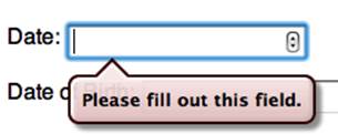
Figure 4-10. Error messaging for required fields that were not completed before an attempt was made at form submission
When required fields are left empty, or an input’s value does not match its type or pattern attribute, error messages will be shown like the ones shown in Figure 4-11. Most browsers support native form validation, with iOS and Android support lagging at this time.
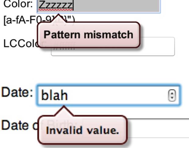
Figure 4-11. Form fields with messaging signaling that validation failed
Native browser form validation detects invalid data, and flags those errors with focus and error messaging. Native validation in HTML5-supporting browsers occurs before submitting the form to the server, submitting the form only if all rules set by attributes in the form fields pass native browser validation tests.
By preventing invalid data from being submitted, the browser saves a round trip to the server. While native validation will eventually be used to supplant client-side JavaScript validation, it will never supplant server-side validation. Browser validation is not sufficient to handle all errors. Always include server-side validation because malicious users will always be able to forge HTTP requests or otherwise mess with data submission.
When form validation is natively provided, the first invalid form element will display the error message and receive focus when the user tries to submit a form that is not fully valid. Eventually with native client-side validation, it may be possible to ensure correct form completion client-side with no JavaScript. HTML5 greatly minimizes the need for client-side form validation, but we still have a ways to go.
The HTML5 specifications provide for DOM methods and properties to enable validating without the cross-browser hoops we’ve been jumping through. HTML5 introduces eight form control properties via the validity state object.[34]
Validity is part of the validity constraint API. It is accessible from all form controls that support validation, and can be accessed with the form controls validity property:
var element = document.querySelector('#form_control_id');
var validityStateObject = element.validity;
or
var validityStateObject = document.form_id.form_control_id.validity;
The validityStateObject contains references to several validity properties:
element.validity.valueMissing
If a required element, as set with the required attribute, has no value set, the valueMissing property is true; false otherwise. The valueMissing property looks at whether a value is missing or not, not whether it is valid or not.
element.validity.typeMismatch
Returns true if the element’s value is not in the correct syntax; false otherwise. For example, if the type is number, email, or url and the value is not a number, email, or URL respectively, then that typeMismatch will return true.
element.validity.patternMismatch
If a form control requires a certain pattern as set with the pattern attribute, and the value of the form control does not match the pattern, the patternMismatch property is true; false otherwise. The pattern attribute limits the value to specific formats as defined by the patternvalue’s regular expression. The patternMismatch is basically the property that enforces any pattern rule set on a form control.
As mentioned earlier, when including the pattern attribute, also set a title describing the rules of the format for improved accessibility.
element.validity.tooLong
When the maxlength attribute is set on a form control, the tooLong property returns true if the element’s value is longer than the provided maximum length; false otherwise, ensuring that a value does not contain too many characters. The maxlength attribute should actually prevent the user from entering too many characters. This property double-checks to ensure that the maxlength was adhered to.
element.validity.rangeUnderflow
rangeUnderflow enforced the minimum value of a form control when the min attribute is set. rangUnderflow returns true if the element’s value is lower than the defined minimum.
element.validity.rangeOverflow
rangeOverflow is the counterpart to rangeUnderflow: it enforces the maximum value of a form control when the max attribute is set.
element.validity.stepMismatch
Returns true if the element’s value doesn’t fit the rules given by the step attribute; false otherwise. The stepMismatch ensures that the form controls value conforms to the step value in conjunction with the min value. The value must be a multiple of the step added to the minimum value.
element.validity.valid
If the form control has no validity problems, the ValidityState object’s valid property will return true; otherwise it will return false. Think of this property as a summary of the preceding seven properties and the customError (described next): if all return false, valid will betrue. If any fail (are true), valid is false.
element.validity.customError
In addition to these validity properties, we have a customError property that returns true if the element has a custom error enabling the handling of errors, but doesn’t actually check for validity.
By default, all form controls have customError of an empty string: empty strings are falsey. To be truthy, you have to call setCustomValidity(message) onto a form control, where message is the text that will be placed in the validation bubble as shown in Figures 4-1, 4-10, and4-11. Setting a message puts the form control into the customError state of true as the custom error message is no longer empty. Until it is falsey, you will be unable to submit the form.
When the custom validity message is set, the control will be invalid and return the customError constraint as true. To clear the error, simply call setCustomValidity("") on the control, passing an empty string value.
NOTE
If you set customError to true by setting a custom validity message the form will not submit even if the form is otherwise valid. Make sure to reset the value to an empty string to enable valid forms to submit.
Easy UI Improvements with CSS
In addition to changing the content of the error messaging, in some browsers you can also control the appearance of those error messages. The preceding error and other UI features of web forms are styleable to some extent.
Controlling validation bubbles
WebKit provides a native look and feel for their validation error speech bubbles. The error bubble is made up of four containing elements that are part of the shadow DOM. These four elements are styleable via pseudoelements that apply to separate sections of the bubble:
::-webkit-validation-bubble
::-webkit-validation-bubble-arrow-clipper
::-webkit-validation-bubble-arrow
::-webkit-validation-bubble-message
The containing element is the absolutely positioned ::-webkit-validation-bubble. The ::-webkit-validation-bubble-arrow-clipper child clips the ::-webkit-validation-bubble-arrow at 16 pixels high, creating a tail for the bubble. The ::-webkit-validation-bubble-message contains the text node of the actual error message. The default styling is in the user style agent, and can be overwritten with your own CSS.[35]
Styling to enhance usability
Like the error messaging, HTML5-supportive browsers stylize all the form controls to some extent. As a developer, you are a pro-user (hopefully) and likely know the subtleties of how a cursor changing over disabled versus active form controls indicates expected user behavior. Most of your users are not pro-users, so use styling to improve the usability of your forms.
For example, to make the user understand that a form control was required, you may have included an asterisk, perhaps encased in a class, to make the asterisk appear more prominently. This mandated including extra markup, such as:
<span class="required">*</span>
This required adding content for presentational reasons, and did nothing other than inform some sighted users that the element might be required. The asterisk provided no useful information to the actual form control.
With HTML5 attributes being included to create differing states of form controls, you can use CSS to stylize the required, disabled, checked, read-only, valid, invalid, focused, hovered, etc., form controls. There are various pseudoclasses by which you can style form elements based on state, including:
input:required,
input:invalid {
background-color: #FFFFFF;
border: 1px solid #FF0000;
}
input:valid {
border: 1px solid #999999;
}
input:read-only {
background-color: #DDDDDD;
border: 1px solid #666666;
}
input:checked + label {
color: #666666;
font-style: italic;
}
We’ll cover CSS in Chapters 6, 7, and 8, so if you are not familiar with pseudoclasses and elements feel free to skip ahead and come back to this section after you’ve mastered those chapters.
Adding the ARIA attribute aria-required="true" and data entry instructions via the title or aria-labeledby attributes provides for even better accessibility support.
New Form Elements
There are several form elements we haven’t mentioned yet. We have five new form elements in HTML5: <datalist>, <output>, <keygen>, <progress>, and <meter>. We’ll also cover differences in a few other elements that predate HTML5.
The <datalist> Element and the list Attribute
For the text, email, url, date-related, time-related, and numeric types of the <input> element, the new list attribute points to a list of values that the browser should offer to the user in addition to allowing the user to pick an arbitrary value.
The list attribute takes as its value the id of its associate <datalist>. <datalist> is a new HTML5 element.
The <datalist> element represents a set of <option> elements that represent predefined options for the <input> elements that associate themselves with that <datalist> via the form field’s list attribute. Several form controls can use the same <datalist>, but each form control that supports the list attribute can be associated with only one <datalist>.
The <datalist> provides a list of data values, in the form of a list of <option> elements. When the form element has a list attribute, the options in the <datalist> provide author-specified autocompletion values for the control. The user can still enter freeform, but options are provided like a <select>, as shown in Figure 4-12:
<p>
<label for="url">Animals: </label>
<input id="animals" type="text" placeholder="animals and sounds"
requiredlist="animalnames" name="animals"/>
</p>
<datalist id="animalnames">
<option value="quack">duck</option>
<option value="banana slug" label="sssss"/>
<option value="sheep" label="bah"/>
<option value="horse" label="neigh"/>
</datalist>
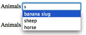
Figure 4-12. The appearance of the <datalist> in supporting browsers (Opera 10.6 is displayed in this screenshot)
Think of it as similar in functionality to the Google autosuggest. In the case of <datalist>, the list of suggested terms is hardcoded or dynamically generated. When the user starts typing, options from the data list that match the characters typed are suggested via a drop-down of the<datalist>’s <option> values or labels, if present. Similar to Google search autocomplete, it can be dynamically updated via an AJAX request. There is an example of the <datalist> element in the online chapter resources.
Graceful degradation of the <datalist>
The element’s contents can include fallback content for browsers not yet supporting <datalist>, providing users of older browsers with the choice to enter freeform data or select from an list of options made up of <option> elements that represent the predefined or suggested values for the form elements linking to it. Each suggestion has a value and a label. The default rendering of <datalist> and its children is hidden.
The <datalist> provides options for the form control, but still allows for freeform data entry. This is a very nice enhancement that you may not want legacy browsers to miss. To enable users of user agents that don’t support <datalist>, which includes most mobile browsers, encompass the options within a <select>. Supporting browsers will ignore everything other than the options within the <datalist> and nonsupporting browsers will ignore the <datalist> tag, showing the descendant content it understands (see Figure 4-13):
<p>
<label for="url">Web Address: </label>
<input id="url" type="url" placeholder="http://www.domain.com"
requiredlist="mydatalist" name="url"/>
</p>
<datalist id="mydatalist">
<p><label>Or select from the list</label>
<select name="url2">
<option value=http://www.standardista.com label="Standardista"/>
<option value="http://www.oreilly.com" label="O'Reilly"/>
<option value="http://www.evotech.net" label="Evolution Technologies"/>
</select>
</p>
</datalist>
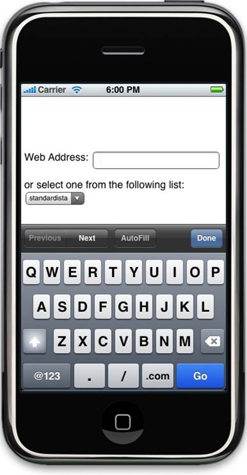
Figure 4-13. With this gracefully degrading implementation of <datalist>, the noncompliant browser shows the children of <datalist>, ignoring the element it doesn’t understand (notice the URL keyboard configuration, and the <p> and <datalist> are visible: touching the Next button will activate the select menu in the datalist)
The fallback content will only be shown in browsers that don’t support <datalist>, as shown in Figure 4-13. Supporting browsers will ignore <p>, <label>, and <select>, and all other elements within a <datalist> other than <option>, as displayed in Figure 4-12. When using the JavaScript-less method of graceful degradation, make sure the server is set to receive data from both form fields.
There is an even better fallback that requires a little bit of JavaScript. The HTML looks like:
<input type="text" name="animal" list="dl_animals" id="animals" />
<datalist id="dl_animals">
<select id="slct_animal">
<option value="moo">Cow</option>
<option value="sssss">Banana Slug</option>
<option value="bah">Sheep</option>
</select>
</datalist>
The JavaScript that makes it work is:
var select = document.getElementById('slct_animal'),
input = document.getElementById('animals');
select.addEventListener('change', function() {
input.value = this.value;
}, false);
The CSS looks like:
input[list],
datalist select {
float: left;
height: 1.4em;
position: relative;
}
input[list] {
z-index: 2;
width: 20em;
}
datalist select {
width: 1.2em;
}
In the preceding example, we’ve added a select with no name attribute, so the select will not be submitted with the form. We’ve also styled the select to appear as a select spinner to the right of the input with the list attribute.
The <output> element
The <output> element acts like a <span> element, except that it is considered to be a form control for the purposes of the DOM. The <output> element, which is new to HTML5, can have the form, name, and for attributes, and the onchange, onforminput, and onformchangeevents in addition to the universal attributes and event handlers.
The output does not have a value attribute. Rather, the value is defined by its inline contents between the opening and closing tag. As such, the <output> element must have both a start tag and an end tag. The value can be set and retrieved via the DOM.
The for attribute value is a bit different for the <output> element than the <label> element: the for attribute takes as its value a space-separated list of the IDs of other elements associated with the output.
The <output> element should be used when the user will never directly manipulate the value, and when the value can be derived from other values, such as the result of an equation based on the values of the elements listed in the for attribute.
CubeeDoo
In CubeeDoo, we use the <output> form element to store the score, level, and seconds left in the current round. In our code example, the current score, current level, and time left are contained in <output> and are updated via DOM manipulation. The HTML is very simply marked up with:
<output name="score">0</output>
<output name="level">1</output>
<output name="time">120</output>
We pre-populate the values because when the page loads at game start, the score is zero, the user is on the first level, and the default time on the clock is 2 minutes. In our JavaScript, we dynamically maintain and update the values.
<meter>
The <meter> is generally used as a gauge to provide a measurement within a known range. The <meter> is used to indicate the current value in relation to the minimum and maximum values, like a needle gauge. Possible implementations include displaying password strength during user entry and similar visual feedback indicators.
The <meter> element’s attributes, which take floats as their value, include min, max, high, low, and optimum. The optimum attribute provides the value for the point that marks the optimal position for the meter. The min and max are the minimum and maximum values respectively. Thehigh and low attributes should be the lowest value that can be considered a high value, and the highest value that can be considered a low value, respectively.
For example, grades may go from 0% to 100%, so you would have a min of 0 and a max of 100. Using the typical American system as an example (with A being 90% and better, a B being between 80% and 89%, etc.), it is generally considered to be good to have a B+ (87%) or better and bad to have a C– (73%) or lower. If you’re not doing so well in school (getting a 61%), your grade meter could look something like this:
<p>Grade: <meter value="61" min="0" max="100" low="73" high="87">D-</meter></p>
The UI provides a meter with the left side being the minimum value and the right being the maximum value. A colored bar fills the meter from the left to right, proportionally, based on the value. Depending on the attributes and the current value (and the browser), the bar may be red, green, or yellow. The bar should be green if the value falls between the high and low value, and red or yellow if it falls outside of those values, depending on the optimum value (as shown in Figure 4-14).
Figure 4-14. The UI and colors of <meter>
The <meter> element should not to be used to show progress. Instead, use the <progress> element for that purpose. Use the <meter> when you know what the minimum and maximum values are, such as grades (max="100"), and when the values go both up and down, like blood pressure or a gas tank. Otherwise, if the value is only going in one direction, use <progress>.
There is an example in the online chapter resources.
<progress>
The <progress> is similar to <meter> but is used to indicate progress toward a goal or task rather than as a gauge. Unlike the <meter> that shows the current value in relation to a minimum and maximum value, the <progress> indicator represents how far a task has progressed between the start of the task and the estimated completion of it. For example, the <progress> element, as shown in Figure 4-15, can be employed to display the progress of a time-consuming function in JavaScript.
The <progress> element takes a value and max attribute, with both being positive floats, and the value being less than the max. There is an example in the online chapter resources.
Figure 4-15. The <progress> element in Firefox OS and Chrome for Android
<keygen>
The self-closing <keygen> provides for a key/pair generator/input control. Useful to client-side application developers for authorization protocols, the <keygen> element represents a control for generating a public-private key pair and for submitting the public key from that key pair. Accepting the attributes of challenge, keytype, autofocus, name, disabled, and form, the keytype value is rsa and the challenge attribute takes as its value a challenge string that is submitted along with the public key. Opera, WebKit, and Firefox all support this element, rendering it as a select menu generating encrypted keys, though all provide different options.
There is an example in the online chapter resources.
Other Form Elements
The following sections provide quick descriptions of the various form elements. We are including these elements that you are most likely familiar with to delineate new features of HTML5.
The <form> element
The <form> element has had a few changes. The form now automatically validates the input types on submission. The new Boolean novalidate (novalidate="novalidate") attribute was added to enable the form to not be natively validated upon submission.
The form controls no longer need to be children of an ancestor <form>: instead the form attribute on the form controls can be included to dictate with which form the control is associated. The autocomplete attribute has also been added to the <form> element.
In addition, the action attribute is no longer required. If omitted, the form will submit to itself, as if action were set to the current page.
<fieldset> and <legend>
The <fieldset> groups form controls together. The remainder of the <fieldset>’s children form the group. The optional first child of the <fieldset> is the <legend>, which gives the <fieldset> group its name. The <legend> element is the title or caption for the rest of the contents of the <fieldset> in which it finds itself. The <legend> can only be found as a child of a <fieldset>, and must have a closing tag.
The Boolean disabled attribute, if specified, causes all the form control descendants of the <fieldset> element, excluding children of the <legend>, to be disabled. The form attribute can be used to associate the <fieldset> element with a specific form (see the description of theform attribute). The name attribute represents the element’s name.
<select>, <option>, <optgroup>
The <select> tag specifies a selection menu. A <select> must contain one or more <option> elements or one or more <optgroup> containing <option>s. In Safari, if the size attribute is explicitly set for this tag, the input box resembles a combo box, otherwise it will resemble a pop-up menu.
<textarea>
The <textarea> is a free-form text field, nominally with no line-break restrictions. This tag specifies a scrollable, multiline text-input block.
New in HTML5 is the wrap attribute. The <textarea> element may have a wrap attribute specified with the values of soft (default) and hard: soft means the text is submitted without line breaks other than explicitly entered line breaks, and hard includes explicit line breaks. If setting the wrap to hard, specify a cols attribute.
In HTML 4, we were required to specify the <textarea>’s size onscreen by specifying values for rows and cols. In HTML5, the rows and cols attributes of the <textarea> element are no longer required attributes as they were in HTML 4, unless you set the wrap attribute to hard, then the cols attribute is required. Otherwise, cols and rows are now optional. CSS should be used to define width and height instead. The closing tag is required.
<button>
The <button> element comes with three types: submit, reset, and button (the default is submit). Unlike the <input type="button"/>, the <button> element is not self-closing: you must include the </button> closing tag. This element remains unchanged from previous versions.
The <label> Element
The <label> element is not new to HTML5, but since it is often misused, it’s worth reviewing.
The <label> provides a caption in the user interface for a form control. The caption is associated with a specific form control by using the for attribute for an explicit label, or by putting the form control inside the <label> element itself creating an implicit label.
The value of the for attribute in the explicit label must match the value of the form control’s id.
It is important to note that the form control/label relationship is not just for improved accessibility for screen readers. Clicking or touching the label provides a click event on the associated form control: touching on the label of a checkbox toggles the checkbox’s state, making the form field more accessible to all users, not just those using screen readers or voiceovers. Clicking or touching the <label> associated with a radio button toggles the checked status of that radio button. Touching a <label> associated with a text field gives focus to that field, prompting the user to enterdata.
In Conclusion
When HTML5 input elements and attributes are fully supported, sites will require less JavaScript client-side validation as the browsers will be doing most of the heavy lifting. However, servers should still perform data validation, as malicious users will be able to bypass any client-side type-checking and validation, and legacy user agents will likely not disappear completely for the foreseeable future.
[30] When you set focus on a form element, the page jumps to that form field, skipping over the preceding associated label for that input; this is bad for accessibility and can negatively impact user experience, especially on small devices where the label may get cut off. Due to accessibility issues with both these methods, you may want to avoid using either one.
[31] Google is working on a requestAutocomplete() API as a web standard to allow form fields to request form completion information the browser knows.
[32] The media capture draft is in the last call.
[33] For example, at the time of this writing, Safari on iOS 6 supports pattern, but does not support number and does not provide for validation on submission.
[34] To be precise, there are ten validity properties, but the specification is evolving. We’ve included the original eight that are relevant to this chapter and already have browser support.
[35] This feature is in WebKit, but not in Blink. As this book is going to print, this feature has been removed from Chrome. I expect we will be able to style the validation bubbles with Web Components, and will update the status of this feature in the online chapter resources.
All materials on the site are licensed Creative Commons Attribution-Sharealike 3.0 Unported CC BY-SA 3.0 & GNU Free Documentation License (GFDL)
If you are the copyright holder of any material contained on our site and intend to remove it, please contact our site administrator for approval.
© 2016-2025 All site design rights belong to S.Y.A.