The Responsive Web (2015)
Part 1. The responsive way
Chapter 2. Design for mobile first
This chapter covers
· Why mobile first
· Designing headers for small screens
· Designing for a touch interface
· Simplified small-screen responsive grids
· Using web fonts in layouts
There’s a term I like to use to describe what happens when a project starts to get out of control: “gilding the lily.” It’s an idiom that’s derived from Shakespeare, and it means to unnecessarily embellish something. A lot of gilding of lilies can go on when you assume everybody visiting your website is on a desktop browser.
When you have a 1,600-pixel-wide canvas, you have a lot of space to fill, so you might add more buttons, animation, widgets, and images. If you were only designing for a desktop, that would be great, but the whole idea behind responsive design is to be able to move from one device to the next fluidly. If, after you designed for the desktop, you needed to make the site mobile, you’d have to start hiding buttons and images and navigation. You’d have to stuff and scale and tuck until your 1,600-pixel canvas was crammed into the frame. If you weren’t careful, the user would end up loading all that hidden content on their phone, which would slow the load time. After spending all that time cramming, your user with a 3G connection would hit the Back button because your page wasn’t loading—not exactly the best user experience. If you’re wondering if there’s a better way, I’m here to tell you there is.
In 2009, Luke Wroblewski wrote a blog post and later a book titled Mobile First, in which he laid out a philosophy of web design and development that asked people to focus first on a mobile experience.[1] It’s true that the canvas you begin with is much smaller, but by developing mobile first, you retain control as the site expands, as opposed to losing control as the site shrinks.
1 The “Mobile First” blog post is on Luke Wroblewski’s Ideation and Design blog, www.lukew.com/ff/entry.asp?933. The book, Mobile First, is published by A Book Apart (2011).
In this chapter, you’ll create a responsive website mobile-first. I’ll first talk a bit more about mobile first and its pros and cons, plus specific challenges designers face when designing for mobile first. Then you’ll create a mobile-first site demonstrating how designers can solve the challenges of designing a responsive site.
Developer insight: responsive web design is a team sport
Although this chapter focuses on the design process, you need to remember that the principles behind the process are important even if you only code. Whether or not you have any interest in design, knowing something about the topics covered here will help you speak to art directors and help give you some ideas that you can share with designers.
As a developer, you might not think of yourself as creative, but the entire site experience depends on you. You are a creative problem solver, and you bring a unique form of creativity to everything you touch. Clean and efficient code is of the utmost importance in a responsive site, because without it pages will load slowly and the interaction can feel clunky. Take your time to develop sites mobile-first, but with the following goals in mind: use semantic markup, object-oriented CSS, and efficient JavaScript.
2.1. Why mobile-first design
One of the biggest challenges in responsive web design is building a site that evolves and scales consistently. The responsive approach seems too limiting to a lot of designers because the canvas they begin with is so much smaller. But by working within the limitations that exist, you can take control of those limitations. By starting with a smaller screen and scaling up, you afford yourself new opportunities as the screen size expands, and you can make careful additions, as opposed to having to cut a site to pieces and squeeze modules into smaller and smaller spaces as you move to smaller screens.
The mobile-first approach provides benefits, but it’s not a design solution that fits all scenarios or workflows. Thus, in this section we’ll look at the benefits of starting small and also at the challenges. Then we’ll get started with our mobile-first site.
Designer insight: the cons of mobile-first design
This book applies mobile-first design in order to teach the concept, but in the interest of balance, it should be noted that there are some cons to this approach. There are definitely some points of contention concerning mobile-first design, but all the arguments I hear arise from the difficultly in understanding how to use the negative space created when you expand from mobile to tablet and desktop screens.
The biggest con to mobile-first design is that it isn’t easy. It takes time and experience. Unfortunately, it’s hard for me to agree that this is really a “con.” Web design is a constantly evolving field, and learning new practices is simply a cost of working on the web. Labeling this as a con can be a way of avoiding learning more about and evolving your craft.
Is mobile-first the only way to design a website? No, certainly not. There are some cases where building a mobile website isn’t the best approach at all, such as if you’re building a company intranet that only operates on the desktop. Mobile-first design is simply a tool for you to use at your discretion, and it’s an important topic when discussing responsive web design. You should use it when it makes sense for your project.
2.1.1. Benefits of mobile-first design
Designing for mobile first can feel like a huge step, and it may be a bit of a departure from your current workflow. When embracing a new way of working, it’s important to vet the idea and get a good sense of its rewards. Aside from creating a mobile site, designing mobile first offers a wealth of value: because of the limited space on mobile screens, designing mobile first forces you to focus your design, content, and user experience on what your clients and their customers need.
Prioritizes content
Mobile-first allows you to prioritize content and focus on the most important parts of your site early. A mobile screen only has room for the most important content, so you need to make a decision about what’s crucial to your site in the early design phases. By loading the essentials first, you’ll be able to add functionality as it’s needed.
Allows progressive enhancement
It’s much easier to fill up new space than to squeeze the same content into a smaller space. A while ago I changed apartments. I was living in a small studio and upgraded to a one bedroom, and in my new apartment I found that I had a lot of open space. After a few trips to the store, I filled the space up pretty well. This move gave me the opportunity to expand on what I already had.
A few years later, I moved from Texas to New York City, and apartments in New York are incredibly small compared to Texas. I quickly ran out of space and ended up having to get rid of a lot of furniture. I had to edit what I owned to fit the new, smaller space.
All in all, the move from a small space to a larger one is hugely preferable to a move from a large space to a small one. By designing for mobile first, you can work in the added space as the site expands, instead of trying to cram the existing content into an ever-tightening space.
There are two terms that describe this pattern. One is progressive enhancement, and it’s the process of starting with a simple base and enhancing it into a more complex product. Graceful degradation is the opposite, taking a complex site and building in fallbacks for components that fail. Moving from a mobile environment to larger screens gives you the chance to progressively enhance, whereas reducing a large-screen site to a mobile one is more like graceful degradation. We’ll cover this subject in detail in chapter 8.
2.1.2. The challenges of designing for mobile first
When designing for mobile first, you’ll be presented with some new challenges, such as working on a smaller canvas. Web design is a constantly evolving process, so a constantly changing canvas is nothing new, but designing for both mobile first and the desktop on the same canvas can be a bit of a learning curve.
Decluttering the screen
With desktop sites, it’s easy to let the content get lost in a sea of secondary information. On some sites, content gets shoved to the side to make room for ads, links to other articles and related products, social media integration, or any number of sidebar distractions.
Mobile is a medium of singular focus, as is evident in some of the most popular apps in mobile platforms, such as Twitter or Instagram. The applications put the content front and center and integrate secondary content at intuitive points along the linear content path.
In designing mobile first, you have an excuse to strip away these secondary, confusing elements and focus directly on the content. Take advantage of it. Mobile first may as well be synonymous with “content first,” and at its core, a mobile website strategy is a content strategy. Mobile web design is 90% content design and 10% decorative design, as a result of the size, power, and bandwidth limitations.
Limiting the input
Another major challenge in mobile-first design is the input limitations. In traditional mouse-and-keyboard computer usage, the input devices are very precise tools. Touch screens only have one input type, a finger. When the first iPhone came out, one of the early complaints was its lack of a physical keyboard. A software-based keyboard can be prone to latency issues, and for people with larger hands, such a keyboard can lead to a lot of errors while typing. These issues have largely been forgotten because the software keyboard on the device screen offered more benefits than problems.
The lack of a mouse adds a new complication to the mix, though: the finger lacks the precision of a mouse. A mouse offers pinpoint accuracy on a clickable object, so interacting with a small button on a page isn’t difficult. In contrast, a finger can obscure the object that the user is attempting to click. As a result, all critical elements need to be larger on a mobile screen. That means you have the challenge of less screen space and also the need for bigger elements. We’ll explore a few ways you can overcome these issues in this chapter.
Developer insight: coarse or precise pointers
In a current draft of upcoming additions to the CSS specifications, there’s a level-four media query for coarse or precise pointers. This would function much like some current media queries but would offer unique styling for pointer types. The media query would classify pointers with limited accuracy, such as touch screens, as coarse, and devices with accurate pointing, such as a mouse, as precise.
These media queries would be called as follows:
@media (pointer:coarse){}
Currently this hasn’t been adopted, but with some luck it might be. For now, developers can identify touch devices singularly by using Modernizr. For more information on how to do this, see chapter 8, which focuses on Modernizr and progressive enhancement.
The thing that initially holds many designers back from mobile-first web design is that they’re being hit with a smaller screen and fewer resources. But with a bit of practice, working within these limitations quickly becomes second nature.
In the next section, we’ll take the prototype and wireframes we built in chapter 1 and start designing mobile first. Because site-level headers are the primary interface for our site, we’ll start there.
It’s all in the name: high-fidelity wireframes
When you’re presenting wireframes to a client, you might think introducing a prototype could be confusing. One easy way to contextualize prototypes is by referring to them as “high-fidelity wireframes.” This can be reassuring and communicates that a rapid prototype is still a rough sketch, even though it’s written in code and is viewable in the browser. Because of its interactive nature, high-fidelity wireframes are a higher-value deliverable as well.
2.2. Designing headers for small screens
The header in the prototype (figure 1.7) includes navigation links to the right (about, contact, and blog). We’ll also add some additional content to the left as an information drawer to give the user some more context for the site. To display these elements on a smaller screen in a way that provides an optimal user experience, we’ll look at the off-canvas design pattern.
Design patterns are reusable solutions for addressing recurring problems. With off-canvas navigation, we can solve the problem of optimizing the user experience (making the screen less cluttered) by hiding the elements to the left or right side of the page, and when cued, the navigation slides out. This is the pattern used by Facebook and Path for hiding the main navigation and allowing the user to focus on the immediately important information.
Let’s get started designing these headers for the small screen.
2.2.1. Creating the header
We’ll start by designing the header’s unaltered state. We’ll give it two buttons that we can later use to cue the off-canvas navigation (see figure 2.1).
Figure 2.1. An initial design for the header. Notice the two icons in the corners: to the left is one denoting information, and to the right is one denoting site navigation.
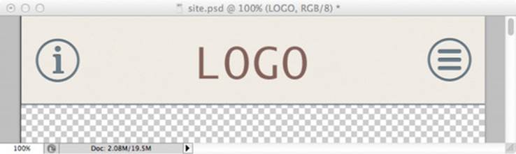
We have two simple icons in the header, both about 44 x 44 pixels (the minimum target size recommended by Apple for the original iPhone Human Interface Guidelines), and a logo to reinforce that the visitor is in the right place. On the left is an information icon. To the right is a three-bar navigation icon—this is becoming a standard icon for expanded navigation. We’ll use these two buttons to give users a way to navigate deeper into the site.
Because we’re using off-canvas navigation, we’ll need to show what that navigation looks like, so let’s get a sense of the spacing, color, and design of the expanded navigation (see figure 2.2).
Figure 2.2. The navigation will be expanded when the three-bar navigation icon is pressed.
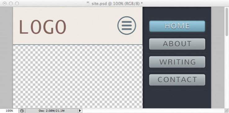
Now we have some obvious site navigation. For this site, there are only a few sections to access, but in a large site you could scroll down to see more options. You could also potentially slide the header off further to the left and leave more room for the navigation on the right.
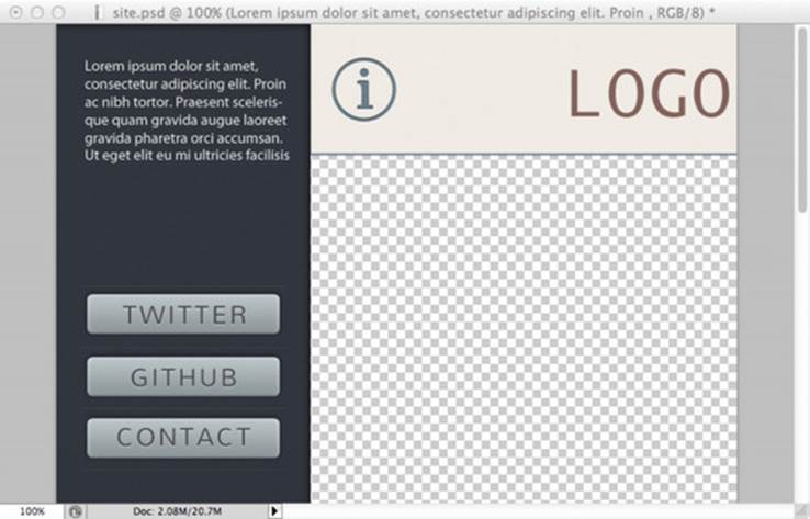
We can easily apply the same style to the information content on the left side of the page to display some more information about the site’s author, content, and so on (see figure 2.3).
Figure 2.3. On the left side, we provide more information. We also repeat a few links from the right navigation element, which is fine because these links will further inform the user about the subject of the site.
Developer insight: off-canvas navigation
Off-canvas navigation can be a complicated challenge for developers, and there are a few different ways to approach it. One is by simply applying various states as classes on the body element (such as left-nav-exposed or right-nav-exposed) and adding and removing these classes with jQuery. This is a relatively simple way of accomplishing this task; we’ll cover some fancier ways to approach it later.
2.3. Designing for a touch interface
As I mentioned earlier, a 44 x 44 pixel size should be the minimum for any clickable target. The user will be engaging the site with a thumb or forefinger, so the target needs to be large enough to easily tap.
Developer insight: tap as a hover
For years, hovering the mouse pointer over an element has been a way of interacting with a page. Users could hover over a page element with their mouse to reveal supplemental content, such as navigation elements or secondary information. In theory, a tap on a touch screen would register as a click, rendering a hover state unusable and the supplemental content hidden.
Fortunately, most mobile browsers have resolved this issue by requiring a second tap on links or elements with a hover state. This double-tapping on mobile browsers is an effective way of ensuring that users can navigate websites, but it’s important when developing responsive sites to keep this feature in mind.
In mobile-first body content design, you’ll want to ensure that you provide control interactions that don’t interfere with the main content of the site. You should use font families and sizes that are easily legible on a digital screen and avoid crowding the screen with links. Large text in a mobile environment is great because it ensures that the user can comfortably read the page without having to hold the phone too close to their face.
It’s also a good idea to use simple background patterns, as opposed to large images, which will slow page loading. Although it’s easy to believe that users want the same things on small-screen devices as they do on desktops, it’s important not to ignore the context implied by a smaller viewport.
Developer insight: patterns and Base64 encoding
In chapter 9 we’ll look at methods of improving site performance, and one of those ways is to use Base64 encoding on images. When implementing small, subtle image patterns, try using Base64 image encoding directly in the CSS to avoid having to make an additional server request for more assets. Adding the image data directly to the CSS will increase the total page size somewhat (each image will be about 37% larger when Base64 encoded), but it will improve site load time slightly because the separate requests for each image are eliminated.
2.3.1. The simplified small-screen grid
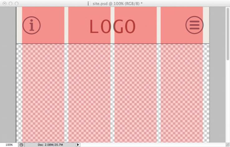
For smaller screens, you need a simplified grid. In chapter 1, I mentioned breaking sites into small grids. I prefer to break them into halves or quarters. Historically, grids have included up to 12 columns, which works in a desktop environment where you have a big width to cover, but on narrow mobile screens, using more than four columns starts to get unmanageable and is too tight for screens smaller than 320 pixels wide. As shown in figure 2.4, four columns give the page a sufficient amount of structure without cluttering the page.
Figure 2.4. The four-column overlay will help the design retain its grid structure throughout the design file.
When working in a grid, it’s important to keep in mind how the site elements will scale and float. It’s best to think of the responsive grid as going from left to right, and then top to bottom. This helps to create a clear and consistent flow of information.
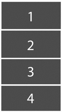
On a small screen, you might have a one-column grid with four blocks stacked on top of each other, as in figure 2.5. This vertical stacking encourages the user to scroll and keeps the page uncluttered.
Figure 2.5. Four elements stacked on a small screen
As more screen real estate becomes available, the elements can adjust their placement and separate into two columns, as in figure 2.6. The available content area will increase relative to the device screen size.
Figure 2.6. The vertically stacked elements can transform into two columns in a mid-sized screen.
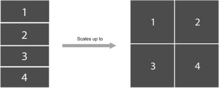
This can be extrapolated further as the viewport gets wider and the elements have more horizontal room to fill. This new grid scales up nicely to four columns with four blocks, as shown in figure 2.7.
Figure 2.7. The same grid again, now for larger screens

As a designer, you should always anticipate the grid flowing from top to bottom and left to right. This logic can apply to all elements on the page, and grids can even be nested inside grid blocks. It’s important to understand and acknowledge this early in the design phase, so you can create sites that take advantage of the way CSS works. This is another reason why prototypes are crucial to responsive design, and why designing in the browser is ultimately the best way to go.
2.4. Designing content for a small screen
Now that you have the grid and navigation, it’s time to give the site its content. You first want to ensure that the background will contrast with the body copy. The content of the page is the reason the user is viewing the site, so you want to give it priority and make the site as easy to read as possible.
In figure 2.8, I used a full-width image to enhance the article and set the tone. The full width will be easy to manipulate later, but it also just looks nice.
Figure 2.8. The designed mobile site
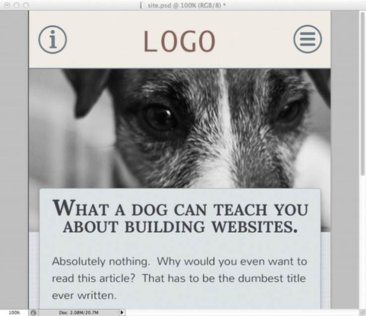
You can also see how the design will work with the off-canvas navigation deployed. You want to make sure you don’t design these elements in a silo, because you need everything to play nicely together and create an appropriate atmosphere for the user.
Designing for content is tough, and it’s one of the biggest reasons that I advocate for the use of prototypes. By prototyping, you can gather content and build a site that meets your client’s needs, instead of forcing the client’s needs to fit your design.
2.4.1. Using web fonts in layouts
In small-screen design, much of the screen real estate is occupied by type, so one of the best ways to give a site a unique look and feel is with web fonts. Using CSS, you can import web fonts into a stylesheet and use them in your document. The fonts are hosted on the site’s server, just like an HTML file or an image, and are loaded into the document. Web fonts can also bog down the page load time for the user, but for the developer it’s an efficient and simple way to add a lot of characters to a site. This section will compare the major web font vendors. In chapter 6 you’ll learn how to embed the web fonts in a CSS stylesheet.
Historically, designers were limited to using fonts that they could assume visitors had installed on their computers. This meant there were only a handful of typefaces that a designer could confidently design around. Any custom font required in a site design had to be implemented with image replacement, which was a huge burden and made editing and updating sites troublesome and time-consuming for both designers and developers.
The use of fonts online is more limiting than in print, because you need fonts that are licensed for use online, or the site’s owners can be fined. But there are several services available to designers to help them use fonts online, most notably Typekit, fonts.com, and Google Fonts.
Typekit
Typekit (https://typekit.com/fonts) was one of the first major font-hosting services available. They were recently bought by Adobe, and their library has expanded dramatically as a result.
Typekit offers a great library and offers reliable cross-browser consistency and the ability to host custom fonts. The downside is that you can’t use the fonts locally, and there’s a small cost.
|
Advantages |
Disadvantages |
|
High quality and highly optimized fonts |
Lacks some of the most popular fonts |
|
Fast to render on the page |
|
|
Affordable plans |
Fonts.com
Fonts.com (www.fonts.com) offers a service similar to Typekit, and it has exclusive rights to several popular font families.
The biggest advantage of fonts.com is that it allows you to download fonts for use in comps, which is nice if you absolutely have to rely on comps. You can also host your own fonts with a fonts.com subscription, a feature that’s unavailable through Typekit. Fonts.com also offers the ability to self-host typefaces with certain packages. There’s also a cost for using fonts.com.
|
Advantages |
Disadvantages |
|
Has exclusive rights to some very popular font families |
Lacks the speed and reliability of Typekit |
|
Fonts available to download for use in comps |
|
|
Self-hosting available |
Google Fonts
Google also hosts a font service, which is free to use and allows you to download the fonts for use locally (www.google.com/fonts). Unfortunately, the selection through Google is limited, and the quality of the fonts isn’t as high as on the subscription sites.
|
Advantages |
Disadvantages |
|
Free |
Limited selection of fonts |
|
All fonts available for download |
Fonts generally of a lower quality |
Self-hosting
In addition to web font services, there’s also the option of self-hosting fonts on your own server. This gives you the flexibility to use the exact font you want (such as a corporate font for a company site), whereas with a service you’re limited to the fonts they have available. This works well if you can acquire and maintain the rights to a font, but purchasing the rights to a web font can be very expensive and it requires a secured hosting environment.
Once you have a client on board to cover the cost, there are a few tricks involved in self-hosting fonts. You first need to be sure you have the bandwidth to serve the typefaces. Second, the type files themselves need to be optimized for web use as well. This means the type needs to be converted into three different formats (WOFF, TrueType, and EOT) in order to cover the formats preferred by the major browsers. (Web fonts are typically available in all three formats, so conversion is only really a concern when the typeface is completely original or extremely rare.) Conversion can compromise the quality of the fonts, but if a custom font is being used, this is an unavoidable consequence. There are processes to improve the quality of web fonts, but they’re painstaking and expensive.
Ultimately, self-hosting is a much more difficult technical hurdle than you might expect and can cause some design issues.
|
Advantages |
Disadvantages |
|
High level of control |
Often fonts not optimized for web performance, creating issues with aliasing and artifacting |
|
Not limited to available libraries |
Can include a very expensive one-time or recurring fee |
2.5. Summary
In this chapter, we discussed the beginning phases of designing a site mobile-first. The role of the designer can be the most difficult on a project, because as a designer you have to communicate a brand via an artistic medium that you might not have a high degree of control over. This is the main reason why a designer with little or no experience in CSS is at a huge disadvantage. Web design will always feel like a limiting and confining medium if you don’t take the time to learn the details, and ultimately that means designing with CSS.
There’s still much to learn about designing responsive web sites. This chapter provides a foundation for some often-unconsidered factors of responsive web design, such as how floats affect objects on the page and web fonts.
Now that you’ve created a small-screen site, it’s time to learn about a new design deliverable that will help you make the transition from PSD (Photoshop Document) to websites. Remember, the goal of responsive design is to not create comps for every single view and every single page. To avoid doing this, in the next chapter you’ll learn how to create and communicate design using a style guide.
2.6. Discussion points
· Do you think designing mobile first will help your team be more creative or less?
· Is there anything unique to designing and developing on mobile that’s particularly exciting to you?
· How do you think designing for mobile is different from designing for desktop? And if both approaches meet somewhere, where is that?
All materials on the site are licensed Creative Commons Attribution-Sharealike 3.0 Unported CC BY-SA 3.0 & GNU Free Documentation License (GFDL)
If you are the copyright holder of any material contained on our site and intend to remove it, please contact our site administrator for approval.
© 2016-2026 All site design rights belong to S.Y.A.