The Responsive Web (2015)
Part 2. Designing for the responsive web
In this part of the book, we’ll start discussing what it takes to design a responsive website. We’ll cover what goes into responsive web design from the visual designer’s and user-experience (UX) designer’s perspectives, but don’t think this information won’t apply to developers. There’s important stuff in here for everyone, and as this book teaches, web design requires collaboration.
In chapter 3 we’ll start the discussion with style tiles. These are a new deliverable that makes creating beautiful designs possible, while not dictating layout. By learning to use style tiles, you’ll learn how to communicate your design ideas to the client and the development team in an easy-to-understand way.
In chapter 4 we’ll begin working on design patterns for building the user experience of a site. I’ll show you some example design patterns and offer some explanation about how to start thinking in design patterns.
In chapter 5 we’ll cover responsive layouts and discuss some of the challenges and opportunities involved in building them. We’ll also discuss content modules and typography in responsive environments.
In chapter 6 we’ll dive into how responsive web design affects your site’s content. You’ll learn how to craft content for mobile, tablet, and desktop screens.
Chapter 3. Using style tiles to communicate design
This chapter covers
· What a style guide is and why it’s important
· The importance of meaningful client deliverables
· Introduction to style tiles
· Building a style tile
Interior designers use swatches and fabric samples to create a palette to work from. This is an important part of the process; painting and furnishing a room is costly in materials and labor, so setting the color and style ahead of time can help to minimize those expenses.
Style guides function in much the same way, enabling clients to decide on a palette and theme before the hard work of drafting the front end of a website begins. This is important in responsive design, because the website requires a lot of moving parts. Every design element needs to be scalable, flexible, and natively built in CSS in order to maintain a small load burden and efficient architecture.
In order to bridge the gap between mobile, tablet, and desktop sites, you need to visualize the design of a site without implying dimensions, size, or format. Style guides give you the ability to abstract your design and break it into manageable chunks.
In this chapter, you’ll learn how to articulate the parts most important to a design and see how to establish a creative visual style for a website without forming the entire site in a graphics editing program. This will let you take a collaborative approach to the actual implementation and create a more vivid and lively website. By breaking away from traditional ways of creating a visual language for a site’s design, you open the process up to the fluidity required in responsive design.
Developer insight: understanding design
This chapter is very much focused on the designer. There are no code samples, and we won’t really talk about CSS. The entire chapter focuses on design, so why should you care? Why not just skip this chapter entirely? Why include it in this book?
With responsive web design, developers no longer have the luxury of remaining in a silo. The process of design is not something developers can ignore any more. This chapter is part of the book because it’s an important part of designing a responsive website. If you’re responsible for building the front end of a website, you’re responsible for collaborating with the designer, and part of that collaboration is helping advocate for things that will make the process easier. Communicating design is an important technique in the process of website creation.
In a site build I recently was working on, we had a module in the site that wasn’t working. It was intended to emulate some 3D motion, but in a 2D plane. The details aren’t important—what’s important is that the design just wasn’t going to work. The designer and I were able to sit down and create something completely new that would work, but this was only possible because I understood his concerns and he understood mine. That understanding facilitated our collaboration.
If you feel like this chapter doesn’t concern you, feel free to skip it, but taking an interest in design will make you a better front-end developer.
3.1. Visualizing design with style guides
When visualizing a design in traditional web development, working with comprehensive layouts (comps) was the norm. As discussed in chapter 1, comps are static images used to represent a single state of the final coded site. The term comp, much like the deliverable itself, is a leftover from the days of print advertising.
The problem with designing in fully laid-out comps is that it assumes too much and fails to communicate the scalability required in responsive web design. Comps are rigid and only represent a single state in a site’s design. They’re also costly to produce and adjust in responsive design. Finally, they present a false sense of security in the site design’s effectiveness. They portray to the client a sort of best-case scenario that rarely reflects the actual use of the site. In a comp, all the content is controlled, but when a site is published and the user or client begins inserting their own content, the visual design often suffers.
Say, for instance, that a comp is designed for a list of recipes. Once a client has the keys to the site turned over to them, they may start adding or removing content, so a design that called for four recipes to be displayed on a page now has eight. Or perhaps the design allows for a recipe title that’s 80 characters long, and the client decides to upload a title that’s 200 characters long, causing the text to overlap its container. There are a myriad of ways a developer can fix these problems, but wouldn’t it be more effective to change the way you work so your sites have the fluidity they need to accommodate these sorts of problems before they arise?
In a sense, the responsive web is about building for these sorts of factors as well. It’s about building websites that are versatile, agile, and driven by purpose. The main purpose of a site is the content it contains, and a well-designed site is one that beautifully contextualizes and provides accessibility to that content.
That’s why style guides are so important. They allow you to talk about the visualization of the site without having to solve the problem of contextualizing the content at the same time. How many times have you been designing a page and had a client change their mind about what certain navigation items should be called? Those problems shouldn’t be dealt with when you’re trying to establish a visual style for a site; they can more easily be resolved in a discussion about the specific labels and content that the site will have.
3.1.1. What is a style guide?
A style guide is a document used to communicate the design standards in place for the site being developed. It needs to communicate layout, branding, typography, color, and navigation to the team. With such a starting point as a guideline for the site design, designers can create a high-quality responsive site quickly and easily.
Most front-end developers spend the majority of their time looking for patterns in order to increase efficiency. A developer who is skilled at finding and capitalizing on visual patterns can dramatically reduce the time it takes to build a site. A style guide is a type of deliverable that gives developers these patterns in no uncertain terms.
When I was a kid, I loved Highlights magazine, a little, paper, bimonthly magazine that had cartoons and games in it. One of the games was called “Spot the Difference.” You would be presented with two different drawings and asked to identify the difference between them. Being a front-end developer involves a lot of this—spotting the differences between comps, or between the site and the comp. The style guide is a sort of bible that developers can follow when executing a site.
Let’s look at what’s included in a style guide.
Layout
When drafting a style guide, you want to make sure you specify spacing with a grid system. The grid may need to be altered for small and midsized screens, but it should give a general sense of proportion and spacing. A defined layout structure lets the developer know that grid blocks should have a certain width, padding, and margin.
Branding, patterns, and color
Your style guide should say something about the client’s online brand. This is more to show patterns and themes than anything else. Setting a color palette gives the team certain colors to work with, as opposed to having random combinations of colors and textures throughout the design.
Typography
The typefaces used on a site are key to the overall site design. You’ll want to indicate all typographic decisions as clearly as possible. Font sizes are relative, but font faces, weights, and styles are important information that should be communicated up front. Most clients have an established typeface, which is important to specify, but there are also other typefaces that may fit well within the project. It’s also important to specify typographic decisions such as how large the base header or paragraph text should be and any inline text styling that will be used, such as italics or inline link styles.
Navigation
Navigation applies specifically to user interface patterns and shapes. This means designing buttons, link styling, and iconography. Again, by pulling the design for these individual elements out of specific use cases, it opens the design up for consistency and lets you focus on how each element plays into the whole picture.
3.1.2. Developing a style guide
A style guide can be reverse-engineered when a site is being developed, but that’s a bit backward. It’s much like building a house so you can draft a blueprint. Instead, you can use style tiles, a framework for building style guides that has emerged in recent years. Whereas a mood board, or collection of images, might be too abstract, and a full page comp might be too absolute, style tiles enable designers to present just enough information without restricting a project. It’s a good starting point for designers who need to present something to clients and developers so that the entire team can have a meaningful conversation about a site’s visual design.
3.1.3. Style tiles: creating a visual language
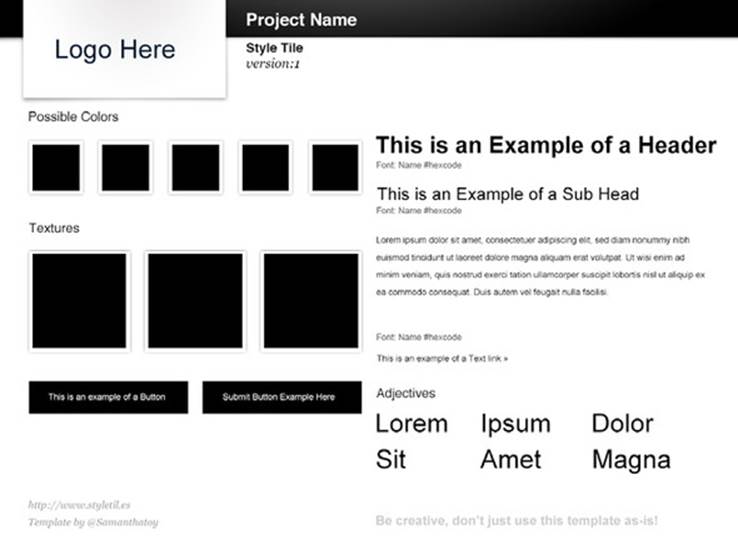
Samantha Warren, the creator of style tiles (shown in figure 3.1), was in search of a way to provide her clients with a better deliverable. Traditional web design involves creating comps in Photoshop, and it can be, at times, an unsatisfying experience.
Figure 3.1. An example of an unstyled style tile. In this chapter, you’ll learn how to turn this into a valuable asset that can communicate a site’s design clearly and quickly.
The problem with comps is that they tell too much about how a site is supposed to look, while not doing much to satisfy some of the most important aspects of a design. Although what a site looks like is important, so are what it does, how it loads, and what the experience feels like. To design a comp and then reproduce it in code is to apply your creativity to what I call a “dead end deliverable.” A comp has no use once it’s been sliced into pieces and put back together with code by a developer. A style tile doesn’t resolve all these problems, but it’s much quicker to assemble than a comp, and it can present a set of visual rules that define how a site should look, feel, and interact.
With responsive design, a site can be built with meaningful deliverables. A rapid prototype guides a site’s back-end structure. A style tile influences front-end design and can be used to offer design guidance as a site expands.
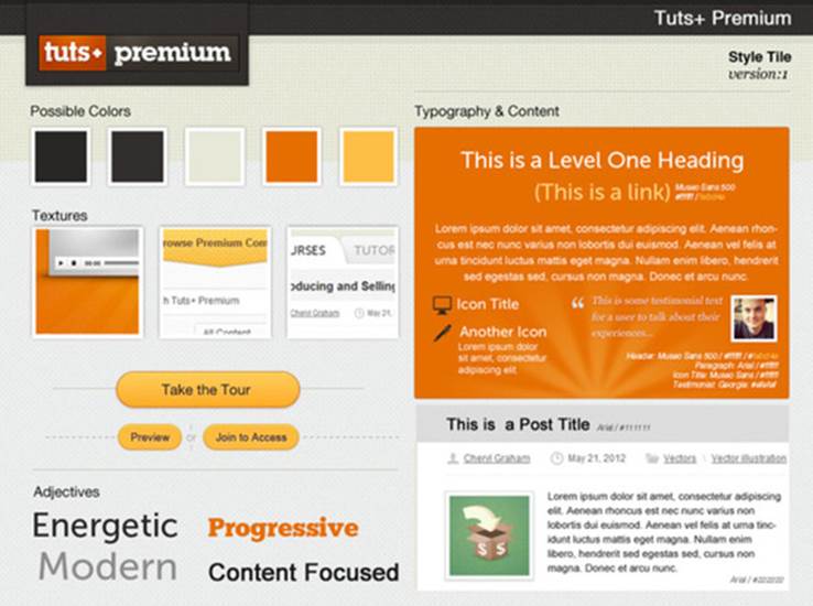
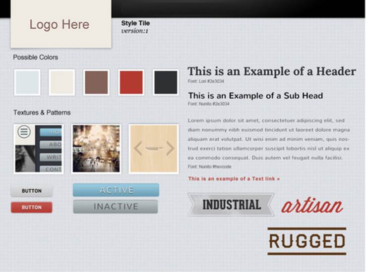
In her article in A List Apart, “Style Tiles and How They Work” (http://alistapart.com/article/style-tiles-and-how-they-work), Warren says that by relying on style tiles to inform design, she’s able to have meaningful conversations with stakeholders about a site’s visual elements earlier, without having to flesh out the entire layout of a site. This provokes thought and dialogue about what the client likes and how the client envisions the appearance of the site. The point is to achieve the results quickly without investing a large amount of time and energy too early in the process.Figure 3.2 shows what a completed style tile could look like.
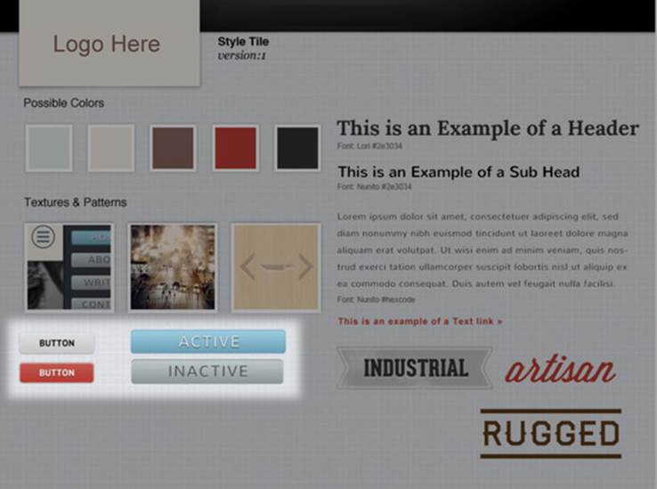
Figure 3.2. An example of a style tile for the tuts+ website. In this example, you can clearly see the core ideas behind the site’s design start to come together.
3.2. How to create a style tile
Using style tiles as an early deliverable requires a huge amount of adaptation from every member of the team. It’s not a burden that falls on the shoulders of the designer alone; rather, it requires all team members to shift the way they discuss the project and the project’s visual identity.
Steve Jobs once said of Apple’s design process that design isn’t just how a thing looks, but how it feels. In order for internal teams to find success with something like a style tile, everyone needs to understand that they’re building toward the goal of how a product is going to feel. Style tiles provide context for the product being built, but in order for them to work, teams have to hold off on the immediate urge to solve all of the problems at once.
So how do you build something that conveys not just a look, but also a feeling? You start by focusing on your client, having meaningful conversations, and learning from them. Next, you create a palette based on the feedback you received. This palette includes not just colors and typefaces, but adjectives and emotive terms to describe the projected end product.
3.2.1. Get feedback
Before starting on a style tile, it’s crucial to get feedback about how a client defines their visual brand. Much of the design work that goes into a style tile depends on feedback from and direct interaction with the client. This might begin as a mood board or a collection of images that convey the brand’s mood in the browser, but ultimately these mood boards are too vague to be used as a deliverable.
As part of a design kickoff survey, ask a series of questions to get at what your client is looking for. Some good examples of questions would be
· If your site was a soda, what would it be (for example, Coca-Cola Classic, Mountain Dew, Dr. Pepper)?
· Is your site modern or traditional?
· If your site was a city, what city would it be?
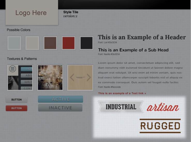
Ideally, you want to collect a series of adjectives to describe the site design. In this chapter, we’ll design a blog you started work on in chapter 1 (see figure 1.8). If I were the client for this site, I might describe what I wanted from the site with adjectives like rugged, industrial, artisan, orhandcrafted. I’d say that if my site was a beer, it would be Shiner Bock, because I want it to have a vintage, unique feel, but still appeal to a large audience. I’d probably describe it as simple and modern, but also somewhat rustic.
Once you know the direction your client wants to go, it’s on to the palette.
3.2.2. Design the style tile
As with all frameworks, the format for designing style tiles is intended as a starting point. The base Photoshop file can be downloaded from http://styletil.es, but it can seem a bit bland (see figure 3.3).
Figure 3.3. The base style tile, downloaded from http://styletil.es
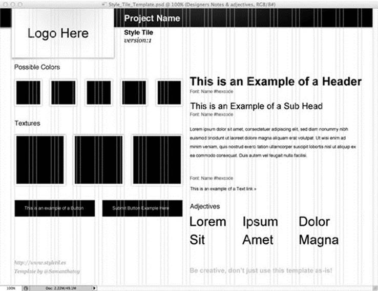
This base gives you a roadmap for the asset you’ll create. In it you have spaces for colors, textures, buttons, some type treatment, and a set of adjectives to describe the online brand of the client. There’s also space to define a logo treatment and to document the name and version of the creative design standards being worked on.
You’ll also notice the cyan vertical rules in the template. This grid layer gives a sense of the basic grid layout and relative sizing. It’s most useful as a guide for the grid system in development. Most of the work here is intended to offer talking points and direction, so keep that in mind.
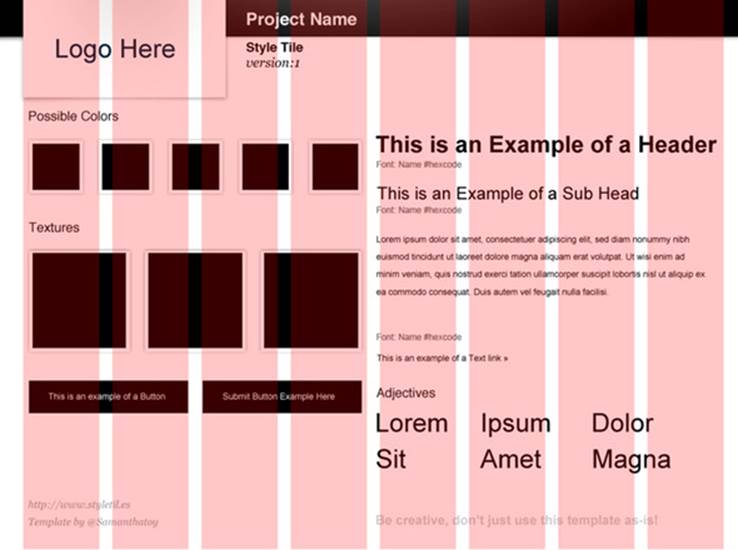
The default is a 16-column grid, but feel free to adjust it to fit your site’s needs. The blog that we’ll design in this chapter will be a type-heavy site, so 16 columns might be too fine a standard. We’ll adjust this and work with a simpler 8-column grid (figure 3.4).
Figure 3.4. An 8-column grid using a semi-transparent red layer
In the previous chapter, we walked through the design of a mobile site and made some creative decisions, such as choosing the font families for this style tile. With the grid in place, you can start adding some already defined assets, such as the logo and some colors and typefaces. This is as simple as changing the swatches and placeholder text in the style tiles template file to ones that are brand-appropriate and that reflect the creative direction of the site.
In the style tile you’re free to conceptualize the brand identity and interactive elements without having to create layout and infrastructure at the same time. This lets you focus on the important parts of the design and leads to better feedback from clients.
3.2.3. Creating the style tile
In order for your style tile to speak to the design of a site, you’ll want to add some important elements. You should feel free to use your creativity to make the style tile unique to your project.
In figure 3.5, I’ve selected a typeface and added some texture, accent images, buttons, and adjectives to describe the site.
Figure 3.5. An early initial pass at creating a style tile
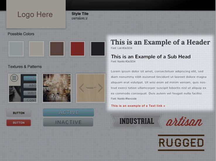
Typography
Adding type to the right side gives you a place to identify typographic style, as seen in figure 3.6. Font sizes, colors, weights, leading, and kerning can all be played with here to get a nice balance and articulate an idea.
Figure 3.6. The typography portion of the style tile. The header font family is set to Lori, and subheads and body to font family Nunito.
Colors
The color swatches on the style tile, highlighted in figure 3.7, present a small color palette that can be used in the site. These colors can be for text, call-to-action buttons, divider lines, accent points, and things like that. It’s a base of colors for use in the site design.
Figure 3.7. An example color swatch
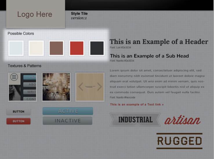
By identifying the colors outside of the comps, you can better ensure consistency and find a unified palette. A site’s color palette can become fractured if it’s reverse-engineered from a comp; with a style tile, all colors are established before they’re applied to the final site.
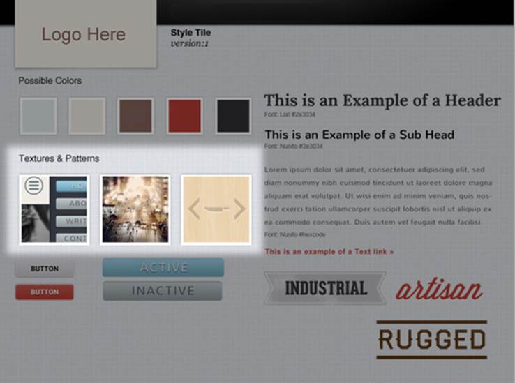
Textures and patterns
Textures and patterns are nice to include in a style tile. Texture can be a useful design tool for separating levels of content or separating elements on a common plane. It’s not a must-have, especially with flat design becoming more popular, but it’s something that I like to plan with in some of my designs. In this area you can present free-form concepts that should end up in the final site.
Say, for instance, you have a site with a main content area with sections of callouts or elements that are tangential to the central content’s focus. Textures give you a way to distinguish between these elements. You also might want a texture to fill your site’s negative space and add more personality to the site.
For me, this section, shown in figure 3.8, is more of a mood board than anything else. The treatment of the images will translate into the final site, and the images themselves will inform the look and feel of the media used on the site.
Figure 3.8. The “textures” here are little artifacts that capture some of the look and feel we want in the final product.
Buttons
For buttons, shown in figure 3.9, you want to design something that looks clickable and that follows some accepted user interface standards. Your buttons don’t always have to look glossy and rounded; what’s important is that they contrast with the background and are obviously buttons.
Figure 3.9. The buttons shown here communicate how they will look on the site, in terms of size, color, background contrast, typography, and so on.
Designer insight: user interface standards
Accepted user interface standards will depend on the company that produces them, but they’re usually similar, like the iOS iPhone Human Interface Guidelines by Apple[a] and the design library for Windows Phone by Microsoft.[b]
a Apple, “iOS Human Interface GuDo not, I’ll do it manually.idelines,” https://developer.apple.com/library/ios/documentation/userexperience/conceptual/mobilehig/MobileHIG.pdf.
b Microsoft, “Design library for Windows Phone,” http://msdn.microsoft.com/en-US/library/-windowsphone/design/fa00461b-abe1-41d1-be87-0b0fe3d3389d(v=vs.105).aspx.
Adjectives
The adjectives section, shown in figure 3.10, should be more or less a playground for ideas. Use a few words to describe the visual brand and some typefaces to accentuate those points. The type and colors presented here don’t necessarily have to be implemented in the final design; their purpose is to help articulate the end goals of the site to the client.
Figure 3.10. Adjectives can help communicate the final goal to clients and teams.
Once you’ve finished adding these elements, you’ve finished your style tile, and you have a base to start with. Keep in mind that the style tile is being built as a deliverable alongside the prototype. This reduces the need to create what I call “snapshot comps,” which are only useful in showing one website state at a time.
3.2.4. Iterative design with a style tile
Another great thing about style tiles is that they’re easy to develop iteratively. You can start with multiple style tiles, each with unique design directions, and easily combine, revise, and add to them to create the final look and feel of the site.
Because style tiles focus on the parts of the design that matter, they can be produced quickly. A few designers can work on different directions independently, and each direction could reflect a different treatment of the user interface elements, mood boards, or colors. Each tile reflects a different impression of the client’s brand, and each one could lead to different and fruitful conversations.
As you work through rounds of revisions, moving toward the final design direction, a style tile can be improved upon to develop the final design. I recommend setting a limit on the number of iterations, though, because criticizing visual elements is very easy, and ultimately the design will be integrated into a prototype that might cause the client and design team to rethink some of the style tile decisions.
3.3. The death of the mockup
Within the web design industry, there has been a lot of talk about what responsive web design means for the creation of Photoshop comps or mockups. If creating a mockup for every viewport is too labor intensive, and you use a style tile to identify visual style, where does this leave the traditional mockup?
This is a hard question to answer, and one I struggle with on a daily basis. For some traditional clients, mockups are a requirement. These clients are afraid of doing anything related to “coding” before they feel familiar with what they’re buying. Many clients find technology intimidating, and are more comfortable with a PDF full of JPEGs. Other clients want everything in the browser as soon as possible. A balance is required.
Most clients (even traditional ones) can be won over to browser-based prototypes. It’s all about using familiar terms to describe new ideas. For instance, I like to refer to rapid prototypes without any visual style as “high fidelity prototypes.” I explain to the client that engaging with the site concept in the browser will give us feedback about the way they interact with it. Because everyone interacts with their devices a little differently, this is a great way to discover how your client interacts with their sites.
Mockups or comps are a poor deliverable for the development team. There’s no true way to simulate a responsive environment (currently) with graphic design tools. In some projects, you could spend hours trying to figure out minor problems, like how a swipe should behave or how an object should follow a touch. Something as simple as binding an interaction to the start or the end of a touch can make or break the way an interaction feels. Unfortunately it’s not possible to simulate that in a static design.
What does this mean for designers? Should every designer learn to code? No, coding and designing are two entirely different things, and there should be a division of labor between code and comp, if only because it’s more economically viable. Having one person build an entire site’s designand code is just too risky. It’s extremely rare to find a developer who is a talented designer or a designer who is a talented coder. The two skillsets are very different and require unique ways of thinking.
What works best is collaborating closely with developers and designers. On one of my current projects, I sit next to the designer and we offer each other feedback as we create elements. He’ll draft a module or component for the site, and I’ll build it into the site templates, module by module.
So is the mockup dead? Yes and no. I think clients and designers still need some mockups, but ultimately how a site feels in the browser needs to supersede everything. A mockup can serve as a good target, and a style tile is great for filling in gaps. But don’t spend too much time building mockups to figure out a site’s details in the browser. Homepage or critical page mockups can be helpful, but the site prototype on the browser is where you can really explore every element of the design.
3.4. Summary
Designing based on style guides is a completely different approach from traditional web design. Responsive web design requires you to rethink a lot of the ways you go about building and designing websites. By abstracting the visual design from the layout and function of a site, you can produce a more specific deliverable, the style tile, that focuses on the immediate needs of a client.
Presenting design guidelines in the form of a style tile also offers designers a reprieve from repeating the same elements over and over again through various compositions, and having to maintain consistency between them. By using style tiles, you focus on what’s most important to a designer: the design.
In the next chapter, we’ll discuss some design patterns that you can use to implement navigation in responsive environments.
3.5. Discussion points
· How could you improve your process to facilitate better collaboration between designers and developers?
· What are some pain points in the design and development process? How do you think you could make the process easier?
· When designing a site, how do you try to anticipate how the site will look in the browser?
· When building the site, what do you do when you find something that won’t work?
All materials on the site are licensed Creative Commons Attribution-Sharealike 3.0 Unported CC BY-SA 3.0 & GNU Free Documentation License (GFDL)
If you are the copyright holder of any material contained on our site and intend to remove it, please contact our site administrator for approval.
© 2016-2026 All site design rights belong to S.Y.A.