Transforms in CSS (2015)
Coordinate Systems
Before embarking on this journey, let’s take a moment to orient ourselves. Two types of coordinate systems are used in transforms, and it’s a good idea to be familiar with both.
NOTE
If you’re already well familiar with Cartesian and spherical coordinate systems, particularly as used in computing, feel free to skip to the next section.
The first is the Cartesian coordinate system, or what’s often called the x/y/z coordinate system. This system is a way of describing the position of a point in space using two numbers (for two-dimensional placement) or three numbers (for three-dimensional placement). In CSS, the system uses three axes: the x, or horizontal axis; the y, or vertical axis; and the z, or depth axis. This is illustrated in Figure 1-1.
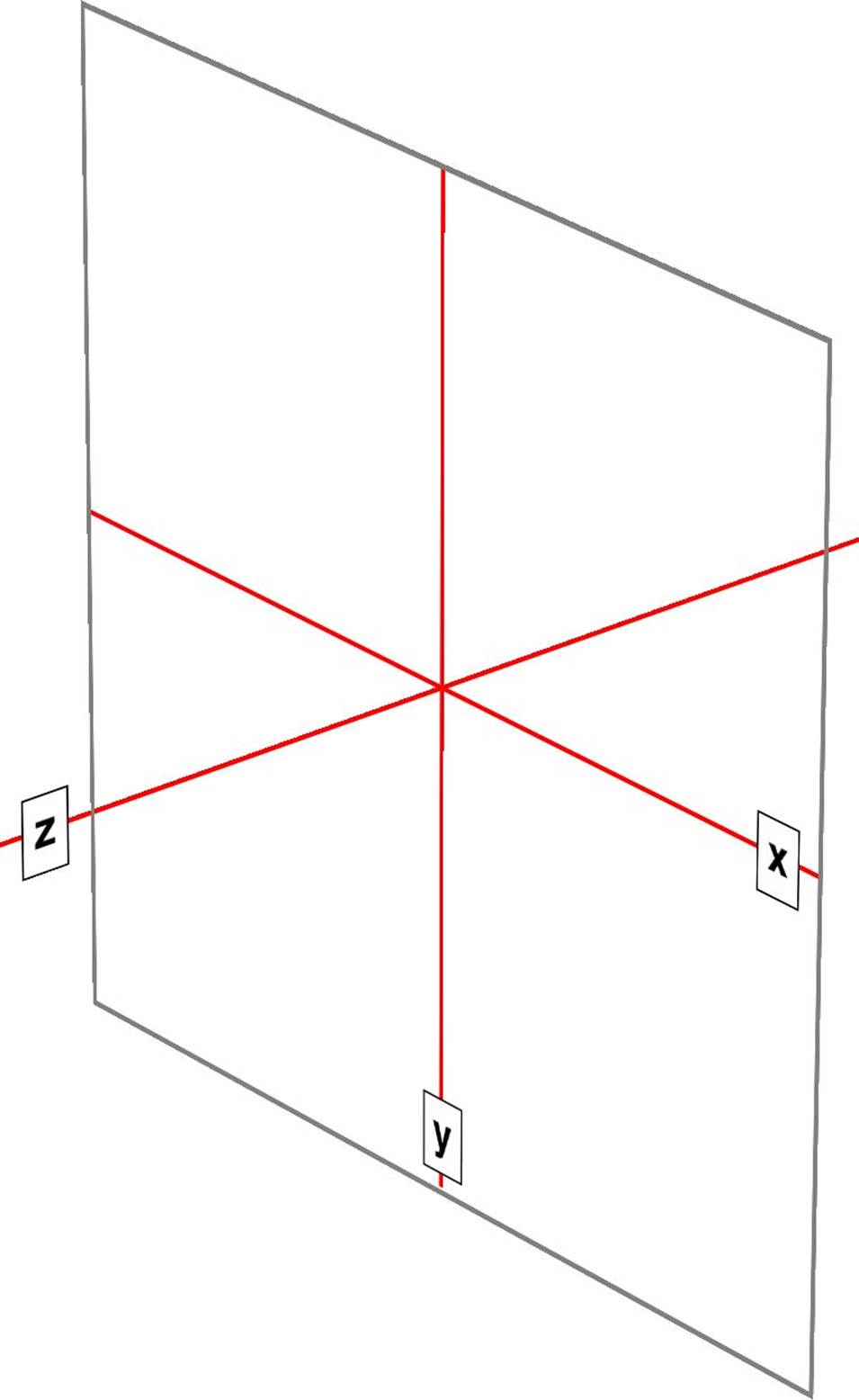
Figure 1-1. The three Cartesian axes used in CSS transforms
For any 2D (two-dimensional) transform, you only need to worry about the x- and y-axes. By convention, positive x values go to the right, and negative values go to the left. Similarly, positive y values go downward along the y-axis, while negative values go upward along the y-axis.
That might seem a little weird, since we tend to think that higher numbers should place something higher up, not lower down, as many of us learned in pre-algebra. (This why the “y” label is at the bottom of the y-axis in Figure 1-1: the labels are placed in the positive direction on all three axes.) If you are experienced with absolute positioning in CSS, think of the top property values for absolutely positioned elements: they get moved downward for positive topvalues, and upward when top has a negative length.
Given this, in order to move an element leftward and down, you would give it a negative x and a positive y value, like this:
translateX(-5em) translateY(33px)
That is in fact a valid transform value, as we’ll see in just a bit. Its effect is to translate (move) the element five ems to the left and 33 pixels down.
If you want to transform something in three-dimensional space, then you add a z-axis value. This axis is the one that “sticks out” of the display and runs straight through your head. In a theoretical sense, that is. Positive z values are closer to you, and negative z values are further away from you. In this regard, it’s exactly like the z-index property.
So let’s say that we want to take the element we moved before and add a z-axis value:
translateX(-5em) translateY(33px) translateZ(200px)
Now the element will appear 200 pixels closer to us than it would be without the z value.
Well you might wonder exactly how an element can be moved 200 pixels closer to you, given that holographic displays are regrettably rare and expensive. How many molecules of air between you and your monitor are equivalent to 200 pixels? What does an element moving closer to you even look like, and what happens if it gets too close? These are excellent questions that we’ll get to later on. For now, just accept that moving an element along the z-axis appears to move it closer or farther away.
The really important thing to remember is that every element carries its own frame of reference and so considers its axes with respect to itself. That is to say, if you rotate an element, the axes rotate along with it, as illustrated in Figure 1-2. Any further transforms are calculated with respect to those rotated axes, not the axes of the display.
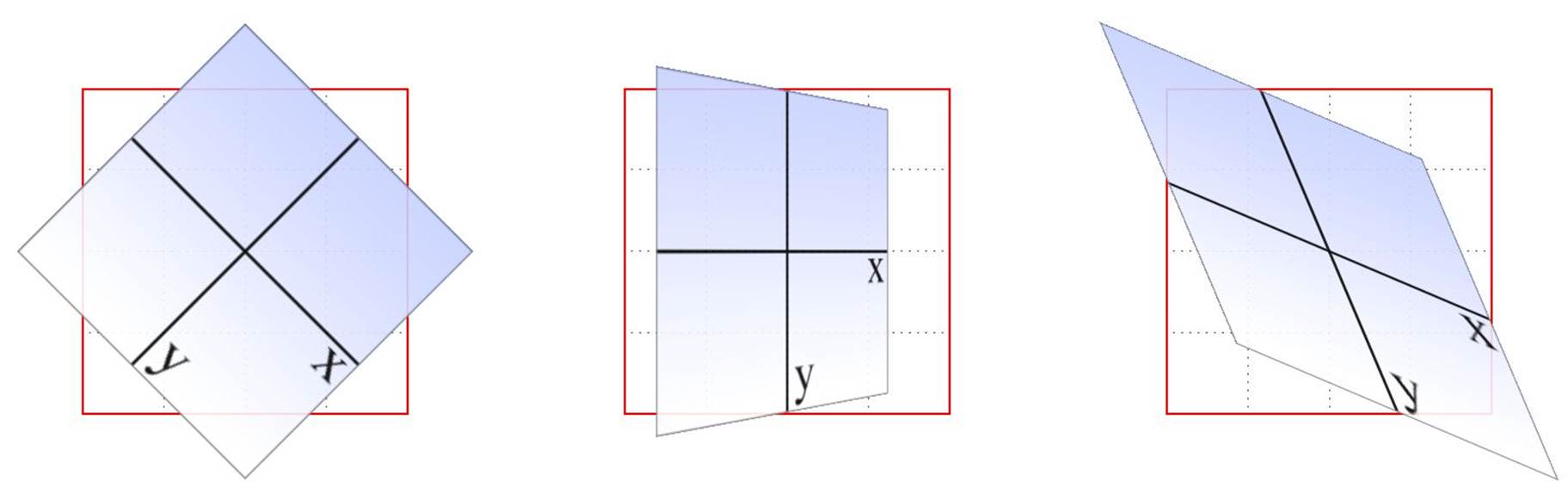
Figure 1-2. Elemental frames of reference
Speaking of rotations, the other coordinate system used in CSS transforms is a spherical system, which describes angles in 3D space. It’s illustrated in Figure 1-3.
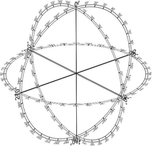
Figure 1-3. The spherical coordinate system used in CSS transforms
For the purposes of 2D transforms, you only have to worry about a single 360-degree polar system: the one that sits on the plane described by the x- and y-axes. When it comes to rotations, a 2D rotation actually describes a rotation around the z-axis. Similarly, rotations around the x-axis tilt the element toward or away from you, and rotations around the y-axis turn the element from side to side. These are illustrated in Figure 1-4.
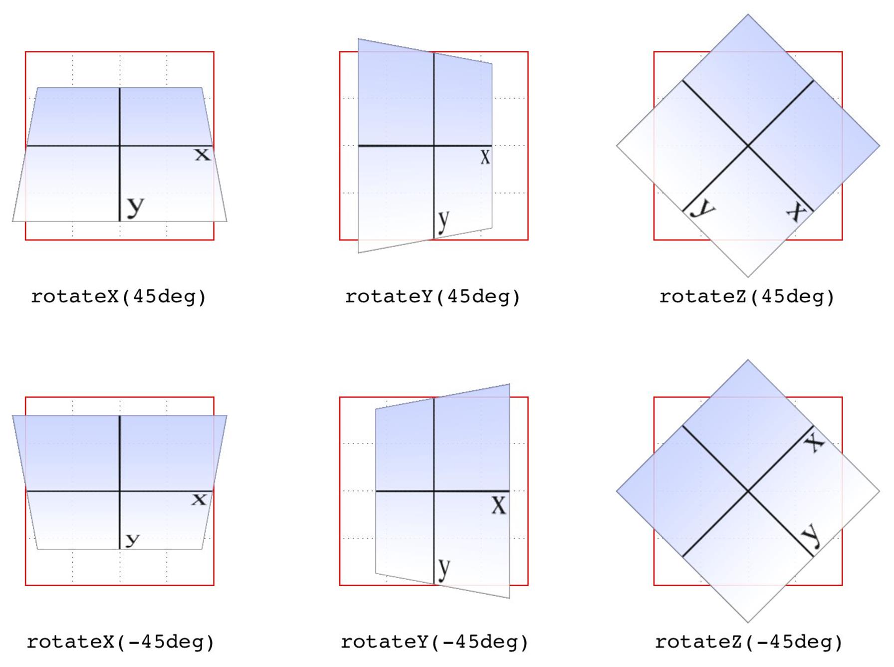
Figure 1-4. Rotations around the three axes
But back to 2D rotations. Suppose you wanted to rotate an element 45 degrees clockwise in the plane of the display (i.e., around the z-axis). The transform value you’re most likely to use is:
rotate(45deg)
Change that to –45deg, and the element will rotate counterclockwise (anticlockwise for our international friends) around the z-axis. In other words, it will rotate in the xy plane, as illustrated in Figure 1-5.
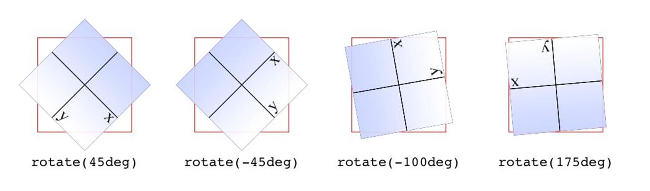
Figure 1-5. Rotations in the xy plane
All right, now that we have our bearings, let’s get started with transforms!
All materials on the site are licensed Creative Commons Attribution-Sharealike 3.0 Unported CC BY-SA 3.0 & GNU Free Documentation License (GFDL)
If you are the copyright holder of any material contained on our site and intend to remove it, please contact our site administrator for approval.
© 2016-2025 All site design rights belong to S.Y.A.