Transforms in CSS (2015)
Transforming
There’s really only one property that applies transforms, along with a few ancillary properties that affect exactly how the transforms are applied. We’ll start with the Big Cheese.
TRANSFORM
|
Values: |
<transform-list> | none | inherit |
|
Initial value: |
none |
|
Applies to: |
All elements except “atomic inline-level” boxes (see explanation) |
|
Inherited: |
No |
|
Percentages: |
Refer to the size of the bounding box (see explanation) |
|
Computed value: |
As specified, except for relative length values, which are converted to an absolute length |
First off, let’s clear up the matter of the bounding box. For any element being affected by CSS, this is the border box; that is, the outermost edge of the element’s border. That means that any outlines and margins are ignored for the purposes of calculating the bounding box.
NOTE
If a table-display element is being transformed, its bounding box is the table wrapper box, which encloses the table box and any associated caption box.
If you’re transforming a Scalable Vector Graphics (SVG) element with CSS, then its bounding box is its SVG-defined object bounding box. Simple enough!
Note that all transformed elements (i.e., elements with transform set to a value other than none) have their own stacking context. While the scaled element may be much smaller or larger than it was before the transform was applied, the actual space on the page that the element occupies remains the same as before the transform was applied. This is true for all the transform functions.
Now, the value entry <transform-list> requires some explanation. This placeholder refers to a list of one or more transform functions, one after the other, in space-separated format. It looks like this, with the result shown in Figure 1-6:
#example {transform: rotate(30deg) skewX(-25deg) scaleY(2);}

Figure 1-6. A transformed div element
The functions are processed one at a time, starting with the first (leftmost) and proceeding to the last (rightmost). This first-to-last processing order is important, because changing the order can lead to drastically different results. Consider the following two rules, which have the results shown in Figure 1-7:
img#one {transform: translateX(200px) rotate(45deg);}
img#two {transform: rotate(45deg) translateX(200px);}
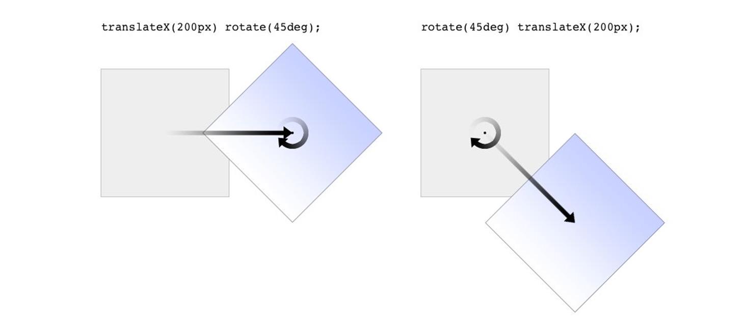
Figure 1-7. Different transform lists, different results
In the first instance, an image is translated (moved) 200 pixels along its x-axis and then rotated 45 degrees. In the second instance, an image is rotated 45 degrees and then moved 200 pixels along its x-axis — that’s the x-axis of the transformed element, not of the parent element, page, or viewport. In other words, when an element is rotated, its x-axis (along with its other axes) rotates along with it. All element transforms are conducted with respect to the element’s own frame of reference.
Compare this to a situation where an element is translated and then scaled, or vice versa; it doesn’t matter which is which, because the end result is the same:
img#one {transform: translateX(100px) scale(1.2);}
img#two {transform: scale(1.2) translateX(100px);}
The situations where the order doesn’t matter are far outnumbered by the situations where it does; so in general, it’s a good idea to just assume the order always matters, even when it technically doesn’t.
Note that when you have a series of transform functions, all of them must be properly formatted; that is, they must be valid. If even one function is invalid, it renders the entire value invalid. Consider:
img#one {transform: translateX(100px) scale(1.2) rotate(22);}
Because the value for rotate() is invalid — rotational values must have a unit — the entire value is dropped. The image in question will simply sit there in its initial untransformed state, neither translated nor scaled, let alone rotated.
It’s also the case that transforms are not usually cumulative. That is to say, if you apply a transform to an element and then later want to add a transformation, you need to restate the original transform. Consider the following scenarios, illustrated in Figure 1-8:
#ex01 {transform: rotate(30deg) skewX(-25deg);}
#ex01 {transform: scaleY(2);}
#ex02 {transform: rotate(30deg) skewX(-25deg);}
#ex02 {transform: rotate(30deg) skewX(-25deg) scaleY(2);}
Figure 1-8. Overwriting or modifying transforms
In the first case, the second rule completely replaces the first, meaning that the element is only scaled along the y-axis. This actually makes some sense; it’s the same as if you declare a font size and then elsewhere declare a different font size for the same element. You don’t get a cumulative font size that way. You just get one size or the other. In the second example, the entirety of the first set of transforms is included in the second set, so they all are applied along with the scaleY() function.
There is an exception to this, which is that animated transforms, whether using transitions or actual animations, are additive. That way, you can take an element that’s transformed and then animate one of its transform functions without overwriting the others. For example, assume you had:
img#one {transform: translateX(100px) scale(1.2);}
If you then animate the element’s rotation angle, it will rotate from its translated, scaled state to the new angle, and its translation and scale will remain in place.
What makes this interesting is that even if you don’t explicitly specify a transition or animation, you can still create additive transforms via the user-interaction pseudoclasses, such as :hover. That’s because things like hover effects are types of transitions; they’re just not invoked using the transition properties. Thus, you could declare:
img#one {transform: translateX(100px) scale(1.2);}
img#one:hover {transform: rotate(-45deg);}
This would rotate the translated, scaled image 45 degrees to its left on hover. The rotation would take place over zero seconds because no transition interval was declared, but it’s still an implicit transition. Thus, any state change can be thought of as a transition, and thus any transforms that are applied as a result of those state changes are additive with previous transforms.
There’s one important caveat: as of this writing, transforms are not applied to “atomic inline-level” boxes. These are inline boxes like spans, hyperlinks, and so on. Those elements can be transformed if their block-level parent is transformed, in which case they go along for the ride. But you can’t just rotate a span unless you’ve changed its display role via display: block, display: inline-block, or something along those lines. The reason for this limitation boils down to an uncertainty. Suppose you have a span (or any inline-level box) that breaks across multiple lines. If you rotate it, what happens? Does each line box rotate with respect to itself, or should all the line boxes be rotated as a single group? There’s no clear answer, and the debate continues, so for now you can’t directly transform inline-level boxes.
NOTE
As of late 2014, transform and its associated properties still had to be vendor-prefixed in WebKit and Blink browsers like Safari and Chrome. No prefixes were needed in other major user agents. This restriction was finally dropped in early 2015.
The Transform Functions
There are, as of this writing, 21 different transform functions, employing a number of different value patterns to get their jobs done. Table 1-1 provides a list of all the available transform functions, minus their value patterns.
|
translate() translate3d() translateX() translateY() translateZ() |
scale() scale3d() scaleX() scaleY() scaleZ() |
rotate() rotate3d() rotateX() rotateY() rotateZ() |
skew() skewX() skewY() |
matrix() matrix3d() perspective() |
|
Table 1-1. Transform functions |
||||
As previously stated, the most common value pattern for transform is a space-separated list of one or more functions, processed from first (leftmost) to last (rightmost), and all of the functions must have valid values. If any one of the functions is invalid, it will invalidate the entire value of transform, thus preventing any transformation at all.
Translation functions
A translation transform is just a move along one or more axes. For example, translateX() moves an element along its own x-axis, translateY() moves it along its y-axis, and translateZ() moves it along its z-axis.
|
Functions |
Permitted values |
|
translateX(), translateY() |
<length> | <percentage> |
These are usually referred to as the “2D” translation functions, since they can slide an element up and down, or side to side, but not forward or backward along the z-axis. Each of these functions accepts a single distance value, expressed as either a length or a percentage.
If the value is a length, then the effect is about what you’d expect. Translate an element 200 pixels along the x-axis with translateX(200px), and it will move 200 pixels to its right. Change that to translateX(-200px), and it will move 200 pixels to its left. For translateY(), positive values move the element downward, while negative values move it upward, both with respect to the element itself. Thus, if you flip the element upside down by rotation, positive translateY() values will actually move the element downward on the page.
If the value is a percentage, then the distance is calculated as a percentage of the element’s own size. Thus, translateX(50%) will move an element 300 pixels wide and 200 pixels tall to its right by 150 pixels, and translateY(-10%)will move that same element upward (with respect to itself) by 20 pixels.
|
Function |
Permitted values |
|
translate() |
[ <length> | <percentage> ] [, <length> | <percentage>]? |
If you want to translate an element along both the x- and y-axes at the same time, then translate() makes it simple. Just supply the x value first and the y value second, and it will act the same as if you combined translateX() translateY(). If you omit the y value, then it’s assumed to be zero. Thus, translate(2em) is treated as if it were translate(2em,0), which is also the same as translateX(2em). See Figure 1-9 for some examples of 2D translation.
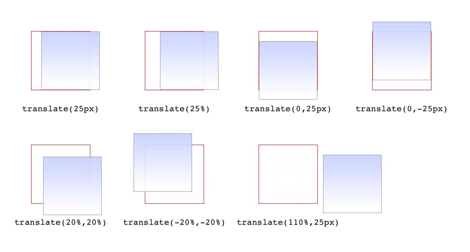
Figure 1-9. Translating in two dimensions
According to the latest version of the specification, both of the 2D translation functions can be given a unitless number. In this case, the number is treated as being expressed in terms of a “user unit,” which is treated the same as a pixel unless otherwise defined. The CSS specification does not explain how a user unit is otherwise defined; however, the SVG specification does, albeit briefly. In the field, no browser tested as of this writing supported unitless numbers of translation values, so the capability is academic, at best.
|
Function |
Permitted value |
|
translateZ() |
<length> |
This function translates elements along the z-axis, thus moving them into the third dimension. Unlike the 2D translation functions, translateZ() only accepts length values. Percentage values are not permitted for translateZ(), or indeed for any z-axis value.
|
Functions |
Permitted values |
|
translate3d() |
[ <length> | <percentage> ], [ <length> | <percentage>], [ <length> ] |
Much like translate() does for x and y translations, translate3d() is a shorthand function that incorporates the x, y, and z translation values into a single function. This is obviously handy if you want to move an element over, up, and forward in one fell swoop. See Figure 1-10 for an illustration of how 3D translation works. There, each arrow represents the translation along that axis, arriving at a point in 3D space. The dashed lines show the distance and direction from the origin point (the intersection of the three axes) and the distance above the xz plane.
Unlike translate(), there is no fallback for situations where translate3d() does not contain three values. Thus, translate3d(1em,-50px) should be treated as invalid by user agents instead of being assumed to be translate3d(2em,-50px,0).
Scale functions
A scale transform makes an element larger or smaller, depending on what value you use. These values are unitless real numbers and are always positive. On the 2D plane, you can scale along the x- and y-axes individually, or scale them together.
|
Functions |
Permitted value |
|
scaleX(), scaleY(), scaleZ() |
<number> |
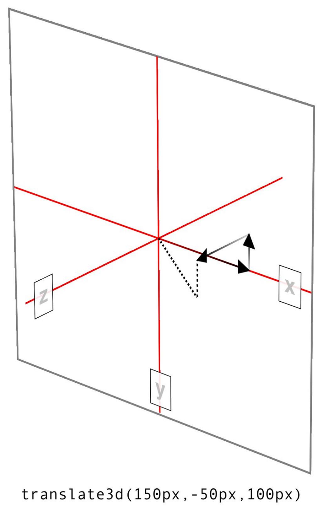
Figure 1-10. Translating in three dimensions
The number value supplied to a scale function is a multiplier; thus, scaleX(2) will make an element twice as wide as it was before the transformation, whereas scaleY(0.5) will make it half as tall. Given this, you might expect that percentage values are permissible as scaling values, but they aren’t.
|
Function |
Permitted value |
|
scale() |
<number> [, <number>]? |
If you want to scale along both axes simultaneously, use scale(). The x value is always first and the y always second, so scale(2,0.5) will make the element twice as wide and half as tall as it was before being transformed. If you only supply one number, it is used as the scaling value for both axes; thus, scale(2) will make the element twice as wide and twice as tall. This is in contrast to translate(), where an omitted second value is always set to zero. scale(1) will scale an element to be exactly the same size it was before you scaled it, as will scale(1,1). Just in case you were dying to do that.
Figure 1-11 shows a few examples of element scaling, using both the single-axis scaling functions, as well as the combined scale().
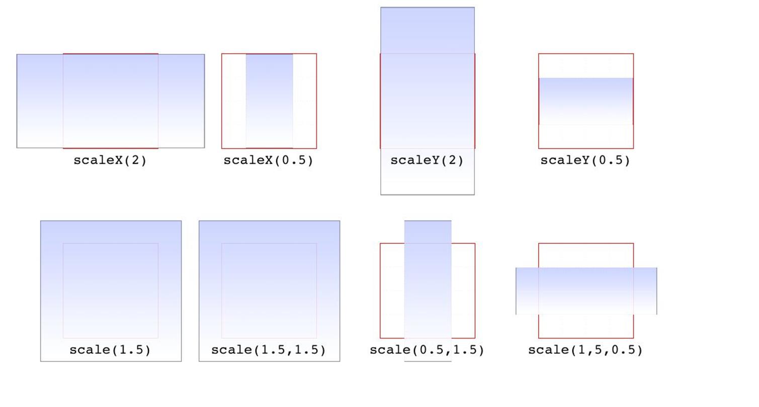
Figure 1-11. Scaled elements
Of course, if you can scale in two dimensions, you can also scale in three. CSS offers scaleZ() for scaling just along the z-axis, and scale3d() for scaling along all three axes at once. These really only have an effect if the element has any depth, which elements don’t by default. If you do make a change that conveys depth — say, rotating an element around the x- or y-axes — then there is a depth that can be scaled, and either scaleZ() or scale3d() can do so.
|
Function |
Permitted value |
|
scale3d() |
<number>, <number>, <number> |
Similar to translate3d(), scale3d() requires all three numbers to be valid. If you fail to do this, then the malformed scale3d() will invalidate the entire transform value to which it belongs.
Rotation functions
A rotation function causes an element to be rotated around an axis, or around an arbitrary vector in 3D space. There are four simple rotation functions, and one less-simple function meant specifically for 3D.
|
Functions |
Permitted values |
|
rotate(), rotateX(), rotateY(), rotateZ() |
<angle> |
All four basic rotation functions accept just one value: a degree. This can be expressed using any of the valid degree units (deg, grad, rad, and turn) and a number, either positive or negative. If a value’s number runs outside the usual range for the given unit, it will be normalized to fit into the accepted range. In other words, a value of 437deg will be tilted the same as if it were 77deg, or, for that matter, -283deg.
Note, however, that these are only exactly equivalent if you don’t animate the rotation in some fashion. That is to say, animating a rotation of 1100deg will spin the element around several times before coming to rest at a tilt of -20 degrees (or 340 degrees, if you like). By contrast, animating a rotation of -20deg will tilt the element a bit to the left, with no spinning; and of course animating a rotation of 340deg will animate an almost-full spin to the right. All three animations come to the same end state, but the process of getting there is very different in each case.
The function rotate() is a straight 2D rotation, and the one you’re most likely to use. It is equivalent to rotateZ() because it rotates the element around the z-axis (the one that shoots straight out of your display and through your eyeballs). In a similar manner, rotateX() causes rotation around the x-axis, thus causing the element to tilt toward or away from you; and rotateY() rotates the element around its y-axis, as though it were a door. These are all illustrated in Figure 1-12.
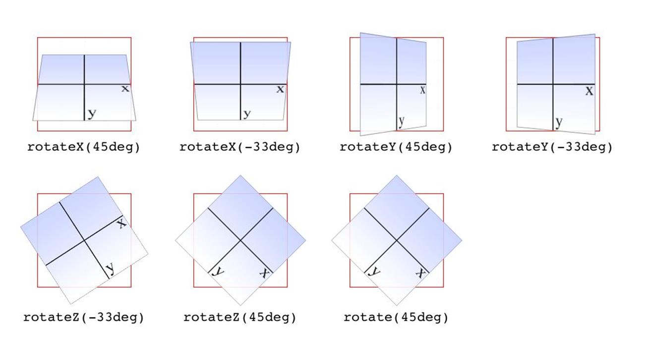
Figure 1-12. Rotations around the three axes
WARNING
Several of the examples in Figure 1-12 present a fully 3D appearance. This is only possible with certain values of the properties transform-style and perspective, described in a later section and omitted here for clarity. This will be true throughout this text in any situation where 3D-transformed elements appear to be fully three-dimensional. This is important to keep in mind because if you just try to apply the transform functions shown, you won’t get the same visual results as in the figures.
|
Function |
Permitted value |
|
rotate3d() |
<number>, <number>, <number>, <angle> |
If you’re comfortable with vectors and want to rotate an element through 3D space, then rotate3d() is for you. The first three numbers specify the x, y, and z components of a vector in 3D space, and the degree value (angle) determines the amount of rotation around the declared 3D vector.
To start with a simple example, the 3D equivalent to rotate(45deg) is rotate3d(0,0,1,45deg). This specifies a vector of zero magnitude on the x- and y-axes, and a magnitude of 1 along the z-axis. In other words, it describes the z-axis. The element is thus rotated 45 degrees around that vector, as shown in Figure 1-13. This figure also shows the appropriate rotate3d() values to rotate an element by 45 degrees around the x- and y-axes.
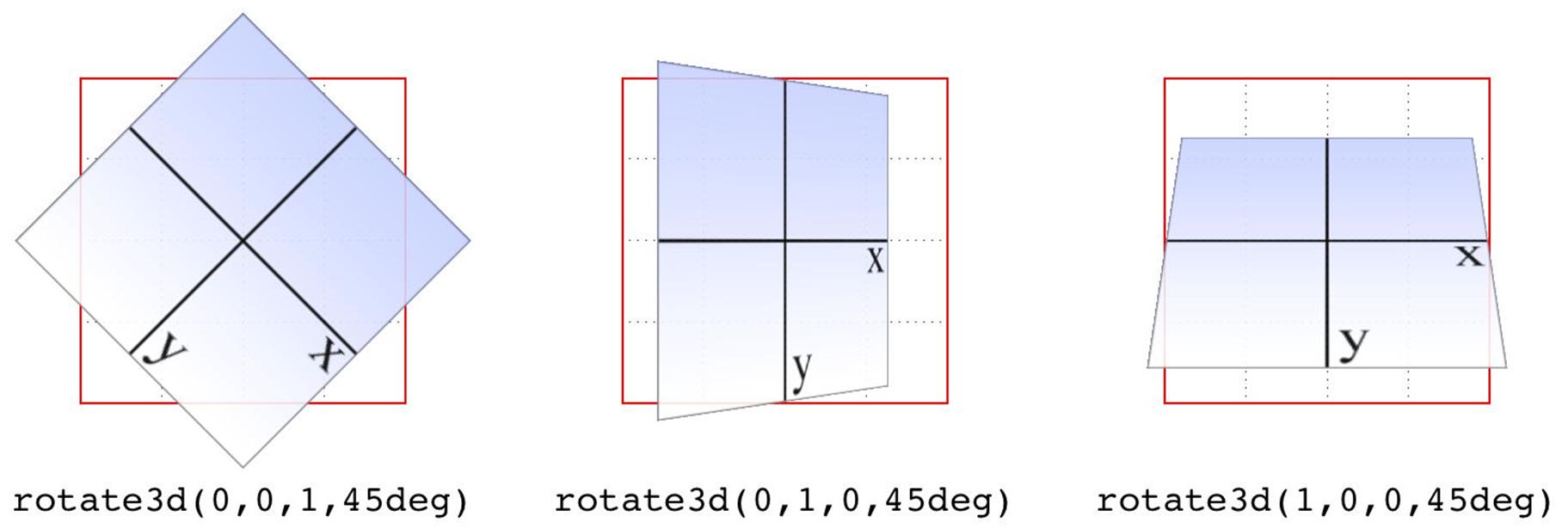
Figure 1-13. Rotations around 3D vectors
A little more complicated is something like rotate3d(-0.95,0.5,1,45deg), where the described vector points off into 3D space between the axes. In order to understand how this works, let’s start with a simple example: rotateZ(45deg) (illustrated in Figure 1-13). The equivalent is rotate3d(0,0,1,45deg). The first three numbers describe the components of a vector that has no x or y magnitude, and a z magnitude of 1. Thus, it points along the z-axis in a positive direction; that is, toward the viewer. The element is then rotated clockwise as you look toward the origin of the vector. Simple enough.
Similarly, the 3D equivalent of rotateX(45deg) is rotate3d(1,0,0,45deg). The vector points along the x-axis in the positive direction (to the right). If you stand at the end of that vector and look toward its origin, then you rotate the element 45 degrees clockwise around the vector. Thus, from the usual viewer placement, the top of the element rotates away from and the bottom rotates toward the viewer.
Let’s make it slightly more complex: suppose you have rotate3d(1,1,0,45deg). When viewed on your monitor, that describes a vector running from the top-left to bottom-right corner, going right through the center of the element (by default, anyway; we’ll see how to change that later on). So the element’s rectangle has a line running through it at a 45-degree angle, effectively spearing it. Then the vector rotates 45 degrees, taking the element with it. The rotation is clockwise as you look back toward the vector’s origin, so again, the top of the element rotates away from the viewer, while the bottom rotates toward the viewer. If we were to change the rotation to rotate3d(1,1,0,90deg), then the element would be edge-on to the viewer, tilted at a 45-degree angle and facing off toward the upper right. Try it with a piece of paper: draw a line from the top left to bottom right, and then rotate the paper around that line.
Okay, so given all that, try visualizing how the vector is determined for rotate3d(-0.95,0.5,1,45deg). If we assume a cube 200 pixels on a side, the vector’s components are 190 pixels to the left along the x-axis, 100 pixels down along the y-axis, and 200 pixels toward the views along the z-axis. The vector goes from the origin point (0, 0, 0) to the point (-190px, 100px, 200px). Figure 1-14 depicts that vector, as well as the final result presented to the viewer.
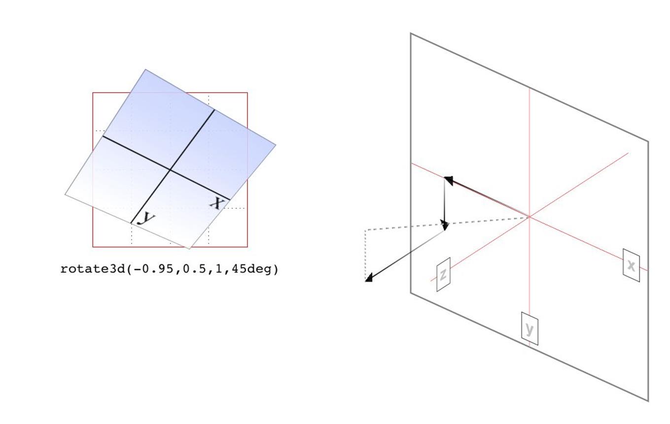
Figure 1-14. Rotation around a 3D vector, and how that vector is determined
So the vector is like a metal rod speared through the element being rotated. As we look back along the line of the vector, the rotation is 45 degrees clockwise. But since the vector points left, down, and forward, that means the top left corner of the element rotates toward the viewer, and the bottom right rotates away, as shown in Figure 1-14.
Just to be crystal clear, rotate3d(1,1,0,45deg) is not equivalent to rotateX(45deg) rotateY(45deg) rotateZ(0deg)! It’s an easy mistake to make, and many people — including several online tutorial authors and, until researching and writing this section, your humble correspondent — have made it. It seems like it should be equivalent, but it really isn’t. If we place that vector inside the imaginary 200 × 200 × 200 cube previously mentioned, the axis of rotation would go from the origin point to a point 200 pixels right and 200 pixels down (200, 200, 0).
Having done that, the axis of rotation is shooting through the element from the top left to the bottom right, at a 45-degree angle. The element then rotates 45 degrees clockwise around that diagonal, as you look back toward its origin (the top left), which rotates the top-right corner of the element away and a bit to the left, while the bottom-left corner rotates closer and a bit to the right. This is distinctly different than the result of rotateX(45deg) rotateY(45deg) rotateZ(0deg), as you can see in Figure 1-15.
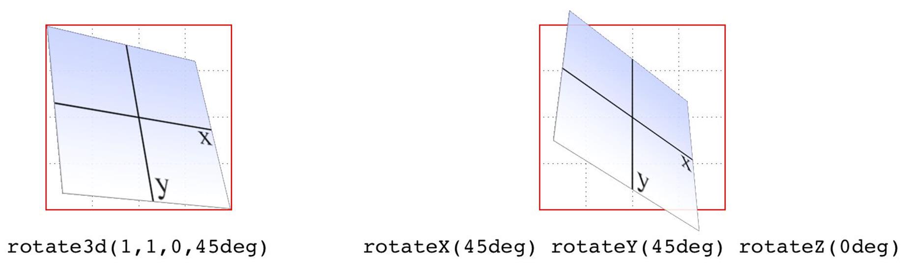
Figure 1-15. The difference between rotating around two axes and rotating around a 3D axis
Skew functions
When you skew an element, you slant it along one or both of the x- and y-axes. There is no z-axis or other 3D skewing.
|
Functions |
Permitted value |
|
skewX(), skewY() |
<angle> |
In both cases, you supply an angle value, and the element is skewed to match that angle. It’s much easier to show skewing rather than try to explain it in words, so Figure 1-16 shows a number of skew examples along the x- and y-axes.
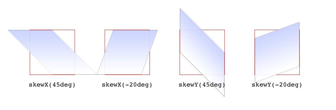
Figure 1-16. Skewing along the x- and y-axes
|
Function |
Permitted values |
|
skew() |
<angle> [, <angle> ]? |
The behavior of including skew(a,b) is different from including skewX(a) with skewY(b). Instead, it specifies a 2D skew using the matrix operation [ax,ay]. Figure 1-17 shows some examples of this matrix skewing and how they differ from double-skew transforms that look the same at first, but aren’t.
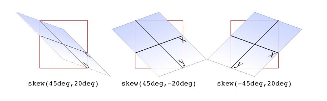
Figure 1-17. Skewed elements
If you supply two values, the x skew angle is always first, and the y skew angle comes second. If you leave out a y skew angle, then it’s treated as zero.
The perspective function
If you’re transforming an element in 3D space, you most likely want it to have some perspective. Perspective gives the appearance of front-to-back depth, and you can vary the amount of perspective applied to an element.
|
Function |
Permitted values |
|
perspective() |
<length> |
It might seem a bit weird that you specify perspective as a distance. After all, perspective(200px) seems a bit odd when you can’t really measure pixels along the z-axis. And yet, here we are. You supply a length, and the illusion of depth is constructed around that value. Lower numbers create more extreme perspective, as though you are right up close to the element and viewing it through a fish-eye lens. Higher numbers create a gentler perspective, as though viewing the element through a zoom lens from far away. Really high perspective values create an isometric effect.
This makes a certain amount of sense. If you visualize perspective as a pyramid, with its apex point at the perspective origin and its base the closest thing to you, then a shorter distance between apex and base will create a shallower pyramid, and thus a more extreme distortion. This is illustrated in Figure 1-18, with hypothetical pyramids representing 200 px, 800 px, and 2,000 px perspective distances.
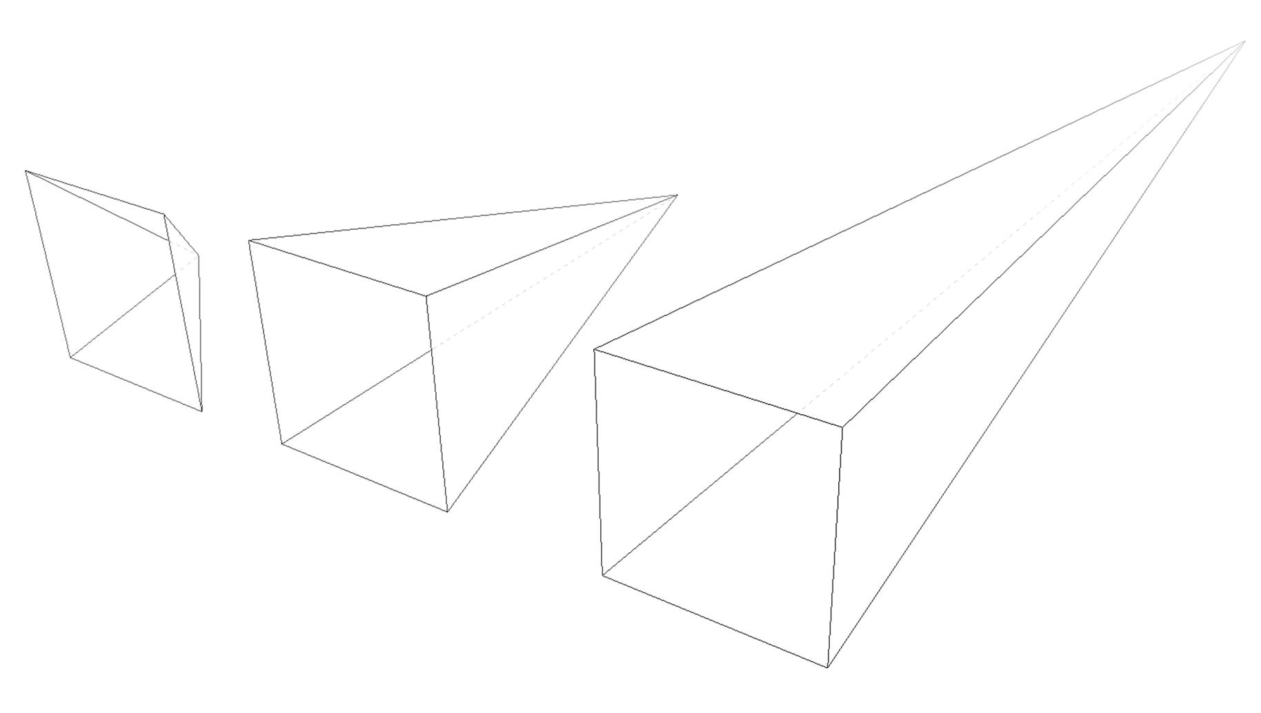
Figure 1-18. Different perspective pyramids
In the documentation for Safari, Apple writes that perspective values below 300px tend to be extremely distorted, values above 2000px create “very mild” distortion, and values between 500px and 1000px create “moderate perspective.”1 To illustrate this, Figure 1-19 shows a series of elements with the exact same rotation as displayed with varying perspective values.
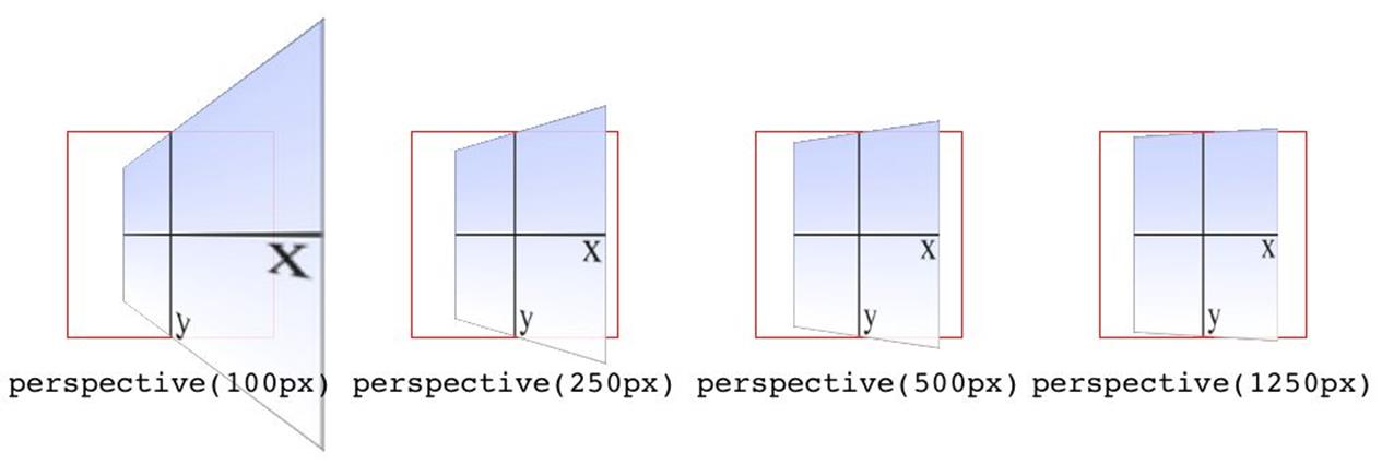
Figure 1-19. The effects of varying perspective values
Perspective values must always be positive, nonzero lengths. Any other value will cause the perspective() function to be ignored. Also note that its placement in the list of functions is very important. If you look at the code for Figure 1-19, the perspective() function comes before the rotateY() function. If you were to reverse the order, the rotation would happen before the perspective is applied, so all four examples in Figure 1-19 would look exactly the same. So if you plan to apply a perspective value via the list of transform functions, make sure it comes first, or at the very least before any transforms that depend on it. This serves as a particularly stark reminder that the order in which you write transform functions can be very important.
NOTE
Note that the function perspective() is very similar to the property perspective, which will be covered later, but they are applied in critically different ways. Generally, you will want to use the perspective property instead of the perspective() function, but there may be exceptions.
Matrix functions
If you’re a particular fan of advanced math, or stale jokes derived from Wachowski Brothers movies, then these functions will be your favorites.
|
Function |
Permitted values |
|
matrix() |
<number> [, <number> ]{5,5} |
In the CSS transforms specification, we find the trenchant description of matrix() as a function that “specifies a 2D transformation in the form of a transformation matrix of the six values a-f.”
First things first: a valid matrix() value is a list of six comma-separated numbers. No more, no less. The values can be positive or negative. Second, the value describes the final transformed state of the element, combining all of the other transform types (rotation, skewing, and so on) into a very compact syntax. Third, very few people actually use this syntax.
We’re not actually going to go through the complicated process of actually doing the matrix math. For most readers, it would be an eye-watering wall of apparent gibberish; and for the rest, it would be time wasted on familiar territory. You can certainly research the intricacies of matrix calculations online, and I encourage anyone with an interest to do so. We’ll just look at the basics of syntax and usage in CSS.
Here’s a brief rundown of how it works. Say you have this function applied to an element:
matrix(0.838671, 0.544639, -0.692519, 0.742636, 6.51212, 34.0381)
That’s the CSS syntax used to describe this transformation matrix:
0.838671 -0.692519 0 6.51212
0.544639 0.742636 0 34.0381
0 0 1 0
0 0 0 1
Right. So what does that do? It has the result shown in Figure 1-20, which is exactly the same result as writing this:
rotate(33deg) translate(24px,25px) skewX(-10deg)
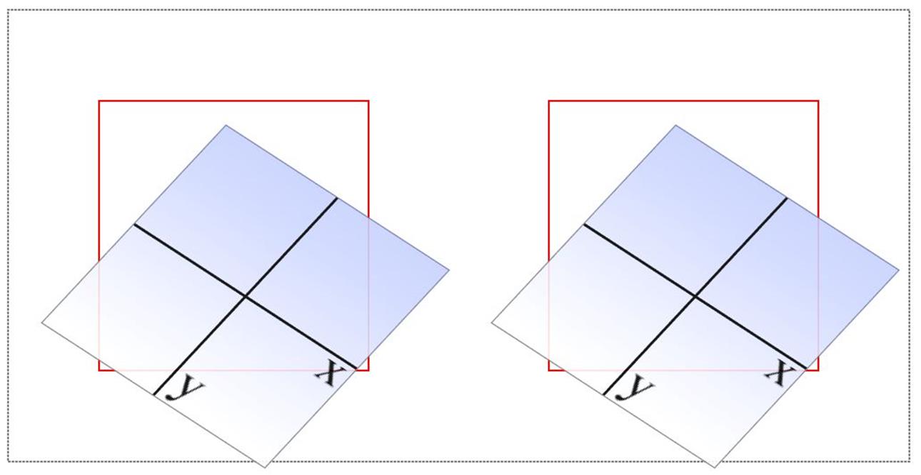
Figure 1-20. A matrix-transformed element and its functional equivalent
What this comes down to is that if you’re familiar with or need to make use of matrix calculations, you can and should absolutely use them. If not, you can chain much more human-readable transform functions together and get the element to the same end state.
Now, that was for plain old 2D transforms. What if you want to use a matrix to transform through three dimensions?
|
Function |
Permitted values |
|
matrix3d() |
<number> [, <number> ]{15,15} |
Again, just for kicks, we’ll savor the definition of matrix3d() from the CSS Transforms specification: “specifies a 3D transformation as a 4 × 4 homogeneous matrix of 16 values in column-major order.” This means the value of matrix3d must be a list of 16 comma-separated numbers, no more or less. Those numbers are arranged in a 4 × 4 grid in column order, so the first column of the matrix is formed by the first set of four numbers in the value, the second column by the second set of four numbers, the third column by the third set, and so on. Thus, you can take the following function:
matrix3d(
0.838671, 0, -0.544639, 0.00108928,
-0.14788, 1, 0.0960346, -0.000192069,
0.544639, 0, 0.838671, -0.00167734,
20.1281, 25, -13.0713, 1.02614)
And write it out as this matrix:
0.838671 -0.14788 0.544639 20.1281
0 1 0 25
-0.544639 0.0960346 0.838671 -13.0713
0.00108928 -0.000192069 -0.00167734 1.02614
Both of which have an end state equivalent to:
perspective(500px) rotateY(33deg) translate(24px,25px) skewX(-10deg)
as shown in Figure 1-21.
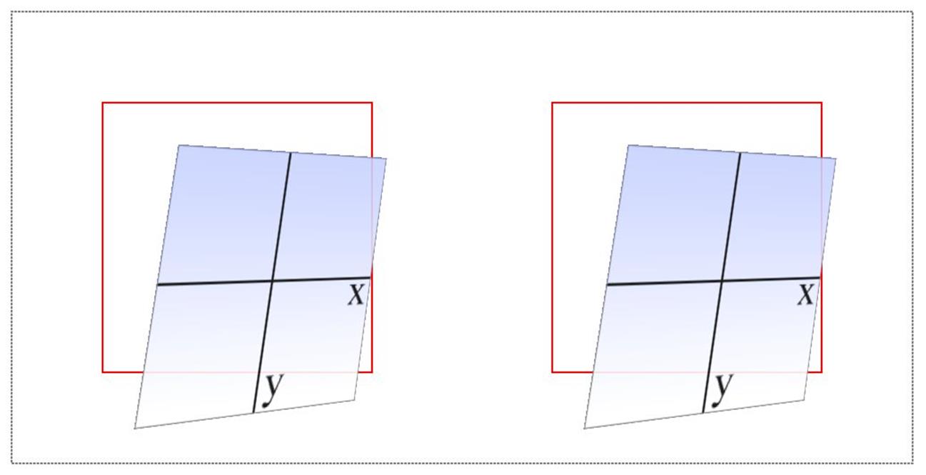
Figure 1-21. A matrix3d-transformed element and its functional equivalent
A note on end-state equivalence
It’s important to keep in mind that only the end states of a matrix() function, and of an equivalent chain of transform functions, can be considered identical. This is for the same reason discussed in the section on rotation: because a rotation angle of 393deg will end with the same visible rotation as an angle of 33deg. This matters if you are animating the transformation, since the former will cause the element to do a barrel roll in the animation, whereas the latter will not. The matrix() version of this end state won’t include the barrel roll, either. Instead, it will always use the shortest possible rotation to reach the end state.
To illustrate what this means, consider the following: a transform chain and its matrix() equivalent:
rotate(200deg) translate(24px,25px) skewX(-10deg)
matrix(-0.939693, -0.34202, 0.507713, -0.879385, -14.0021, -31.7008)
Note the rotation of 200 degrees. We naturally interpret this to mean a clockwise rotation of 200 degrees, which it does. If these two transforms are animated, however, they will have act differently: the chained-functions version will indeed rotate 200 degrees clockwise, whereas the matrix() version will rotate 160 degrees counterclockwise. Both will end up in the same place, but will get there in different ways.
There are similar differences that arise even when you might think they wouldn’t. Once again, this is because a matrix() transformation will always take the shortest possible route to the end state, whereas a transform chain might not. (In fact, it probably doesn’t.) Consider these apparently equivalent transforms:
rotate(160deg) translate(24px,25px) rotate(-30deg) translate(-100px)
matrix(-0.642788, 0.766044, -0.766044, -0.642788, 33.1756, -91.8883)
As ever, they end up in the same place. When animated, though, the elements will take different paths to reach that end state. They might not be obviously different at first glance, but the difference is still there.
Of course, none of this matters if you aren’t animating the transformation, but it’s an important distinction to make nevertheless, because you never know when you’ll decide to start animating things. (Hopefully after reading the companion text on animations!)
All materials on the site are licensed Creative Commons Attribution-Sharealike 3.0 Unported CC BY-SA 3.0 & GNU Free Documentation License (GFDL)
If you are the copyright holder of any material contained on our site and intend to remove it, please contact our site administrator for approval.
© 2016-2026 All site design rights belong to S.Y.A.