Transforms in CSS (2015)
More Transform Properties
In addition to the base transform property, there are a few related properties that help to define things such as the origin point of a transform, the perspective used for a “scene,” and more.
Moving the Origin
So far, all of the transforms we’ve seen have shared one thing in common: the precise center of the element was used as the transform origin. For example, when rotating the element, it rotated around its center, instead of, say, a corner. This is the default behavior, but with the property transform-origin, you can change it.
TRANSFORM-ORIGIN
|
Values: |
[ left | center | right | top | bottom | <percentage> | <length> ] | [ left | center | right | <percentage> | <length> ] [ top | center | bottom | <percentage> | <length> ] <length>? | |
|
Initial value: |
50% 50% |
|
Applies to: |
Any transformable element |
|
Inherited: |
No |
|
Percentages: |
Refer to the size of the bounding box (see explanation) |
|
Computed value: |
A percentage, except for length values, which are converted to an absolute length |
The syntax definition looks really abstruse and confusing, but it’s actually very simple in practice. With transform-origin, you supply two or three keywords to define the point around which transforms should be made: first the horizontal, then the vertical, and optionally a length along the z-axis. For the horiztonal and vertical axes, you can use plain-English keywords like top and right, percentages, lengths, or a combination of different keyword types. For the z-axis, you can’t use plain-English keywords or percentages, but can use any length value. Pixels are by far the most common.
Length values are taken as a distance starting from the top-left corner of the element. Thus, transform-origin: 5em 22px will place the transform origin 5 em to the right of the left side of the element, and 22 pixels down from the top of the element. Similarly, transform-origin: 5em 22px -200px will place it 5 em over, 22 pixels down, and 200 pixels away; that is, 200 pixels behind the place where the element sits.
Percentages are calculated with respect to the corresponding axis and size of the element, as offsets from the element’s top-left corner. For example, transform-origin: 67% 40% will place the transform origin 67 percent of the width to the right of the element’s left side, and 40 percent of the element’s height down from the element’s top side. Figure 1-22 illustrates a few origin calculations.
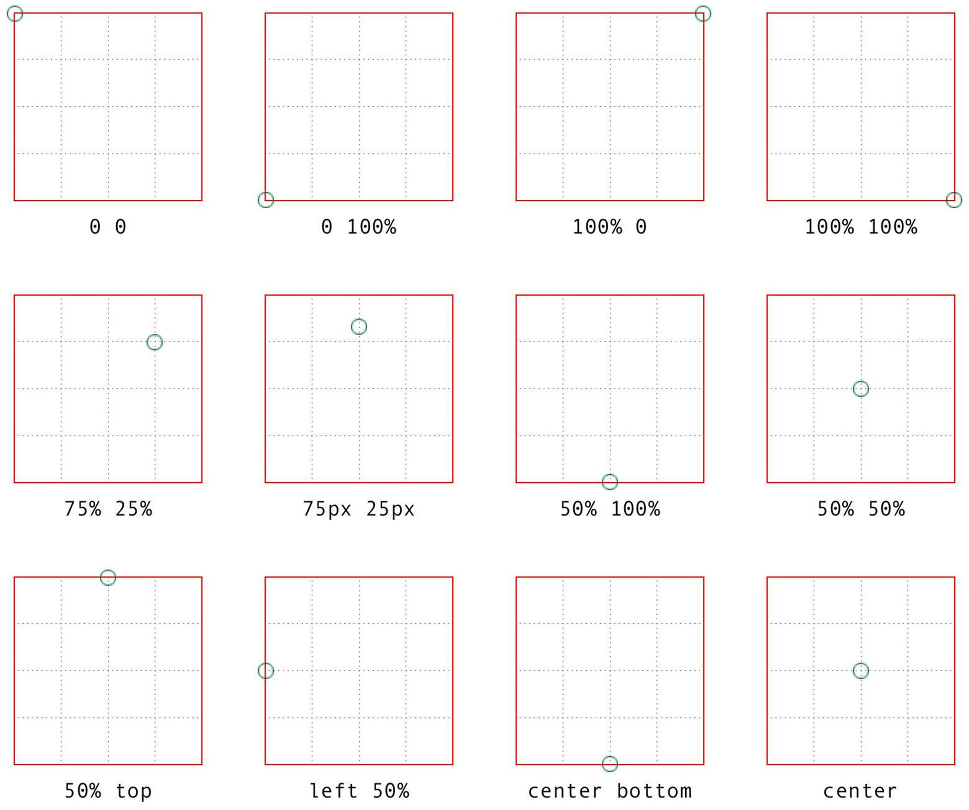
Figure 1-22. Various origin calculations
All right, so if you change the origin, what happens? The easiest way to visualize this is with 2D rotations. Suppose you rotate an element 45 degrees to the right. Its final placement will depend on its origin. Figure 1-23 illustrates the the effects of several different transform origins; in each case, the transform origin is marked with a circle.
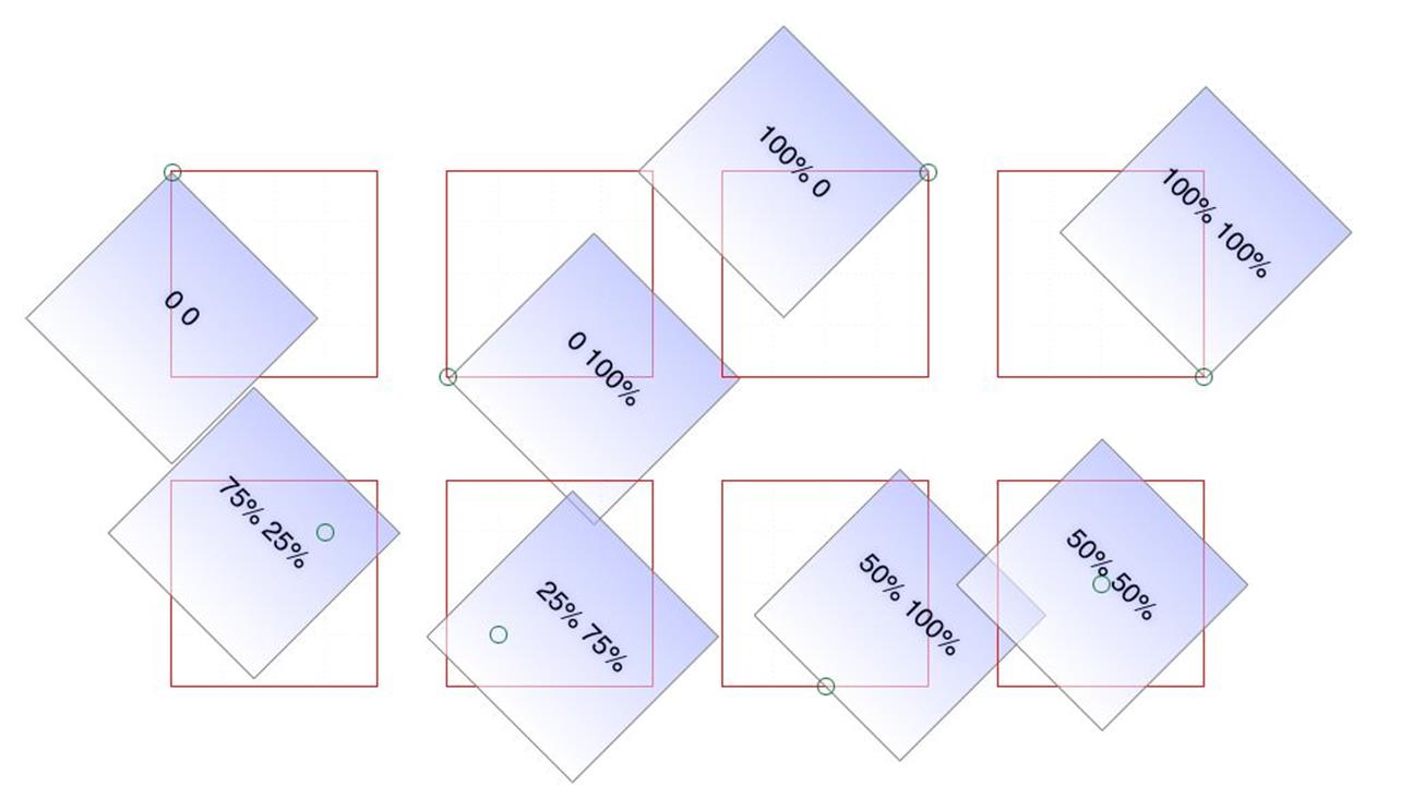
Figure 1-23. The rotational effects of using various transform origins
The origin matters for other transform types, such as skews and scales. Scaling an element with its origin in the center will pull in all sides equally, whereas scaling an element with a bottom-right origin will cause it to shrink toward that corner. Similarly, skewing an element with respect to its center will result in the same shape as if it’s skewed with respect to the top-right corner, but the placement of the shape will be different. Some examples are shown in Figure 1-24; again, each transform origin is marked with a circle.
The one transform type that isn’t really affected by changing the transform origin is translation. If you push an element around with translate(), or its cousins like translateX() and translateY(), it’s going to end up in the same place regardless of where the transform origin is located. If that’s all the transforming you plan to do, then setting the transform origin is irrelevant. If you ever do anything besides translating, though, the origin will matter. Use it wisely.
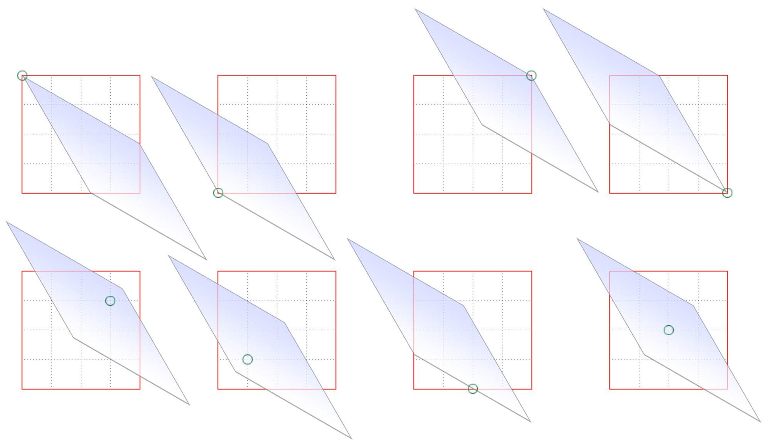
Figure 1-24. The skew effects of using various transform origins
Choosing a 3D Style
If you’re setting elements to be transformed through three dimensions — using, say, translate3d() or rotateY() — you probably expect that the elements will be presented as though they’re in a 3D space. And yet, this is not the default behavior. By default, everything looks flat no matter what you do. Fortunately, this can be overridden with the transform-style property.
TRANSFORM-STYLE
|
Values: |
flat | preserve-3d |
|
Initial value: |
flat |
|
Applies to: |
Any transformable element |
|
Inherited: |
No |
|
Computed value: |
As specified |
Suppose you have an element you want to move “closer to” your eye, and then tilt away a bit, with a moderate amount of perspective. Something like this rule, as applied to the following HTML:
div#inner {transform: perspective(750px) translateZ(60px) rotateX(45deg);}
<div id="outer">
outer
<div id="inner">inner</div>
</div>
So you do that, and get the result shown in Figure 1-25; more or less what you might have expected.
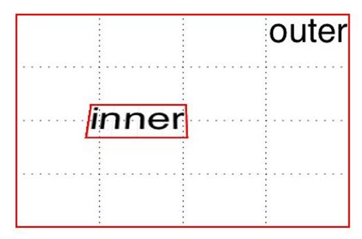
Figure 1-25. A 3D-transformed inner div
But then you decide to rotate the outer div to one side, and suddenly nothing makes sense any more. The inner div isn’t where you envisioned it. In fact, it just looks like a picture pasted to the front of the outer div.
Well, that’s exactly what it is, because the default value of transform-style is flat. The inner div got drawn in its moved-forward-tilted-back state, and that was applied to the front of the outer div as if it was an image. So when you rotated the outer div, the flat picture rotated right along with it, as shown in Figure 1-26:
div#outer {transform: perspective(750px) rotateY(60deg) rotateX(-20deg);}
div#inner {transform: perspective(750px) translateZ(60px) rotateX(45deg);}
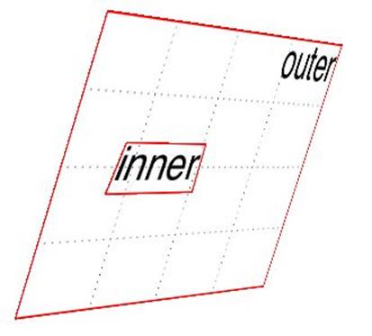
Figure 1-26. The effects of a flat transform style
Change the value to preserve-3d, however, and things are suddenly different. The inner div will be drawn as a full 3D object with respect to its parent outer div, floating in space nearby, and not as a picture pasted on the front of the outer div. You can see the results of this change in Figure 1-27:
div#outer {transform: perspective(750px) rotateY(60deg) rotateX(-20deg);
transform-style: preserve-3d;}
div#inner {transform: perspective(750px) translateZ(60px) rotateX(45deg);}
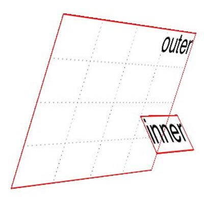
Figure 1-27. The effects of a 3D-preserved transform style
One important aspect of transform-style is that it can be overridden by other properties. The reason is that some values of these other properties require a flattened presentation of an element and its children in order to work at all. In such cases, the value of transform-style is forced to be flat, regardless of what you may have declared.
So, in order to avoid this overriding behavior, make sure the following properties are set to the listed values:
§ overflow: visible
§ filter: none
§ clip: auto
§ clip-path: none
§ mask-image: none
§ mask-border-source: none
§ mix-blend-mode: normal
Those are all the default values for those properties, so as long as you don’t try to change any of them for your preserved 3D elements, you’re fine! But if you find that editing some CSS suddenly flattens out your lovely 3D transforms, one of these properties might be the culprit.
One more note: in addition to the values just mentioned, the value of the property isolation must be, or be computed to be, isolate. (isolation is a compositing property, in case you were wondering.)
Changing Perspective
There are actually two properties that are used to define how perspective is handled: one to define the perspective distance, as with the perspective() function discussed in an earlier section; and another to define the perspective’s origin point.
Defining a group perspective
First, let’s consider the property perspective, which accepts a length that defines the depth of the perspective pyramid. At first glance, it looks just like the perspective() function discussed earlier, but there are some very critical differences.
PERSPECTIVE
|
Values: |
none | <length> |
|
Initial value: |
flat |
|
Applies to: |
Any transformable element |
|
Inherited: |
No |
|
Computed value: |
The absolute length, or else none |
As a quick example, if you want to create a very deep perspective, one mimicking the results you’d get from a zoom lens, you might declare something like perspective: 2500px. For a shallow depth, one that mimics a closeup fish-eye lens effect, you might declare perspective: 200px.
So how does this differ from the perspective() function? When you use perspective(), you’re defining the perspective effect for the element that is given that function. So if you say transform: perspective(800px) rotateY(-50grad);, you’re applying that perspective to each element that has the rule applied.
With the perspective property, on the other hand, you’re creating a perspective depth that is applied to all the child elements of the element that received the property. Confused yet? Don’t be. Here’s a simple illustration of the difference, as shown in Figure 1-28:
div {transform-style: preserve-3d; border: 1px solid gray; width: 660px;}
img {margin: 10px;}
#one {perspective: none;}
#one img {transform: perspective(800px) rotateX(-50grad);}
#two {perspective: 800px;}
#two img {transform: rotateX(-50grad);}
<div><img src="rsq.gif"><img src="rsq.gif"><img src="rsq.gif"></div>
<div id="one"><img src="rsq.gif"><img src="rsq.gif"><img src="rsq.gif"></div>
<div id="two"><img src="rsq.gif"><img src="rsq.gif"><img src="rsq.gif"></div>
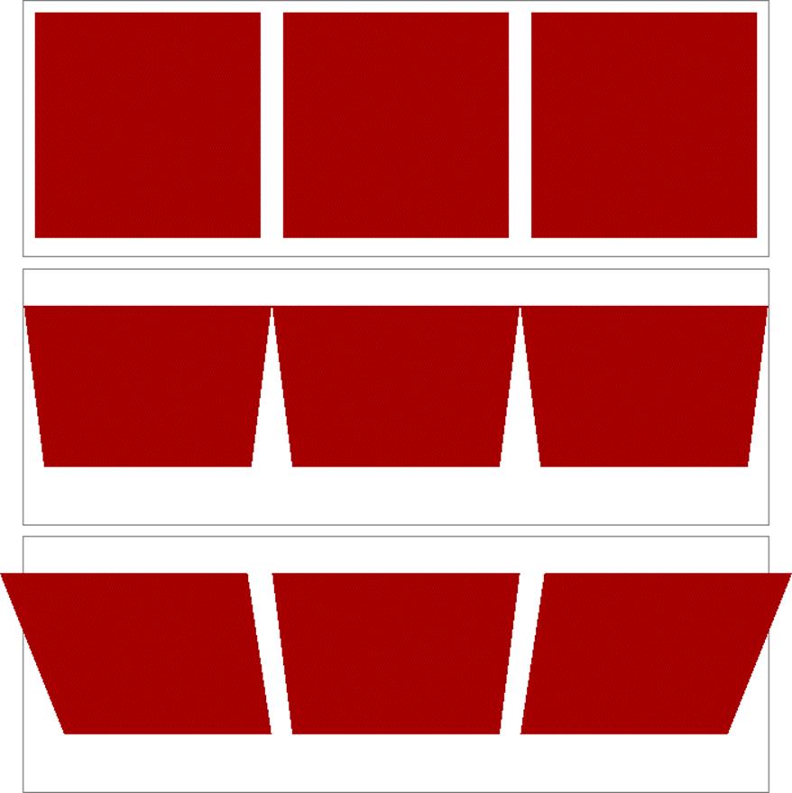
Figure 1-28. Shared perspective versus individual perspectives
In Figure 1-28, we first see a line of images that haven’t been transformed. In the second line, each image has been rotated 50 gradians (equivalent to 45 degrees) toward us, but each one within its own individual perspective.
In the third line of images, none of them has an individual perspective. Instead, they are all drawn within the perspective defined by perspective: 800px; that’s been set on the div that contains them. Since they all operate within a shared perspective, they look “correct”; that is, like we would expect if we had three physical pictures mounted on a clear sheet of glass and rotated toward us around the center horizontal axis of that glass.
NOTE
Note that presence of transform-style: preserve-3d makes this effect possible, as discussed in the previous section.
This is the critical difference between perspective, the property; and perspective(), the function. The former creates a 3D space shared by all its children. The latter affects only the element to which it’s applied. A less important difference is that the perspective() function has to come first or early in its chain of transforms in order to apply to the element as it’s transformed through 3D space. The perspective property, on the other hand, is applied to all children regardless of where their transforms are declared.
In most cases, you’re going to use the perspective property instead of the perspective() function. In fact, container divs (or other elements) are a very common feature of 3D transforms — the way they used to be for page layout — largely to establish a shared perspective. In the previous example, the <div id="two"> was there solely to serve as a perspective container, so to speak. On the other hand, we couldn’t have done what we did without it.
Moving the perspective’s origin
When transforming elements in three dimensions — assuming you’ve allowed them to appear three-dimensional, that is — a perspective will be used. (See transform-style and perspective, respectively, in previous sections.) That perspective will have an origin, which is also known as the vanishing point, and you can change where it’s located with the property perspective-origin.
PERSPECTIVE-ORIGIN
|
Values: |
[ left | center | right | top | bottom | <percentage> | <length> ] | [ left | center | right | <percentage> | <length> ] [ top | center | bottom | <percentage> | <length> ] <length>? | [ center | [ left | right ] ] && [ center | [ top | bottom ] ] |
|
Initial value: |
50% 50% |
|
Applies to: |
Any transformable element |
|
Inherited: |
No |
|
Percentages: |
Refer to the size of the bounding box (see explanation) |
|
Computed value: |
A percentage, except for length values, which are converted to an absolute length |
As you’ve no doubt spotted, perspective-origin and transform-origin (discussed earlier) have the same value syntax, right down to allowing an optional length value defining an offset along the z-axis. While the way the values are expressed is identical, the effects they have are very different. With transform-origin, you define the point around which transforms happen. With perspective-origin, you define the point on which sight lines converge.
As with most 3D transform properties, this is more easily demonstrated than described. Consider the following CSS and markup, illustrated in Figure 1-29:
#container {perspective: 850px; perspective-origin: 50% 0%;}
#ruler {height: 50px; background: #DED url(tick.gif) repeat-x;
transform: rotateX(60deg);
transform-origin: 50% 100%;}
<div id="container">
<div id="ruler"></div>
</div>

Figure 1-29. A basic “ruler”
What we have is a repeated background image of tick-marks on a ruler, with the div that contains them tiled away from us by 60 degrees. All the lines point at a common vanishing point, the top center of the container div (because of the 50% 0% value for perspective-origin).
Now consider that same setup with various perspective origins, as shown in Figure 1-30.
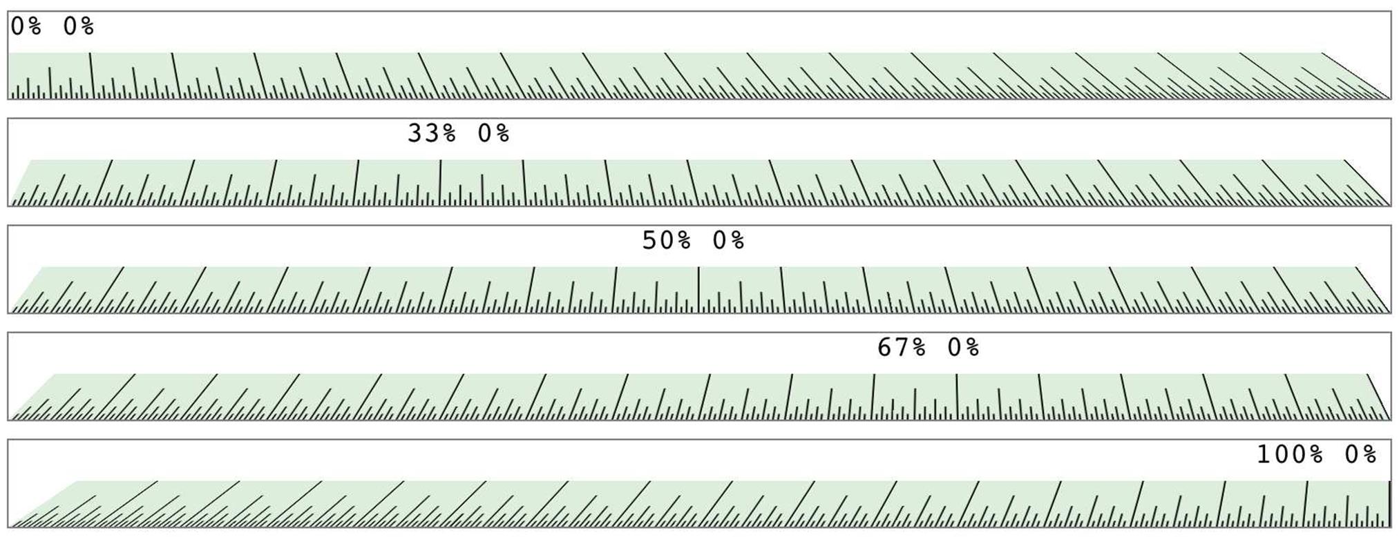
Figure 1-30. A basic “ruler” with different perspective origins
As you can see, moving the perspective origin changes the rendering of the 3D-transformed element.
Note that these only had an effect because we supplied a value for perspective. If the value of perspective is ever the default none, then any value given for perspective-origin will be ignored. That makes sense, since you can’t have a perspective origin when there’s no perspective at all!
Dealing with Backfaces
Something you probably never really thought about, over all the years you’ve been laying out elements, was: what would it look like if I could see the back side of the element? Now that 3D transforms are a possibility, there may well come a day when you do see the back side of an element. You might even mean to do so intentionally. What happens at that moment is determined by the property backface-visibility.
BACKFACE-VISIBILITY
|
Values: |
visible | hidden |
|
Initial value: |
visible |
|
Applies to: |
Any transformable element |
|
Inherited: |
No |
|
Computed value: |
As specified |
Unlike many of the other properties and functions we’ve already talked about, this one is as straightforward as straightforward can be. All it does is determine whether the back side of an element is rendered when it’s facing toward the viewer, or not. It really is just that simple.
So let’s say you flip over two elements, one with backface-visibility set to the default value of visible and the other set to hidden. You get the result shown in Figure 1-31:
span {border: 1px solid red; display: inline-block;}
img {vertical-align: bottom;}
img.flip {transform: rotateX(180deg); display: inline-block;}
img#show {backface-visibility: visible;}
img#hide {backface-visibility: hidden;}
<span><img src="salmon.gif"></span>
<span><img src="salmon.gif" class="flip" id="show"></span>
<span><img src="salmon.gif" class="flip" id="hide"></span>

Figure 1-31. Visible and hidden backfaces
As you can see, the first image is unchanged. The second is flipped over around its x-axis, so we see it from the back. The third has also been flipped, but we can’t see it at all because its backface has been hidden.
This property can come in handy in a number of situations. The simplest is a case where you have two elements that represent the two sides of a UI element that flips over; say, a search area with preference settings on its back, or a photo with some information on the back. Let’s take the latter case. The CSS and markup might look something like this:
section {position: relative;}
img, div {position: absolute; top: 0; left: 0; backface-visibility: hidden;}
div {transform: rotateY(180deg);}
section:hover {transform: rotateY(180deg); transform-style: preserve-3d;}
<section>
<img src="photo.jpg" alt="">
<div class="info">(…info goes here…)</div>
</section>
Actually, this example shows that using backface-visibility isn’t quite as simple as it first appears. It’s not that the property itself is complicated, but if you forget to set transform-style to preserve-3d, then it won’t work as intended. That’s why transform-style is set on the section element.
There’s a variant of this example that uses the same markup, but a slightly different CSS to show the image’s backface when it’s flipped over. This is probably more what was intended, since it makes information look like it’s literally written on the back of the image. It leads to the end result shown in Figure 1-32:
section {position: relative;}
img, div {position: absolute; top: 0; left: 0;}
div {transform: rotateY(180deg); backface-visibility: hidden;
background: rgba(255,255,255,0.85);}
section:hover {transform: rotateY(180deg); transform-style: preserve-3d;}
Figure 1-32. Photo on the front, information on the back
The only thing we had to do to make that happen was to just shift the backface-visibilty: hidden to the div instead of applying it to both the img and the div. Thus, the div’s backface is hidden when it’s flipped over, but that of the image is not.
All materials on the site are licensed Creative Commons Attribution-Sharealike 3.0 Unported CC BY-SA 3.0 & GNU Free Documentation License (GFDL)
If you are the copyright holder of any material contained on our site and intend to remove it, please contact our site administrator for approval.
© 2016-2026 All site design rights belong to S.Y.A.