Creating a Website: The Missing Manual (2015)
Part 4. Interactivity and Multimedia
Chapter 15. Dynamic Buttons and Menus
Over the past 14 chapters, you’ve absorbed a fair amount of web wisdom. You learned to structure web pages using HTML, clothe them with style sheets, and breathe life into them with JavaScript. Now it’s time to reap some of the rewards.
In this chapter, you’ll consider two common (and practical) web page components. First, you’ll learn how to create fancy buttons—for example, ones that light up when a guest points to them. Next, you’ll learn to build a pop-up or pop-open navigation menu, so visitors can cruise around your site in style. These features give you the chance to take the skills you’ve developed in CSS and JavaScript one step further. In other words, it’s time for your hard slogging to pay off with some snazzy website frills.
Fancy Buttons
The trends and styles of web design are always changing. In the early days of the Web, everyone used ordinary text links, like the ones you learned about in Chapter 6:
<a href="graceland.html">Visit Elvis</a>
Over time, these run-of-the-mill links started to look drab. Creative webmasters wanted more, and they decided to use small, clickable pictures, drawn to resemble buttons, instead.
Ordinary Picture Buttons
The most straightforward approach to creating a graphical button is to wrap the button image in an anchor, as described in Chapter 6. Here’s what that looks like:
<a href="graceland.html"><img src="VisitElvis.jpeg" alt="Visit Elvis" /></a>
When you use this method, HTML adds an ugly blue border around the image to indicate that it’s a link. To get rid of the border, you set CSS’s border-style attribute to none.
The second, alternative approach is to use the <img> element in conjunction with JavaScript’s onclick event attribute (Events). Here’s what that looks like:
<img onclick="GoToGraceland()" src="VisitElvis.jpeg" alt="Visit Elvis" />
This method doesn’t generate an ugly blue border, so you don’t need to set the border-style attribute, but you do need to create a JavaScript function named GoToGraceland() and write some code to do whatever you want the button to do. For example, a JavaScript element could change the content in other elements on your page or perform a calculation. You used this approach with the BMI calculator in Chapter 14 (A Basic Form). In that example, visitors clicked a button to have JavaScript perform an arithmetic operation and display the result.
Dynamic Picture Buttons
Pretty soon, web designers weren’t happy with text links or fancy button pictures. They wanted more, and they used JavaScript to get it. The basic idea was to create a new sort of button that uses the JavaScript image-swapping technique you learned about on Image Rollovers. These dynamic buttons (also known as rollover buttons) subtly but noticeably change when a visitor points to them. This effect tells her she’s poised over a real, live button, and all she needs to do is click it to trigger an action, like going to a new page.
For a while, rollover buttons were wildly popular, and virtually everyone used them. And then leading website designers grew a bit tired of all the whirly, glowy button effects, and they decided to strip their pages down to a leaner, classier look. They reduced their use of rollover buttons and made the rollover effects themselves simpler. For example, web designers might change a button’s background color on rollover but plop ordinary HTML text on top of it instead of embedding the text as part of the image. Not only does this create pages that are less busy and less distracting, but it also makes them easier to maintain, because you don’t need to generate dozens of different button pictures. Figure 15-1 shows some examples.
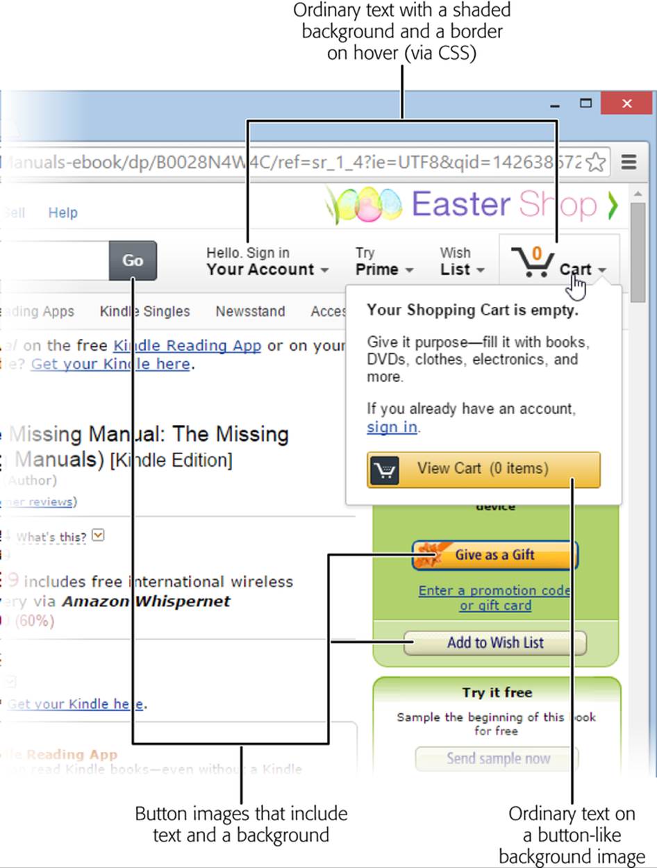
Figure 15-1. This Amazon page uses three types of buttons: ordinary text links in a tinted box, text over a button-like background, and buttons that combine the text and background in one image.
Choosing Your Approach
Before you create any buttons, you need to pick your approach. You have three distinct options for building rollover buttons:
§ Create a background button picture and superimpose HTML text on top of it (Figure 15-2, top). If you use this approach, you need just two pictures, no matter how many buttons you have: a regular button background and a highlighted button background. You reuse those pictures for every button you create. That means that you need to regenerate only two pictures if you want to change the style or size of a button. And if you need to alter the text on a button, you don’t need to touch your pictures at all. Web developers who choose this approach sleep well at night.
§ Create a picture for the entire button, text and all (Figure 15-2, bottom). This approach gives you the most control and allows the most impressive effects. However, it’s also more awkward and requires more effort, because it forces you to create a separate pair of pictures for each button. For example, if you want to put eight graphical buttons on your web page, you need 16 button pictures, one for each button’s normal state and one for its highlighted (mouseover) state.
§ Create a background effect with CSS style settings, and superimpose some HTML text on top of it. This sounds even better, because you don’t need to craft even a single image for your button. However, this choice is also more restrictive. It means that you’ll only be able to create effects that are part of the CSS language. And even though CSS has plenty of slick formatting features (like rounded corners) that lend themselves to glowy buttons, older browsers, like IE 8 and IE 9, which still constitute roughly 10% of the web browsing world, don’t work with these features. So unless you’re willing to leave these visitors out, you need to stick with more boring border and shading choices.
NOTE
You haven’t learned about gradients and other cutting-edge CSS3 settings in this book because they’re still too new to use without a carefully planned fallback strategy. If you want to learn more about the bleeding edge, check out HTML5: The Missing Manual (O’Reilly).
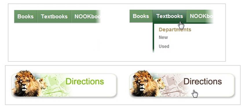
Figure 15-2. Top: This button uses ordinary text with a green background that darkens when a visitor points to it. Bottom: This graphical button swaps pictures when a guest points to it.
So which strategy is right for your site? The first approach (all-picture buttons) makes sense if you want striking effects on part of your site. For example, you might use a few of them on your home page to direct new arrivals to different sections of your site. But for the majority of buttons, the second and third approaches are more convenient and easier to work with.
NOTE
There’s another reason to prefer ordinary text superimposed on a button background: search engines prefer it. As you learned on Supply Alternate Text for All Your Images, search engines give special weight to the text inside an anchor link. But if you use the image-only approach, you lose the chance to get that extra bit of attention.
UP TO SPEED: MAKING BUTTON PICTURES
If you decide to go with button pictures, you need a way to create them. Your options are:
§ Draw them yourself. If you’re graphically inclined, you can create button pictures by hand using just about any graphics program (Adobe Photoshop and Adobe Fireworks are two popular choices). However, getting buttons to look good isn’t always easy. It’s also hard to mass-produce them, because you need to make every button consistent: same text position, size, color palette, and background.
§ Use a button-creation website. If your artistic abilities are feebler than those of Koko the painting gorilla, there’s an easier option. You can use a specialized button-creation program. These programs have no purpose in life other than to help you create attractive buttons with the text, colors, and backgrounds you choose. The Web teems with a range of these tools. They usually start by asking you to specify button details (like the text, color, background, and so on). Once you finish, you simply click a button and the program creates the button image (or images) and displays them in a new page. All you need to do is download the images and start using them on your site. Two examples of online button-making tools include www.buttongenerator.com andwww.grsites.com/button.
§ Use Expression Web. The popular web design tool has a feature that lets you create a whole whack of button pictures and the JavaScript code that manages them. The chief disadvantage is that this feature relies on a slightly cumbersome JavaScript-based approach, rather than the CSS technique that most web designers now prefer. To try it out, choose Insert→Interactive Button from the Expression Web menu.
Tutorial: Creating a Rollover Button
You already know how to build links, and you know the basics of the JavaScript image-swapping technique (described on Image Rollovers). But what you don’t yet know is how to put it all together in a modern package—one that ensures that your buttons look understated but cool, that loads your pictures with no annoying lag, and that uses clever CSS tricks to keep your website free of messy JavaScript. The best way to get a handle on these details is to build a few buttons of your own.
In this tutorial, you’ll start with a rollover button that uses a background picture and taps CSS to manage its states. Next, you’ll see how to tweak a page to use the more complicated picture-with-text approach. Finally, you’ll consider what you need to make an all-CSS, no-picture button for the ultimate in convenience.
TIP
As with all the tutorials in this book, you can get the files from the companion site (http://prosetech.com/web). Look for the Tutorial-15-1 folder (which stands for “Chapter 15, first tutorial”). Inside is the Start folder, which has the set of pages you begin the exercise with, and the End folder, which shows the solution.
The Starter Page
Figure 15-3 shows the page you start with. It uses a standard two-column layout, like the ones you learned to make in Chapter 8. Right now, the column on the left holds a list of ordinary links that use the <a> element. Your challenge is to turn these links into rollover buttons.
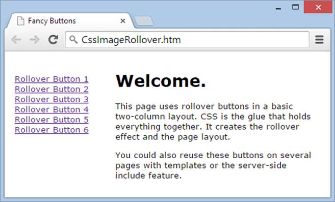
Figure 15-3. This page features a stack of ordinary links with underlined text. It’s a perfect place to practice the fine art of button-crafting.
Structurally, this is a simple page. It uses two <div> elements, one for the list of links on the left, and one for the main content that occupies the rest of the space.
<div class="MenuBar">
<a href="...">Rollover Button 1</a>
<a href="...">Rollover Button 2</a>
<a href="...">Rollover Button 3</a>
<a href="...">Rollover Button 4</a>
<a href="...">Rollover Button 5</a>
<a href="...">Rollover Button 6</a>
</div>
<div class="MainContent">
<h1>Welcome.</h1>
<p>...</p>
<p>...</p>
</div>
The magic that underpins this page is all in the style sheet. First, it applies a basic style rule to the <body> element, so that the page gets a consistent font:
body {
font-family: Verdana,sans-serif;
font-size: small;
}
Then, it positions the menu bar on the left side of the page, using the layout properties you picked up in Chapter 8:
.MenuBar {
position: absolute;
top: 20px;
left: 0px;
margin: 15px;
}
Another rule gives the main content extra margin space on the left, so it can’t overlap the menu:
.MainContent {
margin-left: 165px;
margin-top: 30px;
margin-right: 20px;
}
Finally, a contextual selector (Saving Work with the <div> Element) picks out all the anchor elements in the menu bar:
.MenuBar a {
display: block;
}
This rule uses the display property to transform each <a> element from an inline element into a block element (like a paragraph or a heading). That way, a browser puts each link on a separate line, so you don’t need to add line breaks using the <br> element.
NOTE
Another approach is to make each <a> element a separate item in an unordered list (as represented by the <ul> element). You can then use style sheets to format the list so that it doesn’t show the standard bullet next to each item. Many of the dynamic, pop-up, and collapsible menus you’ll come across on the Web are actually unordered lists on the inside.
Preparing the Button Pictures
The next step is to ready your button images. In this example, you’ve got a relatively simple picture preparation job, because you’re using a button background with superimposed text. That means you need to create an image that looks like the surface of a blank button, and a second image that looks like a highlighted version of the same button (perhaps using a different shade of the same color).
You’ll find two ready-made button backgrounds in the tutorial’s Start folder: NormalButtonBackground.jpg and HighlightedButtonBackground.jpg. Open them and take a look. On their own, they don’t look like much. The NormalButtonBackground.jpg image is a gray, shaded button face, while HighlightedButtonBackground.jpg shows the same button in yellow.
NOTE
Just about anyone can develop two good-looking rectangles in a drawing program. And because you create just two buttons and no text, you won’t face the headaches of trying to get text to line up correctly in each button (which, if done incorrectly, can create maddeningly inconsistent buttons). If you don’t want to make your own graphics, you can take to the Web and use Google’s image-search tool to find a ready-made button background you want to adopt.
Once you have the button images you need, you’re ready to incorporate them into your page. Figure 15-4 shows the result you’re after.
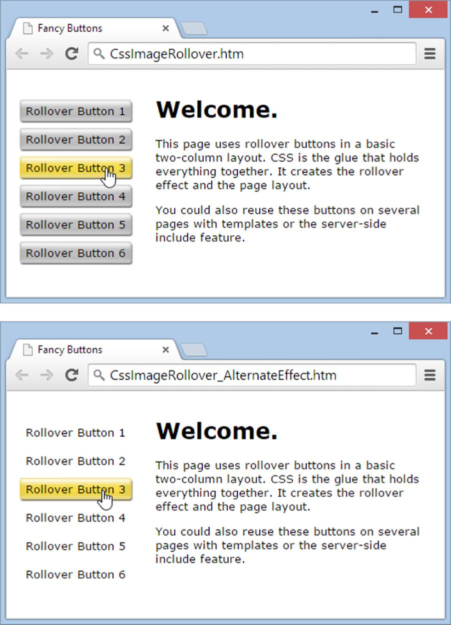
Figure 15-4. Top: Here, every button has a gray shaded background. The rollover effect swaps the gray background for a yellow one. Bottom: Another choice is to leave the background blank initially, for an interesting effect.
Making the Rollover Effect
To create the rollover effect, you need to refine the styles for the <a> elements. Start by opening the CssImageRollover.css style sheet in a text editor.
Your first step is to refine the style that formats the links. Use the text-decoration and color properties to change the text from its standard look (underlined blue) to something that looks more appropriate on a button:
.MenuBar a {
display: block;
text-decoration: none;
color: black;
The real magic starts when you specify the background property. It grabs the image NormalButtonBackground.jpg and puts it behind each anchor:
background: url("NormalButtonBackground.jpg") no-repeat 0 0;
The no-repeat attribute makes sure the browser doesn’t tile the image, and the 0 0 values position the picture’s top-left corner at the top-left corner of the anchor.
Finally, the width and height properties size the anchor to match the size of the background button (125 x 23 pixels), while the margin and padding properties separate the buttons from one another and pad the text inside.
width: 125px;
height: 23px;
margin-bottom: 5px;
padding-top: 5px;
padding-left: 7px;
}
Of course, none of this creates the rollover effect. To get that, you need the hover pseudo-class (first described on Changing Link Colors and Underlining). It springs into action when a guest points to an element. In this case, it changes the background picture:
.MenuBar a:hover {
background: url("HighlightedButtonBackground.jpg") no-repeat 0 0;
}
TIP
If you use a less button-like, more box-like background, you might want to set the text-decoration property to underline in the hover pseudo-class. That way, the link becomes underlined when someone points to it, making its page-navigating purpose clear. Amazon uses this trick in its pop-up menus and in the category-browsing bar that sits across the top of some windows (for instance, the one in Figure 15-1).
This completes the example. However, you may remember that CSS defines a few more pseudo-classes, and you can use them with your button, too. Use visited to control what a link looks like once a guest visits the linked page, and use active to control what a link looks like in the brief moment when a visitor clicks it. For example, you could shift the button slightly to the side to make it look like it’s being pushed in:
.MenuBar a:active {
margin-left: 1px;
}
Alternatively, you could supply another background image.
Picture-with-Text Buttons
You can adapt the previous example to work with full button pictures—that is, images that include both the button background and the button text. Figure 15-5 shows an example.
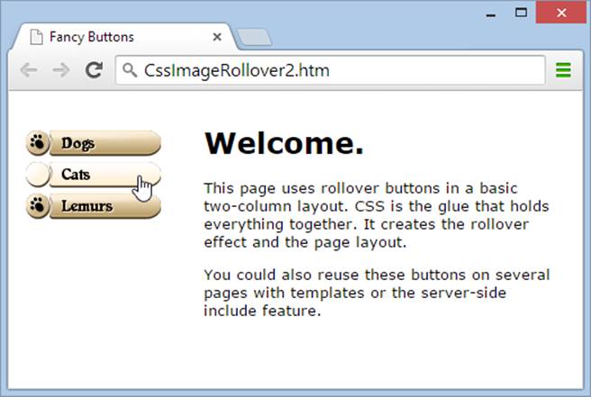
Figure 15-5. This page uses fancy rollover buttons that have graphical text embedded in the image files. Setting up this solution requires a bit more work, because there are six picture files to prepare—two for each button.
When you use a pile of fancy button pictures (instead of one pair of button background images), you need to use a technique called image preloading. This practice ensures that a browser downloads all the button “state” images when it processes the page for the first time, instead of waiting until a visitor points to a button. Although you won’t notice the difference when you run the page from your computer’s hard drive, preloading images makes the buttons more responsive when visitors interact with them over the Internet, particularly if they have a slow connection, and especially if the page holds a lot of buttons.
Web designers have tried a number of techniques for preloading images. Eventually, they settled on packing both button images (the normal and the selected states) into a single image file. Your style sheet dictates which part of the picture a browser shows, so that guests see only one version of the button at a time.
Consider the buttons in Figure 15-5, which were created using an online button-builder, in this case the one at www.buttongenerator.com. You save each pair of button pictures as a single file, as shown in Figure 15-6.
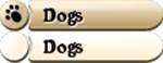
Figure 15-6. This graphic combines a normal (top) and a highlighted (bottom) button image. Your style sheet rules can grab just one part of the picture to use as a button. Note that it doesn’t matter how much space you put between the paired pictures, so long as you keep the space consistent across all your picture pairs.
You can go to www.buttongenerator.com to make your own images, or you can use the images in the Start folder for this tutorial. They are DogsButton.png (the one in Figure 15-6), CatsButton.png, and LemurButton.png.
You can expand this double-button system into a triple-button system if you use the active pseudo class. And some performance-mad web designers pack a whole page worth of buttons and other graphical embellishments into a single background image. They then use carefully targeted style rules to slice and dice the graphic and spread it around all the elements that need it. This system ensures that a browser loads all the button graphics from the start, and that the rollover effects work without lag. It also simplifies your button management, because you have fewer files to keep track of and fewer files to reference in your markup.
NOTE
Not all button-makers can create images for different button states (unclicked, pointed to, clicked, and visited). However, you can usually run the button generator multiple times and choose a slightly different color scheme to create the highlighted button image.
Once you prepare some buttons, you’re ready to build an example page like the one shown in Figure 15-5. You simply take the example you completed in the previous step, change the links, and alter the link-formatting rules in the style sheet.
Your first task is to remove all the text (“Rollover Button 1” and so on) from your anchors, so that the only thing a browser will display is the button images themselves. Then you need to supply the URL of the button pictures. But here’s where things start to get messy. In the previous example, you stored the background pictures using two style rules. But if you want each button to use a different set of pictures, you need a separate style rule for every button—and that’s sure to make a mess of even the best-organized style sheet.
A better solution is to use a style rule that stores all the button information except the picture filenames. Here’s the slightly shorter style rule for formatting anchor elements:
.MenuBar a {
display: block;
width: 115px;
height: 18px;
margin-bottom: 5px;
padding-top: 5px;
padding-left: 7px;
background-repeat: no-repeat;
}
Now you can specify the filename for each button using an inline style. First, remove the old set of links from the MenuBar <div>. Then, add these three links in their place:
<a href="..." style="background-image: url('DogButton.png')"> </a>
<a href="..." style="background-image: url('CatButton.png')"> </a>
<a href="..." style="background-image: url('LemurButton.png')"> </a>
The style rule explicitly sets the width and height of the buttons so that a browser displays only the top part of the button file.
The final ingredient is the rule that displays the pointed-to buttons. It repositions the view of the button image file just a shade (by using a negative number of pixels for background-position), effectively pulling the picture up, so the top portion of the image, which holds the button’s normal state, falls outside the top margin of the anchor button, and the bottom portion of the image, which holds the pointed-to button, is visible. In Figure 15-5, the highlighted button sits 23 pixels below the normal-state button, so the style sheet rule looks like this:
.MenuBar a:hover {
background-position: 0 -23px;
}
Picture-less Buttons
Many minimalist web designers build buttons without any pictures at all. They use CSS properties to create a shaded box for the button and then superimpose a label on it using HTML.
If you go this route, you have a choice. You can accept boring buttons that change their borders, text color, background color, or underlining for a relatively modest effect. For example, Amazon uses the basic border-adding trick as a rollover effect in the page on Figure 15-1.
Your other choice is to use fancier CSS3 properties that some browsers will ignore. These include properties for gradients, shadows, and rounded borders. Taken together, these features can turn an ordinary background into a reasonable facsimile of a fancy button. The problem is that versions of Internet Explorer before IE 9 won’t understand these properties and won’t properly display your buttons. Depending on the properties you choose and the way you apply them, the change could be minor or nearly catastrophic.
To try the CSS-only approach with CSS3 properties, check out the button-maker on the CSS-Tricks site (http://css-tricks.com/examples/ButtonMaker). It lets you adjust colors and shading to create a picture-less button (Figure 15-7).
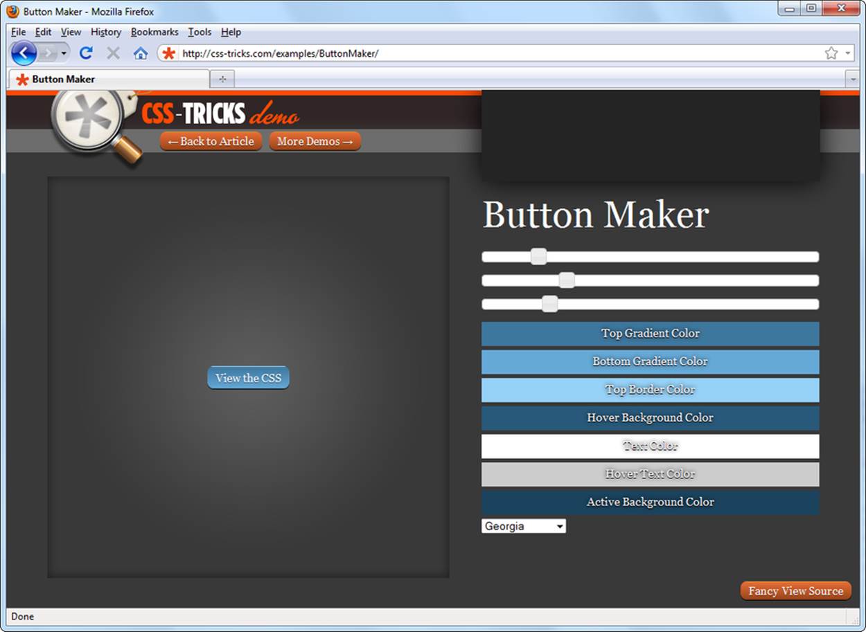
Figure 15-7. To create a button at CSS-Tricks, just play with the sliders and click “View the CSS” when you like what you see. But be warned: The curvy, shaded button shown here turns into a plain blue box for guests using any version of Internet Explorer before IE 9, which isn’t that bad.
If you’re even more ambitious, you can look at more complex JavaScript libraries that pile on even more CSS3 frills. For example, you can find animated buttons and medallions in the iHover library at http://tiny.cc/ihover. They include eye-popping effects like spins and fades that superimpose graphics and text. But once again, IE 9 fans need not apply.
Fancy Menus
When rollover buttons first came into vogue, they were wildly popular. There’s something irresistible about a button that lights up when you point to it. You can, however, have too much of a good thing, and stuffing too many rollover buttons on a page is a surefire way to create an overdone turkey of a website.
In recent years, the Web has seen a small renaissance in simplicity and a trend away from excessive rollover buttons. Part of the reason is the increasing complexity of websites—quite simply, a handful of rollover buttons no longer offer enough navigational aid for today’s typically complex sites. Instead, these sites use more detailed multilevel menus, replacing dozens of rollover buttons with a clearer, more streamlined set of hierarchical links.
A typical menu starts with a collection of anchor elements you group together on a page. The key is to organize these links into logical groups. For example, the website for a company might include a group of product pages, a group of pages with contact and location information, and another group of tech support pages. By arranging links into groups, visitors can find what they’re looking for more easily.
So far, this menu design doesn’t require anything special. Using the linking skills you picked up in Chapter 6 and the layout smarts you gained in Chapter 8, you can easily create a side panel with a grouped list of links. But really neat menus add another flourish—they’re collapsible. That means you don’t see the whole set of links at once. Initially, you see only the group headings, like Products, Contact Information, and Tech Support. When you click a group heading, a list of related links pops open just underneath.
You can create collapsible menus in several ways. Some are easy, while others are dizzyingly complex. In the following sections, you’ll learn how to build a simple collapsible menu of your own, and then use a more complicated menu courtesy of a free JavaScript site.
Do-It-Yourself Collapsible Menus
You can create a respectable menu of your own using dynamic HTML and the collapsible text example from Chapter 14 (Divisions and Spans). The basic idea is to use JavaScript to hide and show specific HTML elements by changing the CSS display property.
Imagine you want to create the cool tabbed menu shown in Figure 15-8. You split the links into three groups and display the topmost link for each group as an onscreen tab. When a guest clicks a tab, the page shows the sublinks for that tab.
In the rest of this section, you’ll get a chance to look at the solution piece by piece. To see the complete page, check out the SimpleTabs.htm page, available from the companion site at http://prosetech.com/web.
The Menu Markup
The design in Figure 15-8 might seem a little intimidating at first, but it consists of only two parts: the tabs at the top of the page and the link boxes (menus) that appear underneath them when a visitor points to a tab. To make these regions easy to deal with, so you can style and manipulate them with JavaScript, you need to wrap them in <div> and <span> elements, as you’ve seen throughout this book.
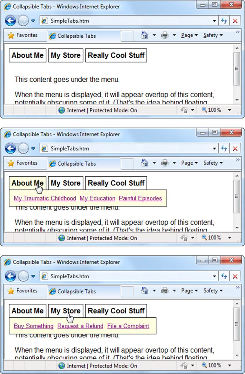
Figure 15-8. Top: When this page first loads, it presents visitors with three tabs. Middle and bottom: As a visitor moves her mouse over a tab box, a set of related links appears underneath. These links “float” above the page content.
The three tabs are grouped together in a <div> with the name TabGroup. Inside, a separate <span> element represents each tab, like this:
<div class="TabGroup">
<span class="Tab">About Me</span>
<span class="Tab">My Store</span>
<span class="Tab">Really Cool Stuff</span>
</div>
The <span> element is the best choice for the tabs, because they need to appear next to one another on the same line. If you used a <div>, you’d get a line break and some space between each element.
These <span> elements have the descriptive class name Tab. That associates them with the following style sheet rule, which gives the tabs the correct font and borders:
.Tab {
font-weight: bold;
padding: 5px;
border-style: solid;
border-width: 1px;
cursor: hand;
}
This rule includes something you haven’t seen yet—the cursor property. It styles the mouse cursor when a guest points to a link element. In this case, the cursor changes to a hand icon (Figure 15-8, middle).
You wrap all the tabs in a <div> that uses the TabGroup class so you can put the TabGroup <div> at a specific position on the page:
.TabGroup {
position: absolute;
top: 16px;
left: 10px;
}
After you declare the tabs, it makes sense to add the floating submenus. Each submenu is simply a box with borders and a yellow background. A group of links sits inside the box. The <div> element makes sense here, because you want each submenu to exist independently of the others on the page (rather than stuffed together into a single line). You also need to give each <div> element a unique ID, so you can change its visibility based on the tab a visitor clicks.
Here are the <div> elements for the three link groups:
<div id="AboutMe" class="Links">
<a href="...">My Traumatic Childhood</a>
<a href="...">My Education</a>
<a href="...">Painful Episodes</a>
</div>
<div id="MyStore" class="Links">
<a href="...">Buy Something</a>
<a href="...">Request a Refund</a>
<a href="...">File a Complaint</a>
</div>
<div id="ReallyCoolStuff" class="Links">
<a href="...">Pie Eating</a>
<a href="...">Harvesting Bananas</a>
<a href="...">Blindfolded Heart Surgery</a>
</div>
The <div> elements float above the page, which means you need to absolutely position them. Here’s the style rule for that:
.Links {
position: absolute;
top: 40px;
left: 10px;
border-width: 1px;
border-style: solid;
padding: 10px;
background-color: lightyellow;
font-size: small;
display: none;
}
Along with the absolute positioning coordinates (40 pixels from the top of the browser window, 10 pixels from the left), this style also sets a few formatting details (the border, background, padding, and text size). More importantly, it uses the display property to explicitly hide all the submenus when the page first loads. So even though this example stacks the submenu <div> elements one on top of the other, you won’t ever see them that way on a page, because you won’t ever see them all at once.
Give the <a> elements inside the floating boxes a bit of margin space so they don’t run into one another:
.Links a {
margin-right: 5px;
}
TIP
If you want a menu with the tabs stacked one above the other, you can tweak this style rule to use the display: block property, just as you did with the panel of rollover buttons on Preparing the Button Pictures.
And, finally, wrap the rest of the content for the page in a <div> element that has the class name MainBody. Give this <div> a generous top margin, so that it clears the tabs:
.MainBody {
margin-top: 70px;
margin-left: 15px;
}
These style sheet rules and <span> and <div> elements create the basic framework for the collapsible menus. The final step is to create a script that displays one of the hidden <div> elements, depending on which tab your visitor selects.
The Code that Shows the Submenus
The code that shows each tab is similar to the code you used for the ToggleVisibility() function in Chapter 14 (Collapsible Text). But in this case, you’re not interested in hiding and showing individual sections. Instead, you want to show a single section, depending on the tab selected, and hide everything else. Two custom functions handle the job: MakeVisible(), which shows the submenu for a specific tab; and ResetAllMenus(), which hides all the submenus.
Here’s a simplified version of the MakeVisible() function. As you can see, it takes an element name, finds the element, and changes its style settings so that it appears on the page.
function MakeVisible(element){
// Find the element and unhide it.
var element = document.getElementById(element)
element.style.display = "block"
}
TIP
If you need to change a bunch of style properties, or if you just want to keep all your style sheet settings in your style sheet (which is always a good idea), there’s another way to write this example. Instead of modifying the style in the MakeVisible() function, you can switch the style. Start by creating two class-based styles in your style sheet, one for visible tabs (say, SelectedTab) and one for hidden tabs (NonSelectedTabs). Then, in the MakeVisible() function, change the element.className property to point to the style you need, like this:
element.className = "NonSelectedTabs"
Once you write the code for the MakeVisible() function, you’re ready to hook it up to all the tab buttons. You have a choice here: MakeVisible() could react to either a click using the onclick event or to a mouse pointing to the tab using the onmouseover event. This example uses the latter approach.
<span class="Tab" onmouseover="MakeVisible('AboutMe')">About Me</span>
<span class="Tab" onmouseover="MakeVisible('MyStore')">My Store</span>
<span class="Tab" onmouseover="MakeVisible('ReallyCoolStuff')">Really Cool
Stuff</span>
The page still isn’t quite right. Although the MakeVisible() function shows the correct tabs, it doesn’t hide anything. That means that if you point to all three tabs, you see all three groups of links at the same time, one above the other.
To hide the irrelevant tabs, you need to get a little craftier. The problem is that Make Visible() knows what tab it’s supposed to show, but it doesn’t know the status of the other two tabs. To find that out, your code needs to search through the rest of the page. In this example, the basic approach is to look for any <div> element that has the class name Links and hide it. The ResetAllMenus() function handles that:
function ResetAllMenus() {
// Get an array with div elements.
var links = document.getElementsByTagName("div")
// Search the array for link boxes, and hide them.
for (var j = 0; j < links.length; j++) {
if (links[j].className == 'Links') links[j].style.display = "none"
}
}
This code is a little tricky. First, the getElementsByTagName() function retrieves a programming object called an array. An array is special because it doesn’t hold just one object; it holds a whole group of them at once. In this case, the array named links holds three objects, one for each<div> element on the page.
Then you use a programming construct called a for loop. It processes code a certain number of times using a built-in counter. In this case, the counter is a variable named j that starts at 0 and keeps increasing until it matches links.length—in other words, until it gets to the last <div>object in the links array. Assuming the links array has three items, your browser executes this statement three times:
if (links[j].className == 'Links') links[j].style.display = "none"
The first time, j is 0, and the code loads up the first object in the list. The second time, j is 1, and it digs up the second object. You can guess what happens the third time. As the code moves through this list, it checks the class name of each <div> element. If it indicates that you found a link box, the code makes it disappear from the page by changing its display style.
NOTE
If the stranger aspects of JavaScript still look like Danish, don’t worry. If you’re inclined, you can learn about JavaScript programming features like arrays, loops, and if statements from a website or a dedicated book (like JavaScript & jQuery: The Missing Manual [O’Reilly]). Or you can keep your sanity and rely on the examples in this book, or find great free scripts online.
Now you can fix the MakeVisible() function so that it first hides all the menus and then reveals just the one you want:
function MakeVisible(element){
ResetAllMenus()
// Find the element and unhide it.
var element = document.getElementById(element)
element.style.display = "block"
}
A good practice is to hide all the floating menu boxes if your guest moves his mouse pointer off the floating link box and over the rest of the page. This suggests that the visitor decided not to click a menu command and went back to reading the page:
<div class="MainBody" onmouseover="ResetAllMenus()">
The code in the downloadable example gets slightly fancier. It hides a selected tab’s border and changes its background color. However, the basic approach is the same.
Third-Party Menus
If you’ve had enough fun writing your own JavaScript code, you’ll be happy to hear that the Web is chock-full of free menu scripts. Many of them have more dazzle than the tabbed menu in the previous example. Some of the extra features you might find include the following:
§ Multilevel menus that let visitors drill down to specific subcategories.
§ Menus that let you collapse and expand subsections, so you can show all the links that interest you.
§ Ridiculously showy effects, like shaded highlighting and transparent backgrounds.
To find a good menu, use a JavaScript sample site (Scripts on the Web), or search for “JavaScript menus” or “CSS menus” on the Web. You’ll find that there’s quite a bit more diversity in menus than in rollover buttons. Every menu looks and behaves a little differently. Some pop up, others slide out, and others try to emulate the look and feel of popular programs like Microsoft Outlook.
TIP
Stay away from menus that force you to bury your links in a block of JavaScript. Not only does this approach make it harder to edit the menus should you add or remove a link, but it also can cause problems for search engines, which might not be able to discover (and index) all the pages on your website. Today’s webmasters put the links in real <a> elements, which you can then stack one after the other or place inside an unordered list.
To get a glimpse of what’s out there, head over to Dynamic Drive (www.dynamicdrive.com/dynamicindex1), which has a nifty set of menus, and a particularly interesting one called Slashdot (www.dynamicdrive.com/dynamicindex1/slashdot.htm). Figure 15-9 shows Slashdot with the same structure as the tabbed menu you saw earlier in this chapter.
TIP
Before you choose a navigation bar for your own site, test drive quite a few. This section walks you through the process, but you’ll want to compare the results with other navigation bars before you commit to one.
In the following sections, you’ll download the script for a Slashdot menu and put it to use.
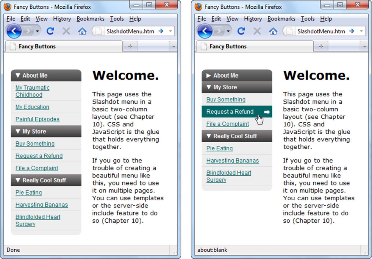
Figure 15-9. The Slashdot menu is collapsible, so you can hide the sections you aren’t interested in. Even better, you can thoroughly customize its colors, icons, and borders, which means you can adapt it for any site.
Getting the Script
To download the Slashdot menu, follow these steps:
1. Go to www.dynamicdrive.com/dynamicindex1/slashdot.htm.
This page displays a sample menu and provides instructions for using it. It also cites browser compatibility for the menu, and the news is good—it works in every mainstream browser.
2. Look for the download link for the sdmenu.zip file. Click it, and then save the ZIP file somewhere on your computer.
The Slashdot menu consists of a JavaScript file, some images, and a style sheet, all of which you’ll find in the ZIP file.
3. Unzip the contents of sdmenu.zip. Put it in your site folder on your computer, along with the rest of your site pages.
Altogether, sdmenu.zip contains a sample page that includes the menu (index.html) and a subfolder (sdmenu) that contains all the support files. Drag both of these into your site folder.
You don’t need to touch the contents of the sdmenu folder (although you might if you want to refine the menu to match your website). By carefully replacing some of the graphics, you can modify the background of the title sections (toptitle.gif and title.gif), the arrows (collapsed.gif,expanded.gif, and linkarrow.gif), and the bottom border (bottom.gif). By cracking open the style sheet (sdmenu.css), you can change the background colors, borders, and spacing for the rest of the menu. Finally, the sdmenu folder includes a JavaScript file (sdmenu.js), which you probably won’t edit at all.
4. Create a new web page (or start editing one that already has a set of menu links you want to adapt into a Slashdot menu).
You could edit your index.html page (and that’s a good way to get started with most examples). However, the Slashdot menu is straightforward and similar to the do-it-yourself collapsible menu you created earlier, so it’s easy enough to incorporate into a new page.
Creating the Menu
The first step to using the Slashdot menu is to attach its style sheet to your page and add a reference to the JavaScript file that powers the menu. You also need a scrap of script that creates your menu when the page loads. All three of these ingredients go in the <head> section of your page, and here’s what they look like:
<head>
<title>Fancy Buttons</title>
<link rel="stylesheet" type="text/css" href="sdmenu/sdmenu.css" />
<script src="sdmenu/sdmenu.js"></script>
<script>
var myMenu;
window.onload = function() {
myMenu = new SDMenu("my_menu");
myMenu.init();
};
</script>
...
</head>
The script code is generic. You can copy it word-for-word into every page that uses the Slashdot menu. The only point to note is that the menu name it uses (my_menu in this example) must match the ID of the <div> element that contains the Slashdot menu on your page.
You probably also want to add an embedded style sheet or link to another style sheet in your <head> section. The example in Figure 15-9 uses three basic style rules. One assigns a font to the page, another positions the sidebar that has the Slashdot menu, and the third positions the main content section:
body {
font-family: Verdana,sans-serif;
font-size: small;
}
.MenuBar {
position: absolute;
top: 20px;
left: 0px;
margin: 15px;
}
.MainContent
{
margin-left: 180px;
margin-top: 30px;
margin-right: 20px;
}
These styles are nothing new. You saw them in earlier examples.
Now it’s time to build the menu. Its structure is remarkably similar to the examples you’ve seen in this chapter. Essentially, each collapsible section of the menu consists of a <div> container full of anchor elements. The only added feature is the title text, which a <span> element at the top of the <div> provides:
<div>
<span>About Me</span>
<a href="...">My Traumatic Childhood</a>
<a href="...">My Education</a>
<a href="...">Painful Episodes</a>
</div>
A typical Slashdot menu contains several collapsible submenus. You wrap them all together in another <div> element and give it a name that matches the menu name in the script:
<div class="sdmenu" id="my_menu">
...
</div>
This is enough to create the Slashdot menu with all its formatting and functionality intact. However, you probably want to wrap the Slashdot <div> in another <div>, one that represents the menu sidebar. That way, you can place the sidebar exactly where you want it, without worrying about style sheet conflicts or modifying the sdmenu.css file.
<div class="MenuBar">
<div class="sdmenu" id="my_menu">
...
</div>
</div>
Here’s the complete markup used to create the menu in Figure 15-9:
<div class="MenuBar">
<div class="sdmenu" id="my_menu">
<div>
<span>About Me</span>
<a href="...">My Traumatic Childhood</a>
<a href="...">My Education</a>
<a href="...">Painful Episodes</a>
</div>
<div>
<span>My Store</span>
<a href="...">Buy Something</a>
<a href="...">Request a Refund</a>
<a href="...">File a Complaint</a>
</div>
<div>
<span>Really Cool Stuff</span>
<a href="...">Pie Eating</a>
<a href="...">Harvesting Bananas</a>
<a href="...">Blindfolded Heart Surgery</a>
</div>
</div>
</div>
NOTE
Once you perfect your website and you’re ready to take it live, remember to upload the sdmenu subfolder and all its files.
POWER USERS’ CLINIC: THE MENUS AND WIDGETS THAT JQUERY UI OFFERS
Although the Slashdot menu gives your site a quick, shake-and-bake menu, it’s probably not the best tool to underpin a big, professional website. Instead, you might prefer to outfit your site with the features and frills of a JavaScript library. That way, you won’t need to continuously trawl the Web for bits and pieces of code to improve your pages. Instead, you can use a library’s comprehensive and unified set of tools.
For example, many web developers use jQuery, a small but wildly popular library that extends the features of ordinary JavaScript. jQuery offers graphical effects like fading and simple animations, and includes plenty of time-saving shortcuts, too. One of the most interesting things about jQuery is the way that other web developers can extend it and add their own plug-ins. One example is the powerful jQuery UI library, which adds a set of slick, interactive widgets for web creators to play with. These include autocomplete text boxes, accordion-style collapsible panels, tabs, and a customizable menu.
If you’re one of the many web developers who use the jQuery library, it’s worth seeing if the jQuery UI menu can help you out. And if you’re using a different JavaScript library, like jQuery or Dojo (JavaScript Libraries), you might find that it includes a similar menu that you can use (or that someone else has created a menu based on your JavaScript library of choice).
Here’s where life gets a bit sticky, simply because there are so many paths to your goal: a nice-looking menu for your web pages. To learn more about the jQuery solution, consider reading JavaScript & jQuery: The Missing Manual (O’Reilly), or visit the jQuery learning center at http://learn.jquery.com.
All materials on the site are licensed Creative Commons Attribution-Sharealike 3.0 Unported CC BY-SA 3.0 & GNU Free Documentation License (GFDL)
If you are the copyright holder of any material contained on our site and intend to remove it, please contact our site administrator for approval.
© 2016-2026 All site design rights belong to S.Y.A.