Creating a Website: The Missing Manual (2015)
Part 2. From Web Page to Website
Chapter 7. Designing Better Style Sheets
You’ve covered a lot of ground with CSS. You’ve used it to set colors, fonts, borders, and more, and you’ve applied your settings with carefully targeted class rules. But CSS isn’t just a way to make stylish web pages; it’s also a way to apply a consistent design to your entire site.
In this chapter, you’ll lay the groundwork you need to build a modern, CSS-powered website. You’ll deepen your understanding of style selectors, and create a properly organized style sheet that suits a whole site’s worth of pages, not just a single document.
All this hard work has significant rewards. If you structure your pages and organize your styles with care, you can create a flexible, adaptable site. You won’t break a sweat when it comes time to change something—whether you need to move a sidebar, change the size of a heading, or revamp everything, extreme-makeover style.
Planning a Style Sheet
You’ve already picked up the basic skills of style-sheet writing. You know how to create an external style sheet and attach it to as many web pages as you want with the <style> element. You’ve also had plenty of practice writing style rules—the formatting instructions that make things happen. But even though you know what style sheets can do, you’re probably less sure about building a practical one—one that condenses complex formatting down to a simple set of rules but remains flexible enough to grow with your website.
That’s OK. Creating style sheets is an art and takes a fair bit of practice. The examples in this chapter will help get your mind in gear. You begin with a single unformatted page in a simple site. First you’ll learn how to pick out the elements in this page and write logical, well-organized rules to format them. Then you’ll expand your rules to cover your entire site.
Figure 7-1 shows your starting canvas—a properly structured HTML page without any style-sheet formatting. Right now, it doesn’t look like much, but it’s always better to start with an ugly but properly designed page than a half-decent-looking page that uses inconsistent markup. (That’s because you can always fix the ugly page with a new style sheet, but you’d need to rewrite its markup before you can give it a face-lift.)
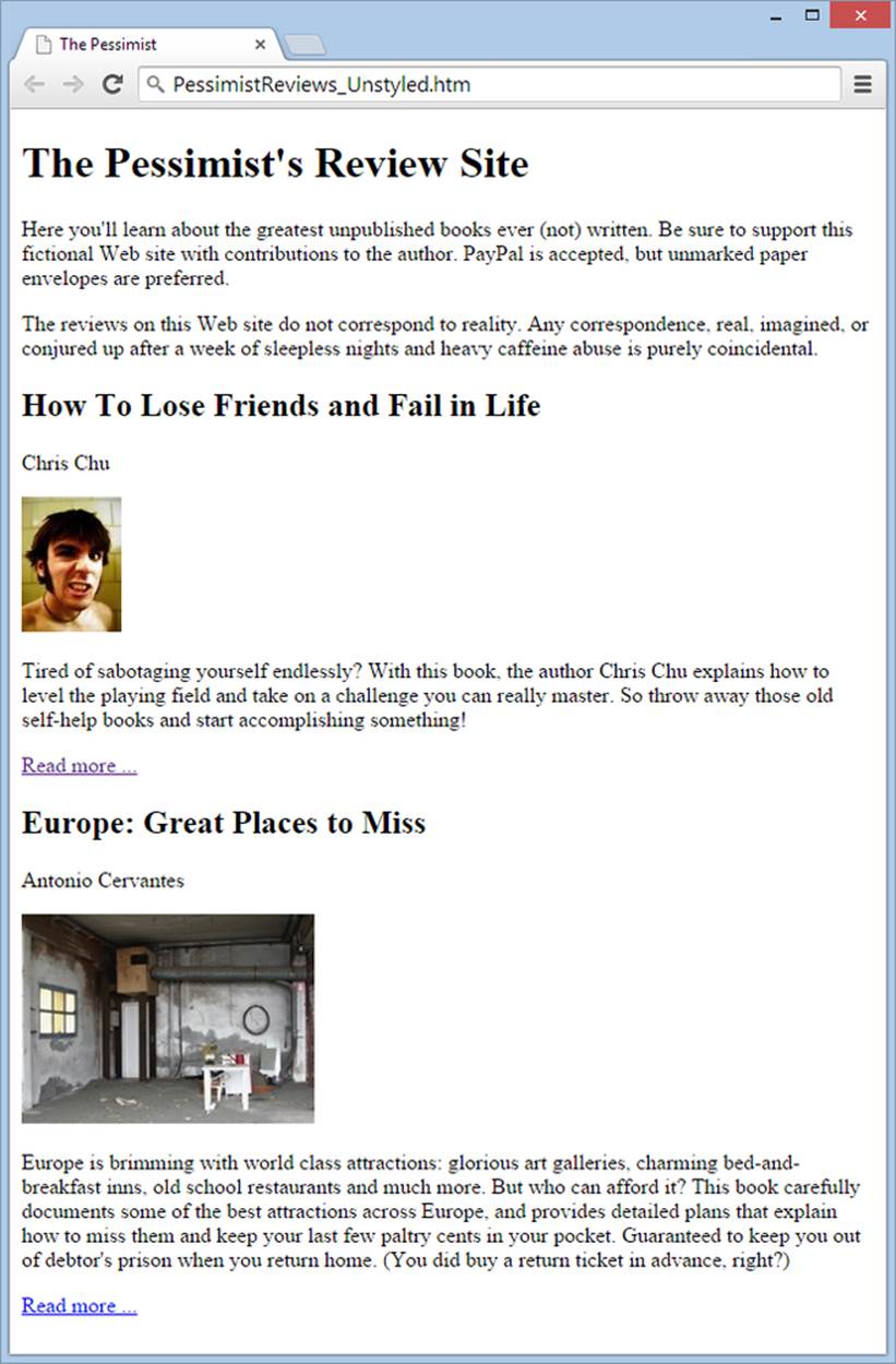
Figure 7-1. This page is pretty straightforward: it holds a general introduction followed by a list of book review summaries, with a link after each one to a full review on a separate page. Right now, the only formatting in the page is the built-in styling that HTML applies to headings, which sets the text in large, bold letters.
Before you get going, it’s a good idea to look at the markup for this page. You can find it on the companion site (http://prosetech.com/web)—look for the file PessimistReviews_Unstyled.htm. Here’s the markup, slightly condensed by leaving out some of the text:
<!DOCTYPE html>
<html>
<head>
<title>The Pessimist</title>
</head>
<body>
<h1>The Pessimist's Review Site</h1>
<p>Here you'll learn about the greatest unpublished books ever ...</p>
<p>The reviews on this Web site do not correspond to reality. Any ... </p>
<h2>How To Lose Friends and Fail in Life</h2>
<p>Chris Chu</p>
<img src="scowl_small.jpg" alt="Face">
<p>Tired of sabotaging yourself endlessly? With this book, the author ...
</p>
<p><a href="LoseFriends.htm">Read more ...</a></p>
<h2>Europe: Great Places to Miss</h2>
<p>Antonio Cervantes</p>
<img src="house_small.jpg" alt="House">
<p>Europe is brimming with world class attractions: glorious art ... </p>
<p><a href="Europe.htm">Read more ...</a></p>
</body>
</html>
Identifying the Main Ingredients
Before you can write any style sheet rules, you need to think hard about your web page and how it’s structured. Here’s a good exercise: make a printout of your page, and then highlight each design element with a pen or marker (Figure 7-2). Your goal is to divide the page into its logical components and then format those different types of content in distinct ways.
For example, your style sheet should distinguish between the paragraph of text in the introduction and the paragraphs of text in the book reviews. And these differences should be clear and obvious, so you (or someone else) can look at the style sheet 12 months from now and still understand what’s going on—and what rules to edit when you want to change the formatting.
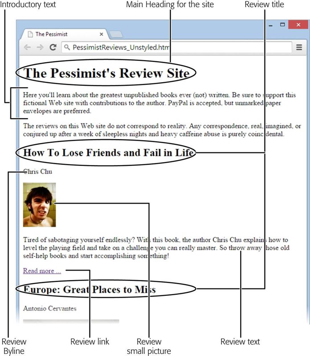
Figure 7-2. In the average HTML document, you have a sea of similar elements—even a complex page often boils down to just headings and paragraph elements. In this example, the general introduction, the author byline, and the book summaries all use <p> elements. However, you should format these elements differently, because they represent different types of content. You’ll tackle that task below.
Building a Complete Style Sheet
When crafting a style sheet, you should begin by writing the most general, wide-reaching style rules first. These include instructions that set the background and typeface for the entire page and rules that target certain types of elements (like paragraphs and headings). Once you finish this job, you can target smaller and more specific design elements using rules that act on specific classes (for example, the author byline and the “Read more” link in Figure 7-1).
Figure 7-3 shows the first version of the review site style sheet. It’s not the finished product—you’ll improve on it as you work through this chapter—but it’s a decent first step on the journey.
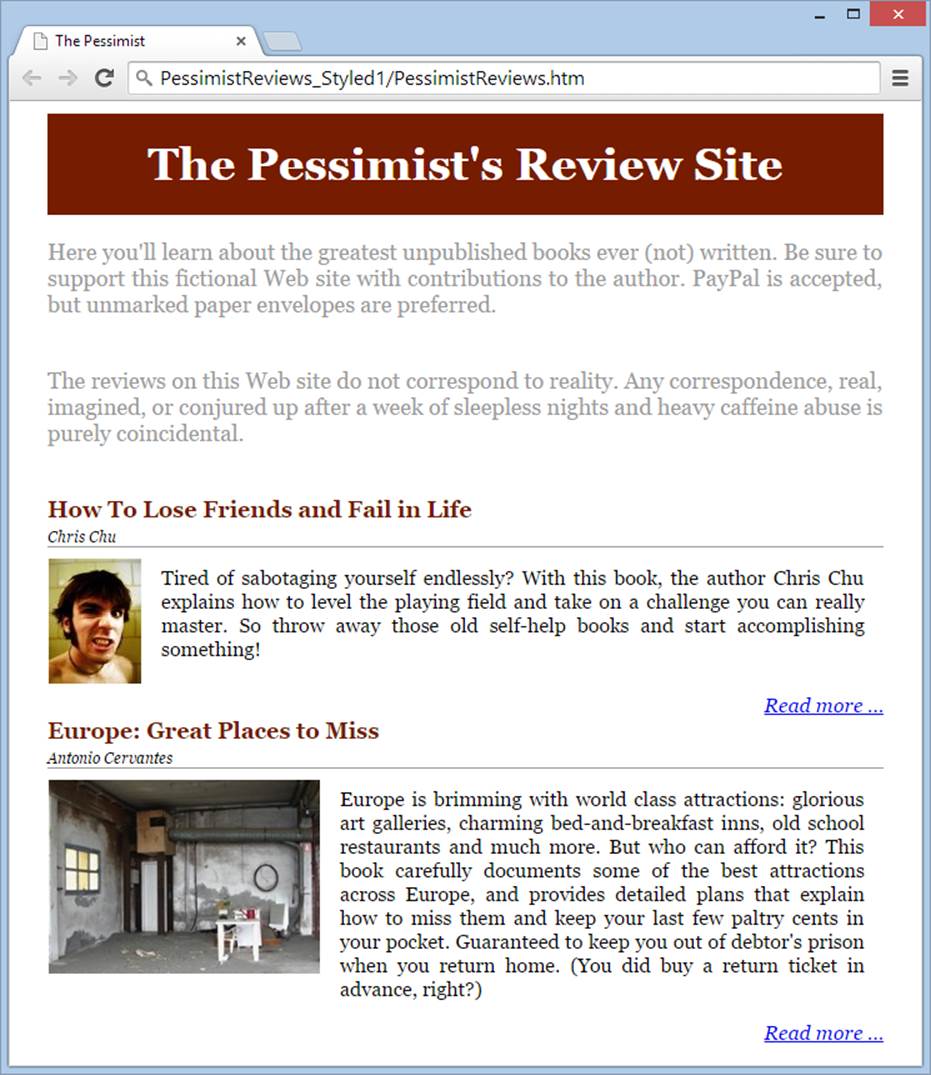
Figure 7-3. The revised style sheet changes the page’s colors, font, and text alignment. It also makes the different parts of the page obvious and unifies repeating sections (like the review titles) with consistent formatting.
Setting the Ground Rules
Your first step is to lock down the basic design for your page, and the best way to do that is by applying a style rule to the most general of HTML elements: <body>.
As you know, the <body> element wraps the rest of your HTML markup. That means that any formatting you apply to it becomes the norm for the entire page. That makes the <body> element a good place to set the following styles:
§ Font. Set the typeface and initial type size here.
§ Margins. Every web page starts with a thin margin along the edges. This space interferes with certain style effects, like positioning a header that fits snugly against the top and sides of the page (an effect you’ll try out on Grouping Content with the <div> Element). Set the margin to 0 if you want your content to stretch out and fill the whole display area, with no space between the edge of the page and the frame of the browser window.
§ Background. If you want a background color (Colors) or a background picture (Background Images) for the entire page, here’s the spot to set it.
In the first version of the review site, the style rule for the <body> element is pretty simple. It sets the Georgia font as the standard typeface for the page:
body {
font-family: Georgia,serif;
font-size: 18px;
}
Formatting Elements with Type Selectors
Your next job is to write style rules that target specific elements. You use these rules to establish the overall formatting of your site, by specifying some of the basic details that apply everywhere in your page.
For example, the review site uses justified text that fills the space between the left and right margins (Alignment), rather than the standard left-aligned, ragged-right text. It makes sense to apply this alignment to all the paragraphs in the page, but not to other elements, like headings or lists. You can do that easily by creating a rule that targets all paragraphs, like this:
p {
text-align: justify;
}
It also makes sense to apply consistent formatting to all the images in the site. In the review site, every image is floated on the left (Tutorial: Wrapping Text Around an Image), given a wider right margin, and outlined with a thin white border. Here’s the style rule that does all that:
img {
float: left;
margin-top: 3px;
margin-right: 15px;
margin-bottom: 7px;
border-style: solid;
border-color: white;
border-width: 1px;
}
NOTE
You don’t need any black magic to figure out the dimensions you should use to put margins around your elements. Instead, it’s a matter of trial and error. Because the review site floats images to the left, you know you’ll probably need to add extra margin space on the right side of the picture to leave some breathing room between the picture and the surrounding text. However, it takes a few edit-save-refresh cycles before you find the settings that look just right.
When you start building a style sheet for your site, you’ll find that it fills up fast. If you can keep your rules lean and concise, your style sheet becomes a bit more manageable and a bit more readable. One way to do that is to use CSS shorthand syntax wherever you can. That means that instead of using style sheet properties like border-style, border-color, and border-width, consider the all-in-one border property that lets you set these three details in a single line of HTML.
You can also condense the margin and padding properties. If you supply a single number, the browser uses that value for all sides of an element. If you supply two numbers, the first one sets the top and bottom margins (or padding), while the second one sets the margins on the side. And if you supply four numbers, they set the margins in this order: top, right, bottom, left.
Here’s a revised version of the <img> rule that applies the same formatting as earlier but uses the CSS shorthand syntax:
img {
float: left;
margin: 3px 15px 7px 0px;
border: solid white 1px;
}
Now you face a few decisions. You have a page filled with content you need to format, but element-based style rules aren’t always the right choice.
For example, most of the page’s content lives inside <p> elements, but you want to format these paragraphs differently, depending on their logical role. This makes them a good candidate for the class-based rules you’ll apply in the next section. However, the two types of headings areconsistent. The <h1> heading announces the title of the site, while each <h2> heading represents a review title.
Here’s the style rule that formats the <h1> heading. It sets a background color, so the heading becomes a shaded red banner. The style rule also changes the text to white lettering and centers it:
h1 {
background-color: #761C00;
margin: 0px;
padding: 20px;
color: white;
text-align: center;
}
You don’t need to set the font, because the headline inherits it from the style you applied to the <body> element. However, you can set the font-size property if the standard <h1> size is too big or too small.
GEM IN THE ROUGH: CHOOSING HARMONIOUS COLORS
Picking the right colors for your site can take time. If you have a logo or graphic prominently featured in your site, you can use a graphics tool (for example, one of the paint programs described on Tutorial: Wrapping Text Around an Image) to pick out the most important colors. You can then use those colors in your style sheet. But if you aren’t trying to match an already established color scheme, you can benefit from an online color-picking tool.
For example, visit http://paletton.com for a graphical color picker that’s both highly advanced and surprisingly easy to use. You choose the type of color scheme you want (monochromatic, adjacent three-color, coordinated four-color, and so on) and then spend some time clicking and dragging dots on an interactive color wheel. As you do, Paletton updates a carefully shaded palette of harmonious color choices. Once you see what you like, copy the color codes so you can use them in your style sheet—just as we did when building the red-and-gray color scheme for the review site.
The last element you might decide to target with a type selector is the <h2> element, which holds the review headings.
Here’s where good web developers can disagree. Although every <h2> element in the page is a review title, this design might not hold true forever. It’s easy to imagine adding <h2> elements that aren’t review titles, either for other sections of this page or in other pages. For that reason, it’s probably better to distinguish the review headings with their own dedicated class, as you’ll do in the next section.
Creating Classes
With the basic rules out of the way, it’s time to move on to the real work of style sheet creation—writing class rules. As you learned on Class Selectors, class rules let you apply style sheet formatting to a single, specific element or group of elements. They also help you think in a more logical, structured way about your web pages. Instead of focusing on the HTML tags you’re using, classes help you focus on styling the different types of information you present.
For example, the review site includes plenty of paragraphs, but they don’t share the same formatting. With class rules, you can format the same element (in this case, <p>) in different ways, depending on whether that paragraph represents a review heading, a review byline, or the actual review text.
Once you mentally divide your page into sections (see Figure 7-2), you’re ready to add the class rules that format them. For example, you can format the review heading with a class selector like this:
h2.reviewTitle {
margin-top: 0px;
font-size: 16px;
color: #761C00;
margin-bottom: 0px;
}
This rule applies to <h2> elements only, and only <h2> elements with the class name reviewTitle. You need to edit the page to put it into effect:
<h2 class="reviewTitle">How To Lose Friends and Fail in Life</h2>
This technique makes sense because at some point the website may include other level-2 headings that don’t correspond to review titles, and so need different formatting.
TIP
Remember, the best class names provide a succinct description of the type of content you want to format. In this example, the class name is reviewTitle, because you’re going to apply this style to the book-review headings. Good class names describe the function of the class rather than its appearance. For example, WarningNote is a good class name, while BoldRedArialBox isn’t. The problem with the latter is that it won’t make sense if you decide to change the formatting of your warning note box (for example, by giving it red lettering). And two years from now, when you edit your style sheet, you may not remember what element BoldRedArialBox is supposed to format.
Class selectors really show their value when you start formatting the paragraphs in your page. The review site uses <p> elements to hold several different types of content, and each one needs its own class with distinct formatting.
/* The introduction text */
p.intro {
color: #9C9C9C;
}
/* The review byline */
p.byline {
font-size: 12px;
font-style: italic;
border-style: outset;
border-width: 0 0 1px 0;
margin: 5px 0 5px 0;
}
/* The review summary text */
p.review {
font-size: 16px;
margin: 15px;
}
/* The link at the end of the review summary */
p.reviewEnd {
font-size: 16px;
font-style: italic;
text-align: right;
margin-bottom: 0px;
clear: both;
}
NOTE
This example introduces another feature—CSS comments. CSS comments look a little different from HTML comments. They always start with the characters /* and end with the characters */. Comments let you document what each class selector does. Without them, it’s all too easy to forget what each style rule does in a complicated style sheet, particularly when you use class selectors.
Practice your style-decoding skills by figuring out what these styles do. Most of the properties apply the usual tweaks to font size and margin space. However, there are a couple of interesting tricks. The byline class, for example, puts a thin border under the author’s name to separate it from the review text. And the reviewEnd class uses the clear property to turn off text wrapping and skip to the bottom of the floated image. This ensures that the next review doesn’t end up beside the floating image from the previous review, which can happen when you have floating images displayed in wide browser windows. (Clearing a Float shows what this blunder looks like.)
To put these styles into action, you need to add your newly chosen class names to various parts of your page. Here’s the modified markup for the review page, incorporating these class names. (To save space, most of the text is left out, but the essential structure is here.)
<h1>The Pessimist's Review Site</h1>
<p class="intro">Here you'll learn about the greatest unpublished books ever
...</p>
<p class="intro">The reviews on this Web site do not correspond to reality.
Any ... </p>
<h2 class="reviewTitle">How To Lose Friends and Fail in Life</h2>
<p class="byline">Chris Chu</p>
<img src="scowl_small.jpg" alt="Face">
<p class="review">Tired of sabotaging yourself endlessly? With this book, the
...</p>
<p class="reviewEnd"><a href="LoseFriends.htm">Read more ...</a></p>
<h2 class="reviewTitle">Europe: Great Places to Miss</h2>
<p class="byline">Antonio Cervantes</p>
<img src="house_small.jpg" alt="House">
<p class="review">Europe is brimming with world class attractions: glorious
...</p>
<p class="reviewEnd"><a href="Europe.htm">Read more ...</a></p>
This isn’t too shabby, but you can streamline your markup with smarter selectors, as you’ll see shortly. But for now, this completes the first version of your style sheet. Fire the page up in your browser, and you’ll get the cleaned-up appearance shown in Figure 7-3. You can see the complete style sheet on the companion site (http://prosetech.com/web), in the PessimistReviews_Styled1 folder.
UP TO SPEED: KEEPING YOUR STYLE SHEET ORGANIZED
To make your style sheet’s rules hierarchy as clear as possible, add the styles that use type selectors (those that target a specific type of element) first. In this example, those are the rules that format the <body> and <p> elements. Then add the class rules, putting related rules together (for example, grouping the styles for the different parts of a review).
Remember, your elements can (and often will) inherit style properties from more than one rule. For example, in the review site, the review text gets its justification setting from the <p> rule. The review class can then extend this style with additional style properties or override the style (for example, change the alignment) if necessary. Of course, extending is better than overriding, because life gets confusing when you have overlapping rules. (In the situation described here, the class selector wins over the type selector, because CSS deems it to be more specific. However, figuring out which rule is the most specific isn’t as straightforward in every situation, as you’ll see on Saving Work with Contextual Selectors.)
Improving Your Style Sheet
The missing ingredient in the previous style sheet is the always-useful <div>.
You probably remember the <div> element from previous chapters. It’s an all-purpose container that lets you group various sections of your web page. You can corral as many elements with the <div> tag as you want, including headings, paragraphs, and lists.
The <div> element plays several important roles in a well-designed style sheet:
§ It groups logically related sections. For example, you can wrap the review title, review byline, and review text in a <div>, making it clear that these components belong together.
§ It adds boxes where you need them. Wouldn’t it be nice to wrap each review in a shaded and bordered box? With a <div>, that’s easy (Figure 7-4).
§ It simplifies your markup. Thanks to style sheet inheritance, the styles you apply to a <div> trickle down to the elements inside. You’re about to see how that can help you trim the number of style rules in your style sheet.
Grouping Content with the <div> Element
A properly applied <div> element can do wonders for your page. It’s the secret weapon that transforms a page from merely functional to flexible.
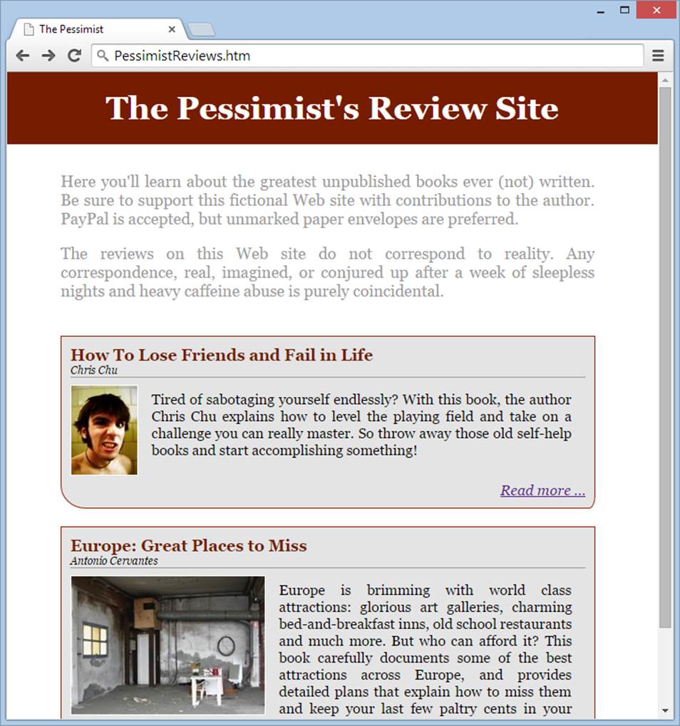
Figure 7-4. This version of the review site adds a number of refinements. Most obviously, the site’s header now sits flush against the top and sides of the page, and each review has its own bordered, shaded box.
You’ll first use a <div> to create the boxes that wrap the reviews. To do that, you need to add a separate <div> element around each review:
<div class="review">
<h2 class="reviewTitle">How To Lose Friends and Fail in Life</h2>
<p class="byline">Chris Chu</p>
<img src="scowl_small.jpg" alt="Face">
<p class="review">Tired of sabotaging yourself endlessly? With this book,
the ...</p>
<p class="reviewEnd"><a href="LoseFriends.htm">Read more ...</a></p>
</div>
<div class="review">
<h2 class="reviewTitle">Europe: Great Places to Miss</h2>
<p class="byline">Antonio Cervantes</p>
<img src="house_small.jpg" alt="House">
<p class="review">Europe is brimming with world class attractions: glorious
...</p>
<p class="reviewEnd"><a href="Europe.htm">Read more ...</a></p>
</div>
Then you simply add a rule that styles the review <div>s:
/* The review box. */
div.review {
background-color: #E4E4E4;
margin: 20px 0 20px 0;
padding: 10px;
border: 1px #8A2700 solid;
border-bottom-left-radius: 28px 26px;
border-bottom-right-radius: 7px 14px;
}
These properties shade the review’s background, add a border, and set the margin (the space between the border and the surrounding content), and padding (the space between the border and the inside content, which is the review text in this example). The style gets a little bit fancy with theborder-bottom-left-radius and border-bottom-right-radius properties, which use slightly different curves to smooth out the bottom-left and bottom-right corners of the box.
But the review copy isn’t the only place the revised review site uses a <div>. You also need a <div> for the header bar shown in Figure 7-4. Creating this bar takes two steps. First, you strip out the standard margin around the page using a style for the <body> element:
body {
margin: 0px;
padding: 0px;
font-family: Georgia,serif;
font-size: 18px;
}
Second, you add another <div> to hold all the content of the page except the header. This <div>’s job is to add the margin space back to the page, so your pictures and text don’t end up scrunched along the side.
/* The page content, not including the header */
div.main {
margin: 30px 70px 0 60px;
}
You put the start tag for this <div> just after the header, and the closing </div> tag at the end of the page, just before the footer (or in this case, just before the </body> tag that ends the page, because there is no footer). Here’s the basic structure:
<!DOCTYPE html>
<html>
<head>
...
</head>
<body>
<h1>The Pessimist's Review Site</h1>
<div class="main">
<!-- The rest of the page goes here, including everything. -->
</div>
</body>
</html>
NOTE
There’s no shame in having a <div> hold other <div> elements. In fact, it’s a rare page that doesn’t have <div> elements nested this way. For example, in the review site, the main <div> holds all the <div> elements for the reviews.
Figure 7-5 dissects the second version of the review site, showing you where the hidden <div> elements lie.
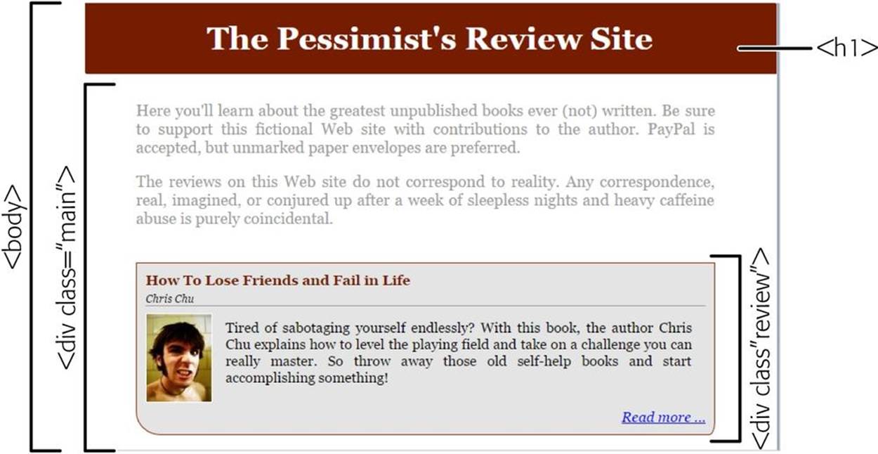
Figure 7-5. In this example, the HTML markup wraps each review in a <div> element, which applies a background color and borders to visually set off the reviews from the rest of the page. Techniques like these can help organize dense pages that have lots of information.
NOTE
The <div> element is also the key to page layout. Once you put a distinct chunk of content into a <div>, not only can you style it as a single unit, but you can also place the whole block wherever you need it on your page. This makes the <div> a perfect container for things like headers, menus, footers, ad bars, and any sort of panel or box. You’ll learn more about <div>-powered layouts in the next chapter.
Saving Work with the <div> Element
Thanks to style sheet inheritance (The Cascade), elements within a <div> inherit many of their properties from the parent <div>. Font size and margin settings are two good examples. If you set the font-size property in a <div> that contains paragraphs of review text, all those paragraphs get that formatting for free.
NOTE
Although there are some style properties (like margin and padding) that don’t support inheritance, most do. The style property tables in Chapter 3 indicate which properties use inheritance.
Once you add review boxes to your page, you can use inheritance to your advantage. For example, instead of assigning a 16-pixel font size to the p.review and p.reviewEnd classes, you can set the type size once in the div.review class (and still override it in the p.byline class).
You can save even more markup by adding a div.intro class to hold the two introductory paragraphs at the beginning of the page. There you can set the text color:
/* The introduction section. */
div.intro {
color: #9C9C9C;
margin-bottom: 40px;
}
Now you don’t need the p.intro class at all. You can delete it from your style sheet and remove the class attribute from the two introductory paragraphs.
If these changes seem small, remember that a typical style sheet is stuffed with dozens or hundreds of rules. A few modest savings like these can reduce the complexity of your style sheet quite a bit.
The <div> element is a great way to save loads of time, and web experts use it regularly. But the next technique can help you improve your markup even more.
Saving Work with Contextual Selectors
Applying a class attribute to every element you want to format can get tedious fast. In the example above, you need to add the class=“review” attribute to every paragraph after the byline. Fortunately, you can use another great shortcut, courtesy of the <div> element and a new type of selector, called a contextual selector.
A contextual selector targets an element inside another element. To understand what that means, take a look at this type selector:
b {
color: red;
}
It formats all bold text in red. But what if you want it to work only on bold text that appears inside a bulleted list? You can do that using the following contextual type selector, which finds unordered list elements (<ul>) and then hunts for bold elements inside them. If it finds any, it makes the bold text red:
ul b {
color: red;
}
To create a contextual type selector, you simply put a space between the two elements.
Contextual selectors are useful, but figuring out how to write one in a style sheet full of nested elements can get a little dizzying. You’ll see the real benefit of a contextual selector when you use one to target a specific type of element inside a specific type of class. For example, consider what happens if you take this style sheet rule:
h2.review {
and change the selector to this:
div.review h2 {
The first part of this selector finds all the <div> elements in your page. The second part limits those matches to <div> elements that have the class name review applied to them. The third and final part of the selector locates the <h2> elements inside the <div>. The end result is that every level-2 review heading gets the appropriate formatting, while headings in the rest of the page are left alone.
Best of all, you can remove the class attribute from the <h2> element, leaving the following, simpler markup:
<div class="review">
<h2>...</h2>
You can repeat this trick to format the <img> or <a> elements in a review without using class names.
You can even target the ordinary paragraphs inside your <div>, but here you have to be careful. That’s because CSS considers contextual selectors to be more specific than type or class selectors. For example, imagine that you want to create a paragraph-formatting rule that uses a contextual selector like this:
div.review p {
You want this rule to apply to all the review paragraphs except the byline at the beginning and the link at the end. Ideally, you want to use just three classes in the review markup, like this:
<div class="review">
<h2>...</h2>
<p class="byline">...</p>
<p>...</p>
<p>...</p>
<p>...</p>
<p class="reviewEnd">...</p>
</div>
Here’s where you run into a problem, because the browser ignores the formatting in the byline and reviewEnd classes. That’s because the browser decides that these class rules are less specific than the new paragraph rule that uses the contextual selector.
NOTE
Confused? CSS has a quirky and often overlooked system of precedence, which decides which rules are more specific than others (and so win out in a formatting clash). The rule of thumb is that a contextual selector always beats a class selector. But if you want the full, gory details, which spell out the winners when different types of style rules conflict, check out the Smashing Magazine article at http://tinyurl.com/css-specific.
To correct this problem, you need to change the byline and reviewEnd classes. The easiest way to make them more specific is to modify them to use a contextual selector as well. In other words, instead of creating a rule that applies to any paragraph that uses the byline class, you need to create a rule that applies to any paragraph that uses the byline class and is located inside a review:
div.review p.byline {
This corrects the problem. Best of all, it lets you simplify your markup. Now you need to apply classes to each review in just three places: in the <div> container for the review itself, in the byline, and in the link at the end. You no longer need to add a class to the regular paragraphs or the heading.
NOTE
When using classes and contextual selectors, most web designers don’t bother specifying the element names. That’s because this selector is a bit clunky:
div.review p.byline
Instead, this works just as well and is more readable: .review .byline
This selector grabs the elements that use the byline class, provided they’re inside an element the uses the review class. The end result is the same.
Contextual selectors are a wildly popular way to define formatting rules for different sections of a page. If you look at other people’s style sheets (and you should, to learn new tricks and practice your CSS skills), you’ll see plenty of <div> elements and contextual selectors at work.
If you’ve lost track of what style rules are still in the style sheet and which ones you don’t need anymore, check out the following outline, which lists all the rules in the revised version of review-site style sheet.
/* Remove the margin and set the font for the whole page */
body { ... }
/* Set the justification for all paragraphs */
p { ... }
/* Float and style all images */
img { ... }
/* The shaded site header */
h1 { ... }
/* The page content, not including the header */
div.main { ... }
/* The introduction section. */
div.intro { ... }
/* The entire review box. */
div.review { ... }
/* The review title */
.review h2 { ... }
/* The review summary text */
.review p { ... }
/* The review byline */
.review .byline { ... }
/* The link at the end of the review summary */
.review .reviewEnd { ... }
You can see this style sheet, complete with all its formatting glory, on the companion site (http://prosetech.com/web) in the PessimistReviews_Styled2 folder.
SHARPEN UP: PRACTICE STYLING A PAGE
You may understand the style sheet techniques covered in this chapter, but there’s no substitute for trying them out yourself. If you’re ready to apply some CSS mojo, here’s a good exercise: First, get the PessimistReviews_Unstyled.htm page from the companion site. That’s the unformatted version of the review page you saw back in Figure 7-1. Next, grab the latest and greatest style sheet,PessimistReviews.css, from the PessimistReviews_Styled2 folder.
Your challenge is to apply the styles from the PessimistReviews.css style sheet to the PessimistReviews_Unstyled.htm page. To do that, you first need to add the missing <div> elements. You need one that wraps all the content in the page (the main content), one for the introduction, and one for each review. Then you must add the class attributes to the elements that need them. If you rework the page correctly, you’ll see the page shown in Figure 7-4. If you run into trouble, check out the correct solution—the PessimistReviews.htm page in the PessimistReviews_Styled2 folder.
Creating a Style Sheet for an Entire Site
Class rules aren’t just useful for separating different types of content. They’re also handy if you want to define rules for your whole site in a single style sheet.
Consider the review site you’ve been working on. As you add more pages to it, it’s reasonable to assume that you’ll use some of the same formatting rules on the new pages. For example, you’re likely to keep the site header, the Georgia font, and the text-justification settings for other pages in your site. But you’ll probably need to supplement the style sheet you’ve built so far with additional rules that deal with different types of content.
Figure 7-6 shows an example of a new page that could benefit from some extra fine-tuning. It displays the full text of a single review. This is the page visitors see if they click the “Read more” link in the review summary on the main page.
You can adapt the existing style sheet to suit this new page several ways. One is to create a whole new set of rules for full-review pages. For example, you could wrap the review summaries in a <div> and apply a class named reviewSummary to them, and you could wrap the full reviews in a<div> and use the class name reviewFull for them. The reviewSummary class would get the border and smaller heading, while the reviewFull class would get a similar page, but with no border and larger text.
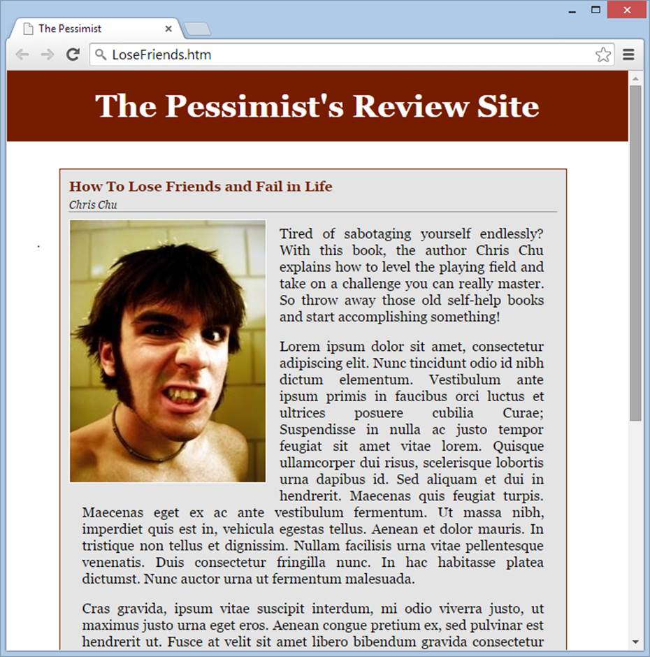
Figure 7-6. The full review gets the same formatting as the review summary on the main page. However, some of the styling doesn’t seem to fit as well here, including the bordered box that surrounds the entire review and the small-seeming review title.
Here’s an outline of the style rules you need:
/* ************************************************ */
/* Styles for the review summaries on the main page. */
/* ************************************************ */
/* The entire review box. */
div.reviewSummary { ... }
/* The review title */
.reviewSummary h2 { ... }
/* The review summary text */
.reviewSummary p { ... }
/* The review byline */
.reviewSummary .byline { ... }
/* The link at the end of the review summary */
.reviewSummary .reviewEnd { ... }
/* **************************************************** */
/* Styles for the full review on the single-review page. */
/* **************************************************** */
/* The whole review section. */
div.reviewFull { ... }
/* The review title */
.reviewFull h2 { ... }
/* The review text */
.reviewFull p { ... }
/* The review byline */
.reviewFull .byline { ... }
Another approach is to continue using the same class names. After all, in both cases you’re formatting a review. The only difference is the context of that review—the fact that it now has the whole page to itself. To capture the change in this context, you can add another <div> container around the <div> that holds the review. For example, on the single review page you could use markup like this:
<div class="singlePageReview">
<div class="review">
<h2>How To Lose Friends and Fail in Life</h2>
<p class="byline">Chris Chu</p>
<img src="scowl_big.jpg" alt="Face">
<p>Tired of sabotaging yourself endlessly? With this book, the author Chris
Chu explains how to level the ...
Now you need to write contextual selectors that alter a few details for reviews on the single-review page. For this task, you’ll need more elaborate contextual selectors. Instead of simply specifying the byline class (the author byline) in the review class (the <div> container that holds the review), as you did earlier, now you need to target the byline class in the review class in the singlePageReview class. Here’s the selector that does the job:
.singlePageReview .review .byline {
If you’re making just a few changes, this add-on approach is surprisingly elegant. For example, by adding the three rules shown below, you can give the single-review page a more suitable appearance (Figure 7-7).
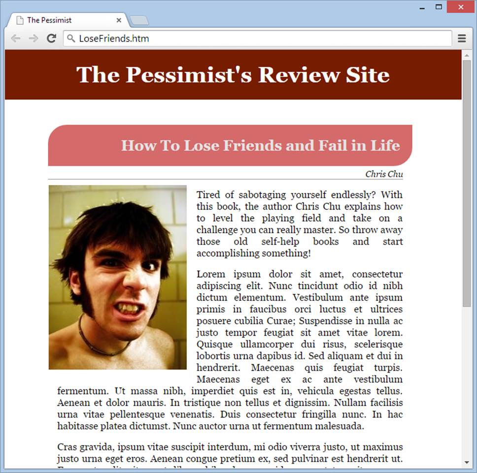
Figure 7-7. Using contextual selectors, full-page reviews like this one look different from review summaries. But thanks to the many shared details in coloring, type, and alignment, both pages stay consistent and look like they belong in the same site.
.singlePageReview .review {
border: none;
background: transparent;
}
.singlePageReview .review .byline {
font-size: 14px;
text-align:right;
margin-right: 15px;
}
.singlePageReview .review h2 {
font-size: 24px;
text-align:right;
color: #E4E4E4;
background: #D46A6A;
border-radius: 30px 0;
padding: 20px;
}
Tutorial: Becoming a Style Detective
In this chapter, you accomplished some serious styling work. But no matter how carefully you organize your styles, something will eventually go wrong. You’ll tweak the properties in a rule, refresh the page, and find that the element you’re attempting to change has stubbornly ignored your commands.
You could have altered the wrong rule. Or mistyped a class name. Or added a rule that another setting in a different rule canceled out. Finding the root of a style problem isn’t always easy, because the more complex your style sheet, the more difficult it is to identify the rules that format a specific part of your page.
Consider one of the review paragraphs in the previous example. It acquires a combination of styles from no fewer than four places:
§ It inherits <body> element settings, like the font family.
§ It gets the paragraph-specific formatting you set in the <p> style rule.
§ It inherits the settings from the <div> that holds the review.
§ It gets the formatting you specified for all review paragraphs through the contextual .review .p selector.
So what do you do if an element on your page doesn’t have the formatting you think it should, based on the styles you set? You could fumble around in the dark, making random changes to the style sheet in an attempt to fix the problem. But a better idea is to call in the reinforcements and use a CSS inspection tool.
A CSS inspection tool is a browser feature or plug-in that analyzes what’s happening in your web page. It tells you what style properties are in effect on every element, and where the element gets these settings from. Using a CSS inspection tool is like performing an x-ray on your page to see the CSS logic hiding underneath.
In the not-so-distant past, you needed to install (and maybe even buy) some sort of specialized tool to get this CSS wizardry. But today, every modern browser provides this feature—and, surprisingly, each browser implements it in pretty much the same way. The following steps walk you through the process of using CSS inspection:
1. First, grab yourself a page you want to analyze.
A good starting point is the final review in the PessimistReviews.htm page, which you can find in the PessimistReviews_Styled2 folder on the companion site (http://prosetech.com/web).
2. Open the page in your favorite browser.
Google Chrome is a superb choice for CSS inspection, but Firefox and Opera offer CSS tools that are nearly as good. Internet Explorer can perform the same magic, but it works best in IE 11 or later.
If you’re using Safari, you need to make a quick trip to the menu to turn on the developer tools before you go any further. Choose Safari→Preferences→Advanced and make sure the “Show Develop menu in menu bar” checkbox is turned on.
3. Choose an element you want to study.
For example, in the PessimistReview.htm page, you might decide to zero in on one of the review bylines.
4. On the web page, right-click the element you want to examine, and then choose Inspect Element.
A multi-tabbed panel of web developer tools appears at the bottom of your web page (Figure 7-8).
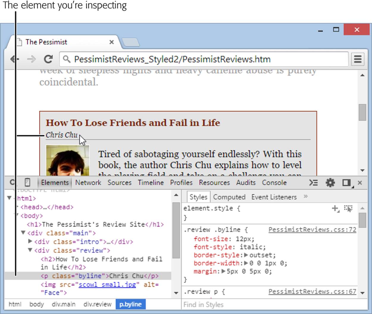
Figure 7-8. There are plenty of goodies packed into the inspection-tool tabs you see here. On the left, you’ll see the HTML markup for the page, nicely formatted and color coded. You can collapse or expand parts of the listing to focus on the part that interests you (just click the tiny arrows in the left margin). On the right side is something even more interesting—a list of all the styles that affect the element you picked.
5. Expand the developer panel so you can see most of the CSS styles listed.
The developer panel starts out small, but you can make it bigger by dragging the bar that separates the developer panel from the web page up.
Figure 7-9 shows a closeup view of the style list in Chrome.
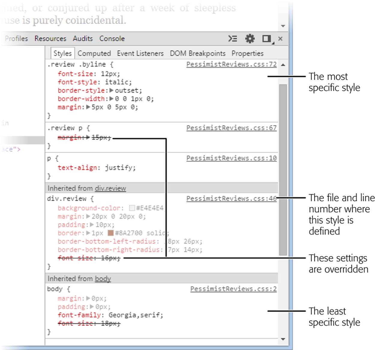
Figure 7-9. The browser’s CSS inspector arranges styles in order, putting the most specific ones (the ones that are applied last, and that have last say) on top. In this example, that means the properties in the .review .byline style override those in the more general .review p style. The crossed-out properties (like the margin property in the .review p style and thefont-size property in the div.review style) are properties that have been overridden for the current element.
6. When you finish, pick a new element to study.
You can choose an element two ways. You can right-click something on the page and choose Inspect Element again, or you can click the element you want in the HTML outline on the left side of the developer panel.
If you’re prepared to dig deeper, most browsers add a few more CSS analyzing goodies. You can do any of the following:
o See the computed style settings. You may see a Computed button or tab above the style list. Click it to see the combined effect of your styles—in other words, to see a single list that shows all the properties in effect on the chosen element.
o Turn off a style property. Most browsers also let you turn off specific style settings to better understand how they affect the page. To do this, clear the checkbox next to the property you want to turn off. (In some browsers, including Chrome and Firefox, you need to point to the property before the checkbox appears.) Keep in mind that this style-switching is just a temporary testing tool—it doesn’t change your style sheet, nor does it affect what your page looks like the next time you open it in a browser.
o Edit a style property. Want to quickly test a change? Double-click one of the style properties in the list and then type in a new value. Your browser applies the new style setting immediately (Figure 7-10). If this solves the problem or improves the page, you can make the same edit to your style sheet.
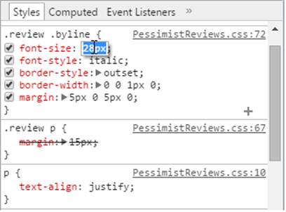
Figure 7-10. Curious about what would happen if you gave the byline class a 28-pixel font? You can find out by double-clicking the font-size property and making this quick edit. You can clear the checkmark next to any property to temporarily turn that setting off.
All materials on the site are licensed Creative Commons Attribution-Sharealike 3.0 Unported CC BY-SA 3.0 & GNU Free Documentation License (GFDL)
If you are the copyright holder of any material contained on our site and intend to remove it, please contact our site administrator for approval.
© 2016-2026 All site design rights belong to S.Y.A.