D3.js in Action (2015)
Part 3. Advanced techniques
The final three chapters and chapter 12 (online) are focused on moving beyond small-scale and one-off data visualization to create interactive applications and the reusable code they require. Chapter 9 ties together multiple views into data using different layouts with brush-based filtering to produce a data dashboard. Chapter 10 focuses on the structure of components and layouts in D3 by walking you through the creation of a simple grid layout and legend component. Chapter 11 tackles the problem of representing thousands of datapoints graphically onscreen while maintaining performance and interactivity. Chapter 12 (online only: www.manning.com/meeks/) shows how to use D3’s built-in functionality in a touch and mobile environment, while exploring the concept of responsive data visualization. Part 3 and chapter 12 give you the skills necessary to build your own framework or application on top of D3, with high performance in a mobile or big data environment.
Chapter 9. Composing interactive applications
This chapter covers
· Linking multiple charts
· Automatically resizing graphics based on screen size change
· Creating and using brush controls
· Implementing time scales
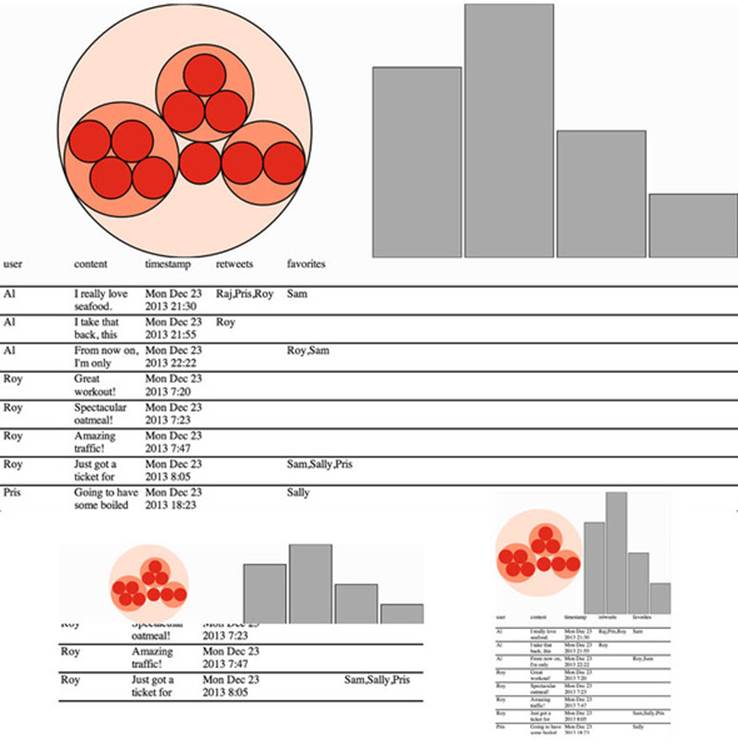
Throughout this book, you’ve seen how data can be measured and transformed to produce charts highlighting one or another aspect of the data. Even though you’ve used the same dataset in different layouts and with different methods, you haven’t presented different charts simultaneously. In this chapter, you’ll learn how to tie multiple views of your data together. This type of application is typically referred to as a dashboard in data visualization terminology (an example of which will be built in this chapter, as shown in figure 9.1). You’ll need to create and manage multiple<svg> elements as well as implement the brush component, which allows you to easily select part of a dataset. You’ll also need to more clearly understand data-binding so that you can coordinate the interactivity.
Figure 9.1. Throughout this chapter, we’ll build toward this fully operational data dashboard, first creating the individual chart elements (section 9.1), then adding interactivity (section 9.2), and finally adding a brush to filter the data by time (section 9.3).
Infoviz term: dashboard
Multiple charts combined into a single application have been around since the 1970s and were traditionally associated with decision support systems. Dashboards provide the kind of multiple views into a dataset that you’ll see in this chapter, and are often the selling point of charting libraries like NVD3.
Although they’re typically presented as several charts sharing screen space, the principles of data dashboards can also be applied to web mapping and text-based applications through modal pop-ups or any website that provides several different charts simultaneously. In those cases, the act of highlighting datapoints may be a response to the scrolling of text or zooming in on a map, rather than mousing over a data visualization element.
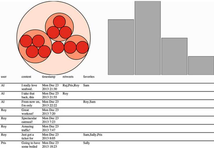
To get started, we need to design the interface that we want. Designs can be rough sketches or detailed sets of user requirements. Figure 9.2 shows a simple sketch that combines several of the charts we used in previous chapters. Each of these could represent the same dataset from tweets.json, but in a different manner. With a data dashboard, we want to provide a user with multiple perspectives of the data as well as the ability to drill down into the data and see individual datapoints. We’ll use a circle pack like we used in chapter 5 so that users can differentiate tweeters and their tweets, a bar chart for raw number of tweets, and a spreadsheet like the one in chapter 8 so that users can view the content of individual tweets. We also want to let users slice and dice their data, so later we’ll add that functionality with a brush. Both the bar chart and circle packing require that we use d3.nest(), whereas the spreadsheet takes the unchanged object array.
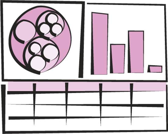
Figure 9.2. A sketch of a dashboard, showing a circle pack, bar chart, and spreadsheet that display our data
From the sketch, you can easily imagine interaction possibilities and changes that you may want to see based on user activity; for instance, highlighting which elements in each chart correspond to elements in other charts, or giving more detail on a particular element based on a click.
9.1. One data source, many perspectives
By the time you’re done with this section, you’ll have created the data dashboard shown in figure 9.3, and added interactivity and dynamic filtering to it.
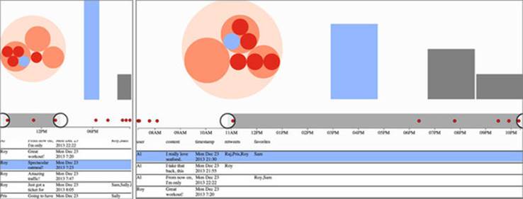
Figure 9.3. What our data dashboard will ultimately look like
To make this all work, we need an HTML page that has the divs and other elements that we’ll use.
Listing 9.1. HTML for our dashboard
<!doctype html>
<html>
<script src="d3.v3.min.js" type="text/JavaScript"></script>
<body onload="dashboard()" >
<svg id="leftSVG" class="svgDash"></svg>
<svg id="rightSVG" class="svgDash"></svg>
<div id="spreadsheet"></div>
</body>
</html>
We also need to set up our CSS to split the page into the required three regions: two SVG canvases (one for the circle packing layout and one for the bar chart) and one div element for the spreadsheet. In the following listing, you can see the initial CSS for our dashboard.
Listing 9.2. Dashboard CSS
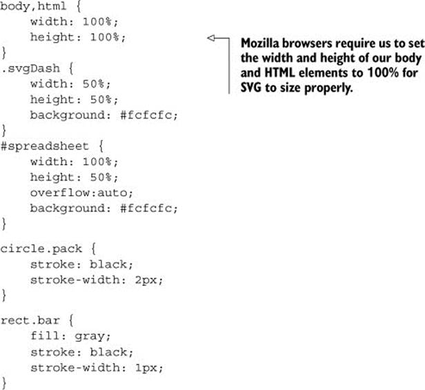
We can use percentages of the screen because an SVG element can be displayed as a percentage just like div elements. But the elements drawn in the SVG won’t scale to fit the SVG automatically. Instead, we’ll bind functionality to window.onresize to redraw our visual elements (as shown in listing 9.3). We could also use the viewport attribute of an SVG element to automatically resize the graphics, but we’ll want more fine-grained control of our graphics when creating data visualization applications (recall the distinction between graphical and semantic zoom discussed in chapter 7).
9.1.1. Data dashboard basics
Before we redraw anything, we need to load our data and add our charts. We’ll accomplish that by calling the startup function on the successful completion of d3.json loading the venerable tweets.json file we worked with in chapter 5.
Listing 9.3. General dashboard function
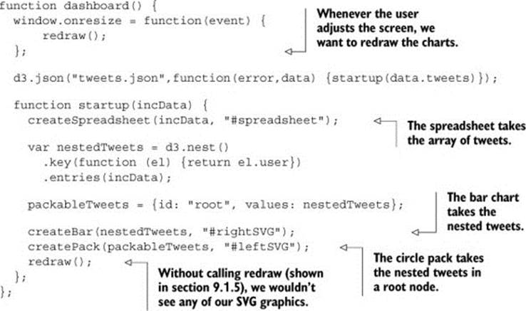
We’ll get to redraw() in listing 9.8 after we first look at each individual chart, so that you can see everything that’s happening on startup.
Each chart has its own function accessing the raw or processed dataset, as shown in listing 9.3. By using the same nested array for our packable tweets and our bar chart, we can determine if the data bound to SVG elements in each chart is the same. It’s critical that you use the same array for both, and not use d3.nest twice to create an array that contains the same data but isn’t the same array. That’s because d3.nest creates new nested user elements ("Al", "Pris", "Sam", "Roy") that are treated differently (even though they have the same attributes) than another set of nested user elements created by another iteration of d3.nest.
This is easier to understand in practice. The code in listing 9.4 shows two uses of d3.nest to create the same nested structure with the same data. But when you check to see if one element in the first array is the same as an element in the second array, you see that they’re different objects, even though they look the same.
Listing 9.4. Comparing nested data
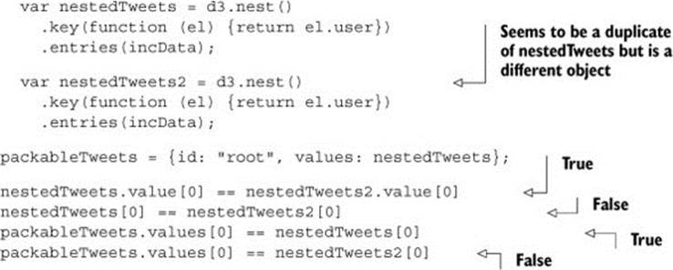
Keeping this in mind, we create the chart function in listing 9.3 to pass datasets that have shared elements. Because the objects are shared, we can identify which graphics (whether a circle or rectangle or line of a spreadsheet) refer to the same object.
9.1.2. Spreadsheet
The first chart we’ll create is the same spreadsheet we made in chapter 8, except without any of the sorting buttons. It takes the object array as it appears in tweets.json, which we can pass straight to our createSpreadsheet function in the following listing. I’m not going to dwell on the individual charting functions like this, which are explained in more detail in earlier chapters.
Listing 9.5. The spreadsheet code
function createSpreadsheet(incData, targetDiv) {
var keyValues = d3.keys(incData[0]);
d3.select(targetDiv)
.append("div")
.attr("class", "table");
d3.select("div.table")
.append("div")
.attr("class", "head row")
.selectAll("div.data")
.data(keyValues)
.enter()
.append("div")
.attr("class", "data")
.html(function (d) {return d})
.style("left", function(d,i) {return (i * 100) + "px";});
d3.select("div.table")
.selectAll("div.datarow")
.data(incData, function(d) {return d.content}).enter()
.append("div")
.attr("class", "datarow row")
.style("top", function(d,i) {return (40 + (i * 40)) + "px";});
d3.selectAll("div.datarow")
.selectAll("div.data")
.data(function(d) {return d3.entries(d);})
.enter()
.append("div")
.attr("class", "data")
.html(function (d) {return d.value})
.style("left", function(d,i,j) {return (i * 100) + "px";});
};
Notice that createSpreadsheet uses a variable targetDiv that’s passed to each select function. This is in contrast to earlier implementations where the CSS selector was explicitly declared in the code. This way the functions could be reused for different pages.
9.1.3. Bar chart
The second chart we’ll add to our dashboard is a bar chart, which requires that we nest the data so that we can count tweets. Because we’ll redraw the graphical elements in a separate function, you’ll see in the following listing that the code doesn’t declare any graphical aspects of the rectangles that make up our bar chart.
Listing 9.6. Bar chart code
function createBar(incData,targetSVG) {
d3.select(targetSVG).selectAll("rect").data(incData)
.enter()
.append("rect")
.attr("class", "bar");
};
When we use the redraw function later, we’ll use D3 functions that you haven’t seen before to draw this chart more effectively and dynamically.
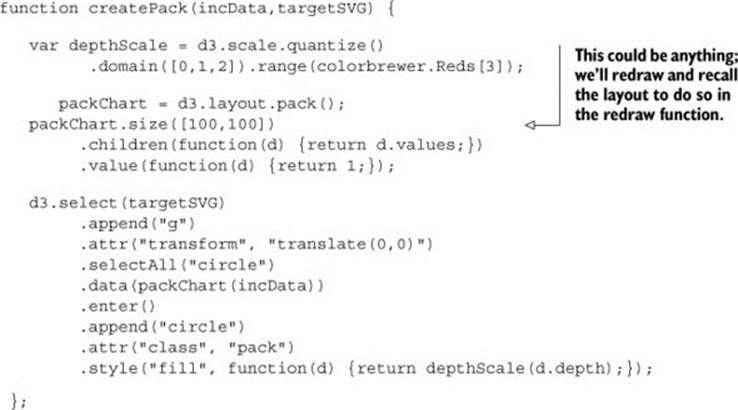
9.1.4. Circle pack
You learned how to make a circle pack chart in chapter 5. Listing 9.7 shows how we can deploy similar code to lay the groundwork for adding our circle pack chart to our dashboard. As with the bar chart, we don’t declare any of the graphical channels that we expect to change if the page is resized, which means we only declare fill and stroke.
Listing 9.7. Circle pack code
9.1.5. Redraw: resizing based on screen size
The redraw function creates the visual elements of your charts based on the current size of the screen. Without the redraw function, your charts wouldn’t display, because the circles in the circle pack have no xy information and the bars in your bar chart have no height or width. This may seem counterintuitive, but it’s better to have your chart-drawing code in one place for easy maintainability. If you’re going to constantly update a chart, as we’re doing with our dashboard, then there’s no reason at all to draw the elements (or set their graphical channels) when you first append them to the SVG canvas. By decoupling the preparation of the dataset from their drawing, you’re doing the same thing that layout functions are designed to do in D3: not draw things, but process them for drawing. You can then call the redraw function, as shown in the following listing, not only when the screen resizes but whenever a change to filters or data warrants it. For example, we can filter the tweets to a certain period of time, which we’ll do in section 9.3, “Brushing.”
Listing 9.8. The redraw function
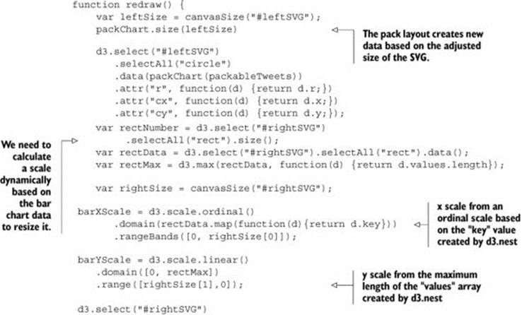

We use the rangeBands function of d3.scale.ordinal() to efficiently create a reusable bar chart. rangeBands divides the given width into equal areas, which is useful for a bar chart. You may be tempted to use the bare object array as your domain, but rangeBands uses the string version of the domain objects, which results in "[object object]" rather than unique identifiers for each object. Instead, we’ll create a mapping of our array based on the key values (the names of each tweet creator) to use as our domain. For the range array of the ordinal scale, we’ll use the current width of the svg element where it’s being used, which we calculate using canvasSize().
Our redraw function finally produces graphics for a screenshot. With this code, the charts respond to changes in screen size, as demonstrated by the various versions in figure 9.4.
Figure 9.4. The charts automatically resize when the screen is resized. The bar chart is stretched to fit, while the circle pack chart is recalculated to fit the space as best as possible.
I didn’t make any redraw functions for the spreadsheet, because it’s a more involved process that follows the same principles. But now that we have a dashboard that loads the data into different views and resizes automatically, it’s time to wire the views together to make it interactive.
9.2. Interactivity: hover events
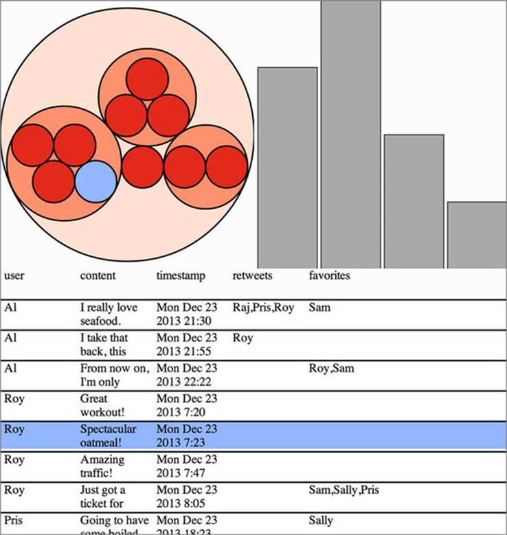
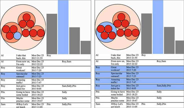
First, we’ll highlight a row on the spreadsheet when hovering over the corresponding circles in the circle pack. You do this by checking the circle elements to see if the bound data is the same as the data bound to the spreadsheet elements. If you’re using the same data to create multiple charts, as we do in this example, then this is the most straightforward method to use. But if you’re loading data from multiple sources, but that data refers to the same things, then you’ll need to use a unique ID for this test, such as an employee identification number or a user ID. Because both the divs and the circles hold the same data, binding the same event listener to each, as in listing 9.9, results in cross-highlighting, as shown in figure 9.5.
Figure 9.5. Hovering over a circle or data row highlights the element moused over and the corresponding element data row or circle that represents the same datapoint.
Listing 9.9. Row-highlighting code
Now we’ll tie the bar chart in. Recall that because of our nesting function, each bar in the bar chart corresponds to one of the level 1 hierarchical circles. Therefore, we can update our hover behavior to do the same thing we did with the spreadsheet rows and check to see if one bound datapoint is the same as the other, with the results seen in figure 9.6.
Figure 9.6. The same code that checks to see if the datapoints are the same in the circle pack chart as in the spreadsheet can be used to identify nested data parents, as long as the data comes from the same d3.nest operation.
Listing 9.10. Highlighting nested data elements
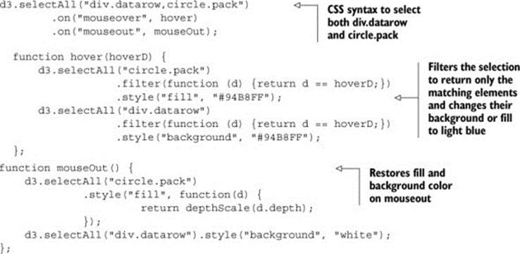
function hover(hoverD) {
d3.selectAll("circle").filter(function (d) {return d == hoverD})
.style("fill", "#94B8FF");
d3.selectAll("div.datarow").filter(function (d) {return d == hoverD})
.style("background", "#94B8FF");
d3.selectAll("rect.bar").filter(function(d) {
return d.values.indexOf(hoverD) > -1;
}).style("fill", "#94B8FF");
};
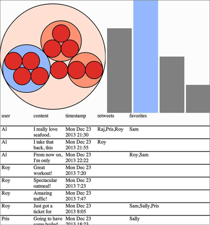
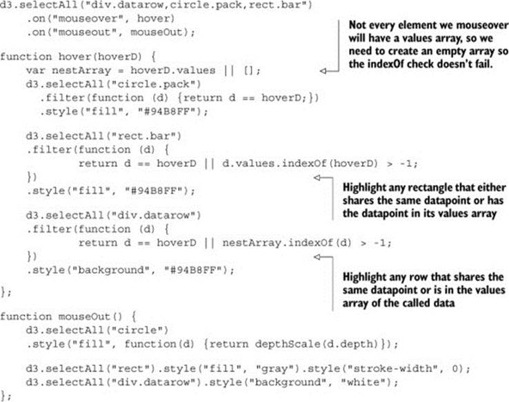
But we also want to check if the group of tweets represented in each bar contains the data point represented by the element being hovered over (whether a circle or spreadsheet row). We’ll use JavaScript’s built-in indexOf function of an array to test the rect.bar elements to see if they contain one of these tweets. We’ll also do the same in reverse to highlight the data rows that appear in a level 1 circle of the circle pack or one of the bars in the bar chart. The new, improved functions are shown in the following listing, and the results are shown in figure 9.7.
Figure 9.7. Cross-highlighting in action. The same code provides both results shown if we mouseover an individual data row or level 2 circle (right), highlighting the corresponding bar on the bar chart that represents that nested data. It also highlights the data rows that correspond to the nested elements in the data for the level 1 circles or bars when we mouseover those (left).
Listing 9.11. Improved highlighting functions
Obviously, the same principles could be applied to click events, or you could reintroduce the modal pop-up we used in chapter 3 to expose more functionality. But rather than add more interactivity, I’ll switch gears and introduce a new control: the brush.
9.3. Brushing
The brush component, d3.svg.brush(), is like the axis component because it creates SVG elements when called (typically by a <g> element). But it’s also like the zoom behavior because brush has interactions that update a data element that you can use for interactivity. Brushes are valuable interactive components that allow users to intuitively slice up their data. For our dashboard, we’ll add a brush that lets users show tweets only from particular times of the day. You not only need to learn how to use the brush component and understand the brush events that come with the component, but also, because we’ll base our activity on when tweets are made, you need to understand D3’s built-in scale for dealing with time: d3.time.scale.
9.3.1. Creating the brush
A brush in D3 takes a scale and creates a region where the user can select part of that scale by clicking and dragging. First, we need a new div into which we’ll place our brush, and so we need to update our page to include a #brush div in between our chart divs and our spreadsheet div.
Listing 9.12. HTML for our dashboard with a brush
<!doctype html>
<html>
<script src="d3.v3.min.js" type="text/JavaScript"></script>
<body onload="dashboard()" >
<svg id="leftSVG" class="svgDash"s></svg>
<svg id="rightSVG" class="svgDash"></svg>
<div id="brush"></div>
<div id="spreadsheet"></div>
</body>
</html>
This requires that we add a reference in the CSS to our new div and slightly adjust the #spreadsheet div to take up less room.
Listing 9.13. Brush div CSS changes
#brush {
overflow: auto;
width: 100%;
height: 20%;
}
#spreadsheet {
overflow: auto;
width: 100%;
height: 30%;
}
Because we need a scale to build a brush, we’ll start by making a new scale that suits our tweet data: d3.time.scale. This scale is designed to take JavaScript Date datatypes and deal with them like the more common d3.scale.linear. To populate the domain of our new scale, we need to find the earliest and latest times of each tweet. We do this by using d3.extent and built-in JavaScript array mapping functionality to create an array of Date datatypes from the string representation of the times of each tweet.
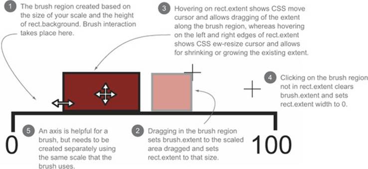
A brush is an interactive collection of components that allows a user to drag one end of the brush to designate an extent, or to move that extent to a different range. Typical brush aspects are explained in figure 9.8. In this chapter we only create a brush that allows selection along the x-axis, but if you want to see a brush that selects along the x- and y-axes, you can check out chapter 11, where we use it to select points laid out on an xy plane.
Figure 9.8. Components of a brush
It’s also helpful to create an axis to go along with our brush. The brush is created as a region of interactivity, and clicking on that region produces a rectangle in response. But before any interaction, the area looks blank. By including an axis, we inform the user of the range attached to this brush. Our new axis needs more particular formatting because we’re using a time scale.
After that, we’ll create a brush and assign the time scale to the brush’s .x() function. We can also create brushes that are vertical or allow for selecting a region by setting the .y() function. We’ll assign an event listener that listens for the custom event "brush" to call the functionbrushed(). Code to create the brush is shown in listing 9.14, while code for the actual behavior when the brush is used is explained in listing 9.15. The "brush" event happens any time the user drags the mouse along the brush region after clicking on the region.
Listing 9.14. Brush creation and function
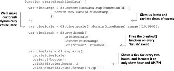
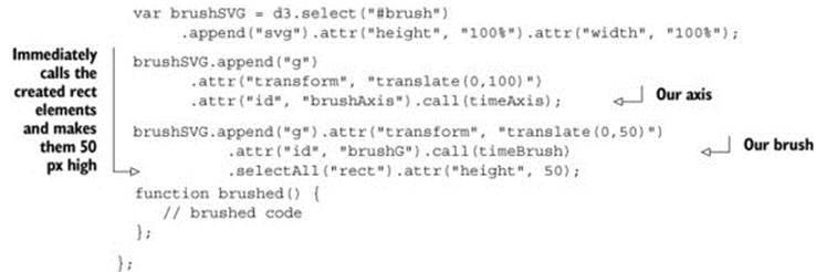
In particular, we use d3.time.hours in the ticks() function to create an axis with ticks every two hours. We then use d3.time.format in the tickFormat() function to show only the hour and whether it’s A.M. or P.M.
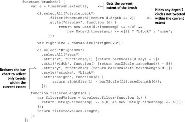
The brushed() function (listing 9.15) that we previously defined in the createBrush function gets the current extent of the brush using its built-in function and compares that extent to the two datasets we used for our circle pack chart and bar chart. It then adjusts the size of the bars in the bar chart or the visibility of the circles in the circle pack based on whether the corresponding data falls within the range of the current extent.
Listing 9.15. The brushed function
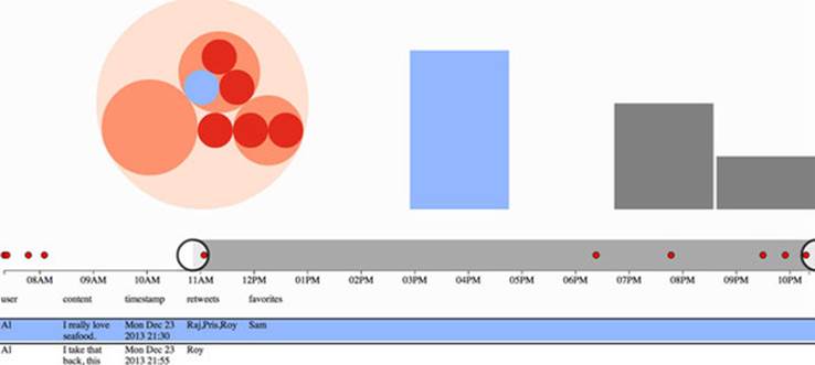
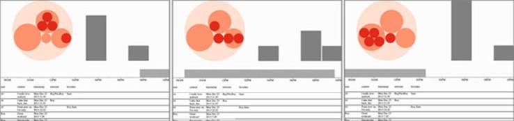
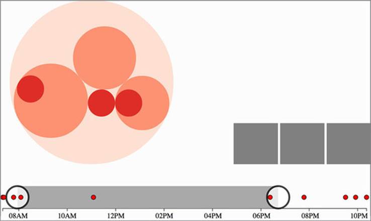
This brush allows users to designate a block of time during the day that the tweets are made. It shows only those level 2 circles on the circle pack that correspond to tweets that were made during that time. It also adjusts the bar chart to show totals for the tweets made during that time. Figure 9.9 shows three different brushed regions and the corresponding changes to the circle pack chart and bar chart.
Figure 9.9. The results of our brushed() function showing level 2 circle visibility and bar chart changes based on the changing extent of our brush
9.3.2. Making our brush more user friendly
The addition of an axis makes a brush more comprehensible to a user than a blank space that happens to show a different cursor on mouseover. But brushing isn’t a common user activity, and you should do a couple things to make brushes more user friendly. One common thing is to add a set of handles on each end of the brush to signify that the brush is resizable from those ends. The areas that allow for resizing (and that trigger the ew-resize cursor) are on both ends of the brush. They can be seen by selecting the SVG rect elements in use by the brush and changing their visibility style as well as their fill:
d3.selectAll("g.resize > rect").style("visibility", "visible").style("fill",
"red")
The result, shown in figure 9.10, is that our invisible resizing regions are now visible and distinct from the rest of the brush. This may be fine, but typically, handles are, if you’ll pardon the pun, handled differently.
Figure 9.10. The rect elements in the resizing areas on each end of the brush are now visible and filled red.
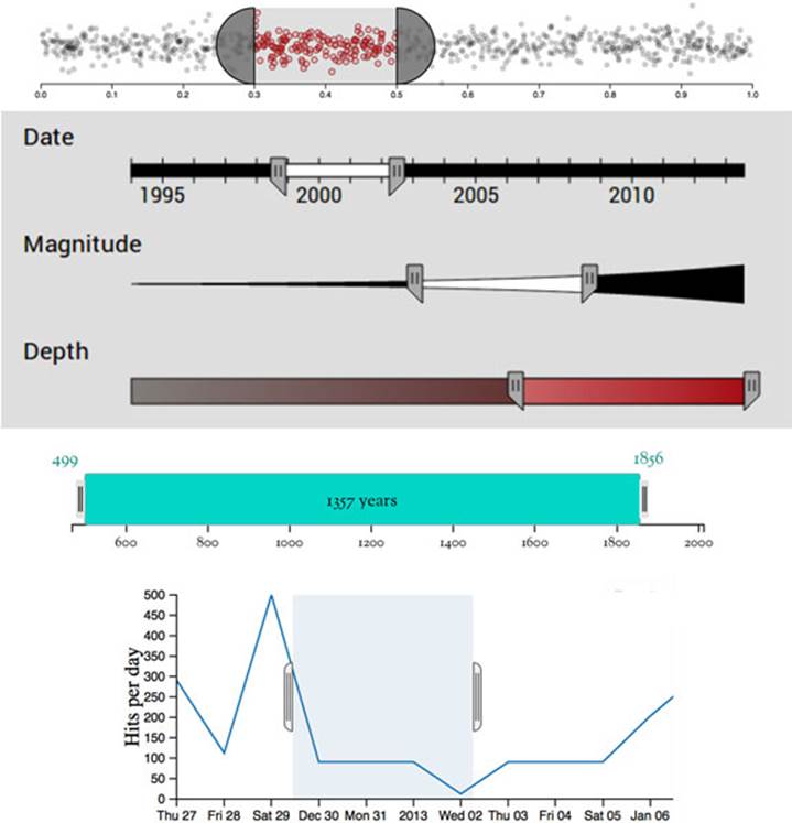
D3.js examples use a variety of brush handles, from semicircles to beveled rectangles, as shown in figure 9.11. But you can do more than give a brush handles; for example, you can provide feedback about whether there’s any data that overlaps with the brushed region. You’ll see that as soon as you make handles for your brush.
Figure 9.11. Brush handles on a variety of brushes, such as (from top) an example by Mike Bostock, a CS project exploring earthquake frequency, the Kindred Britain search brush, and dc.js.[1]
1 See these examples at the following URLs: Brush Handles by Mike Bostock (http://bl.ocks.org/mbostock/4349545); earthquake visualization by Andrew Lee (http://vis.berkeley.edu/courses/cs294-10-fa13/wiki/index.php/A3-AndrewLee); Kindred Britain search brush (http://kindred.stanford.edu); dc.js (http://dcjs.github.io/dc.js/).
Our handles won’t be quite as exciting as these. Instead, we’ll add semitransparent circles on each end, which results in a brush with handles like that shown in figure 9.12:
d3.selectAll("g.resize").append("circle")
.attr("r", 25)
.attr("cy",25)
.style("fill", "white")
.style("stroke", "black")
.style("stroke-width", "4px")
.style("opacity", .75);
Figure 9.12. A brush with SVG circles as handles

Notice that the circles are also listening for the brush resizing event (as you can tell because the ew-resize cursor appears on mouseover). The event listener is assigned to the g.resize element, and any SVG elements added to that g (such as the circles we just appended) also fire that event. So our handles are not only attractive, they’re also functional. Well, at least they’re functional.
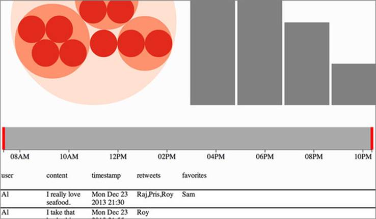
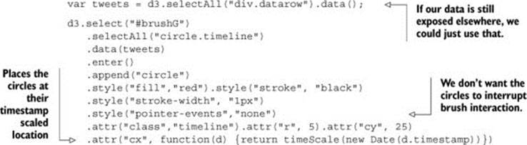
The next thing we’ll do to improve the usability of our brush is to add an indication of where tweets fall on our timeline. We can accomplish this easily with the code in the following listing. The results are shown in figure 9.13.
Figure 9.13. A brush with circles appended indicating when tweets occurred
Listing 9.16. Tweets on a timeline
We could do more with upgrading the brush UI elements, such as making the timeline circles highlight and dim if they fall in the brush range. But instead let’s look more closely at the brush events fired by the brush control.
9.3.3. Understanding brush events
Activity on the brush region fires three separate custom events: "brush", "brushstart", and "brushend". You’ve probably figured them out based on their names, but for clarity, "brushstart" is fired when you mousedown on the brush region, "brush" is fired continuously as you drag your mouse after "brushstart" and before mouseup, and "brushend" is fired on mouseup. In most implementations of a brush, it makes sense to wire it up so that whatever function you want applied with user activity only happens on the "brush" event. But you may have functions that are more expensive, such as redrawing an entire map or querying a database. In that case you could use "brushstart" to cause a visual change in your map (turning elements gray or transparent) and wait until "brushend" to run more heavy-duty activity.
9.3.4. Redrawing components
Our entire application responsively resizes whenever we change the dimensions of our browser window. But our brush doesn’t resize. It was drawn at a particular size when we created it, and runs off the screen if we make the width too small or looks puny if we make the width too large.
It may seem like you need to delete the graphical elements of the brush and recreate it whenever you redraw your other visual elements. Fortunately, D3 components like axis and brush can be recalled by the containing element to resize them. All you need to do is include in your redraw code the code in the following listing, which now includes reference to the axis and brush components we earlier created.
Listing 9.17. Component redrawing
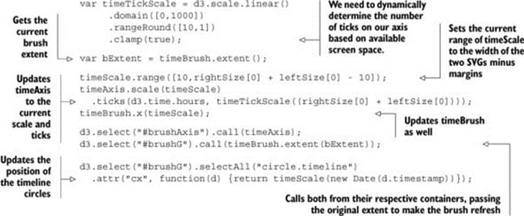
As shown in figure 9.14, we now have an axis and brush and datapoints on the brush that all update as the screen is resized.
Figure 9.14. Two different sizes of our application showing that the axis and brush, as well as axis ticks and brush timeline circles, update based on screen size
We’ll stop there. You could replace any of the charts with one of the charts we looked at earlier, such as a pie chart, network visualization, or map. Controls like the brush can be powerful, but it’s also important to make such controls accessible to your users.
9.4. Summary
In this chapter you learned how to create an interactive dashboard with multiple chart types and brush-based filtering. Specifically, you learned about
· Formatting HTML for multiple SVG canvases
· How to bind the same dataset to multiple charts to allow for easy cross-highlighting
· Decoupling chart creation from drawing to enable a redraw function for a responsive page
· How to implement the time scale
· How to implement the brush control
· Making the brush more useful for users
· Making components and controls like axis and brush responsive to screen resizing
In the next chapter, we’ll focus on creating components like the axis component, and layouts like pie or pack. Learning how to create components and layouts will give you a better understanding of how D3 works while giving you the tools to make better, more reusable code in the future.
All materials on the site are licensed Creative Commons Attribution-Sharealike 3.0 Unported CC BY-SA 3.0 & GNU Free Documentation License (GFDL)
If you are the copyright holder of any material contained on our site and intend to remove it, please contact our site administrator for approval.
© 2016-2026 All site design rights belong to S.Y.A.