D3.js in Action (2015)
Part 3. Advanced techniques
Chapter 10. Writing layouts and components
This chapter covers
· Writing a custom legend component
· Writing a custom grid layout
· Adding functionality to make layout and component settings customizable
· Adding interactivity to components
Throughout this book, we’ve dealt with D3 components and layouts. In this chapter we’ll write them. After you’ve created your own layout and your own component, you’ll more clearly understand the structure and function of layouts. You’ll also be able to use that layout, and other layouts that you create on your own later, in the charts that you build with D3.
In this chapter we’ll create a custom layout that places a dataset on a grid. For most of the chapter, we’ll use our tweets dataset, but the advantage of a layout is that the particular dataset doesn’t matter. The purpose of this chapter isn’t to create a grid, but rather to help you understand how layouts work. We’ll create a grid layout because it’s simple and allows us to focus on layout structure rather than the particulars of any data visualization layout. We’ll follow that up by extending the layout so it can have a set size that we can change. You’ll also see how the layout annotates the dataset we send so that individual datapoints can be drawn as circles or rectangles. A grid isn’t the most useful or sexy layout, but it can teach you the basics of layouts. After that, we’ll build a legend component that tells users the meaning of the color of our elements. We’ll do this by basing the graphical components of the legend on the scale we’ve used to color our chart elements.
10.1. Creating a layout
Recall from chapter 5 that a layout is a function and an object that modifies a dataset for graphical representation. Here, we’ll build that function. Later, we’ll give it the capacity to modify the settings of the layout in the same manner that built-in D3 layouts operate.
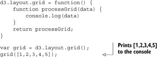
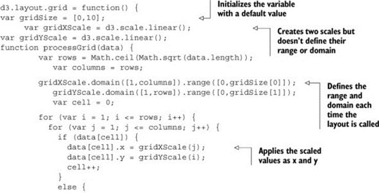
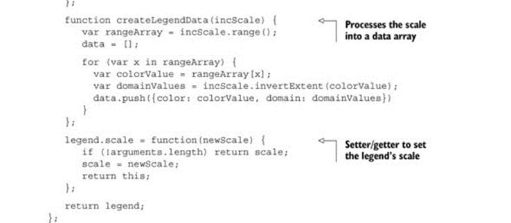
You’ll see this in more detail later, but first we need to create an object that returns the function that processes our data. After we create this function, we’ll use it to implement the calls that a layout needs. In the following listing, you can see the function and a test where we instantiate it and pass it data.
Listing 10.1. d3.layout.grid.js
That’s not an exciting layout, but it works. We don’t need to name our layout d3.layout.x or any other particular name, but using that namespace makes it more readable in the future. Before we start working on the functions that will create our grid, we have to define what this layout does. We know we want to put the data on a grid, but what else do we want? Here’s a simple spec:
· We want to have a default arrangement of that grid, say, equal numbers of rows and columns.
· We also want to let the user define the number of rows or columns.
· We want the grid to be laid out over a certain size.
· We also need to allow the user to define the size of the grid.
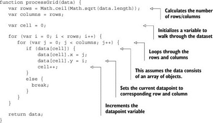
That’s a good start. First we need to initialize all the variables that this grid needs to access to make it happen. We also need to define getter and setter functions to let the user access those variables, because we want to keep them scoped to the d3.layout.grid function. The first thing we can do is update the processGrid function to look like it does in listing 10.2. It takes an array of objects and updates them with x and y data based on grid positions. We derive the size of the grid from the number of data objects sent to processGrid. It turns out this isn’t a difficult mathematical problem. We take the square root of the number of datapoints and round it up to the nearest whole number to get the right number of rows and columns for our grid. This makes sense when you think about how a grid is a set of rows and columns that allows you to place a cell on one of those rows and columns for each datapoint. The number of rows times columns needs to be at least the number of cells (the number of datapoints). If we decide to have the same number of rows as columns, then it’s that number squared.
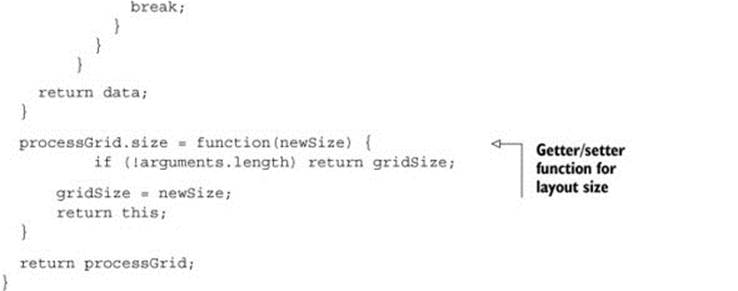
Listing 10.2. Updated processGrid function
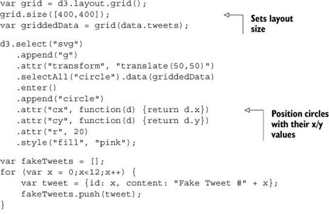
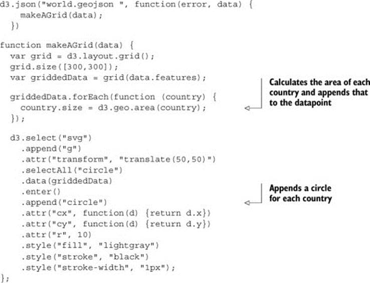
To test our nascent grid layout, we can load tweets.json and pass it to grid. The grid function displays the graphical elements onscreen based on their computed grid position. In the following listing, you can see how we’d pass data from tweets.json to our grid layout.
Listing 10.3. Using our grid layout
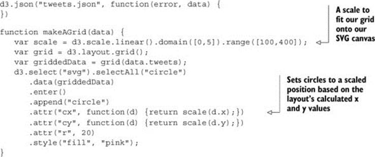
The results in figure 10.1 show how the grid function has correctly appended x and y coordinates to draw the tweets as circles on a grid.
Figure 10.1. The results of our makeAGrid function that uses our new d3.layout.grid to arrange the data in a grid. In this case, our data consists of 10 tweets that are each represented as a pink circle laid out on a grid.

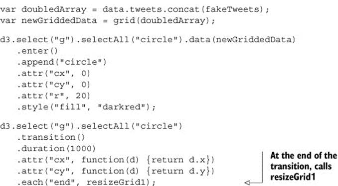
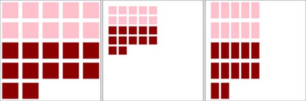
The benefit of building this as a layout is that if we add more data to it, it automatically adjusts and allows us to use transitions to animate that adjustment. To do this, we need more data. Listing 10.4 includes a few lines to create data that represents our new tweets. We also use the.concat() function of an array in native JavaScript that, when given the state shown in figure 10.1, should produce the results in figure 10.2.
Figure 10.2. The grid layout has automatically adjusted to the size of our new dataset. Notice that our new elements are above the old elements, but our layout has changed in size from a 4 x 4 grid to a 5 x 5 grid, causing the old elements to move to their newly calculated position.

Listing 10.4. Update the grid with more elements
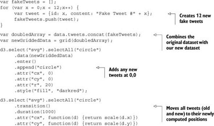
The results in figure 10.2 show snapshots of the animation from the old position to the new position of the circles.
Calculating a scale based on what you know to be the grid size results in an inefficient piece of code. That wouldn’t be useful if someone put in a different dataset. Instead, when designing layouts you’ll want to provide functionality so that the layout size can be declared, and then any adjustments necessary happen within the code of the layout that processes data. To do this, we need to add a scoped size variable and then add a function to our processGrid function to allow the user to change that size variable. Sending a variable sets the value, and sending no variable returns the value. We achieve this by checking for the presence of arguments using the arguments object in native JavaScript. The updated function is shown in the following listing.
Listing 10.5. d3.layout.grid with size functionality
You can see the updated grid layout in action by slightly changing our code for calling the layout, as shown in the following listing. We set the size, and when we create our circles, we use the x and y values directly instead of using scaled values.
Listing 10.6. Calling the new grid layout
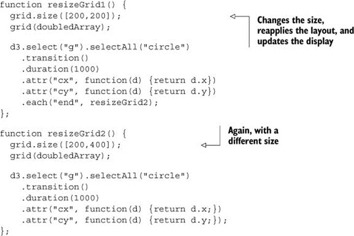
This code refers to a resizeGrid1() function, shown in the following listing, that’s chained to a resizeGrid2() function. These functions use the ability to update the size setting on our layout to update the graphical display of the elements created by the layout.
Listing 10.7. The resizeGrid1() function
This creates a grid that fits our defined space perfectly, as shown in figure 10.3, and with no need to create a scale to place the elements.
Figure 10.3. The grid layout run on a 400 x 400 size setting
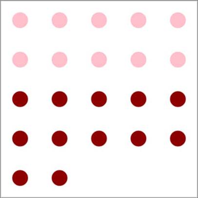
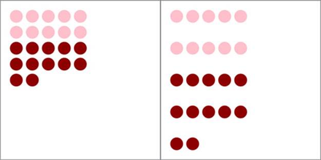
Figure 10.4 shows a pair of animations where the grid changes in size as we adjust the size setting. The grid changes to fit a smaller or an elongated area. This is done using the transition’s "end" event. It calls a new function that uses our original grid layout but updates its size and reapplies it to our dataset.
Figure 10.4. The grid layout run in a 200 x 200 size (left) and a 200 x 400 size (right)
Before we move on, it’s important that we extend our layout a bit more so that you can better understand how layouts work. In D3 a layout isn’t meant to create something as specific as a grid full of circles. Rather it’s supposed to annotate a dataset so you can represent it using different graphical methods. Let’s say we want our layout to also handle squares, which would be a desired feature when dealing with grids.
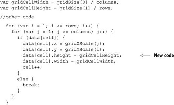
To handle squares, or more specifically rectangles (because we want them to stretch out if someone uses our layout and sets the height and width to different values), we need the capacity to calculate height and width values. That’s easy to add to our existing layout function.
Listing 10.8. Layout code for calculating height and width of grid cells
And with that in place, we can call our layout and append <rect> elements instead of circle elements. We can update our code as in listing 10.9 to offset the x and y attributes (because <rect> elements are drawn from the top left and not from the center like <circle> elements) and also apply the width and height values that our layout computes.
Listing 10.9. Appending rectangles with our layout
d3.select("g").selectAll("rect")
.transition()
.duration(1000)
.attr("x", function(d) {return d.x - (d.width / 2);})
.attr("y", function(d) {return d.y - (d.height / 2);})
.attr("width", function(d) {return d.width;})
.attr("height", function(d) {return d.height;})
.each("end", resizeGrid1);
If we update the rest of our code accordingly, the result is the same animated transition of our layout between different sizes, but now with rectangles that grow and distort based on those sizes, as shown in figure 10.5.
Figure 10.5. The three states of the grid layout using rectangles for the grid cells
This is a simple example of a layout, and doesn’t do nearly as much as the kinds of layouts we’ve used throughout this book, but even a simple layout like this provides reusable, animatable content. Now we’ll look at another reusable pattern in D3, the component, which creates graphical elements automatically.
10.2. Writing your own components
You’ve seen components in action, particularly the d3.svg.axis component. You can also think of the brush as a component, because it creates graphical elements. But it tends to be described as a “control” because it also loads with built-in interactivity.
The component that we’ll build is a simple legend. Legends are a necessity when working with data visualization, and they all share some things in common. First, we’ll need a more interesting dataset to consider, though we’ll continue to use our grid layout. The legend component that we’ll create will consist eventually of labeled rectangles, each with a color corresponding to the color assigned to our datapoints by a D3 scale. This way our users can tell, at a glance, which colors correspond to which values in our data visualization.
10.2.1. Loading sample data
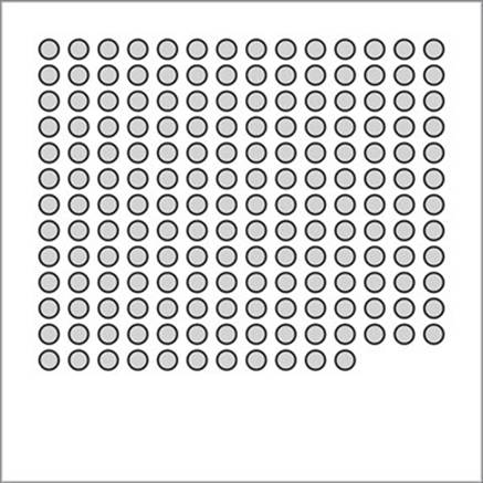
Instead of the tweets.json data, we’ll use world.geojson, except we’ll use the features as datapoints on our custom grid layout from section 10.1 without putting them on a map. Listing 10.10 shows the corresponding code, which produces figure 10.6. You may find it strange to load geodata and represent it not as geographic shapes but in an entirely different way. Presenting data in an untraditional manner can often be a useful technique to draw a user’s attention to the patterns in that data.
Figure 10.6. The countries of the world as a grid
Listing 10.10. Loading the countries of the world into a grid
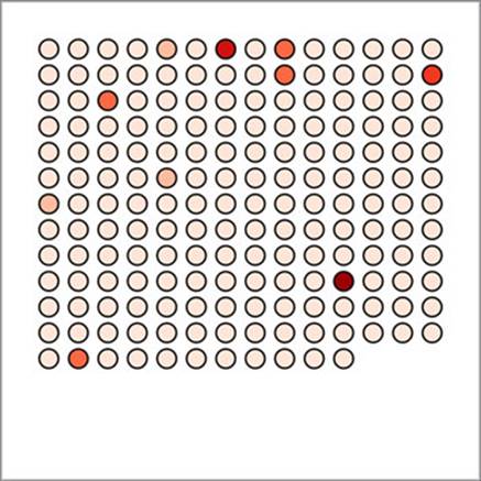
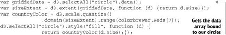
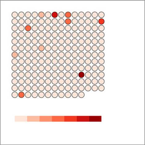
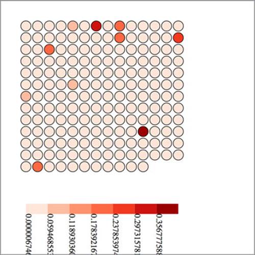
We’ll focus on only one attribute of our data: the size of each country. We’ll color the circles according to that size using a quantize scale that puts each country into one of several discrete categories. In our case, we’ll use the colorbrewer.Reds[7] array of light-to-dark reds as our bins. The quantize scale will split the countries into seven different groups. In the following listing you can see how to set that up, and figure 10.7 shows the result of our new color scale.
Figure 10.7. Circles representing countries colored by area
Listing 10.11. Changing the color of our grid
For a more complete data visualization, we’d want to add labels for the countries or other elements to identify the continent or region of the country. But we’ll focus on explaining what the color indicates. We don’t want to get bogged down with other details from the data that could be explained, for example, using modal windows, as we did for our World Cup example in chapter 4, or using other labeling methods discussed throughout this book. For our legend to be useful, it needs to account for the different categories of coloration and indicate which color is associated with which band of values. But before we get to that, let’s build a component that creates graphical elements when we call it. Remember that the d3.select("#something").call(someFunction) function of a selection is the equivalent ofsomeFunction(d3.select("#something")). With that in mind, we’ll create a function that expects a selection and operates on it.
Listing 10.12. A simple component
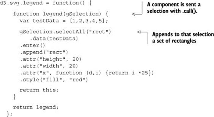
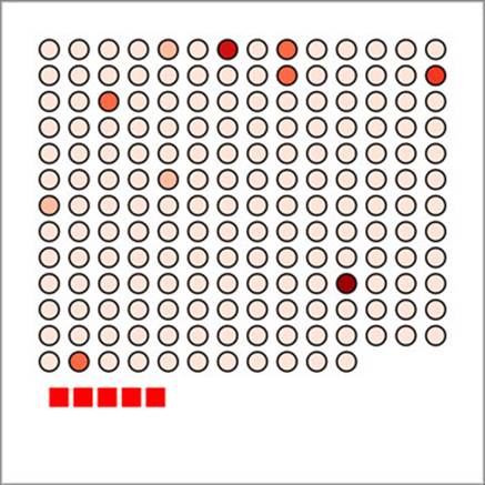
We can then append a <g> element to our chart and call this component, with the results shown in figure 10.8:
var newLegend = d3.svg.legend();
d3.select("svg").append("g")
.attr("id","legend")
.attr("transform", "translate(50,400)")
.call(newLegend);
Figure 10.8. The new legend component, when called by a <g> element placed below our grid, creates five red rectangles.
And now that we have the structure of our component, we can add functionality to it, such as allowing the user to define a custom size like we did with our grid layout. We also need to think about where this legend is going to get its data. Following the pattern of the axis component, it would make the most sense for the legend to refer directly to the scale we’re using and derive, from that scale, the color and values associated with the color of each band in the scale.
10.2.2. Linking components to scales
To do that, we have to write a new function for our legend that takes a scale and derives the necessary range bands to be useful. The scale that we send it will be the same countryColor scale that we use to color our grid circles. Because this is a quantize scale, we’ll make our legend component hardcoded to handle only quantize scales. If we wanted to make this a more robust component, we’d need to make it identify and handle the various scales that D3 uses.
Just like all scales have an invert function, they also have the ability to tell you what domain values are mapped to what range values. First, we need to know the range of values of our quantize scale as they appear to the scale. We can easily get that range by usingscale.quantize.range():
We can pass those values to scale.quantize.invertExtent to get the numerical domain mapped to each color value:
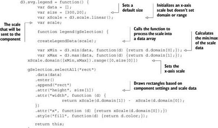
Armed with these two functions, all we need to do now is give our legend component the capacity to have a scale assigned to it and then update the legend function itself to derive from that scale the dataset necessary for our legend. Listing 10.13 shows both the new d3.legend.scale()function that uses a quantize scale to create the necessary dataset, and the updated legend() function that uses that data to draw a more meaningful set of <rect> elements.
Listing 10.13. Updated legend function
We call this updated legend and set it up:
var newLegend = d3.svg.legend().scale(countryColor);
d3.select("svg").append("g")
.attr("transform","translate(50,400)")
.attr("id", "legend").call(newLegend);
This new legend now creates a rect for each band in our scale and colors it accordingly, as shown in figure 10.9.
Figure 10.9. The updated legend component is automatically created, with a <rect> element for each band in the quantize scale that’s colored according to that band’s color.
If we want to add interactivity, it’s a simple process because we know that each rect in the legend corresponds to a two-piece array of values that we can use to test the circles in our grid. The following listing shows that function and the call to make the legend interactive.
Listing 10.14. Legend interactivity
d3.select("#legend").selectAll("rect").on("mouseover", legendOver);
function legendOver(d) {
console.log(d)
d3.selectAll("circle")
.style("opacity", function(p) {
if (p.size >= d.domain[0] && p.size <= d.domain[1]) {
return 1;
} else {
return .25;
}
});
};
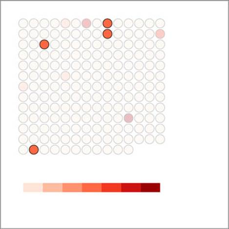
Notice that this function isn’t defined inside our legend component. Instead, it’s defined and called after the legend is created, because after it’s created, our legend component is just a set of SVG elements with data bound to it like any other part of our charts. This interactivity allows us to mouseover the legend and see which circles fall in a particular range of values, as shown in figure 10.10.
Figure 10.10. The legendOver behavior highlights circles falling in a particular band and deemphasizes the circles not in that band by making them transparent.
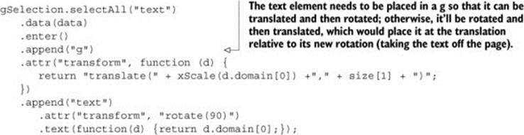
Finally, before we can call our legend done, we need to add an indication of what those colored bands mean. We could call an axis component and allow that to label the bands, or we can label the break points by appending text elements for each. In our case, because the numbers provided for d3.geo.area are so small, we’ll also need to rotate and shrink those labels quite a bit for them to fit on the page. To do this, we can add the code in listing 10.15 to our legend function in d3.svg.legend.
Listing 10.15. Text labels for legend
As shown in figure 10.11, they aren’t the prettiest labels. We could adjust their positioning, font, and style to make them more effective. They also need functions like the grid layout has to define size or other elements of the component.
Figure 10.11. Our legend with rudimentary labels
This is usually the point where I say that the purpose of this chapter is to show you the structure of components and layouts, and that making the most effective layout or component is a long and involved process that we won’t get into. But this is an ugly legend. The break points are hard to read, and it’s missing pieces that the component needs, such as a title and an explanation of units.
10.2.3. Adding component labels
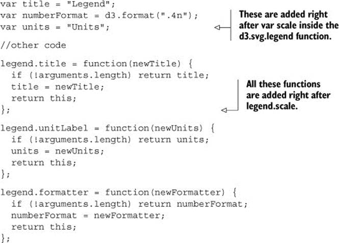
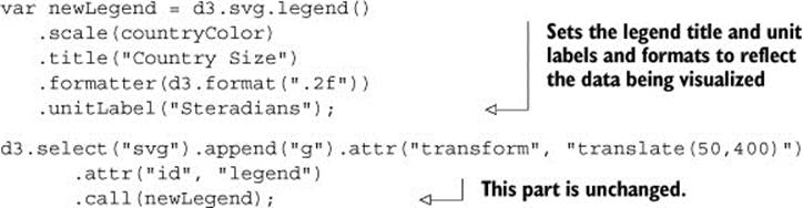
Let’s add those features to the legend, and create ways to access them, as shown in listing 10.16. We’re using d3.format, which allows us to set a number-formatting rule based on the popular Python number-formatting mini-language (found athttps://docs.python.org/release/3.1.3/library/string.html#formatspec).
Listing 10.16. Title and unit attributes of a legend
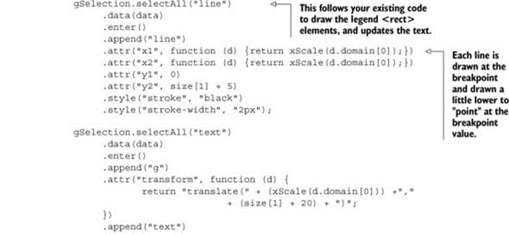
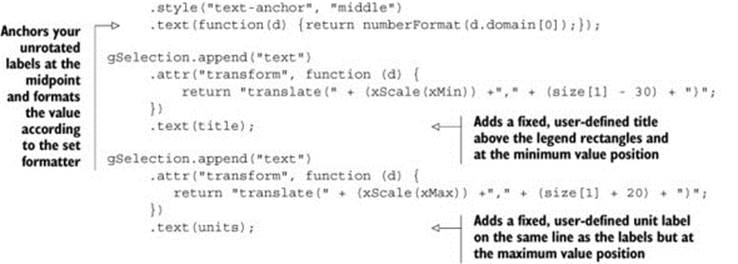
We’ll use these new properties in our updated legend drawing code shown in listing 10.17. This new code draws SVG <line> elements at each breakpoint, and foregoes the rotated text in favor of more readable, shortened text labels at each breakpoint. It also adds two new <text>elements, one above the legend that corresponds to the value of the title variable and one at the far right of the legend that corresponds to the units variable.
Listing 10.17. Updated legend drawing code
This requires that we set these new values using the code in the following listing before we call the legend.
Listing 10.18. Calling the legend with title and unit setting
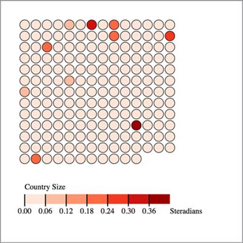
And now, as shown in figure 10.12, we have a label that’s eminently more readable, still interactive, and useful in any situation where the data visualization uses a similar scale.
Figure 10.12. Our legend with title, unit labels, appropriate number formatting, and additional graphical elements to highlight the breakpoints
By building components and layouts, you better understand how D3 works, but there’s another reason why they’re so valuable: reusability. You’ve built a chart using a layout and component (no matter how simple) that you wrote yourself. You could use either in tandem with another layout or component, or on its own, with any data visualization charts you use elsewhere.
Infoviz term: reusable charts
After you’ve worked with components, layouts, and controls in D3, you may start to wonder if there’s a higher level of abstraction available that could combine layouts and controls in a reusable fashion. That level of abstraction has been referred to as a chart, and the creation of reusable charts has been of great interest to the D3 community.
This has led to the development of several APIs on top of D3, such as NVD3, D4 (for generic charts), and my own d3.carto.map (for web mapping, not surprisingly). It’s also led The Miso Project to develop d3.chart, a framework for reusable charts. If you’re interested in using or developing reusable charts, you may want to check these out:
d3.chart http://misoproject.com/d3-chart/
d3.carto.map https://github.com/emeeks/d3-carto-map
http://visible.io (D4)
http://nvd3.org (NVD3)
You may also try your hand at building more responsive components that automatically update when you call them again, like the axis and brushes we dealt with in the last chapter. Or you may try creating controls like d3.brush and behaviors like d3.behavior.drag. Regardless of how extensively you follow this pattern, I recommend that you look for instances when your information visualization can be abstracted into layouts and components, and try to create those instead of building another one-off visualization. By doing that, you’ll develop a higher level of skill with D3 and fill your toolbox with your own pieces for later work.
10.3. Summary
This chapter showed you how to follow two of the patterns that appear in D3: layouts and components. You learned how to create both of these in a way that you can reuse them and combine them in a single chart:
· Create a general layout structure with getter and setter functions.
· Build the functionality necessary for the layout to modify sent data with attributes for drawing.
· Make a layout dynamically change size based on a size setting.
· Modify sent data to dynamically change the size of individual grid cells.
· Create a general component that can be called by a <g> element to create graphical elements.
· Tie that component to scale for its dataset.
· Label the individual pieces of the component with <text> elements.
In the next chapter we’ll look at a few optimization techniques that you’ll find useful for data visualization with large datasets.
All materials on the site are licensed Creative Commons Attribution-Sharealike 3.0 Unported CC BY-SA 3.0 & GNU Free Documentation License (GFDL)
If you are the copyright holder of any material contained on our site and intend to remove it, please contact our site administrator for approval.
© 2016-2026 All site design rights belong to S.Y.A.