D3.js in Action (2015)
Part 3. Advanced techniques
Chapter 11. Big data visualization
This chapter covers
· Creating large random datasets of multiple types
· Using HTML5 canvas in conjunction with SVG to draw large datasets
· Optimizing geospatial, network, and traditional dataviz
· Working with quadtrees to enhance spatial search performance
This chapter focuses on techniques to create data visualization with large amounts of data. Because it would be impractical to include a few large datasets, we’ll also touch on how to create large amounts of sample data to test your code with. You’ll use several layouts that you saw earlier, such as the force-directed network layout from chapter 6 and the geospatial map from chapter 7, as well as the brush component from chapter 9, except this time you’ll use it to select regions across the x- and y-axes.
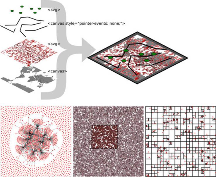
This chapter touches on an exotic piece of functionality in D3: the quadtree (shown in figure 11.1). This is an advanced technique we’ll use to improve interactivity and performance. We’ll also revisit HTML5 canvas throughout the chapter to see how we can use canvas in tandem with SVG to get the high performance and maintain the interactivity that SVG is so useful for.
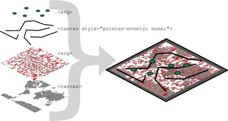
Figure 11.1. This chapter focuses on optimization techniques such as using HTML5 canvas to draw large datasets in tandem with SVG for the interactive elements. This is demonstrated with maps (section 11.1), networks (11.2), and traditional xy data (section 11.3), which uses the D3 quadtree function (section 11.3.2).
We’ve worked with data throughout this book, but this time, we’ll appreciably up the ante by trying to represent a thousand or more datapoints using maps, networks, and charts, which are significantly more resource-intensive than a circle pack chart, a bar chart, or a spreadsheet.
11.1. Big geodata
In chapter 7, you had only 10 cities representing the entire globe. That’s not typical: when you’re working with geodata, you’ll often work with large datasets describing many complex shapes. Fortunately, there’s built-in functionality in D3 for drawing that complex data with HTML5 canvas, which dramatically improves performance. For this chapter, we’ll need to include a <canvas> element in our DOM.
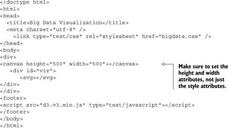
Listing 11.1. bigdata.html
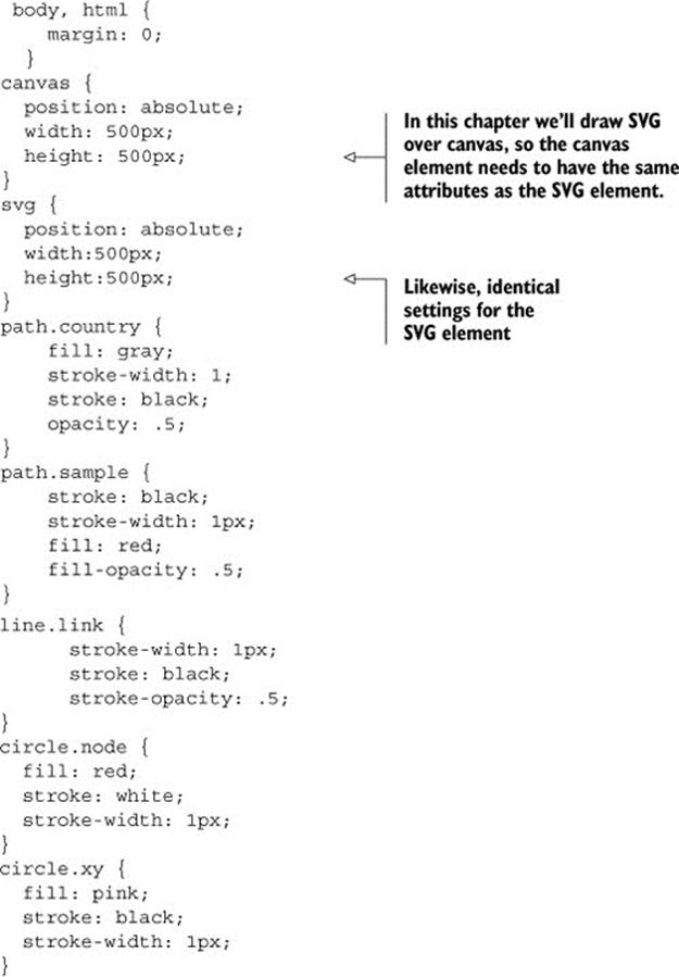
To handle our <canvas> element, as well as some of the visual elements we’ll create in this chapter, we need to account for them in our CSS, as in the following listing. We want our <canvas> element to line up with our <svg> element so that we can use HTML5 canvas as a background layer to any SVG elements we create.
Listing 11.2. bigdata.css
11.1.1. Creating random geodata
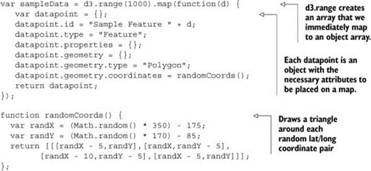
The first thing we need is a dataset with a thousand datapoints. Rather than using data from a pregenerated file, we’ll invent it. One useful function available in D3 is d3.range(), which allows you to create an array of values. We’ll use d3.range() to create an array of a thousand values. We’ll then use that array to populate an array of objects with enough data to put on a network and on a map. Because we’re going to put this data on a map, we need to make sure it’s properly formatted geoJSON, as in the following listing, which uses the randomCoords() function to create triangles.
Listing 11.3. Creating sample data
After we have this data, we can throw it on a map like the one we first created in chapter 7. In the following listing we use the world.geojson file from chapter 7, so that we have some context for where the triangles are drawn.
Listing 11.4. Drawing a map with our sample data on it
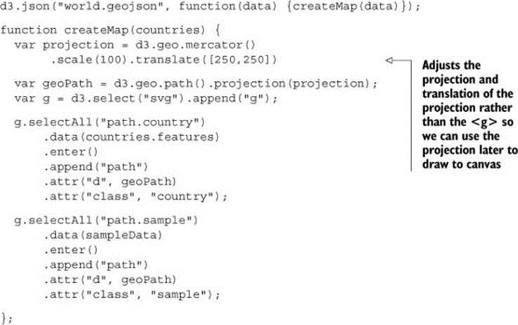
Although our random triangles will obviously be in different places, our code should still produce something that looks like figure 11.2.
Figure 11.2. Drawing random triangles on a map entirely with SVG
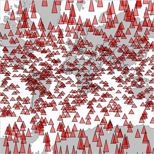
A thousand datapoints isn’t very many, even on a small map like this. And in any browser that supports SVG, the data should be able to render quickly and provide you with the kind of functionality, like mouseover and click events, that you may want from your data display. But if you add zoom controls, like you see in listing 11.5 (the same zooming we had in chapter 7), then you’ll notice that the performance of the zooming and panning of the map isn’t so great. If you expect your users to be on mobile, then optimization is still a good idea.
Infoviz term: big data visualization
By the time you read this book, big data will probably sound as dated as Pentium II, Rich Internet Application, or Buffy Cosplay. Big data and all the excitement surrounding big data resulted from the broad availability of large datasets that were previously too large to handle. Often, big data is associated with exotic data stores like Hadoop or specialized techniques like GPU supercomputing (along with overpriced consultants).
But what constitutes big is in the eye of the beholder. In the domain of data visualization, the representation of big data doesn’t typically mean placing thousands (or millions or trillions) of individual datapoints onscreen at once. Rather, it tends to mean demographic, topological, and other traditional statistical analysis of these massive datasets. Counterintuitively, big data visualization often takes the form of pie charts and bar charts. But when you look at traditional practice with presenting data interactively—natively—in the browser, the size of the datasets you’re dealing with in this chapter really can be considered “big.”
Listing 11.5. Adding zoom controls to a map
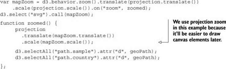
Now we can zoom into our map and pan around, as shown in figure 11.3. If you expect your users to be on browsers that handle SVG very well, like Chrome or Safari, and you don’t expect to put more features on a map, then you may not even need to worry about optimization.
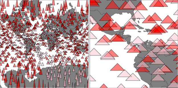
Figure 11.3. Zooming in on the sample geodata around South America
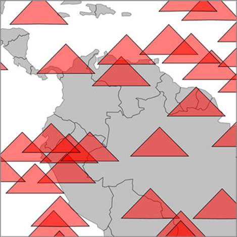
But what if you want to build interactive websites that work on all modern browsers? Firefox doesn’t have the best SVG performance, and zooming this map in Firefox isn’t a pleasant experience. If you change your d3.range() setting from 1000 to 5000, then even browsers that handle SVG well start to slow down.
11.1.2. Drawing geodata with canvas
One solution for optimization, which we touched on earlier, is to draw the elements with canvas instead of SVG. That’s why we have a canvas element in our sample HTML page for this chapter, and why it’s styled in such a way as to be directly underneath our <svg> element. Instead of creating SVG elements using D3’s enter syntax, we use the built-in functionality in d3.geo.path to provide a context for HTML5 canvas. In the following listing, you can see how to use that built-in functionality with your existing dataset.
Listing 11.6. Drawing the map with canvas
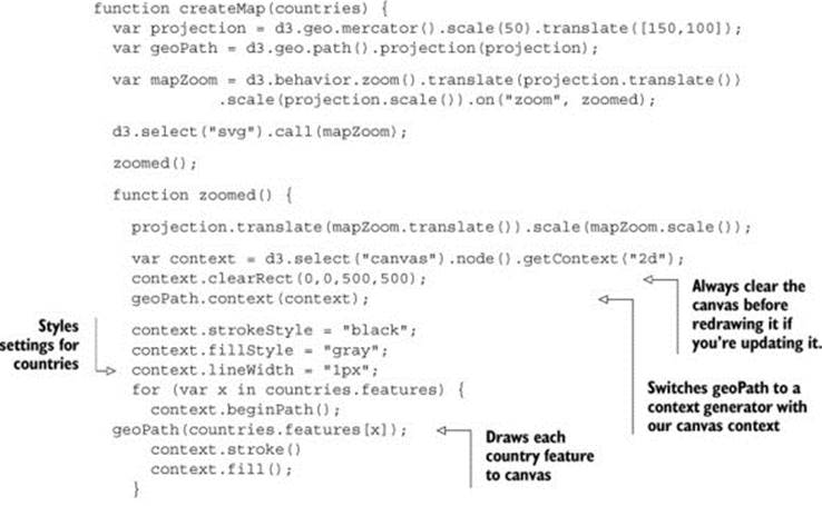

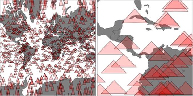
You can see some key differences between listings 11.6 and 11.5. In contrast with SVG, where you can move elements around as well as redraw them, you always have to clear and redraw the canvas to update it. Although it seems this would be slower, performance increases on all browsers, especially those that don’t have the best SVG performance, because you don’t need to manage hundreds or thousands of DOM elements. The graphical results, as seen in figure 11.4, demonstrate that it’s hard to see the difference between SVG and canvas rendering.
Figure 11.4. Drawing our map with canvas produces higher performance, but slightly less crisp graphics. On the left, it may seem like the triangles are as smoothly rendered as the earlier SVG triangles, but if you zoom in as we’ve done on the right, you can start to see clearly the slightly pixelated canvas rendering.
11.1.3. Mixed-mode rendering techniques
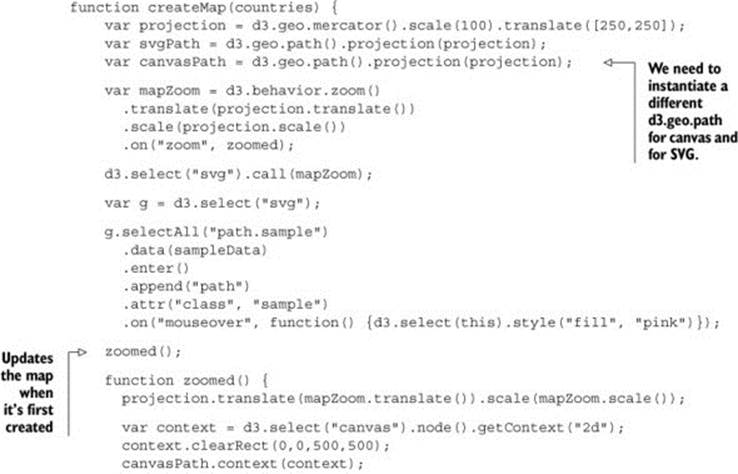
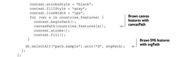
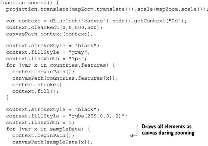
The drawback with using canvas is that you can’t easily provide the level of interactivity you may want for your data visualization. Typically, you draw your interactive elements with SVG and your large datasets with canvas. If we assume that the countries we’re drawing aren’t going to provide any interactivity, but the triangles will, then we can render the triangles as SVG and render the countries as canvas using the code in the following listing. This requires that we initialize two versions of d3.geo.path—one for drawing SVG and one for drawing canvas—and then we use both in our zoomed function.
Listing 11.7. Rendering SVG and canvas simultaneously
This allows us to maintain interactivity, such as the mouseover function on our triangles to change any triangle’s color to pink when moused over. This approach maximizes performance by rendering any graphics that have no interactivity using HTML5 canvas instead of SVG. As shown infigure 11.5, the appearance produced using this method is virtually identical to that using canvas only or SVG only.
Figure 11.5. Background countries are drawn with canvas, while foreground triangles are drawn with SVG to use interactivity. SVG graphics are individual elements in the DOM and therefore amenable to having click, mouseover, and other event listeners attached to them.
But what if you have massive numbers of elements and you really do want interactivity on all them, but you also want to give the user the ability to pan and drag? In that case, you have to embrace an extension of this mixed-mode rendering. You render in canvas whenever users are interacting in such a way that they can’t interact with other elements. In other words, we need to render the triangles in canvas when the map is being zoomed and panned, but render them in SVG when the map isn’t in motion and the user is mousing over certain elements.
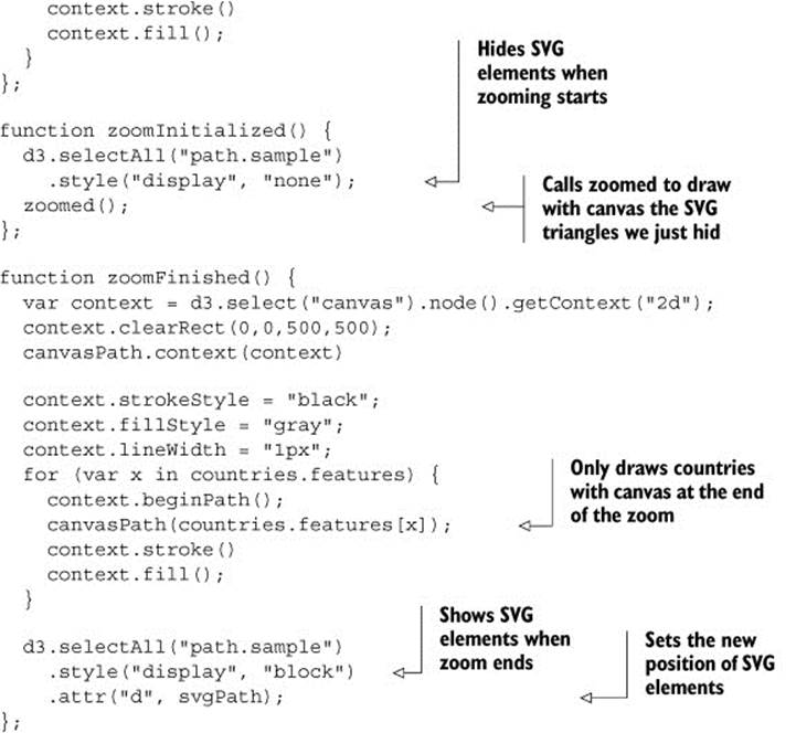
How do you determine when a zoom event starts and when it finishes? In the past you had to set a timer, check to see if the user was still zooming, and then redraw the elements. But, fortunately, D3 introduced a pair of new events to the zoom control: "zoomstart" and "zoomend". These fire, as you may guess, when the zoom event begins and ends, respectively. The following listing shows how you’d initialize a zoom behavior with different functions for these different events.
Listing 11.8. Mixed rendering based on zoom interaction

This allows us to restore our canvas drawing code for triangles to the zoomed function and to move the SVG rendering code out of the zoomed function and into a new zoom-Finished function. We also need to hide the SVG triangles when zooming or panning starts by creating azoomInitialized function that itself also fires the zoomed function (to draw the triangles we just hid, but in canvas). Finally, our zoomFinished function also contains the canvas drawing code necessary to only draw the countries. The different drawing strategies based on zoom events are shown in table 11.1.
Table 11.1. Rendering action based on zoom event
|
zoom event |
Countries rendered as |
Triangles rendered as |
|
zoomed |
Canvas |
Canvas |
|
zoomInitialized |
Canvas |
Hide SVG |
|
zoomFinished |
Canvas |
SVG |
As you can see in the following listing, this code is inefficient, but I wanted to be explicit about this functionality, because it’s a bit convoluted.
Listing 11.9. Zoom functions for mixed rendering
As a result of this new code, we have a map that uses canvas rendering when users zoom and pan, but SVG rendering when the map is fixed in place and users have the ability to click, mouse over, or otherwise interact with the graphical elements. It’s the best of both worlds. The only drawback of this approach is that we have to invest more time making sure our <canvas> element and our <svg> element line up perfectly, and that our opacity, fill colors, and so on are close enough matches that it’s not jarring to the user to see the different modes. I haven’t done this in the previous code, so that you can see that the two modes are in operation at the same time, and that’s reflected in the difference between the two graphical outputs in figure 11.6.
Figure 11.6. The same randomly generated triangles rendered in SVG while the map isn’t being zoomed or panned (left) and in canvas while the map is being zoomed or panned (right). Notice that only the SVG triangles have different fill values based on user interaction, because that isn’t factored into the canvas drawing code for the triangles on the right.
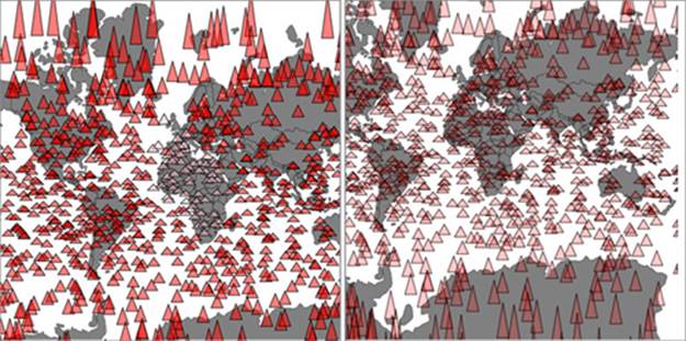
The kind of pixel-perfect alignment necessary to make the transition from one mode to another, as well as the fastidious color matching also required, isn’t something I have the space to explain in this book, but you’ll need to do both to make the best interactive information visualization. If you look closely at figure 11.6, you’ll notice that the canvas element (on the right) is a pixel or so shifted up and to the left, and that’s without testing it in other browsers that may have different default settings for <canvas> or <svg> or both.
Finally, using canvas and SVG drawing simultaneously may present a difficulty. Say we want to draw a canvas layer over an SVG layer because we want the canvas layer to appear above some of our SVG elements visually but below other SVG elements, and we want interactivity on all them. In that case we’d need to sandwich our canvas layer between our SVG layers and set the pointer-events style of our canvas layer, as shown in figure 11.7.
Figure 11.7. Placing interactive SVG elements below a <canvas> element requires that you set its pointer-events style to "none", even if it has a transparent background, in order to register click events on the <svg> element underneath it.
If you add further alternating layers of interactivity but with graphical placement above and below, then you can end up making a <canvas> and <svg> layer cake in your DOM that’s hard to manage and also hard to mentally conceptualize.
11.2. Big network data
It’s great that d3.geo.path has built-in functionality for drawing geodata to canvas, but what about other types of data visualization? One of the most performance-intensive layouts is the force-directed layout that we dealt with in chapter 6. The layout calculates new positions for each node in your network at every tick. When you use SVG, you need to redraw the network constantly. When I first started working with force-directed layouts in D3, I found that any network with more than 100 nodes was too slow to prove useful. That was a problem because larger networks could still have structure that would benefit from interactivity and animation that needed SVG.
In my own work, I looked at how different small D3 applications hosted on gist.github.com share common D3 functions. D3 coders can understand how different information visualization methods use D3 functions commonly associated with other types of information visualization. You can explore this network along with how D3 Meetup users describe themselves at http://emeeks.github.io/introspect/block_block.html.
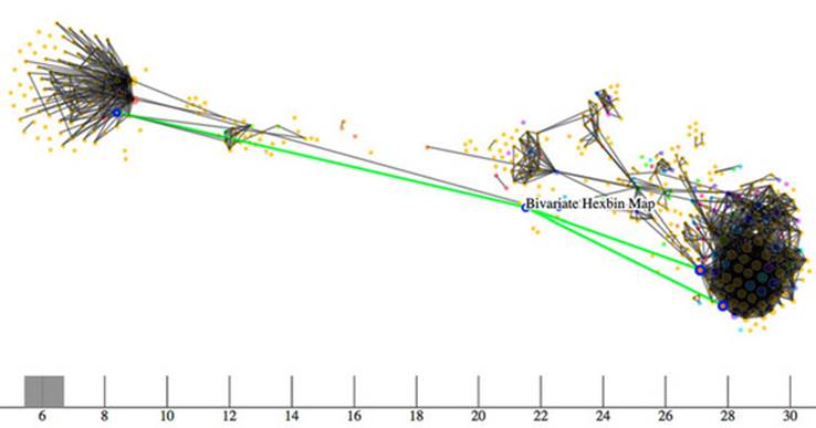
To explore these connections, I needed to have a method for dealing with over a thousand different examples and thousands of connections between them. You can see some of this network in figure 11.8. I wanted to show how this network changed based on a threshold of shared functions, and I also wanted to provide users with the capacity to click each example to get more details, so I couldn’t draw the network using canvas. Instead, I needed to draw the network using the same mixed-rendering method we looked at to draw all those triangles on a map. But in this case I used canvas for the network edges and SVG for the network nodes.
Figure 11.8. A network of D3 examples hosted on gist.github.com that connects different examples to each other by shared functions. Here you can see that the example “Bivariate Hexbin Map” by Mike Bostock (http://bl.ocks.org/mbostock/4330486) shares functions in common with three different examples: “Metropolitan Unemployment,” “Marey’s Trains II,” and “GitHub Users Worldwide.” The brush and axis component allows you to filter the network by the number of connections from one block to another.
Using bl.ocks.org
Although D3 is suitable for building large, complex interactive applications, you often make a smal, single-use interactive data visualization that can live on a single page with limited resources. For these small applications, it’s common in the D3 community to host the code ongist.github.com, which is the part of GitHub designed for small applications. If you host your D3 code as a gist, and it’s formatted to have an index.html, then you can use bl.ocks.org to share your work with others.
To make your gist work on bl.ocks.org, you need to have the data files and libraries hosted in the gist or accessible through it. Then you can take the alphanumeric identifier of your gist and append it to bl.ocks.org/username/ to serve a working copy for sharing. So, for instance, I have a gist at https://gist.github.com/emeeks/0a4d7cd56e027023bf78 that demonstrates how to do the mixed rendering of a force-directed layout like I described in this chapter. As a result, I can point people to http://bl.ocks.org/emeeks/0a4d7cd56e027023bf78 and they can see the code itself as well as the animated network in action.
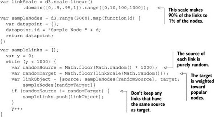
Doing this kind of mixed rendering with networks isn’t as easy as it is with maps. That’s because there’s no built-in method to render regular data to canvas as with d3.geo.path. If you want to create a similar large network that combines canvas and SVG rendering, you have to build the function manually. First, though, you need data. This time, instead of sample geodata, listing 11.10 shows how to create sample network data.
Building sample network data is easy: you can create an array of nodes and an array of random links between those nodes. But building a sample network that’s not an undifferentiated mass is a little bit harder. In listing 11.10 you can see my slightly sophisticated network generator. It operates on the principle that a few nodes are very popular and most nodes aren’t (we’ve known about this principle of networks since grade school). This does a decent job of creating a network with 3000 nodes and 1000 edges that doesn’t look quite like a giant hairball.
Listing 11.10. Generating random network data
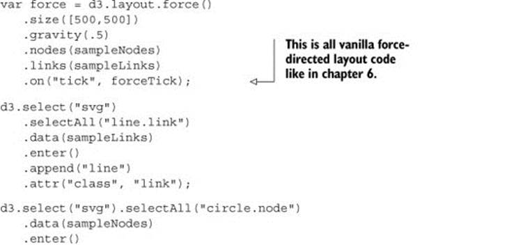
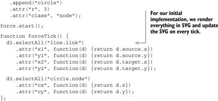
With this generator in place, we can instantiate our typical force-directed layout using the code in the following listing, and create a few lines and circles with it.
Listing 11.11. Force-directed layout
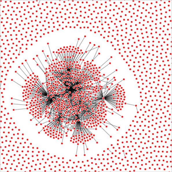
This code should be familiar to you if you’ve read chapter 6. Generation of random networks is a complex and well-described practice. This random generator isn’t going to win any awards, but it does produce a recognizable structure. Typical results are shown in figure 11.9. What’s lost in the static image is the slow and jerky rendering, even on a fast computer using a browser that handles SVG well.
Figure 11.9. A randomly generated network with 3000 nodes and 1000 edges
When I first started working with these networks, I thought the main cause of slowdown was calculating the myriad positions for each node on every tick. After all, node position is based on a simulation of competing forces caused by nodes pushing and edges pulling, and something like this, with thousands of components, seems heavy duty. That’s not what’s taxing the browser, though. Instead, it’s the management of so many DOM elements. You can get rid of many of those DOM elements by replacing the SVG lines with canvas lines. Let’s change our code so that it doesn’t create any SVG <line> elements for the links and instead modify our forceTick function to draw those links with canvas.
Listing 11.12. Mixed rendering network drawing
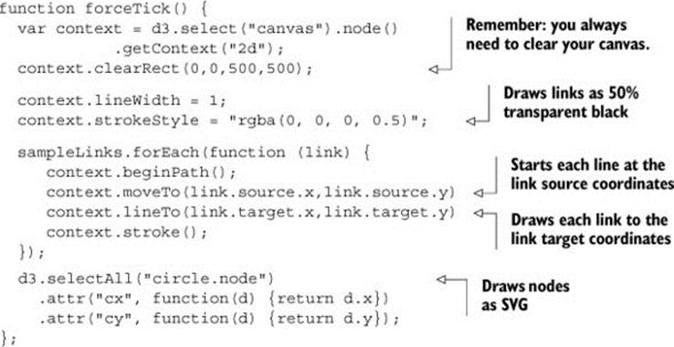
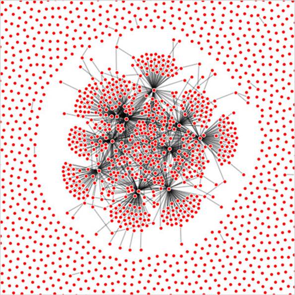
The rendering of the network is similar in appearance, as you can see in figure 11.10, but the performance improves dramatically. Using canvas, I can draw 10,000 link networks with performance high enough to have animation and interactivity. The canvas drawing code can be a bit cumbersome (it’s like the old LOGO drawing code), but the performance makes it more than worth it.
Figure 11.10. A large network drawn with SVG nodes and canvas links
We could use the same method as with the earlier maps to use canvas during animated periods and SVG when the network is fixed. But we’ll move on and look at another method for dealing with large amounts of data: quadtrees.
11.3. Optimizing xy data selection with quadtrees
When you’re working with a large dataset, one issue is optimizing search and selection of elements in a region. Let’s say you’re working with a set of data with xy coordinates (anything that’s laid out on a plane or screen). You’ve seen enough examples in this book to know that this may be a scatterplot, points on a map, or any of a number of different graphical representations of data. When you have data like this, you often want to know what datapoints fall in a particular selected region. This is referred to as spatial search (and notice that “spatial” in this case doesn’t refer to geographic, but rather space in a more generic sense). The quadtree functionality is a spatial version of d3.nest, which we used in chapter 5 and chapter 8 and will use again in chapter 12 (available online only) to create hierarchical data. Following the theme of this chapter, we’ll get started by creating a big dataset of random points and render them in SVG.
11.3.1. Generating random xy data
Our third random data generator doesn’t require nearly as much work as the first two did. In the following listing, all we do is create 3000 points with random x and y coordinates.
Listing 11.13. xy data generator
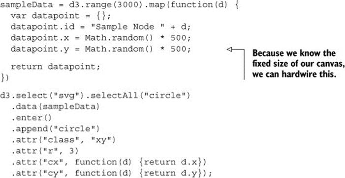
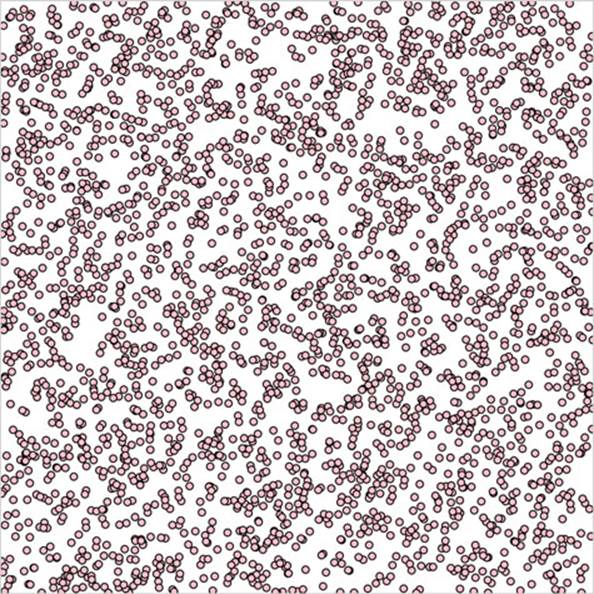
As you may expect, the result of this code, shown in figure 11.11, is a bunch of pink circles scattered randomly all over our canvas.
Figure 11.11. 3000 randomly placed points represented by pink SVG <circle> elements
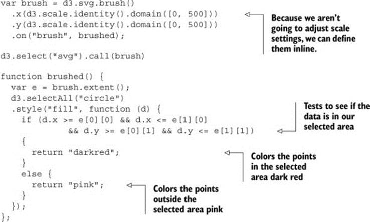
11.3.2. xy brushing
Now we’ll create a brush to select some of these points. Recall when we used a brush in chapter 9 that we only allowed brushing along the x-axis. This time, we allow brushing along both x- and y-axes. Then we can drag a rectangle over any part of the canvas. In listing 11.14, you can see how quick and easy it is to add a brush to our canvas. We’ll also add a function to highlight any circles in the brushed region. In this example we use d3.scale.identity for our .x() and .y() selectors. All d3.scale.identity does is create a scale where the domain and range are exactly the same. It’s useful for times like these when the function operates with a scale but your scale domain directly matches the range of your graphical area.
Listing 11.14. xy brushing
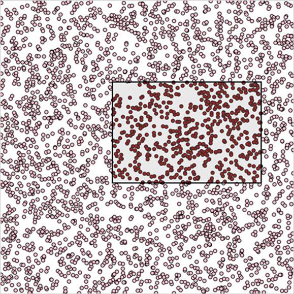
With this brushing code, we can now see the circles in the brushed region, as shown in figure 11.12.
Figure 11.12. Highlighting points in a selected region
This works, but it’s terribly inefficient. It checks every point on the canvas without using any mechanism to ignore points that might be well outside the selection area. Finding points within a prescribed area is an old problem that has been well explored. One of the tools available to solve that problem quickly and easily is a quadtree. You may ask, what is a quadtree and what should I use it for?
A quadtree is a method for optimizing spatial search by dividing a plane into a series of quadrants. You then divide each of those quadrants into quadrants, until every point on that plane falls in its own quadrant. By dividing the xy plane like this, you nest the points you’ll be searching in such a way that you can easily ignore entire quadrants of data without testing the entire dataset.
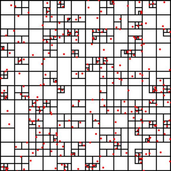
Another way to explain a quadtree is to show it. That’s what this information visualization stuff is for, right? Figure 11.13 shows the quadrants that a quadtree produces based on a set of point data.
Figure 11.13. A quadtree for points shown in red with quadrant regions stroked in black. Notice how clusters of points correspond to subdivision of regions of the quadtree. Every point falls in only one region, but each region is nested in several levels of parent regions.
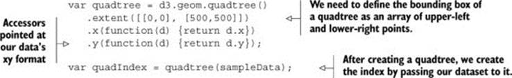
Creating a quadtree with xy data of the kind we have in our dataset is easy, as you can see in listing 11.15. We set the x and y accessors like we do with layouts and other D3 functions.
Listing 11.15. Creating a quadtree from xy data
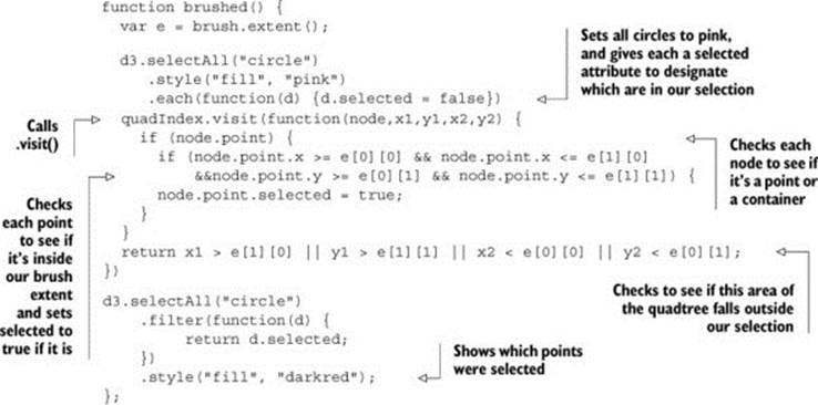
After you create a quadtree and use it to create a quadtree index dataset like we did with quadIndex, you can use that dataset’s .visit() function for quadtree-optimized searching. The .visit() functionality replaces your test in a new brush function, as shown in listing 11.16. First, I’ll show you how to make it work in listing 11.16. Then, I’ll show you that it does work in figure 11.14, and I’ll explain how it works in detail. This isn’t the usual order of things, I realize, but with a quadtree, it makes more sense if you see the code before analyzing its exact functionality.
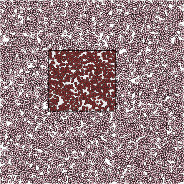
Figure 11.14. Quadtreeoptimized selection used with a dataset of 10,000 points
Listing 11.16. Quadtree-optimized xy brush selection
The results are impressive and much faster. In figure 11.14, I increased the number of points to 10,000 and still got good performance. (But if you’re dealing with datasets that large, I recommend switching to canvas, because forcing the browser to manage all those SVG elements is going to slow things down.)
How does it work? When you run the visit function, you get access to each node in the quadtree, from the most generalized to the more specific. With each node, which we access in listing 11.16 as node, you also get the bounds of that node (x1, y1, x2, y2). Because nodes in a quadtree can either be the bounding areas or the actual points that generated the quadtree, you have to test if the node is a point and, if it is, you can then test if it’s in your brush bounds like we did in our earlier example. The final piece of the visit function is where it gets its power, but it’s also the most difficult to follow, as you can see in figure 11.15.
Figure 11.15. The test to see if a quadtree node is outside a brush selection involves four tests to see if it is above, left, right, or below the selection area. If it passes true for any of these tests, then the quadtree will stop searching any child nodes.

The visit function looks at every node in a quadtree, unless visit returns true, in which case it stops searching that particular quadrant and all its child nodes. So you test to see if the node you’re looking at (represented as the bounds x1,y1,x2,y2) is entirely outside the bounds of your selection area (represented as the bounds e[0][0], e[0][1], e[1][0], e[1][1]). You create this test to see if the top of the selection is below the bottom of the node’s bounds; if the bottom of the selection is above the top of the node’s bounds; if the left side of the selection is to the right of the right side of the node’s bounds; or if the right side of the selection is to the left of the left side of the node’s bounds. That may seem a bit hard to follow (and sure takes up more time as a sentence than it does as a piece of code), but that’s how it works.
You can use that visit function to do more than optimized search. I’ve used it to cluster nearby points on a map (http://bl.ocks.org/emeeks/066e20c1ce5008f884eb) and also to draw the bounds of the quadtree in figure 11.13.
11.4. More optimization techniques
You can improve the performance of the data visualization of large datasets in many other ways. Here are three that should give you immediate returns: avoid general opacity, avoid general selections, and precalculate positions.
11.4.1. Avoid general opacity
Whenever possible, use fill-opacity and stroke-opacity or RGBA color references rather than the element opacity style. General element opacity, the kind of setting you get when you use "style: opacity", can slow down rendering. When you use specific fill or stroke opacity, it forces you to pay more attention to where and how you’re using opacity.
So instead of
d3.selectAll(elements).style("fill", "red").style("opacity", .5)
do this:
d3.selectAll(elements).style("fill", "red").style("fill-opacity", .5)
11.4.2. Avoid general selections
Although it’s convenient to select all elements and apply conditional behavior across those elements, you should try to use selection.filter with your selections to reduce the number of calls to the DOM. If you look at the code in listing 11.16, you’ll see this general selection that clears the selected attribute for all the circles and sets the fill of all the circles to pink:
d3.selectAll("circle")
.style("fill", "pink")
.each(function(d) {d.selected = false})
Instead, clear the attribute and set the fill color of only those circles that are currently set to the selection. This limits the number of costly DOM calls:
d3.selectAll("circle")
.filter(function(d) {return d.selected})
.style("fill", "pink")
.each(function(d) {d.selected = false})
If you adjust the code in that example, the performance is further improved. Remember that manipulating DOM elements, even if it’s changing a setting like fill, can cause the greatest performance hit.
11.4.3. Precalculate positions
You can also precalculate positions and then apply transitions. If you have a complex algorithm that determines an element’s new position, first go through the data array and calculate the new position. Then append the new position as data to the datapoint of the element. After you’ve done all your calculations, select and apply a transition based on the calculated new position. When you’re calculating complex new positions and applying those calculated positions to a transition of a large selection of elements, you can overwhelm the browser and see jerky animations.
So, instead of
d3.selectAll(elements)
.transition()
.duration(1000)
.attr("x", newComplexPosition);
do this:
d3.selectAll(elements)
.each(function(d) {d.newX = newComplexPosition(d)});
d3.selectAll(elements)
.transition()
.duration(1000)
.attr("x", function(d) {return d.newX});
11.5. Summary
In this chapter, we looked at a few ways to deal with large datasets, and by necessity touched on methods for generating those datasets. Specifically, we looked at
· Generating random geodata
· Using the .context function of d3.geo.path to draw map features using canvas
· Using zoom’s start and end functionality to render elements in canvas or SVG
· Generating random network data
· Drawing network lines in canvas
· Generating random xy data
· Creating an xy brush
· Highlighting selected features
· Building a quadtree
· Using a quadtree for optimized spatial search
In the next chapter (available as an online supplement), we’ll focus on one area where performance tuning is important: data visualization on mobile. You’ll see the built-in functionality in D3 for handling touch interfaces and spend time thinking about design principles for interactive data visualization on mobile.
If you want to grow your D3 skill set, I’d suggest starting with bl.ocksplorer (http://bl.ocksplorer.org/), which allows you to find examples of D3 code based on specific D3 functions. You should also check out the work of Mike Bostock (http://bl.ocks.org/mbostock) and Jason Davies (http://www.jasondavies.com/) to see the cutting edge of data visualization with D3. D3 has an active Google Group (https://groups.google.com/forum/#!forum/d3-js), if you’re interested in discussing the internals of the library, and many popular Meetup groups like the Bay Area D3 User Group (http://www.meetup.com/Bay-Area-d3-User-Group/). I find the best place to keep up with D3 is on Twitter, where you can see examples posted with the hashtag #d3js and examples of when things don’t quite go right (but are still beautiful) with the hashtag #d3brokeandmadeart.
All materials on the site are licensed Creative Commons Attribution-Sharealike 3.0 Unported CC BY-SA 3.0 & GNU Free Documentation License (GFDL)
If you are the copyright holder of any material contained on our site and intend to remove it, please contact our site administrator for approval.
© 2016-2026 All site design rights belong to S.Y.A.