Enyo: Up and Running (2015)
Chapter 3. Components, Controls, and Other Objects
In Chapter 2, we covered kinds and inheritance. It should come as no surprise that Enyo makes good use of those features by providing a rich hierarchy of kinds you can use and build upon in your apps. In this chapter, we’ll focus on two important kinds that Enyo provides: Component andControl. We’ll also touch on some of the other kinds that you’ll need to flesh out your apps.
Components
Components introduce one of the most-used features of Enyo apps: the ability to create kinds composed of other kinds. This ability to compose new components from other components is one of the key features that encapsulation allows. Most kinds you’ll use, including the Application kind, will be based upon Component or one of its descendants.
Composition
Composition is a powerful feature that lets you focus on breaking down your app into discrete pieces and then combine those pieces together into a unified app. We used this feature in Chapter 1 when we built a traffic light out of three individual lights. Each descendant of Component has acomponents block that takes an array of component definitions.
For example, in Advanced Events, the Receiver kind has a Control named display:
enyo.kind({
name: 'Receiver',
components: [
{ name: 'display', content: 'Waiting...' },
{ kind: 'Signals', onButtonSignal: 'update' }
],
...
Methods within Receiver can access display through this.$.display. For set() and get(), the path would be $.display.propertyName. Enyo stores references to all owned components in the $ object. Components without explicit names (such as Signals in the previous example) are given unique names and added to $.
TIP
Every component declared within a kind will be owned by the kind, even if nested within multiple components blocks.
Many of the components that Enyo supplies were designed as containers for other components. We’ll cover many of these kinds in Chapter 4. Some, such as Button, weren’t intended to contain other components.
Component Methods
Components introduce create() and destroy() methods to assist with the component’s lifecycle. These methods can be overridden by kinds that derive from Component to provide extra functionality, such as allocating and deallocating resources. We previously used the create() method when we wanted to invoke the myValueChanged() method. We can use this feature to create a simple heartbeat object:
enyo.kind({
name: 'Heartbeat',
events: {
onBeat: ''
},
create: function() {
this.inherited(arguments);
this.timer = window.setInterval(enyo.bind(this, 'beat'), 1000);
},
destroy: function() {
if(this.timer !== undefined) {
window.clearInterval(this.timer);
}
this.inherited(arguments);
},
beat: function() {
this.doBeat({});
}
});
TIP
We used the destroy() method to ensure that we cleaned up the timer we allocated in the create() method. You may also notice that we introduced a new method: enyo.bind(). In all our previous event handlers, Enyo made sure the context of the event handlers was set correctly. We’ll need to take care of that ourselves when subscribing directly to non-Enyo events. For more information on binding and why it’s necessary, please see this article on Binding Scope in JavaScript.
Dynamic Components
Up to this point we’ve always created components when a kind is being instantiated. It is also possible to create and destroy components dynamically. Components have a number of methods for interacting with their owned components. You can use createComponent() to create an individual component or create a number of components at once using createComponents(). To remove a component from its owner, call the component’s destroy() method. It is also possible to destroy all owned components by calling destroyComponents(). The following example shows how to create a component dynamically:
enyo.kind({
name: 'DynamicSample',
components: [
{ kind: 'Button', content: 'Click', ontap: 'tapped' }
],
tapped: function(sender, event) {
this.createComponent({ content: 'A new component' });
this.render();
return true;
}
});
TIP
New controls are not rendered until requested. Call the render() method on a control to ensure that it and its children are rendered to the DOM.
Controls
Control, a descendant of Component, is the kind responsible for providing the user interface to your apps. A large part of what makes an app an app is the user interface. The Enyo core provides wrappers around the most basic type of controls found natively in browsers. The Onyx and Moonstone libraries expand upon those basic controls and provide the more specialized elements expected in modern apps.
Controls are important because they map to DOM nodes. They introduce a number of properties and methods that will be important for your apps. By default, controls render into a div element. You can override this behavior by specifying the tag property when defining the control (e.g., tag: 'span').
Core Controls
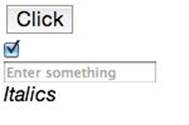
The core visual controls in Enyo are wrappers around the basic elements you can create directly with HTML. Of course, because they’re Enyo controls, they’ll have properties and events defined that make them easy to use within your apps. The core controls include: Button, Checkbox, Image,Input, RichText, Select, and TextArea.
The following code sample creates a simple app with several controls:
enyo.kind({
name: 'ControlSample',
components: [
{ kind: 'Button', content: 'Click', ontap: 'tapped' },
{ tag: 'br'},
{ kind: 'Checkbox', checked: true, onchange: 'changed' },
{ tag: 'br'},
{ kind: 'Input', placeholder: 'Enter something', onchange: 'changed' },
{ tag: 'br'},
{ kind: 'RichText', value: '<i>Italics</i>', onchange: 'changed' }
],
tapped: function(sender, event) {
// React to taps
},
changed: function(sender, event) {
// React to changes
}
});
TIP
You will note that the controls themselves are unstyled, appearing with the browser’s default style. In Onyx Controls, we’ll see how the Onyx versions of these controls compare to the base versions. You may also note that some controls use the content property to set the content of the control. The exceptions to this rule are the text field controls: Input, TextArea, and RichText. These controls use the value property to get and set the text content. In these samples we use simple br tags to arrange the controls. In an actual app, you’ll want to use CSS or the layout controls described in the next chapter.
TIP
By default, most Enyo controls escape any HTML in their content or value properties. This is to prevent the inadvertent injection of JavaScript from unsafe sources. If you want to use HTML in the contents, set the allowHtml property to true. By default, RichText allows HTML content.
Onyx Controls
The Onyx library (an optional piece of Enyo) includes professionally designed widgets. These controls expand upon the basic set available in the Enyo core. The Onyx controls that correspond to the core controls use the same interface as those core controls:
enyo.kind({
name: 'ControlSample',
components: [
{ kind: 'onyx.Button', content: 'Click', ontap: 'tapped' },
{ tag: 'br'},
{ kind: 'onyx.Checkbox', checked: true, onchange: 'changed' },
{ tag: 'br'},
{ kind: 'onyx.InputDecorator', components: [
{ kind: 'onyx.Input', placeholder: 'Enter something',
onchange: 'changed' }
]},
{ tag: 'br'},
{ kind: 'onyx.InputDecorator', components: [
{ kind: 'onyx.RichText', value: '<i>Italics</i>',
onchange: 'changed' }
]}
],
tapped: function(sender, event) {
// React to taps
},
changed: function(sender, event) {
// React to changes
}
});
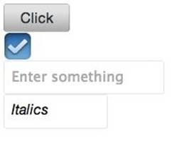
TIP
As you can see, the Onyx widgets are much more pleasing to look at. With Onyx, we wrapped the text input controls in an InputDecorator. This is a control that allows for additional styling and should be used for all Onyx input controls.
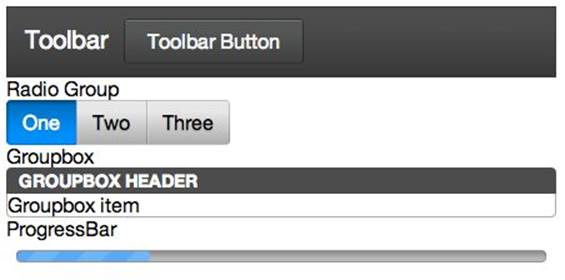
The Onyx library also provides a number of new controls, including Groupbox, ProgressBar, Toolbar and TimePicker, among others. Here’s a sample of some of the new Onyx controls that shows off their important properties and events:
enyo.kind({
name: 'OnyxSample',
components: [
{ kind: 'onyx.Toolbar', components: [
{ content: 'Toolbar' },
{ kind: 'onyx.Button', content: 'Toolbar Button' }
]},
{ content: 'Radio Group' },
{ kind: 'onyx.RadioGroup', onActivate: 'activated', components: [
{ content: 'One', active: true },
{ content: 'Two' },
{ content: 'Three' }
]},
{ content: 'Groupbox' },
{ kind: 'onyx.Groupbox', components: [
{ kind: 'onyx.GroupboxHeader', content: 'Groupbox Header' },
{ content: 'Groupbox item' }
]},
{ content: 'ProgressBar' },
{ kind: 'onyx.ProgressBar', progress: 25 }
],
activated: function(sender, event) {
// React to radio button activation change
}
});
TIP
Moonstone Controls
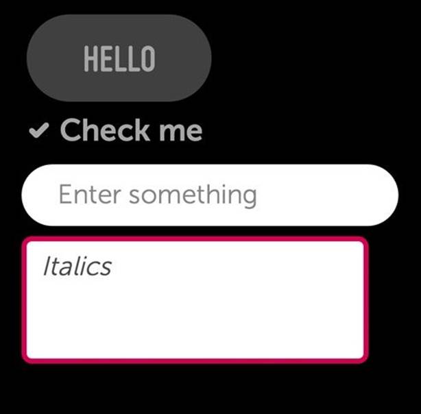
Another UI library available for use with Enyo is the Moonstone library. Moonstone was designed specifically for use on smart TVs. The use cases for smart TVs are very different from those for touch-based devices. Moonstone is a lot more styled than Onyx and includes many more components. Here are the basic controls we showed previously, rendered with the Moonstone styling:
enyo.kind({
name: 'View',
classes: 'moon',
components: [
{ kind: 'moon.Button', content: 'Hello', ontap: 'tapped' },
{ kind: 'moon.CheckboxItem', checked: true, content: 'Check me',
onchange: 'changed' },
{ kind: 'moon.InputDecorator', components: [
{ kind: 'moon.Input', placeholder: 'Enter something',
onchange: 'changed' }
] },
{ kind: 'moon.InputDecorator', components: [
{ kind: 'moon.RichText', value: '<i>Italics</i>',
onchange: 'changed' }
] }
],
tapped: function(sender, event) {
// React to taps
},
changed: function(sender, event) {
// React to changes
}
});
TIP
Moonstone components are designed to work with the Enyo Spotlight library, which supports both five-way navigation (up, down, left, right, select) and cursor selection. If you mouse over the components, you will see them highlight to indicate they have focus. You can also switch to using the arrow keys on your keyboard to navigate among the components. Spotlight is a topic unto itself and we won’t cover it here. If you’re interested in learning more about it, see the Spotlight documentation.
There are too many Moonstone controls to get into here, so here’s a screenshot of the Moonstone Always Viewing VideoPlayer sample:

For more information on Moonstone, see the “Building TV Applications” section of the Enyo docs site.
Methods and Properties
Controls have a number of methods and properties that focus on their special role in interacting with the DOM. These methods include rendered(), hasNode(), and a number of others for manipulating the DOM. The important properties include classes and style, which we’ll cover inChapter 6.
The first method, rendered(), can be overridden to perform processing that only takes place when the DOM node associated with the control is available. By default, controls are not rendered into the DOM until they are required. In our samples, the Application kind takes care of rendering its view at startup. As always, be sure to call the inherited() method within rendered().
The second important method, hasNode(), allows us to test whether the DOM node for the control exists and to retrieve it, if available. hasNode() will return null if no node is available. This is most useful when you are creating new controls that will need to manipulate the DOM, or when you want to wrap a widget from another UI library.
The following example shows a naive way to implement a scalable vector graphic (SVG) container object. The only purpose is to show off the rendered() and hasNode() methods:
enyo.kind({
name: 'Svg',
svg: '',
rendered: function() {
this.inherited(arguments);
this.svgChanged();
// Can only call when we have a node
},
svgChanged: function() {
var node = this.hasNode();
if(node !== null) {
node.innerHTML = '<embed src="' + this.svg +
'" type="image/svg+xml" />';
}
}
});
TIP
There are many additional methods and properties available on Control. Please see the API documentation for details.
Other Important Objects
Not all functionality in an app is provided by visible elements. For many apps, there is processing that must be done in the background. Enyo provides a number of objects that handle such processing. These objects include Application, Router, Animator, Ajax, and JsonpRequest. SeeChapter 5 for more information on other important non-visual objects.
Application
One important component that we have not discussed yet is the Application component. Application is a type of controller that takes care of rendering the app. Each of the samples we’ve looked at uses Application. In general, an app will derive a new kind based on Application and specify the startup view.
The view property can contain either the name of a Control to render or a kind definition. When rendered, the view property will contain the instance of the view that was created. By default, the view is rendered as soon as the Application object is created. If you need to do some processing before the view is rendered, set the renderOnStart property to false and then call render() when ready.
The Application component is also a good place to keep track of data shared among various controls. All controls will have an app property that contains the instance of Application. This property can be used to bind to shared models and collections.
Router
Enyo has a Router component that handles routing. Routing, for our purposes, is the process of setting application state through the use of the URL. Specifically, Router uses the URL location hash to store information about the state of the app. The hash allows apps to maintain state between page loads and respond to the back button in the browser. Changing the location hash does not force a page reload.
The router works by monitoring and updating the location hash. Routers have routes, which are patterns for the data in the location hash and specify methods to be invoked. The following is an example router definition:
enyo.kind({
name: 'Routing',
components: [
{ name: 'router', kind: 'Router', routes: [
{ path: 'user/:userid', handler: 'routeUser' },
{ path: 'about', handler: 'routeAbout' },
{ path: 'home', handler: 'home', default: true }
]}
],
routeUser: function(userID) {
// Display user profile
},
routeAbout: function() {
// Show about screen
},
home: function() {
// Default route if no other path matches
}
});
In the route declarations, any portions of the route that are prefixed with a colon (:) are converted into arguments to the handler method. By default, the router will trigger an update when it is created. In our example, the location hash will be tested against the paths, and if none match, home()will be executed (because it’s the default). The trigger() method is used to trigger the routing and, optionally, update the location hash. The following command updates the location hash and triggers the home action:
this.$.router.trigger({ location: 'home', change: true });
Routing is a powerful way to centralize app state changes and pairs very well with Application. For example, route handlers can set the active view, apply models and collections (see Chapter 5), or change the active panel (see Panels).
Animator
Animator is a component that provides for simple animations by sending periodic events over a specified duration. Each event sends a value that iterates over a range during the animation time. The following example shows how you could use Animator to change the width of a div:
enyo.kind({
name: 'Expando',
components: [
{ name: 'expander', content: 'Presto',
style:
'width: 100px; background-color: lightblue; text-align: center;' },
{ name: 'animator', kind: 'Animator', duration: 1500, startValue: 100,
endValue: 300, onStep: 'expand', onEnd: 'done' },
{ kind: 'Button', content: 'Start', ontap: 'startAnimator' },
],
startAnimator: function() {
this.set('$.expander.content', 'Presto');
this.$.animator.play();
},
expand: function(sender, event) {
this.$.expander.applyStyle('width', Math.floor(sender.value) + 'px');
},
done: function() {
this.set('$.expander.content', 'Change-o');
}
});
TIP
Enyo also has some kinds for dealing with sprite animation. Find out more from this blog post.
Ajax and JsonpRequest
Ajax and JsonpRequest are both objects that facilitate performing web requests. It is worth noting that they are objects and not components. Because they are not components, they cannot be included in the components block of a kind definition. We can write a simple example to show how to fetch some data from a web service:
enyo.kind({
name: 'AjaxSample',
components: [
{ kind: 'Button', content: 'Fetch Repositories', ontap: 'fetch' },
{ name: 'repos', content: 'Not loaded...', allowHtml: true }
],
fetch: function() {
var ajax = new enyo.Ajax({
url: 'https://api.github.com/users/enyojs/repos'
});
ajax.go();
ajax.response(this, 'gotResponse');
},
gotResponse: function(sender, inResponse) {
var i, output = '';
for(i = 0; i < inResponse.length; i++) {
output += inResponse[i].name + '<br />';
}
this.set('$.repos.content', output);
}
});
TIP
In this sample we use the GitHub API to fetch the list of the Enyo repositories. In the button’s tap handler, we create an Ajax object, populate it with the appropriate API URL, and set the callback method for a successful response. We could have passed additional parameters for the service when we called the go() method. In general, we would trap error responses by calling ajax.error() with a context and error handling method.
TIP
The Ajax object performs its request asynchronously, so the call to go() does not actually cause the request to start. The request is not initiated until after the fetch() method returns.
A general discussion of when and how to use Ajax and JSON-P are outside the scope of this book.
WARNING
By default, Enyo adds a random query string onto Ajax requests to prevent aggressive browser caching. This can interfere with some web services. To disable this feature, add cacheBust: false to the Ajax configuration object.
We’ll touch more on using web data sources in Chapter 5.
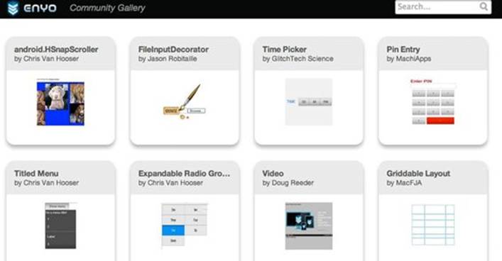
Community Gallery
The Enyo developers decided to keep the core of Enyo very simple. The additional libraries supplied with Enyo are also similarly focused. No framework can provide all the possible components that users will need. Fortunately, all the features of Enyo that we’ve discussed up to this point mean that it’s very easy to create reusable components. The developers have created a community gallery to make it easy to find and share these reusable components. The gallery includes a variety of components that can be easily dropped in to your apps.
Hopefully you will feel motivated to create new components and share them with the community.
Summary
In this chapter, we explored components and the visual controls that Enyo developers use to make beautiful apps. We explored the various widgets that Onyx and Moonstone have to offer and learned a bit about using them. We also covered some non-visual objects Enyo provides. In the next chapter, we’ll take Enyo to the next level by exploring how to arrange controls.
All materials on the site are licensed Creative Commons Attribution-Sharealike 3.0 Unported CC BY-SA 3.0 & GNU Free Documentation License (GFDL)
If you are the copyright holder of any material contained on our site and intend to remove it, please contact our site administrator for approval.
© 2016-2026 All site design rights belong to S.Y.A.