Web Development with jQuery (2015)
Part II. jQuery UI
Chapter 18. Tabs
This installment of my introduction to jQuery and jQuery UI presents how to work with the jQuery UI Tabs plugin, a plugin that makes it easier to implement tabbed functionality, in which you click a series of tabs that toggles the display of content that either already exists in the document or is loaded dynamically via an AJAX request.
jQuery UI provides all the functional aspects that you need to implement a tabbed user interface. For styling the interface, like Dialog and the Datepicker, you can either use a jQuery UI theme or create your own style sheet.
Implementing a tabbed user interface, like much of the plugin functionality that jQuery UI offers, is easy and straightforward. You need learn about only a few fundamentals, such as how to structure markup destined to become tabs and, of course, the various options that the Tabs plugin offers to allow tweaking the implementation to cover the variations in use as well as callback events.
This chapter covers how to implement and style a tabbed user interface and covers a few of the options offered by the Tabs plugin that you're most likely to be interested in using. Like the other jQuery UI plugins, a comprehensive reference of options, callback events, and arguments are covered in Appendix Q, “Tabs.”
Implementing Tabs
To start with your tabbed user interface implementation, here's a remedial demonstration of the jQuery UI Tabs plugin without any options or styling. The objective is to present where you stand using the plugin out-of-the-box, which is the purpose of the following example (Example 18-1 in the source code download materials at www.wrox.com/go/webdevwithjquery):
<!DOCTYPE HTML>
<html xmlns='http://www.w3.org/1999/xhtml'>
<head>
<meta http-equiv='content-type'
content='application/xhtml+xml; charset=utf-8' />
<meta http-equiv='content-language' content='en-us' />
<title>Tabs Plugin</title>
<script src='../jQuery.js'></script>
<script src='../jQueryUI.js'></script>
<script src='Example 18-1.js'></script>
<link href='Example 18-1.css' rel='stylesheet' />
</head>
<body>
<div id='exampleTabs'>
<ul>
<li>
<a href='#exampleTabFirst'>
<span>First Tab</span>
</a>
</li>
<li>
<a href='#exampleTabSecond'>
<span>Second Tab</span>
</a>
</li>
<li>
<a href='#exampleTabThird'>
<span>Third Tab</span>
</a>
</li>
</ul>
<div id='exampleTabFirst'>
<p>
Lorem ipsum dolor sit amet, consectetuer adipiscing elit.
Suspendisse id sapien. Suspendisse rutrum libero sit amet dui.
Praesent pede elit, tincidunt pellentesque, condimentum nec,
mollis et, lacus. Donec nulla ligula, tempor vel, eleifend ut.
</p>
</div>
<div id='exampleTabSecond'>
<p>
Cras eu metus orci. Nam pretium neque ante. In eu mattis sem,
Ut euismod nulla. Curabitur a diam eget risus vestibulum
mattis et at turpis. Etiam semper, orci sit amet semper
molestie, nibh sem hendrerit est, auctor varius arcu purus ut
enim. Curabitur nisi nunc, ullamcorper a placerat a, faucibus
imperdiet urna. Maecenas cursus ullamcorper dolor, ac viverra
nibh consectetur eget.
</p>
</div>
<div id='exampleTabThird'>
<p>
Mauris sollicitudin, sem non tempor molestie, quam nunc
blandit lectus, quis molestie dui arcu in lectus. In id
fringilla elit. Ut auctor lectus eget orci malesuada, et
lacinia ligula interdum. Pellentesque bibendum, orci eget
euismod scelerisque, nibh nulla posuere mi, quis commodo
purus sem et arcu.
</p>
</div>
</div>
</body>
</html>
The preceding document is styled with the following style sheet:
body {
font: 12px 'Lucida Grande', Arial, sans-serif;
background: #fff;
color: rgb(50, 50, 50);
}
div#exampleTabFirst {
background: lightblue;
padding: 5px;
}
div#exampleTabSecond {
background: lightgreen;
padding: 5px;
}
div#exampleTabThird {
background: yellow;
padding: 5px;
}
The following script demonstrates a call to the jQuery UI's tabs() method:
$(document).ready(
function()
{
$('div#exampleTabs').tabs();
}
);
Figure 18.1 shows that the preceding actually doesn't look like much so far, but some groundwork had been laid in preparation of creating a proper tabbed user interface.
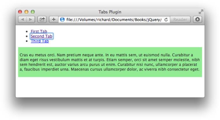
Figure 18.1
Styling the Tabbed User Interface
Because the Tabs plugin requires either a theme or a custom style sheet to be applied, you need to examine the markup document after the tabs() method has been executed to see how the Tabs plugin modifies the markup. The modified markup document is presented in the following example, which is Example 8-2 in the source code download materials:
<!DOCTYPE HTML>
<html xmlns='http://www.w3.org/1999/xhtml'>
<head>
<meta http-equiv='content-type'
content='application/xhtml+xml; charset=utf-8' />
<meta http-equiv='content-language' content='en-us' />
<title>Tabs Plugin</title>
<script src='../jQuery.js'></script>
<script src='../jQueryUI.js'></script>
<script src='Example 18-2.js'></script>
<link href='Example 18-2.css' rel='stylesheet' />
</head>
<body>
<div id="exampleTabs"
class="ui-tabs
ui-widget
ui-widget-content
ui-corner-all">
<ul class="ui-tabs-nav
ui-helper-reset
ui-helper-clearfix
ui-widget-header
ui-corner-all"
role="tablist">
<li class="ui-state-default
ui-corner-top"
role="tab"
tabindex="0"
aria-controls="exampleTabFirst"
aria-labelledby="ui-id-1"
aria-selected="true">
<a href="#exampleTabFirst"
class="ui-tabs-anchor"
role="presentation"
tabindex="-1"
id="ui-id-1">
<span>First Tab</span>
</a>
</li>
<li class="ui-state-default
ui-corner-top"
role="tab"
tabindex="-1"
aria-controls="exampleTabSecond"
aria-labelledby="ui-id-2"
aria-selected="false">
<a href="#exampleTabSecond"
class="ui-tabs-anchor"
role="presentation"
tabindex="-1"
id="ui-id-2">
<span>Second Tab</span>
</a>
</li>
<li class="ui-state-default
ui-corner-top"
role="tab"
tabindex="-1"
aria-controls="exampleTabThird"
aria-labelledby="ui-id-3"
aria-selected="false">
<a href="#exampleTabThird"
class="ui-tabs-anchor"
role="presentation"
tabindex="-1"
id="ui-id-3">
<span>Third Tab</span>
</a>
</li>
</ul>
<div class="ui-tabs-panel
ui-widget-content
ui-corner-bottom"
id="exampleTabFirst"
aria-labelledby="ui-id-1"
role="tabpanel"
aria-expanded="true"
aria-hidden="false">
<p>
Lorem ipsum dolor sit amet, consectetuer adipiscing elit.
Suspendisse id sapien. Suspendisse rutrum libero sit amet dui.
Praesent pede elit, tincidunt pellentesque, condimentum nec,
mollis et, lacus. Donec nulla ligula, tempor vel, eleifend ut.
</p>
</div>
<div class="ui-tabs-panel
ui-widget-content
ui-corner-bottom"
id="exampleTabSecond"
aria-labelledby="ui-id-2"
role="tabpanel"
aria-expanded="false"
aria-hidden="true">
<p>
Cras eu metus orci. Nam pretium neque ante. In eu mattis sem,
Ut euismod nulla. Curabitur a diam eget risus vestibulum
mattis et at turpis. Etiam semper, orci sit amet semper
molestie, nibh sem hendrerit est, auctor varius arcu purus ut
enim. Curabitur nisi nunc, ullamcorper a placerat a, faucibus
imperdiet urna. Maecenas cursus ullamcorper dolor, ac viverra
nibh consectetur eget.
</p>
</div>
<div class="ui-tabs-panel
ui-widget-content
ui-corner-bottom"
id="exampleTabThird"
aria-labelledby="ui-id-3"
role="tabpanel"
aria-expanded="false"
aria-hidden="true">
<p>
Mauris sollicitudin, sem non tempor molestie, quam nunc
blandit lectus, quis molestie dui arcu in lectus. In id
fringilla elit. Ut auctor lectus eget orci malesuada, et
lacinia ligula interdum. Pellentesque bibendum, orci eget
euismod scelerisque, nibh nulla posuere mi, quis commodo
purus sem et arcu.
</p>
</div>
</div>
</body>
</html>
The preceding markup document contains all the class name and attribute changes that the Tabs plugin makes to the document. The additional class names and attributes are not necessary to style the document because these are all automatically added by the Tabs plugin upon calling the tabs() method. I have included the additional class names and attributes to illustrate what happens to the markup document after the tabs() method has completed execution. The following style sheet is applied to the preceding example.
body {
font: 12px 'Lucida Grande', Arial, sans-serif;
background: #fff;
color: rgb(50, 50, 50);
}
div#exampleTabFirst {
background: lightblue;
padding: 5px;
}
div#exampleTabSecond {
background: lightgreen;
padding: 5px;
}
div#exampleTabThird {
background: yellow;
padding: 5px;
}
.ui-tabs-hide {
display: none;
}
ul.ui-tabs-nav {
list-style: none;
padding: 0;
margin: 0;
height: 22px;
border-bottom: 1px solid darkgreen;
}
ul.ui-tabs-nav li {
float: left;
height: 17px;
padding: 4px 10px 0 10px;
margin-right: 5px;
border: 1px solid rgb(200, 200, 200);
border-bottom: none;
position: relative;
background: yellowgreen;
}
ul.ui-tabs-nav li a {
text-decoration: none;
color: black;
}
ul.ui-tabs-nav li.ui-tabs-active {
background: darkgreen;
border-bottom: 1px solid darkgreen;
}
ul.ui-tabs-nav li.ui-tabs-active a {
color: white;
outline: none;
}
div {
display: none;
}
The style sheet and XHTML are joined with the following JavaScript:
$(document).ready(
function()
{
$('div#exampleTabs').tabs({
active : 1
});
}
);
Figure 18.2 shows the results.
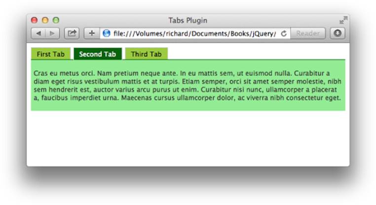
Figure 18.2
In Figure 18.2, you can see that the tabs are laid out in a manner that's more consistent with what you might expect from a tabbed UI. With the addition of the active option with the value of 1, the second content panel is visible by default when the page loads. Theactive option toggles the selected tab, counting from zero.
The class name ui-state-active references the selected tab. The class name ui-state-hover references the tab the mouse cursor is hovering over. Both class names are applied to the <li> elements that eventually become tabs.
When you click the labels in the <ul> element, you toggle between the different content panels. Making tabs requires some structural rules. First, you have a list of items, and in that list you have hyperlinks to anchors.
<ul>
<li>
<a href='#exampleTabFirst'>
<span>First Tab</span>
</a>
</li>
<li>
<a href='#exampleTabSecond'>
<span>Second Tab</span>
</a>
</li>
<li>
<a href='#exampleTabThird'>
<span>Third Tab</span>
</a>
</li>
</ul>
In the preceding snippet of markup, each hyperlink links to an anchor that appears elsewhere in the document, by including a pound sign, followed by that element's id name. Structuring the document in this way makes your scripting unobtrusive. If scripting is disabled, the user can still navigate the tabs by clicking a link to an anchor, instead of toggling the display of a content pane.
Following the list, you have three <div> elements, each having an id name that corresponds to the anchor link, which makes those elements anchors.
<div id='exampleTabFirst'>
<p>
Lorem ipsum dolor sit amet, consectetuer adipiscing elit.
Suspendisse id sapien. Suspendisse rutrum libero sit amet dui.
Praesent pede elit, tincidunt pellentesque, condimentum nec,
mollis et, lacus. Donec nulla ligula, tempor vel, eleifend ut.
</p>
</div>
When you call the tabs() method, jQuery looks at the list and automatically pulls the id names from the hyperlinks.
Loading Remote Content via AJAX
Loading remote content instead of local content is easy to do. The following document shows an example, which is Example 8-3 in the source code download materials, of how to set up a tab that loads remote content using AJAX, instead of having that content already loaded in your document.
<!DOCTYPE HTML>
<html xmlns='http://www.w3.org/1999/xhtml'>
<head>
<meta http-equiv='content-type'
content='application/xhtml+xml; charset=utf-8' />
<meta http-equiv='content-language' content='en-us' />
<title>Tabs Plugin</title>
<script src='../jQuery.js'></script>
<script src='../jQueryUI.js'></script>
<script src='Example 18-3.js'></script>
<link href='Example 18-3.css' rel='stylesheet' />
</head>
<body>
<div id='exampleTabs'>
<ul>
<li>
<a href='#exampleTabFirst'>
<span>First Tab</span>
</a>
</li>
<li>
<a href='#exampleTabSecond'>
<span>Second Tab</span>
</a>
</li>
<li>
<a href='#exampleTabThird'>
<span>Third Tab</span>
</a>
</li>
<li>
<a href='Fourth Tab.html'>
<span>Fourth Tab</span>
</a>
</li>
</ul>
<div id='exampleTabFirst'>
<p>
Lorem ipsum dolor sit amet, consectetuer adipiscing elit.
Suspendisse id sapien. Suspendisse rutrum libero sit amet dui.
Praesent pede elit, tincidunt pellentesque, condimentum nec,
mollis et, lacus. Donec nulla ligula, tempor vel, eleifend ut.
</p>
</div>
<div id='exampleTabSecond'>
<p>
Cras eu metus orci. Nam pretium neque ante. In eu mattis sem,
Ut euismod nulla. Curabitur a diam eget risus vestibulum
mattis et at turpis. Etiam semper, orci sit amet semper
molestie, nibh sem hendrerit est, auctor varius arcu purus ut
enim. Curabitur nisi nunc, ullamcorper a placerat a, faucibus
imperdiet urna. Maecenas cursus ullamcorper dolor, ac viverra
nibh consectetur eget.
</p>
</div>
<div id='exampleTabThird'>
<p>
Mauris sollicitudin, sem non tempor molestie, quam nunc
blandit lectus, quis molestie dui arcu in lectus. In id
fringilla elit. Ut auctor lectus eget orci malesuada, et
lacinia ligula interdum. Pellentesque bibendum, orci eget
euismod scelerisque, nibh nulla posuere mi, quis commodo
purus sem et arcu.
</p>
</div>
</div>
</body>
</html>
A new markup document is created to contain the content of the fourth tab, and it is called Fourth Tab.html, which is also referenced in the href attribute of the <a> element for the new tab in the preceding markup document.
<p>
Quisque tempus euismod justo vitae ultrices. Nam in
ligula sit amet mi molestie luctus. Aenean et
egestas arcu. Mauris dictum tortor sit amet purus
aliquam condimentum. Integer fermentum at odio vitae
sollicitudin.
</p>
The following style sheet is applied to the AJAX-enabled example. This style sheet adds a new rule for a <div> element with the id name ui-tabs-1.
body {
font: 12px 'Lucida Grande', Arial, sans-serif;
background: #fff;
color: rgb(50, 50, 50);
}
div#exampleTabFirst {
background: lightblue;
padding: 5px;
}
div#exampleTabSecond {
background: lightgreen;
padding: 5px;
}
div#exampleTabThird {
background: yellow;
padding: 5px;
}
div#ui-tabs-1 {
background: pink;
padding: 5px;
}
.ui-tabs-hide {
display: none;
}
ul.ui-tabs-nav {
list-style: none;
padding: 0;
margin: 0;
height: 22px;
border-bottom: 1px solid darkgreen;
}
ul.ui-tabs-nav li {
float: left;
height: 17px;
padding: 4px 10px 0 10px;
margin-right: 5px;
border: 1px solid rgb(200, 200, 200);
border-bottom: none;
position: relative;
background: yellowgreen;
}
ul.ui-tabs-nav li a {
text-decoration: none;
color: black;
}
ul.ui-tabs-nav li.ui-tabs-active {
background: darkgreen;
border-bottom: 1px solid darkgreen;
}
ul.ui-tabs-nav li.ui-tabs-active a {
color: white;
outline: none;
}
div.ui-tabs-panel {
display: none;
}
The JavaScript has no changes from Example 18-2 because the bits that enable AJAX loading occur entirely in the markup and in the Tabs plugin.
$(document).ready(
function()
{
$('div#exampleTabs').tabs({
active : 1
});
}
);
Figure 18.3 shows the results.
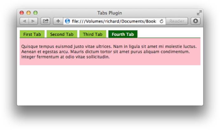
Figure 18.3
In the preceding markup document, there are a few minor modifications made to add a new tab that has content loaded via AJAX. You set up the tab with the href attribute referencing the document that you want to load by AJAX. The id attribute is not necessary and is automatically generated by the Tabs plugin. (It does this for all the tabs if you want to structure your document using automatically generated id names.)
Using a server-side script, you can add logic on the server side that presents content within your normal template depending on whether scripting is enabled on the client side. To do that, by default, make the link content.html?noscript=true. Then, in your JavaScript, automatically remove the query string portion ?noscript=true at page load, which would then signal your server-side script to serve only the content, rather than the content within a template. Without this, if scripting is disabled, your visitors can still see the content; it will simply be plain, unstyled, and unbranded.
Finally, the class name ui-tabs-loading is applied to the <li> element during the time that the content is loading from the server up until the time the Tabs plugin loads and displays it.
Animating Tab Transitions
Most things in jQuery UI can be customized with any of the animation effects provided by jQuery, and the Tabs plugin is no exception. Like the Dialog plugin, the Tabs plugin also accepts show and hide options, which can specify an effect when a tab is opened and when a tab is closed, respectively.
The following script demonstrates how to animate a tab transition:
$(document).ready(
function()
{
$('div#exampleTabs').tabs({
active : 1,
show : 'explode',
hide : 'fade'
});
}
);
The preceding script adds an explode effect when tabs are opened and fades out when tabs are closed. This example is available in this book's source code materials in Example 18-4.html. Comprehensive documentation of animation options is provided in Appendix Q.
Summary
Several additional options can also be used with a Tabs implementation. I've covered some of the more useful options in this chapter, and you can find a full reference of all options available for the Tabs plugin in Appendix Q.
In this chapter, you learned how to implement a tabbed user interface using the jQuery UI Tabs plugin. By default, the Tabs plugin offers no presentational styling. You learned how to approach styling a tabbed user interface so that you can apply your own custom styling. Another option is to use a jQueryUI theme, which you can download from the jQuery UI website at www.jqueryui.com.
You learned that the Tabs plugin supports loading content remotely using AJAX; you need to add only a little markup to accomplish this.
And finally, you also learned that the Tabs plugin supports animated transitions between tabs via the show and hide options.
Exercises
1. Which option would you use to change the default tab that is displayed after the tabs() method has been applied?
2. What class names are used to style the active tab and the hover tab?
3. What do you have to do to load content via an AJAX call?
4. What options can you use to animate tab transitions?
All materials on the site are licensed Creative Commons Attribution-Sharealike 3.0 Unported CC BY-SA 3.0 & GNU Free Documentation License (GFDL)
If you are the copyright holder of any material contained on our site and intend to remove it, please contact our site administrator for approval.
© 2016-2026 All site design rights belong to S.Y.A.