jQuery and JavaScript Phrasebook (2014)
14. Implementing Mobile Web Sites with jQuery
Mobile devices are the fastest growing development platform. Much of that development is geared toward making web sites mobile friendly. Users expect the portability provided by their mobile devices but the robustness that is already implemented in the traditional web sites.
This chapter focuses on using the jQuery Mobile library to help you get moving on creating some clean, cool mobile web pages. The jQuery Mobile library has extensive capabilities. The phrases in this chapter cover the basic structure, syntax, and concepts to help you implement a much wider variety of mobile solutions.
Getting Started with jQuery Mobile
Much of the jQuery Mobile framework is built on extending the current HTML elements with additional functionality. jQuery Mobile builds on the HTML framework by adding data attributes to the HTML elements.
All the data attributes begin with data- and end with some slightly descriptive word of what the attribute means. The jQuery Mobile library’s additional methods, events, styles, and values that fit the mobile needs are attached to the element. You will see this extensively in the examples to come.
Table 14.1 lists many of the attributes along with some of the values they support. The table is a good way to visualize how the data attribute method works and can act as a reference.
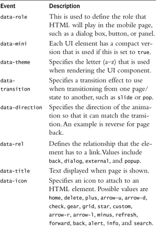
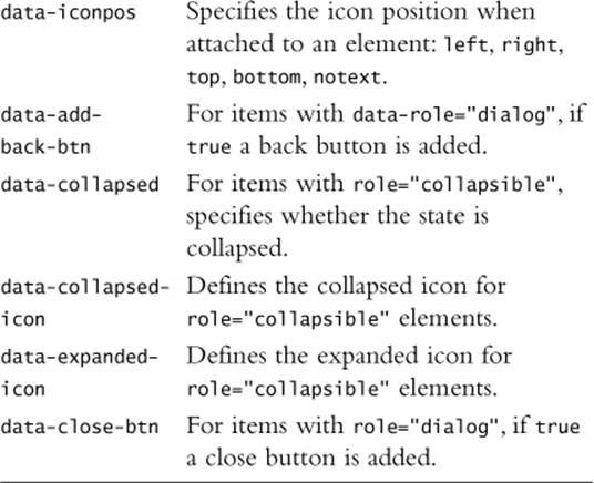
Table 14.1 A Few of the Data Attributes Added in jQuery Mobile
Determining if the Page Is Being Viewed on a Mobile Device
if( /Android|webOS|iPhone|iPad|iPod|BlackBerry/i.test(
navigator.userAgent) ) {
. . . mobile code here . . .
}
You can use the following JavaScript and regex statement to parse the navigator.userAgent value and determine whether a user is coming into your web site on a mobile device:
if( /Android|webOS|iPhone|iPad|iPod|BlackBerry/ i.test(navigator.userAgent) ) { }
The statement parses the userAgent attribute and tries to find the most common strings incorporated in the mobile browsers.
Detecting Mobile Screen Size
$("#contentBody").width(screen.width).height(screen.height);
In today’s mobile world, the fact that a user is on a mobile device is no longer the critical question. The new critical question is this: How much screen space do users have to work? You need to check on the device’s screen size. Does it have a 3-inch, 4-inch, or 11-inch screen? There is a big difference. To get the screen size, use screen.height and screen.width in JavaScript and then adjust your pages dynamically to support that size.
Specifying Different Theme Swatches
<div data-role="header" data-theme="b">
<h1>Teach</h1></div>
<a data-role="button"
data-theme="a" src="next">Next</a>
The CSS files that come with jQuery Mobile include several versions of styling called swatches. A swatch is just a letter assignment that specifies what color scheme to use when rendering the mobile elements. Swatches are typically specified using the data-theme attribute. For example:
<div data-role="header" data-theme="b"><h1>Teach</h1></div>
Handling New Mobile Events
$("#myImage").on("swipeleft", function(e) {
. . .swipe left code . . . });
$(document).on("pageLoad", function(e, data) {
. . . page load code . . . });
$(document).on("pagebeforechange", function(e, data) {
var toPage = data.toPage;
. . . page change code . . . });
One of my favorite features of jQuery Mobile is how easy it is to implement mobile events. The library automatically creates the events and adds them to elements based on the data attributes. If you want to add or remove a specific mobile event, you can do so using the .on() method from jQuery that you are already familiar with.
For example, to add a tap handler to an element #myImage, you would use the following:
$("#myImage").on("swipeleft", function() { });
Table 14.2 lists some of the mobile events and describes their purpose.
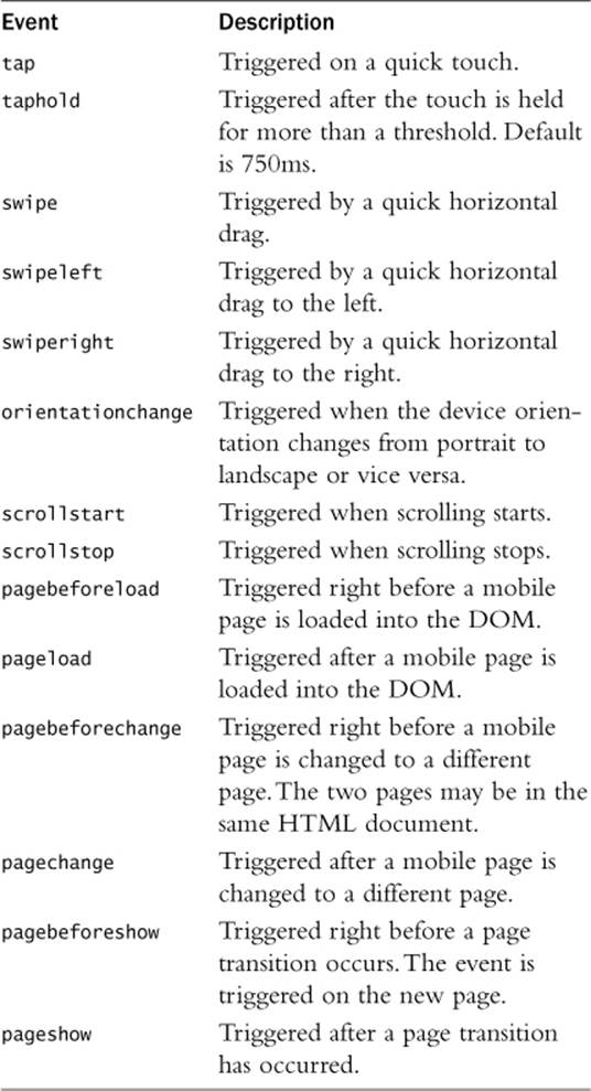
Table 14.2 New Events Added by jQuery Mobile
An important feature included with jQuery mobile is the ability to trigger and handle events linked to changing and loading pages.
When you change pages, the following events are triggered:
 pagebeforechange, pagechange, pagebeforeload, pageload, pageshow, pagehide
When you load pages, the following events are triggered:
pagebeforeload, pageload
These events allow you to implement code to handle new pages being transitioned and prevent pages from being downloaded from the server. The events are implemented as standard jQuery events, and the object passed back to the handler includes things like url, toPage, absUrl,dataUrl, and xhr object as well as the options used for changing pages.
The following code shows an example of adding a pageload event handler:
$(document).on("pageload", function(e, obj){
if($("#pageThree .ui-content").length) {
$("#pageThree .ui-content").append("Page loaded from ."+ obj.url); }
});
By the way
jQuery Mobile also includes several virtual mouse events, such as the mask, the mouse, and touch events, to allow developers to register just the basic mouse events. These work well for the most part, but there are still a few quirks with them. The virtual events arevmouseover, vmouseout, vmousedown, vmousemove, vmouseup, vmouseclick, and vmousecancel.
Changing Pages with jQuery Code
$("#pageTwo").on("swipeleft", function(){
$.mobile.changePage("newPage.html", {transition: "slide", reverse:true}); });
jQuery provides the $.mobile.changePage(URL, options) method to dynamically change pages, where URL is the new page location. Table 14.3 shows the available options for the .changePage() call. The following code is an example of adding a swipeleft event handler to load a remote web page when the user left-swipes the page on the device. Notice that a transition of “slide” is used, and reverse option is set to true:
$("#pageTwo").on("swipeleft", function(){
$.mobile.changePage("newPage.html", {transition: "slide", reverse:true}); });
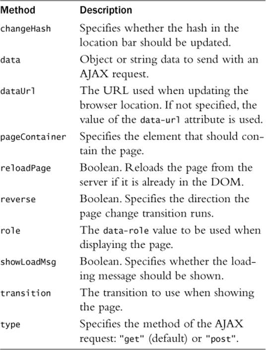
Table 14.3 Options for the .changePage() and .loadPage() Calls
Loading Mobile Pages without Displaying Them
<$.mobile.loadPage("newPage.php",
{data=$("form").serialize(), type="post"});
Another helpful function is .loadPage(URL, options). It downloads the mobile page from the web server using an AJAX call but does not change the mobile page to the downloaded one. Actually, .changePage() calls .loadPage() underneath to retrieve the page. Most of the options listed in Table 14.3 are also available via .loadPage(), except changeHash, dataUrl, reverse, and transition.
The .loadPage() function is useful for preloading pages in the initialization functions that you want available later but do not want to display yet. The following code shows an example of loading a page using POST data from a form:
$.mobile.loadPage("newPage.php",
{data=$("form").serialize(), type="post"});
Defining the Viewport Meta Tag
<meta name="viewport" content="width=device-width,
initial-scale=1">
A critical component of using jQuery Mobile is adding the viewport settings in a <meta> tag inside the page <head> tag. The viewport defines how the browser displays the page zoom level and the dimensions used.
Specifically, you need to set the content="width=device-width, initial-scale=1" as shown next. These settings force the device’s browser to render the web page width at exactly the number of pixels available on the device:
<meta name="viewport" content="width=device-width,
initial-scale=1">
Without specifying the viewport setting, the mobile page is at a much higher size than the screen width, making the page look small. The user can still zoom in on the web page.
Configuring jQuery Mobile Default Settings
<script src="../js/jquery-2.0.3.min.js"></script>
<script>
$(document).bind( "mobileinit", function () {
$.mobile.page.prototype.options.headerTheme = "b";
$.mobile.page.prototype.options.footerTheme = "b";
});
</script>
<script src="../js/jquery.mobile-custom.min.js"></script>
jQuery Mobile is initialized when the library is loaded. Any page elements with jQuery Mobile tags are initialized as well and use the default settings to create mobile versions of the elements.
Occasionally, you may want to override the default settings. To do this, you need to add a mobileinit event handler to the document object before loading the jQuery Mobile library. Then you can add your default override code in that handler function.
I mostly use the mobileinit handler to change the default theme swatches because that can’t be done on the fly after the library has been loaded. The following code shows an example of setting the default header and footer themes:
<script src="../js/jquery-2.0.3.min.js"></script>
<script>
$(document).bind( "mobileinit", function () {
$.mobile.page.prototype.options.headerTheme = "b";
$.mobile.page.prototype.options.footerTheme = "b";
});
</script>
<script src="../js/jquery.mobile-custom.min.js"></script>
Notice that the init <script> is placed after jQuery is loaded but before jQuery Mobile is loaded.
Building Mobile Pages
Creating mobile pages is actually simple. Pages consist of <div> elements that are enhanced in jQuery Mobile using the data tags discussed in the previous chapter. This section focuses on using the data tags to define mobile web pages.
Creating a Mobile Web Page
<div data-role="page">
<div data-role="header"><h1>Header</h1></div>
<div data-role="content" id="content">
<p>Images</p>
<img src="../images/flower.jpg" />
</div>
<div data-role="footer"><h4>Footer</h4></div>
</div>
Mobile pages are composed of three main parts: the header, the footer, and content between them. All three are not necessarily required, but it is a good idea to at least have a header with the content, especially when working with multiple pages.
All these elements are defined by adding data-role attributes to <div> elements. The content inside the <div> elements can be just about anything, including text, images, forms, and lists.
The following code shows an example of creating a simple mobile web page with a header, footer, and text and image content. Figure 14.1 illustrates the look of the web page:
01 <html>
02 <head>
03 <title>Python Phrasebook</title>
04 <meta charset="utf-8" />
05 <meta name="viewport" content="width=device-width,
06 initial-scale=1">
07 <script src="../js/jquery-2.0.3.min.js"></script>
08 <script src="../js/initmobile.js"></script>
09 <script
10 src="../js/jquery.mobile-custom.min.js"></script>
11 <link rel="stylesheet"
12 href="../js/css/jquery.mobile-custom.min.css" />
13 <script>
14 $(document).ready(function() {
15 checkForMobile();
16 });
17 </script>
18 <style>
19 p { text-align:center; font:italic 45px Helvetica;
20 color:blue; margin:5px; }
21 img { width:235px; }
22 </style>
23 </head>
24 <body>
25 <div id="border"><div id="frame"><div data-role="page">
26 <div data-role="header"><h1>Header</h1></div>
27 <div data-role="content" id="content">
28 <p>Yosemite</p>
29 <p>Falls</p>
30 <img src="../images/falls.jpg" />
31 </div>
32 <div data-role="footer"><h4>Footer</h4></div>
33 </div></div></div>
34 </body>
35 </html>
ch1401.html
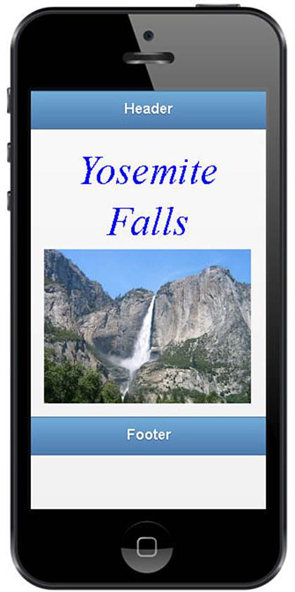
Figure 14.1 Basic mobile web page with a header, a footer, and a comment with text and images from ch1401.html.
Notice that each of the components has a distinct value for data-role. Figure 14.1 shows the resulting mobile web page.
By the way
All the mobile examples included in this chapter contain <div id="border"><div id="frame"> elements in the HTML <body> and a call to checkForMobile() in the jQuery code. The checkForMobile() code is located in the included initmobile.jsfile I created. It styles those elements for non-mobile browsers so that a phone image is displayed as the background. I used this to capture the images for this chapter. I also use this concept with mobile development because I can see in my development browser. I then test on an actual device.
Creating Fixed Headers and Footers
<div data-role="header" data-position="fixed">
<h1>Header</h1></div>
...
<div data-role="footer" data-position="fixed">
<h4>Footer</h4></div>
By default, both the header and the footer flow with the content, meaning that if you scroll the content up or down, the header scrolls with the content. Often, you want the header, footer, or both to stay in a fixed position on the device screen so that it is always displayed. jQuery Mobile makes that adjustment simple to make.
To make the header or footer—or a toolbar for that matter—fixed, all you have to do is add the data-position="fixed" attribute to the <div>. This make them stay in place, the header at the top of the page and the footer at the bottom regardless of how the content scrolls.
Implementing Mobile Sites with Multiple Pages
Mobile sites are composed of either a single HTML document with multiple <div data-role="page"> elements or multiple HTML documents with those elements. Each <div> element represents a single mobile page.
When using multiple pages in your mobile web site, you need to implement code and UI controls to provide ways for the user to transition from one mobile page to another. The transitions should be smooth and intuitive based on the controls and content interaction.
You can change mobile pages by linking to the second page from the first using one of two methods: adding navigation buttons or programmatically changing the page in your jQuery code.
The pages can come from <div> elements in the same web page or external URLs downloaded to the device. The following phrases describe the methods of implementing multiple page mobile sites.
Adding Navigation Buttons
<a href="#page2" data-role="button">Page2</a>
<a href="hour2201-page3.html" data-role="button">Page</a>
Navigation buttons are links to other mobile pages. Typically, navigation buttons are added to the header or footer element for easy visibility. However, you can also place them inside the mobile content.
Navigation buttons are created by adding the data-role="button" attribute to an <a> link. The href attribute should point to the hash tag or URL of the mobile page you want to switch to. The following code shows the syntax for defining an <a> tag as a navigation link for a local link:
<a href="#page2" data-role="button">Page2</a>
The following code shows the syntax for defining an <a> tag as a navigation link for a remote link:
<a href="hour2201-page3.html" data-role="button">Page3</a>
Positioning Navigation Buttons
<a href="#page3" data-role="button"
class="ui-btn-right">Next</a>
<a href="#page1" data-role="button"
class="ui-btn-left">Prev</a>
You can position the button on the left or right side of the header or footer, adding the .ui-btn-right or .ui-btn-left class to the <a>. This applies jQuery Mobile CSS styles to position the button on the right or left side of the header or footer.
Adding Page Change Transitions
. . . in HTML . . .
<a data-role="button" data-transition="slide">Next</a>
<a data-role="button" data-transition="slide"
data-direction="reverse">Prev</a>
. . . in jQuery . . .
$.mobile.changePage("#next", {transition:"slide" }); });
$.mobile.changePage("#prev", {transition:"slide",
reverse:true }); });
Transitions are added to page changes by adding the data-transition attribute to the <a> link or other element that is generating the transition. You can also specify transition in the options element if you are calling .changePage(). For example:
<a data-role="button" data-transition="slide">Next</a>
or
$.mobile.changePage("#next", {transition:"slide" }); });
You can also reverse the direction of the transition, which is especially useful if you want the screen to look like it is scrolling backward to a previous page. To change the direction of the transition, use data-direction="reverse" in the <a> tag or add reverse:true to the.changePage() options. For example:
<a data-role="button" data-transition="slide"
data-direction="reverse">Prev</a>
or
$.mobile.changePage("#prev", {transition:"slide",
reverse:true }); });
Creating a Back Button
<a data-rel="back data-role="button"
class="ui-btn-right">Next</a></div>
Another useful feature included in jQuery Mobile is the ability to define a navigation button as a back button. A back button uses the browser history to navigate to the previous button mobile page. To define a link as a back button, you need to add the data-rel="back" attribute. For example:
<a data-rel="back data-role="button" class="ui-btn-right">Next</a></div>
Notice that there is not an href attribute. That is because the href attribute will be ignored; instead, the most recent URL will be popped off the browser’s navigation history list.
Changing Pages with Swipe Event Handlers
$("#image").on("swipe", function(){
. . . swipe code here . . .
});
$("#pageTwo").on("swipeleft", function(){
$.mobile.changePage("#page3", {transition:"slide"}); });
$("#pageTwo").on("swiperight", function(){
$.mobile.changePage("#page1", {transition:"slide", reverse:true}); });
The second method is to use the use the $.mobile.changePage(URL, options) function call, where the URL is the link location. Table 14.3 shows the available options for the .changePage() call.
The following is an example of adding a swipeleft event handler to load a remote web page when the user left-swipes the page on the device. Notice that a transition of "slide" is used, and the reverse option is set to true to make the transition slide to the left:
$("#pageTwo").on("swipeleft", function(){
$.mobile.changePage("#page3", {transition:"slide", reverse:true}); });
The following is an example of adding a swiperight event handler to load a remote web page when the user right-swipes the page on the device. Notice that a transition of "slide" is used, but the reverse option is not set:
$("#pageTwo").on("swiperight", function(){
$.mobile.changePage("#page1", {transition:"slide" }); });
Adding Navigation Buttons and Swipe Events Example
The following code shows a full example of implementing navigation buttons and swipe events to traverse three different pages. The code in lines 14–27 implement swipe event handlers that call .changePage() with transitions to handle finger swipes. Lines 38–47 implement the first mobile page, lines 48–59 implement the second mobile page, and lines 60–68 implement the third. Each of the pages has one or two navigation buttons in the header. Figure 14.2 illustrates the multipage app:
01 <html>
02 <head>
03 <title>Python Phrasebook</title>
04 <meta charset="utf-8" />
05 <meta name="viewport" content="width=device-width,
06 initial-scale=1">
07 <script src="../js/jquery-2.0.3.min.js"></script>
08 <script src="../js/initmobile.js"></script>
09 <script
10 src="../js/jquery.mobile-custom.min.js"></script>
11 <link rel="stylesheet"
12 href="../js/css/jquery.mobile-custom.min.css" />
13 <script>
14 $(document).ready(function() {
15 checkForMobile();
16 $("#page1").on("swipeleft", function(){
17 $.mobile.changePage("#page2",
18 {transition:"slide"}); });
19 $("#page2").on("swiperight", function(){
20 $.mobile.changePage("#page1",
21 {transition:"slide", reverse:true}); });
22 $("#page2").on("swipeleft", function(){
23 $.mobile.changePage("#page3",
24 {transition:"slide", }); });
25 $("#page3").on("swiperight", function(){
26 $.mobile.changePage("#page1",
27 {transition:"slide", reverse:true}); });
28 });
29 </script>
30 <style>
31 p { text-align:center; font:italic 45px Helvetica;
32 color:blue; margin:5px; }
33 img { width:235px; }
34 </style>
35 </head>
36 <body>
37 <div id="border"><div id="frame">
38 <div data-role="page" id="page1">
39 <div data-role="header"><h1>Page 1</h1>
40 <a data-role="button" href="#page2"
41 data-transition="slide"
42 class="ui-btn-right">Page 2</a>
43 </div>
44 <div data-role="content">
45 <p>Arches NP</p><img src="../images/arch.jpg"/>
46 </div>
47 </div>
48 <div data-role="page" id="page2">
49 <div data-role="header"><h1>Page 2</h1>
50 <a data-role="button" href="#page1"
51 data-transition="slide"
52 data-direction="reverse">Page 1</a>
53 <a data-role="button" href="#page3"
54 data-transition="slide">Page 3</a>
55 </div>
56 <div data-role="content">
57 <p>TiKal</p><img src="../images/ pyramid2.jpg"/>
58 </div>
59 </div>
60 <div data-role="page" id="page3">
61 <div data-role="header"><h1>Page 3</h1>
62 <a data-role="button" href="#page2"
63 data-transition="slide"
64 data-direction="reverse">Page 2</a>
65 </div>
66 <div data-role="content">
67 <p>Sunset</p><img src="../images/jump.jpg" /></div>
68 </div>
69 </div></div>
70 </body>
71 </html>
ch1402.html
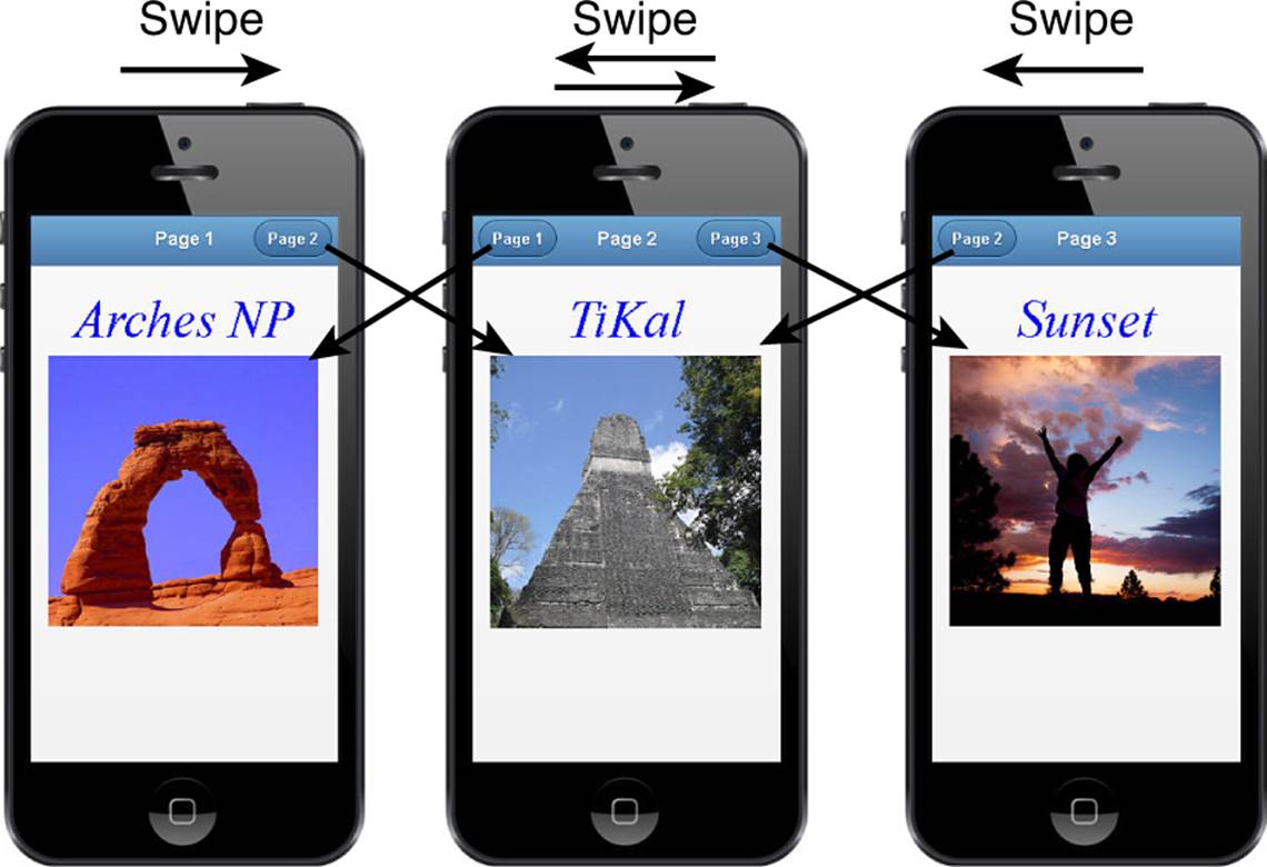
Figure 14.2 Multipage web site that allows you to navigate using navigation buttons or page swipes ch1402.html.
Creating a Navbar
<div data-role="navbar" >
<ul>
<li><a href="#pageTwo">Page 2</a></li>
<li><a href="#pageThree">page 3</a></li>
<li><a href="#pageFour">page 4</a></li>
</ul>
</div>
Another method of navigating pages is a navbar. A navbar is a set of buttons grouped together in a single bar element. Each button links to a different mobile page.
Navbars are defined by adding the role="navbar" to a <div> and then adding a list of pages to link to using <ul>, <li>, and <a> elements. For example, the following code renders a navbar similar to the one in Figure 14.2:
<div data-role="navbar" >
<ul>
<li><a href="#pageTwo">Page 2</a></li>
<li><a href="#pageThree">page 3</a></li>
<li><a href="#pageFour">page 4</a></li>
</ul>
</div>
The navbar <div> can be placed anywhere; you can put it in the header as shown in Figure 14.3, in the footer, with the content, or it can stand alone between the other sections of the mobile page. A common place to put the navbar is in a fixed footer. This allows the navbar to remain present even as the content scrolls.
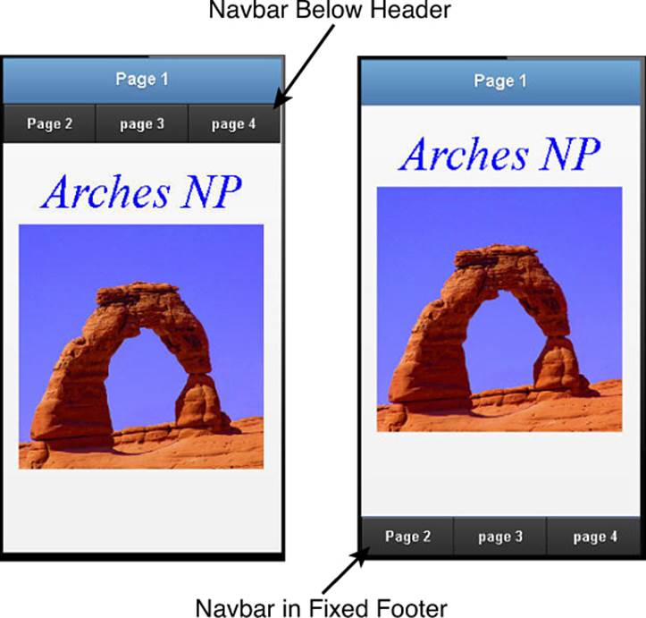
Figure 14.3 Mobile web page with navbar below the header and as a fixed footer.
Applying a Grid Layout
<div class="ui-grid-a">
<div class="ui-block-a">Row 1 Column 1</div>
<div class="ui-block-b">Row 1 Column 2</div>
<div class="ui-block-a">Row 2 Column 1</div>
<div class="ui-block-b">Row 2 Column 2</div>
</div>
One of the basic layouts provided by jQuery Mobile is the grid. The idea behind the grid layout is to split the page into equal-sized blocks, similar to an HTML table. You can then place content in those blocks, and they are automatically laid out correctly.
To add a grid layout, you need to add a <div class="ui-grid-#">, where # specifies the number of columns to include. The values are a (2 columns), b (3 columns), c (4 columns), and so on. For example, the following defines a three-column grid:
<div class="ui-grid-b"> </div>
Items are added to the grid by specifying a <div ui-block-#>, where # is the column letter, a (first), b (second), and so on. The first time a column letter is specified, the item is placed in row 1 of the grid in that column position. The second time it is placed in row 2. For example, to create a 2×2 grid, use the following code:
<div class="ui-grid-a">
<div class="ui-block-a">Row 1 Column 1</div>
<div class="ui-block-b">Row 1 Column 2</div>
<div class="ui-block-a">Row 2 Column 1</div>
<div class="ui-block-b">Row 2 Column 2</div>
</div>
You can also create a single-column grid using <div class="ui-grid-solo">. For example:
<div class="ui-grid-solo">
<div class="ui-block-a"><p id="number"></p></div>
</div>
The best way to demonstrate how grid layouts work is to show you a practical example. The following code implements three different grid layouts in a single page to build a basic calculator app, shown in Figure 14.4. The first is a basic single-item grid with a number display, and then a 3×4 grid with calculator digit elements. The last grid is a 5×1 grid with calculator buttons:
01 <html>
02 <head>
03 <title>Python Phrasebook</title>
04 <meta charset="utf-8" />
05 <meta name="viewport" content="width=device-width,
06 initial-scale=1">
07 <script src="../js/jquery-2.0.3.min.js"></script>
08 <script src="../js/initmobile.js"></script>
09 <script src="../js/jquery.mobile.js"></script>
10 <link rel="stylesheet"
11 href="../js/css/jquery.mobile.css" />
12 <script>
13 $(document).ready(function() {
14 $(document).ready(function() {
15 checkForMobile();
16 $("p").on("click", function(){
17 $("#number").append($(this).html()); });
18 $("span").on("click", function(){
19 if ($(this).html() === "="){
20 $("#number").html(eval($("#number").html()));
21 } else {$("#number").html(""); };
22 });
23 });
24 });
25 </script>
26 <style>
27 p, span { margin:2px; border-radius:15px;
28 background-color:#888888; color:white;}
29 p, span { font:bold 30px/50px arial;
30 text-align:center; border:3px ridge blue;}
31 #number { background-color:black; min-height:50px;
32 text-align:right; padding-right:5px; }
33 span { background-color:#555555; display:block; }
34 #logic span { background-color:#B10000; }
35 #logic p { background-color:#0066AA; }
36 </style>
37 </head>
38 <body>
39 <div id="border"><div id="frame">
40 <div data-role="header"><h1>Grid Page</h1></div>
41 <div data-role="content">
42 <div class="ui-grid-solo">
43 <div class="ui-block-a"><p id="number"></p></div>
44 </div>
45 <div class="ui-grid-b">
46 <div class="ui-block-a"><p>1</p></div>
47 <div class="ui-block-b"><p>2</p></div>
48 <div class="ui-block-c"><p>3</p></div>
49 <div class="ui-block-a"><p>4</p></div>
50 <div class="ui-block-b"><p>5</p></div>
51 <div class="ui-block-c"><p>6</p></div>
52 <div class="ui-block-a"><p>7</p></div>
53 <div class="ui-block-b"><p>8</p></div>
54 <div class="ui-block-c"><p>9</p></div>
55 <div class="ui-block-a"><span>C</span></div>
56 <div class="ui-block-b"><p>0</p></div>
57 <div class="ui-block-c"><span>CE</span></div>
58 </div>
59 <div class="ui-grid-d" id="logic">
60 <div class="ui-block-a"><p>+</p></div>
61 <div class="ui-block-b"><p>-</p></div>
62 <div class="ui-block-c"><p>*</p></div>
63 <div class="ui-block-d"><p>/</p></div>
64 <div class="ui-block-e"><span>=</span></div>
65 </div>
66 </div>
67 </div></div>
68 </body>
69 </html>
ch1403.html
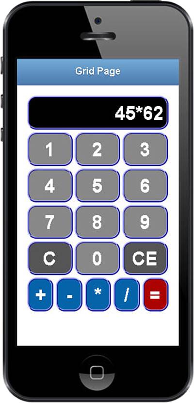
Figure 14.4 Using the jQuery Mobile grid layout to implement a basic calculator app in ch1403.html.
Implementing Listviews
One of the most common ways to organize mobile content is with listviews. Listviews organize the content into scrollable, linkable lists that are easy to view and navigate. jQuery UI does a great job of providing a framework to easily implement listviews in your code.
The application of listviews varies a lot depending on the amount and type of data that is being placed in them. To handle this, jQuery provides an array of different types of lists. The following sections cover the most commonly used.
Watch out!
If you dynamically add items to lists, tables, and so on in jQuery code, you need to call the refresh() action on that element to refresh the contents with jQuery Mobile.
Creating a Basic Listview
<ul data-role="listview">
<li><a href="#one">Link 1</a></li>
<li><a href="#two">Link 2</a></li>
<li>Non Linkable Item</li>
</ul>
Lists are created by adding the data-role="listview" to a <ul> or <ol> element. jQuery automatically handles formatting the <li> elements into a list form. For <ol> elements, the formatted listview contains the numbering for each line item.
Using Nested Lists
<ul data-role="listview" >
<li>Hobbits<ul><li>Frodo</li><li>Sam</li>
<li>Bilbo</li></ul></li>
<li>Elves<ul><li>Legolas</li><li>Elrond</li>
<li>Galadriel</li></ul></li>
<li>Men<ul><li>Aragorn</li><li>Boromir</li>
<li>Theoden</li></ul></li>
</ul>
Nested lists are created by nesting additional <ul> elements inside the listview. jQuery Mobile automatically detects this and builds up linkable pages to the sublists. The following code shows an example of implementing nested lists, as shown in Figure 14.5:
01 <html>
02 <head>
03 <title>Python Phrasebook</title>
04 <meta charset="utf-8" />
05 <meta name="viewport" content="width=device-width,
06 initial-scale=1">
07 <script src="../js/jquery-2.0.3.min.js"></script>
08 <script src="../js/initmobile.js"></script>
09 <script src="../js/jquery.mobile.js"></script>
10 <link rel="stylesheet"
11 href="../js/css/jquery.mobile.css" />
12 <script>
13 $(document).ready(function() {
14 checkForMobile();
15 });
16 </script>
17 </head>
18 <body>
19 <div id="border"><div id="frame">
20 <div data-role="page" id="nested">
21 <div data-role="header"><h1>Nested List</h1></div>
22 <div data-role="content">
23 <ul data-role="listview">
24 <li>Hobbits<ul><li>Frodo</li><li>Sam</li>
25 <li>Bilbo</li></ul></li>
26 <li>Elves<ul><li>Legolas</li><li>Elrond</li>
27 <li>Galadriel</li></ul></li>
28 <li>Men<ul><li>Aragorn</li><li>Boromir</li>
29 <li>Theoden</li></ul></li>
30 </ul></div></div>
31 </div></div>
32 </body>
33 </html>
ch1404.html
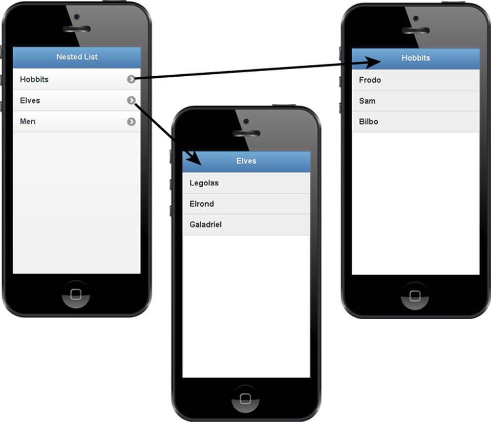
Figure 14.5 Applying nested lists using the jQuery Mobile code in ch1404.html.
Implementing Split Button List
<ul data-role="listview">
<li><a href="#">Jeep</a><a href="#" data-icon="star">Like</a></li>
<li><a href="#">Ford</a><a href="#" data-icon="star">Like</a></li>
<li><a href="#">Chevy</a><a href="#" data-icon="star">Like</a></li>
</ul>
Split-button lists are lists that include multiple options on each line. This can be useful in a variety of ways. When listing products for sale, the main part can link to more details and the secondary link can add the item to the cart. To create a split-button list, create two <a> elements in the<li> item.
Adding Dividers to Lists
<ul data-role="listview" >
<li data-role="list-divider">Numbers</li>
<li>1</li><li>2</li><li>3</li>
<li data-role="list-divider">Letters</li>
<li>A</li><li>B</li><li>C</li>
</ul>
. . .
<ul data-role="listview" data-autodividers="true">
<li>Alex</li><li>Alice</li><li>Brad</li><li>DaNae </li><li>David</li>
<li>Isaac</li><li>Jordan</li><li>Nancy</li>
</ul>
A divided list is one in which elements of the list are divided from each other by a simple bar. The idea is to make it easier for the user to see the list items by splitting up the view.
You can create divided lists manually by injecting your own dividers and adding a data-role="list-divider" to one of the <li> elements. For example:
<ul data-role="listview" >
<li data-role="list-divider">Numbers</li>
<li>1</li><li>2</li><li>3</li>
<li data-role="list-divider">Letters</li>
<li>A</li><li>B</li><li>C</li>
</ul>
You can also automatically add dividers by adding data-autodividers="true" to the <ul> element. This splits the elements every time the first character changes and creates a divider for that letter. For example, the following code adds an autodivider:
<ul data-role="listview" data-autodividers="true">
<li>Alex</li><li>Alice</li><li>Brad</li><li>DaNae</li><li>David</li>
<li>Isaac</li><li>Jordan</li><li>Nancy</li>
</ul>
Implementing a Searchable List
<ul data-role="listview" data-filter="true">
<li>Rome</li><li>Milan</li><li>Florence</li><li>Genoa</li><li>Venice</li>
<li>Naple</li><li>Balonga</li><li>Bari</li><li>Turin</li><li>Palermo</li>
</ul>
Another useful feature is the searchable list. jQuery Mobile has a nice search feature built in that allows you to search the current list. The search feature adds a text input at the top of the list and filters the items as you type text into the list. Only the items that match the filter text are displayed.
Searchable lists are created by adding data-filter= "true" to the <ul> element containing the list. For example, the following code adds a searchable list:
<ul data-role="listview" data-filter="true">
<li>Rome</li><li>Milan</li><li>Florence</li><li>Genoa</li><li>Venice</li>
<li>Naple</li><li>Balonga</li><li>Bari</li><li>Turin</li><li>Palermo</li>
</ul>
Using Collapsible Blocks and Sets
<div data-role="collapsible" data-collapsed="false">
<h3>Photo Information</h3>
<p>Single Content.</p>
</div>
<div data-role="collapsible-set">
<div data-role="collapsible">
<h3>Image 1</h3><img src"1.jpg" /></div>
<div data-role="collapsible" >
<h3> Image 2</h3><img src="2.jpg" /></div>
<div data-role="collapsible">
<h3> Image 3</h3><img src="3.jpg" /></div>
</div>
Another useful way to represent content is by dividing it into collapsible elements. A header is presented that the user can see, but the content the header represents is hidden until the header is clicked.
This allows you to show and hide the content in-line rather than linking to another page. Collapsible elements can be represented as a stand-alone block or as a set of connected blocks.
To create a collapsible item, all you need to do is add data-role="collapsible" to a <div> element. The <div> element needs to have a header to display in a bar when it’s collapsed. To group items, you add multiple <div data-role="collapsible"> elements inside a<div data-role="collapsible-set"> element.
To force an item to be expanded, add data-collapsed= "false". This sets the initial state to expanded, although you can still collapse and expand it by clicking on the header.
Also, you can control the themes used to render the collapsible sets using data-theme to define the header and data-content-theme to define the collapsed content.
Adding Auxiliary Content to Panels
<div data-role="panel" id="config"
data-position="right" data-display="reveal">
<div data-role="header" data-theme="a">
<h3>Panel</h3></div>
<h3>Settings</h3>
<label for="Option1">Option 1</label>
<input type="checkbox" id="Option1"></input>
<label for="Option2">Option 2</label>
<input type="checkbox" id="Option2"></input>
<a data-role="button" data-icon="delete"
data-rel="close" data>Close Config</a>
</div>
A useful way to present data that is not necessarily part of the page but is relevant is panels. A panel is similar to the page but sits off to the left or right side. When opened, the panel reveals the additional information.
Panels are defined using data-role="page" and must be siblings to the header, content, and footer elements inside a mobile page. Panels are opened by linking to the id value, similar to opening a new page. When the link is clicked, the panel is displayed using one of the following three display modes:
 data-display="overlay"—Panel elements overlay the existing page with a transparent background.
data-display="push"—Panel content “pushes” the existing page as it is exposed.
data-display="reveal"—Panel sits under the current page and is revealed as the current page slides away.
The panel is positioned using data-position="right" or data-position="left". When opened, it scrolls with the page. You can force a fixed position using data-position-fixed="true", in which case the panel contents appear relative to the screen and not the scroll position.
To close the panel, add a link button with the <a data-rel="closed"> attribute set to the panel page. You can also close a panel from jQuery code using the following:
$( "#panelId" ).panel( "close" );
Working with Popups
<div data-role="panel" id="config"
data-position="right" data-display="reveal">
<div data-role="header" data-theme="a">
<h3>Panel</h3></div>
<h3>Settings</h3>
<label for="Option1">Option 1</label>
<input type="checkbox" id="Option1"></input>
<label for="Option2">Option 2</label>
<input type="checkbox" id="Option2"></input>
<a data-role="button" data-icon="delete"
data-rel="close" data>Close Config</a>
</div>
One of your best friends when implementing mobile page content is the popup. A popup is different from a panel in that it can be displayed anywhere on the page that’s currently being viewed. This allows you to add additional bits of extra information that the user can easily click and see.
Popups are defined using data-role="popup" and can be placed anywhere inside the content of a mobile page. Popups are also opened by linking to the ID value of the <div data-role="popup"> tag. However, you must add a data-rel="popup" to the <a> tag that links to the popup. You can also manually open a popup using the following from jQuery code:
$("#popupId").popup();
The popup is positioned using data-position-to attribute that can be set to window, origin, or the #id of an element. jQuery Mobile tries to center the popup over that element.
To close the popup, simply click on the page somewhere other than the popup. Also, you can add a Close button to the popup <div> by adding the data-rel="back" attribute. For example, the following code adds a Close button and specifies the delete icon and notext:
<a href="#" data-rel="back" data-role="button" data-theme="a"
data-icon="delete" data-iconpos="notext" class="ui-btn-right">Close</a>
The following shows an example creating a popup menu of links that tie to photo popups, as illustrated in Figure 14.6. One thing to note is that the image popup has a class="photopopup". This provides class settings to style the image popup container.
01 <html>
02 <head>
03 <title>Python Phrasebook</title>
04 <meta charset="utf-8" />
05 <meta name="viewport" content="width=device-width,
06 initial-scale=1">
07 <script src="../js/jquery-2.0.3.min.js"></script>
08 <script src="../js/initmobile.js"></script>
09 <script src="../js/jquery.mobile.js"></script>
10 <link rel="stylesheet"
11 href="../js/css/jquery.mobile.css" />
12 <script>
13 $(document).ready(function() {
14 checkForMobile();
15 });
16 </script>
17 <style>
18 .photopopup img { width:220px; }
19 #menu-popup {width:200px; }
20 </style>
21 </head>
22 <body>
23 <div id="border"><div id="frame">
24 <div data-role="page" id="pageOne">
25 <div data-role="header"><h1>Popups</h1></div>
26 <div data-role="content">
27 <a data-role="button" href="#menu" data-rel="popup"
28 id="menuLink">Popup Menu</a>
29 <div data-role="popup" id="menu"
30 data-position-to="#menuLink">
31 <ul data-role="listview">
32 <li><a href="#photo1" data-rel="popup"
33 id="imageLink">Image 1</a></li>
34 <li><a href="#photo2" data-rel="popup"
35 id="imageLink">Image 2</a></li>
36 </ul></div>
37 <div data-role="popup" id="photo1"
38 data-position-to="window" class="photopopup">
39 <a href="#" data-rel="back" data-role="button"
40 data-icon="delete" data-iconpos="notext"
41 class="ui-btn-right">Close</a>
42 <img src="../images/falls.jpg" /></div>
43 <div data-role="popup" id="photo2"
44 data-position-to="window" class="photopopup">
45 <a href="#" data-rel="back" data-role="button"
46 data-icon="delete" data-iconpos="notext"
47 class="ui-btn-right">Close</a>
48 <img src="../images/peak.jpg" /></div>
49 </div>
50 </div>
51 </div></div>
52 </body>
53 </html>
ch1405.html
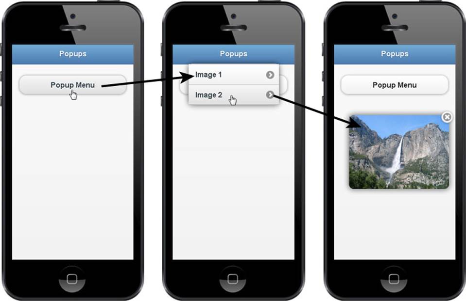
Figure 14.6 Creating a menu popup that links to photo popups using jQuery Mobile code in ch1405.html.
Building Mobile-Friendly Tables
<table data-role="table" data-mode="reflow"
id="parkTable">
. . . or . . .
<table data-role="table" data-mode="columntoggle"
id="parkTable">
<thead><tr><th>Park</th>
<th data-priority="1">State</th>
<th data-priority="2">Est.</th>
<th data-priority="3">Photo</th></tr>
</thead>
<tbody>
<tr><td>Yellowstone</th><td>MT</td><td>1872</td>
<td><img src="bison.jpg" width="100" /></tr>
<tr><td>Yosemite</th><td>CA</td><td>1872</td><td>
<img src="falls.jpg" width="100" /></tr>
<tr><td>Zion</th><td>UT</td><td>1919</td><td>
<img src="peak.jpg" width="100" /></tr>
</tbody>
</table>
jQuery Mobile adds a data-mode attribute to the <table> tag to allow for mobile-friendly tables. There are two types of ways to make a table mobile-friendly.
The first is to reduce thenumber of columns displayed, and the second is to collapse rows into column sets so they can be stacked on each other. This is done by adding the data-role="table" and data-mode="reflow" to the <table> tag. Cells in the table are repositioned so that they flow with the rest of the page. In reflow mode, when the table is 2 columns wide, the columns are broken up into individual and cells stacked on top of each other. Then the headers in the column are added as labels to the cells so that each cell contains the column header to the left to identify the value.
The second solution is to add a data-mode="column-toggle" to the <table> tag. This provides the user with a popup menu so the user can enable/disable columns to display. The columns that can be enabled/disabled in columntoggle mode are designated by adding a data-priority=# attribute to the <th> items in the first <tr> of the <thead> element. You cannot disable columns without the data-priority. The # value of data-priority ranges from 1 (highest) to 6 (lowest).
Creating Mobile Forms
jQuery Mobile introduces several attributes for elements that extend and define the behavior to support mobile devices. Table 14.4 lists some of those attributes that you need to be familiar with as you implement mobile forms. The list is not comprehensive.
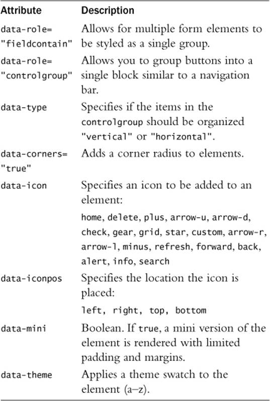
Table 14.4 jQuery Mobile Data Attributes for Form Elements
Adding/Hiding Labels
<div data-role="fieldcontain" class="ui-hide-label">
<label for="username">Username:</label>
<input type="text" name="username" id="username"
value="" placeholder="Username"/>
</div>
Labels are required on form inputs in jQuery Mobile. This allows the library to format the form elements appropriately for mobile devices. Therefore, you need to add a label and use the for attribute to link it to the form input. The good news is that jQuery mobile provides a class that you can easily hide the label with.
Disabling Form Elements
<input type="text" name="username" id="username" value=""
placeholder="Username" class="ui-disabled" />
You can disable form elements by adding the ui-disabled class to them in the HTML definition or programmatically in your jQuery code. Disabling the elements prevents the control from accepting input from the user. Also, jQuery Mobile has special styling that is applied to disabled controls to make it apparent to the user that the form element cannot be used.
Refreshing Form Elements
var mySelect = $("#mySelect");
mySelect [0].selectedIndex = 1;
mySelect.selectmenu("refresh");
$("#myCheckbox").prop("checked",true).checkboxradio("refresh");
$("#myRadio").prop("checked",true).checkboxradio("refresh");
$("#mySlider").val(100).slider("refresh");
When programmatically changing items in a form, such as adding options to a select, you need to call the refresh function on the item. Following are some examples of adjusting form elements using jQuery and then refreshing them.
Adding Form Elements
jQuery Mobile elements are for the most part standard. jQuery Mobile formats them for better display on mobile devices. However, there are a few data attributes that you should be aware of:
data-role="fieldcontain"—Add to a container class around multiple form elements. Helps mobile elements, especially <label> elements, track closer.
class="ui-hide-label">—Adding this class to a fieldcontain container causes the label to hide.
data-role="button"—Forces <a> links to be displayed as mobile buttons.
data-icon—Specifies an icon that can be added to a button or link.
data-iconpos—Specifies the location of the icon.
data-role="controlgroup"—Add to a container class around multiple form elements. The elements are rendered as a single set. You can also add data-type="horizontal" and data-type="vertical to define whether the buttons are stacked on top of each other or in a row.
The best way to illustrate a mobile form is to show you an example. The following code implements several of the HTML form elements and applies the jQuery Mobile attributes to them. The rendered version of the form is shown in Figure 14.7:
01 <html>
02 <head>
03 <title>Python Phrasebook</title>
04 <meta charset="utf-8" />
05 <meta name="viewport" content="width=device-width,
06 initial-scale=1">
07 <script src="../js/jquery-2.0.3.min.js"></script>
08 <script src="../js/initmobile.js"></script>
09 <script src="../js/jquery.mobile.js"></script>
10 <link rel="stylesheet"
11 href="../js/css/jquery.mobile.css" />
12 <script>
13 $(document).ready(function() {
14 checkForMobile();
15 });
16 </script>
17 <style>
18 </style>
19 </head>
20 <body>
21 <div id="border"><div id="frame">
22 <div data-role="page" id="pageOne">
23 <div data-role="header"><h1>Form</h1></div>
24 <div data-role="content">
25 <div data-role="controlgroup"
26 data-type="horizontal" data-mini="true">
27 <button data-icon="grid"
28 data-iconpos="notext">b</button>
29 <button data-icon="gear"
30 data-iconpos="notext">b</button>
31 <button data-icon="star"
32 data-iconpos="notext">b</button>
33 </div>
34 <div data-role="fieldcontain" class="ui-hide-label">
35 <label for="search">Search</label>
36 <input type="search" name="search"
37 id="search" value="" />
38 </div>
39 <div data-role="fieldcontain" class="ui-hide-label">
40 <input type="text" name="username" id="username"
41 placeholder="your name here"/>
42 <label for="username">Name</label>
43 </div>
44 <fieldset data-role="controlgroup" data-mini="true">
45 <input type="radio" name="rc" id="rc1" value="rc1"/>
46 <label for="rc1">Family</label>
47 <input type="radio" name="rc" id="rc2" value="rc2"/>
48 <label for="rc2">Friend</label>
49 </fieldset>
50 <div data-role="controlgroup" data-type="horizontal"
51 data-mini="true" data=theme="a">
52 <input type="checkbox" name="hcb" id="hcb1" />
53 <label for="hcb1">Post</label>
54 <input type="checkbox" name="hcb" id="hcb2" />
55 <label for="hcb2">Link</label>
56 <input type="checkbox" name="hcb" id="hcb3" />
57 <label for="hcb3">Share</label>
58 </div>
59 <div data-role="fieldcontain" class="ui-hide-label">
60 <label for="area">Comments:</label>
61 <textarea name="textarea" id="area" data-theme="a">
62 Comments</textarea>
63 </div>
64 <button data-inline="true"
65 data-theme="b">Accept</button>
66 <button data-inline="true"
67 data-theme="e">Decline</button>
68 </div>
69 </div></div>
70 </body>
71 </html>
ch1406.html
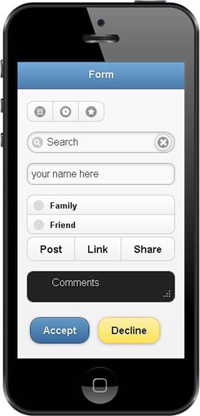
Figure 14.7 Creating basic mobile form elements using the jQuery Mobile code in ch1406.html.
All materials on the site are licensed Creative Commons Attribution-Sharealike 3.0 Unported CC BY-SA 3.0 & GNU Free Documentation License (GFDL)
If you are the copyright holder of any material contained on our site and intend to remove it, please contact our site administrator for approval.
© 2016-2026 All site design rights belong to S.Y.A.