JavaScript and jQuery for Data Analysis and Visualization (2015)
PART III Visualizing Data Programmatically
Chapter 10 Building Custom Charts with Raphaël
What's In This Chapter
· The SVG library Raphaël
· gRaphaël, a charting plug-in for Raphaël
· An example of how to extend Raphaël to create a custom donut chart
CODE DOWNLOAD The wrox.com code downloads for this chapter are found at www.wrox.com/go/javascriptandjqueryanalysis on the Download Code tab. The code is in the chapter 10 download and individually named according to the names throughout the chapter.
As developers, we're fortunate to have a variety of excellent charting solutions at our fingertips. Nine times out of ten, these libraries and plug-ins provide all the functionality our apps need.
But what about those times you want something more? In these cases, you have two options: Write something from scratch or extend an existing script. Although reinventing the wheel can be tempting, it's usually best to save time and start with an already-built project.
This chapter first introduces the SVG library Raphaël, which provides an excellent foundation for creating custom graphics. You then explore gRaphaël, a charting plug-in for Raphaël that you can use to create simple visualizations such as pie charts and bar graphs.
Finally, you learn how to extend Raphaël, leveraging its utilities as a starting point for your own custom visuals. You follow a practical example of creating a donut chart plug-in as you pick up concepts you can use to create charts of any type.
Introducing Raphaël
Raphaël is a handy JavaScript library for drawing, manipulating, and animating vector graphics. It offers a variety of APIs that standardize and simplify SVG code. This library provides all the building blocks you need to create rich, interactive graphics on the web.
SVG Versus Canvas Charts
Modern web graphics fall into two main categories: SVG and canvas. When you're working with a charting library, this distinction is largely behind the scenes. But there are a few notable differences that are worth considering before you choose a charting solution.
This chapter focuses on SVG charts because they can be easier to customize. Graphics rendered in SVG are easy to manipulate, whereas those rendered in canvas are more static. For example, if you render a circle in SVG, you can resize it, recolor it, move its vertices, add a click handler, and so on. On the other hand, canvas uses static rendering, so if you want to alter the circle, you need to redraw it completely. Although it's not terribly daunting to redraw canvas with the help of a library, it does make it harder to extend an existing library. That's because the logic for rendering canvas is more abstract and obfuscated, whereas SVGs exist plainly in the DOM.
However, this DOM accessibility isn't a free lunch—in general SVG underperforms canvas alternatives. But don't worry, these performance differences are covered in more detail in Chapter 12.
Getting Started with Raphaël
After downloading the library from http://raphaeljs.com/ and including it on the page, the next step is creating a wrapper element for your SVG:
<div id="my-svg"></div>
Next, you need to create a drawing canvas that Raphaël can use to add SVGs. In Raphaël, that's called the “paper,” which you can assign to your wrapper element:
var paper = Raphael(document.getElementById('my-svg'), 500, 300);
This code creates a drawing canvas with the wrapper using a width of 500px and a height of 300px. Now you can add any shapes you want:
var rect = paper.rect(50, 25, 200, 150);
rect.attr('fill', '#00F');
var circle = paper.circle(300, 200, 100);
circle.attr('fill', '#F00');
circle.attr('stroke-width', 0);
Here Raphaël's rect() API draws a rectangle that is 200px wide and 150px tall. It places that rectangle at the coordinates (50, 25) within the drawing canvas and then colors it blue (#00F).
Next, the script draws a circle with a radius of 100px that is centered on (300, 200). It colors it red (#F00) and removes the default stroke by setting its width to zero. Because the circle is drawn second, it renders on top of the rectangle, as you can see in Figure 10.1.

Figure 10.1 This rectangle and circle are drawn with Raphaël.
You can find this example in the Chapter 10 folder on the companion website. It's named raphael-basics.html.
NOTE If you'd prefer to include Raphaël from a CDN, you can use cdnjs: http://cdnjs.com/libraries/raphael.
Drawing Paths
If you need anything more than simple shapes, you can draw them yourself using coordinates and paths. For example:
var triangle = paper.path('M250,50 L100,250 L400,250 L250,50');
This line uses the path() API to draw a line based on coordinates. Although the path string here might seem daunting, it's actually fairly straightforward:
1. M250,50 starts the path at coordinates (250,50).
2. L100,250 draws a line from the starting point to (100,250).
3. L400,250 draws a line from that vertex to point (400,250).
4. L250,50 draws a line back to the starting point, closing the shape.
When all these paths are drawn together, it renders the triangle shown in Figure 10.2.
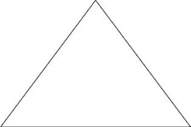
Figure 10.2 This triangle was drawn with Raphaël's path() API.
Next, the path string can be simplified a bit:
var triangle = paper.path('M250,50 L100,250 L400,250 Z');
Here, the last command in the string was replaced with Z—a shorthand to close the path at the starting point.
NOTE To learn more about SVG path strings, visit https://developer.mozilla.org/en-US/docs/Web/SVG/Tutorial/Paths.
Importing Custom Shapes into Raphaël
You can also use Raphaël to draw a variety of curves from simple arcs to complex Beziers. However, manually generating the path strings for complex curves can be challenging. Luckily there are tools you can use to generate Raphaël code for curves of any type.
One option is to export an SVG directly from Adobe Illustrator, using SaveDocsAsSVG, a script bundled with Illustrator. Shown in Figure 10.3, this tool allows you to export vectored graphics as SVG code.
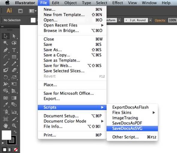
Figure 10.3 Adobe Illustrator allows you to export SVGs.
After you save the SVG, simply open it in a text editor and look for the path string. For example, your code might look something like the output for this simple curve:
<?xml version="1.0" encoding="iso-8859-1"?>
<!-- Generator: Adobe Illustrator 16.0.4, SVG Export Plug-In . SVG Version: 6.00
Build 0) -->
<!DOCTYPE svg PUBLIC "-//W3C//DTD SVG 1.1//EN"
"http://www.w3.org/Graphics/SVG/1.1/DTD/svg11.dtd">
<svg version="1.1" id="Layer_1" xmlns="http://www.w3.org/2000/svg"
xmlns:xlink="http://www.w3.org/1999/xlink" x="0px" y="0px"
width="600px" height="400px" viewBox="0 0 600 400"
style="enable-background:new 0 0 600 400;" xml:space="preserve">
<path style="fill:none;stroke:#000000;stroke-width:2.1155;stroke-miterlimit:10;"
d="M251.742,85.146 C75.453,48.476,100.839,430.671,309.565,250.152"/>
</svg>
I've highlighted the important piece here, M251.742,85.146 C75.453,48.476,100.839,430.671,309.565,250.152. You can now take this string to use with Raphaël's path() API:
paper.path('M251.742,85.146 C75.453,48.476,100.839,430.671,309.565,250.152');
As shown in Figure 10.4, Raphaël now renders the same curve.
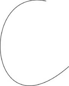
Figure 10.4 The SVG from Illustrator is now rendered with Raphaël.
This technique works great when you want to cherry pick a curve or two. But if you need to import a complete graphic, the SVG code can become significantly more complicated. In these cases it's better to turn to a conversion tool like Ready Set Raphael, which is shown in Figure 10.5 and is available at at www.readysetraphael.com/. Simply upload the exported SVG to this converter, and it outputs the Raphaël code you need.
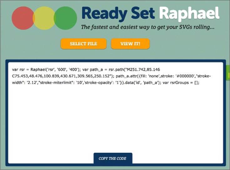
Figure 10.5 Ready Set Raphaël converts SVGs to Raphaël code.
Animating Raphaël Graphics
One of the best parts about Raphaël is its robust animation support, which allows you to render a variety of animations with minimal effort. For example, you can animate the triangle you drew earlier:
var triangle = paper.path('M250,50 L100,250 L400,250 Z');
triangle.animate({transform: 'r 360'}, 4000, 'bounce');
This rotates the triangle 360 degrees (r 360), which occurs over a period of 4000 milliseconds, using the bounce easing method. If you run this script in the browser then you see the triangle rotate, with a flamboyant bounce effect. If you'd like something a little more subdued, try a different easing method, such as < to ease in, > to ease out, or <> to ease in and out.
You can add any number of transformations to the transform string. For example, to shrink and rotate the triangle, you'd write:
triangle.animate({transform: 'r 360 s 0.2'}, 4000, '<>');
This uses a scale transformation to shrink the triangle to 20 percent of its original size (while also rotating).
Beyond basic transformations, you can also animate a variety of styling options and even the individual vertices of your shapes. To learn more, visit the Raphaël docs at http://raphaeljs.com/reference.html#Element.animate.
Handling Mouse Events with Raphaël
One of the best parts of working with SVG is how easy it is to assign mouse events. Because you can interface directly with the shapes in the SVG, it becomes trivial to assign any event listeners you need:
triangle.node.onclick = function() {
triangle.attr('fill', 'red');
};
This script first grabs the DOM reference to the triangle shape in Raphaël and then assigns the onclick listener. The example uses the basic onclick handler for simplicity, but feel free to use a jQuery event handler or another more robust listener if you'd like.
However, if you run this script in the browser, it might not have the result you expect. Because the triangle is just a thin path, it is extremely difficult to click; SVG mouse events target the shape itself, so in this case you have to click an extremely thin line to trigger the handler. To get around this, simply set a background color for the triangle:
triangle.attr('fill', 'white');
triangle.node.onclick = function() {
triangle.attr('fill', 'red');
};
Alternatively, if you need a truly transparent triangle, you can use RGBa:
triangle.attr('fill', 'rgba(0,0,0,0)');
triangle.node.onclick = function() {
triangle.attr('fill', 'rgba(255,0,0,1)');
};
Here the triangle starts completely transparent, rgba(0,0,0,0), and then changes to opaque red, rgba(255,0,0,1).
TIP Don't use transparency unless it's necessary. Opaque colors tend to render and perform better in SVG.
Working with GRaphaël
There are many charting options for Raphaël, notably gRaphaël, an official release from Sencha Labs, the owners of Raphaël. gRaphaël can render a variety of common visualizations such as pie charts, line graphs, and bar charts.
gRaphaël provides a simple starting point for creating your own custom charts. If you need rich functionality out of the box, you'll be better off with a more robust charting solution such as D3, as covered in chapters 11 and 16 of this book. But if you're looking for something simple and easy to extend, gRaphaël is an excellent choice.
First download the script from http://g.raphaeljs.com/ and include the core as well as whichever chart modules you need. Next, reference a DOM element to instantiate the SVG paper:
var paper = Raphael(document.getElementById('my-chart'), 500, 300);
You can find the examples from this section in the Chapter 10 folder on the companion website. It's named graphael-charts.html.
NOTE If you'd prefer to include gRaphaël from a CDN, consider using cdnjs: http://cdnjs.com/libraries/graphael.
Creating Pie Charts
When you've made sure you're including raphael.js, g.raphael.js, and g.pie.js, you can render a pie chart with a single line of code:
paper.piechart(250, 150, 120, [80, 55, 32, 21, 9, 5, 2]);
As shown in Figure 10.6, this creates a pie chart centered at (250,150), with a radius of 120px, and showing the values in the array.
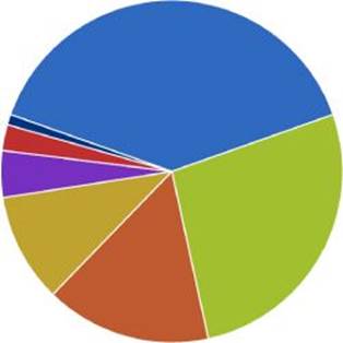
Figure 10.6 gRaphaël renders a basic pie chart.
Chances are you'll also want to label the slices of this pie. To do so, you need to dig into the last argument of the piechart() API:
paper.piechart(250, 150, 120, [80, 55, 32, 21, 9, 5, 2], {
legend: [
'croissants',
'bagels',
'doughnuts',
'muffins',
'danishes',
'scones',
'coffee cakes'
]
});
Passing in the legend array creates a labeled legend for the pie chart, as you can see in Figure 10.7.
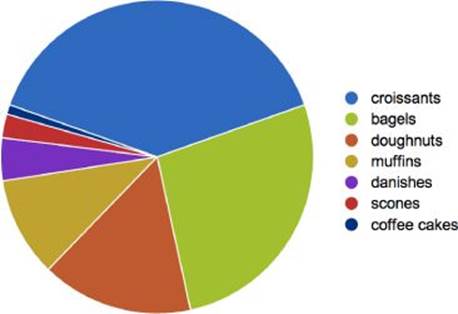
Figure 10.7 A legend has been added to the pie chart.
You can use this same option object to tweak the colors of the chart, set up links for the various slices, and more. To learn more about the piechart() API, visit http://g.raphaeljs.com/reference.html#Paper.piechart.
Creating Line Charts
After you've included g.line.js, you can also render line graphs with ease:
var xVals = [0, 5, 10, 15, 20, 25, 30, 35, 40, 45, 50],
yVals = [46, 75, 91, 64, 82, 41, 53, 47, 73, 76, 62];
paper.linechart(0, 0, 500, 300, xVals, yVals);
In this code, a line chart is drawn between (0,0) and (500,300) using the provided xVals and yVals. That code renders the line graph shown in Figure 10.8.
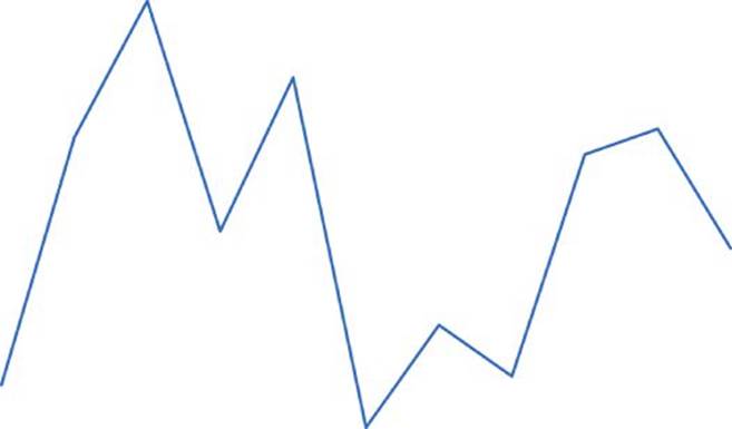
Figure 10.8 gRaphaël's basic line chart.
If you need multiple lines, you can pass in additional sets of y values:
var xVals = [0, 5, 10, 15, 20, 25, 30, 35, 40, 45, 50],
yVals = [46, 75, 91, 64, 82, 41, 53, 47, 73, 76, 62],
yVals2 = [71, 51, 55, 40, 62, 66, 42, 81, 84, 57, 73];
paper.linechart(0, 0, 500, 300, xVals, [yVals, yVals2]);
Here, the second set of y values creates a second line that you can see in Figure 10.9.
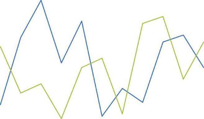
Figure 10.9 gRaphaël's line charts allow multiple lines.
You can then establish the x and y axis by passing the axis option:
paper.linechart(20, 0, 500, 280, xVals, [yVals, yVals2],
{axis: '0 0 1 1'});
Here the axis array displays axes in TRBL (top right bottom left) order, so in this case the script renders the axes on the bottom and left sides of the chart, as you can see in Figure 10.10.
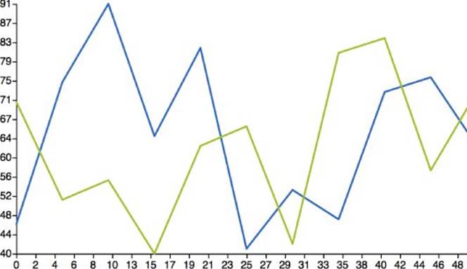
Figure 10.10 Setting the axis option creates x and y axes.
However, you may have noticed that the axes are labeled a bit oddly—for instance, look at the number of steps on the x-axis.. Unfortunately, adjusting the labels is a bit complicated—you have to set the axis step value like so:
paper.linechart(20, 0, 500, 280, xVals, [yVals, yVals2],
{axis: '0 0 1 1', axisxstep: 10});
Here, axisxstep defines the number of steps to show on the x axis. However, the option is a bit counterintuitive because the value of 10 actually renders 11 steps, as shown in Figure 10.11.
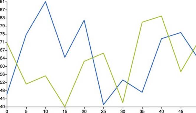
Figure 10.11 The x-axis has been relabeled with more useful steps.
Finally, gRaphaël provides a handful of options you can use to alter the visualization. For example, to shade the chart like the area chart in Figure 10.12, simply pass the shade option:
paper.linechart(20, 0, 500, 280, xVals, [yVals, yVals2],
{axis: '0 0 1 1', axisxstep: 10, shade: true});
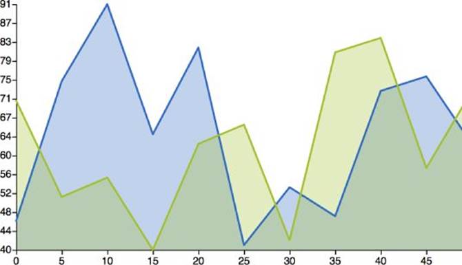
Figure 10.12 The shade option allows you to render area charts.
Alternatively, you can create a curved graph like the one in Figure 10.13:
paper.linechart(20, 0, 500, 280, xVals, [yVals, yVals2],
{axis: '0 0 1 1', axisxstep: 10, shade: true,
smooth: true, symbol: 'circle'});
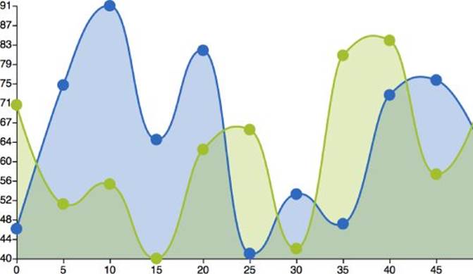
Figure 10.13 The smooth option creates curved lines.
Here, smooth renders the curved lines and symbol renders the points along the line.
These are just a few of the options available to the linechart() API. To learn about more possibilities, visit http://g.raphaeljs.com/reference.html#Paper.linechart.
Creating Bar and Column Charts
gRaphaël also provides some bar chart support, although to be honest the functionality is quite limited. To get started, include the gRaphaël core as well as g.bar.js. The barchart() API works fairly similarly to linechart(); the main difference is that you only pass in a single set of values as opposed to (x,y) pairs:
var vals = [46, 75, 91, 64, 82, 41, 53, 47, 73, 76, 62];
paper.barchart(0, 0, 500, 300, [vals]);
The preceding code renders the column chart shown in Figure 10.14.
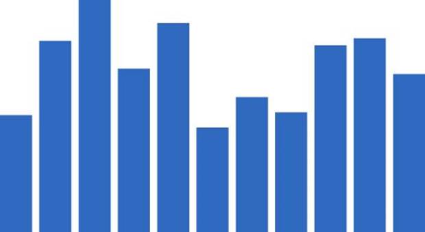
Figure 10.14 gRaphaël renders a basic column chart.
Pay careful attention to the values because they are passed as an array contained in an array. That allows you to render multiple sets of bars:
var vals = [46, 75, 91, 64, 82, 41, 53, 47, 73, 76, 62],
vals2 = [71, 51, 55, 40, 62, 66, 42, 81, 84, 57, 73];
paper.barchart(0, 0, 500, 300, [vals, vals2]);
As shown in Figure 10.15, this renders the two values side by side.
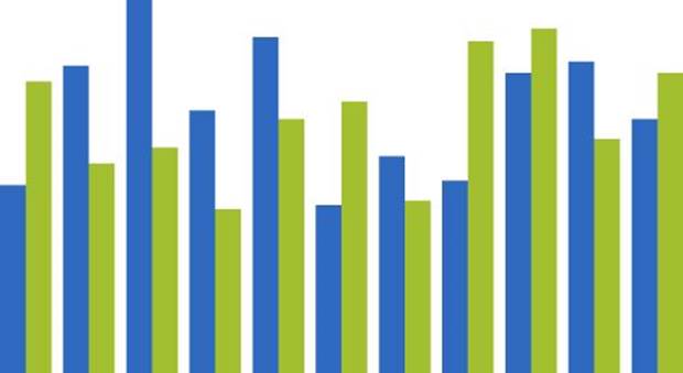
Figure 10.15 Adding a second data set creates a clustered column chart.
Unfortunately, labeling gRaphaël's bar chart can be a challenge because there is no native axis support. That said, you can use some of Raphaël's utilities to create your own labels. To get started, take a look at this simple gRaphaël plug-in:
Raphael.fn.labelBarChart = function(x_start, y_start, width, labels, textAttr) {
var paper = this;
// offset x_start and width for bar chart gutters
x_start += 10;
width -= 20;
var labelWidth = width / labels.length;
// offset x_start to center under each column
x_start += labelWidth / 2;
for ( var i = 0, len = labels.length; i < len; i++ ) {
paper.text( x_start + ( i * labelWidth ), y_start, labels[i] ).attr
( textAttr );
}
};
Don't worry too much about the nuts and bolts of this script. The important piece is the call to paper.text(). This API renders text in the SVG according to a variety of parameters.
Next, to use this script, simply pass the labels you want to use:
var labels = ['Col 1', 'Col 2', 'Col 3', 'Col 4', 'Col 5', 'Col 6', 'Col 7',
'Col 8'];
paper.labelBarChart(0, 290, 500, labels, {'font-size': 14});
Here, the labelBarChart() API creates labels starting at (0, 290), with a width of 290, the result of which you can see in Figure 10.16.
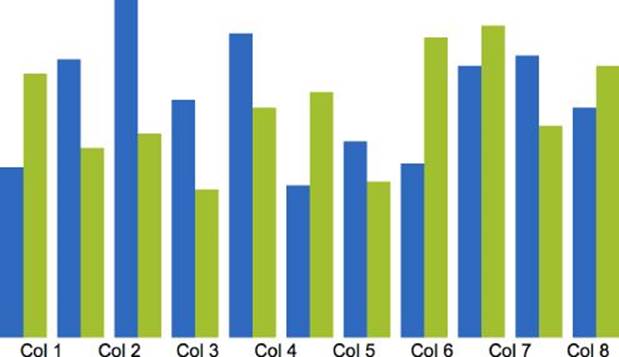
Figure 10.16 A bar chart using a custom label plug-in.
That takes care of labeling the different data sets. Labeling the y-axis, on the other hand, is more complex. As an exercise, follow the labelBarChart() plug-in example to create a plug-in to label the axis.
Extending Raphaël to Create Custom Charts
One of the best parts of working with Raphaël and gRaphaël is how lightweight and extensible the libraries are. Each provides an excellent jumping off point for creating your own custom charts.
You've already gotten a glimpse of extending Raphaël with the labelBarChart() plug-in earlier in this chapter. In this section, you find out how to use a variety of the utility functions in Raphaël to build the donut chart shown in Figure 10.17.
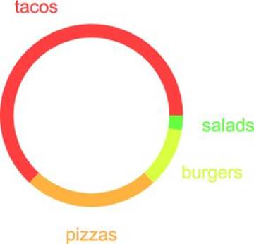
Figure 10.17 This custom donut chart plug-in extends Raphaël.
You create the donut chart as a versatile plug-in with a variety of options. By the end of this example, you'll be able to use these concepts to create any chart you need.
You can find this example in the Chapter 10 folder on the companion website. It's named custom-donut-chart.html.
Setting Up with Common Patterns
To get started, extend the Raphaël core and create a new plug-in for donut charts:
Raphael.fn.donutChart = function (cx, cy, r, values, options) {
// ...
}
This new function accepts a variety of arguments you need to position and render the chart:
· X and Y coordinates of the center point
· Radius for the chart
· Values to display
· Miscellaneous options
Next, store a few variables for later:
Raphael.fn.donutChart = function (cx, cy, r, values, options) {
var paper = this,
chart = this.set(),
rad = Math.PI / 180;
return chart;
};
Here, the script renames this to paper for easy access to the SVG canvas and then stores a reference to the set(), or group of shapes in the SVG. Additionally, it caches the value of a single radian—that'll come in handy later when you do a little trigonometry (don't worry; it isn't too painful). Finally, the script returns the set of shapes in the SVG to allow for easy access and chainability with other APIs.
The next step is setting up a framework for the plug-in options. Besides the main settings for the chart position and values, the plug-in accepts an argument for a general set of options. These secondary options should have smart defaults so that the user can ignore the settings unless they're needed:
Raphael.fn.donutChart = function (cx, cy, r, values, options) {
var paper = this,
chart = this.set(),
rad = Math.PI / 180;
// define options
var o = options || {};
o.width = o.width || r * .15;
return chart;
};
This snippet establishes a basic option for the width of the donut chart (which defaults to 15 percent the size of the radius). As you develop the script, you'll add more options.
Drawing an Arc
Before getting into any data processing, start with the visuals. When it comes to donut charts, the basic graphical building block is an arc, like the one shown in Figure 10.18.

Figure 10.18 Donut charts are made up of arcs like this one.
To draw these arcs, you need to create a reusable function that positions and draws each of the curves. Fortunately, you already have all the information you need from the settings; you just have to use some basic math and trigonometry:
function draw_arc(startAngle, endAngle) {
// get the coordinates
var x1 = cx + r * Math.cos(-startAngle * rad),
y1 = cy + r * Math.sin(-startAngle * rad),
x2 = cx + r * Math.cos(-endAngle * rad),
y2 = cy + r * Math.sin(-endAngle * rad);
// draw the arc
return paper.path(
["M", x1, y1,
"A", r, r, 0, +(endAngle - startAngle > 180), 0, x2, y2
]
);
}
This function takes the angles for the arc and determines the coordinates for the start and end points of the shape. If you don't understand the trigonometry, don't worry too much. Basically, you need to multiply the radius by the cosine and sine of the angle to get the x and y offsets respectively. Add these to the center coordinates and you have the coordinates for your arc.
TIP If you'd like to learn more about circle trigonometry, visit www.mathsisfun.com/sine-cosine-tangent.html. Despite the URL, we make no promises that math is fun.
The next step is drawing the arc with the same path() API you used earlier this chapter. Here, the script creates a standard SVG path string from the data. The path starts at (x1,y1) and then draws an arc with radius r to (x2,y2).
If you hardcode values for cx, cy, and r, and pass in a startAngle and endAngle, you should see something like Figure 10.19.
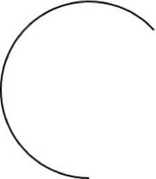
Figure 10.19 This arc is drawn using basic trig.
Although you could stop right here and just widen the stroke for each arc, you're going to draw an entire outline. Drawing the whole shape provides more versatility—for example, enabling you to add a stroke to the shape itself. But it also adds some complexity because you need to draw a second arc inside the first, and add that to the original shape:
// interior radius
var rin = r - o.width;
// draw arc
function draw_arc(startAngle, endAngle) {
// get the coordinates
var x1 = cx + r * Math.cos(-startAngle * rad),
y1 = cy + r * Math.sin(-startAngle * rad),
x2 = cx + r * Math.cos(-endAngle * rad),
y2 = cy + r * Math.sin(-endAngle * rad),
xin1 = cx + rin * Math.cos(-startAngle * rad),
yin1 = cy + rin * Math.sin(-startAngle * rad),
xin2 = cx + rin * Math.cos(-endAngle * rad),
yin2 = cy + rin * Math.sin(-endAngle * rad);
// draw the arc
return paper.path(
["M", xin1, yin1,
"L", x1, y1,
"A", r, r, 0, +(endAngle - startAngle > 180), 0, x2, y2,
"L", xin2, yin2,
"A", rin, rin, 0, +(endAngle - startAngle > 180), 1, xin1, yin1, "z"]
);
}
Here, the script first calculates the interior radius (rin) using the radius and the width option you established earlier. Next, it uses the same trigonometry technique to determine the start and end coordinates of the interior arc ((xin1,yin1) and (xin2,yin2)).
Then, the path string gets a little more complicated:
1. It starts at the interior start point.
2. It draws a line to the exterior start point.
3. It traces an arc to the exterior end point.
4. It draws a line to the interior end point.
5. It closes the shape by drawing an arc back to the interior start point.
Last but not least, you color these shapes. But rather than hardcode color values, it's better to keep things open ended. A good approach is to add a general style option that you can populate as needed with fill colors, stroke settings, and so on.
function draw_arc(startAngle, endAngle, styleOpts) {
// get the coordinates
var x1 = cx + r * Math.cos(-startAngle * rad),
y1 = cy + r * Math.sin(-startAngle * rad),
x2 = cx + r * Math.cos(-endAngle * rad),
y2 = cy + r * Math.sin(-endAngle * rad),
xin1 = cx + rin * Math.cos(-startAngle * rad),
yin1 = cy + rin * Math.sin(-startAngle * rad),
xin2 = cx + rin * Math.cos(-endAngle * rad),
yin2 = cy + rin * Math.sin(-endAngle * rad);
// draw the arc
return paper.path(
["M", xin1, yin1,
"L", x1, y1,
"A", r, r, 0, +(endAngle - startAngle > 180), 0, x2, y2,
"L", xin2, yin2,
"A", rin, rin, 0, +(endAngle - startAngle > 180), 1, xin1, yin1, "z"]
).attr(styleOpts);
}
Here the function allows you to pass a general styleOpts value with any styling information you need. Finally, let's take a look at usage:
Raphael.fn.donutChart = function (cx, cy, r, values, options) {
var paper = this,
chart = this.set(),
rad = Math.PI / 180;
// define options
var o = options || {};
o.width = o.width || r * .15;
// interior radius
var rin = r - o.width;
// draw arc
function draw_arc(startAngle, endAngle, styleOpts) {
// get the coordinates
var x1 = cx + r * Math.cos(-startAngle * rad),
y1 = cy + r * Math.sin(-startAngle * rad),
x2 = cx + r * Math.cos(-endAngle * rad),
y2 = cy + r * Math.sin(-endAngle * rad),
xin1 = cx + rin * Math.cos(-startAngle * rad),
yin1 = cy + rin * Math.sin(-startAngle * rad),
xin2 = cx + rin * Math.cos(-endAngle * rad),
yin2 = cy + rin * Math.sin(-endAngle * rad);
// draw the arc
return paper.path(
["M", xin1, yin1,
"L", x1, y1,
"A", r, r, 0, +(endAngle - startAngle > 180), 0, x2, y2,
"L", xin2, yin2,
"A", rin, rin, 0, +(endAngle - startAngle > 180), 1, xin1, yin1, "z"]
).attr(styleOpts);
}
draw_arc(0, 240, { fill: '#f0f', stroke: 0 });
return chart;
};
var paper = Raphael(document.getElementById('donut-chart'), 250, 250);
paper.donutChart(125, 125, 100, [], { width: 20 });
This example renders the arc shown in Figure 10.20, with a pink fill color and no stroke.

Figure 10.20 This arc is styled with Raphaël.
Now you've established the basic building blocks for the donut chart graphic. In the coming sections you see how to convert your data into values you can render with this versatile function.
Massaging Data into Usable Values
With the arc function in place, the next step is creating usable values. When it comes to the data in donut charts, they act a lot like pie charts: The only information that matters is percentages. Thus, to render this chart, you have to take a few steps:
1. Fetch the total of all values.
2. Determine the percentage for an individual value.
3. Render that percentage as an angle with the draw_arc() function.
4. Start the next arc at the angle where the prior arc stopped.
The first step is really straightforward. Simply loop through the values array you set up earlier to fetch the total:
var total = 0;
for (var i = 0, max = values.length; i < max; i++) {
total += values[i];
}
Alternatively, if you aren't worried about backward compatibility for older browsers, you can use the newer Array.reduce() method:
var total = values.reduce();
Next, you need to process and render each individual value. Start with a function that determines what percentage of the donut to render:
var angle = 0;
function build_segment(j) {
var value = values[j],
angleplus = 360 * value / total;
var arc = draw_arc( angle, angle + angleplus );
angle += angleplus;
}
// build each segment of the chart
for (i = 0; i < max; i++) {
build_segment(i);
}
As you can see, the build_segment() function starts by calculating the percentage of the full circle that the segment should occupy. Then it leverages the draw_arc() function to render an arc from the starting angle to the ending point. Finally, it increments the angle value to set the starting point for the next segment in the loop.
Next, run the script with a random data set:
paper.donutChart(125, 125, 100, [120, 45, 20, 5]);
As you can see in Figure 10.21, that script renders the donut chart, but it only renders as outlines. That's because you still need to set the color values.
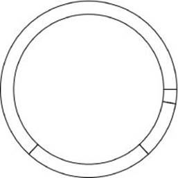
Figure 10.21 This screenshot shows the initial donut chart rendering.
Rather than hardcode, you can set the colors up in a way that can be customized:
if ( typeof o.colors == 'undefined' ) {
for (var i = 0, max = values.length; i < max; i++) {
o.colors.push( Raphael.hsb(i / 10, .75, 1) );
}
}
In the preceding code, the colors are set up using the same options object you used earlier for the chart width. That way, the developer can set the colors if she wants. Alternatively, if the user doesn't set any values, the script uses the Raphaël utility function hsb() to create unique colors for each value in the chart. That's a nifty technique that uses the hue to space colors out evenly around the color wheel.
Finally, apply each color in the build_segment() loop:
function build_segment(j) {
var value = values[j],
angleplus = 360 * value / total,
styleOpts = {
fill: o.colors[j]
};
var arc = draw_arc( angle, angle + angleplus, styleOpts );
angle += angleplus;
}
Now the script renders the colorful chart shown in Figure 10.22.
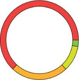
Figure 10.22 The donut chart has been rendered in color.
Finally, add some customization options for the stroke:
o.strokeWidth = o.strokeWidth || 0;
o.strokeColor = o.strokeColor || '#000';
and apply them to each segment:
function build_segment(j) {
var value = values[j],
angleplus = 360 * value / total,
styleOpts = {
fill: o.colors[j]
};
if ( o.strokeWidth ) {
styleOpts.stroke = o.strokeColor;
styleOpts['stroke-width'] = o.strokeWidth;
}
else {
styleOpts.stroke = 'none';
}
var arc = draw_arc( angle, angle + angleplus, styleOpts );
angle += angleplus;
}
Here, the stroke is applied if it exists. But as you can see in Figure 10.23, the script now defaults to using no stroke.

Figure 10.23 The chart now defaults to strokeless.
Now the plug-in is rendering the chart at its most basic level. Here's the script so far:
Raphael.fn.donutChart = function (cx, cy, r, values, options) {
var paper = this,
chart = this.set(),
rad = Math.PI / 180;
// define options
var o = options || {};
o.width = o.width || r * .15;
o.strokeWidth = o.strokeWidth || 0;
o.strokeColor = o.strokeColor || '#000';
// create colors if not set
if ( typeof o.colors == 'undefined' ) {
o.colors = [];
for (var i = 0, max = values.length; i < max; i++) {
o.colors.push( Raphael.hsb(i / 10, .75, 1) );
}
}
// interior radius
var rin = r - o.width;
// draw arc
function draw_arc(startAngle, endAngle, styleOpts) {
// get the coordinates
var x1 = cx + r * Math.cos(-startAngle * rad),
y1 = cy + r * Math.sin(-startAngle * rad),
x2 = cx + r * Math.cos(-endAngle * rad),
y2 = cy + r * Math.sin(-endAngle * rad),
xin1 = cx + rin * Math.cos(-startAngle * rad),
yin1 = cy + rin * Math.sin(-startAngle * rad),
xin2 = cx + rin * Math.cos(-endAngle * rad),
yin2 = cy + rin * Math.sin(-endAngle * rad);
// draw the arc
return paper.path(
["M", xin1, yin1,
"L", x1, y1,
"A", r, r, 0, +(endAngle - startAngle > 180), 0, x2, y2,
"L", xin2, yin2,
"A", rin, rin, 0, +(endAngle - startAngle > 180), 1, xin1, yin1, "z"]
).attr(styleOpts);
}
// process each segment of the arc and render
function build_segment(j) {
var value = values[j],
angleplus = 360 * value / total,
styleOpts = {
fill: o.colors[j]
};
if ( o.strokeWidth ) {
styleOpts.stroke = o.strokeColor;
styleOpts['stroke-width'] = o.strokeWidth;
}
else {
styleOpts.stroke = 'none';
}
var arc = draw_arc( angle, angle + angleplus, styleOpts );
angle += angleplus;
}
var angle = 0,
total = 0;
// fetch total
for (var i = 0, max = values.length; i < max; i++) {
total += values[i];
}
// build each segment of the chart
for (i = 0; i < max; i++) {
build_segment(i);
}
return chart;
};
Adding Mouse Interactivity
Now that the script renders the chart, the next step is to add interactivity. Fortunately, setting up a click handler is pretty easy with the SVG event listeners. First, create an option the developer can use for click handlers:
o.onclick = o.onclick || function() {};
and then apply the handler in the build_segment() function:
function build_segment(j) {
var value = values[j],
angleplus = 360 * value / total,
styleOpts = {
fill: o.colors[j]
};
if ( o.strokeWidth ) {
styleOpts.stroke = o.strokeColor;
styleOpts['stroke-width'] = o.strokeWidth;
}
else {
styleOpts.stroke = 'none';
}
var arc = draw_arc( angle, angle + angleplus, styleOpts );
arc.click( function() {
o.onclick(j);
});
angle += angleplus;
}
As you can see, the script applies a simple click handler to the arc that is returned from the draw_arc() function. Next, add handlers for mouseover and mouseout:
o.onmouseover = o.onmouseover || function() {};
o.onmouseout = o.onmouseout || function() {};
Now apply the handler:
arc.mouseover(function () {
o.onmouseover(j);
}).mouseout(function () {
o.onmouseout(j);
});
Finally, add some visual flare and animate the segments on mouseover:
arc.mouseover(function () {
arc.stop().animate({transform: 's' + o.animationScale + ' ' + o.animationScale +
' ' + cx + " " + cy}, o.animationDuration, o.animationEasing);
o.onmouseover(j);
}).mouseout(function () {
arc.stop().animate({transform: ""}, o.animationDuration, o.animationEasing);
o.onmouseout(j);
});
As you can see, the script leverages Raphaël's animate() API to adjust the scale of the segments on mouseover. It starts by stopping any queued animations with stop(), and then goes into a transform animation. Of course, you also need to set up defaults for the animation options:
o.animationDuration = o.animationDuration || 300;
o.animationScale = o.animationScale || 1.1;
o.animationEasing = o.animationEasing || 'backOut';
Finally, make sure that the plug-in returns the full set of SVG shapes. If you remember, when you first set up the script, you cached a set of SVG shapes:
var chart = this.set();
Keep this list fresh by pushing each new arc to the set at the end of the build_segment() function:
chart.push(arc);
Labeling the Data
Last but not least, you need to label the chart using Raphaël's text() API. First set up some options with smart defaults:
o.labels = o.labels || [];
o.labelOffsetX = o.labelOffsetX || 50;
o.labelOffsetY = o.labelOffsetY || 30;
Here, the labels option allows the user to pass an array of text labels, and labelOffsetX and labelOffsetY control how far away to render the labels from the chart.
Next, in the build_segment() loop, determine which label to include and where:
// create labels if they exist
if ( o.labels[j] !== 'undefined' ) {
var halfAngle = angle + (angleplus / 2),
label = draw_label( o.labels[j], halfAngle );
}
In this snippet, the script first centers the label by calculating the halfway point of the arc. Then it passes this angle along with the text for the label to the draw_label() function. That function looks like this:
function draw_label( label, angle ) {
var labelX = cx + ( r + o.labelOffsetX ) * Math.cos( -angle * rad ),
labelY = cy + ( r + o.labelOffsetY ) * Math.sin( -angle * rad ),
txt = paper.text( labelX, labelY, label );
return txt;
}
Here, the script uses more trigonometry to calculate the coordinates for the label. These are adjusted by the values in the offset settings and then passed into Raphaël's text() API along with the text for the label. Finally, make sure to pass in your labels:
paper.donutChart(200, 200, 100, [120, 45, 20, 5], {
labels: [
'tacos',
'pizzas',
'burgers',
'salads'
]
});
The result is shown in Figure 10.24. As you can see, the styling of these labels leaves something to be desired.
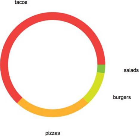
Figure 10.24 Custom labels have been added to the donut chart.
Finalize the script by adding some basic styling settings, and make sure to color each label to match its segment:
function draw_label( label, angle, styleOpts ) {
var style = {};
style.fill = styleOpts.fill || '#000';
style['font-size'] = styleOpts['font-size'] || 20;
var labelX = cx + ( r + o.labelOffsetX ) * Math.cos( -angle * rad ),
labelY = cy + ( r + o.labelOffsetY ) * Math.sin( -angle * rad ),
txt = paper.text( labelX, labelY, label ).attr( style );
return txt;
}
That adds a styleOpts argument to the script, with some basic defaults for the color and font size. Next, pass the color in the build_segment() loop:
if ( o.labels[j] !== 'undefined' ) {
var halfAngle = angle + (angleplus / 2),
label = draw_label( o.labels[j], halfAngle, {
fill: o.colors[j]
});
}
Now the labels are looking much better, as you can see in Figure 10.25.
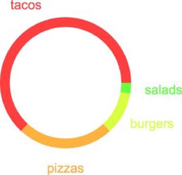
Figure 10.25 After styling the labels, the donut chart is complete.
Last but not least, make sure to add this label to the main chart object so the labels get returned along with the other shapes in this SVG:
if ( typeof label != 'undefined' ) chart.push( label );
Wrapping Up
Finally, have one last look at the plug-in—this time with the code all put together:
Raphael.fn.donutChart = function (cx, cy, r, values, options) {
var paper = this,
chart = this.set(),
rad = Math.PI / 180;
// define options
var o = options || {};
o.width = o.width || r * .15;
o.strokeWidth = o.strokeWidth || 0;
o.strokeColor = o.strokeColor || '#000';
o.onclick = o.onclick || function() {};
o.onmouseover = o.onmouseover || function() {};
o.onmouseout = o.onmouseout || function() {};
o.animationDuration = o.animationDuration || 300;
o.animationScale = o.animationScale || 1.1;
o.animationEasing = o.animationEasing || 'backOut';
o.labels = o.labels || [];
o.labelOffsetX = o.labelOffsetX || 50;
o.labelOffsetY = o.labelOffsetY || 30;
// create colors if not set
if ( typeof o.colors == 'undefined' ) {
o.colors = [];
for (var i = 0, max = values.length; i < max; i++) {
o.colors.push( Raphael.hsb(i / 10, .75, 1) );
}
}
// interior radius
var rin = r - o.width;
// draw arc
function draw_arc(startAngle, endAngle, styleOpts) {
// get the coordinates
var x1 = cx + r * Math.cos(-startAngle * rad),
y1 = cy + r * Math.sin(-startAngle * rad),
x2 = cx + r * Math.cos(-endAngle * rad),
y2 = cy + r * Math.sin(-endAngle * rad),
xin1 = cx + rin * Math.cos(-startAngle * rad),
yin1 = cy + rin * Math.sin(-startAngle * rad),
xin2 = cx + rin * Math.cos(-endAngle * rad),
yin2 = cy + rin * Math.sin(-endAngle * rad);
// draw the arc
return paper.path(
["M", xin1, yin1,
"L", x1, y1,
"A", r, r, 0, +(endAngle - startAngle > 180), 0, x2, y2,
"L", xin2, yin2,
"A", rin, rin, 0, +(endAngle - startAngle > 180), 1, xin1, yin1, "z"]
).attr(styleOpts);
}
// add label at given angle
function draw_label( label, angle, styleOpts ) {
var style = {};
style.fill = styleOpts.fill || '#000';
style['font-size'] = styleOpts['font-size'] || 20;
var labelX = cx + ( r + o.labelOffsetX ) * Math.cos( -angle * rad ),
labelY = cy + (r + o.labelOffsetY) * Math.sin( -angle * rad ),
txt = paper.text( labelX, labelY, label ).attr( style );
return txt;
}
// process each segment of the arc and render
function build_segment(j) {
var value = values[j],
angleplus = 360 * value / total,
styleOpts = {
fill: o.colors[j]
};
if ( o.strokeWidth ) {
styleOpts.stroke = o.strokeColor;
styleOpts['stroke-width'] = o.strokeWidth;
}
else {
styleOpts.stroke = 'none';
}
// draw the arc
var arc = draw_arc( angle, angle + angleplus, styleOpts );
// create labels if they exist
if ( o.labels[j] !== 'undefined' ) {
var halfAngle = angle + (angleplus / 2),
label = draw_label( o.labels[j], halfAngle, {
fill: o.colors[j]
});
}
// mouse event handlers
arc.click( function() {
o.onclick(j);
});
arc.mouseover(function () {
arc.stop().animate({transform: 's' + o.animationScale + ' ' +
o.animationScale + ' ' + cx + " " + cy}, o.animationDuration,
o.animationEasing);
o.onmouseover(j);
}).mouseout(function () {
arc.stop().animate({transform: ""}, o.animationDuration, o.animationEasing);
o.onmouseout(j);
});
angle += angleplus;
chart.push( arc );
if ( typeof label != 'undefined' ) chart.push( label );
}
var angle = 0,
total = 0;
// fetch total
for (var i = 0, max = values.length; i < max; i++) {
total += values[i];
}
// build each segment of the chart
for (i = 0; i < max; i++) {
build_segment(i);
}
return chart;
};
var paper = Raphael(document.getElementById('donut-chart'), 400, 400);
paper.donutChart(200, 200, 100, [120, 45, 20, 5], {
labels: [
'tacos',
'pizzas',
'burgers',
'salads'
]
});
To recap:
1. The script starts by creating an options framework with smart defaults.
2. It defines its first core function, draw_arc(), which renders each segment of the donut chart using basic trigonometry and Raphaël's path() API.
3. The second core function, draw_label(), renders each label at the appropriate location using Raphaël's text() API.
4. The third core function, build_segment(), first massages the data into a usable format and then passes the refined data to draw_arc() and draw_label(). Then it applies mouse event listeners, both for a general click event and also to animate the segments on mouseover.
5. The script calculates the total and initiates the build_segment() loop to render the chart.
As shown in Figure 10.25, the script is rendering the donut chart nicely, but there's still room for improvement. Mainly you could add more options to make the plug-in more versatile. As an exercise, try adding customizable settings for the following:
· Altering the startAngle of the chart
· Rendering the segments clockwise or counterclockwise
· Creating a loading animation that expands the donut when it first appears on the screen
Summary
This chapter explained how to use the SVG library Raphaël to render custom charts. You started by getting familiar with the basics of Raphaël: drawing basic shapes and adding animation and mouse event listeners. You also learned techniques for importing your own vector graphics to use with the library.
Next you were introduced to gRaphaël, a simple charting library for Raphaël. With gRaphaël, you explored rendering a variety of different visualizations, from pie charts to line graphs and bar graphs.
Finally, you followed a practical example to create a donut chart plug-in for Raphaël. In this plug-in, you leveraged your knowledge of Raphaël along with basic trigonometry to render a custom graphic.
In the coming chapters, you discover more charting solutions, including the highly interactive D3, as well as various mapping and time series libraries.