JavaScript and jQuery for Data Analysis and Visualization (2015)
PART III Visualizing Data Programmatically
· Chapter 9: Exploring Charting Tools
· Chapter 10: Building Custom Charts with Raphaël
· Chapter 11: Introducing D3
· Chapter 12: Incorporating Symbols
· Chapter 13: Mapping Global, Regional, and Local Data
· Chapter 14: Charting Time Series with IgniteUI igDataChart
Chapter 9 Exploring Charting Tools
What's in This Chapter
· Building a chart using the HTML5 canvas element from the ground up
· Learning the basics of linear interpolation and how it relates to practically everything in charting
· Using key frame animation and easing functions to create pleasing transitions in a chart
· Using the Google Charts API to make everything easier
· Displaying bar, line, and pie visualizations using the Google Charts API.
CODE DOWNLOAD The wrox.com code downloads for this chapter are found at www.wrox.com/go/javascriptandjqueryanalysis on the Download Code tab. The code is in the chapter 09 download and individually named according to the names throughout the chapter.
Chapter 3, “Building a Visualization Foundation,” covers the breadth of charting visualizations, which can be used to tell the desired story with your data. This chapter takes a deep dive into how to actually implement these visualizations.
Building charting visualizations can be a daunting task, even with high-quality charting tools making things as simple as possible. This is because charting application programming interfaces (APIs) need to be quite complex in order to grant you the flexibility to achieve all the scenarios that might be important to you. As with anything complicated, the best strategy for understanding something is to break things down, understand all the smaller moving parts, and then put things together again.
To facilitate this, you start this chapter by building a chart from scratch! Don't worry—it's not quite as scary as it sounds. You will be jumping into the deep end of the pool, but you'll come out a strong swimmer. The custom chart you are building doesn't do everything that a full charting API can accomplish (it would take a full book to lead you through doing that!), but it helps to show how all the parts of a chart interact with each other.
Beyond that, you are building some interesting animation features into your chart that even some fully functional charting APIs don't support, and you are learning how to do some very interesting things with the HTML5 Canvas at the same time.
Later in the chapter, you implement similar scenarios using the Google Charts API, which is a high-level and polished API for creating charting visualizations. You will find that all the scenarios that this chapter investigates take considerably less code and are easier to quickly understand when using the Google Charts API, so if you are looking for “easy mode” you could skip directly to that section of the chapter. However, you might also notice that the Google Chart's versions are less dynamic and don't help you to understand some of the underlying concepts in play.
Creating HTML5 Canvas Charts
This chapter focuses on the most-used core charting scenarios, including bar, column, line, area, and pie. These visualizations are, far and away, the most used types. First, let's build a basic column chart from scratch! Following that, you can successively layer on features such as axes, animation, and data changes. To render your chart, you use the HTML5 canvas element.
HTML5 Canvas Basics
There is a primer on the HTML5 canvas in the section “Making Use of the HTML5 Canvas” in Chapter 3 of this book. It may be helpful to you to read that section before reading this chapter.
The canvas is a new feature that was added to the HTML standard in HTML5. It provides a basic 2D rendering API, which you can use from JavaScript, for rendering vector graphics and text into a bitmap and displaying that within an HTML page. Prior to the advent of the canvas, it was not so easy to achieve this style of dynamic rendering. Your options were to
· Use a plug-in to render the content such as Java, Flash, Silverlight, Scalable Vector Graphics (SVG) (for browsers that did not support it natively), and so on
· Render the content as an image on the server and serve as a static file
· Try to “fake” the required graphics using Document Object Model (DOM) elements and Cascading Style Sheets (CSS)
Given the prevalence of Flash on desktop machines, that option has been rather popular for charting in the browser. However, given the rejection of the plug-in model from the mobile web, it is no longer a viable option for a website that is designed for extremely broad consumption. Static images are undesirable because they lack any client-side dynamic nature and increase the burden on the server if they need to be generated on demand. Lastly, trying to fake charting graphics using DOM and CSS would be broadly accessible, but is needlessly complicated and rife with limitations to be circumvented.
Luckily, all modern browser versions support both the HTML5 canvas element and the SVG element. Without these, it would be very difficult to create dynamic charting visualizations in browsers while eschewing plug-ins. SVG is discussed in detail in Chapters 10 and 11 whereas the first part of this chapter focuses on the canvas element.
Why would you want to use canvas in preference to SVG? Why would you want to use SVG in preference to canvas? The answer is somewhat complicated, but it boils down to “it depends,” or “use a bit of both.” SVGs strengths are the following:
· It is scalable without losing fidelity. (The S in SVG stands for scalable, after all.) This is especially important for the modern web as device screens have increasingly high dots per inch (DPI) metrics. Scalable graphics can, usually, automagically take advantage of a higher DPI screen.
· Because SVG is DOM based, you can inspect its layout at runtime in a DOM inspector.
· You can apply styling with CSS.
· You can attach event handlers to graphical elements.
· Most vector graphics editors export to static SVG files.
· It performs better than canvas when the size of the element is large.
· Interacting with it is declarative. You are interested in defining the outcome, not the low-level means by which it is achieved.
Meanwhile, the strengths of the canvas element are these:
· It performs better than SVG when there are lots of graphical elements that need to be rendered or when rendering is progressive/additive.
· It is very lightweight in that it does not have required memory and processing overhead associated with each graphical element.
· It allows for per-pixel manipulation of the output, allowing for scenarios that would not be practical using the graphics primitives provided to you via SVG.
· The API surface is small compared to SVG. It is easy to learn and has implementations with very consistent performance and behavioral semantics across different browser environments.
· Interacting with it is very explicit and imperative. You are interested in taking control of the outcome, and the means by which is it is achieved.
Linear Interpolation
Before you dive into writing a chart from scratch, it helps if you're familiar with the style of calculation that you will find all throughout charting (and graphics programming in general). So pervasive is it that many graphics systems provide built-in and optimized functions to perform it (usually named lerp). That calculation is called linear interpolation. The basic idea of linear interpolation is to connect a line between two points. Let's say you want to connect a line between points x0, y0 and x1, y1. You can vary the value of x between x0 and x1, and calculate the corresponding y value as
y = y0 + (y1 - y0) * (x - x0) / (x1 - x2)
A useful way to think of (x - x0) / (x1 - x2) is that it resolves to a value between 0 and 1 depending on how far x is between x0 and x1. It acts as a weighting that you can multiply by the y range (y1 - y0) so that when the weighting is 0 then y = y0 and by the time the weighting is 1 then y = y1. Linear interpolations are useful for connecting points with line segments, but that's not all you use them for. They are also very useful for blending. If you want a linear animated blend between two values based on a time value that varies between 0 and 1, you can express it with the following equation, where p is the time value, start is the start value to blend from, and end is the end value to blend to:
v = start + p * (end - start)
How does this relate to the first linear interpolation equation? Well, imagine that the x axis represents time, and the y values represent the in-between values of the blend. The x movement can be simplified to be a parameter p that varies from 0 to 1, as you saw before. These equations are all over this chapter, so it's good to start with a solid grounding in them.
A Simple Column Chart
Column and bar charts let you compare values of discrete categories using either the width or height of a set of rectangles. Figure 9.1 shows a bar chart rendered using the Google Charts API, and Figure 9.2 shows a bar chart using the Google Charts API, for example.
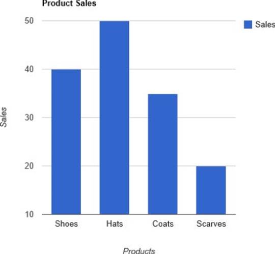
Figure 9.1 A column chart rendered with the Google Charts API helps compare values between categories.
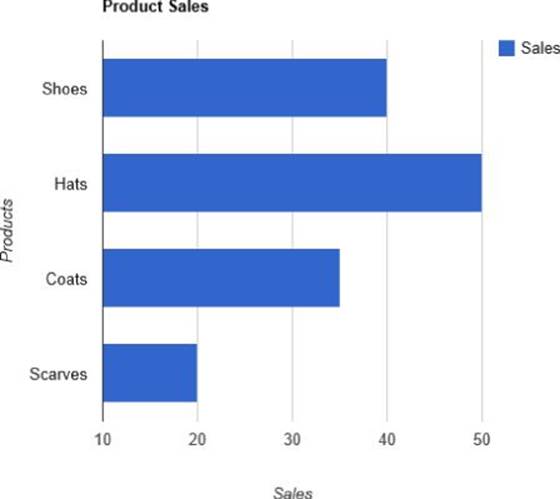
Figure 9.2 A bar chart rendered with the Google Charts API displays the same information as the column chart but is oriented differently.
Listing 9-1 first shows you how to create a simple column visualization from scratch using the HTML5 canvas.
Listing 9-1
var data = [
{ "name": "Shoes", "Q1": 40, "Q2": 25 },
{ "name": "Hats", "Q1": 50, "Q2": 40 },
{ "name": "Coats", "Q1": 35, "Q2": 45 },
{ "name": "Scarves", "Q1": 20, "Q2": 15 }
];
var palette = [
"rgba(143, 39, 26, 1)",
"rgba(13, 113, 125, 1)",
"rgba(72, 176, 19, 1)"
];
var ChartElement = function (chart) {
this._chart = chart;
this._color = "rgba(80, 80, 80, 1)";
};
ChartElement.prototype._validate = function () {
if (this._chart._data === null ||
isNaN(this._chart._minValue) ||
isNaN(this._chart._maxValue)) {
return false;
}
return true;
};
ChartElement.prototype._update = function () {
this._chart.update();
}
ChartElement.prototype.color = function (col) {
this._color = col;
this._update();
return this;
};
ChartElement.prototype.chart = function () {
return this._chart;
};
var ColumnSeries = function (chart) {
ChartElement.call(this, chart);
this._valueAccessor = null;
this._color = "rgba(255, 0, 0, 1)";
};
ColumnSeries.prototype = Object.create(ChartElement.prototype);
ColumnSeries.prototype._validate = function () {
if (this._valueAccessor === null) {
return false;
}
return ChartElement.prototype._validate.call(this);
};
ColumnSeries.prototype._render = function (ctx) {
if (!this._validate()) {
return;
}
var currWidth, currHeight,
currX, currY,
currColor, i;
var data = this._chart._data;
var f = {};
f.xPositions = [];
f.yPositions = [];
f.widths = [];
f.heights = [];
currColor = this._color;
var index = this._index;
var width = this._chart.seriesWidth();
var halfWidth = width / 2.0;
var offset = this._chart.offset(index);
var zeroPosition = this._chart.scaleY(0);
var val, scaledX, scaledY;
for (i = 0; i < data.length; i++) {
val = this._valueAccessor(data[i]);
scaledY = this._chart.scaleY(val);
scaledX = this._chart.scaleX(i);
f.xPositions.push(scaledX + offset - halfWidth);
f.yPositions.push(Math.min(scaledY, zeroPosition));
f.widths.push(width);
f.heights.push(Math.abs(scaledY - zeroPosition));
}
for (var i = 0; i < f.widths.length; i++) {
currX = f.xPositions[i];
currY = f.yPositions[i];
currWidth = f.widths[i];
currHeight = f.heights[i];
ctx.fillStyle = currColor;
ctx.fillRect(
currX, currY,
currWidth, currHeight);
}
};
ColumnSeries.prototype.valueAccessor = function (accessor) {
this._valueAccessor = accessor;
this._update();
return this;
};
var Chart = function (targetId) {
this._canvas = document.getElementById(targetId);
this._ctx = this._canvas.getContext("2d");
this._ctx.font = "14pt Verdana";
this._data = null;
this._totalWidth = this._canvas.width;
this._totalHeight = this._canvas.height;
this._leftMargin = 50;
this._rightMargin = 50;
this._topMargin = 50;
this._bottomMargin = 50;
this._minValue = NaN;
this._maxValue = NaN;
this._series = [];
this._gap = 0.25;
this._calculatePlotArea();
};
Chart.prototype.column = function () {
var c = new ColumnSeries(this);
this._series.push(c);
c._index = this._series.length - 1;
this.update();
return c;
};
Chart.prototype.minValue = function (val) {
this._minValue = val;
this.update();
return this;
};
Chart.prototype.maxValue = function (val) {
this._maxValue = val;
this.update();
return this;
};
Chart.prototype._calculatePlotArea = function () {
var left = this._leftMargin;
var top = this._topMargin;
var width = this._totalWidth -
(this._leftMargin + this._rightMargin);
var height = this._totalHeight -
(this._topMargin + this._bottomMargin);
this._plotLeft = left;
this._plotTop = top;
this._plotWidth = width;
this._plotHeight = height;
};
Chart.prototype._render = function () {
var ctx = this._ctx;
ctx.clearRect(0, 0, this._totalWidth, this._totalHeight);
ctx.fillStyle = "rgba(240,240,240,1)";
ctx.fillRect(0, 0, this._totalWidth, this._totalHeight);
for (var i = 0; i < this._series.length; i++) {
this._series[i]._render(ctx);
}
};
Chart.prototype.update = function () {
this._render();
return this;
};
Chart.prototype.data = function (data) {
this._data = data;
this.update();
return this;
};
Chart.prototype.scaleY = function (val) {
var p = (val - this._minValue) /
(this._maxValue - this._minValue);
p = 1.0 - p;
return this._plotTop + p * this._plotHeight;
};
Chart.prototype.offset = function (seriesIndex) {
var fullWidth = this._plotWidth / this._data.length;
var start = this._gap / 2.0 * fullWidth;
var span = seriesIndex * this.seriesWidth();
span += this.seriesWidth() / 2.0;
var offset = start + span;
return offset;
};
Chart.prototype.scaleX = function (val) {
var p = val / this._data.length;
return this._plotLeft + p * this._plotWidth;
};
Chart.prototype.seriesWidth = function () {
var fullWidth = this._plotWidth / this._data.length;
var actualWidth = fullWidth * (1.0 - this._gap);
actualWidth /= this._series.length;
return actualWidth;
};
var chart = new Chart("chart")
.minValue(0)
.maxValue(60)
.data(data);
chart.column()
.color(palette[0])
.valueAccessor(function (item) {
return item.Q1;
});
chart.column()
.color(palette[1])
.valueAccessor(function (item) {
return item.Q2;
});
That puts all the JavaScript in place in order to display the visualization. To render that in a web page, though, you need the other bits and pieces. Here is the CSS to use:
#chart {
width: 700px;
height: 500px;
}
And this is the HTML to use:
<!DOCTYPE html>
<html>
<head>
<title>Basic Canvas Chart</title>
<link rel="stylesheet" href="BasicCanvasChart.css">
</head>
<body>
<canvas id="chart"
width="700"
height="500">
</canvas>
<script type="text/javascript" src="BasicCanvasChart.js">
</script>
</body>
</html>
Most of the canvas code in this chapter uses this exact HTML, only with a different CSS and JavaScript reference, so the markup/styling snippets aren't listed for each example. The full files are available on the companion website for this book. Listing 9-1 produces the results displayed in Figure 9.3, and the code is in the file BasicCanvasChart.js/html/css on the companion website.
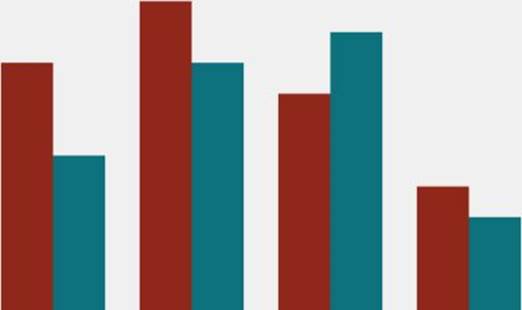
Figure 9.3 This shows a column chart built from scratch using the HTML5 canvas.
Okay, let's break down all the components of Listing 9-1 before making things more complicated. The code starts with this:
var data = [
{ "name": "Shoes", "Q1": 40, "Q2": 25 },
{ "name": "Hats", "Q1": 50, "Q2": 40 },
{ "name": "Coats", "Q1": 35, "Q2": 45 },
{ "name": "Scarves", "Q1": 20, "Q2": 15 }
];
This code just defines the data that is used in the column chart. It contains four categories—Shoes, Hats, Coats, and Scarves—and it contains two values for each of those categories: Q1 and Q2. The goal is to map each of those sets of values to a different column series plotted over the same categories.
A column chart plots data against a continuous numeric axis and a discrete category axis, as opposed to some other chart types—such as scatter charts—that plot the data against two continuous numeric axes.
var palette = [
"rgba(143, 39, 26, 1)",
"rgba(13, 113, 125, 1)",
"rgba(72, 176, 19, 1)"
];
This code defines a palette to be used to define the colors for the various series added to the chart. The HTML5 canvas supports CSS color strings, so an array of them will suffice to act as a palette.
var ChartElement = function (chart) {
this._chart = chart;
this._color = "rgba(80, 80, 80, 1)";
};
ChartElement.prototype._validate = function () {
if (this._chart._data === null ||
isNaN(this._chart._minValue) ||
isNaN(this._chart._maxValue)) {
return false;
}
return true;
};
ChartElement.prototype._update = function () {
this._chart.update();
}
ChartElement.prototype.color = function (col) {
this._color = col;
this._update();
return this;
};
ChartElement.prototype.chart = function () {
return this._chart;
};
NOTE The code in this chapter uses JavaScript classical inheritance techniques. The domain concepts in charting are naturally hierarchical, so they lend themselves to representation using inheritance for code reuse.
The preceding code defines a base class for all of the various elements in the chart. The various series and axis types will inherit from this class. Currently, this supports the ability to store the desired color for the series, holds a reference to the containing chart, and can be asked to validate or update its visual output.
NOTE Here, I'm using the convention that a property on an object with a preceding underscore character in the name is held to not be part of the public interface of the class. This clues in consumers of the API as to which portions they can safely interact with and which they can't.
A chart series is an element of a chart that is bound to a particular data set. Most charting APIs use the terminology series to speak of this element. Figure 9.4 shows a screenshot of the chart with the plot area (which contains two column series) emphasized with a dark background.
var ColumnSeries = function (chart) {
ChartElement.call(this, chart);
this._valueAccessor = null;
this._color = "rgba(255, 0, 0, 1)";
};
ColumnSeries.prototype = Object.create(ChartElement.prototype);
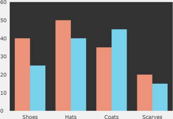
Figure 9.4 Here, the plot area portion of the chart is emphasized with a dark background to delineate it from the rest of the chart.
This code defines a constructor for the ColumnSeries class and causes it to inherit from the ChartElement class. The constructor calls the base constructor, initializes the value of the _valueAccessor property to null, and assigns a default color to the series (red). The_valueAccessor expects to be provided a function that can be used to extract values for the series from each data item.
ColumnSeries.prototype._validate = function () {
if (this._valueAccessor === null) {
return false;
}
return ChartElement.prototype._validate.call(this);
};
Next, the _validate function is defined for the ColumnSeries. This should return true when the series has everything that it needs to render. The series must have a _valueAccessor so that it can extract the values that it needs from the data items. Other validation is provided by the base implementation of this function on the ChartElement class.
ColumnSeries.prototype._render = function (ctx) {
if (!this._validate()) {
return;
}
var currWidth, currHeight,
currX, currY,
currColor, i;
var data = this._chart._data;
var f = {};
f.xPositions = [];
f.yPositions = [];
f.widths = [];
f.heights = [];
This code begins to define the _render function for the ColumnSeries class. If the series is not currently valid, it will abort. Some useful variables are defined, it fetches the data from the chart and then creates an object called f (this stands for frame, as you will see later) that will hold the calculated values for rendering the columns into the canvas.
currColor = this._color;
var index = this._index;
var width = this._chart.seriesWidth();
var halfWidth = width / 2.0;
var offset = this._chart.offset(index);
Here, you gather the CSS color string which will be used to fill the columns. Following that, the current index of the series within the chart is acquired. This is populated by the chart when the series is created. this._chart.seriesWidth() asks the chart how wide the current series should be. The chart should be able to examine how many series are present to partition the plot space accordingly. The chart is also queried for how much to offset the current series within the grouping of series. Refer to Figure 9.3 to see how each category has a distinct cluster of columns centered around it. The offset indicates how far from the start of that category the center of this series' column should be placed. The chart object knows the total number of series present, so the chart will decide this for you.
To see what is meant by the offset, first examine Figure 9.5, which has a black line at the start of each category along the x axis.
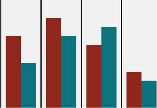
Figure 9.5 Some guidelines indicate where the categories on the x axis begin.
Now examine Figure 9.6 to see black lines through the center of all the columns in the first column series contained in the chart. The distance between these black lines and the starts of the categories should all be the same, and they are equal to the offset queried from the chart.
var zeroPosition = this._chart.scaleY(0);
var val, scaledX, scaledY;
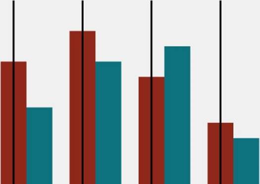
Figure 9.6 The guidelines on this chart indicate where the center of each item is for the first series.
This code asks the chart to scale the number 0 into the y-coordinate space of the plot area. Generally, when rendering a column series, the columns move up from 0 if their values are positive and descend down from 0 if their values are negative. Thus, it's important to know the y-coordinate position in the plot area that represents the 0 line of the axis. Following this, some variables are defined to store the current data value, and the x-y coordinates of the top middle of the current column (or bottom middle if its value is negative).
for (i = 0; i < data.length; i++) {
val = this._valueAccessor(data[i]);
scaledY = this._chart.scaleY(val);
scaledX = this._chart.scaleX(i);
f.xPositions.push(scaledX + offset - halfWidth);
f.yPositions.push(Math.min(scaledY, zeroPosition));
f.widths.push(width);
f.heights.push(Math.abs(scaledY - zeroPosition));
}
This loop calculates the positions and width and heights of the columns. First it calls the _valueAccessor on the current data item. Then it asks the chart to scale the current value into the y-coordinate system of the plot area and stores that in scaledY. Then it asks the chart for the start of the category at index i and stores that in scaledX. The start of the category is not where the column is located, though, as shown in Figures 9.5 and 9.6. You add the offset to the start of the category to find where the center of the column should be for the current category. You want the position of the top left of the column, however, so next you subtract half of the column width from the value and store that as the x position of the column.
For the y position of the column, the column will either extend up from the 0 line or descend from it, so the minimum of scaledY and zeroPosition should represent the top of the column.
NOTE Why is the minimum y value at top of the column? In most 2D rendering APIs the coordinate origin is the top left of the screen, and the y coordinates increase as you move down the screen. Because of this, the tops of the columns have lower y values than the bottoms of the columns.
All the columns have the same width, which was provided by the chart at the beginning of the function. The height of each column is the distance between the scaledY value and the zeroPosition value. Math.abs is used to ensure that the column height is positive regardless of whether the column extends up or down from the zeroPosition.
ctx.fillStyle = currColor;
for (var i = 0; i < f.widths.length; i++) {
currX = f.xPositions[i];
currY = f.yPositions[i];
currWidth = f.widths[i];
currHeight = f.heights[i];
ctx.fillRect(
currX, currY,
currWidth, currHeight);
}
};
Finally, provided the values calculated in the previous loop, you can render all the columns as rectangles into the HTML5 canvas 2D context, which was passed into the function. First ctx.fillStyle = currColor sets the fill color that will be used for the column to the current color of the series; then fillRect is called on the canvas context to render a rectangle into the canvas providing its top, left, width, and height.
ColumnSeries.prototype.valueAccessor = function (accessor) {
this._valueAccessor = accessor;
this._update();
return this;
};
This function allows for the _valueAccessor to be set on the series.
var Chart = function (targetId) {
this._canvas = document.getElementById(targetId);
this._ctx = this._canvas.getContext("2d");
this._ctx.font = "14pt Verdana";
this._data = null;
this._totalWidth = this._canvas.width;
this._totalHeight = this._canvas.height;
this._leftMargin = 50;
this._rightMargin = 50;
this._topMargin = 50;
this._bottomMargin = 50;
this._minValue = NaN;
this._maxValue = NaN;
this._series = [];
this._gap = 0.25;
this._calculatePlotArea();
};
This code block defines a constructor for the Chart class. You provide an element ID to the constructor to indicate which canvas element the Chart should inhabit. This element is found in the document, and getContext("2d") obtains a 2D rendering context from the located canvas element.
NOTE What is the significance of getContext("2d")? Why not just use getContext()? Well, the canvas element is also used as a container for 3D graphics using WebGL, in which case you call getContext("webgl").
The constructor also defines initial values for other properties of the chart. Properties defined include
· _totalWidth: The total width of the chart
· _totalHeight: The total height of the chart
· _leftMargin: The left margin around the plot area
· _topMargin: The top margin around the plot area
· _rightMargin: The right margin around the plot area
· _bottomMargin: The bottom margin around the plot area
· _minValue: The minimum value of the y axis
· _maxValue: The maximum value of the y axis
· _series: The series that are added to the chart
· _gap: The proportion of each category on the x axis that is devoted to white space
Last, _calculatePlotArea is called to decide the plot area dimensions.
Chart.prototype.column = function () {
var c = new ColumnSeries(this);
this._series.push(c);
c._index = this._series.length - 1;
this.update();
return c;
};
This function causes a new ColumnSeries to be created, and adds it to the chart's _series array. It also populates the _index on the series, and causes it to update.
Chart.prototype.minValue = function (val) {
this._minValue = val;
this.update();
return this;
};
Chart.prototype.maxValue = function (val) {
this._maxValue = val;
this.update();
return this;
};
These functions allow for the minimum and maximum values of the y axis to be set on the chart.
NOTE This chart implementation delegates most of the range management and scaling logic to the chart because the axes are built-in and not very customizable. In a more complete implementation, scaling and range management is more naturally the concern of the axes.
Chart.prototype._calculatePlotArea = function () {
var left = this._leftMargin;
var top = this._topMargin;
var width = this._totalWidth -
(this._leftMargin + this._rightMargin);
var height = this._totalHeight -
(this._topMargin + this._bottomMargin);
this._plotLeft = left;
this._plotTop = top;
this._plotWidth = width;
this._plotHeight = height;
};
This function determines the viable rectangle for plotting series content within the chart. The goal is that there is sufficient space to render the axis labels within the marginal area.
Chart.prototype._render = function () {
var ctx = this._ctx;
ctx.clearRect(0, 0, this._totalWidth, this._totalHeight);
ctx.fillStyle = "rgba(240,240,240,1)";
ctx.fillRect(0, 0, this._totalWidth, this._totalHeight);
for (var i = 0; i < this._series.length; i++) {
this._series[i]._render(ctx);
}
};
This function implements the main render pass for the chart. Here, you perform these steps:
1. Retrieve the canvas 2D context from where it is stored on the chart.
2. Clear any existing content in the canvas.
3. Set the fill color to a gray color.
4. Fill the background of the canvas to the gray color.
5. For each series in the chart, ask the series to render itself into the canvas context. The render code for the ColumnSeries was discussed earlier.
NOTE As opposed to a retained mode system, such as SVG, the canvas element is an immediate mode rendering interface. There is no “undo,” and you aren't building a tree of displayed objects. Each time you want to update the content displayed, you will be clearing the content of the canvas and then re-rendering all the content that you want to be displayed. This is in stark contrast to SVG, where you would make some manipulations to the existing SVG DOM tree, and SVG would update the visual to accommodate. As discussed earlier in the chapter, these differences in interaction have various pros and cons.
Chart.prototype.update = function () {
this._render();
return this;
};
This function is called whenever something has changed that invalidates the current look of the chart. Right now, you are just having it immediately re-render the chart content, but this gets adjusted when animation is introduced later.
Chart.prototype.data = function (data) {
this._data = data;
this.update();
return this;
};
This function allows for data to be assigned to the chart. It stores the data in a property on the chart and then invalidates the current chart visual.
Chart.prototype.scaleY = function (val) {
var p = (val - this._minValue) /
(this._maxValue - this._minValue);
p = 1.0 - p;
return this._plotTop + p * this._plotHeight;
};
This function should have some very familiar-looking math, if you think back to the discussion on linear interpolation at the beginning of the chapter. Here you are using linear interpolation to map from the values along the numeric axis, which range from _minValueto _maxValue, into the y-pixel space of the plot area that ranges from _plotTop to (_plotTop + _plotHeight). p represents how far along the numeric axis val is. Because p is a value between 0 and 1, p = 1.0 - p will invert it. After the inversion, p is used as a weighting to determine the associated position within the plot area. Why the inversion? Conventional screen coordinates (used by the canvas) increase from top to bottom, rather than chart coordinates which should increase from bottom to top (at least, usually).
Chart.prototype.scaleX = function (val) {
var p = val / this._data.length;
return this._plotLeft + p * this._plotWidth;
};
scaleX is a very similar idea to scaleY. It's a linear interpolation that is used to map the index of a category into the pixel space of the plot area. The resulting position should be the start of the category for an index.
Chart.prototype.seriesWidth = function () {
var fullWidth = this._plotWidth / this._data.length;
var actualWidth = fullWidth * (1.0 - this._gap);
actualWidth /= this._series.length;
return actualWidth;
};
This function calculates how wide an individual series should be in the chart. This is done by dividing the available plot area width by the number of items, reducing this space by the _gap setting, so some space is left between the clusters for each category and then dividing by the number of series present in the chart.
Chart.prototype.offset = function (seriesIndex) {
var fullWidth = this._plotWidth / this._data.length;
var start = this._gap / 2.0 * fullWidth;
var span = seriesIndex * this.seriesWidth();
span += this.seriesWidth() / 2.0;
var offset = start + span;
return offset;
};
offset, as you saw before, should calculate how far from the beginning of a category the visual for a series should be placed, based on its index. This is achieved by first finding the start position of the cluster by taking the _gap into account. Then seriesWidth() is added for each series that precedes the series in question, and half of seriesWidth() is added to get an offset that equates to the center of the space reserved for the series.
Provided all this, you can proceed to actually create an instance of the chart:
var chart = new Chart("chart")
.minValue(0)
.maxValue(60)
.data(data);
chart.column()
.color(palette[0])
.valueAccessor(function (item) {
return item.Q1;
});
chart.column()
.color(palette[1])
.valueAccessor(function (item) {
return item.Q2;
});
This code performs the following:
· Creates a chart with a y axis that has a minimum value of 0 and a maximum value of 60 and assigns it some data
· Adds a column series to the chart that uses the first color in the palette as its color and gets its values from the Q1 property of the items in the data array
· Adds a second column series to the chart that uses the second color in the palette as its color and gets its values from the Q2 property of the items in the data array
Implementing Axes
The chart you've built so far performs the work of axes, but does not actually render any labels to tell you what the scales of the axes are! An axis is a chart element that displays the values along an edge of a chart. Figure 9.7 emphasizes the axis areas of the chart where the scale labels are displayed.
Figure 9.7 This shows where the chart axes are by darkening the background behind them.
Also, after the axes are in place, you'll start to make the chart animate, so, to prepare for that, you reorganize a few other things. The style of animation used is called key frame animation. Basically, if you can encapsulate everything that represents the render state of a series or axis into a frame class and drive the rendering from this frame, then later you'll be able to display a smooth transition by generating linearly interpolated frames between a starting frame and an ending frame. So, to start:
var KeyFrame = function () {
this.xPositions = [];
this.yPositions = [];
};
KeyFrame.prototype.clear = function () {
this.xPositions.length = 0;
this.yPositions.length = 0;
};
var ColumnsKeyFrame = function () {
KeyFrame.call(this);
this.widths = [];
this.heights = [];
};
ColumnsKeyFrame.prototype = Object.create(KeyFrame.prototype);
ColumnsKeyFrame.prototype.addColumn = function (
x, y,
width, height) {
this.xPositions.push(x);
this.yPositions.push(y);
this.widths.push(width);
this.heights.push(height);
return this;
};
ColumnsKeyFrame.prototype.clear = function () {
KeyFrame.prototype.clear.call(this);
this.widths.length = 0;
this.heights.length = 0;
};
This column's key frame should look familiar to you. Basically, you've moved all the rendering data that was being calculated as local variables in the ColumnSeries’ _render function to this frame class for storage.
var AxisKeyFrame = function () {
KeyFrame.call(this);
this.labelTexts = [];
};
AxisKeyFrame.prototype = Object.create(KeyFrame.prototype);
AxisKeyFrame.prototype.addLabel = function (
x, y,
text) {
this.xPositions.push(x);
this.yPositions.push(y);
this.labelTexts.push(text);
return this;
};
AxisKeyFrame.prototype.clear = function () {
KeyFrame.prototype.clear.call(this);
this.labelTexts.length = 0;
};
Your axis visuals will consist of labels, arranged along the plot area, indicating the scale of the axis. To this effect, the AxisKeyFrame class stores much the same data as the ColumnsKeyFrame, but stores a text value for the label rather than width and height information.
if (!window.queueFrame) {
if (window.requestAnimationFrame) {
window.queueFrame = window.requestAnimationFrame;
} else if (window.webkitRequestAnimationFrame) {
window.queueFrame = window.webkitRequestAnimationFrame;
} else if (window.mozRequestAnimationFrame) {
window.queueFrame = window.mozRequestAnimationFrame;
} else {
window.queueFrame = function (callback) {
window.setTimeout(1000.0 / 60.0, callback);
};
}
}
As part of the change to using key frames for rendering the chart, you switch to using the requestAnimationFrame for scheduling the rendering of the chart. requestAnimationFrame, if available, provides more reliable timer callbacks than setTimeout or setInterval, making for smoother animations. requestAnimationFrame is not available in some browsers, however, so the preceding code checks for it and gracefully degrades to using setTimeout to animate if it is unavailable.
ChartElement.prototype._update = function () {
if (!this._validate()) {
return;
}
if (this._chart._data === null) {
return;
}
this._updateFrames();
this._chart.dirty();
};
ChartElement.prototype._updateFrames = function () {
this._updateFrame(this._displayFrame);
};
Next, you edit some functions on the ChartElement class. Before, when a series needed to be updated, it would just call update on the containing chart, causing an immediate re-render. Now, the _update function calls _updateFrames, which in turn makes sure that the key frame for the element is updated. Then, it tells the chart that it is dirty, and needs to be re-rendered at the earliest opportunity. These changes tie into the animation support you'll be adding, but have another nice side effect. Before, if you changed many different settings, an immediate re-render was forced after each change. Now, instead, you will mark that a re-render is needed, but it will happen at some time later, after the current interaction has yielded. In this way, renders of the chart are batched and deferred. The deferral mechanism is discussed later in this section.
var ColumnSeries = function (chart) {
ChartElement.call(this, chart);
this._displayFrame = new ColumnsKeyFrame();
this._valueAccessor = null;
this._color = "rgba(255, 0, 0, 1)";
};
In the preceding code, the constructor of the ColumnSeries is altered to construct an instance of the ColumnsKeyFrame for use later.
ColumnSeries.prototype._render = function (ctx) {
var f = this._displayFrame;
var currWidth, currHeight,
currX, currY;
ctx.fillStyle = this._color;
for (var i = 0; i < f.widths.length; i++) {
currX = f.xPositions[i];
currY = f.yPositions[i];
currWidth = f.widths[i];
currHeight = f.heights[i];
ctx.fillRect(
currX, currY,
currWidth, currHeight);
}
};
The _render function, which previously had been deciding what to render and then rendering it, now just renders the information stored in the _displayFrame.
ColumnSeries.prototype._updateFrame = function (frame) {
var data = this._chart._data;
var index = this._index;
var width = this._chart.seriesWidth();
var halfWidth = width / 2.0;
var offset = this._chart.offset(index);
var zeroPosition = this._chart.scaleY(0);
var val, scaledX, scaledY;
frame.clear();
for (var i = 0; i < data.length; i++) {
val = this._valueAccessor(data[i]);
scaledY = this._chart.scaleY(val);
scaledX = this._chart.scaleX(i);
frame.addColumn(
scaledX + offset - halfWidth,
Math.min(scaledY, zeroPosition),
width,
Math.abs(scaledY - zeroPosition));
}
};
The _updateFrame function contains the logic that used to be in the top half of the _render function, except rather than storing the information about what needs to be rendered in local variables, it populates the key frame that was passed in as a parameter.
var CategoryAxis = function (chart) {
ChartElement.call(this, chart);
this._displayFrame = new AxisKeyFrame();
this._labelAccessor = null;
};
CategoryAxis.prototype = Object.create(ChartElement.prototype);
CategoryAxis.prototype._validate = function () {
if (this._labelAccessor === null) {
return false;
}
return ChartElement.prototype._validate.call(this);
};
CategoryAxis.prototype._render = function (ctx) {
var f = this._displayFrame;
var currText,
currX, currY;
ctx.fillStyle = this._color;
for (var i = 0; i < f.xPositions.length; i++) {
currX = f.xPositions[i];
currY = f.yPositions[i];
currText = f.labelTexts[i];
var width = ctx.measureText(currText).width;
ctx.fillText(
currText,
currX - width / 2.0,
currY);
}
};
CategoryAxis.prototype.labelAccessor = function (accessor) {
this._labelAccessor = accessor;
this._update();
return this;
};
CategoryAxis.prototype._updateFrame = function (frame) {
var data = this._chart._data;
var scaledX, nextScaled, label, pos;
frame.clear();
for (var i = 0; i < data.length; i++) {
label = this._labelAccessor(data[i]);
scaledX = this._chart.scaleX(i);
nextScaled = this._chart.scaleX(i + 1);
pos = (scaledX + nextScaled) / 2.0;
frame.addLabel(
pos,
this._chart._totalHeight - 20,
label);
}
};
The definition of the CategoryAxis follows basically the same pattern as the ColumnSeries, but we've highlighted some of the interesting differences in the preceding code.
var width = ctx.measureText(currText).width;
In order to find the left position of some text so that it is centered around a point, you need to know how wide that text is. You can ask the canvas context to measure a string with the current font and tell you how wide that text would be when rendered.
CategoryAxis.prototype.labelAccessor = function (accessor) {
this._labelAccessor = accessor;
this._update();
return this;
};
labelAccessor is analogous to valueAccessor on the ColumnSeries. Here, though, you are allowing for a function to be provided that fetches label text from the items of the data array.
label = this._labelAccessor(data[i]);
scaledX = this._chart.scaleX(i);
nextScaled = this._chart.scaleX(i + 1);
pos = (scaledX + nextScaled) / 2.0;
As the CategoryAxis key frame is being populated, you fetch the label value using the _labelAccessor and then determine the x position of the label by finding the midpoint between the start of the current category and the start of the next category.
var NumericAxis = function (chart) {
ChartElement.call(this, chart);
this._displayFrame = new AxisKeyFrame();
};
NumericAxis.prototype = Object.create(ChartElement.prototype);
NumericAxis.prototype._render = function (ctx) {
var f = this._displayFrame;
var currText,
currX, currY;
ctx.fillStyle = this._color;
for (var i = 0; i < f.xPositions.length; i++) {
currX = f.xPositions[i];
currY = f.yPositions[i];
currText = f.labelTexts[i];
ctx.textBaseline = "middle";
ctx.fillText(
currText,
currX,
currY);
}
};
NumericAxis.prototype._updateFrame = function (frame) {
var min = this._chart._minValue;
var max = this._chart._maxValue;
var interval = (max - min) / 6.0;
var label, scaledY;
frame.clear();
for (var i = min; i <= max; i += interval) {
label = i.toString();
scaledY = this._chart.scaleY(i);
frame.addLabel(
15,
scaledY,
label);
}
};
The NumericAxis is roughly the same idea as the CategoryAxis. We've again highlighted some of the interesting differences, though.
ctx.textBaseline = "middle";
When rendering the y-axis labels, you want them to be centered vertically around their location. Thankfully you can tell the canvas to set the text baseline to "middle" to achieve this.
var min = this._chart._minValue;
var max = this._chart._maxValue;
var interval = (max - min) / 6.0;
This calculates a very basic auto interval for the axis. This splits the space into six sections, which results in seven labels being rendered. This is simple, but a bit naïve. It can easily result in lots of decimal points in the labels!
for (var i = min; i <= max; i += interval) {
label = i.toString();
Provided a minimum, maximum, and interval, you can loop over the values and convert them into string labels for display.
this._xAxis = new CategoryAxis(this);
this._yAxis = new NumericAxis(this);
this._isDirty = false;
You add these lines to the Chart's constructor because this chart will be hard coded to use one CategoryAxis and one NumericAxis, and the chart starts with its dirty flag set to false, indicating it does not need to render yet.
Chart.prototype.xAxis = function () {
return this._xAxis;
};
You add the xAxis function to the chart so that you can access the chart's x axis to modify its settings.
Chart.prototype.dirty = function () {
if (this._isDirty) {
return;
}
this._isDirty = true;
var self = this;
window.queueFrame(function () {
self._render();
});
};
This is another new function for the chart that is called by the chart or its elements when they want to indicate that the chart needs to be re-rendered. It calls the requestAnimationFrame API to request that the _render function of the chart gets called at the earliest opportunity.
Chart.prototype._render = function () {
var ctx = this._ctx;
ctx.clearRect(0, 0, this._totalWidth, this._totalHeight);
ctx.fillStyle = "rgba(240,240,240,1)";
ctx.fillRect(0, 0, this._totalWidth, this._totalHeight);
this._xAxis._render(ctx);
this._yAxis._render(ctx);
for (var i = 0; i < this._series.length; i++) {
this._series[i]._render(ctx);
}
};
The chart's _render function now calls the _render functions of the two axes in addition to the series.
Chart.prototype.update = function () {
this._xAxis._update();
this._yAxis._update();
for (var i = 0; i < this._series.length; i++) {
this._series[i]._update();
}
return this;
};
The chart's update function calls the _update functions of all the elements.
chart.xAxis()
.labelAccessor(function (item) {
return item.name;
});
For the final piece, you need to tell the x axis how to retrieve the category labels from the data items when constructing the chart. With the axes incorporated, the chart looks like Figure 9.8, and you can access the files CanvasChartWithAxes.js/html/css on the companion website.
Figure 9.8 A chart with axes, which was built from scratch using the HTML5 canvas.
Adding Animation
Many of the changes enacted for adding columns to the chart were sneakily preparing you for animating the contents of the chart. You achieve the animation at a high level by having the series and the axes create a new target frame when their settings or data is changed and then perform a linear interpolation (yep, your old friend) between the values of the previous key frame and the next key frame.
KeyFrame.prototype.interpolateThings = function (
p, target, previous, next, doInterpolate, getFallbackValue) {
var minCount = Math.min(previous.length, next.length);
var maxCount = Math.max(previous.length, next.length);
var i = 0, prevLen = previous.length,
nextLen = next.length, fallBack = getFallbackValue();
var lastPrev = prevLen > 0 ? previous[prevLen - 1] : fallBack;
var lastNext = nextLen > 0 ? next[nextLen - 1] : fallBack;
for (i = 0; i < maxCount; i++) {
if (i < minCount) {
target[i] = doInterpolate(p, previous[i], next[i]);
}
else if (i < previous.length) {
target[i] = doInterpolate(p, previous[i], lastNext);
}
else if (i < next.length) {
target[i] = doInterpolate(p, lastPrev, next[i]);
}
}
target.length = maxCount;
};
KeyFrame.prototype.interpolateNumbers = function (
p, target, previous, next) {
this.interpolateThings(p, target, previous, next,
function (p, prev, next) {
return prev + p * (next - prev);
},
function () {
return 0;
});
};
KeyFrame.prototype.interpolate = function (p, previous, next) {
this.interpolateNumbers(p,
this.xPositions,
previous.xPositions,
next.xPositions);
this.interpolateNumbers(p,
this.yPositions,
previous.yPositions,
next.yPositions);
};
The preceding code defines the interpolateThings function to aid in interpolating arrays of entities that should be interpolated based on the animation progress (which will range from 0 to 1). When one array has fewer items than another, either the last item is used to interpolate with the overflow values, or, if one of the arrays is empty, a default value is used in the interpolation. The interpolateNumbers function uses the interpolateThings function to define how to interpolate two arrays of numbers. Finally the base interpolatefunction is defined for KeyFrame, which interpolates the x positions and the y positions for the KeyFrame.
ColumnsKeyFrame.prototype.interpolate = function (p, previous, next) {
KeyFrame.prototype.interpolate.call(this, p, previous, next);
this.interpolateNumbers(
p,
this.widths,
previous.widths, next.widths);
this.interpolateNumbers(
p,
this.heights,
previous.heights, next.heights);
};
An interpolate function is added to the ColumnsKeyFrame, which interpolates the widths and heights of the columns.
AxisKeyFrame.prototype.interpolate = function (p, previous, next) {
KeyFrame.prototype.interpolate.call(this, p, previous, next);
this.interpolateThings(p,
this.labelTexts,
previous.labelTexts,
next.labelTexts,
function (p, previous, next) {
return next;
},
function () {
return "";
});
};
As with the ColumnsKeyFrame, the main interpolation work is done in the base interpolate method, which interpolates the x and y position arrays. This method just ensures that when you interpolate the text of a label it returns the next label value rather than trying to animate the value of the label.
Next there are some changes to ChartElement:
var ChartElement = function (chart) {
this._chart = chart;
this._color = new Color(1, 80, 80, 80);
this._animationProgress = -1;
this._animationStartTime = null;
this._transitionDuration = 1000;
this._displayFrame = null;
this._previousFrame = null;
this._nextFrame = null;
};
Some new properties are added:
· _animationProgress: Tracks the current progress of the running animation.
· _animationStartTime: Tracks the start time of the current animation.
· _transitionDuration: The settable duration for the animations that get played in milliseconds.
· _displayFrame: The current displaying frame for the chart element. During an animation, this will be an interpolated frame between the _previousFrame and the _nextFrame. This is always the frame that gets rendered.
· _previousFrame: The previous key frame that was rendered.
· _nextFrame: The next key frame that is the goal of the current animation.
ChartElement.prototype.transitionDuration = function (val) {
this._transitionDuration = val;
return this;
};
This code allows for the duration of the animations to be changed.
ChartElement.prototype._startAnimation = function () {
this._animationProgress = 0;
this._animationStartTime = window.getHighResTime();
this._chart.ensureTicking();
};
ChartElement.prototype._isAnimating = function () {
return this._animationProgress != -1;
};
These functions allow for an animation to be started for the chart element and to determine if an animation is currently running for that element. The chart actually manages ensuring that this element's _tickAnimation function gets called as the animation frames are generated, so the element just asks the chart to _ensureTicking and tracks the start time of the current animation.
ChartElement.prototype._tickAnimation = function (time) {
if (!this._isAnimating()) {
return false;
}
var elapsed = time - this._animationStartTime;
var finishing = false;
if (elapsed >= this._transitionDuration) {
elapsed = this._transitionDuration;
this._updateFrame(this._previousFrame);
finishing = true;
}
this._animationProgress = elapsed / this._transitionDuration;
this._animationProgressUpdated();
if (finishing) {
this._animationProgress = -1;
return false;
}
return true;
};
_tickAnimation compares the current time to the start time in order to see if the animation is over, or to calculate the current progress based on the desired duration of the animation. In so doing, the _animationProgress property is updated with a value between 0 and 1 that represents the progress of the current animation, which will be the weighting for the blending, and _animationProgressUpdated is called.
ChartElement.prototype._animationProgressUpdated = function () {
this._displayFrame.interpolate(
this._animationProgress,
this._previousFrame,
this._nextFrame);
};
_animationProgressUpdated is the main driver for the interpolation you've been defining. Each time the animation ticks it will use the current progress to update the _displayFrame to contain values that are an interpolation between the previous key frame and the next key frame. To facilitate this arrangement the _updateFrames method is also modified:
ChartElement.prototype._updateFrames = function () {
var swap = this._previousFrame;
this._startAnimation();
this._previousFrame = this._displayFrame;
this._displayFrame = swap;
this._updateFrame(this._nextFrame);
};
_updateFrames is called when a new target frame needs to be generated for the element. To facilitate this, the current _displayFrame becomes the _previousFrame, and a new _nextFrame is generated. When the animation starts ticking, it generates a new _displayFrame that contains the interpolated values between the two. Each successive tick of the animation updates _displayFrame again, shifting it farther away from _previousFrame and closer to _nextFrame.
All of the chart element types need to construct their previous and next frames in their constructors:
var CategoryAxis = function (chart) {
ChartElement.call(this, chart);
this._displayFrame = new AxisKeyFrame();
this._previousFrame = new AxisKeyFrame();
this._nextFrame = new AxisKeyFrame();
this._labelAccessor = null;
};
var NumericAxis = function (chart) {
ChartElement.call(this, chart);
this._displayFrame = new AxisKeyFrame();
this._previousFrame = new AxisKeyFrame();
this._nextFrame = new AxisKeyFrame();
};
var ColumnSeries = function (chart) {
ChartElement.call(this, chart);
this._displayFrame = new ColumnsKeyFrame();
this._previousFrame = new ColumnsKeyFrame();
this._nextFrame = new ColumnsKeyFrame();
this._valueAccessor = null;
this._color = new Color(1, 255, 0, 0);
};
Finally, the main animation driver is added to the chart:
Chart.prototype.ensureTicking = function () {
var self = this;
if (this._isTicking) {
return;
}
this._isTicking = true;
window.queueFrame(function () {
self.animationTick();
});
};
Chart.prototype.animationTick = function () {
var time = window.getHighResTime();
var self = this;
var stillAnimating = false;
if (this._xAxis._tickAnimation(time)) {
stillAnimating = true;
}
if (this._yAxis._tickAnimation(time)) {
stillAnimating = true;
}
for (var i = 0; i < this._series.length; i++) {
if (this._series[i]._tickAnimation(time)) {
stillAnimating = true;
}
}
this._render();
if (stillAnimating) {
window.queueFrame(function () {
self.animationTick();
});
} else {
this._isTicking = false;
}
};
ensureTicking bootstraps things by queuing an animation frame, which calls the animationTick method. animationTick calls _tickAnimation on all of the chart elements, calls the main _render method of the chart to render it out to the canvas, and finally, if any of the elements were still in progress, requests a new animation frame that will re-call animationTick when the new frame is ready.
With all this in place, you can load the chart and see it animate into place. Figure 9.9 shows the chart in mid animation, and you can find the code in the files CanvasChartAnimation.js/html/css on the companion website.
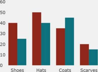
Figure 9.9 A column chart animates into view, rendered using the HTML5 canvas.
Why does everything animate in from the corner, though? The first time the chart renders, there is no previous frame state for any of the elements. The interpolation you defined used 0 for any initial numeric state, so everything is animating in from point 0,0. It would be more optimal if the columns were already in position and only their heights were animated. You can achieve that by defining an initial previous frame to use for the chart elements.
KeyFrame.prototype._isEmptyFrame = function () {
return this.xPositions.length === 0;
};
First, it helps to be able to detect if you are animating from an unpopulated frame.
ChartElement.prototype._animationProgressUpdated = function () {
var displayFrame = this._displayFrame;
var previousFrame = this._previousFrame;
var nextFrame = this._nextFrame;
var actualProgress = this._easing(this._animationProgress);
if (previousFrame._isEmptyFrame() &&
this._populateDefaultFrame) {
this._populateDefaultFrame(previousFrame, nextFrame);
}
displayFrame.interpolate(
actualProgress,
previousFrame,
nextFrame);
};
Then, if the previous frame is an empty frame, a chart element can generate a default frame rather than animating from the empty frame. You may also notice the addition of the _easing call in this code. You can read more about that later in this chapter.
CategoryAxis.prototype._populateDefaultFrame = function (
frame, nextFrame) {
for (var i = 0; i < nextFrame.xPositions.length; i++) {
frame.xPositions[i] = 0;
frame.yPositions[i] = this._chart._totalHeight - 20;
}
};
CategoryAxis provides an implementation of _populateDefaultFrame that starts all of the labels underneath the plot area, but on the left side of the chart. This way they should animate in from the left rather than the top left.
NumericAxis.prototype._populateDefaultFrame = function (
frame, nextFrame) {
for (var i = 0; i < nextFrame.xPositions.length; i++) {
frame.xPositions[i] = nextFrame.xPositions[i];
frame.yPositions[i] = this._chart._plotTop + this._chart._plotHeight;
}
};
NumericAxis provides a similar implementation, except it animates the labels in from the bottom of the chart.
ColumnSeries.prototype._populateDefaultFrame = function (
frame, nextFrame) {
for (var i = 0; i < nextFrame.xPositions.length; i++) {
frame.xPositions[i] = nextFrame.xPositions[i];
frame.yPositions[i] = this._chart._plotTop +
this._chart._plotHeight;
frame.widths[i] = nextFrame.widths[i];
frame.heights[i] = 0;
}
};
Finally, ColumnSeries provides an implementation that starts the columns in their eventual x-positions, but with a collapsed height and an adjusted top position.
Now, if you run the code you get a much cleaner animation where the columns animate in from the bottom of the chart and the labels slide into place from the bottom left. You can see the results in Figure 9.10, which shows the chart mid animation, and you can find the code in the file CanvasChartAnimationWithStartingFrame.js/html/css on the companion website.
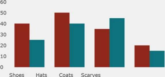
Figure 9.10 This shows an animating column chart with starting frames, built from scratch using the HTML5 canvas.
So what was that easing call about?
var easing = {};
easing.toIn = function (f, t) {
return f(t * 2.0) / 2.0;
};
easing.toOut = function (f, t) {
t = 1 - t;
return (1.0 - f(t * 2.0)) / 2.0 + 0.5;
};
easing.cubicIn = function (t) {
return t * t * t;
};
easing.cubicInOut = function (t) {
if (t < 0.5) {
return easing.toIn(easing.cubicIn, t);
} else {
return easing.toOut(easing.cubicIn, t);
}
};
var ChartElement = function (chart) {
this._chart = chart;
this._color = new Color(1, 80, 80, 80);
this._animationProgress = -1;
this._animationStartTime = null;
this._transitionDuration = 1000;
this._displayFrame = null;
this._previousFrame = null;
this._nextFrame = null;
this._easing = easing.cubicInOut;
};
An easing function adjusts the speed with which an animation progresses. It can make motion look more natural for the beginning and/or the end to play at different speeds compared to the middle portion. Your animation, so far, has left progress moving at a linear rate. The idea of the preceding code is to use a piecewise cubic function to bend the linear relationship between time and progress into a different shape, specifically one that accelerates and decelerates at the beginning and end. Figure 9.11 shows the linear relationship between time and progress you used for the previous sample, and Figure 9.12 shows the piecewise cubic relationship between time and progress that will be used now.
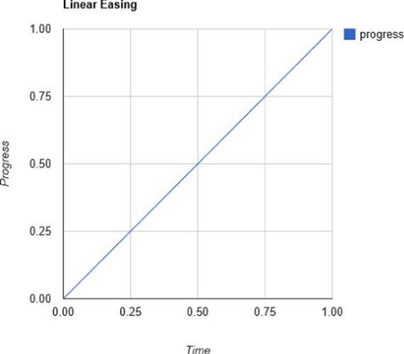
Figure 9.11 A linear relation between time and progress creates a steadily progressing animation with no speed changes.
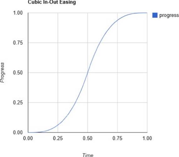
Figure 9.12 A piecewise cubic relationship between time and progress creates an animation that speeds up and slows down over time.
Finally, now that all the animation groundwork is in place, you get some really neat effects if you modify the data of the column series with a button on the page.
var data2 = [
{ "name": "Shoes", "Q1": 20, "Q2": 35 },
{ "name": "Hats", "Q1": 30, "Q2": 40 },
{ "name": "Coats", "Q1": 45, "Q2": 25 },
{ "name": "Scarves", "Q1": 10, "Q2": 25 }
];
First, you need a second set of data.
var initialData = true;
var button = document.getElementById("changeData");
button.onclick = function () {
if (initialData) {
chart.data(data2);
initialData = false;
} else {
chart.data(data);
initialData = true;
}
};
Then all you need to do to animate the change is call data to toggle back and forth between the original data and the new data when a button is pressed. You can see the chart mid animation between the two data sets in Figure 9.13, and you can find the code in the files CanvasChartAnimationWithDataUpdate.js/html/css on the companion website.
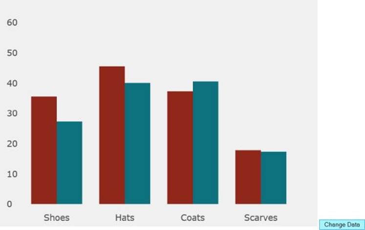
Figure 9.13 A column chart animating between data sets, in order to show how the data changes over time.
Things get even more interesting if you have different amounts of data items in the sets you are toggling between:
var data = [
{ "name": "Shoes", "Q1": 40, "Q2": 25 },
{ "name": "Hats", "Q1": 50, "Q2": 40 },
{ "name": "Coats", "Q1": 35, "Q2": 45 },
{ "name": "Scarves", "Q1": 20, "Q2": 15 }
];
var data2 = [
{ "name": "Shoes", "Q1": 20, "Q2": 35 },
{ "name": "Hats", "Q1": 30, "Q2": 40 },
{ "name": "Coats", "Q1": 45, "Q2": 25 },
{ "name": "Scarves", "Q1": 10, "Q2": 25 },
{ "name": "Socks", "Q1": 55, "Q2": 15 },
{ "name": "Sweaters", "Q1": 50, "Q2": 35 }
];
Figure 9.14 shows the chart in the midst of animating new data items into place, and the code is in the files CanvasChartAnimationLine.js/html/css on the companion website. These files also show an implementation of line series.
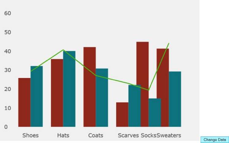
Figure 9.14 The custom Canvas chart you are building animates between two data sets to show new data being introduced over time.
Starting with Google Charts
We hope your plunge into the deep-end of building charting tools from scratch has given you a good low-level understanding of how visualizations are put together.
Building your own tools from scratch, or using low-level visualization APIs such as D3, can grant you a great deal of flexibility, but the lack of high-level abstractions and simplifications can truly hamper productivity. Thankfully, the charting API landscape is diverse and there are products to use from all along the complexity spectrum. One constrained and high-level product, which is correspondingly simple to use, is the Google Charts API.
Google Charts API Basics
To use the Google Charts API, you set up a data table instance, with rows corresponding to individual items in a data series and columns corresponding to a set of categories, or some number of data series plotted for those categories. First up, you see how much less code it is to put together a bar chart compared to building your column chart from scratch earlier.
A Basic Bar Chart
All of the following code for the Google Charts API uses this CSS:
#chart {
width: 500px;
height: 500px;
}
This just defines the size of the container for the chart, using CSS. And here's the HTML:
<!DOCTYPE html>
<html>
<head>
<title>Google Charts API Basic Bar Chart</title>
<script type="text/javascript" src="https://www.google.com/jsapi">
</script>
<script type="text/javascript">
google.load('visualization', '1',
{ packages: ['corechart'] });
</script>
<script type="text/javascript"
src="847060_ch13_GoogleChartsAPIBarChart.js">
</script>
<link rel="stylesheet"
href="847060_ch13_GoogleChartsAPIBarChart.css">
</head>
<body>
<div id="chart"></div>
</body>
</html>
In this code, you are referencing the Google Visualization API scripts and requesting that the corechart package be downloaded. Like many JavaScript APIs, Google Charts is modular so that you can select only the features you want in order to save bandwidth and load pages faster. The <div> is what holds the chart, and that's what you targeted with the CSS rule just before.
function renderChart() {
var data = google.visualization.arrayToDataTable([
['product', 'Sales'],
['Shoes', 40],
['Hats', 50],
['Coats', 35],
['Scarves', 20]
]);
var options = {
title : "Product Sales",
hAxis: { title: "Sales" },
vAxis: { title: "Products" }
};
var chart = new google.visualization.BarChart(
document.getElementById("chart"));
chart.draw(data, options);
}
google.setOnLoadCallback(renderChart);
That's not much code, huh? First, you create a data table with two columns. The types of the columns (string and number) are determined automatically. When you request a chart to be rendered, Google Charts tries to do the intelligent thing with them. Next, some options are provided, which basically just assigns some titles to the axes and the chart itself. Last, a google.visualization.BarChart is created, targeting the <div> with the ID chart, and the chart is drawn, providing the data and the options.
All of that is gathered into a function so that you can call
google.setOnLoadCallback(renderChart);
This ensures that you don't try to render the chart before the correct JavaScript resources have been downloaded or before the page DOM is ready. You can see the result in Figure 9.15. The GoogleChartsAPIBarChart.js/html/css files are on the companion website.
Figure 9.15 This bar chart was created with the Google Charts API.
A Basic Pie Chart
Having seen how much the Google Charts API simplifies displaying a bar chart, you can move on to pie charts, which are another popular chart type. Actually, it turns out to be a complete non-issue. Just change the chart initialization line to
var chart = new google.visualization.PieChart(
document.getElementById("chart"));
and delete the titles for the axes (you don't have any, anymore):
var options = {
title : "Product Sales"
};
You can see the result in Figure 9.16, and you can find the GoogleChartsAPIPieChart.js/html/css files on the companion website.
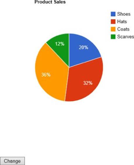
Figure 9.16 This pie chart was created with the Google Charts API.
Also, take a moment to notice all the interesting ancillary features that the Google Charts API bundles in for you, for free. When you run the sample, do you notice how you can select slices by clicking them? Do you notice the hover effects when your cursor is over a slice? Okay, now it's time for a neat trick that would be extremely difficult to pull off if you had written this pie chart from scratch. Change the options block to.
var options = {
title : "Product Sales",
is3D: true
};
Now the chart is in faux 3D! Check it out in Figure 9.17. The GoogleChartsAPIPieChart3D.js/html/css files are on the companion website. Keep in mind, though, that 3D rarely adds any new information to a visualization you are trying to build, but it can, often, make a visualization harder to interpret. It's a good idea, when considering adding 3D elements to a visualization, to evaluate whether they are actually adding extra information, or whether the addition is purely aesthetic. If the latter, it may be better to use some restraint.
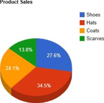
Figure 9.17 A simple setting has transformed a pie chart into a faux 3D pie chart.
Working with Chart Animations
Earlier in this chapter, you saw how powerful and flexible animations could be when building them from scratch. But they also take a lot of code and effort to enable. Now check out how you would achieve a similar effect using the Google Charts API:
function renderChart() {
var data = google.visualization.arrayToDataTable([
['product', 'Sales', { role: 'annotation' } ],
['Shoes', 0, "40"],
['Hats', 0, "50"],
['Coats', 0, "35"],
['Scarves', 0, "20"]
]);
var options = {
title : "Product Sales",
hAxis: { title: "Sales", viewWindow: { min: 0, max: 55 } },
vAxis: { title: "Products" },
animation: {
duration: 1000,
easing: 'inAndOut',
}
};
var button = document.getElementById('changeData');
var initialAnimationPlayed = false;
var chart = new google.visualization.BarChart(
document.getElementById("chart"));
google.visualization.events.addListener(chart, 'ready',
function() {
if (!initialAnimationPlayed) {
initialAnimationPlayed = true;
data.setValue(0, 1, 40);
data.setValue(1, 1, 50);
data.setValue(2, 1, 35);
data.setValue(3, 1, 20);
chart.draw(data, options);
} else {
button.disabled = false;
}
});
chart.draw(data, options);
var firstData = true;
button.onclick = function () {
if (!firstData) {
firstData = !firstData;
data.setValue(0, 1, 40);
data.setValue(1, 1, 50);
data.setValue(2, 1, 35);
data.setValue(3, 1, 20);
data.setValue(0, 2, "40");
data.setValue(1, 2, "50");
data.setValue(2, 2, "35");
data.setValue(3, 2, "20");
} else {
firstData = !firstData;
data.setValue(0, 1, 25);
data.setValue(1, 1, 40);
data.setValue(2, 1, 45);
data.setValue(3, 1, 15);
data.setValue(0, 2, "25");
data.setValue(1, 2, "40");
data.setValue(2, 2, "45");
data.setValue(3, 2, "15");
}
button.disabled = true;
chart.draw(data, options);
};
}
google.setOnLoadCallback(renderChart);
The key differences here are
· You start with the data values at 0.
· You enable animation for the chart and specify an animation duration and an animation-easing function.
· You create a click handler for a button that makes updates to the data table and redraws the chart.
· It's important to only make changes to the chart when it is “ready.”
This still could have been simpler, actually. Many charting APIs offer a facility to transition in the initial data values without needing to explicitly default the data to 0, but, at the time of this writing, Google Charts API doesn't seem to support this. Also, it's a bit cumbersome to avoid interacting with the chart when it isn't ready to receive commands.
You can see the animated bar chart after the data change has completed in Figure 9.18, which you can find in the GoogleChartsAPIBarChartAnimated.js/html/css files on the companion website.
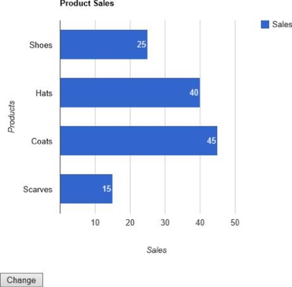
Figure 9.18 This animated bar chart was created using the Google Charts API.
You'll find also that if you substitute LineChart or AreaChart for BarChart everything should work fine for those charting types with no additional configuration other than retitling the axes. This is the power of working with a high-level charting API.
The GoogleChartsAPISelectType.js/html/css files on the companion website show you how to build a page that easily lets you swap between the main category charting types without animation. You can see the line chart in Figure 9.19.
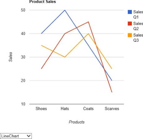
Figure 9.19 This line chart was created using Google Charts API.
Summary
You accomplished an awful lot this chapter. You learned:
· Some of the basics of plotting data in a chart
· How the HTML5 canvas differs from SVG, Flash, and other graphics tools
· How to use linear interpolation to map coordinates or blend changes over time
· How to use the HTML5 canvas and key frames to render and animate data in a page
· How to use the HTML5 canvas to render dynamic column charts
· How to use the HTML5 canvas to show changes to data over time
· How to use the Google Charts API to render a bar chart, a pie chart, and a 3D pie chart
· How to use the Google Charts API to animate a bar chart